The independent source for health policy research, polling, and news.
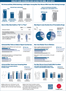
Visualizing Health Policy: Health Care Coverage and Access for Men, 2013-2015
This Visualizing Health Policy infographic provides a snapshot of men’s health care and insurance coverage issues, including health status, access to care and use of services. It compares the uninsured rates of men and women, their cost barriers to care, their connection to clinicians, and their use of prescription drugs, screening, and counseling services. Fewer men than women gained coverage between October 2013 and March 2015, and the uninsured rate continues to be higher for men than women. Although men are less likely than women to experience cost barriers to care, uninsured men are twice as likely as all men to report cost barriers resulting in delayed care or reduced prescription medications. Men are also are less likely to have seen a health care provider in the past two years and seek screening services or discuss their sexual health with providers.
Visualizing Health Policy is a monthly infographic series produced in partnership with the Journal of the American Medical Association (JAMA). The full-size infographic is freely available on JAMA’s website and is published in the print edition of the journal.
