Medicare Advantage: How Robust Are Plans’ Physician Networks?
Executive Summary
One of the biggest trade-offs between Medicare Advantage and traditional Medicare is that Medicare Advantage plans have a more limited network of doctors and other providers. The size and breadth of provider networks can be an important factor for beneficiaries when choosing between traditional Medicare and Medicare Advantage, and among Medicare Advantage plans. As of 2017, 19 million of the 58 million people on Medicare (33%) are enrolled in a Medicare Advantage plan, yet little is known about their provider networks.
19 million people on Medicare are in a #MedicareAdvantage plan, yet little is known about their provider networks.
This report is the first known study to examine the size and composition of Medicare Advantage plans’ physician networks. This analysis draws upon data from 391 plans, offered by 55 insurers in 20 counties, and accounted for 14% of all Medicare Advantage enrollees nationwide in 2015. Key findings include:
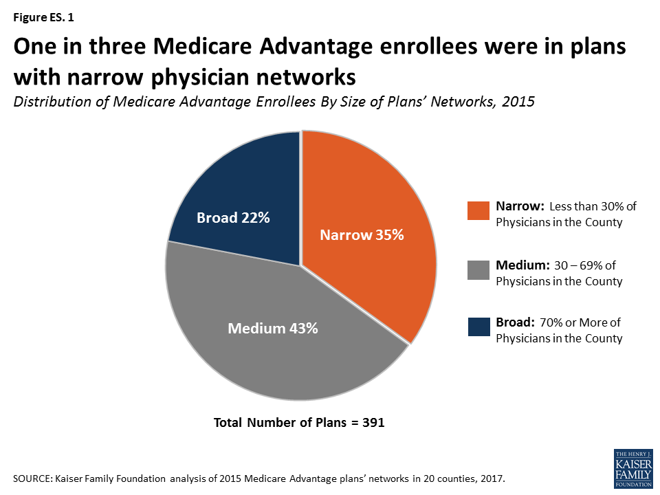
- More than three in ten (35%) Medicare Advantage enrollees were in narrow-network plans while about two in ten (22%) were in broad-network plans. To some degree, the relative narrowness of plan networks masks the total number of physicians that enrollees could access, particularly in larger counties.
- Medicare Advantage networks included less than half (46%) of all physicians in a county, on average.
- Network size varied greatly among Medicare Advantage plans offered in a given county. For example, while enrollees in Erie County, NY had access to 60% of physicians in their county, on average, 16% of the plans in Erie had less than 10% of the physicians in the county while 36% of the plans had more than 80% of the physicians in the county.
- Access to psychiatrists was typically more restricted than for any other specialty. Medicare Advantage plans had 23% of the psychiatrists in a county, on average; 36% of plans included less than 10% of psychiatrists in their county. Some plans provided relatively little choice for other specialties as well; 20% of plans included less than 5 cardiothoracic surgeons, 18% of plans included less than 5 neurosurgeons, 16% of plans included less than 5 plastic surgeons, and 16% of plans included less than 5 radiation oncologists.
- Broad-network plans tended to have higher average premiums than narrow-network plans, and this was true for both HMOs ($54 versus $4 per month) and PPOs ($100 versus $28 per month).
Insurers may create narrow networks for a variety of reasons, such as to have greater control over the costs and quality of care provided to enrollees in the plan. The size and composition of Medicare Advantage provider networks is likely to be particularly important to enrollees when they have an unforeseen medical event or serious illness. However, accessing the information may not be easy for users, and comparing networks could be especially challenging. Beneficiaries could unwittingly face significant costs if they accidentally go out-of-network. Differences across plans, including provider networks, pose challenges for Medicare beneficiaries in choosing among plans and in seeking care, and raise questions for policymakers about the potential for wide variations in the healthcare experience of Medicare Advantage enrollees across the country.
Report
Introduction
For people on Medicare, one of the biggest trade-offs between Medicare Advantage and traditional Medicare is that Medicare Advantage plans have a more limited network of doctors and other providers. Medicare Advantage plans restrict the doctors, hospitals, and other providers from whom their enrollees can receive care, while traditional Medicare allows people to see any provider that accepts Medicare (overwhelming majority of providers). Seniors value having the ability to choose their own doctors as well as keep their existing doctors, and say that the doctors in the network are an important factor in their plan selections.1
Although Medicare Advantage enrollment is rising rapidly, with one in three beneficiaries now in a Medicare Advantage plan, relatively little is known about Medicare Advantage plans’ provider networks.2 The Centers for Medicare and Medicaid Services (CMS) requires Medicare Advantage plans to include a specified number of physicians for each of the 26 specialties, along with hospitals, and other providers within a particular driving time and distance of enrollees;3 however, little information is available about the extent to which plans go beyond these basic requirements. A prior analysis showed that Medicare Advantage hospital networks vary greatly in size and composition.4 The size and composition of a plan’s physician network can have important implications for Medicare Advantage enrollees, including whether or not they can see a given physician (for HMO enrollees) or how much more they would need to pay for out-of-network care (for PPO enrollees).
When forming their networks, insurers may choose to contract with some but not all physicians for a variety of reasons. For example, the insurer may want to have greater control over the cost or quality of care provided by a physician or they may prefer to limit the number of physicians included in their network for other reasons. Curating and restricting their provider networks may also allow insurers to improve the coordination and efficiency of care for their enrollees.
At the same time, physicians may or may not want to be a part of a Medicare Advantage network. They may not want the extra paperwork and time that may come with accepting another insurer, may not want additional patients, or may have concerns with a plan’s payment rates or other terms of a given plan’s contract.
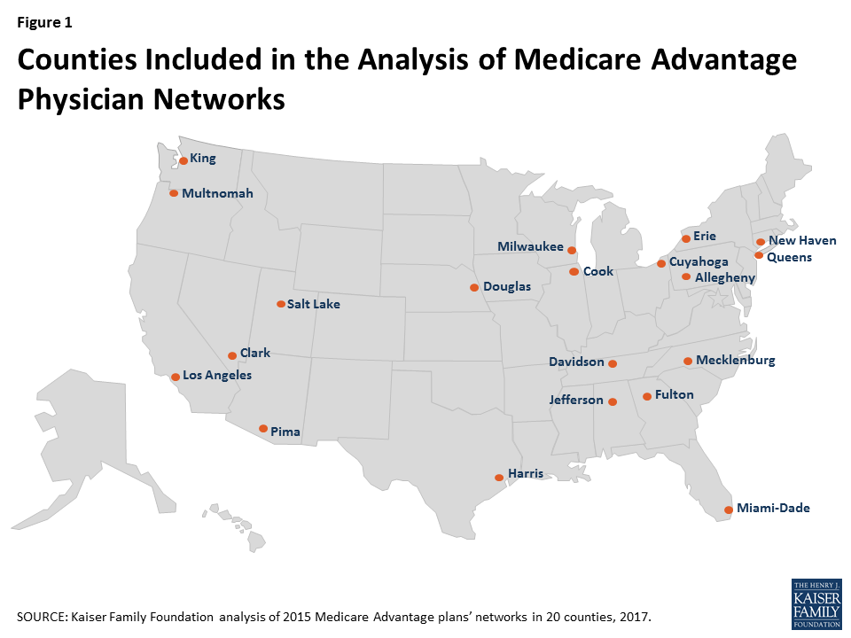
This report is the first known study to examine the size and composition of Medicare Advantage plans’ networks, focusing on physicians. This analysis draws upon data from 391 plans, offered by 55 insurers, in 20 counties, accounting for 14 percent of all Medicare Advantage enrollees nationwide in 2015. The report analyzes the size of provider networks across and within the 20 counties, overall and by specialty, and looks at the relationship between network size and other plan features, including plan types, premiums, star ratings, and insurers. We defined Medicare Advantage networks as broad if they included 70 percent or more of the physicians in a county, medium if they included between 30 and 69 percent of the physicians in a county, and narrow if they included less than 30 percent of the physicians in a county.
Growing evidence indicates that many plans do not maintain accurate directories.5 For example, in an investigation, CMS found that the directories had many errors and 45 percent of the doctors listed had incorrect information in plans’ directories.6 Unlike CMS, we do not assess the accuracy of the directories, nor do we assess whether the physicians in the directories actually accept the insurance.
Methods
For this analysis, we examined physician networks of Medicare Advantage Health Maintenance Organizations (HMOs) and local Preferred Provider Organizations (PPOs) offered in 20 counties in 2015 (Figure 1). We selected a geographically diverse set of counties that encompass a sizeable share of the total Medicare Advantage population. These counties range in size, per capita Medicare spending, the number of plans offered to Medicare beneficiaries, and Medicare Advantage penetration rates in 2015 (Table A1).
We downloaded from each insurer’s website the provider directories for each Medicare Advantage plan offered in the 20 counties during the 2015 open enrollment period; provider directories could only be accessed directly from the insurers because the directories are not posted on the Medicare Plan Finder, the website developed by CMS to support Medicare Advantage plan comparisons. We converted the directories for each plan to a machine-readable format. We then matched the text in the directories against a national census of physicians maintained by SK&A using a text-matching method that searched the directories for the names of every doctor practicing in each county (see Appendix for details).
We categorized networks into one of three sizes based on the share of physicians in the county that were included in the directory: broad (70% or more of the physicians), medium (30-69% of the physicians), and narrow (less than 30% of the physicians). These categories are the same as those used in a prior analysis of Medicare Advantage hospital networks, and are the same cut-offs that were used in a McKinsey & Company report examining ACA Marketplace networks.7 The analysis included the 26 physician specialties that Medicare Advantage plans were required to include in their networks, and excluded all other specialties. For a more detailed description of the study methods, see the Appendix.
Results
Size of Plans’ Networks
By Plan
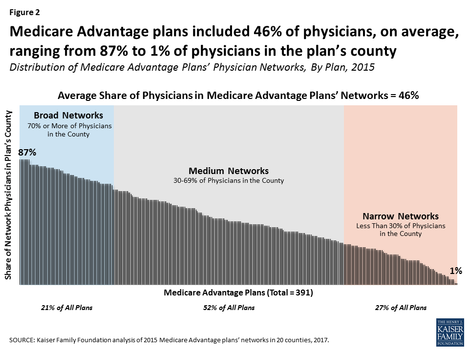
Medicare Advantage plan networks included less than half (46%) of all physicians in a county, on average, in 2015 (Figure 2). In comparison, other studies have found that about 30 percent of all physicians in a rating area were included in ACA Marketplace plans in 2014.8 About one in four (27%) plans had narrow networks (with less than 30% of physicians in the county), about half (52%) of all plans had medium-sized networks (with 30 to 69% of physicians in the county), and about one in five (21%) plans had broad networks (with 70% or more of the physicians in the county).
By Enrollment
While about one in four (27%) Medicare Advantage plans had narrow networks, these plans included about one in three (35%) Medicare Advantage enrollees in the 20 counties in 2015, indicating that enrollees were somewhat disproportionately enrolled in plans with narrow networks (Figure 3). Four in ten (43%) enrollees were in plans with medium networks of physicians and about two in ten (22%) enrollees were in plans with broad networks of physicians. Some Medicare Advantage enrollees may be in plans with relatively narrow networks because they are comfortable with the way in which the plan delivers care, or they selected the plan based on other factors, such as low premiums.

Closed-panel HMOs (also known as staff model HMOs) generally have narrow networks because the plans’ parent insurers directly employ the majority of physicians in insurer’s provider networks. This study includes some closed-panel HMOs, such as Kaiser Permanente, but the majority of enrollees in narrow-network plans in the study were not in closed-panel HMOs; the largest closed-panel HMO in the study was Kaiser Permanente, which included 26 percent of all enrollment in narrow-network plans and 10% of total enrollment in the study.
By County
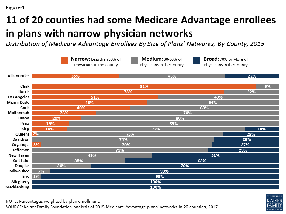
Network size varied widely across counties in 2015 (Figure 4; Table A2). In three large counties (Clark, Harris, and Los Angeles), most Medicare Advantage enrollees were in plans with narrow physician networks. In contrast, in seven counties (New Haven, Salt Lake, Douglas, Milwaukee, Erie, Allegheny, and Mecklenburg), more than half of all Medicare Advantage enrollees were in plans with broad networks, including four counties in which nearly all Medicare Advantage enrollees were in plans with broad networks (Allegheny, Erie, Mecklenburg, and Milwaukee).
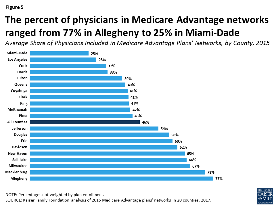
Similarly, the average size of Medicare Advantage plans’ physician networks varied greatly across the 20 counties. In Allegheny County, for example, Medicare Advantage plans included in their provider networks 77 percent of all physicians practicing in the county, on average; in contrast, the Medicare Advantage plans in Miami-Dade County included just 25 percent of all physicians in the county, on average (Figure 5). In four counties (Allegheny, Mecklenburg, Milwaukee, and Salt Lake), Medicare Advantage enrollees had access to at least two-thirds of all practicing physicians in the county, on average; however, in three counties (Cook, Los Angeles, and Miami-Dade), enrollees had access to less than one-third of the physicians in the county, on average.
The percent of physicians included in a Medicare Advantage plan network may mask the large number of physicians that an enrollee can access, particularly for plans in large counties. For example, while the average plan in Los Angeles County included only 28 percent of the physicians in the county, there were over 13,000 physicians in Los Angeles County and the average plan in Los Angeles County included 3,758 physicians – more physicians than the average plan in any of the other counties in this study. In effect, even though Medicare Advantage plans in Los Angeles had some of the narrowest physician networks, enrollees in plans in Los Angeles often had access to more physicians than enrollees in broader plans in other counties. Nevertheless, even in large counties, Medicare Advantage enrollees in narrow-network plans have access to fewer physicians than enrollees in medium or broad-network plans or beneficiaries in traditional Medicare.
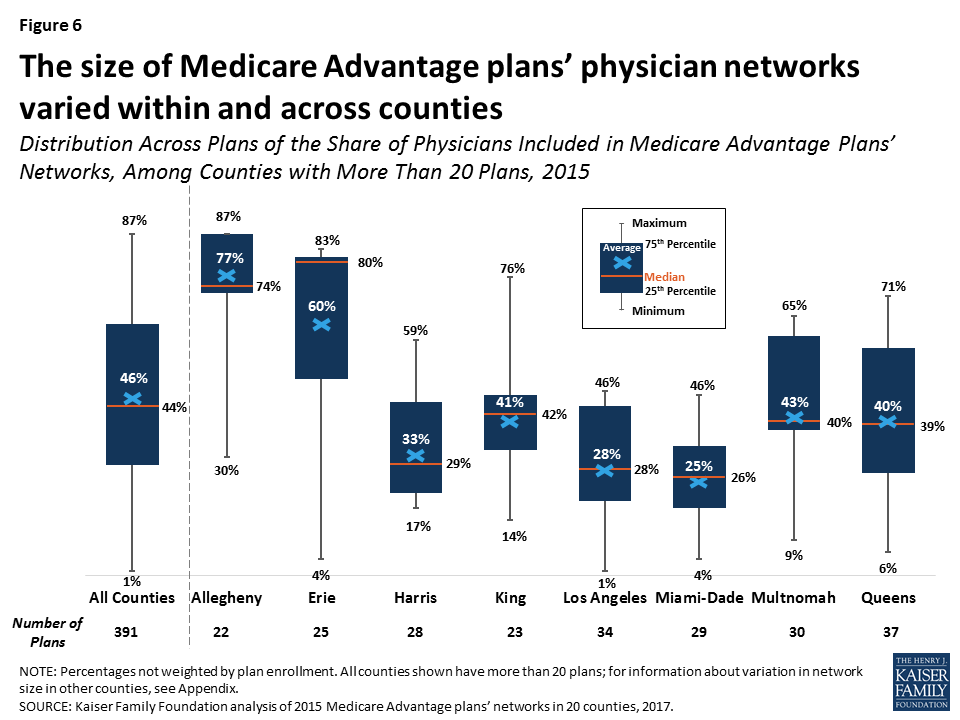
The size of Medicare Advantage provider networks also varied across plans within counties – an important consideration for beneficiaries choosing between plans (Figure 6; Table A3). For example, in Queens County, the size of plan networks ranged from 71 percent of the physicians in the county to as few as 6 percent of physicians in the county, with the average plan including 40 percent of physicians in the county. Similarly, while Medicare Advantage enrollees in Erie County had access to 60 percent of the physicians in the county, 16 percent of the plans in Erie had less than 10 percent of the physicians in the county while 36 percent of the plans had more than 80 percent of the physicians in the county.
By Specialty
Medicare Advantage plans included about four in ten (42%) primary care physicians in a county, on average, ranging from 20 percent in Miami-Dade to 77 percent in Allegheny (Table A4). However, the average share of physicians included in Medicare Advantage networks also ranged across specialties (Figure 7). For 12 of the 26 required specialties, Medicare Advantage plan networks included the majority of the physicians in their county, on average. The plan networks also included nearly half (43%) of geriatricians (not a required specialty) in a county, on average, ranging from 18 percent in Miami-Dade County to 88 percent in Allegheny County.
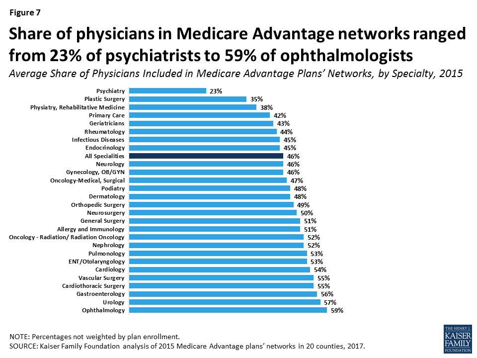
Access to psychiatrists was more restricted than for any other specialty, on average.9 On average, plans included less than one-quarter (23%) of the psychiatrists in a county, ranging from 7 percent in Los Angeles and Pima to 45 percent in Allegheny. More than one-third (36%) of the 391 Medicare Advantage plans included less than 10 percent of the psychiatrists in their county. The small share of psychiatrists in Medicare Advantage plan networks, particularly in some counties such as Los Angeles, raises the likelihood that beneficiaries in traditional Medicare receiving care for serious mental health issues would likely need to switch psychiatrists to remain in their plan’s network if they were to enroll in a Medicare Advantage plan.
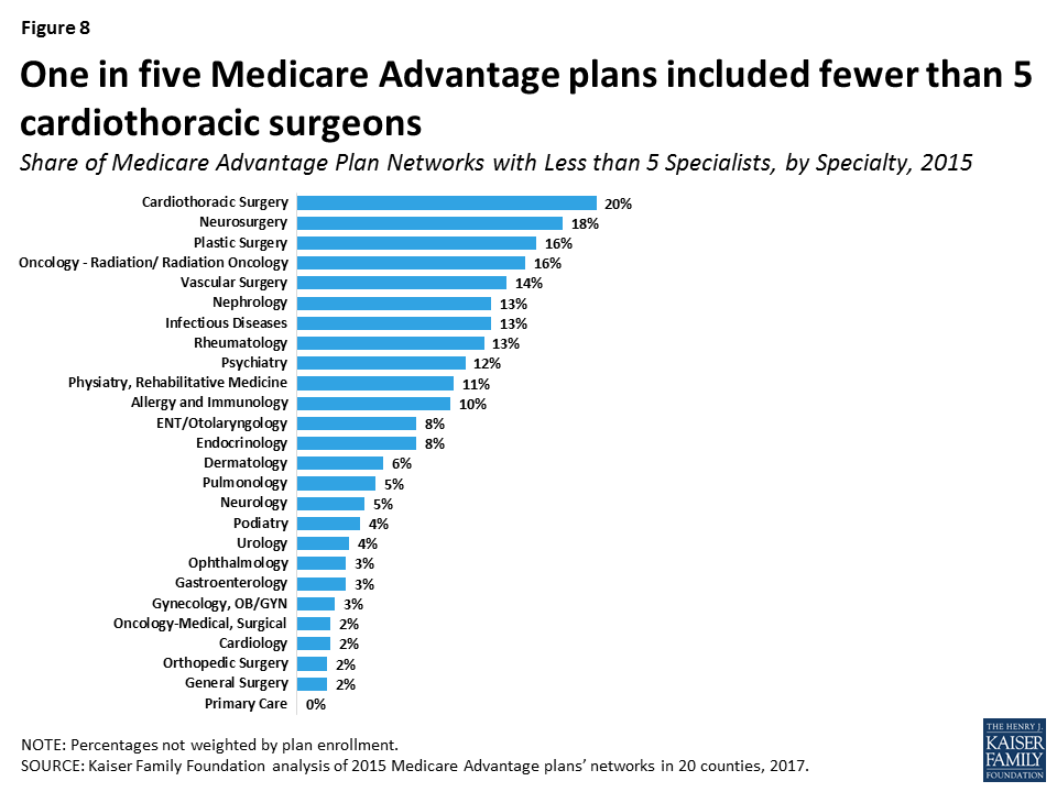
Some plans included relatively small numbers of some specialties, indicating that enrollees would have relatively little choice in physicians (Figure 8). For example, 20% of plans included less than 5 cardiothoracic surgeons, 18% of plans included less than 5 neurosurgeons, 16% of plans included less than 5 plastic surgeons, and 16% of plans included less than 5 radiation oncologists. We examined whether these plans with limited access for some specialties were concentrated in counties with predominantly narrow networks, but found that they were generally spread across many counties, including counties with broader networks.
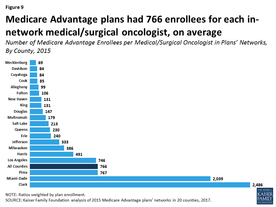
Ratio of Enrollees to Network Physicians
To examine an additional indicator of network size, we calculated the ratio of Medicare Advantage enrollees for each network physician across the 20 counties, and found considerable variation both by county and by specialty. In Mecklenburg County, for example, enrollees were in plans that had 69 enrollees for each medical/surgical oncologist in network, on average. This ratio contrasts significantly from Clark County, which had an average of 2,486 Medicare Advantage enrollees for each medical/surgical oncologist (Figure 9). For psychiatrists, the range was even greater across counties—from an average of 43 enrollees per in-network psychiatrist in Douglas County to over 5,000 in Clark and Pima Counties (not shown).10 In general, plans had lower ratios for primary care physicians, with about half the counties averaging fewer than 30 Medicare Advantage enrollees for each in-network primary care physician (not shown).
These ratios supplement our overall analysis of network size in Medicare Advantage, but they do not, on their own, provide specific information about network adequacy for patient access to care. Without information on physicians’ actual caseloads (including Medicare Advantage, commercial insurance, Medicaid, and traditional Medicare patients), it is not possible to assess if counties with high enrollee-to-physician ratios indicate access issues. Nonetheless, Medicare beneficiaries in plans with higher ratios have fewer physicians per enrollee listed in their plans’ provider directories. Additionally, counties with higher shares of narrow-network plans tended to have higher ratios of enrollees to network physicians, which suggests a relationship between narrow networks and high enrollee-to-physician ratios.
Relationship Between Size of Plans’ Networks and Other Plan Features
HMOs versus PPOs
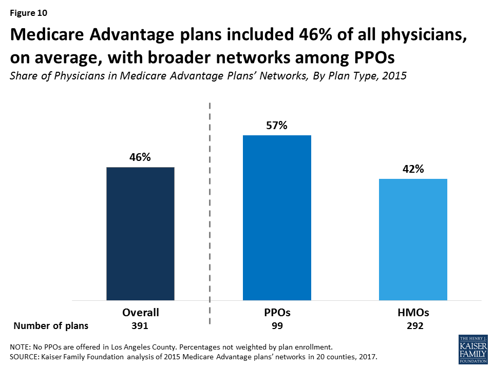
Medicare Advantage PPOs tended to have broader physician networks than Medicare Advantage HMOs (Figure 10). PPOs included 57 percent of physicians in their county, on average, compared to HMOs, which included 42 percent of physicians in their county, on average. The smaller size of the HMO networks compared to the PPO networks is important because most Medicare Advantage enrollees are in HMOs, which will not cover the cost of non-emergency care received from physicians outside the provider network. In contrast, PPOs will partly cover the cost of out-of-network care with beneficiaries paying a higher amount if they see an out-of-network provider.11
These results held across most counties, with the HMOs in most of the counties having narrower networks than PPOs, on average (Table A5). The differences between HMO and PPO networks are diluted by the fact that a number of insurers use the same network for their Medicare Advantage HMO and PPOs in a given county. Among PPOs offered by insurers that also offered an HMO in the county, 44 percent had the same provider network as the insurer’s HMO.12
Network Size by Plan Premiums
Broad-network plans tended to have higher average premiums than narrow-network plans, and this was true for both HMOs ($54 versus $4 per month) and PPOs ($100 versus $28 per month; Figure 11).
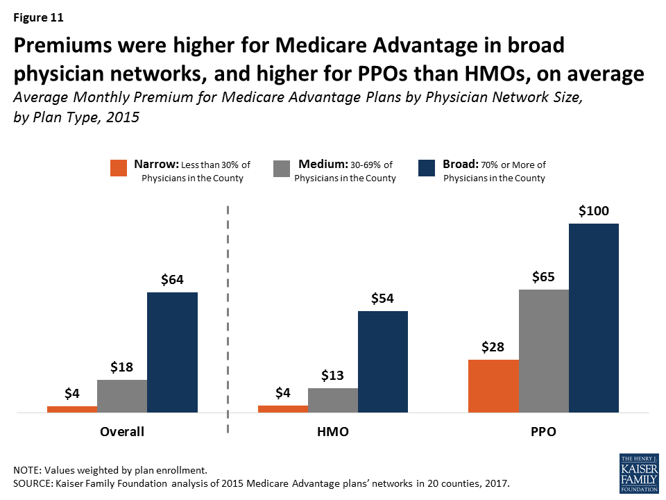
While PPOs tend to have both higher premiums and broader networks than HMOs, the correlation between network size and premiums is independent of the correlation between network size and plan type.
In most but not all counties, broad-network plans typically had higher premiums than narrow-network plans. In 8 of the 11 of the counties that had a broad-network plan as well as medium and/or narrow-network plans (Allegheny, Davidson, Jefferson, King, Milwaukee, New Haven, Queens, and Salt Lake), the average premium was higher for broad-network plans than narrow and/or medium-network plans (Figure 12). In one county, Mecklenburg, only broad-network plans were offered. This finding is similar to findings from ACA Marketplace studies, and suggests that, in some counties, enrollees could use premiums as a rough proxy for network size.13
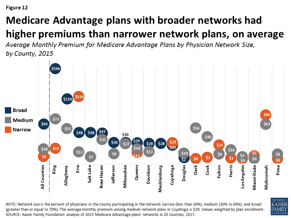
However, in 5 of the 12 counties with narrow-network plans (Cuyahoga, Erie, Fulton, Miami-Dade, and Multnomah), average premiums were higher for narrow-network plans than for medium and/or broad-network plans.
Network Size By Star Rating
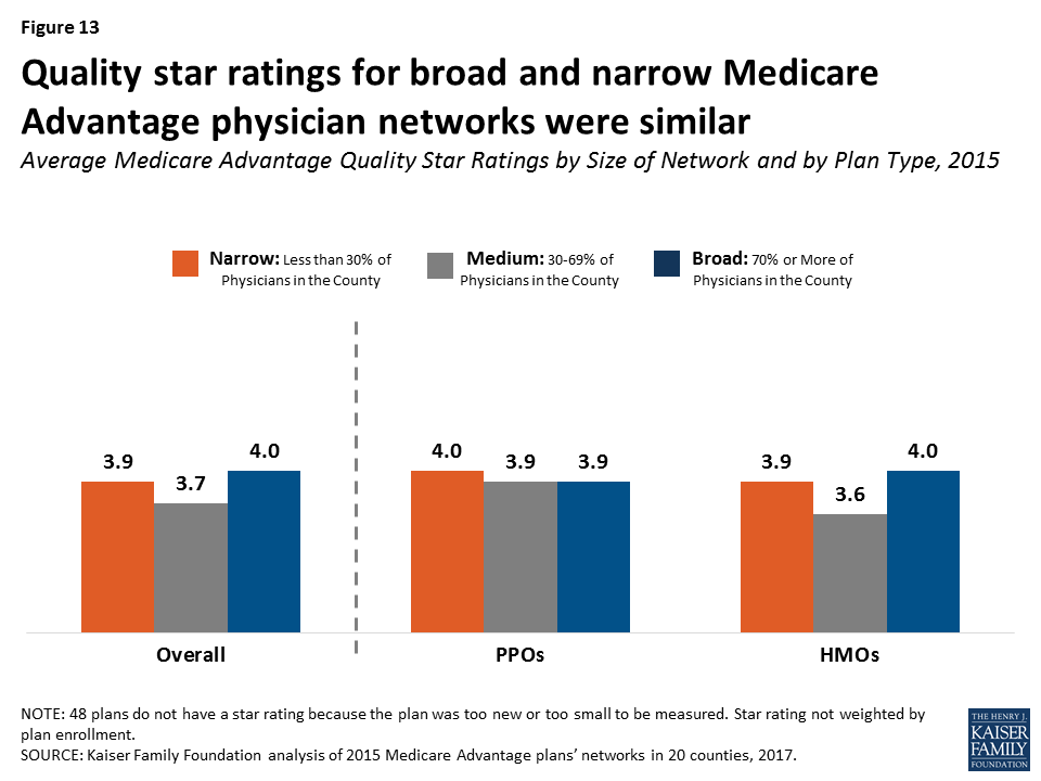
Medicare Advantage plans’ quality star ratings do not appear to be related to the size of plans’ networks: the average star ratings for narrow-network plans were similar to those for broad-network plans in 2015 (3.9 stars versus 4.0 stars, respectively; Figure 13). Similarly, examining the relationship within plan types, star ratings did not differ significantly for narrow and broad network PPOs (4.0 stars and 3.9 stars, respectively) and narrow and broad network HMOs (3.9 stars and 4.0 stars, respectively). For consumers, this finding suggests that star ratings are not a good proxy for network size.
Variations in Networks By Insurer
Among the insurers offering plans in multiple counties, none consistently had broad or narrow networks. For example, while UnitedHealthcare had broad networks in Douglas, Mecklenburg, Milwaukee, Queens, and Salt Lake Counties, it had narrow networks in Clark, Harris, and Miami-Dade Counties. Likewise, Blue Cross Blue Shield (BCBS) affiliated plans had broad networks in seven counties (Allegheny, Davidson, Erie, Jefferson, King, Mecklenburg, and Salt Lake), but narrow physician networks in three counties (Harris, King, and Los Angeles). This finding suggests that local market characteristics typically are a stronger influence on network design than the philosophy or general practices of particular insurers. For consumers, this finding suggests caution against assuming a given insurer’s brand is a reliable proxy for network size.
Average County Network Size By Other County Characteristics
The average size of plans’ physician networks in a given county was not correlated with the Medicare Advantage penetration rate in the county, the Medicare spending quartile in the county, the extent to which enrollment in the county was concentrated in one plan, or enrollment. In other words, large plans with many enrollees did not have significantly broader networks than plans with fewer enrollees.
It is possible that specific local market characteristics that we could not measure, such as provider consolidation or the dominance of certain insurers in an area, are related to the size of networks. For example, in Clark County, most (55% in 2015) enrollees are in plans operated by UnitedHealthcare, which has relatively narrow networks in the county because it owns (through its Optum subsidiary) a large medical group that comprises most of its network.14
Access To Provider Directories
The CMS Medicare Plan Finder, designed by CMS to help Medicare beneficiaries and others choose among competing plans, currently includes a link to each Medicare Advantage plan’s website, where beneficiaries can find a downloadable provider directory and/or a searchable database. Motivated consumers could check the directory or database to see if their doctors are included in the plan’s network. However, accessing the information may not be easy for users, and comparing networks could be especially challenging. Additionally, as was found in the prior analysis of Medicare Advantage hospital networks, as well as other studies, the information in the directories is often inaccurate.15
The Medicare Plan Finder also posts an estimate of the total number of providers in the network, but the total includes physicians as well as other providers, such as hospitals, nurses, skilled nursing facilities, and laboratory testing sites. This estimate would not be helpful for Medicare beneficiaries who are looking to see if the plans available to them have a narrow or broad physician network. Further, the estimated number of providers displayed on the CMS website for each plan does not necessarily cover the same geographic area because some plans cover much broader areas than others. For example, the estimate for one plan may include the number of in-network providers in a county while the estimate for another plan may include the number of in-network providers in a state, the latter of which may or may not be useful for beneficiaries who may need to travel a great distance to see some of the in-network providers. As a consequence, the number of providers posted on the Medicare Plan Finder may not be particularly useful for people who are trying to compare plans to figure out how many physicians (or other providers) are available in-network in the area where they live.
Discussion
The results of this analysis, the first known study of Medicare Advantage physician networks, has important implications for the 19 million Medicare beneficiaries now enrolled in Medicare Advantage plans, and for the millions of Boomers who are becoming eligible for Medicare and choosing between traditional Medicare and Medicare Advantage plans.16 A prior analysis showed that Medicare Advantage hospital networks vary greatly in size and composition.17 The breadth and scope of provider networks has the potential to affect out-of-pocket costs and quality of care for Medicare enrollees. Medicare Advantage enrollees incur higher costs if they go out-of-network without prior approval in Medicare PPOs, and pay the full cost for out-of-network care in Medicare HMOs. With half of all Medicare beneficiaries living on an income of about $26,000 or less per person in 2016,18 the cost of out-of-network care could be prohibitively expensive. Provider networks can also be an important consideration for beneficiaries who value the ability to maintain care arrangements with specific physicians, or have access to certain specialists if they develop a serious medical condition. Many seniors as well as younger people find it difficult to navigate complex networks and incur “surprise” medical bills because they unintentionally went out of their plan’s network.19
Seniors say they value having the ability to choose their own medical providers, and that provider networks are a key factor in choosing a health plan.20 Yet, seniors would be hard-pressed to compare the Medicare Advantage plan provider networks in their area to learn which have broad or narrow physician networks. The Medicare Plan Finder includes an estimate of the number of physicians and other providers in a plan’s network, but these estimates are not a reliable proxy for the relative size of a plan’s physician network.
Given the strong need for accurate, up-to-date provider directories to inform beneficiaries as they choose plans, CMS could consider a range of strategies to improve the quality of information available to current and prospective Medicare Advantage enrollees, in addition to its proposal to review all Medicare Advantage networks at least every three years.21 CMS could post provider directories for each Medicare Advantage plan, along with other information provided on the Medicare Plan Finder website. CMS could also require plans to produce provider directories in an easily comparable, uniform format to make it easier for consumers to compare the physician networks of Medicare Advantage plans in their area, as is required by plans participating in the ACA Marketplaces. Also, CMS could give insurers a stronger incentive to maintain current and accurate directories by incorporating a measure of these attributes in their star rating system.
This report documents that Medicare Advantage plans’ networks vary across the country and within counties – to a degree and in a manner that has not been previously recognized. The extent of this variation raises important questions about the experiences of current and future enrollees who unwittingly end up in narrow-network plans, as a result of their inability to evaluate plans’ provider networks. These wide variations in provider networks are also important for policymakers because they raise questions about the minimum standards for physician access and the lack of tools and resources to allow Medicare beneficiaries to compare the scope and composition of Medicare Advantage plans’ provider networks.
This issue brief was funded in part by The Retirement Research Foundation.
Appendix
Geographic Focus
This study examined Medicare Advantage plans available in 2015 in 20 counties: Allegheny County, PA; Clark County, NV; Cook County, IL; Cuyahoga County, OH; Davidson County, TN; Douglas County, NE; Erie County, NY; Fulton County, GA; Harris County, TX; Jefferson County, AL; King County, WA; Los Angeles County, CA; Mecklenburg County, NC; Miami-Dade County, FL; Milwaukee County, WI; Multnomah County, OR; New Haven County, CT; Pima County, AZ; Queens County, NY; and Salt Lake County, UT. The county is the smallest area, in general, that a Medicare Advantage plan must cover. Counties vary greatly in size and may not be the best metric to assess the health care market of particular locales, but an analysis at the county level provided the most complete set of data available for this type of analysis, as well as a reasonable snapshot of the health care market accessible to beneficiaries in that region.
Sources and Analysis of Data
We categorized networks into one of three sizes based on the share of physicians in the county that were included in the directory: broad (70% or more of the physicians), medium (30-69% of the physicians), and narrow (less than 30% of the physicians). The analysis included the 26 specialties that Medicare Advantage plans are required to include in their networks in 2015, and excluded all other specialties. For example, the analysis does not include pediatricians, diagnostic radiologists, anesthesiologists, or emergency medicine specialists.
The provider directories were collected from the websites of the insurers offering the plans during the Medicare Open Enrollment Period in order to best mimic what Medicare beneficiaries would access when selecting a plan. We focus our analysis on HMOs and local PPOs because the other types of Medicare Advantage plans either do not have networks (e.g., some private fee-for-service plans), have networks that are structured to cover areas larger than a county (e.g., regional PPOs), are paid in unique ways that influence the selection of providers available to beneficiaries (e.g., cost plans), or are not available for general enrollment (Special Needs Plans and employer group waiver plans). In 19 of 20 counties, both HMOs and local PPOs were available in 2015, with the exception of Los Angeles County, which only had Medicare Advantage HMOs. Of the 422 plans eligible to be included the analysis in the 20 counties, we were able to download the provider directories for 391 plans, including 292 HMOs and 99 local PPOs. These 391 plans accounted for 94 percent of the Medicare Advantage enrollment in the 20 counties. The provider directories missing from the analysis (31 out of 422 plans) either could not be downloaded and saved in a readable format, or were not available on the insurer’s website or directly from the insurer.
The directories were converted to machine-readable format and the text in the directories were matched against a national census of physicians maintained by SK&A using a text-matching method.22 The text-matching program searched the directories for the names of every doctor practicing in each county.
We converted the directories for each plan to a machine-readable format to conduct this analysis. Many PDF were saved as PDFs without text, requiring the files to be recreated in order to be read. Once converted to a machine-readable format, we matched the text in the directories against a national census of physicians maintained by SK&A using a text-matching method. SK&A Information Services Inc., maintains a national database of physicians, which they continuously update through a telephone verification process, and this analysis used an SK&A database prepared on January 4, 2016. The text-matching program searched the directories for the names of every doctor practicing in each county.
Using the R statistical software program, we used a publicly available PDF text converter to load each directory as a text file (.txt).23 The analysis excluded the following doctors:
- Doctors who work exclusively for the Veterans Administrations (about a percent of all physicians).
- Doctors whose listed specialty in SK&A was not a required category for Medicare Advantage plan networks.
SK&A assigns physicians up to two specialties. If a doctor’s primary classification was pediatrics or a select number of other specialties, they were excluded. The largest specialties not included in the analysis are pediatricians, diagnostic radiologists, anesthesiologists, emergency medicine specialists and optometrists. For the remaining doctors, we used the primary classification to categorize them into one of the 26 classifications established by CMS. For the remaining providers who were neither excluded nor classified, we turned to the secondary specialty and either grouped them with the 26 categories or dropped them. Nationally the largest specialty was primary care (32%) followed by gynecology OB/GYN (7%), cardiology (6%) and orthopedic surgery (6%). Geriatricians were defined separately; any doctor included in the analysis was grouped into a specialty as well as a geriatrician. Therefore, a geriatrician could be listed as both a primary care specialist, as well as a geriatrician. About one percent of physicians are geriatricians. In sum, more than 25% of doctors were excluded from the analysis.
The boundaries of counties do not always align with the zip codes available in the SK&A data. To be conservative, we included doctors who have at least one practice location in a zip code, which is at least partially included in one of the 20 counties. Our text-matching method searched for a string match of all the doctors in a given county. For each doctor’s name within the county, we flagged every occurrence where the last name was within three words of the first name. This method would identify both “Johnathan Hancock” and “Hancock, Johnathan” as well as cases in which the directory included a middle name or title such as “Johnathan Adam Hancock”, “Hancock IV, Johnathan Adam” or “Hancock, (Surgeon), Johnathan Adam”.
In addition, we searched last names and up to nine nicknames for every doctors in the county. For example, we would successfully identify “Johnathan Hancock” as either “John Hancock” or “Johnny Hancock”. We selected 435 formal names, which often have nicknames; for example Matt as a nickname for Matthew or Bill, Billy, Will, Willie, Willy as nicknames for William. Thirty-eight percent of physicians in the 20 counties had at least one nickname – about 0.64 percent had six or more nicknames (Elizabeth, Katherine, Margaret).
To reduce match errors with hyphenated last names – we eliminated punctuation – so regardless of whether a directory listed Kareem Abdul-Jabbar as “Kareem Abdul-Jabbar”, “Kareem Abdul Jabbar”, or “Kareem AbdulJabbar” we would successfully identify the doctor as practicing.
To test the validity of the text-matching program, 20 names were drawn at random from each of the 20 counties (400 names in total) using the SK&A dataset, and then a person searched for those names in the directories by hand, in the same fashion that an enrollee would look for their doctor. For 377 out of 400 names (94%), the person and the text-matching program agreed. Of the names that did not match, 3% were false-negatives (text-matching program did not count the physician in the directory when it should have done so) and 3% were false-positives, indicating that the totals were 99.8% accurate. The most important form of error may be the accuracy of the provider directory – our text analysis only identifies whether a provider is listed in the directory, not whether that provider is taking new patient or even still practicing in the service area. The error in our text analysis method may work to both overestimate and underestimate the percentage of doctors.
Some examples of potential false-positives – or cases in which out method would over estimate the number of doctors may include:
- Cases in which the directory contains the name of someone who is not an eligible physician and there is an eligible physician by the same name practicing in the county but is not included in the network. For example, a plan does not include a primary care doctor named “Marie Curie” but does include an optometrist by the same name “Marie Curie”.
- While most directories are structured as list of physicians followed by contact information it is possible that there are at least some occurrences of false-positives through the proximity of names. For example if a directory included the sentence, “Thomas Jefferson and John Adam were fierce political rivals” and there happened to be a physicians in the county named “John Jefferson” we would incorrectly identify him as a physician in the plan.
- If a county included multiple doctors with the same name, and a plan only included one of these doctors in its network – we would incorrectly identify them all as participating. Only 502 instances occurred where there were duplicate names (out of 66,679 physicians).
Alternatively, there are cases in which our text analysis may undercount the percentage of doctors participating in the network. Some examples of true-negatives may include cases in which a directory lists a physician under a different name than the one listed in the SK&A directory. This may include cases in which the physician’s name is spelled differently in the directory and the SK&A database or the doctor uses only one of their two hyphenated last names.
Some of this study’s findings were aggregated by county and across counties by weighting each plan’s results by its enrollment using the Centers for Medicare and Medicaid Services Medicare Advantage Enrollment files for March 2015. Data on plan enrollment was made available by CMS for March 2015 (”State/County/Contract/Plan (CPSC) Enrollment Data”). No enrollment data is available for plans with fewer than 10 enrollees (7% of the plans in our sample).24 Categorization of the plans as Preferred Provider Organizations (PPO) and Health Maintenance Organization (HMO) was made by CMS.25
Tables
| Table 1. Characteristics of Counties Included in the Analysis, 2015 | |||||||
| County | Largest city | Number of Plans Available in County (Universe) | Number of Plans Successfully Evaluated | Medicare Advantage Enrollment Evaluated | Medicare Advantage Penetration Rate | Percent of Enrollment in County Evaluated | Counties’ Enrollment As Percent of National Medicare Advantage Market |
| All Counties | – | 422 | 391 | 1,512,624 | 40% | 94% | 13.9% |
| Allegheny, PA | Pittsburgh | 22 | 22 | 100,832 | 62% | 100% | 0.9% |
| Clark, NV | Las Vegas | 11 | 11 | 98,767 | 38% | 100% | 0.8% |
| Cook, IL | Chicago | 19 | 18 | 51,404 | 17% | 64% | 0.7% |
| Cuyahoga, OH | Cleveland | 26 | 20 | 18,231 | 37% | 40% | 0.4% |
| Davidson, TN | Nashville | 15 | 15 | 27,624 | 42% | 100% | 0.2% |
| Douglas, NE | Omaha | 13 | 13 | 15,501 | 23% | 100% | 0.1% |
| Erie, NY | Buffalo | 25 | 25 | 74,043 | 56% | 100% | 0.6% |
| Fulton, GA | Atlanta | 17 | 15 | 21,933 | 35% | 96% | 0.2% |
| Harris, TX | Houston | 31 | 28 | 122,838 | 39% | 100% | 1.1% |
| Jefferson, AL | Birmingham | 12 | 12 | 35,862 | 42% | 100% | 0.3% |
| King, WA | Seattle | 26 | 23 | 73,976 | 34% | 98% | 0.7% |
| Los Angeles, CA | Los Angeles | 35 | 34 | 379,715 | 43% | 99% | 3.3% |
| Mecklenburg, NC | Charlotte | 15 | 15 | 26,535 | 31% | 100% | 0.2% |
| Miami-Dade, FL | Miami | 31 | 29 | 204,503 | 62% | 100% | 1.8% |
| Milwaukee, WI | Milwaukee | 6 | 5 | 31,697 | 41% | 98% | 0.3% |
| Multnomah, OR | Portland | 30 | 30 | 43,941 | 58% | 100% | 0.4% |
| New Haven, CT | New Haven | 16 | 13 | 32,475 | 28% | 94% | 0.3% |
| Pima, AZ | Tucson | 13 | 13 | 55,754 | 46% | 100% | 0.5% |
| Queens, NY | New York City | 46 | 37 | 52,739 | 43% | 62% | 0.7% |
| Salt Lake, UT | Salt Lake City | 13 | 13 | 44,254 | 41% | 100% | 0.4% |
| SOURCE: Kaiser Family Foundation analysis of CMS Medicare Advantage enrollment and landscape files for 2015. | |||||||
| Table 2. Distribution of Medicare Advantage Plans’ Physician Networks Versus Plan Enrollment, 2015 | ||||||
| Distribution of Medicare Advantage Plans | Distribution of Medicare Advantage Enrollees | |||||
| County | Narrow(Less than 30%) | Medium(30-69%) | Broad(At Least 70%) | Narrow(Less than 30%) | Medium(30-69%) | Broad(At Least 70%) |
| All Counties | 27% | 52% | 21% | 35% | 43% | 22% |
| Allegheny, PA | 0% | 5% | 95% | 0% | 0% | 100% |
| Clark, NV | 45% | 55% | 0% | 91% | 9% | 0% |
| Cook, IL | 39% | 61% | 0% | 40% | 60% | 0% |
| Cuyahoga, OH | 35% | 45% | 20% | 3% | 70% | 27% |
| Davidson, TN | 0% | 73% | 27% | 0% | 74% | 26% |
| Douglas, NE | 0% | 69% | 31% | 0% | 24% | 76% |
| Erie, NY | 16% | 28% | 56% | 0% | 3% | 96% |
| Fulton, GA | 27% | 73% | 0% | 20% | 80% | 0% |
| Harris, TX | 61% | 39% | 0% | 78% | 22% | 0% |
| Jefferson, AL | 0% | 83% | 17% | 0% | 71% | 29% |
| King, WA | 22% | 70% | 9% | 14% | 72% | 14% |
| Los Angeles, CA | 53% | 47% | 0% | 51% | 49% | 0% |
| Mecklenburg, NC | 0% | 0% | 100% | 0% | 0% | 100% |
| Miami-Dade, FL | 66% | 34% | 0% | 46% | 54% | 0% |
| Milwaukee, WI | 0% | 40% | 60% | 0% | 7% | 93% |
| Multnomah, OR | 20% | 80% | 0% | 26% | 74% | 0% |
| New Haven, CT | 0% | 62% | 38% | 0% | 49% | 51% |
| Pima, AZ | 31% | 69% | 0% | 15% | 85% | 0% |
| Queens, NY | 27% | 68% | 5% | 2% | 75% | 23% |
| Salt Lake, UT | 0% | 54% | 46% | 0% | 38% | 62% |
| SOURCE: Kaiser Family Foundation analysis of Medicare Advantage plans’ physician networks in 20 counties, 2017. | ||||||
| Table 3. Distribution Across Plans of the Share of Physicians Included in Medicare Advantage Plans’ Networks, 2015 | |||||||
| Number of Plans | Average | Minimum | 25th Percentile | Median | 75th Percentile | Maximum | |
| All Counties | 391 | 46% | 1% | 28% | 44% | 64% | 87% |
| Allegheny, PA | 22 | 77% | 30% | 72% | 74% | 87% | 87% |
| Clark, NV | 11 | 41% | 21% | 25% | 53% | 53% | 60% |
| Cook, IL | 18 | 32% | 17% | 28% | 33% | 35% | 54% |
| Cuyahoga, OH | 20 | 41% | 7% | 21% | 40% | 50% | 77% |
| Davidson, TN | 15 | 62% | 37% | 56% | 65% | 68% | 77% |
| Douglas, NE | 13 | 58% | 43% | 44% | 58% | 75% | 79% |
| Erie, NY | 25 | 60% | 4% | 50% | 80% | 81% | 83% |
| Fulton, GA | 15 | 39% | 11% | 29% | 40% | 54% | 59% |
| Harris, TX | 28 | 33% | 17% | 23% | 28% | 43% | 59% |
| Jefferson, AL | 12 | 54% | 42% | 43% | 52% | 55% | 82% |
| King, WA | 23 | 41% | 14% | 32% | 42% | 46% | 76% |
| Los Angeles, CA | 34 | 28% | 1% | 18% | 28% | 42% | 46% |
| Mecklenburg, NC | 15 | 73% | 70% | 70% | 70% | 77% | 82% |
| Miami-Dade, FL | 29 | 25% | 4% | 17% | 26% | 33% | 46% |
| Milwaukee, WI | 5 | 67% | 42% | 52% | 79% | 81% | 81% |
| Multnomah, OR | 30 | 42% | 9% | 37% | 40% | 60% | 65% |
| New Haven, CT | 13 | 65% | 53% | 54% | 66% | 73% | 73% |
| Pima, AZ | 13 | 43% | 22% | 28% | 46% | 55% | 66% |
| Queens, NY | 37 | 40% | 6% | 26% | 39% | 58% | 71% |
| Salt Lake, UT | 13 | 66% | 34% | 59% | 63% | 82% | 83% |
| NOTE: All percentages are not weighted by the number of enrollees in each plan.SOURCE: Kaiser Family Foundation analysis of Medicare Advantage plans’ physician networks in 20 counties, 2017. | |||||||
| Table 4. Average Share of Physicians Included in Medicare Advantage Plans’ Networks, by County and Specialty, 2015 | |||||||
| Specialty | All Counties | Allegheny | Clark | Cook | Cuyahoga | Davidson | Douglas |
| All Specialties | 46% | 77% | 41% | 32% | 41% | 62% | 58% |
| Primary Care | 42% | 77% | 32% | 30% | 40% | 47% | 51% |
| Geriatricians | 43% | 88% | 38% | 37% | 46% | 68% | 76% |
| Allergy and Immunology | 51% | 75% | 41% | 33% | 43% | 67% | 78% |
| Cardiology | 54% | 86% | 52% | 43% | 41% | 82% | 65% |
| Cardiothoracic Surgery | 55% | 86% | 29% | 46% | 37% | 83% | 53% |
| Dermatology | 48% | 81% | 48% | 26% | 48% | 65% | 85% |
| Endocrinology | 45% | 85% | 36% | 28% | 33% | 66% | 63% |
| ENT/ Otolaryngology | 53% | 90% | 64% | 32% | 47% | 79% | 63% |
| Gastroenterology | 56% | 83% | 59% | 37% | 49% | 82% | 74% |
| General Surgery | 51% | 77% | 44% | 31% | 40% | 67% | 61% |
| Gynecology, OB/GYN | 46% | 75% | 51% | 30% | 40% | 53% | 66% |
| Infectious Diseases | 45% | 82% | 52% | 46% | 43% | 50% | 53% |
| Nephrology | 52% | 74% | 74% | 39% | 38% | 80% | 59% |
| Neurology | 46% | 75% | 35% | 33% | 35% | 74% | 61% |
| Neurosurgery | 50% | 80% | 69% | 34% | 42% | 90% | 51% |
| Medical, Surgical Oncology | 47% | 83% | 51% | 34% | 49% | 77% | 67% |
| Radiation/ Radiation Oncology | 52% | 47% | 71% | 43% | 56% | 88% | 38% |
| Ophthalmology | 59% | 88% | 57% | 39% | 51% | 73% | 74% |
| Orthopedic Surgery | 49% | 82% | 37% | 32% | 48% | 64% | 66% |
| Physiatry, Rehabilitative Medicine | 38% | 67% | 33% | 24% | 29% | 61% | 38% |
| Plastic Surgery | 35% | 79% | 10% | 27% | 35% | 39% | 55% |
| Podiatry | 48% | 77% | 42% | 31% | 38% | 63% | 69% |
| Psychiatry | 23% | 45% | 9% | 13% | 25% | 43% | 32% |
| Pulmonology | 53% | 88% | 56% | 43% | 41% | 71% | 62% |
| Rheumatology | 44% | 72% | 45% | 28% | 42% | 65% | 58% |
| Urology | 57% | 88% | 54% | 43% | 44% | 78% | 64% |
| Vascular Surgery | 55% | 93% | 24% | 32% | 49% | 61% | 71% |
| Erie | Fulton | Harris | Jefferson | King | Los Angeles | Mecklenburg | |
| All Specialties | 60% | 39% | 33% | 54% | 41% | 28% | 73% |
| Primary Care | 57% | 32% | 28% | 50% | 39% | 32% | 71% |
| Geriatricians | 43% | 30% | 32% | 35% | 33% | 29% | 83% |
| Allergy and Immunology | 71% | 44% | 27% | 35% | 49% | 28% | 73% |
| Cardiology | 70% | 50% | 40% | 59% | 53% | 34% | 88% |
| Cardiothoracic Surgery | 68% | 53% | 45% | 77% | 51% | 40% | 79% |
| Dermatology | 60% | 39% | 31% | 46% | 42% | 17% | 78% |
| Endocrinology | 63% | 39% | 28% | 44% | 42% | 24% | 74% |
| ENT/ Otolaryngology | 62% | 44% | 27% | 51% | 46% | 27% | 87% |
| Gastroenterology | 68% | 52% | 37% | 68% | 52% | 32% | 85% |
| General Surgery | 67% | 45% | 40% | 68% | 45% | 31% | 77% |
| Gynecology, OB/GYN | 57% | 27% | 30% | 60% | 35% | 26% | 84% |
| Infectious Diseases | 60% | 49% | 36% | 51% | 47% | 26% | 56% |
| Nephrology | 61% | 48% | 43% | 41% | 46% | 39% | 60% |
| Neurology | 62% | 49% | 34% | 38% | 49% | 24% | 70% |
| Neurosurgery | 73% | 41% | 31% | 66% | 38% | 35% | 69% |
| Medical, Surgical Oncology | 55% | 54% | 23% | 35% | 48% | 26% | 77% |
| Radiation/ Radiation Oncology | 73% | 59% | 42% | 83% | 38% | 30% | 90% |
| Ophthalmology | 70% | 55% | 54% | 77% | 51% | 34% | 81% |
| Orthopedic Surgery | 59% | 43% | 36% | 59% | 43% | 24% | 79% |
| Physiatry, Rehabilitative Medicine | 53% | 31% | 25% | 50% | 40% | 18% | 73% |
| Plastic Surgery | 54% | 25% | 20% | 30% | 22% | 15% | 39% |
| Podiatry | 68% | 46% | 36% | 80% | 42% | 28% | 69% |
| Psychiatry | 36% | 18% | 25% | 34% | 22% | 7% | 30% |
| Pulmonology | 62% | 52% | 38% | 68% | 52% | 33% | 76% |
| Rheumatology | 54% | 31% | 28% | 42% | 52% | 24% | 60% |
| Urology | 66% | 51% | 51% | 86% | 46% | 32% | 79% |
| Vascular Surgery | 66% | 57% | 50% | 84% | 51% | 38% | 66% |
| Miami-Dade | Milwaukee | Multnomah | New Haven | Pima | Queens | Salt Lake | |
| All Specialties | 25% | 67% | 42% | 65% | 43% | 40% | 66% |
| Primary Care | 20% | 65% | 35% | 54% | 41% | 37% | 60% |
| Geriatricians | 18% | 50% | 29% | 75% | 36% | 34% | 59% |
| Allergy and Immunology | 53% | 73% | 50% | 64% | 54% | 43% | 69% |
| Cardiology | 31% | 74% | 44% | 82% | 53% | 50% | 71% |
| Cardiothoracic Surgery | 35% | 90% | 54% | 79% | 51% | 43% | 74% |
| Dermatology | 24% | 63% | 48% | 79% | 44% | 44% | 68% |
| Endocrinology | 21% | 64% | 46% | 73% | 34% | 40% | 66% |
| ENT/ Otolaryngology | 34% | 69% | 60% | 77% | 52% | 50% | 78% |
| Gastroenterology | 44% | 73% | 61% | 79% | 48% | 50% | 72% |
| General Surgery | 33% | 70% | 54% | 79% | 51% | 45% | 67% |
| Gynecology, OB/GYN | 23% | 74% | 51% | 66% | 44% | 41% | 67% |
| Infectious Diseases | 27% | 62% | 30% | 45% | 59% | 34% | 55% |
| Nephrology | 37% | 79% | 56% | 73% | 60% | 38% | 67% |
| Neurology | 31% | 64% | 32% | 69% | 41% | 44% | 66% |
| Neurosurgery | 23% | 61% | 40% | 69% | 56% | 37% | 80% |
| Medical, Surgical Oncology | 24% | 71% | 34% | 68% | 39% | 46% | 72% |
| Radiation/ Radiation Oncology | 40% | 66% | 45% | 74% | 67% | 38% | 49% |
| Ophthalmology | 31% | 73% | 61% | 87% | 53% | 55% | 82% |
| Orthopedic Surgery | 27% | 77% | 44% | 83% | 53% | 39% | 73% |
| Physiatry, Rehabilitative Medicine | 10% | 55% | 31% | 61% | 29% | 43% | 60% |
| Plastic Surgery | 11% | 65% | 41% | 65% | 31% | 32% | 55% |
| Podiatry | 20% | 68% | 52% | 84% | 46% | 31% | 70% |
| Psychiatry | 10% | 41% | 23% | 26% | 7% | 20% | 37% |
| Pulmonology | 47% | 80% | 55% | 70% | 28% | 49% | 56% |
| Rheumatology | 38% | 54% | 44% | 66% | 50% | 35% | 52% |
| Urology | 44% | 77% | 57% | 88% | 50% | 54% | 71% |
| Vascular Surgery | 28% | 64% | 46% | 71% | 67% | 56% | 84% |
| NOTE: All percentages not weighted by the number of enrollees in each plan.SOURCE: Kaiser Family Foundation analysis of Medicare Advantage plans’ physician networks in 20 counties, 2017. | |||||||
| Table 5. Average Share of Physicians Included in Medicare Advantage HMO and PPO Networks, By County, 2015 | ||||||
| County | Number of Plans | Size of Provider Networks, by Plan Type | ||||
| Total | HMO | PPO | Overall | HMO | PPO | |
| All Counties | 391 | 292 | 99 | 46% | 42% | 57% |
| Allegheny, PA | 22 | 13 | 9 | 77% | 80% | 73% |
| Clark, NV | 11 | 6 | 5 | 41% | 30% | 56% |
| Cook, IL | 18 | 12 | 6 | 32% | 29% | 37% |
| Cuyahoga, OH | 20 | 15 | 5 | 41% | 33% | 65% |
| Davidson, TN | 15 | 11 | 4 | 62% | 57% | 75% |
| Douglas, NE | 13 | 8 | 5 | 58% | 58% | 59% |
| Erie, NY | 25 | 18 | 7 | 60% | 65% | 47% |
| Fulton, GA | 15 | 10 | 5 | 39% | 34% | 48% |
| Harris, TX | 28 | 19 | 9 | 33% | 27% | 44% |
| Jefferson, AL | 12 | 9 | 3 | 54% | 48% | 71% |
| King, WA | 23 | 18 | 5 | 41% | 37% | 58% |
| Los Angeles, CA | 34 | 34 | 0 | 28% | 28% | N/A |
| Mecklenburg, NC | 15 | 9 | 6 | 73% | 74% | 72% |
| Miami-Dade, FL | 29 | 26 | 3 | 25% | 24% | 30% |
| Milwaukee, WI | 5 | 3 | 2 | 67% | 71% | 61% |
| Multnomah, OR | 30 | 17 | 13 | 43% | 40% | 46% |
| New Haven, CT | 13 | 11 | 2 | 65% | 65% | 66% |
| Pima, AZ | 13 | 12 | 1 | 43% | 41% | 66% |
| Queens, NY | 37 | 33 | 4 | 40% | 38% | 60% |
| Salt Lake, UT | 13 | 8 | 5 | 66% | 60% | 74% |
| NOTE: No Medicare Advantage PPOs were offered in Los Angeles County in 2015. All percentages are not weighted by the number of enrollees in each plan.SOURCE: Kaiser Family Foundation analysis of Medicare Advantage plans’ physician networks in 20 counties, 2017. | ||||||
Endnotes
- Jacobson G, Swoope C, Perry M, and Slosar M. “How are Seniors Choosing and Changing Health Insurance Plans?,” Kaiser Family Foundation, May 2014. Available at: http://modern.kff.org/medicare/report/how-are-seniors-choosing-and-changing-health-insurance-plans/. ↩︎
- Jacobson G, Damico A, Neuman T, and Gold M. “Medicare Advantage 2017 Spotlight: Enrollment Market Update,” Kaiser Family Foundation, June 2017. Available at: http://modern.kff.org/medicare/issue-brief/medicare-advantage-2017-spotlight-enrollment-market-update/. ↩︎
- See Centers for Medicare and Medicaid Services, CY2016 MA HSD Provider and Facility Specialties and Network Adequacy Criteria Guidance. Available at: https://www.cms.gov/Medicare/Medicare-Advantage/MedicareAdvantageApps/Downloads/CY2016_MA_HSD_Network_Criteria_Guidance.pdf. ↩︎
- A prior analysis found that 16 percent of Medicare Advantage plans had narrow hospital networks, defined as including less than 30 percent of the hospitals in a county. See Jacobson G, Trilling A, Neuman T, Damico A, and Gold M. “Medicare Advantage Hospital Networks: How Much Do They Vary?,” Kaiser Family Foundation, June 2016. Available at: http://modern.kff.org/report-section/medicare-advantage-hospital-networks-how-much-do-they-vary-results/. ↩︎
- US Government Accountability Office, “Medicare Advantage: Actions Needed to Enhance CMS Oversight of Provider Network Adequacy,” August 2015. Available at: http://www.gao.gov/assets/680/672236.pdf. Resneck JS, Quiggle A, Liu M, and Brewster DW. “The Accuracy of Dermatology Network Physician Directories Posted by Medicare Advantage Health Plans in an Era of Narrow Networks,” JAMA Dermatol., October 2014; 150(12):1290-1297. Available at: http://jamanetwork.com/journals/jamadermatology/fullarticle/1919439. ↩︎
- Centers for Medicare and Medicaid Services, “Online Provider Directory Review Report,” January 13, 2017. Available at: https://www.cms.gov/Medicare/Health-Plans/ManagedCareMarketing/Downloads/Provider_Directory_Review_Industry_Report_Final_01-13-17.pdf. ↩︎
- For a description of the network categories relative to McKinsey & Company’s categories, see the Methods section of Jacobson G, Trilling A, Neuman T, Damico A, and Gold M. “Medicare Advantage Hospital Networks: How Much Do They Vary?,” Kaiser Family Foundation, June 2016. Available at: http://modern.kff.org/report-section/medicare-advantage-hospital-networks-how-much-do-they-vary-results/. ↩︎
- Polsky D, Cidav Z, and Swanson A. “Marketplace Plans with Narrow Physician Networks Feature Lower Monthly Premiums Than Plans with Larger Networks,” Health Affairs, October 2016. Available at: http://content.healthaffairs.org/content/35/10/1842.abstract. ↩︎
- This finding is similar to those in another report discussing physician networks for mental health care in the ACA marketplaces; see Zhu J, Zhang Y, and Polsky D. “Networks In ACA Marketplaces Are Narrower For Mental Health Care Than For Primary Care,” Health Affairs, September 2017. Available at: http://content.healthaffairs.org/content/36/9/1624.abstract. ↩︎
- Note that 9 plans in our analysis had no psychiatrists in the directories, and are not included in the ratio analysis. We consider this to be a conservative method in estimating the enrollee burden; if these plans were included, the ratios of enrollees to psychiatrists would be larger. ↩︎
- Jacobson G, Damico A, Neuman T, and Gold M. “Medicare Advantage 2017 Spotlight: Enrollment Market Update,” Kaiser Family Foundation, June 2017. Available at: http://modern.kff.org/medicare/issue-brief/medicare-advantage-2017-spotlight-enrollment-market-update/. ↩︎
- Among plans offered in the same county by the same insurer, but without a common provider network, HMOs included 48 percent of all physicians in their county, on average, while PPOs included 58 percent of physicians in their county, on average. ↩︎
- Dafny L, Hendel I, Marone V, and Ody C. “Narrow Networks On The Health Insurance Marketplaces: Prevalence, Pricing, And The Cost Of Network Breadth,” Health Affairs, September 2017. Available at: http://content.healthaffairs.org/content/36/9/1606.abstract?sid=230cbad6-de5b-4c55-b4aa-26b01641a875. ↩︎
- Business Wire, “UnitedHealth Group Signs Definitive Agreement to Acquire Sierra Health Services, Inc.” March 12, 2007. Available at: http://www.businesswire.com/news/home/20070312005513/en/UnitedHealth-Group-Signs-Definitive-Agreement-Acquire-Sierra. ↩︎
- A prior analysis of Medicare Advantage hospital networks found that 11 out of 231 plans included hospitals that had been torn down or closed. See Jacobson G, Trilling A, Neuman T, Damico A, and Gold M. “Medicare Advantage Hospital Networks: How Much Do They Vary?,” Kaiser Family Foundation, June 2016. Available at: http://modern.kff.org/report-section/medicare-advantage-hospital-networks-how-much-do-they-vary-results/. See also Centers for Medicare and Medicaid Services, “Online Provider Directory Review Report,” January 13, 2017. Available at: https://www.cms.gov/Medicare/Health-Plans/ManagedCareMarketing/Downloads/Provider_Directory_Review_Industry_Report_Final_01-13-17.pdf. See also US Government Accountability Office, “Medicare Advantage: Actions Needed to Enhance CMS Oversight of Provider Network Adequacy,” August 2015. Available at: http://www.gao.gov/assets/680/672236.pdf. ↩︎
- Jacobson G, Damico A, Neuman T, and Gold M. “Medicare Advantage 2017 Spotlight: Enrollment Market Update,” Kaiser Family Foundation, June 2017. Available at: http://modern.kff.org/medicare/issue-brief/medicare-advantage-2017-spotlight-enrollment-market-update/. ↩︎
- A prior analysis found that 16 percent of Medicare Advantage plans had narrow hospital networks, defined as including less than 30 percent of the hospitals in a county. See Jacobson G, Trilling A, Neuman T, Damico A, and Gold M. “Medicare Advantage Hospital Networks: How Much Do They Vary?,” Kaiser Family Foundation, June 2016. Available at: http://modern.kff.org/report-section/medicare-advantage-hospital-networks-how-much-do-they-vary-results/. ↩︎
- Jacobson G, Griffin S, Neuman T, and Smith K. “Income and Assets of Medicare Beneficiaries, 2016-2035,” Kaiser Family Foundation, April 2017. Available at: http://modern.kff.org/medicare/issue-brief/income-and-assets-of-medicare-beneficiaries-2016-2035/. ↩︎
- For more information, see Pollitz, K. “Surprise Medical Bills,” Kaiser Family Foundation, March 2016. Available at: http://modern.kff.org/private-insurance/issue-brief/surprise-medical-bills/. ↩︎
- Jacobson G, Swoope C, Perry M, and Slosar M. “How are Seniors Choosing and Changing Health Insurance Plans?,” Kaiser Family Foundation, May 2014. Available at: http://modern.kff.org/medicare/report/how-are-seniors-choosing-and-changing-health-insurance-plans/. ↩︎
- Federal Register, Volume 82, No. 137, July 19, 2017. Available at: https://www.gpo.gov/fdsys/pkg/FR-2017-07-19/pdf/2017-15071.pdf. ↩︎
- See SK&A, Physician Data. Available at: http://www.skainfo.com/databases/physician-data. ↩︎
- Cichini, K. “Reading and Text Mining a PDF-File in R,” September 2012. Available at: http://thebiobucket.blogspot.com/2012/09/reading-and-text-mining-pdf-file-in-r.html. ↩︎
- See Centers for Medicare and Medicaid Services, Monthly Enrollment by Contract/Plan/State/County. Available at: https://www.cms.gov/research-statistics-data-and-systems/statistics-trends-and-reports/mcradvpartdenroldata/monthly-enrollment-by-contract-plan-state-county.html. ↩︎
- See Centers for Medicare and Medicaid Services, Plan Crosswalks. Available at: https://www.cms.gov/Research-Statistics-Data-and-Systems/Statistics-Trends-and-Reports/MCRAdvPartDEnrolData/Plan-Crosswalks.html. ↩︎