The Latest on Geographic Variation in Medicare Spending: A Demographic Divide Persists But Variation Has Narrowed
Executive Summary
Geographic variation in Medicare utilization and spending has been a frequent subject of discussion and analysis among researchers and policymakers for many years. Some researchers have suggested that the differences in Medicare spending across geographic areas resulted mainly from differences in practice patterns, which could be addressed by policy interventions, such as changes in financial incentives for providers. Other researchers have emphasized differences in beneficiaries’ health and socioeconomic status as drivers of geographic variation in Medicare spending, which are less amenable to policy intervention than practice patterns.
This paper contributes to the body of research on geographic variation in Medicare spending by analyzing variation in Medicare per capita spending at the county level, using the most current data available (2013); analyzing detailed county-level data on utilization and spending for specific types of services; and examining changes over time from 2007 to 2013 in county-level Medicare per capita spending growth rates. We rank counties based on Medicare per capita spending in 2013 and spending growth rates between 2007 and 2013, and examine characteristics of counties at the top and bottom of the rankings. (A related interactive map shows Medicare per beneficiary spending, and spending growth, in counties across the U.S.) The primary data source for this analysis is the February 2015 update of the Medicare Geographic Variation Public Use File (GV PUF) from the Centers for Medicare & Medicaid Services (CMS).
Key Findings from this Analysis
Geographic Variation in 2013 Medicare Per Capita Spending
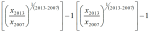
- Unadjusted Medicare per capita spending averaged $9,415 in 2013, but was nearly two times greater in the 20 counties with the highest per capita spending ($13,149) than in the 20 counties with the lowest per capita spending ($6,726).
- The 20 counties with the highest unadjusted Medicare per capita spending in 2013 were primarily in northeast, mid-Atlantic, and southern states. Compared to the 20 lowest-spending counties, and the national average, the 20 highest-spending counties have much sicker and poorer beneficiary populations, on average, and a substantially greater share of black and Hispanic beneficiaries.
- Medicare per capita spending on hospital inpatient care is more than twice as high in the highest-spending counties than in the lowest-spending counties, making it by far the most important service category in terms of explaining spending differences between the highest- and lowest-spending counties.
- When we adjust per capita spending in the 20 highest-spending counties and the 20 lowest-spending counties to account for differences in Medicare prices and beneficiaries’ health risk, we find that the gap between the averages narrows substantially—from a 96 percent difference ($13,139 versus $6,726) to a 22 percent difference ($9,344 versus $7,640)—but does not disappear.
- Ranking counties based on price- and health-adjusted spending, we find that 19 of the 20 counties with the highest adjusted per capita spending are in the south, with Texas and Louisiana together accounting for 14 of the 20 counties. The 20 highest-spending counties stand out for having significantly more post-acute care providers per capita and significantly fewer physicians than the 20 lowest-spending counties.
Geographic Variation in Medicare Per Capita Spending Growth Rates, 2007-2013
- The average annual rate of growth in unadjusted Medicare per capita spending between 2007 and 2013 was 2.2 percent nationwide, but ranged from -0.9 percent among the 20 counties with the lowest spending growth rate to 4.6 percent among the 20 counties with the highest spending growth rate.
- Fifteen of the 20 counties with the lowest spending growth rates are in southern states; the 20 counties with the highest spending growth rates are more geographically dispersed. In the counties with the lowest spending growth rates, Medicare per capita spending for hospital services, home health care, and durable medical equipment fell from 2007 to 2013.
Change in Geographic Variation, 2007-2013
- Counties with relatively high unadjusted Medicare per capita spending in 2007 tended to experience relatively low spending growth between 2007 and 2013, and vice versa. But counties at the top of the ranking of unadjusted Medicare per capita spending have tended to remain at the top over time.
- The amount of geographic variation in unadjusted Medicare spending—as measured by the coefficient of variation—began to decline after 2009, indicating a modest narrowing of geographic variation in recent years.
Our analysis shows that geographic variation in Medicare per capita spending persists, although the gap between the highest- and lowest-spending counties appears to have narrowed since 2009. Recent activities, including new efforts to change how providers deliver care and how Medicare pays for it, may be helping to curb Medicare spending in many parts of the country, including areas with some of the more notable excesses in spending. The Affordable Care Act included a number of provisions designed to encourage greater efficiency in the delivery of care for Medicare beneficiaries by modifying incentives for providers to reduce excess costs and improve quality of care. Yet even with such efforts, deep differences in per capita Medicare spending in different parts of the country remain and are likely to persist due to underlying differences in beneficiary characteristics related to poverty and poor health, along with differences in the prices that Medicare pays for services, that contribute to variations in spending.
Report
Introduction
Gawande’s work built on examinations of differences in Medicare spending per capita among hospital referral regions (HRRs)2 by researchers at Dartmouth University. Dartmouth researchers concluded that such differences could not be explained by differences in health status, and that “increased Medicare spending in high-cost regions provides no important benefits in terms of survival.”3 The Dartmouth researchers suggested that the differences in spending across HRRs resulted mainly from differences in practice patterns, which could be addressed by policy interventions, such as changes in financial incentives for providers.4
In contrast, other researchers have emphasized differences in beneficiaries’ health status as drivers of geographic variation in Medicare spending. Reschovsky et al. found that differences in disease burden were largely responsible for geographic variation in Medicare spending, based on their analysis of data from 60 communities.5 Similarly, Zuckerman et al. found that beneficiary demographics and health status help to explain geographic differences in Medicare spending, but also found that even after adjusting for other possibly relevant factors, such as provider supply measures, significant unexplained differences remained.6 Sheiner also concluded, based on a state-level analysis, that much of the geographic variation in Medicare spending can be explained by differences in health status and demographics, which are less amenable to policy intervention than practice patterns.7
In 2009, Congress directed the Institute of Medicine (IOM) to conduct a series of studies on geographic variation in Medicare spending and in the broader health care system. The IOM documented significant variation in spending even within high-spending and low-spending areas; showed that much of the geographic variation in Medicare spending is attributable to differences in post-acute care spending; and ultimately recommended against changes in payment policy designed primarily to reduce geographic variation in spending.8 The IOM expressed some concern that reductions in payments to providers in high-spending areas could inadvertently penalize providers practicing appropriately who happened to work in high-fraud areas.
This paper contributes to the body of research on geographic variation in Medicare spending in three ways. First, we analyze variation in Medicare per capita spending at the county level, rather than at the state or HRR level, using the most current data available (through 2013). Second, we analyze detailed data on utilization and spending for specific types of services in our comparisons of high- versus low-spending counties. Third, we examine changes over time from 2007 to 2013 in county-level Medicare per capita spending to compare counties with high versus low rates of growth, and to assess whether geographic variation in per capita spending is increasing or decreasing.
Our analysis addresses the following questions:
- How does Medicare per capita spending vary by county in 2013, and what are the characteristics of the counties with the highest and lowest Medicare per capita spending? How does the amount of variation, and the characteristics of high- versus low-spending counties, differ if rankings are based on unadjusted Medicare spending versus Medicare spending adjusted for differences in prices and beneficiary health status?
- How much variation exists across counties in the rate of growth in Medicare per capita spending between 2007 and 2013, and what are the characteristics of the counties with the highest and lowest per capita spending growth rates?
- Did the amount of geographic variation in Medicare per capita spending increase or decrease from 2007 to 2013?
Data and Methods
The primary data source for this analysis is the February 2015 update of the Medicare Geographic Variation Public Use File (GV PUF) from the Centers for Medicare & Medicaid Services (CMS).1 We analyzed data at the county level (the most-granular level available), focusing on 2007 and 2013, the earliest and latest years in the 2015 GV PUF. The GV PUF reports spending and beneficiary characteristics only among Medicare beneficiaries enrolled in both Parts A and B and in traditional Medicare (i.e., excluding beneficiaries enrolled in a private Medicare Advantage plan). To avoid mistakenly identifying counties as high- or low-spending based on a few individual outliers, our analysis included only the 736 counties with an average of 10,000 or more traditional Medicare beneficiaries from 2007 through 2013. The national averages discussed in our analysis include all counties, regardless of the number of beneficiaries in any given year.
We ranked the 736 counties in our analysis using three different spending measures. The first measure is unadjusted Medicare per capita spending in 2013, which enables us to show how counties rank on their actual Medicare per capita spending levels, including the effects of differences in prices and health risk. (In this context, ‘price’ refers to Medicare payment rates for services, which are set based on formulas that take into account differences in local wages and certain provider characteristics such as add-on payments for teaching hospitals.) The second measure is price and health-risk adjusted Medicare per capita spending in 2013, which enables us to show how counties rank when differences in prices and health risk are factored out. The third measure is the average annual rate of growth from 2007 to 2013 in unadjusted Medicare per capita spending.
For each of these three spending measures, we identified and compared the counties at the top and bottom of the rankings. For ease of display, we focus on comparisons of the 20 top and bottom counties. We tested whether our results were sensitive to the selection of 20 counties in each group by replicating our analysis for groups of 50 counties; the results were not appreciably different. Our analysis compares beneficiary-weighted averages across these groups of 20 counties for Medicare beneficiary characteristics, health care provider supply measures, and service spending and use, as well as the county-level poverty rate:
- Beneficiary characteristics include percent black, percent Hispanic, percent eligible for both Medicare and Medicaid, and health risk scores (“hierarchical condition categories,” or HCCs) from the GV PUF; the share of traditional Medicare beneficiaries with five or more chronic conditions, based on our analysis of a five percent sample of Medicare claims from the 2013 CMS Chronic Conditions Data Warehouse (CCW); and the percent of county residents ages 65 and over living in poverty, based on our analysis of American Community Survey (ACS) 2008-2012 five-year pooled data from the 2013-2014 Area Health Resources File (AHRF); and the percent of beneficiaries living in metropolitan areas, based on our analysis of the AHRF.
- Measures of health care provider supply are reported per 10,000 county residents and include the number of physicians, primary care physicians as a percent of all physicians, hospital beds, skilled nursing facility beds, home health agencies, ambulatory surgical centers, and hospices. Supply measures are from our analysis of the AHRF for various years.
- Measures of spending and utilization from the GV PUF include the share of beneficiaries using specific Medicare-covered services, spending per capita and per user, and event counts (days, visits, procedures) per 1,000 beneficiaries.
- County-level poverty from the AHRF is the poverty rate among county residents of all ages.
To examine whether geographic variation in county-level Medicare per capita spending increased or decreased between 2007 and 2013, we calculated the “coefficient of variation” (COV) in county-level spending. This measure is useful for measuring trends in spending variation, while adjusting for inflation.
Our analyses use the entire population of U.S. counties and the entire population of Medicare fee-for-service beneficiaries within those counties, rather than a random sample. Although conventional tests of statistical significance are not necessary in this situation, we present results from statistical significance testing for the comparisons of county-level averages in the appendix tables. For more details on the data and methods used in this analysis, see Appendix 1: Data and Methods.
Findings
How does Medicare per capita spending vary by county in 2013, and what are the characteristics of the counties with the highest and lowest Medicare per capita spending?
Unadjusted Medicare per capita spending in 2013 averaged $9,415 nationwide, but was nearly two times greater, on average, in the 20 counties with the highest per capita spending ($13,149) than in the 20 counties with the lowest per capita spending ($6,726) (Figure 1). Unadjusted Medicare per capita spending in 2013 ranged from a low of around $6,000 in Josephine County, Oregon to a high of more than $16,000 in Miami-Dade County, Florida (Appendix 2: Table 1).
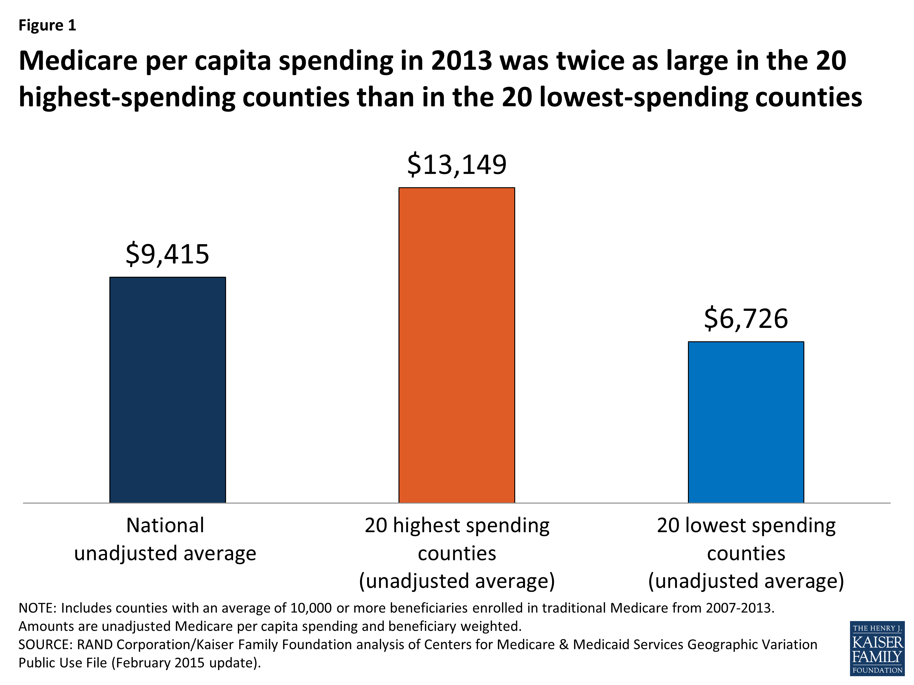
Figure 1: Medicare per capita spending in 2013 was twice as large in the 20 highest-spending counties than in the 20 lowest-spending counties
Most (13 of 20) of the counties with the highest unadjusted Medicare per capita spending in 2013 are in states in the northeastern and mid-Atlantic regions of the country (NY, MD, NJ, PA, CT, MA), five are in Southern states (FL, TX, LA), and the remaining two are in California and Michigan (Figure 2).1 In contrast, most (14 of 20) of the counties with the lowest per capita spending are in western states (OR, CO, NM, HI, MT, WA). The 20 highest-spending counties included substantially larger numbers of Medicare beneficiaries than the 20 lowest-spending counties (totaling 4.6 million versus 735,000 in 2013).
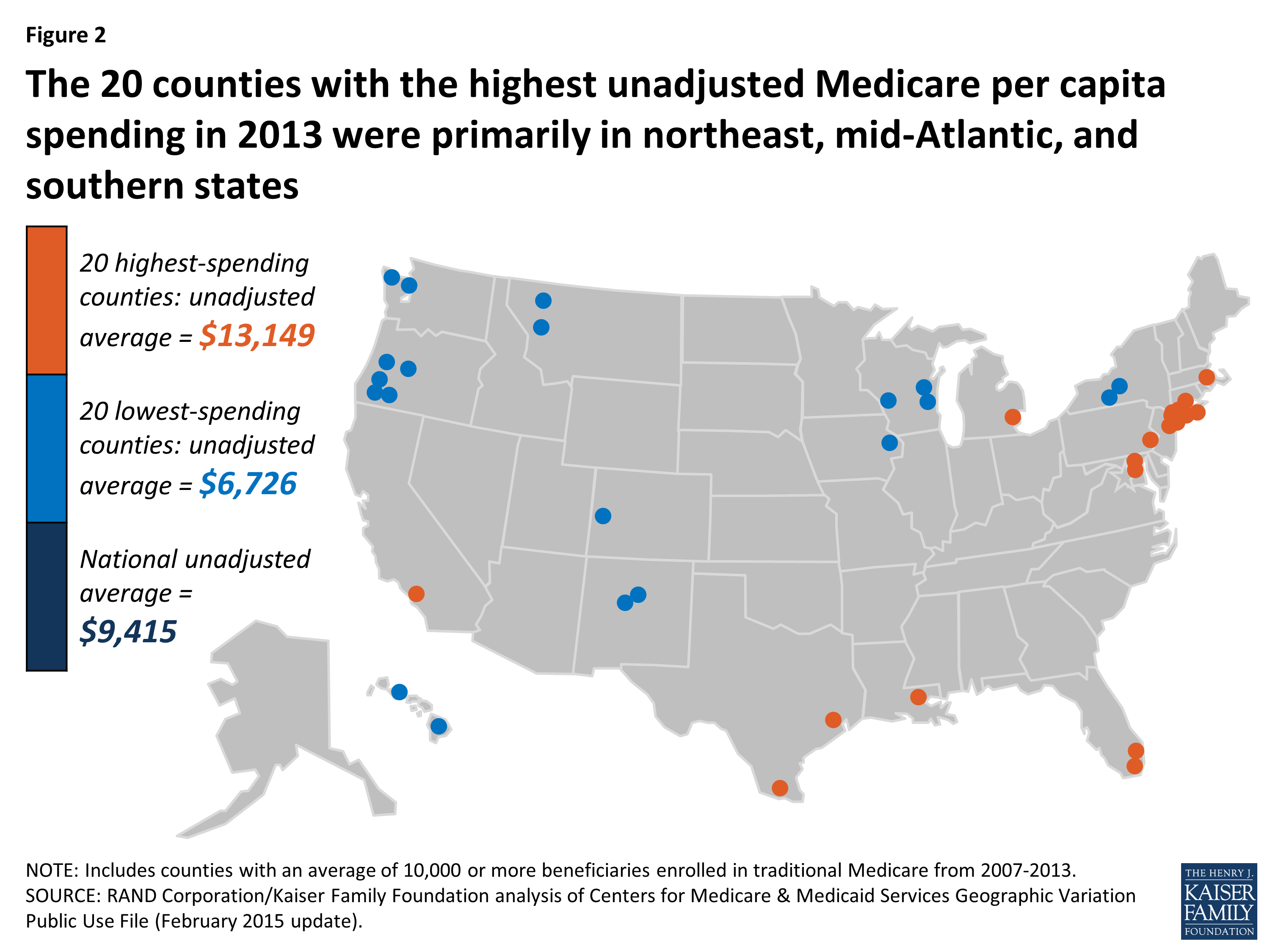
Figure 2: The 20 counties with the highest unadjusted Medicare per capita spending in 2013 were primarily in northeast, mid-Atlantic, and southern states
The highest-spending counties differ from the lowest-spending counties on several dimensions, including beneficiary health status, income, race and ethnicity, and measures of provider supply (Figure 3; Appendix 2: Table 2). For example, 42.5 percent of beneficiaries in the highest-spending counties have five or more chronic conditions, almost double the rate among beneficiaries in the lowest-spending counties (23.4%), and higher than the national average (34.0%). The average poverty rate among people ages 65 and older is nearly two times greater in the 20 highest-spending counties (14.7%) than in the 20 lowest-spending counties (7.8%), and higher than the national average (9.8%). Relatively high poverty rates in the highest-spending counties are reflected in the larger share of beneficiaries dually eligible for Medicare and Medicaid: 34.9 percent in the 20 counties with the highest Medicare per capita spending compared to 16.5 percent in the 20 counties with the lowest per capita spending. A much larger share of beneficiaries in the highest-spending counties are black (19.1%) than in the lowest-spending counties (1.0%) or nationally (9.8%). Similarly, Hispanic beneficiaries account for 17.8% percent of beneficiaries in the highest-spending counties, but just 7.1 percent of beneficiaries in the lowest-spending counties and 6.0 percent nationally.
Figure 3: The 20 highest-spending counties in 2013 had a larger share of beneficiaries who had five or more chronic conditions; were eligible for Medicare and Medicaid; living in poverty; and black or Hispanic
Counties with higher unadjusted Medicare per capita spending in 2013 typically had a larger supply of various types of providers than the lowest-spending counties (Appendix 2: Table 2). Notably, the 20 highest-spending counties had 33.7 doctors per 10,000 county residents in 2012 (the most recent year available), 9.7 more than the national average and 9.3 more than in the lowest-spending counties. The highest-spending counties also had more hospital beds and home health agencies per 10,000 county residents compared to both the national average and the lowest-spending counties, but a smaller number of hospices and ambulatory surgical centers.
The 20 highest- and lowest-spending counties differed substantially in spending per capita for specific Medicare-covered services in 2013 (Figure 4; Appendix 2: Table 3). By far the most important service category in terms of explaining spending differences between the highest- and lowest-spending counties is hospital inpatient care—which is perhaps not surprising, given that inpatient spending is among the most costly types of Medicare-covered service both on a per-capita and a per-user basis. Average spending per capita on hospital inpatient care in 2013 was more than twice as high in the highest-spending counties than in the lowest-spending counties ($4,914 versus $2,335). The difference in hospital inpatient spending is due to a combination of a larger share of the beneficiary population using hospital inpatient services, higher prices paid, and greater quantity and intensity of services received by inpatient users in the 20 highest-spending counties. For example, in the highest-spending counties, an average of 19.2 percent of traditional Medicare beneficiaries had a hospital inpatient stay, compared to the national average of 17.5 percent and 13.2 percent in the 20 lowest-spending counties. Hospital inpatient use was also higher in the 20 highest-spending counties, averaging 2,081 days per 1,000 beneficiaries, compared to 1,530 nationally and 988 in the 20 lowest-spending counties.
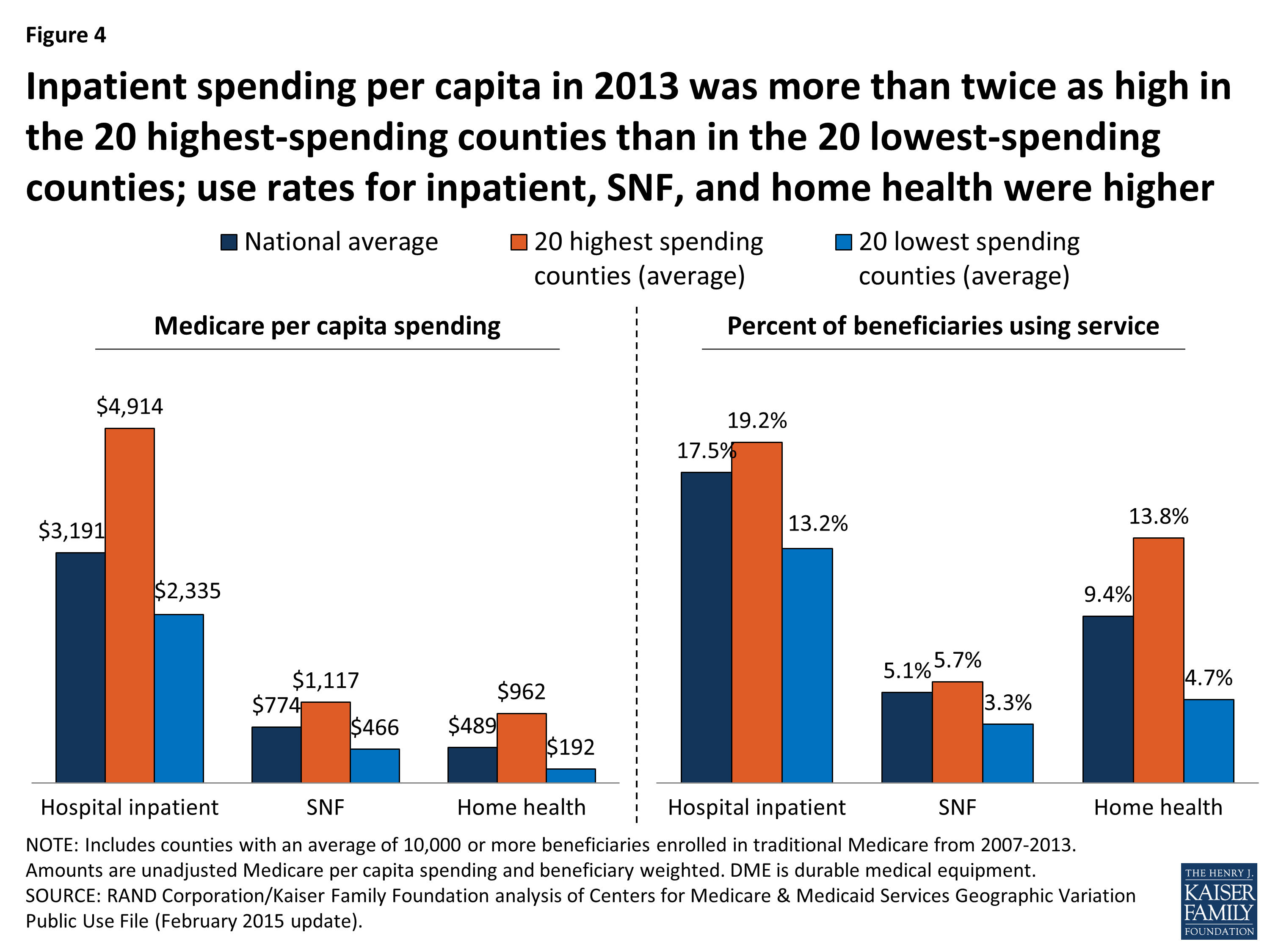
Figure 4: Inpatient spending per capita in 2013 was more than twice as high in the 20 highest-spending counties than in the 20 lowest-spending counties; use rates for inpatient, SNF, and home health were higher
The 20 highest-spending counties in 2013 also had substantially higher spending and use for post-acute care (skilled nursing facility (SNF) and home health care services) relative to the national average and the 20 lowest-spending counties. SNF spending per capita in 2013 averaged $1,117 in the 20 highest-spending counties, 44 percent higher than the national average ($774) and 140 percent higher than in the 20 lowest-spending counties ($466). The per capita spending differences were even larger for home health services ($962, $489, and $192, respectively). The percent of traditional Medicare beneficiaries using SNF in the 20 highest-spending counties in 2013 (5.7%) was higher than national average (5.1%) and higher than in the lowest-spending counties (3.3%). The differences in use rates for home health are even more striking: 13.8 percent of beneficiaries used home health services in the 20 highest-spending counties in 2013, compared to a national average of 9.4 percent, and just 4.7 percent in the 20 lowest-spending counties. The number of SNF covered days per 1,000 beneficiaries was significantly higher in the 20 highest-spending counties (2,429) than the national average (1,887) or the average for 20 lowest-spending counties (1,093). Home health visits per 1,000 beneficiaries averaged 6,207 in the highest-spending counties—six times more than in the lowest-spending counties (1,019) and twice the national average (3,062).
Taken together, these findings suggest that higher unadjusted county-level Medicare per capita spending is partly driven by having a traditional Medicare beneficiary population that is poorer and sicker than average and that uses hospital inpatient services and post-acute care at higher rates and with greater intensity than beneficiaries in lower-spending counties. Counties with relatively high Medicare per capita spending also have a larger supply of certain health care providers than lower-spending counties, which may be related to having a sicker beneficiary population.
How does the amount of variation, and the characteristics of high- versus low-spending counties, differ if rankings are based on unadjusted Medicare spending versus Medicare spending adjusted for differences in prices and beneficiary health status?
Ranking counties based on their actual (unadjusted) Medicare per capita spending reveals the counties where Medicare spends the most and the least, but these spending amounts reflect both the prices that Medicare pays for services at the local level and the health status of beneficiaries living in each county. When we adjust for these price and health-risk differentials and compare the average adjusted per capita spending amounts between the 20 highest-spending counties and the 20 lowest-spending counties, we find that the gap between the averages narrows substantially—from a 96 percent difference ($13,139 versus $6,726) to a 22 percent difference ($9,344 versus $7,640)—but does not disappear (Figure 5). This reduction in the gap between the average spending amounts based on adjusted per capita spending makes sense, since the adjustment mitigates two of the factors (price and health risk) that contribute to county-level spending variation.

Figure 5: Adjusting for price and health-risk differences narrows the variation between average 2013 per capita spending in the 20 highest- and lowest-spending counties
Another way of exploring the effect of price and health-risk adjustments is to examine the ranking of counties based on adjusted Medicare per capita spending, which produces a different set of counties at the top and bottom of the rankings than ranking based on unadjusted per capita spending. Based on this ranking, 19 of the 20 counties with the highest adjusted Medicare per capita spending are located in southern states (TX, LA, FL, OK, AL), with 9 counties located in Texas alone, and only one county located in a non-southern state (OH) (Figure 6; Appendix 2: Table 4). In contrast, a majority (17 out of 20) of the lowest spending counties based on price and risk-adjusted per capita spending are located in western states (CA, CO, HI, NM, OR), including 9 counties in California alone; the remaining 3 counties are in AK and NY.
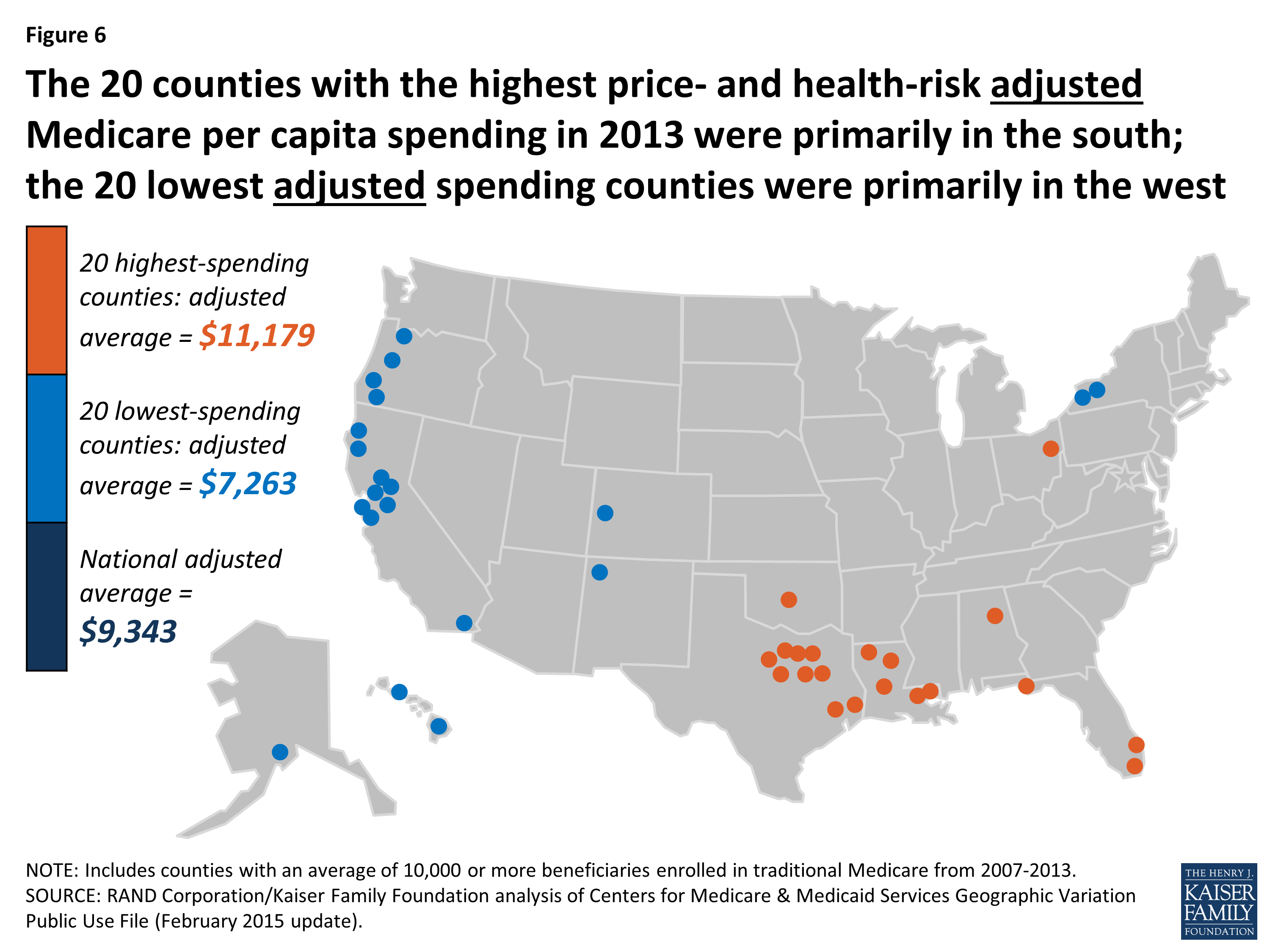
Figure 6: The 20 counties with the highest price- and health-risk adjusted Medicare per capita spending in 2013 were primarily in the south; the 20 lowest adjusted spending counties were primarily in the west
Based on the county rankings by price and health-risk adjusted spending, we find that some demographic differences between the 20 counties at the top and bottom of the ranking, but those differences are not as large as the differences between the counties ranked by unadjusted per capita spending. The 20 highest adjusted spending counties have a somewhat sicker beneficiary population (HCC score of 1.11 versus 0.96), and a larger share of black (8.9% versus 6.8%) and Hispanic (15.8% versus 10.6%) beneficiaries, but a smaller share of beneficiaries eligible for both Medicare and Medicaid (25.3% versus 28.9%) (Appendix 2: Table 5).
In terms of provider supply, the 20 counties with the highest adjusted per capita Medicare spending had 26.5 percent fewer physicians per 10,000 residents than the 20 counties with the lowest adjusted spending, but a larger supply of hospital beds and ambulatory surgical centers, as well as more post-acute providers, including SNF beds, home health agencies, and hospices. Higher adjusted Medicare per capita spending in the top 20 adjusted spending counties could reflect what the Dartmouth researchers refer to as “practice patterns” related to having a larger supply of certain types of providers, or it could reflect higher levels of demand related to having somewhat sicker beneficiary populations.
How much variation exists across counties in the rate of growth in Medicare per capita spending between 2007 and 2013, and what are the characteristics of the counties with the highest and lowest per capita spending growth rates?
The annual rate of growth in Medicare per capita spending between 2007 and 2013 averaged 2.2 percent nationally, and ranged from -0.9 percent, on average, among the 20 counties with the lowest spending growth rate (i.e., a decline in nominal per capita spending) to 4.6 percent, on average, among the 20 counties with the highest spending growth rate (Figure 7).
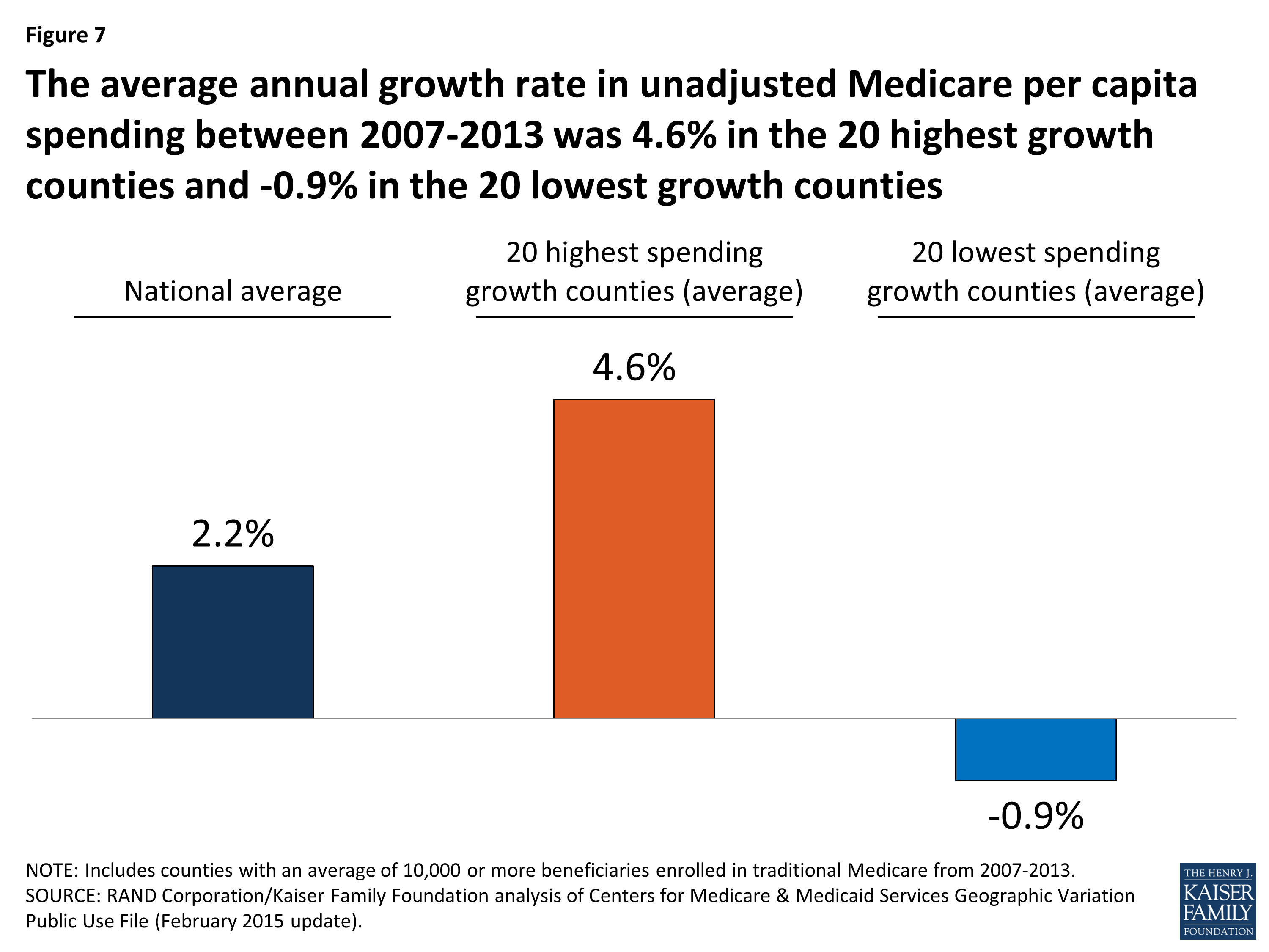
Figure 7: The average annual growth rate in unadjusted Medicare per capita spending between 2007-2013 was 4.6% in the 20 highest growth counties and -0.9% in the 20 lowest growth counties
Between 2007 and 2013, five counties experienced negative average annual growth in per capita spending: Miami-Dade County, FL (-1.84%), Hidalgo County, TX (-1.70%); Wilson County, TN (-0.35%), Orange County, NC (-0.17%), and Walker County, AL (-0.08%). Fifteen of the 20 counties with the lowest spending growth rates are in southern states, while the 20 counties with the highest spending growth rates are more geographically dispersed (Figure 8; Appendix 2: Table 6). None of the 20 counties with the highest spending growth rates between 2007 and 2013 were among the 20 counties with the highest per capita spending amounts in 2013; similarly, none of the 20 counties with the lowest spending growth rates between 2007 and 2013 were among the 20 counties with the lowest per capita spending amounts in 2013.
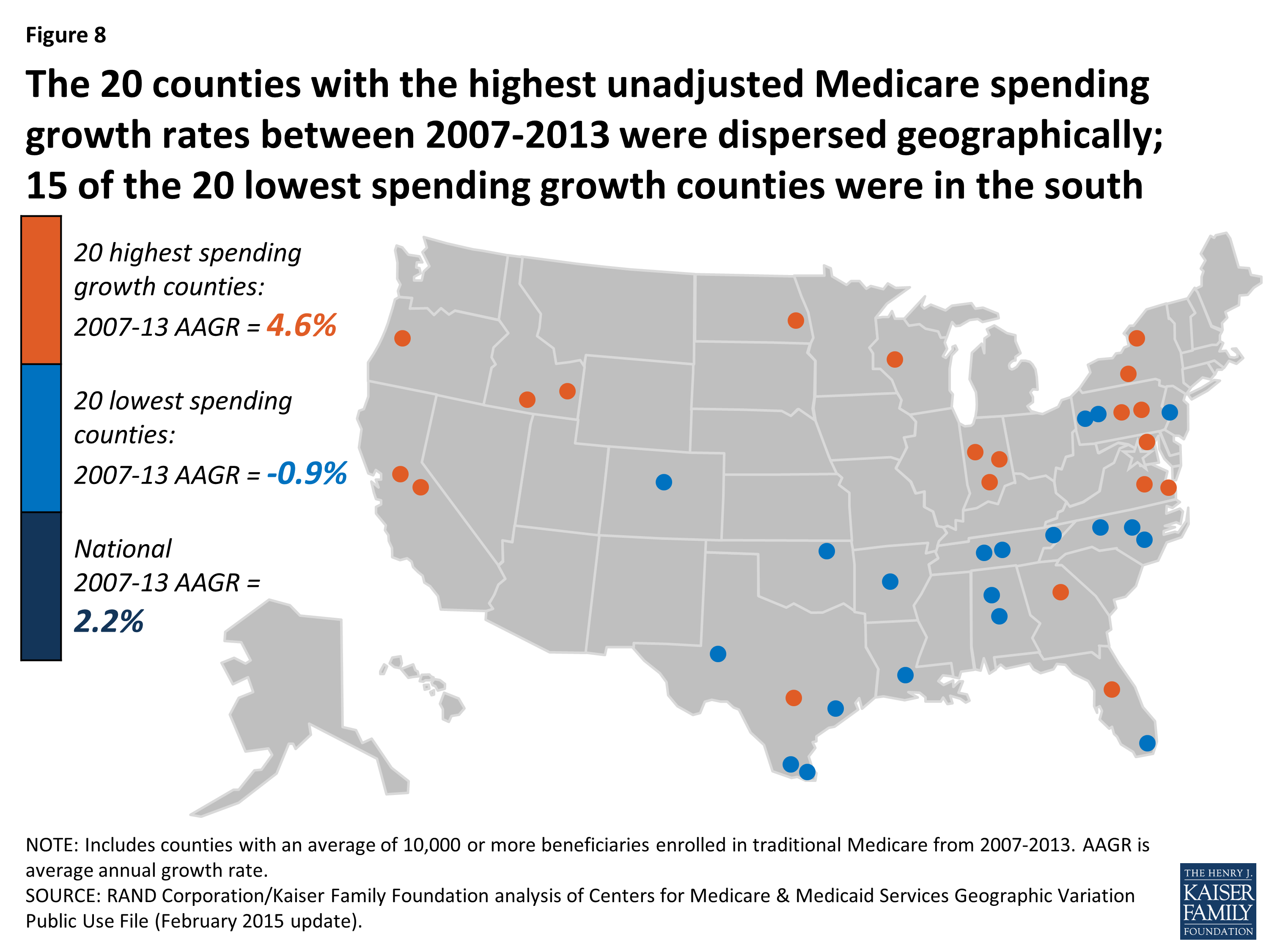
Figure 8: The 20 counties with the highest unadjusted Medicare spending growth rates between 2007-2013 were dispersed geographically; 15 of the 20 lowest spending growth counties were in the south
Unlike the 20 highest-spending and lowest-spending counties, where a comparison reveals several differences in beneficiary characteristics in 2013, there are few notable differences in health status or demographics between the counties with the highest spending growth rates and lowest spending growth rates (Appendix 2: Table 7). The 20 counties with the highest spending growth rates had somewhat fewer Medicare beneficiaries in 2013 than counties with the lowest spending growth rates (totaling 658,000 versus 994,000), but these two sets of counties were similar in terms of average HCC scores, the share of black beneficiaries, and the share of beneficiaries who were eligible for both Medicare and Medicaid in 2013. The only demographic characteristic that differed between counties with the highest and lowest spending growth rates was that Hispanic beneficiaries represented a much larger share of beneficiaries in the lowest spending growth counties, on average, in 2013 (32.4% versus 4.4%); this is likely due to the fact that Miami-Dade County and a handful of counties in Texas with much higher-than-average shares of Hispanic beneficiaries were among the 20 counties with the lowest Medicare per capita spending growth rates across these years.
We also did not observe major changes in beneficiary demographics between 2007 and 2013 that would suggest that such changes played a large role in the rate of Medicare per capita spending growth in these counties. We did observe a difference in the average annual rate of growth in the overall poverty rate among county residents of all ages, which increased at an average annual rate of 4.4 percent in the 20 counties with the highest spending growth rates, compared to 2.3 percent in the 20 counties with the lowest spending growth rates. Average annual growth in the share of black, Hispanic, and Medicare-Medicaid eligible beneficiaries was slightly higher in the highest spending growth counties than in the lowest spending growth counties, while Medicare Advantage penetration increased at the same average annual rate in both sets of counties.
We examined changes in the rate of growth in measures of provider supply to assess whether counties with higher rates of Medicare per capita spending growth also had faster growth in provider supply compared to counties with lower spending growth rates (Appendix 2: Table 7). Contrary to expectations, we found no discernable relationship. For example, in the 20 counties with the fastest growth in Medicare per capita spending, the average number of physicians per 10,000 county residents grew slightly at an average annual growth rate of 0.4% (from 21.0 in 2007 to 21.5 in 2012, the latest year available), and was unchanged in the 20 slowest-growing counties (27.4 in both 2007 and 2012). For another example, we observed a decline over time in the number of hospital beds and skilled nursing facility beds per 10,000 county residents in both the 20 counties with the highest spending growth rates and the 20 counties with the lowest spending growth rates.
Although we did not observe major distinctions between high-spending growth and low-spending growth counties in terms of changes in beneficiary demographics and provider supply measures, we did observe notable differences between these groups of counties in the rate of change in service spending and use between 2007 and 2013. Three service categories account for much of the difference in spending growth between the counties with the highest and lowest spending growth rates: hospital inpatient, home health, and durable medical equipment (DME) (Figure 9; Appendix 2: Table 8).
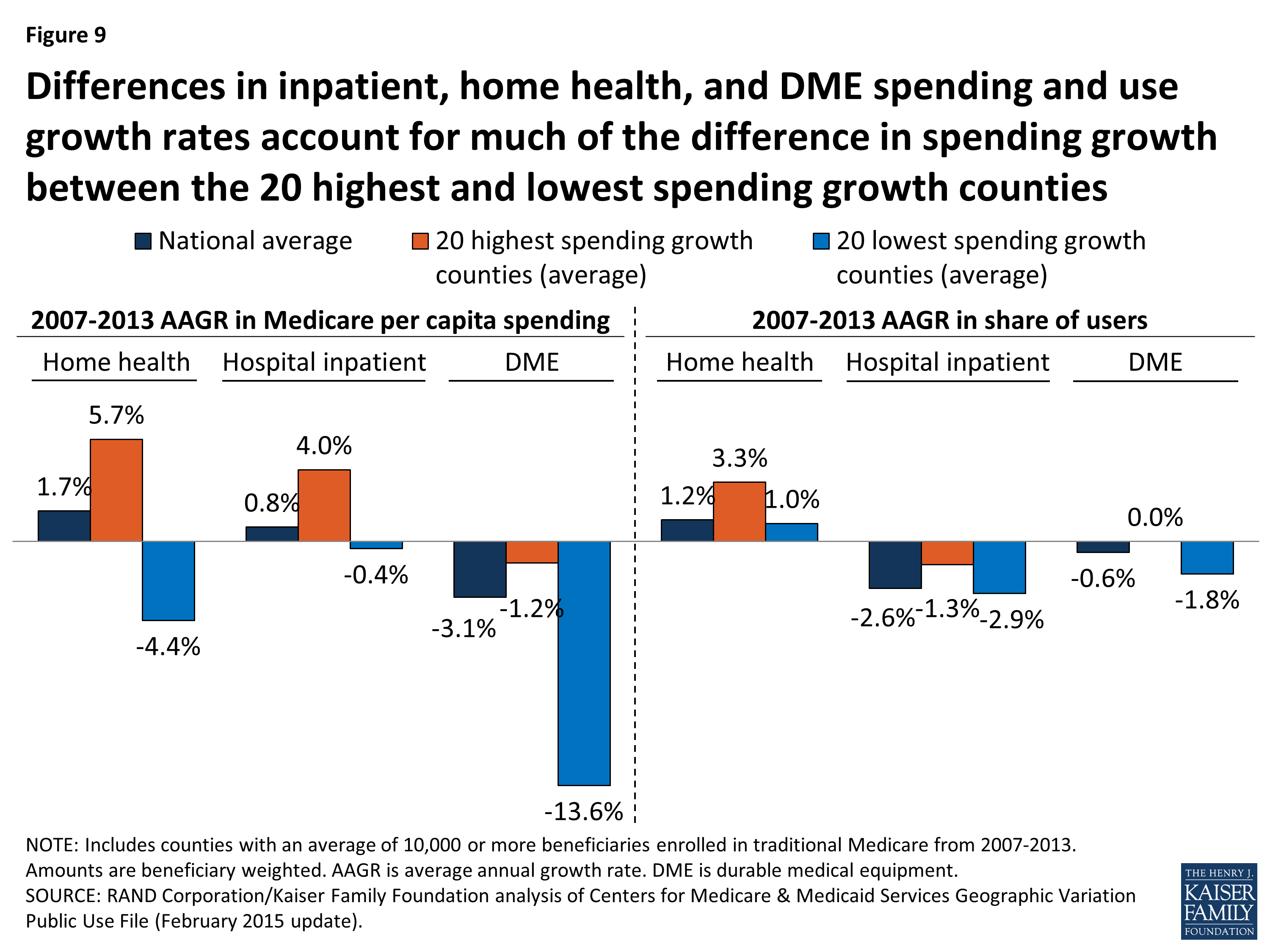
Figure 9: Differences in inpatient, home health, and DME spending and use growth rates account for much of the difference in spending growth between the 20 highest and lowest spending growth counties
In the 20 highest spending growth counties, average hospital spending per capita increased by 4.0 percent between 2007 and 2013, while it decreased by 0.4 percent in the 20 lowest spending growth counties. Readmission rates increased by 0.2 percent, on average, in the highest spending growth counties, but decreased by 0.8 percent in lowest spending growth counties. The difference in growth in spending on home health services was even more striking: increasing at an average annual rate of 5.7 percent in the highest spending growth counties, but decreasing at an average annual rate of 4.4 percent in the lowest spending growth counties. DME spending per capita fell in both the highest and lowest spending growth counties, but the average annual decrease was much smaller in the former set of counties than the latter (-1.2% versus -13.6%).
Compared to the 20 lowest spending growth counties, the 20 counties with the highest spending growth experienced higher average annual growth in the share of beneficiaries using home health services (3.3% versus 1.0%), and a smaller average annual decrease in the share of beneficiaries using hospital inpatient services (-1.3% versus -2.9%). Conversely, the 20 lowest spending growth counties experienced a reduction in the rate of growth in users of DME services, compared to a flat rate of growth in the highest spending growth counties (-1.8% versus 0.0%).
Did the amount of geographic variation in Medicare per capita spending increase or decrease from 2007 to 2013?
Our analysis shows that, in general, counties with relatively high Medicare per capita spending in 2007 tended to experience relatively low spending growth between 2007 and 2013, and vice versa (Figure 10). But although county-level 2007 Medicare per capita spending is negatively related to spending growth over time, high levels of Medicare per capita spending by county have tended to persist over time. Of the 20 counties with the highest per capita spending in 2013, all but two were among the 20 highest-spending counties in 2007 (Appendix 2: Table 9).
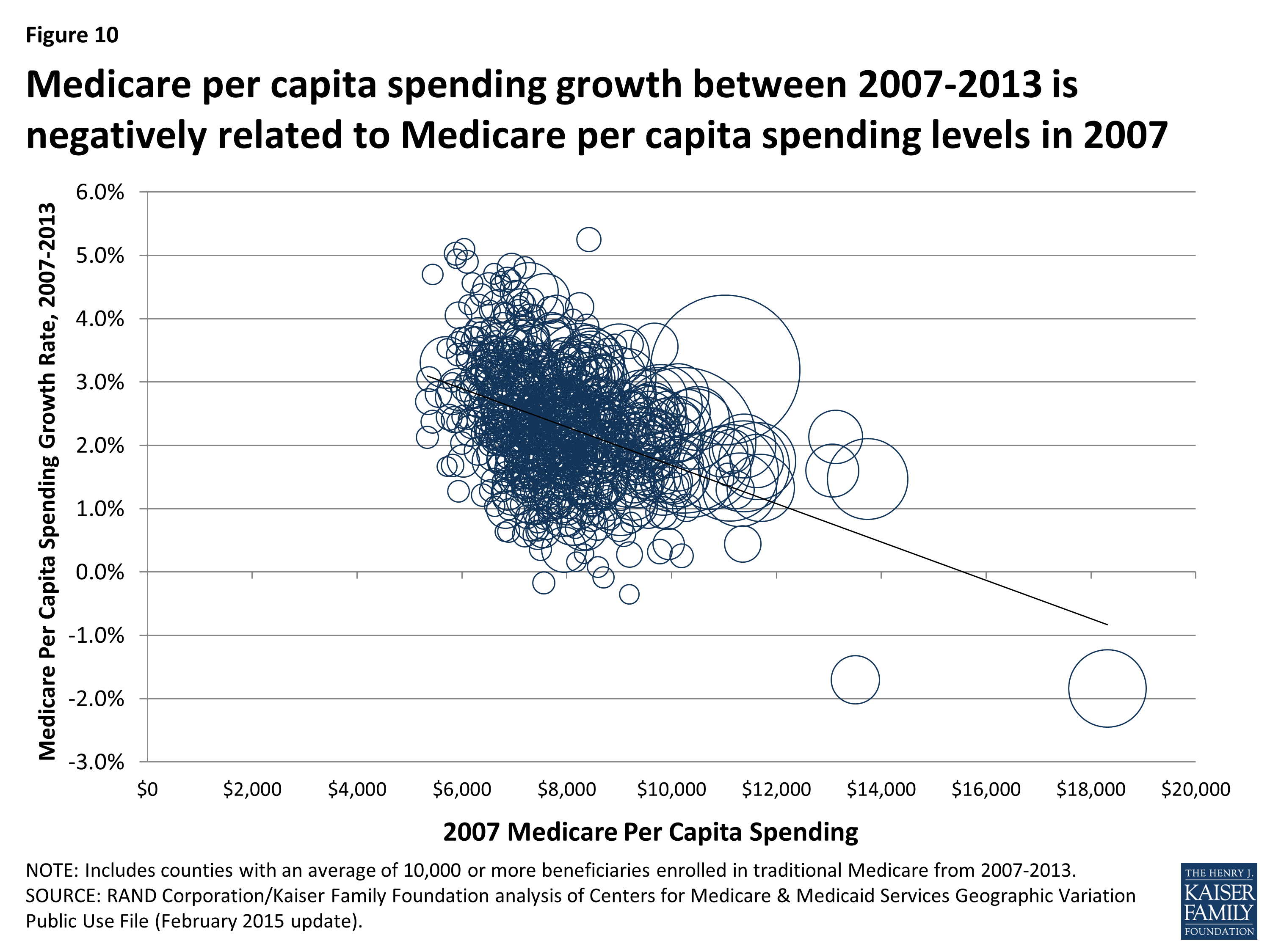
Figure 10: Medicare per capita spending growth between 2007-2013 is negatively related to Medicare per capita spending levels in 2007
To further explore the question of whether geographic variation narrowed or widened over these years, we measured the beneficiary-weighted county-level coefficient of variation for each year from 2007 through 2013 for two spending measures: unadjusted per capita spending, and price and health-risk adjusted per capita spending, including all counties (not just counties with 10,000 or more beneficiaries). We found that the coefficient of variation for unadjusted per capita spending increased slightly from 2007 (0.141) to 2009 (0.143), and then decreased each year thereafter, falling to 0.125 in 2013, a 13 percent decline (Figure 11; Appendix 2: Table 10). The coefficient of variation in adjusted per capita spending followed a similar trend, rising initially and then falling by 15 percent from 2009 to 2013 (from 0.078 to 0.066). We also examined the coefficient of variation by type of service, and found that declines in geographic variation were particularly pronounced for three service categories: home health, durable medical equipment, and hospice. This convergence, or narrowing of variation, in county-level Medicare per capita spending in recent years represents the continuation of a trend since the 1970s toward a reduction in geographic variation in Medicare per capita spending.2
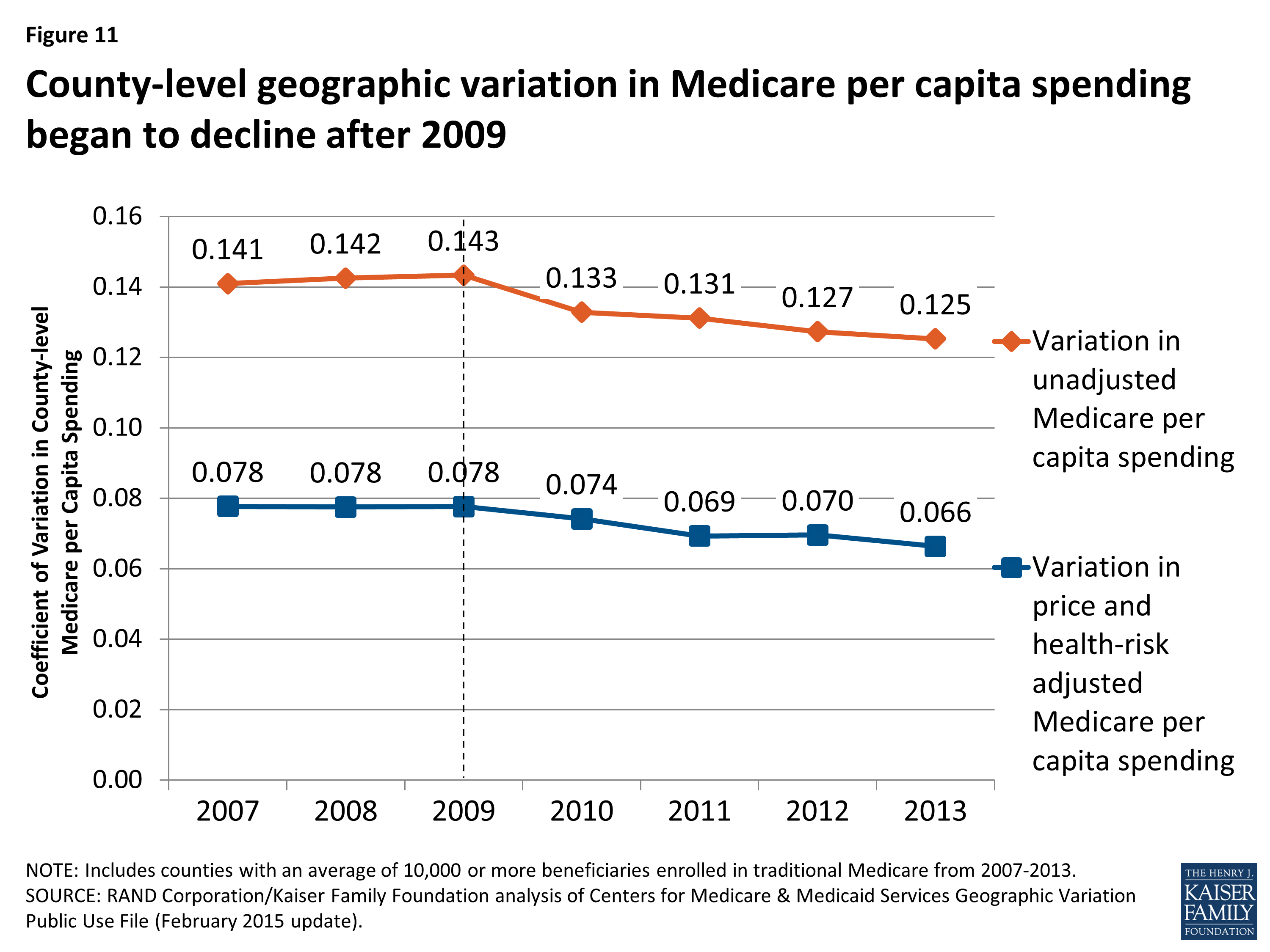
Figure 11: County-level geographic variation in Medicare per capita spending began to decline after 2009
Conclusion
Previous research on geographic variation in Medicare spending suggested that wide variation in per capita spending was driven by differences in the supply of providers combined with an inappropriate profit orientation in some areas, and that the gap between high-spending and low-spending areas could be narrowed by policies that encourage providers in high-spending areas to behave more like providers in low-spending areas. More recent research has shown that the areas of the country with relatively high unadjusted Medicare per capita spending are marked by a confluence of poor health, high rates of poverty, and high prices. Thus, changing provider practice patterns may help to curtail spending growth and reduce variation in spending across counties but will not eliminate the abiding socioeconomic, demographic, and health disparities between the highest- and lowest-spending counties.
At the same time, our analysis shows that differences in county-level spending remain even after adjusting for differences in prices and beneficiary health status that affect Medicare per capita spending. In light of our finding that counties with the highest price- and health-risk adjusted per capita spending have a larger supply of certain types of providers, including post-acute care providers, the question remains whether higher spending in these areas is driven by medical practice styles or by demand for care from a relatively sicker beneficiary population, or some combination of both. Further research is needed to understand this relationship.
In recent years, policies have been implemented within Medicare that may have helped to curb some of the more notable excesses in high-spending areas of the country, and new efforts are underway in the program to change how providers deliver care and how Medicare pays for it. These activities include: an increased focus on program integrity in Medicare, with a special emphasis on high-fraud regions and services; a new competitive bidding program for durable medical equipment; a hospital readmission reduction program; the Medicare Shared Savings Program; and bundled payments for episodes of care. It is beyond the scope of this paper to quantify the extent to which these policies have affected geographic variation in Medicare per beneficiary spending, but our findings suggest that they may have played some role in the narrowing of variation.
The Affordable Care Act included a number of provisions designed to encourage greater efficiency in the delivery of care for Medicare beneficiaries by modifying incentives for providers to reduce excess costs and improve quality of care. Some of these initiatives may help to constrain the growth in per capita spending in all areas and further reduce the variation between the highest- and lowest-spending areas, but some regional differences are likely to persist due to profound differences in the health and socioeconomic characteristics of the Medicare population across the county, along with differences in the prices Medicare pays for services.
We gratefully acknowledge Anthony Damico for assistance with data analysis, and two external reviewers for valuable feedback on a draft of this report.
Appendices
Appendix 1: Data and Methods
The primary data source for this analysis is the February 2015 update of the Medicare Geographic Variation Public Use File (GV PUF) from the Centers for Medicare & Medicaid Services (CMS).1 The GV PUF includes data for the U.S. overall and for three different geographic levels: state, county, and hospital referral region (HRR). We analyzed data at the county level because that is the most-granular level available. Our analysis focuses on the years 2007 and 2013, the earliest and latest years, respectively, in the 2015 GV PUF.
The GV PUF reports spending and beneficiary characteristics only among Medicare beneficiaries enrolled in both Parts A and B (i.e., not just one or the other), and in the traditional Medicare program (i.e., excluding beneficiaries enrolled in a private Medicare Advantage plan). Because of increases in Medicare Advantage enrollment, the share of Medicare beneficiaries included in the GV PUF study population declined from 71 percent in 2007 (33.0 million out of 46.7 million) to 62 percent in 2013 (34.3 million out of 55.2 million).
The GV PUF include three types of spending measures: “actual costs” (unadjusted Medicare payments, excluding beneficiary cost sharing and third-party payments), “standardized costs” (that is, a simulated measure of costs calculated by CMS using a single national price schedule that reflects the quantity and intensity of services but does not include market- or provider-level price adjustments), and “standardized risk-adjusted costs” (that is, standardized costs adjusted for differences in health risk by dividing by the HCC (hierarchical condition categories) score). (In this paper, we refer to “standardized costs” as price-adjusted spending, and “standardized risk-adjusted costs” as price- and risk-adjusted spending.) In addition, for each combination of county, year, and service category we created a set of Medicare price indexes, equal to the ratio of actual costs over standardized costs. In a county with prices equal to the national average, the price index equals 1.00. These price indexes reflect the market-level and provider-specific adjustments that are applied in each county in Medicare’s price-setting formulas, such as differences in local wages and certain provider characteristics such as add-on payments for teaching hospitals. In our discussion of spending by service category, we focus on spending per capita since this measure is the product of the percent of beneficiaries using each service, the Medicare price index for that type of service, and the standardized (i.e., price-adjusted) costs per user.
The county-level GV PUF include 3,136 counties, but many of those counties contain relatively few Medicare beneficiaries. Medicare per capita spending in those small counties can vary widely from county to county and from year to year due to random beneficiary-level variation. To avoid mistakenly identifying counties as high- or low-spending based on a few individual outliers, our analysis included only the 736 counties with an average of 10,000 or more traditional Medicare beneficiaries from 2007 through 2013. These 736 counties included 25.9 million traditional Medicare beneficiaries in 2013, which represents 76 percent of the GV PUF population in that year. The national averages discussed in our analysis include all counties, regardless of the number of beneficiaries in any given year.
We merged the county-level GV PUF with county-level measures of population: the poverty rate among county residents of all ages and the supply of health care providers from the Area Health Resources Files (AHRF) produced by the Health Resources and Services Administration (HRSA).2 For some measures of population demographics and supply, the most recent data available in the AHRF was prior to 2013. To calculate county-level supply measures, we divided the number of providers (e.g., active physicians) by the total number of county residents (i.e., not just Medicare beneficiaries). To calculate national average measures of supply, we first summed supply and population nationwide, and then calculated supply per capita.
We analyzed county-level data on the share of traditional Medicare beneficiaries with multiple chronic conditions, using a 5 percent sample of claims from the 2013 CMS Chronic Conditions Data Warehouse (CCW). We calculated the percent of beneficiaries living in metropolitan areas, based on our analysis of the AHRF. We also analyzed county-level data from the American Community Survey (ACS) 2008-2012 five-year pooled data from the 2013-2014 AHRF on the share of county residents ages 65 and older living in poverty. We matched variables from these separate data files to the GV PUF using the five-digit Federal Information Processing Standard (FIPS) codes, which uniquely identify counties and county-level equivalent areas in the U.S.
We ranked the 736 counties in our analysis using three different spending measures: 1) unadjusted Medicare per capita spending in 2013, to show how counties rank on their actual Medicare per spending levels, regardless of price and health risk differences; 2) price- and health-risk adjusted Medicare per capita spending in 2013; and 3) the annual rate of growth from 2007 to 2013 in unadjusted Medicare per capita spending.3 Our measure of county-level price- and health-risk adjusted spending equals price-adjusted spending divided by the mean HCC score.
For each of these three spending measures, we identified the 20 counties at the top and bottom of the rankings, which yielded six sets of 20 counties. We tested whether our results were sensitive to the selection of 20 counties in each group by replicating our analysis for groups of 50 counties. The results were not appreciably different. For each of those six sets of counties, we calculated beneficiary-weighted averages of spending and utilization measures and demographics, which gives greater weight to counties with larger numbers of traditional Medicare beneficiaries.
Our analysis compares these groups of counties in terms of Medicare beneficiary characteristics, health care provider supply measures, spending and utilization measures, and county-level poverty:
- Beneficiary characteristics include percent black, percent Hispanic, percent eligible for both Medicare and Medicaid, and health risk scores (HCCs) from the GV PUF; the percent of traditional Medicare beneficiaries with five or more chronic conditions, based on our analysis of a five percent sample of Medicare claims from the 2013 CCW; and the percent of county residents ages 65 and over living in poverty, based on our analysis of ACS 2008-2012 five-year pooled data from the 2013-2014 AHRF, and the percent of beneficiaries living in metropolitan areas, based on our analysis of the AHRF.
- Measures of health care provider supply are reported per 10,000 county residents and include the number of physicians, primary care physicians as a percent of all physicians, hospital beds, skilled nursing facility beds, home health agencies, ambulatory surgical centers, and hospices. Supply measures are from our analysis of the AHRF for various years.
- Measures of spending and utilization from the GV PUF include the percent of beneficiaries using specific Medicare-covered services (hospital inpatient, outpatient, evaluation & management, procedures, skilled nursing facility, home health, durable medical equipment, and hospice), spending per capita and per user, and event counts (days, visits, procedures) per 1,000 beneficiaries.
- County-level poverty from the AHRF is the poverty rate among county residents of all ages.
We used the “coefficient of variation” (COV) as a summary measure of the amount of geographic variation in county-level Medicare per capita spending to examine whether geographic variation increased or decreased between 2007 and 2013. The COV equals the beneficiary-weighted standard deviation in Medicare per capita spending divided by the beneficiary-weighted mean. We included all 3,136 counties in the COV calculation. The COV is useful for measuring trends in spending variation, while adjusting for inflation.
Our analyses use the entire population of U.S. counties and the entire population of Medicare fee-for-service beneficiaries within those counties, rather than a random sample. Although conventional tests of statistical significance are not necessary in this situation, we present results from statistical significance testing for the comparisons of county-level averages in the appendix tables. For these tests, we used the TTEST procedure in SAS, weighted by the number of beneficiaries and assuming unequal variance.
Appendix 2: Tables
| Table 1: Counties with the Highest and Lowest Unadjusted Medicare Per Capita Spending, 2013 | |||||
| Rank in 2013 | County | State | 2013 Medicare per capita spending (unadjusted) |
2013 Medicare per capita spending (price and health-risk adjusted) |
2007-2013 Medicare per capita spending growth rate |
| United States average | $9,415 | $9,343 | 2.2% | ||
| 20 highest-spending counties (unadjusted) | |||||
| 1 | Miami-Dade | FL | $16,386 | $11,179 | -1.8% |
| 2 | Kings | NY | $14,998 | $8,235 | 1.5% |
| 3 | Bronx | NY | $14,903 | $7,948 | 2.1% |
| 4 | Baltimore City | MD | $14,370 | $9,505 | 1.6% |
| 5 | Los Angeles | CA | $13,309 | $9,021 | 3.2% |
| 6 | Queens | NY | $12,909 | $8,349 | 1.8% |
| 7 | Essex | NJ | $12,902 | $9,148 | 1.8% |
| 8 | Philadelphia | PA | $12,811 | $9,060 | 2.0% |
| 9 | Broward | FL | $12,664 | $10,357 | 1.3% |
| 10 | Wayne | MI | $12,566 | $9,761 | 1.7% |
| 11 | Hudson | NJ | $12,475 | $8,952 | 1.9% |
| 12 | Suffolk | MA | $12,274 | $8,412 | 1.9% |
| 13 | New York | NY | $12,208 | $9,184 | 1.3% |
| 14 | Harris | TX | $12,195 | $10,418 | 1.6% |
| 15 | Hidalgo | TX | $12,182 | $8,971 | -1.7% |
| 16 | Tangipahoa | LA | $12,130 | $11,066 | 1.5% |
| 17 | Baltimore | MD | $12,115 | $9,811 | 2.4% |
| 18 | Richmond | NY | $12,113 | $9,077 | 1.3% |
| 19 | Passaic | NJ | $11,976 | $9,542 | 2.5% |
| 20 | New Haven | CT | $11,952 | $8,980 | 2.8% |
| 20 lowest-spending counties (unadjusted) | |||||
| 1 | Josephine | OR | $6,058 | $7,513 | 2.1% |
| 2 | Mesa | CO | $6,263 | $7,618 | 2.4% |
| 3 | Santa Fe | NM | $6,288 | $7,871 | 2.7% |
| 4 | Tompkins | NY | $6,310 | $7,659 | 1.7% |
| 5 | Missoula | MT | $6,404 | $8,295 | 1.3% |
| 6 | Hawaii | HI | $6,433 | $6,269 | 3.0% |
| 7 | Flathead | MT | $6,434 | $8,260 | 1.7% |
| 8 | Douglas | OR | $6,550 | $7,521 | 2.8% |
| 9 | Clallam | WA | $6,655 | $8,311 | 2.4% |
| 10 | Jackson | OR | $6,692 | $7,908 | 1.8% |
| 11 | Deschutes | OR | $6,757 | $8,501 | 2.4% |
| 12 | Outagamie | WI | $6,767 | $7,913 | 2.0% |
| 13 | Island | WA | $6,800 | $8,011 | 2.4% |
| 14 | Lane | OR | $6,860 | $7,810 | 2.8% |
| 15 | Sheboygan | WI | $6,869 | $8,307 | 1.2% |
| 16 | Honolulu | HI | $6,923 | $6,672 | 3.3% |
| 17 | Dubuque | IA | $6,946 | $8,733 | 3.0% |
| 18 | Steuben | NY | $6,973 | $7,631 | 2.5% |
| 19 | Bernalillo | NM | $7,034 | $7,769 | 2.9% |
| 20 | La Crosse | WI | $7,034 | $7,727 | 3.5% |
| SOURCE: RAND Corporation/Kaiser Family Foundation analysis of Centers for Medicare & Medicaid Services Geographic Variation Public Use File (February 2015 update). | |||||
| Table 2: Average Total Spending, Beneficiary Demographics, and Provider Supply Measures for Counties with the Highest and Lowest Unadjusted Medicare Per Capita Spending, 2013 | ||||
| National average | 20 highest spending counties (unadjusted) | 20 lowest spending counties (unadjusted) | High-low difference | |
| Medicare per capita spending (unadjusted) | $9,415 | $13,149 | $6,726 | 95.5%**** |
| Medicare per capita spending (price and health-risk adjusted) | $9,343 | $9,344 | $7,640 | 22.3%**** |
| Health risk (hierarchical condition categories [HCC] score) | 1.00 | 1.19 | 0.87 | 37.3%**** |
| Medicare price index | 1.06 | 1.21 | 1.07 | 12.8%**** |
| Number of beneficiaries (traditional Medicare and Medicare Advantage, in thousands) | 50,181 | 4,645 | 735 | 532.3%**** |
| Medicare Advantage enrollment share | 31.6% | 42.8% | 42.2% | 1.4% |
| Beneficiary demographics (% of beneficiaries) | ||||
| Black | 9.8% | 19.1% | 1.0% | 1763.9%**** |
| Hispanic | 6.0% | 17.8% | 7.1% | 151.2%** |
| Eligible for Medicare and Medicaid | 21.3% | 34.9% | 16.5% | 111.8%**** |
| Poverty rate among people ages 65 and older | 9.8% | 14.7% | 7.8% | 88.5% |
| Residing in a metropolitan area | 85.3% | 100.0% | 77.1% | 29.7%** |
| Five or more chronic conditions | 34.0% | 42.5% | 23.4% | 81.6% |
| Characteristics of overall county population | ||||
| Poverty rate | 16.0% | 20.0% | 15.6% | 28.5%*** |
| Supply of health care providers (per 10,000 county residents) | ||||
| Physicians | 24.06 | 33.74 | 24.48 | 37.8%* |
| Primary care physicians as a % of all physicians | 38.5% | 37.1% | 41.3% | -10.1%** |
| Hospital beds | 25.30 | 28.30 | 22.33 | 26.7% |
| Skilled nursing facility beds | 51.49 | 44.55 | 38.03 | 17.1% |
| Home health agencies | 0.40 | 0.62 | 0.18 | 248.0%*** |
| Ambulatory surgical centers | 0.17 | 0.16 | 0.20 | -18.1% |
| Hospices | 0.12 | 0.08 | 0.13 | -38.3%* |
| NOTE: P-values are calculated by applying a t-test to the difference between the 20 highest and 20 lowest-spending counties, assuming unequal variance. *: p-value<0.10, **: p-value<0.05, ***: p-value<0.01, ****: p-value<0.001.
SOURCE: RAND Corporation/Kaiser Family Foundation analysis of Centers for Medicare & Medicaid Services Geographic Variation Public Use File (February 2015 update) for spending and most beneficiary demographics; American Community Survey 2008-2012 pooled data for poverty among people ages 65 and older; a 5 percent sample of claims from the 2013 CMS Chronic Conditions Data Warehouse (CCW) for five or more chronic conditions; Area Health Resources File for metropolitan area residents, characteristics of overall county population, and provider supply measures (various years). |
||||
| Table 3: Average Spending and Use of Specified Medicare-Covered Services for Counties with the Highest and Lowest Unadjusted Medicare Per Capita Spending, 2013 | ||||
| Measure | National average | 20 highest spending counties (unadjusted) | 20 lowest spending counties (unadjusted) | High-low difference |
| Hospital inpatient | ||||
| Spending per capita | $3,191 | $4,914 | $2,335 | 110.5%**** |
| Percent using | 17.5% | 19.2% | 13.2% | 45.8%**** |
| Price index | 1.24 | 1.57 | 1.25 | 25.8%**** |
| Standardized costs per user | $14,722 | $16,230 | $14,295 | 13.5%**** |
| Covered days per capita | 1,530 | 2,081 | 988 | 110.7%**** |
| Readmission rate | 18.0% | 21.2% | 14.8% | 44.0%**** |
| Outpatient | ||||
| Spending per capita | $1,195 | $1,184 | $1,038 | 14.1% |
| Percent using | 63.7% | 56.0% | 61.1% | -8.3% |
| Price index | 1.02 | 1.08 | 1.04 | 4.0% |
| Standardized costs per user | $1,846 | $1,939 | $1,652 | 17.3%*** |
| Visits per capita | 4,221 | 3,626 | 4,071 | -10.9% |
| Evaluation & management | ||||
| Spending per capita | $904 | $1,323 | $634 | 108.8%**** |
| Percent using | 87.8% | 86.7% | 84.7% | 2.4%** |
| Price index | 0.96 | 1.02 | 0.93 | 9.9%**** |
| Standardized costs per user | $1,078 | $1,489 | $803 | 85.4%**** |
| Visits per capita | 13,316 | 17,897 | 9,979 | 79.3%**** |
| Procedures | ||||
| Spending per capita | $605 | $785 | $467 | 67.9%**** |
| Percent using | 61.1% | 62.8% | 54.6% | 15.1%**** |
| Price index | 0.98 | 1.06 | 0.96 | 10.9%**** |
| Standardized costs per user | $1,011 | $1,170 | $896 | 30.6%**** |
| Procedures per capita | 4,612 | 6,011 | 3,629 | 65.6%**** |
| Skilled nursing facility | ||||
| Spending per capita | $774 | $1,117 | $466 | 139.8%**** |
| Percent using | 5.1% | 5.7% | 3.3% | 72.3%**** |
| Price index | 0.97 | 1.09 | 1.01 | 7.5%** |
| Standardized costs per user | $15,840 | $18,008 | $14,038 | 28.3%**** |
| Covered days per capita | 1,887 | 2,429 | 1,093 | 122.3%**** |
| Home health | ||||
| Spending per capita | $489 | $962 | $192 | 402.0%**** |
| Percent using | 9.4% | 13.8% | 4.7% | 193.4%**** |
| Price index | 0.96 | 1.09 | 1.02 | 7.4%** |
| Standardized costs per user | $5,428 | $5,942 | $3,957 | 50.2%**** |
| Visits per capita | 3,062 | 6,207 | 1,019 | 509.1%**** |
| Durable medical equipment | ||||
| Spending per capita | $199 | $182 | $155 | 17.7%** |
| Percent using | 27.6% | 27.2% | 22.7% | 19.8%*** |
| Price index | 0.94 | 0.93 | 0.96 | -3.4%**** |
| Standardized costs per user | $770 | $727 | $696 | 4.4% |
| Events per capita | 1,723 | 1,597 | 1,371 | 16.6%* |
| Hospice | ||||
| Spending per capita | $305 | $296 | $263 | 12.6% |
| Percent using | 2.7% | 2.3% | 2.5% | -5.8% |
| Price index | 0.99 | 1.11 | 1.04 | 6.8%** |
| Standardized costs per user | $11,499 | $11,448 | $9,966 | 14.9%* |
| Covered days per capita | 1,889 | 1,561 | 1,619 | -3.6% |
| NOTE: P-values are calculated by applying a t-test to the difference between the 20 highest and 20 lowest-spending counties, assuming unequal variance. *: p-value<0.10, **: p-value<0.05, ***: p-value<0.01, ****: p-value<0.001.
SOURCE: RAND Corporation/Kaiser Family Foundation analysis of Centers for Medicare & Medicaid Services Geographic Variation Public Use File (February 2015 update). |
||||
| Table 4: Counties with the Highest and Lowest Adjusted Medicare Per Capita Spending, 2013 | |||||
| Rank in 2013 | County | State | 2013 Medicare per capita spending (unadjusted) |
2013 Medicare per capita spending (price and health-risk adjusted) |
2007-2013 Medicare per capita spending growth rate |
| United States average | $9,415 | $9,343 | 2.2% | ||
| 20 highest-spending counties (adjusted) | |||||
| 1 | Smith | TX | $10,369 | $11,572 | 2.4% |
| 2 | Collin | TX | $9,932 | $11,429 | 1.1% |
| 3 | Hunt | TX | $10,999 | $11,343 | 2.2% |
| 4 | Montgomery | TX | $10,887 | $11,283 | 2.1% |
| 5 | Henderson | TX | $10,379 | $11,238 | 2.2% |
| 6 | Palm Beach | FL | $11,925 | $11,221 | 2.3% |
| 7 | Etowah | AL | $9,493 | $11,195 | 2.3% |
| 8 | Miami-Dade | FL | $16,386 | $11,179 | -1.8% |
| 9 | Denton | TX | $10,379 | $11,153 | 1.5% |
| 10 | St. Tammany | LA | $10,808 | $11,146 | 1.4% |
| 11 | Bay | FL | $10,167 | $11,080 | 2.5% |
| 12 | Tangipahoa | LA | $12,130 | $11,066 | 1.5% |
| 13 | Cleveland | OK | $9,269 | $10,945 | 2.1% |
| 14 | Rapides | LA | $9,935 | $10,938 | 1.9% |
| 15 | Parker | TX | $10,175 | $10,924 | 3.3% |
| 16 | Bossier | LA | $10,311 | $10,918 | 1.6% |
| 17 | Jefferson | OH | $10,393 | $10,907 | 3.1% |
| 18 | Orange | TX | $10,241 | $10,904 | 1.9% |
| 19 | Ouachita | LA | $10,913 | $10,891 | 1.4% |
| 20 | Johnson | TX | $11,011 | $10,880 | 3.6% |
| 20 lowest-spending counties (adjusted) | |||||
| 1 | Hawaii | HI | $6,433 | $6,269 | 3.0% |
| 2 | San Francisco | CA | $10,144 | $6,613 | 2.7% |
| 3 | Honolulu | HI | $6,923 | $6,672 | 3.3% |
| 4 | Yolo | CA | $8,060 | $7,127 | 2.9% |
| 5 | Solano | CA | $9,158 | $7,154 | 2.1% |
| 6 | Mendocino | CA | $7,894 | $7,287 | 3.4% |
| 7 | Anchorage | AK | $7,930 | $7,308 | 2.9% |
| 8 | Sacramento | CA | $9,447 | $7,369 | 4.4% |
| 9 | San Juan | NM | $8,257 | $7,377 | 2.1% |
| 10 | Santa Clara | CA | $9,797 | $7,410 | 3.1% |
| 11 | Imperial | CA | $9,799 | $7,418 | 4.1% |
| 12 | Monroe | NY | $8,030 | $7,434 | 1.6% |
| 13 | San Joaquin | CA | $9,123 | $7,499 | 3.1% |
| 14 | Linn | OR | $7,169 | $7,512 | 4.7% |
| 15 | Josephine | OR | $6,058 | $7,513 | 2.1% |
| 16 | Humboldt | CA | $7,624 | $7,519 | 3.7% |
| 17 | Douglas | OR | $6,550 | $7,521 | 2.8% |
| 18 | Multnomah | OR | $7,853 | $7,543 | 3.1% |
| 19 | Erie | NY | $7,978 | $7,572 | 2.5% |
| 20 | Mesa | CO | $6,263 | $7,618 | 2.4% |
| SOURCE: RAND Corporation/Kaiser Family Foundation analysis of Centers for Medicare & Medicaid Services Geographic Variation Public Use File (February 2015 update). | |||||
| Table 5: Average Total Spending, Beneficiary Demographics, and Provider Supply Measures for Counties with the Highest and Lowest Adjusted Medicare Per Capita Spending, 2013 | ||||
| National average | 20 highest spending counties (adjusted) | 20 lowest spending counties (adjusted) | High-low difference | |
| Medicare per capita spending (unadjusted) | $9,415 | $12,119 | $8,529 | 42.1%**** |
| Medicare per capita spending (price and health-risk adjusted) | $9,343 | $11,179 | $7,263 | 53.9%**** |
| Health risk (hierarchical condition categories [HCC] score) | 1.00 | 1.11 | 0.96 | 15.6%**** |
| Medicare price index | 1.06 | 1.02 | 1.24 | -18.3%**** |
| Number of beneficiaries (traditional Medicare and Medicare Advantage, in thousands) | 50,181 | 1,214 | 1,507 | -19.5% |
| Medicare Advantage enrollment share | 31.6% | 40.7% | 47.2% | -13.8% |
| Beneficiary demographics (% of beneficiaries) | ||||
| Black | 9.8% | 8.9% | 6.8% | 30.4% |
| Hispanic | 6.0% | 15.8% | 10.6% | 48.7% |
| Eligible for Medicare and Medicaid | 21.3% | 25.3% | 28.9% | -12.5% |
| Poverty rate among people ages 65 and older | 9.8% | 11.6% | 9.1% | 28.0% |
| Residing in a metropolitan area | 85.3% | 98.5% | 90.4% | 9.0% |
| Characteristics of overall county population | ||||
| Poverty rate | 16.0% | 16.2% | 15.6% | 3.7% |
| Supply of health care providers (per 10,000 county residents) | ||||
| Physicians | 24.06 | 22.24 | 30.25 | -26.5%** |
| Primary care physicians as a % of all physicians | 38.5% | 39.7% | 41.3% | -3.9% |
| Hospital beds | 25.30 | 27.45 | 22.89 | 19.9% |
| Skilled nursing facility beds | 51.49 | 46.39 | 35.33 | 31.3%* |
| Home health agencies | 0.40 | 1.02 | 0.15 | 587.8%**** |
| Ambulatory surgical centers | 0.17 | 0.19 | 0.13 | 41.4%** |
| Hospices | 0.12 | 0.14 | 0.06 | 119.0%* |
| NOTE: P-values are calculated by applying a t-test to the difference between the 20 highest and 20 lowest-spending counties, assuming unequal variance. *: p-value<0.10, **: p-value<0.05, ***: p-value<0.01, ****: p-value<0.001.
SOURCE: RAND Corporation/Kaiser Family Foundation analysis of Centers for Medicare & Medicaid Services Geographic Variation Public Use File (February 2015 update) for spending and most beneficiary demographics; American Community Survey 2008-2012 pooled data for poverty among people ages 65 and older; Area Health Resources File for metropolitan area residents, characteristics of overall county population, and provider supply measures (various years). |
||||
| Table 6: Counties with the Highest and Lowest Medicare Per Capita Spending Growth Rates, 2007-2013 | |||||
| Rank | County | State | 2007 Medicare per capita spending (unadjusted) |
2013 Medicare per capita spending (unadjusted) |
2007-2013 Medicare per capita spending growth rate |
| United States average | $8,272 | $9,415 | 2.2% | ||
| 20 highest spending growth counties | |||||
| 1 | Allegany | MD | $8,421 | $11,446 | 5.2% |
| 2 | Eau Claire | WI | $6,042 | $8,142 | 5.1% |
| 3 | Cass | ND | $5,883 | $7,895 | 5.0% |
| 4 | Twin Falls | ID | $5,896 | $7,878 | 4.9% |
| 5 | Jefferson | NY | $6,093 | $8,119 | 4.9% |
| 6 | Wayne | IN | $7,201 | $9,546 | 4.8% |
| 7 | Bell | TX | $6,945 | $9,204 | 4.8% |
| 8 | Bartholomew | IN | $6,614 | $8,717 | 4.7% |
| 9 | Linn | OR | $5,442 | $7,169 | 4.7% |
| 10 | Tippecanoe | IN | $6,864 | $9,003 | 4.6% |
| 11 | Clarke | GA | $6,934 | $9,090 | 4.6% |
| 12 | Centre | PA | $6,733 | $8,814 | 4.6% |
| 13 | Bonneville | ID | $6,200 | $8,105 | 4.6% |
| 14 | Tuolumne | CA | $6,749 | $8,798 | 4.5% |
| 15 | Chesterfield | VA | $6,508 | $8,461 | 4.5% |
| 16 | Sacramento | CA | $7,283 | $9,447 | 4.4% |
| 17 | Hampton City | VA | $7,020 | $9,092 | 4.4% |
| 18 | Chemung | NY | $6,370 | $8,235 | 4.4% |
| 19 | Marion | FL | $7,585 | $9,778 | 4.3% |
| 20 | Northumberland | PA | $7,335 | $9,439 | 4.3% |
| 20 lowest spending growth counties | |||||
| 1 | Miami-Dade | FL | $18,315 | $16,386 | -1.8% |
| 2 | Hidalgo | TX | $13,504 | $12,182 | -1.7% |
| 3 | Wilson | TN | $9,194 | $9,000 | -0.4% |
| 4 | Orange | NC | $7,559 | $7,482 | -0.2% |
| 5 | Walker | AL | $8,700 | $8,656 | -0.1% |
| 6 | Beaver | PA | $8,595 | $8,635 | 0.1% |
| 7 | Shelby | AL | $8,183 | $8,263 | 0.2% |
| 8 | St. Landry | LA | $10,189 | $10,346 | 0.3% |
| 9 | Johnston | NC | $9,197 | $9,350 | 0.3% |
| 10 | Surry | NC | $8,326 | $8,473 | 0.3% |
| 11 | Warren | NJ | $9,774 | $9,966 | 0.3% |
| 12 | Pulaski | AR | $7,950 | $8,120 | 0.4% |
| 13 | Williamson | TN | $7,496 | $7,660 | 0.4% |
| 14 | Fort Bend | TX | $9,942 | $10,210 | 0.4% |
| 15 | Cameron | TX | $11,354 | $11,662 | 0.4% |
| 16 | Butler | PA | $8,346 | $8,614 | 0.5% |
| 17 | Boulder | CO | $7,449 | $7,716 | 0.6% |
| 18 | Ector | TX | $9,084 | $9,411 | 0.6% |
| 19 | Washington | TN | $7,202 | $7,463 | 0.6% |
| 20 | Washington | OK | $6,819 | $7,084 | 0.6% |
| SOURCE: RAND Corporation/Kaiser Family Foundation analysis of Centers for Medicare & Medicaid Services Geographic Variation Public Use File (February 2015 update). | |||||
| Table 7: Average Spending, Beneficiary Demographics, and Provider Supply Measures for Counties with the Highest and Lowest Medicare Per Capita Spending Growth Rates, 2007 and 2013 | ||||||||||
| National average | 20 highest spending growth counties | 20 lowest spending growth counties | High-low AAGR difference | |||||||
| 2007 | 2013 | AAGR | 2007 | 2013 | AAGR | 2007 | 2013 | AAGR | ||
| Medicare per capita spending (unadjusted) | $8,272 | $9,415 | 2.2% | $6,951 | $9,089 | 4.60% | $12,124 | $11,513 | -0.9% | 5.4%*** |
| Medicare per capita spending (price and health-risk adjusted) | $8,218 | $9,343 | 2.2% | $7,377 | $8,907 | 3.20% | $9,906 | $9,927 | 0.0% | 3.2%* |
| Health risk (hierarchical condition categories [HCC] score) | 1 | 1 | 0.0% | 0.96 | 1 | 0.7% | 1.16 | 1.15 | -0.3% | 0.9%*** |
| Medicare price index | 1.04 | 1.06 | 0.2% | 1.03 | 1.09 | 0.90% | 1.02 | 1.03 | 0.0% | 0.8%* |
| Number of beneficiaries (traditional Medicare and Medicare Advantage, thousands) | 42,507 | 50,181 | 2.80% | 545 | 658 | 3.20% | 821 | 994 | 3.20% | 0.0% |
| Medicare Advantage enrollment share | 22.3% | 31.6% | 6.0% | 22.90% | 31.4% | 5.5% | 28.80% | 39.4% | 5.4% | 0.1% |
| Beneficiary demographics (% of beneficiaries) | ||||||||||
| Black | 9.4% | 9.80% | 0.8% | 8.0% | 8.6% | 1.1% | 8.7% | 8.9% | 0.4% | 0.7% |
| Hispanic | 5.5% | 6.0% | 1.3% | 3.8% | 4.4% | 2.3% | 31.8% | 32.4% | 0.3% | 2.%**** |
| Eligible for Medicare and Medicaid | 20.4% | 21.3% | 0.7% | 19.7% | 22.4% | 2.1% | 34.7% | 35.1% | 0.2% | 1.9%*** |
| Residing in a metropolitan area | 84.9% | 85.3% | 0.1% | 88.0% | 88.0% | 0.0% | 93.6% | 93.6% | 0.0% | 0.0% |
| Characteristics of overall county population | ||||||||||
| Poverty rate | 13.0% | 16.0% | 3.5% | 13.2% | 17.1% | 4.4% | 17.5% | 20.0% | 2.3% | 2.2% |
| Supply of health care providers (per 10,000 county residents) | ||||||||||
| Physicians | 23.32 | 24.06 | 0.5% | 21.01 | 21.53 | 0.4% | 27.37 | 27.36 | 0.0% | 0.4% |
| Primary care physicians as a % of all physicians | 39.6% | 38.3% | -0.6% | 39.8% | 38.6% | -0.5% | 43.2% | 42.9% | -0.1% | -0.4% |
| Hospital beds | 26.61 | 25.3 | -0.80% | 30.95 | 27.95 | -1.7% | 33.8 | 31.35 | -1.2% | -0.4% |
| SNF beds | 53.61 | 51.49 | -0.70% | 50.27 | 48 | -0.8% | 42.61 | 41.56 | -0.4% | -0.4% |
| Home health agencies | 0.31 | 0.4 | 4.10% | 0.25 | 0.25 | -0.2% | 0.84 | 1.17 | 5.6% | -5.8%**** |
| Ambulatory surgical centers | 0.16 | 0.17 | 1.10% | 0.23 | 0.21 | -1.1% | 0.16 | 0.16 | 0.0% | -1.1% |
| Hospices | 0.1 | 0.12 | 3.10% | 0.1 | 0.11 | 1.2% | 0.09 | 0.1 | 2.4% | -1.1% |
|
NOTE: AAGR is average annual growth rate. SNF is skilled nursing facility. P-values are calculated by applying a t-test to the difference between the 20 highest and 20 lowest-spending counties, assuming unequal variance. *: p-value<0.10, **: p-value<0.05, ***: p-value<0.01, ****: p-value<0.001. SOURCE: RAND Corporation/Kaiser Family Foundation analysis of Centers for Medicare & Medicaid Services Geographic Variation Public Use File (February 2015 update) for spending and most beneficiary demographics; Area Health Resources file for metropolitan area residents, characteristics of overall county population, and provider supply measures (various years). |
||||||||||
| Table 8: Average Spending and Use of Specified Medicare-Covered Services for Counties with the Highest and Lowest Medicare Per Capita Spending Growth Rates, 2007-2013 | |||||||||||
| Measure | National average | 20 highest spending growth counties | 20 lowest spending growth counties | High-low AAGR difference | |||||||
| 2007 | 2013 | AAGR | 2007 | 2013 | AAGR | 2007 | 2013 | AAGR | |||
| Hospital inpatient | |||||||||||
| Spending per capita | $3,048 | $3,191 | 0.8% | $2,601 | $3,285 | 4.00% | $3,614 | $3,527 | -0.4% | 4.4%**** | |
| Percent using | 20.5% | 17.5% | -2.6% | 18.6% | 17.3% | -1.3% | 22.0% | 18.40% | -2.9% | 1.6%**** | |
| Price index | 1.18 | 1.24 | 0.9% | 1.15 | 1.3 | 2.0% | 1.23 | 1.25 | 0.3% | 1.6%**** | |
| Standardized costs per user | $12,650 | $14,722 | 2.6% | $12,201 | $14,779 | 3.2% | $13,254 | $15,055 | 2.1% | 1.1%**** | |
| Covered days per capita | 1,901 | 1,530 | -3.6% | 1,601 | 1,443 | -1.7% | 2,329 | 1,796 | -4.2% | 2.5%**** | |
| Readmission rate | 19.2% | 18.0% | -1.1% | 17.5% | 17.7% | 0.2% | 20.3% | 19.3% | -0.8% | 1.0%*** | |
| Outpatient | |||||||||||
| Spending per capita | $767 | $1,195 | 7.70% | $710 | $1,229 | 9.60% | $680 | $1,054 | 7.6% | 2.0%* | |
| Percent using | 62.8% | 63.7% | 0.2% | 58.9% | 61.5% | 0.7% | 57.7% | 60.9% | 0.9% | -0.2% | |
| Price index | 0.97 | 1.02 | 0.80 | 0.97 | 1.02 | 0.8% | 0.95 | 0.96 | 0.2% | 0.6%*** | |
| Standardized costs per user | $1,260 | $1,846 | 6.6% | $1,235 | $1,953 | 7.9% | $1,255 | $1,811 | 6.3% | 1.6%** | |
| Visits per capita | 3,806 | 4,221 | 1.7% | 3,734 | 4,593 | 3.5% | 3,027 | 3,496 | 2.4% | 1.1% | |
| Evaluation & management | |||||||||||
| Spending per capita | $768 | $904 | 2.8% | $635 | $825 | 4.5% | $987 | $1,102 | 1.8% | 2.6%**** | |
| Percent using | 89.1% | 87.8% | -0.2% | 88.6% | 87.6% | -0.2% | 89.6% | 88.4% | -0.2% | 0.0% | |
| Price index | 0.98 | 0.96 | -0.4% | 0.95 | 0.94 | -0.2% | 0.96 | 0.95 | -0.1% | 0.0% | |
| Standardized costs per user | $883 | $1,078 | 3.4% | $754 | $999 | 4.8% | $1,140 | $1,293 | 2.1% | 2.7%**** | |
| Visits per capita | 13,093 | 13,316 | 0.3% | 11,531 | 12,506 | 1.4% | 16,714 | 16,003 | -0.7% | 2.1%**** | |
| Procedures | |||||||||||
| Spending per capita | $541 | $605 | 1.9% | $488 | $595 | 3.4% | $655 | $638 | -0.5% | 3.8%**** | |
| Percent using | 60.9% | 61.1% | 0.1% | 58.8% | 59.5% | 0.2% | 63.6% | 63.1% | -0.1% | 0.3%* | |
| Price index | 0.98 | 0.98 | 0.0% | 0.95 | 0.96 | 0.2% | 0.96 | 0.98 | 0.3% | -0.1% | |
| Standardized costs per user | $908 | $1,011 | 1.8% | $869 | $1,021 | 2.7% | $1,060 | $1,026 | -0.5% | 3.3%**** | |
| Procedures per capita | 4,271 | 4,612 | 1.3% | 3,810 | 4,208 | 1.7% | 5,144 | 4,699 | -1.5% | 3.2%**** | |
| Skilled nursing facility | |||||||||||
| Spending per capita | $641 | $774 | 3.2% | $564 | $716 | 4.1% | $629 | $728 | 2.5% | 1.6%* | |
| Percent using | 5.3% | 5.1% | -0.7% | 4.7% | 4.8% | 0.3% | 4.8% | 4.6% | -0.8% | 1.1% | |
| Price index | 0.97 | 0.97 | 0.0% | 0.98 | 1.01 | 0.5% | 0.92 | 0.92 | -0.1% | 0.7%*** | |
| Standardized costs per user | $12,581 | $15,840 | 3.9% | $12,325 | $15,038 | 3.4% | $14,174 | $17,243 | 3.3% | 0.1% | |
| Covered days per capita | 1,966 | 1,887 | -0.7% | 1,735 | 1,775 | 0.4% | 2,039 | 1,939 | -0.8% | 1.2% | |
| Home health | |||||||||||
| Spending per capita | $443 | $489 | 1.7% | $273 | $381 | 5.7% | $2,121 | $1,621 | -4.4% | 10.1%**** | |
| Percent using | 8.8% | 9.4% | 1.2% | 6.9% | 8.4% | 3.3% | 17.1% | 18.2% | 1.0% | 2.3%*** | |
| Price index | 0.96 | 0.96 | 0.0% | 0.98 | 1.01 | 0.5% | 0.94 | 0.93 | -0.3% | 0.7%*** | |
| Standardized costs per user | $5,282 | $5,428 | 0.5% | $4,008 | $4,466 | 1.80% | $10,499 | $7,814 | -4.8% | 6.6%**** | |
| Visits per capita | 3,246 | 3,062 | -1.0% | 1,746 | 2,189 | 3.8% | 26,008 | 11,289 | -13.0% | 16.8%**** | |
| Durable medical equipment | |||||||||||
| Spending per capita | $241 | $199 | -3.10% | $219 | $204 | -1.2% | $514 | $214 | -13.6% | 12.4%**** | |
| Percent using | 28.6% | 27.6% | -0.6% | 27.3% | 27.3% | 0.0% | 34.3% | 30.8% | -1.8% | 1.8%**** | |
| Price index | 0.99 | 0.94 | -1.0% | 0.99 | 0.94 | -0.9% | 0.99 | 0.92 | -1.2% | 0.3%** | |
| Standardized costs per user | $849 | $770 | -1.6% | $808 | $791 | -0.4% | $1,420 | $753 | -10.0% | 9.7%*** | |
| Events per capita | 1,950 | 1,723 | -2.0% | 1,833 | 1,731 | -1.0% | 2,998 | 1,946 | -6.9% | 6.0%**** | |
| Hospice | |||||||||||
| Spending per capita | $244 | $305 | 3.8% | $190 | $281 | 6.7% | $280 | $412 | 6.6% | 0.1% | |
| Percent using | 2.4% | 2.7% | 2.3% | 2.0% | 2.6% | 4.5% | 2.4% | 2.9% | 3.6% | 0.9% | |
| Price index | 1.01 | 0.99 | -0.3% | 1.03 | 1.03 | -0.1% | 1 | 0.97 | -0.5% | 0.4%** | |
| Standardized costs per user | $10,313 | $11,499 | 1.8% | $8,941 | $10,345 | 2.5% | $11,307 | $13,975 | 3.6% | -1.1% | |
| Covered days per capita | 1,678 | 1,889 | 2.0% | 1,352 | 1,727 | 4.2% | 1,844 | 2,424 | 4.7% | -0.5% | |
|
NOTE: AAGR is average annual growth rate. P-values are calculated by applying a t-test to the difference between the 20 highest and 20 lowest-spending counties, assuming unequal variance. *: p-value<0.10, **: p-value<0.05, ***: p-value<0.01, ****: p-value<0.001.
SOURCE: RAND Corporation/Kaiser Family Foundation analysis of Centers for Medicare & Medicaid Services Geographic Variation Public Use File (February 2015 update).
|
|||||||||||
| Table 9: Top 20 Counties with the Highest Unadjusted Medicare Per Capita Spending, 2007 and 2013 |
||||||||||
| Top 20 Counties in 2007 | Top 20 Counties in 2013 | |||||||||
| County | State | 2007 Medicare per capita spending (unadjusted) |
Rank in 2007 | Rank in 2013 | County | State | 2013 Medicare per capita spending (unadjusted) |
Rank in 2013 | Rank in 2007 | |
| Miami-Dade | FL | $18,314.65 | 1 | 1 | Miami-Dade | FL | $16,386 | 1 | 1 | |
| Kings | NY | $13,741.57 | 2 | 2 | Kings | NY | $14,998 | 2 | 2 | |
| Hidalgo | TX | $13,504.04 | 3 | 15 | Bronx | NY | $14,903 | 3 | 4 | |
| Bronx | NY | $13,130.10 | 4 | 3 | Baltimore City | MD | $14,370 | 4 | 5 | |
| Baltimore City | MD | $13,063.16 | 5 | 4 | Los Angeles | CA | $13,309 | 5 | 17 | |
| Broward | FL | $11,700.08 | 6 | 9 | Queens | NY | $12,909 | 6 | 7 | |
| Queens | NY | $11,630.65 | 7 | 6 | Essex | NJ | $12,902 | 7 | 8 | |
| Essex | NJ | $11,624.09 | 8 | 7 | Philadelphia | PA | $12,811 | 8 | 9 | |
| Philadelphia | PA | $11,380.84 | 9 | 8 | Broward | FL | $12,664 | 9 | 6 | |
| Wayne | MI | $11,377.52 | 10 | 10 | Wayne | MI | $12,566 | 10 | 10 | |
| Cameron | TX | $11,354.43 | 11 | 25 | Hudson | NJ | $12,475 | 11 | 14 | |
| New York | NY | $11,299.01 | 12 | 13 | Suffolk | MA | $12,274 | 12 | 18 | |
| Richmond | NY | $11,210.86 | 13 | 18 | New York | NY | $12,208 | 13 | 12 | |
| Hudson | NJ | $11,139.52 | 14 | 11 | Harris | TX | $12,195 | 14 | 15 | |
| Harris | TX | $11,109.23 | 15 | 14 | Hidalgo | TX | $12,182 | 15 | 3 | |
| Tangipahoa | LA | $11,066.91 | 16 | 16 | Tangipahoa | LA | $12,130 | 16 | 16 | |
| Los Angeles | CA | $11,021.51 | 17 | 5 | Baltimore | MD | $12,115 | 17 | 20 | |
| Suffolk | MA | $10,963.29 | 18 | 12 | Richmond | NY | $12,113 | 18 | 13 | |
| Nassau | NY | $10,762.73 | 19 | 23 | Passaic | NJ | $11,976 | 19 | 23 | |
| Baltimore | MD | $10,493.62 | 20 | 17 | New Haven | CT | $11,952 | 20 | 30 | |
| SOURCE: RAND Corporation/Kaiser Family Foundation analysis of Centers for Medicare & Medicaid Services Geographic Variation Public Use File (February 2015 update). | ||||||||||
| Table 10: Coefficient of Variation in County-Level Medicare Per Capita Spending, By Type of Service, 2007-2013 | |||||||||
| Type of service | 2007 | 2008 | 2009 | 2010 | 2011 | 2012 | 2013 |
2007-2013 difference
|
2007-2013 % change |
| All services | 0.141 | 0.142 | 0.143 | 0.133 | 0.131 | 0.127 | 0.125 | -0.016 | -11.1% |
| Hospital inpatient | 0.169 | 0.174 | 0.179 | 0.174 | 0.175 | 0.171 | 0.170 | 0.001 | 0.6% |
| Outpatient | 0.184 | 0.181 | 0.179 | 0.179 | 0.182 | 0.185 | 0.185 | 0.001 | 0.3% |
| Evaluation & management | 0.212 | 0.217 | 0.217 | 0.214 | 0.213 | 0.207 | 0.207 | -0.005 | -2.4% |
| Procedures | 0.180 | 0.189 | 0.190 | 0.188 | 0.191 | 0.188 | 0.185 | 0.005 | 3.0% |
| Skilled nursing facility | 0.222 | 0.219 | 0.219 | 0.220 | 0.225 | 0.230 | 0.232 | 0.010 | 4.6% |
| Home health | 0.667 | 0.696 | 0.664 | 0.521 | 0.530 | 0.509 | 0.501 | -0.166 | -24.8% |
| Durable medical equipment | 0.245 | 0.202 | 0.177 | 0.160 | 0.152 | 0.147 | 0.159 | -0.086 | -35.0% |
| Hospice | 0.350 | 0.329 | 0.317 | 0.308 | 0.297 | 0.290 | 0.280 | -0.070 | -20.1% |
| NOTE: Coefficients of variation by type of service do not sum to coefficient of variation in total spending for all services.
SOURCE: RAND Corporation/Kaiser Family Foundation analysis of Centers for Medicare & Medicaid Services Geographic Variation Public Use File (February 2015 update). |
|||||||||
Endnotes
Report
Introduction
A. Gawande, "The Cost Conundrum: What a Texas Town can Teach Us about Health Care," New Yorker (June 2009); available at http://www.newyorker.com/magazine/2009/06/01/the-cost-conundrum.
Hospital referral regions (HRRs) are regional markets for tertiary medical care including at least one hospital performing major cardiovascular procedures and neurosurgery. See "Appendix on the Geography of Health Care in the United States" in Center for the Evaluative Clinical Sciences Dartmouth Medical School, The Quality of Medical Care in the United States: A Report on the Medicare Program, 1999; available at http://www.dartmouthatlas.org/atlases/99Atlas.pdf.
E.S. Fisher, D.E. Wennberg, T.A. Stukel, D.J. Gottlieb, F.L. Lucas, E.L. Pinder, "The Implications of Regional Variations in Medicare Spending. Part 2: Health Outcomes and Satisfaction with Care," Annals of Internal Medicine 138, no. 4 (February 18 2003): 288-298.
J. Skinner, E.S. Fisher, Reflections on Geographic Variations in U.S. Health Care, May 12 2010; available at http://www.dartmouthatlas.org/downloads/press/Skinner_Fisher_DA_05_10.pdf.
J.D. Reschovsky, J. Hadley, P.S. Romano, "Geographic Variation in Fee-for-Service Medicare Beneficiaries’ Medical Costs Is Largely Explained by Disease Burden," Medical Care Research and Review OnlineFirst (May 28 2013); available at http://mcr.sagepub.com/content/early/2013/04/26/1077558713487771.abstract.
S. Zuckerman, T. Waidmann, R. Berenson, J. Hadley, "Clarifying Sources of Geographic Differences in Medicare Spending," New England Journal of Medicine 363, no. 1 (July 1 2010): 54-62.
L. Sheiner, "Why the Geographic Variation in Health Care Spending Cannot Tell Us Much about the Efficiency or Quality of Our Health Care System," Brookings Papers on Economic Activity, Vol. 2014, No. 2, 2014, pp. 1-72.
J.P. Newhouse, A.M. Garber, R.P. Graham, M.A. McCoy, M. Mancher, A. Kibria, et al., editors. Variation in Health Care Spending: Target Decision Making, Not Geography. Washington (DC): National Academies Press, 2013.
Data and Methods
Centers for Medicare & Medicaid Services, Medicare Data for the Geographic Variation Public Use File: A Methodological Overview, February 2015; available at http://www.cms.gov/Research-Statistics-Data-and-Systems/Statistics-Trends-and-Reports/Medicare-Geographic-Variation/Downloads/Geo_Var_PUF_Methods_Paper.pdf.
Findings
The top 20 counties are different when ranked by total, rather than per capita, Medicare spending in 2013. Nine counties appear on both lists, but some counties—most likely by virtue of the number of traditional Medicare beneficiaries residing in the county (e.g., Cook County, Illinois; Maricopa County, Arizona; and San Diego County, California)—appear on the list of 20 highest-spending counties by total spending but not by per capita spending.
See Figure 4 in Congressional Budget Office, Geographic Variation in Health Care Spending, February 2008, Pub. No. 2978; available at http://www.cbo.gov/ftpdocs/89xx/doc8972/02-15-GeogHealth.pdf.
Appendices
Appendix 1: Data and Methods
Centers for Medicare & Medicaid Services, Medicare Data for the Geographic Variation Public Use File: A Methodological Overview, February 2015; available at http://www.cms.gov/Research-Statistics-Data-and-Systems/Statistics-Trends-and-Reports/Medicare-Geographic-Variation/Downloads/Geo_Var_PUF_Methods_Paper.pdf.
Health Resources and Services Administration, Technical and User Documentation for the 2013-2014 County Area Health Resources Files, 2015; available at http://datawarehouse.hrsa.gov/DataDownload/ARF/AHRF_USER_TECH_2013-2014.zip.
We calculated the annual growth rate in x from 2007 to 2013 as