The independent source for health policy research, polling, and news.
Visualizing Health Policy: Recent Trends in Employer-Sponsored Insurance
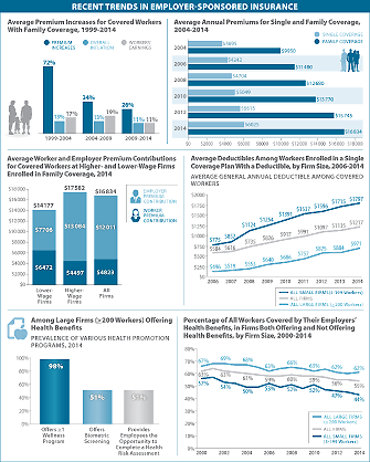
This Visualizing Health Policy takes a look at recent trends in employer-sponsored insurance, including average premium increases for workers with family coverage, the average yearly cost of premiums for single and family coverage and how those costs have increased in the past decade, along with the prevalence of health promotion programs (such as wellness programs) offered by large firms. It also looks at differences in premium and worker contributions at firms with many lower-wage workers and firms with many higher-wage workers; the average general annual deductible for workers who face a deductible for single coverage; and the percentage of workers covered by employers’ health benefits at offering and non-offering firms, from 2000 to 2014.
Visualizing Health Policy is a monthly infographic series produced in partnership with the Journal of the American Medical Association (JAMA). The full-size infographic is freely available on JAMA’s website and is published in the print edition of the journal.
.png?t=1415726595345)