The independent source for health policy research, polling, and news.
Visualizing Health Policy: Medicare Spending: A Look at Present, Short-Term and Long-Term Trends
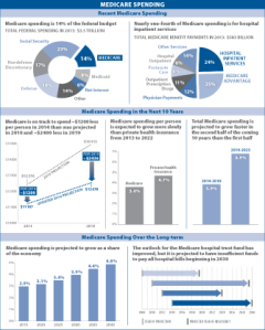
This Visualizing Health Policy infographic provides an overview of Medicare spending, including information on current federal spending relative to other government programs (e.g., Social Security) and percent-share of spending across Medicare services, as well as projected Medicare spending over the next decade and beyond. Recent federal spending on Medicare is about a third of Defense and Social Security spending combined. In the short term, Medicare spending per person is expected to be lower relative to previous projections and to grow more slowly than private health insurance. In the long term, Medicare spending as a share of the economy is projected to grow, and Medicare is projected to lack sufficient funds to pay all hospital bills beginning in 2030.
Visualizing Health Policy is a monthly infographic series produced in partnership with the Journal of the American Medical Association (JAMA). The full-size infographic is freely available on JAMA’s website and is published in the print edition of the journal.
