Potential Impacts of New Requirements in Florida and Texas for Hospitals to Request Patient Immigration Status

Published: Aug 26, 2024

Recent actions in Florida and Texas newly require hospitals to request immigration status from patients, with the aim of assessing the cost of providing care to undocumented immigrants. In May 2023, Florida Governor Ron DeSantis signed Senate Bill (SB) 1718 into law, which, among other actions, requires hospitals that receive Medicaid or Children’s Health Insurance Program (CHIP) funding to collect information on patient immigration status. In August 2024, Texas Governor Greg Abbott issued an executive order that similarly requires hospitals receiving Medicaid or CHIP funding to collect information on patient immigration status effective November 1, 2024. While these actions require hospitals to request this information, they must also inform patients that, as required by federal law, their response will not affect their care. In Florida, the hospitals must also indicate that the response will not result in a report to immigration authorities. This requirement is not specified in the Texas Executive Order. Under federal law, hospitals are required to provide emergency screening and stabilization services to all patients seeking emergency care. This brief examines the potential implications of these requirements for immigrant families and the states’ workforces and economies.

Noncitizen immigrants, including lawfully present and undocumented immigrants, make up about one in ten of residents in Florida and Texas, but larger shares of residents, including many U.S.-born citizen children, live in immigrant families. As of 2022, there were roughly 2 million noncitizen immigrants in Florida, including both lawfully present and undocumented immigrants, who make up 9% of the state’s population, and Texas had about 2.8 million noncitizen immigrants, who make up one in ten of the state’s population (Figure 1). A larger number of residents in both states live in immigrant families, which often include people of mixed immigration statuses, including U.S.-born citizen children. In Florida, 17% or over 740,000 children have at least one noncitizen parent, and in Texas over one in five (22%) or about 1.7 million children are in a family with a noncitizen parent.

1 in 10 People in Florida and Texas is a Noncitizen Immigrant

Overall, KFF and other research shows that despite having a higher uninsured rate, noncitizen immigrants, particularly those who are undocumented, use less health care and have lower health care spending than those born in the U.S. Undocumented immigrants are less likely than citizens to report using health care, including emergency care. Further, immigrants, including undocumented immigrants, have lower per capita health care expenditures than U.S.-born citizens, and data suggest they subsidize health care for U.S.-born citizens by paying more into the system through health insurance premiums and taxes than they utilize. Lower use of health care among immigrants likely reflects a combination of them being younger and healthier than their U.S.-born counterparts as well as them facing increased barriers to care, including lower rates of coverage due to more limited access to private coverage and Medicaid eligibility restrictions for immigrants. Undocumented immigrants are not eligible to enroll in Medicaid or other federally funded health coverage. Medicaid payments for emergency services may be made directly to hospitals for individuals who are otherwise eligible except for immigration status to help cover the costs incurred for providing this care. Federal funds may not be used to provide Medicaid coverage to undocumented immigrants, though some states have used their own funds to provide such coverage.

Initial data from Florida suggest that less than 1% of hospital emergency room visits and admissions were among undocumented immigrants. Florida released a public dashboard and a separate report submitted to the state legislature based on hospital reporting under the new requirement for June through December 2023. These reports show that less than 1% of inpatient admissions and emergency department visits were among patients who identified themselves as not lawfully present. The 7% to 8% of patients who declined to provide responses may include additional undocumented immigrants. The state extrapolates an estimate that the cost of care provided to undocumented immigrants over this period was $556 million. However, as noted by the state in the legislative report and others, it is unclear how much of that care was uncompensated. Costs of care for undocumented immigrants may be covered via self-pay, private coverage, or, in some cases, Emergency Medicaid (if it is emergency care provided to an individual who would otherwise be eligible except for immigration status). The legislative report further specifies that the state did not identify any correlation between the level of uncompensated care and the level of undocumented immigrants presenting at the hospital, and that high levels of uncompensated care were more associated with rural county status than the share of undocumented immigrant patients. There also did not appear to be a correlation between total profitability and the share of undocumented immigrants.

These new requirements, along with other recent restrictive immigration policies in these states, will likely contribute to increased fears among immigrant families, which may negatively impact their daily lives, physical health, and mental well-being. These new hospital requirements sit against a backdrop of other recent restrictive immigration policies enacted by these states. For example, the Florida law also creates penalties for hiring undocumented immigrants, expands employment verification screening requirements, invalidates out-of-state drivers’ licenses for undocumented immigrants, establishes criminal penalties for transporting undocumented immigrants into the state, increases funding to relocate or bus migrants to other parts of the U.S., and expands state authority to carry out immigration enforcement. Texas passed legislation in November 2023 that enables state and local law enforcement agencies to question and arrest any individual they believe to be an undocumented immigrant at ports of entry, although its implementation is currently on hold due to legal challenges. These types of new restrictions, along with the new hospital requirements, will likely increase fears among immigrant families, which may may make them more reluctant to access health care for themselves and their children. Prior KFF analysis of Trump-era restrictive immigration policies found that such fears and impacts extend beyond undocumented immigrants to those who are lawfully present and children in immigrant families, who often are U.S-born citizens. One news report suggests that Florida’s Emergency Medicaid expenditures fell after implementation of the requirements, which may reflect decreased use of care among undocumented immigrants and could have negative health consequences given that this funding goes toward emergent care, including care for labor and delivery. It is also possible that some undocumented immigrants have migrated out of the state. Given these types of concerns, the American Medical Association suggests avoiding explicit documentation of immigration status of patients and their family members in a health record.

These actions also will likely have implications for the states’ economies and workforces. More limited access to health care can potentially negatively affect worker productivity. Moreover, increased fears among immigrant families may impact their work. Following Florida’s passage of SB 1718, it was reported that food service businesses in the state lost not only long-time employees but also customers who now may be afraid of going to public places. Agriculture and construction industries have also taken a hit, with reports of abandoned construction sites in the state following the passage of SB 1718. It is likely that Texas’ economy and workforce will also be impacted due to the chilling effects of and misinformation around SB 4, even though the law is yet to take effect. These impacts may be especially significant in Florida and Texas due to the outsized role immigrants play in the states’ workforces, particularly in certain occupations. Almost three quarters of nonelderly noncitizen immigrants work, similar to the share of their citizen counterparts. Noncitizen immigrants make up 12% of Florida and Texas’ overall nonelderly adult workforce, but they make up higher shares of workers in certain occupations. In Florida, noncitizen immigrants account for one in three (34%) of the state’s construction workers, almost half (47%) of the state’s farming and fishing workers, and one in six (17%) transportation workers. In Texas, noncitizen immigrants make up four in ten (41%) construction workers, one in three (33%) farming and fishing workers, and about one in eight (13%) transportation workers. The impacts of lost workers in these occupations may have larger ripple effects through the states’ economies and beyond.

Noncitizen Immigrants Play Outsized Roles in Certain Occupations in Florida and Texas

How Narrow or Broad Are ACA Marketplace Physician Networks?

Authors: Matthew Rae, Karen Pollitz, Kaye Pestaina, Michelle Long, Justin Lo, and Cynthia Cox
Published: Aug 26, 2024

Report

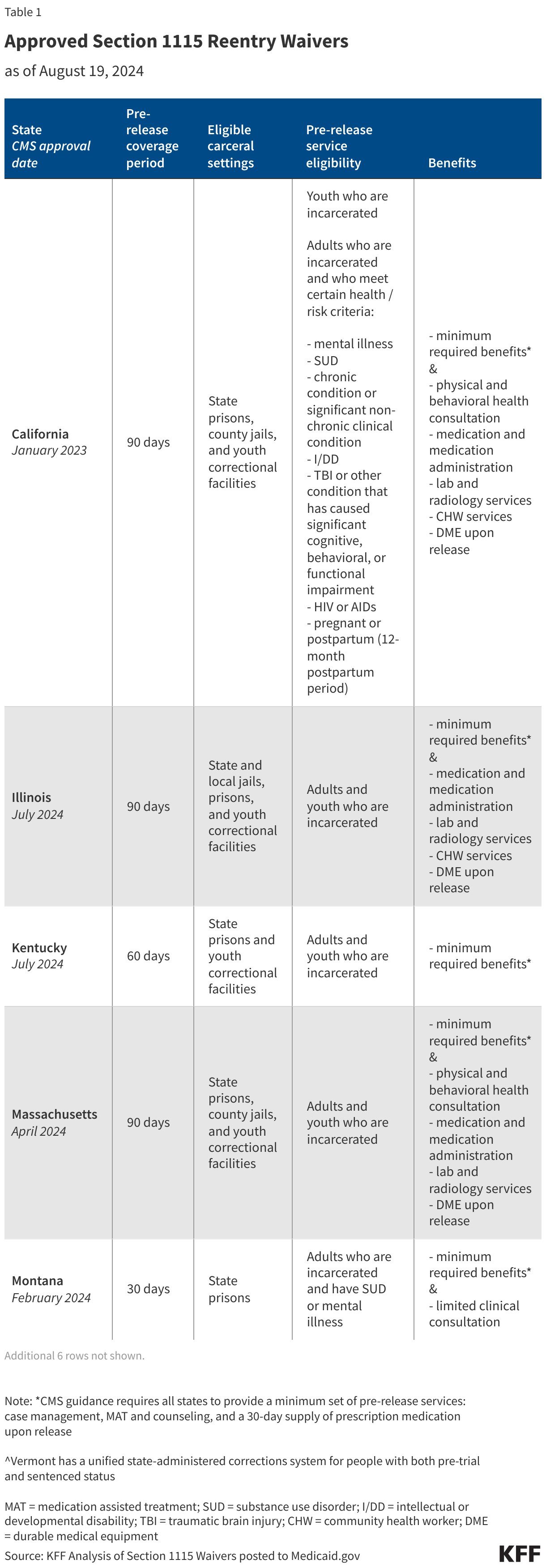
One way insurers seek to control costs is to limit the size of the physician networks serving their plans. Providers agree to lower fees and other terms with insurers in order to be included in one or more of the networks they offer. Insurers then either limit coverage to services provided by network providers or encourage enrollees to use network providers through lower cost sharing. Reducing the number of providers in-network can effectively reduce plan costs, but it also limits enrollees’ choices, increases wait times, and can complicate the continuity of care for those switching plans. Enrollees receiving care from out-of-network providers often face coverage denials or substantially higher out-of-pocket expenses. These factors highlight how the size and composition of provider networks impact access to care and the financial protection insurance provides enrollees.

The breadth of provider networks in the Affordable Care Act (ACA) Marketplaces has been the subject of significant policy interest. Insurers often compete aggressively to be among the lowest-cost plans, potentially leaving enrollees with poor access. According to the 2023 KFF Survey of Consumer Experiences with Health Insurance, one in five (20%) consumers with Marketplace plans reported that in the past year, a provider they needed was not covered by their insurance, and nearly one in four (23%) said a provider they needed to see that was covered by their insurance did not have appointments available. Enrollees with Marketplace coverage were more likely than those with employer coverage to face these challenges. While the Centers for Medicare and Medicaid Services (CMS) establishes minimum standards for the adequacy of provider networks for Marketplace plans, insurers retain considerable flexibility in how they design networks and how many providers they include. As a result, the breadth of plan networks varies considerably within counties, presenting challenges for consumers who need to select a plan with little information on the network breadth of their options.

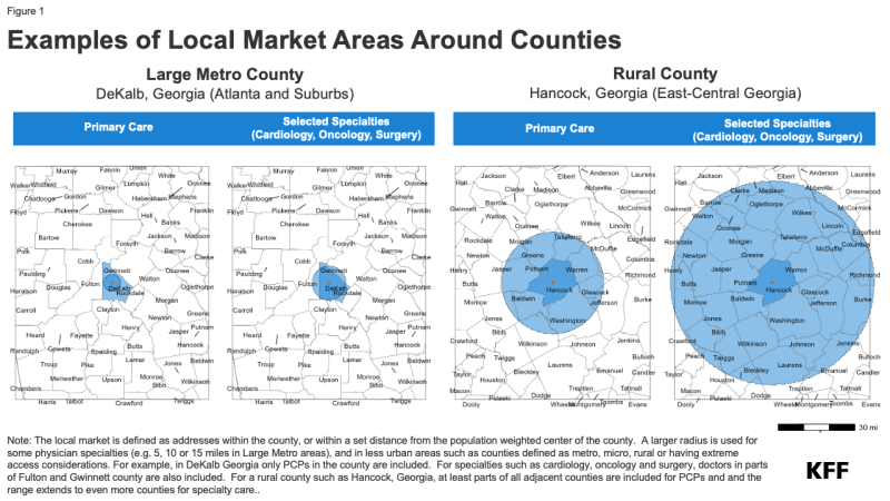
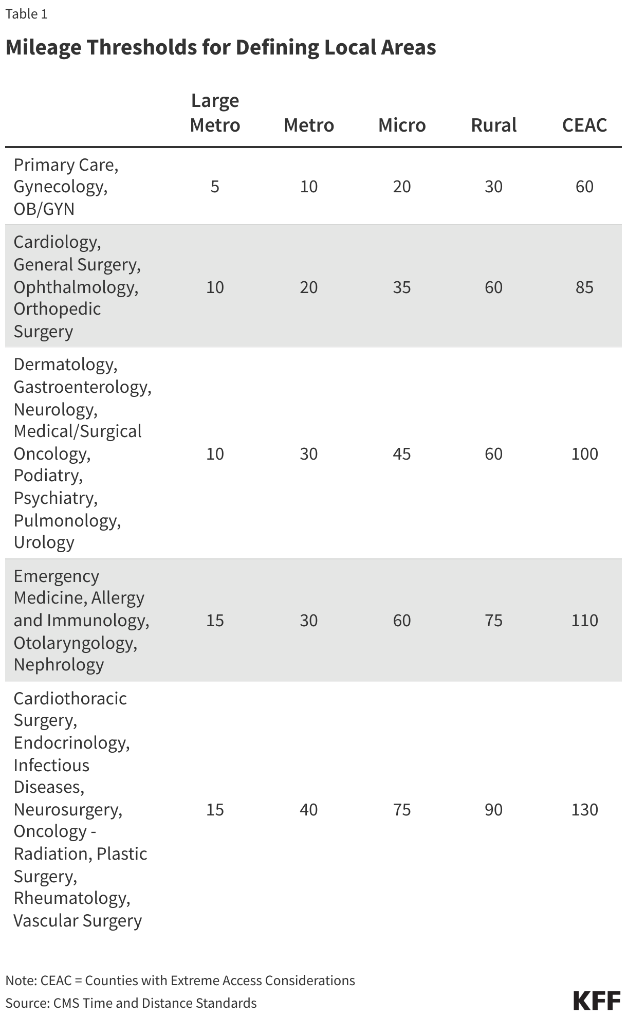
This brief examines the share of doctors participating in the provider networks of Qualified Health Plans (QHPs) offered in the individual market in the federal and state Marketplaces in 2021, and how network breadth affected costs for enrollees. The analysis uses data on the physician workforce, from 2021, matching that to provider networks in marketplace plans from the same year. Doctors filing Medicare Part B claims in or near each county are considered to be part of the active workforce available to Marketplace enrollees. Only doctors filing a claim and therefore known to have engaged in patient care in 2021 were included. The share of local physicians participating in a network is a rough measure of how much access enrollees have; depending on the number of providers in the area and the workloads of those physicians, enrollees in plans with similar breadths may face different wait times to book appointments. The share of local physicians participating in-network distinguishes whether enrollees have a broad or narrow choice of local doctors. Those in plans including a small share of doctors have fewer options when trying to find a provider with available appointments. See the Methods section for more details.

Key Findings

  • On average, Marketplace enrollees had access to 40% of the doctors near their home through their plan’s network, with considerable variation around the average. Twenty-three percent of Marketplace enrollees were in a plan with a network that included a quarter or fewer of the doctors in their area, while only 4% were in a plan that included more than three-quarters of the area doctors in their network.
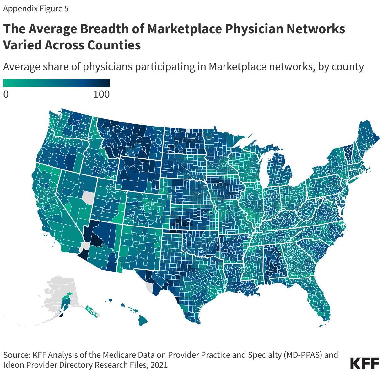
  • Some of the narrowest network plans were found in large metro counties, where enrollees on average had access to 34% of doctors through their plan networks. Marketplace enrollees in Cook County, IL (Chicago) and Lee County, FL (Fort Myers) were enrolled in some of the narrowest networks (with average physician participation rates of 14% and 23%, respectively). Plans in rural counties tended to include a larger share of the doctors in the area, though rural counties had fewer doctors overall relative to the population compared to large metro counties.
  • On average, more than one-quarter (27%) of actively practicing physicians were not included in any Marketplace plan network.
  • On average, Silver plans with higher shares of participating doctors had higher total premiums. Compared to plans where 25% or fewer of doctors participated in-network, those with participation rates between 25% and 50% cost 3% more while those with participation rates of more than 50% cost 8% more. (Silver plans are midlevel plans in terms of patient cost-sharing and are particularly significant because they are the benchmark for federal premium subsidies.)
  • More than 4 million enrollees (37% of all enrollees) lived in a county in which the two lowest-cost Silver plans included fewer than half of the doctors in the area and a broader plan was available. In order for these enrollees to enroll in the cheapest Silver plan that included at least half the doctors, they would have needed to spend an additional $88 per month.

How Broad are Marketplace Plan Physician Networks?

On average, enrollees in the ACA Marketplaces had access to 40% of the doctors near their homes through their plan’s network. This share was similar for pediatric and non-pediatric doctors.

Most Marketplace Enrollees Had Access to Fewer than Half of Local Physicians in their Plan’s Network

A quarter of enrollees were in plans where fewer than 26% of the local doctors participated in their plan’s network, while another quarter were in plans where at least 54% of local doctors participated.

There is no formal definition of what constitutes a narrow network plan. Some researchers have labeled plans covering fewer than a quarter of the physicians in an area as narrow. Under this definition, 23% of Marketplace enrollees were in a narrow network plan. About seven in ten enrollees (70%) were in a plan that included half or fewer of the doctors near their home. Only 4% of enrollees were in a plan that included at least three-quarters of local doctors, and 1% of enrollees were in a plan that included at least 85% of local doctors.

Most Marketplace Enrollees Were in Plans that Included Less than Half of Local Physicians in their Plan’s Network

How Broad Are Plan Networks for Primary Care and Physician Specialties?

Even a plan with a relatively large share of local doctors participating in its network may not have enough doctors in different specialties to meet the needs of plan enrollees. In particular, enrollees with chronic conditions may look for plans that include their doctors across multiple specialties.

Primary Care Physicians: Marketplace enrollees, on average, had plan networks that included 43% of the primary care doctors in their area. A quarter of Marketplace enrollees had plan networks that included fewer than 25% of primary care doctors. More than half a million Marketplace enrollees were in a plan with fewer than 50 in-network primary care doctors near their homes. As is the case for physician networks overall, primary care physician networks tended to be narrower in large metro counties, where the average enrollee had a plan network that included 35% of local primary care doctors. While primary care doctors account for a smaller share of spending than specialists, they play an important role in insurers’ network design either by acting as gatekeepers to specialty care and referring patients to specialists.

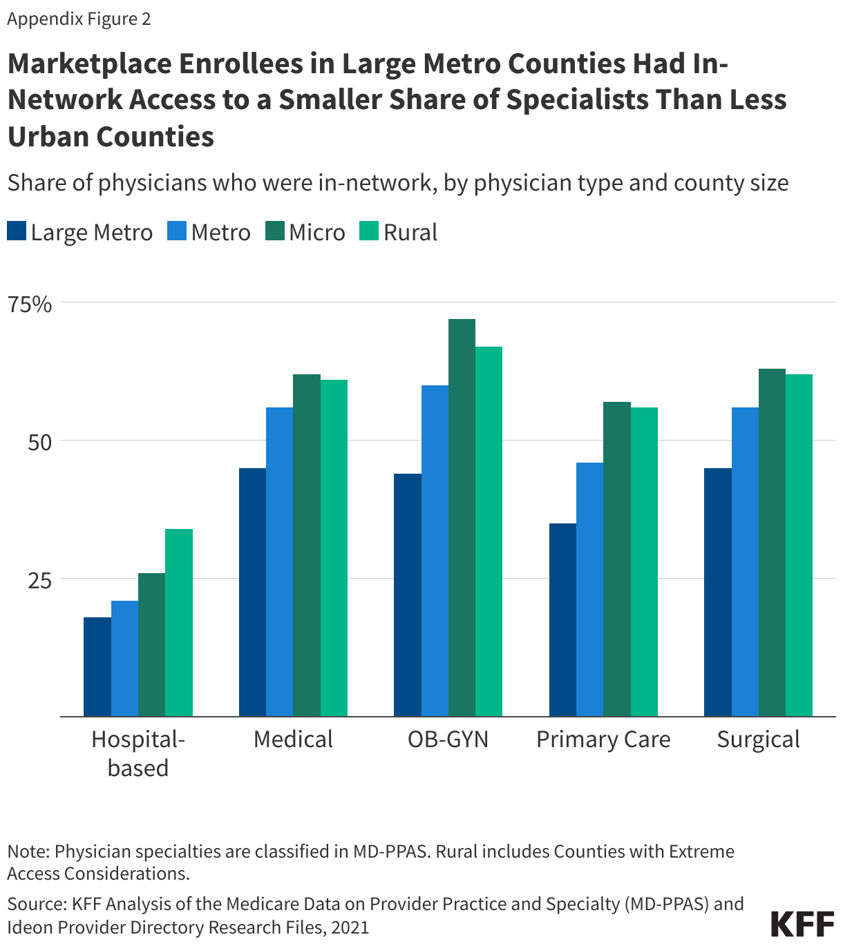
Specialists: Marketplace plan networks tended to include a larger share of practicing medical and surgical specialists than primary care physicians. The average Marketplace enrollee had a plan network that included 52% of medical specialists and 53% of surgical specialists in their area; however, one-quarter of Marketplace enrollees had access to fewer than 34% of the medical specialists and 32% of the surgical specialists. On average, Marketplace enrollees had plan networks that included 21% of hospital-based physicians, which may include anesthesiologists, radiologists, pathologists, and emergency physicians.1  Information on additional specialties is available in the appendix.

Psychiatrists: Marketplace networks for psychiatrists were smaller. On average, Marketplace enrollees had access to 37% of the psychiatrists in their area through their plan.2  Twenty-five percent of Marketplace enrollees were in a plan that included 16% or fewer of the psychiatrists near their homes.

The Average Marketplace Enrollee Had Access to About Half of Medical and Surgical Specialists in Their Area, but Fewer than Half of Primary Care Doctors and Other Specialists

How Does Network Breadth Vary by Location?

Network breadth varied based on where plans were offered, with those in urban areas having lower physician participation rates, on average. In 2021, CMS designated county types based on their population and density; there are 78 Large Metro counties and 723 Metro counties. Most Marketplace enrollees lived in one of these urban county designations, including 38% in Large Metro counties and 48% in Metro counties.

Urban Counties: While Large Metro and Metro counties had more doctors, smaller shares of them participated in Marketplace plan networks compared to doctors in more rural areas. Marketplace enrollees in Large Metro counties, on average, had access to 34% of the doctors in their area through their plan networks, with a quarter enrolled in a plan whose network included fewer than 23% of local doctors. Marketplace enrollees in Metro counties, on average, had access to 42% of local doctors through their plan networks, while those in Rural counties, on average, had access to 52% of local doctors.

The Average Enrollee in Large Metro and Metro Counties Had in-Network Access to Less than Half of Local Doctors

The 30 counties with the highest enrollment in the Marketplaces collectively represented 34% of all Marketplace enrollees and 21% of the U.S. population. These counties are typically urban and disproportionately in states that have not expanded Medicaid under the ACA.3 

There was significant variation in network breadth across these 30 counties. Differences in average network breadth across these counties are the result of a combination of factors including the physician workforce, market characteristics, and insurer strategies. With networks with low provider participation rates, most Marketplace enrollees in Cook County, IL (Chicago) had access to fewer than one in six (14%) doctors in their area on average. Similarly, Marketplace enrollees in Lee County, FL (Fort Myers) and Fort Bend County, TX (outside Houston) had in-network access to less than a quarter of local doctors (23% and 24%, respectively). In contrast, some larger US cities had broader networks than those available in Houston and Chicago. For example, enrollees in Middlesex County, MA (outside Boston), Gwinette County, GA (outside Atlanta), and Travis County, TX (Austin) had in-network access to almost half of the doctors in their areas on average (46%, 46%, and 49%, respectively).

In 2021, 14% of Marketplace enrollees (1.6 million people) lived in four counties: Los Angeles, CA; Miami-Dade, FL; Broward, FL (Fort Lauderdale); and Harris, TX (Houston). On average, enrollees in each of these counties had in-network access to less than 4-in-10 local doctors (25%, 36%, 38%, and 25%, respectively).

High physician participation rates may not result in meaningful choice if there are few doctors in the area in the first place. For example, enrollees in Hidalgo County, TX (McAllen), on average, had access to 61% of local doctors through their plan networks, but this may have reflected chronic shortages in the number of practicing doctors in the county.4 

On Average, Marketplace Enrollees in Nearly All Large Counties Were in Plans That Included Fewer Than Half of Local Doctors

Rural Areas: On average, Marketplace enrollees in Rural counties had access to about half (52%) of local doctors through their plan networks, higher than the average in more urban counties. The higher provider participation rates in rural areas, however, need to be considered in the context of the small number of primary care doctors and specialists practicing in these areas. For example, 2.9 million Marketplace enrollees in Rural counties had fewer than 10 dermatologists in their local area, 2.5 million had fewer than 10 gynecologists, and 1.7 million had fewer than 10 cardiologists in their plan networks. In some cases, these providers may already have full panels, and an enrollee’s choice may be even more limited than the number of physicians who accept the plan.

County Demographics: On average, Marketplace enrollees living in counties with a higher share of people of color had narrower networks than counties with a smaller share.5  The quarter of Marketplace enrollees living in the counties with the highest share of people of color had access to 34% of doctors in-network, on average, compared to 42% in counties with a smaller share of people of color. This difference may reflect the higher concentration of people of color in large metro counties, where plans typically had narrower networks.

Counties With Higher Shares of People of Color Had Narrower Physician Networks on Average

How Much Choice Do Consumers Have Over Networks in the County Where They Live?

Provider networks vary within counties, meaning that individuals shopping for a Marketplace plan may have the option to enroll in plans with vastly different network breadths. In 2021, 70% of enrollees (nearly 8 million people) lived in a county where one or more plans covered fewer than a quarter of the doctors in the area. Among these enrollees, nearly 4.3 million (54%) also had the opportunity to enroll in a plan that included more than half the doctors in the area.

In the 30 counties with the most enrollment, enrollees could choose from about 8 distinct plan networks, on average. Even within the same county, enrollees may have access to vastly different shares of physicians in-network. For example, in Lee County, FL (Fort Myers), a quarter of Marketplace enrollees were enrolled in plans with networks that included fewer than 5% of local doctors, while a quarter were enrolled in plans with networks that included more than 45%. Similarly, in Travis County, TX (Austin), a quarter of Marketplace enrollees were enrolled in a plan with a network that included fewer than 36% of local doctors, while a quarter were enrolled in plans that included at least 70%. Consumers in these counties have the opportunity to enroll in plans with vastly different physician networks but often face higher premiums to do so. (See section “How is Network Breadth Related to Plan Premiums?” for details.)

The Vast Majority of Enrollees in Large Counties Were in Plan Networks With Fewer Than Half of the Area Physicians

Access to a “Broad” Network Plan: A large share of Marketplace enrollees (91%) lived in a county in 2021 where they could not choose a plan with a network that included at least 75% of doctors in their areas. Among the 30 counties with the most Marketplace enrollment, only two—Middlesex County, MA (outside Boston) and Hidalgo County, TX (McAllen)—had at least one plan network choice with a physician participation rate of 75% or more. In most cases, the broadest Marketplace plan network offered in these 30 counties was much narrower than this. For example, the physician participation rate for the broadest Marketplace plan network offered was 22% in Cook County, IL (Chicago), 38% in Hillsborough County, FL (Tampa), and 40% in Maricopa County, AZ (Phoenix). In these counties, shoppers were unable to enroll in a plan that covered at least half of the doctors in their community, even if they were willing and able to pay more.

Enrollees in Large Counties Often Had Access to Less Than Half of Doctors


Across Large Counties, Physician Networks Varied Considerably, But Few Broad Network Options Were Offered

Doctors Not Participating in Any Marketplace Network: Some doctors did not participate in any Marketplace plan network in 2021. On average, 27% of actively practicing physicians who submitted Medicare claims were not included in any Marketplace plan network offered to enrollees that year. This means that people transitioning to a Marketplace plan from another coverage source may not have been able to find any plan that included their doctor. In some counties, a much higher share of doctors did not participate in any Marketplace network, including Cook County, IL (Chicago), where 60% of doctors did not participate in any Marketplace plan networks, Dallas County, TX (36%), and Lee County, FL (Fort Myers) (41%).

In Many Large Counties, At Least One-Quarter of Physicians Did Not Participate in Any Network

How Visible Are Differences in Network Breadth to Plan Shoppers?

The difficulty of selecting an appropriate plan for a consumer’s health needs is heightened by the tremendous number of choices in many counties. The average Marketplace consumer had a choice of more than 58 plans (including 23 Silver plans) in 2021, a number that has since grown.6 

Plan choices can involve different provider networks. For example, in Harris County, TX (Houston), consumers in 2021 had a choice of 87 plans that used seven different provider networks, with physician participation rates that ranged from 9% to 52%. However, these network differences are largely invisible to consumers. The lack of consumer tools to evaluate and measure plan networks can make it more challenging to choose a plan. Other than in a limited pilot operating in two states (Tennessee and Texas), the only tool available for HealthCare.gov consumers to evaluate a plan’s network is to search for individual providers, one by one, in directories, which may not always be up to date.

Further complicating the challenges of selecting plans, the marketing names of plans offered by the same insurer using different provider networks do not clearly indicate network differences. For example, AmeriHealth of New Jersey offers multiple Silver plans in Camden County, NJ. The narrow plan was marketed as “IHC Silver EPO AmeriHealth Advantage” (with a physician participation rate of 40%), while the broader network Silver plan was marketed as “IHC Silver EPO Regional Preferred” (with a physician participation rate of 74%). Based on these names, shoppers may not be able to discern that these plans had different networks with very different participation rates.

Shoppers can also search by plan type. The vast majority of Marketplace enrollees (84%) were in HMO or EPO plans in 2021, which have closed networks that generally do not cover non-emergency services provided outside of their provider network. A smaller share of Marketplace enrollees were in PPO plans (13%) and POS plans (4%), which provide some coverage for out-of-network care. The cost for such care can be quite expensive because out-of-network providers can sometimes balance bill and cost sharing for their services is typically higher and not subject to the annual out-of-pocket maximum.

Marketplace consumers seeking access to a broader choice of physicians and who have the choice of a PPO plan might assume such plan networks are analogous to the broad PPO networks offered to many in the employer market. On average in 2021, Marketplace enrollees who signed up for PPO plans had access to 53% of local doctors through their plan networks, compared to 37% for those enrolled in HMOs and 38% for those enrolled in EPO plans. However, plan type is not necessarily reflective of network breadth. In almost half (46%) of counties with both a PPO and either an HMO or EPO Marketplace plan, at least one HMO or EPO plan had a broader network than a PPO plan. Many Marketplace enrollees also did not have the option to choose a PPO plan: 60% of enrollees lived in a county in which only closed-network (HMO and/or EPO) plans were available.

Marketplace plans are categorized into metal levels based on the overall level of cost sharing required by the plans (deductibles, copays, etc.). In 2021, enrollees in Bronze, Silver, and Gold plans had access to similar shares of physicians in their areas (41%, 39%, and 44%, respectively). This is the result of issuers utilizing the same networks across metal levels within a county. In only 1% of counties did an insurer’s broadest Silver plan use a different network than its broadest Bronze plan.

HealthCare.gov has not yet widely released a consumer assistance tool to aid shoppers in filtering options by network breadth. Since 2017, CMS has operated a limited pilot with information on network breadth for consumers in Tennessee and Texas.7  Under this network transparency pilot, CMS provides measures of plan network breadth for hospitals, primary care providers, and pediatricians as an aid to Marketplace shoppers in those states. CMS calculates a participation rate by determining the share of providers participating in any Marketplace networks in the area. CMS then categorizes plan networks as “Basic” (0%-29%), “Standard” (30%-69%), or “Broad” (70%+), based on how many physicians participate in at least one QHP network. Whereas the denominator used throughout this analysis is physicians who submitted claims to Medicare, the CMS tool only considers providers that participate in Marketplace plans. Therefore, even plans with narrow networks in areas where most doctors do not participate in Marketplace plans could be labeled “standard” or “broad” using this method. For example, whereas 90% of physicians in Travis County, TX (Austin) who take Medicare participated in at least one Marketplace plan in 2021, only 64% of doctors in Dallas County, TX did. Therefore, a plan covering a quarter of all the available doctors in both counties would be considered a “basic” plan in Travis County, TX but a “standard” plan in Dallas County.

Generally, the method used in the CMS “network transparency” tool does not seem to facilitate comparing plan networks across counties and may exaggerate the breadth of plan networks, potentially leading some consumers to believe that their plan includes a larger share of local providers than it actually does. Under the CMS pilot method, only 16% of Marketplace enrollees in 2021 were enrolled in a plan that would be considered “basic”; this compares to 33% of Marketplace enrollees would be considered to be in a basic plan if the definition of local doctors used in this paper were applied.

Nearly Twice As Many Enrollees Were in a Plan That Would be Considered 'Basic' if CMS Pilot Study Measure Used A Broader Definition of Practicing Physicians

Network Breadth by Plan Insurer

Marketplace shoppers may consider who the insurer is when making inferences about plan networks.

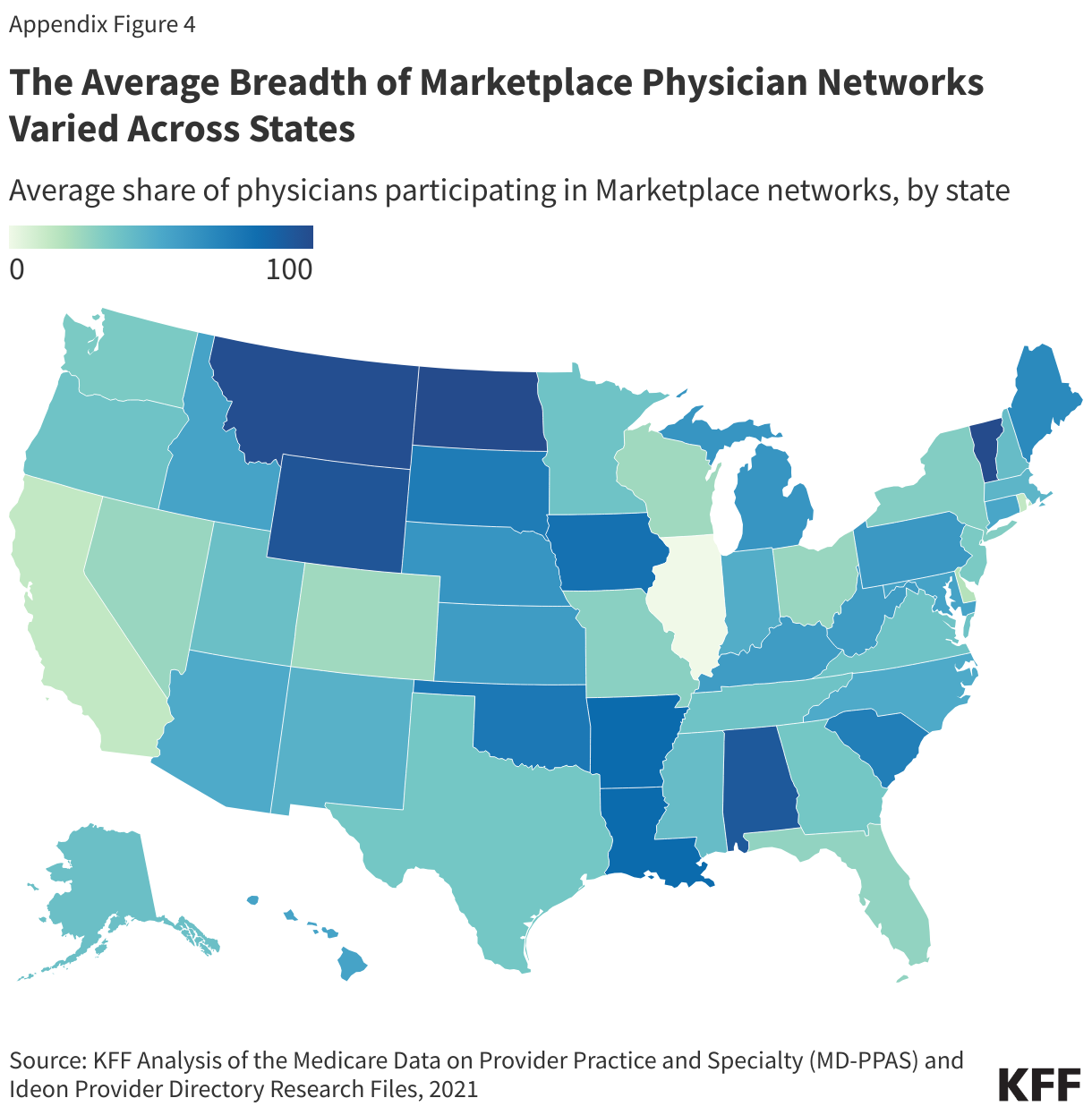
Blue Cross and/or Blue Shield (BCBS) plans are sponsored by a mixture of for-profit and tax-exempt insurers. While these companies are run independently, they are affiliated through an association, and many share a common heritage. In many states, the BCBS affiliates are the largest insurers participating in the Marketplace and may in some cases also be the largest insurers or administrators for employer-sponsored coverage as well. On average, enrollees in BCBS Marketplace plans in 2021 had access to 49% of doctors in their areas through their plan networks, a larger share than enrollees in plans offered by other insurers (35%).8  Even so, BCBS Marketplace plan networks, on average, excluded about half of the doctors available to those in traditional Medicare. Further, there was considerable variation in participation rates by doctors among plans sponsored by BCBS insurers, sometimes even within the same county. For example, in Wayne County, MI (Detroit), the Blue Care Network and Blue Cross/BlueShield plan network participation rates ranged from 20% to 59% across plan options. Similarly, in Camden County, NJ, Independence Blue Cross offered two networks, with physician participation rates of 40% and 74%. Florida Blue in Miami-Dade County, FL offered multiple plan networks with participation rates ranging from 25% to 51%.

Network Breadth Varies Across Insurers

Insurers Also Participating in Medicaid Managed Care: Insurers with a large presence in the Medicaid managed care organization (MCO) market also have a solid footprint in the Marketplaces. Overall, the breadth of Marketplace plan networks sponsored by MCO insurers was similar to that of insurers overall (41% vs. 40%, respectively).9  One of the largest MCOs that expanded into the Marketplaces is Centene Corporation, which sponsors plans under Ambetter, Health Net, and other brand names. The average participation rate for doctors in plan networks offered by Centene was lower than the overall Marketplace average (33% vs. 40%). Molina, another major MCO insurer offering Marketplace plans, had an average physician participation rate of 35% in its plan networks.

Integrated Delivery Systems: Integrated delivery systems, such as Kaiser Permanente, Geisinger Health Plan, and the Chinese Community Health Plan, institute a different approach to network design. Under these plans, health care financing and delivery are conducted by the same organization. Providers are typically employees of the plan or an affiliated medical group, and these plans generally do not cover non-emergency care provided by doctors outside of the network. Although enrollees in these plans may not have a wide choice of physicians in the area, these integrated models strive to improve access through care coordination and may be less complex for patients to navigate which providers are in and out of their networks. Enrollees in Kaiser plans, by far the largest integrated delivery system, on average, had access to about one in five (19%) doctors in their area. Of note, the breadth of Kaiser physician networks does not lower the overall Marketplace average substantially because only 7% of Marketplace enrollees nationally were enrolled in Kaiser plans.

Non-profit Insurers: On average, Marketplace enrollees covered by plans sponsored by non-profit insurers in 2021 had in-network access to 43% of the doctors in their areas, compared to 38% for those covered by for-profit insurers. Excluding enrollees in Kaiser health plans, enrollees covered by non-profit insurers had access to 47% of local doctors on an in-network basis on average.

How is Network Breadth Related to Plan Premiums?

On average, Silver plans with higher shares of participating doctors had higher total premiums. When compared to plans where fewer than 25% of doctors participated in-network, those with participation rates between 25% and 50% cost 3% more while those with participation rates of more than 50% cost 8% more. While other factors also contribute to plan premiums, including the breadth of hospital networks and the plan design, narrow physician networks were associated with meaningfully lower total costs. The average total premium for a 40-year-old enrolled in a Silver Marketplace plan in 2021 was $466 a month. For these enrollees to sign up for a Silver plan that included more than 50% of area physicians, their premiums would have increased $37 per month. The statistical model used to estimate these premium differences is described in the methods.

Silver Plans With Broader Physician Networks Had Higher Premiums Than Those with Narrower Networks

Enrollee Cost to Purchase a Broader Plan

Consumers with private health insurance generally consider the breadth of provider networks very important when choosing a plan, yet many remain price-sensitive when selecting plans with higher costs. A 2019 KFF/LA Times survey found that 36% of adults with employer coverage said the cost of the plan (premiums and cost sharing) was the main reason they chose their plan, while 20% cited the choice of providers.

One way to illustrate how the cost of broader plans is passed on to consumers is to consider the counties where enrollees face higher premiums for a broader plan. Most (90%) of Marketplace enrollees receive a tax credit to offset all or part of the cost of the monthly premium. The size of the premium tax credit available to enrollees is based on both household income and the cost of the benchmark plan, defined as the second-lowest-cost Silver plan. ACA enrollees are responsible for paying the entire amount between the cost of the benchmark plan and a higher-cost plan. Enrollees in counties where the benchmark plans have relatively low physician participation rates may need to pay a significant amount to enroll in a broad network plan.

Among Marketplace enrollees, 74% percent, or 8.5 million enrollees, were in a county where the two lowest-cost Silver plans had fewer than 50% of physicians participating in their networks. Of these, about half, or 4.3 million enrollees, did not have a Silver plan available to them that included at least half of the local physicians in its network; 4.2 million enrollees did have at least one such plan available to them. For those 4.2 million people, the average additional cost to enroll in a Silver plan with at least half the local doctors participating was $88 (for a 40-year-old).

One in five Marketplace enrollees (19%, or 2 million enrollees) lived in a county where the two lowest-cost Silver plans included fewer than 25% of local physicians in-network. Fifty percent of these enrollees, or 1 million enrollees, lived in a county where at least one plan included at least half the doctors. Among these enrollees, the cost to enroll in a plan with at least half the local doctors would have cost $95 more than the benchmark plan each month.

Implications for Consumers and Potential Federal Efforts to Increase Access to Care

Having a plan with a narrow network increases the chances that an enrollee receives care out-of-network, either inadvertently (e.g., receiving care from an out-of-network provider they did not choose at an in-network facility), or because they are unable to find an in-network physician at the time and place they need. It can also have consequences for enrollees’ ability to seek care in a timely fashion and their health. The 2023 KFF Survey of Consumer Experiences with Health Insurance found that 20% of adults with Marketplace coverage said that in the past year, a particular doctor or hospital they needed was not covered by their insurance. Among Marketplace enrollees who experienced this problem, 34% said that needed care was delayed, 34% said they were unable to get needed care, and 25% experienced a decline in health status.

Additionally, going out-of-network can be costly for enrollees. Enrollees using out-of-network providers may face higher cost sharing and balance billing if the services provided are not regulated by the No Surprises Act. Among those who indicated experiencing a network adequacy problem in the consumer survey, almost half (47%) said they ended up paying more out of pocket for care than expected, including 22% who said the additional cost was $500 or more.

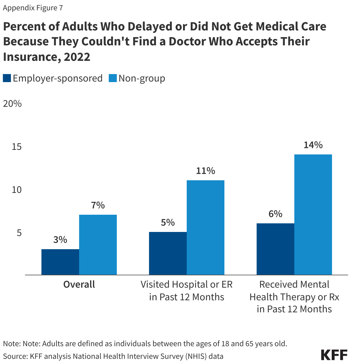
Some have suggested that the design of the Marketplace encourages insurers to offer narrower networks compared to those included in employer plans in order to keep premiums down. Employers use health benefits to attract and retain workers and have an incentive to create broader networks that appeal to their workforce. One analysis found that primary care networks for large group plans were 25% larger than those found on the Marketplaces.10  The higher prevalence of narrow network plans corresponds to a greater share of enrollees facing challenges finding in-network providers. The 2023 KFF Survey of Consumer Experiences with Health Insurance found that adults with Marketplace coverage were more likely than those with employer-sponsored health insurance to report that a particular doctor or hospital they needed was not covered by their insurance (20% vs. 13%) (Figure 14). Additionally, 34% of Marketplace enrollees in fair or poor health reported that a particular doctor or hospital they needed was not covered by their plan, nearly two times more than those with an employer plan (16%). Similarly, a forthcoming KFF analysis of the 2022 National Health Interview Survey found that challenges finding doctors led some adults to delay or skip care (Appendix Figure 7). Those with non-group coverage, such as Marketplace plans, were twice as likely as those with employer plans to indicate that they had delayed or skipped care in the past year because they couldn’t find a doctor who accepted their plan (7% vs. 3%). Among those who visited a hospital or emergency room during the past year, 11% of non-group enrollees reported skipping or delaying care, compared to 5% of those with employer coverage.

Marketplace Enrollees Are More Likely Than Those with Employer Plans To Need a Provider Who Was Not In Their Network

Even still, network breadth is only one component of access to care and may not always gauge how well enrollees are served. There are many aspects consumers consider when selecting a plan. This analysis examines network breadth but does not address other standards that health plans, physician networks, and physicians are required to meet. Enrollees in plans with broad networks may still face challenges scheduling appointments and considerable wait times. For some specialties, such as psychiatry, workforce shortages make it hard for enrollees to find providers even in plans that include a broad swath of physicians. Workforce shortages in many rural areas mean that even if a plan has a broad provider network, there still may be an insufficient number of providers to meet the needs of that community. Furthermore, many enrollees face additional challenges using their plan, including stringent prior authorization requirements.

Similarly, a plan with a narrow network—measured as the share of physicians in the area participating—may still provide adequate access to care, just not necessarily with a broad choice of providers. States use a range of network adequacy rules, with many requiring the inclusion of different types of providers, but only ten evaluate wait times to determine if a network meets minimum standards. The ACA requires that Marketplace plans maintain networks sufficient in number and types of providers for the purpose of ensuring that all services will be accessible without unreasonable delay. Currently, federal network adequacy standards require that plans provide access to at least one in-network provider for 90% of plan enrollees living within certain time/distance thresholds (for example, in large metro areas, no more than 10 minutes or 5 miles from a primary care provider, or no more than 30 minutes or 10 miles from an oncologist.) Although these standards measure geographic proximity to in-network care, they do not measure network breadth. Additionally, starting in 2025, federal Marketplace plans will be required to meet maximum appointment wait-time standards (e.g., no more than a 15-calendar day wait for routine primary care appointments or 30 days for non-urgent specialty care appointments).

A central challenge in analyzing network breadth is the quality of available data. The inclusion of so-called “phantom providers”—physicians listed in the network but who are not actually available to plan enrollees at the location or in the specialty they are listed—may increase the apparent breadth of plan networks without actually increasing access to care. Federal laws and regulations require Marketplace plans to publish online an up-to-date and complete provider directory. However, CMS has found high rates of incomplete and inaccurate information in these directories. Additionally, the No Surprises Act Improvements in plan directory data would facilitate regulation and decrease the burden on consumers comparing and using the plan. In 2022, CMS solicited public comment on establishing a national provider directory that private plans could use as a database for their own plan directories. Further action on this proposal is still pending, but this could improve available information about the landscape of available providers, allowing for the development of improved consumer information about provider ratios that show the share of practicing area providers (overall and by specialty) included in the provider network of each QHP.

This work was supported in part by a grant from the Robert Wood Johnson Foundation. KFF maintains full editorial control over all of its policy analysis, polling, and journalism activities.

Methods

Methods and Scope

Plan Enrollment: This analysis estimates the share of physicians included in individual Marketplace plans in 2021. In total, 11.4 million enrollees selected a plan on either HealthCare.gov (7.9 million) or a state-based Marketplace (3.6 million). There were 5,120 plans offered, 4,619 of which had at least ten enrollees. Plan enrollment at the county level was estimated by distributing HIOS level enrollment in each county to the associated plans offered in the county, proportional to their total enrollment. An insurer may use the same provider network for several plans, either in different markets or within the same service area. In some areas, insurers may use multiple provider networks across the plan choices they offer.

Provider Network Data: Information on plan provider directories was compiled by Ideon through an API with insurers as well as other data including the National Plan and Provider Enumeration System (NPPES). These files are widely cited as some of the most reliable snapshots of provider directory data currently available (Zhu et al., Oh et al., Politzer et al., Marr et al.). Data for carriers not participating in the Ideon API were supplemented with carriers’ public filings. The 2021 Ideon researcher file contained incomplete information for a limited number of plans. To account for networks with truncated data, we applied several trimming rules. First, networks with fewer than 223 physicians (the 2nd percentile) or without a hospital were excluded. Second, following Zhu et al., networks with fewer than 2.5% of the physicians within the market were excluded. In total, plans with about 2.5% of Marketplace enrollment were excluded from the analysis. The Ideon researcher file was made available with the support of the Robert Wood Johnson Foundation.

Local Markets: Local physicians are defined as those who practice within the same county as an enrollee or are within the distance thresholds specified as part of CMS’s network adequacy standards for HealthCare.gov plans. Thus, a wider area is used for enrollees living in more rural counties, or for specialist physicians. This approach accounts for differences in county geographical sizes and acknowledges that physician markets do not conform to county boundaries. For example, in a Large Metro county, primary care physicians are included in the denominator if they are within the county or 5 miles of its center, compared to 30 miles from the county center in a Rural county. A specialist such as a cardiologist is included in Large Metro counties if they are within the county or 10 miles of its center, or within 60 miles of a Rural county center. While the mileage standards in network adequacy regulations are based on the proximity to plan enrollees, this analysis measures the distance from the population-weighted center of the county.


Mileage Thresholds for Defining Local Areas

In total, CMS designates 78 “Large Metro” counties based on their population and population density and 723 “Metro” counties. Most ACA enrollees live in one of these urban county designations, including 38% in Large Metro counties and 48% in Metro counties. For example, Large Metro areas are classified as counties with at least one million people and a population density of at least 1,000 people per square mile, or counties with 500,000-999,999 people and a population density of at least 1,500 people per square mile, or counties with a population density of at least 5,000 people. The county classifications follow the definitions used in the Medicare Advantage network adequacy rules (Table 3-1) and are available in the 2022 Health Service Delivery file published by CMS.

The Vast Majority of Marketplace Enrollees Lived in Large Metro and Metro Counties

Active Physician Workforce: Private health plan network directories often include many physicians who may have retired or are otherwise no longer working in patient care. To estimate the total number of physicians who are in active practice, we relied on Medicare Data on Provider Practice and Specialty (MD-PPAS), a federal database of physicians who submitted at least one Medicare Part B claim in 2021 and therefore saw at least one Medicare patient in the year. Medicare Part B is the largest payer of physician services, covering some 58 million people ages 65 and older and younger adults with disabilities. Virtually all non-pediatric physicians participate in the program, with about 1% formally opting out altogether. In total, 680,000 physicians, including 181,000 primary care doctors, were included in MD-PPAS in 2021.

Estimates of the number of physicians vary. The Health Resources and Services Administration (HRSA) and the Association of American Medical Colleges (AAMC) use the American Medical Association (AMA) Physician Masterfile, which contains 947,000 physicians. The Bureau of Labor Statistics estimates there were 762,000 jobs for physicians and surgeons in 2021. Many of these physicians may be engaged in jobs that do not require them to regularly see patients, including research, administration, or management roles. As a proxy for the number of physicians working in patient care, this analysis is limited to physicians who submitted at least one Medicare Part B claim in the year. This may include at least some physicians who are in roles where they only occasionally see patients.

Physician Specialties and Addresses: Specialties are defined in MD-PPAS based on physician submissions to the Provider Enrollment, Chain, and Ownership System (PECOS) as well as which claims were submitted to Medicare. Throughout, MD-PPAS’s discrete classification of five specialties (psychiatry, primary care, medical specialist, surgical specialist, and hospitalist) is used. A provider is considered a hospitalist if they self-report being a hospitalist in PECOS, or if more than 90% of their claim lines were delivered on an inpatient basis. In total, 29% of physicians in the MD-PPAS file are defined as hospitalists. Sub-specialties, including those listed in the appendix, are defined using a provider’s primary National Uniform Claim Committee (NUCC) taxonomy code in NPPES. Specialty groupings are defined using the definitions specified in CMS’s network adequacy template.

Within and across network directories, physicians may have multiple address listings, in some cases because they have several practice locations, and in other cases, plan directories may have incorrect or obsolete address information. Physicians were assigned to a single address based on the location in which they were listed most frequently across directories for plans with at least 25 enrollees.

Plan Premiums: The percentage change in premiums associated with physician network breadth is calculated by modeling the logged-transformed premium for a Silver plan for a 40-year-old enrollee across all 38,000 Marketplace plan/county combinations. The model holds constant plan type and local market characteristics through fixed effects within the rating area. Plans with physician penetration rates between 25% and 50% and more than 50% have significantly higher premiums than plans narrower than these thresholds (p <.0001 and p <.0001, respectively). There is considerable variation in the premiums. Factors other than physician networks, including market characteristics and hospital networks, are also related to plan premiums.

Limitations: A central challenge in analyzing provider networks is determining the size of the physician workforce. While the vast majority of physicians engaged in active practice accept Medicare, some physicians may be inadvertently missed, including those in closed-network HMOs serving exclusively commercial populations or those specializing in services not typically used by Medicare enrollees. Telehealth providers whose addresses are not within the local market are also excluded. Further, this analysis only considers individual-level physicians enumerated in the plan directory. In some cases, plans may include group health practices in their networks and not individually list providers.

Conversely, this analysis may exaggerate the breadth of provider networks. “Phantom providers,” or physicians who are listed in the plan directory but no longer accept the plan, may artificially increase the breadth of some plans. One secret shopper study documented that 10% of physicians in California Marketplace plans’ provider directories had never accepted the plan. Additionally, this analysis includes all providers whose NPIs are in the directory; some providers may be included in the network for some services or at some locations but not others.

Inherently, this analysis only measures whether providers are included in a plan’s network, not their availability for enrollees wishing to schedule appointments. Some relatively small networks may have physicians with smaller panels and be able to better accommodate enrollees’ health needs than relatively broad networks in which providers are included in a large number of plans.

Appendix

Most Enrollees Had In-Network Access to Fewer than Half of the Primary Care Doctors in Their Area
Marketplace Enrollees in Large Metro Counties Had In-Network Access to a Smaller Share of Specialists Than Less Urban Counties
The Average Marketplace Enrollee Had In-Network Access to Fewer Than Half of Psychiatrists in Their Area
The Average Breadth of Marketplace Physician Networks Varied Across States
The Average Breadth of Marketplace Physician Networks Varied Across Counties
Neither Metal Level Nor Plan Type Were Reliable Indications of Network Breadth
Percent of Adults Who Delayed or Did Not Get Medical Care Because They Couldn't Find a Doctor Who Accepts Their Insurance, 2022

Endnotes

  1. Hospitalists are specialists whom consumers are less likely to have the opportunity to choose, and who are more likely to charge higher out-of-network fees. However, the No Surprises Act protects Marketplace consumers, in some circumstances, from so-called surprise out-of-network bills from these physicians. It is yet to be seen whether this law will encourage more hospital-based physicians to join provider networks. ↩︎
  2. Compared to other specialties, a higher share of psychiatrists have opted out of Medicare (7.7%). In addition, psychiatrists only billing private payers are not included in the MD-PPAS data and as a result, are not included in this analysis. This analysis includes only physicians and so does not measure network inclusion of other non-physician mental health professionals such as psychologists, clinical social workers, or counselors. A higher share of psychiatrists are not accepting new patients covered by Medicare than other specialties. ↩︎
  3. In addition, other state policy decisions impact Marketplace enrollment. For example, while six counties in New York State rank in the top 30 by population, none rank in the top 30 counties by Marketplace enrollment because some New Yorkers are eligible for the Basic Health Plan. ↩︎
  4. In total, 921 doctors were practicing in Hidalgo County, TX, a quarter of the workforce of similar size counties. Among the 30 counties with the largest Marketplace enrollment, four (Clark County, NV; Hidalgo County, TX; Riverside County, CA; and Osceola County, FL) have census population to primary care physician ratios that place them in the top 25% of most underserved counties in the U.S. HHS Area Resource File identified 406 primary care physicians (M.D. and D.O.) in Hidalgo, fewer than the rest of the counties with high enrollment except Osceola County, FL. Health Resources and Services Administration (HRSA) identifies part of all 30 counties as primary care shortage areas, with the exception of Collin County, TX (Plano). ↩︎
  5. People of color include people of any race who identify as Hispanic or those that identify as Black/African American, AIAN, or NHOPI, or two or more races. County classifications are from the CDC/ATSDR Social Vulnerability Index. ↩︎
  6. Studies have illustrated that the number of plans available to enrollees continues to increase. Assistant Secretary for Planning and Evaluation (ASPE) found that the average number of plans in HealthCare.gov states increased from approximately 26 in 2019 to 61 in 2021 and 108 in 2022. This average is weighted to county-level Marketplace enrollment. When considering only plans with enrollment, the average Marketplace consumer had access to 56 plans in 2021. ↩︎
  7. Maine Marketplace plans were part of this pilot until opening its own state-based Marketplace website. ↩︎
  8. Companies and related subsidiaries were grouped by their parent or group affiliation using data obtained from HHS Medical Loss Ratio public use files, Mark Farrah Associates Health Coverage Portal TM, and supplemented with additional research, including insurer press releases and healthinsurance.org. Mark Farrah Associates collects data from plan regulatory filings from the National Association of Insurance Commissioners (NAIC). The level of coordination between subsidiaries sponsored by a single parent varies. This approach follows the method used here and here. BCBS member organizations are grouped together based on the categorization by Mark Farrah. For the purposes of this report, Elevance (formerly Anthem) is not included with other BCBS plans. ↩︎
  9. In total, 58% of Marketplace enrollees were covered by a plan whose parent company had at least some Medicaid enrollment in their state. Insurers that also had Medicaid enrollment participated in 74% of counties nationally. Insurers in states without comprehensive, risk-based MCOs (AL, AK, CT, ID, ME, MT, OK, SD, VT, WY) were not classified as MCOs. Insurers were classified as sponsoring an MCO if they had Medicaid enrollment in Mark Farrah Associates Health Coverage PortalTM. ↩︎
  10. Graves et al., similarly used Ideon 2019 data and found that large group plans cover 57.3% of primary care physicians compared to 45.7% in Marketplaces. This analysis considers a different definition of local markets, and does not weight network breadth by enrollment.   ↩︎
News Release

KFF Analysis Finds Physician Networks in ACA Marketplace Plans Vary Widely, and Enrollees Typically Pay More in Premiums to Access Broader Networks

A Quarter of Practicing Physicians Did Not Participate in Any Marketplace Plans in 2021

Published: Aug 26, 2024

A KFF analysis of physician networks in the Affordable Care Act’s Marketplace plans finds wide variations in the share of local practicing physicians who participate, with the least costly plans generally having a smaller share of physicians than more expensive plans.

The analysis examines the breadth of physician networks listed in Marketplace plan directories in 2021 in nearly every county nationally in relation to the number of actively practicing physicians locally. 

On average, Marketplace enrollees had access to 40% of practicing physicians in their area in 2021, with wide variations across plans. For instance, 23% of enrollees were in plans with no more than a quarter of local doctors, while only 4% were in plans with at least three-quarters of local doctors.

Plans with networks that include a larger share of local physicians typically have higher premiums. For example, Marketplace silver plans with at least half of local participating doctors in their networks on average cost 8% more than plans with less than a quarter of participating doctors on average.This can lead to savings for consumers comfortable with a narrower doctor network, but higher costs for enrollees who want access to plans with a broader network. For example, in counties where the two lowest cost plans have narrower networks (up to a quarter of doctors) but one with a broader network is offered (at least half of doctors), it would cost $95 extra per month to enroll in the broader network plan.

The breadth of a plan’s network can be a factor in enrollees’ ability to access care.  A 2023 KFF survey found that one in five consumers enrolled in Marketplace plans said that a provider they needed was not covered by their insurance, more than the share with employer coverage who say so.

Other findings include:

  • Marketplace consumers living in large metropolitan areas on average are in networks that include only about a third of local physicians, while those living in rural counties on average are in networks with about half of local physicians. Those differences reflect the smaller pool of providers in many rural areas.
  • Even with higher average participation rates, enrollees in rural counties often have relatively few in-network doctors, particularly specialists. For instance, at least 2.5 million enrollees in rural counties have fewer than 10 dermatologists and fewer than 10 gynecologists in their local area.
  • Marketplace enrollees on average have in-network access to about half of active OB-GYN physicians (55%) and surgical specialists (53%) in their markets, but a smaller share of primary care doctors (43%) and psychiatrists (37%).
  • On average, 27% of active practicing physicians were not in any Marketplace plan networks, with much higher shares in some counties such as Cook County/Chicago in Illinois (60%), Dallas County in Texas (36%), and Lee County/Fort Myers in Florida (41%). Marketplace enrollees who want to see those doctors would not be able to find any plan that includes them in its network.

For consumers, assessing the breadth of Marketplace plans’ networks when choosing a plan can be extremely difficult. In 2021, for example, enrollees on average had a choice of 58 different plans in their county, including variations offered by the same insurer with different provider networks, with no overall way to measure the breadth of each option’s network. In addition, not all providers listed in a plan’s network will be open to taking new patients, further narrowing options for some consumers.

The analysis also examines how much choice consumers have in the breadth of the networks in their county where they live, variations within and across geographic areas, and differences across plan insurers. 

KFF Tracker: U.S. Global Health Programs by Country and Region

Published: Aug 23, 2024

This fact sheet does not reflect recent changes that have been implemented by the Trump administration, including a foreign aid review and restructuring. For more information, see KFF’s Overview of President Trump’s Executive Actions on Global Health.

The U.S. supports global health programs in almost 80 countries, with additional countries reached through its regional efforts and contributions to multilateral organizations.1  In each partner country, U.S. programs often operate in multiple program or health areas, which may include: the President’s Emergency Plan for AIDS Relief (PEPFAR), Tuberculosis (TB), the President’s Malaria Initiative (PMI), Neglected Tropical Diseases (NTDs), Family Planning and Reproductive Health (FP/RH), Maternal and Child Health (MCH), Nutrition, and Global Health Security. This tracker provides an overview of U.S. bilateral global health programs by country and region through:

  • a map of U.S. bilateral global health programs by country (Figure 1);
  • a list of countries where the U.S. operates bilateral global health programs by program area (Table 1); and
  • a summary of the number of countries reached by region and program area (Table 2).

The tracker currently reflects FY 2023 data2  and will be updated annually. See also the KFF tracker for U.S. global health country-level funding.

Map of U.S. Global Health Programs by Country, FY 2023
U.S. Bilateral Global Health Programs by Program Area and Country, FY 2023
Number of Countries Where the U.S. Operates Global Health Programs by Program Area and Region, FY 2023
  1. Number of countries represents countries that received funding directly from the U.S. government as reported on ForeignAssistance.gov; additional countries may be reached through “regional” and “worldwide” programming. ↩︎
  2. Reflects U.S. global health programs by country and region as identified in FY 2023 planned funding data from ForeignAssistance.gov for all global health programs, with the exception of Neglected Tropical Diseases (NTDs), whose countries were identified through the FY 2023 USAID NTD fact sheet and personal communication with USAID. See also KFF’s U.S. Global Health Budget Tracker for more details on planned funding by country. ↩︎

Beyond Cost, What Barriers to Health Care do Consumers Face?

Published: Aug 22, 2024

High cost-sharing and expenses not covered by insurance leave some people with expensive medical bills. But costs are not the only barriers to health care access.

According to KFF’s new analysis, many adults can face logistical barriers to care, like work schedules or finding a doctor in network or appointment. In 2022, about 1 in 5 adults under age 65 experienced at least one barrier to accessing care aside from cost.

The full analysis and other data on health costs are available on the Peterson-KFF Health System Tracker, an online information hub dedicated to monitoring and assessing the performance of the U.S. health system.

VOLUME 5

AI Chatbots as Health Information Sources

This is Irving Washington and Hagere Yilma. We direct KFF’s Health Misinformation and Trust Initiative and on behalf of all of our colleagues across KFF who work on misinformation and trust we are pleased to bring you this edition of our bi-weekly Monitor.


Summary

In this issue, we take a closer look at the reliability of artificial intelligence (AI) chatbots as a source of health information. We explore public opinion on chatbot accuracy based on KFF surveys and highlight recent examples of AI-generated election misinformation in the news. In addition, we share our firsthand experience querying AI chatbots on health topics and discuss research on gaps in safeguards.


Stylized quote card reads: “While most of the attention around AI in health is focused on how it can transform medical practice and create new business opportunities, consumers are also using it, and the jury is still out on whether it will empower or confuse them,” KFF President and CEO Drew Altman said. “At KFF, our focus will be on how AI and other information technologies affect people.”

Latest KFF Health Misinformation Tracking Poll Highlights Public Uncertainty Over AI’s role in Delivering Accurate Health Information

With the growing public interest in artificial intelligence and with many companies integrating AI into their consumer-facing platforms, the latest KFF Health Misinformation Tracking Poll finds that about two-thirds of adults say they have used or interacted with artificial intelligence. While AI may serve as a beneficial tool in efforts to dispel misinformation, it may also increase the spread of false or misleading claims if misused. Notably, when it comes to information provided by AI chatbots, most adults (56%) – including half of AI users – are not confident that they can tell the difference between what is true and what is false (Figure 1).

Most Adults Are Not Confident They Can Tell Whether Information From AI Chatbots Is True or False 

The KFF Health Misinformation Tracking Poll also finds that most adults are not confident that health information provided by AI chatbots is accurate. While about half of the public say they trust AI chatbots, such as ChatGPT, Microsoft CoPilot, or Google Gemini, to provide reliable information on practical tasks like cooking and home maintenance and on technology, fewer say they trust chatbots to provide reliable health (29%) or political information (19%; Figure 2).

Half of Adults Trust AI Chatbots to Provide Reliable Information About Practical Tasks, Technology; Fewer Trust Their Reliability for Health  and Political Information 

At this early stage in the development of consumer-facing, generative AI models, most of the public (55%) are uncertain if these technologies are having a positive or negative impact on those seeking health information online. About one in five adults (23%) say AI is doing more to hurt those seeking accurate health information while a similar share (21%) say it is doing more to help those efforts.


Deeper Dive: How AI Chatbots Are Changing in Handling Health Misinformation

Screenshots of three different chatbot models responding to a question about Ivermectin as an effective COVID-19 treatment.

While some research suggests AI chatbots are just as accurate medical professionals in answering health queries, concerns about biased or inaccurate information persist. To enhance accuracy and reliability, AI chatbots are regularly updated to improve the chatbot’s ability to identify and correct misinformation. Over the past year, developers have trained AI models on larger and more diverse data sets of information, improving AI’s ability to cross-reference information from multiple reliable sources to verify claims and detect inconsistencies.

While some platforms focus on user experience and management tools, the general trend is to use advanced AI techniques to better understand context, protect data accuracy, and provide more reliable information. Both Google and Microsoft have recently renamed their AI chatbots to reflect these improvements: Google’s Bard is now called Gemini, and Microsoft’s Bing Chat has been renamed Copilot. OpenAI has also upgraded ChatGPT, including a new real-time voice interactions, which Axios notes could make people more comfortable using the AI chatbot for health information.

To understand how three well-known AI chatbots – ChatGPT, Google Gemini (formerly Google Bard), and Microsoft CoPilot (formerly Bing Chat) – have changed in how they handle health-related questions, KFF’s Hagere Yilma asked each of the chatbots in November 2023, March 2024, and again in August 2024 whether the 11 false claims examined in the KFF Health Misinformation Tracking Poll were true or false. Below is a summary of her observations (full responses from AI chatbots can be found here). Her observations shared here provide a glimpse into the accuracy and reliability of these chatbots, but only reflect the experience of a single chatbot user and are not generalizable scientific research. Chatbots may give different answers depending on the individual user, the questions asked, and updates to the AI models.

Chatbots Differ in Directness When Addressing False Claims, Often Highlighting Complexity

For the most part, each chatbot pointed out false claims, but sometimes they explained that the statement’s accuracy was more complicated instead of just saying it was false. When we first tested the chatbots, both Google Gemini and Microsoft CoPilot directly refuted false claims, while ChatGPT tended to approach these claims with more caution. Rather than definitively labeling some claims as false, ChatGPT noted the complexity of the issue and the need for further research. For example, when asked if the claim that ivermectin as an effective COVID-19 treatment is true, ChatGPT said that there is still some debate about ivermectin’s effectiveness and suggested that more research is needed, without directly calling the statement false. When we revisited these chatbots in March and August 2024, ChatGPT became more assertive, labeling more claims as false, but still labeled two of the statements about firearms as “not entirely accurate” or “complex” rather than outright refuting it. In March 2024, CoPilot also labeled the same two statements about firearms as “not entirely accurate” or “lacks conclusive evidence.”

Challenges in Citing Sources

The chatbots had different approaches to sharing scientific evidence when supporting their responses. In November 2023 and March 2024, ChatGPT usually mentioned that there is scientific evidence refuting the tested claims but didn’t cite specific studies. For example, when asked if COVID-19 vaccines have caused thousands of deaths in otherwise healthy people, ChatGPT said “The overwhelming evidence from clinical trials and real-world data indicates that the benefits of COVID-19 vaccination in reducing the risk of severe illness, hospitalization, and death far outweigh any potential risks” but did not offer any details about the trials or data it was referring to. On the other hand, Gemini and CoPilot cited specific studies as evidence, but Gemini typically did not provide links and sometimes provided inaccurate details about the studies. CoPilot provided links, but these sometimes led to third-party summaries instead of the actual research, which could make it difficult for users to verify the information for themselves.

Chatbots’ Use of Public Health References Evolves Over Time

Over time, the chatbots showed notable changes in how they reference public health institutions to support their answers. In 2023, ChatGPT took a cautious approach, only citing specific agencies like the CDC or FDA for COVID or vaccine-related questions. For most other health claims, it would generally suggest consulting trusted sources without naming them. For example, when asked if the Affordable Care Act established a government panel to make decisions about end-of-life care for people on Medicare, ChatGPT mentioned “It’s important to rely on accurate and credible sources when evaluating claims about healthcare policies and to avoid misinformation…” but didn’t cite any credible sources. Google Gemini and Microsoft CoPilot, on the other hand, initially referenced specific institutions as trusted sources for most questions in 2023.

By 2024, we observed a shift: ChatGPT began referencing specific institutions across a broader range of health topics, while Gemini shifted to providing general resource links and only for some questions. However, CoPilot maintained consistency throughout the entire period, referencing statistics and recommendations from public health organizations while also including links to a broader range of sources, such as news articles, fact-checking resources, research studies, and practice guidelines.

The Bottom Line

While our observations reflect our own limited test and are not generalizable, there are still a few takeaways to consider. AI chatbots can be a convenient starting point for quick health info, thanks to their speed and ease of use. But they’re not perfect or always reliable. Sometimes these tools give misleading information, misrepresent sources, or leave out important context. To be on the safe side, it’s a good idea to double-check chatbot answers by looking at multiple sources. You should also stay informed about system updates, as chatbot responses may change with each update.


Recent Developments

AI Chatbots Can Also Spread Election Misinformation

Hill Street Studios / Getty Images

The World Economic Forum’s Global Risks Report (2024) identified misinformation and disinformation fueled by generative AI as the leading short-term threat to global stability and democratic processes. Ahead of the 2024 U.S. election, a New York Times (NYT) article demonstrated how easily AI chatbots can be manipulated to spread misinformation. NYT staffers customized chatbots by feeding them millions of social media posts from platforms like Reddit and Parler, allowing the bots to develop both liberal and conservative viewpoints. When asked about the election and other contentious issues, the chatbots generated extreme, biased, and often misleading responses, demonstrating how AI could flood social media with disinformation.

Five Secretaries of State wrote an open letter to Elon Musk, calling for immediate changes to the AI chatbot Grok after it spread false information about Kamala Harris’s eligibility for the 2024 presidential ballot. The letter, led by the Minnesota Secretary of State, highlighted the chatbot’s inaccuracies, such as incorrectly stating that ballot deadlines had passed in several states, which could have misled voters. The secretaries stressed the importance of providing accurate election information and suggested that Grok should direct users to trusted resources such as CanIVote.org.

AI-Fueled Russian Disinformation Campaign Targets Paris Olympics and Boxer Imane Khelif

Maja Hitij (Staff) / Getty Images

AI played a role in a Russian disinformation campaign targeting the 2024 Paris Olympics. According to the Associated Press, AI was used to generate fake images, audio, and video, including a viral video that portrayed Paris as a decaying, crime-ridden city. The video, which featured an AI-enhanced singer mocking the Games, was quickly translated into 13 languages by AI. This disinformation campaign also amplified false gender claims about Algerian boxer Imane Khelif, stemming from her controversial disqualification by a Russian-influenced boxing association. These claims then gained traction online, especially after public figures like presidential candidate Donald Trump weighed in. The campaign to undermine the Olympics demonstrated how AI tools are being used to spread false stories on a global scale.

AlonzoDesign / Getty Images

Research Updates

Inconsistent Safeguards in AI Chatbots Can Lead to Health Disinformation

A study published earlier this year in BMJ evaluated how well large language models (LLMs) could prevent users from prompting chatbots to create health disinformation. It found that while some AI chatbots consistently avoided creating false information, other models frequently created false health claims, especially when prompted with ambiguous or complex health scenarios. In addition, the study found that the safeguards were inconsistent – some models provided accurate information in one instance but not in others under similar conditions. The researchers criticized the lack of transparency from AI developers, who often did not disclose the specific measures they had taken to mitigate these challenges.

Source: Menz, B. D., Kuderer, N. M., Bacchi, S., Modi, N. D., Chin-Yee, B., Hu, T., … & Hopkins, A. M. (2024). Current safeguards, risk mitigation, and transparency measures of large language models against the generation of health disinformation: repeated cross-sectional analysis. BMJ, 384.

ChatGPT Updates Provide More Accurate Answers to Vaccine Myths

A 2023 study published in Vaccines evaluated how well ChatGPT, including both the free GPT-3.5 and the paid GPT-4.0 versions, answered questions about vaccination myths dispelled by the World Health Organization. The study found that GPT-4.0 provided more accurate and clearer answers compared to GPT-3.5, achieving 85.4% overall accuracy. However, both versions occasionally provided misleading information and were not entirely error-free, suggesting that while AI tools can assist in healthcare information, they should be used with caution and supplemented by expert advice.

Source: Deiana, G., Dettori, M., Arghittu, A., Azara, A., Gabutti, G., & Castiglia, P. (2023). Artificial intelligence and public health: evaluating ChatGPT responses to vaccination myths and misconceptions. Vaccines, 11(7), 1217.

About The Health Information and Trust Initiative: the Health Information and Trust Initiative is a KFF program aimed at tracking health misinformation in the U.S., analyzing its impact on the American people, and mobilizing media to address the problem. Our goal is to be of service to everyone working on health misinformation, strengthen efforts to counter misinformation, and build trust. 


View all KFF Monitors

The Monitor is a report from KFF’s Health Information and Trust initiative that focuses on recent developments in health information. It’s free and published twice a month.

Sign up to receive KFF Monitor
email updates


Support for the Health Information and Trust initiative is provided by the Robert Wood Johnson Foundation (RWJF). The views expressed do not necessarily reflect the views of RWJF and KFF maintains full editorial control over all of its policy analysis, polling, and journalism activities. The Public Good Projects (PGP) provides media monitoring data KFF uses in producing the Monitor.


How Did Medicaid Renewal Outcomes Change During the Unwinding?

Authors: Bradley Corallo and Jennifer Tolbert
Published: Aug 21, 2024

After a three-year pause in Medicaid disenrollments, the continuous enrollment provision ended on March 31, 2023, kicking off a long process in which states were required to complete renewals verifying the eligibility of all enrollees in the program. States were permitted to resume disenrollments in April 2023, but some states delayed the start of their unwinding periods until June or July 2023. By August 2024, all but three states have completed their unwinding periods (one additional state, New York, has not set an end date for unwinding). States also had considerable flexibility in how they implemented their unwinding plans, and these decisions likely affected renewal outcomes. For example, 17 states opted to prioritize “likely ineligible” enrollees early in their unwinding period, while some states chose to de-prioritize certain vulnerable populations for later in the unwinding period. States also implemented a substantial number of policy and procedural changes leading up to and during the unwinding, such as adopting federal flexibilities, updating eligibility systems and processes, and experimenting with new outreach strategies and partnerships.

During the unwinding period, states were required to report monthly data on renewal outcomes, providing for the first time, a mechanism for monitoring the renewal process across states. To date, roughly 24 million have been disenrolled and 54 million have had their coverage renewed during the unwinding. As a result, national Medicaid/CHIP enrollment has declined by more than 13 million (13.9%) from its peak at the start of unwinding and stands at 82 million people enrolled as of April 2024. Because enrollment data include new people entering the program as well as people reenrolling after losing Medicaid, the net change in enrollment is smaller than the total disenrolled during the unwinding. April 2024 enrollment is still roughly 10.4 million (14.6%) higher than pre-pandemic enrollment levels of about 71 million, though most states had not yet finished their unwinding periods as of April 2024.

This policy watch uses unwinding data collected through KFF’s Medicaid Enrollment and Unwinding Tracker to examine how national-level renewal outcomes changed over the course of unwinding, including changes in the share of people who had their coverage renewed or were disenrolled from Medicaid each month. States’ unwinding periods have been aligned and are reported as months into the unwinding period (e.g., Month 1, Month 2, Month 3…). For example, Month 1 for Arizona is April 2023 but June 2023 for California. The data reflect updated renewal reports, where available, which follow-up on outcomes for cases initially reported as pending. Due to the lag in reporting updated data, some states’ updated renewal reports are not available for later months.

Over the course of the unwinding period, the share of people whose coverage was renewed increased while the share who were disenrolled dropped. From the start of each state’s unwinding period in Month 1 through Month 12, the share of people who retained Medicaid increased from 58% to 66% (Figure 1). Over the same period, the share of disenrollments declined from 38% to 23%. A sizable drop in the number of people disenrolled each month, from 2.8 million people in the first month to 1.6 million people in the twelfth month, appears to be driving the trends, although the number of people whose coverage was renewed each month increased slightly over the period from 4.1 million to 4.6 million. The decrease in the number of people disenrolled partially reflects states working through their “likely ineligible” populations in the early months of unwinding, as well as states’ policy and procedural changes in response to early unwinding data.

Monthly Medicaid Renewal Outcomes During Unwinding

Among those who retained coverage, the share of people renewed on an ex parte basis increased from 51% in Month 1 to 70% in Month 12 (Figure 2). Ex parte renewals, also known as auto-renewals, require states to verify an enrollee’s eligibility based on data available to the state without requiring the enrollee to submit documentation. The Centers for Medicare and Medicaid Services (CMS) encouraged states to increase ex parte renewal rates – and provided new flexibilities during the unwinding period for them to do so – as a strategy to help eligible people avoid losing Medicaid coverage during the renewal process. Notably, there was a large increase in ex parte renewals in Month 7, jumping from 57% to 68%. The timing of this jump in ex parte renewals reflects many factors, including policy and procedural changes, as well as CMS taking enforcement action in 29 states to address noncompliance with federal ex parte requirements.

The Share of Medicaid Enrollees Renewed on an Ex Parte Bases vs. Renewed via Renewal Form, Among Those Maintaining Medicaid Coverage

Although the total number of disenrollments declined during the unwinding period, among people disenrolled from Medicaid, the share of people disenrolled for procedural reasons remained high. Procedural disenrollments occur when someone’s eligibility (or ineligibility) could not be verified, typically because the renewal process was not completed. During the unwinding, procedural disenrollments as a share of total disenrollments decreased from 74% in Month 1 to 66% in Month 12 (Figure 3). However, while states took steps to reduce procedural disenrollments through increased outreach to enrollees and other policy and procedural changes, roughly two-thirds of people who were disenrolled from Medicaid in Month 12 of unwinding lost coverage for procedural or paperwork reasons, reflecting ongoing issues with the renewal process.

The Share of Medicaid Enrollees Disenrolled for Procedural Reasons vs. the Share Determined Ineligible, Among Those Disenrolled From Medicaid

The national data present a high-level picture of renewal outcomes during the unwinding but mask differences across states. For example, while most states experienced gains in ex parte renewal rates during the unwinding, the magnitude of the changes varied. Similarly, in most states, the procedural disenrollment rate declined, but in some states the rate increased, possibly reflecting pauses in procedural disenrollments in the early months of unwinding or other procedural issues. Differences in state policies, procedures, enrollee populations, and system capabilities are likely the biggest factors driving the variation in renewal outcomes across states. However, more analysis is needed to understand which factors had the largest impact on renewal outcomes.

Ex Parte Renewal Rates Among Those Retaining Medicaid Coverage, States' First Three Months vs. Last Three Months of Unwinding

What are the Trends in Health Utilization and Spending in Early 2024?

Published: Aug 20, 2024

Recent trends in healthcare utilization and spending suggest that most spending on health services exceeds pre-pandemic levels and health costs are growing at a faster rate than in recent years. However, utilization of care has been uneven by setting and market. For example, some measures of hospital utilization remain lower than pre-pandemic levels, which could reflect a continuing transition of care to outpatient centers.

This chart collection examines recent trends in healthcare utilization and spending using a variety of data sources. As of the first quarter of 2024, annual growth in health services spending is now higher than before the pandemic.

The full chart collection and other data on health costs are available on the Peterson-KFF Health System Tracker, an online information hub dedicated to monitoring and assessing the performance of the U.S. health system.

The First-Ever Government Negotiation Process for Drugs Has Finished, But the Politics Are Ongoing

Published: Aug 19, 2024

Authored by KFF’s Tricia Neuman, Juliette Cubanski and Larry Levitt, this post for Health Affairs Forefront examines how the results of the first-ever Medicare drug price negotiations will generate savings for the government and for Medicare beneficiaries, and how candidates’ views on the issue could play a role in the upcoming elections and in shaping the future of government negotiation of drug prices.

Section 1115 Waiver Watch: Medicaid Pre-Release Services for People Who Are Incarcerated

Published: Aug 19, 2024

Note: For the latest information on states with approved pre-release waivers, view our  Section 1115 tracker “Key Themes Maps.In April 2023, the Centers for Medicare and Medicaid Services (CMS) released guidance encouraging states to apply for a new Section 1115 demonstration opportunity to test transition-related strategies to support community reentry for people who are incarcerated. This demonstration allows states a partial waiver of the “inmate exclusion policy,” which prohibits Medicaid from paying for services provided during incarceration (except for inpatient services). Justice-involved people are disproportionately low-income and often have complex and/or chronic conditions, including behavioral health needs (mental health conditions and/or substance use disorder (SUD)). Reentry services aim to improve care transitions and increase continuity of health coverage, reduce disruptions in care, improve health outcomes, and reduce recidivism rates.

As of August 19, 2024, CMS has approved Section 1115 reentry waiver requests from 11 states, while 13 additional reentry waivers remain pending. In July 2024, CMS announced it had developed a standard demonstration application and special terms and conditions to expedite the review and approval of reentry waiver requests (approving 7 reentry waivers in July). States with governors across political parties have pursued these waivers. California will be the first state to implement its reentry demonstration in October 2024 (after gaining approval in January 2023); California’s experience may inform other states’ implementation efforts. This Waiver Watch reviews CMS guidance and summarizes key features of the eleven approved 1115 reentry waivers.

What are the demographics and health needs of people who are incarcerated?

About 1.2 million people were incarcerated in federal and state prisons as of the end of 2022 and 660,000 people were held in local jails as of mid-year 2022. However, millions more interact with the correctional system each year (Appendix Table 1). The vast majority of people who are incarcerated in prisons and jails are male and over half of all people who are incarcerated are people of color (Appendix Figure 1). Hispanic and Black people are disproportionately represented among the carceral population (i.e., compared to their representation in the general population). Black people are incarcerated in prisons at nearly five times the rate of White people, and in jails more than three times the rate of White people. Racial disparities in incarceration further exacerbate health disparities.

Individuals who are incarcerated have higher rates of mental illness, substance use disorder, and chronic and physical health care needs than the general population and are particularly vulnerable upon release. These individuals have higher rates of chronic diseases such as hypertension, tuberculosis, hepatitis, and HIV/AIDS than the general population and also have significant behavioral health needs. An estimated 65% of people incarcerated in prisons (across the U.S.) have an active substance use disorder. Despite the high rates of physical and behavioral health needs among people who are incarcerated, access to health care services in prisons and jails is variable and may be limited. The U.S. Department of Justice issued guidance in 2022 indicating that preventing individuals who become incarcerated from continuing medication assisted treatment for opioid use disorder (prescribed before their detention) is a violation of the Americans with Disabilities Act (ADA). Upon release, people who were formerly incarcerated experience significant obstacles, including poverty, homelessness, stigma, legal barriers (e.g., to obtaining housing, employment etc.), and challenges accessing health care. When people leave incarceration, they are at greater risk of overdose death and suicide compared to the general population, as well as other adverse outcomes like increased risk for emergency department use, hospitalization, and recidivism.

What is the role of Medicaid for enrollees who are incarcerated?

The Affordable Care Act (ACA) Medicaid expansion provided new opportunities to connect enrollees leaving incarceration to coverage and services. The ACA expanded Medicaid eligibility to nearly all adults with incomes at or below 138% FPL ($20,783 for an individual in 2024) in the 41 states that have adopted the expansion. Previously, many adults who were incarcerated did not qualify for Medicaid due to restrictions that excluded low-income adults without dependent children from the program.

The “inmate exclusion” policy limits Medicaid coverage available to people who are incarcerated, but states have used various strategies to help maintain eligibility and coordinate care for people transitioning from incarceration. Current rules allow people to be enrolled in Medicaid while incarcerated, but the Medicaid “inmate exclusion” policy limits Medicaid reimbursement for incarcerated individuals to inpatient care provided at facilities that meet certain requirements. Most states facilitate access to Medicaid coverage by suspending rather than terminating coverage for enrollees who become incarcerated. Suspending eligibility expedites access to federal Medicaid funds if people receive inpatient care while incarcerated and allows coverage to be active immediately upon release, which facilitates access to health care services in the community. States have also adopted other strategies to coordinate care pre-release, including developing managed care requirements and fee-for-service initiatives.

Justice-Involved Youth

While the number of youth in juvenile detention and correctional facilities has fallen since 2000, 25,014 youth (under age 21) were in juvenile residential facilities in 2020. 2,250 juveniles (under 18) were incarcerated in adult prisons and jails in 2021. Justice-involved youth report high rates of adverse childhood experiences that research demonstrates is linked to poor health outcomes, including heart disease, substance use disorders, sexually transmitted diseases, and premature death among adults. Approximately two-thirds of justice-involved youth have diagnosable mental health or substance use disorders. As many as 50% of youth referred to the juvenile justice system are also involved with the child welfare system.

Current Requirements: The SUPPORT Act prohibits states from terminating Medicaid eligibility for individuals under age 21 or former foster care youth under age 26 while incarcerated. The Consolidated Appropriations Act (CAA) of 2023 extended this requirement to CHIP as well.

New Requirements: The 2023 CAA required states to implement 12-month continuous eligibility for children in Medicaid and CHIP as of January 1, 2024; CMS guidance on implementing this requirement includes considerations for specific populations, including children who become incarcerated. Starting January 1, 2025, the 2023 CAA requires Medicaid and CHIP to cover medically necessary screenings (including medical, dental, and behavioral health), diagnostic services, and case management for all eligible youth (under age 21 and former foster care youth under age 26) in public institutions (including state prisons, local jails, tribal jails and prisons, and all juvenile detention and youth correctional facilities) 30 days prior to release. States must continue to provide case management services for at least 30 days post-release. Some states are using 1115 waivers to provide pre-release services to incarcerated youth beyond minimum CAA requirements. The 2023 CAA also gives states an option to provide Medicaid or CHIP services (full benefits) to all youth (under age 21 and former foster care youth under age 26) in public institutions pending disposition of charges (i.e., awaiting the outcome of charges).

What are 1115 waiver options to provide Medicaid coverage for individuals pre-release from carceral settings?

The 2018 SUPPORT Act directed CMS to issue guidance on how waivers can improve care transitions for people who are incarcerated but otherwise eligible for Medicaid. The SUPPORT Act required the Secretary of Health and Human Services (HHS) to convene a group of stakeholders to help inform the design of a demonstration opportunity to improve care transitions for people leaving incarceration. Findings from that convening were summarized in a report from the Office of the Assistant Secretary for Planning and Evaluation (ASPE) and referenced in the waiver guidance issued by CMS. The report identifies promising practices to connect people to health care who are reentering the community after incarceration and summarizes the research evidence. Evidence suggests medication-assisted treatment (MAT) for opioid use disorder during incarceration and after release is associated with lower overdose and mortality rates and in-reach by peer navigators is associated with greater engagement in care following release. Other research suggests that Medicaid coverage can reduce recidivism.

In April 2023, CMS released guidance on the new Medicaid Reentry Section 1115 demonstration opportunity. The guidance summarizes CMS goals as well as demonstration features and minimum requirements, including:

  • Carceral Settings. States participating in the demonstration may provide coverage for certain pre-release services to people incarcerated in state and/or local jails, prisons, and/or youth correctional facilities. States have discretion to identify the specific carceral settings eligible to participate and may set limitations on facility participation.
  • Medicaid Eligibility and Enrollment. States are expected to suspend (rather than terminate) Medicaid eligibility when an adult Medicaid enrollee becomes incarcerated. States that do not currently suspend eligibility will be expected to fully implement suspension policies within two years. States are expected to work with corrections partners to assist people who are incarcerated but not already enrolled in Medicaid to apply for Medicaid upon or during incarceration, but no later than 45 days before expected release. States may consider using “presumptive eligibility” for individuals anticipated to have short incarceration stays.
  • Eligibility for Pre-Release Services. States have the flexibility to define target populations (e.g., those with specific health conditions) and establish eligibility criteria. CMS encourages states to propose broadly defined populations of people soon-to-be released from incarceration who are otherwise Medicaid eligible.
  • Minimum Benefits. CMS expects state proposals will include benefits “sufficiently robust” to be likely to improve care transitions, covering at least a minimum set of pre-release services:
    • Case management to assess physical, behavioral health, and health-related social needs (HRSN) and assist people who are incarcerated in obtaining both pre- and post- release services (including setting up post-release appointments);
    • MAT for all types of substance use disorders, with accompanying counseling; and
    • A 30-day supply of all prescription medications at the time of release.

States may request to cover other services including, for example, family planning services, behavioral health or preventive services (including peer support), and/or Hepatitis C treatment.

  • Pre-Release Timeframe. States may offer coverage of pre-release services 30 to 90 days before the expected date of release.
  • Provider Requirements. States may choose to offer in-person or telehealth services. CMS indicates a preference for “in reach” by community-based providers. If states rely on carceral health care providers, they must comply with Medicaid participation policies set by the state.
  • Capacity Building Funds. CMS will consider state requests for time-limited federal matching funds for certain new expenditures (e.g., development of new business and operational practices and related IT, workforce development, and outreach and stakeholder convening) to support the implementation of reentry demonstration waivers.
  • Reinvestment Requirements. States must agree to reinvest federal matching funds received for carceral health care services currently funded with state/local dollars into activities that increase access or improve the quality of health care services for people who are incarcerated or were recently released or for health-related social services that may help divert people released from incarceration from criminal justice involvement.

What is the current landscape of pre-release waivers?

As of August 2024, eleven states have approval to provide pre-release services to certain incarcerated, Medicaid eligible individuals (Figure 1). CMS has developed a standard demonstration application and special terms and conditions (STCs) to expedite the approval of pre-release waiver requests (approving 7 waivers in July 2024). Features of the approved demonstrations (i.e., eligible carceral settings, pre-release coverage period, eligibility criteria for pre-release services, and benefits) vary across states (Table 1). The number of people potentially affected by these initiatives will vary based on each state’s incarcerated population as well as other state specific factors/decisions (e.g., eligibility criteria for services, state/corrections efforts to identify and enroll Medicaid-eligible individuals). California, for example, estimated in its initial application that approximately 200,000 people each year will be eligible to receive pre-release services under the demonstration waiver, while Washington estimated 4,000 people will receive pre-release services each year (both states’ estimates assume about half of all individuals released from incarceration will be eligible for pre-release services). Section 1115 waivers must be “budget neutral” for the federal government (i.e., costs under a waiver must not exceed what federal costs would have been for a state without the waiver). In its approvals, CMS has established per member per month spending caps for reentry services and aggregate (annual) spending caps for reentry planning and implementation activities.

As of August 2024, thirteen additional states (including DC) have pre-release waivers pending review at CMS. These pending requests vary in scope by pre-release period, eligibility, and benefits. Many of these requests were submitted prior to the release of the April 2023 CMS guidance. States with pending requests may need to make changes to conform with the new guidance and requirements.

Section 1115 Waivers Requesting Waiver of Inmate Exclusion Policy
Approved Section 1115 Reentry Waivers

What to watch?

Reentry initiatives are often part of broader reforms included in state 1115 waivers. States may currently be pursuing other policies and initiatives aimed at supporting individuals following release from correctional settings. For example, a few states have or are seeking approval to implement 12-month continuous eligibility for certain adults, including individuals released from corrections facilities, to promote continuity of coverage. Additionally, CMS recently expanded tools available to states to address enrollee health-related social needs, including approving coverage (under 1115 authority) of rent/temporary housing and utilities for up to 6 months as well as other housing and nutrition supports. Target populations include individuals experiencing high-risk care transitions—including from corrections facilities and the child welfare system. The outcome of the 2024 presidential election may affect states’ ability to continue to pursue some of these initiatives, as Section 1115 waivers generally reflect administrative priorities.

Implementation of pre-release services will require forging new partnerships with and providing significant technical assistance to corrections agencies, health care providers, and community-based organizations. CMS recognizes the operational complexities involved with providing services to an incarcerated population. States must submit reentry implementation plans to CMS for approval. Approved reentry waivers include authority to spend federal Medicaid funds on activities that support implementation, including planning activities, staff recruitment and training, and IT infrastructure. State Medicaid agencies will need to work closely with corrections agencies including to ensure access to demonstration-covered services, to facilitate access into carceral facilities for community-based health care providers and case managers, and to ensure systems are in place to share data and information. In April 2024, the Health Resources and Services Administration (HRSA) announced new funding for community health centers to support transitions in care for people leaving incarceration along with draft policy guidance. Community health centers provide comprehensive primary and behavioral health care services to individuals in medically underserved communities and may play an important role in post-release care delivery.

Section 1115 demonstration waivers are subject to regular reporting, monitoring, and evaluation requirements. As a condition of approval, states must submit a monitoring protocol, quarterly and annual reports, a mid-point assessment report, an evaluation design, and interim/summative evaluation reports. Information and analyses from independent evaluations will help answer questions about the impact of these initiatives on continuity of coverage, management of serious behavioral health conditions, and health outcomes (e.g., post-release overdose deaths, suicide, and other adverse outcomes); however, these evaluations will not be available for a number of years. In the meantime, initial implementation plans and regular state monitoring reports may yield important operational details, implementation information (including challenges and mid-course corrections), as well as preliminary enrollment and pre-release service utilization data. California will be the first state to implement its reentry demonstration in October 2024 (after gaining approval in January 2023). California’s experience may inform other states’ implementation efforts.

Federal legislation may further impact Medicaid coverage and access for people who are incarcerated and state capacity to support community transition. The Consolidated Appropriations Act of 2024, signed into law in March 2024, requires states to suspend rather than terminate Medicaid coverage for all individuals who are incarcerated starting January 1, 2026 (this suspension requirement is already in place for youth). The legislation includes $113.5 million in appropriated funds to help states meet the new requirement. It also directs CMS to issue guidance (within 18 months) on strategies and best practices to address implementation and operational challenges to ensure access to and continuity of care for Medicaid and CHIP beneficiaries before, during, and after incarceration. These efforts could supplement ongoing state approaches and federal investments to expand access to substance use disorder treatment. Other legislation introduced at the federal level in 2023 (e.g., SUPPORT ACT reauthorization, the Reentry Act, and the Due Process Continuity of Care Act) would expand Medicaid coverage for people who are incarcerated if passed.

Appendix Tables

Overview of the Criminal Justice-Involved Population
People Who Are Incarcerated by Gender, Race and Ethnicity, 2022