Assessing PEPFAR’s Impact: Analysis of Mortality in PEPFAR Countries
Issue Brief
Key Findings
PEPFAR, the U.S. global HIV program and the largest commitment by any nation to address a single disease in history, is at an important juncture nearing its two decade mark. We assessed its health impact by analyzing the change in the mortality rate in 90 PEPFAR recipient countries between 2004-2018 compared to similar low and middle income countries. We find that PEPFAR was associated with large, significant declines in mortality, as follows:
- The all-cause mortality rate in PEPFAR recipient countries was 20% lower than what would have been expected without PEPFAR support.
- This effect was strongest where PEPFAR’s investments were greatest; there was an almost 27% reduction in the all-cause mortality rate in countries where PEPFAR had the highest per capita spending compared to a 16% reduction in countries with the lowest per capita PEPFAR spending (relative to control countries).
- The high investment PEPFAR countries were primarily those engaged in more intensive planning and programming through the PEPFAR “COP” process. PEPFAR COP countries experienced a 26% decline in the mortality rate compared to 17% in PEPFAR countries that did not prepare COPs. Because we did not assess the independent effect of PEPFAR spending in COP countries, it is unclear if mortality declines were due to greater spending, more intensive planning and programming, or some combination of both.
- Finally, the decline in the mortality rate has continued over the course of the program, including in all three major five-year PEPFAR program phases. The biggest drops occurred in the first two phases, with a more modest, but significant, drop since.
- These findings provide strong evidence that PEPFAR continues to have a significant and positive impact on health outcomes in the countries in which it works and that future investments would be expected to yield additional reductions in mortality. They also suggest that PEPFAR has had positive spillover effects beyond HIV.
Introduction
PEPFAR, the U.S. global AIDS program and largest commitment by any nation to address a single disease in history, is at an important juncture. First started as an emergency effort, when HIV was ravaging much of sub-Saharan Africa, the program is now nearing its two-decade mark. It also awaits the nomination by the President of a new Coordinator, is in the process of developing its next five-year strategy, and will soon be considered for reauthorization by Congress. As policymakers and others look towards PEPFAR’s future, understanding its impact will be an important input. While its impact has been documented in earlier studies1 , we sought to add to this body of knowledge by providing an assessment of its health impact over 15 years of the program. Working with researchers at Brandeis University, we undertook an analysis of the change in mortality in PEPFAR countries. Specifically, we analyzed the change in the all-cause mortality rate in 90 PEPFAR countries between 2004, the first year in which PEPFAR funding began, and 2018, the most recent year of complete data, compared to a control group of 67 low- and middle-income countries. We explored several model specifications, each of which had statistically significant results. Each specification controlled for numerous baseline variables which may also be expected to influence mortality outcomes and which help make the control group more comparable to the PEPFAR group. Still, it is important to note that there may be other, unobserved ways in which control countries differed from PEPFAR countries. We report the results here for our final model specification. See methodology for more detail and tables with results from all models.
Findings
Our analysis of PEPFAR’s estimated impact on all-cause mortality between 2004 and 2018 finds that:
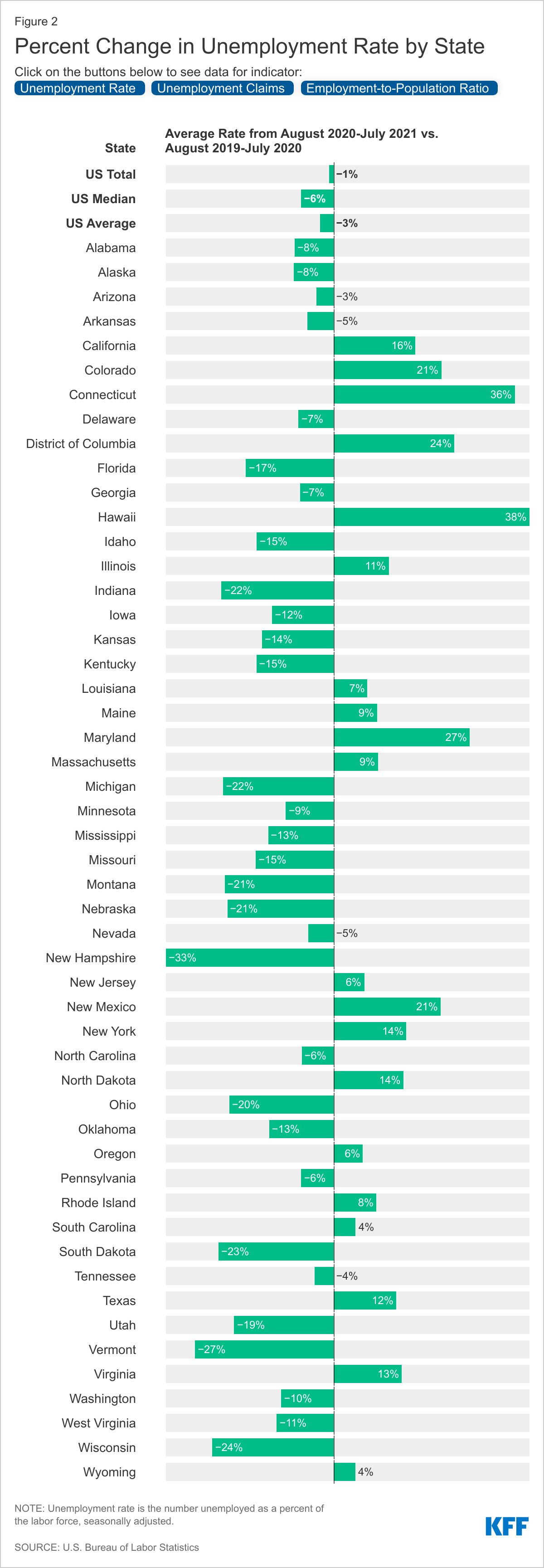
PEPFAR countries, taken together, were associated with a significant decline in the all-cause mortality rate between 2004 and 2018, compared to what would have been expected. The all-cause mortality rate in PEPFAR countries was 20.4% lower than what would have been expected had PEPFAR been absent, suggesting the program has had a significant and positive impact on health outcomes. While countries that received PEPFAR support had higher mortality rates prior to the initiation of the program compared to controls, they, and control countries, saw a modest decline from 1990 to the introduction of PEPFAR, followed by a rapid decline in mortality in PEPFAR countries. (see Figure 1).
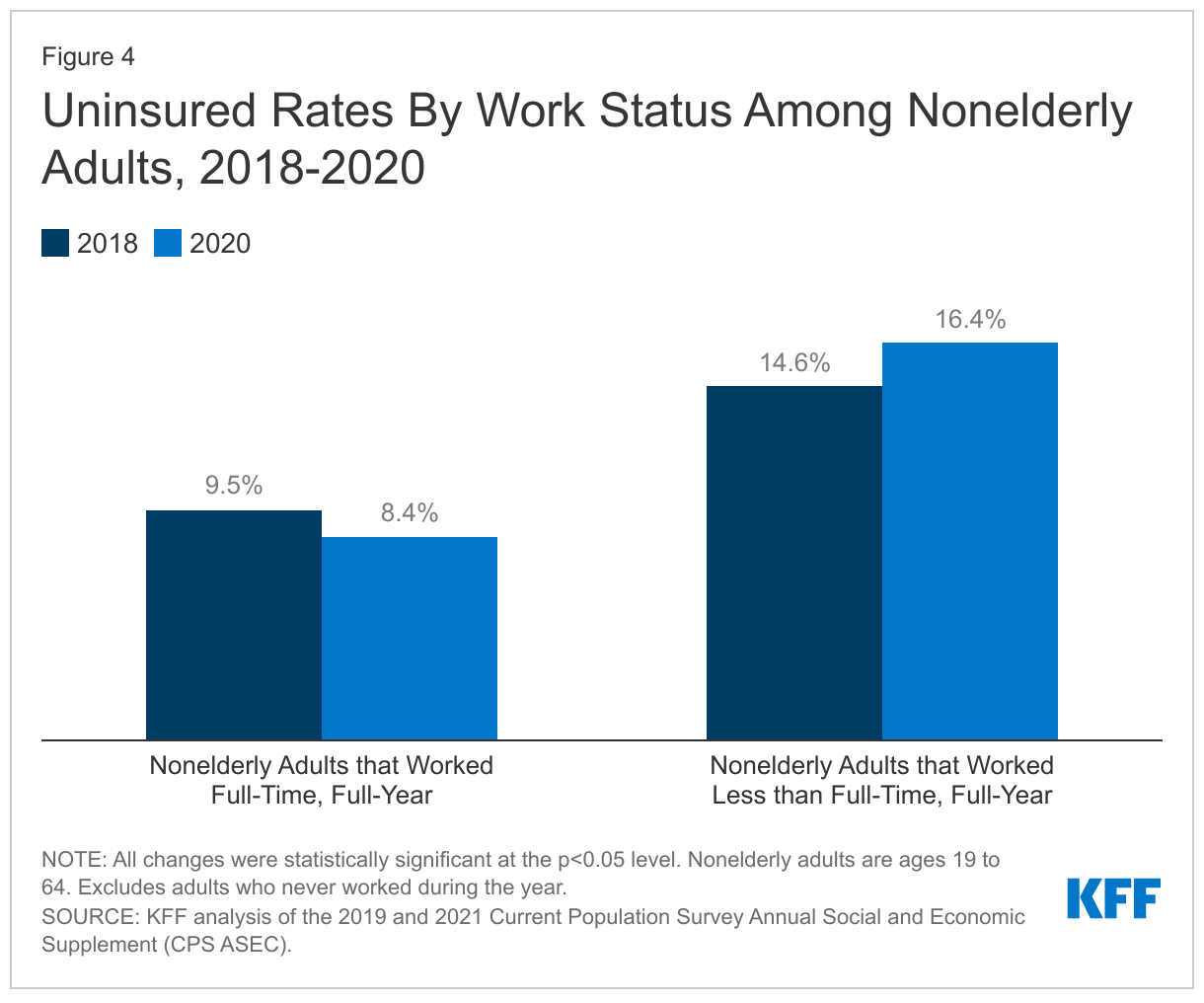
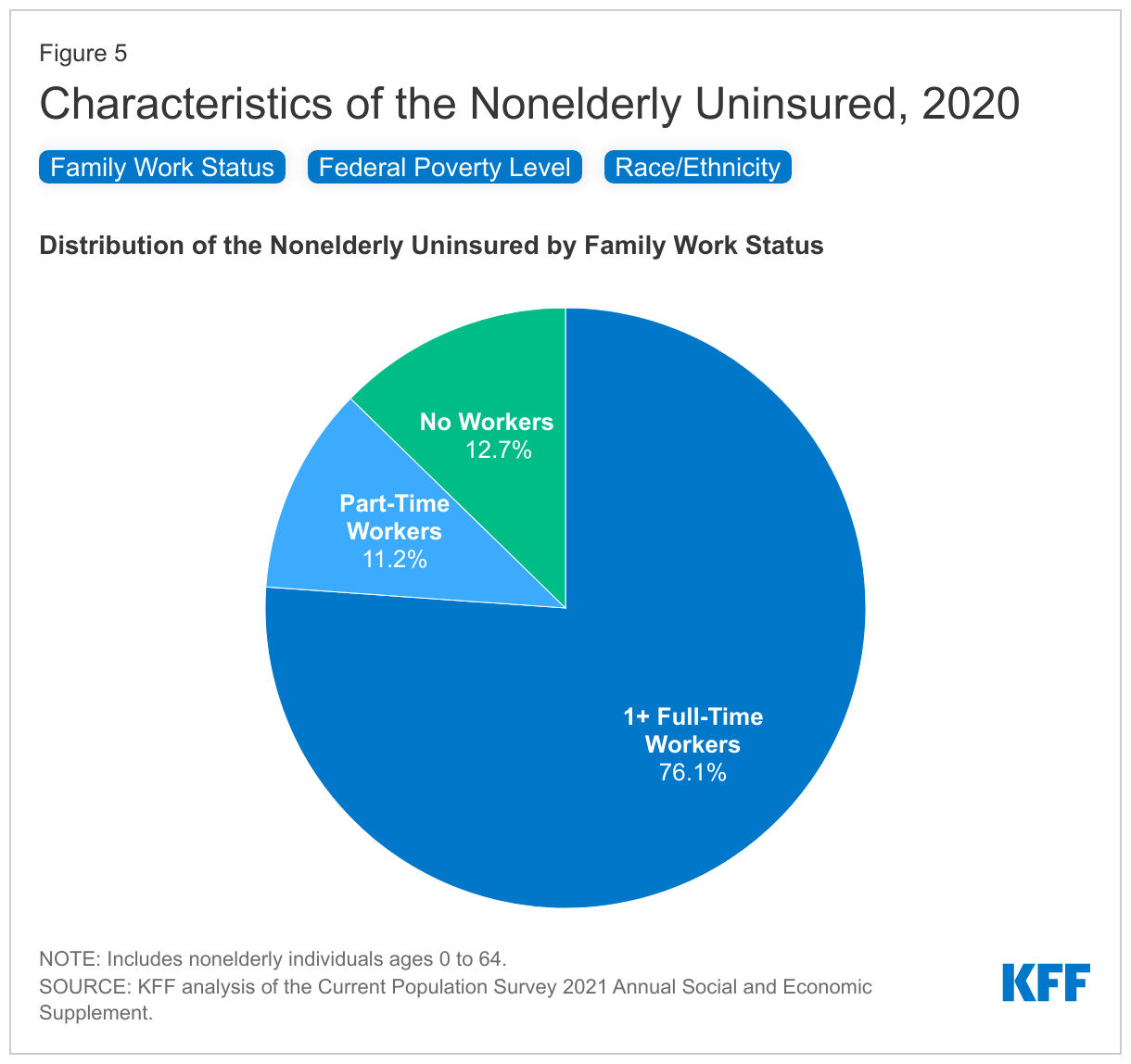
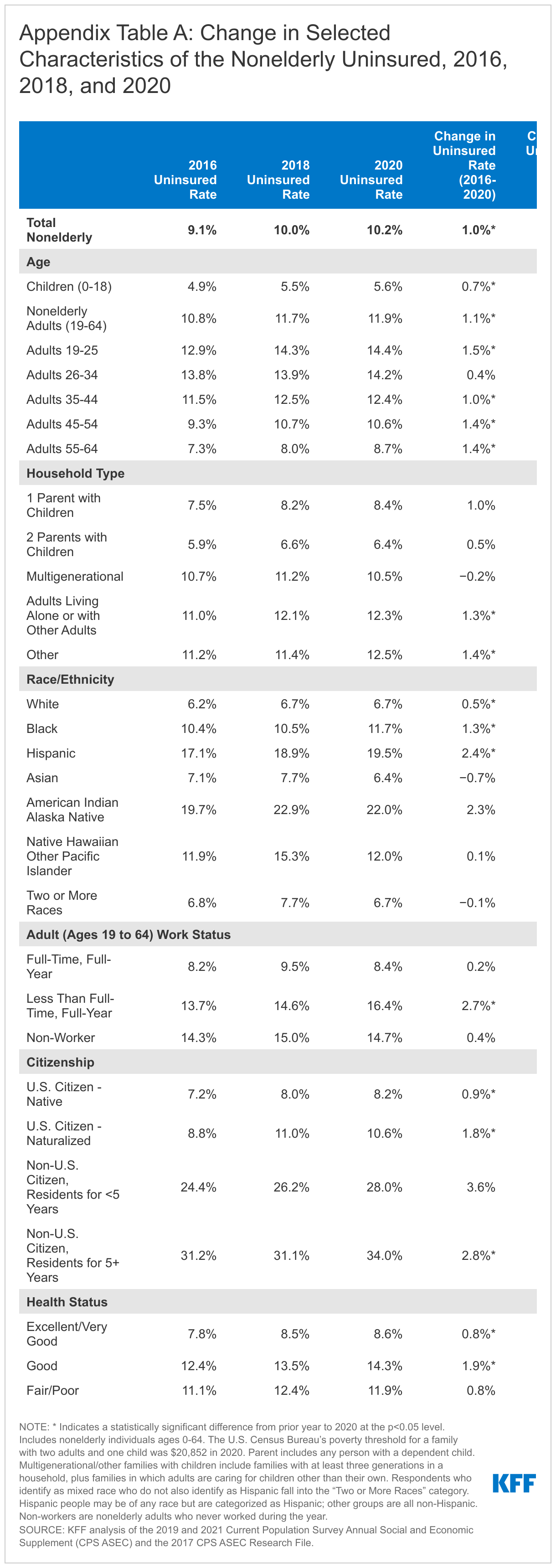
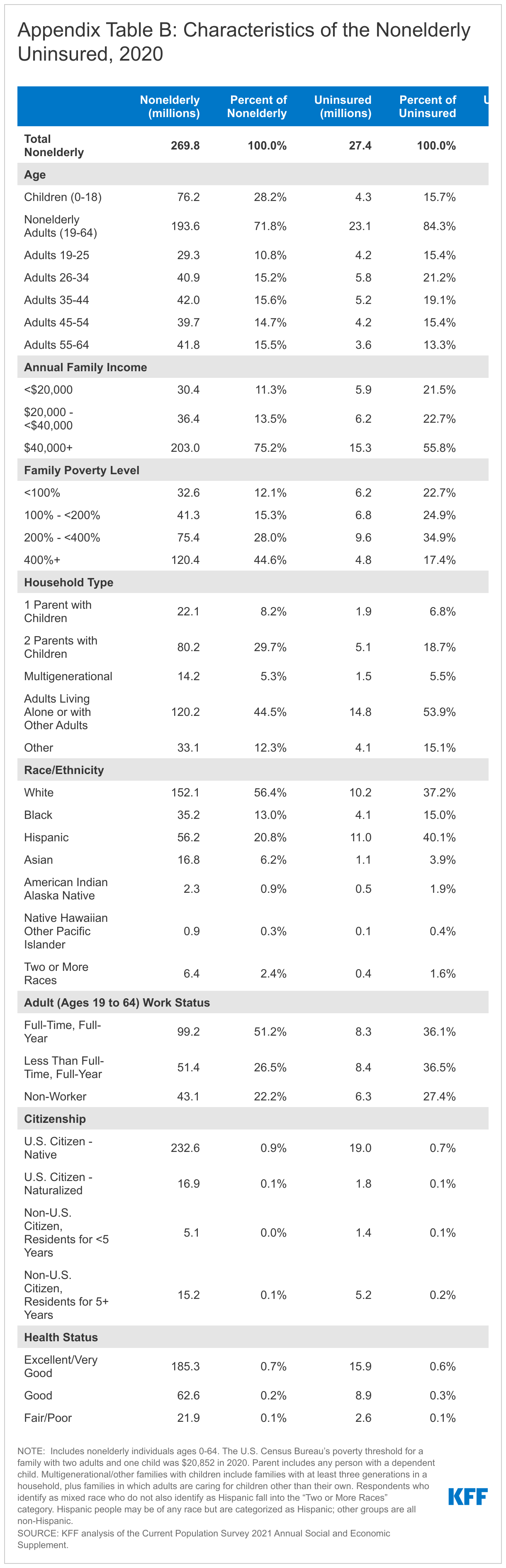
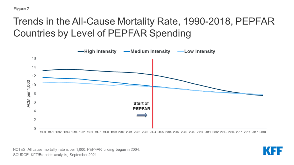
The mortality decline was greatest in countries with higher levels of PEPFAR investments. We segmented countries into three groups – high, medium, and low spending intensity – based on cumulative PEPFAR spending per capita in each country. In countries with high PEPFAR spending intensity, the all-cause mortality rate reduction was approximately 26.6% over the 2004-2018 period, compared to the control group. Reductions were less in medium and low intensity countries, respectively (14.0% and 15.7%) but even in these countries, PEPFAR was associated with a significant decline in mortality, compared to the control group (see Figures 2 and 3).
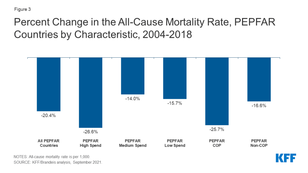
Countries with the greatest PEPFAR investments were primarily countries engaged in more intensive planning and programming through the PEPFAR “COP” process. Each year, a subset of countries receiving PEPFAR support is required to prepare Country Operational Plans (COPs). COPs document annual funding levels linked to results and serve as budget and target allocation and tracking tools. Country teams work intensively to develop these plans for their HIV programming, in concert with headquarters at the State Department, which approves them for funding.2 Our analysis finds that the all-cause mortality rate in PEPFAR COP countries3 declined by approximately 25.7% over the period, compared to 16.6% in PEPFAR countries that did not prepare COPs. (see Figure 3). Because we did not assess the independent effect of PEPFAR spending in COP countries, it is unclear if mortality declines were due to greater spending, more intensive planning and programming, or some combination of both, and it would be important to examine these different effects further.
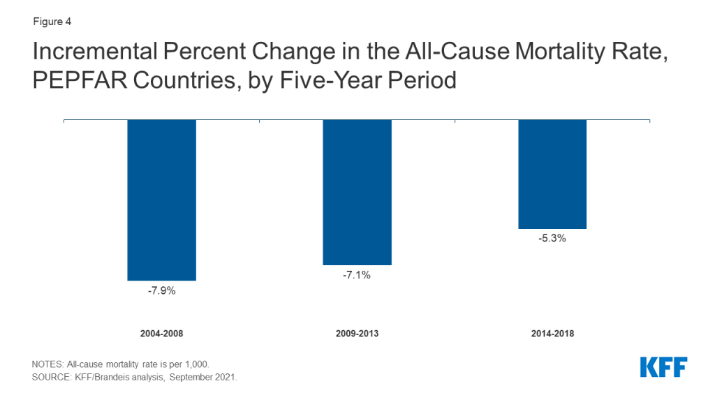
Finally, the decline in the mortality rate has continued over the course of the program, including in all three major five-year PEPFAR phases, with the biggest drops occurring in the first two phases, and a more modest, but significant, drop since. We looked at three distinct five-year periods of the program, 2004-2008, 2008-2013 and 2013-2018, corresponding with PEPFAR’s authorization periods, to estimate the incremental mortality effects over time. We find that the decline in the mortality rate has continued throughout the program, with an 7.9% decline occurring in the first five-year period, followed by an additional decline of 7.1% and 5.3%, respectively, in the two subsequent periods (see Figure 4). This pattern was similar in COP countries, although the mortality decline was greatest in the second five year phase of the program (8.8%, 9.4%, and 7.4%).
Implications
These findings build on prior analyses that also found reductions in mortality in PEPFAR countries, relative to others. Here, we offer additional evidence that PEPFAR continues to have a significant and positive impact on health outcomes in the countries in which it works, particularly in those countries where it has concentrated financial investments and engaged in more intensive planning and programming. Moreover, these effects have continued over the course of the program. Our findings also suggest that PEPFAR has had positive spillover effects beyond HIV. At the same time, and despite PEPFAR’s positive impact, HIV continues to take a toll in many low- and middle-income countries.4 Our finding that PEPFAR investments were associated with a continued reduction in mortality over time suggests that further program investments will also yield additional mortality benefits. Taken together, these findings offer policymakers and other PEPFAR stakeholders new input into discussions concerning PEPFAR’s future, particularly given competing financial pressures and a challenging global health and development landscape.
Methodology
We used a difference-in-difference5 , quasi-experimental design to estimate a “treatment effect” (PEPFAR), based on comparison to a control group (the counterfactual). The difference-in-difference design compares the before and after change in outcomes for the treatment group to the before and after change in outcomes for the control group. Our outcome of interest was the crude death rate, all causes (per 1,000). We chose this outcome, instead of the HIV mortality rate, because available HIV mortality estimates are derived using assumptions that include the role of HIV treatment, which is itself one of PEPFAR’s interventions. We included data on the mortality rate starting in 1990, to assess patterns before and after PEPFAR.
We constructed a panel data set for 157 low- and middle- income countries between 1990 and 2018. Our PEPFAR group included 90 countries that had received PEPFAR support over the period. Our control group included 67 low and middle income countries that had not received any PEPFAR support or had received minimal PEPFAR support (<$1M over the period or <$.05 per capita) between 2004 and 2018. Data on PEPFAR spending by country were obtained from the U.S. government’s https://foreignassistance.gov/ database and represent U.S. fiscal year disbursements. Data for the mortality rate were obtained from the World Bank’s World Development Indicators (WDI) (https://datatopics.worldbank.org/world-development-indicators/. We explored several difference-in-difference model specifications. Each specification controlled for numerous baseline variables, compared to an unadjusted model, variables which may be expected to influence mortality outcomes and which help make the control group more comparable to the PEPFAR group.
Our baseline variables and model specifications were as follows:
| Table 1: Baseline Variables | |
| Variable | Data Source |
| 1. GDP per capita (current USD) | WDI, https://datatopics.worldbank.org/world-development-indicators/ |
| 2. Recipient of U.S. HIV funding prior to 2004 (dummy variable) | USAID, https://foreignassistance.gov/ |
| 3. Total population | United Nations, Department of Economic and Social Affairs, Population Division (2019). World Population Prospects 2019, Online Edition. Rev, https://population.un.org/wpp/ |
| 4. Life expectancy at birth (years) | WDI, https://datatopics.worldbank.org/world-development-indicators/ |
| 5. Total fertility rate (births per woman) | WDI, https://datatopics.worldbank.org/world-development-indicators/ |
| 6. Percent urban population (of total population) | WDI, https://datatopics.worldbank.org/world-development-indicators/ |
| 7. School enrollment, secondary (% gross) | WDI, https://datatopics.worldbank.org/world-development-indicators/ |
| 8. WB country income classification | World Bank, https://datahelpdesk.worldbank.org/knowledgebase/articles/906519-world-bank-country-and-lending-groups |
| 9. HIV prevalence (% of population ages 15-49) | WDI, https://datatopics.worldbank.org/world-development-indicators/ (from UNAIDS).To address missing values in some cases, additional data were obtained from the Global Burden of Disease Collaborative Network,Global Burden of Disease Study 2019 (GBD 2019) Results.Seattle, United States: Institute for Health Metrics and Evaluation (IHME), 2020, http://ghdx.healthdata.org/gbd-results-tool. |
| 10. Per capita donor spending on health (non-PEPFAR) | OECD Creditor Reporting System database, https://stats.oecd.org/Index.aspx?DataSetCode=crs1 |
| 11. Per capita domestic health spending, government and private, PPP (current $) | WDI, https://datatopics.worldbank.org/world-development-indicators/ |
| Table 2: Model Specifications | |
| Model | Difference-in Difference Specification |
| 1 | Unadjusted model |
| 2 | Includes baseline variables 1-9 |
| 3 | Includes baseline variables 1-11 |
| 4 | Includes baseline variables 1-9, and yearly per capita donor spending on health (non-PEPFAR) by all donors. |
Our final model for main reported results is model 4 which, in addition to baseline variables, includes a yearly estimate of donor health spending from all sources other than PEPFAR (including, for example, U.S. spending on other health areas as well as spending by other bilateral and multilateral donors on health) to adjust for potential confounding influences of these other health investments on all-cause mortality. We did not include domestic health spending as a baseline variable in this model due to the potential confounding with donor health spending. The pre-intervention period for this model started in 2002.
Each of our model specifications produced similar, statistically significant results. In our final model, almost all results were significant at the p<0.001 level; one result was significant at the p<0.01 and three were significant at p<0.05. We also ran all models with and without China and India, the two most populous countries in the world, to assess whether they were influencing the results. In both cases, PEPFAR’s impact was still significant and results were similar.
Despite the strengths of the difference-in-difference design, there are limitations to this approach. While we adjusted for numerous baseline factors that could be correlated with mortality outcomes, there may be other, unobservable factors that are not captured here. Similarly, while our baseline factors are also intended to adjust for selection bias, and make the PEPFAR and control groups more comparable, there may be other ways in which control countries differed from PEPFAR countries (and factors which influenced which countries received PEPFAR support), which could bias the estimates.
| Table 3: Baseline Mean Mortality Rate, All Causes, 2004(crude deaths per 1,000) | |
| All PEPFAR countries | 10.5 |
| COP countries | 12.6 |
| Non-COP countries | 9.4 |
| PEPFAR Spending Intensity | |
| High | 12.3 |
| Medium | 9.7 |
| Low | 9.5 |
| Table 4: Estimates of PEPFAR’s Impact on Mortality, 2004-2018(Percent change in all-cause mortality rate) | ||||
| Model Specification | Model 1 | Model 2 | Model 3 | Model 4 |
| All PEPFAR countries | -19.9% | -22.5% | -27.4% | -20.4% |
| COP countries | -22.8% | -26.8% | -29.6% | -25.7% |
| Non-COP countries | -17.9% | -19.7% | -25.0% | -16.6% |
| PEPFAR Spending Intensity | ||||
| High | -25.0% | -29.3% | -30.6% | -26.6% |
| Medium | -20.0% | -21.4% | -28.3% | -14.0% |
| Low | -13.3% | -15.3% | -19.5% | -15.7% |
| Time Period: All PEPFAR countries | ||||
| 2004-2008 | -9.0% | -11.2% | -13.9% | -7.9% |
| 2004-2013 | -15.0% | -17.3% | -21.2% | -15.0% |
| 2004-2018 | -19.9% | -22.5% | -27.4% | -20.4% |
| Time Period: PEPFAR COP countries | ||||
| 2004-2008 | -7.8% | -11.0% | -12.3% | -8.8% |
| 2004-2013 | -15.9% | -19.5% | -21.5% | -18.2% |
| 2004-2018 | -22.8% | -26.8% | -29.6% | -25.7% |
| NOTE: Refer to Table 2 for model specifications. | ||||
| Table 5: Estimates of PEPFAR’s Impact on Mortality, 2004-2018(Percentage point difference-in-difference and standard errors) | ||||
| Model Specification | Model 1 | Model 2 | Model 3 | Model 4 |
| All PEPFAR countries | -2.095***(0.232) | -2.364***(0.190) | -2.879***(0.265) | -2.139***(0.435) |
| COP countries | -2.875***(0.294) | -3.380***(0.262) | -3.726***(0.341) | -3.232***(0.541) |
| Non-COP countries | -1.682***(0.236) | -1.847***(0.179) | -2.346***(0.218) | -1.565***(0.423) |
| PEPFAR Spending Intensity | ||||
| High | -3.081***(0.304) | -3.608***(0.247) | -3.770***(0.299) | -3.271***(0.495) |
| Medium | -1.942***(0.304) | -2.080***(0.244) | -2.744***(0.326) | -1.357*(0.542) |
| Low | -1.263***(0.304) | -1.451***(0.244) | -1.850***(0.315) | -1.494**(0.515) |
| Time Period: All PEPFAR countries | ||||
| 2004-2008 | -0.949**(0.355) | -1.172***(0.261) | -1.463***(0.357) | -0.830*(0.401) |
| 2004-2013 | -1.571***(0.269) | -1.813***(0.208) | -2.224***(0.287) | -1.578***(0.413) |
| 2004-2018 | -2.095***(0.232) | -2.364***(0.190) | -2.879***(0.265) | -2.139***(0.435) |
| Time Period: PEPFAR COP countries | ||||
| 2004-2008 | -0.988*(0.434) | -1.385***(0.372) | -1.547**(0.473) | -1.114*(0.502) |
| 2004-2013 | -2.008***(0.335) | -2.457***(0.292) | -2.713***(0.376) | -2.298***(0.513) |
| 2004-2018 | -2.875***(0.294) | -3.380***(0.262) | -3.726***(0.341) | -3.232***(0.541) |
| NOTES: Refer to Table 2 for model specifications. Standard errors are shown in parentheses. ***p < 0.001 **p < 0.01 *p < 0.05 | ||||
Jen Kates, Adam Wexler, Stephanie Oum, and Anna Rouw are with KFF. Allyala Nandakumar, Gary Gaumer, Dhwani Hariharan, and William Crown are with Brandeis University.
Endnotes
- These include: Eran Bendavid E, Bhattacharya J. The President’s Emergency Plan for AIDS Relief in Africa: An Evaluation of Outcomes. Ann Intern Med. 2009;150:688-695. Available at: https://www.acpjournals.org/doi/10.7326/0003-4819-150-10-200905190-00117?url_ver=Z39.88-2003&rfr_id=ori%3Arid%3Acrossref.org&rfr_dat=cr_pub%3Dpubmed&; Bendavid E, Holmes CB, Bhattacharya J, Miller G. HIV Development Assistance and Adult Mortality in Africa. JAMA. 2012;307(19):2060–2067. Available at: https://jamanetwork.com/journals/jama/fullarticle/1157487; Wagner Z, Barofsky J, Sood N. PEPFAR Funding Associated With An Increase In Employment Among Males in Ten Sub-Saharan African Countries. Health Aff (Millwood). 2015;34(6):946-953. Available at: https://www.ncbi.nlm.nih.gov/pmc/articles/PMC4782769/; and Daschle T, Frist B. Building Prosperity, Stability, and Security Through Strategic Health Diplomacy: A Study of 15 Years of PEPFAR. Bipartisan Policy Center, Washington DC, 2018. Available at: https://bipartisanpolicy.org/download/?file=/wp-content/uploads/2019/03/Building-Prosperity-Stability-and-Security-Through-Strategic-Health-Diplomacy-A-Study-of-15-Years-of-PEPFAR.pdf. ↩︎
- State Department, PEPFAR 2021 Country and Regional Operational Plan (COP/ROP) Guidance for all PEPFAR Countries, February 11, 2021. Available at: https://www.state.gov/wp-content/uploads/2021/02/PEPFAR-COP21-Guidance-Final.pdf (accessed September 16, 2021). ↩︎
- Thirty-one countries. ↩︎
- https://www.unaids.org/en/resources/documents/2021/2021-global-aids-update. ↩︎
- Gertler, Paul J., Sebastian Martinez, Patrick Premand, Laura B. Rawlings, and Christel M. J. Vermeersch. 2016. Impact Evaluation in Practice, second edition. Washington, DC: Inter-American Development Bank and World Bank. ↩︎