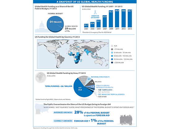
This month’s Visualizing Health Policy infographic shows global health funding’s share of the US federal budget, the flattening of US funds for global health during the 21st century, where US dollars for global health are spent, the major areas receiving US global health funding, and how the US public overestimates the percentage of the federal budget that is spent on foreign aid.

Visualizing Health Policy is a monthly infographic series produced in partnership with the Journal of the American Medical Association (JAMA). The full-size infographic is freely available on JAMA’s website and is published in the print edition of the journal.
Filling the need for trusted information on national health issues, the Kaiser Family Foundation is a nonprofit organization based in Menlo Park, California.ia.
Contact
- Katie Smith
- (202) 347-5270
- ksmith@kff.org