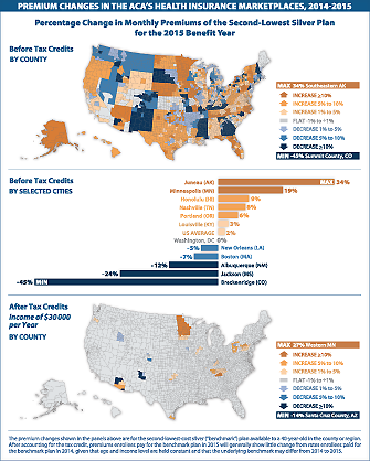
This Visualizing Health Policy infographic illustrates the change in monthly premiums by county, and select cities, from 2014 to 2015 for a 40-year-old person covered by the second-lowest-cost silver “benchmark” plan in the Affordable Care Act’s insurance marketplaces. Premium changes were greatest in Summit County, Colo. (45% decrease) and southeastern Alaska (34% increase), before tax credits. After accounting for tax credits, premiums for a 40-year-old person with an annual income of $30,000 would remain flat in most of the country, as long as the enrollee changed from the 2014 benchmark plan to the plan designated as the benchmark for 2015.

Visualizing Health Policy is a monthly infographic series produced in partnership with the Journal of the American Medical Association (JAMA). The full-size infographic is freely available on JAMA’s website and is published in the print edition of the journal.
Contact
- Amy Jeter
- (650) 854-9400
- ajeter@kff.org
- Craig Palosky
- (202) 347-5270
- cpalosky@kff.org