The Washington State Health Care Landscape

Published: Jun 3, 2014

The Affordable Care Act (ACA) went into full effect on January 1, 2014, ushering in health insurance reforms and new health coverage options in Washington and across the country. As Washington expands health coverage throughout the state, it is also at the forefront of efforts to increase health systems integration and improve health care data collection. This fact sheet provides an overview of population health, health coverage, and health care delivery in Washington in the era of health reform.

Demographics
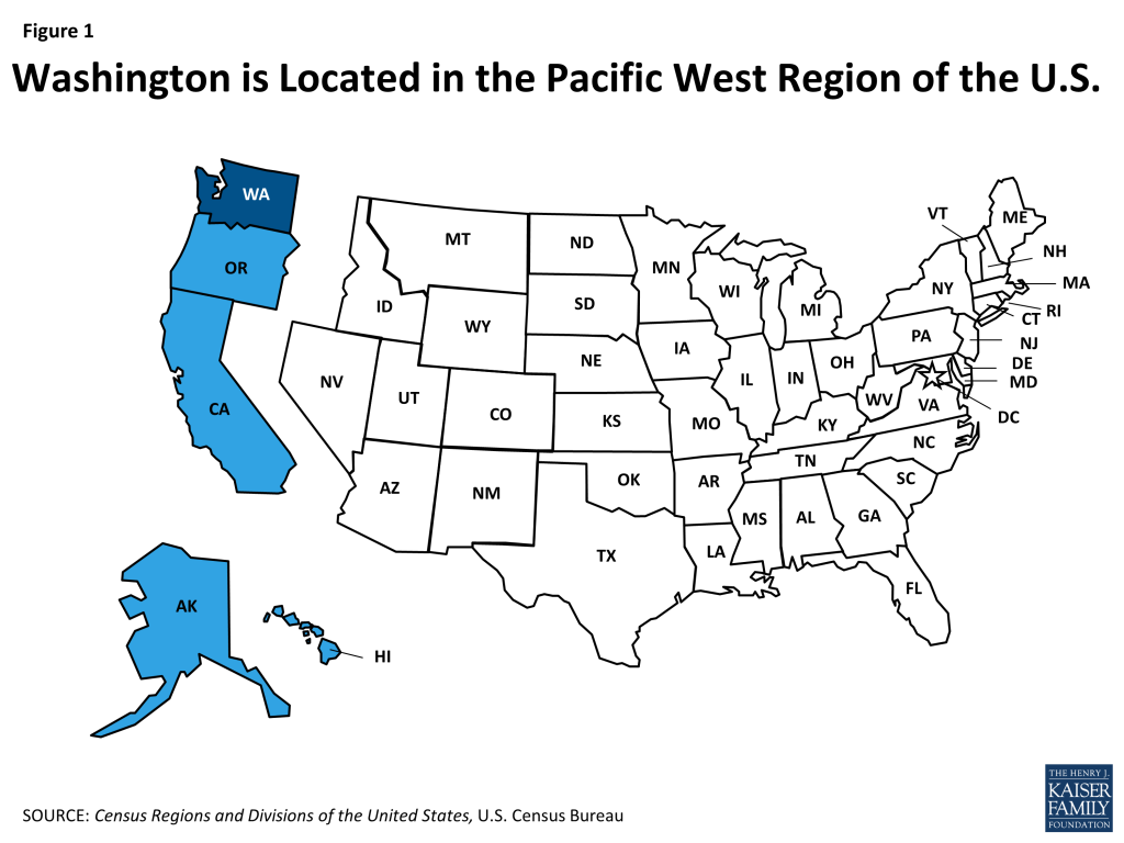
Figure 1: Washington is Located in the Pacific West Region of the U.S.

Washington is home to 6.8 million people, making it the 13th most populous state in the U.S.1  At over 66,500 square miles, Washington is the 20th largest state and ranks 25th in population density.2  As the north-western most state of the contiguous U.S., Washington is one of five states located in the country’s Pacific West region (Figure 1).3  Washington’s topography is diverse. The state is home to numerous mountain ranges, including the Olympic Mountains in the northwest, the Rocky Mountains in the northeast, and the Cascade Mountains, which have active volcanoes, including Mt. Rainier and Mt. St. Helens, and run from north to south across the state. The Columbia Plateau is in the center of the state and extends south to the Columbia River and Puget Sound in the northwest provides access to the Pacific Ocean.4 

Washington’s population is concentrated in the state’s urban areas. As of July 2012, over 50% of Washington’s population lived in 3 urban counties (King, Pierce, and Snohomish) and 29% of state residents live in the Seattle metro area.5  (See Figure 11 in the Appendix for Washington’s nonelderly population by county.) Washington’s unemployment rate in October 2013 was 7%, slightly lower than the U.S. average of 7.3%.6 
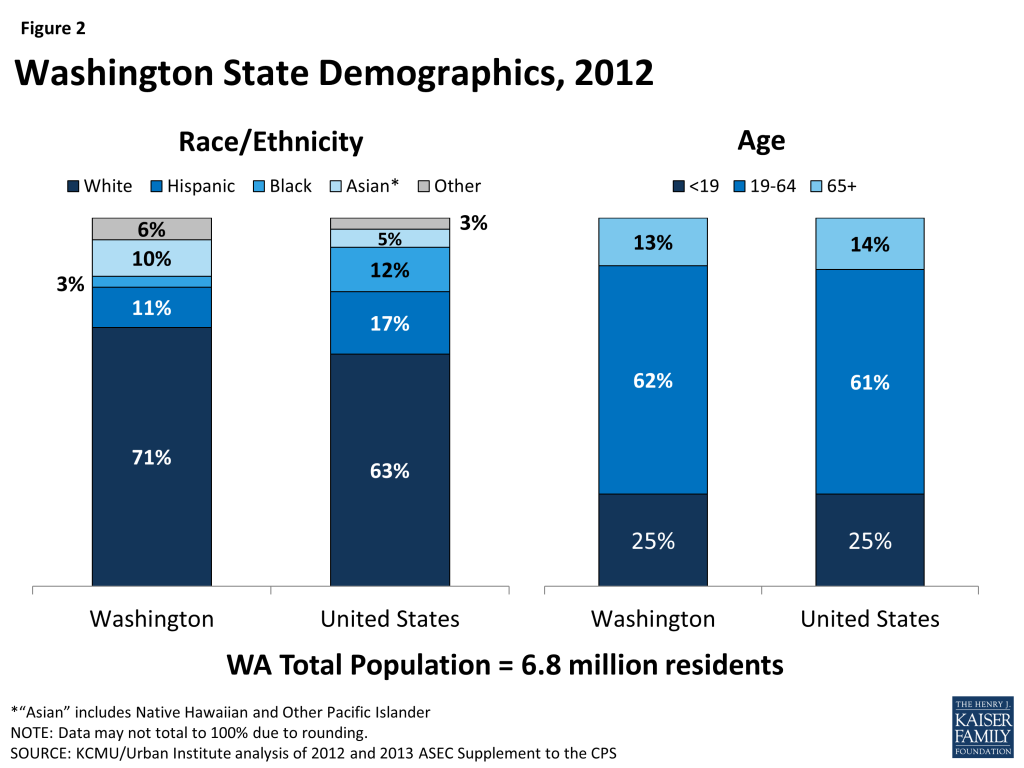
Figure 2: Washington State Demographics, 2012

Washington residents are more likely to identify as White or Asian, Native Hawaiian, or other Pacific Islander and less likely to identify as Hispanic or Black than U.S. residents as a whole. Seven in ten (71%) Washington residents identify as White, compared to 11% who identify as Hispanic, 10% who identify as Asian, Native Hawaiian, or other Pacific Islander, and 3% who identify as Black (Figure 2).7  Washington is also home to over 69,000 American Indians and Alaska Natives, who account for 1% of the state population.8  Ninety-two percent of Washington’s residents are U.S. citizens.9  The age distribution of Washington’s population aligns with that of the U.S. overall, with more than 6 in 10 (62%) residents between the ages of 19-64.10  One in six (16%) of individuals in Washington are living in poverty (have income below 100% of the federal poverty level (FPL) or $11,670 for an individual, $19,790 for a family of 3 in 2014) and more than 6 in 10 (62%) have family income levels below 400% FPL that qualify them for either Medicaid or premium subsidies in the state Health Insurance Marketplace under the ACA (Figure 3).
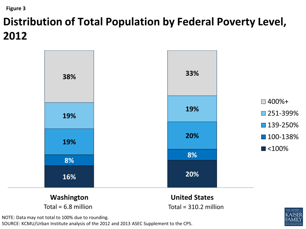
Figure 3: Distribution of Total Population by Federal Poverty Level, 2012

However, poverty rates vary by race/ethnicity and age. Twelve percent of those who identified as White were living in poverty in 2012, compared to 35% of those who identified as Black and 28% of those who identified as Hispanic. In addition, among children under age 19, one-fifth (20%) were living in poverty, while only 15% of adults age 19-64 and 9% of adults age 65 and over were living in poverty.11 

State Economy

Washington’s economy is growing steadily, despite state budgetary challenges. In 2012, Washington’s Gross Domestic Product (GDP) was $375.7 billion, making it the 14th largest economy in the U.S.12  Like many other states across the country, Washington experienced an increase in its real GDP from 2011 to 2012 and Washington was among the 10 states that experienced the largest percentage increase to its state economy that year.13  Computer software development (Microsoft and Nintendo), online retailers (Amazon and Expedia), and aircraft construction (Boeing) are major industries in the state, as well as lumber and wood production (Weyerhaeuser), agriculture, and tourism.14  Like other states across the country, Washington experienced budgetary challenges during the recent economic downturn and the Washington State Economic and Revenue Forecast Council is projecting a $1.3 billion budget shortfall for the 2013-2015 state budget cycle, up from previous projections of $900 million due to higher than anticipated Medicaid enrollment.15 

Population Health

Overall population health in Washington is ranked above the national average. Washington ranked 14 among the 50 states for total population health in the United Health Care Foundation’s report, America’s Health Rankings 2013.16  Compared to other states across the country, Washington has a low prevalence of both obesity and diabetes among adults, and fewer deaths due to heart disease.17 ,18 ,19  In addition, the share of adults who smoke in Washington is smaller than the U.S. overall.20  However, the percentage of adults who report poor mental health in Washington is higher than in many states across the country, as is the prevalence of asthma among adults and the incidence of invasive cancer. 21 ,22 ,23 

Disparities in health and health care access exist in Washington. Like other states across the country, measures of health status in Washington vary by race/ethnicity and patterns across these measures in Washington are similar to national averages. Eighty-seven percent of those who identify as White report being in very good or excellent health, compared to 77% of Blacks, 73% of American Indian or Alaska Natives, and 69% of Hispanics.24  Also, while the rates of overweight and obesity statewide are low, those who identify as American Indian or Alaska Native (79%), Black (76%), or Hispanic (69%) are more likely to be overweight or obese than those who identify as White (61%) or Asian, Native Hawaiian, or other Pacific Islander (42%).25  In addition, those who identify as Black (44%) and White (42%) are more likely to report mental health issues, compared to those who identify as Asian, Native Hawaiian, or other Pacific Islander (33%), or Hispanic (26%).26  The rates of reported mental health issues in Washington are higher than national averages across these racial and ethnic groups, except for Hispanics.27 

Disparities in access to care also exist in Washington. For example, while 75% of those who identify as White and 71% of those who identify as Asian, Native Hawaiian, or other Pacific Islander report having a usual source of care, the rate is only 63% for Blacks and American Indians and Alaska Natives, and 46% for Hispanics.28 

State and local efforts to reduce health disparities are underway. In 2006, Washington’s Legislature established the Governor’s Interagency Council on Health Disparities under Governor Christine Gregoire. The Interagency Council develops annual action plans and convenes advisory committees to address racial/ethnic and gender-based health disparities in the state.29  In 2009, the Washington State Board of Health adopted a five-year strategic plan with five goals to reduce health disparities.30  In addition, the King County Department of Health operates the Seattle and King County REACH coalition, which works to reduce the prevalence of diabetes in King County among communities of color.31 

Coverage
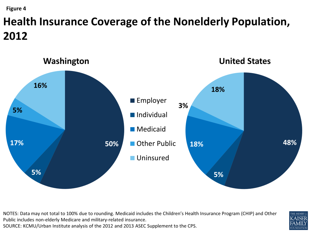
Figure 4: Health Insurance Coverage of the Nonelderly Population, 2012

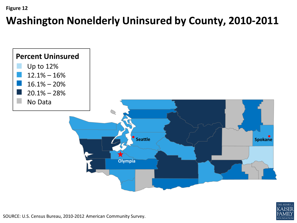
Nearly 948,000 people, or 16% of Washington’s nonelderly adults and children, were uninsured in 2012 (Figure 4).32  This rate is similar to the national average of 15%, which reflects the range of uninsured rates across the country from 4% in Massachusetts to 24% in Texas. As shown in Figure 12 (Appendix), the nonelderly uninsured in Washington are not equally distributed across the state’s counties, with the central counties east of the Cascade Mountains and the West Coast south of the Olympic Mountains having higher uninsured rates than other areas of the state. As in other states across the U.S., the majority of the nonelderly uninsured in Washington have at least one full-time worker in their households, have income below 400% of the FPL, and are under age 55 (Figure 5).33  Nearly 6 in 10 (57%) of nonelderly uninsured Washingtonians identify as White, nearly one-quarter (22%) identify as Hispanic, 10% identify as Asian, Native Hawaiian, or other Pacific Islander, and 5% identify as Black.34 
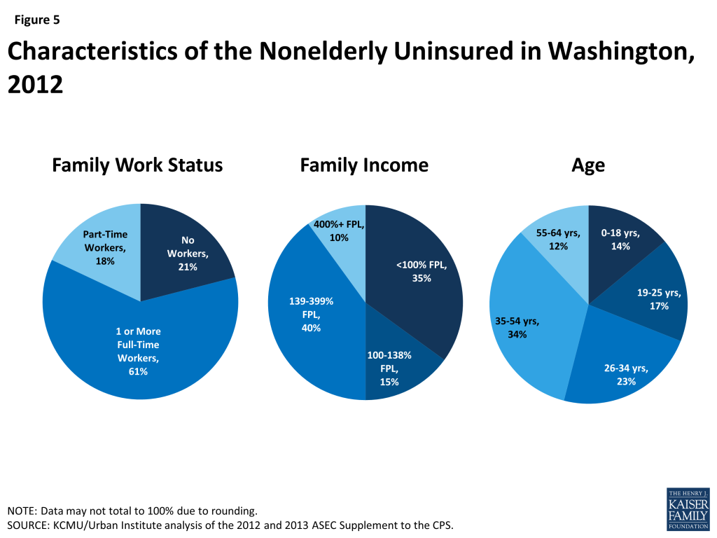
Figure 5: Characteristics of the Nonelderly Uninsured in Washington, 2012

Among the 86% of Washingtonians with health insurance, the largest share (50% of the state population) have employer-sponsored coverage, followed by Medicare (16%), Medicaid (13%), and private individual insurance (5%)(Figure 4).35 

Medicaid

Similar to the national picture, the large majority of Medicaid enrollees in Washington are children, but the elderly and individuals with disabilities account for most spending on Medicaid. Based on data for Fiscal Year (FY) 2010 (the latest year available to compute spending by group), 57% of Medicaid, known in the state as Apple Health, enrollees were children, who accounted for 24% of expenditures (Figure 6).36  About 1 in 5 enrollees (22%) were elderly or people with disabilities, who accounted for 61% of total program costs. Average spending per beneficiary was $4,849, less than the national average of $5,563 and less than most nearby states (Figure 7).37 
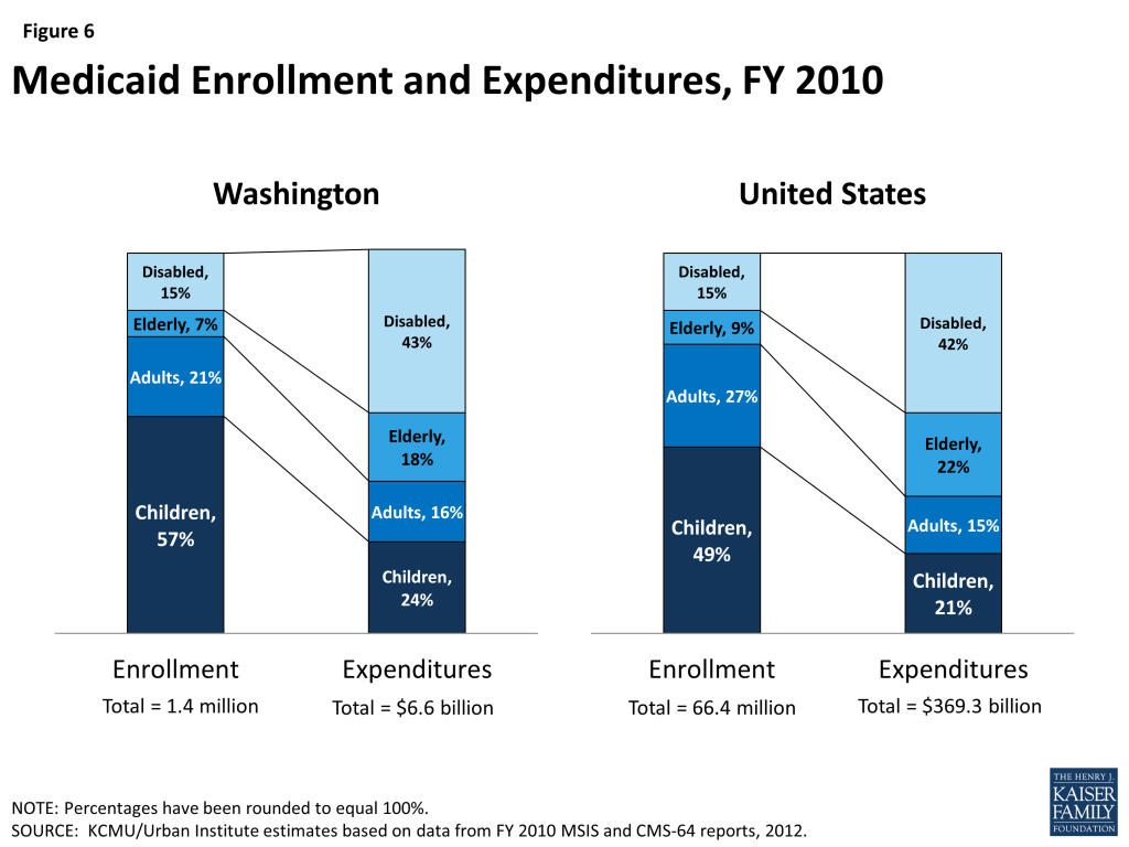
Figure 6: Medicaid Enrollment and Expenditures, FY 2010

Medicaid costs are shared by the state and the federal government, with the federal government paying 50% of the cost of Washington Medicaid; therefore, for every $1.00 that Washington spends on Medicaid, the federal government sends an additional $1.00 to the state in matching funds.38  Washington provides coverage to children up to 317% FPL through a separate CHIP program, for which the federal government pays 65% of the cost.39  The combined federal and state spending on Medicaid in Washington for FY 2011 was $7.6 billion, a growth of one billion from FY 2010 that was largely attributable to the transition of many enrollees from the state-funded Basic Health Plan to Medicaid, which enabled the state to draw down new federal matching funds (discussed in more detail below). Federal and state spending on Washington Medicaid then remained relatively stable at $7.6 billion for FY 2012.40  In State Fiscal Year (SFY) 2011, Medicaid accounted for 24% of total state spending, 26% of state general fund spending, and 44% of state spending of federal funds (Figure 8).41  Medicaid is the second largest source of state general fund spending, behind elementary and secondary education, but the largest source of federal revenue flowing into the state.
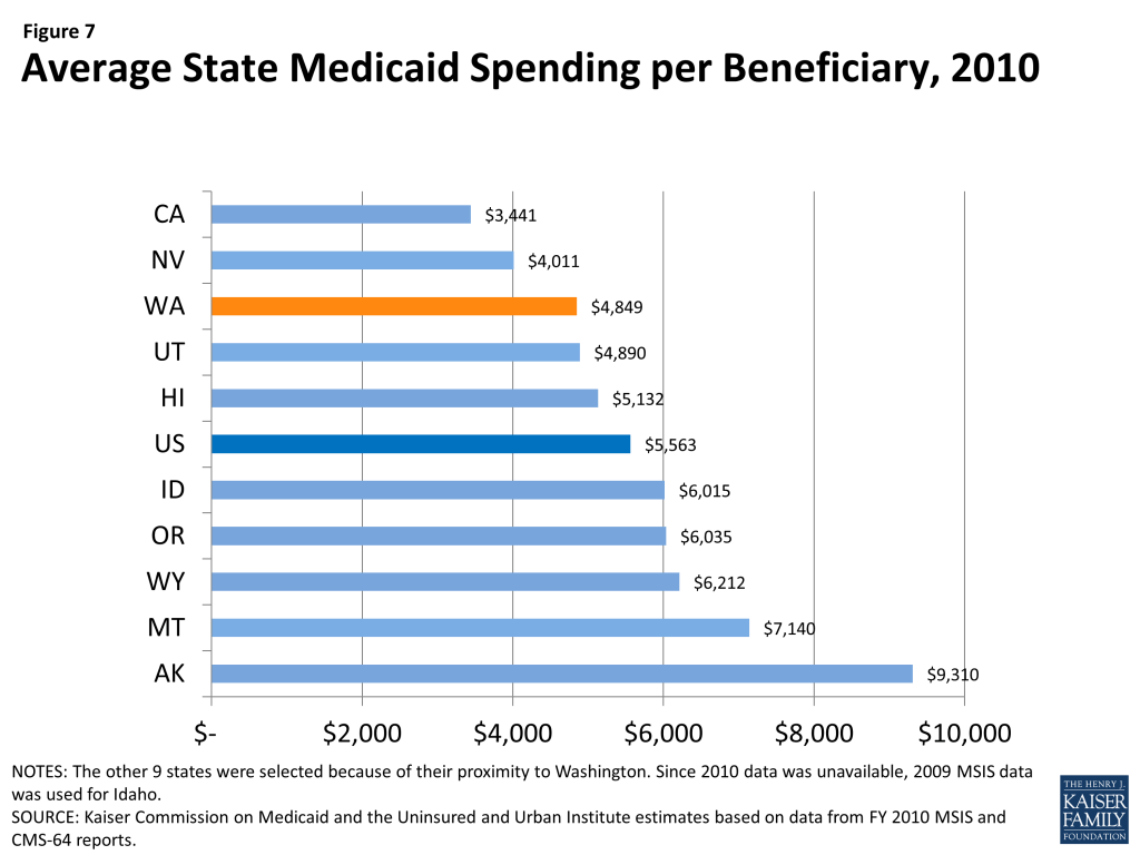
Figure 7: Average State Medicaid Spending per Beneficiary, 2010

Nearly all Medicaid beneficiaries in Washington are enrolled in managed care. Nearly 9 out of 10 (88%) Medicaid enrollees in Washington are enrolled in a managed care arrangement.42  Apple Health contracts with five commercial managed care organizations, to provide comprehensive health services, and eleven regional support networks (10 county plans and 1 private plan), to provide mental health services. Enrollment into managed care arrangements is growing nationwide and, in 2011, Washington was one of 23 states where at least 80% of Medicaid enrollees were enrolled in managed care.43 

Washington has implemented a health home initiative for Medicaid beneficiaries with chronic conditions, including dual eligible beneficiaries. In July 2013, Washington began the phasing in its health home initiative across six coverage areas for beneficiaries who have one chronic condition and are at risk for developing another.44  Washington selected Health Home Lead entities to implement the health home initiative and contract with Care Coordination Organizations to provide health home services, such as care coordination and case management. Washington’s health home initiative covers a broad range of chronic conditions and services are provided on a fee-for-service basis or in a managed care system, depending on the Lead Entity. Fee-for-service health homes have a three-tiered payment methodology and are reimbursed based on their levels of outreach and consumer engagement activities, the ratio of providers to beneficiaries, and the ratio of telephone to face-to-face beneficiary encounters. All of these costs are built into the overall capitation rate for managed care health homes. Washington is providing all health homes with access to its Predictive Risk Intelligence System (PRISM), which is a secure, web-based clinical support tool that uses predictive modeling to help identify clients most in need of care coordination. PRISM is intended to complement provider electronic health records and the state’s health information exchange, OneHealthPort. As of October 2013, health homes were operating in all areas of the state, except King and Snohomish counties, which are two of the three most populous counties in the state and where nearly 30% of the state’s high-risk Medicaid beneficiaries reside.45 
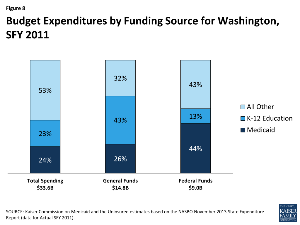
Figure 8: Budget Expenditures by Funding Source for Washington, SFY 2011

Washington is seeking to better coordinate care and control costs for its dual eligible beneficiaries, who often have complex and costly health care needs. In 2010, Washington had nearly 172,000 dual eligible individuals, who made up 13% of total state Medicaid enrollment and accounted for 32% of total state Medicaid costs.46  In an effort to better integrate care and align financing for these beneficiaries, CMS is using new authority afforded under the ACA to launch demonstration projects in several states across the country that test new care coordination and delivery models. Washington is one of 11 states approved to participate in the duals demonstration projects.47 

Two duals demonstration projects were approved by CMS for Washington, one using capitated managed care model for dual eligible beneficiaries in two urban counties, King and Snohomish, and the other using a managed fee-for-service model for high-risk, high-cost adult dual eligible beneficiaries in the state’s other 37 counties.48  Washington’s managed fee-for-service demonstration, which builds off of the state’s health home model, began enrolling 21,000 beneficiaries in July 2013. Beneficiaries are automatically enrolled in a health home initiative, but choose whether to receive Medicaid health home services; their other Medicare and Medicaid services continue on a fee-for-service basis. The state will retroactively share in any savings from the managed fee-for-service demonstration with CMS if savings and quality benchmarks are met. The state’s capitated managed care demonstration will begin enrolling 27,000 beneficiaries in July 2014. Participation in this demonstration is voluntary for eligible beneficiaries, although they will be auto-enrolled into one of the plans, unless they take action to affirmatively opt-out. Savings are deducted prospectively from CMS and the state’s contributions to the Medicare and Medicaid baseline capitated rates, according to the state’s Memorandum of Understanding with CMS.

Health Reform
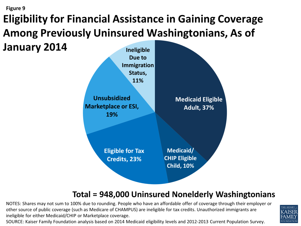
Figure 9: Eligibility for Financial Assistance in Gaining Coverage Among Previously Uninsured Washingtonians, As of January 2014

The ACA could extend coverage to nearly 950,000 uninsured Washingtonians. A main goal of the ACA is to extend health coverage to many of the 47 million nonelderly uninsured individuals across the country, including 948,000 uninsured Washingtonians. The ACA accomplishes this through insurance reforms and by establishing new coverage pathways, including an expansion of Medicaid to cover nearly all nonelderly individuals up to 138% of the FPL ($16,105 for an individual, $27,310 for a family of 3 in 2014), and by providing premium tax credits to many individuals between 100% – 400% FPL to purchase coverage on the Health Insurance Marketplaces (Figure 9). As a result of the Supreme Court decision on the ACA, the Medicaid expansion is now effectively a state option.49  Washington is one of 26 states and DC implementing the ACA Medicaid expansion.50  Among previously uninsured adults, nearly four in 10 (37%) will be eligible for Medicaid and nearly one in four (23%) will be eligible for premium tax credits under the ACA.51 

Washington expanded health coverage prior to the ACA through a state-funded Basic Health Plan. In 1987, Washington began extending coverage to certain groups of low-income adults and children through a state-funded managed care program pilot called the Basic Health Plan (BHP).52  Over the following decades, the BHP was extended statewide and became a health coverage plan for tens of thousands of low-income, working adults with incomes below 200% FPL, who were ineligible for Medicaid.Washington’s BHP became the model for the Basic Health Program under ACA.53  Enrollment into Washington’s BHP continued to grow through the mid-90’s and reached its enrollment cap of 130,000 in 2003. Coverage levels remained at roughly 100,000 through 2008.54  However, amid state budget pressures during the recent economic downturn, Washington cut BHP funding by 43% in its 2009 – 2011 State Budget and there were plans to eliminate the program all-together.55  As a result of the funding cuts, Washington dramatically cut the number of BHP beneficiaries and closed the program to new enrollees. Meanwhile, the waiting list for the BHP continued to grow and had surpassed 150,000 in 2011.56  Despite continued program pressures, the BHP remained in effect until Washington received approval of their Section 1115 Medicaid waiver and was able to transition many enrollees to Medicaid.57 

Medicaid Expansion

Washington received a Medicaid waiver to both get a head start preparing for the ACA Medicaid expansion and maintain coverage for many low-income residents. Washington was one of seven states (including DC) using new authority under the ACA or a Medicaid waiver to expand Medicaid coverage early to many low-income adults eligible for coverage under the ACA, beginning in January 2014.58  CMS approved Washington’s Section 1115 “Transitional Bridge” Medicaid Demonstration waiver, which was in effect from January 1, 2011 to December 31, 2013, to maintain coverage for nonelderly adults up to 133% FPL who were enrolled in the state-funded BHP or the state Alcohol and Drug Addiction Treatment Support Act programs, providing them access to primary, acute, and mental health care until the ACA went into full effect.59  Enrollment under the waiver was capped, with annual enrollment targets of 43,300, and individuals were subject to cost-sharing that exceeded normal Medicaid limits. By January 1, 2014, enrollees under the Transitional Bridge program were transitioned to Medicaid coverage under the ACA, which is not capped and has lower beneficiary cost-sharing. In addition, the state receives an enhanced federal match rate for both enrollees transferred from the Transitional Bridge program and newly eligible beneficiaries under the Medicaid expansion.
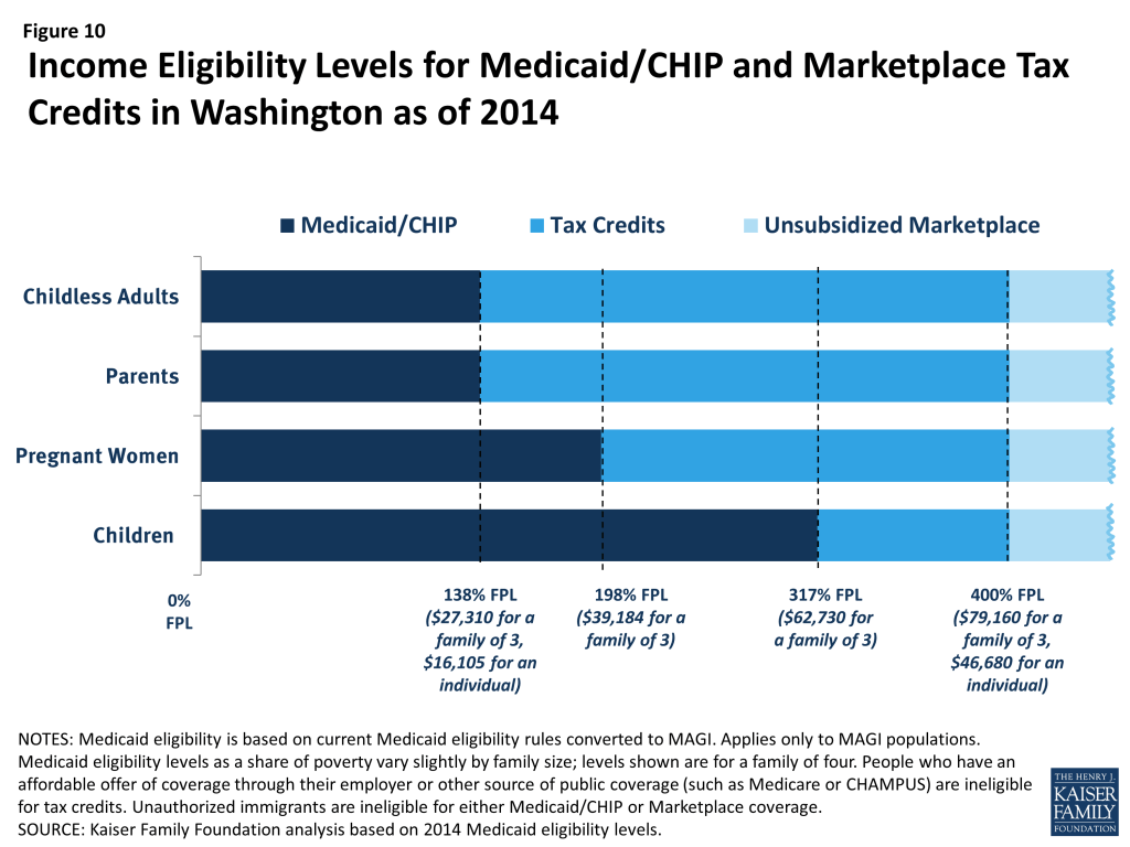
Figure 10: Income Eligibility Levels for Medicaid/CHIP and Marketplace Tax Credits in Washington as of 2014

Washington has had high Medicaid enrollment and has surpassed its 2018 Medicaid enrollment goals. As of March 31, 2014, 423,221 new individuals (not previously on Medicaid) had signed up for Medicaid in Washington, including over 285,000 newly eligible adults since October 1, 2013, which surpasses the state’s 2018 Medicaid enrollment goal of one-quarter of a million enrollees.60 ,[endnote 113654-96] In addition, Washington processed nearly 417,000 Medicaid renewals and redeterminations during the same time period.61  As of January 1, 2014, the Medicaid eligibility levels in Washington are 317% FPL for children, 198% FPL for pregnant women, and 138% FPL for parents and other adults (Figure 10).62  To prepare for the anticipated surge in enrollment and to make the enrollment process easier for consumers, Washington integrated its online Medicaid and Marketplace systems and all individuals submit online applications for coverage and Medicaid renewals through the Marketplace web portal. Individuals can also apply for coverage in person, over the phone, and by mail. Medicaid does not have an open enrollment period, so eligible individuals may continue to sign up throughout the year.

Health Insurance Marketplace

Washington is one of 17 states operating a state-based Health Insurance Marketplace.63  On May 11, 2011, Governor Gregoire signed Senate Bill 5445 into law establishing the Washington Health Benefit Exchange.64  Washington is operating a state-based Marketplace, called Washington Healthplanfinder, which is governed by an 11-member board and operates as a self-sustaining public-private partnership that is separate and independent from the state.65  Washington was awarded $266 million in federal grant funds to assist with the establishment of their state-based Marketplace, including a nearly $1 million Exchange Planning Grant and $265 million in Exchange Establishment Grants.66 

In February 2013, Washington’s Marketplace released guidance for Qualified Health Plans participating in Healthplanfinder.67  To assist consumers in comparing across plans, the Board also approved nine consumer rating factors that evaluated plans based on enrollee satisfaction, provider reimbursement, and promotion of primary care.68  Eight insurance carriers are offering 46 Qualified Health Plans in Washington’s Marketplace.69  At $283 per month, Seattle has the 18th highest monthly premium for a Benchmark Health plan among major cities across the country, before subsidies.70 

Washington’s Marketplace established partnerships with groups and organizations throughout the state to help with consumer outreach and assistance. The Marketplace awarded $6 million in grant funding to ten entities to serve as Lead Organizations for the state’s In-person Assistance program and $420,000 in grant funding to five organizations as part of its Tribal Assister Program.71 ,72 ,73  The Lead Organizations are responsible for building, training, and managing a network of partners in their region to conduct in-person education and enrollment assistance. As of October 2013, they had trained 1,100 In-person Assisters and partnered with nearly 100 community organizations, including eight Outreach Partners, across the state.74  Washington Healthplanfinder also trained more than 1,000 registered brokers to assist with Marketplace outreach and enrollment.75 

Washington’s Marketplace also invested heavily in advertising and consumer outreach activities. The Marketplace’s consumer education campaign targeted consumers through a variety of avenues, including grassroots activities, social media, and business outreach. Healthplanfinder advertisements appeared on television, radio, print, billboards, buses, and in other public areas. In August 2013, Marketplace began an online advertising campaign to build Healthplanfinder brand awareness and, in September, launched a campaign to explain how consumers could use the online portal to compare plans and enroll into coverage.76  The Marketplace produced an eight-part “Countdown to Coverage” webinar series to educate consumers on the ACA, how Healthplanfinder works, and the coverage options available in 2014.77  The Marketplace also partnered with a national nonprofit, The Young Invincibles, to develop a free smartphone application that provides information about the ACA and targets young adults.78 

Starting October 1, 2013, Washington’s Marketplace held a series of outreach and enrollment events throughout the open enrollment period, including a mobile enrollment tour featuring a customized Washington Healthplanfinder bus.79  The bus made stops at nine mobile enrollment event locations throughout the state, and IPAs used laptops to enroll consumers on-site.

To assist individuals who speak languages other than English, Washington’s Marketplace materials and consumer assistance services are available in multiple languages. The Washington Healthplanfinder website is fully translated into Spanish and informational materials are available to consumers in 7 different languages (Cambodian, Chinese, Korean, Laotian, Russian, Somali, Spanish, and Vietnamese) other than English. In addition, beginning October 1, 2013, Washington Healthplanfinder customer call center representatives had access to a language line with translation capabilities for 175 different languages and bilingual English-Spanish speakers on staff, to assist with eligibility determinations and marketplace plan enrollment.80 

Washington had successful Marketplace plan enrollment during the first open-enrollment period. During the first open-enrollment period, 163,207 individuals enrolled in and paid for Marketplace coverage through the Washington Healthplanfinder.81  With over 32% of their potential Marketplace population enrolled, Washington has the 10th highest percent of eligible individuals enrolled among the states.82 

Delivery System Reform

Washington is working to better coordinate and integrate care through delivery system reform initiatives. In February 2013, Washington was awarded a 6-month $1 million State Innovation Model Pre-Testing Award Grant by CMS to develop a comprehensive State Health Care Innovation Plan (SHCIP).83  Washington’s SHCIP builds off of existing quality, community health, and health prevention collaboratives to create an aligned, person-centered, primary care-focused health system that both increases care quality and reduces costs.84  To achieve this, Washington’s SHCIP creates a virtual Accountable Care Organization (ACO) that coordinates care both among primary care providers and specialists and among health care facilities. In addition, the state’s SHCIP works to align financing and payment systems in order to support integrated medical and behavioral health and supports the use of evidence-based strategies to improve care quality.

Washington will also select up to 10 communities throughout the state to receive Community of Health Planning Grants, authorized through House Bill 2572, as part of the state efforts to advance value-based purchasing, promote community health, and increase integration of needed social supports for individuals with chronic illness.85 

Safety Net

Washington’s safety net delivery system will continue to play an important role in providing health care to the state’s vulnerable population. Washington’s community health centers and hospitals provide access to needed primary, preventive, and acute care series for low-income and underserved residents. Washington is home to 25 federally qualified health centers (FQHCs) that operate 243 sites throughout the state.86  In 2012, the state’s FQHCs saw 819,000 patients, 35% of whom were uninsured and 44% of whom had Medicaid.87  Nearly 7 in 10 (68%) health center patients in 2011 had incomes below 100% FPL.88 ,89  The Department of Health and Human Services awarded Washington’s FQHCs $5.2 million for FYs 2013 and 2014 to assist with outreach and enrollment under the ACA.90 

Harborview Medical Center is the state’s main safety net hospital serving Seattle and the surrounding areas and is the only designated Level 1 adult and pediatric trauma and burn center in the state.91  In FY 2012, Harborview provided $210 million in uncompensated care. To provide additional help to hospitals that serve a high number of uninsured and underinsured patients, the federal government sends states Disproportionate Share Hospital (DSH) payments. In FY 2013, Washington received over $194 million in federal DSH payments and in FY 2014, it is anticipated to receive $197 million in DSH payments.92  DSH payments are slated to be scaled back under the ACA, which has prompted some hospital and health centers to establish new partnerships and to collaborate to operate clinics with extended hours, to which individuals who show up to Emergency Departments with non-emergent medical conditions can be diverted.93 

Despite Washington’s existing safety net, there are Health Professional Shortage Areas (HPSAs) and unmet need for care. As of July 2013, Washington had 147 primary care HPSAs and only 47% of the primary health care need in the state was being met.94  The state had 112 mental health and 107 dental HPSAs, and only 40% of the need for mental health care services and 28% of the need for dental services was being met.95  Washington is one of 17 states that allows nurse practitioners to practice with full autonomy.96 

Looking Ahead

There is much to watch in Washington moving forward. Individuals who have newly gained coverage under the Medicaid expansion or the state Marketplace are beginning to interact with their new health plans and providers. Washington is working to transform its health care delivery and payment system through its health home initiative, SHCIP, and local planning grants and collaboratives. In addition, Washington’s focus on advanced data reporting and analytics will likely allow stakeholders and policy leaders to receive timely data and begin to analyze the impact of the ACA and other health policy changes on the health, health care access, and health care utilization of Washingtonians now and in the future.

Appendix
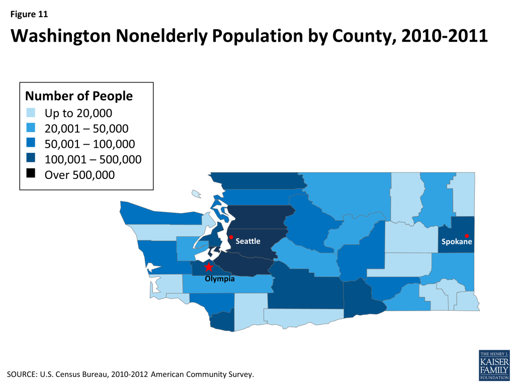
Figure 11: Washington Nonelderly Population by County, 2010-2011
Figure 12: Washington Nonelderly Uninsured by County, 2010-2011
  1. Urban Institute and Kaiser Commission on Medicaid and the Uninsured estimates based on the Census Bureau’s March 2012 and 2013 Current Population Survey (CPS: Annual Social and Economic Supplements). ↩︎
  2. World Atlas, United States, http://www.worldatlas.com/aatlas/infopage/usabysiz.htm. ↩︎
  3. U.S. Department of Commerce, Economics, and Statistics Administration, Census Regions and Divisions of the United States (U.S. Census Bureau), http://www.census.gov/geo/maps-data/maps/pdfs/reference/us_regdiv.pdf. ↩︎
  4. World Atlas, Washington: Geography, http://www.worldatlas.com/webimage/countrys/namerica/usstates/waland.htm. ↩︎
  5. U.S. Census Bureau, Annual Estimates of the Resident Population: April 1, 2010 to July 1, 2013 (March 2014). ↩︎
  6. Washington and state figures from Table 3, Regional and State Employment and Unemployment: October 2013, and Unemployment rates by State, seasonally adjusted: October 2012 and 2013, Bureau of Labor Statistics, available at http://www.bls.gov/news.release/laus.t03.htm. U.S. figure from Bureau of Labor Statistics, available at http://data.bls.gov/cgi-bin/surveymost?bls ↩︎
  7. UI/KCMU estimates based on March 2012 and 2013 ASEC Supplement to the CPS. ↩︎
  8. UI/KCMU estimates based on March 2012 and 2013 ASEC Supplement to the CPS. ↩︎
  9. UI/KCMU estimates based on March 2012 and 2013 ASEC Supplement to the CPS. ↩︎
  10. UI/KCMU estimates based on March 2012 and 2013 ASEC Supplement to the CPS. ↩︎
  11. UI/KCMU estimates based on March 2012 and 2013 ASEC Supplement to the CPS. ↩︎
  12. Bureau of Economic Analysis, Gross Domestic Product by State 2012 (June 6, 2013). ↩︎
  13. Bureau of Economic Analysis, Widespread Economic Growth in 2012 (June 6, 2013), http://www.bea.gov/newsreleases/regional/gdp_state/gsp_newsrelease.htm. ↩︎
  14. Washington State Economic and Revenue Forecast Council, April Economic & Revenue Update (April 10, 2014), http://www.erfc.wa.gov/publications/documents/apr14.pdf. ↩︎
  15. Washington State Economic and Revenue Forecast Council, Budget Outlook (May 2014), http://www.erfc.wa.gov/forecast/budgetOutlook.shtml. ↩︎
  16. United Health Care Foundation, America’s Health Rankings: State Ranking Overview: 2013 (2013), http://www.americashealthrankings.org/rankings. ↩︎
  17. Obesity: 62.3% of adults in Washington were overweight or obese, compared to a national average of 62.4%. Washington has the 16th lowest rates of overweight and obesity among adults across the U.S. (KCMU analysis of the Center for Disease Control and Prevention (CDC)’s Behavioral Risk Factor Surveillance System (BRFSS) 2012 Survey Results). ↩︎
  18. Diabetes: 8.8% of Washington adults have been diagnosed with diabetes, compared to a national average of 10.2%. Washington had the 15th lowest rate of adults with Diabetes (KCMU analysis of the CDC’s BRFSS 2012 Survey Results). ↩︎
  19. Heart Disease: Washington had 151.5 deaths due to heart disease per 100,000, compared to the national average of 179.1 deaths per 100,000. Washington has the 12th lowest rates across the U.S. (The Centers for Disease Control and Prevention (CDC), National Center for Health Statistics, Division of Vital Statistics, National Vital Statistics Report Volume 61, Number 4, Table 19, May 8, 2013). ↩︎
  20. Smoking: 17.2% of adults in Washington smoke, compared to a national average of 18.8%. Washington has the 12th lowest adult smoking prevalence across the U.S. (KCMU analysis of the CDC’s BRFSS 2012 Survey Results). ↩︎
  21. Mental Health: 38.6% of adults report poor mental health in Washington, compared to a national average of 35.6%. Washington has the fifth highest percent of adults reporting poor mental health across the country (KCMU analysis of the CDC’s BRFSS 2012 Survey Results). ↩︎
  22. Asthma: 9.6% of Washington adults self-report having asthma, compared to 8.6% of adults nationally. Washington has the 16th highest asthma rate across the country (2010 Behavioral Risk Factor Surveillance System (BRFSS), Table C1, analysis by Air Pollution and Respiratory Health Branch, National Center for Environmental Health Centers for Disease Control and Prevention, available at http://www.cdc.gov/asthma/brfss/2010/brfssdata.htm). ↩︎
  23. Cancer: 483.5 per 100,000 Washingtonians have invasive cancers, compared to a national average of 459 per 100,000. Washington has the 12th highest invasive cancer rate across the U.S. (U.S. Cancer Statistics Working Group. United States Cancer Statistics: 1999-2009 Incidence and Mortality Web-based Report. Atlanta (GA): Department of Health and Human Services, Centers for Disease Control and Prevention, and National Cancer Institute; 2013). ↩︎
  24. KCMU analysis of the CDC’s BRFSS 2012 Survey Results ↩︎
  25. The rates of overweight and obesity for American Indians and Alaska Natives and Blacks are higher in Washington than the U.S. averages of 70% and 73%, respectively. KCMU analysis of the CDC’s BRFSS 2012 Survey Results ↩︎
  26. KCMU analysis of the CDC’s BRFSS 2012 Survey Results ↩︎
  27. National averages for rates of reported mental health issues are: Black (39%), White (39%), Asian, Native Hawaiian, or other Pacific Islander (30%), Hispanic (38%). KCMU analysis of the CDC’s BRFSS 2012 Survey Results. ↩︎
  28. KCMU analysis of the CDC’s BRFSS 2012 Survey Results ↩︎
  29. Governor’s Interagency Council on Health Disparities website, http://healthequity.wa.gov/ and their State Action Plan to Eliminate Health Disparities (December 2013 Update), http://healthequity.wa.gov/Portals/9/Doc/Publications/Reports/HDC-Reports-Dec-2013-Action-Plan-Update.pdf. ↩︎
  30. Washington State Board of Health, Health Disparities, http://sboh.wa.gov/OurWork/CurrentProjects/HealthDisparities.aspx. ↩︎
  31. King County Department of Health, Seattle & King County REACH Coalition: Reducing diabetes health disparities experienced by communities of color, http://www.kingcounty.gov/healthservices/health/chronic/reach.aspx. ↩︎
  32. UI/KCMU estimates based on March 2012 and 2013 ASEC Supplement to the CPS. ↩︎
  33. UI/KCMU estimates based on March 2012 and 2013 ASEC Supplement to the CPS. ↩︎
  34. UI/KCMU estimates based on March 2012 and 2013 ASEC Supplement to the CPS. ↩︎
  35. UI/KCMU estimates based on March 2012 and 2013 ASEC Supplement to the CPS. ↩︎
  36. KCMU/Urban Institute estimates based on data from FY 2010 MSIS and CMS-64 reports, 2012. ↩︎
  37. KCMU/Urban Institute estimates based on data from FY 2010 MSIS and CMS-64 reports, 2012. ↩︎
  38. Federal Register, November 30, 2012 (Vol 77, No. 231), pp 71420-71423, at http://www.gpo.gov/fdsys/pkg/FR-2012-11-30/pdf/2012-29035.pdf. ↩︎
  39. Martha Heberlein, Tricia Brooks, Joan Alker, Samantha Artiga, and Jessica Stephens, Getting into Gear for 2014: Findings from a 50-State Survey of Eligibility, Enrollment, Renewal, and Cost-Sharing Policies in Medicaid and CHIP, 2012-2013 (January 2013), http://modern.kff.org/medicaid/report/getting-into-gear-for-2014-findings-from-a-50-state-survey-of-eligibility-enrollment-renewal-and-cost-sharing-policies-in-medicaid-and-chip-2012-2013/ and Federal Register, November 30, 2012 (Vol 77, No. 231), pp 71420-71423. ↩︎
  40. Urban Institute estimates based on data from CMS (Form 64), as of 8/24/12 and 9/16/13. ↩︎
  41. Kaiser Commission on Medicaid and the Uninsured estimates based on the NASBO November 2013 State Expenditure Report (data for Actual SFY 2011). ↩︎
  42. Centers for Medicare & Medicaid Services, Medicaid Managed Care Enrollment Report (November 2012), http://www.medicaid.gov/Medicaid-CHIP-Program-Information/By-Topics/Data-and-Systems/Downloads/2011-Medicaid-MC-Enrollment-Report.pdf. ↩︎
  43. State Health Facts, Medicaid Managed Care Enrollees as a Percent of State Medicaid Enrollees (State Health Facts, November 2012), https://modern.kff.org/medicaid/state-indicator/medicaid-managed-care-as-a-of-medicaid/. ↩︎
  44. Washington State Health Care Authority, Health Homes, http://www.hca.wa.gov/pages/health_homes.aspx. ↩︎
  45. Washington Health Care Authority, All High Risk Medicaid Clients by County (June 2011), http://www.hca.wa.gov/documents/health_homes/HighRiskMedicaidClientsByCounty.pdf. ↩︎
  46. Kaiser Commission on Medicaid and the Uninsured and Urban Institute estimates based on data from FY 2010 MSIS, 2013, https://modern.kff.org/medicaid/issue-brief/medicaids-role-for-dual-eligible-beneficiaries/ ↩︎
  47. Kaiser Commission on Medicaid and the Uninsured, State Demonstration Proposals to Integrate Care and Align Financing and/or Administration for Dual Eligible Beneficiaries (Kaiser Family Foundation, April 2014), https://modern.kff.org/medicaid/fact-sheet/state-demonstration-proposals-to-integrate-care-and-align-financing-for-dual-eligible-beneficiaries/. For more information, see: MaryBeth Musumeci, Financial and Administrative Alignment Demonstrations for Dual Eligible Beneficiaries Compared: States with Memoranda of Understanding Approved by CMS (Kaiser Family Foundation, April 2014), https://modern.kff.org/medicaid/issue-brief/financial-alignment-demonstrations-for-dual-eligible-beneficiaries-compared/. ↩︎
  48. Washington’s memorandum of understanding for its capitated managed care demonstration: http://www.cms.gov/Medicare-Medicaid-Coordination/Medicare-and-Medicaid-Coordination/Medicare-Medicaid-Coordination-Office/FinancialAlignmentInitiative/Downloads/WACAPMOU.pdf and its managed fee-for-service final demonstration agreement: http://www.adsa.dshs.wa.gov/duals/documents/WA%20Final%20Demonstration%20Agreement.pdf. ↩︎
  49. MaryBeth Musumeci, A Guide to the Supreme Court’s Affordable Care Act Decision (Kaiser Family Foundation, June 2012), https://modern.kff.org/health-reform/issue-brief/a-guide-to-the-supreme-courts-affordable/. ↩︎
  50. State Health Facts, Status of State Action on the Medicaid Expansion Decision, 2014 (March 26, 2014), https://modern.kff.org/health-reform/state-indicator/state-activity-around-expanding-medicaid-under-the-affordable-care-act/. ↩︎
  51. KCMU analysis based on 2014 Medicaid eligibility levels and 2012-2013 CPS. ↩︎
  52. Washington State Legislature, Basic Health Plan – Health Care Access Act (1987), http://apps.leg.wa.gov/rcw/default.aspx?cite=70.47&full=true. ↩︎
  53. Federal Register, March 12, 2014 (79 FR 14111), pp 14111-14151, at https://federalregister.gov/a/2014-05299. ↩︎
  54. State of Washington Department of Social and Health Services, Section 1115 Medicaid Waiver Application (July 7, 2010), see Exhibit 4, http://www.hca.wa.gov/hcr/documents/waiver/1115WaiverCover7710.pdf. ↩︎
  55. Kim Justice, Cuts on the Rise, Health in Decline (Washington State Budget & Policy Center, February 2012), http://budgetandpolicy.org/reports/cuts-on-the-rise-health-in-decline. Also see: Evans School of Public Affairs, Implementing Budget Cuts in the Basic Health Plan: A Case Study (University of Washington), http://hallway.evans.washington.edu/cases/details/implementing-budget-cuts-basic-health-plan-case-study. ↩︎
  56. DJ Wilson and Amy Snow Landa, “The Basic Health Plan model may live on” (HeraldNet, February 16, 2014), http://www.heraldnet.com/article/20140216/OPINION03/140219431. ↩︎
  57. Washington maintained its state-funded BHP after approval of the 1115 waiver for some individuals not eligible for Medicaid under the ACA. ↩︎
  58. Martha Heberlein, et.al., Getting into Gear for 2014: Findings from a 50-State Survey of Eligibility, Enrollment, Renewal, and Cost-Sharing Policies in Medicaid and CHIP, 2012-2013 (January 2013). For more information, also see: Benjamin Sommers, Emily Arntson, Genevieve Kenney, and Arnold Epstein, “Lessons from Early Medicaid Expansion Under Health Reform: Interviews with Medicaid Officials,” Medicare & Medicaid Research Review vol. 3, no. 4 (2013), E1-E18, http://www.cms.gov/mmrr/Downloads/MMRR2013_003_04_a02.pdf. ↩︎
  59. Washington Section 1115 “Transitional Bridge” Demonstration Waiver approval letter, http://www.medicaid.gov/Medicaid-CHIP-Program-Information/By-Topics/Waivers/1115/downloads/wa/wa-transitional-bridge-ca.pdf. ↩︎
  60. Washington Health Benefit Exchange, Coverage Enrollment Report October 1, 2013 – March 31, 2014 (April 23, 2014), http://wahbexchange.org/files/4513/9821/1124/WAHBE_End_of_Open_Enrollment_Data_Report_FINAL.pdf. ↩︎
  61. Washington Health Benefit Exchange, Coverage Enrollment Report October 1, 2013 – March 31, 2014. ↩︎
  62. KCMU analysis based on CMS, State Medicaid and CHIP Income Eligibility Standards Effective January 1, 2014 (October 24, 2013). ↩︎
  63. State Health Facts. “State Decisions for Creating Health Insurance Marketplaces” (Kaiser Family Foundation, May 28, 2013), http://modern.kff.org/health-reform/state-indicator/health-insurance-exchanges/. ↩︎
  64. Washington State Legislature, Senate Bill 5445 (May 2011), http://apps.leg.wa.gov/billinfo/summary.aspx?bill=5445&year=2011. ↩︎
  65. Kaiser Family Foundation, State Marketplace Profiles: Washington (October 2013), https://modern.kff.org/health-reform/state-profile/state-exchange-profiles-washington/. ↩︎
  66. State Health Facts, Total Health Insurance Exchange Grants (Kaiser Family Foundation, January 2014), https://modern.kff.org/health-reform/state-indicator/total-exchange-grants/. ↩︎
  67. Washington Health Benefit Exchange, Guidance for Participation in the Washington Health Benefit Exchange (February 2013), http://wahbexchange.org/wp-content/uploads/HBE_Guidance_for_Participation11.pdf. ↩︎
  68. Consumer Assessment of Healthcare Providers and Systems (CAHPS) data was used for enrollee satisfaction and Healthcare Effectiveness Data and Information Set (HEDIS) data was used for provider reimbursement and promotion of primary care, http://www.wahbexchange.org/exchange-board/policy-issues/consumer-rating-system/. ↩︎
  69. Washington Healthplanfinder, Health Insurance Companies and Plan Rates for 2014 (September 2013), http://www.wahbexchange.org/files/6413/8022/9697/Health_Insurance_Companies_and_Plan_Rates_2014_9.26.13.pdf and State Health Facts, State Marketplace Profiles: Washington (Kaiser Family Foundation, October 2013), https://modern.kff.org/health-reform/state-profile/state-exchange-profiles-washington/. ↩︎
  70. This is the monthly premium for a single, 40-year-old at 250% FPL. With premium tax credits, the monthly premium drops to $193. To see how Washington compares to other states, see: State Health Facts, “ 2014 Monthly Premiums for a Single 40-Year-Old at 250 Percent of Poverty in a Major City in Each State” (Kaiser Family Foundation), https://modern.kff.org/other/state-indicator/2014-monthly-premiums-for-a-single-40-year-old-at-250-percent-of-poverty-in-a-major-city-in-each-state/. ↩︎
  71. State Health Facts, Consumer Assistance Program Grants under the Affordable Care Act, as of FY 2012 (Kaiser Family Foundation, September 2012), https://modern.kff.org/health-reform/state-indicator/consumer-assistance-program-grants/. ↩︎
  72. Washington Health Benefit Exchange, “Washington Health Benefit Exchange Selects Organizations for In-Person Customer Support Program” (June 2013), http://www.wahbexchange.org/news-resources/press-room/press-releases/washington-health-benefit-exchange-selects-organizations. ↩︎
  73. Washington Health Benefit Exchange, “Washington Healthplanfinder Opens Customer Support Program for New Health Plan Options” (September 2013), http://www.wahbexchange.org/news-resources/press-room/press-releases/customer-support-program/. ↩︎
  74. Washington Healthplanfinder, “One Month Behind Us: 50,000 Enrolled and Counting” Vol. 1, Issue 10 (October 2013), http://createsend.com/t/r-DBB9D11932E454B82540EF23F30FEDED#toc_item_4 and Washington Health Benefit Exchange, “Washington Healthplanfinder Selects Outreach Partners, Ramps up Advertising Efforts” (October 2013), http://wahbexchange.org/news-resources/press-room/outreach-partners-release. ↩︎
  75. Seattle Business, “Washington Healthplanfinder Trains Brokers to Help Consumers Select New Health Coverage Options” (September 19, 2013), http://www.seattlebusinessmag.com/blog/washington-healthplanfinder-trains-brokers-help-consumers-select-new-health-coverage-options. ↩︎
  76. Washington Health Benefit Exchange, “Washington Healthplanfinder Expands Ad Campaign to Educate Consumers about New Way to Find Health Insurance” (September 2013), http://www.wahbexchange.org/news-resources/press-room/press-releases/adcampaign. ↩︎
  77. Washington Health Benefit Exchange, “Countdown to Coverage Webinar Series”, http://www.wahbexchange.org/news-resources/webinar-series/. ↩︎
  78. Washington Health Benefit Exchange, “Washington Healthplanfinder Selects Outreach Partners, Ramps up Advertising Efforts” (October 2013), http://wahbexchange.org/news-resources/press-room/outreach-partners-release. ↩︎
  79. Washington Health Benefit Exchange, “Washington Healthplanfinder Mobile Enrollment Tour Kicks Off in Spokane” (October 2013), http://www.wahbexchange.org/news-resources/press-room/press-releases/wa-healthplanfinder-mobile-enrollment-tour. ↩︎
  80. Washington Health Benefit Exchange, “Washington Health Benefit Exchange Selects Faneuil, Inc. to Operate Call Center in Spokane, WA” (September 2013), http://www.wahbexchange.org/news-resources/press-room/press-releases/washington-health-benefit-exchange-selects-faneuil-inc-opera/. ↩︎
  81. Office of the Assistant Secretary for Planning and Evaluation (ASPE), Department of Health and Human Services (HHS), Health Insurance Marketplace: Summary Enrollment Report for the Initial Annual Open Enrollment Period (May 1, 2014), http://aspe.hhs.gov/health/reports/2014/MarketPlaceEnrollment/Apr2014/ib_2014Apr_enrollment.pdf. ↩︎
  82. State Health Facts, Marketplace Enrollment as a Share of the Potential Marketplace Population (April 19, 2014), https://modern.kff.org/health-reform/state-indicator/marketplace-enrollment-as-a-share-of-the-potential-marketplace-population/. ↩︎
  83. Centers for Medicare & Medicaid Services (CMS), State Innovation Model Initiative: Model Pre-Testing Awards, http://innovation.cms.gov/initiatives/State-Innovations-Model-Pre-Testing/index.html. ↩︎
  84. Washington Health Care Authority, Washington State Health Care Innovation Plan (December 2013), http://www.hca.wa.gov/shcip/Documents/SHCIP_InnovationPlan_121913.pdf. ↩︎
  85. Washington State Legislature, HB 2572, (May 30, 2014), http://apps.leg.wa.gov/billinfo/summary.aspx?bill=2572. ↩︎
  86. HRSA, Washington: Health Center Outreach and Enrollment Assistance, http://www.hrsa.gov/about/news/2013tables/outreachandenrollment/wa.html. ↩︎
  87. HRSA, Washington: Health Center Outreach and Enrollment Assistance. Percent on Medicaid is from 2011 and is available at: National Association of Community Health Centers, Washington Health Center Fact Sheet, http://www.nachc.com/client/documents/research/WA12.pdf. ↩︎
  88. National Association of Community Health Centers, Washington Health Center Fact Sheet. ↩︎
  89. For additional information about FQHCs in Washington compared to the rest of the U.S., see: Peter Shin, Jessica Sharac, and Sara Rosenbaum, The Potential Impact of the Affordable Care Act on Uninsured Community Health Center Patients: A Nationwide and State-by-State Analysis (George Washington University School of Public Health and Health Services, October 16, 2013), http://sphhs.gwu.edu/sites/default/files/GG%20uninsured%20impact%20brief.pdf. ↩︎
  90. HRSA, Washington: Health Center Outreach and Enrollment Assistance. ↩︎
  91. Harborview Medical Center, About Us, http://www.uwmedicine.org/harborview/about. ↩︎
  92. Federal Register, February 28, 2014 (Vol. 79 No. 40), pp. 11436, http://www.gpo.gov/fdsys/pkg/FR-2014-02-28/pdf/2014-04032.pdf. ↩︎
  93. Carol Ostrom, “Health-Care David and Goliath Partner To Open After-Hours Clinic” (Kaiser Health News, April 22, 2014), http://www.kffhealthnews.org/Stories/2014/April/22/Seattle-After-Hours-Clinic.aspx. ↩︎
  94. Bureau of Clinician Recruitment and Service, Health Resources and Services Administration (HRSA), U.S. Department of Health & Human Services, HRSA Data Warehouse: Designated Health Professional Shortage Areas Statistics, as of July 29, 2013, http://ersrs.hrsa.gov/reportserver/Pages/ReportViewer.aspx?/HGDW_Reports/BCD_HPSA/BCD_HPSA_SCR50_Smry_HTML. ↩︎
  95. HRSA, Designated Health Professional Shortage Areas Statistics, as of July 29, 2013. ↩︎
  96. American Association of Nurse Practitioners, State Practice Environment 2013, http://www.aanp.org/legislation-regulation/state-legislation-regulation/state-practice-environment. ↩︎
CHIP Enrollment Snapshot: December 2013

Authors: Vernon Smith, Ph.D., Health Management Associates, Laura Snyder, and Robin Rudowitz
Published: Jun 3, 2014

Issue Brief

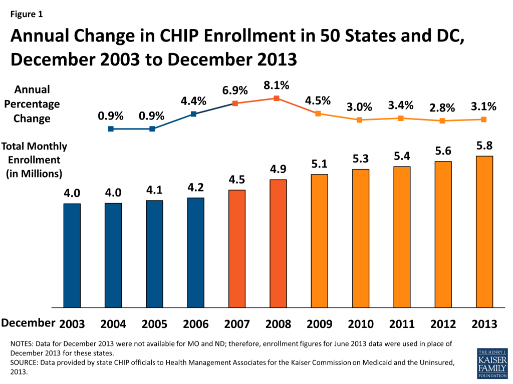
In December 2013, nearly 5.8 million children were enrolled in the Children’s Health Insurance Program (CHIP.) Enrollment in December 2013 increased on net by 175,020 or by 3.1 percent, compared to one year earlier. Since 2011, annual rates of growth have remained fairly steady, hovering around 3 percent. In contrast, during the height of the Recession, enrollment increased annually by 6.9 to 8.1 percent. (Figure 1, Appendix Tables 1 and 2)

Figure 1: Annual Change in CHIP Enrollment in 50 States and DC, December 2003 to December 2013

CHIP, combined with Medicaid, provides a crucial safety net of coverage for low-income children. Both programs, aided by maintenance of eligibility (MOE) provisions maintained under the Affordable Care Act (ACA) helped to stave off increases in the number of uninsured children. Between 2007 and 2012, the uninsured rate for children dropped from 10.9% to 9.2%, despite a decline in the share of children with employer-sponsored coverage.1  While the MOE provisions for adults ended in January 2014, the MOE provisions for children remain in effect until October 2019. However, the ACA only extended CHIP funding through October 2015; Congress would need to appropriate additional funds in order for allotments to be available after October 2015. This, combined with the advent of new coverage options available through the marketplaces, raises questions about the program’s future role.

This report focuses on changes in monthly CHIP enrollment between December 2012 and December 2013. This is a long standing report that collects monthly CHIP enrollment data for December (and June, not reported here) going back to 2000. The most recent data included in this report predate preliminary data released by CMS that show the early effects of full implementation of the ACA. While the data provided in this report are not directly comparable to the data released by CMS (see methodology for more details,) they provide context for the preliminary data released by CMS, illustrating historical trends in CHIP enrollment.

ACA Eligibility Changes for Children

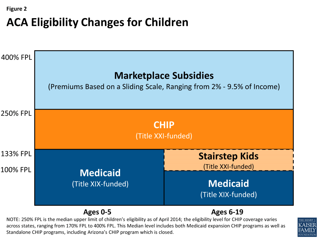
The ACA requires that Medicaid cover children with incomes up to 133 percent of the federal poverty level (FPL) as of January 2014. Before this change, states were required to cover children under the age of six in families with income of at least 133 percent FPL and school-age children and teens with incomes up to 100 percent FPL in Medicaid. Many states already covered children with incomes up to 133 percent FPL in Medicaid, but due to the change in law, 21 states needed to transition some children, mostly school-age children with incomes between 100 and 133 (a.k.a. Stairstep children) from their CHIP state plans to their Medicaid state plans.2  (Figure 2) These children remain eligible for the Title XXI Federal CHIP match rate.

Figure 2: ACA Eligibility Changes for Children

As of April 2014, more than half of the states (29, including DC) cover children in families with incomes at or above 250% FPL and 19, including DC, cover children in families with incomes at or above 300% FPL either through Medicaid or CHIP. Thirty-seven states continue to operate standalone CHIP programs, most in combination with CHIP Medicaid expansions, for higher income children.3 

A few of the 21 states that covered “Stairstep” children under separate CHIP programs decided to move these children before the requirement was in place. New York and Colorado implemented an early transition of children from CHIP to Medicaid but are maintaining separate CHIP programs. Meanwhile, New Hampshire and most recently California transitioned all CHIP kids to Medicaid, not just these older children with incomes under 133 percent FPL. The remaining 17 states will transition an estimated 13 percent to 48 percent of their CHIP coverage to Medicaid.4 

Note About this Report: This CHIP enrollment report series has always included Title XXI-funded enrollees only (children enrolled in Medicaid expansion CHIP programs and stand-alone CHIP programs) while its companion on Medicaid enrollment has included Title XIX-funded enrollees only; this has ensured an unduplicated count between Medicaid and CHIP children. Because of difficulties identifying which of these children are in fact being transitioned and to continue to ensure unduplicated counts with the companion report for Medicaid, these “Stairstep” children are included as CHIP enrollees in this report. Therefore, the early transitions described above are accounted for within this report rather than in the Medicaid Enrollment report.

Continued improvement in economic conditions likely resulted in both some growth as children shifted from Medicaid to CHIP and some declines as family incomes continued to increase above CHIP eligibility levels. CHIP offers coverage to low-income children in families who do not have access to affordable coverage but whose incomes are above Medicaid eligibility levels. Therefore, economic pressures provide both upward and downward pressure on enrollment. As the economy continues to improve, as it did during 2013, family income rises, which results in some children shifting from Medicaid to CHIP coverage. However, economic conditions improving can also result in some children leaving the program as income increases above CHIP eligibility levels for higher income families.During the period from December 2012 to December 2013, there were a number of factors likely influencing CHIP enrollment in different directions, most notably:

Successful outreach and enrollment efforts for new Marketplaces likely pushed enrollment up in some states.  Implementation of the major coverage provisions of the ACA had begun but had not been completed. Broad outreach efforts to encourage individuals to apply for coverage (through CHIP, Medicaid, or the Marketplaces) were well underway; such efforts in the past have been noted to apply upward pressure on CHIP enrollment. CHIP programs also face the same ACA requirements in terms of enrollment simplifications, coordination with Medicaid and the new Marketplaces, as well as the use of Modified Adjust Gross Income beginning in 2014. The full effect of these changes would occur just after this data collection period.

Problems implementing new enrollment systems for the Federally Facilitated Marketplace (FFM) and State Based Marketplaces (SBM) likely put downward pressure on CHIP enrollment growth. States and the Federal Government faced IT systems challenges, particularly early on in the open enrollment period, which may have applied some downward pressure on CHIP enrollment during this period.  States that relied on FFMs had significant problems with “account transfers” from the FFM to agencies handling CHIP enrollment. Many children were assessed or determined eligible for CHIP through the FFMs, but because of system problems, accounts could not be easily transferred to effectuate enrollment. There were also some SBMs that also faced similar issues. Although problems persist, some progress in resolving these issues was made after the timeframe for this report.

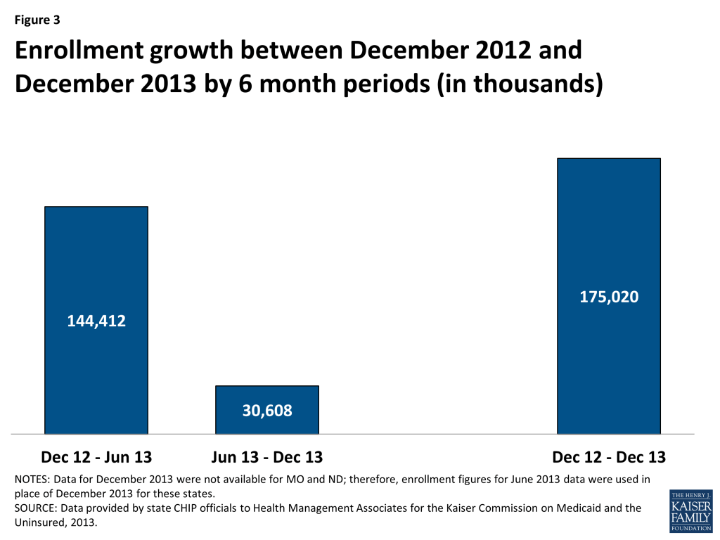
On net, CHIP enrollment increased by 175,020 between December 2012 and December 2013 despite slow enrollment growth in the second half of the period. CHIP enrollment increased to nearly 5.8 million as 175,020 more individuals (on net) were enrolled in coverage in December 2013 compared to December 2012. Enrollment growth over the year was on track with previous trends but slowed in the second half of this 12 month period (June 2013 to December 2013.) There were 144,412 more children on net enrolled in CHIP in June 2013 compared to December 2012; in contrast, CHIP enrollment increased by only 30,608 between June 2013 and December 2013. (Figure 3) The slow growth noted in the second half of the year (June 2013 to December 2013,) may be a reflection of the initial difficulties states and the federal government faced with IT systems and file transfers.

Figure 3: Enrollment growth between December 2012 and December 2013 by 6 month periods (in thousands)

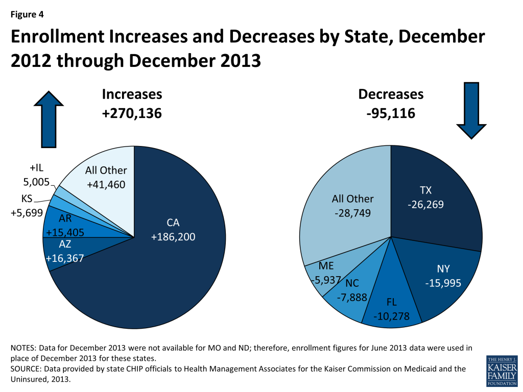
The net CHIP enrollment growth includes increases in 29 states and decreases in 22 states. Over half of states (29) reported enrollment increases during this period as 270,136 more children were enrolled in CHIP in these states in December 2013 compared to one year earlier. In contrast, 22 states saw enrollment declines as 95,116 fewer children were enrolled in these states in December 2013 compared to one year earlier. (Figure 4)

Figure 4: Enrollment Increases and Decreases by State, December 2012 through December 2013

The three states that were driving these increases include:

  • California’s CHIP enrollment increased in California by 16.4 percent as 186,200 additional children were enrolled in December 2013 compared to December 2012. It is important to note that the transition of children previously enrolled in the Title XXI Healthy Families to Medi-Cal (Medicaid) would not affect CHIP enrollment numbers reflected in this report because these children are still included in the CHIP counts. The increase in the number of children enrolled in CHIP may be related to outreach and enrollment efforts tied to expanded Medicaid and CHIP coverage programs in California, and also to the improving economy with children moving up the income scale between Medicaid and CHIP.
  • Arizona saw CHIP enrollment growth of 54 percent as an additional 16,367 children were enrolled in CHIP in December 2013 compared to one year earlier due to a new temporary program, KidsCare II, that began enrolling children in May 2012. This program ended January 31, 2014; the state sent out notices to approximately 14,000 families with incomes over 133% FPL that they would need to apply for coverage through the Marketplace. The original KidsCare program still exists, but enrollment remains frozen, meaning no new applications are being accepted and children who lose this coverage due to failure to pay premiums will not be able to reenroll later. According to the state, just over 2,600 children remain enrolled in the original KidsCare program.5  The original KidsCare has been closed to new enrollment since December 2009 due to state budget shortfalls. CHIP enrollment steadily declined for several reporting periods, reaching its lowest level in over a decade in June 2012, when enrollment totaled only 12,238 (compared to over 64,000 before the enrollment freeze was first implemented.)
  • Arkansas saw a 20 percent increase in CHIP enrollment between December 2013 and December 2012 as enrollment increased by 16,367. All of this enrollment growth occurred in the second half of the period; Arkansas actually saw a small decline in CHIP enrollment in the first six months of this period (December 2012 to June 2013.) It is likely that the sharp increase in enrollment was due in part to the state’s adoption of fast track enrollment options made available through CMS in an effort to help states launch the Medicaid expansion and efficiently enroll eligible individuals. Specifically, Arkansas was one of five states that implemented the fast track enrollment option allowing states to enroll individuals based on existing data from their Supplemental Nutrition Assistance Program. Arkansas, along with West Virginia, used this process to not only enroll adults but also children who were eligible but not enrolled.6 

The largest declines in CHIP enrollment occurred in Texas, New York, and Flordia; the factors underlying these declines however are not readily apparent.

CONCLUSION

Overall, CHIP enrollment growth remained on track with previous trends, despite much slower growth seen in the second half of this period (June 2013 to December 2013.) Economic improvements apply both upward and downward pressure on CHIP enrollment; as income increases some children shift from Medicaid to CHIP while others transition off the program as their income rises above CHIP eligibility levels. Like Medicaid, CHIP programs also saw some upward (through increased outreach) and downward pressure (from enrollment systems issues) related to the implementation of the ACA. CHIP programs, along with state Medicaid programs continue to play a critical role in assuring health coverage for uninsured children. However, the future of the program remains uncertain as funding is slated to end in October 2015 unless Congress acts.

Methodology

The data in this report reflect the number of children, including individuals covered under the unborn child option, enrolled in CHIP programs in each state. State CHIP officials provided data specifically for the month of December 2013. States also were asked to review data in previous reports in this series and to update data as might be appropriate for previous periods. The data for this report were requested in March 2014; responses for most states were returned by May 2014. Data for specific states in reports issued by CMS may differ from data in this report. Beyond the “point-in-time” versus “ever-enrolled” counts described below, differences occur when states provide data for this report for a point-in-time other than the final day of a quarter, when states update enrollment counts, e.g., for retroactive eligibility of a Medicaid-expansion CHIP program.

The data in this report are “point-in-time,” meaning the number of individuals enrolled in a specific month, such as December 2013. A “point-in-time” count is distinct from the “ever-enrolled” count, which is provided in reports issued by CMS. The annual count of children ever-enrolled will always exceed the number enrolled at any point- in-time, as long as new enrollments and departures occur during the year. Recent experience shows that one-third of CHIP enrollees enrolled at any time during the year were not enrolled at the end of the year.

Net Change. The data collected for this report are net changes in enrollment across the program and within select eligibility groups, taking into account the net impact of children enrolling and disenrolling from the CHIP program. Because this data are not individual level data and states do not make a distinction between enrollment among current beneficiaries and new beneficiaries, it is not possible to determine from this data the number of children that left the program and the number that newly enrolled in a given time period. For example, this data set cannot be used to determine how many of the 5.8 million beneficiaries enrolled in December 2013 had been enrolled in December 2012.

Differences between this report and preliminary data released by CMS of monthly enrollment trends. Starting in April 2014, CMS began publishing monthly reports that include total Medicaid and CHIP enrollment as part of an initiative to provide data on a broad set of Medicaid and CHIP eligibility and enrollment performance indicators to inform program management and oversight.7  However, this data resource, while providing some of the most timely Medicaid and CHIP enrollment data in the program’s history, is still in its early stages of development. Notable differences between that data and the data provided here include:

  1. Inclusion of Medicaid. The CMS report combines enrollment figures for Medicaid (Title XIX) and CHIP (Title XXI.) We report these two groups separately; CHIP enrollment (Title XXI) is included in this report and Medicaid enrollment (Title XIX) is included in a separate report https://www.kff.org/medicaid/issue-brief/medicaid-enrollment-snapshot-december-2013.
  2. Reporting Method. CMS asks states to submit their enrollment data through an online portal each month, revising data reported for the previous month only. As discussed above, we ask states to report data for June and December of each year. States are asked to submit updated data as far back as they desire each time the data are collected.
  3. Retroactive Eligibles. Medicaid expansion CHIP programs allow for up to three months of retroactive eligibility. Because of the timeliness of the data collection process, the CMS data do not generally reflect retroactive enrollment. For this report, we ask states to include retroactive enrollment whenever possible.
  4. Trend. This data sources goes back to 2000, showing enrollment trends in monthly enrollment for December and June between 2000 and 2014. The CMS data captures monthly enrollment before open enrollment for the Marketplaces began (average of enrollment between June and September 2013) and enrollment for January, February and March 2014.


Tables

Table A-1: Total CHIP Enrollment by State (Monthly Enrollment), December 2006 – 2013
State20062007200820092010201120122013
Alabama65,73970,07870,85872,20675,24683,86585,76284,431
Alaska8,5987,1218,8319,71410,42011,07510,82310,199
Arizona58,24664,11564,37746,88623,98013,53630,39446,761
Arkansas69,07668,31967,42667,42070,15271,82377,76893,173
California*938,618990,5851,104,0291,114,7911,110,4191,138,5071,137,9461,324,146
Colorado45,40457,98562,77869,64066,57772,03785,02888,513
Connecticut16,57916,46013,10014,72613,79313,18512,70912,874
DC5,2105,0325,6156,5286,4406,5386,5786,843
Delaware4,9506,0086,3016,3975,4876,3566,9086,285
Florida201,616231,177218,717236,671255,169251,450256,551246,273
Georgia273,175254,820208,086207,617203,861201,022223,064222,373
Hawaii16,60017,70620,35023,27624,97327,77828,49529,784
Idaho16,62425,68028,40827,85222,25025,07124,01726,166
Illinois166,727182,675221,995226,396240,587255,180246,252251,257
Indiana71,96372,09169,36475,70682,59997,14383,46684,541
Iowa33,88234,19538,73746,42350,14063,72662,06364,493
Kansas35,18137,74839,60639,55439,52246,60150,40256,101
Kentucky52,06753,46753,57561,39864,11469,20666,78264,844
Louisiana100,672113,140126,035122,856125,052122,487121,208121,699
Maine14,19614,18715,13016,85915,96916,76017,94612,009
Maryland104,812107,396105,79897,15397,37597,83897,90598,552
Massachusetts88,17897,33998,588106,995117,380114,113116,870121,775
Michigan44,54042,15744,65939,18542,01244,24845,32749,549
Minnesota2,7562,6402,2392,0561,7632,0722,0061,658
Mississippi60,19063,11166,02267,68368,04470,68369,95869,609
Missouri*67,83960,10864,67867,71373,22873,76372,00069,854
Montana13,11215,70015,70020,33022,04726,60130,33731,844
Nebraska24,90825,97326,88526,15629,65831,26931,39531,939
Nevada28,03929,45623,35621,51521,00224,36420,88022,116
New Hampshire7,6267,8708,6228,3308,9149,28611,66212,911
New Jersey124,523115,812125,120146,217161,913165,294169,534172,764
New Mexico8,7949,99110,0418,8838,2747,9257,9277,448
New York387,204371,985366,649389,947400,086425,178476,718460,723
North Carolina**109,006117,066124,572132,273175,945186,099198,569190,681
North Dakota*4,4884,8204,6354,1844,7674,8164,9434,956
Ohio145,094144,041153,387160,340161,638163,499156,929151,195
Oklahoma66,59365,29067,58971,16367,98460,57071,76873,867
Oregon32,35140,35947,93050,54763,42871,14175,29579,899
Pennsylvania141,868165,227180,615195,245190,798191,213186,586184,501
Rhode Island12,71611,32812,18213,59514,82115,53315,24415,647
South Carolina33,25341,46850,39055,14559,11365,02767,32166,818
South Dakota11,16211,57511,94312,25412,90513,10713,43613,712
Tennessee46,36761,99874,07877,15777,86479,43184,349
Texas326,231398,818514,774561,929571,257596,145622,920596,651
Utah33,20631,53637,75442,29637,68637,13136,07833,877
Vermont3,0653,4813,4823,4513,5394,0524,1894,042
Virginia81,30086,50395,468100,618106,873111,703117,750113,216
Washington12,07521,01123,24226,42430,65431,38431,96528,293
West Virginia25,27324,83924,37425,05324,32324,88824,80225,011
Wisconsin31,26133,91368,51380,27595,18293,14492,75691,412
Wyoming5,3855,6315,7765,3995,5215,5585,8595,908
Total4,231,9714,525,4004,890,2995,109,3485,262,0375,438,8545,592,5225,767,542
NOTES: Data refers to CHIP coverage of children (including those covered under the unborn child option) funded through Title XXI. *Two states (MO and ND) were not able to provide CHIP data for December 2013. CHIP enrollment data reported for here for December 2013 for MO and ND was from June 2013, not December 2013. **NC was unable to provided updated figures for Medicaid expansion CHIP; data reported here for December 2012 and 2013 reflect updated enrollment for standalone CHIP in this state, but reflect June 2012 data for Medicaid expansion CHIP in this state.SOURCE: Compiled by Health Management Associates from state CHIP enrollment reports for KCMU.
Table A-2: Total CHIP Enrollment by State (Percentage Change), December 2005 – 2013

State

05-0606-0707-0808-0909-1010-1111-1212-13
Alabama0.5%6.6%1.1%1.9%4.2%11.5%2.3%-1.6%
Alaska-17.0%-17.2%24.0%10.0%7.3%6.3%-2.3%-5.8%
Arizona7.1%10.1%0.4%-27.2%-48.9%-43.6%124.5%53.8%
Arkansas10.6%-1.1%-1.3%0.0%4.1%2.4%8.3%19.8%
California*14.5%5.5%11.5%1.0%-0.4%2.5%0.0%16.4%
Colorado-1.1%27.7%8.3%10.9%-4.4%8.2%18.0%4.1%
Connecticut13.1%-0.7%-20.4%12.4%-6.3%-4.4%-3.6%1.3%
DC26.8%-3.4%11.6%16.3%-1.3%1.5%0.6%4.0%
Delaware6.3%21.4%4.9%1.5%-14.2%15.8%8.7%-9.0%
Florida4.0%14.7%-5.4%8.2%7.8%-1.5%2.0%-4.0%
Georgia14.5%-6.7%-18.3%-0.2%-1.8%-1.4%11.0%-0.3%
Hawaii8.4%6.7%14.9%14.4%7.3%11.2%2.6%4.5%
Idaho20.2%54.5%10.6%-2.0%-20.1%12.7%-4.2%8.9%
Illinois21.6%9.6%21.5%2.0%6.3%6.1%-3.5%2.0%
Indiana1.1%0.2%-3.8%9.1%9.1%17.6%-14.1%1.3%
Iowa-6.8%0.9%13.3%19.8%8.0%27.1%-2.6%3.9%
Kansas-5.1%7.3%4.9%-0.1%-0.1%17.9%8.2%11.3%
Kentucky2.5%2.7%0.2%14.6%4.4%7.9%-3.5%-2.9%
Louisiana-8.0%12.4%11.4%-2.5%1.8%-2.1%-1.0%0.4%
Maine-3.5%-0.1%6.6%11.4%-5.3%5.0%7.1%-33.1%
Maryland5.8%2.5%-1.5%-8.2%0.2%0.5%0.1%0.7%
Massachusetts17.7%10.4%1.3%8.5%9.7%-2.8%2.4%4.2%
Michigan-22.0%-5.4%5.9%-12.3%7.2%5.3%2.4%9.3%
Minnesota29.1%-4.2%-15.2%-8.2%-14.3%17.5%-3.2%-17.3%
Mississippi-6.8%4.9%4.6%2.5%0.5%3.9%-1.0%-0.5%
Missouri*-6.4%-11.4%7.6%4.7%8.1%0.7%-2.4%-3.0%
Montana9.8%19.7%0.0%29.5%8.4%20.7%14.0%5.0%
Nebraska3.4%4.3%3.5%-2.7%13.4%5.4%0.4%1.7%
Nevada2.7%5.1%-20.7%-7.9%-2.4%16.0%-14.3%5.9%
New Hampshire-0.1%3.2%9.6%-3.4%7.0%4.2%25.6%10.7%
New Jersey1.2%-7.0%8.0%16.9%10.7%2.1%2.6%1.9%
New Mexico-24.2%13.6%0.5%-11.5%-6.9%-4.2%0.0%-6.0%
New York-3.5%-3.9%-1.4%6.4%2.6%6.3%12.1%-3.4%
North Carolina-18.8%7.4%6.4%6.2%33.0%5.8%6.7%-4.0%
North Dakota*21.7%7.4%-3.8%-9.7%13.9%1.0%2.6%0.3%
Ohio15.7%-0.7%6.5%4.5%0.8%1.2%-4.0%-3.7%
Oklahoma9.6%-2.0%3.5%5.3%-4.5%-10.9%18.5%2.9%
Oregon10.8%24.8%18.8%5.5%25.5%12.2%5.8%6.1%
Pennsylvania2.7%16.5%9.3%8.1%-2.3%0.2%-2.4%-1.1%
Rhode Island6.1%-10.9%7.5%11.6%9.0%4.8%-1.9%2.6%
South Carolina-24.0%24.7%21.5%9.4%7.2%10.0%3.5%-0.7%
South Dakota-0.1%3.7%3.2%2.6%5.3%1.6%2.5%2.1%
Tennessee33.7%19.5%4.2%0.9%2.0%6.2%
Texas1.0%22.3%29.1%9.2%1.7%4.4%4.5%-4.2%
Utah-5.1%-5.0%19.7%12.0%-10.9%-1.5%-2.8%-6.1%
Vermont-1.7%13.6%0.0%-0.9%2.5%14.5%3.4%-3.5%
Virginia6.3%6.4%10.4%5.4%6.2%4.5%5.4%-3.9%
Washington-40.6%74.0%10.6%13.7%16.0%2.4%1.9%-11.5%
West Virginia2.5%-1.7%-1.9%2.8%-2.9%2.3%-0.3%0.8%
Wisconsin6.0%8.5%102.0%17.2%18.6%-2.1%-0.4%-1.4%
Wyoming10.1%4.6%2.6%-6.5%2.3%0.7%5.4%0.8%
Total4.4%6.9%8.1%4.5%3.0%3.4%2.8%3.1%
NOTES: Data refers to CHIP coverage of children (including those covered under the unborn child option) funded through Title XXI. *Two states (MO and ND) were not able to provide CHIP data for December 2013. CHIP enrollment data reported for here for December 2013 for MO and ND was from June 2013, not December 2013. **NC was unable to provided updated figures for Medicaid expansion CHIP; data reported here for December 2012 and 2013 reflect updated enrollment for standalone CHIP in this state, but reflect June 2012 data for Medicaid expansion CHIP in this state.SOURCE: Compiled by Health Management Associates from state CHIP enrollment reports for KCMU.

Endnotes

  1. Kaiser Commission on Medicaid and the Uninsured, The Uninsured: A Primer – Key Facts about Health Insurance on the Eve of Coverage Expansions. (Washington, DC: Kaiser Commission on Medicaid and the Uninsured,) October 2013. http://modern.kff.org/report-section/the-uninsured-a-primer-2013-3-how-and-why-has-the-number-of-uninsured-people-changed/. ↩︎
  2. While most children with income up to 400% FPL that do not qualify for CHIP in their state will be eligible for tax credits to purchase coverage in the Marketplace, some children will not be eligible for tax credits because a parent may have access to “affordable” employer coverage. However, the affordability test for employer coverage is based on a calculation of the individual coverage relative to a workers wages (not the cost of a family policy).  This situation is referred to as the “family glitch.” ↩︎
  3. See Medicaid/CHIP MAGI Eligibility Levels by FPL, Medicaid Moving Forward 2014, Eligibility Data http://medicaid.gov/AffordableCareAct/Medicaid-Moving-Forward-2014/medicaid-moving-forward-2014.html#. ↩︎
  4. Wesley Prater and Joan Alker, Georgetown University Center for Children and Families, Aligning Eligibility for Children: Moving the Stairstep Kids to Medicaid, (Washington, DC: Kaiser Commission on Medicaid and the Uninsured,) August 2013. http://modern.kff.org/medicaid/issue-brief/aligning-eligibility-for-children-moving-the-stairstep-kids-to-medicaid/. ↩︎
  5. “KidsCare II – Arizona’s Temporary Children’s Health Insurance Program (CHIP) ends January 31, 2014; Regular KidsCare Enrollment Update,” Arizona Health Care Cost Containment System (AHCCCS), accessed May 27, 2014. http://www.azahcccs.gov/applicants/KidsCareII.aspx. KidsCare Coverage Moving Forward. Arizona Health Care Cost Containment System (AHCCCS), (Arizona: AHCCCS,) June 26, 2013. http://www.azahcccs.gov/publicnotices/Downloads/KidsCareCoverage.pdf ↩︎
  6. Artiga, Samantha. Fast Track to Coverage: Facilitating Enrollment of Eligible People into the Medicaid Expansion. (Washington, DC: Kaiser Family Foundation,) November 2013. https://modern.kff.org/medicaid/issue-brief/fast-track-to-coverage-facilitating-enrollment-of-eligible-people-into-the-medicaid-expansion/. ↩︎
  7. See Monthly Medicaid and CHIP reports, Medicaid Moving Forward 2014, Eligibility Data http://medicaid.gov/AffordableCareAct/Medicaid-Moving-Forward-2014/medicaid-moving-forward-2014.html#. ↩︎

Medicaid Enrollment Snapshot: December 2013

Authors: Laura Snyder, Robin Rudowitz, and Eileen Ellis and Dennis Roberts, Health Management Associates
Published: Jun 3, 2014

Issue Brief

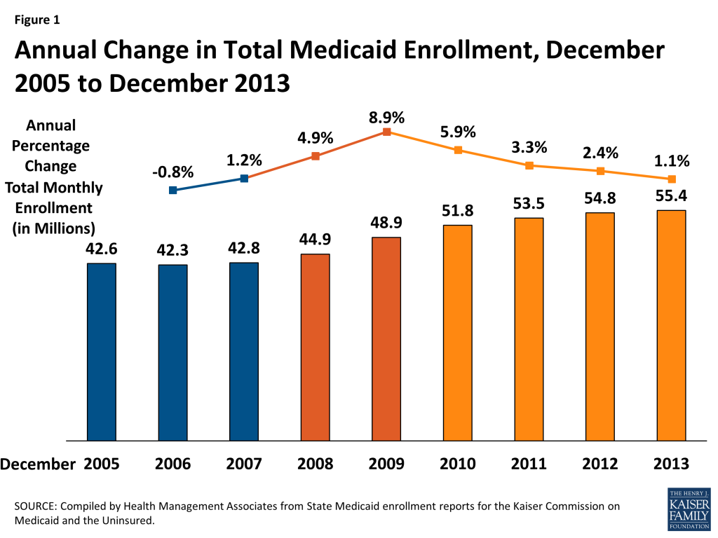
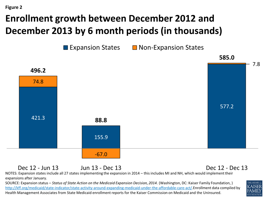
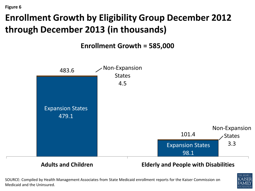
As of December 2013, nearly 55.4 million individuals were enrolled in Medicaid. Compared to one year earlier, enrollment grew by 1.1 percent – the slowest rate since before the Great Recession. (Figure 1) An additional 585,000 individuals were enrolled in Medicaid programs across the country in December 2013 compared to one year earlier, a fraction of the increases seen at the height of the recession,1  when 4 million additional individuals enrolled over a 12 month period between December 2008 and 2009. This is also the monthly period immediately before the January 2014 implementation of the adult Medicaid expansion.

Figure 1: Annual Change in Total Medicaid Enrollment, December 2005 to December 2013

This report focuses on changes in monthly Medicaid enrollment between December 2012 and December 2013. (Appendix Table A-1, which also includes data from our separate CHIP report) This is a long standing report series that collects monthly Medicaid enrollment data for December (and June, not reported here) going back to 2000. While the most recent data included in this report predate preliminary data released by CMS that show the early effects of full implementation of the ACA, this report series is an important source of historical trend data that provides the necessary context to understand these new sources of Medicaid enrollment data. In addition to providing historical trends (Appendix Tables A2-A3), these data also provide more detail about enrollment, such as the distribution of the enrollment among children, adults, or the elderly and people with disabilities, as well as Medicaid enrollment trends for each of these groups (Appendix Tables A4-A6.) While not directly comparable to the enrollment data released by CMS (see methodology for more details) – this report provides helpful context, additional detail and historical trend information not available in the CMS data.

During the period from December 2012 to December 2013, there were a number of factors likely influencing Medicaid enrollment in different directions, most notably:

Continued improvement in economic conditions resulted in slower Medicaid enrollment growth. Medicaid is a countercyclical program; when economic conditions worsen, people lose their jobs, their income declines and they become eligible for Medicaid. The reverse is also true; as economic conditions improve, unemployment declines, income rises and people no longer qualify for Medicaid coverage. During 2013, economic conditions continued to improve, particularly in comparison to the earlier recessionary periods, applying downward pressure on Medicaid enrollment growth.

Early expansion of Medicaid in some states, as well as successful outreach and enrollment efforts for new Marketplaces pushed enrollment up in some states. Implementation of the major coverage provisions of the ACA had begun but had not been completed. Broad outreach efforts to encourage individuals to apply for coverage (through Medicaid, the Marketplaces, or CHIP) were underway by December 2013, and in the past such efforts have put upward pressure on Medicaid enrollment. While the Medicaid expansion was not set to begin until January 2014 (just after this data collection period) states such as California and Colorado, which had elected to expand coverage to childless adults and parents ahead of time saw increased enrollment in these programs, boosting Medicaid enrollment totals. Changes related to the Medicaid coverage expansion in other states and other enrollment effects of the ACA more broadly would start until January 2014, the month following this data.

Problems implementing new enrollment systems for the Federally Facilitated Marketplace (FFM) and State Based Marketplaces (SBM) put downward pressure on Medicaid enrollment growth. States and the Federal Government faced IT systems challenges, particularly early on in the open enrollment period for the Marketplace, which may have applied some downward pressure on Medicaid enrollment during this period. States that relied on FFMs had significant problems with “account transfers” from the FFM to Medicaid. Many individuals were assessed or determined eligible for Medicaid through the FFMs, but because of system problems, accounts could not be easily transferred to effectuate enrollment. There were also some SBMs that faced similar issues. Although problems persist, some progress in resolving these issues was made after the timeframe for this report.

(Appendix Tables A1-A3)Medicaid enrollment increased slightly to 55.4 million as 585,000 more individuals (on net) were enrolled in Medicaid in December 2013 compared to December 2012. Enrollment growth over the year was lower than previous trends but slowed even further in the second half of this 12 month period (June 2013 to December 2013) as the number of people enrolled increased by only 88,800 compared to an increase of 496,200 enrollees between December 2012 and June 2013. (Figure 2) Nearly all states saw slower enrollment growth between June 2013 and December 2013 than in the prior six month period, but the decline was particularly notable in states not expanding their Medicaid programs; virtually all of these states were also coordinating with the FFM and many faced the IT systems issues noted above.

Figure 2: Enrollment growth between December 2012 and December 2013 by 6 month periods (in thousands)

To date, 27 states are implementing the expansion in 2014 (Figure 3). All of these states except Michigan and New Hampshire started enrolling people in the new eligibility group in January 2014; Michigan began enrolling individuals in the new eligibility group in April 2014 and New Hampshire, which passed legislation to adopt the Medicaid expansion in March 2014, plans to start enrollment for the new eligibility group in July 2014. The remaining 24 states were not implementing the expansion in 2014 although debate about the expansion was on-going in 5 states at the time of this report.2 

Figure 3: Current Status of State Medicaid Expansion Decisions, 2014

In contrast to previous releases of this report, nearly half of states (24) reported enrollment declines during this period as 309,400 fewer individuals were enrolled in these states in December 2013 compared to one year earlier. However, in 27 states enrollment grew during this period as 894,400 more individuals were enrolled in Medicaid in December 2013 compared to one year earlier. (Figures 4 and 5)

Figure 4: Enrollment Increases and Decreases by State, December 2012 through December 2013 (in thousands)
Figure 5: Change in Total Medicaid Enrollment, by StateDecember 2013 Compared to December 2012

Enrollment Growth Across Eligibility groups

(Appendix Tables A1, A4-A6)

Enrollment growth between December 2012 and December 2013 was driven by enrollment growth among adults and children as opposed to the elderly and people with disabilities. (Figure 6)

Figure 6: Enrollment Growth by Eligibility Group December 2012 through December 2013 (in thousands)

On net, enrollment of adults and children increased by 483,600 between December 2012 and December 2013. This reflects a net increase of 577,900 adults during this period, concentrated in states expanding Medicaid in 2014. States that were driving increases include:

  • California‘s increase among adults enrolled in Medicaid was driven by continued growth in its Low Income Health Program (LIHP.) Enacted as part of the state’s Bridge to Reform waiver, LIHP allowed counties to expand eligibility to adults with incomes up to 133 percent of the Federal Poverty Level (FPL), starting in July 2011. California’ LIHP enrollment increased quickly. By December 2013, total enrollment in the program reached 704,016. (These individuals were transitioned by the state in January 2014 to the new ACA Medicaid expansion group).3 
  • Colorado implemented a Section 1115 waiver program to cover childless adults with incomes below 10% FPL in early 2012 with an enrollment cap of 10,000, which was reached before the end of the first year. After deciding to implement the Medicaid expansion, the state gradually raised the enrollment cap starting in April 2013.4  Enrollment increased by over 7,000 between December 2012 and December 2013. (The state automatically transitioned these 17,000 individuals along with the roughly 9,000 still on the waiting list over to the new Medicaid expansion group in January 2014).5 
  • In late 2012, Illinois obtained a Section 1115 demonstration waiver, “CountyCare,” which provided Medicaid coverage to adults age 19-64 with incomes below 133% FPL who lived in Cook County, Illinois (which encompasses the city of Chicago and the surrounding area). The demonstration was designed to help the state and Cook County Health and Hospitals System build capacity and experience to support implementation of the Medicaid expansion in 2014 and get a jump-start on enrollment. Enrollment for the program began in February 2013; by December 2013, enrollment had reached nearly 80,000.6 
  • New York, a state that had expanded coverage to childless adults well ahead of the ACA, saw across the board enrollment growth, including its TANF-related groups and its expansion to safety-net adults.7 
  • Florida and Pennsylvania, both states not expanding in 2014 and coordinating with the FFM, saw notable enrollment growth as well. Florida saw across the board enrollment growth throughout the year, particularly among children covered under Medicaid. Pennsylvania enrollment appears to show notable growth among adults during this period, nearly all of which occurred in the second half of the year. While some of this growth is driven by an increase among some TANF-related adults, changes in reporting also occurred during this period that may result in including groups normally excluded from this report, making it appear there is higher growth than there would be otherwise.8 

In contrast to adults, Medicaid enrollment of children actually saw a small decline on net during this period as 26 states saw declines in Medicaid enrollment of children (most notably in Illinois, Texas, Michigan, Georgia, and Indiana) while 25 states saw increases (most notably in Colorado, Florida, New York, Alabama and Maryland.) States that are implementing the Medicaid expansion in 2014 experienced relatively flat growth among children whereas states not implementing the Medicaid expansion in 2014 saw a more substantial decline in enrollment of children in Medicaid. Some of these children may have transitioned to CHIP as family income increased; CHIP enrollment grew during this same period by 175,020.9  The decline in Medicaid enrollment of children was concentrated in the second half of the period (June 2013 to December 2013) and in states not expanding Medicaid in 2014 nearly all of which opted to coordinate with the FFM; this may be a reflection of the initial difficulties states and the federal government faced with IT systems and file transfers. A few states, most notably California and Colorado, were in the process of transitioning children from their stand-alone CHIP programs to Medicaid during this period. These children are still funded through Title XXI and therefore are not included in the counts reported here; they are included in the counts reported in a separate companion report on CHIP enrollment.

Enrollment increases among the elderly and people with disabilities contributed to total enrollment growth during this period, but to a lesser extent than in recent years. Medicaid enrollment among the elderly and people with disabilities grew very little in Medicaid programs across the country during this period, as 101,400 more aged and disabled beneficiaries were enrolled in December 2013 than in December 2012 (0.7% growth compared to enrollment growth of 2.7% in the prior annual period.) Overall, enrollment grew in all but 12 states for this group; the largest declines occurred in Pennsylvania, California, Georgia, Tennessee, and Kentucky largely among disabled groups. Over two-thirds of states saw slower growth from June 2013 to December 2013 than in the previous six month period.

CONCLUSION

During 2013, Medicaid enrollment growth continued to slow to levels not seen since before the Great Recession. Changes in Medicaid enrollment growth during this period were likely influenced by a number of factors, including a continually improving economy (applying downward pressure on Medicaid enrollment) but also by the early stages of implementation of the major coverage provisions of the ACA (which likely applied both upward pressure on Medicaid enrollment from increased outreach as well as enrollment growth among early expansion states and downward pressure from IT systems issues both states and the federal government faced in the early part of the Marketplace open enrollment period.) Medicaid enrollment growth seen during this period was largely driven by increased enrollment of adults in states that are expanding Medicaid in 2014.

However, after a slow rate of growth in 2013, Medicaid enrollment appears to have increased substantially during the beginning of 2014; preliminary data from CMS shows that combined Medicaid and CHIP enrollment grew by at least 4.8 million or 8.2% during the open enrollment period. According to this preliminary data, nearly all of the enrollment growth during this period occurred in states that implemented the Medicaid expansion; these states experienced substantially higher growth in Medicaid enrollment than states that have not expanded (12.9% vs. 2.6%).10  CMS, which is collecting this data as part of efforts to collect a broad set of eligibility and enrollment performance indicators to inform program management and oversight, has indicated that more detailed information on which eligibility groups are driving enrollment in each state is anticipated to be released sometime over the summer.


Methodology

This report is based on data provided by each of the 50 states and the District of Columbia. Health Management Associates (HMA) asked each state to provide the internal reports they use to track enrollment in the program. Each state’s report included total enrollment and enrollment in certain eligibility categories. Report categories are not standardized across states. Where it was possible to do so, the state enrollment data were grouped to further examine trends in specific Medicaid eligibility categories. The data tables and graphs in this document present “point-in-time” monthly Medicaid enrollment counts for the months of June and December of each year from 2000 through 2013 rather than “ever-enrolled” counts published by CMS. The data were provided to HMA by each state Medicaid program in March and April 2014.  Historical data may change over time as states change how they report their enrollment data as well as if a state provides revised data for previous time periods.

Net Change. The data collected for this report are net changes in enrollment across the program and within select eligibility groups, taking into account the net impact of individuals enrolling and disenrolling from the Medicaid program. Because these data are not individual level data and states do not make a distinction between enrollment among current beneficiaries and new beneficiaries, it is not possible to determine from this data the number of individuals that left the program and the number that newly enrolled in a given time period.

Definitions of Medicaid Enrollment. The counts provided by the states reflect all persons with Medicaid eligibility for each month. Every person with Medicaid coverage was counted as an enrollee with the exception of family planning waiver and pharmacy plus waiver enrollees. No adjustment was made for other persons who are enrolled in Medicaid categories with less than full coverage. Therefore the enrollment figures reported here include a small number of individuals that are covered by Medicaid only for emergency services and persons with Medicare and Medicaid dual eligibility enrolled as either Specified Low-Income Medicare Beneficiaries (SLMBs), Qualified Individuals (QIs), and as Qualified Medicare Beneficiaries (QMBs). To the extent possible, state-only health coverage programs and Medicaid expansion CHIP enrollees not funded by Medicaid are excluded.

Non-Disabled Children and Non-Disabled Adults. To remain consistent with other enrollment reports, such as the Medicaid Statistical Information System (MSIS), this report groups disabled children in the elderly and disabled category. However, the detail provided in enrollment reports from states varies in the level of detail available. Most states are able to provide data that breaks out the number of non-disabled children either within the same report or through a separate report. In 2 states (IL and WI) some estimation is required due to differences in report totals to determine the number of non-disabled children. For CA, data available for 2012 onward allows for breakouts of children from adults in each eligibility category reported; this data is used to estimate such breaks in data from 2011 and earlier. Additionally, there are a relatively small number of enrollees whose eligibility pathway was not identified. These individuals were included in the non-elderly non-disabled adult counts unless clearly identified as children.

State Variation in Enrollment Reports. Common variations across the states include how states count “spend-down” enrollees and whether states adjust for “retroactive” eligibiles. Some states include in their enrollment counts persons with excess income that qualify to “spend-down” to Medicaid eligibility whether or not they have incurred sufficient medical costs to become eligible for Medicaid in that month. Other states only include those individuals that have met their “spend-down” requirement. Since a primary goal of this report is to identify trends, these variations have been deemed acceptable given that the state does not change its methodology over time. Data for some states include “retroactive” eligibles, i.e., individuals whose Medicaid eligibility is established at a later date, but whose coverage is retroactive to a prior point in time. Effort was made to use reports that reflect retroactive eligibility where they exist. Yet, it is possible that additional changes occurred after the counts provided for use here.

Differences between this report and preliminary data released by CMS of monthly enrollment trends. Starting in April 2014, CMS began publishing monthly reports that include total Medicaid and CHIP enrollment as part of an initiative to provide data on a broad set of Medicaid and CHIP eligibility and enrollment performance indicators to inform program management and oversight.11  However, this data resource, while providing some of the most timely Medicaid enrollment data in the program’s history, is still in its early stages of development. Notable differences between that data and the data provided here include:

  1. Definition of Medicaid beneficiary. CMS limits the definition of Medicaid beneficiary to those receiving comprehensive benefits and therefore excludes populations such as 1) partial-benefit Duals (QMBs, SLMBs, QIs), 2) 1115 waivers providing limited benefits, 3) those receiving emergency services through Medicaid due to immigration status issues. The data provided in this report includes all of these groups.
  2. Inclusion of CHIP. The CMS report combines enrollment figures for Medicaid (Title XIX) and CHIP (Title XXI.) We report these two groups separately; Medicaid enrollment (Title XIX) is included in this report and CHIP enrollment (Title XXI) is included in a separate report https://www.kff.org/medicaid/issue-brief/chip-enrollment-snapshot-december-2013.
  3. Reporting Method. CMS asks states to submit their enrollment data through an online portal each month, revising data reported for the previous month only. As discussed above, this report is compiled from off the shelf reports states submit to Health Management Associates for June and December of each year. States are asked to submit updated data as far back as they desire each time the data are collected.
  4. Retroactive Eligibles. Medicaid allows for up to three months of retroactive eligibility. Because of the timeliness of the data collection process, the CMS data do not generally reflect retroactive enrollment. For this report, we ask states to include retroactive enrollment whenever possible.
  5. Trend. This data sources goes back to 2000, showing enrollment trends in monthly enrollment for December and June between 2000 and 2014. The CMS data captures monthly enrollment before open enrollment for the Marketplaces began (average of enrollment between June and September 2013) and enrollment for January, February and March 2014.
  6. Enrollment by Eligibility Group. Data reported by CMS shows total enrollment across Medicaid and CHIP, but cannot, at this point in time, show enrollment by eligibility group (children, adults, aged and disabled.) This however, is something that is expected to change in the near future.


Tables

Table A-1: December 2013 Snapshot of Medicaid and CHIP enrollment
StateChildren in MedicaidAdultsElderly and People with DisabilitiesMedicaid TotalCHIPTotal
Alabama483,94551,733320,853856,531        84,431941,815
Alaska62,50919,43825,198107,145        10,199117,933
Arizona619,070360,811265,4031,245,284        46,7611,288,495
Arkansas299,80342,932211,134553,869        93,173630,196
California3,634,1612,771,4421,931,4038,337,006  1,324,1469,590,645
Colorado435,891194,759142,304772,954        88,513862,549
Connecticut290,713237,47690,510618,699        12,874631,274
DC73,27984,32256,247213,848   6,285220,556
Delaware86,70484,64239,779211,125          6,843217,801
Florida1,706,485566,2551,067,8413,340,581      246,2733,603,561
Georgia877,947181,525449,5601,509,032      222,3731,736,905
Hawaii118,586108,12050,946277,652        29,784306,542
Idaho137,80525,15171,654234,610        26,166258,950
Illinois1,521,722643,308524,9952,690,025      251,2572,934,163
Indiana548,017163,036279,708990,761        84,5411,073,116
Iowa220,963107,460133,393461,816        64,493525,340
Kansas209,91537,923102,464350,302        56,101405,965
Kentucky382,99497,012302,772782,778        64,844847,848
Louisiana561,925161,978331,2191,055,122      121,6991,176,564
Maine112,33577,28677,316266,937        12,009279,318
Maryland458,354305,701202,271966,326        98,5521,063,575
Massachusetts412,956437,128426,2511,276,335      121,7751,396,037
Michigan892,494504,933495,1671,892,594        49,5491,939,665
Minnesota389,676287,640195,675872,991          1,658874,883
Mississippi332,76251,839240,782625,383        69,609695,324
Missouri***445,64697,876232,224775,746        69,854845,600
Montana68,05411,44836,786116,288        31,844148,107
Nebraska118,56027,49755,132201,189        31,939233,321
Nevada206,89445,26179,168331,323        22,116352,589
New Hampshire88,58514,18732,545135,317        12,911147,932
New Jersey558,385112,909288,379959,673      172,7641,129,849
New Mexico309,02193,63998,403501,063          7,448508,825
New York1,839,0932,064,2901,258,0035,161,386      460,7235,626,023
North Carolina*869,242168,498463,5201,501,260      190,6811,699,903
North Dakota***35,8589,73718,81464,409          4,95669,365
Ohio978,409558,312539,8912,076,612      151,1952,227,864
Oklahoma420,29184,155175,270679,716        73,867753,233
Oregon263,689151,688143,048558,425        79,899635,112
Pennsylvania**993,004317,795827,6162,138,416      184,5012,322,189
Rhode Island68,81946,07559,904174,798        15,647189,977
South Carolina429,494114,223233,462777,179        66,818844,564
South Dakota61,00013,31426,035100,349        13,712113,463
Tennessee620,370290,891362,1461,273,407        84,3491,356,284
Texas2,573,257245,404795,8633,614,524      596,6514,256,160
Utah161,65741,54380,203283,403        33,877318,885
Vermont54,17247,05340,108141,333          4,042145,219
Virginia468,169107,330267,490842,989      113,216957,110
Washington666,552169,251296,5301,132,333        28,2931,164,459
West Virginia176,39141,866132,121350,378        25,011375,057
Wisconsin466,099250,361228,905945,365        91,4121,037,425
Wyoming42,0968,00815,88765,991          5,90871,977
Total27,853,81812,736,46014,822,29855,412,5775,767,54261,149,511
NOTES: Data refers to Medicaid coverage (Title XIX- funded) only for all groups except CHIP; CHIP data reported her are collected in a separate report focused on Title XXI-funded coverage. *NC data for Medicaid and Medicaid Expansion CHIP reflect June 2013. **PA included a new category in December 2013 which appears to contain some Title XXI –funded enrollees as well as some family planning enrollees, both of which are excluded from other states. ***CHIP enrollment data for MO and ND are from June 2013.SOURCE: Compiled by Health Management Associates from state Medicaid and CHIP enrollment reports for KCMU.
Table A-2: Total Medicaid Enrollment by State (Monthly Enrollment in Thousands), December 2006 – 2013

State

20062007200820092010201120122013
Alabama665.6673.1710.8748.6806.1839.5829.7856.5
Alaska81.177.780.794.4102.2108.1108.9107.1
Arizona970.91,023.41,101.11,345.01,350.51,350.71,268.31,245.3
Arkansas489.7504.2495.7526.4534.6543.2548.1553.9
California6,360.66,444.46,653.87,039.67,289.67,633.18,138.78,337.0
Colorado390.5380.7429.8494.7556.1620.8671.9773.0
Connecticut386.8406.2428.7456.0550.9574.2603.9618.7
DC125.9125.6130.1140.4185.3194.5202.1213.8
Delaware142.8149.0158.0174.4193.4205.5211.3211.1
Florida2,104.42,082.62,304.62,676.92,917.53,070.73,254.23,340.6
Georgia1,277.11,252.51,330.11,447.31,512.81,508.91,546.01,509.0
Hawaii182.3183.6202.6225.7241.7257.7262.0277.7
Idaho171.0163.7168.7194.9214.9217.7228.8234.6
Illinois1,873.01,992.42,098.82,272.52,510.52,606.32,592.12,690.0
Indiana781.6795.8881.7941.5968.9987.01,019.0990.8
Iowa308.2324.2353.7392.5418.4440.9463.2461.8
Kansas245.0252.0257.2275.5289.7337.3343.2350.3
Kentucky687.4702.3724.5763.6786.6796.5803.6782.8
Louisiana865.7847.5877.6928.9974.21,024.81,049.71,055.1
Maine258.2259.2253.2268.6282.7287.8281.8266.9
Maryland523.7536.8595.5713.8811.8870.6911.8966.3
Massachusetts1,007.01,031.41,049.41,129.41,185.61,190.31,253.51,276.3
Michigan1,499.01,496.41,609.71,751.61,949.41,901.31,898.41,892.6
Minnesota581.9590.3615.7689.8733.9860.6869.2873.0
Mississippi520.8521.1541.1595.9610.3619.9621.7625.4
Missouri***725.3721.3755.2810.3824.1818.2805.6775.7
Montana82.089.591.294.7104.9105.9110.1116.3
Nebraska176.0174.6178.8200.0206.5205.9207.9201.2
Nevada166.5180.0195.0238.6280.3297.2305.7331.3
New Hampshire107.9110.4117.1128.1132.0133.7138.8135.3
New Jersey752.0766.5796.3840.6872.3969.3986.0959.7
New Mexico388.0401.6448.1501.6508.5507.4510.2501.1
New York4,125.24,093.74,239.64,596.04,805.34,939.85,067.35,161.4
North Carolina*1,180.81,208.11,281.71,337.41,377.81,443.51,498.01,501.3
North Dakota***50.752.455.562.864.965.164.964.4
Ohio1,587.31,602.71,708.51,870.71,979.52,016.32,062.92,076.6
Oklahoma514.7522.4533.3588.0624.0651.0668.9679.7
Oregon342.2338.4371.2427.4509.2556.6568.2558.4
Pennsylvania**1,872.01,893.91,963.92,052.92,166.82,088.42,083.72,138.4
Rhode Island166.2162.6155.9166.0169.7171.9174.3174.8
South Carolina634.3618.8661.1668.4684.0701.5773.0777.2
South Dakota89.490.291.798.5101.5102.3102.4100.3
Tennessee1,243.51,244.01,227.51,248.11,280.51,324.71,313.91,273.4
Texas2,789.92,864.42,921.03,249.03,509.93,652.93,652.93,614.5
Utah189.1186.9204.7236.2259.3273.9282.0283.4
Vermont116.0120.8126.7133.5137.4138.8141.8141.3
Virginia636.6650.8687.4759.5802.2820.7846.9843.0
Washington853.0864.8917.21,009.71,064.91,130.61,132.81,132.3
West Virginia300.2302.7310.8327.0334.2335.6332.2350.4
Wisconsin655.8674.7753.7921.5958.5968.6948.9945.4
Wyoming56.855.557.463.968.067.267.266.0
Total42,30142,80844,90348,91851,80453,53554,82855,413
NOTES: Data refers to Medicaid coverage (Title XIX- funded) only. *NC data reflect June 2013. **PA included a new category in December 2013 which appears to contain some Title XXI –funded enrollees as well as some family planning enrollees, both of which are excluded in all other periods and from other states. ***CHIP enrollment data that is used to subtract out Title XXI-funded enrollees from Medicaid enrollment for MO and ND was from June 2013, not December 2013.SOURCE: Compiled by Health Management Associates from state Medicaid enrollment reports for KCMU.
Table A-3: Total Medicaid Enrollment by State (Percentage Change), December 2005 – 2013

State

05-0606-0707-0808-0909-1010-1111-1212-13
Alabama-2.3%1.1%5.6%5.3%7.7%4.1%-1.2%3.2%
Alaska-4.6%-4.1%3.8%16.9%8.3%5.8%0.7%-1.6%
Arizona-2.9%5.4%7.6%22.2%0.4%0.0%-6.1%-1.8%
Arkansas2.2%3.0%-1.7%6.2%1.6%1.6%0.9%1.1%
California-1.2%1.3%3.2%5.8%3.6%4.7%6.6%2.4%
Colorado-1.5%-2.5%12.9%15.1%12.4%11.6%8.2%15.0%
Connecticut-2.0%5.0%5.5%6.4%20.8%4.2%5.2%2.4%
DC-1.1%-0.3%3.6%7.9%32.0%4.9%3.9%5.8%
Delaware0.6%4.3%6.0%10.4%10.9%6.2%2.8%-0.1%
Florida-4.8%-1.0%10.7%16.2%9.0%5.3%6.0%2.7%
Georgia-9.7%-1.9%6.2%8.8%4.5%-0.3%2.5%-2.4%
Hawaii-2.8%0.7%10.3%11.4%7.1%6.6%1.7%6.0%
Idaho2.7%-4.3%3.1%15.5%10.3%1.3%5.1%2.5%
Illinois5.5%6.4%5.3%8.3%10.5%3.8%-0.5%3.8%
Indiana2.2%1.8%10.8%6.8%2.9%1.9%3.2%-2.8%
Iowa0.4%5.2%9.1%10.9%6.6%5.4%5.1%-0.3%
Kansas-7.5%2.8%2.1%7.1%5.2%16.4%1.8%2.1%
Kentucky1.9%2.2%3.2%5.4%3.0%1.3%0.9%-2.6%
Louisiana-5.0%-2.1%3.5%5.8%4.9%5.2%2.4%0.5%
Maine4.5%0.4%-2.3%6.1%5.3%1.8%-2.1%-5.3%
Maryland3.5%2.5%10.9%19.9%13.7%7.2%4.7%6.0%
Massachusetts5.7%2.4%1.7%7.6%5.0%0.4%5.3%1.8%
Michigan3.7%-0.2%7.6%8.8%11.3%-2.5%-0.2%-0.3%
Minnesota-0.1%1.4%4.3%12.0%6.4%17.3%1.0%0.4%
Mississippi-7.2%0.1%3.8%10.1%2.4%1.6%0.3%0.6%
Missouri***-11.4%-0.5%4.7%7.3%1.7%-0.7%-1.5%-3.7%
Montana-3.1%9.1%2.0%3.7%10.9%1.0%4.0%5.6%
Nebraska-0.2%-0.8%2.4%11.9%3.3%-0.3%1.0%-3.2%
Nevada-3.7%8.1%8.3%22.4%17.5%6.0%2.9%8.4%
New Hampshire0.5%2.3%6.0%9.5%3.0%1.3%3.8%-2.5%
New Jersey1.8%1.9%3.9%5.6%3.8%11.1%1.7%-2.7%
New Mexico5.4%3.5%11.6%12.0%1.4%-0.2%0.5%-1.8%
New York-1.5%-0.8%3.6%8.4%4.6%2.8%2.6%1.9%
North Carolina*2.1%2.3%6.1%4.3%3.0%4.8%3.8%0.2%
North Dakota***-2.8%3.3%6.0%13.1%3.4%0.4%-0.4%-0.8%
Ohio0.3%1.0%6.6%9.5%5.8%1.9%2.3%0.7%
Oklahoma4.8%1.5%2.1%10.3%6.1%4.3%2.8%1.6%
Oregon-5.3%-1.1%9.7%15.1%19.2%9.3%2.1%-1.7%
Pennsylvania**2.7%1.2%3.7%4.5%5.5%-3.6%-0.2%2.6%
Rhode Island-1.3%-2.2%-4.1%6.5%2.2%1.3%1.4%0.3%
South Carolina-2.0%-2.4%6.8%1.1%2.3%2.6%10.2%0.5%
South Dakota0.7%0.9%1.6%7.4%3.1%0.8%0.2%-2.0%
Tennessee-1.7%0.0%-1.3%1.7%2.6%3.5%-0.8%-3.1%
Texas0.0%2.7%2.0%11.2%8.0%4.1%0.0%-1.1%
Utah-6.1%-1.2%9.5%15.4%9.8%5.6%3.0%0.5%
Vermont1.3%4.2%4.9%5.4%2.9%1.1%2.1%-0.3%
Virginia-0.5%2.2%5.6%10.5%5.6%2.3%3.2%-0.5%
Washington-1.0%1.4%6.1%10.1%5.5%6.2%0.2%0.0%
West Virginia-2.8%0.8%2.7%5.2%2.2%0.4%-1.0%5.5%
Wisconsin0.3%2.9%11.7%22.3%4.0%1.1%-2.0%-0.4%
Wyoming-1.1%-2.2%3.3%11.4%6.4%-1.1%-0.1%-1.8%
Total-0.8%1.2%4.9%8.9%5.9%3.3%2.4%1.1%
NOTES: Data refers to Medicaid coverage (Title XIX- funded) only. *NC data reflect June 2013. **PA included a new category in December 2013 which appears to contain some Title XXI –funded enrollees as well as some family planning enrollees, both of which are excluded in all other periods and from other states. ***CHIP enrollment data that is used to subtract out Title XXI-funded enrollees from Medicaid enrollment for MO and ND was from June 2013, not December 2013.SOURCE: Compiled by Health Management Associates from state Medicaid enrollment reports for KCMU.
Table A-4: Non-Disabled, Non-Elderly Enrollees (Monthly Enrollment in Thousands), June 2006 – 2013
State20062007200820092010201120122013
Alabama396.7399.7429.5469.4518.7544.6513.7535.7
Alaska61.157.459.972.779.283.583.681.9
Arizona772.2818.0889.81123.71117.41104.01012.3979.9
Arkansas322.4330.3315.5340.5340.4341.3340.0342.7
California4665.24707.54873.35214.75422.25729.76190.06405.6
Colorado287.0274.9319.2380.0436.2493.8537.4630.7
Connecticut303.5321.7342.4369.1461.7485.5513.5528.2
DC85.384.186.493.6135.4142.8148.4157.6
Delaware111.4116.7124.6139.9157.5168.0172.5171.3
Florida1362.11320.01506.41819.81987.62082.02212.02272.7
Georgia919.2889.3954.51058.61101.81076.91088.71059.5
Hawaii142.1142.5159.9181.1195.5209.3212.5226.7
Idaho125.0115.2118.2135.9152.5157.1160.1163.0
Illinois1425.71552.31651.51810.42029.62102.02079.62165.0
Indiana583.3592.7672.1722.2732.9734.0747.4711.1
Iowa196.2212.1239.3275.6299.0317.8332.0328.4
Kansas165.3169.1170.5184.2193.9237.8242.6247.8
Kentucky414.8422.3439.1471.8487.3491.0494.4480.0
Louisiana598.0574.3593.5633.9663.8704.0722.4723.9
Maine180.8180.2173.8186.9199.1212.2204.7189.6
Maryland357.5368.9422.6534.8622.6675.7714.9764.1
Massachusetts665.1682.2693.6762.1802.4797.3839.6850.1
Michigan1107.41097.41196.81322.31497.21425.61411.61397.4
Minnesota418.4422.1442.4510.0546.9668.2673.2677.3
Mississippi304.7307.7326.5373.4383.6386.1384.5384.6
Missouri***531.7524.0529.3575.3582.2574.3569.4543.5
Montana54.961.262.162.771.671.374.379.5
Nebraska127.7126.3129.6149.4153.9152.5153.3146.1
Nevada115.2126.0138.6179.4214.8224.9229.8252.2
New Hampshire79.480.184.493.896.295.8104.6102.8
New Jersey503.9513.5536.5575.9600.4686.6695.2671.3
New Mexico304.6315.6359.3410.4413.6410.1411.7402.7
New York3095.13038.43152.73469.03636.03733.53829.13903.4
North Carolina*782.8802.8868.0914.2941.1993.31036.71037.7
North Dakota***33.635.138.145.046.546.646.245.6
Ohio1161.31165.61247.01390.51472.91500.11544.61536.7
Oklahoma367.0369.5376.0425.0454.2478.2494.4504.4
Oregon239.3232.4260.1310.2384.3424.8430.9415.4
Pennsylvania**1131.21131.71168.31215.81274.31200.41197.91310.8
Rhode Island109.8106.5100.0109.4112.0113.4115.5114.9
South Carolina445.6429.6451.2454.0461.8470.8537.9543.7
South Dakota66.867.468.574.877.477.577.074.3
Tennessee843.1842.3814.5909.3938.4964.9945.1911.3
Texas2155.22206.02240.12539.22771.22886.32870.42818.7
Utah130.4126.9141.1169.2188.9198.9204.5203.2
Vermont91.183.888.695.399.1100.3101.8101.2
Virginia414.4423.6454.5519.2551.8562.4582.9575.5
Washington627.4632.1676.6758.2799.3852.2841.5835.8
West Virginia185.5184.9189.8203.4206.5205.0203.3218.3
Wisconsin476.9490.9563.4722.9749.4751.3725.4716.5
Wyoming43.942.343.849.853.251.951.650.1
Total30,08830,31731,98435,60837,91639,19740,10740,590
NOTES: This group includes children, parents, pregnant women and childless adults. Data refers to Medicaid coverage (Title XIX- funded) only. *NC data for December 2013 reflect June 2013.**PA included a new category in December 2013 which appears to contain some Title XXI –funded enrollees as well as some family planning enrollees, both of which are excluded in all other periods and from other states. ***CHIP enrollment data that is used to subtract out Title XXI-funded enrollees from Medicaid enrollment for MO and ND was from June 2013, not December 2013.SOURCE: Compiled by Health Management Associates from state Medicaid enrollment reports for KCMU.
Table A-5: Non-Disabled Children (Monthly Enrollment in Thousands), December 2006 – 2013

State

20062007200820092010201120122013
Alabama356.0359.0385.9422.4466.0490.2463.1483.9
Alaska49.045.747.358.361.764.363.862.5
Arizona470.3493.7530.1640.7627.0648.1637.2619.1
Arkansas278.6286.2273.4295.9295.7297.2295.6299.8
California*2884.72917.93032.23251.53398.73431.33648.23634.2
Colorado221.1214.1248.7294.5318.2354.4379.5435.9
Connecticut217.9226.4236.9253.9273.5281.7288.3290.7
DC64.963.364.970.472.974.075.173.3
Delaware64.366.068.974.581.184.886.786.7
Florida1080.51049.31178.21414.71527.41594.81668.71706.5
Georgia742.7714.9774.5874.0909.2889.1902.5877.9
Hawaii87.786.993.8102.2108.8113.0115.8118.6
Idaho109.1102.4104.5118.5133.3137.2136.7137.8
Illinois1115.81208.41282.51397.31527.61586.11573.81521.7
Indiana459.8475.1516.8553.7564.9557.3570.5548.0
Iowa143.1151.3169.5193.4206.0213.7220.3221.0
Kansas137.9139.9144.6159.5162.8202.7207.5209.9
Kentucky320.0326.0338.4366.8380.7385.5391.0383.0
Louisiana504.0484.5499.3533.8559.0562.8562.8561.9
Maine97.698.299.3106.8110.0113.5112.0112.3
Maryland289.5293.0318.1367.7407.4430.8441.2458.4
Massachusetts359.5362.9360.1386.6395.7392.2405.0413.0
Michigan794.7795.0762.7828.5921.6911.2929.1892.5
Minnesota309.0311.2324.6357.9378.8382.5387.2389.7
Mississippi271.9274.5286.6327.3335.9336.6334.3332.8
Missouri****424.6424.7430.7465.7474.0469.0465.5445.6
Montana44.049.350.350.358.659.763.268.1
Nebraska105.0105.9108.3124.6122.2121.0121.6118.6
Nevada96.4102.6116.1149.1176.6188.2194.2206.9
New Hampshire65.566.670.177.879.780.188.288.6
New Jersey429.1438.5462.8503.3528.4557.7571.0558.4
New Mexico250.1254.5274.7302.4312.9312.4314.1309.0
New York1619.21583.71624.81734.61774.81798.11804.51839.1
North Carolina**616.8635.8682.8750.6771.1821.8868.0869.2
North Dakota****24.025.228.634.335.235.735.635.9
Ohio803.4808.8853.9934.2971.1986.7985.3978.4
Oklahoma324.8330.8337.2380.9401.1406.4416.3420.3
Oregon170.4174.7185.9232.5258.5282.4270.3263.7
Pennsylvania***886.5890.4933.0988.81040.3983.9996.6993.0
Rhode Island67.065.861.066.467.968.169.568.8
South Carolina355.9341.0357.9351.5349.2355.9423.7429.5
South Dakota52.052.854.259.260.963.162.961.0
Tennessee551.7540.3554.4606.1622.5647.0637.6620.4
Texas1941.82001.52038.32325.72544.12648.12623.42573.3
Utah97.494.1106.7127.7149.9160.4163.2161.7
Vermont49.250.251.552.953.153.554.154.2
Virginia340.9347.4370.4426.9452.3460.5475.0468.2
Washington510.9521.3561.8628.3655.3670.8672.8666.6
West Virginia155.9154.1157.9168.4170.7170.2168.4176.4
Wisconsin319.7329.3357.5413.1442.2452.9463.9466.1
Wyoming36.034.936.241.144.143.243.242.1
Total21,76721,97023,00925,44726,84127,43227,94827,854
NOTES: Data refers to Medicaid coverage (Title XIX- funded) only. *CA data reported here for December 2011 and earlier periods are based on some estimation of the number of non-disabled children. **NC data for December 2013 reflect June 2013. ***PA included a new category in December 2013 which appears to contain some Title XXI –funded enrollees as well as some family planning enrollees, both of which are excluded in all other periods and from other states. ****CHIP enrollment data that is used to subtract out Title XXI-funded enrollees from Medicaid enrollment for MO and ND was from June 2013, not December 2013.SOURCE: Compiled by Health Management Associates from state Medicaid enrollment reports for KCMU.
Table A-6: Non-Elderly, Non-Disabled Adults (Monthly Enrollment in Thousands), December 2006 – 2013

State

20062007200820092010201120122013
Alabama40.640.743.647.052.754.450.651.7
Alaska12.111.712.614.417.619.319.919.4
Arizona301.9324.3359.7483.0490.4455.9375.1360.8
Arkansas43.844.142.144.544.844.144.442.9
California*1780.41789.61841.11963.22023.52298.52541.82771.4
Colorado65.960.970.585.5118.0139.4157.9194.8
Connecticut85.695.3105.5115.2188.3203.8225.2237.5
DC20.420.721.523.262.568.773.384.3
Delaware47.150.755.865.476.383.185.984.6
Florida281.6270.7328.2405.0460.1487.2543.3566.3
Georgia176.5174.4180.0184.6192.7187.8186.2181.5
Hawaii54.455.766.178.986.796.396.7108.1
Idaho15.912.713.717.519.219.923.425.2
Illinois309.9343.9369.0413.1502.0516.0505.7643.3
Indiana123.5117.6155.3168.5168.0176.7176.9163.0
Iowa53.160.869.882.293.1104.0111.7107.5
Kansas27.429.225.924.731.235.135.137.9
Kentucky94.996.3100.7105.0106.6105.5103.597.0
Louisiana94.089.994.2100.1104.8141.2159.6162.0
Maine83.282.074.580.189.198.692.677.3
Maryland68.075.8104.6167.1215.1245.0273.6305.7
Massachusetts305.6319.2333.6375.5406.7405.1434.7437.1
Michigan312.7302.4434.1493.9575.6514.4482.6504.9
Minnesota109.5110.9117.8152.1168.1285.7286.0287.6
Mississippi32.833.240.046.147.749.550.251.8
Missouri****107.199.498.6109.6108.1105.3103.997.9
Montana10.911.911.812.313.011.611.211.4
Nebraska22.720.421.324.831.831.531.727.5
Nevada18.923.322.630.338.236.735.645.3
New Hampshire13.913.614.316.016.515.716.414.2
New Jersey74.775.073.772.671.9128.9124.2112.9
New Mexico54.561.184.7108.0100.797.797.693.6
New York1475.91454.71527.91734.51861.31935.32024.72064.3
North Carolina**166.0167.0185.1163.6170.0171.5168.7168.5
North Dakota****9.510.09.510.711.310.910.59.7
Ohio357.9356.8393.1456.2501.8513.4559.3558.3
Oklahoma42.238.738.844.153.171.878.184.2
Oregon68.957.774.277.7125.8142.4160.6151.7
Pennsylvania***244.7241.3235.2226.9234.0216.5201.3317.8
Rhode Island42.840.739.043.044.145.246.046.1
South Carolina89.788.693.3102.5112.6114.9114.1114.2
South Dakota14.814.614.315.616.514.414.013.3
Tennessee291.4302.1260.2303.2315.9317.9307.5290.9
Texas213.3204.4201.8213.5227.1238.3246.9245.4
Utah33.132.834.441.538.938.541.341.5
Vermont42.033.637.142.546.046.847.847.1
Virginia73.676.284.192.399.6101.9107.9107.3
Washington116.5110.9114.8129.9143.9181.4168.7169.3
West Virginia29.630.931.934.935.834.834.941.9
Wisconsin157.2161.6205.9309.9307.2298.4261.6250.4
Wyoming7.97.47.68.69.28.78.58.0
Total8,3218,3478,97510,16111,07511,76512,15912,736
NOTES: Data refers to Medicaid coverage (Title XIX- funded) only. *CA data reported here for December 2011 and earlier periods are based on some estimation of the number of non-elderly, non-disabled adults. **NC data for December 2013 reflect June 2013. ***PA included a new category in December 2013 which appears to contain some Title XXI –funded enrollees as well as some family planning enrollees, both of which are excluded in all other periods and from other states. ****CHIP enrollment data that is used to subtract out Title XXI-funded enrollees from Medicaid enrollment for MO and ND was from June 2013.SOURCE: Compiled by Health Management Associates from state Medicaid enrollment reports for KCMU.
Table A-7: Elderly and People with Disabities (Monthly Enrollment in Thousands), June 2006 – 2013
State20062007200820092010201120122013
Alabama269.0273.3281.3279.1287.4294.9316.0320.9
Alaska20.020.420.821.723.024.625.325.2
Arizona198.7205.4211.3221.3233.1246.7256.0265.4
Arkansas167.2173.9180.2186.0194.2201.9208.2211.1
California1,695.41,736.81,780.51,824.91,867.41,903.41,948.71,931.4
Colorado103.6105.7110.5114.7120.0127.0134.5142.3
Connecticut83.384.586.387.089.288.790.590.5
DC40.641.543.746.949.951.753.756.2
Delaware31.432.333.334.536.037.538.839.8
Florida742.3762.6798.2857.1929.9988.71,042.21,067.8
Georgia357.8363.2375.6388.7411.0432.1457.3449.6
Hawaii40.241.142.744.646.248.449.550.9
Idaho45.948.550.659.062.460.668.771.7
Illinois447.3440.0447.3462.1480.9504.2512.5525.0
Indiana198.3203.1209.6219.3236.0253.0271.6279.7
Iowa112.0112.1114.5116.8119.4123.2131.2133.4
Kansas79.782.986.891.295.899.4100.6102.5
Kentucky272.6280.0285.3291.8299.3305.5309.2302.8
Louisiana267.7273.2284.1295.0310.4320.8327.3331.2
Maine77.379.079.481.783.675.777.177.3
Maryland166.2167.9172.9179.0189.3194.9196.9202.3
Massachusetts341.9349.3355.8367.3383.2393.0413.9426.3
Michigan391.7398.9412.9429.3452.2475.8486.7495.2
Minnesota163.5168.1173.3179.8187.0192.3196.0195.7
Mississippi216.1213.5214.6222.5226.7233.8237.1240.8
Missouri193.6197.3225.9235.0242.0243.9236.2232.2
Montana27.128.329.132.033.334.735.836.8
Nebraska48.448.349.250.652.553.454.655.1
Nevada51.254.056.359.165.572.376.079.2
New Hampshire28.530.332.634.435.837.934.132.5
New Jersey248.1253.0259.7264.7271.9282.8290.9288.4
New Mexico83.486.088.891.394.997.398.598.4
New York1,030.11,055.31,086.91,127.01,169.21,206.41,238.11,258.0
North Carolina*398.1405.3413.7423.2436.7450.2461.3463.5
North Dakota17.117.217.417.818.418.618.718.8
Ohio426.0437.2461.4480.3506.5516.2518.3539.9
Oklahoma147.8152.9157.3163.1169.8172.8174.6175.3
Oregon103.0106.0111.1117.2124.9131.8137.3143.0
Pennsylvania740.7762.3795.6837.2892.5888.0885.8827.6
Rhode Island56.456.155.856.657.758.558.859.9
South Carolina188.6189.2210.0214.4222.2230.7235.1233.5
South Dakota22.622.823.223.724.124.825.526.0
Tennessee400.4401.6413.0338.8342.0359.8368.7362.1
Texas634.8658.4680.9709.8738.7766.6782.6795.9
Utah58.660.063.567.070.575.077.580.2
Vermont24.837.038.138.238.338.540.040.1
Virginia222.2227.2232.9240.3250.4258.3264.1267.5
Washington225.6232.6240.6251.5265.7278.4291.3296.5
West Virginia114.7117.8120.9123.7127.7130.6128.9132.1
Wisconsin178.9183.8190.2198.6209.0217.3223.5228.9
Wyoming12.913.213.614.214.815.315.515.9
Total12,21312,49012,91913,31113,88914,33814,72114,822
NOTES: Data refers to Medicaid coverage (Title XIX- funded) only. *NC data for December 2013 reflect June 2013.SOURCE: Compiled by Health Management Associates from state Medicaid enrollment reports for KCMU.

Endnotes

  1. The Great Recession officially began in December 2007 and officially ended in July 2009 according to the National Bureau of Economic Research; however, the effects of the Great Recession continued well past this point. ↩︎
  2. State Health Facts, Status of State Action on the Medicaid Expansion Decision, 2014. (Washington, DC: Kaiser Family Foundation, ) downloaded May 27, 2014. https://modern.kff.org/medicaid/state-indicator/state-activity-around-expanding-medicaid-under-the-affordable-care-act/. ↩︎
  3. Research and Analytic Studies Division, Medi-Cal Statistical Brief: Medi-Cal Monthly Eligibles Trend Report for January 2014. (California: Department of Health Care Services,) 2014. http://www.dhcs.ca.gov/dataandstats/statistics/Documents/RASB_Issue_Brief_Medi-Cal_Eligibles_Trend_Report_for_January_2014%20(Feb%202014).pdf. ↩︎
  4. Colorado Department of Health Care Policy and Financing, Colorado Medicaid Will Enroll More Childless adults from Waitlist. (Colorado: Colorado State Government,) February 21, 2013. http://www.colorado.gov/cs/Satellite?blobcol=urldata&blobheader=application%2Fpdf&blobkey=id&blobtable=MungoBlobs&blobwhere=1251855278811&ssbinary=true. ↩︎
  5. Colorado Department of Health Care Policy and Financing, Medicaid Expansion Update. (Colorado: Colorado State Government,) December, 16 2013. http://www.colorado.gov/cs/Satellite?blobcol=urldata&blobheader=application%2Fpdf&blobkey=id&blobtable=MungoBlobs&blobwhere=1251919771103&ssbinary=true. ↩︎
  6. Artiga, Samantha. Profiles of Medicaid Outreach and Enrollment Strategies: The Cook County Early Expansion Initiative. (Washington, DC: Kaiser Family Foundation,) April 2014. https://modern.kff.org/medicaid/issue-brief/profiles-of-medicaid-outreach-and-enrollment-strategies-the-cook-county-early-expansion-initiative/. ↩︎
  7. The only exception was a small decline in enrollment in its Family Health Plus program, a long-standing 1115 waiver to extend coverage to adults with income up to 150% FPL; the state reduced eligibility for this program down to 138% FPL in January 2014 and had previously reported plans to use Medicaid funds to help further subsidize coverage for those previously covered under the program purchasing coverage through the state’s Marketplace. Vernon Smith, Kathleen Gifford, Eileen Ellis, Robin Rudowitz and Laura Snyder, Medicaid in a Historic Time of Transformation: Results from a 50-State Budget Survey for State Fiscal Years 2013 and 2014. (Washington, DC: Kaiser Family Foundation,) October 2013. https://modern.kff.org/medicaid/report/medicaid-in-a-historic-time-of-transformation-results-from-a-50-state-medicaid-budget-survey-for-state-fiscal-years-2013-and-2014/. ↩︎
  8. According to guidance issued by the state to counties in September 2013 (see below), the new MG category includes the following groups that are normally excluded from counts in this report: children with income between 100 and 133 percent FPL ages 6-18 who were previously eligible under CHIP (also known as stairstep children) and women enrolled in SelectPlan, the state’s family planning waiver. According to the memo, those that have submitted applications on or after October 1, 2013 will be enrolled under the new MG categories; it was not possible at the time of this report to separate out these two groups either reenrolled or newly enrolled from the others in this group. Tom Strickler, Director of Bureau Operations. Operations Memorandum #13-09-04: Medicaid Eligibility Rule Changes Under the Affordable Care Act (ACA). (Pennsylvania: Pennsylvania Department of Public Welfare,) September 27, 2013. http://services.dpw.state.pa.us/oimpolicymanuals/manuals/bop/ma/OPS1300904.pdf. ↩︎
  9. Two states were not able to provide updated CHIP enrollment data for December 2013 – Missouri and North Dakota. Vern Smith, Laura Snyder and Robin Rudowitz. CHIP Enrollment Snapshot: December 2013. (Washington, DC: Kaiser Family Foundation,) May 2014. ↩︎
  10. Medicaid & CHIP: March 2014 Monthly Applications, Eligibility Determinations, and Enrollment Report, (Washington, DC: Centers for Medicare and Medicaid Services,) May 1, 2014. http://medicaid.gov/AffordableCareAct/Medicaid-Moving-Forward-2014/medicaid-moving-forward-2014.html#. In calculating these rates of growth, CMS excluded CT, DE, ND, ME and MO as they had not reported complete data for either the baseline period or for March 2014. Also, MI and NH were not included in the calculations for the rate of growth in expansion states as neither state had yet implemented their expansion (MI implemented in April 2014 while NH is planning to implement in July 2014.) ↩︎
  11. See Monthly Medicaid and CHIP reports, Medicaid Moving Forward 2014, Eligibility Data http://medicaid.gov/AffordableCareAct/Medicaid-Moving-Forward-2014/medicaid-moving-forward-2014.html#. ↩︎
News Release

June 23 Event: A Town Hall Forum with Ambassador Deborah L. Birx

Published: Jun 2, 2014

At 10:30 a.m. ET on June 23, the Kaiser Family Foundation will host a town hall forum with Ambassador Deborah L. Birx, M.D. the new U.S. Global AIDS Coordinator, to lay out her vision for the next phase of  the U.S. President’s Emergency Plan for AIDS Relief (PEPFAR) in supporting efforts to achieve an AIDS-free generation. The session will be moderated by Jen Kates, a Foundation vice president and director of global health and HIV policy, and provide an opportunity for interactive engagement with the new Ambassador.

WHEN:

Monday, June 23 at 10:30 a.m. ET (Registration and breakfast at 10:00 a.m. ET)

WHERE:

Barbara Jordan Conference CenterKaiser Family Foundation Offices1330 G Street, NW Washington, D.C.(one block west of Metro Center)

View the archived webcast of this briefing.

News Release

New Analysis Provides Early Look At Increase in Individual Market Enrollees 

Published: Jun 2, 2014

A new Kaiser Family Foundation analysis of health insurer reports to state regulators provides a first glimpse of enrollment in the individual, or non-group, insurance market under the Affordable Care Act.  These initial filings reflect enrollment both through the new state insurance marketplaces created under the Affordable Care Act as well as through off-exchange plans.

The analysis suggests a net increase from the end of 2013 of about 3 million to 3.5 million people with coverage that began by the end of March, bringing the total number of people in the individual market to approximately 15 million. This estimate only reflects a portion of the increase that occurred during the Affordable Care Act’s initial open enrollment period and does not include the late March surge in enrollment, as many new enrollees started their coverage after the period covered in these initial filings.

Assuming the off-exchange market experienced a surge similar to the state marketplaces, the analysis suggests the net increase in individual market enrollment could ultimately be twice as large, once the next round of data becomes available. This first look at the direction of enrollment suggests that, even accounting for people leaving the market, the number of people purchasing their own health coverage grew substantially and likely continued to grow toward the end of the enrollment period. The analysis suggests that once the late March surge in enrollment is recorded in insurer filings, the number of people in the individual market should be significantly higher than the 11 to 12 million people enrolled in 2013.

The analysis examines enrollment for insurers with comparable data from last year and the first quarter this year, as well as new entrants into the market this year.  Some sizeable insurers have not yet filed their 2014 data, largely because they have different filing requirements or deadlines, making it impossible to directly compare total enrollment from the two periods.

Authored by Foundation researchers, Individual Market Enrollment Ticks Up in Early 2014 is based on filings submitted to insurance regulators and compiled by Mark Farrah Associates.

Individual Market Enrollment Ticks Up in Early 2014

Published: Jun 2, 2014
Section:
0 / 0

Marketplace enrollment has been one of the few measures available thus far to gauge the early success of the Affordable Care Act (ACA) in expanding access to health insurance. The latest figures released by the Department of Health and Human Services put the number of people who have selected a plan on the Marketplace at about 8 million as of the end of the open enrollment period (which extended through mid-April in most states).

But this measure is incomplete. Although it is often referred to as the Marketplace “enrollment” number, we do not know how many of the 8 million have paid their premium and effectuated their coverage.  Also, an unknown number of people selected plans in the individual market outside of the Marketplaces (directly through an insurance company or broker, instead of going through healthcare.gov or their state’s Marketplace) and other enrollees have left the market.

New data became available last week that, while still incomplete, provide information about the growth in individual market insurance coverage during the early part of 2014. Insurers recently submitted filings with insurance regulators (compiled by Mark Farrah Associates), that provide totals of the number of people enrolled in their individual market products.  Because these filings only represent the number of people whose coverage began by March 31, they do not capture new enrollees who signed up toward the end of open enrollment with coverage beginning in April or May. While not complete for a variety of reasons discussed in more detail below, these filings provide some initial indications of how the ACA has affected enrollment in the individual market overall, which includes people purchasing their own coverage both on and off of the exchange Marketplaces.

What this new information shows is that, for individual market insurers with available data, the number of people with coverage in effect at the end of March was about 29 percent higher than at the end of December. (As there was a slight dip in December, comparing March enrollment to the end of September would yield a net increase of 26 percent).  Roughly one fourth of this growth was from new plans, including new insurers and CO-OP plans as well as insurers that had previously operated in other markets or states.  Overall, this suggests that the individual insurance market grew substantially during the first part of 2014, although many questions remain and we will need to wait for the next round of filings to get a more complete picture of overall enrollment, including capturing the late March enrollment surge.

Figure 1: Percent change in enrollment from previous quarter

There are some challenges with using these initial data to measure the impact of the ACA on enrollment. The first is that several important insurers are not represented in these filings, largely because they have different filing requirements or different deadlines.  Because some sizable insurers that reported in 2013 have not yet filed their 2014 data, the overall totals from the two periods are not comparable.  To address this, we looked only at insurers that submitted first quarter filings, and excluded insurers that only report annually or have not yet submitted their first quarter filings.  The plans included in this analysis represent about two thirds of the overall market and it is possible that the insurers not included saw higher or lower growth rates in their enrollment.

A second limitation is that these filings measure the number of people whose coverage began by March 31,  and therefore are not likely to include enrollees who signed up after mid-February (because their coverage would have taken effect in April or May).  Coverage begins on the first of each month, so generally speaking a person would need to sign up by February 15 for coverage to begin March 1, and therefore be in place at the end of March when enrollment was measured for these filings. Even some earlier applicants may have had later effective dates if they did not pay their initial premium right away.  The majority of marketplace signups occurred after mid-February, which means that these initial filings likely underrepresent the ultimate number of individual market enrollees.  We will need to wait for the second round of 2014 data to get a clearer picture of enrollment as of the end of the open enrollment period.

Given these limitations, a complete count of people purchasing their own coverage is still unavailable.  However, if the insurers that were not included in these initial filings experienced similar growth rates to the insurers with available data, this would yield a net increase of roughly 3 to 3.5 million people for a total of about 15 million people in the individual market with coverage in effect by March, 2014.

As these are aggregate numbers, it is not clear how much of this growth is attributable to Marketplace enrollment. To put this in perspective, between 3.3 and 4.2 million people had signed up for Marketplace coverage by mid-February, but we do not know how many paid their premium in time to begin coverage in March and be included in these filings.

With the surge in enrollment that occurred through the Marketplaces at the end of open enrollment (with plan effective dates in April and May), the number of new enrollees in 2014 could conceivably double when these later enrollment data become available. However, we do not yet know whether off-exchange insurers experienced the same growth, nor do we know whether the people who signed up toward the end of open enrollment paid their premiums at the same rates as earlier enrollees.  Again, we will need to wait until the second round of enrollment data become available later this year.

What makes these initial filings interesting is that they provide our first look at net enrollment: not only counting the people who signed up for coverage through the Marketplace, but also accounting for people signing up off of the exchange, and those who left the market altogether. And what these numbers suggest is that enrollment in the individual market grew rapidly in early 2014, and most likely continued to grow through April and May as many plans took effect in those months.

Methods

This analysis is based on filings that insurers submit to state regulators.  The source of the data was the Health Coverage Portal TM, a market database maintained by Mark Farrah Associates, which includes information from the National Association of Insurance Commissioners and California’s Department of Managed Health Care.  First quarter 2014 data are still preliminary and several insurers have yet to file their first quarter data.  We excluded plans that have not yet filed their first quarter enrollment data and also excluded plans that file on an annual basis (i.e. plans that file as life insurance companies, as well as two plans in New Jersey).  New plans (those that filed for the first time in first quarter 2014, including new companies, new subsidiaries, and existing insurers that previously had operated in other states or markets) were included in the analysis.

The analysis is limited to the 50 states and the District of Columbia, and does not include the territories. Enrollment is measured by the number of covered lives in major medical coverage on March 31, 2014, and does not include specialty coverage.  The percent change in enrollment represents the change in total enrollment of all plans included in the analysis in a given quarter, from the total enrollment of all plans included in the previous quarter.

Uncompensated Care for the Uninsured in 2013: A Detailed Examination

Authors: Teresa A. Coughlin, John Holahan, Kyle Caswell, and Megan McGrath
Published: May 30, 2014

Executive Summary

Despite not having health insurance, millions of uninsured Americans use health care services every year.  Since health care is costly and the vast majority of uninsured have limited financial means, many uninsured often cannot pay their medical bills.1  Recognizing the need for and importance of health care providers that care for those without insurance, the federal government, states and localities have long provided support—financial and otherwise—to help defray providers’ the costs of caring for uninsured individuals.

With the enactment of the Affordable Care Act (ACA), millions of previously uninsured individuals will gain insurance coverage through either Medicaid or private plans purchased through the health care marketplaces.  As people gain coverage, providers’ costs associated with caring for uninsured individuals that previously went uncompensated will decline, as more people have a direct source of payment (insurance) for their care.  In this paper, we take a close look at uncompensated care in 2013, just before implementation of health reform’s major coverage provisions. These estimates provide an important baseline against which to measure major changes that are occurring under the ACA. Key findings from the analysis include:

  • On average, a person who is uninsured for the entire year will incur considerably lower medical expenses than someone who is insured for the full year. In 2013, the average uninsured person had half the amount of medical expenditures as the average insured person ($2,443 versus $4,876).
  • In 2013, the cost of “uncompensated care” provided to uninsured individuals was $84.9 billion. Uncompensated care includes health care services without a direct source of payment. In addition, people who are uninsured paid an additional $25.8 billion out-of-pocket for their care.
  • The majority of uncompensated care (60%) is provided in hospitals. Community based providers (including clinics and health centers) and office-based physicians provide the rest, providing 26% and 14% of uncompensated care, respectively.
  • In 2013, $53.3 billion was paid to help providers offset uncompensated care costs. Most of these funds ($32.8 billion) came from the federal government through a variety of programs including Medicaid and Medicare, the Veterans Health Administration, and other programs. States and localities provided $19.8 billion, and the private sector provided $0.7 billion.

Overview of Methods

We developed estimates of spending on uncompensated care by using two different approaches. First, we used the Medical Expenditure Panel Survey (MEPS), a household survey of the U.S. civilian non-institutionalized population, to examine use of medical care and source of payment for services (if any) for people with and without insurance coverage. We adjust the MEPS to inflate spending to 2013 $ and also to match national benchmarks for aggregate spending. We define total “uncompensated care” as the costs associated with care that was unpaid, but would have been paid if the person was insured, plus expenditures from indirect sources made on behalf of the uninsured. This approach provides estimates of per capita and aggregate spending on uncompensated care. Second, we used data from provider sources (hospitals, community providers, and physicians) to build an estimate of the value of uncompensated care provided by different types of providers. This second approach has some limitations in that the underlying data do not capture all services and it relies on conservative assumptions about how much program spending for different programs went towards services for the uninsured. Despite these limitations, the second estimate is useful because the underlying data enable us to estimate uncompensated care spending by provider type. Last, we examine budget and spending data for several public programs to develop estimates of how much funding is available from various sources to offset the cost of uncompensated care. More detail on the methods is available in the report and the statistical appendix.

The Cost of Uncompensated Care

Over 72 million nonelderly people were without insurance coverage for either the full year (40.8 million people) or for part of the year (31.4 million people) in 2013. On average, a person who is uninsured had considerably lower annual health care expenses than a person who is insured. This difference reflects the uninsured population’s lower health services utilization rate and lower intensity of service use compared to the insured population. Compared to nonelderly people who had insurance for a full year, for whom average per capita medical expenditures were $4,876, nonelderly people who were without insurance for a full year used health care services valued at about half that amount, or just $2,443 per capita per year (see Figure 1). Nonelderly people who were uninsured for part of the year had annual medical expenditures about 30% lower than people who were insured for the full year, spending an average of $3,439 annually per capita. Part-year uninsured individuals spent more per capita than full-year uninsured individuals largely due to higher spending in the months that they had coverage.

Figure 1: Per Capita Medical Spending Among the Nonelderly, by Insurance Status and Source of Payment, 2013

Despite lower overall spending, people without insurance pay nearly as much as insured people out-of-pocket for their care. Nonelderly people without coverage for the full year spent an average of $500 out-of-pocket per year, while part-year uninsured people spent an average of $476 per year and full-year insured people spent an average of $610 per year. Because uninsured individuals have much lower total spending per capita, these out-of-pocket amounts translate to very different shares of total expenses: full-year uninsured pay for 20% of their care out-of-pocket, compared to 14% for part-year uninsured and 12% for full-year insured.

While full-year uninsured individuals have a small amount of their care covered by a direct payment source ($240 per year, which likely represents retroactive Medicaid payments), most of their care ($1,702 per year, or 70% of their total annual expenses) is “uncompensated,” or not linked to a direct payment source tied to an individual (such as insurance coverage). Not surprisingly, nonelderly people who are part-year uninsured have a higher amount of their annual medical expenses covered by a direct payment source (specifically, their insurance coverage for the period they were insured, which covers $2,286 per capita), but on average, $677 of medical expenses (about 20% of total per capita expenses) for part-year uninsured people are uncompensated. For people who were insured for the full year, the majority of their care ($4,034, or 83%) is covered through direct payments by their insurance. Full-year insured people have a small amount ($232) of uncompensated care covered by payments from sources other than insurance.

In aggregate, medical care spending for the uninsured population—that is, for the full-year uninsured and for the periods that the part-year uninsured population lacked coverage—totaled $121 billion in 2013 (Figure 2). Of these expenses, 21%, or $25.8 billion, were paid out-of-pocket by the uninsured. The majority of expenses (70%), however, were uncompensated, totaling $84.9 billion in uncompensated care costs in 2013. Thirty percent ($35.9 billion) was uncompensated care indirectly paid for by other private, public, or unclassified sources, and 40 percent ($49.0 billion) was implicitly subsidized care not linked to a specific funding source.

Figure 2: Aggregate Medical Spending for Nonelderly Uninsured, bySource of Payment, 2013

Uncompensated Care Provided by Site of Service

Using a second source of data to estimate uncompensated care yields a very similar estimate of the aggregate value of uncompensated care used by the uninsured: $74.9 billion in 2013. This second estimate is lower than the $84.9 billion reported above because the underlying data do not capture all services. In addition, the second estimate relies on conservative assumptions about how much program spending for different programs went towards services for the uninsured. Despite these limitations, the second estimate is useful because the underlying data enable us to estimate uncompensated care spending by provider type.

Figure 3: Uncompensated Care by Place of Service, 2013

Hospitals, community providers (such as clinics and health centers), and office-based physicians all provide care to the uninsured. Using the second estimate of total uncompensated care provided to the uninsured population ($74.9 billion), we estimate what share was provided in hospitals versus community-based settings. Not surprisingly given the high cost of hospital-based care, the majority (60%) of uncompensated care is provided by hospitals. Community-based providers that receive public funds provide a little over a quarter (26%) of uncompensated care.  The remainder of uncompensated care, 14%, is provided by office-based physicians.

Sources of Funding for Uncompensated Care

Providers do not bear the full cost of their uncompensated care. Rather, funding is available through a wide variety of sources to help providers defray the costs associated with uncompensated care. This funding may be linked to an individual patient’s care or may be paid as a lump sum or grant to a provider.

We estimate that in 2013, $53.3 billion was paid to help providers offset uncompensated care costs. Most of these funds ($32.8 billion) came from the federal government through a variety of programs including Medicaid and Medicare, the Veterans Health Administration, the Indian Health Service, Community Health Centers block grant, and Ryan White CARE Act (Figure 4). States and localities provided $19.8 billion, and the private sector provided $0.7 billion.

Figure 4: Sources of Funding for Uncompensated Care, 2013

Looking at specific programs, Medicaid was the single largest source of funds to pay for uncompensated care (Figure 5). In 2013, we estimate Medicaid contributed $13.5 billion to help pay for care for the uninsured, accounting for 25.3 percent of funding, through its disproportionate share hospital (DSH) and upper payment limit (UPL) mechanisms. Through a separate DSH program and its indirect medical education spending, Medicare provided 15% of funds available for uncompensated care. At $9.8 billion, state and local appropriations for indigent care programs were the second largest funder (18%), followed by the Veterans Administration ($8.1 billion, or 15% of funding). Close behind was state and local public assistance funding at $7.3 billion, or 14%. At a much lower level, community health centers funding totaled $3 billion (6%), followed by the Indian Health Service ($2.1 billion, or 4%), Ryan White Care Act ($1.5 billion, or 3%) and Maternal and Child Health Title V Block Grant ($0.1 billion, or <1%).

Figure 5: Sources of Funding for Uncompensated Care, by Program, 2013

In total, these sources of government funding offset about two-thirds of the cost of providing uncompensated care to the uninsured population ($53.3 billion available in funds to cover $84.9 billion in uncompensated care). With an additional $10.5 billion in charity care that was provided by office-based physicians, there remains $21.1 billion in uncompensated care that is not covered by government funding or physician charity care. Some argue that providers in fact cover the cost associated with providing this uncompensated care by charging higher rates to private payers, who in turn may charge enrollees higher premiums. However, there is no evidence that providers have charged private payers higher rates to offset rising uncompensated care costs. Further, the value of this uncompensated care is very small relative to total spending by private payers. In 2013, private health insurance expenditures were $925.2 billion, which means that even if all remaining uncompensated care costs were shifted to private insurers, it would represent only 2.3 percent of total private expenditures.

Discussion

While providers incur significant costs in caring for the uninsured, the bulk of their costs (about two-thirds) are compensated through a web of complex funding streams that are financed largely with public dollars. While these funding streams may offset the cost of uncompensated care in the aggregate, these funds may not be targeted to the individual providers who provide the most uncompensated care. As a result, some providers likely incur costs caring for the uninsured for which they receive little to no compensation. Thus, the system may be inefficiently making funds available to help pay for care for the uninsured.

The ACA includes a major expansion of insurance coverage, and millions have already enrolled in new plans. Based on the premise that coverage expansions under the ACA will result in fewer individuals receiving uncompensated care, the ACA also includes important provisions related to uncompensated care. Changes to DSH aim to better target Medicaid and Medicare DSH payments to hospitals; in addition, overall DSH funds will be reduced, reflecting the fact that there will be fewer uninsured individuals. However, with some states opting not to expand their Medicaid programs, and with some people remaining ineligible for coverage, it will be important to monitor how the DSH changes affect providers’ uncompensated care costs. This analysis estimated that hospitals provide the majority of uncompensated care to the uninsured, and federal payments under DSH provide a substantial amount of funding to help offset those costs. Thus, it is possible that changes to DSH will lead hospitals to reduce the level of uncompensated care they provide or to pursue aggressive billing against uninsured patients.

States and localities, which also provide a substantial amount of funding for uncompensated care, could change their spending under the ACA. Relying on the same logic that the federal government used to reduce Medicare and Medicaid DSH payments, states and localities could argue that providers will need less uncompensated care funding because more of the uninsured will have coverage through Medicaid, health insurance marketplaces or other coverage.  The benefits from the coverage expansion, however, will vary widely across states and even within areas within a state.

While the ACA holds great promise to substantially expand coverage and thus reduce the amount of uncompensated care in the system, many people will remain uninsured even after full implementation. These remaining uninsured include those left out of Medicaid expansions because their state chose not to expand; people who are ineligible for assistance because they are undocumented immigrants; and others who either do not have an affordable offer of coverage or choose to remain uninsured. As the ACA continues to roll out across the nation and as payment and delivery systems adapt to the changing policy environment, it will be important to monitor how levels of uncompensated care and funding for that care affect specific health care providers and the provision of uncompensated care for uninsured individuals.

Introduction

Despite not having health insurance, millions of uninsured Americans use health care services every year.  Since health care is costly and the vast majority of uninsured have limited financial means, many uninsured often cannot pay their medical bills.2  Recognizing the need for and importance of health care providers that care for those without insurance, the federal government, states and localities have long provided support—financial and otherwise—to help defray providers’ the costs of caring for uninsured individuals.

The federal government, for instance, heavily invests in the roughly 1,200 community health centers located across the country.  It also helps to cover providers’ uncompensated care costs through Medicare and Medicaid disproportionate share hospital (DSH) payments, which are targeted to hospitals to partially offset costs associated with caring for the uninsured and other vulnerable populations. Providers that render care to the uninsured vary widely across the country, ranging from teaching hospitals and community health centers to office-based physicians and school-based clinics.With the enactment of the Affordable Care Act (ACA), signed into law on March 23, 2010, the nation’s health care landscape will be fundamentally reshaped, particularly for how care is delivered to the low-income uninsured and how that care is financed.  Chief among the ACA’s many provisions is the Medicaid expansion in which states, at their option, can cover individuals up to 138 percent of the federal poverty line (FPL). The ACA also provides subsidies for people with incomes below 400 percent of the FPL to purchase health insurance and tax credits to help small businesses provide coverage to their employees. In addition, the law establishes health insurance Marketplaces for individuals and businesses to obtain health coverage and requires individuals to have coverage if affordable insurance offers are available. Over the next decade an estimated 25 million people will gain health insurance through the ACA.3 

To help cover the costs of this significant expansion of insurance coverage afforded by the ACA, the federal government is providing considerable financial support.  For example, for states choosing to expand Medicaid, the federal government will pay all of the costs between 2014 and 2016; the federal share will gradually decline until 2019 when it will be permanently set at 90 percent. The federal government is also paying 100 percent of the cost of premium tax credits for Marketplace coverage.  All totaled, the cost of the ACA to the federal government is estimated to be around $1.3 trillion over the first ten years (2013-2023).4 

Some of the costs associated with the ACA, however, will be offset by reductions in health care providers’ uncompensated care costs: providers’ costs associated with caring for uninsured individuals that previously went uncompensated will decline because many of these individuals will have insurance coverage once the ACA is fully implemented.  Anticipating fewer uninsured and lower levels of uncompensated care, the ACA reduces federal Medicare DSH payments beginning in 2014 through 2020 and Medicaid DSH beginning in 2016 through 2020.  With the expansion of coverage under the ACA, state governments and localities could also realize savings. Many states and local areas support health care services and programs for the uninsured. With higher levels of insurance coverage provided by the ACA, the need for such support may decline.

In this report, we build on earlier work and take a close look at uncompensated care in 2013, just before implementation of health reform.5  As detailed below, we use two alternative approaches to estimate the cost associated with uncompensated care that was provided to the nonelderly uninsured in 2013. We also examine how uncompensated care was distributed across health care providers as well as the sources of funding currently in the health care system to help defray providers’ uncompensated care costs.  Finally, we explore the long-standing issue of whether and to what extent private health insurance dollars were used to cover health care costs of the uninsured.

Study findings offer a comprehensive picture of uncompensated care for the uninsured prior to coverage expansions under the ACA, including the level of spending, which providers render it, and the funding sources available to help pay for it. Apart from providing this basic information, study findings identify potential federal, state and local funds currently used to finance uncompensated care that under health reform could be saved and redirected for other purposes or to help pay for care received by the newly insured.

The paper is organized in several sections. In the first two sections, we present estimates of uncompensated care in 2013 using two alternative approaches.  In the third section, we examine the different sources of funding currently available in the health care system to help pay for uncompensated care. Then we examine the extent to which private health insurance dollars are used to help cover uncompensated care.  We conclude with a discussion of the study findings and their policy implications.

Report: The Cost Of Uncompensated Care

In this section we present 2013 estimates of uncompensated care costs for the uninsured based on data from the Medical Expenditure Panel Survey (MEPS).  We begin with a brief description of the survey and the methods; a detailed discussion is provided in the statistical appendix.    

Data and Methods for MEPS Analysis

MEPS Survey

The MEPS is a household survey nationally representative of the U.S. civilian non-institutionalized population.6   It has a rotating panel design, where each panel covers two complete calendar years. The Household Component (HC) collects detailed information on health insurance status and medical care use by month, as well as medical expenditures by source.  To improve measurement of individuals’ responses to questions about health care use and cost, the MEPS includes the Medical Provider Component (MPC), which links select respondents’ information on medical use with provider information on and expenditures for health care services by payer (e.g., private insurance, public sources).  We use both the HC and MPC data in our analysis.

To obtain more precise uncompensated care estimates, we pool three years of MEPS data, representing calendar years 2008, 2009, and 2010. 7   Given that most elderly have Medicare coverage, we limit our analysis sample to respondents aged 0 to 64. Our final study sample is 86,047 respondent-year observations.

Adjustments to the MEPS Data

Several adjustments were made to the MEPS data that are detailed in the statistical appendix. The first is a reconciliation adjustment for the acknowledged level of expenditure differences between the MEPS and the National Health Expenditure Accounts (NHEA) data, which are widely viewed as a full accounting of national health care expenditures.8  Based on previous work by Sing et al., observed expenditures in the MEPS were inflated by payer (private insurance, Medicare, Medicaid, other) to more accurately represent aggregate medical expenditures in the U.S. as presented in the NHEA.9 

We use MEPS data for 2008 to 2010 for the analysis.  To project uncompensated care for the 2013 population, two additional adjustments were imposed on the MEPS: The first was a population growth adjustment made to target the 2013 population; the second was to adjust for the change in per capita medical expenditures, which accounts for price and quantity changes per person that occurred between 2008 and 2013. These adjustments are based on the projections of Personal Health Care Expenditures from the NHEA.10 

Estimating Uncompensated Care Using the MEPS

One important distinction between the NHEA and the MEPS is that the MEPS data do not include “implicitly subsidized care,” defined here as care received by the uninsured but not paid for by a directly identifiable source that can be linked to the patient. Implicitly subsidized care may be covered through indirect payments made to providers (from either private or public sources) that decrease the cost of medical care provided to the uninsured. Examples of implicitly subsidized care include Medicaid DSH payments and private grant programs.

We estimate the amount of implicitly subsidized care using the MEPS data. This calculation, detailed in the statistical appendix, compares the level of payment providers would have expected, on average, from the uninsured if they had had insurance to what they actually received from the uninsured. The difference is our estimate of implicitly subsidized care.

We define total “uncompensated care” as the costs associated with implicitly subsidized care (described above) plus expenditures from indirect sources made on behalf of the uninsured. These indirect sources, which we refer to as “other private, public, and unclassified sources,” include a wide range of payers such as the Veterans Administration, the Indian Health Service, local and state health departments, as well as automobile and homeowner’s insurance.11  We did not include spending from the MEPS expenditure category “other public” that is sometimes linked to uninsured individuals.12  This “other public” category is actually Medicaid expenditures, for which in theory there should be none for our study sample of individuals during the period in which they report being uninsured. That we find some Medicaid expenditures in periods in which an individual reported being uninsured may reflect a presumptive Medicaid eligibility decision and/or reporting error made by respondents.

Results for MEPS Analysis

Health Care Spending and Uncompensated Care Costs per Uninsured Person

Using the MEPS data, Table 1 reports projected estimates of per capita medical spending among nonelderly respondents, by insurance status and source of payment in 2013.13   We show spending estimates by four insurance statuses: all uninsured (full-and part-year uninsured), full-year uninsured only, part-year uninsured only, and, for comparison, full-year insured. For the part-year uninsured, we further break out spending and show spending while individuals are insured and while they are uninsured. We broke out sources of payment by direct payment sources (out-of-pocket, private insurance, Medicare, Medicaid, and other public) and indirect sources, including other private, public, and unclassified sources, and an estimate of implicitly subsidized care.

Across all uninsured (both those uninsured for the full year and those uninsured for only part of the year), medical spending per capita totaled a projected $2,876 in 2013 (Column 1).  The single largest source of payment for the uninsured is implicitly subsidized care, which equals $653 per person.  Indirect payments made by other private, public and unclassified sources were the second highest ($604 per person). Taken together, uncompensated care spending for the full-year uninsured is estimated at $1,257 per person in 2013, which represents approximately 44 percent of total per capita medical spending ($2,876) for the uninsured overall.

For the full-year uninsured (column 2), by far the largest single source of payment for health is implicitly subsidized care, which equals $1,005 per person.  Indirect payments made by other private, public and unclassified sources were the second highest ($697 per person). Taken together, uncompensated care spending for the full-year uninsured are estimated at $1,702 per person in 2013, which represents approximately 70 percent of total per capita medical spending ($2,443) for the full-year uninsured. Remaining spending are payments made out-of-pocket by the uninsured ($500 per person) and spending by other public sources ($240 per person).

Table 1: Per capita medical spending by insurance status and source of payment among the nonelderly (projected 2013$)
All uninsuredFull-year uninsuredPart-year uninsuredFull-year insured
(1)(2)(3)(4)(5)(6)
AllWhile insuredWhile uninsured
Sample size26,41915,62710,79257,979
2013 population estimate72,180,99740,799,80131,381,196196,400,000
Total expenditures ($)$2,876$2,443$3,439$2,878$561$4,876
By source of payment ($)
   Direct sources$1.62$740$2,762$2,601$162$4,644
      Out-of-pocket$490$500$476$315$162$610
      Private insurance$559$0$1,286$1,286$0$2,966
      Medicare$24$0$56$56$0$343
      Medicaid$411$0$944$944$0$725
      Other public a$136$240$0$0$0$0
Indirect sources (uncompensated care)$1,257$1,702$677$278$399$232
Other private, public & unclassified sources b$604$697$482$278$204$232
      Implicitly subsidized$653$1,005$195$0$195$0
Source: Urban Institute estimates using MEPS data representing calendar years 2008, 2009, and 2010, pooled together.Note: Estimates are restricted to respondents aged 0-64 with 12 months of health insurance data.a Corresponds to the MEPS expenditure category “other public,” which are Medicaid payments among respondents that reported zero months of Medicaid coverageb Includes payments from the following MEPS expenditure categories: other private, VA, Tricare, other federal, other state & local, workers compensation, and other unclassified sources.

As expected, medical spending for those covered by health insurance for the entire year are much higher than that that of uninsured. Per person spending among the full-year insured equals $4,876 per person (column 6), about 70 percent higher than that for all uninsured ($2,876; column1).Medical spending for the part-year uninsured was estimated at $3,439 per person (column 3). Not surprisingly, most health care costs for part-year uninsured (84 percent, or$2,878 per person, column 4) occurred during periods in which they had insurance. Private insurance and Medicaid contributed approximately 77 percent of per capita spending during the time respondents reported being insured ($1,286 and $944 per person, respectively). For the period during which these individuals were uninsured (column 5), medical spending was just $561 per person. Implicitly subsidized care was $195 per person, while expenditures from other private, public, and unclassified sources were $204 per person.

Aggregate Uncompensated Care Spending for the Uninsured Population

Table 2 reports projected aggregate medical expenditures for 2013 for the entire uninsured nonelderly population for the months that they were uninsured.14  Column 1 shows aggregate medical expenditures for individuals who were uninsured at any time during the year; columns 2 and 3 show this information for full-year uninsured only and part-year uninsured only, respectively.  Total uncompensated care for all uninsured in 2013 is estimated at $84.9 billion (column 1). Nearly two-thirds of that uncompensated care ($49.0 billion) is implicitly subsidized care with the balance ($35.9 billion) paid by other private, public, and unclassified sources.  Uncompensated care for the uninsured accounts for approximately 70 percent of their total medical expenditures while uninsured ($121.0 billion) in 2013. Remaining expenditures for the uninsured were $25.8 billion in out-of-pocket payments and $10.3 billion in Medicaid spending (i.e., “other public”), which likely represent retroactive payments.15   The vast majority of uncompensated care (85 percent; $72.0 billion) spent on the uninsured is for those who are without insurance the full year (column 2).

Table 2: Aggregate medical expenditures for the nonelderly uninsured, by source of payment (projected, billions 2013$)
(1)(2)(3)
All uninsured, at any point during the year Full-year uninsuredPart-year uninsured
Total uncompensated care expenditures$84.9$72.0$12.9
Implicitly subsidized a$49.0$42.7$6.3
Other private, public & unclassified sources b$35.9$29.3$6.6
Out-of-pocket expenditures$25.8$20.6$5.1
Other public c$10.3$10.3$0.0
Total medical expenditures$121.0$102.9$18.1
Source:  Urban Institute estimates using MEPS data representing calendar years 2008, 2009, and 2010, pooled together.Note: Per capita expenditures in Table 1 were calculated over MEPS respondents with 12 months of health insurance data, whereas the aggregate expenditures in Table 2were calculated over all respondents. As a result, the aggregate estimates are larger than the per capita estimates multiplied by their respective population size. In addition, aggregate spending estimates are calculated only for periods of time that people lack coverage. Months during which the part-year uninsured had insurance coverage are not counted.a  See the statistical appendix for details on the construction of implicitly subsidized care.b  Includes the following MEPS expenditure categories: other private, VA, Tricare, other federal, other state & local, workers compensation, and other unclassified sources.c  Corresponds to the MEPS expenditure category “other public,” which are Medicaid payments among respondents that reported zero months of Medicaid coverage.


Report: Uncompensated Care Provided By Site Of Service

In this section, we present a second estimate of 2013 uncompensated care costs. Given the many assumptions required to generate the estimates, we made two estimates to crosscheck our work. The data we use for the second estimate also enables us to assess how the burden of uncompensated care is divided among health care providers and what are the different sources of funding currently in the health care system to help pay for uncompensated care.

Aggregate Uncompensated Care for Uninsured Using Second Approach

Under the second approach, we estimate that uncompensated care totaled $74.9 billion in 2013 (Table 3). This is about 12 percent lower than the $84.9 billion in uncompensated care we estimate using MEPS data (Table 2).  The lower estimate generated under the second approach likely reflects the lack of data for some known sources of uncompensated care. For example, using the second approach, we do not have information on the free drugs provided by pharmaceutical companies. Similarly, we do not have data on uncompensated care that is recognized as being provided by a wide range of health providers such as pharmacists, dentists, optometrists, therapists, and providers of medical devices and supplies.16 

Table 3: Uncompensated Care Costs  by Place of Service (projected,  2013 ($billions))
Place of ServiceTotal Costs% Costs
Total Uncompensated Care$74.9100%
Hospital-based$44.659.5%
Community-Based$30.340.5%
Publicly Supported$19.826.4%
Federal$14.819.8%
State/local$5.06.7%
Office-Based Physicians$10.514%
Source: Urban Institute estimates derived from secondary data.

The difference between our two estimates could also reflect the conservative assumptions we made about uncompensated care provided by publicly supported providers such as the Veterans Administration and the Indian Health Service (see below). For uncompensated care supported by these public programs, we assume that that the uninsured use care proportionate to their share of the overall population. In reality, however, the insured have access to other providers and probably only occasionally use publicly-supported providers like the Veterans Administration. We are thus likely underestimating the level of uncompensated care these publicly-supported providers render to the uninsured.

Uncompensated Care Costs by Place of Service (Hospital versus Community)

Of the $74.9 billion in uncompensated care for the uninsured (the estimate from the published data from government sources and provider data), we further estimate that about 60 percent ($44.6 billion) is provided by hospitals, with the balance ($30.3 billion) rendered by community-based providers, including those who receive public funds and office-based physicians (Table 3).  Of the uncompensated care rendered in the community, $14.8 billion was provided by a collection of community-based providers that are at least in part sponsored by the federal government such as the Veterans Administration.  Another $5.0 billion was provided by community-based health care programs and services supported with funds provided by states and local governments. Office-based physicians provided an estimated $10.5 billion in uncompensated care to the uninsured.  Below we describe the various data sources and assumptions we used to arrive at these estimates.

Data and Assumptions Used for Uncompensated Care by Place of Services Analysis

Hospital Uncompensated Care Costs

Uncompensated care is defined by the American Hospital Association (AHA) as care for which no payment is ever received from the patient or an insurer.17  The AHA’s estimate of hospitals’ total unreimbursed costs includes both bad debt and charity care but excludes underpayment from Medicaid and Medicare. The AHA defines charity care as unreimbursed services for which hospitals did not expect to receive payment because the patient’s inability to pay had been predetermined; bad debt is unreimbursed services for which hospitals had expected to receive a payment but ultimately did not receive payment.  Despite the differences in how they are defined, in practice hospitals often struggle to draw a distinction between charity care and bad debt.18 

The AHA calculates the cost of uncompensated care by multiplying hospitals’ charges for uncompensated care by their cost-to-charge ratios. Using data from its 2011 annual survey, the AHA reported that, nationally, uncompensated care comprised 5.9 percent of total hospital expenses, costing hospitals approximately $41.1 billion.19   We inflate this estimate to report that hospitals delivered $44.6 billion in uncompensated care in 2013 (Table 3).

Community-Based Uncompensated Care

We break out community-based uncompensated care into two categories: (1) uncompensated care provided by community-based providers that received financial support from the federal government, states and localities, and (2) uncompensated care provided by office-based physicians.  Overall, we estimated that community-based uncompensated care totaled $30.3 billion in 2013.

Publicly-Supported. Of community-based uncompensated care, $19.8 billion is sponsored with public funds, either through the federal government or states and localities. Federal programs that support such community-based care include the Veterans Health Administration, the Indian Health Service, and HRSA’s Community Health Centers.  State and local governments also support community-based programs that provide health care services to the uninsured.

To develop the estimate of federal funds for community-based uncompensated care, we rely on program and budget data published by six federal programs that support care delivered by clinics and other direct care providers. Specifically, we include spending on six federal programs: the Veterans Administration, the Indian Health Service, the Community Health Centers, the Maternal and Child Health Bureau, and the HIV/AIDS Bureau (Ryan White Care Act).20  Many of these providers also render care to insured low-income individuals. To the extent possible, we exclude from our estimates of uncompensated care the share of costs attributable to patients with insurance. We also exclude, to the extent possible, costs associated with long-term care services. In particular, our estimates of uncompensated care spending by federal programs use published program expenditure data for acute care medical services and the share of program costs (or users) identified as being provided to uninsured or self-pay patients. The proportion of uninsured users were either estimated directly from program-specific data or computed from health insurance coverage data collected by the Current Population Survey.

For the estimate of uncompensated care supported by state and local governments, we used information on public assistance programs for which data are available from the Office of the Actuary at the Centers for Medicare and Medicaid Services).21   We estimate that state and local governments’ indigent care and public assistance programs also spend a large amount on care for the uninsured—$5.0 billion in services delivered to the uninsured rendered by a variety of providers.

Office-Based Physicians’ Uncompensated Care

Office-based physicians were estimated to provide $10.5 billion in uncompensated care to the uninsured in 2013. To derive this estimate, we figured number of hours of care physicians provide to the uninsured and then multiplied that by the average gross hourly income of physicians.  We used two data sources for this calculation. The first was the 2008 Health Tracking Physician Survey conducted by The Center for Studying Health System Change which reported that in 2008, 59.1 percent of physicians provided some charity care, providing an average of 9.5 hours per month delivering that care.22  Using a 2007 estimate of physicians’ average gross earnings per hour of $281.50,23  and inflating to 2013 prices, we arrive at an estimate of $9.4 billion in uncompensated care delivered by physicians.24 

The second data source we use to estimate the level of physicians’ uncompensated care was the 2009 American Medical Association’s Physician Practice Information Survey which found that 53.5 percent of physicians spent an average of three hours per week (or 12 hours per month) delivering uncompensated care.25  Using the weighted number of physicians from the CSHC survey, this would amount to $11.6 billion in uncompensated care from physicians. Since these estimates were fairly close, we split the difference and estimate that the amount of uncompensated care provided by physicians is $10.5 billion in 2013.

As mentioned, we acknowledge that our estimate of uncompensated care provided in the community is understated because we do not include uncompensated care known to be rendered by a host of other providers, including pharmacists and dentists.


Report: Sources Of Funding For Uncompensated Care

Relying on secondary data sources, we estimate that uncompensated care for the uninsured to be $74.9 billion in 2013 (Table 3).  Providers, however, often do not bear the full cost of their uncompensated care. Through various, complicated ways, funding is available from a wide variety of sources (e.g., the federal government as well as private entities) to help providers defray the costs associated with uncompensated care. Sometimes this funding is directly linked to an individual patient’s care, but often it is paid out in a lump sum such as Medicaid DSH payments or state or local grants dedicated to fund community indigent health programs or services.

Uncompensated care funding sources are diverse, ranging from the Medicaid program, to the Veterans Administration, to community health centers. In this section, we estimate the level of funds provided by major funders of uncompensated care in 2013, including the federal government, states and local governments, and private entities. To do this, we rely on several data sources, including program and budget data we used in the previous sections.

Table 4 summarizes our results on sources of uncompensated care funding in 2013.  We estimate that across the various funding streams, $53.3 billion was paid in 2013 to help providers offset uncompensated care costs.  As shown, the federal government is by far the largest funder of uncompensated care. In 2013, we estimate across a range of programs, the federal government provides $32.8 billion (61.5 percent) to help providers cover costs associated with caring for the uninsured. State and localities are the second largest, providing another $19.8 billion; the private sector is estimated to contribute $0.7 billion.

In terms of programs, Medicaid is the single largest funder of uncompensated care. In 2013, we estimate Medicaid contributed $13.5 billion to help pay for care for the uninsured, accounting for 25.3 percent of funding.  At $9.8 billion, state and local appropriations for indigent care programs were the second largest funder, followed by the Veterans Administration ($8.1 billion) and Medicare ($8.0 billion). Close behind was state and local public assistance funding at $7.3 billion. At a much lower level, community health centers funding totaled $3 billion, followed by the Indian Health Service ($2.1 billion), Ryan White Care Act ($1.5 billion) and Maternal and Child Health Title V Block Grant ($0.1 billion).

We report aggregate Medicaid, Medicare and state and local government payments made to providers, mostly hospitals. At the individual provider level, these payments may overcompensate some providers for their uncompensated care but undercompensate others.  To the extent that funding for uncompensated care does not match a given provider’s rendering of that care, the funding reported in Table 4 may not defray providers’ uncompensated care as much as indicated.

Table 4: Uncompensated Care Funding by Program Type and Funding Source, Projected 2013 ($billions)
Funding Source
ProgramFederalState/LocalPrivateTotal
Total$32.8(61.5%)$19.8(37.1%)$0.7(1.3%)$53.3(100%)
Medicaid program (DSH and UPL payments)$11.8$1.6$13.5(25.3%)
Medicare program (DSH and IME payments)$8.0$8.0(15.0%)
State/local tax appropriations for indigent programs$9.8$9.8(18.4%)
State/local public assistance$7.3$7.3(13.7%)
Veterans Health Administration$8.1$8.1(15.2%)
Indian Health Service$2.1$2.1(3.9%)
Community Health Centers$1.9$0.8$0.3$3.0(5.6%)
Ryan White CARE Act$0.9$0.2$0.4$1.5(2.8%)
MCH Title V Block Grant*$0.1*$0.1(0.2%)
Note: * We estimated that federal government provided $20.0 million and private sources $22.4 million in funding for MCH Title V Block Grant, but because of rounding these amounts are not shown in table.Source: Urban Institute estimates derived from secondary data.

Data Sources and Assumptions Used for Sources of Funding Analysis

In this section we describe the data sources and the assumptions used to generate the estimates presented in Table 4 by each of the funding sources.  As part of this discussion, where appropriate, we break out what share of each funding source is directed to hospitals. This information is used in the following section that looks at the extent to which uncompensated care funding covers providers’ costs.

Table 5. Estimates of Medicaid and Medicare Supplemental Payments Available to Fund Uncompensated Care, projected 2013($billions)
Provider      Potentially Available Amount ($Billions)
 Federal State/Local Total
Medicaid
DSH Payments9.61.511.1
UPL Payments14.31.716.1
Less Medicaid Underpayments-12.1 -1.6 -13.7
Total Medicaid11.81.613.5
Medicare
DSH Payments$5.70.05.7
IME Payments2.30.02.3
Total Medicare8.00.08.0
Source: Urban Institute calculations.

The Medicaid Program

Medicaid has two major payments that help fund the cost of hospital uncompensated care: DSH payments and upper payment limit (UPL) payments. DSH payments, for which there is a capped federal allotment, are a required Medicaid payment targeted to hospitals that treat large numbers of low-income patients.26   UPL payments are optional Medicaid payments that states can make under the Medicare upper payment limit to a range of providers including hospitals. Since state Medicaid reimbursement levels are often less than those of Medicare’s, states can make additional Medicaid payments that are above their regular Medicaid rates, yet within the Medicare UPL.  Both DSH and UPL payments can help defray hospitals’ uncompensated care costs associated with caring for the uninsured as well as help make up for the so-called “Medicaid underpayment” or “Medicaid shortfall” due to Medicaid hospital rates often being less than costs of providing the service.

DSH Payments

To estimate funds available to help pay for hospitals uncompensated care through Medicaid DSH payments we used a several step process. The preliminary 2013 federal Medicaid DSH allotment is $11.5 billion.27  Some share of the allotment (roughly $1.9 billion) is allocated to mental hospitals, so the federal DSH allotment available to acute care hospitals is estimated at $9.6 billion.  Assuming that states fully spent out their DSH allotments (which is frequently the case) and applying an average federal match of 59.6 percent in 2013, total federal and state DSH payments to inpatient acute care hospitals in 2013 are estimated to be $16.0 billion, of which $9.6 billion is federal and $6.4 billion is state funds (before adjustments below).28 

The state share of DSH payments, however, is often financed with provider taxes (PTs), inter-governmental transfers (IGTs), certified public expenditures (CPEs) and the like. As a result, states’ shares of DSH payments often do not represent new funds to hospitals.29  Based on a 2009 survey of state financing of DSH payments, an estimated 77.2 percent of states’ share of DSH payments to acute care hospitals was financed with revenues gained from PTs, IGTs or CPEs.30   For our study, we assumed that the balance, 22.8 percent, was financed with state general funds (SGFs). We further assumed that the states’ share raised by PTs and the like do not represent “new” funds to the hospitals but SGFs do. Last, we assumed that the share of SGF used to finance inpatient DSH payments has remained constant between 2009 and 2013.  Assuming that only 22.8 percent of the state share of DSH payments represent real new dollars to hospitals, we estimate that $1.5 billion ($6.4 billion x 22.8%) in state funds are available to help fund hospitals’ uncompensated care through Medicaid DSH programs. Adding our estimate of the state DSH ($1.5 billion)  to our estimate of the full federal DSH allotment for acute care hospitals ($9.6 billion), we estimate a total of $11.1 billion in Medicaid DSH payments were available to acute care hospitals to help cover their uncompensated care costs in 2013 (Table 5).

UPL Payments

According to the CMS-64, in 2011, 34 states made an estimated $17.7 billion (federal and state) in inpatient hospital UPL payments, and 21 states made $4.4 billion (federal and state) in outpatient hospital UPL payments, for combined total UPL payments of $22.1 billion.31  Assuming an average (not-ARRA enhanced) federal match of 59.9 percent in 2011,32  the federal share of UPL payments is $13.2 billion; the state share $8.9 billion in 2011.

Akin to DSH payments, states often use IGT, CPEs and the like to fund UPL payments.  A 2009 survey found that 82.0 percent of state’s hospital UPL payments was financed with revenues from provider taxes, IGTs or CPEs.  We assume that the balance, 18.0 percent, was financed with SGFs. Consistent with our assumptions for DSH payments, we assumed that the state share raised by PTs, IGTs and CPEs for UPL payments do not represent “new” funds to the hospitals but SGFs do.  We also assumed that the share of SGF used to finance inpatient UPL payments has remained constant between 2009 and 2013, and that the same financing ratio applies to both inpatient and outpatient UPL payments.

Applying the 18.0 percent SGF to the estimated state share of UPL payments ($8.9 billion) in 2011, we estimate $1.6 billion of states’ share of UPL were available to fund hospitals’ uncompensated care in 2011.  We then used the National Health Expenditures hospital data to inflate the supplemental provider payments from 2013, estimating that UPL payments potentially available to fund hospitals’ uncompensated care for uninsured totaled $16.1 billion, of which $14.3 billion was federal funds and $1.7 billion was state funds (Table 5).

Adjusting for Medicaid Underpayment

In a final step to estimate the level of Medicaid funding potentially available to hospitals for uncompensated care, we subtract a portion of Medicaid DSH and UPL payments as an offset that implicitly compensates some hospitals for low Medicaid payment rates, sometimes referred to as the “Medicaid underpayment.” The AHA defines the Medicaid underpayment as the difference between hospitals’ incurred costs of providing care to Medicaid patients and the reimbursement hospitals receive from state Medicaid programs for that care. The AHA  estimated Medicaid underpayments in 2012 at $13.7 billion.33  Distributing this between the federal and state shares, we estimate $12.1 billion in federal payments and $1.6 billion in state payments. We then subtract these underpayments from our estimates of DSH and UPL payments.  After adjusting for underpayments,  estimate that total Medicaid payments available to cover hospital uncompensated care were $13.5 billion in 2013. 34 

The Medicare Program

Medicare provides support for uncompensated care through Medicare DSH payments and its indirect medical education (IME) program. All Medicare payments for uncompensated care are from federal funds.

Medicare DSH payments

Medicare’s DSH adjustment to payment rates, included in the Prospective Payment Systems (PPS) for hospital inpatient services, is an attempt to provide additional funding to hospitals that treat a large number of poor patients. Hospitals qualify for Medicare DSH payments if their ratio of low-income patients (called the disproportionate patient percentage or DPP) is above 15 percent. The DPP is calculated using the proportion of Medicare inpatient days accounted for by Medicare beneficiaries who are eligible for Supplemental Security Income and the proportion of all inpatient days by people covered by Medicaid.

Medicare DSH payments are justified by the assumption that hospitals that treat a large proportion of low-income patients have higher costs and thus need to be reimbursed at higher rates. In recent years, however, there has been some dispute over whether a hospital’s share of low-income patients is actually correlated with higher costs. Medicare Payment Advisory Commission (MedPac) studies have found that the DPP, the low-income patient share, is only loosely tied to higher Medicare costs per case.35  The distribution of DSH payments also calls into question whether they solely support indigent care, as their distribution across hospitals often does not align with where the concentration of uncompensated care is the highest.36  Consequently, we assume that only half of Medicare DSH payments actually support uncompensated care. Given the Congressional Budget Office’s 2013 forecast of $11.4 billion37  in Medicare DSH payments, we attribute $5.7 billion as potentially available to pay for hospitals’ uncompensated care for the uninsured (Table 5).

Medicare IME payments

An adjustment for IME, based on the hospital’s ratio of residents per bed, is also incorporated into Medicare hospital payments in an effort to recognize the higher patient costs incurred by hospitals with graduate medical programs. A major justification for this adjustment rests on the claim that teaching hospitals take on the responsibility of treating the uninsured, among other important social missions. Recent MedPac studies, however, also questioned the strength of this relationship. IME payments appear to support many functions in addition to supporting uncompensated care. For this reason, we attribute only one-third of total IME payments, $2.3 billion, to care for the uninsured.38   We combine the portion of Medicare’s DSH and IME program payments, which are potentially available to support uncompensated care, and calculate that $8.0 billion in federal dollars are available to support uncompensated care through the Medicare program in 2013 (Table 5).

State and Local Governments

Medical care for the uninsured is funded by payments from state and local governments in the form of tax appropriations and support to public assistance and indigent care programs for which data are published by the Office of the Actuary at the Centers for Medicare and Medicaid Services (CMS).39  Although there is no information to indicate exactly how these tax appropriations are used, they are largely directed to public hospitals to support a variety of functions.40   So while these funds are not specifically earmarked to support uncompensated care to the uninsured, the hospitals to which they are targeted suggest they are available for that purpose.

In 2011, CMS reported that the total state and local medical care spending was $20.9 billion, with $18.1 billion going to hospitals and $2.8 billion going towards supporting home health care and other personal services. We only include those funds going towards hospitals; we assume that the funds directed towards home health care and other personal services likely support long-term care services, which we excluded.  We assume that half of public payments to hospitals support uncompensated care, (with the remaining half going to other hospital functions), which produces an estimate of $9.1 billion in 2011. After inflating to 2013, our estimate of state and local appropriations dedicated to indigent health care programs is $9.8 billion (Table 4).

The CMS data also report that state and local government public assistance programs or indigent care programs spent $6.7 billion on medical care in 2011, with $2.1 billion going to hospitals; the balance ($4.6 billion) went to physicians and clinic services, prescription drugs, and other providers. After inflating to 2013 dollars, we estimate that these state and local public assistance programs support $7.3 billion in uncompensated care (Table 4).

Veterans Health Administration

The Veterans Health Administration (VHA) spent $45.5 billion on medical care for veterans in 2012 (Table 6).41  Using the President’s Budget for the Department of Affairs Medical programs, we calculated that $32.4 billion, 71 percent of total VHA medical care spending, funded direct acute hospital care, outpatient care, and related operating expenses.42  According to a study conducted on veteran’s health insurance coverage, 24 percent of VHA users lack health coverage.43   Applying the proportion of VHA users who are uninsured, 24 percent, to the estimate of acute hospital and outpatient care spending, $32.4 billion, we estimate that the VHA spent approximately $7.8 billion on care to the uninsured in 2012. Inflating this figure to the projected 2013 budget level produces an estimate of $8.1 billion in VHA spending on the uninsured in 2013, all of which is federal funds (Table 4).44  VHA is a federal program, so all these funds are attributed to federal sources.

Table 6. Veterans Health Administration (VHA) Expenditures on Care to the Uninsured, 2013 ($billions)
Total VHA medical expenditures, 2012$45.5
Amount for direct acute medical care (71% of total)a$32.4
Percent of VHA Users with Only VHA Coverageb24.0%
Estimated Direct Medical Care Expenditures on the Uninsured, year$7.8
Inflated to 2013 budget estimate (factor of 1.037)c$8.1
Source: U.S. Dept. of Veterans Affairs expenditures data: http://www.va.gov/vetdata/Expenditures.asp.a 71% derived from FY 2012 national VHA budget (in millions): acute hospital care services (7,210) + outpatient care services (24,126) + proportionate general operating expenses ($1,052) = total direct medical ($32,388)/total medical program budget ($45,521) = 71%. See http://www.whitehouse.gov/sites/default/files/omb/budget/fy2013/assets/vet.pdf.b Could not find a more recent estimate so we are using the estimate from Shen, Lee, Hendicks and Kazis. “Veteran’s Health Insurance and Demand for VA Care.” http://gateway.nlm.nih.gov/MeetingAbstracts/102272533.html.c Inflation factor based on difference between 2012 estimated VA budget for medical services and 2013 estimate budget for these services. Department of Veteran’s Affairs FY 2013 Budget Estimate. http://www.va.gov/budget/summary/VolumeMedicalPrograms.pdf.

Indian Health Service

Approximately 2.1 million of the nation’s estimated 3.3 million American Indians and Alaskan natives receive health care from the Indian Health Service (IHS). The extensive Federal IHS delivery system is comprised of 28 hospitals, 61 health centers, and 33 health stations, with additional services purchased from private providers outside the IHS delivery system.45   The IHS is a significant source of care for those without another source of health coverage, as 32 percent of American Indians and Alaska Natives are uninsured.46 

The IHS was budgeted to receive $3.1 billion in Federal appropriations for acute care services in 2013 (Table 7).47   We subtract third-party collections for acute care services from total expenditures on these services and calculate what share of this funding is devoted to care for the uninsured. With third-party payers paying for approximately one-third of acute care services, we estimate that the IHS will spend $2.1 billion in federal funds on the uninsured in 2013 (Table 4).48 

Table 7. Indian Health Service Appropriations for Medical Care to the Uninsured ($billions), 2013
Acute Care Services, 2013$3.1
Insurance Collections$1.0
Total Support for Care to Uninsured (AC funding – AC collection)a$2.1
Source: Department of Health and Human Services Indian Health Service FY 2013 Performance Budget Submission.a Uses FY 2013 continuing resolution estimate from Department of Health and Human Services Indian Health Service FY 2014 Justification of Estimates for Appropriations Committees so no inflation necessary. http://www.ihs.gov/BudgetFormulation/documents/FY2014BudgetJustification.pdf.

Community Health Centers

In 2011, the Community Health Centers (CHC) program delivered care to over 20 million patients, including 7 million uninsured, about 36 percent of total patients CHCs served.49  We calculate total CHC spending on medical and clinical care services by summing direct care costs and related facility/administrative costs and estimate a total of $12.3 billion in direct medical spending in 2011 (Table 8).50   We exclude costs associated with enabling services such as case management and outreach. To estimate CHC spending on the uninsured, we apply the proportion of charges attributable to uninsured patients, 27.2 percent, to the total costs for direct care ($12.3 billion) to estimate $3.3 billion spent on care for the uninsured. We also subtract out-of-pocket payments by the uninsured ($0.8 billion) to estimate that CHCs provided $2.5 billion in uncompensated care for the uninsured in 2011.51   Inflating this figure to the projected 2013 budget level produces an estimate of $3.0 billion in CHC spending on the uninsured.

Table 8. Estimated Cost of Uncompensated Care to the Uninsured at Community Health Centers, 2013 ($billions)
Medical and Clinical Service Costs, 2011a$12.3
Share of Charges * (Uninsured)27.2%
Medical and Clinical Service Costs (Uninsured)$3.3
Self-Pay Collections (Uninsured)$0.8
Total-Uncompensated Care Costs (Uninsured)$2.5
Inflated to 2013 Budget Estimate (factor of 1.196)b$3.0
Source: Bureau of Primary Health Care, HRSA, Uniform Data System, National Rollup report (2011).Notes:*Uninsured patients’ charges / all patients’ charges = $3.78 / $13.88 = 27.23%.a Accrued cost for medical care and other clinical services. Does not include any facility or non-clinical support services.b Inflation factor based on difference between 2011 actual Community Health Center budget and President’s 2013 budget for the program. FY 2013 HHS Budget in Brief. http://www.hhs.gov/budget/budget-brief-fy2013.pdf

To support their operations, CHCs receive financial support from the federal government, states and localities as well as private funds. To break down the total amount spent by the CHC on the uninsured into that funded by the federal government, state/local, and private sources, we assume that the proportion in which they support uncompensated care is the same as the proportion in which they contribute to CHCs’ grant revenues. By applying these ratios to the total CHC uncompensated care costs, we calculate that federal spending, which is responsible for 63.0 percent of CHC grant revenue, accounts for $1.9 billion of CHCs’ uncompensated care. State/local spending, which is responsible for 27.5 percent of CHC grant revenue, pays for $830.5 million, and private spending, 9.4 percent of CHC grant revenue, pays for $283.9 million in 2013 (Table 4).52 

Ryan White CARE Act

The Ryan White Comprehensive AIDS Resources Emergency Act (CARE) provides HIV-related services to over half a million people each year who are low-income, uninsured, or underinsured persons living with HIV and AIDS. CARE funds are directed to supporting primary medical care, including outpatient and inpatient services, as well as providing medications and support services.53  The majorityof direct medical care delivered via the CARE Act is funded through Part A (emergency assistance to the metropolitan areas most affected by the HIV/AIDS epidemic) and Part B, including the AIDS Drugs Assistance Program (ADAP).54  We only include the funds directed through these two parts of the program in our estimate of uncompensated care to the uninsured.

To calculate the share of CARE spending that is attributable to care for the uninsured (Table 9), we first calculate the share of funds spent on direct medical care in each of three categories: Part A spending (83 percent), Part B non-ADAP spending (77 percent), and Part B ADAP spending (100 percent).55  We then multiply the total medical care spending in each category by the share of charges attributable to the uninsured based on the uninsured rate among that part of the program’s users. Sixty percent of ADAP users are uninsured,56  and 33 percent of all CARE Act recipients are uninsured.57  Applying these proportions of the uninsured patients to their respective total costs attributable to direct medical care, we estimate $1.4 billion was spent on the uninsured in 2012. After inflating this figure to anticipated 2013 budget levels, we estimate that the CARE Act Program spent $1.5 billion in spending on the uninsured.58 

To calculate the distribution of CARE Act program’s total spending among federal, state/local, and private sources we add the federal share of ADAP spending (50.2 percent) to Part A and Part B non-ADAP spending, both of which are entirely federally funded. This produces an estimated $904.8 million in federal funding. State and local governments contribute 16.5 percent of ADAP funding, resulting in an estimated $197 million in spending on the uninsured. Private sources provided $398 million (Table 4).59 

Table 9. Ryan White CARE Act Spending on Medical Care to the Uninsured, 2013 ($billions)
Part A 
Federal Grants to Eligible Metropolitan Areas$0.7
Amount for Direct Medical Care83.2%
Percent of Part A Patients Uninsuredc33%
Part A Medical Care Spending on Uninsured$0.2
Inflated to 2013 budget estimate (factor of 1)d$0.2
Part B (Non-ADAP) 
Federal Grants (excluding ADAP)$0.4
Estimated Share for Direct Medical Careb76.7%
Percent of CARE Act Patients Uninsuredc33%
Part B Spending on Uninsured$0.1
Inflated to 2013 budget estimate (factor of 1.033)d$0.1
Part B AIDS Drug Assistance Program (ADAP) 
Total ADAP Budget, Federal and State Sourcesa$1.9
Amount for Direct Care100%
Percent of ADAP Patients Uninsured60%
ADAP Spending on Uninsured$1.1
Inflated to 2013 budget estimate (factor of 1.072)d$1.2
Total Ryan White Care to Uninsured, 2013$1.5
Source: The Ryan White HIV/AIDS Program Progress Report 2012. Ahead of the  Curve. U.S. Department of Health and Human Services. November 2012. http://hab.hrsa.gov/data/reports/progressreport2012.pdf; Kaiser State Health Facts Online, Insurance Status of AIDS Drug Assistance Program (ADAP) Clients, 2011 www.statehealthfacts.org; HRSA. Part A Allocations Report for Total Part A Grantees http://hab.hrsa.gov/data/reports/files/fy12partaallocations.pdfand FY 2012 Allocation Report for All Grantees http://hab.hrsa.gov/data/reports/files/fy12partballocations.pdfNotes:a The ADAP budget is spending almost entirely on medications. Some states also use ADAP funds to purchase/maintain health insurance coverage. This figure does not include nationwide ADAP spending on insurance.b Excludes support services, outreach and education, case management, and early intervention. Includes a proportionate amount of administration and planning monies.c CRS Report for Congress reports that in 2011, 33% of the patients served by the Ryan White program are uninsured. http://www.fas.org/sgp/crs/misc/RL33279.pdfd Inflation factor based on difference between 2011 actual Ryan White HIV/AIDS Activities budget and President’s 2013 budget for the program. FY 2013 HHS Budget in Brief.  http://www.hhs.gov/budget/budget-brief-fy2013.pdf

Maternal and Child Health Bureau

The Title V Maternal and Child Health (MCH) Block Grant program supports a broad range of enabling, population-based, and direct health care services for over 44 million pregnant women and children, including children with special health needs.60   The program’s primary aim is to improve the health of all mothers and children in the U.S., focusing on low-income, uninsured, and underinsured persons. On average, 7.5 percent of those served by the program are uninsured.61 

To estimate the share of MCH Block Grant spending that goes toward care for the uninsured, we calculate the share of total spending for each category of program recipient (pregnant women, infants, etc.) that is attributable to direct care services, 65.5 percent, and add a proportionate share of infrastructure expenditures. We then multiply this spending by the share of program recipients in each category who are uninsured, which produces an estimated $213 million in MCH spending (Table 10). Because some MCH spending comes from program income, we reduce estimated total spending on the uninsured by 33 percent and calculate an estimate of $142.7 million in uncompensated care for the MCH Block Grant.

We allocate MCH’s total spending on the uninsured among state/local, federal, and private funding sources by multiplying the MCH spending on the uninsured by the share of total program spending attributable to each source. The bulk of the funding, 69.5 percent is attributable to state/local governments, which accounts for $99.2 million. The federal government is responsible for 14 percent, $20.0 million, and private sources fund the remaining 15.7 percent, $22.4 million (Table 4).62 

Table 10. Maternal and Child Health (MCH) Block Grant Spending on Care for Uninsured in US, 2013 ($millions)
Pregnant WomenInfants<1Children 1-22Children w/ Special Health NeedsAll OthersAll Users
Total MCD Block Grant expenditures, 2013a$302.2$405.1$1,175.1$3,593.7$262.6$5,738.7
Average share attributable to Direct Health Care & Related Infrastructure: 65.5*%$214.3$287.3$833.6$2,549.2$186.3$4,068.7
Percent of users uninsured5.4%5.6%5.7%3.6%24.7%
Est. MCH Block Grant spending on uninsured, 2013$11.6$16.1$47.5$91.8$46.0$213.0
Source: Maternal and Child Health Bureau, HRSA Title V Information System (TVIS), FY 2011, https://performance.hrsa.gov/mchb/mchreportsa Included Federal allocation, match and overmatch, and program income.b Inflation factor based on difference between 2011 actual Maternal and Child Health Bureau budget and President’s 2013 budget for the program. FY 2013 HHS Budget in Brief.  http://www.hhs.gov/budget/budget-brief-fy2013.pdf


Report: Cost Shifting And Remaining Uncompensated Care Costs

Some observers maintain that some uncompensated care is financed by private insurance through cost-shifting—that is, health care providers, particularly hospitals, make up for losses they incur in treating uninsured patients by charging higher prices to and collecting higher payments from privately insured patients. This is a long-standing, complicated and controversial issue. Recent data suggest that private insurance payments exceed hospitals’ costs by over 30 percent.63  In contrast, payments by both Medicare and Medicaid are less than hospital costs.64  That private insurance payments exceed hospitals’ costs by a considerable amount enables hospitals to finance Medicare and Medicaid underpayments, as well as other expenditure items hospitals determined to be part of their missions.

However, there is limited evidence to indicate that rising numbers of uninsured people (and thus increases in uncompensated care) have caused hospitals to increase their charges to the privately insured. Even as the uninsured rate grew over the past two decades, hospitals’ uncompensated care as a share of overall cost has remained steady. Further, the private payment to cost ratio has steadily increased since 2001, suggesting that the rise in private surpluses is related to other forces, not caring for the uninsured.

Some hospitals with substantial market power in a local area may be able to negotiate higher charges in response to an increase in uncompensated care or a growth in Medicare and Medicaid underpayments. A prime example of such a hospital is major teaching hospitals. MedPac data, however, have shown that major teaching hospitals typically have lower private payment to cost ratios, high ratios of uncompensated care costs as a percentage of overall cost, and low total margins compared with other hospitals.65  MedPac work has also demonstrated that while some teaching hospitals may be able to increase charges when necessary, this does not seem to be the dominant pattern for hospitals overall.66   Specifically, MedPac found that in markets where private payments were high, hospital costs were also high. The presence of high private payments meant financial pressure was weak and hospitals incurred greater costs. Hospitals in these markets often lost money on Medicare because Medicare payments are set exogenously based on diagnoses and geographic cost indices, not the actual cost experience of the hospitals. This study also reported that in areas where there was more financial pressure because of a more competitive market, hospitals could not demand higher private payments, thus their costs were lower but their Medicare margins higher.

Based on the data generated in this study, we estimate the potential scope of cost shifting to private payers is relatively small. The value of uncompensated care in 2013 was $84.9 billion, and government sources provided $53.3 billion in payments to providers to help offset these costs. Of the remaining $31.6 billion in uncompensated care, $10.5 billion is charity care provided by office-based physicians (Table 3), which leaves $21.1 billion in uncompensated care costs that arguably could be financed by private insurance in the form of higher payments and ultimately higher insurance premiums in 2013. Total private health insurance expenditures in 2013 are estimated to be $925.2 billion (based on NHE projections). Using our estimate of $21.1 billion in providers’ uncompensated care costs that does not represent physician charity or is not covered by government funds, the amount potentially associated with uncompensated care cost shifting is only 2.3 percent of private health insurance costs in 2013. Even if our $21.1 billion estimate of the level of providers’ uncompensated care costs that is potentially financed by private insurance is off by as much as 100 percent (due to government funds overpaying some hospitals and undercompensating others, for example) and is instead $42.2 billion, the potential cost shift of caring for the uninsured to private insurance would only account for 4.6 percent of private health insurance costs in 2013.

Report: Discussion

In this study, using MEPS data, we estimated providers’ uncompensated care for the uninsured in the U.S. health system at $84.9 billion in 2013. Relying on secondary data from government and provider sources, we produced a second 2013 estimate of uncompensated care of $74.9 billion.  We believe that the latter understates uncompensated care: For one, the second estimate does not include acknowledged uncompensated care provided by office-based non-physician health care providers such as dentists, optometrists and chiropractors. Further, owing to data limitations, we made some admittedly crude assumptions about the shares of government-sponsored community-based providers’ budgets (such as the Veterans Administration) that went to pay for care for the uninsured. For many of these providers, we assumed this share was equal to the level of uninsurance in the overall population.  Given that insured individuals generally have more options on where to get health care than the uninsured, we recognize that this assumption underestimates how much of these providers’ budgets is spent on the uninsured.  For these reasons, we believe that the $84.9 billion estimate is closer to the actual level of uncompensated care in 2013.

While providers incur significant costs in caring for the uninsured, the bulk of their costs are compensated through a web of complex funding streams that are financed largely with public dollars.  Only a small share, at the most 4.6 percent, of uncompensated care is estimated to be paid for through cost-shifting to those with private insurance.

We estimate that in the aggregate nearly two-thirds of providers’ uncompensated care costs are offset with government payments designed to cover these costs.  Importantly, however, our analysis examines providers’ uncompensated care costs and sources of funding overall, not at the individual provider level. It has long been recognized that funding for uncompensated care is not perfectly allocated to match each provider’s uncompensated care.  As a result, some providers likely incur costs caring for the uninsured for which they receive little to no compensation for. Indeed, important provisions in the ACA calls for improved targeting of Medicaid and Medicare DSH payments to hospitals.

Consistent with earlier work, our analysis shows that the federal government is the largest funder of uncompensated care, providing more than three-fifths of the available funding.  Through DSH and UPL payments, we estimate that Medicaid provided 25.3 percent of total available public funds to cover uncompensated care costs, far surpassing the level of other funding streams. The Medicare program, through both DSH and IME payments, is also a major funder of uncompensated care. Combined these Medicaid and Medicare payments comprised an estimated 40.3 percent of uncompensated care funding in 2013.

Given the importance of these Medicare and Medicaid payments in helping to defray providers’ uncompensated care costs, it will be critical to monitor how the ACA cutbacks in DSH payments affect hospitals, which we estimate provided about 60 percent of uncompensated care in 2013. Based on the premise that the ACA reforms will result in fewer individuals receiving uncompensated care, the law reduces Medicare and Medicaid DSH payments. While as of this writing DHHS has yet to release final rules on the reductions, by 2019 Medicaid DSH payments are to be cut about 50 percent over baseline projections and Medicare DSH payments 28 percent.67  DSH payment cuts will affect some individual hospitals more than others, since hospitals vary in the amount of uncompensated care they provide and the amount of DSH funding they receive.

Additional concerns have surfaced about how the cutbacks will affect hospitals, particularly considering that the 2012 Supreme Court decision making the Medicaid expansion optional under the ACA and several states deciding not to expand their Medicaid programs. Given this, the coverage gains from the ACA Medicaid will be less than initially projected, and hospitals will likely have a higher level of uncompensated care than had been projected in the post-reform world. General concerns about general ACA rollout (e.g., low public awareness and limited outreach and enrollment) have raised further concerns about the reduction in uncompensated care. All in all, this could potentially lead some hospitals to reduce the level of uncompensated care they provide or pursue aggressive billing against the uninsured.

More broadly, states and localities could similarly reduce their considerable funding of uncompensated care for the indigent, which we estimated to account for nearly a third of overall funding for uncompensated care.  Relying on the same logic that the federal government used to reduce Medicare and Medicaid DSH payments, states and localities could argue that providers will need less uncompensated care funding because more of the uninsured will have coverage through Medicaid, health insurance marketplaces or other coverage.  The benefits from the coverage expansion, however, will vary widely across states and even within areas within a state.

The nation is currently in a highly dynamic health care environment. We have recently implemented dramatic policy changes that will affect the overall level of public and private insurance coverage, as well as uncompensated care funding. How levels of uncompensated care and funding for that care will affect specific health care providers is unclear at this juncture.  It will be essential for federal, state and local policymakers, providers, and consumer advocates to monitor how these many changes affect the provision of uncompensated care for uninsured individuals, of whom there still will be an estimated 29 million in 2017.68 

Statistical Appendix

MEPS Design, Analysis Sample, and Definitions

The MEPS is a household survey that is nationally representative of the U.S. civilian non-institutionalized population.69  Consequently, it does not include individuals staying in nursing homes or long-term hospitals, those with long stays in acute-care hospitals, those in the military or people in correctional facilities. It has a rotating panel design, where each panel covers two complete calendar years with five rounds of data collection. Each panel is selected from a subsample of households participating in the National Health Interview Survey (NHIS).

The MEPS Household Component (HC) collects information on medical expenditures directly related to a respondent from a specific source. As a result, indirect payments not related to respondents’ specific medical events are not included in the MEPS. Examples of indirect payments include disproportionate share payments, grants, and tax appropriations. MEPS also does not collect expenditures on over-the-counter items or phone contacts with providers.

In addition to the HC, the Medical Provider Component (MPC) is a follow-up survey, which links select respondents’ information on medical use with medical providers. It collects information such as dates of visit, type of use, charges and expenditures for health care services by payer. It is used as a source from which to impute data in the HC, in order to improve self-reported data as well as estimate service expenditures for individuals covered by plans with capitation payments.

Medical expenditures in the MEPS are disaggregated by source of payment. Standard sources include private insurance companies, Medicare, Medicaid, and payments made by the respondent (out-of-pocket expenditures). Additional categories, referred to here as “other private, public and unclassified sources,” include the other private sources, Veterans Health Administration, Tricare, other federal sources, other state and local sources, workers compensation, other unclassified sources.

To obtain more precise uncompensated care estimates using the MEPS, the three most recent years of survey data available were pooled representing calendar years 2008, 2009, and 2010, which includes 102,767 respondent-year observations. This work is limited to respondents aged 0 to 64, with positive sample weights, resulting in a final subsample of 86,047 respondent-year observations.

MEPS/National Health Expenditure Accounts Reconciliation Adjustment

The MEPS captures less aggregate medical expenditures than the National Health Expenditure Accounts (NHEA) data, which is considered the standard for aggregate medical expenditure estimates for the entire U.S. This discrepancy between the MEPS and the NHEA persists even after accounting for differences in populations across sources, as well as differences in medical expenditure categories collected.70  For example, the MEPS is limited to the civilian non-institutionalized population, whereas the NHEA data covers all individuals—including those in nursing homes, correctional facilities, and the military that are excluded from the MEPS.71  Examples of expenditure categories in the NHEA that are not in the MEPS include non-durable medical products (i.e., “over-the-counter” items), nursing home care, public administration, and research. After accounting for these differences, previous work estimates that the MEPS collects between 13.8 percent (Sing et al., 2006) and 17.6 percent (Bernard et al., 2013) less expenditures than the NHEA data.

We apply a reconciliation adjustment to the pooled MEPS expenditure data in order to more closely reflect the NHEA aggregate expenditure totals. Using information reported in Sing et al. (2006), we calculate adjustment factors for payments by private insurance, Medicaid, Medicare, and all other sources (defense, Veterans’ Affairs, workers’ compensation, other public, and other sources) and apply them to the corresponding expenditure categories in the MEPS. These factors are reported in Table A1. Note that there is no adjustment for out-of-pocket expenditures. This is because the NHEA does not directly measure this category of expenditures—it is a residual—whereas the MEPS collects this information directly from respondents. That is, we assume the out-of-pocket expenditures collected in the MEPS are more accurate.

Table A1: MEPS/NHEA Reconciliation Adjustment Factors
Source of paymentAdjustment factor
Out-of-pocket1.000
Private insurance1.262
Medicaid1.462
Medicare1.110
All other sources0.977
Source: Calculations from Sing et al. (2006), tables 2 and 5.

The decision to use adjustment factors from Sing et al. (2006), and not Sing et al. (2013), was a result of how the factors change between studies, notably “all other sources.” Using Sing et al. (2006) it is equal to 0.977 (see Table A1) compared with 1.294 using Sing et al. (2013). This large increase stems from a disproportionate decrease in workers compensation expenditures collected in the MEPS compared with the NHEA data between these two studies.72  Furthermore, the contribution of workers’ compensation to the uncompensated care estimate (calculation defined below) is relatively small, while the contribution of the collective group “all other sources” to the uncompensated care estimate is large. Consequently, the “all other sources” adjustment factor equal to 0.977 results in a more conservative estimate of uncompensated care. Finally, the remaining adjustment factors changed relatively little between studies.

Population Growth and Medical Expenditures per Person Adjustments

Two additional adjustments were imposed on the MEPS in order to project uncompensated care for the 2013 population. This is because the data used in this study represents the populations corresponding to calendar years 2008, 2009 and 2010, pooled together, which were the most recent MEPS data available at the time of the analysis. The first adjustment targets the 2013 population total, and the adjustment factors are reported in Table A2. The second adjustment attempts to account for changes in both the price and quantity of medical use per person between 2008 through 2010 and 2013. These factors also are reported in Table A2 and are calculated from the NHEA per capita personal health care expenditures, historical data and projections.73 

Table A2: Per Capita Medical Expenditure and Population Growth Adjustment Factors for 2013 Projections
 Per capita medical expenditure adjustment factorsPopulation growth adjustment factors
2008 to 20131.1671.041
2009 to 20131.1211.033
2010 to 20131.0901.025
Source: Calculations from the National Health Expenditure Projections 2011-2021, Personal Health Care Expenditures per Capita, tables 1 and 5.

While the adjustments described above account for population growth and increases in per capita medical expenditures, they do not account for changes in broader underlying economic relationships. In particular, the reference period for our data (2008-2010) in part covers the great recession (December 2007 to June 2009), and the initial recovery. Should there be significant differences in 2013 population compared with that of 2008-2010—e.g., unemployment, poverty/family income, rate of uninsured—they will not be accounted for in the 2013 uncompensated care projections reported here.

Estimating Uncompensated Care

Medical Expenditures Among Individuals with Part Year Coverage

In this work, medical expenditures during months respondents report that they were uninsured are distinguished from months while insured. We combine the monthly self-reported health insurance data in the MEPS-HC with monthly expenditure data (by service and payer) located in the MEPS events files to make this distinction. In a small number of cases, respondents’ reported they were uninsured in a given month, but  have corresponding expenditures from private insurance, Medicaid, or Medicare. This may occur due to reporting error on insurance coverage. We reclassify such expenditures as those while insured.

Defining Implicitly Subsidized Care

“Implicitly subsidized care” is defined here as care received when a person is uninsured but not paid for by a directly identifiable source linked to the patient. Such payments include indirect payments to providers, from private or public sources, that partially offset the cost of medical care provided to the uninsured. Examples of implicitly subsidized care include public and private grant programs and Medicare and Medicaid disproportionate share (DSH) payments. As these payments are not tied to a particular individual, they are not measured in the MEPS.

Intuitively, the estimate of implicitly subsidized care using the MEPS equals the difference between total expected payments for medical services while the respondent is uninsured, as if they were insured, and any payments from private sources. To calculate the value of implicitly subsidized care, we multiply the aggregate payment to charge ratio for privately insured individuals with total charges for while uninsured, then subtract from that amount the actual payment received by private sources. More formally, implicitly subsidized care is defined for each MEPS respondent as follows:

8596 code

Defining Uncompensated Care

We define total “uncompensated care” as the costs associated with implicitly subsidized care (described above) plus expenditures from indirect sources made on behalf of the uninsured. These indirect sources, which we refer to as “other private, public, and unclassified sources,” include a wide range of payers such as the Veterans Administration, the Indian Health Service, local and state health departments, as well as automobile and homeowner’s insurance.74  Specifically, the MEPS expenditure categories included are VA, workers’ compensation, other federal, other state and local, other private, and other unclassified sources.  These payments are included in the calculation of uncompensated care as they are indirect sources, which would most likely have been paid by a health insurance plan, private or public, had the individual been insured. The calculation of uncompensated care assumes that payments from other sources are paid at 100 percent, and any discrepancy between charges corresponding to these sources and expected private payments represent a contractual discount accepted by the provider.

The sources of payment  included in “other private, public, and unclassified sources” excludes payments from private insurance, the respondent (i.e., out-of-pocket), Medicare, and Medicaid.75  Payments corresponding to the MEPS expenditure category “other public” are also excluded, which is sometimes linked to uninsured individuals.76  This “other public” category is actually Medicaid expenditures, for which in theory there should be none for our study sample of individuals who report being uninsured.77  That we find some Medicaid expenditures (defined by MEPS as “other public” expenditures) for periods in which an individual reported being uninsured may reflect a presumptive Medicaid eligibility decision on behalf of medical providers and/or reporting error made by respondents.78 

Endnotes

  1. ASPE Research Brief, “The Value of Health Insurance: Few of the Uninsured Have Adequate Resources to Pay Potential Hospital Bills,” U.S. Department of Health and Human Services, 2011. ↩︎
  2. ASPE Research Brief, “The Value of Health Insurance: Few of the Uninsured Have Adequate Resources to Pay Potential Hospital Bills,” U.S. Department of Health and Human Services, 2011. ↩︎
  3. Congressional Budget Office, “Table 1: CBO’s May 2013 Estimate of the Effects of the Affordable Care Act on Health Insurance Coverage,” 2013. http://www.cbo.gov/publication/44176 ↩︎
  4. Congressional Budget Office, “Table 2: CBO’s May 2013 Estimate of the Budgetary Effects of the Insurance Coverage Provisions Contained in the Affordable Care Act,” 2013. http://www.cbo.gov/publication/44176 ↩︎
  5. Hadley J, Holahan J, Coughlin TA, Miller D. “Covering the Uninsured in 2008: Current Costs, Sources of Payment, and Incremental Costs,” Health Affairs 27 (5): w399-w415, 2008. http://content.healthaffairs.org/content/27/5/w399.full ↩︎
  6. For more details see “MEPS HC-138, 2010 Full Year Consolidated Data File” available at http://meps.ahrq.gov/mepsweb/data_stats/download_data/pufs/h138/h138doc.pdf. ↩︎
  7. The 2008, 2009, and 2010 MEPS files were the most current data available at the time this research was completed. ↩︎
  8. Sing M, Banthin JS, Selden TM, Cowan CA, Keehan SP. “Reconciling Medical Expenditure Estimates from the MEPS and NHEA, 2002,” Health Care Financing and Review 28 (1): 25-40, Fall 2006; Bernard D, Cowan C, Selden T, Cai L, Catlin A, Heffler S. “Reconciling Medical Expenditure Estimates from the MEPS and NHEA, 2007.” Medicare & Medicaid Research Review 2 (4): E1-E20. ↩︎
  9. Ibid. ↩︎
  10. See National Health Expenditure Projections 2011-2021. Baltimore, MD: Centers for Medicare and Medicaid Services, Office of the Actuary, National Health Statistics Group, http://www.cms.gov/Research-Statistics-Data-and-Systems/Statistics-Trends-and-Reports/NationalHealthExpendData/Downloads/Proj2011PDF.pdf. ↩︎
  11. More specifically, indirect sources of uncompensated care include the following MEPS expenditure categories: other private, the Veterans Administration, Tricare, other federal, other state and local, workers compensation, and other unclassified sources.  Other federal includes expenditures on behalf of the Indian Health Service and military treatment facilities. Other state and local includes expenditures on behalf of community clinics, local and state health departments, and other state programs than Medicaid. Other unclassified sources may include automobile or homeowner’s insurance, or other unknown sources. Other private includes expenditures from private insurance companies among individuals that report no private coverage, which may arise due to non-comprehensive health insurance and/or reporting error. ↩︎
  12. Among the 15,919 respondents that did not report any health insurance during the year, 1,584 have positive “other public” expenditures. For more documentation on “other public” expenditures, see page C-101 of “MEPS HC-138, 2010 Full Year Consolidated Data File” available at http://meps.ahrq.gov/mepsweb/data_stats/download_data/pufs/h138/h138doc.pdf. ↩︎
  13. To accurately capture annual costs, Table 1 is limited to respondents with 12 months of health insurance data. Those with less than 12 months of health insurance data are mostly infants, but may also include those who die during the year and individuals in a particular household who moved out. ↩︎
  14. The estimates reported in Table 2 are larger than the corresponding per person amount multiplied by their respective population size reported in Table 1. This is because Table 1 is restricted to nonelderly respondents with 12 months of available health insurance coverage data, while Table 2 includes all nonelderly respondents both those with full insurance information and those with only partial information. In addition, aggregate spending estimates are calculated only for periods of time that people lack coverage. Months during which the part-year uninsured had insurance coverage are not counted. ↩︎
  15. As discussed in the methods section and statistical appendix, the MEPS medical expenditure category “other public” equals Medicaid payments among individuals that report zero months of Medicaid coverage. ↩︎
  16. GPO. “Congratulating American Dental Association on its 150th Anniversary.” May 2009. http://www.gpo.gov/fdsys/pkg/CREC-2009-05-12/html/CREC-2009-05-12-pt1-PgH5420.htm ↩︎
  17. Uncompensated Hospital Care Cost Fact Sheet. Washington, DC: American Hospital Association, January 2013. Patients who are insured may also contribute to a hospital’s bad debt, which would result in an over estimation of the value of uncompensated care for the uninsured. We believe, however, any overestimate that may result from this is offset by other sources of uncompensated care that we were unable to measure. ↩︎
  18. Ibid. ↩︎
  19. Ibid. ↩︎
  20. Despite that much of the care provided by the Veterans Health Administration and the Indian Health Service is through hospitals, we include their spending on uncompensated care in the community-based providers’ category because the AHA excludes federal hospitals such as the VA from its estimate of hospitals’ uncompensated care. ↩︎
  21. Table 19: National Health Expenditures by type of Expenditure and Program, Calendar Year 2011. Washington, DC: Centers for Medicare and Medicaid Services, Office of the Actuary, National Health Statistics Group. ↩︎
  22. Boukus ER, Cassil A, O’Malley AS. “A Snapshot of U.S. Physicians: Key Findings from the 2008 Health Tracking Physician Survey.” Data Bulletin No. 35. Washington, DC: Center for Studying Health System Change, September 2009. http://www.hschange.com/CONTENT/1078/. ↩︎
  23. Berenson R, Zuckerman S, Stockley K, Nath R, Gans D, Hammons T. What If All Physician Services Were Paid Under the Medicare Fee Schedule? An Analysis Using Medical Group Management Association Data. Washington, DC: Urban Institute, March 2010.  http://www.urban.org/UploadedPDF/412051_physcian_service.pdf. ↩︎
  24. Inflation based on projected physician expenses from the NHE. This does not exclude the amount of uncompensated care provided by salaried physicians employed by hospitals and clinics. ↩︎
  25. Report I: Summary Data from the Physician Practice Information Survey: All Specialties Combined. Chicago, IL: American Medical Association, March 2009, http://www.ama-assn.org/resources/doc/rbrvs/ppi-survey-data-summary.pdf. ↩︎
  26. Some states also provide Medicaid graduate medical education payments, which are not accounted for in our analysis. ↩︎
  27. Medicaid Program; Disproportionate Share Hospital Allotments and Institutions for Mental Diseases Disproportionate Share Hospital Limits for FY 2012, and Preliminary FY 2013 Disproportionate Share Hospital Allotments and Limits.  Federal RegisterNotices 78(144 ) Friday, July 26, 2013 http://www.gpo.gov/fdsys/pkg/FR-2013-07-26/pdf/2013-17965.pdf ↩︎
  28. An Overview of Changes in the Federal Medical Assistance Percentages (FMAPs) for Medicaid. Kaiser Commission for Medicaid and the Uninsured, July 2013, https://modern.kff.org/wp-content/uploads/2013/01/8210.pdf ↩︎
  29. Data from unpublished 2011 Urban Institute survey. ↩︎
  30.   Ibid. ↩︎
  31. CMS-64 Quarterly Expense Report. “Financial Management Report for FY 2011.” http://medicaid.gov/Medicaid-CHIP-Program-Information/By-Topics/Data-and-Systems/MBES/CMS-64-Quarterly-Expense-Report.html. ↩︎
  32. An Overview of Changes in the Federal Medical Assistance Percentages (FMAPs) for Medicaid. ↩︎
  33. American Hospital Association. Underpayment by Medicare and Medicaid: fact sheet, 2014. Chicago (IL). Available from: http://www.aha.org/content/14/2012-medicare-med-underpay.pdf. ↩︎
  34. To be conservative we did not inflate Medicaid underpayments to 2013 because of the uncertainty around Medicaid reimbursement levels and hospital costs. ↩︎
  35. Medicare Payment Advisory Commission, Report to the Congress: Medicare Payment Policy,  March 2007, p. 77. ↩︎
  36. Report to the Congress: Medicare Payment Policy. Washington, DC: Medicare Payment Advisory Commission, March 2007, p.77. ↩︎
  37. March 2012 Medicare Baseline. Washington, DC: Congressional Budget Office, Match 13, 2012, http://www.cbo.gov/sites/default/files/cbofiles/attachments/43060_Medicare.pdf. ↩︎
  38. Ibid. ↩︎
  39. Centers for Medicare and Medicaid Services. Table 19: National Health Expenditures by type of Expenditure and Program, Calendar Year 2011. ↩︎
  40. Center for Medicare and Medicaid Services. “The Nation’s Health Dollar ($2.7 Trillion), Calendar Year 2011: Where It Went.” http://www.cms.gov/Research-Statistics-Data-and-Systems/Statistics-Trends-and-Reports/NationalHealthExpendData/Downloads/PieChartSourcesExpenditures2011.pdf ↩︎
  41. Expenditures: Veteran Data and Information 2012. Washington, DC: US Dept. of Veterans Affairs, National Center for Veterans Analysis and Statistics, http://www.va.gov/vetdata/Expenditures.asp. ↩︎
  42. FY 2013 President’s Budget for the Department of Veterans Affairs Medical Programs. Washington, DC: White House, http://www.whitehouse.gov/sites/default/files/omb/budget/fy2013/assets/vet.pdf. ↩︎
  43. Estimate from Shen Y, Lee A, Hendricks A, Kazis L. “Veterans’ Health Insurance and Demand for VA Care.” http://gateway.nlm.nih.gov/MeetingAbstracts/102272533.html ↩︎
  44. Inflation factor derived from 2013 spending estimate in the Department of Veterans Affairs FY 213 Budget Estimate. ↩︎
  45. Indian Health Service Fact Sheet. Rockville MD: US Department of Health and Human Services, Indian Health Service, 2013, http://www.ihs.gov/factsheets/index.cfm?module=dsp_fact_quicklook ↩︎
  46. 2012 March Supplement to the Current Population Survey. ↩︎
  47. This amount also includes a proportionate share of support costs.  Indian Health Service Budget Request FY 2014. Rockville MD: US Department of Health and Human Services, Indian Health Service, March 12, 2013.  http://www.ihs.gov/BudgetFormulation/documents/FY2014BudgetJustification.pdf ↩︎
  48. Indian Health Service Budget Request FY 2014. ↩︎
  49. National Rollup Report. FY 2011. Rockville MD: US Department of Health and Human Services, Bureau of Primary Health Care, HRSA Community Health Center Uniform Data System, http://bphc.hrsa.gov/uds/doc/2011/National_Universal.pdf ↩︎
  50. Ibid. ↩︎
  51. Ibid. ↩︎
  52. Ibid. pg. 63 ↩︎
  53. Ahead of the Curve: The Ryan White HIV/AIDS Program Progress Report 2012. Rockville, MD: US Department of Health and Human Services,  November 2012, http://hab.hrsa.gov/data/reports/progressreport2012.pdf ↩︎
  54. Used to be called titles. Systems switched in 2007. This also prevents double counting of funds because Part C and Part D are directed to other various community health programs, including CHCs and the MCHB program. ↩︎
  55. Part A Allocations Report for Total Part A Grantees (http://hab.hrsa.gov/data/reports/files/fy12partaallocations.pdf) and FY 2012 Allocation Report for All Grantees (http://hab.hrsa.gov/data/reports/files/fy12partballocations.pdf). Rockville, MD: US Department of Health and Human Services, Health Resources and Services Administration. ↩︎
  56. Insurance Status of AIDS Drug Assistance Program (ADAP) Clients, 2011.  Kaiser State Health Facts Online, www.statehealthfacts.org. ↩︎
  57. Johnson AJ. The Ryan White HIV/AIDS Program. Washington, DC: Congressional Research Service,  2011, http://www.fas.org/sgp/crs/misc/RL33279.pdf ↩︎
  58. Ryan White Program by Part, Funding & Grantees, FY 2012. Kaiser State Health Facts Online,  https://modern.kff.org/hivaids/fact-sheet/the-ryan-white-program/ ↩︎
  59. Distribution of AIDS Drug Assistance Program (ADAP) Budget by Source, FY 2011. Kaiser State Health Facts Online,  https://modern.kff.org/hivaids/state-indicator/adap-budget-by-source/ ↩︎
  60. Federal-State Title V Block Grant Partnership Budget, by Category of Service FY 2013. Rockville, MD: US Department of Health and Human Services, Maternal and Child Health Bureau, HRSA Title V Information System (TVIS), FY 2013, https://mchdata.hrsa.gov/tvisreports/FinancialData/; Number of Individuals Served by Title V, by Class of Individuals. Rockville, MD: US Department of Health and Human Services, Maternal and Child Health Bureau, HRSA, Title V Information System (TVIS), FY 2011, https://mchdata.hrsa.gov/tvisreports/ProgramData/ ↩︎
  61. Percentage of Individuals Served by Title V, by Source of Coverage. Rockville, MD: US Department of Health and Human Services, Maternal and Child Health Bureau, HRSA, Title V Information System (TVIS), FY 2011, https://mchdata.hrsa.gov/tvisreports/ProgramData/ ↩︎
  62. Federal-State Title V Block Grant Partnership Budget, FY 2013. Rockville, MD: US Department of Health and Human Services, Maternal and Child Health Bureau, HRSA Title V Information System (TVIS), FY 2013, https://mchdata.hrsa.gov/tvisreports/FinancialData/ ↩︎
  63. Medpac. Chart 6-22. Change in Medicare hospital inpatient costs per discharge and private payer payment-to-cost ratio, 1987-2010.” p. 82. Medpac: Health Care Spending and the Medicare Program. June 2012. ↩︎
  64. Underpayment by Medicare and Medicaid Fact Sheet. Washington, DC: American Hospital Association, December 2010. ↩︎
  65. Report to the Congress: Medicare Payment Policy. Washington, DC: Medicare Payment Advisory Commission, March 2001, p.182-186; A Data Book: Health Care Spending and the Medicare Program. Washington, DC: Medicare Payment Advisory Commission, June 2013, p.80-82. ↩︎
  66. Report to the Congress, Washington, DC: Medicare Payment Advisory Commission, March 2009, p.57-66. ↩︎
  67. See Memorandum from Richard S. Foster, Chief Actuary, Centers for Medicare & Medicaid Services, April 22, 2010, available at http://graphics8.nytimes.com/packages/pdf/health/oactmemo1.pdf.  See Letter from Douglas W. Elmendorf, Director of the Congressional Budget Office, to Nancy Pelosi, Speaker, U.S. House of Representatives, Table 5, March 20, 2010. ↩︎
  68. Congressional Budget Office. “CBO’s February 2013 Estimate of the Effects of the Affordable Care Act on Health Insurance Coverage.” February 2013.   http://www.cbo.gov/sites/default/files/cbofiles/attachments/43900_ACAInsuranceCoverageEffects.pdf ↩︎
  69. For details see “MEPS HC-138, 2010 Full Year Consolidated Data File” available at http://meps.ahrq.gov/mepsweb/data_stats/download_data/pufs/h138/h138doc.pdf. ↩︎
  70. M. Sing et al., “Reconciling Medical Expenditure Estimates from the MEPS and NHEA, 2002,” Health Care Financing and Review 28 (1): pp. 25-40, Fall 2006.; D. Bernard et al., “Reconciling Medical Expenditure Estimates from the MEPS and NHEA, 2007.” Medicare & Medicaid Research Review 2 (4): pp. E1-E20. ↩︎
  71. For documentation on the NHEA data, see “National Health Expenditures Accounts: Methodology Paper, 2011. Definitions, Sources, and Methods.” available at http://www.cms.gov/Research-Statistics-Data-and-Systems/Statistics-Trends-and-Reports/NationalHealthExpendData/Downloads/dsm-11.pdf. ↩︎
  72. This is apparent from the source of payment totals for workers’ compensation in Sing et al. (2006, table 2 and table 5) and Bernard et al. (2013, exhibit 2 and exhibit 5). ↩︎
  73. See “National Health Expenditure Projections 2011-2021” available at http://www.cms.gov/Research-Statistics-Data-and-Systems/Statistics-Trends-and-Reports/NationalHealthExpendData/Downloads/Proj2011PDF.pdf. ↩︎
  74. More specifically, indirect sources of uncompensated care include the following MEPS expenditure categories: other private, the Veterans Administration, Tricare, other federal, other state and local, workers compensation, and other unclassified sources.  Other federal includes expenditures on behalf of the Indian Health Service and military treatment facilities. Other state and local includes expenditures on behalf of community clinics, local and state health departments, and other state programs than Medicaid. Other unclassified sources may include automobile or homeowner’s insurance, or other unknown sources. Other private includes expenditures from private insurance companies among individuals that report no private coverage, which may arise due to non-comprehensive health insurance and/or reporting error. ↩︎
  75. See page C-101 of “MEPS HC-138, 2010 Full Year Consolidated Data File” available at http://meps.ahrq.gov/mepsweb/data_stats/download_data/pufs/h138/h138doc.pdf. ↩︎
  76. Among the 15,919 respondents that did not report any health insurance during the year, 1,584 have positive “other public” expenditures. For more documentation on “other public” expenditures, see page C-101 of “MEPS HC-138, 2010 Full Year Consolidated Data File” available at http://meps.ahrq.gov/mepsweb/data_stats/download_data/pufs/h138/h138doc.pdf. ↩︎
  77. This is a slight deviation from previous work (Hadley et al, 2008), which included the “other public” category. Excluding “other public” in this part of the calculation results in a more conservative estimate of uncompensated care. ↩︎
  78. See page C-101 of “MEPS HC-138, 2010 Full Year Consolidated Data File” available at http://meps.ahrq.gov/mepsweb/data_stats/download_data/pufs/h138/h138doc.pdf. ↩︎
News Release

Majority of the Public Say They Haven’t Been Affected By the Health Reform Law

Published: May 30, 2014

Democrats More Likely to Say They Have Been Helped By the Law, Republicans More Likely to Say They Have Been Hurt

Republican Voters Want ACA Debate to Continue, Democrats Would Rather Hear Candidates Talk About Issues Like Jobs, Independents Are More Split

More than four years after the Affordable Care Act’s enactment and more than a month after the close of open enrollment, six in 10 Americans (60%) say the health reform law has not had an impact on them or their families, Kaiser’s May Tracking Poll finds.

Among those who say it has, Republicans are much more likely to say their families have been hurt by the law (37%) than helped (5%), while Democrats are more likely to say their families have been helped (26%) than hurt (8%).  Independents fall in between, though more say that their families have been hurt than helped.  This relationship between partisanship and reported impact of the law holds when controlling for other factors such as income, race/ethnicity, and insurance status.

may_tracking_slab_graphic_chart

When those who say they’ve been helped or hurt by the law are asked about specifics, most of those who report being hurt say it has increased their health care costs (14% of the public overall), while the most common response among those who report being helped is that it has allowed someone in their family to get or keep coverage (5% of the public overall).

This month’s poll also takes an early look at registered voters’ views in advance of November’s congressional midterm elections. (As the election nears, our polling will look more closely at likely voters.)

The poll finds more registered voters (51%) say they are tired of hearing candidates talk about the health care law and want them to focus more on other issues like jobs than say it is important for candidates to continue to debate the health reform law (43%).  These averages mask a familiar partisan divide on the ACA, with a majority of Democratic voters (69%) saying they are tired of the debate and a majority of Republican voters (60%) saying they want it to continue. Independents are more split, with half (50%) saying they’d rather hear candidates talk about issues like jobs and 44 percent saying they want the ACA debate to continue.

Overall a majority of registered voters say they will consider a candidate’s position on the health care law as just one of many important factors to their vote.  About three in 10 voters (31%) say they would only vote for a candidate who shares their view on the health reform law.  This includes a somewhat larger share of those with an unfavorable view of the law (38%) than a favorable one (28%), suggesting the law may be more of a motivator for opponents than supporters. The share of voters who say they would only vote for a like-minded candidate on the health care law is similar to the share who say the same about government spending (33%), while slightly fewer say the same about job creation and immigration reform (22% each).

Other findings include:

  • The public’s overall perception of the law is unchanged over the past month, with 38 percent holding a favorable view of the law and 45 percent holding an unfavorable one.  As in the past, most Democrats view the law favorably, and most Republicans view it unfavorably. There is also an intensity gap on favorability, with nearly twice as many Republicans expressing a “very” unfavorable view as Democrats expressing a “very” favorable one (61% vs. 36%).
  • As in previous tracking polls, a majority of the public overall (59%), including majorities of Democrats and Independents, say they want their representative in Congress to work to improve the law, rather than repeal it and replace it with an alternative. Two thirds of Republicans favor repeal and replace. When those who favor the “improve” option are asked to say in their own words how they would like to see the law improved, one in five cite affordability of health care and lower costs (20%), while fewer say increasing help for specific groups such as seniors or the poor (11%) and expanding access and availability more generally (11%). Other specific improvements were suggested by small shares of the public.
  • This month’s Health Policy News Index finds the health law’s enrollment numbers were the most followed health policy story, with 58 percent of the public following it closely. This represents a 10 percentage point increase in the share closely following that story since March.   For comparison, 69% say they closely followed the kidnapping of school girls in Nigeria, and 65% the conflict between Ukraine and Russia.

The survey was designed and analyzed by public opinion researchers at the Kaiser Family Foundation and was conducted from May 13-19 among a nationally representative random digit dial telephone sample of 1,505 adults ages 18 and older (including 1,279 registered voters). Telephone interviews were conducted by landline (750) and cell phone (755) and were carried out in English and Spanish. The margin of sampling error is plus or minus 3 percentage points for the full sample and 3 percentage points for registered voters. For results based on subgroups, the margin of sampling error may be higher.

Poll Finding

Kaiser Health Policy News Index: May 2014

Authors: Liz Hamel, Jamie Firth, and Mollyann Brodie
Published: May 30, 2014

The Kaiser Health Policy News Index is designed to help journalists and policymakers understand which health policy-related news stories Americans are paying attention to, and what the public understands about health policy issues covered in the news. This month’s Index finds that news about the Affordable Care Act (ACA) enrollment numbers was followed by more than half the public, ranking behind two non-health news stories (the kidnapping of Nigerian schoolgirls and the ongoing conflict between Ukraine and Russia). While much of the big news around enrollment came out in April, attention to these stories has continued to inch up over the last several months, with the share closely following enrollment news up 5 percentage points since April, and up 10 points since March.

Figure 1

News about the kidnapping of a large group of school girls in Nigeria and the ongoing conflict between Ukraine and Russia caught the public’s attention this month, with large shares (69 percent and 65 percent respectively) saying they followed the stories “very” or “fairly” closely. Not far behind these headline-grabbing stories, nearly six in ten (58 percent) report closely following  news about how many people have enrolled in health insurance options under the ACA. This share is up from 55 percent in April and 48 percent in March.

Figure 2

The only other health policy story that captured a significant share of public attention this month was reporting on the rate of growth in national health care spending, followed closely by 48 percent. Other non-health stories followed by about half the public include discussions of the federal budget (51 percent) and the National Climate Assessment report about the present and future impacts of climate change (50 percent). Slightly fewer (42 percent) followed the release of a White House task force report about sexual assault on college campuses.

Other breaking health policy stories were not closely followed by the public this month. Just under a quarter (23 percent) report closely following reports of insurance company’s first quarter profits, and even fewer say they followed Senate confirmation hearings for Health and Human Services Secretary nominee Sylvia Burwell and Oregon’s decision to switch from its state-run health insurance marketplace to the federal marketplace (19 percent each).

NOTE: These questions were asked as part of the May 2014 Kaiser Health Tracking Poll. For more results from that survey, including methods, see: Kaiser Health Tracking Poll: May 2014.


Poll Finding

Kaiser Health Tracking Poll: May 2014

Authors: Liz Hamel, Jamie Firth, and Mollyann Brodie
Published: May 30, 2014

Kaiser Health Tracking Poll: May 2014

The latest Kaiser Health Tracking Poll finds that more than four years after the passage of the Affordable Care Act (ACA) and several months into the first year of its coverage expansions, most Americans do not feel personally impacted by the law. Among the minority who say they have felt an impact, more feel they have been harmed than helped by the law, with Republicans more likely to say they have been hurt and Democrats more likely to say they have been helped. More continue to want Congress to work on improving the law than repealing it, with those who want improvements calling for lower health care costs, expanded access, and more help for specific populations. Six months out from the 2014 midterm election and in the midst of primary battles in many states, the ACA is already a frequent topic of political conversation and the subject of an abundance of campaign advertising. Even at this early stage, about half of registered voters say they are tired of hearing candidates for Congress talk about the health care law and want them to focus more on other issues like jobs, while just over four in ten want candidates to continue debating the law. Views on this question track the familiar ACA partisan divide. A majority of voters say they’ll consider a candidate’s position on the health care law as one of many factors in their vote, while three in ten say they would only vote for a candidate who shares their views on the health care law. This is about the same as the share who say their vote would be similarly dependent on a candidate’s views on government spending and somewhat higher than the share who say their votes depend on a candidate’s views on job creation and immigration. With the election still six months away, just over half of voters say they haven’t paid much attention to the campaign so far.

Majority Says They Haven’t Been Impacted By ACA; Partisan Divide In Who Reports Being Helped And Hurt

With open enrollment closed and the first year of the ACA’s coverage expansions underway, six in ten Americans continue to say they have felt no direct personal impact of the law yet. Among those who say they have felt an impact, a larger share reports being directly hurt than directly helped by the law (24 percent versus 14 percent). However, just as overall opinion of the law has divided along party lines from the start, reported personal impact appears to do the same, with Democrats more likely to say the law has helped them (26 percent) and Republicans more likely to report being hurt by the ACA (37 percent). Even when controlling for other demographic factors that might be related to ACA impact, such as income, race/ethnicity, and insurance status, party identification remains a significant predictor of whether an individual reports being helped or hurt by the law.

Figure 1

When those who report being helped or hurt by the law are asked for further detail on how they’ve been impacted, most of those who report being hurt say it has increased their health care costs (14 percent of the public overall), while fewer say it has made it more difficult for them to access care (3 percent) or caused someone in their family to lose insurance (2 percent). Among those who feel they’ve been helped by the law, the largest share (5 percent of the public overall) say it has allowed someone in their family to get or keep coverage, while others say the law has made it easier for them to get needed care (4 percent) or that it has lowered their health care costs (3 percent).

Overall Opinion Holds Steady, Tilting Unfavorable

This month, 45 percent of the public reports having an unfavorable view of the health care law and 38 percent report a favorable one. This 7-percentage point gap has held fairly steady since March, but is smaller than the 14- to 16-point unfavorable tilt in opinion measured in Kaiser tracking polls from November through January following the botched rollout of the health insurance exchanges.

Figure 2

Sharp political polarization continues to exist, with about two-thirds (64 percent) of Democrats having a favorable opinion of the law and three- quarters (75 percent) of Republicans expressing an unfavorable view. The intensity gap in opinion also continues, with nearly twice as many Republicans expressing a “very” unfavorable view as Democrats having a “very” favorable one (61 percent versus 36 percent).

Figure 3

Three In Ten Report Knowing Someone Who Gained Coverage

Roughly three in ten Americans (31 percent) say they personally know someone who was able to get health insurance because of the ACA, while somewhat smaller shares report knowing someone who lost their health insurance (23 percent) or lost their job or had their hours cut due to the law (19 percent). A partisan gap exists here as well: more than twice as many Democrats as Republicans say they know someone who gained coverage as a result of the law (46 percent versus 19 percent), while Republicans are far more likely than Democrats to believe they know someone who lost coverage (34 percent versus 15 percent) or had a job-related impact (34 percent versus 10 percent).

Figure 4

Majority Wants Congress To Improve ACA, Mainly By Lowering Costs and Increasing Access

As previous Kaiser tracking polls have found, despite the negative tilt in opinion of the law overall, the public would rather Congress work to improve the ACA than throw it out and start over. About six in ten (59 percent) say they would prefer their representative in Congress work to improve the law, while about a third (34 percent) want their representative to work to repeal the law and replace it with something else.

Figure 5

When asked to say in their own words how they would like to see the law improved, those who want improvements primarily want Congress to do more to make health care and insurance more affordable (20 percent), followed by increasing help for specific groups such as seniors or the poor (11 percent) and expanding access and availability more generally (11 percent). A variety of other improvements were suggested by small shares of the public. It’s notable that roughly a quarter of those who want their Congressional representative to work on improvements to the law either didn’t know or declined to state any specific way in which they’d like to see the law improved.

Table 1: Public’s Suggestions For ACA Improvements
BASED ON THOSE WHO WANT REPRESENTATIVE TO WORK TO IMPROVE THE LAW: If you could ask your representative in Congress to work on ONE improvement to the health care law, what would it be? (Top 8 responses shown)
Make health care/insurance more affordable20%
More help for specific groups (seniors, the poor, etc.)11
Expand Access/ availability11
Cover more/specific services5
Eliminate individual mandate/fines/penalties3
Better communication/inform public/simplify3
Improve equity/fairness3
Change to a single-payer/universal health care system3
Don’t know/ Refused24

One factor in the public’s preference for improving over repealing and replacing the law may be their sense of whether a viable replacement exists. At this point, a majority of the public (61 percent) says Republicans in Congress do not have an agreed-upon alternative to replace the ACA, while 13 percent believe they do and a quarter don’t know. Even among those who favor the repeal and replace option, just two in ten (20 percent) believe Republicans have settled on an alternative.

Partisans Divide Over Whether Candidates Should Continue ACA Debate

Six months out from the 2014 midterm election and in the midst of primary battles in many states, the ACA is already a frequent topic of political conversation and the subject of an abundance of campaign advertising. Even at this early stage, about half of registered voters (51 percent) say they are tired of hearing candidates for Congress talk about the health care law and want them to focus more on other issues like jobs, while a smaller share (43 percent) want candidates to continue debating the law.

A familiar partisan divide is evident, with about seven in ten Democratic voters saying they’d rather hear candidates discuss other issues and six in ten Republican voters saying it’s important to keep up the debate. Independents are more split, with half saying they’re tired of hearing about it and 44 percent wanting the debate to go on. Looked at another way, two-thirds of voters who view the ACA favorably say they want candidates to focus on other issues, while almost six in ten of those who have an unfavorable view of the law want debate to continue.

Figure 6

 ACA Ranks Second Behind Economy/Jobs As Issue Voters Most Want To Hear About From Candidates

The health care law may be one of the most politicized issues heading into the election season; however, when asked to name the top issues they would most like to hear Congressional candidates talk about, voters’ top mention is the economy and jobs (34 percent). Second on their list is health care (25 percent), followed by a list of issues in the single digits including education (8 percent), energy and environmental issues (8 percent), the federal budget deficit (8 percent), and immigration (7 percent).

The ranking of the economy/jobs and health care as the top two issues that voters want to hear about from candidates is consistent across those who identify as Democrats, Republicans and independents. Further down the list, partisans differ on other issues, with more Democrats saying they want to hear candidates talk about energy and environmental issues (12 percent), and more Republicans mentioning government spending and the federal deficit (12 percent).

Table 2: Issues Voters Would Most Like To Hear Candidates Talk About
AMONG REGISTERED VOTERS: Thinking about the campaigns for the U.S. House and Senate this fall, what two issues would you most like to hear your Congressional candidates talk about? (OPEN-END)TotalDemocratIndependentRepublican
Economy/Jobs34%37%31%38%
Health care25252231
Education81267
Energy and Environment81284
Debt/Budget deficit/ government spending83912
Immigration/ Border security7686
Dissatisfaction with government6684
Defense/ War5377
Taxes/ Tax reform5465

 Health Care Law One Among Many Issues Voters Say They Will Consider

Among registered voters, most (52 percent) say that they will consider a candidate’s stance on the health care law as just one of many important factors in their voting decision, while three in ten (31 percent) say they would only vote for a candidate who shares their views on the law. Just 11 percent say the ACA won’t be a major factor in their vote. The share saying they would only vote for a candidate who shares their views on the health care law is similar to the share who say the same about government spending (33 percent), and slightly higher than the share who would only vote for a candidate who shares their views on job creation and immigration reform (22 percent each).

Figure 7

Reflecting the intensity gap mentioned above, voters with an unfavorable view of the ACA are more likely to say they would only vote for a candidate who shares their views on the law than those whose view of the law is favorable (38 percent versus 28 percent). However, when analyzed by party identification, the share who say they would only vote for a like-minded candidate on the ACA is similar among Democrats (33 percent) and Republicans (36 percent), but somewhat lower among independents (26 percent).

Figure 8

A caveat to this early read on the role of the ACA in the midterms is that with the general election still six months away, most voters say they are not yet paying close attention to the campaign. Just 17 percent of registered voters say they have been able to pay “a lot” of attention to the campaign so far, while roughly half (51 percent) say they have paid “not much” or “no attention” so far.

Figure 9

This Kaiser Health Tracking Poll was designed and analyzed by public opinion researchers at the Kaiser Family Foundation (KFF) led by Mollyann Brodie, Ph.D., including Liz Hamel, Bianca DiJulio, and Jamie Firth. The survey was conducted May 13-19, 2014, among a nationally representative random digit dial telephone sample of 1,505 adults ages 18 and older, living in the United States, including Alaska and Hawaii (note: persons without a telephone could not be included in the random selection process). Computer-assisted telephone interviews conducted by landline (750) and cell phone (755, including 381 who had no landline telephone) were carried out in English and Spanish by Princeton Data Source under the direction of Princeton Survey Research Associates International (PSRAI). Both the random digit dial landline and cell phone samples were provided by Survey Sampling International, LLC. For the landline sample, respondents were selected by asking for the youngest adult male or female currently at home based on a random rotation. If no one of that gender was available, interviewers asked to speak with the youngest adult of the opposite gender. For the cell phone sample, interviews were conducted with the person who answered the phone. KFF paid for all costs associated with the survey.

The combined landline and cell phone sample was weighted to balance the sample demographics to match estimates for the national population using data from the Census Bureau’s 2012 American Community Survey (ACS) on sex, age, education, race, Hispanic origin, nativity (for Hispanics only), and region along with data from the 2010 Census on population density. The sample was also weighted to match current patterns of telephone use using data from the January-June 2013 National Health Interview Survey. The weight takes into account the fact that respondents with both a landline and cell phone have a higher probability of selection in the combined sample and also adjusts for the household size for the landline sample. All statistical tests of significance account for the effect of weighting.

The margin of sampling error including the design effect for the full sample is plus or minus 3 percentage points. Numbers of respondents and margin of sampling error for key subgroups are shown in the table below. For results based on other subgroups, the margin of sampling error may be higher. Sample sizes and margin of sampling errors for other subgroups are available by request. Note that sampling error is only one of many potential sources of error in this or any other public opinion poll.

GroupN (unweighted)M.O.S.E.
Total1,505±3 percentage points
Registered Voters(RV)1279±3 percentage points
Party Identification

   Democrats

449±5 percentage points

   Republicans

387±6 percentage points

   Independents

494±5 percentage points
Opinion of ACA

   Favorable Opinion of the ACA

579±5 percentage points

   Unfavorable Opinion of the ACA

705±4 percentage points
Party Identification Among RV

   Democrats

401±6 percentage points

   Republicans

357±6 percentage points

   Independents

405±6 percentage points
Opinion of ACA Among RV

   Favorable Opinion of the ACA

494±5 percentage points

   Unfavorable Opinion of the ACA

619±5 percentage points