Medicare Part D: A First Look at Medicare Prescription Drug Plans in 2021

Authors: Juliette Cubanski and Anthony Damico
Published: Oct 29, 2020

Issue Brief

During the Medicare open enrollment period from October 15 to December 7 each year, beneficiaries can enroll in a plan that provides Part D drug coverage, either a stand-alone prescription drug plan (PDP) as a supplement to traditional Medicare, or a Medicare Advantage prescription drug plan (MA-PD), which covers all Medicare benefits, including drugs. Among the 46 million Part D enrollees in 2020, 20.2 million (44%) are in PDPs and 19.3 million (41%) are in MA-PDs (excluding the 7.0 million (15%) in employer-only group PDPs and MA-PDs). This issue brief provides an overview of Medicare Part D drug plans that will be available in 2021 and key trends over time.

Part D Plan Availability

The Average Medicare Beneficiary Has a Choice of Nearly 60 Medicare Plans with Part D Drug Coverage in 2021, Including 30 Medicare Stand-alone Drug Plans and 27 Medicare Advantage Drug Plans
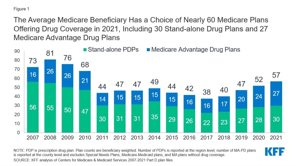
Figure 1: The Average Medicare Beneficiary Has a Choice of Nearly 60 Medicare Plans Offering Drug Coverage in 2021, Including 30 Stand-alone Drug Plans and 27 Medicare Advantage Drug Plans

A larger number of Part D plans will be offered in 2021 than in recent years. The average Medicare beneficiary will have a choice of 30 stand-alone PDPs in 2021, two more PDP options than in 2020, and eight more than in 2017, a 36% increase (Figure 1). Although the number of PDP options in 2021 is half of what it was at the peak in 2007 (when there were 56 PDP options, on average), this is the fourth year in a row with an increase in the average number of stand-alone drug plan options.

In 2021, beneficiaries will also have access to 27 MA-PDs, on average, a 71% increase in MA-PD options since 2017 (excluding Medicare Advantage plans that do not offer the drug benefit and plans not available to all beneficiaries; overall, an average of 33 Medicare Advantage plan options will be available in 2021).

Based on September 2020 enrollment, 8 out of 10 PDP enrollees (80%) in 2021 are projected to be in PDPs operated by just four firms: UnitedHealth, Centene (which acquired WellCare in 2020), Humana, and CVS Health (based on PDP enrollment as of September 2020). All four firms offer PDPs in all 34 PDP regions in 2021.

A Total of 996 Medicare Part D Stand-Alone Prescription Drug Plans Will Be Offered in 2021, a 5% Increase From 2020 and a 34% Increase Since 2017
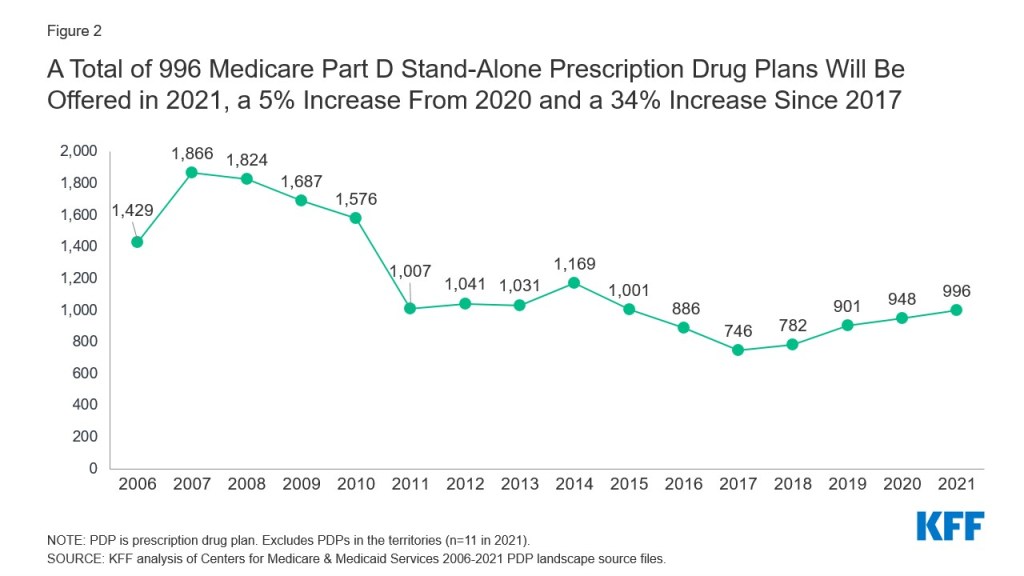
Figure 2: A Total of 996 Medicare Part D Stand-Alone Prescription Drug Plans Will Be Offered in 2021, a 5% Increase From 2020 and a 34% Increase Since 2017​

A total of 996 PDPs will be offered in the 34 PDP regions in 2021 (plus another 11 PDPs in the territories), an increase of 48 PDPs (5%) over 2020, and 250 more PDPs (a 34% increase) since 2017 (Figure 2). This increase is primarily due to the Trump Administration’s elimination of the “meaningful difference” requirement for enhanced benefit PDPs offered by the same organization in the same region. Eliminating this requirement means that PDP sponsors no longer have to demonstrate that their enhanced PDPs offered in the same region are meaningfully different in terms of enrollee out-of-pocket costs. In 2021, 62% of PDPs (618 plans) will offer enhanced Part D benefits—a 60% increase in the availability of enhanced-benefit PDPs since 2017, when just over half of PDPs (387 plans) offered enhanced benefits.

The number of PDPs per region in 2021 will range from 25 PDPs in Alaska to 35 PDPs in Texas and will be the same or higher in 32 of the 34 PDP regions compared to 2020 (see map, Table 1).


Part D Premiums

The Estimated Average Monthly Premium for Medicare PDPs Is Projected to Increase by 9% to $41 in 2021, Based on Current Enrollment

Figure 3: The Estimated Average Monthly Premium for Medicare PDPs Is Projected to Increase by 9% to $41 in 2021, Based on Current Enrollment​

The estimated national average monthly PDP premium for 2021 is projected to increase by 9% to $41, from $38 in 2020, weighted by September 2020 enrollment (Figure 3). It is likely that the actual average weighted premium for 2021, after taking into account enrollment choices by new enrollees and plan changes by current enrollees, will be somewhat lower than the estimated average. CMS reported that the average premium for basic Part D coverage offered by PDPs and MA-PDs will be an estimated $30 in 2021. Our premium estimate is higher because it is based on PDPs only (excluding MA-PDs) and includes PDPs offering both basic and enhanced coverage (enhanced plans, which account for 62% of all PDPs in 2021, have higher premiums than basic plans, on average).

Average Monthly Premiums for the 21 National Part D Stand-alone PDPs Are Projected to Range from $7 to $89 in 2021, with Higher Average Premiums for Enhanced Benefits and Zero-Deductible PDPs

Figure 4: Average Monthly Premiums for the 21 National Part D Stand-alone Drug Plans Are Projected to Range from $7 to $89 in 2021​

PDP premiums will vary widely across plans in 2021, as in previous years (Figure 4, Table 2). Among the 21 PDPs available nationwide, average premiums will range from a low of $7 per month for SilverScript SmartRx to a high of $89 per month for AARP MedicareRx Preferred.

Changes to premiums from 2020 to 2021, averaged across regions and weighted by 2020 enrollment, also vary widely across PDPs, as do the absolute amounts of monthly premiums for 2021.

  • The 1.9 million non-LIS enrollees in the largest PDP, CVS Health’s SilverScript Choice (which had a total of 3.9 million enrollees in 2020, including those receiving low-income subsidies) will face a modest $1 (2%) decrease in their average monthly premium, from $29 in 2020 to $28 in 2021.
  • In contrast, the 1.8 million non-LIS enrollees in the second largest PDP, AARP MedicareRx Preferred, will face a $10 (12%) increase in their average monthly premium between 2020 and 2021, from $79 to $89. This is the highest monthly premium among the national PDPs in 2021.
  • The 1.3 million non-LIS enrollees in the fourth largest PDP, Humana Premier Rx, will see a $7 (13%) increase in their monthly premium, from $58 in 2020 to $65 in 2021.

Most Part D stand-alone drug plans in 2021 (62% of PDPs) will offer enhanced benefits for a higher monthly premium. Enhanced benefits can include a lower (or no) deductible, reduced cost sharing, or a higher initial coverage limit than under the standard benefit design. The average premium in 2021 for enhanced benefit PDPs is $51, which is 55% higher than the monthly premium for PDPs offering the basic benefit ($33) (weighted by September 2020 enrollment).

In 2021, a large majority of PDPs (86%) will charge a deductible, with most PDPs (67%) charging the standard amount of $445 in 2021. Across all PDPs, the average deductible in 2021 will be $345 (weighted by September 2020 enrollment). The average monthly premium in 2021 for PDPs that charge no deductible is $88, nearly three times the monthly premium for PDPs that charge the standard deductible ($34) or a partial deductible ($31) (weighted by September 2020 enrollment).

Nearly 8 in 10 Part D Stand-alone Drug Plan Enrollees Without Low-income Subsidies Will Pay Higher Premiums in 2021 If They Stay in Their Current Plan

Figure 5: Nearly 8 in 10 Part D Stand-alone Drug Plan Enrollees Without Low-income Subsidies Will Pay Higher Premiums in 2021 If They Stay in Their Current Plan​

Most (78%, or 10 million) of the 13.4 million Part D PDP enrollees who are responsible for paying the entire premium (which excludes Low-Income Subsidy (LIS) recipients) will see their monthly premium increase in 2021 if they stay in their same plan, while 2.8 million (21%) will see a premium reduction if they stay in their same plan (Figure 5).

Nearly 2 million non-LIS enrollees (13%) will see a premium increase of $10 or more per month, while significantly fewer (0.2 million non-LIS enrollees, or 1%) will see a premium reduction of the same magnitude. One-third (34%) of non-LIS enrollees (4.6 million) are projected to pay monthly premiums of at least $60 if they stay in their current plans, and more than 230,000 (2% of non-LIS enrollees) are projected to pay monthly premiums of at least $100.

The Average Monthly Part D Premium in 2021 for the Subset of Enhanced Stand-alone Drug Plans Covering Insulin at a $35 Monthly Copay Is Substantially Higher Than Premiums for Other PDPs
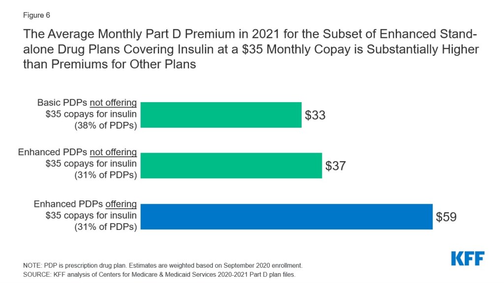
Figure 6: The Average Monthly Part D Premium in 2021 for the Subset of Enhanced Stand-alone Drug Plans Covering Insulin at a $35 Monthly Copay is Substantially Higher than Premiums for Other Plans​

New for 2021, beneficiaries in each state will have the option to enroll in a Part D plan participating in the Trump Administration’s new Innovation Center model in which enhanced drug plans cover insulin products at a monthly copayment of $35 in the deductible, initial coverage, and coverage gap phases of the Part D benefit. Participating plans do not have to cover all insulin products at the $35 monthly copayment amount, just one of each dosage form (vial, pen) and insulin type (rapid-acting, short-acting, intermediate-acting, and long-acting).

In 2021, a total of 1,635 enhanced Part D plans will participate in this model, which represents just over 30% of both PDPs (310 plans) and MA-PDs (1,325 plans) available in 2021, including plans in the territories. Between 8 and 10 enhanced PDPs in each region are participating in the model, in addition to multiple MA-PDs (see map). The average premium in 2021 for the subset of enhanced PDPs participating in the insulin $35 copay model ($59) is nearly twice as high as the monthly premium for basic PDPs ($33) and 61% higher than the average premium for enhanced PDPs that are not participating in the model ($37) (weighted by September 2020 enrollment).


Part D Cost Sharing

Part D Enrollees Will Pay Much Higher Cost-Sharing Amounts for Brands and Non-preferred Drugs Than For Drugs on a Generic Tier, and a Mix of Copays and Coinsurance for Different Formulary Tiers

Figure 7: In 2021, Part D Enrollees Will Pay Much Higher Cost-Sharing Amounts for Brands and Non-preferred Drugs than for Drugs on a Generic Tier, and a Mix of Copays and Coinsurance for Different Formulary Tiers​

In 2021, as in prior years, Part D enrollees will face much higher cost-sharing amounts for brands and non-preferred drugs (which can include both brands and generics) than for drugs on a generic tier, and a mix of copayments and coinsurance for different formulary tiers (Figure 7). The typical five-tier formulary design in Part D includes tiers for preferred generics, generics, preferred brands, non-preferred drugs, and specialty drugs. Among all PDPs, median standard cost sharing in 2021 is $0 for preferred generics and $5 for generics (an increase from $4 in 2020), $40 for preferred brands (a decrease from $42 in 2020), 40% coinsurance for non-preferred drugs (an increase from 38% in 2020; the maximum allowed is 50%), and 25% coinsurance for specialty drugs (the same as in 2020; the maximum allowed is 33%).

Among the 21 national PDPs, 13 PDPs, covering 9.3 million enrollees as of September 2020, are increasing cost-sharing amounts for drugs on at least one formulary tier between 2020 and 2021 (Table 3). Five PDPs are increasing copayments for generics, with increases ranging from $1 to $4; six PDPs are increasing copayments for preferred brands, with increases ranging from $3 to $10; and 10 PDPs are increasing coinsurance for non-preferred drugs, with increases ranging from 2 percentage points (e.g., from a 38% coinsurance rate to 40%) to 14 percentage points (e.g., from a 35% coinsurance rate to 49%).

Low-Income Subsidy Plan Availability

In 2021, 259 Part D Stand-Alone Drug Plans Will Be Premium-Free to Enrollees Receiving the Low-Income Subsidy (Benchmark Plans)
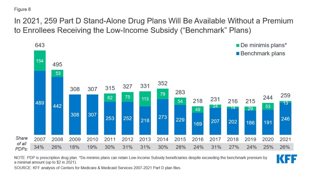
Figure 8: In 2021, 259 Part D Stand-Alone Drug Plans Will Be Available Without a Premium to Enrollees Receiving the Low-Income Subsidy (“Benchmark” Plans)​

In 2021, a larger number of PDPs will be premium-free benchmark plans—that is, PDPs available for no monthly premium to Medicare Part D enrollees receiving the Low-Income Subsidy (LIS)—than in recent years, with 259 premium-free benchmark plans, or roughly a quarter of all PDPs in 2021 (Figure 8). Through the Part D LIS program, enrollees with low incomes and modest assets are eligible for assistance with Part D plan premiums and cost sharing. As of 2020, approximately 13 million Part D enrollees are receiving LIS, including 6.7 million (52%) in PDPs and 6.1 million (48%) in MA-PDs.

On average (weighted by Medicare enrollment), LIS beneficiaries have eight benchmark plans available to them for 2021, or about one-fourth the average number of PDP choices available overall. All LIS enrollees can select any plan offered in their area, but if they enroll in a non-benchmark plan, they must pay some portion of their chosen plan’s monthly premium. In 2021, 10% of all LIS PDP enrollees who are eligible for premium-free Part D coverage (0.6 million LIS enrollees) will pay Part D premiums averaging $33 per month unless they switch or are reassigned by CMS to premium-free plans.

The number of benchmark plans available in 2021 will vary by region, from five to 10 (see map). In 2020, 89% of the 6.6 million LIS PDP enrollees are projected to be in PDPs operated by five firms: CVS Health, Centene, Humana, UnitedHealth, and Cigna (based on 2020 enrollment).


Discussion

Our analysis of the Medicare Part D stand-alone drug plan landscape for 2021 shows that millions of Part D enrollees without low-income subsidies will face premium and other cost increases in 2021 if they stay in their current stand-alone drug plan. There are more plans available nationwide in 2021, with Medicare beneficiaries having 30 PDP choices during this year’s open enrollment period, plus 27 Medicare Advantage drug plan options. Most Part D PDP enrollees who remain in the same plan in 2021 will be in a plan with the standard $445 deductible and will face much higher cost sharing for brands than for generic drugs, including as much as 50% coinsurance for non-preferred drugs.

Some Part D enrollees who choose to stay in their current plans may see lower premiums and other costs for their drug coverage, but nearly 8 in 10 non-LIS enrollees will face higher premiums if they remain in their current plan, and many will also face higher deductibles and cost sharing for covered drugs. Some beneficiaries might find the best coverage and costs for their specific medications in a plan with a relatively low premium, while for other beneficiaries, a higher-premium plan might be more suitable. Because Part D plans vary in a number of ways that can have a significant effect on an enrollee’s out-of-pocket spending, beyond the monthly premium, all Part D enrollees could benefit from the opportunity to compare plans during open enrollment.

Juliette Cubanski is with KFF.Anthony Damico is an independent consultant.


Methods

This analysis focuses on the Medicare Part D stand-alone prescription drug plan marketplace in 2021 and trends over time. The analysis includes 20.2 million enrollees in stand-alone PDPs, as of March 2020. The analysis excludes 17.4 million MA-PD enrollees (non-employer), and another 4.6 million enrollees in employer-group only PDPs and 2.3 million in employer-group only MA-PDs for whom plan premium and benefits data are unavailable.

Data on Part D plan availability, enrollment, and premiums were collected from a set of data files released by the Centers for Medicare & Medicaid Services (CMS):

– Part D plan landscape files, released each fall prior to the annual enrollment period

– Part D plan and premium files, released each fall

– Part D plan crosswalk files, released each fall

– Part D contract/plan/state/county level enrollment files, released on a monthly basis

– Part D Low-Income Subsidy enrollment files, released each spring

– Medicare plan benefit package files, released each fall

In this analysis, premium estimates are weighted by September 2020 enrollment unless otherwise noted. Percentage increases are calculated based on non-rounded estimates and in some cases differ from percentage calculations calculated based on rounded estimates presented in the text.

Tables

Table 1: Medicare Part D Stand-alone Prescription Drug Plans, Benchmark Plans, Insulin Model Plans, and Monthly Premiums, 2020 and 2021
Number of PDPsNumber of Benchmark PDPsNumber of Insulin Model PDPsWeighted Average PDP Monthly Premium
State/territory2020202120202021202120202021
U.S. Total948996244259308$38$41
Alabama30327810$42$44
Alaska2425779$36$38
Arizona313212109$37$41
Arkansas2731679$34$36
California3232879$40$42
Colorado2627789$36$41
Connecticut2527789$42$46
Delaware27271099$39$42
District of Columbia27271099$35$37
Florida27284510$41$45
Georgia2832689$35$39
Hawaii2526559$31$34
Idaho2828899$35$39
Illinois28318109$38$42
Indiana2830789$35$37
Iowa2928879$33$41
Kansas2829679$33$36
Kentucky2830789$35$36
Louisiana2626989$37$39
Maine2628679$37$42
Maryland27271099$37$40
Massachusetts2527789$40$44
Michigan3029999$37$40
Minnesota2928879$34$42
Mississippi2527779$33$35
Missouri2829569$36$38
Montana2928879$34$39
Nebraska2928879$32$38
Nevada2829579$36$39
New Hampshire2628679$36$42
New Jersey2830879$44$46
New Mexico2627779$34$36
New York2728978$45$47
North Carolina2831999$38$41
North Dakota2928879$32$37
Ohio2830259$34$38
Oklahoma2930899$38$40
Oregon2829899$34$40
Pennsylvania3133101010$38$43
Rhode Island2527789$39$43
South Carolina2829559$38$42
South Dakota2928879$31$37
Tennessee30327810$37$39
Texas3035589$35$38
Utah2828899$37$41
Vermont2527789$38$42
Virginia2930779$35$39
Washington2829899$36$42
West Virginia3133101010$40$44
Wisconsin3031999$39$41
Wyoming2928879$38$44
Puerto Rico662$51$60
American Samoa110$43$58
Guam220$45$51
Northern Mariana Islands110$30$46
U.S. Virgin Islands110$47$70
NOTE: PDP is prescription drug plan. U.S. total counts exclude PDPs in the territories, while weighted average includes territories. Average monthly premium is weighted by September 2020 enrollment for the region in which the state is located. Benchmark plan counts include “de minimis” plans, which can retain Low-Income Subsidy beneficiaries despite exceeding the benchmark premium by a minimal amount (up to $2 in 2021). Benchmark plans are not shown for the territories because the LIS is not available to residents of the territories. Insulin model plans are not shown for 2020 because the model is new in 2021.

SOURCE: KFF analysis of Centers for Medicare & Medicaid Services 2020-2021 Part D plan files.

Table 2: National Medicare Part D Stand-alone Prescription Drug Plans in 2021
Enrollment1Weighted average monthly premium2
Plan NameType of planBenchmark planInsulin model planNumber (in millions)% of totalTop 10 in 202020202021$ change% change
All PDPs20.2100%$38$41$39%
AARP MedicareRx PreferredEnhancedNoYes3210.1%2$79$89$1012%
AARP MedicareRx Saver PlusBasicYes3No1.25.9%5$32$33$12%
AARP MedicareRx WalgreensEnhancedNoNo0.73.5%$34$35$13%
Cigna Secure RxBasicYes3No0.52.7%$30$29$0-2%
Cigna Secure-Essential RxEnhancedNoNo0.21.0%$22$24$27%
Cigna Secure-Extra RxEnhancedNoYes0.20.7%$56$50-$7-12%
Elixir RxPlus*BasicYes4No0.83.9%9$22$23$16%
Express Scripts Medicare – ChoiceEnhancedNoYes<0.10.2%$83$75-$8-9%
Express Scripts Medicare – SaverEnhancedNoYes0.21.0%$24$26$26%
Express Scripts Medicare – ValueBasicYes3No0.41.8%$36$33-$2-7%
Humana Basic Rx PlanBasicYes3No1.57.2%3$31$31$00%
Humana Premier Rx PlanEnhancedNoYes1.47.1%4$58$65$713%
Humana Walmart Value Rx PlanEnhancedNoNo0.84.0%7$13$17$430%
SilverScript ChoiceBasicYes3No419.9%1$29$28-$1-2%
SilverScript SmartRxEnhancedNoNoNew in 2020$75
WellCare ClassicBasicYes3No1.15.3%6$29$28-$1-4%
WellCare Medicare Rx SaverBasicYes3No0.83.9%8$30$32$14%
WellCare Medicare Rx SelectEnhancedNoNo0.73.3%$20$24$422%
WellCare Medicare Rx Value PlusEnhancedNoYes0.42.2%$72$76$46%
WellCare Value ScriptEnhancedNoYes0.83.8%10$17$17$01%
WellCare Wellness RxEnhancedNoYes0.63.2%$14$16$212%
NOTE: PDP is prescription drug plan. Analysis excludes enrollees in employer group plans. *Called EnvisionRx Plus in 2020. 1Enrollment as of March 2020, includes enrollees with and without low-income subsidies. Top 10 in 2020 based on March 2020 enrollment. 2Weighted by September 2020 enrollment, assumes current PDP enrollees remain in their same plan, and makes no assumptions about plan choices by new enrollees for 2021. 3In most regions. 4In some regions. 5Unweighted median because PDP is new for 2020.

SOURCE: KFF analysis of Centers for Medicare & Medicaid Services 2020-2021 Part D plan files.

Table 3: Median Standard Cost-Sharing Amounts in National Medicare Part D Stand-alone Prescription Drug Plans in 2021
Preferred GenericsGenericsPreferred Brands 1Non-preferred drugsSpecialty tier drugs
Plan name2020202120202021202020212020202120202021
ALL PDPs$0$0$4$5$42/25%$40/19%38%40%25%25%
AARP MedicareRx Preferred$5$5$10$10$45$4540%40%33%33%
AARP MedicareRx Saver Plus$1$1$6$6$26$3235%40%25%25%
AARP MedicareRx Walgreens$0$0$5$6$40$4032%40%25%25%
Cigna Secure-Essential Rx$0$0$2$218%18%43%47%25%25%
Cigna Secure-Extra Rx$4$4$10$10$42$4250%50%31%31%
Cigna Secure Rx$1$1$2$2$30$3536%50%25%25%
Elixir RxPlus$1$1$3$6$35/15%$43/15%235%45%25%25%
Express Scripts Medicare – Choice$2$2$7$7$42$4248%50%28%31%
Express Scripts Medicare – Saver$1$2$4$7$30$3547%50%25%28%
Express Scripts Medicare – Value$1$1$3$3$25$2435%49%25%25%
Humana Basic Rx Plan$0$0$1$125%20%38%34%25%25%
Humana Premier Rx Plan$1$1$4$4$42$4544%49%25%25%
Humana Walmart Value Rx Plan$1$1$4$4$4718%35%35%25%25%
SilverScript Choice$0$0$1$5$47$3538%40%27%27%
SilverScript SmartRxn/a$0n/a$19n/a$46n/a48%n/a25%
WellCare Classic$0$0$2$2$32$3034%34%25%25%
WellCare Medicare Rx Saver$0$0$2$4$28$3838%37%25%25%
WellCare Medicare Rx Select$0$0$3$3$47$4742%42%25%25%
WellCare Medicare Rx Value Plus$1$1$4$4$47$4747%47%33%33%
WellCare Value Script$0$0$7$7$43$4347%47%25%25%
WellCare Wellness Rx$0$0$5$5$40$4046%46%25%25%
NOTE: PDP is prescription drug plan. Estimates are weighted medians for those plans that vary cost sharing by region (weighted by September 2020 enrollment). n/a is not applicable because plan is new for 2020. 1Approximately 81% of September 2020 enrollees are in plans with a preferred brand copay and 19% are in plans with a preferred brand coinsurance. 2Based on September 2020 enrollment, 53% of Elixir RxPlus enrollees will pay copays and 47% will pay coinsurance for preferred brand drugs.

SOURCE: KFF analysis of Centers for Medicare & Medicaid Services 2020-2021 Part D plan files.

Loss of the ACA Could Greatly Erode Health Coverage and Benefits for Women

Published: Oct 29, 2020

Introduction

As the Supreme Court prepares to hear the most recent challenge to the Affordable Care Act (ACA), we consider what loss of the ACA would mean for women. The broad reach of the ACA and its impact on women’s coverage is considerable, as millions have gained private or public coverage, no-cost coverage for recommended preventive services including many pregnancy-related services, caps on out-of-pocket spending, and protections against discrimination based on sex in the insurance market. The expansion of coverage under the ACA was financed in part by increases in a variety of taxes, which directly or indirectly affect women as well. All of these changes – some affecting both men and women and some affecting women specifically — are at risk in the upcoming case.

Affordable coverage options for many uninsured women will shrink as federal funding for Medicaid expansion and subsidized care are eliminated, if the ACA is overturned.

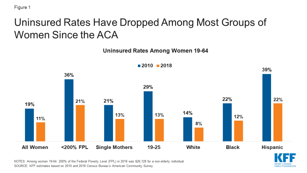
Since the ACA went into effect, the uninsured rate among adult women under 65 has declined among all demographic groups (Figure 1). This is a direct result of the ACA’s major coverage provisions: expansion of Medicaid, the subsidized plans available through the Marketplaces, and the provision that allows workers to enroll adult children up to age 26 as dependents in their parents’ employer-sponsored plans. There has also been a sharp drop in the uninsured rate among men over the past decade, but compared to women, men remain more likely to be uninsured and comprise more than half (55%) of the remaining uninsured population.

Figure 1: Uninsured Rates Have Dropped Among Most Groups of Women Since the ACA

States would not be able to sustain the costs of coverage for the expanded Medicaid population, especially in the face of budgetary shortfalls arising from the pandemic. Coverage in the individual insurance market would be unaffordable to many people without federal subsidies, reversing coverage gains of the past decade and leading to a rise in uninsured women.

Gains in coverage and affordability of services for pregnancy-related care, pre- and post- partum, would be lost.

The ACA made many improvements to support care for pregnant people. In the private insurance market, the ACA established a floor for “essential health benefits” (EHB) that individual market plans must cover, including maternity care, which most non-group plans did not include prior to the ACA. Furthermore, all private plans (group and non-group) as well as Medicaid expansion programs are now required to cover routine pregnancy screenings and vitamins, at no cost under the ACA’s preventive services policy. This extends to the postpartum period as well, with all plans now required to cover lactation counseling and breast pumps without charge. The law also requires employers with at least 50 employees to provide break time and a private space for hourly workers to express milk. One study found a 10% increase in breastfeeding duration associated with coverage for breastfeeding supports and another study reported that while some women were not provided with adequate break times and private spaces to pump, those who did were twice as likely to be exclusively breastfeeding at six months.

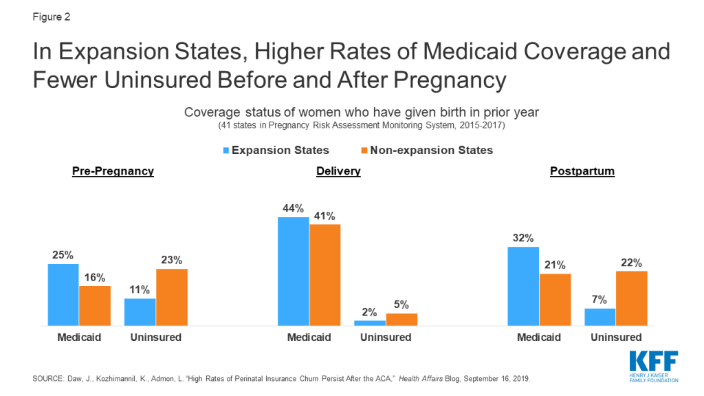
Coverage for maternity services has been required for decades in most employer-sponsored plans due to the Pregnancy Discrimination Act and under Medicaid as a mandatory benefit in all states. Nationally, the Medicaid program covers more than four in ten births and over half in several states. For low-income mothers in expansion states, Medicaid expansion has afforded greater continuity in coverage, as many can now retain Medicaid coverage because they qualify under the ACA’s higher eligibility level, whereas in non-expansion states, many women lose coverage just two months after giving birth (Figure 2). Recently, long overdue attention on maternal mortality has highlighted the importance of coverage before, during, and after pregnancy. One study found that Medicaid expansion was associated with lower maternal mortality rates compared to non-expansion states.

Figure 2: In Expansion States, Higher Rates of Medicaid Coverage and Fewer Uninsured Before and After Pregnancy​

Health insurance plans could reinstate discriminatory policies like gender rating (charging women more than men for the same benefits), excluding maternity benefits, and denying coverage or charging more for those with pre-existing conditions.

The ACA banned a number of practices that were common among non-group insurers prior to the law. In addition to excluding benefits important for women such as pregnancy-related care, many individual market insurers charged women more than men for the same coverage, a practice called gender rating. Although gender rating affected both women and men, younger women were routinely charged more than men for plans that typically did not include maternity care. One 2012 study that reviewed gender-based differentials in individual market premiums found that reproductive age women were consistently charged higher rates than men the same age, up to 85% higher depending on the state. Conversely, the study found that among 55-year olds, some plans charged slightly higher rates to men, but the magnitude in difference was much lower compared to younger people.

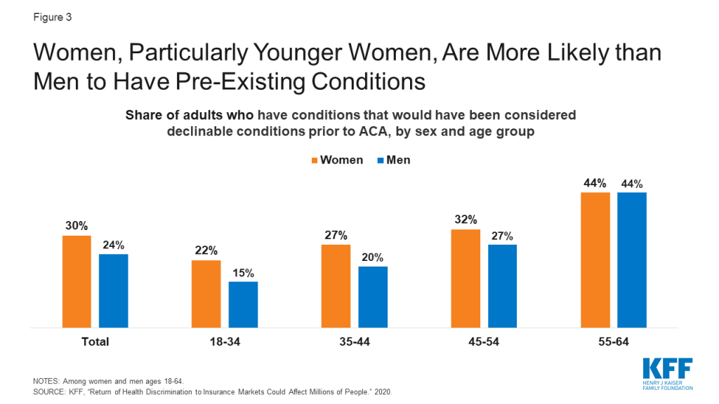
Pre-ACA, it was also routine for non-group plans to deny coverage or charge higher premiums based on an individual’s health status. We estimate that 30% of non-elderly adult women have pre-existing conditions, such as breast cancer, heart disease, or pregnancy that would have made them ineligible for purchasing an individual insurance policy before the ACA. Women have higher rates of pre-existing conditions than men, particularly during the reproductive years (Figure 3).

Figure 3: Women, Particularly Younger Women, Are More Likely than Men to Have Pre-Existing Conditions

Affordability challenges could worsen without the ACA. The limit on annual out-of-pocket charges under private insurance might be revoked and plans could also resume charging women out-of-pocket for contraception, cancer screenings such as mammograms and colonoscopies, well woman checkups, and other preventive services.

The ACA addressed several affordability challenges experienced by women, who on average use the health system more often and have higher health expenses compared to men. Among adults and children in large employer plans, KFF analysis finds that average out-of-pocket spending is 35% higher among females compared to males. The ACA requires plans to cap annual out of pocket charges for enrollees ($8,150 for individuals and $16,300 for families in 2020). This was not required prior to the ACA, and 17% of workers covered by employer-sponsored insurance were in plans without any limit on out-of-pocket spending.

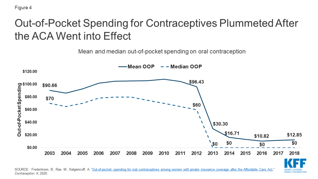
Cost protections are also integrated in the ACA requirement that all private plans and Medicaid expansion programs cover preventive services recommended by the U.S. Preventive Services Task Force (USPSTF), the Health Resources and Services Administration, and the CDC’s Advisory Committee on Immunization Practices, without charging cost-sharing. The slate of covered services includes many that are exclusively or disproportionately used by women, such as prenatal tests, breastfeeding services, mammograms, bone density screenings for older women, and all FDA approved prescribed contraceptives for women, including more expensive methods such as long acting reversible contraceptives (IUDs and implants). Our analysis has documented the sharp impact of the contraceptive coverage requirement, with most women now having no out-of-pocket spending for contraception (Figure 4).

Figure 4: Out-of-Pocket Spending for Contraceptives Plummeted After the ACA Went into Effect ​

Should the ACA be overturned, plans could raise the amount of out-of-pocket charges they allow, and full coverage for preventive services would no longer be required by federal law, allowing private plans to return to pre-ACA cost sharing practices. Although some states have their own requirements for contraceptive coverage and other services, state laws do not have the same reach as the ACA because they do not apply to self-funded employer plans (which cover 67% of workers with employer coverage), and many individuals would not be assisted. The loss of the ACA could make many services unaffordable and out of reach for women, who on average have higher health care expenses, lower incomes, fewer financial assets, and higher poverty rates than men.

Older women and women with long-term disabilities who are covered by Medicare may lose full coverage for preventive services and face higher out-of-pocket spending.

For Medicare beneficiaries, the ACA eliminated out-of-pocket charges for preventive services recommended by the USPSTF, such as screenings for breast cancer, osteoporosis, and depression. The ACA also added a new annual wellness visit to Medicare, which is covered at no cost to beneficiaries. Without the ACA, Medicare may return to charging 20% co-insurance for preventive services, as was the case before its enactment, meaning millions of women with Medicare would face higher out-of-pocket costs for needed preventive services.

Nearly all (94%) women covered by Medicare use a prescription medication. The ACA helped reduce beneficiaries’ out-of-pocket drug spending if they reached the Medicare Part D coverage gap, or “donut hole”, where beneficiaries were responsible for the full costs of their prescription medications prior to the ACA. The ACA gradually closed the donut hole by phasing down coinsurance charges and adding a manufacturer price discount on brand-name drugs in the donut hole. There is uncertainty around what might happen to the ACA’s coverage gap provision as a result of the Supreme Court case, since the provision was modified by subsequent legislation. However, if the ACA is struck down in its entirety, including the coverage gap provision and subsequent changes to it, that could mean an increase in out-of-pocket drug spending for women enrolled in Part D without low-income subsidies who have drug spending in the donut hole, which was the case for 15% of women enrolled in Part D in 2018.

Conclusion

This is not the first time that the Supreme Court will be deciding an ACA case with great consequences for women’s health. In the last six years, the Court has ruled on three cases about the ACA’s contraceptive coverage requirement, permitting more employer exemptions and resulting in more women losing guaranteed contraceptive coverage without cost sharing. Fully overturning the ACA would have even broader ramifications, reversing many of the important gains in coverage and the insurance reforms that have benefited women across the country.

News Release

The COVID-19 Pandemic Has Taken a Higher Toll on Nursing Homes with Relatively High Shares of Black or Hispanic Residents

Published: Oct 27, 2020

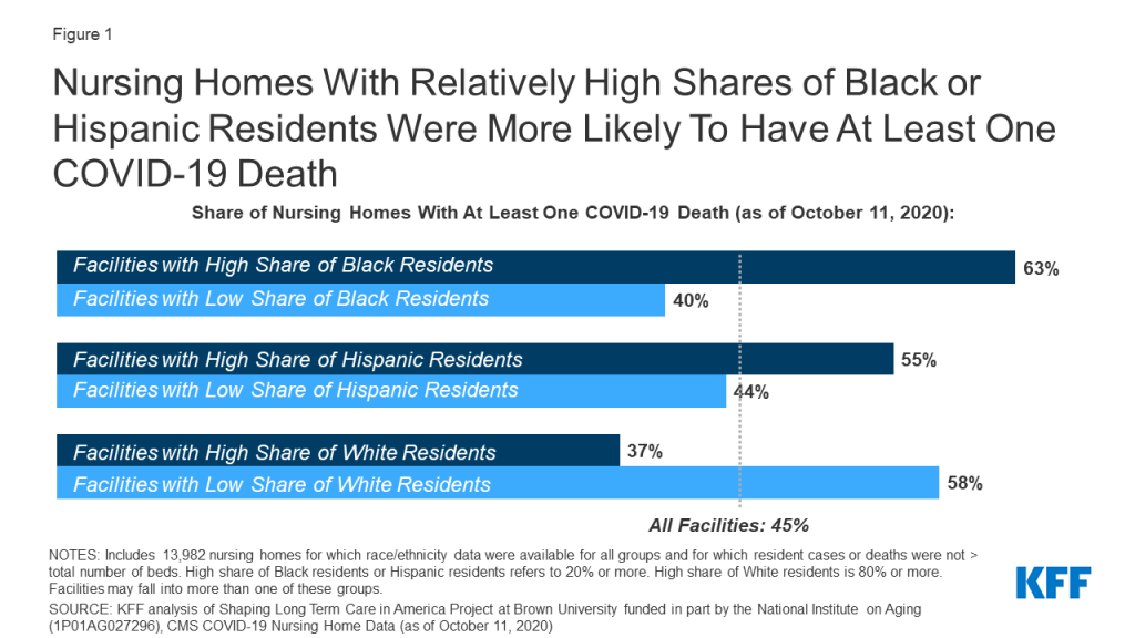
Nursing homes with a relatively high share of Black or Hispanic residents are more likely to have had a resident die of COVID-19 than homes with lower shares of such residents, finds a new KFF analysis.

Nationwide, 63 percent of nursing homes with a relatively high share of Black residents reported one or more COVID-19 death, as did 55 percent of nursing homes with a relatively high share of Hispanic residents, finds the analysis. That compared to 40 percent and 44 percent of nursing homes with a lower share of Black and Hispanic residents, respectively. (Nursing homes were defined as having a relatively high share of Black or Hispanic residents if such residents accounted for 20 percent or more of the resident population.)

The analysis, based on data from 13,982 nursing facilities nationwide, or approximately 93 percent of all nursing facilities, adds to the understanding of how a pandemic that has hit communities of color disproportionately hard is playing out in long-term care facilities that are home to many of those most vulnerable to the effects of the virus. Long-term care facilities account for just 8 percent of all coronavirus cases but more than 40 percent of all COVID-19 deaths.

For the full analysis, which includes state-level data for 21 states, visit kff.org

Racial and Ethnic Disparities in COVID-19 Cases and Deaths in Nursing Homes

Authors: Priya Chidambaram, Tricia Neuman, and Rachel Garfield
Published: Oct 27, 2020

Data Note

Long-term care facilities, such as nursing homes, have experienced a disproportionate share of deaths during the COVID-19 pandemic. The most recently available data show long-term care facilities account for 8% of all coronavirus cases but more than 40% of all COVID-19 deaths. Overall, COVID-19 has taken a disproportionate toll on communities of color. Black, Hispanic, and American Indian and Alaska Native (AIAN) populations have been shown to be at increased risk for cases, deaths, and hospitalizations. However, because the Center for Medicare and Medicaid Services does not require nursing facilities to report race/ethnicity data for COVID-19 cases and deaths, it is not possible to document the full scope of the pandemic on communities of color in nursing homes, or other long-term care settings. Only four states report cases and deaths in long-term care facilities by race/ethnicity (Iowa, Indiana, Louisiana, and Mississippi).

In the absence of these data, this analysis uses linked datasets – one with facility-level cases and deaths as of October 11th and another with 2017 facility-level resident information by race/ethnicity – to examine cases and deaths based on racial/ethnic composition of nursing home residents. Specifically, it assesses whether nursing homes with relatively high shares of Black and Hispanic residents experienced a disproportionate burden of cases and deaths compared to those with lower shares of Black and Hispanic residents as well as a higher share of White residents. Data were not available to separately analyze cases and deaths for other racial/ethnic groups. The analysis is based on data from 13,982 nursing facilities nationwide (approximately 93% of all nursing facilities). In addition to national data, we present similar results at the state level, where sufficient data are available. See methods for more details on how nursing homes were categorized, data limitations, and analytic approach.

Deaths and Cases by Resident Race/Ethnicity

Nursing homes with relatively high shares of Black or Hispanic residents were more likely to report at least one COVID-19 death than nursing homes with lower shares of Black or Hispanic residents (Figure 1). Overall, within the 13,982 nursing homes included in this analysis, 12% of all nursing home residents are Black and 6% are Hispanic. Our analysis finds deaths due to COVID-19 were more common among nursing homes with relatively high shares of Black or Hispanic residents (defined in this analysis as 20% or greater). Nationwide, 63% of nursing homes with a relatively high share of Black residents reported one or more COVID-19 death, higher than the share reported by nursing homes with a lower share of Black residents (40%). Similarly, 55% of nursing homes with a relatively high share of Hispanic residents reported COVID-19 deaths, higher than the share reported by nursing homes with a lower share of Hispanic residents (44%).

Figure 1: Nursing Homes With Relatively High Shares of Black or Hispanic Residents Were More Likely To Have At Least One COVID-19 Death

Nursing homes with relatively high shares of Black or Hispanic residents were more likely to report coronavirus cases than other nursing homes, although the differences are narrower than for reported COVID-19 deaths (Figure 2). Nursing homes with a high share of Black residents were more likely to report coronavirus cases than nursing homes with a low share of Black residents (87% compared to 79%). Similarly, nursing homes with a relatively high share of Hispanic residents were more likely to report coronavirus cases (84%) than nursing homes with a lower share (81%).

Figure 2: Nursing Homes With Relatively High Shares of Black or Hispanic Residents Were More Likely To Have At Least One Coronavirus Case​

Case Outbreak Severity by Resident Race/Ethnicity

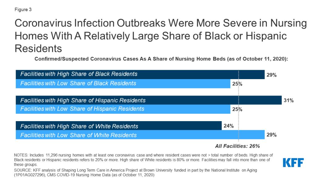
Among nursing homes that had at least one case of coronavirus, nursing homes with relatively high shares of Black or Hispanic residents reported more severe case outbreaks than nursing homes with low shares of Black or Hispanic residents, as measured by confirmed or suspected cases as a share of nursing home beds (Figure 3). In nursing homes with a relatively high share of Black residents, positive cases among residents account for 29% of beds, as compared to 25% of beds in nursing homes with a relatively low share of Black residents. Similarly, among nursing homes with a relatively high share of Hispanic residents, positive cases among all residents account for 31% of beds, as compared to 25% of beds in nursing homes with a relatively low share of Hispanic residents.

Figure 3: Coronavirus Infection Outbreaks Were More Severe in Nursing Homes With A Relatively Large Share of Black or Hispanic Residents

Cases and Deaths by Resident Race/Ethnicity in Select States

National patterns of COVID-19 deaths and cases in nursing homes with relatively high shares of Black or Hispanic residents generally persist at the state-level, based on data from 21 states. State-level analysis allows for a better understanding of whether observed national racial disparities may be attributed to regional outbreaks and geographic variations in the composition of the population by race/ethnicity. This analysis is limited to the twenty-one states with a sufficient number of nursing homes that had either a high share of Black or Hispanic residents, as described in greater detail in the methods section. Among these states, the experience of nursing homes with a high share of Black or Hispanic residents generally mirrored the national pattern.

In 19 of the 21 states for which there were sufficient data, nursing homes with a relatively high share of Black or Hispanic residents were more likely to report one or more death than other nursing homes in the state (Appendix Table 1). In some instances, these differences were relatively large, some with a gap of 20 percentage points or more. For example, in Florida, the share of nursing homes reporting one or more death due to COVID-19 was substantially higher among nursing homes with a high share of Hispanic residents than in other nursing homes (85% vs 63%). A similar gap between nursing homes with high and low share residents of Black residents was observed in five states (Illinois, Maryland, Michigan, New York, and Pennsylvania), where the gap in the share that reported at least one death was equal to or exceeded 20 percentage points. In Michigan, for example, 64% of nursing homes with a high share of Black residents reported 1 or more death, as compared to 35% in nursing homes with a low share of Black residents. The gap in the share of reported at least one death was not as pronounced in all states. For example, the gap between nursing homes with high versus lower shares of Black residents was fewer than 10 percentage points in Alabama, Florida, and Ohio.

Similarly, differences in the share of facilities that reported at least one case and case severity by resident race/ethnicity seen nationally generally also held in these states. Like the national data, state data shows that nursing homes with relatively more Black or Hispanic residents were more likely to report at least one COVID-19 case, though differences were less pronounced than death patterns; the exception to this pattern is Florida, Louisiana, North Carolina, and South Carolina where nursing facilities with higher and lower shares of Black residents were either equally likely to report at least one case (Florida and South Carolina) or facilities with a lower share of Black residents were slightly more likely to report a case (Louisiana and North Carolina).

With respect to the severity of outbreaks at the state level, the pattern observed at the national level was generally evident at the state level. However, in a few states, including Arkansas, Georgia, Louisiana, New Jersey, Ohio, and South Carolina, facilities with low shares of Black residents had equal or slightly more severe outbreak severity as facilities with high shares of Black residents.

Discussion

These findings confirm that nursing homes with a relatively large share of Black or Hispanic residents have been disproportionately affected by COVID-19, as measured by the share reporting deaths, share reporting cases, and the severity of outbreak.  This analysis amplifies prior research that finds that the coronavirus has disproportionately impacted communities of color, including residents in nursing homes, potentially reflecting patterns of community transmission or nursing home quality. Research supports a strong relationship between nursing home cases and community transmission. There have been more mixed results when evaluating the relationship between nursing homes coronavirus outbreaks and nursing home quality, with some research finding a relationship and some not. Nursing homes are now required by the Center for Medicare and Medicaid services to report cases and deaths on a regular basis, but they are not required to report the data by race and ethnicity, and few states include such information in their own public reporting; such information is needed to document the direct impact of the pandemic on older residents of color, and the underlying factors that drive these disparities. Even without such data, this analysis makes it clear that residents in facilities that serve a relatively large share of Black and Hispanic residents have been disproportionately affected by the coronavirus.

Appendices: Methods

Data Sources

This analysis draws on federal data published by the Center for Medicare and Medicaid Services (CMS)and additional facility-level data from Brown School of Public Health’s LTCfocus.org data, which includes summary-level information derived from 2017 MDS (Minimum Dataset) data.

data on cases and deaths

Data on coronavirus cases and deaths in nursing homes is from federal data published by the Center for Medicare and Medicaid Services (CMS). CMS requires all Medicare and Medicaid certified nursing facilities to report data on suspected and confirmed coronavirus cases and deaths for residents and staff. These data collection standards make the federal data more comparable across states than state-published data. Data in this paper reflects nursing home cases and deaths as of October 11, 2020. A major limitation of this data is the time period included: facilities were only required to report data starting May 8th, 2020 and reporting cases or deaths prior to that date was not required. Thus, data may not be counting cases or deaths in facilities or states that experienced outbreaks earlier in spring 2020. For more information on the federal data, see KFF analysis comparing the state-reported data to the federal data.

In addition, some nursing homes in the CMS data report a greater number of cases and/or deaths than the total number of beds in the nursing home. We dropped approximately 1,000 nursing homes for which this was the case, leading to a final sample of 13,982 nursing homes. This sample is a subset of the approximately 15,000 nursing homes in the US.

Data on Race/Ethnicity of Residents

CMS does not require nursing facilities to report cases and deaths by race/ethnicity. Therefore, facility-level data on resident race/ethnicity was pulled from Brown School of Public Health’s LTCfocus.org data, which includes summary-level information derived from 2017 MDS (Minimum Dataset) data. MDS assessments are completed for all residents in nursing homes to identify each resident’s functional capabilities and help nursing home staff identify health problems. Demographic data, including race/ethnicity, is collected during this process as well. Brown School of Public Health provides summary data of MDS from 2010-2017, including facility-level data on the share of nursing home residents who are Black, White, or Hispanic. This analysis does not include data on staff cases and deaths since MDS does not collect data on racial makeup of nursing home staff, and we were unable to identify a data source for race/ethnicity of nursing home staff at the facility level.

The LTCfocus.org data censors data points representing fewer than 11 residents due to privacy standards set forth by CMS. Due to the small number of Black or Hispanic residents in many nursing homes, this created missing data points in nearly 9,000 nursing homes. For these “missing” data points, we imputed a value of 5.5 residents and calculated shares of residents based on the newly imputed value. We conducted a sensitivity analysis that showed that results were largely unchanged when the sample included and excluded the nursing homes with imputed data.

Classifying Facilities by Resident Race/Ethnicity

Overall, within the 13,982 nursing homes included in this analysis, 12% of all nursing home residents are Black and 6% are Hispanic. Nursing homes have a disproportionately low share of Hispanic residents when compared to total US population distribution by Race/Ethnicity. We categorized nursing homes where 20% or more of residents were Black or Hispanic as “High Share of Black Residents” or “High Share of Hispanic Residents.” This definition is based on the distribution of share of Black and Hispanic residents among the 13,982 nursing homes in our sample and a need to have adequate sample within each group. Many nursing homes reported extremely low shares of Black or Hispanic residents or zero Black or Hispanic residents. The following are the Ns for the groups reported in the paper:

Number of Facilities Included in Analysis, by Race/Ethnicity Group
 Category DefinitionTotal Facilities
Total US Facilities13,982
Low Share of Black ResidentsUnder 20%10,995
High Share of Black Residents20% or greater2,987
Low Share of Hispanic ResidentsUnder 20%12,995
High Share of Hispanic Residents20% or greater987
Low Share of White ResidentsUnder 80%5,276
High Share of White Residents80% or greater8,706

Residents may be double counted in race/ethnicity data (for example, a resident could be counted as both “White” and “Hispanic”). Therefore, some facilities with a “high” share of Black or Hispanic residents may overlap with facilities with a “high” share White residents.

Choosing States for State-Level Analysis

State-level analysis was limited to the states with 50 or more facilities in the high share of Black or Hispanic residents categories, based on our definitions of “high share” described above. In total, we were able to provide state-level data on 21 states. California, Florida, New York, and Texas each had 50 or more nursing homes with a high share of both Black and Hispanic residents, and the remaining 17 states in the analysis had only a sufficient number of nursing homes with a high share of Black residents.

Appendices: Table

Appendix Table 1: COVID-19 Cases and Deaths In Nursing Homes by Resident Race/Ethnicity in Select States, as of October 11, 2020
 Total Nursing Homes in SampleShare of Nursing Homes with At Least One COVID-19 DeathShare of Nursing Homes with At Least One COVID-19 CaseCOVID-19 Case Rate* Among Nursing Homes With Cases
Total US Nursing Homes13,98245%81%26%
Alabama    
All Nursing Homes21565%97%37%
Low share of Black residents11163%96%36%
High share of Black residents10466%98%38%
Low share of Hispanic residentsN/AN/AN/AN/A
High share of Hispanic residentsN/AN/AN/AN/A
Arkansas
All Nursing Homes20146%82%26%
Low share of Black residents14843%81%28%
High share of Black residents5353%83%21%
Low share of Hispanic residentsN/AN/AN/AN/A
High share of Hispanic residentsN/AN/AN/AN/A
California
All Nursing Homes1,02944%85%33%
Low share of Black residents83242%84%32%
High share of Black residents19752%89%38%
Low share of Hispanic residents66839%83%31%
High share of Hispanic residents36153%90%37%
Florida
All Nursing Homes64365%93%30%
Low share of Black residents46864%93%29%
High share of Black residents17569%93%33%
Low share of Hispanic residents57663%92%29%
High share of Hispanic residents6785%94%35%
Georgia
All Nursing Homes32363%89%35%
Low share of Black residents10054%88%37%
High share of Black residents22366%89%34%
Low share of Hispanic residentsN/AN/AN/AN/A
High share of Hispanic residentsN/AN/AN/AN/A
Illinois
All Nursing Homes68848%83%24%
Low share of Black residents54041%81%24%
High share of Black residents14872%90%24%
Low share of Hispanic residentsN/AN/AN/AN/A
High share of Hispanic residentsN/AN/AN/AN/A
Indiana
All Nursing Homes47637%72%21%
Low share of Black residents42636%71%20%
High share of Black residents5050%80%26%
Low share of Hispanic residentsN/AN/AN/AN/A
High share of Hispanic residentsN/AN/AN/AN/A
Louisiana
All Nursing Homes27175%93%28%
Low share of Black residents9577%95%29%
High share of Black residents17673%92%28%
Low share of Hispanic residentsN/AN/AN/AN/A
High share of Hispanic residentsN/AN/AN/AN/A
Maryland
All Nursing Homes21661%84%29%
Low share of Black residents9646%75%23%
High share of Black residents12073%91%32%
Low share of Hispanic residentsN/AN/AN/AN/A
High share of Hispanic residentsN/AN/AN/AN/A
Michigan
All Nursing Homes40241%79%20%
Low share of Black residents31035%78%19%
High share of Black residents9264%82%22%
Low share of Hispanic residentsN/AN/AN/AN/A
High share of Hispanic residentsN/AN/AN/AN/A
Missouri
All Nursing Homes48941%78%23%
Low share of Black residents41638%77%22%
High share of Black residents7355%84%25%
Low share of Hispanic residentsN/AN/AN/AN/A
High share of Hispanic residentsN/AN/AN/AN/A
Mississippi
All Nursing Homes18066%89%39%
Low share of Black residents6658%85%36%
High share of Black residents11471%91%40%
Low share of Hispanic residentsN/AN/AN/AN/A
High share of Hispanic residentsN/AN/AN/AN/A
North Carolina
All Nursing Homes39541%81%26%
Low share of Black residents18335%81%24%
High share of Black residents21246%81%27%
Low share of Hispanic residentsN/AN/AN/AN/A
High share of Hispanic residentsN/AN/AN/AN/A
New Jersey
All Nursing Homes33679%91%30%
Low share of Black residents24080%91%31%
High share of Black residents9676%93%28%
Low share of Hispanic residentsN/AN/AN/AN/A
High share of Hispanic residentsN/AN/AN/AN/A
New York
All Nursing Homes60359%81%21%
Low share of Black residents42454%75%20%
High share of Black residents17973%93%22%
Low share of Hispanic residents53058%79%20%
High share of Hispanic residents7368%90%23%
Ohio
All Nursing Homes87236%70%23%
Low share of Black residents70234%68%23%
High share of Black residents17043%76%20%
Low share of Hispanic residentsN/AN/AN/AN/A
High share of Hispanic residentsN/AN/AN/AN/A
Pennsylvania
All Nursing Homes65546%83%29%
Low share of Black residents56240%83%27%
High share of Black residents9377%85%36%
Low share of Hispanic residentsN/AN/AN/AN/A
High share of Hispanic residentsN/AN/AN/AN/A
South Carolina
All Nursing Homes16769%93%39%
Low share of Black residents5963%93%39%
High share of Black residents10872%94%39%
Low share of Hispanic residentsN/AN/AN/AN/A
High share of Hispanic residentsN/AN/AN/AN/A
Tennessee
All Nursing Homes29444%87%20%
Low share of Black residents23741%87%19%
High share of Black residents5760%88%26%
Low share of Hispanic residentsN/AN/AN/AN/A
High share of Hispanic residentsN/AN/AN/AN/A
Texas
All Nursing Homes1,05250%81%25%
Low share of Black residents83146%80%25%
High share of Black residents22164%86%27%
Low share of Hispanic residents81546%80%24%
High share of Hispanic residents23761%84%31%
Virginia
All Nursing Homes26241%79%25%
Low share of Black residents12831%76%24%
High share of Black residents13451%81%26%
Low share of Hispanic residentsN/AN/AN/AN/A
High share of Hispanic residentsN/AN/AN/AN/A
NOTES: N/A=fewer than 50 facilities; High share = 20% or greater; Low share=Under 20%; * Case rate is calculated as resident cases/beds.SOURCE: KFF analysis of data from Shaping Long Term Care in America Project at Brown University and CMS COVID-19 Nursing Home Data as of 10/11/2020

What Happens to Medicaid Drug Policy if the ACA is Overturned?

Author: Rachel Dolan
Published: Oct 26, 2020

Policy discussions around the potential elimination of the Affordable Care Act (ACA) under the court challenge California v. Texas have largely focused on coverage provisions related to the exchanges, Medicaid and preexisting condition protections. The repeal of the ACA could mean loss of Medicaid coverage for up to 15 million that were enrolled in the ACA Medicaid expansion group prior to the COVID-19 pandemic; however, repeal could also mean significant changes to Medicaid prescription drug policy with implications for state and federal spending for prescription drugs for non-expansion Medicaid enrollees.

Under the Medicaid Drug Rebate Program (MDRP), manufacturers who want their drugs covered by Medicaid must enter a federal rebate agreement under which they rebate a specified portion of the Medicaid payment for the drug to the states, who in turn share the rebates with the federal government. The rebate amount is set by statute and includes two main components: a rebate based on a percentage of average manufacturer price (AMP) or the largest “best price” discount provided to most private purchasers, and an inflationary component to account for price increases. The ACA made changes to the amount of rebates and also expanded states’ ability to collect rebates on drugs delivered through managed care plans. In 2010, CBO originally estimated more than $38 billion in federal savings over 10 years for the Medicaid drug-related provisions in the ACA.

How did the ACA affect Medicaid prescription drug policy?

The ACA increased federal drug rebates under the MDRP. The ACA increased base rebate amounts for both generic and brand drugs: the minimum rebate for brand drugs increased from 15.1 percent to 23.1 percent and the base rebate for generic drugs increased from 11 percent to 13 percent. The federal government captures all additional savings. In addition, the ACA established additional rebates for new formulations of existing productions (line extensions), minimum rebates for certain clotting and pediatric drugs, and capped the total rebate amount for drugs at 100% AMP. The law also excluded certain manufacturer discounts from AMP (the price used to calculate rebates) which increase AMP and manufacturer rebate obligations.

The ACA also extended eligibility for rebates to drug benefits provided through managed care. Previously, rebates were only available for drugs purchased through fee-for service (FFS) and many states carved out their drug benefit even if they otherwise provided services through managed care.

The ACA also made other changes to limit Medicaid payment for drugs. These changes include a decrease in federal limits on pharmacy reimbursement for certain multiple source drugs, drugs that have both a brand and generic (FULs).

What are the implications for states and the federal government if the ACA is overturned?

Overturning the ACA could increase federal Medicaid drug spending. Rebates under the MDRP provide a significant offset to Medicaid prescription drug spending, amounting to nearly 60% in 2018. Medicaid base rebates would return to lower, pre-ACA levels and the Medicaid program would receive smaller rebates on generic drugs and certain brand drugs for traditional Medicaid populations. This would largely impact federal spending, as the rebate increase from the ACA accrues to the federal government. Medicaid would also no longer receive additional rebates for line extension drugs and the federal reimbursement benchmark (FUL) would increase to pre-ACA amounts for certain multisource drugs. In addition, the AMP for some drugs could decrease without the exclusion of certain manufacturer discounts, lowering rebates and increasing spending for both states and the federal government.

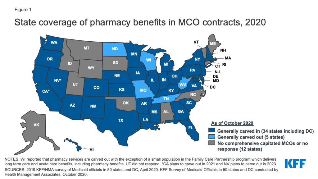
States would no longer be able to collect rebates for drugs provided through managed care. This would be a significant loss in rebates for states and the federal government, and to avoid these losses, states would need to carve out the pharmacy benefit from managed care. Over the 2010–2015 period, CBO estimated the share of Medicaid outpatient drug spending covered through Medicaid managed care plans grew from about 10 percent to roughly half. As of October 2020, 34 of 40 MCO states carved in the pharmacy benefit (Figure 1). States could negotiate additional supplemental rebates with manufacturers but they would be unlikely to offset other rebate losses.

Figure 1: State coverage of pharmacy benefits in MCO contracts, 2020

The elimination of the ACA would have fundamental implications for access to care for up to 15 million individuals in the expansion group, but would also increase federal drug spending for non-expansion Medicaid enrollees. Federal Medicaid drug spending could increase as the federal government would receive lower rebates on drug spending for traditional Medicaid populations. States would also need to restructure how the drug benefit is delivered to avoid rebate losses as most now provide the benefit through managed care.

This Week in Coronavirus: October 16 to October 22

Published: Oct 23, 2020

Here’s our recap of the past week in the coronavirus pandemic from our tracking, policy analysis, polling, and journalism.

Yesterday the U.S. hit its fourth highest daily total on the number of reported coronavirus cases with approximately 71,700. Through the 22nd of each month of the pandemic, October now has the second highest total number of cases, second to July only.

KFF’s October health tracking poll finds that two-thirds of the public are worried that they or their family will get sick from the coronavirus, which is up 13 percentage points since April. Through mid-October of this year, The U.S. has a higher coronavirus mortality rate than many of its peer countries, with the coronavirus ranking as the nation’s third-leading cause of death, behind only heart disease and cancer.

As the government and public health officials press forward via Operation Warp Speed on identifying a successful vaccine, a new brief examines the challenges for what comes next—successful distribution to the American people. The brief looks at the issues of funding, supply and monitoring, and the role of all levels of government. It also looks at larger related health policy issues of insurance coverage and out-of-pocket costs, racial and ethnic disparities and the challenge of building public confidence in a vaccine.

Here are the latest coronavirus stats from KFF’s tracking resources:

Global Cases and Deaths: Total cases worldwide is over 41 million this week – with an increase of approximately 2.8 million new confirmed cases in the past seven days. There were approximately 39,000 new confirmed deaths worldwide and the total confirmed deaths is over 1.1 million.

U.S. Cases and Deaths: Total confirmed cases in the U.S. surpassed 8.4 million this week. There was an increase of roughly 428,000 confirmed cases between October 16 and October 22. Approximately 5,300 confirmed deaths in the past week brought the total in the United States to approximately 223,000.

State Social Distancing Actions (includes Washington D.C.) that went into effect this week:

Extensions: IA, NC

Rollbacks: HI, MD, NY

New Restrictions: IL, NM, NY

New Face Mask Requirement: MS

The latest KFF COVID-19 resources:

  • Distributing a COVID-19 Vaccine Across the U.S. – A Look at Key Issues (News Release, Issue Brief)
  • KFF Health Tracking Poll: COVID-19 in the U.S. (News Release, Report)
  • Webinar: How Might the Pandemic Affect Health Premiums, Utilization, and Outcomes in 2021 and Beyond? (Archived Recording)
  • The Pandemic’s Effect on the Widening Gap in Mortality Rate between the U.S. and Peer Countries (News Release, Issue Brief)
  • U.S. Global Funding for COVID-19 by Country and Region (Issue Brief)
  • Updated: COVID-19 Coronavirus Tracker – Updated as of October 23 (Interactive)
  • Updated: State Data and Policy Actions to Address Coronavirus (Interactive)

The latest KHN COVID-19 stories:

  • Can Ordinary COVID Patients Get the Trump Treatment? It’s OK to Ask (KHN, NBC News)
  • Bridging the Miles — And the Pandemic — Teledentistry Makes Some Dentists Wince (KHN, Fortune)
  • Older COVID Patients Battle ‘Brain Fog,’ Weakness and Emotional Turmoil (KHN, CNN)
  • Despite Pandemic Threat, Gubernatorial Hopefuls Avoid COVID Nitty-Gritty (KHN, Bozeman Daily Chronicle)
  • Lost on the Frontline: Explore the Database (KHN, The Guardian)
  • KHN’s ‘What the Health?’: A Little Good News and Some Bad on COVID-19 (KHN)
  • Analysis: Winter Is Coming for Bars. Here’s How to Save Them. And Us. (KHN, New York Times)
  • Travel on Thanksgiving? Pass the COVID (KHN, MinnPost)
  • Trump Says He Saved 2 Million Lives From COVID. Really? (KHN, PolitiFact)

A Year of Crisis: How COVID-19 Upended the Election’s Focus on Health Care Policy—Or Did It?

Published: Oct 23, 2020

In this October 2020 post for The JAMA Health Forum, Ashley Kirzinger and Mollyann Brodie examine how the COVID-19 pandemic and other crises shook up the mix of issues voters care about without changing the 2020 presidential race’s core dynamic as a referendum on President Trump’s first term in office.

Other contributions to The JAMA Forum are also available.

U.S. Global Funding for COVID-19 by Country and Region

Published: Oct 23, 2020

As of October 16, Congress has enacted four emergency supplemental funding bills to address the COVID-19 pandemic, which collectively provide almost $3.2 billion for the global response. Of this amount, approximately $2.4 billion (75%) was designated for country, regional, and worldwide programming efforts through the State Department ($350 million), the U.S. Agency for International Development (USAID) ($1.24 billion), and the Centers for Disease Control and Prevention (CDC) ($800 million); the remainder was for operating expenses, including the evacuation of U.S. citizens and consular operations. With negotiations between Congress and the Administration over a fifth supplemental package on shaky ground, we examined the status of global COVID-19 country, regional, and worldwide funding to assess how much has been committed to date and where it has been directed.

Data were available to analyze virtually all (97%) of the $1.59 billion provided to State and USAID, specifically the funding that had been committed as of August 21, 2020.1  The data also included $99 million in existing funding provided by USAID through its Emergency Reserve Fund for Contagious Infectious Disease Outbreaks (ERF),2  bringing the total to approximately $1.64 billion. Data were not available on funding provided to CDC, including data disaggregated by country or region.3 

The analysis shows that:

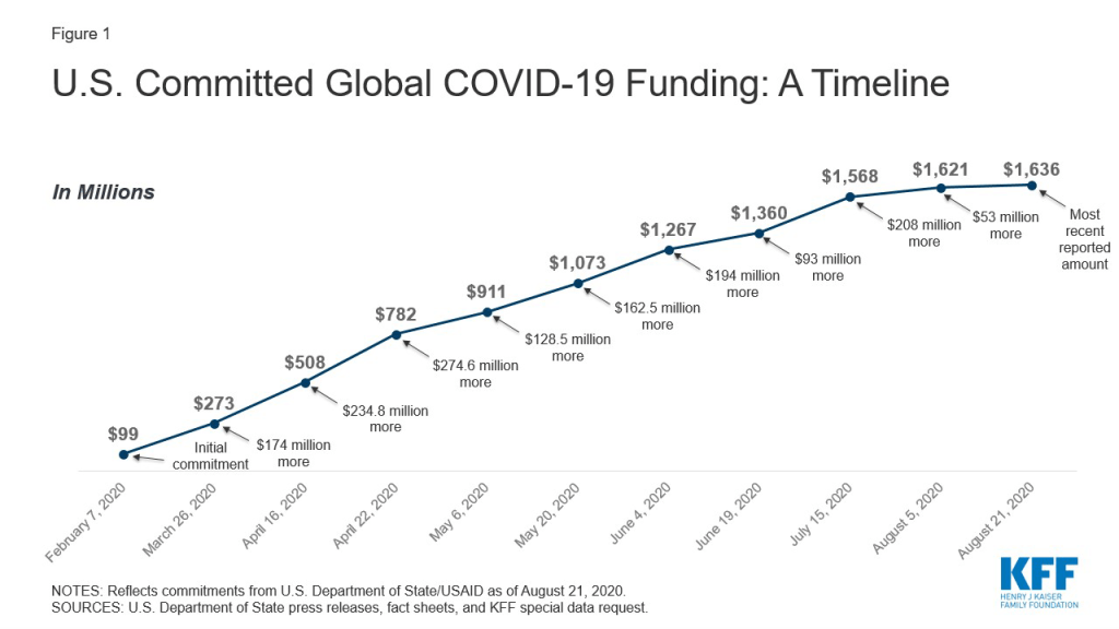
  • As of August 21, 2020, more than $1.6 billion has been committed by State and USAID to respond to COVID-19 globally, including virtually all (approximately $1.54 billion) of the funding provided through COVID-19 emergency supplemental appropriations and $99 million of existing funding from the ERF.
  • Funding was first committed on February 7, through the ERF and before the passage of emergency supplemental funding bills. Funding commitments were next announced on March 27, soon after the first emergency supplemental bill was enacted, and announcements of commitments continued through August 21. See Figure 1.
  • Most funding has been directed to Africa (30%), followed by Asia (17%), the Middle East and North Africa (13%), Latin America and the Caribbean (9%), and Europe and Eurasia (7%). An additional 25% is categorized as “worldwide” funding, which is not designated for a specific region or country at this time. See Figure 2.
  • Funding has been committed to 117 countries (additional countries may be reached through regional and worldwide programming) to support a range of activities, including (but not limited to): case management, community engagement, disease surveillance, infection prevention and control in health facilities, laboratory systems capacity and preparedness, and risk communications. See Table 1.
  • The ten countries with the largest funding commitments, by region, include:
    • Africa (4 countries: Ethiopia [which receives the greatest amount of funding], Nigeria, South Sudan, and Sudan);
    • Asia (2 countries: Afghanistan and Bangladesh);
    • the Middle East and North Africa (3 countries: Iraq, Jordan, and Lebanon); and
    • Europe and Eurasia (1 country: Italy, the only high income country in the top 10, receives the second greatest amount of funding – $50 million).

See Figure 3. These ten countries each received at least $35 million and together account for more than a quarter of funding ($444.3 million) committed by State and USAID.

Figure 1: U.S. Committed Global COVID-19 Funding: A Timeline


  1. State Department, “UPDATE: The United States Continues to Lead the Global Response to COVID-19” fact sheet, August 21, 2020. Data also provided by the State Department in response to a special data request from KFF in May 2020. Some but not all of this funding has been formally obligated; see Testimony of James Richardson, Director, Office of Foreign Assistance, State Department, during SFRC full committee hearing “Pandemic Preparedness, Prevention, and Response,” June 18, 2020, https://www.foreign.senate.gov/hearings/covid-19-and-us-international-pandemic-preparedness-prevention-and-response-061820. ↩︎
  2. In earlier fiscal years, Congress has provided funding to the ERF at USAID to allow this funding to be made available to support future responses to any “emerging health threat that poses severe threats to human health.” See KFF, The U.S. Government and Global Health Security. ↩︎
  3. CDC has posted broad information on how it plans to spend $300 million of the emergency funding; see CDC, “CDC COVID-19 Global Response,” webpage, updated Aug. 5, 2020, https://www.cdc.gov/coronavirus/2019-ncov/global-covid-19/global-response.html. ↩︎
News Release

Analysis: COVID-19 Ranks as a Top 3 Leading Cause of Death in the U.S., Higher than in Almost All Other Peer Countries

Published: Oct 22, 2020

A new KFF analysis examines leading causes of death and mortality rates in the United States and comparable countries.

The U.S. has a higher COVID-19 mortality rate than many of its peer countries, with COVID-19 ranking as the nation’s third-leading cause of death in 2020, behind only heart disease and cancer. Among similarly large and wealthy countries, only in Belgium does COVID-19 also rank as the third highest cause of death. COVID-19 ranks fourth in France, Sweden, and the United Kingdom, but much lower in Germany and Austria, where it ranks 17th and 18th respectively.

The analysis compares the number of COVID-19 deaths in each country through October 15th with annual deaths for other conditions in the most recent full year of data, generally 2017. On the heels of a CDC study finding nearly 300,000 excess deaths in the U.S., this KFF analysis looks at excess death data internationally, finding that the per capita rate of excess deaths in the U.S. is among the highest compared to similarly large and wealthy countries.

Prior to the pandemic, the U.S. had the highest overall mortality rate compared to peer countries. The coronavirus will likely widen the gap in mortality rates between the U.S. and its peer countries, both due to the higher number of deaths directly attributed to COVID-19 in the U.S. compared to peer countries, as well as due to causes potentially exacerbated by the pandemic, including delayed or forgone care.

The analysis is available on the Peterson-KFF Health System Tracker, an online information hub dedicated to monitoring and assessing the performance of the U.S. health system.

The Pandemic’s Effect on the Widening Gap in Mortality Rate between the U.S. and Peer Countries

Authors: Krutika Amin, Giorlando Ramirez, and Cynthia Cox
Published: Oct 22, 2020

A new KFF brief looks at where COVID-19 falls as a leading cause of death in the U.S. compared to similarly large and wealthy countries. The analysis finds that COVID-19 mortality rates are the third leading cause of death in the U.S., a ranking shared by only one peer country, Belgium. In several other peer countries, including Australia and Germany, COVID-19 is not close to breaking into the top 10 leading causes of death.

The brief also addresses high per capita excess deaths in the U.S. – the number of deaths exceeding what is expected in a typical year.

The analysis is available on the Peterson-KFF Health System Tracker, an online information hub dedicated to monitoring and assessing the performance of the U.S. health system.