KFF designs, conducts and analyzes original public opinion and survey research on Americans’ attitudes, knowledge, and experiences with the health care system to help amplify the public’s voice in major national debates.
The implementation of the Affordable Care Act (ACA) has focused attention on the composition of the nongroup market: how it looked before the new regulatory provisions take effect and how it will change afterwards. One basic question has been how many people are covered in the nongroup market. There are several ways of answering this question, depending on the time period for measuring enrollment and the information source. There is substantial turnover among people with nongroup coverage, which means that the number of people covered at the beginning of a year (or at any other point in time) is quite different than the number of people who keep that coverage throughout the whole year.
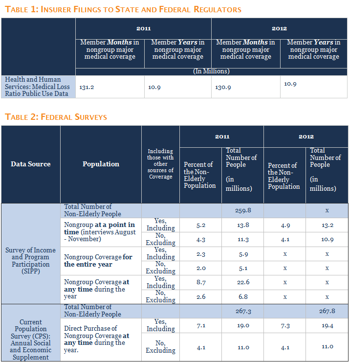
Administrative data from regulatory filings by insurers can be used to count the number of months of nongroup enrollment for a year.1 In 2011 and 2012, there were about 131 million covered months of enrollment in nongroup major medical coverage,2 which translates into about 10.9 million full years of nongroup coverage (Table 1).3 This “member year” number gives us a good estimate of the number of people who have nongroup coverage in an average month, but does not tell us about the types of people who had coverage or for how long they kept it. These questions can be better answered using survey data.
This brief discusses coverage estimates from two national surveys often used to analyze health coverage: the Survey of Income and Program Participation (SIPP) and the Annual Social and Economic Supplement of the Current Population Survey (ASEC). SIPP is a good source of information because it is a large survey, follows respondents over a period of time, and collects coverage information for each month of the year. The ASEC also is a large survey and has the advantage in that it can support coverage estimates at the state level. Our discussion uses data for 2011 because some estimates in SIPP are not available for 2012. All of the estimates discussed in the text are shown in Table 2, which also includes estimates for 2012 where available.
Survey of Income and Program Participation
The Survey of Income and Program Participation (SIPP) interviews a panel of respondents three times each year for several years (the panels vary in duration) and collects coverage information for each month of each year that a respondent participates in the survey. The 2008 panel started with more than 40,000 eligible households. Respondents with insurance coverage are asked about their insurance coverage for each month of the year. SIPP also collects detailed income, employment and demographic information (similar to the ASEC) that can be used to analyze the circumstances of people and families with different types of coverage. Unfortunately, although it has a large national sample, it does not support coverage or other estimates at the state level.
SIPP enables analysis of several different questions about the nongroup market for any year, such as: how many people have nongroup coverage at any particular point in time during a year (e.g., in January or some other month); how many people had nongroup coverage at any time during a year (i.e., the total number of people with at least one month of nongroup coverage), and how many people have nongroup coverage for each month during the year. Longer periods also can be analyzed, although response rates diminish over time and statistical techniques need to be used to correct for loss of participants.
Particularly important for the nongroup market, where there is considerable turnover and where people use the market for different purposes, is that SIPP allows analysis of coverage duration: how long do people stay with nongroup coverage once they have it? People who rely on the nongroup market for long periods of time, such as the self-employed, may have different needs and different resources than people who use nongroup coverage for short periods, such as those who purchase coverage when they are between jobs. The monthly approach in SIPP also allows analysis of people who report multiple types of coverage during a year: did they have more than one coverage type at the same time or did they have different types of coverage at different times of the year? 4
Beginning with a point-in-time estimate, we use SIPP to look at the coverage reported by respondents in the month prior to their Fall 2011 interview (the last year for which calendar-year weights are available for SIPP) and find that about 13.8 million people had nongroup coverage at that time.5 Of these, 11.3 million had nongroup coverage and no other type of coverage, which is likely the best answer to the question of how many people rely on the nongroup market at any given time. An additional 2.5 million people had nongroup coverage and some other type of coverage during the same month. In some cases those people may have been in the midst of a transition, or the nongroup coverage they are reporting may be supplemental insurance rather than comprehensive major medical coverage.
Looking at coverage over a whole the year, about 22.6 million nonelderly people had nongroup coverage in at least one month during 2011. Of these, 6.8 million people had nongroup coverage as their only type of coverage (other than being uninsured) during 2011, including about 5.1 million people who had nongroup coverage (and no other type of coverage) in all 12 months of 2011.
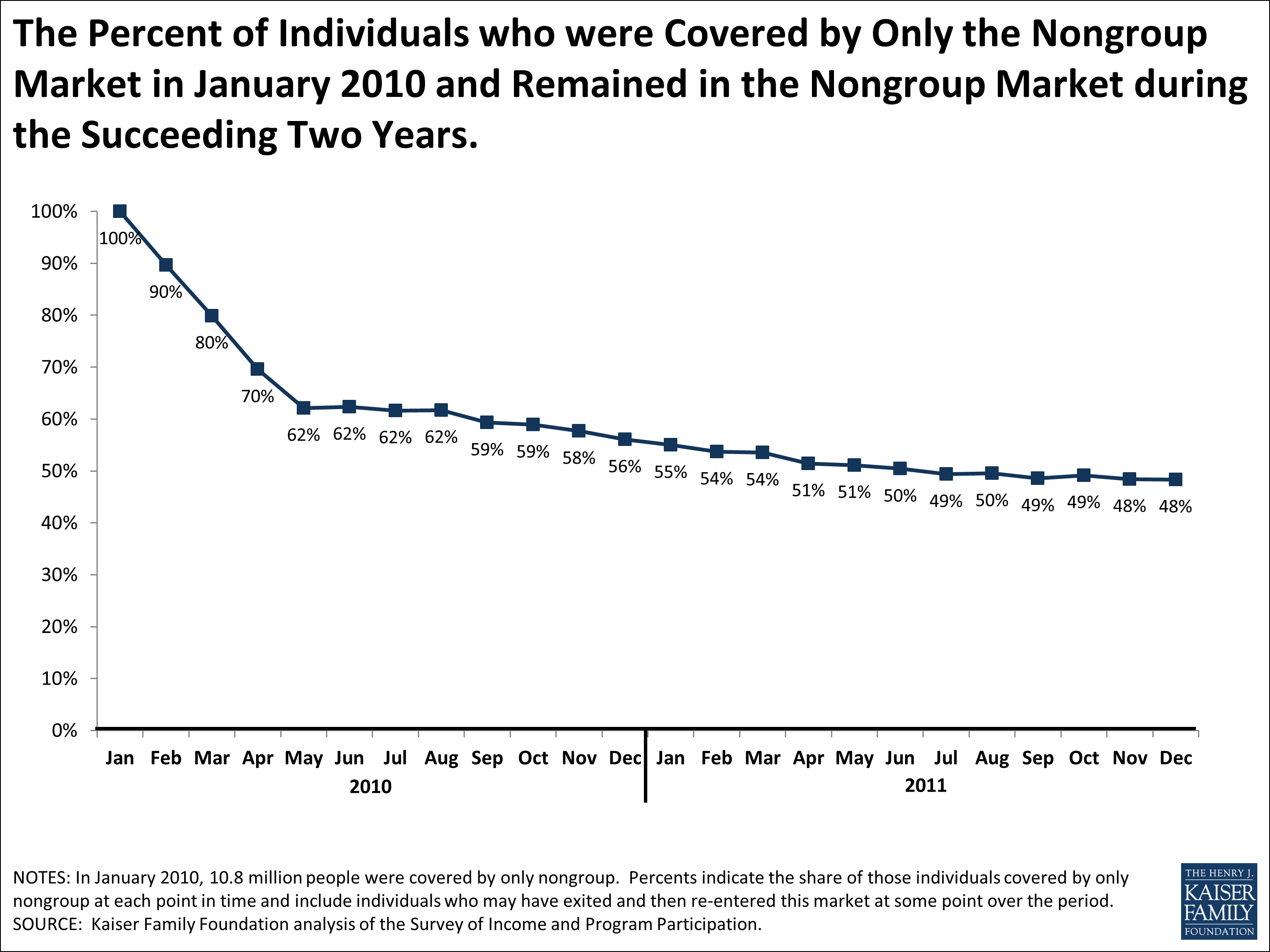
We also can use SIPP to look at how long people who have nongroup coverage keep it. One way of doing this is to look at people who had nongroup coverage at the beginning of a period and then see what percentage report having nongroup coverage at later points in time. As shown in the chart above, if we start with people who had only nongroup coverage in January, 2010, 62% still had only nongroup coverage in July, 2010, 56% still had only nongroup coverage in December, 2010, and 48% had nongroup coverage only in December, 2011. The percentages are almost identical if we look at people who had nongroup plus other coverage types and follow them over the same period. These percentages fall, however, if we look only at people who are continuously covered by nongroup coverage (e.g., they are covered by nongroup coverage for every month across the periods considered). Starting again with people reporting nongroup coverage only in January, 2010, 56% were continuously covered by nongroup coverage through July, 2010, 44% were continuously covered by nongroup coverage through December, 2010, and 31% were continuously covered through December, 2011.
One of the difficulties in using surveys to analyze coverage is that they do not always capture enough information to categorize the coverage reported. In SIPP for 2011, about 8.8 million nonelderly people had coverage identified as “other” at some point during the year, and, of this group, 1.1 million have no other source of coverage during the entire year. If we look at a point in time, about 3.9 million nonelderly people had “other” coverage in the Fall of 2011, with about 2.4 million of them having no other type of coverage. The majority of the 3.9 million people with “other” coverage is young (78 percent are under age 27) and about half (51 percent) say that they are covered by someone outside of the household. This pattern is similar to what we see in the ASEC, discussed below: there are a number of younger people covered as dependents where there is no information to determine the type of coverage that it is. It seems likely that most of these people are dependents under employer-based coverage, because that is the largest source of coverage for families, but some are likely dependents under TRICARE or nongroup policies.6 We do not know how many of these people with “other” coverage have nongroup policies, but to the extent that they do the estimates above are somewhat lower than they should be.
Current Population Survey
The ASEC is the survey that many analysts use for basic estimates of insurance coverage. The Foundation bases many of its estimates on the ASEC, including the basic coverage statistics published in State Health Facts and our primer on the uninsured. The ASEC provides socioeconomic and demographic information of the non-institutionalized American population. The Census Bureau and the Bureau of Labor Statistics administer ASEC as a supplement of the Current Population Survey.7 It is conducted every March and asked of over 60,000 households.
The ASEC is widely used because it is timely, supports both national and state-level estimates, and provides detailed information on insurance coverage, income, employment, and other personal characteristics. The health coverage questions on the ASEC ask about enrollment in public and private types of coverage, the source of coverage (e.g, through an employer or purchased directly), and whether individuals are covered in their own name or as a dependent on someone else’s policy. There is some disagreement among analysts about the time period over which coverage is being measured. The questions ask about having each type of coverage at any time during the year, but many analysts treat the estimates as reflecting the number of people enrolled in a coverage type on any given day during the year (i.e., a point-in-time estimate).8
Estimated from the ASEC, about 19 million nonelderly people were covered by a plan purchased directly from an insurer in 2011. This is the source of the higher range of estimates for the size of the nongroup market that is sometimes cited. However, about 8 million of these people also have other types of coverage as well during the year, primarily coverage from a current or former employer, from Medicaid, or from another government program. In some cases a person may have different types of coverage at different times in the year and in others a person may have more than one type of coverage at the same time. The number of nonelderly people who report having coverage purchased directly from an insurer as their only source of coverage is about 11 million in 2011. This is similar to the SIPP estimate of 11.3 million people with nongroup coverage only in the Fall of 2011.
In addition to those who report direct coverage from an insurer, a number of respondents in the ASEC report that they are covered through someone who lives outside of their household. As with SIPP, the ASEC does not ascertain whether this coverage is provided through an employer, a military program such as TRICARE, or a policy purchased directly from an insurer. About 8.4 million nonelderly people are covered by someone outside of their household in 2011, and for 5.8 million it is the only source of coverage reported in the survey. The vast majority of people with only coverage provided outside of the household are young (86 percent were below the age of 27 in 2011). While most of this coverage is likely dependent coverage under employer-based plans, some of it is nongroup coverage, and to the extent that it is, the estimates above of nongroup coverage are somewhat lower than they should be. The Foundation previously has treated a portion of this coverage as “other private” and included them in the nongroup category in some publications, which likely overstated the number of people with nongroup coverage alone.9
One of the limitations of the ASEC is that it does not address coverage dynamics. Respondents are asked if they had different types of coverage in the past year, but the survey does not collect information about how long people keep each type of coverage that they report or whether they had them at the same time or at different times during the year. Without this information, it is difficult to assess how much respondents depend on each type of coverage that they report. This is one reason why using SIPP may provide a fuller picture of the nongroup market for national estimates.
Discussion
The pre-reform nongroup market is complicated. It was fairly small, serving less than 5 percent of the nonelderly population, with a much smaller population relying on the nongroup market as their only source of coverage. In addition, the nongroup market experiences substantial turnover. There is a large group of purchasers with short stays and another group who rely on the market for longer periods of time. This makes sense because the nongroup market really serves several purposes. Most people with coverage get it through the employer-based system or through public coverage because both receive large federal and state subsidies and are stable sources of coverage. The nongroup market has to fit in around the edges of these other sources of coverage and largely has served the various groups of people who do not qualify for them for one reason or another (e.g., the self-employed, workers or unemployed people without an offer of employer-sponsored coverage, and early retirees not yet eligible for Medicare).The turnover in, and varied populations served by, the pre-reform nongroup market have posed challenges for analysts and others trying to understand the changes occurring under the ACA. The number of people who have and keep nongroup coverage as their primary source of protection is considerably smaller than the number of people in the market at any given point in time. A considerably larger number of people have nongroup coverage sometime during a year, but many have short tenures and may or may not experience any of the changes underway.
Looking forward, the size of the market is predicted to grow dramatically as millions of uninsured people, many assisted by new premium tax credits, obtain and retain nongroup coverage. By 2016, CBO estimates that about 18 million additional people will have nongroup coverage.10 The financial assistance, plus the new requirement that people have coverage or pay a penalty, will likely lengthen the average time that people stay in this market. However, the market will also continue to serve people between jobs or in transitions, so some turnover will continue as people move into and out of employer-based or public coverage.
The Medical Loss Ratio (MLR) provision of the Affordable Care Act requires health insurance issuers to publicly report certain financial and enrollment figures each year. Health and Human Services (HHS) makes these MLR data publicly available for years dating back to 2011. Insurers operating in the nongroup market (and similarly in the small and large group markets) must report enrollment in terms of covered lives, member months, and life-years. The number of covered lives represents the total number of people insured under the plan (including dependents) on the last day of the reporting period. As this is a point-in-time measurement, the number of covered lives does not necessarily reflect enrollment changes throughout the year. The number of member months is the number of people insured (including dependents) on a certain day of each month in the reporting year. By dividing members months by twelve, insurers arrive at the number of life-years. Life-years (also called member years) is a measure of average monthly enrollment and therefore accounts for changes in enrollment throughout the year. ↩︎
The calculation is enrollment months divided by 12. ↩︎
Our analysis of the Survey of Income and Program Participation entailed three separate weighting methodologies: point-in-time weights included with every interview microdata file; 2011 calendar-year weights; 2009-2011 three-year panel weights. These three weighting techniques follow the recommendations by the Census Bureau and allow for generalizations to the noninstitutionalized population of the United States over the varying periods of time mentioned in the text, figure, and table. ↩︎
SIPP interviews the individuals within each household on a four-month rotating basis. Although these estimates were derived from responses collected across four months during the Fall of 2011 (2008 Panel, Wave 10), since each respondent only had one interview in that period, the results are analytically very similar to cross-sectional data. The US Census Bureau commonly employs this strategy to minimize any possible recall bias. Using the cross-sectional weights to look only at the month of September, the 13.8 million we presented in the text would not change. ↩︎
Coverage from outside of the household is likely private coverage because eligibility for public programs is determined for each person and not on a family basis. ↩︎
The Bureau of Labor Statistics. Labor Force Statistics from the Current Population Survey. ↩︎
See for example, Kenney, Genevieve, John Holahan, and Len Nichols. “Toward a More Reliable Federal Survey for Tracking Health Insurance Coverage and Access.” Health Services Research 41.3p1 (2006): 918-45. Print.
Klerman, Jacob, Michael Davern, Kathleen Call, Victoria Lynch, and Jeanne Ringel. “Understanding The Current Population Survey’s Insurance Estimates And The Medicaid ‘Undercount’.” Health Affairs 28.6 (2009): n. pag. Web.
Short, Pamela. Counting and Characterizing The Uninsured. Economic Research Initiative on the Uninsured. University of Michigan, n.d. Web. ↩︎
In prior publications, people with coverage from outside of the household and no other type of coverage were split into two categories: those under age 15 were treated as having employer-sponsored coverage and those age 15 and older were treated as having other private or nongroup coverage. ↩︎
Congressional Budget Office. CBO’s May 2013 Estimate of the Effects of the Affordable Care Act on Health Insurance Coverage. N.p., n.d. Web. 3 Dec. 2013. . The baseline estimates 22 million new enrollees in insurance exchanges, with a 4 million person reduction in nongroup and other. ↩︎
Community health centers are a key source of primary care in medically underserved areas, and their role is expected to grow as coverage expands under the ACA. To sharpen understanding of the health center patient population, this brief compares the characteristics of health center patients and the low-income population overall, using data from the Health Center Patient Survey and the National Health Interview Survey. Health center patients are poorer, more racially and ethnically diverse, and more likely to be uninsured. They also report worse health status. Health center patients fare at least as well as low-income people overall on important measures of preventive care and care management. Findings on receipt of cancer care and selected chronic care services may reflect health center difficulties securing specialist referrals for patients. This pre-ACA profile of health center patients sets the stage for measuring change in the coming years and highlights important health center-related implications of states’ Medicaid expansion decisions.
Section:
0/0
Community health centers are a key source of comprehensive primary care in medically underserved communities across the country, and their role is expected to grow as health coverage expands under the Affordable Care Act (ACA). To sharpen understanding of the health center patient population, this brief compares it to the overall low-income population, using data from the Health Center Patient Survey and the National Health Interview Survey, respectively. The pre-ACA profile of health center patients that emerges sets the stage for measuring change following implementation of the reform law and can inform health center policy, planning, and assessment moving forward.
Key Findings
Compared to the low-income population overall, health center patients are more disadvantaged. Health center patients are poorer, more racially and ethnically diverse, and more likely to be unemployed and uninsured than the broader low-income population.
Health center patients are twice as likely as low-income people overall to report being in only fair or poor health – 32% compared to 16%. The disparity in self-reported health status is apparent not only in the aggregate, but also within different insurance categories. For example, among both Medicaid beneficiaries and the uninsured, 1 in 3 health center patients report being in fair or poor health, compared to about 1 in 7 low-income individuals generally. These findings point to health centers as a locus of care for a largely low-income population with substantial health burdens.
Rates of chronic conditions are higher among the health center patient population. Adult health center patients report having diabetes and asthma at rates 50% higher than the rates among all low-income adults. Their self-reported rate of hypertension is also higher.
On key measures of preventive care and care management, health center patients fare as well as or better than the low-income population in general. Children who are health center patients are more likely than all low-income children to have received a check-up and a dental visit in the past year. Cancer screening rates are roughly similar between adult health center patients and all low-income adults, and adult health center patients with chronic diseases are at least as likely to receive chronic care services. However, mixed findings on cancer care and low rates of chronic care receipt point to health center difficulties in securing access to specialist care for patients.
Conclusion
Expanded coverage under the ACA promises health centers new revenues to expand and improve care, and newly insured patients stand to gain greater access to specialists as they join health plans with broader provider networks. In states that do not expand Medicaid, health centers and some 1 million uninsured health center patients will miss out on these improvements. Even as coverage expands, health centers will continue to serve many uninsured people and provide services not covered by insurance. Ongoing grant funding is needed to meet these costs. With expected changes in the health center population as many uninsured adults gain coverage, health centers may begin to strengthen their capacity to manage serious and chronic conditions and to enhance their adult preventive services to keep adults healthy and active.
Issue Brief: Introduction
Community health centers play a central role in ensuring access to care in medically underserved communities across the country. Typically, they are located in low-income areas that are lacking in other health care resources. In 2011, over 1,100 federally funded health centers operating in about 8,500 urban and rural locations across the United States served more than 20 million patients. Health centers provide comprehensive primary medical care, often including behavioral health services and dental care, and provide support services such as translation, transportation, and case management that help patients to gain access to care. The nation’s reliance on health centers is likely to grow as health insurance coverage expands under the Affordable Care Act (ACA). Recognizing the need to expand the role of health centers, the ACA established a dedicated five-year $11 billion health center trust fund to broaden access to care in medically underserved, low-income communities.
Knowledge about the characteristics of health center patients and how they use care is important for several reasons. First, the increased emphasis on “patient-centeredness” that is part of comprehensive health system reform begins with an understanding of the patients being served. Second, such understanding is needed to inform policy specifically related to the establishment, operation, payment, and funding of community health centers. Third, it is likely that, as health centers grow in number and strength in response to the ACA’s insurance expansions and direct investments, the profile of health center patients may change. Health centers already play a key role in the provider networks of Medicaid and CHIP health plans, and, in many communities, they are expected to play a key role in the networks offered by Qualified Health Plans, especially plans offered by firms that do business in both the Medicaid market and the new Marketplaces (either through a single plan that satisfies the requirements of both markets, or through affiliated plans that share common networks). Establishing a profile of health center patients before the ACA is implemented sets the stage for measuring change over time, understanding the impact of the ACA, particularly the impact of state decisions regarding the Medicaid expansion, and assessing the environment in which health centers operate and the resources available to them to carry out their mission.
The Health Resources and Services Administration (HRSA)’s Bureau of Primary Health Care periodically collects information on a nationally representative sample of health center patients, through its Health Center Patient Survey. To learn more about the health center population, this brief compares data from the most recent Health Center Patient Survey, conducted in 2009, to data on the low-income* U.S. population, drawn from the National Health Interview Survey (NHIS), on which the Health Center Patient Survey is also modeled. The 2010 NHIS was used because it included more variables of interest for this study than the 2009 NHIS. Detail on the data and methodology associated with each of the two surveys are available in the Methods Appendix at the end of this report.
* In this paper, “low-income” is defined as income below 200% of the federal poverty level (FPL), which is $22,980 for an individual and $47,100 for a family of four in 2013.
Issue Brief: Demographic Characteristics
Community health center patients differ demographically from the total U.S. population and even from the low-income U.S. population. In part, the differences reflect health centers’ specific statutory mission to serve medically underserved communities and populations. In addition, some of the differences reported in this analysis may stem from the fact that the comparison presented here is between people who use health center services and a general low-income population that comprises both people who use and people who do not use health care (including care offered by health centers) in the survey period. Compared to the low-income population overall, health centers users are poorer, more racially and ethnically diverse, more likely to be working-age adults, and more likely to be unemployed and uninsured. Many of these factors relate to one another. For example, people of color experience disproportionately high rates of unemployment and low income,1 and low-income working-age adults are more likely than others to be uninsured.2
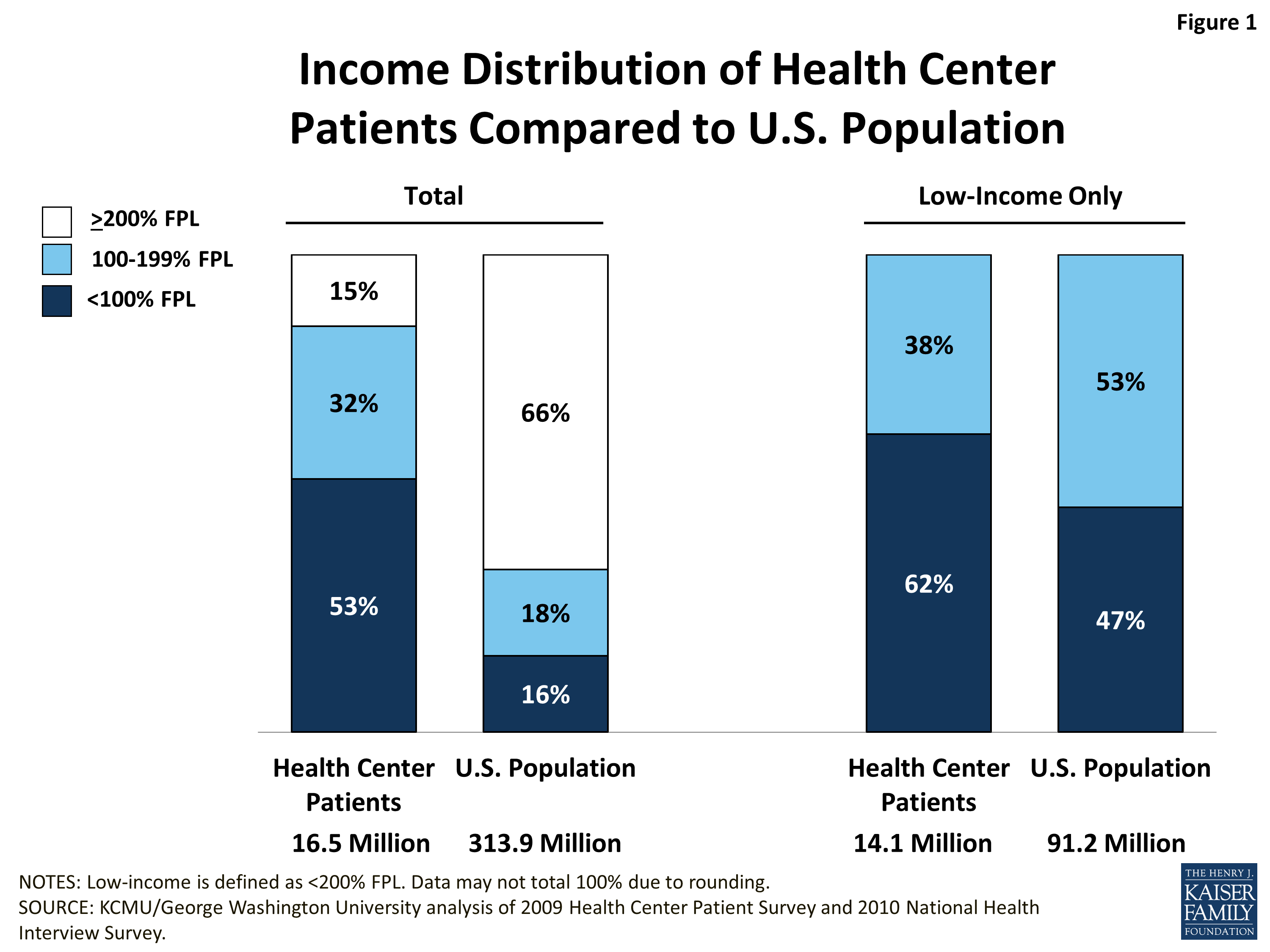
Income. Community health center patients are much more likely to be low-income than the U.S. population overall. More than half (53%) of individuals who obtain at least some of their care from health centers have income below the federal poverty level (FPL) ($11,490 for an individual and $23,550 for a family of four in 2013), and almost another third (32%) have income between 100% and 199% FPL (Figure 1, left panel). The remaining 15%, who have income equal to at least 200% FPL, tend to have very limited income as well. A recent analysis found that only 3% of CHC patients had incomes above 400%.3
The income distribution of the total U.S. population is much different. One-third of the population is below 200% FPL, divided about evenly between those below poverty and those between 100% and 199% FPL. Two-thirds have income at or above 200% FPL, and income levels in this group are not bunched near 200% FPL but are widely distributed.
Even within the population below 200% FPL, poverty is deeper among health center patients (Figure 1, right panel). More than six in ten low-income health center patients have income below the poverty level; by contrast, less than half (47%) of the low-income population overall is in this lowest income band. Our study population – all health center patients* – is overwhelmingly a low-income one. For that reason, and because low income is so strongly associated with certain other patient characteristics, we use the low-income U.S. population as our comparison group in the remainder of this analysis.
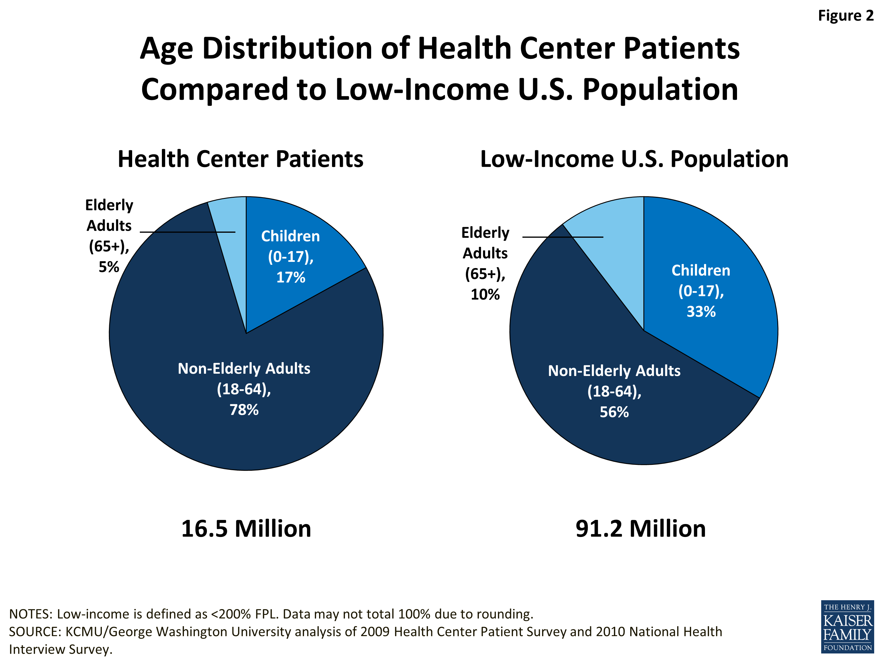
Age. Non-elderly adults (age 18-64) make up a much larger share of the health center patient population than of the low-income population overall. More than three-quarters of health center patients are working-age adults, compared to 56% of low-income people generally (Figure 2). Correspondingly, both children and people age 65 and older make up smaller shares of the health center population. Children represent 17% of health center patients, compared to 33% of low-income people overall; people age 65 and older represent 5% of health center patients, compared to 10% of all low-income people. The higher representation of working-age adults among health center patients suggests that low income non-elderly adults are especially reliant on health centers, compared to either low-income children or older adults. This finding likely reflects the significantly elevated uninsured rate among low-income working-age adults compared to other low-income age groups, a fact that requires them to depend more heavily on safety-net providers for care.4 It also may reflect the relatively high and unmet need for health care among a segment of the low-income adult population, which, when a health center exists in the community, leads them to seek care.
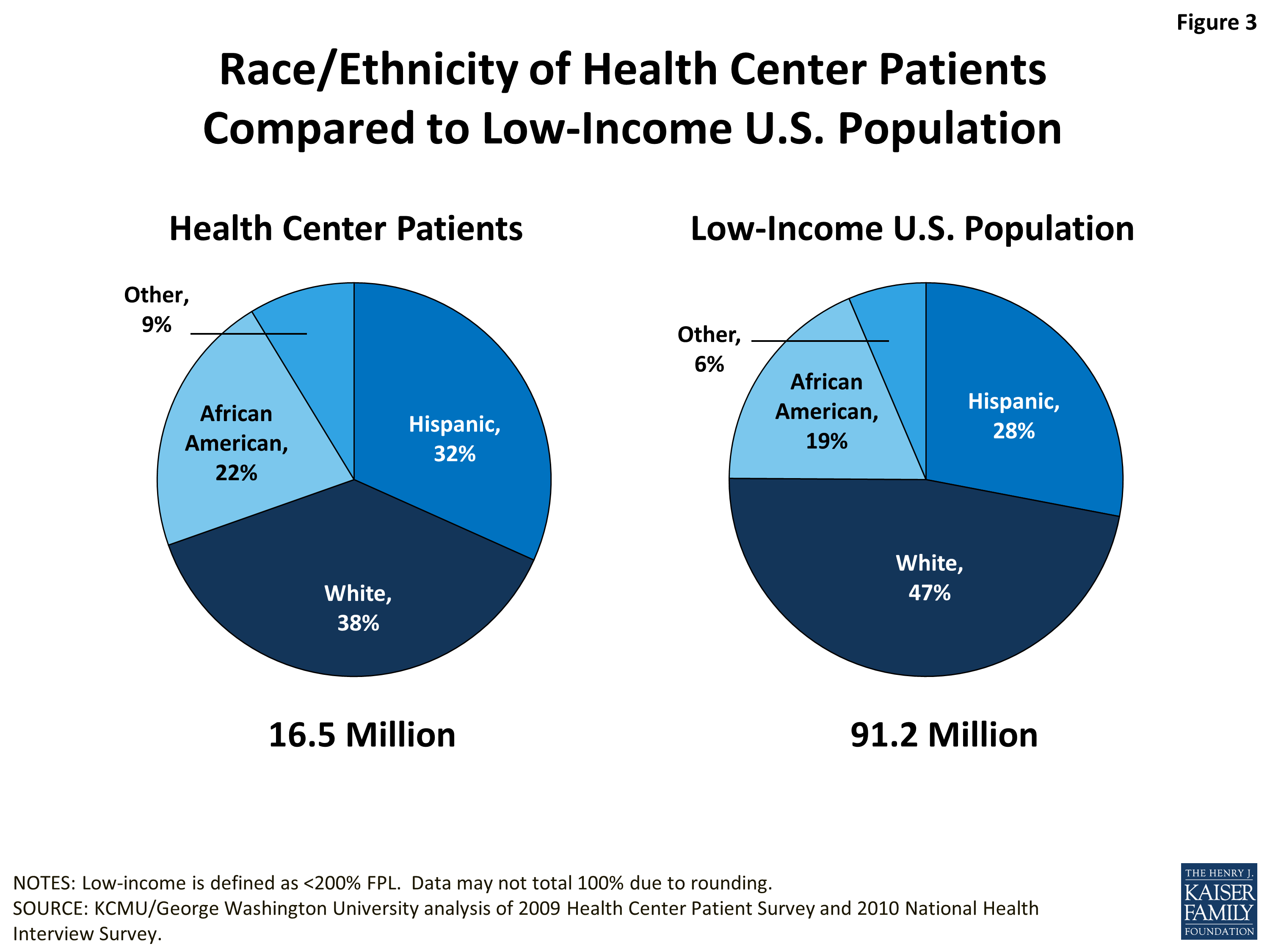
Race/ethnicity. Health center patients are more racially and ethnically diverse than the low-income population overall. They are more likely to be Hispanic, African-American, or a member of another racial or ethnic minority group. Patients are less likely to be White than the general low-income population (Figure 3). Thus, health centers play an important role in serving communities of color and helping narrow racial and ethnic disparities in health care. The relatively high representation of people of color among health center patients is likely a reflection of the strong correlations between race/ethnicity and low income, poorer health status, higher uninsured rates, and residence in medically underserved areas.
Language preference/primary language. Roughly three-quarters of both health center patients and the low-income population overall report English as their preferred or primary language. Over a fifth (22%) of health center patients say they prefer to speak Spanish over English or another language. Among the general low-income population, 13% say they speak only or mostly Spanish, while another 6% say they speak both English and Spanish. However, the two surveys ask about primary language differently, so the measures are not directly comparable between the two populations (Figure 4).
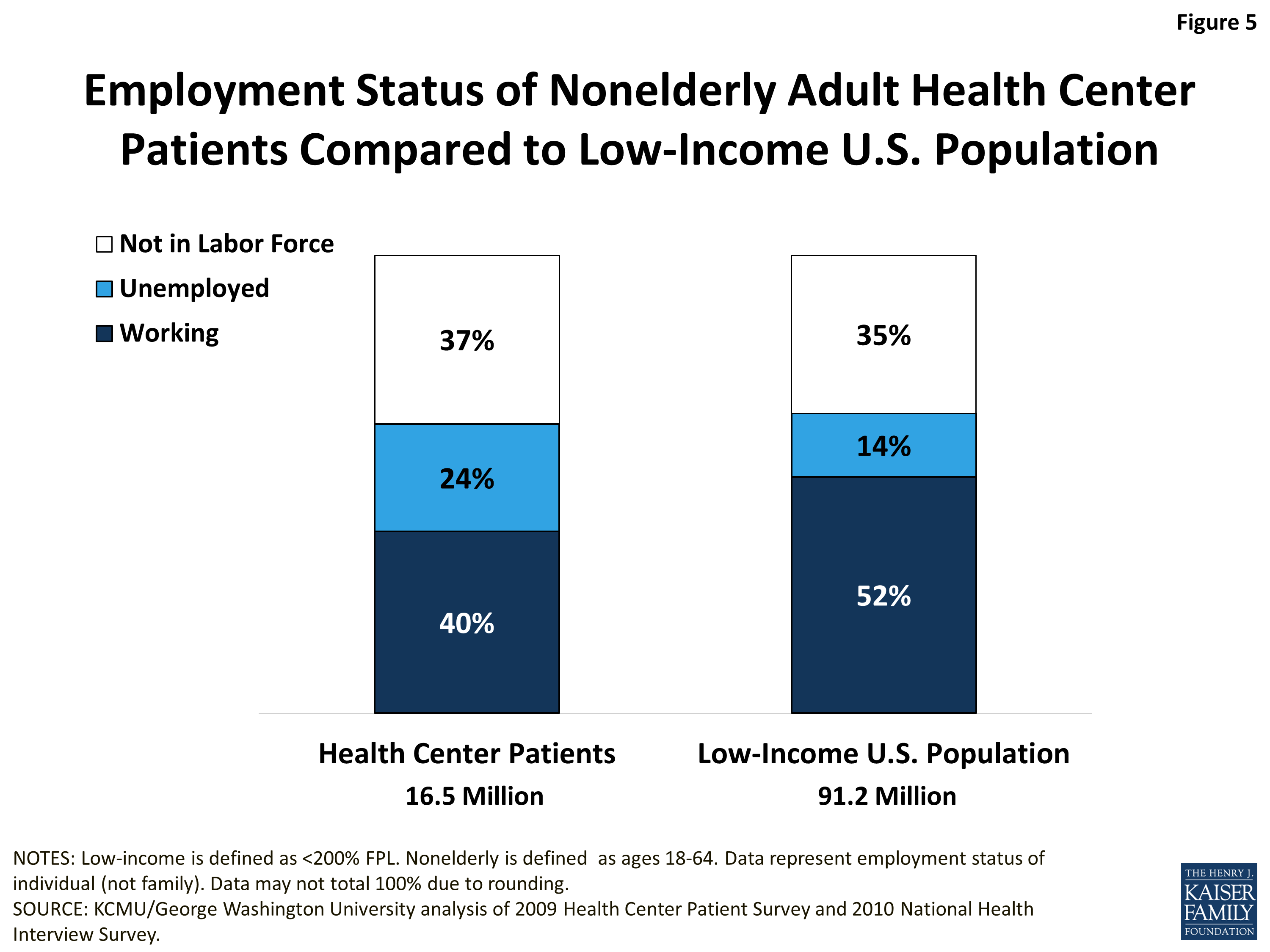
Employment status. Health center patients are more likely to be unemployed than low-income people overall. In 2009-2010, 24% of working-age adult health center patients were unemployed, compared to 14% of all low-income working-age adults (Figure 5). Given the adverse impact of joblessness on insurance coverage, the resulting difficulty that unemployed people face affording necessary health care, and the fact that health centers have traditionally served as a source of care for people who have trouble affording services, the higher unemployed rate among health center patients is not surprising.
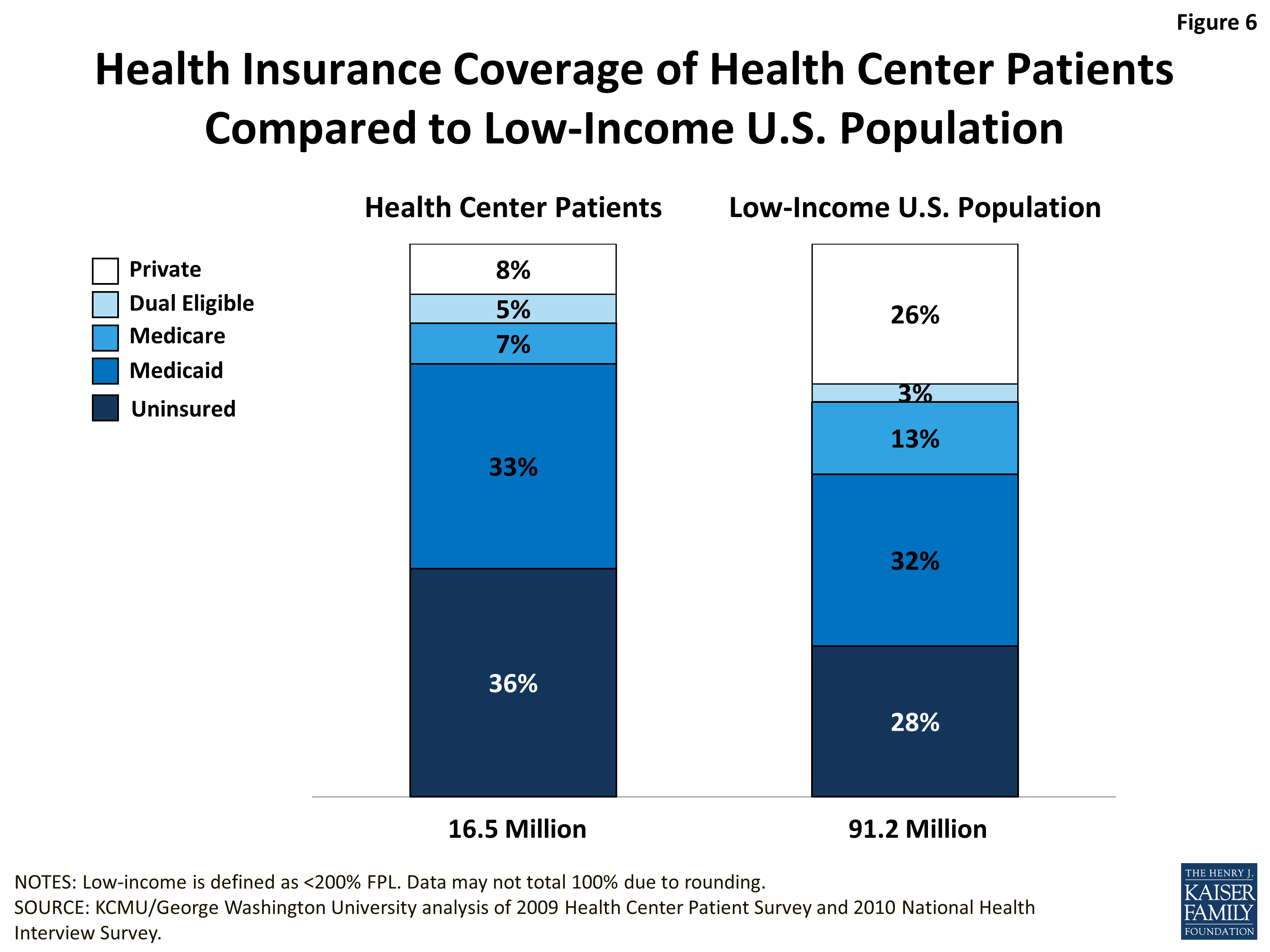
Uninsured rate. Health center patients have higher uninsured rates than the general low-income population, in part because they are more likely to fall into the age range (nonelderly adults) in which the risk of being uninsured is highest. While 28% of all low-income people are uninsured, 36% of all health center patients are uninsured (Figure 6). Despite the fact that health center patients are more likely to be uninsured, the proportion of people with Medicaid coverage is almost the same – roughly one-third – among health center patients and the low-income population generally. Not unexpectedly, given the under-representation of patients age 65 and older among health center users (relative to the overall low-income population), the share of individuals with Medicare is relatively low among health center patients, compared to the overall low-income population (7% versus 13%). Also, even though working-age adults make up a substantially larger share of health center patients than of the broader low-income population, the rate of private coverage – largely, employer-sponsored insurance – is much lower among health center patients than among low-income people generally – 8% compared to 26%. Factors that may help to explain health center patients’ lower rate of private coverage include the deeper poverty of health center users, their worse health status (discussed below), and their higher rate of unemployment.
* Note: The total health center population is 16.5 million in all Figures in this brief. This total differs from the total of 20 million health center patients, cited in the Introduction. The difference is attributable to the use of different data sources (2009 Health Center Patient Survey and 2011 Uniform Data System Report (HRSA, 2012), respectively), and to the weighting methodology and additional adjustments to the data in the Health Center Patient Survey.
Issue Brief: Health Status
Health center patients are in poorer health than the low-income population overall. They report poorer health status, more chronic health conditions, and higher rates of smoking and obesity. These patterns reflect underlying differences in health status between health center patients and the general low-income population, but also the fact that people who seek health care — here, health center users — are, by definition, likely to need services, whereas the overall low-income population includes both health care users and non-users, whose health care needs presumably are more limited. The data show that health center patients are a population with substantial needs for health care.
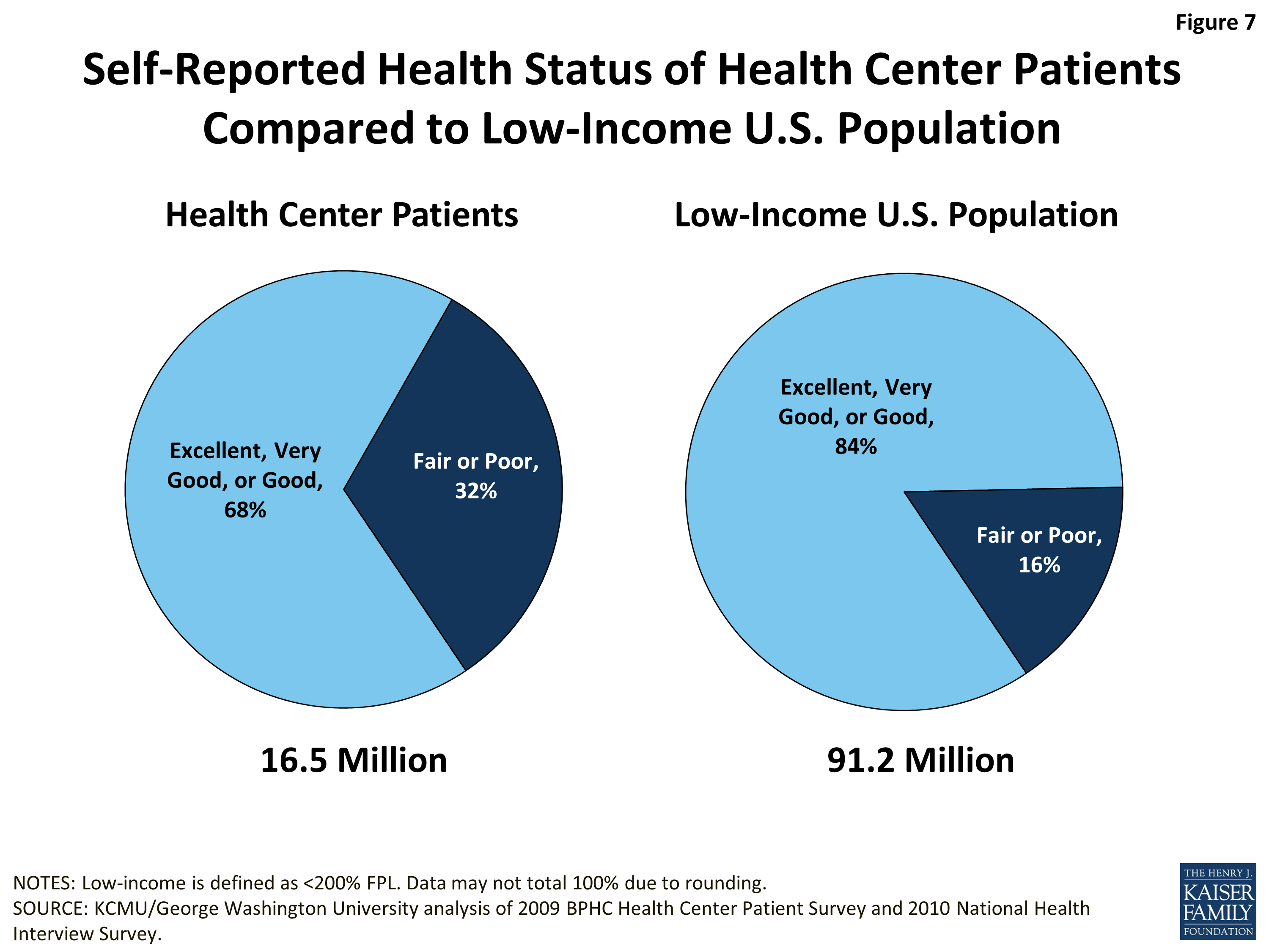
Self-reported health status. Health center patients are twice as likely as low-income people overall to report being in fair or poor health, as opposed to excellent, very good, or good health (32% vs. 16%) (Figure 7). It is important to note again that, because all individuals participating in the Health Center Patient Survey are seeking care, they might be more likely to be in fair or poor health than the broader low-income population captured in the NHIS, a household survey that includes both users and non-users.
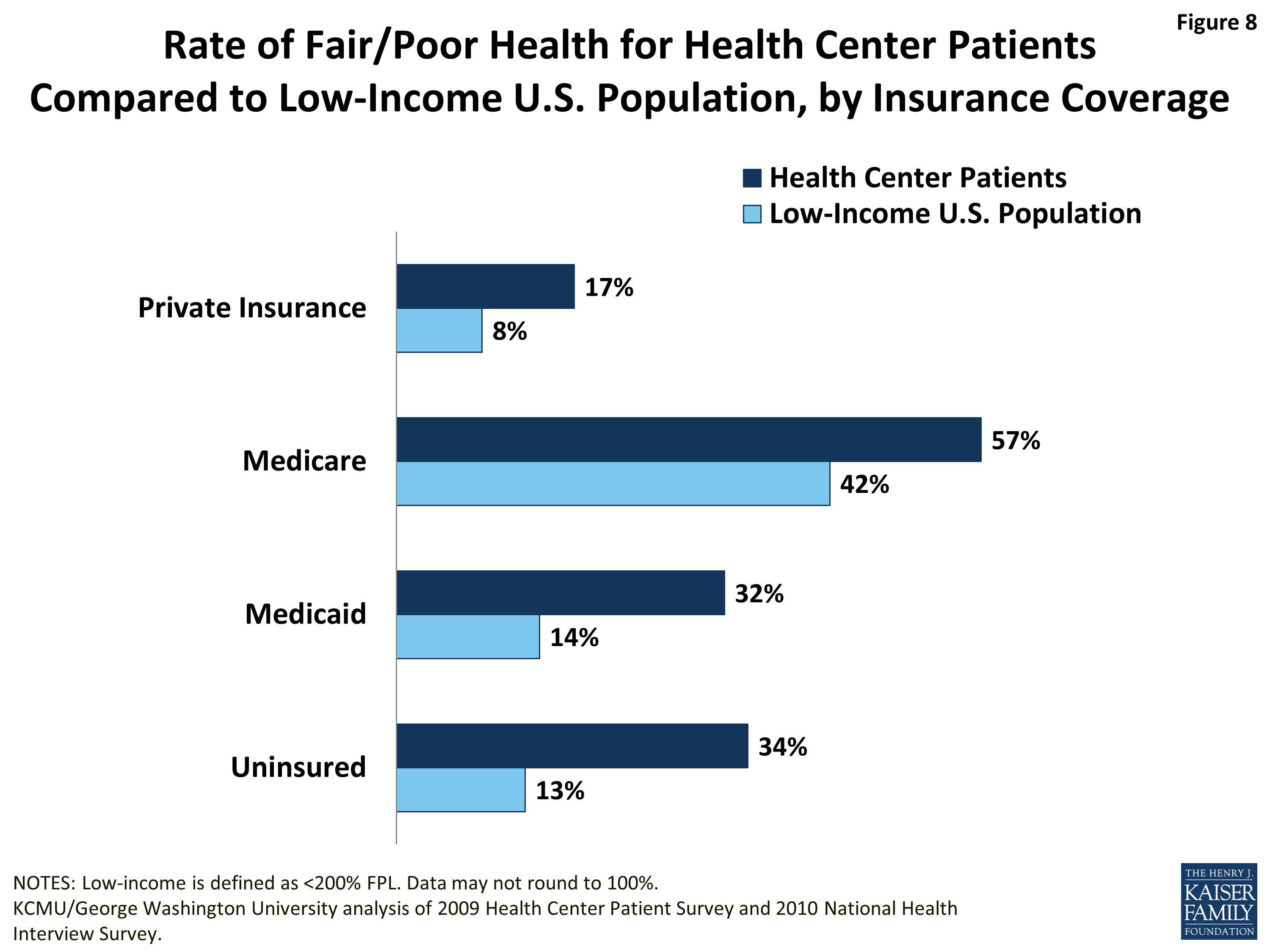
Self-reported health status, by insurance coverage. Health center patients are more likely to report being in fair or poor health than the general low-income population, not only in the aggregate but also within different health insurance categories. Among the privately insured, the share reporting fair/poor health is twice as high for health center patients as for low-income people overall (17% vs. 8%) (Figure 8). Within the Medicare, Medicaid, and uninsured populations, which have much higher rates of fair/poor health than the privately insured, the rates for health center patients far exceed those for low-income people overall in the same coverage group. Among Medicaid beneficiaries, 42% of all low-income people but 57% of health center patients report fair/poor health. Among both Medicaid beneficiaries and the uninsured, 1 in 3 health center patients reports being in fair/poor health, compared to about 1 in 7 low-income individuals generally. These findings point to health centers as a locus of care for a subgroup of the low-income population that has substantial health burdens.
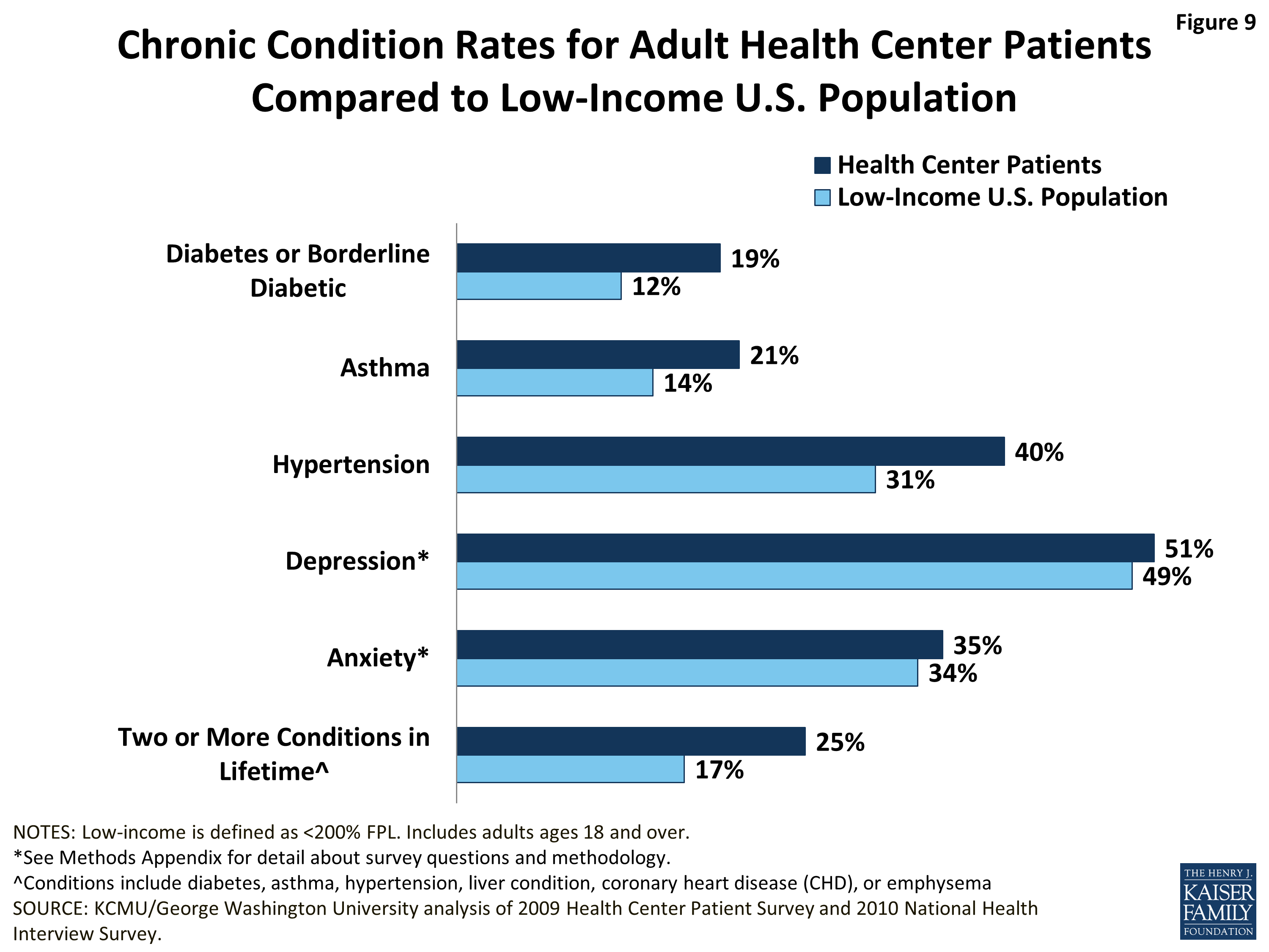
Chronic conditions. Adult health center patients are more likely than low-income adults overall to report that they have had one or more of a number of major chronic conditions during their lifetime. In particular, adult health center patients report rates of diabetes and asthma 50% higher than in the total low-income adult population (Figure 9). They also report higher rates of hypertension. In addition, a quarter of all adult health center patients report having had two or more chronic conditions, compared to 17% of all low-income adults. Half of both adult health center patients and low-income adults overall report depression, and about a third of both populations report anxiety. These high rates of mental health conditions may in part stem from the way the survey questions related to these conditions were framed. The Health Center Patient Survey asked patients to self-report whether they had ever had depression or anxiety in their lifetime. The NHIS asked only a subsample of adults who reported symptoms of anxiety/depression whether they had been told by a medical professional that they had either of these conditions.
The high rates of chronic illness among adult health center patients may be one reason these individuals presented for care. The high rates also reveal that care of people with chronic diseases and conditions is central to the work of health centers.
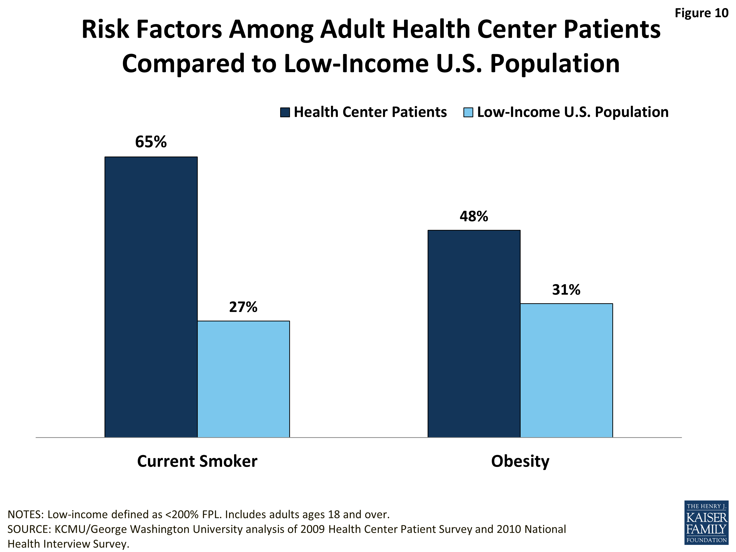
Health risk factors. Smoking and obesity rates are not only high among adult health center patients, but also much higher than for the low-income population overall. Nearly two-thirds (65%) of health center patients are current smokers, compared to about a quarter (27%) of all low-income adults (Figure 10). Almost half are obese, compared to 31% of low-income adults overall. Smoking and obesity are closely linked with serious health problems such as cardiovascular disease and diabetes. The very high prevalence of these risk factors in the health center population may help to explain the patterns in chronic disease prevalence discussed above.
Issue Brief: Use Of Care
Health centers’ mission is to provide comprehensive primary care to their patients. Preventive health services and care management for ongoing health conditions are core components of this care, and several of the metrics used to evaluate health center quality focus on such services. Other research has demonstrated that health centers perform comparably to, if not better than, private practice physicians and other primary care providers in these spheres of care.5 This analysis, which complements that research, finds that, on key measures of preventive care and care management, health center users fare better than the low-income population in general. As with the results on health status, comparisons of utilization between health center patients and the low-income population overall may partly reflect the fact that health center patients are, by definition, already receiving care. However, even accounting for this difference, the analysis indicates some areas for concern regarding health center patients’ ability to access follow-up services, which may be outside the scope of services available at most health centers and thus require referrals. Because so many health center patients are uninsured, health centers face particular challenges in obtaining referrals.
Preventive Care
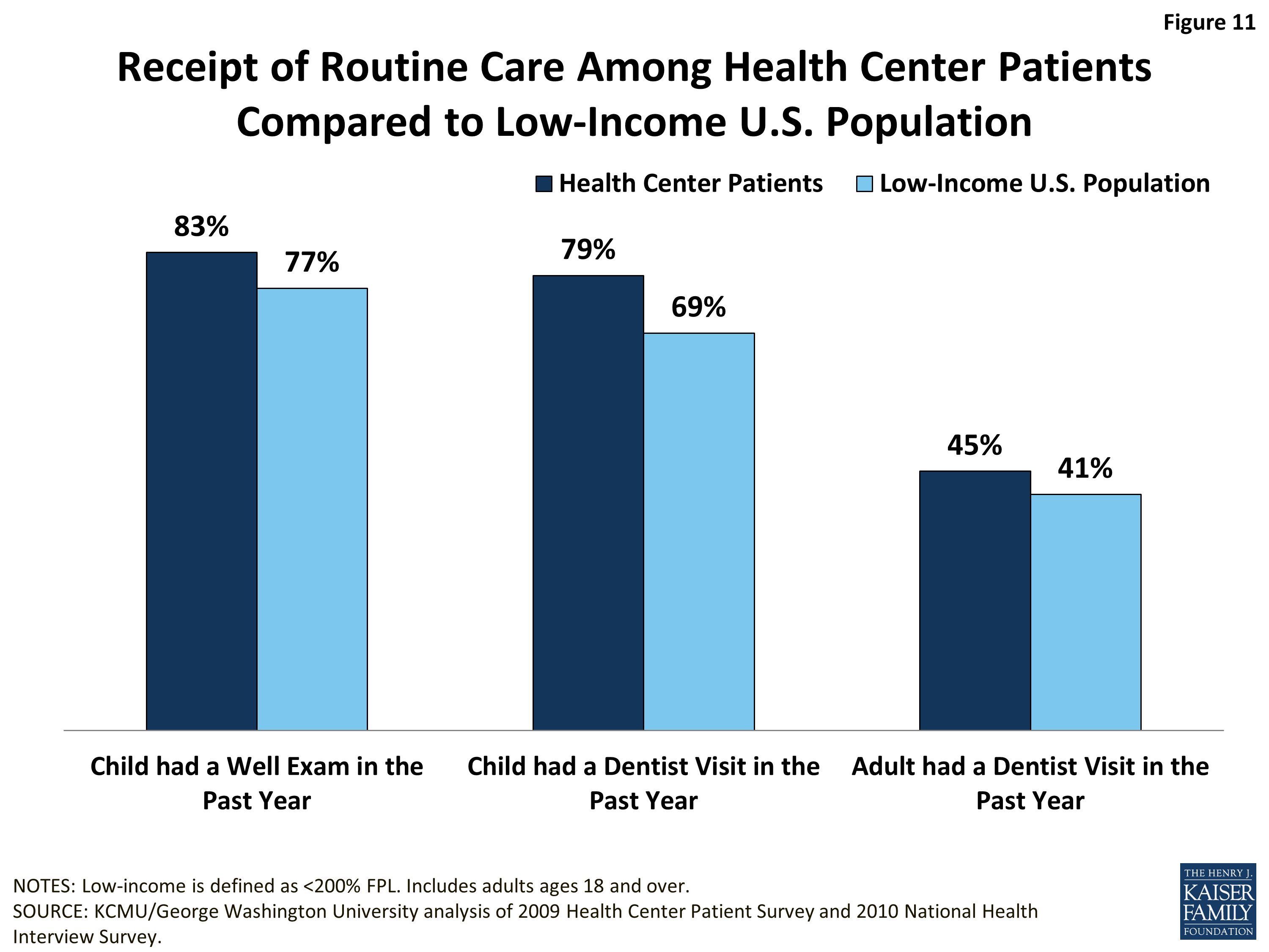
Well-child visits. On the most basic measure of preventive care for children—whether a child had a check-up within the past year—the data show that children who were health center patients fared better than children in the broader low-income population (Figure 11). This difference could reflect several underlying causes: patients who visit health centers may be more engaged in their care and thus more likely to visit a doctor for well-visits; health centers may do a better job of bringing patients in for routine care; or patients not seeking care at a health center may encounter barriers to well-child visits.
Dental visit. Health center patients are at least as likely as the general low-income population to report having had a dental visit in the past year (Figure 11). The share of adults with a dental visit is similar between the two populations. The fact that, in both groups, fewer than half received a visit warrants concern given the importance of good oral health to good overall health. The low visit rate likely reflects the high uninsured rate among low-income adults as well as very limited Medicaid coverage of adult dental benefits and low dentist participation in Medicaid. The low proportion of adult health center patients with a dental visit may also reflect the fact that, while dental care has been a priority expansion service for health centers, as of 2011, only 78% of all health centers reported offering dental care.6 Dental visit rates are higher among children, likely because of Medicaid’s comprehensive benefit package for children, known as EPSDT, which includes oral health services. Notably, children who are health center patients are more likely than low-income children overall to report a dental visit in the past year (79% vs. 69%). It is possible that children who receive at least some care in health centers are more connected to the health care system generally (including dental care), compared to all low-income children, or that they have better access to dental care through health centers compared to children who do not use health centers. The extent to which health centers that offer dental care focus on pediatric oral health also may be a factor.
Considering that health center patients are more likely to be uninsured than low-income people overall, it is interesting that they appear at least as likely to secure a dental visit. This finding may reflect the fact that, as mentioned earlier, most health centers offer dental care. At the same time, given that it is not possible to know whether the care received was preventive in nature or treatment for a dental problem, this finding is difficult to interpret. It could indicate a stronger connection to the health care system among health center users compared to low-income people overall, the availability of dental services in most health centers, and/or higher rates of oral disease among health center patients.
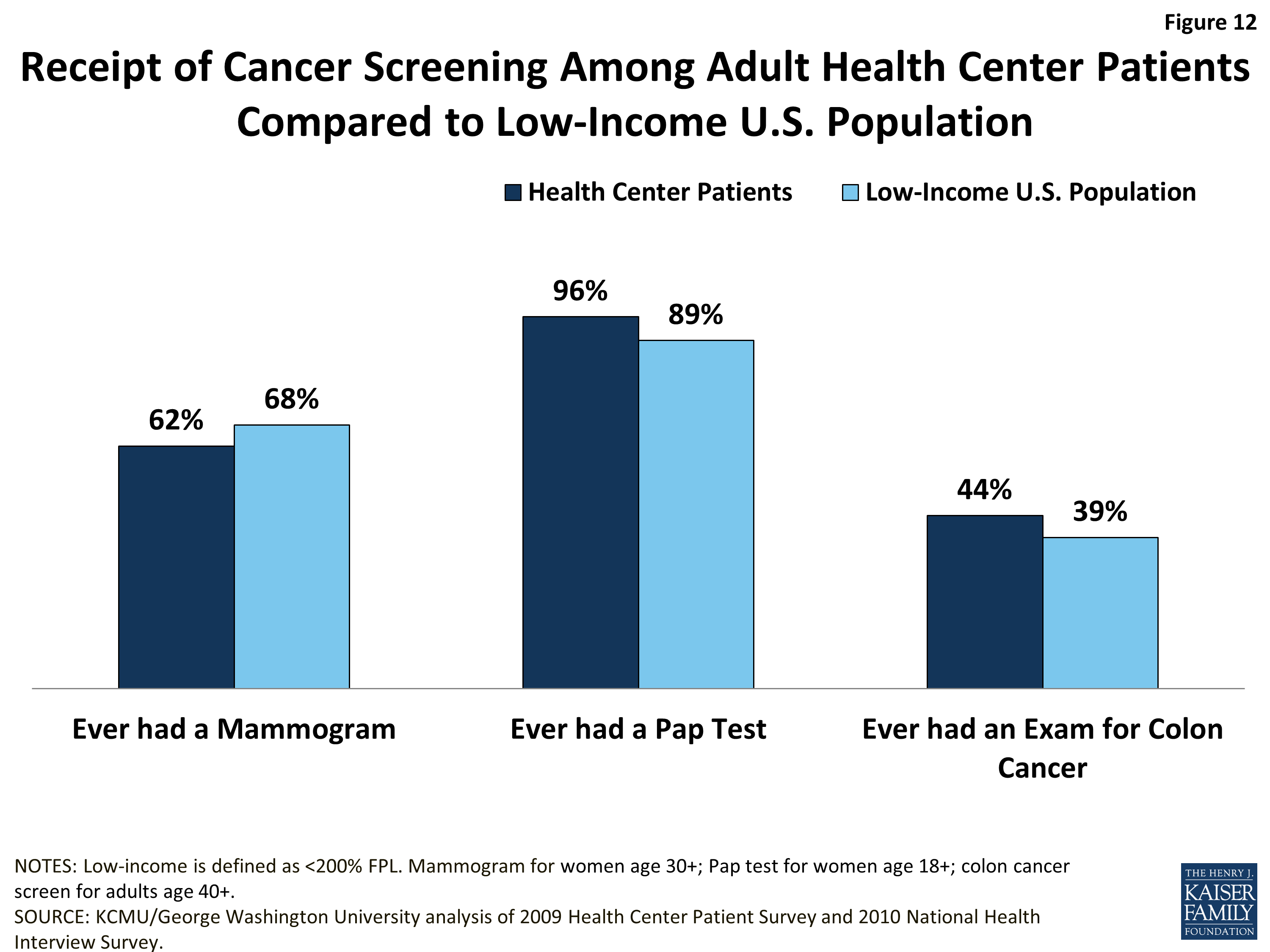
Cancer screening. Adult health center patients are at least as likely as low-income adults overall to report ever having received a Pap test (women only) or an exam for colon cancer, but appear slightly less likely to report ever having received a mammogram (women only) (Figure 12).
Follow-up and Chronic Care
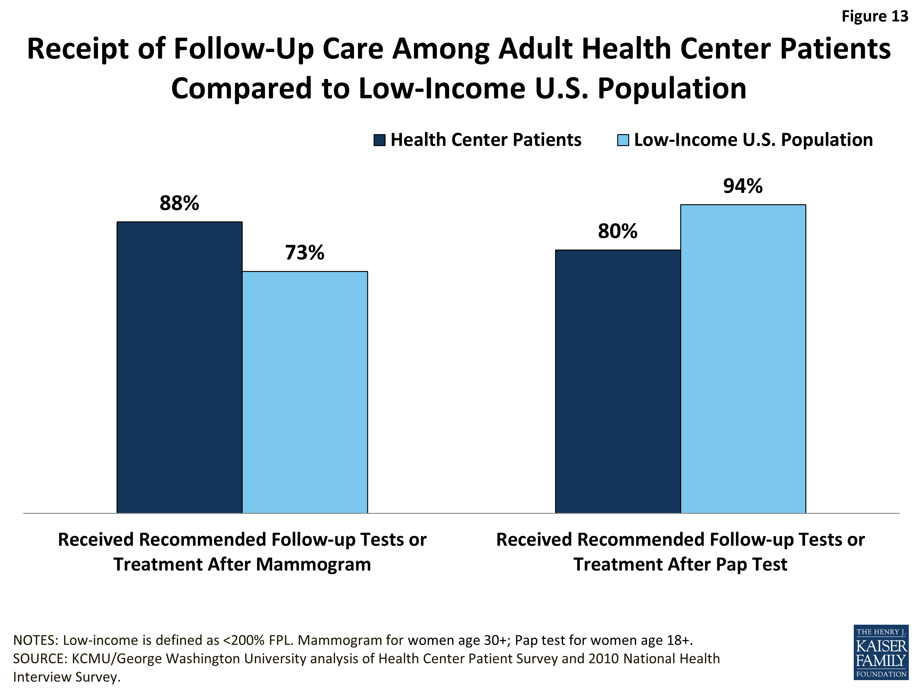
Follow-up cancer care. In addition to check-ups and screenings, referral for follow-up services and ongoing management of chronic illnesses are core components of comprehensive care. The findings on health center patients’ access to follow-up cancer tests are mixed and caution is required in interpreting them.
Although female health center patients are slightly less likely than all low-income women to report ever having received a mammogram, those who did have a mammogram and were referred for follow-up care are more likely (88% versus 73%) to have reported receiving the recommended follow-up care (Figure 13). At the same time, although they are slightly more likely than low-income women overall to report ever having received a Pap test, health center patients who did receive a Pap test are markedly less likely to report that they received the recommended follow-up care. Because health centers’ capacity to provide or arrange for specialist care, including cancer treatment, is very limited, measures of receipt of recommended follow-up cancer care by health center patients may reflect more about the issue of low-income people’s access to specialty care broadly, than about health centers or health center patients in particular. At the same time, a separate study of family planning services at health centers (which include Pap tests) suggests that health centers may focus less on providing this cancer screening service than other family planning services.7 Differences in follow-up care between health center patients and all low-income people may also stem from insurance differences between the two groups that affect their access.
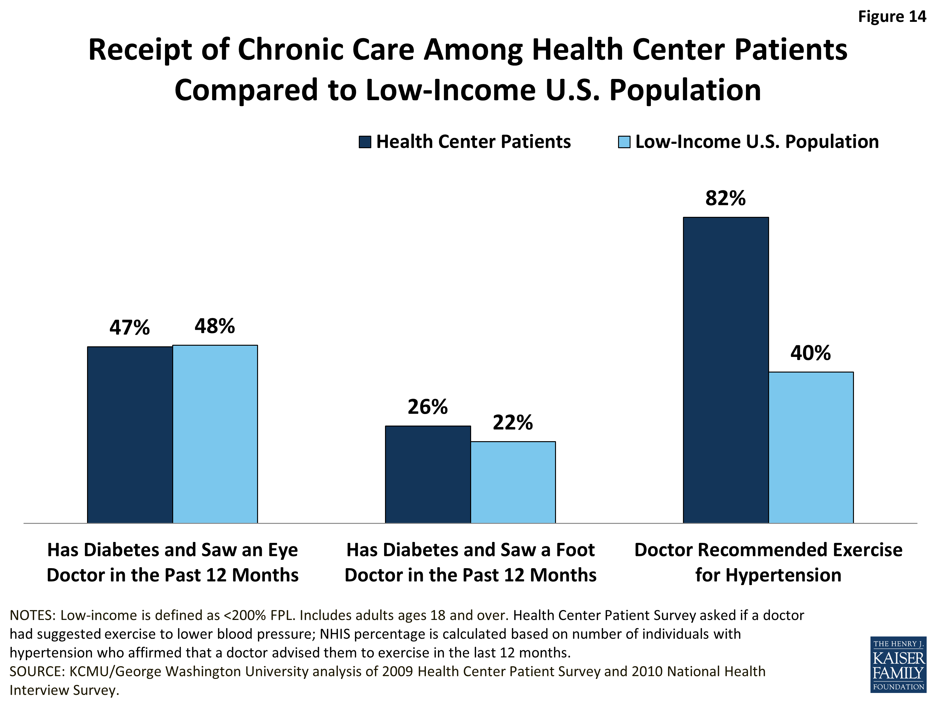
Chronic care. Among adults with diabetes, health center patients and all low-income adults report relatively similar rates of receipt of care to manage their diabetes. Roughly half of both populations report having seen an eye doctor in the past 12 months, and about one-quarter report having seen a foot doctor (Figure 14). As with cancer care, the follow-up eye and foot care described here is specialty care that health centers generally do not offer; thus, these measures, too, are indicators of access to specialty care among low-income people, rather than of health center performance or effectiveness.
Adult health center patients with hypertension are more than twice as likely as all low-income adults with hypertension to report that a doctor recommended exercise for them (82% vs. 40%). Some of this difference may reflect methodological differences in how the rates for the two groups are determined. The rate for health center patients is based directly on the Health Center Patient Survey question that asks respondents if a doctor suggested exercise to lower their blood pressure. The rate for low-income adults was derived as the share of NHIS respondents with hypertension who affirmed that their doctor advised them to exercise in the last 12 months. As distinct from the other two measure of chronic care, which require access to specialists, a recommendation to exercise is squarely within health centers’ preventive and primary care capacity. The higher rate of receipt of this intervention for hypertension among health center patients compared to low-income adults overall suggests that health centers are playing an important role in fostering patient self-management of this prevalent chronic condition.
Issue Brief: Conclusion
The findings of this analysis point to two important sets of implications stemming from the ACA. The first has to do with the impact of health reform – primarily, the Medicaid expansion – on current health center patients and operations. The second concerns potential changes in the profile of the patients who seek care from health centers and potential resulting changes in health centers’ activities and role in the health care system.
Impact of coverage expansions on current health center patients and operations.The ACA is expected to significantly expand health coverage among current health center patients. A recent study estimates that approximately 4 million uninsured health center patients will gain coverage in 2014 through the Medicaid expansion and the new Marketplaces.8 In the 26 states (including DC) moving forward with the expansion, an estimated 2.8 million uninsured health center patients will gain coverage, of whom roughly 1.2 million will gain Medicaid. In the 25 states that, as of October 2013, were not moving forward with the expansion, about 1.2 million uninsured health center patients will gain coverage through the Marketplaces. However, over 1 million health center patients who could have gained Medicaid will remain uninsured.
State decisions on the Medicaid expansion have implications not only for health center patients but also for health center operations, because increased insurance coverage will generate new third-party revenues that health centers need to expand and improve care. The same study mentioned above estimates that health centers in the states expanding Medicaid will see $900 million more in patient revenues than they would have had they elected not to expand Medicaid. By the same token, health centers in the states not moving forward will miss out on an estimated $555 million in Medicaid revenues in 2014 – about half of the total $1.2 billion in new patient revenues that they could have generated if their states had opted in favor of the expansion.
An important positive implication of expanded coverage is that patients will join health plans that offer provider networks and formal referral arrangements that should improve their access to specialist care that is not furnished directly by health centers. Several factors currently contribute to health centers’ struggle to secure referrals.9 The first is their location in medically underserved communities, where the number of specialists is limited. A second factor is the slow development of formal affiliation agreements between health centers and specialty care practices and institutions.10 A third factor may be the fact that health centers must guarantee that all their patients, not only the insured ones, have access to specialty referrals; this requirement may reduce specialists’ willingness to enter referral arrangements if they seek to avoid a high volume of uncompensated cases. Even as health center patients gain insurance and plan membership under the ACA, travel time and distance to providers may continue to pose obstacles to access. In many communities, health centers are seeking to overcome travel and financial barriers through telemedicine arrangements with specialists. However, whether insurers will cover telemedicine consultations remains to be seen.
Health center patients are at higher risk for social and behavioral as well as health problems. To serve these patients effectively, the health care system, including health centers, must function at a higher level and on a broader set of fronts than the clinical health care front alone. A number of new demonstration programs and funding opportunities under the ACA are ushering in important system changes that have the potential to improve care for health center patients. In particular, increased funding for health centers provides support for expanded services, such as behavioral health care and dental care. Further, a new ACA demonstration program to test the patient-centered medical home (PCMH) model in health centers offers promise as a path to addressing patient needs more comprehensively. More than 500 health centers are participating in this program. Going forward, a key challenge will be to ensure that public and private insurers incorporate into their payment systems the financial support needed to sustain the PCMH model, which requires not only excellent clinical practice, but also greater patient engagement efforts, including the development of strong provider-patient relationships, investment in care management, ongoing communication, increased time, health education and patient supports, and the use of health information technology.
Health centers in the states not moving forward with the Medicaid expansion, and even in the states that do expand Medicaid, will continue to serve a large share of uninsured people and will need ongoing grant funding to treat these patients. They will also need grant support to cover the costs they absorb for insured patients who are unable to afford their cost-sharing amounts. In addition, they will have to bear the costs of non-covered services (e.g., adult dental care) and services for insured patients who hit their treatment limits (e.g., an annual maximum number of mental health visits). Further, despite the relative breadth of the essential health benefits, they are unlikely to include the array of health supports needed by low-income adult health center patients, such as health education and transportation, or social services, such as assistance with enrolling in and renewing their insurance. In Massachusetts, where health centers are in their sixth year of operating in a health reform environment, grant funding remains essential to program operations. Federal grant funding comprised approximately 18.3% of Massachusetts health center revenues in 2011, defraying the costs of serving both uninsured patients and uninsured clinical and health support services.11
ACA impact on the profile of patients that health centers will serve. The ACA will expand coverage not only among current health center patients, but also among the broader communities that health centers serve. As adults gain coverage, they can be expected to seek care, and in medically underserved communities (where uninsured adults disproportionately reside), the quest for care can be expected to further heighten the need for health center resources. An immediate after-effect of health reform in Massachusetts was a surge in the demand for primary care from health centers.12 Over the 2007-2011 time period, the number of patients served by health centers in Massachusetts grew by 6%, from 123,388 to 131,141. The growth was fueled by both insured and uninsured patients, as more insured people sought care and as more uninsured people turned to health centers as other sources of care for the uninsured shrank.
What will the new health center patients be like? Presumably, some will be similar to those who currently use health centers – very poor and confronting serious health risks and conditions. But many can be expected to be younger, healthier, and less impoverished men and women seeking primary health care that, for the first time, they can afford. Many health centers have established clinical sites on community college campuses and in other locations accessible to lower-income younger workers and their families. Given the possible shift in the demographic profile of the health center population under the ACA, current repositioning by health centers, to serve healthy individuals and families as well as patients with significant health needs, seems likely to continue, reshaping health centers’ role. In addition to increasing their capacity to manage chronic conditions, they may focus on building strong adult preventive services, including wellness programs, women’s preventive services, the full complement of adult immunization services, and other clinical services aimed at keeping adults healthy and active. This increased emphasis on prevention might also, in many communities, lead to partnerships between health centers and employers to offer worksite and community wellness activities that may reduce downstream health care costs and expand the role of health centers in advancing community health.
Additional support for this paper was provided by the RCHN Community Health Foundation.
Table 1
Table 1: Demographic Characteristics, Health Status, and Receipt of Preventive Care of CommunityHealth Center Patients and the Low-Income U.S. Population, 2009/2010
Health Center Patients
Low-Income U.S. Population
Weighted N
16.5 Million
91.2 Million
Demographic Characteristics
Age
Children (Age 0-17)
17.0%
33.4%
Non-Elderly Adults (Age 18-64)
78.4%
56.2%
Elderly Adults (Age 65+)
4.6%
10.4%
Race/Ethnicity
White
37.9%
47.1%
Hispanic
31.7%
28.0%
African American
21.7%
18.5%
Other
8.7%
6.4%
Primary Language
English
77.2%
76.7%
Spanish
22.0%
13.4%
Bilingual
N/A
5.5%
Other
0.8%
4.3%
Employment Status (Ages 18-64)
Working
39.6%
51.6%
Unemployed
23.5%
13.8%
Not in the Labor Force
36.8%
34.6%
Health Insurance Coverage
Uninsured
36.4%
27.7%
Medicaid
32.6%
31.6%
Medicare
6.5%
13.3%
Medicare-Medicaid Dual Eligible
4.6%
3.3%
Private Insurance
8.0%
25.7%
Health Status
All Ages
Self-Reported Health Status
Excellent, Very Good, or Good
67.7%
84.1%
Fair or Poor
32.3%
15.9%
Share in Fair/Poor Health by Insurance Coverage
Uninsured
34.4%
12.6%
Medicaid
32.1%
13.5%
Medicare
57.2%
42.4%
Private Insurance
17.4%
8.4%
Adults (Ages 18+)
Health Conditions that Individuals have Ever Had
Diabetes or Borderline Diabetic
19.2%
12.0%
Depression*
50.8%
49.2%
Anxiety*
35.4%
33.6%
Asthma
20.6%
14.3%
Hypertension
39.9%
30.5%
Two or More Conditions in Lifetime^
25.4%
16.6%
Risk Factors
Current Smoker
64.9%
27.1%
Obesity
48.1%
31.1%
Use of Care
Children
Receipt of Routine/Well Care
Child had Well Exam in the Past Year
83.0%
76.8%
Child had Dentist Visit in the Past Year
78.7%
69.4%
Adults (Ages 18+)
Receipt of Routine/Well Care
Adult had Dentist Visit in the Past Year
44.8%
41.4%
Receipt of Cancer Screening
Ever Had a Mammogram (Women ages 30+)
62.3%
67.7%
Ever Had a Pap Test (Women ages 18+)
95.5%
89.4%
Ever Had an Exam for Colon Cancer (Ages 40+)
44.4%
38.8%
Receipt of Follow-Up Care (Among Those Who Needed It)
Received Recommended Follow-Up Tests/Treatment for Mammogram (Women ages 30+)
88.4%
73.4%
Received Recommended Follow-Up Tests/Treatment for Pap Test (Women ages 18+)
79.9%
93.6%
Receipt of Chronic Care Among Adults
Has Diabetes and Saw Eye Doctor in Past 12 Months
47.2%
47.6%
Has Diabetes and Saw Foot Doctor in Past 12 Months
26.0%
21.8%
Doctor Recommended Exercise for Hypertension
81.8%
40.4%
NOTES: Data represent all ages unless otherwise noted. Data for health center patients are for the year 2009, and data for the U.S. low-income population are for the year 2010.
* The Health Center Patient Survey asked respondents to self-report whether they had ever had anxiety or depression in their lifetime. The NHIS depression and anxiety questions were asked of sample adults who completed the Quality of Life supplement (administered to approximately one-quarter of sample adults). The questions asked respondents who reported feeling worried, nervous, or anxious at least monthly, or who took medication for those feelings, whether they agreed with the statement: “I have been told by a medical professional that I have anxiety/depression.”^ Conditions include diabetes, asthma, hypertension, liver condition, coronary heart disease, and emphysema.
SOURCE: KCMU/George Washington University analysis of 2009 Health Center Patient Survey and 2010 National Health Interview Survey (NHIS).
Methods Appendix
Data Sources: This analysis uses data from the 2009 Health Center Patient Survey and the 2010 National Health Interview Survey (NHIS). The Health Center Patient Survey is a nationally representative survey of patients served by HRSA-supported community health centers. The survey collects self-reported information on socio-demographic characteristics, access to health care services, health status, utilization of services, and satisfaction and perceived quality of care. In the 2009 survey, 4,562 individuals were surveyed at 347 health center sites.To compare health center patients to the general population, we relied on the 2010 NHIS, a nationally representative survey of the health, health care access, and health services use of the civilian non-institutionalized population in the United States.13 We used the 2010 NHIS (rather than 2009, the year of the Health Center Patient Survey) because it included more variables of interest for this analysis than the 2009 NHIS. In order to have a national comparison group similar to health center patients, we restrict the NHIS sample to the low-income subpopulation (<200% FPL). The sample size for the 2010 NHIS low-income subpopulation was 31,020.
Analysis. For both the health center patient and NHIS samples, we examined socio-demographic characteristics including income, age, gender, race/ethnicity, language preference, employment status, and insurance status.
To evaluate adult health status, we compared self-perceived health status, report of smoking, and whether the respondent had ever been told that he or she had asthma, diabetes, hypertension, emphysema, liver or heart disease. We also assessed whether respondents had depression or anxiety. In the Health Center Patient Survey, we captured depression and anxiety based on self-reports of whether the respondent had ever had these illnesses in his/her lifetime. In the NHIS, we measured depression and anxiety using questions in the Quality of Life supplement, which is administered to approximately one-quarter of adults in the overall sample. These questions asked respondents who either (i) reported feeling worried, nervous, or anxious at least monthly, or (ii) took medication for those feelings, a follow-up question about whether they had been told by a medical professional that they had anxiety or depression. We used the follow-up question to estimate overall prevalence of depression or anxiety. Last, we measured obesity by calculating each respondent’s body mass index (BMI) based on self-report of height and weight.
We assessed receipt of preventive services based on whether respondents reported receiving routine annual physical and dental exams, as well as cancer screenings appropriate to their age and gender. Last, we measured receipt of follow-up care for women and chronic condition management for respondents with diabetes and hypertension.
Peter Shin, Jessica Sharac, and Sara Rosenbaum, Assessing the Potential Impact of the Affordable Care Act on Uninsured Community Health Center Patients: A Nationwide and State-by-State Analysis (Washington, DC: George Washington University School of Public Health and Health Services, October 2013), http://sphhs.gwu.edu/sites/default/files/GG%20uninsured%20impact%20brief.pdf. ↩︎
Peter Shin, Jessica Sharac, and Sara Rosenbaum, Assessing the Potential Impact of the Affordable Care Act on Uninsured Community Health Center Patients: A Nationwide and State-by-State Analysis (Washington, DC: George Washington University School of Public Health and Health Services, October 2013), http://sphhs.gwu.edu/sites/default/files/GG%20uninsured%20impact%20brief.pdf. ↩︎
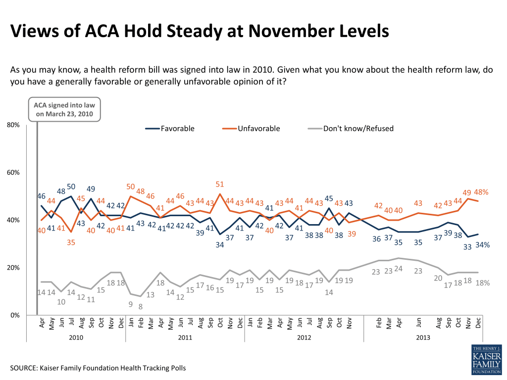
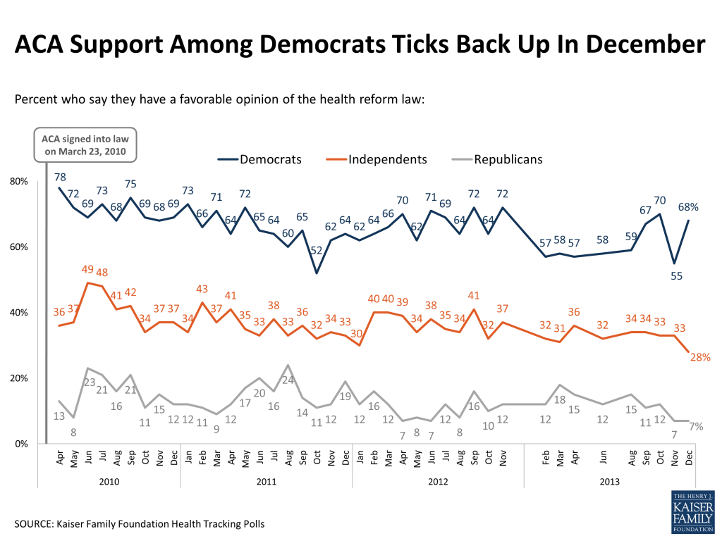
The Latest Kaiser Health Tracking Poll finds a 13 percentage point rebound in support for the Affordable Care Act (ACA) among Democrats this month, but no overall movement in support or opposition to the ACA since the November poll found a negative shift in views following the problem-plagued rollout of the law. In December, 34 percent have a favorable view of the ACA and 48 percent have an unfavorable view. The share of Americans that expect to see no personal impact from the law reached a new high in Kaiser polling this month and now stands at nearly half the public. Still, the public is more likely to attribute negative consequences to the law (believing it has increased the federal deficit and caused many people to lose their insurance coverage) than to say it has had positive effects (such as lowering prescription costs for seniors, eliminating cost-sharing for preventive services, and providing rebates to consumers whose health plans spent too much on administration). Americans are divided on what they would like Congress to do next with the law, with about four in ten wanting the law to be expanded or kept as is and a similar share wanting to see it repealed (either being replaced with a Republican alternative or repealed and not replaced). This month’s survey also highlights some of the problems the uninsured continue to experience in accessing and paying for health care; for example, the uninsured are about twice as likely as those with insurance to report problems paying medical bills, and four times as likely to say they had trouble getting medical care in the past year.
Overall Views Remain The Same As In November, Despite Rallying Support From Democrats
The latest Kaiser Health Tracking Poll finds that in December, about a third (34 percent) of the public has a favorable view of the ACA, while nearly half (48 percent) view the law unfavorably, shares that are largely unchanged from November. Support rallied this month among Democrats – 68 percent of them now express a favorable view of the law, up from 55 percent last month.
Figure 1Figure 2
This month’s poll did not find a similar rebound in support among independents who say they lean toward the Democratic Party. In previous polls, this group’s views have pretty closely mirrored those of Democrats, but while the share of Democrats with a favorable view of the ACA jumped 13 percentage points from November to December, the share of Democratic-leaning independents viewing the law favorably was flat (49 percent in December, the same share measured in the November poll).
Views of the law continue to be overwhelmingly negative among both Republicans and Republican-leaning independents. Among “pure” independents this month (those who say they don’t lean towards either party), unfavorable views outnumber favorable ones by a margin of two to one (52 percent unfavorable versus 25 percent favorable).
FIGURE 3: Views Of The ACA Sharply Divided By Party ID
As you may know, a health reform bill was signed into law in 2010. Given what you know about the health reform law, do you have a generally favorable or generally unfavorable opinion of it?
Total public
Democrats
Democratic-leaning independents
“Pure” independents (don’t lean)
Republican-leaning independents
Republicans
Favorable
34
68
49
25
12
7
Unfavorable
48
13
25
52
78
80
Don’t know/Refused
18
19
27
23
10
13
Views also continue to tilt negative among women this month – a group that had historically been more evenly split on the law but shifted negative in November. This month, 49 percent of women have an unfavorable view of the ACA and 35 percent have a favorable view. This is similar to the split among men (32 percent favorable, 48 percent unfavorable).
When those with an unfavorable view of the law are asked why they feel this way, the most common responses have to do with concerns about costs (23 percent of those with an unfavorable view), opposition to the law’s individual mandate (18 percent), and concerns about the role of government (13 percent). Smaller shares say they are opposed to the process by which the law was passed or that individuals should have to pay for their own insurance (7 percent each). Two issues that have recently been in the news were each mentioned each by 6 percent as a reason their views are unfavorable: employers cancelling health insurance policies and a sense that the government hasn’t delivered on its promises.
FIGURE 4: In Their Own Words
Among the 48 percent who have an unfavorable view: Could you tell me in your own words what is the main reason you have an unfavorable opinion of the health reform law?
Category
Percent mentioning
Quotes
Cost concerns
23
“I am now paying more for my insurance than I was before.”“Increased the cost of my health care.”“The cost to the consumer is more.”“It’s going to bankrupt the country.”
Opposed to individual mandate/Unconstitutional
18
“Because it does not give me a choice of whether I want it or not.”“That it shouldn’t be forced upon people.”“It forcing people to do things they don’t want to do.”“I believe it is unconstitutional and it takes away from our freedoms as Americans.”
Concerns about government
13
“Because the government shouldn’t be involved in our health care.”“I don’t want the government sticking their nose into my private business.”“I think it’s an overreach of the federal government.”“Not a fan of socialized medicine.”
Opposed to process
7
“It was poorly thought out it was poorly executed it’s still not working out properly.”“Poorly thought out and poorly organized.”
Individuals should pay their own way
7
“Because it is asking those who work for a living to provide health care for people who take from the government.”“Because I’m getting tired of paying everybody’s bills.”“I think everyone should be able to fend for themselves and get what they can afford.”
Policy cancellations
6
“Don’t like the idea that some people had to have their health care cancelled, and the idea of them losing their doctors.”“My existing plan was cancelled and cost for my insurance has more than doubled.”
Didn’t do what it was supposed to
6
“I believe we were misled by the president.”“Because it was supposed to lower prices, but my premium has gone up.”“Because it’s nothing of what was promised, it’s caused all these people to lose their health care.”
Among those with a favorable view of the law, by far the most common reasons given have to do with the fact that the law will expand access to health care and insurance (57 percent). Just under one in ten of those with a favorable view also mention a belief that the law will control or decrease health care costs (9 percent), help people with pre-existing conditions (8 percent), and leave the country better off in general (7 percent).
FIGURE 5: In Their Own Words
Among the 34 percent who have a favorable view: Could you tell me in your own words what is the main reason you have a favorable opinion of the health reform law?
Category
Percent mentioning
Quotes
Expanding access to care and insurance
57
“Because it provides health care to a lot of people who wouldn’t have it otherwise.”“Because health care should be accessible for everybody.” “I can stay with my parents insurance.”“It gives our low income families in the country a chance at health care.”
Will make health care more affordable/control costs/lower costs
9
“Because for years the rising cost of health care has bankrupted the country. At least we are trying to do something.”“I believe it’s making health care more affordable.”“Because there are too many people who don’t have a way of paying for their health care without going bankrupt.”
Insurance reforms/Will help people with pre-existing conditions
8
“No cap, and that they can’t hold it against you for having a pre-existing condition.”“People are not being denied for no reason.”“It allows people with pre-existing conditions to get health insurance.”
Country/people will be better off generally
7
“A lot people have been benefited of the new health care law.”“I think it will be good in the long run for Americans.”“It helps people that need help.”
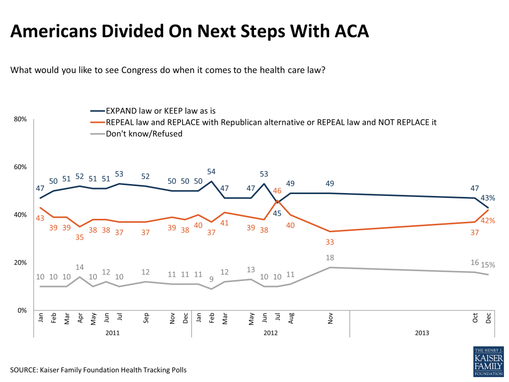
The public is divided this month on what it would like to see Congress do next with the law. Just over four in ten (42 percent) want to see the law repealed (including 16 percent who want it replaced with a Republican alternative and 26 percent who want it repealed and not replaced), while a similar share (43 percent) want Congress to expand the law (23 percent) or keep it as is (20 percent). This is a shift from October, when those who wanted to keep or expand the law outnumbered those who wanted to repeal it by a 10-point margin.
Figure 6
Public More Likely To Attribute Negative Than Positive Consequences To Law
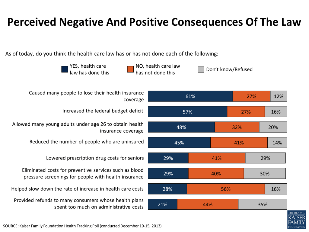
In terms of views of what the law has accomplished so far, Americans are more likely to attribute negative rather than positive consequences to the ACA. Perhaps reflecting the recent focus on policy cancellations in the non-group market, six in ten believe the law has caused many people to lose their health coverage (61 percent), and a similar share believe it has increased the federal budget deficit (57 percent). These beliefs reflect deeper divisions on the law, as Republicans and those with an unfavorable view of the law are much more likely to attribute these consequences to the ACA than are Democrats and those with a favorable view.
When it comes to positive consequences, about half think the law has allowed many young adults to obtain coverage (48 percent), and a similar share believe the law has already reduced the number of people who are uninsured (45 percent). The public is less likely to think the law has lowered prescription drug costs for seniors (29 percent say the law has done this, including 22 percent of seniors), eliminated cost-sharing for preventive services (29 percent), helped slow down the rate of increase in health care costs (28 percent), and provided refunds for consumers whose health plans spent too much on administrative costs (21 percent). Democrats are more likely than Republicans and independents to attribute these positive consequences to the law, but still more than half of Democrats say the law has not done each of these four things or they are not sure if it has.
Figure 7
Largest Share Continue To Expect No Personal Impact
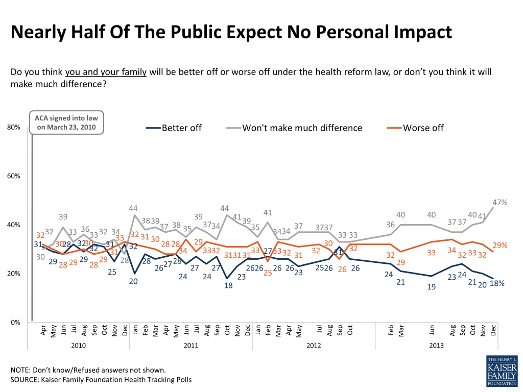
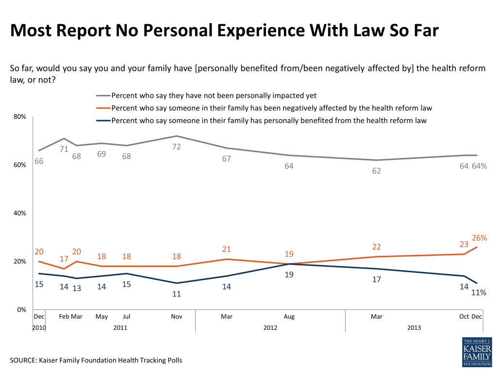
On a personal level, the share of the public saying they expect the law won’t make much difference for their own families reached a new high in Kaiser tracking this month. Nearly half (47 percent) now say they don’t expect the law to impact them, up from 41 percent last month. As to whether they’ve already been impacted, nearly two-thirds (64 percent) say they haven’t been helped or hurt by the law so far, while about a quarter say they’ve been negatively affected and one in nine say they’ve benefited from the law.
Figure 8Figure 9
Among those who say they’ve been negatively affected by the law, most (59 percent) point to concerns about health care costs as the specific way in which the law has hurt them. Just over one in ten mention cuts in benefits or scaled-back choices (13 percent), while ten percent mention coverage cancellations (either that they or someone they know has had their coverage cancelled, or that they fear their coverage will be cancelled because of the law). Among those who feel they’ve been helped by the law, nearly half (47 percent) mention expanded access to health care or benefits, while a quarter (25 percent) point to lower health care costs and 12 percent mention the extension of dependent coverage to adults under age 26.
Some Progress Perceived In Fixing Website Problems, But Government Still Gets Poor Ratings For Implementation
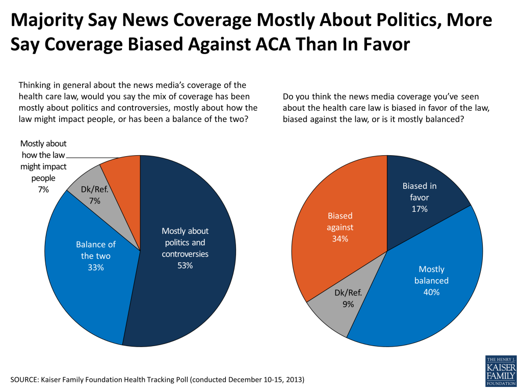
Attention to news about the ACA rollout continues to be high in December, with about six in ten saying they followed these news stories very (21 percent) or fairly closely (38 percent). The share saying they closely followed news about the ACA rollout is somewhat lower than the share paying as much attention to reports about the U.S. economy (67 percent), and about equivalent to the share that reports following news about the death of Nelson Mandela (62 percent). Just over half the public continues to say that news coverage of the law is mainly about politics and controversies, while 7 percent say it’s mostly about how the law will impact people and a third say it’s a balance of the two. The plurality (40 percent) say news coverage is mostly unbiased, but twice as many say coverage is biased against (34 percent) as biased in favor of the law (17 percent).
Figure 10
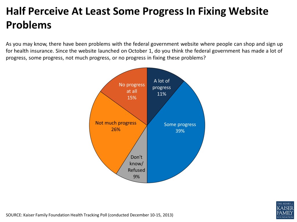
One of the main ACA stories in the news this month has been the ongoing government efforts to fix the website problems with the online health insurance marketplace, Healthcare.Gov. Half the public believes the federal government has made “a lot” (11 percent) or “some” progress (39 percent) in fixing these problems, while four in ten say there has been “not much” progress (26 percent) or “no progress at all” (15 percent).
Figure 11
Despite perceiving at least some progress on this front, the public continues to give the federal government very low ratings for implementing the law – eight in ten say they’re doing an “only fair” (31 percent) or “poor” job (50 percent), while just 15 percent rate it as “excellent” or “good,” similar to October’s ratings.
The public gives their state governments somewhat higher ratings than the federal government when it comes to implementing the law, though still more than six in ten think their state is doing an “only fair” or “poor” job. Residents of states that are operating their own health insurance marketplaces are about twice as likely as those in states defaulting to the federal marketplace to give their state government a positive rating for implementation (33 percent versus 17 percent), but even in these states the majority say the state is doing an “only fair” or “poor” job.
FIGURE 12: Federal Government Gets Poor Ratings for Implementation, States Only Slightly Setter
Regardless of whether you support or oppose the health care law, how good a job would you say the FEDERAL GOVERNMENT is doing implementing the law?
Regardless of whether you support or oppose the health care law, how good a job would you say your STATE GOVERNMENT is doing implementing the law?
Total public
Total public
Among those in states operating their own marketplace
Among those in states defaulting to the federal marketplace*
NET Excellent/Good
15
23
33
17
Excellent
3
4
6
2
Good
12
19
27
15
NET Only fair/Poor
81
63
55
68
Only fair
31
34
33
35
Poor
50
29
22
33
Don’t know/Refused
4
14
13
15
*includes those states with a state-federal partnership exchange
A Spotlight On The Uninsured
With new coverage for some individuals set to begin in a few weeks, more than half (54 percent) of the non-elderly uninsured continue to say they don’t have enough information about the ACA to know how the law will impact them, and seven in ten (69 percent) say they’ve heard only a little or nothing about the new health insurance marketplace. This month, 15 percent of the uninsured say they’ve been personally contacted by someone about the law through a phone call, email, text message, or door-to-door visit.
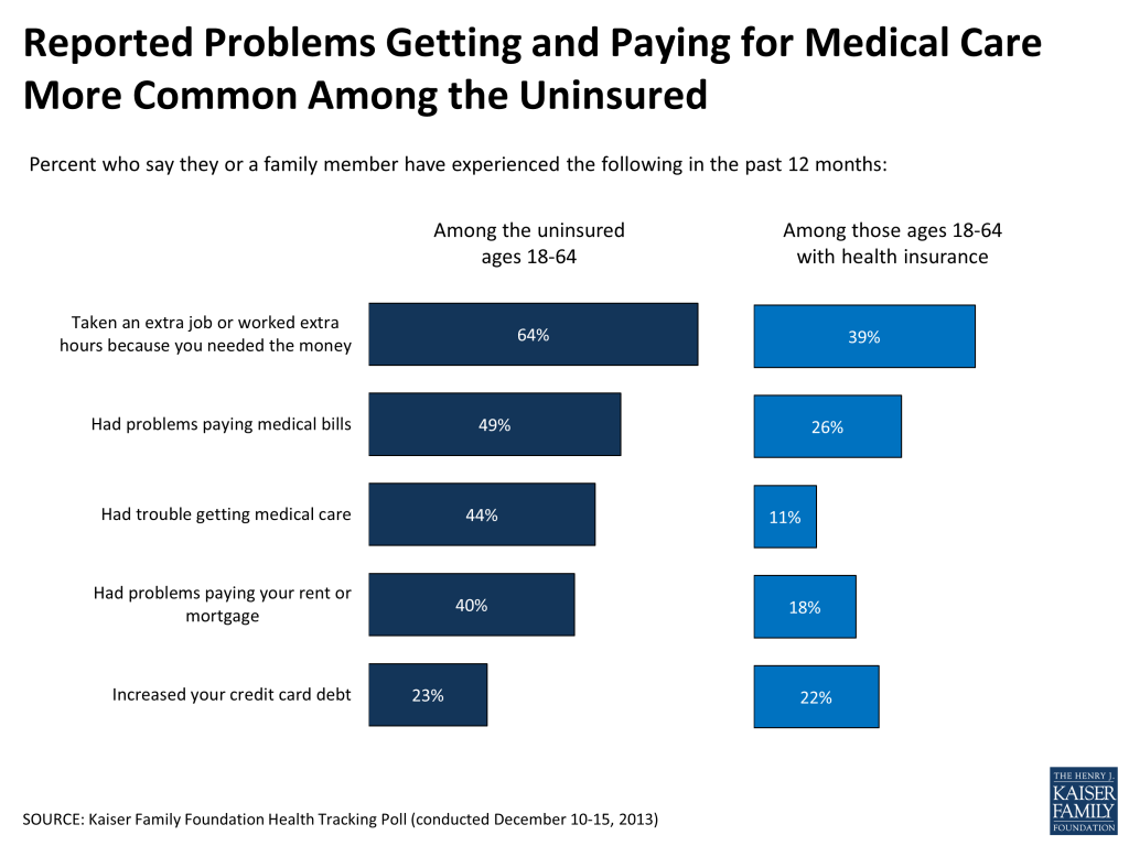
The survey also highlights the difficulties those without health insurance continue to experience in accessing and paying for medical care. Roughly half (49 percent) of the uninsured say their family has had problems paying medical bills in the last year, about twice as many as adults under age 65 with health insurance (26 percent). And 44 percent of the uninsured say they’ve had trouble getting medical care, four times the rate reported by those with insurance (11 percent). The uninsured also report other financial struggles at higher rates, including taking on a second job or extra hours at work and having difficulty paying housing costs.
Figure 13
The uninsured are also less likely than those with insurance to say their health needs are being met “very well.” This is true when it comes to both their physical health needs (31 percent of the uninsured versus 61 percent of the insured under age 65) and their mental or emotional health needs (42 percent versus 64 percent).
This Kaiser Health Tracking Poll was designed and analyzed by public opinion researchers at the Kaiser Family Foundation (KFF) led by Mollyann Brodie, Ph.D., including Liz Hamel, Bianca DiJulio, and Jamie Firth. The survey was conducted December 10-15, 2013, among a nationally representative random digit dial telephone sample of 1,206 adults ages 18 and older, living in the United States, including Alaska and Hawaii (note: persons without a telephone could not be included in the random selection process). Computer-assisted telephone interviews conducted by landline (602) and cell phone (604, including 304 who had no landline telephone) were carried out in English and Spanish by Princeton Data Source under the direction of Princeton Survey Research Associates International (PSRAI). Both the random digit dial landline and cell phone samples were provided by Survey Sampling International, LLC. For the landline sample, respondents were selected by asking for the youngest adult male or female currently at home based on a random rotation. If no one of that gender was available, interviewers asked to speak with the youngest adult of the opposite gender. For the cell phone sample, interviews were conducted with the person who answered the phone. KFF paid for all costs associated with the survey.
The combined landline and cell phone sample was weighted to balance the sample demographics to match estimates for the national population using data from the Census Bureau’s 2011 American Community Survey (ACS) on sex, age, education, race, Hispanic origin, nativity (for Hispanics only), and region along with data from the 2010 Census on population density. The sample was also weighted to match current patterns of telephone use using data from the July-December 2012 National Health Interview Survey. The weight takes into account the fact that respondents with both a landline and cell phone have a higher probability of selection in the combined sample and also adjusts for the household size for the landline sample. All statistical tests of significance account for the effect of weighting.
The margin of sampling error including the design effect for the full sample is plus or minus 3 percentage points. Numbers of respondents and margin of sampling error for key subgroups are shown in the table below. For results based on other subgroups, the margin of sampling error may be higher. Sample sizes and margin of sampling errors for other subgroups are available by request. Note that sampling error is only one of many potential sources of error in this or any other public opinion poll.
SummaryPrior to the enactment of the Affordable Care Act (ACA), a number of states used Section 1115 Medicaid Demonstration Waivers to expand coverage to adults and to operate Medicaid programs in ways not otherwise allowed under federal rules. Beginning in January 2008, Indiana began enrolling adults in its new Healthy Indiana Plan (HIP), which was authorized under Section 1115 waiver demonstration authority. Under the plan, Indiana uses Medicaid funds to provide a benefit package modeled after a high-deductible health plan and health savings account to previously uninsured very poor and low-income adults.
As enacted, the ACA called for an expansion of Medicaid for nearly all non-disabled adults with incomes at or below 138% of the Federal Poverty Level (FPL) that is largely funded with federal dollars. However, as a result of the Supreme Court ruling on the ACA, the Medicaid expansion is effectively a state option. The majority of states that have used Section 1115 waivers to expand Medicaid coverage to adults plan to implement the Medicaid expansion and transition current waiver coverage to new coverage under the ACA. By doing so, these states will receive the enhanced federal matching funds for this coverage. A smaller number of states with existing waivers that cover adults are not moving forward with the ACA Medicaid expansion and their waivers are set to expire beginning January 1, 2014. If these states do not renew their waivers, adults covered by the waivers will lose coverage when they expire.
On September 3, 2013, Indiana obtained a one-year waiver extension from the Centers for Medicare and Medicaid Services (CMS) with some amendments primarily related to who is eligible for coverage. CMS extended the plan “to not disrupt the coverage currently afforded in Indiana as the state continues to consider its coverage options.”1 While this temporarily preserves coverage for many adults currently covered by the waiver, it also leaves many who would be eligible under the ACA’s full Medicaid expansion without access to new coverage options. The waiver also allows for higher-cost sharing than otherwise allowed under the Medicaid program. The state also will not be able to access the enhanced federal matching funds tied to new coverage that is available to states implementing the Medicaid expansion. Governor Pence remains committed to expanding Healthy Indiana and continuing discussions with CMS. This brief provides an overview of HIP and the implications of the waiver extension and Indiana’s decision to not implement the ACA Medicaid expansion.
Goals for Healthy Indiana Plan
When enacted, HIP had 7 goals:
Reduce the number of uninsured residents in the state;
Improve statewide access to health care services for low-income residents;
Promote value-based decision making and personal responsibility;
Promote primary care and prevention;
Prevent chronic disease progression with secondary prevention (treatment, prescriptions);
Provide appropriate, and quality or evidence-based, health care services; and
Ensure state fiscal responsibility and efficient management of the program.
The HIP waiver renewal application shows progress in meeting each of these goals based on evaluations and analysis performed by the state, Mathematica and Milliman.
Eligibility and Enrollment in the Healthy Indiana Plan
Eligibility and Enrollment from 2008 – 2012. As approved in 2008, HIP expanded coverage to parents with dependent children with incomes above the state’s eligibility limit for full Medicaid coverage (22% FPL) and below 200% FPL and other adults with incomes between 0% and 200% FPL. While there was no enrollment cap for parents, other childless adults were subject to an enrollment cap of 34,000. At the end of 2008, 37,568 adults were enrolled in HIP. Two-thirds of those enrollees were childless adults and the remaining third were parents (Figure 1).2
Figure 1: HIP Enrollment of Parents with Dependent Children and Other Adults, 2008 -2012
Enrollment remained open for childless adults until March 2009 when it neared the enrollment cap. The state has since opened enrollment twice, but enrollment has fallen over time through attrition. As of December 2012, there were only 13,225 childless adults enrolled in HIP, accounting for only a third of enrollment allowed under its current cap of 36,500 and an additional 46,388 adults remain on the waitlist for coverage.3 In contrast, parent enrollment increased between 2008 and 2012, from about 12,000 parents to over 25,000.
A 2009 study found that compared to the commercially insured population in Indiana, the HIP population had higher utilization, costs, frequency of disease and morbidity. The study also found that individuals who enrolled earliest had the highest average risk scores suggesting that the most severe adverse selection was when the program was first implemented.4 At the end of 2012, most (70%) of the 39,005 total enrollees in HIP were poor and nine in ten (90%) had income below 150% of poverty.5 Nearly one in three (29%) was age 50 or older.6 Race distribution has stayed relatively steady over the course of the demonstration with over eight in ten identifying as White, one in ten as Black, and the remaining 7% identifying as either Hispanic or Native American.7
Eligibility and Enrollment Under the Waiver Extension. As of January 2014, individuals with incomes above 100% FPL will be eligible for premium tax credits to help purchase coverage through the new Health Insurance Marketplaces established by the ACA. As such, the 2013 waiver extension will decrease HIP eligibility levels from 200% FPL to 100% FPL for both parents and childless adults on April 30, 2014.8 For current HIP enrollees and childless adults on the waitlist, Indiana has a plan to transition those who have incomes between 100% and 200% FPL to Marketplace coverage. Similar to the original waiver, under the extension, parents will not be limited by enrollment caps or open enrollment periods, and will have the ability to enroll in HIP provided they make the required contributions (discussed below). Enrollment for childless adults, however, will be capped at 36,500 and limited by open enrollment periods. While the extension does not establish caps on parent enrollment, it allows Indiana to amend the waiver to change eligibility criteria for both parents and childless adults if the state finds that expenditures will exceed annual state funds. Due to funding constraints, HIP was never intended to cover all eligible residents. Estimated take-up has ranged from 5% to 16% of those eligible.9 State estimates predict total enrollment in HIP to be about 45,000 in 2014.
Program Design
The HIP benefit package is modeled after a high-deductible plan and health savings account.10 It consists of three components provided through managed care plans:
High-deductible coverage: After meeting a $1,100 deductible, individuals are covered for state-specified benefits up to a $300,000 annual cap and a $1 million lifetime cap.
Personal Wellness and Responsibility (POWER) Account: This account is used to cover the $1,100 in initial medical costs. The POWER Accounts provide incentives for participants to utilize services in a cost-efficient manner. To stay enrolled in coverage, HIP members make monthly contributions to their POWER Accounts (based on income but no more than 2% of income for enrollees at or below 100% FPL). Medicaid funds cover the gap between the enrollees’ payments and the $1,100 deductible amount required for the POWER Account. Employers are permitted to contribute up to 50% of the members required contribution to their employees’ POWER Accounts. The renewal for 2013 allows Not-for-profit organizations are allowed to contribute up to 75% of an enrollee’s contributions.
A portion of enrollees do not contribute to POWER accounts and the state pays the full amount. This portion was about 35% in 2008 and has decreased to about 21% of enrollees in 2010 through 2012. Of HIP enrollees not contributing to their accounts, about 13% were parents with no income or already contributing at least 5% of their family income to their child’s CHIP coverage. The other 87% of non-contributors were childless adults with no income.11 About 8% of HIP members ever enrolled in the program between 2008 and 2010 were disenrolled due to failure to make POWER account payments. This suggests that some low-income, uninsured adults are willing to make financial contributions to their health care, although as discussed above, many individuals in HIP have higher medical needs.
Preventive care: Individuals are covered for up to $500 in preventive care that is not subject to the deductible and does not draw from the POWER Account. By obtaining state-specified preventive care, enrollees can carry over state POWER Account contributions to the next year, which helps offset required enrollee payments.Evaluations have found 90% of HIP members have a physician visit within 12 months of enrolling as well as declines in the number of members reporting the ER as their usual source of care. Compared to Indiana’s Hoosier HealthWise (HHW) Medicaid population, HIP enrollees had higher rates of well-care visits (higher rates for caretakers than non-caretakers).12
Enrollees receive care through managed care plans that contract with the state. Once an individual selects or is assigned to a plan and makes an initial POWER Account payment, the enrollee must remain in that plan for 12 months.13 Currently, there are three managed care plans from which most enrollees choose—Anthem Blue Cross and Blue Shield (62% of the enrollees), MDWise with AmeriChoice (24%), and Managed Health Services (MHS) (9%).14 Enrollees who have an identified high-risk condition (e.g., cancer, organ transplant recipient, HIV/AIDS) receive benefits through the “Enhanced Services Plan (ESP) (4% of enrollees),” which is a fee-for-service inpatient health plan that also manages the state’s high risk pool.
Key Issues to Consider
The ACA Medicaid expansion eliminates the need for states to obtain a Section 1115 waiver to cover adults. One of the primary goals of the original HIP waiver was to reduce the uninsured.15 Prior to the ACA, states could only cover childless adults and receive federal Medicaid funds by obtaining a Section 1115 waiver. As such, section 1115 waivers that to expanded coverage to adults often included limited benefit packages, higher cost-sharing and/or enrollment caps to limit costs. Since the ACA expands Medicaid to adults with significant federal funding, the need for and role of waivers fundamentally changes. CMS guidance specifies that states will not be eligible for enhanced matching funds from the ACA if there is a cap on enrollment or a partial expansion. CMS has recently issued new regulations related to cost-sharing and it is not clear if they will grant waivers of these limits that would be eligible for enhanced matching funds.16
In the absence of the Medicaid expansion, coverage gaps will remain for poor adults in Indiana. The one year extension of HIP preserves coverage for the parents and other adults currently covered by the program. However, because enrollment in the program remains limited many poor uninsured adults who would be eligible for coverage under the Medicaid expansion will not gain access to coverage. Poor adults who are not enrolled in the waiver will remain ineligible for Medicaid and they also will be ineligible for tax credits for Marketplace coverage, which begin at 100% FPL. Recent analysis finds that some 181,930 poor adults in Indiana could fall into this coverage gap, representing 88% of the state’s poor uninsured (this analysis assumes that parents with incomes above 24% FPL and childless adults fall into the coverage gap because the waiver provides limited coverage).17 These individuals will not have other alternatives for full coverage and will likely remain uninsured. Further, the safety net of clinics and hospitals that has traditionally served the uninsured population will continue to be stretched in Indiana.
Without implementing the ACA Medicaid expansion, Indiana also will forgo significant amounts of federal financing. If Indiana implemented the Medicaid expansion, the state could see an additional $17.3 billion, or 24%, increase in federal funds over the 2013-2022 period with small increases in state funding $537 million or a 1.3% increase after accounting for savings due to reduced uncompensated care costs. States could also see additional savings and broader economic benefits from the increases in coverage and federal financing.18 Under the waiver renewal, Indiana is not eligible for enhanced federal matching funds and continues to receive the state’s regular match rate for adults covered under the waiver.
There is no deadline by which states must determine whether they will implement the Medicaid expansion. Indiana can continue to evaluate how it will proceed and whether it will adopt the Medicaid expansion as they continue to offer coverage through the HIP waiver that will expire at the end of 2014. In a letter to Secretary Sebelius from November 15, 2013, Governor Pence said that he was looking forward to further discussions regarding the potential expansion of the Healthy Indiana Plan; however, he also stated that “it is essential that the State be able to maintain the consumer-driven model on which the program is predicated.”19 CMS has raised issues about the monthly account contributions required under HIP.
Parents below 22% were eligible for regular Medicaid before implementation of the Healthy Indiana Plan, and continue to receive regular Medicaid coverage. Parents below 22% FPL who are not eligible for Medicaid because they exceed resource limits ($1,000) are eligible for the Healthy Indiana Plan. ↩︎
Parents below 22% were eligible for regular Medicaid before implementation of the Healthy Indiana Plan, and continue to receive regular Medicaid coverage. Parents below 22% FPL who are not eligible for Medicaid because they exceed resource limits ($1,000) are eligible for the Healthy Indiana Plan. ↩︎
Parents below 22% were eligible for regular Medicaid before implementation of the Healthy Indiana Plan, and continue to receive regular Medicaid coverage. ↩︎
Parents below 22% were eligible for regular Medicaid before implementation of the Healthy Indiana Plan, and continue to receive regular Medicaid coverage. Parents below 22% FPL who are not eligible for Medicaid because they exceed resource limits ($1,000) are eligible for the Healthy Indiana Plan. ↩︎
Indiana extended coverage for individuals between 100 and 200% until April 30, 2014 due to issues enrolling in the federal marketplace. ↩︎
Although modeled after a High Deductible Health Plan (HDHP) and HSA, there are key differences between the structure of the HIP and a HDHP-HSA. First, the individual has the ability to choose whether or not to participate, and how much to invest, in an HSA in the private market. This is not the case for HIP enrollees. Second, individuals manage their HSAs and can use it to pay for a broad set of medical expenses. In contrast, POWER Accounts are administered by the managed care plans. As such, individuals with HSAs can “shop around” for the most cost effective plan and use the funds where they need; HIP enrollees, on the other hand, have much less control over their POWER Account funds. ↩︎
Enrollees may change plans for cause such as: failure of insurer to provide covered services; failure of insurer to comply with established standards of medical administration; significant language or cultural barriers; corrective action levied against the insurer by the state ↩︎
Anthem and MHS are established commercial plans in Indiana that serves some regular Medicaid enrollees. MDWise is an established Medicaid plan in Indiana that has partnered with AmeriChoice to provide HIP coverage. ↩︎
Kaiser Commission on Medicaid and the Uninsured, The Coverage Gap: Uninsured Poor Adults in States that Do Not Expand Medicaid (Washington, DC: Kaiser Commission on Medicaid and the Uninsured, October 2013), https://modern.kff.org/wp-content/uploads/2013/10/8505-the-coverage-gap-uninsured-poor-adults7.pdf. This analysis assumes childless adults and parents with incomes above 24% ($4,697 annually) would fall into the coverage gap. The gap does not account for more limited coverage included in the waiver (due to the cap and the higher cost-sharing requirements). ↩︎
Si usted o alguien de su familia tiene una condición de salud preexistente – como una enfermedad cardíaca, asma o inclusive un embarazo – usted encontrará que es mucho más fácil obtener cobertura o cambiar de plan, comenzando en el 2014. Obamacare prohíbe a las aseguradoras negar cobertura a personas con condiciones preexistentes, o condiciones físicas o mentales que existan antes que haya comenzado la cobertura. Las aseguradoras tampoco pueden negarse a pagar por otro cuidado médico y servicios relacionados con una condición preexistente, o cobrarle más porque haya una condición preexistente en la familia.
Qué está cubierto
Si usted no tiene seguro o quiere cambiar planes, usted puede comprar un nuevo plan en el mercado de seguros individual o en el nuevo Mercado de Seguros Médicos de su estado (o intercambio). Estos planes cubren visitas al doctor, hospitalizaciones, recetas médicas y cuidado materno, sin ninguna restrición por condiciones preexistentes. Cubrirán servicios preventivos como inmunizaciones, exámenes y contracepción sin costo para usted. Usted no tiene que presentar detalles sobre su salud o su historia médica para aplicar. El mercado le permite comparar planes y precios. El período abierto de inscripción para el Mercado de Seguros Médicos de su estado va desde el 1 de octubre de 2013 hasta el 31 de marzo de 2014. La cobertura comienza el 1 de enero del 2014.
Tipos de planes
Los planes dentro y fuera del mercado se presentan en cuatro niveles —bronce, plata, oro y platino— y varían en lo que cubren, lo que cuestan las primas (el costo mensual de su seguro) y los costos que requieren en deducibles y gastos de bolsillo. Pero estos planes no cobran más basándose en su historia clínica. Las aseguradoras sólo pueden modificar sus primas en base a su edad, el número de miembros de la familia cubiertos por la póliza, y si usted consume tabaco.
Ayuda con las primas
Si usted compra una póliza en el Mercado de Seguro Médicos de su estado, puede también ser elegible para ayuda financiera para cubrir el costo. En general, usted puede ser elegible si es una persona soltera con un ingreso anual en el rango de $11.500 a $46.000 o si su ingreso familiar está en el rango de $19.500 a $78.000 para una familia de tres. El rango puede variar de acuerdo al tamaño de la familia. Use la calculadora on-line de la Kaiser Family Foundation para tener un estimado de las primas y los subsidios disponibles para usted. Las personas con ingresos más bajos que compren cobertura a través del Mercado de Seguros Médicos también pueden ver reducidos sus deducibles y gastos de bolsillo. Si su ingreso es más bajo, usted puede ser elegible para cobertura a través del Medicaid.
Otras Opciones
Obamacare estableció en 2010 un programa temporal para ofrecer cobertura a personas con condiciones preexistentes. Si usted tiene cobertura a través del plan de condiciones preexistentes, puede expirar a fin del enero 2014, pero usted necesitaría comprar cobertura en el Mercado de Seguros Médicos inmediatamente.
Si actualmente usted tiene seguro que compró usted mismo (no a través del empleador), entonces el plan puede estar exento de los requerimientos de la ley acerca de las condiciones preexistentes. Sin embargo, usted todavía puede dejar esa cobertura y comprar una bajo las nuevas reglas.
Preguntas
El Gobierno federal tiene una línea telefónica que funciona las 24 horas para atender consultas de los consumidores: 1-800-318-2596. Para encontrar más información sobre Obamacare, visita www.cuidadodesalud.gov.
As enrollment statistics in the new health insurance marketplaces start to become available, there is a growing focus on whether the enrollment of so-called “young invincibles” will be sufficient to keep insurance markets stable. Enrollment of young adults is important, but not as important as conventional wisdom suggests since premiums are still permitted to vary substantially by age. Because of this, a premium “death spiral” is highly unlikely.
Why does the age distribution of enrollees matter?
The Affordable Care Act (ACA) requires insurers in the individual market to cover anyone who wishes to enroll and restricts how insurers can vary premiums based on enrollee characteristics. Premiums cannot vary at all based on health status or gender. Premium variations based on age are limited to a ratio of three to one (meaning the premiums for a 64 year-old is three times the premium for a 21 year-old). Previously, premium variations based on age were more typically about five to one.
The limit on age rating means that, on average, older adults will be paying premiums that do not fully cover their expected medical expenses, while younger adults will be paying premiums that more than cover their expenses. For this system to work, young people need to enroll in sufficient numbers to produce a surplus in premium revenues that can be used to cross-subsidize the deficit created by the enrollment of older people. If that does not occur, premium revenues will fall short of expenses and insurers may seek to raise premiums the following year. Figure 1 illustrates how average costs for adults vary by age relative to the allowed premium variation allowed under the ACA.1 Generally speaking, adults in their late 30s to late 50s will pay premiums that are about the same as what they would pay without any restrictions on age rating. Younger adults pay more than they would without any age rating limits and older adults pay less.
While enrollment in the federal and state-based marketplaces have tended to receive the most attention – and are the only enrollment statistics currently being reported – it is the age distribution across the entire individual market that matters from the perspective of the risk pool. That is because insurers are required to set premiums based on a “single risk pool” that encompasses all plans newly-purchased or renewed after January 1, 2014, both inside and outside the marketplaces. (Policies that are grandfathered or renewed prior to 2014 are not part of this risk pool. And, catastrophic plans, which are available only to people under age 30 and those who cannot otherwise find insurance that costs no more than 8% of their income, may use a different rating approach that reflects the younger age of people expected to enroll in these plans.)
Also, risk pooling occurs state by state, so if one state enrolls a substantial number of young adults, it will not help the insurance market in a state that is less successful.
Figure 1
How many young adults does the market need?
Generally speaking, the goal is to enroll young adults in approximately the same proportion that they represent in the pool of potential individual market enrollees. This potential market includes people who are:
Currently uninsured or buying their own insurance already.
Not eligible for Medicaid or affordable employer coverage.
Using the basic approach described here, we analyzed the Survey of Income and Program Participation to estimate the age distribution of potential individual market enrollees. As Figure 2 shows, 40% of the potential market is represented by adults age 18-34.
In setting their premiums for 2014, each insurer had to project who they thought would enroll. Some insurers may have been optimistic, assuming proportionate enrollment of young people. Others may have been pessimistic, and set their premiums somewhat higher across-the-board as a result. Because the ACA includes a risk adjustment system that transfers funds from individual market insurers in a state with younger and healthier enrollees to those with older and sicker enrollees, what really matters for next year is the demographic composition of actual enrollment in total in each state compared to what insurers as a whole projected. In the future, the goal remains to get a proportionate mix of enrollees by age in a given state.
Figure 2
What happens if enrollment among young adults falls short?
Because young adults will be cross-subsidizing older adults, they need to enroll in sufficient numbers for that cross-subsidy to be sufficient. In other words, if 7 million people enroll in the new health insurance marketplaces – which is what the Congressional Budget Office has projected – then 40% of them (or 2.8 million) would need to be young adults (assuming a similar proportion enrolled in ACA-compliant plans outside of the marketplaces as well). If 5 million people enroll, then the target for young adults would be 2 million.
If enrollment among young adults falls short, then the total amount of premiums collected by insurers will be less than the total health care expenses of enrollees plus administrative overhead and profit. And, if insurers believe that those enrollment patterns will continue into 2015, then they may raise premiums higher to compensate for the loss.
However, because premiums are still allowed to vary substantially based on age, the financial consequences of lower enrollment among young adults are not as great as conventional wisdom might suggest.
Scenario 1: Young adults age 18-34 enroll at a 25% lower rate than other individuals relative to the potential market.Under this scenario, young adults would represent 33% of individual market enrollees instead of 40% as in the potential market. Taking into account the allowed three-to-one variation in premiums due to age, we find that costs (health care expenses plus overhead and profits) would be about 1.1% higher than premium revenues.
Scenario 2: Young adults age 18-34 enroll at a 50% lower rate than other individuals relative to the potential market. Under this scenario, young adults would represent 25% of enrollees, substantially less than their share of the potential market. It is roughly comparable to what Covered California reported for October and November (the first two months of open enrollment), with 21% of all enrollees who picked a plan in the 18-34 age range. However, this is likely a worst-case scenario, since the expectation is that older and sicker individuals are more likely to buy first and that younger and healthier people will tend to wait until towards the end of the open enrollment period (which concludes March 31, 2014). In fact, our recent survey of people in California who are uninsured found that 58% of young adults said they planned to get coverage in 2014. But, if this more extreme assumption of low enrollment among young adults holds, overall costs in individual market plans would be about 2.4% higher than premium revenues.
Insurers typically set their premiums to achieve a 3-4% profit margin, so a shortfall due to skewed enrollment by age could reduce the profit margin of insurers substantially in 2014. But, even in the worst case, insurers would still be expected to earn profits, and would then likely raise premiums in 2015 to make up the shortfall, However, a one to two percent premium increase would be well below the level that would trigger a “death spiral,” which would occur if insurers needed to increase premiums substantially, in turn further discouraging young and healthy people from enrolling.
From the perspective of keeping insurance premiums stable, how enrollment is distributed by health within each age group is, in fact, more important, since premiums cannot vary at all by health status under the ACA. In other words, the goal is to enroll healthy as well as sick young adults, and also healthy older adults. (Older adults are more likely to be sick than younger people, but that is mostly accounted for by the fact that premiums can vary by age.)
However, questions about health and pre-existing conditions are no longer asked on insurance applications, so we will not know for quite a while whether sicker people are enrolling at a higher rate than healthier people. If they do, there are some “shock absorbers” built into the system, including risk corridors (where the federal government shares financially in an insurer’s gains or losses beyond a specified range) and reinsurance (where the federal government covers a portion of the cost for people with high health expenses).
Achieving a balanced risk pool in the individual insurance market will help to make it an attractive market for insurers and keep premiums down over time. Conversely, enrollment of a disproportionate share of older and sicker people will tend to drive premiums up. However, premiums are not as sensitive to the mix of enrollment as fears about a “death spiral” suggest, particularly with respect to age. It is important to attract the “young invincibles,” but maybe with a greater focus on the “invincible” part.
Average costs by age are based on an average of pre-ACA rate tables that reflect no limits on age rating, as well as variations in health costs by age in an analysis sponsored by the Society of Actuaries. Relative premiums under a three-to-one limit on age rating are based on the standard age factors for the individual market for 2014. All amounts have been normalized based on our estimate of the distribution of potential enrollees in the individual market by age. ↩︎
Undocumented immigrants are not eligible to purchase insurance in the new health insurance marketplaces. They can buy insurance directly from insurers, but are not expected to do so in large numbers. ↩︎
For each of the two scenarios, we projected what total costs would be for the assumed age distribution using an estimated variation of costs by age, and then compared that to what premium revenues would be using the standard age factors with three-to-one allowed variation in premiums. We assumed that administrative overhead and profits were a constant percentage of claims across age groups. ↩︎
Much attention currently is focused on enrollment estimates to gauge and measure implementation of the Affordable Care Act (ACA) coverage expansions that will take effect on January 1, 2014. Recently, HHS and CMS have reported new eligibility and enrollment data for the Marketplaces created by the ACA and Medicaid and CHIP, providing some of the timeliest data on Medicaid enrollment that has ever been captured and preliminary information on how early ACA implementation is impacting Medicaid enrollment. However, currently, there is no single data source that provides comprehensive information on Medicaid enrollment. As such, to gain a full picture of enrollment in Medicaid, it is important to look across the different enrollment paths connecting people to the program today (Figure 1). This brief provides an overview of these different enrollment paths and national level data available to date on enrollment through these avenues.
8530 – The Many Roads to Medicaid
Background
The early technological problems of the Marketplaces, particularly the Federal Marketplace, Healthcare.gov, were well-documented and contributed to lower than anticipated enrollment in qualified health plans (QHPs) during the initial month of open enrollment. A coinciding story, however, has been the early success of enrollment in Medicaid, the other key coverage expansion of the ACA. The ACA will expand Medicaid eligibility to adults with incomes at or below 138% of the federal poverty level (FPL) in the 26 states and DC that are moving forward with the expansion in 2014 and simplify eligibility and enrollment policies in all states.
While the early success of enrollment in Medicaid has spurred attention, it is important to note that Medicaid enrollment was always anticipated to account for a significant share of the coverage gains under the ACA. According to the Congressional Budget Office’s May 2013 estimates, by 2016 the ACA is expected to result in a reduction of the uninsured of 25 million with a 12 million increase in Medicaid enrollment.1 The enrollment increases in Medicaid will reflect coverage gains among both adults made newly eligible for the program by the expansion as well as among individuals who were already eligible under existing rules but not enrolled. In the 26 states implementing the expansion in 2014, millions of low-income adults will become newly eligible for the program. Moreover, in all states, more people who were already eligible for the program will enroll as they are connected to coverage through broad outreach efforts and new simplified enrollment processes that states must implement, regardless of whether they expand Medicaid. Many of these “currently eligible” people are children, since states extend Medicaid and CHIP eligibility for children to much higher incomes than adults.
The early success of enrollment in Medicaid stems from a variety of factors including the fact that it is easier to enroll people into an existing program than it is to start something new and that to complete enrollment in a QHP through the Marketplace, individuals must select a plan and pay their first month’s premium. Moreover, with implementation of the ACA’s new streamlined enrollment policies for Medicaid, there are now many roads open to connect people to the program, including several avenues that allow states to quickly and efficiently enroll large numbers of eligible people to the program. This array of Medicaid enrollment options is reflective of the ACA’s vision of a “no wrong door” enrollment system that is intended to connect a person to the coverage for which he or she is eligible regardless of where or through which mode a person applies. Given the multiple roads connecting people to Medicaid today, it is important to examine data across these paths to gain a full understanding of Medicaid enrollment. Examining data associated with any one path will only provide one piece of the enrollment picture. Below is a brief roadmap of these paths and the associated enrollment data available to date.
A Brief Roadmap of Current Medicaid Enrollment Pathways
State Medicaid and CHIP agencies
Throughout implementation of the ACA, states have continued to operate their Medicaid and CHIP programs, and individuals have continued to apply through the existing enrollment pathways for the programs. Prior to the ACA, all states allowed individuals to apply for Medicaid or CHIP by mail or in-person, and an increasing number were offering additional application pathways for families. For example, as of January 2013, 37 states had an online Medicaid or CHIP application in place and 17 states were accepting telephone applications.2 As states implement the new streamlined Medicaid eligibility and enrollment processes required under the ACA, all states will move toward providing consumers multiple options to apply—including online, by phone, in-person, and by mail—using a single, streamlined application that will screen for eligibility for Medicaid, CHIP, and advance premium tax credits for Marketplace coverage. In addition, some states have integrated or plan to integrate Medicaid enrollment with other social service programs, such as Temporary Assistance for Needy Families or the Supplemental Nutrition Assistance Program (SNAP), so that a person applying for other types of assistance can be screened for eligibility for health coverage and vice versa.
Early data from CMS show that in October 2013, nearly 2.5 million applications were submitted to Medicaid and CHIP agencies, including applications submitted online, via mail, in person, or by phone.3 These reflect applications for individuals eligible under existing rules as well as for individuals made newly eligible for the program in the 24 states that had already begun processing applications for the Medicaid expansion to adults that will take effect as of January 2014. (Ohio and Michigan are also implementing the expansion, but had not yet begun processing applications for newly eligible adults as of October 2013.) An application may include more than one individual in a household. Overall, nearly 1.5 million new Medicaid and CHIP eligibility determinations were made by state Medicaid and CHIP agencies and State-Based Marketplaces (SBMs) in October 2013, with the significant majority, 1.3 million, determined eligible for Medicaid.4 These reflect determinations for all Medicaid eligibility groups, not just for adults made newly eligible by the ACA’s Medicaid expansion. These determinations do not include Medicaid and CHIP assessments and determinations made by the Federally-Facilitated Marketplace (FFM), which is operating in 36 states. The application and determination data remain subject to gaps and limitations as states remain in varied stages of readiness to report these data.5 However, overall, the early data show continued strong demand for Medicaid and CHIP coverage. In addition, comparisons to earlier baseline data show an increase in Medicaid and CHIP application volume since open enrollment in the Marketplaces began in October 2013, particularly in states implementing the Medicaid expansion.6 CMS and states plan to continue to enhance and improve the Medicaid and CHIP application, eligibility, and enrollment data that will be reported over time, which will eventually allow for a more comprehensive understanding of Medicaid enrollment through this data source.
Health insurance Marketplaces
As a key part of the ACA’s “no wrong door” enrollment approach, the Marketplaces will determine or assess individuals’ eligibility for all health coverage programs, including Medicaid and CHIP, and individuals will be enrolled in the program for which they are eligible regardless of how they apply. States operating SBMs generally have linked or integrated systems that are designed to determine eligibility for all health coverage options and facilitate the next steps for enrollment. However, in states using the FFM, electronic transfers of individual accounts between the Marketplace and Medicaid agencies are essential for coordinating enrollment. Due to ongoing technological challenges with the FFM, these transfers have been delayed. However, CMS has developed mitigation strategies to transfer information to states and has provided options to allow states to use transferred data files to make eligibility determinations until the electronic transfers are operational.7
In the first two months since the Marketplaces opened for enrollment on October 1, 2013, 803,000 people, accounting for over one in four (26%) of the total 3.1 million processed applications, were determined or assessed as eligible for Medicaid or CHIP.8 These early data provide some sense of the number of individuals likely to enroll in Medicaid through the Marketplaces based on activity during this first month of open enrollment. However, in many cases, additional steps still need to be taken by state Medicaid agencies to effectuate enrollment for these processed applications. Moreover, it is important to recognize that these data do not reflect the enrollments stemming from applications submitted to Medicaid and CHIP agencies. Of the 803,000 people assessed or determined eligible for Medicaid or CHIP by a Marketplace, two thirds or roughly 534,000 were processed by a SBM, although several states with SBMs were not able to break out this data point, while one-third or about 269,000 were processed through the FFM.9 While not all SBM states reported separate data on the number of people determined or assessed as Medicaid or CHIP eligible, in those that did, Medicaid represented a larger share of processed applications (about 40%) compared to states relying on the FFM (15%).10 This, in part, reflects the fact that all states with a SBM are implementing the Medicaid expansion, while many of the states utilizing the FFM are not implementing the expansion at this time. Many of the applications assessed or determined as Medicaid or CHIP eligible in the states not expanding Medicaid are likely for children, given that these states extend eligibility for children to higher levels, while eligibility for adults remains very limited.
Facilitated Enrollment through new “Fast Track” Strategies
Recognizing the significant administrative demands on states as they implement the Medicaid expansion and new enrollment processes and systems, CMS has offered states strategies to expedite enrollment. In particular, two of these strategies allow states to get a jump-start on enrollment by using data already available through SNAP or children’s Medicaid and CHIP programs to reach and enroll Medicaid-eligible individuals through significantly streamlined processes.11 As of November 2013, the four states that had implemented these “fast track” strategies had together enrolled more than 223,000 people in coverage, enabling these states to reach a significant share of their Medicaid expansion population while minimizing burdens on staff and consumers and reducing the volume of traffic traveling through Medicaid and Marketplace enrollment systems.12 Some of the enrollment occurring through these strategies is reflected in the October 2013 Medicaid and CHIP eligibility determination data reported by CMS.
Transitions from existing coverage programs
Some states have existing health coverage programs for adults and will automatically transition adults in these programs to the Medicaid expansion as of January 2014. Since the enactment of the ACA, seven states (California, Connecticut, Colorado, the District of Columbia, Minnesota, New Jersey, and Washington13 ) have expanded Medicaid coverage to adults to get an early start on the Medicaid expansion.14 These programs are designed to transition to the Medicaid expansion when it becomes effective in January, which will result in large numbers of adults enrolling in the expansion. For example, as of September 2013, California had over 640,000 adults enrolled in the portion of its Bridge to Reform waiver that will automatically transition to the Medicaid expansion as of January 2014.15 Moreover, some additional states, like Maryland, have existing coverage programs for adults that have been in place since before the ACA was enacted, and most plan to automatically transition this coverage to the Medicaid expansion as of January.16
Conclusion
In conclusion, there has been early success enrolling individuals in Medicaid. As the ACA is implemented, the program will continue to experience enrollment gains as newly eligible individuals enroll in states implementing the expansion and already eligible individuals, particularly children, are connected to the program through broad outreach efforts and simplified enrollment processes. As such, tracking enrollment in Medicaid will be important for understanding impacts of the ACA.
HHS and CMS have achieved significant strides forward in making timely Medicaid enrollment data available with the release of new Marketplace and Medicaid enrollment reports. However, there currently is no single source of data available to understand the full picture of what is happening with Medicaid enrollment. As CMS continues to enhance the data it reports, it will provide more comprehensive data that will allow for a broader understanding of Medicaid enrollment trends. However, in the interim, it is important to examine data across the array of paths connecting people to the program today to fully assess enrollment changes.
Even when more comprehensive Medicaid enrollment data become available, additional information and analysis will be needed to understand key ACA implementation issues, including, for example, what share of enrollees are newly eligible, consumer experiences and satisfaction the enrollment process, and how Medicaid enrollment compares to enrollment through the new Marketplaces. Moreover, ultimately, understanding the success of the ACA in meeting its intended goals will require looking beyond enrollment data to examine broader impacts such as the reduction in the number of uninsured and continuity of coverage for people over time. However, measuring these outcomes will take time and extend beyond this initial year of implementation.
Congressional Budget Office, “CBO’s May 2013 Estimate of the Effects of the Affordable Care Act on Health Insurance Coverage,” Table 1. ↩︎
Heberlein, M., et al., “Getting into Gear for 2014: Findings from at 50-State Survey of Eligibility, Enrollment, Renewal, and Cost-Sharing Policies, in Medicaid and CHIP, 2012-2013, Kaiser Commission on Medicaid and the Uninsured, January 2013. ↩︎
Centers for Medicare and Medicaid Services, “Medicaid and CHIP: October Monthly Applications and Eligibility Determinations Report,” December 3, 2013. ↩︎
Wachino, V., et al., “Medicaid and CHIP Eligibility and Enrollment Performance Measures: An Introduction,” Kaiser Commission on Medicaid and the Uninsured,” forthcoming. ↩︎
Centers for Medicare and Medicaid Services, “New Flexibility: Using Account Transfer Flat Files to Enroll Individuals in Medicaid and CHIP,” SHO #12-008, Affordable Care Act #28, November 29, 2013. ↩︎
Department of Health and Human Services, Office of the Assistant Secretary for Planning and Evaluation, “Health Insurance Marketplace: December Enrollment Report,” December 11, 2013. ↩︎
Centers for Medicare and Medicaid Services, “Facilitating Medicaid and CHIP Enrollment and Renewal in 2014,” SHO#13-003, ACA #26, May 17, 2013. ↩︎
Guyer, J., “Fast Track to Coverage: Facilitating Enrollment of Eligible People into the Medicaid Expansion,” Kaiser Commission on Medicaid and the Uninsured, November 2013. ↩︎
County-based expansions have also been implemented in Ohio and Illinois. ↩︎
Kaiser Commission on Medicaid and the Uninsured, “Where are States Today? Medicaid and CHIP Eligibility Levels for Children and Non-Disabled Adults,” March 2013. ↩︎
California Department of Health Care Services, “LIHP September 2013, Monthly Enrollment,” November 15, 2013. ↩︎
Kaiser Commission on Medicaid and the Uninsured, “A Look at Section 1115 Medicaid Demonstration Waivers Under the ACA: A Focus on Childless Adults,” October 2013. ↩︎
Since 2006, Medicare beneficiaries have had access to prescription drug coverage offered by private plans, either stand-alone prescription drug plans (PDPs) or Medicare Advantage prescription drug plans (MA-PD plans). In 2013, more than 35 million Medicare beneficiaries are enrolled in Medicare drug plans, including 22.5 million in PDPs and 12.8 million in MA-PD plans; about 11 million Part D enrollees are receiving extra help through the Part D Low-Income Subsidy (LIS) program to pay their drug plan premiums and cost sharing. Part D has evolved since its inception in 2006 due to changes in the private plan marketplace and the regulations that govern the program. This report presents findings from an analysis of the Medicare Part D marketplace in 2013 and changes in drug coverage and costs since 2006..
Key Part D Facts in 2013
Enrollees in Part D have, on average, a choice of 31 PDPs and about 20 MA-PD plans.
The average PDP enrollee has a monthly Part D premium of $38.54 in 2013, but premiums vary considerably by region and plan sponsor. The least expensive PDP nationally has a $15.00 premium, while the most expensive plan charges $165.40
Nearly all Part D plans (both PDPs and MA-PD plans) in 2013 use tiered cost sharing; two-thirds have five cost-sharing tiers.
Most Part D plans use a specialty tier for high-cost medications in 2013, and many Part D enrollees are in plans with a 33 percent coinsurance rate for specialty tier drugs.
Most plans (69 percent of PDPs) cover no more than is required by law in the benefit’s coverage gap.
In 2013, the ten largest firms that sponsor Part D plans (both PDPs and MA-PD plans) account for more than three-fourths of all enrollees; three firms account for half of all enrollees; and UnitedHealth alone accounts for more than one in five Part D enrollees.
The number of Low-Income Subsidy (LIS) benchmark plans varies by region, ranging from 2 in Florida and Nevada and 3 in Florida to 15 in Arkansas.
One-fourth of PDP enrollees are in plans with lower-than-average ratings, while only 8 percent are in more highly rated plans..
Fewer PDPs are offered in 2013 than in any previous year, and the trend has been downward since 2007.
The average PDP premium, weighted by enrollment, has increased by 49 percent since 2006, but has been nearly unchanged since 2010.
The share of PDPs using percentage-based coinsurance for non-specialty brand-name drug tiers is on the rise, as is the share of plans with five tiers. Percentage coinsurance for non-preferred brand drugs is usually higher than that for drugs on the specialty tier.
The median cost sharing for a 30-day supply of non-preferred brand-name drugs in PDPs has increased by 55 percent since 2006, from $55 to $85, while cost sharing for preferred brand drugs increased by 43 percent, from $28 to $40. But cost sharing for generic tiers is lower than in earlier years.
PDPs have applied utilization management restrictions to an increasing share of on-formulary brand-name drugs over time.
The Part D marketplace for LIS enrollees has been volatile, with only 15 plans qualifying as benchmark plans in every year from 2006 to the present.
Since 2006, Medicare beneficiaries have had access to prescription drug coverage offered by private plans, either stand-alone prescription drug plans (PDPs) or Medicare Advantage prescription drug plans (MA-PD plans). These Medicare drug plans (also referred to as Part D plans) receive payments from the government to provide Medicare-subsidized drug coverage to enrolled beneficiaries. Part D plans are required to offer a defined standard benefit or one that is equal in value (Exhibit 1). They may also offer an enhanced benefit. Medicare drug plans must meet defined requirements, but may vary in terms of premiums, benefit design, gap coverage, formularies, and utilization management rules.
Exhibit 1. Standard Medicare Prescription Drug Benefit, 2013
In 2013, more than 35 million Medicare beneficiaries are enrolled in Medicare drug plans, including 22.5 million in PDPs and 12.8 million in MA-PD plans.1, 2 About 11 million Part D enrollees are receiving extra help through the Part D Low-Income Subsidy (LIS) program to pay their drug plan premiums and cost sharing. Part D has evolved since its inception in 2006 due to changes in the private plan marketplace and the regulations that govern the program. The ACA is bringing significant improvements to the program, primarily phasing out the coverage gap, or “doughnut hole,” in the drug benefit.3 In addition to a 50 percent manufacturer discount on the price of brand-name drugs in the gap, the law further reduces cost sharing for brand-name and generic drugs in the gap, gradually reducing cost sharing to the level that applies before the gap, thus eliminating the coverage gap in 2020. In addition, the Centers for Medicare & Medicaid Services (CMS) has implemented other statutory and regulatory changes that have resulted in some consolidation of Part D plan offerings, along with a degree of greater standardization, starting in 2011.
This report presents findings from an analysis of the Medicare Part D marketplace in 2013 and changes in drug coverage and costs since 2006.4 It presents key findings related to Medicare drug plan premiums, the subsidy for low-income beneficiaries, the coverage gap, benefit design and cost sharing, formularies, and utilization management, based on data from CMS for all plans participating in Part D. More detail about the methods used in this analysis is provided below.
Fewer PDPs are offered in 2013 than in any previous year. There are 1,031 PDPs in 2013, about 1 percent fewer than in 2012 and one-third fewer than in 2010. Even with this decline, at least 25 PDPs are offered in every region this year (excluding plans in the territories). While the number of PDPs rose sharply between 2006 and 2007, the number has decreased each year since then (Exhibit 2). Both marketplace and policy factors have contributed to the decline. The Part D plan market has witnessed several mergers between sponsoring organizations and consolidation of plan offerings by sponsors. Through regulations issued in 2010, CMS started a process to eliminate duplicative plan offerings and plans with low enrollment. For example, most sponsors now offer two plan options (one basic and one enhanced) instead of the three options offered in past years.
Exhibit 2. Distribution of Medicare Part D Stand-Alone Prescription Drug Plans, by Benchmark Status, 2006-2013
The average number of PDPs per region has come down from a high of 56 in 2007 to 31 in 2013 (weighted by regional enrollment). In 2013, virtually all beneficiaries have at least one Medicare Advantage (MA) option as well: 20 on average, the majority of which also offer drug coverage.5 Thus beneficiaries participating in Part D continue to have a wide array of choices.
Current CMS policies suggest that the number of PDPs may continue to decline in future years. Corporate acquisitions completed in 2012 led to further consolidation of the PDPs offered in 2013 in order for sponsors to remain compliant with CMS limits on plan offerings by the same sponsor.6 Some new plan sponsors entered the market in 2013, which kept the total number of offerings roughly the same as in 2012. But PDPs offered by these new sponsors have attracted few enrollees beyond the assignment of some LIS enrollees. The call letter issued by CMS to solicit plan participation for 2014 reiterates the agency’s authority not to renew plans with low enrollment. Currently, 218 PDPs (21 percent of all PDPs in 2013) have fewer than 1,000 enrollees, the level at which CMS urges sponsors to consider withdrawal or consolidation; 65 of these PDPs have fewer than 100 enrollees.7 The low-enrollment PDPs include most of those offered by sponsors entering the program for the first time in 2013.
In 2013, 1,623 Medicare Advantage drug plans are offered. The number of MA-PD plans increased by about 50 percent between 2006 and 2009, from 1,333 plans to 1,991 plans.8 However, the availability of MA-PD plans has fallen since then; the 1,623 MA-PD plans currently offered is about 18 percent fewer than at the peak.
Premiums
Since 2006, the average PDP premium, weighted by enrollment, has increased by 49 percent, and the 2013 average is 2 percent higher than in 2012. Monthly PDP premiums vary widely. The weighted average premium paid by beneficiaries for stand-alone Part D coverage has increased since the start of the program, from $25.93 in 2006 to $38.54 in 2013 (Exhibit 3).9,10 After a 1-percent decrease in the average premium between 2011 and 2012, the average PDP enrollee is paying 2 percent more in premiums in 2013.
Exhibit 3. Weighted Average Monthly Premiums for Medicare Part D Stand-Alone Prescription Drug Plans, 2006-2013
A key factor driving slow premium growth in recent years is the availability of generic versions of many drugs used for common chronic conditions, which helps to limit growth in total plan costs and hence premiums. In 2010, Lipitor, Zyprexa, Seroquel, Actos, and Plavix – five of the eight drugs with the highest Part D drug costs – represented 13 percent of total Part D drug costs. Generic versions of these drugs entered the market between the fourth quarter of 2011 and the second quarter of 2013, creating the opportunity for substitution of the less costly generic version for the brand-name equivalent. A conservative assumption that the average price of these drugs was reduced by half in 2013, compared to 2010, would suggest a 6 percent reduction in total drug costs from these five drugs alone.11
Enrollment in two of the program’s newer PDPs, offered at below-average premiums, also helped lower the average premium in 2013. In 2013, Coventry’s First Health Part D Value Plus PDP, a new entry in 2012 with an average premium of $29.50 in 2013, had a net increase of 250,000 non-LIS enrollees (likely including many who switched from other First Health PDPs). AARP’s Saver Plus PDP, new in 2013 with a $15.00 premium in 30 regions, attracted 248,000 non-LIS enrollees while also enrolling 307,000 LIS beneficiaries.12
Nationwide, the least expensive PDP has a $15.00 monthly premium, while the most expensive PDP has a $165.40 premium, an 11-fold difference. Although some differences can be explained by the relative generosity of the benefits offered or the relative efficiency across plans, other differences are not so easily explained.
The trend in the Part D premium average, combined across stand-alone PDPs and Medicare Advantage drug plans, has been essentially flat since 2010, hovering around $30.13 This lower average is influenced by lower premiums for the drug benefit offered by MA-PD plans. The average 2013 monthly premium amount attributable to drug benefits in MA-PD plans is $13.30, about $1 higher than in 2012 but virtually identical to the average in 2010.14 The MA-PD average is about $25 below the PDP average, in part because many MA-PD plans reduce or eliminate their premiums by using a portion of rebates from the Medicare Advantage payment system.15 Nearly half of all MA-PD plans charge no premium for their drug benefit. Average monthly premiums for both types of plans have been essentially unchanged since 2010, whereas premiums for MA-PD plans rose considerably more slowly than PDP premium in the program’s earlier years. The overall share of enrollees in MA-PD plans has risen since the start of Part D – from about 23 percent to 34 percent of enrollees not participating through employer group Part D plans.
Trends in monthly PDP premiums vary across the different organizations that sponsor PDPs. The modest increase in the average premium across all Part D enrollees hides larger changes at the plan level (Exhibit 4). The seven PDPs with the highest enrollment all charged higher average premiums in 2013 compared to 2012, but the size of the increase varied considerably. The plan with the highest enrollment, UnitedHealth’s AARP MedicareRx Preferred, had the smallest increase of the large plans, 2 percent above its 2012 monthly premium (from $39.85 to $40.45). By contrast, Humana’s Walmart Preferred PDP raised its premium by 23 percent over 2012 after just a 2 percent increase in 2012 (from $15.10 to $18.50). Since 2006, premium increases for some PDPs have been larger than the increase in the national average, in percentage terms. For example, the average monthly premium for Humana’s Enhanced PDP in 2013 is about three times its 2006 average ($43.74 versus $14.73).
Exhibit 4. Premiums in Medicare Part D Stand-Alone Prescription Drug Plans with Highest 2013 Enrollment, 2006-2013
Part D premiums vary by geography. Average premiums are considerably higher in certain regions than in others in 2013. These geographic differences generally have persisted from year to year. Beneficiaries enrolled in a basic PDP in New Mexico in 2013 pay an average of $20.67 per month, while those in the New York PDP region pay $41.50 (Exhibit 5), double that in New Mexico.16 Regional differences in premiums have continued over time and grew wider in 2013. The low-premium region experienced a 13 percent drop, while premiums in the highest regions are up.
Exhibit 5. Weighted Average Premium for Medicare Part D Basic Stand-Alone PDPs, by Region, 2013
New Mexico and Arizona were among the regions with the lowest average premiums for the last four years. Likewise, Wisconsin, Delaware/DC/Maryland, and Idaho/Utah have been among the most expensive regions for four years. Some regions, however, have seen significant changes in their premiums relative to other regions. New York had an average premium below the national median in 2010, but is now the most expensive region. Conversely, Missouri was one of the five most expensive regions in 2010 but now falls below the national average. Reasons for these changes are not readily apparent, but may be attributable to both shifts in the mix of plan enrollment in these regions and regional differences in the premiums charged by specific plans.
Some plan sponsors charge as much as two or three times more for the identical basic PDP from one region to another. Thirteen plan sponsors offer a basic PDP in at least 27 of the 34 PDP regions. For six of these national or near-national PDPs, premiums for the identical plan design are more than two times greater in one region than in another (Exhibit 6). The largest absolute difference is for the HealthSpring PDP, which charges beneficiaries $26.50 in Arizona and $81.00 in Florida for the same coverage. By contrast, two PDPs have a uniform premium across all regions, and the Aetna/CVS PDP has a difference of only $4.50 between its lowest and highest regions.
Exhibit 6. Range of Monthly Premiums for National and Near-National Medicare Part D Basic Stand-Alone PDPs, 2013
Within each region, some plan sponsors charge more than twice as much as other sponsors for their basic PDPs(Exhibit 7). In Hawaii, the highest premium for a basic PDP is $40.50 for the MedicareRx Rewards Standard PDP, which is a little more than double the $18.50 premium for the Humana Walmart-Preferred PDP. By contrast, the highest premium for a basic PDP in Delaware/Maryland/Washington, DC is $105.80 for the BlueRx Standard plan, seven times the lowest premium in its region ($15.00 for AARP MedicareRx Saver Plus PDP). By law, all basic PDPs provide a benefit with the same actuarial value. There is little reason to suspect that premium differences in the same region are attributable to variations in prescribing patterns from local physicians. Therefore, the observed premium variations most likely result from different utilization patterns by plan enrollees, leading to differences in total plan costs.
Exhibit 7. Minimum and Maximum Monthly Premiums for Medicare Part D Basic Stand-Alone PDPs, by Region, 2013
Beneficiaries selecting PDPs with an enhanced benefit package pay higher premiums on average for their Part D coverage, even for the part attributable to the basic benefit package. The weighted average monthly premium for PDPs with enhanced benefits is $48.70, compared to $31.98 for PDPs offering the basic benefit package (Exhibit 8). Thus, enrollees pay about 50 percent more to get enhanced benefits. Enhanced plans typically lower or eliminate plan deductibles and may have lower cost sharing for enrollees’ prescriptions. Some enhanced plans also expand the coverage of drugs during the coverage gap beyond the amount included in the basic benefit. But analysis of enhanced PDPs in earlier years sometimes revealed only small benefit differences compared to the same sponsor’s basic PDPs.17
Exhibit 8. Weighted Average Monthly Premiums for Stand-Alone PDPs, by Type of Benefit Package, 2013
Starting with PDPs offered in 2011, CMS has required sponsors to ensure that benefits in enhanced PDPs are meaningfully different than the basic benefits. In 2013, an enhanced PDP must now have cost-sharing differences that result in $23 lower monthly out-of-pocket costs than the corresponding basic PDP. As a result the spread between premiums for enhanced PDPs and basic PDPs has been higher than in earlier years. Also, as part of the policy for meaningful differences, CMS now allows sponsors to offer a second enhanced PDP only if expected out-of-pockets costs for cost sharing are even lower (by $12 per month) than for the first enhanced PDP and the second enhanced PDP has coverage for at least some brand drugs in the coverage gap. As a result of these stricter requirements, average monthly premiums for enhanced PDPs offered as a second option are considerably higher: $100.02 versus $43.09 for enhanced PDPs not meeting this stricter standard (Exhibit 8).
Higher premiums for enhanced PDPs partly reflect the cost of offering the enhanced benefits. But in addition, the portion of the premium that corresponds to the basic benefit is often considerably different than the premium for the same sponsor’s basic PDP. This may reflect enrollment of beneficiaries with higher drug needs (beyond differences captured by risk adjustment) in the enhanced plans.
As with PDPs, average premiums vary considerably by MA-PD plan sponsor. Plans offered by United Healthcare, with 22 percent of the MA-PD market, have a weighted average premium of $1.72 for the drug benefit (in addition to a premium of $4.37 for the medical benefits under Part C). By contrast, Humana, the second largest company in this market segment (19 percent of MA-PD enrollees) has an average premium of $13.29 (plus $22.63 for Part C). The next two largest MA-PD sponsors are Kaiser Permanente, with a 6 percent market share and a $3.76 average premium (plus $39.96 for Part C), and Anthem Wellpoint, with a 5 percent market share and a $26.27 average premium (plus $4.74 for Part C).
The Coverage Gap
In 2013, most PDPs (69 percent) offer little or no gap coverage beyond what is required by law; PDPs offering extra gap coverage cost more and have attracted fewer enrollees.18In 2013, beneficiaries reaching the gap pay 47.5 percent of the full price for brand-name drugs in the gap (after a manufacturer price discount of 50 percent and plans paying 2.5 percent), and 79 percent of the cost for generics (plans pay the remaining 21 percent). Under current law, beneficiaries will face average cost sharing of only 25 percent for all drugs in the gap by 2020 – the same as in the initial coverage period – effectively eliminating the coverage gap.
In 2013, 94 percent of all PDP enrollees are in plans without additional gap coverage beyond what is required by law (Exhibit 9). Overall, only 48 percent of PDP enrollees are potentially exposed to the gap in coverage if their spending exceeds the initial coverage limit, because LIS enrollees do not pay the full drug costs when they reach the gap. In 2013, the vast majority of non-LIS Part D enrollees (88 percent) are enrolled in PDPs with no gap coverage beyond what is required by the ACA.
Exhibit 9. Share of Enrollment in Medicare Part D Plans, By Level of Gap Coverage, 2006 and 2013
A similar share of MA-PD plans (27 percent) than PDPs (31 percent) offer additional gap coverage in 2013 for more than a “few” drugs, but a much larger share of MA-PD plan enrollees than PDP enrollees are in such plans.19 About one-third (35 percent) of MA-PD plan enrollees have at least some additional gap coverage beyond what the ACA requires, a substantial increase since 2006 in the share with gap coverage (Exhibit 9), but lower than the level of gap coverage in 2012 (38 percent) or 2011 (43 percent).20 The higher level of additional gap coverage among enrollees in MA-PD plans occurs largely because Medicare Advantage plans are able to use payments received from the government for providing benefits covered under Parts A and B to reduce cost sharing and premiums under Part D.21 Furthermore, because Medicare Advantage plans cover hospital and physician services and other Medicare benefits, they have stronger incentives than PDPs to offer at least some gap coverage to forestall the negative health and cost consequences that could arise if enrollees do not take their medications when they reach the gap.
The vast majority of Part D enrollees with gap coverage (beyond that required by law) are in plans that cover only some generic drugs in the gap. In 2013, only about 3 percent of PDP enrollees and less than 1 percent of MA-PD plan enrollees have any significant gap coverage for brand-name drugs beyond the 50 percent discount and 2.5 percent payment that all plans must provide. Furthermore, gap coverage that includes all generic drugs (as opposed to a subset of generic drugs) has declined substantially over time. In 2013, only 2 percent of MA-PD plan enrollees and less than 1 percent of PDP enrollees are in plans that cover all generics in the gap.
Enrollees in stand-alone Part D plans tend to pay substantially higher premiums for plans with gap coverage (beyond that which is required by law) compared to those without such coverage. On average, the weighted monthly premium for a stand-alone PDP offering additional gap coverage for generic drugs is $79.51, about $44 per month above that for plans offering no gap coverage (Exhibit 10).22 Plans with gap coverage for at least some brands are the most expensive, with average premiums of $101.32, which is about $22 per month higher than for plans covering only generics in the gap.
Exhibit 10. Weighted Average Monthly Premiums for Medicare Part D Stand-Alone PDPs, by Level of Gap Coverage, 2013
Benefit Design and Cost Sharing
Most Part D plans do not offer the defined standard benefit (with a $325 deductible and 25 percent coinsurance); the vast majority have a tiered cost-sharing structure with incentives for enrollees to use less expensive generic and “preferred” brand-name drugs. The number of plans that offer the defined standard benefit is small; in 2013, only 3 percent of PDPs and 2 percent of MA-PD plans offer the standard benefit that has no formulary tiers (with 3 percent and 1 percent of enrollment, respectively).
In 2013, about two-thirds of all plans (67 percent of both PDPs and MA-PD plans) use five cost-sharing tiers: preferred and non-preferred tiers for generic drugs, preferred and non-preferred tiers for brand drugs, and a tier for specialty drugs. About 62 percent of PDP enrollees and 74 percent of MA-PD enrollees are in these plans. Most of the other Part D enrollees are in plans with four tiers: 1 generic tier, 2 brand tiers, and a specialty tier.23 Prior to 2012, four-tier arrangements were most common; their use started to decline in 2012.
Use of a deductible by stand-alone PDPs is considerably higher in 2013 than in the first few years of the program, but down somewhat since 2010 (Exhibit 11). About 55 percent of PDPs charge a deductible this year, compared to between 40 percent and 45 percent from 2006 and 2009 and 60 percent in 2010. Most PDPs with a deductible use the standard deductible allowed by law ($325 in 2013). A far smaller number of MA-PD plans (13 percent) use a deductible in 2013.
Exhibit 11. Share of Medicare Part D Stand-Alone Prescription Drug Plans, By Deductible Amount, 2006-2013
Although copayments in the form of a flat dollar payment amount remain the most common type of cost sharing, the share of PDPs using percentage-based coinsurance for non-specialty brand-name drug tiers has increased since 2006. In 2013, 45 percent of PDPs with a tier for non-preferred brand drugs charge a coinsurance rate for drugs on that tier. Of these plans, nearly all have a mixed pricing design. Typically they use a flat copayment for their generic drug tiers, and many also use a flat copayment for preferred brand drugs. The use of percentage coinsurance for drugs remains uncommon among MA-PD plans.
Since 2006, the median cost sharing for a 30-day supply of “non-preferred” brand-name drugs in stand-alone PDPs has increased by 55 percent, from $55 to $85, while cost sharing for “preferred” brand drugs increased by 43 percent, from $28 to $40. From 2011 to 2013, the spread between tiers widened modestly. In 2013, MA-PD plans generally have somewhat higher cost-sharing levels than PDPs. Median cost sharing for generic drugs in PDPs is $2 in 2013, lower than any year since the program began (Exhibit 12). It seems likely that PDPs are trying to capitalize on the increasing availability of generic alternatives. For PDPs with two generic tiers (about two-thirds of all PDPs and PDP enrollment), the median cost sharing was $2 for the preferred generic tier and $5 for the non-preferred tier (both lower than in 2012). By contrast, MA-PD plans with two generic tiers charge $3 and $10. Some PDPs set cost sharing for their non-preferred generic tier as high as $33.
Exhibit 12. Cost Sharing for Medicare Part D Plans, 2006-2013, and Employer-Sponsored Plans, 2013
Cost-sharing amounts for commonly used brand-name drugs without generic equivalents vary widely across Part D plans in 2013, as they have in previous years. For preferred brand tiers, PDPs set copayment levels as low as $22 and as high as $45; for non-preferred tiers, the copayments range from $45 to $95. These ranges are less than in some previous years because of CMS guidance that sets maximum allowable copayment levels. Median cost-sharing levels have increased over time.
Meanwhile, for plans that use percentage coinsurance instead of dollar copayments, cost sharing may be higher or lower based on the actual retail price of the drug. The median coinsurance percentage for PDPs in 2013 for the preferred brand tier is 23 percent. For drugs on the non-preferred brand tier, the median coinsurance rate is 43 percent, a substantial share of the drug’s cost. In fact, about 60 PDPs require beneficiaries to pay half the cost of drugs on the non-preferred brand tier (though less than the 75 percent coinsurance applied in some previous years).
Medicare Part D plans generally charge more than private-sector employer plans do for preferred and non-preferred brand drugs, but much less for generics. At the median,PDPs charge $40 per month for a preferred brand in 2013, well above the average $29 charged by employer plans (Exhibit 12).24 Cost-sharing differences are even greater for non-preferred brands ($85 for PDPs vs. $52 for employer plans). By contrast, employers charge much higher copays for generic drugs ($10), compared to $2 for PDPs. Thus the spreads between cost sharing for brands and generics and between preferred and non-preferred brand drugs are greater in Medicare Part D plans – increasing the incentives for plan enrollees to choose generics or preferred brand drugs.
Specialty Tiers
Most Part D plans use a specialty tier for high-cost medications in 2013, and many Part D enrollees are in plans with a 33 percent coinsurance rate for specialty tier drugs. In 2013, among Part D enrollees in plans using tiered cost sharing, 92 percent of PDP enrollees and 99 percent of MA-PD plan enrollees are in plans with a specialty tier. Specialty tiers are commonly used by Medicare drug plans for relatively expensive drugs (at least $600 per month in 2013). Plans typically have higher cost sharing for specialty-tier drugs than they do for preferred or non-preferred drugs, with coinsurance rates ranging from 25 percent to 33 percent. Many of the plans without specialty tiers charge coinsurance for all covered brand-name drugs, including drugs that tend to be placed by other plans on specialty tiers. Thus, cost sharing in these plans may actually be higher than that in plans with specialty tiers.
While CMS limits the coinsurance rate for drugs placed on a specialty tier to 25 percent, plans are allowed to impose higher cost sharing (up to 33 percent) for specialty tier drugs if offset by a lower deductible.25 In 2013, about 48 percent of PDP enrollees and 82 percent of MA-PD plan enrollees are in plans charging 33 percent coinsurance for specialty drugs in the initial coverage period (Exhibit 13). Compared to 2009, this share is down modestly for PDPs, but up substantially for MA-PD plans. By contrast, only four of the 35 national or near-national PDPs charged a 33 percent coinsurance rate for specialty tier drugs in 2006.
Exhibit 13. Share of Enrollment in Medicare Part D Plans with Specialty Tiers, by Specialty Tier Coinsurance Rate, 2009-2013
The one national PDP (Humana Walmart-Preferred) without a specialty tier in 2012 added one in 2013, effectively lowering the cost sharing for drugs placed on this new specialty tier instead of a non-preferred brand tier from 35 percent to 25 percent, provided the drugs are purchased at the plan’s preferred pharmacies. However, three other national (or near-national) PDPs still place most specialty drugs on a non-preferred brand tier with coinsurance as high as 50 percent on that tier, much higher than the maximum coinsurance permitted for a specialty tier.
Placing a drug on the specialty tier or on a non-preferred brand tier with high coinsurance can have serious cost implications for plan enrollees. A specialty drug priced at the $600 threshold will cost the beneficiary between $150 and $200 per month during the initial coverage period prior to the coverage gap. But monthly cost sharing for other common specialty drugs, such as Copaxone (for multiple sclerosis), Enbrel (for rheumatoid arthritis), Gleevec (for certain cancers), and Truvada (for HIV) can range from $300 to $2,000, before a beneficiary reaches the coverage gap or qualifies for catastrophic coverage.
Formularies and Utilization Management
The scope of formulary coverage continues to vary widely across PDPs in 2013. Part D plan formularies typically include more drugs than CMS standards require, but formulary coverage varies considerably across plans.26 Some plans list all drugs from the CMS drug reference file on their formularies, while other plans list as few as 62 percent of these drugs.27 The five largest PDPs range in formulary coverage from 77 percent to 92 percent of drugs in the reference file. In 2013, the average PDP enrollee is in a plan where the formulary lists 83 percent of the drugs in the CMS drug reference file, slightly below the average in recent years. The average enrollee in MA-PD plans is in a plan with slightly more drugs (89 percent) on formulary than PDPs. Beneficiaries retain the option of requesting an exception to have the plan cover an off-formulary drug or can purchase the drug by paying out of pocket.
Examining coverage of the top ten brand-name drugs commonly used by Medicare beneficiaries illustrates the variation in formulary coverage (Exhibit 14).28 In 2013, five of the top ten brand drugs are off formulary for at least 5 percent of all PDP enrollees. Seven of the top ten brands are on a preferred cost-sharing tier for a majority of PDP enrollees (compared to all ten in 2013). The three drugs from this list least likely to be available on a preferred tier are Celebrex, Cymbalta, and Lyrica, all of which are prescribed for pain relief (Cymbalta also is used to treat depression). Celebrex is off formulary for nearly one-fourth of PDP enrollees, who will pay the full price (about $325 per month, depending on dosage) to obtain the drug. Cymbalta and Lyrica are on a non-preferred tier for over half of PDP enrollees.
Exhibit 14. Share of Medicare Part D Stand-Alone PDP Enrollees with Coverage of Top Ten Brand-Name Drugs, by Formulary Tier, 2013
Since 2007, PDPs have applied utilization management (UM) restrictions to an increasing share of on-formulary brand-name drugs. Even if a drug is listed on a plan’s formulary, utilization management rules, including step therapy, prior authorization and quality limits, may restrict a beneficiary’s access to the drug.29 The presence of such rules has increased since 2007, with 35 percent of drugs subject to some utilization management in 2013, up from 18 percent in 2007 although down marginally compared to 2012 (Exhibit 15). Quantity limits (e.g., limiting a prescription to 30 pills for 30 days) are applied to 18 percent of drugs in 2013, prior authorization is applied to 21 percent of drugs, and step therapy to 1 percent of drugs, on average across all PDPs (weighted for enrollment). MA-PD plans tend to apply UM restrictions to a somewhat smaller share of drugs; in particular they are less likely to apply quantity limits.
Exhibit 15. Share of Covered Drugs with Utilization Management (UM) Restrictions Across All Medicare Part D Stand-Alone PDPs, 2007-2013
The top ten brand-name drugs illustrate the variations in utilization management (Exhibit 16). At least 70 percent of PDP enrollees face UM restrictions for eight of the top ten brand-name drugs. Most restrictions are quantity limits that create limited concerns for most enrollees. Three of the top drugs (Celebrex, Cymbalta, and Lyrica) have prior authorization required for at least 20 percent of PDP enrollees for whom the drug is on formulary. Two of these three drugs (Celebrex and Lyrica) have step therapy requirements for at least 20 percent of PDP enrollees. These are the same drugs that are most likely to be off formulary or on a non-preferred tier, meaning that PDPs are using a variety of tools to manage their use.
Exhibit 16. Share of Medicare Part D Stand-Alone PDP Enrollees Facing UM Restrictions for Top Ten Brand-Name Drugs, 2013
Low-Income Subsidy Plan Availability and Enrollment Dynamics
The number of “benchmark” plans – those available to beneficiaries receiving Part D Low-Income Subsidies for no monthly premium – has been essentially unchanged between 2011 and 2013, even as the total number of PDPs has declined modestly. The total number of benchmark plans for Part D Low-Income Subsidy (LIS) enrollees nationwide is 331 in 2013, just 4 plans above the number in 2012 (Exhibit 2). Several policies in place since 2011, including the “de minimis” policy that allows plans to waive a premium amount of up to $2 in order to retain their LIS enrollees, has kept the number of benchmark plans from dropping. The number of LIS benchmark plans varies by region, ranging from 2 in Florida and Nevada and 3 in Florida to 15 in Arkansas.
The benchmark plan market remains volatile, however. The benchmark plan market has changed considerably over the program’s eight years, which has generated significant instability for low-income enrollees. Of the 409 benchmark plans offered in 2006, only 15 plans have qualified as benchmark plans in every year since then. For a number of other plans, mergers interrupted continuous benchmark status, but the acquiring plan sponsor had a benchmark plan into which enrollees were transferred.30 Of the 327 benchmark plans available to LIS recipients for zero premium at the start of 2012, 38 lost benchmark status for 2013, fewer than between 2011 and 2012.31
As of the open enrollment period for the 2013 plan year (October 15 to December 7, 2012), about 2.7 million people – one of every four LIS beneficiaries – were enrolled in benchmark PDPs in 2012 that failed to qualify as benchmark plans in 2013. To address this issue, CMS reassigned about 900,000 beneficiaries (including some in MA-PDs that exited the market) to new PDPs for the 2013 benefit year. But another 1.8 million beneficiaries were not eligible for automatic reassignment by CMS because at some point they had switched plans on their own.
About 1.6 million LIS beneficiaries (19 percent of all LIS enrollees in PDPs) remain in non-benchmark PDPs in 2013 and are paying premiums for Part D coverage this year, a number that is lower than the peak in 2009, but which has grown since 2011. Another 204,000 LIS beneficiaries enrolled in MA-PD plans also pay a Part D premium for their plans. The proportion of LIS beneficiaries in PDPs paying premiums rose from 6 percent in 2006 to 26 percent in 2009, declined to 13 percent in 2011, but was back up to 19 percent in 2013 (Exhibit 17). Without the de minimis premium waiver, about 2.2 million LIS beneficiaries in these PDPs (about one-fourth of LIS enrollment) would either pay a small premium or would have been reassigned to different PDPs to avoid a premium.
Exhibit 17. Distribution of Monthly Part D Premiums for Low-Income Subsidy PDP Enrollees Paying Premiums, 2006-2013
Nearly half of the LIS beneficiaries paying premiums in 2013 are enrolled in PDPs offered by UnitedHealth, mostly in the MedicareRx Preferred PDP, which lost benchmark status in all regions over the past two years. Depending on the region, these 737,000 enrollees are paying from $1.60 to $19.90 per month. This offers further evidence that beneficiaries may not be reevaluating their plan options each year, even when it could save them money.
About 614,000 LIS beneficiaries are paying monthly premiums of $10 or more in 2013, representing nearly 40 percent of the 1.6 million LIS beneficiaries who pay any premium(Exhibit 18). It is possible that the LIS enrollees who pay a premium to enroll in these plans do so because of formulary or other individual considerations; another possibility, however, is that these enrollees do not know that there are zero-premium plans available to them or have been unable to navigate the process of switching plans to avoid paying a premium.
Exhibit 18. Number of Low-Income Subsidy PDP Enrollees Paying Monthly Premiums, 2006-2013
Part D Performance Ratings
More than two thirds (68 percent) of all PDP enrollees are in plans with average ratings (3 and 3.5 of 5 stars), and another 8 percent are in plans with higher ratings, but nearly one-fourth (24 percent) of PDP enrollees are in plans with below-average ratings. CMS has reported performance ratings for Part D plans since the fall of 2006 and has used a five-star scale since the fall of 2008. In 2013, the Part D ratings are based on 18 measures in 4 categories. CMS has moved toward more use of outcome and patient experience measures, rather than process measures (such as call center performance). This year’s ratings include five measures of patient safety or medication adherence. In contrast to the ratings for Medicare Advantage plans, however, CMS does not use quality ratings for Part D plans to determine bonus payments to these plans or to make plan assignments for LIS beneficiaries.
Overall ratings in 2013 are up somewhat from 2012, but remain lower than in 2011. About 39 percent of PDPs have ratings of 3.5 stars or higher in 2013, compared to 18 percent of PDPs in 2012 and 56 percent of PDPs in 2011. It is unclear the degree to which differences reflect changing performance by the PDPs or modifications of the rating measures used by CMS. Ratings in 2013 for MA-PD plans are considerably higher than for PDPs. About 70 percent of MA-PD plans have drug plan ratings of 3.5 stars or higher in 2013, compared to 39 percent of PDPs. About 17 percent of MA-PD plans received 4.5 or 5.0 stars, compared to just 1 percent of PDPs.
Based on the pattern of enrollment by plan ratings, there is little evidence to suggest that beneficiaries use ratings to guide their enrollment decisions. In 2013, the share of PDP enrollees (32 percent) in plans with relatively high ratings (3.5 stars or more) is somewhat lower than the share of PDPs (39 percent) with those ratings (Exhibit 19). An analysis of plan switching between 2009 and 2010 shows that enrollees in plans with at least 4 stars were actually more likely to switch than those in lower rated plans (16 percent versus 10 percent). It also shows that those who did switch plans were only slightly more likely to end up in a higher-rated plan (29 percent versus 20 percent).32 More research is needed to determine the relative importance of premiums, overall drugs costs, and performance ratings on individual beneficiary choices.
Exhibit 19. Share of Medicare Part D Stand-Alone PDPs and PDP Enrollees, by Plan Star Ratings, 2013
Under current CMS policy, plans with ratings of less than three stars for three years in a row are subject to a special “low performance” flag on the Medicare Plan Finder website and may have their contracts terminated. Only one PDP contract currently has this designation (plus 2 contracts in Puerto Rico): the MedicareRx Rewards Standard and Plus PDPs, both operated by Wellpoint, with about 59,000 enrollees in 24 regions, have a rating of 2 stars.
Starting in 2012, beneficiaries are eligible at any time outside the regular open enrollment period to switch from their current drug plan to a PDP with a five-star rating (or a MA-PD plan with an overall five-star rating). In 2013, only three PDPs with about 275,000 enrollees have five-star ratings: two offered by Blue Cross Blue Shield in the seven-state upper Midwest region and one offered by Excellus, a New York Blue Cross Blue Shield plan. Among MA-PD plans, 63 plans with about 700,000 enrollees earned five stars. They include Kaiser Permanente plans in most regions it serves and several smaller plans. Information is not available on how many people have used this special enrollment period, but aggregate monthly enrollment numbers suggest that Part D enrollees are not aware of or have not acted on this option.
Trends in The Part D Marketplace, 2006-2013
The total number of Part D enrollees—more than 35 million in 2013—is up about 12 percent from 2012, a higher increase than in previous years. Part of the higher increase is attributable to the first “baby boomers” aging into Medicare and enrolling in Part D. In addition, some employers have shifted their retirees to Part D plans, especially to employer-only plans,33 as a result of a provision in the Affordable Care Act of 2010 (ACA) that eliminated, effective in 2013, the tax deductibility of the 28 percent federal retiree drug subsidy for employers who provide creditable prescription drug coverage to Medicare beneficiaries. Over the two years from 2011 to 2013, total enrollment in employer-only plans has doubled from 2.9 million to 5.9 million beneficiaries, with nearly all the increase in employer-only PDPs.
Over the program’s first eight years, the Part D marketplace has been somewhat concentrated; in 2013, the ten largest sponsors of Part D plans account for more than three-fourths of all enrollees, three firms account for half of all enrollees, and UnitedHealth alone accounts for more than one in five Part D enrollees. The ten largest Part D plan sponsors in 2013 have enrolled 27.7 million beneficiaries in either a stand-alone PDP or an MA-PD plan (Exhibit 20).34 Their share of enrollment (78 percent) is higher than in 2006 (72 percent). Seven of these ten firms sponsor both stand-alone PDPs and MA-PD plans. The exceptions are Kaiser Permanente, which offers only MA-PD plans, and CVS Caremark, Express Scripts, and Envision, which offer only PDPs. Other than Kaiser Permanente, at least 40 percent of each of the top firms’ enrollment is in PDPs.
Exhibit 20. Top 10 Firms Offering Medicare Part D Plans Ranked by 2013 Enrollment
Enrollment growth since 2006 for CVS Caremark, CIGNA, Express Scripts, and Aetna is due largely to acquisitions of other plan sponsors. CVS Caremark has used an acquisitions strategy to become the third largest sponsor in the Part D marketplace. The parent company now includes 5 of the 18 firms with the most enrollees in the program’s first year. CIGNA and Aetna have grown their Part D market shares through similar acquisitions strategies.
Express Scripts has grown both through its recent acquisition of Medco, but also through the increased number of employer-only plans available in 2013. Because the ACA eliminated the tax deduction available to employers for the retiree drug subsidy, effective in 2013, some employers have shifted retirees to employer-only PDPs and MA-PD plans. Four of the top plan sponsors dominate this segment of the market, with nearly three-fourths of all enrollees in employer-only Part D plans: Express Scripts (40 percent), CVS Caremark (16 percent), UnitedHeath (10 percent), and Kaiser Permanente (8 percent).
UnitedHealth and Humana have been the two largest plan sponsors from the start of the program, but their combined share of enrollment has dropped from 45 percent in 2006 to 37 percent in 2013. UnitedHealth, likely due in part to its successful marketing relationship with AARP, has maintained its top position for five years and has seen its enrollment grow by about 38 percent since 2006. Humana has maintained a strong Part D presence, likely due in part to offering the lowest PDP premiums in 2006 and retaining many of those enrollees over time despite premium increases for its older plans. Higher-than-average premium increases and a loss of LIS benchmark status in most regions contributed to a 26 percent drop in Humana’s Part D enrollment between 2006 and 2010. But Humana’s introduction of the Walmart-Preferred PDP in 2011 reversed this decline with a 60 percent increase in the firm’s Part D enrollment from 2010 to 2013, resulting in a net enrollment gain of 19 percent over the 2006-2013 period.
There has been more change at the level of specific plan offerings than plan sponsors. Only four of the top ten PDPs or MA-PD plans by enrollment in 2013 were among the top ten in 2006. Within many plan sponsors’ offerings, there have been significant changes in enrollment, with changes partly due to sponsors adding, dropping, or consolidating plans. Among the top ten plans in 2006, UnitedHealth’s AARP MedicareRx Preferred PDP, Humana’s Enhanced PDP, CVS Caremark’s SilverScript Basic PDP, and Kaiser Permanente’s Senior Advantage HMO have retained their top-ten ranks as of 2013 (Exhibit 21). Two of the top plans in 2013 are new entrants since 2006. The Humana Walmart-Preferred PDP was a new offering in 2011, ultimately replacing another Humana plan that was among the top plans in 2006. SilverScript’s Group Calendar PDP includes offerings of various employers for their retirees. Its growth reflects the increased interest in this model in 2013.
Exhibit 21. Top 10 Medicare Part D Plans Ranked by 2013 Enrollment
Overall, enrollment shifts among the top plans and plan sponsors have been accelerated by automatic re-assignment of LIS beneficiaries. If a plan loses its designation as a benchmark plan, CMS reassigns beneficiaries to a benchmark plan offered by the same sponsor if one is available; otherwise they are switched at random to a benchmark plan offered by another sponsor.
The most popular plans differ considerably for non-LIS and LIS beneficiaries. Overall, the PDP market varies by region.35 For 2013, AARP MedicareRx Preferred PDP (offered by UnitedHealth) is the largest PDP in 22 regions, SilverScript Basic PDP is the largest in 9 regions, Humana Walmart-Preferred PDP leads in 2 regions, and MedicareBlue Rx Standard PDP has the largest share of enrollment in one region. In addition to being the largest plan overall, AARP MedicareRx Preferred PDP has enrolled nearly one-third of all non-LIS enrollees nationally and has the most non-LIS enrollees in 30 of 34 PDP regions (Exhibit 22). With the help of its acquisition strategy, CVS Caremark’s SilverScript Basic PDP dominates the LIS market with about one-third of national LIS enrollment and the highest share of LIS enrollees in 28 regions. Like many PDPs with high LIS enrollment, SilverScript Basic PDP has attracted only a small share (14 percent) of non-LIS enrollees. By contrast, Humana’s Walmart-Preferred PDP has attracted enrollment in nearly equal shares from both non-LIS and LIS beneficiaries, and is among the top five plans by enrollment in each category.
Exhibit 22. Top 5 Medicare Part D Stand-Alone PDPs, Ranked by 2013 LIS Enrollment and Non-LIS Enrollment
Concentration of enrollment among PDPs, nationally, in 2013, as measured by a statistical measure of market competition, is down slightly from 2012 and down further from 2011.36 This partially reflects enrollment growth in some of the newly offered PDPs. But concentration is greater within regions than at the national level. Furthermore, if non-LIS and LIS beneficiaries are treated as separate markets, both are more concentrated – especially within regions.37 The most concentrated regions tend to be in the northeastern and southwestern states.
Medicare Part D plans are an important source of prescription drug coverage for more than 35 million Medicare beneficiaries in 2013. The program grew more than usual in the last year, as a result of some employers shifting retirees from employer-operated coverage into employer-only Part D plans along with the addition of more baby boomers aging on to Medicare as they reach age 65.
Program improvements, such as closing the benefit’s coverage gap, are occurring because of changes specified in the 2010 health reform law. CMS has estimated that in 2012, about 3.5 million beneficiaries benefited from lower out-of-pocket costs on both brand-name and generic drugs in the gap.38 Because almost no plans provide additional gap coverage for brand-name drugs, the discounts offer valuable financial protection to Part D enrollees who reach the gap.
Ongoing efforts by CMS to streamline the program have led to a smaller and better-defined set of plan options for Part D enrollees. The number of PDPs is down by nearly one-half since the peak level of offerings in 2007. The program still guarantees considerable choice, with an average of 31 PDPs and about 20 MA options. Mergers among plan sponsors and regulatory guidance from CMS have contributed to the decline, simplifying choices for Part D enrollees. And yet, the Part D marketplace remains volatile, as mergers continue to reshape the market and as premiums vary across plans. Plan consolidations that result from acquisitions lead to enrollment shifts, but evidence is lacking for a clear linkage between enrollment shifts and either premium changes or plan performance ratings.
Growth in average premiums has essentially flattened since 2010 after rising about 10 percent annually before then. Rising use of generic drugs, triggered by patent expirations for many popular brand-name drugs, has been a major factor in slowing premium growth – paralleling slower growth in the broader health system.39 The result has been savings for both the government and Part D plan enrollees. But it remains unclear whether slower growth will continue as the rate of patent expirations slows. And although premiums have been flat in recent years, enrollees have faced increases in cost sharing for individual drugs purchased over the program’s seven years, especially for brand-name drugs. In the last two years, many plans have lowered cost sharing for generic drugs, thus increasing incentives to select generics.40
The Low-Income Subsidy program continues to represent a significant source of savings for qualifying beneficiaries. But the continuing volatility of the PDP offerings available without a premium to LIS beneficiaries remains a concern. CMS assigned about 900,000 LIS beneficiaries to new plans in 2013, thus protecting their full benefits but potentially resulting in disruptions in coverage. But 1.6 million LIS enrollees are paying premiums when they could be in zero-premium plans, including more than 600,000 LIS beneficiaries paying premiums of at least $10 per month in 2013.
CMS has strengthened its system of plan performance ratings over a period of several years, but there is little evidence that ratings play a significant role in plan selection. Nearly one-fourth of PDP enrollees are in PDPs with fewer than 3 stars – a level considered low performance. Fewer than one in ten are in PDPs with at least 4 stars.
One key measure of success of the Part D program is that it has increased the availability of needed drugs to Medicare beneficiaries at a lower out-of-pocket cost than without a drug benefit. This has occurred as program spending has come in considerably below the government’s original expectations. But a benefit delivered exclusively through private plans has experienced disruptions that result from volatility in the marketplace. LIS beneficiaries have been especially vulnerable to this volatility. Based on experience in the program’s first five years, only a small share (13 percent) of all Medicare Part D enrollees voluntarily switch plans during the annual enrollment period.41 As CMS continues its efforts to ensure that available plans offer real differences and to improve the performance ratings of competing plans, it will be important to understand whether a better defined market encourages more enrollees to compare plans and make informed decisions annually.
This report presents an analysis of the Medicare Part D 2013 marketplace, prepared by Jack Hoadley and Laura Summer (Health Policy Institute, Georgetown University), Elizabeth Hargrave (NORC at the University of Chicago), and Juliette Cubanski (Kaiser Family Foundation).
Data on plan availability and premiums were collected primarily from a set of files published by CMS on a regular basis:
Plan “landscape” files, released each fall prior to the annual enrollment period. These files include basic plan characteristics, such as plan names, premiums, deductibles, gap coverage, and benchmark plan status.
Plan premium files, also released each fall. These files include more detail plan characteristics, especially the premiums charged to LIS beneficiaries, the portions of the premiums allocated to the basic and enhanced benefits, and the separate drug premiums for MA-PD plans.
Plan crosswalk files, also released each fall. These files identify which plans are matched up when a plan sponsor changes its plan offerings from one year to the next.
Enrollment files, released on a monthly basis. These files include total enrollment by plan. We use March 2013 enrollments for enrollment-based analysis in this report, because March is the single month for which CMS has released separate plan-level enrollment information for LIS enrollees. Enrollment files suppress totals for plans with 10 or fewer enrollees. We impute a value of 5 enrollees for these plans.
LIS enrollment files, released each spring. These files include total enrollment counts for LIS enrollees.
Plan finder files, released each fall. These files, which supply information for the Plan Finder, contain cost-sharing amounts at the tier level, as well as tier labels.
Results on plan benefits and formularies were supplemented with results from analysis funded by the Medicare Payment Advisory Commission (MedPAC) and performed by Elizabeth Hargrave and Katie Merrell (Social & Scientific Systems, Inc.). This analysis used plan benefit and formulary files released by CMS, in addition to the plan landscape and enrollment files. An important element of this analysis is that a drug is defined as a unique chemical entity. Thus, a plan is counted as listing a drug on its formulary if it lists any brand or generic version or any form or strength of the chemical entity. Portions of this analysis are published in MedPAC’s annual reports to Congress and databooks. We appreciate the cooperation of Katie Merrell and the MedPAC staff in making information available for this report.
Centers for Medicare & Medicaid Services, Medicare Advantage, Cost, PACE, Demo, and Prescription Drug Plan Contract Report – Monthly Summary Report (Data as of March 2013) (accessed at http://www.cms.gov/MCRAdvPartDEnrolData/MCESR/list.asp). ↩︎
Part D allows employer or union group health plan sponsors to enroll Part D eligible individuals in PDPs or MA-PD plans that are designed and open only to individuals affiliated with these sponsors. CMS publishes enrollment numbers for these employer-only plans, but does not release benefit design characteristics. As a result, employer-only plans are excluded from much of the analysis in this report. ↩︎
Patient Protection and Affordable Care Act (PPACA) and the Health Care and Education Reconciliation Act of 2010 (HCERA) ↩︎
In February 2012, CIGNA completed its acquisition of HealthSpring, including its Bravo Health subsidiary. In April 2012, Express completed its acquisition of Medco, and CVS Caremark completed its acquisition of Health Net’s Part D business. In addition, Aetna completed the acquisition of Coventry Health in May 2013. ↩︎
Although many of these PDPs are regional offerings of plans offered nationally, the enhanced PDP offered by one national sponsor averages about 192 per region. The basic PDPs offered by two new sponsored average 112 and 303 enrollees. ↩︎
This count excludes drug plans offered by Special Needs Plans, a type of Medicare Advantage Plan that limits membership to beneficiaries with specific diseases or characteristics. In 2013, 644 SNPs are offered; see Marsha Gold et al., “Medicare Advantage 2013 Spotlight: Plan Availability and Premiums,” Kaiser Family Foundation, November 2012 https://modern.kff.org/medicare/report/medicare-advantage-2013-plan-availability-and-premiums/. ↩︎
The 2013 average reported here ($38.54) is lower than the amount reported in the 2012 “First Look” spotlight ($40.18) because the new average is weighted by actual 2013 enrollment. Jack Hoadley et al., “Medicare Part D: A First Look at Part D Plan Offerings in 2013,” November 2012, https://modern.kff.org/medicare/report/medicare-part-d-first-look-at-2013-plan-offerings/. The average amount is lower because net switches in plan enrollment in the fall open enrollment season (including LIS beneficiaries reassigned to new plans by CMS) were to lower-premium plans. Averages for some previous years differ by small amounts because different months are used for comparability. ↩︎
This increase is similar to the 48 percent increase in the monthly premium between 2006 and 2012 for a single person enrolled in FEHB BC/BS (from $125.82/month in 2006 to $186.14/month in 2013). ↩︎
As new plans, First Health Part D Value Plus PDP and AARP MedicareRx Saver Plus PDP are not yet subject to the requirement that plan premiums reflect the actual use of enrollees. ↩︎
The combined average monthly Part D premium in 2013 is $29.95. ↩︎
In 2013, CMS (personal communication) calculated that the average MA-PD premium prior to rebates was $9.50 per month lower than those for PDPs. Thus, the average plan applies a rebate amount of about $15.50 to lower the premium. ↩︎
Like the national averages, other averages presented here are weighted based on April 2013 enrollment. ↩︎
We classify plans labeled by CMS as covering few brands or few generics (defined as less than 10 percent of drugs in a particular category) as having “little or no coverage.” We have not analyzed information on which drugs are included in the “few” drugs covered by these plans. Similarly our category “mostly generics only” includes plans that add just a “few” brand drugs to their coverage of generics. ↩︎
Another 23 percent of MA-PD plans have gap coverage for a “few” drugs in the gap, but these plans are excluded from our definition of gap coverage. ↩︎
This estimate excludes enrollees in plans covering only a “few” drugs in the gap. ↩︎
Medicare Payment Advisory Commission, Report to the Congress: Medicare Payment Policy, Chapter 3, March 2009. ↩︎
PDPs offering an enhanced benefit, but no gap coverage, have a modestly higher average premium ($41.60) than the average for PDPs with little or no coverage in the gap. ↩︎
In the program’s first two years, a small subset of enrollees were in PDPs with one tier each for brand and generic drugs, but use of this model had nearly disappeared by 2012. ↩︎
CMS, “Medicare Part D Manual, Chapter 6, Part D Drugs and Formulary Requirements,” March 9, 2007. ↩︎
Plans must list at least two drugs in every drug category and class, as well as most or all drugs in six protected classes. See CMS, Chapter 6, “Part D Drugs and Formulary Requirements” in the Medicare Part D Manual, available at http://www.cms.hhs.gov. ↩︎
These results are from analysis for MedPAC, conducted by Elizabeth Hargrave and Katie Merrell (see note 4). For that analysis, the universe of drugs includes all unique chemical entities in the CMS reference file. For example, plans are considered to cover a drug if they cover any version of drug, for example if they cover a generic version but not the brand version or if they omit certain forms or strengths of the drug. ↩︎
Brand-name drugs are based on counts of drugs by number of fills for all beneficiaries in Part D plans in 2010, as reported by CMS (the most recent report available). For purposes of this analysis, we excluded all drugs for which a generic drug will be available by the mid-2013. ↩︎
These results are also from the analysis for MedPAC (see note 4). That analysis classifies a drug as having a particular type of utilization management if that characteristic applies to any form or strength of the drug that is on the lowest possible tier used by that plan for that drug. ↩︎
For example, for 2013 enrollees in Community CCRx Basic PDPs in 19 regions were transferred into the SilverScript Basic PDPs as a result of the acquisition of Universal American by CVS Caremark in 2011. ↩︎
This excludes 18 plans where enrollment could be transferred to other benchmark plans offered by the same sponsor as a result of mergers; for example, the BravoRx and HealthSpring PDPs were acquired by CIGNA. ↩︎
Part D allows employer or union group health plan sponsors to enroll Part D eligible individuals in PDPs or MA-PD plans that are designed and open only to individuals affiliated with these sponsors. CMS publishes enrollment numbers for these employer-only plans, but does not release benefit design characteristics. As a result, employer-only plans are excluded from much of the analysis in this report. ↩︎
The marketplace analysis in this section, unlike other parts of the analysis, incorporates both PDPs and MA-PD plans and includes plans in the territories and plans offered exclusively to retirees from a particular employer. ↩︎
Most MA-PD plans are not offered on a regional basis, so this analysis is based only on PDP offerings. ↩︎
Market competition among PDPs, as measured by the Herfindahl index, averages 1262 across the 34 regions for overall enrollment, similar to the 2012 level but down from the 2011 level of 1474, but above the 2010 level of 909. The comparable index value computed nationally for 2013 is 986. According to current guidelines used by the Department of Justice and the Federal Trade Commission, markets in which the index is between 1500 and 2500 points are considered to be moderately concentrated, and those in which the index is in excess of 2500 points are considered to be highly concentrated. Overall, 7 of 34 regions qualify as moderately concentrated, while the other 27 and not concentrated. ↩︎
In 2013, the non-LIS population reaches the level considered moderately concentrated in 12 of 34 regions and highly concentrated in another 6 regions. Comparable numbers for the LIS population are 16 moderately concentrated regions and 5 highly concentrated regions. ↩︎
Jack Hoadley, Katie Merrell, Elizabeth Hargrave, and Laura Summer, “In Medicare Part D Plans, Low or Zero Copays and Other Features to Encourage the Use of Generic Statins Work, Could Save Billions,” Health Affairs 31(10): 2266-2275, October 2012. ↩︎
For many people, having good access to health care means having a regular doctor, being able to schedule timely appointments with that doctor, and being able to find new ones when needed. Good access to doctors is especially important for people with Medicare—seniors and adults with permanent disabilities—because they are significantly more likely than others to need health care services. Media reports over the last several years have periodically raised the question of whether Medicare beneficiaries have trouble finding a doctor who will see them.1 Indeed, looming threats of significant Medicare payment cuts for physician services due to the Sustainable Growth Rates (SGR) system (a payment formula that has been in law, but repeatedly overridden by Congress) continues to generate news stories of doctors not taking Medicare patients.2
This issue brief examines the evidence on Medicare patients’ access to physicians to assess the extent to which these concerns are supported by findings from multiple patient surveys, physician surveys, published studies, and new physician data from Medicare. .
Main findings:
On a national level, Medicare patients have good access to physicians. The vast majority (96%) of Medicare beneficiaries report having a usual source of care, primarily a doctor’s office or doctor’s clinic.
Most people with Medicare—about 90 percent—are able to schedule timely appointments for routine and specialty care. Medicare seniors are more likely than privately insured adults age 50-64 to report “never” having to wait longer than they want for timely routine care appointments.
A small share of Medicare beneficiaries say they looked for a new physician in the past year, and only 2 percent of seniors with Medicare report problems finding one when needed—comparable to rates reported by privately insured adults age 50-64.
Medicare seniors report foregoing medical care at similar or lower rates than privately insured adults age 50-64. Certain subgroups of the Medicare population are more likely than others to report not seeing a doctor when they thought they needed to during the year, particularly beneficiaries who: are under age 65 and qualify for Medicare because of a permanent disability; have either Medicaid (dually eligible for Medicare and Medicaid) or no supplemental coverage; are Black; have lower incomes; are in fair or poor health, and/or have five or more chronic conditions. Even within these vulnerable subgroups, however, the majority do not report foregoing doctor visits when needed.
According to recently-released physician survey data, the majority (91%) of non-pediatric physicians accept new Medicare patients—the same rate that accept new patients with private non-capitated insurance. This correlation persists generally across states, indicating that physician acceptance of new Medicare patients may be more related to local market factors than issues unique to Medicare overall.
According to new physician data from Medicare, less than 1 percent of physicians in clinical practice have formally “opted-out” of the Medicare program, with psychiatrists accounting for the largest share (42%).
These findings show that according to national patient and physician surveys (described in the text box on page 11) and other data sources, most Medicare beneficiaries enjoy good access to physician services, comparable to the experiences of privately insured patients.
Most physicians accept new Medicare patients, and relatively few have formally opted out of the Medicare program. More granular analysis is needed to examine access problems that may be more evident in local markets and the consequences for beneficiaries in those areas. In addition, greater attention is needed to assess and address access concerns, to the extent they occur, among beneficiaries with the greatest needs and vulnerabilities.
The majority of Medicare patients have a usual source of health care
Multiple national surveys find that the vast majority of people with Medicare have a usual source of care for when they are sick or seeking medical advice. This key indicator of access to care is particularly important for Medicare beneficiaries because they tend to have more chronic conditions and medical needs than others.
Overall, 96 percent of Medicare beneficiaries say they have a usual source of care, with most (86%) reporting that it is either a doctor’s office or a doctor’s clinic, according analysis of the Medicare Current Beneficiary Survey (MCBS) (Exhibit 1).3 Similarly high rates of having a usual source of care among Medicare seniors are documented in other surveys, ranging from 92 percent to 98 percent, as found in the 2010 Medical Expenditure Panel Survey (MEPS) and the 2011 National Health Interview Survey (NHIS).4 In fact, Medicare beneficiaries are more likely than younger adults (age 18-65) with private insurance to report having a usual source of care, according to both MEPS and NHIS.
Exhibit 1. The majority of Medicare beneficiaries report having a usual source of care; typically a doctor’s office or doctor’s clinic
While just 4 percent of all Medicare beneficiaries report having no usual source of care, certain vulnerable subgroups of the Medicare population are more at risk for lacking a usual source of care. For example, 12 percent of Medicare beneficiaries without any supplemental coverage (such as Medigap, or Medicaid) report having no usual source of care. Other vulnerable groups who report not having a usual source of care at slightly higher rates than the overall Medicare population include Hispanic beneficiaries, beneficiaries with Medicaid, beneficiaries with lower incomes, and beneficiaries under age 65 with a permanent disability (Appendix Table 1).
Most Medicare patients report always or usually being able to schedule timely doctor appointments
In addition to having a regular physician, being able to schedule timely medical appointments is another marker of good access to care. On this measure, most beneficiaries appear to be able to schedule appointments fairly easily. For example, when quantifying access by the number of days that beneficiaries say they must wait for appointments, about half (51%) of beneficiaries report that they are able to get appointments within three days and only 12 percent report that they have to wait 19 days or more to get an appointment, according to our analysis of the MCBS (not shown).
When asked about scheduling timely appointments, beneficiaries in traditional Medicare and those in Medicare Advantage report similar experiences. Specifically, 88 percent of beneficiaries in traditional Medicare and 87 percent of beneficiaries in Medicare Advantage report either “usually” or “always” being able to schedule timely appointments for routine care, according to the 2012 Consumer Assessment of Health Providers and Systems (CAHPS) surveys (Exhibit 2). Rates for scheduling specialist appointments are even higher, with 92 percent of beneficiaries in traditional Medicare and 90 percent in Medicare Advantage reporting that it is “always” or “usually” easy to get appointments with specialists.
Exhibit 2. Most Medicare beneficiaries report that they can schedule timely appointments
Seniors on Medicare report similar experiences as younger privately insured adults age 50-64 when it comes to waiting for an appointment to see a doctor for routine medical care. According to the 2012 Medicare Payment Advisory Commission (MedPAC) patient survey, 77 percent of Medicare seniors and 72 percent of privately insured adults age 50-64 report “never” having to wait longer than they wanted to get an appointment for routine care.5
In every state and DC, a very small share of beneficiaries—less than 5 percent in both traditional Medicare and Medicare Advantage—report that they encounter major problems and are “never” able to schedule timely appointments with a doctor for either routine care or specialty care, according to the CAHPS surveys (Appendix Tables 2 and 3). Among beneficiaries in traditional Medicare, the share who report either “never” or only “sometimes” being able to schedule timely appointments for routine care ranges from 8.4 percent in Oregon to 16.5 percent in New Mexico. With regard to specialty care, the percentage of beneficiaries who report that it is either “never” or only “sometimes” easy to get appointments with specialists ranges from 3.8 percent in Nebraska to 13.5 percent in New Mexico. Further analysis is needed to assess the causes and effects of variations observed across states, and to examine within-state variations at a more granular level to assess the extent to which access problems vary by local health markets.
Most Medicare beneficiaries are able to find a new doctor when they need one, but a small share encounter problems
Most beneficiaries have a usual source of care and say they have not needed to look for a new primary care doctor or specialist in the past year. Among the small share of seniors who have looked for a new physician—perhaps because of a new medical problem, their doctor retired, or they moved—most report being able to find one, but a small number report experiencing problems.6 The MedPAC survey and the NHIS show similar experiences among seniors with Medicare and younger adults with private insurance when it comes to finding new physicians. For both Medicare seniors and privately insured individuals, problems are a little more likely to occur when looking for a primary care physician compared with a specialist.
Finding a primary care physician. Among Medicare seniors, a very small share (1.8%) report problems finding a primary care physician, similar to the rate observed among privately insured adults age 50 to 64 (1.6%) according to the 2012 MedPAC patient survey (Exhibit 3). A main reason for this low rate among the Medicare beneficiary population is that only 7 percent of Medicare beneficiaries report looking for a new primary care physician during the year. Another national survey, the 2011 NHIS, similarly shows that 2.4 percent of Medicare seniors and 1.7 percent of privately insured adults age 18-64 had trouble finding a general doctor or provider in the past year, with 0.4 percent of Medicare beneficiaries ages 65 and older and 0.5 percent of privately insured individuals saying that they were unable to find one.
Exhibit 3. MedPAC finds that most Medicare seniors do not seek a new physician, but a small share report problems finding one
A 2008 Kaiser Family Foundation survey similarly found that 12 percent of Medicare beneficiaries under age 65 reported problems finding a doctor who accepts Medicare, compared with 4 percent among their older Medicare counterparts.7
Finding a specialist. A very small share of seniors with Medicare (1.6%) report having a problem finding a new specialist, a share comparable to privately insured adults age 50 to 64 (2.4%), as reported on the MedPAC survey. Of note, this survey also found that among seniors with Medicare and privately insured adults age 50 to 64, nonwhites are more likely to report problems finding a new specialist (data not shown).8
Only 4 percent of the overall Medicare population report being either “very dissatisfied” or “dissatisfied” with the availability of specialists, but certain subgroups of people with Medicare are more likely to report dissatisfaction at these levels, according to our analysis of the MCBS. These include beneficiaries in poor and fair health (11% and 6% respectively), beneficiaries under age 65 who qualify for Medicare because of a disability (8%), beneficiaries who do not live in metropolitan areas (6%), beneficiaries with 5 or more chronic conditions (6%), and beneficiaries with lower incomes (5%) (Appendix Table 4).
Most Medicare beneficiaries report that they see a doctor when needed
Looking at patient access to physicians more broadly, most Medicare beneficiaries report that they are able to see a doctor for a medical problem or condition when they think they need to, with less than 10 percent reporting delaying or foregoing medical care in the previous year (Exhibit 4). Compared with privately insured individuals(age 50 to 64), Medicare seniors have lower rates of forgoing medical care. Among people needing specialty care, equal percentages (7%) of Medicare seniors and privately insured 55 to 64 year olds report not getting specialty care when they needed it, according to the Health Tracking Household Survey (HTHS) conducted by the Center on Health Systems Change.9
Exhibit 4. Seniors on Medicare report foregoing medical care at similar or lower rates than privately insured adults age 50-64
Although most people with Medicare see physicians when they think they need to, certain subgroups report foregoing care more frequently—particularly those who are more likely to use health care due to ongoing medical conditions. Medicare beneficiaries under age 65 with permanent disabilities report that they did not see a doctor when they thought they should have at more than three times the rate of Medicare seniors (19% vs. 6%) (Exhibit 5, Appendix Table 5). Also at higher risk of foregoing physician visits include beneficiaries who: are in poor or fair health (22% and 14% respectively), have at least five chronic conditions (16%), have no supplemental coverage (15%) or Medicaid (14%), are Black (12%), and/or have lower incomes (11%).
Exhibit 5. Certain Medicare beneficiaries are more at risk of foregoing a needed doctor visit
Among the 9 percent of beneficiaries who said that they did not see a doctor for a medical problem in the MCBS survey, 8 percent (equivalent to less than 1% of the total Medicare population) attribute the reason to having trouble finding a doctor (not shown); 2 percent of the 9 percent who did not see a doctor when needed said that the problem was due to doctors not accepting their insurance—with no statistically significant difference between Medicare Advantage and beneficiaries in traditional Medicare. More common reasons cited by patients include that the medical problem was not serious or the cost was too high.10
The Commonwealth Fund reports similar findings from its 2010 Health Insurance Survey. Results from this survey show that Medicare seniors are less likely than younger adults with employer-sponsored coverage to report a variety of access problems related to medical costs.11 Also, this survey shows that across all insurance types, including but not limited to Medicare, adults who are more likely to experience cost-related access problems are those who have low incomes, are in poor health, or have chronic health conditions.
Most doctors are accepting new Medicare patients—with some variation by state and clinical specialty
Most office-based physicians (91%) report that they accept new Medicare patients into their practice, according to analysis of the 2012 National Ambulatory Medical Care Survey (NAMCS)-National Electronic Health Records Survey (Exhibit 6).12 This acceptance rate for new Medicare patients is the same as for new patients with private non-capitated insurance (91%), but is higher than for new patients with private capitated insurance (72%), Medicaid (71%), and no charge/charity care (47%).13 For both Medicare and Medicaid, the NAMCS does not distinguish insurance coverage provided under private health plans (such as Medicare Advantage or Medicaid managed care plans) versus traditional Medicare or Medicaid.
Exhibit 6. Most office-based physicians accept new Medicare patients; rates for Medicare are the same or better than private insurance
Most physicians (97%) report having open practices, with the remaining small share of physicians indicating that they have closed practices and are not accepting any new patients, regardless of insurance type. While most physicians are in open practices, the NAMCS does not inquire about the degree to which physicians in open practices are taking all, most, or just some new patients. Therefore, among the 91 percent of physicians reporting that they are accepting new Medicare patients, it is unknown from this survey to what degree these physicians are accepting all or some new Medicare patients who seek an appointment with them, but they have not closed their practice entirely to new Medicare patients. A helpful modification to the NAMCS would be to ask physicians with open practices whether they take some or all new patients, by insurance type.
Results from the NAMCS are similar to those found in other national surveys, such as the 2008 Health Tracking Physician Survey (HTPS), conducted by the Center for Studying Health Systems Change.14 The HTPS survey found, for example, that among physicians with more than 25 percent of their revenue coming from Medicare (likely excluding pediatricians, predominantly), only 4 percent reported that they were not accepting any new Medicare patients—the same rate as for new privately insured patients. Additionally, a 2012 survey conducted by the Physicians Foundation found that 8.6 percent of physicians reported that “time or cost constraints compelled them to close their practice to Medicare patients”; and 27 percent reported doing the same for Medicaid patients.15
While overall rates of physicians accepting new Medicare patients is high, there is some variation by physicians’ specialty, state, size of practice, and sex, but no significant differences by other characteristics such as age, type of area (rural/urban), or type of medical degree (Appendix Table 6).
Variation by specialty. Almost all surgical specialists (98%) accept new Medicare patients, but rates are lower among both primary care physicians and other medical specialists (both 88%), (Appendix table 6). Similar differences by specialty are observed in the acceptance of new patients with non-capitated private insurance. That is, surgeons, medical specialists and primary care doctors are as likely to accept new Medicare patients as they are patients with private non-capitated insurance. Overall, primary care physicians are slightly more likely to have closed practices—in which they are not taking any new patients, regardless of insurance—compared with specialists.
Among all physician specialties, psychiatrists are least likely to accept new Medicare patients, with only 64 percent reporting that they accept new Medicare patients in their practice, similar to the rate reported by psychiatrists for new patients with private non-capitated insurance (Appendix Table 6). Smaller shares of psychiatrists are willing to take new patients with private capitated insurance (53%), Medicaid (44%) and no charge/charity (39%). Consistent with these findings, in physician focus groups conducted for MedPAC, psychiatry was the specialty that physicians cited most frequently as difficult for obtaining patient referrals, noting specific problems finding psychiatrists who are accepting new Medicare patients.16
However, among psychiatrists who already have Medicare patients in their current caseload (comprising at least 10 percent of their practice revenue), a considerably higher share (95%) accept new Medicare patients, according to further analysis of the NAMCS-NEHS (not shown). This higher rate suggests that beneficiary access to psychiatrists is concentrated among a relatively smaller subset of psychiatrists who already see Medicare patients, with a significant portion not seeing any Medicare patients.
Variation by State. In every state, the majority of physicians accept new Medicare patients, but there is some variation among states—ranging from 79 percent of physicians in Oregon and Rhode Island to 98 percent in Florida (Exhibit 7). In more than half of all states, at least 90 percent of physicians accept new Medicare patients. Additionally, more than half of all Medicare beneficiaries (58%) live in states where at least 90 percent of office-based physicians accept new Medicare patients (not shown).17
Exhibit 7. Across all states, most physicians accept new Medicare patients
Across states, physicians’ acceptance of new Medicare patients is generally correlated with acceptance of new private non-capitated patients and to rates of physicians in open practices, though there are some exceptions. This suggests that in most states, physician acceptance of new Medicare patients may be more related to local market factors than issues unique to Medicare overall (Appendix Table 7).
Acceptance rates, by state, are helpful, but do not provide enough granularity to assess the extent to which certain markets may be more affected than others by physicians choosing not to accept new Medicare patients. Local market conditions play a significant role in physicians’ decisions to participate (or not) with different insurers, often not captured in state-level data.18 For example, the ability of physician practices to leverage higher rates with insurers in any given market could influence participation decisions by physicians, with larger groups exerting greater influence over smaller groups.
The number of physicians seeing Medicare patients is growing, with few formally “opting-out” of Medicare
On a national level, the number of physicians billing Medicare has continued to rise at the same rates as growth in the beneficiary population. From 2009 to 2011, the number of physicians billing Medicare grew from 525,000 to 549,000 maintaining a steady ratio of about 12.3 physicians per 1,000 Medicare beneficiaries.19 The ratios for primary care physicians and specialists per 1,000 beneficiaries have remained steady at 3.8 and 8.5 respectively over those three years, according to MedPAC analysis. These national counts, however, do not address the geographic distribution of physicians and concerns that physician supply, relative to the population, tends to be lower in communities with higher rates of minority and low-income residents who, on average, have greater medical needs than others.20
As has been the case for the past decade, almost all physicians and clinical professionals (96%) who have registered with Medicare have signed “participation” agreements with Medicare, which means that they accept Medicare’s fee-schedule rates as payment-in-full for all services they provide to Medicare patients.21 “Non-participating” physicians may charge beneficiaries higher fees up to a specified maximum, but there are several incentives in the Medicare program for physicians to sign participation agreements, attributing to its high rate across the country.
As of September 2013, among all U.S. physicians in clinical practice, less than 1 percent (4,863) have signed affidavits with Medicare indicating that they have “opted out” of the Medicare program entirely, according to new, unpublished data released by the Center for Medicare and Medicaid Services (Exhibit 8).22 Physicians who have opted out of Medicare contract privately with any and all of their Medicare patients for whatever agreed-upon fee they choose. Medicare does not reimburse either the physician or the Medicare patient for any services provided by physicians who have opted out of the Medicare program. Opt-out physicians must tell their Medicare patients that they have opted out of Medicare and provide them with a document stating that Medicare will not reimburse either the physician or the patient for any services furnished by opt-out physicians. Medicare patients must sign this document to signify their understanding of it.
Exhibit 8. Less than 1% of physicians in patient care have formally “opted out” of Medicare, with psychiatrists making up the largest share
Psychiatrists are disproportionately represented among the 0.7 percent of physicians who have opted out of Medicare—comprising 42 percent of all physicians who have opted out. This finding is likely related to data presented earlier in this brief showing that psychiatrists are less likely than other physician specialties to accept new Medicare patients or new privately-insured patients—suggesting a tendency in psychiatry towards requiring payment directly from patients, rather than seeking reimbursement through insurance.
In addition to these 4,863 physicians, another 1,775 clinical professionals with non-physician doctorate degrees (i.e. chiropractors, oral surgeon dentists, podiatrists, and optometrists) also have opted-out of the Medicare program. Dentists who are oral surgeons comprise the majority of this group.
By age, older doctors are considerably more likely to opt out of Medicare, with those over the age of 50 comprising more than 70 percent of the doctors who have opted out of Medicare (not shown). Geographically, in all states except the District of Columbia, less than 2 percent of doctors in each state have opted out of the Medicare program. New York (1.5%) and Connecticut (1.2%) have the next highest rates of physicians who have opted out of Medicare, after DC (6.0%) (Appendix Table 8). Though representing only a fraction of physicians, further research would be helpful to examine opt-out rates in local markets, such as in certain metropolitan areas where rates may be higher, as they are in DC.
Nationally, patient and physician surveys and Medicare’s administrative data show that most Medicare patients enjoy good access to physicians and most physicians are accepting new Medicare patients. Moreover, survey findings reveal that Medicare beneficiaries and adults with private insurance report similar access to physicians.
While the majority of Medicare beneficiaries report having a usual source of care and do not forego needed physician visits, certain subgroups of Medicare beneficiaries have higher rates of access problems that warrant close attention. These include beneficiaries with no supplemental insurance or Medicaid, beneficiaries under age 65 living with a permanent disability, beneficiaries in fair and poor health, beneficiaries with four or more chronic conditions, and beneficiaries with lower incomes. For the most part, however, even among these subgroups, most do not report significant problems securing access to medical care when needed.
Physician surveys and Medicare data tell a complementary story to the patient surveys. Overall 91 percent of physicians report taking new Medicare patients—comparable to the rate for new private non-capitated patients. About 1 percent of physicians have formally opted-out of the Medicare program to contract privately with all their Medicare patients, with psychiatrists comprising the largest share. Factors that influence physician decisions about acceptance of new patients can be strongly influenced by local health market circumstances that cannot be ascertained from state-level data. Further research is needed at a more local level to understand how access is affected by other factors including provider supply, other insurer interactions, changes in group practice dynamics, and patient demand for medical services. Survey instruments could be improved to determine if doctors in open practices access some or all new patients, by type of insurance.
While this paper focuses mostly on physicians, the number of other health professionals who provide care to Medicare patients—such as nurse practitioners and physician assistants—has grown rapidly over the past decade.23 Approximately 30 percent of Medicare beneficiaries report having seen a physician assistant or a nurse practitioner for some or all of their primary care, with rural beneficiaries twice as likely as their urban counterparts to have seen these health professionals.24 Access to nurse practitioners and physician assistants may help to ease the caseloads of physician practices, particularly for primary care.
Finally, with the Medicare population aging and growing by 2 million each year, and with an expected influx of newly insured younger adults following implementation of the Affordable Care Act, ongoing efforts will be needed to monitor access issues for Medicare beneficiaries overtime. While some have raised concerns that the supply of physicians in the United States will not keep pace with demand, others have noted that improvements in coordinated, team-based care, and greater reliance on other practitioners, may help mitigate or address this concern.25 Further work is needed to assess the extent to which access problems may be a concern in certain communities, among patients needing certain types of treatment, and among certain populations, but for now, the preponderance of evidence is clear, and consistent: the majority of people with Medicare have good access to physician care.
The authors gratefully acknowledge Esther Hing of the National Center for Health Statistics for her invaluable assistance with data from the National Ambulatory Medical Care Survey.
Consumer Assessment of Healthcare Providers and Systems (CAHPS) Surveys
The CAHPS is a set of national surveys that provides information on consumers’ experiences with health care, focusing on quality from the patient perspective, such as the ease of access to health care services, and the communication skills of providers. There are separate CAHPS surveys for enrollees in Medicare Advantage (MA) plans and for beneficiaries in traditional Medicare. The Fee-for-Service CAHPS survey has a sample size of 275,000 beneficiaries in traditional Medicare. The CAHPS surveys were first launched in 1995, with a focus on assessment of health plans, and are generally conducted annually.
Medical Expenditure Panel Survey (MEPS) Household Component
MEPS Household Component is an interview-based survey of households drawn from a nationally representative sample of respondents in the prior year’s National Health Interview Survey. MEPS collects information for each person in the household on the following: demographic characteristics, health conditions, health status, use of medical services, charges and source of payments, access to care, satisfaction with care, health insurance coverage, income, and employment. Respondents are interviewed multiple times during a two-year period. The sample size for 2012 was about 31,200 individuals (12,400 households), including 3,700 people age 65 and over. MEPS is administered by the Agency for Healthcare Research and quality, and began in 1996. Data from the survey are released annually.
The MCBS is a continuous survey of a nationally representative sample of the Medicare population, including those who are aged, disabled, residing in the community, and residing in long-term care facilities. The beneficiary survey is focused on health care utilization, costs, and sources of payment for services. Respondents are surveyed multiple times per year over 3-4 years. The sample size for a given year of reported responses is approximately 12,000 beneficiaries. Data files for the MCBS are divided into two sets: the MCBS Access to Care file (detailing beneficiaries access to health care, satisfaction with care, and usual source care) and the MCBS Cost and Use file (which links Medicare claims to survey-reported events and offers complete expenditure and source of payment data on all health care services, including those not covered by Medicare). The Centers for Medicare & Medicaid Services (CMS) has administered the MCBS since 1991.
MedPAC’s patient survey is a nationally representative annual telephone survey of Medicare beneficiaries age 65+ and privately insured persons aged 50-64. The survey asks about a variety of health care access issues, including ability to make medical appointments and find physicians. The sample size for this survey has grown to 8,000 respondents—half Medicare beneficiaries, half privately insured individuals age 50-64. MedPAC, an independent Congressional agency, has administered this survey since 2003.
The NAMCS is a nationally representative annual survey that examines the utilization and provision of ambulatory medical care services based on a systematic random sample of patient visits to non-federally employed office-based physicians primarily engaged in direct patient care. Data are obtained on physician practice characteristics, patient demographics, patients’ symptoms, physicians’ diagnoses, and medications ordered or provided. For 2012, the sample of eligible physicians completing the in-person or mail survey was approximately 5,000 physicians. The National Center for Health Statistics has administered the NAMCS since 1989, in addition to several other prior years.
The NHIS is a nationally representative, cross-sectional household interview survey that provides health status, health care access, and health service utilization information for the civilian non-institutionalized population. The annual sample size is approximately 35,000 households (approximately 87,500 persons). The NHIS is administered annually by the National Center for Health Statistics and was initiated in 1957, under a different name.
The Commonwealth Fund Health Insurance Survey is a nationally representative telephone survey of adults age 19 and over. It inquires about experience with and access to health care, demographic characteristics, and insurance status. The 2010 survey oversampled adults expected to have low incomes. The sample size is 4,005 adults, with 3,033 age 19-64 and 940 age 65 and older. In general, this survey has been conducted every two years since 1999, with prior surveys conducted in partnership with the Kaiser Family Foundation.
This survey of Medicare beneficiaries, both nonelderly adults with disabilities and seniors, was conducted in 2008. The survey, conducted by mail and telephone, examines demographic characteristics, service use, and access to care among nonelderly and elderly Medicare beneficiaries. To identify and obtain an adequate sample of nonelderly disabled Medicare beneficiaries, the survey sample was drawn from administrative data provided by the Centers for Medicare and Medicaid Services. Responses were weighted to be nationally representative of the non-institutional beneficiary population. The total sample size is 3,913 beneficiaries, comprised of 2,288 people ages 18-64 with permanent disabilities and 1,625 age 65 and older.
The HTHS is a periodic, national household survey that collects information on changes in health care access, utilization, coverage, costs and other experiences with the health care system. It is representative of the civilian non-institutionalized population, nationwide. HTHS is conducted by Mathematica Policy Research for the Center for Studying Health System Change. The 2010 survey, conducted by telephone, included 9,200 families (approximately 17,000 individuals). HTHS was first conducted in 1996; plans for future rounds of this survey are unknown.
The HTPS is a periodic, nationally representative survey of physicians who provide direct patient care. The survey focuses on inquiries about sources of practice revenue and compensation, practice arrangements, quality of care, patient referrals, information technology, and problems they face in practicing medicine. The 2008 survey was conducted by mail and included a sample of 4,700 physicians. Previous rounds of the survey had larger sample sizes and were administered by telephone interviews. The first HTPS survey was fielded in 2004; plans for future rounds of this survey are unknown.
The Physicians Foundation Survey of America’s Physicians is an email survey sponsored by the Physicians Foundation—a nonprofit organization “founded to advance the work and development of physicians.” The survey includes topics such as professional satisfaction and morale, health system trends, career plans, and the medical practice environment. The sample size for the 2012 survey was 13,575 physician respondents.
Cable News Network, “State of the Union with Candy Crowley,” Mike Rogers, Ezekiel Emanuel, and John Fleming Interview transcript. October 27, 2013 at [http://transcripts.cnn.com/TRANSCRIPTS/1310/27/sotu.01.html]. Melinda Becker, “More Doctors Steer Clear of Medicare, Some Doctors Opt Out of Program Frustrated With Payment Rates and Mounting Rules,” New York Times, July 29, 2013; Paula Span, “Found: Doctors Who Take Medicare,” New York Times, July 6, 2011; Julie Connelly, “Doctors are Opting Out of Medicare,” New York Times, April 1, 2009. ↩︎
Clune, Sarah, “Finding a Doctor Who Accepts Medicare,” PBS News Hour, March 4, 2013. Carrie Teegardin, “Medicare: Is there a doctor in the house?,” Atlanta Journal-Constitution, December 13, 2010. ↩︎
All analyses using the MCBS in this issue brief exclude beneficiaries who reside in nursing facilities or other institutional settings. ↩︎
Another 17% of Medicare seniors and 21% of privately insured individuals stated that they “sometimes” had to wait longer than they wanted to get routine care appointments. Medicare Payment Advisory Commission, Report to the Congress: Medicare Payment Policy, Chapter 4, March 2013. ↩︎
Medicare Payment Advisory Commission, Report to the Congress: Medicare Payment Policy, Chapter 4, March 2013. ↩︎
Cubanski, Juliette, and Patricia Neuman. “Medicare Doesn’t Work As Well For Younger, Disabled Beneficiaries As It Does For Older Enrollees,” Health Affairs 29, No. 9 (September 2010). ↩︎
Nonwhite Medicare seniors were statistically more likely to report “big problems” finding a specialist, and nonwhite privately insured 50-64 year olds were more likely to report experiencing “small problems” and less likely to report experiencing “no problems.” Medicare Payment Advisory Commission, Report to the Congress: Medicare Payment Policy, Chapter 4, March 2013. ↩︎
Yee, Tracy, Peter Cunningham, Gretchen Jacobson, Patricia Neuman, and Zachary Levinson. “Cost and Access Challenges: A Comparison of Experiences Between Uninsured and Privately Insured Adults Aged 55 to 64 with Seniors on Medicare,” Kaiser Family Foundation (May 2012); Medicare Payment Advisory Commission, Report to the Congress: Medicare Payment Policy, Chapter 4, March 2013. ↩︎
Results from another survey, the NHIS, shows that 3.7% of Medicare beneficiaries and 2.5% of privately insured said they were told by the doctor’s office or clinic that they would not accept their insurance. It is difficult to discern for Medicare beneficiaries, whether the insurance being referenced is Medicare, Medicare Advantage, and/or other supplemental coverage, including Medicaid. ↩︎
Davis, Karen, Kristof Stremikis, Michelle M. Doty, and Mark A. Zezza. “Medicare Beneficiaries Are Less Likely to Experience Cost-And Access-Related Problems Than Adults With Private Coverage,” Health Affairs 31, No. 8 (August 2012). ↩︎
The NAMCS excludes facility-based specialties such as emergency-room physicians, radiologists and pathologists. Additionally, this analysis excludes pediatricians and pediatric subspecialists from acceptance rates for new Medicare patients and new private non-capitated patients to facilitate comparison between the two insurance categories. ↩︎
Capitated insurance typically pays providers, such as primary care physicians, a monthly amount per covered patient in the provider’s caseload, rather than per-service reimbursements typical of non-capitated insurance. ↩︎
Bishop, Tara F., Alex D. Federman, Salomeh Keyhani. “Declines in Physician Acceptance of Medicare and Private Coverage,” Archives of Internal Medicine 171, No. 12 (June 2011); Boukus, Ellyn, Alwyn Cassil, Ann S. O’Malley. “A Snapshot of U.S. Physicians: Key Findings from the 2008 Health Tracking Physician Survey,” Center for Studying Health System Change, Data Bulletin, No. 35 (September 2009). Decker, Sandra. “In 2011 Nearly One-Third Of Physicians Said They Would Not Accept New Medicaid Patients, But Rising Fees May Help,” Health Affairs, 31, no.8 (2012). ↩︎
The Physicians Foundation, A Survey of America’s Physicians: Practice Patterns and Perspectives, September, 2012. This survey asked a separate question that included actions that physicians are planning to take in the future “as a results of ongoing problems with the Medicare fee schedule.” Rates of limiting acceptance of Medicare and Medicaid patients were higher than those reported in the question asking only about actions actually taken. Other activities in the question about planned actions included renegotiating or terminating some commercial health plan contracts, and to a lesser extent opting out of Medicare, and change to nonparticipating status. ↩︎
Hoadley, Jack, Laura Summer, and Ayesha Mahmud. “Findings from Beneficiary and Physician Focus Groups,” NORC and Georgetown University, Prepared for the Medicare Payment Advisory Commission (October 2009). ↩︎
For this calculation, data on the number of Medicare beneficiaries in each state come from Kaiser Family Foundation analysis of the State/County Penetration file, released by CMS in March of 2011. ↩︎
Ginsberg, Paul. “Wide Variation in Hospital and Physician Payment Rates Evidence of Provider Market Power,” Center for Studying Health System Change, Research Brief, No. 16 (November 2010). ↩︎
Medicare Payment Advisory Commission, Report to the Congress: Medicare Payment Policy, Chapter 4, March 2013. ↩︎
Goodman David C., and Kevin Grumbach. “Does Having More Physicians Lead to Better Health System Performance?” JAMA, vol. 299, no. 3 (2008). ↩︎
Data on opt-out physicians (with either a Doctor of Medicine (MD) or a Doctor of Osteopathic Medicine (DO) degree) and non-physician doctors (chiropractors, oral surgeon dentists, podiatrists, and optometrists) are derived from unpublished data from the Center for Medicare and Medicaid Services and reflect physician/doctor opt-out status as of September 30, 2013. ↩︎
Health Resources and Services Administration, “The U.S. Nursing Workforce: Trends in Supply and Education,” (2013). Auerbach, David. “Will the NP workforce grow in the future? New forecasts and implications for healthcare delivery,” Medical Care 50 No 7 (July 2012). Roderick S. Hooker, James F. Cawley, and Christine M. Everett. “Predictive modeling the physician assistant supply: 2010-2025,” Public Health Reports 126 (September/October 2011). ↩︎
Medicare Payment Advisory Commission, Report to the Congress: Medicare Payment Policy, Chapter 4, March 2013. ↩︎
Grover, Atul and Lidia M. Niecko-Najjum, “Building A Health Care Workforce For The Future: More Physicians, Professional Reforms, and Technological Advances,” Health Affairs 32, No. 11 (November 2013). Dall, Timothy M., Paul D. Gallo, Ritasree Chakrabarti, Terry West, April P. Semilla and Michael V. Storm, “An Aging Population and Growing Disease Burden Will Require a Large and Specialized Health Care Workforce By 2025” Health Affairs 32, No. 11 (November 2013). Bodenheimer, T., M. Smith “Primary Care: Proposed Solutions To The Physician Shortage Without Training More Physicians.” Health Affairs 32, No. 11 (November 2013).
↩︎