Sexual Health of Adolescents and Young Adults in the United States

Published: Aug 20, 2014

In recent years, there has been a reduction in rates of teen pregnancy, births, and abortions.  Similarly there has been a drop off in the share of adolescents engaging in sexual activity. Despite this shift, recent data indicate that the rates of unintended pregnancy and sexually transmitted infections (STIs) among teens and young adults remain higher in the U.S. than in other developed nations and are considerably higher among certain racial and ethnic minorities and in different geographic regions in the nation. This fact sheet provides key data on sexual activity, contraceptive use, pregnancy, prevalence of STIs, and access to reproductive health services among teenagers and young adults in the U.S.

Sexual Activity

  • Nearly half (47%) of all high school students report ever having had sexual intercourse in 2013, a decline from 54% in 1991. A similar share of male and female students report ever having had sex (48% vs. 46%).1 
  • There are racial and ethnic differences in sexual activity rates. Black high school students are more likely to have had intercourse (60%) compared to White (44%) and Hispanic students (49%).  A higher share of Black high school students (14%) and Hispanic students (6%) initiated sex before age 13 compared to White students (3%).2 
  • More than one in ten (13%) female teens and one in six (17%) male teens had more than four sexual partners in their lives. The percentage of high school students who report having had four or more sexual partners declined from 18% in 1995 to 15% in 2013.3 
  • One-third (34%) of high school students are currently sexually active, defined as having had sexual intercourse with at least one person in the previous three months. Almost one-quarter (22%) of these students reported using alcohol or drugs during their most recent sexual encounter. More males reported using alcohol or drugs (26%) compared to females (19%), and White males (28%) had higher rates than Black males (19%).4 
  • One in ten high school students who dated or went out with someone within the previous 12 months reported having experienced dating violence. More than 10% of students reported experiencing physical violence, and 10% of students reported experiencing sexual dating violence. Seven percent of students have been physically forced to have sexual intercourse, with more females (11%) than males (4%) reporting this experience.5   One in four women ages 15 to 24 report that they have talked with a health care provider about dating violence.6 
  • Young women experience the highest rates of rape and sexual assault among all age groups. More than 1 in 5 (22%) college women have been victims of physical abuse, sexual abuse, or threats of physical violence.7  Among women who have ever been raped, 30% were raped when they were between the ages of 11 and 17 and 37% were raped between the ages of 18 and 24.8 
  • “Sexting” is the exchange of explicit sexual messages or images by mobile phone. More than one in ten (13%) 14 to 24 year olds report having shared a naked photo or video of themselves via digital communication such as the internet or text messaging.9 
  • Twice as many young adults identify as lesbian, gay, bisexual, or transgender (LGBT) compared to older adults. A 2013 survey found 6.4% of adults ages 18 to 29 identified as LGBT compared to 3.2% of 30 to 49 year olds.10 

Contraception

  • Three quarters (74%) of teen girls reported learning about birth control in school.11  Half (50%) of teen girls ages 15 to 18 discussed contraception with a health care provider, compared to 77% of young adult women (ages 19 to 24).12  Among adolescents, 53% of females and 45% of males talked about contraception or STIs with their partner before their first time having sex.13 
  • 22% of teen females and 14% of teen males reported they did not use contraception at first intercourse.14  Research has shown that those who reported condom use at their sexual debut were more likely to engage in protective behaviors than those who did not report condom use at first intercourse.15 
  • Two thirds (66%) of sexually active teen males and half (53%) of teen females said they had used a condom at last sexual intercourse (Table 1).16 
Table 1: Types of contraceptives used by teens or by teen’s partner during last sexual intercourse, among teens ages 15-19
Type of contraceptiveAll teens, ages 15-19White, Non-HispanicBlack, Non-HispanicHispanicMalesFemales
Condom59.1%57.1%64.7%58.3%65.8%53.1%
Birth Control Pills19%25.9%8.2%9.0%15.1%22.4%
IUD/Implant1.6%1.9%1.1%1.3%1.3%1.8%
Shot/Patch/Ring4.7%4.8%5.7%4.3%3.7%5.6%
NOTE: Totals do not round to 100% because some teens may use more than one method and other teens do not use any methods.SOURCE: CDC. Youth Risk Behavior Surveillance System: US, 2013. MMWR, 63(-4). 2014.
  • 19% of currently sexually active high school students report that they or their partner used birth control pills to prevent pregnancy at last sexual intercourse. 17  White students (26%) were more likely to use birth control pills compared to Black (8%) and Hispanic (9%).18  Approximately 9% of teens used both condoms and one other method of contraceptive during last sexual intercourse.
  • Emergency contraceptive (EC) pills can prevent pregnancy when taken within a few days of unprotected intercourse. One type of EC pill, Plan B, is available without a prescription in-front-of-the-counter without age restrictions. Other ECs, such as ella, are available with a prescription. Most teen girls age 15 to 18 (78%) report that they have heard of EC pills.19  From 2006 through 2010, 14% of female teens who had ever had sex had ever used EC pills.20 
  • The American Congress of Obstetricians and Gynecologists (ACOG) formally recommends long-acting reversible contraceptives (LARCs), such as intra-uterine devices (IUDs), for adolescents.21  LARCs are considered among the most effective forms of reversible contraception.  However, utilization rates have been increasing. Approximately 7.4% of women aged 15 to 19 used a LARC in 2013, including an IUD, contraceptive patch, contraceptive implants, vaginal ring or injection.22 
  • IUDs have historically had high up-front costs with insertion and supplies typically costing between $500 and $1,000. The Affordable Care Act (ACA) requires most new private plans to cover many preventive services important for sexual health without cost sharing, including FDA approved prescribed contraceptive services and supplies for women.23  When financial barriers are removed, studies have shown a majority of women will choose LARCs which have the highest effectiveness rate.24 

Pregnancy

  • The pregnancy rate among female teens ages 15 to 19 in 2010 was 57.4 per 1,000, a drop of more than 50% since the peak in 1990.25  Despite the decline in this rate over the past decade, the U.S. continues to have among the highest teen pregnancy, birth, and abortion rates in the developed world.26 
  • The teen birth rate has decreased significantly over the past decades, falling to 27 births per 1,000 females ages 15 to 19 in 2013 from 62 births per 1,000 females in 1991 (Figure 1).27 
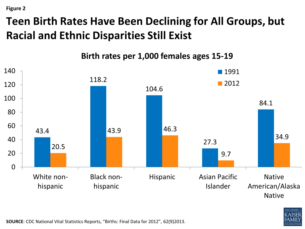
  • Although birth rates have fallen for teens of all races and ethnicities, the rates for African American, Hispanic and Native American teens are over twice the rates of White and Asian American youth (Figure 2).
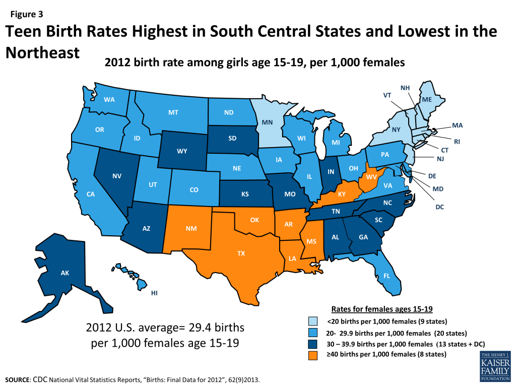
  • There are also geographic differences in teen birth rates across the nation. In 2012, teen birth rates were highest in South Central states and lowest in the Northeast (Figure 3).  The range varied considerably by state with New Mexico having the highest rate (47.5 births per thousand females 15 to 19) compared to a low in New Hampshire (13.8 births per thousand females 15 to 19).28  Teen birth rates have been declining in rural areas, but not as quickly as in suburban and urban areas.29 
  • The vast majority (82%) of teen pregnancies are unplanned compared to less than half of women above age 25.30  These teen pregnancies comprise more than one sixth of total unintended pregnancies annually in the U.S. and 36% of these unintended pregnancies end in abortion.31   Approximately 18% of women having abortions in the U.S. are teens and 33% are between the ages of 20 and 24.32   Women ages 15 to 19 comprised 17% of women of reproductive age (ages 15 to 44) in 2008.33 
Figure 1: Pregnancy, Birth, and Abortion Rates Among Teens Have Been Steadily Declining in the U.S.
Figure 2: Teen Birth Rates Have Been Declining for All Groups, but Racial and Ethnic Disparities Still Exist
Figure 3: Teen Birth Rates Highest in South Central States and Lowest in the Northeast

Sexually Transmitted Infections (STIs) and HIV/AIDS

  • Compared to older adults, sexually active teens and young adults are at higher risk for acquiring STIs, due to a combination of behavioral, biological and cultural factors (Figure 4). Though they make up 25% of the sexually active population, they account for nearly half of new STI cases.34 
Figure 4: Most New Cases of Sexually Transmitted Infections Occur in Youth and Young Adults
  • HPV is the most common STI among teens, with some estimates reaching an infection rate of 35% of 14 to 19 year olds.35  Currently, there are two vaccines (Gardasil and Cervarix) that protect against strains of HPV associated with cervical cancer and genital warts. The CDC recommends that all girls and women up to age 26 receive the 3 dose course of HPV vaccinations, as well as all boys up to age 21.36  These vaccines are now covered by private insurance without cost sharing, along with counseling on and screening for sexually transmitted infections, by the ACA’s policy for coverage of preventive services.37 
  • Teens ages 15 to 19 and young adults ages 20 to 24 accounted for the most reported cases of Chlamydia and Gonorrhea in 2012. Females are at greater risk than men of acquiring sexually transmitted infections, and the consequences include pelvic inflammatory disease, pregnancy complications, and infertility.38 
  • Despite the high rates of infection, many young women do not receive provider counseling on STIs. One-third of teen girls and almost half (45%) of young adult women ages 19 to 25 report that they have discussed STIs with their providers in the past three years.39 
  • Research has found that STI screening rates vary among youth. One study estimates that 37% of young men and 70% of young women ages 15 to 24 had an STI test in the past year.40  However, in another recent survey,  more than half (56%) of young women who reported having an STI test incorrectly assumed it was a routine part of the exam, which is often not the case.41 
  • Over 34,000 young people, ages 13 to 24, were estimated to be living with HIV in the U.S in 2009.42  This age group accounts for 26% of new HIV infections.  Most young people with HIV/AIDS were infected through sexual contact.43 
  • In 2013, 85% of high school students reported that they had been taught about AIDS or HIV infection in school.44  However, there are still gaps in knowledge about HIV/AIDS. One-third of teens ages 12-17 do not know that HIV is an STI.45 

Access to Services

  • Health insurance coverage and the ability to pay for services affect teens’ access to reproductive health care. Prior to many of the ACA insurance coverage benefits taking effect, approximately 25% of young adults 19 to 25 years old were uninsured and 15% were covered by Medicaid in 2012. Six in ten (61%) young adults lived in a low-income household (below 200% of the federal poverty level).46  After the initial insurance enrollment period in 2014, the uninsured rate among young adults ages 18 to 25 has declined to 18.7%.47 
  • Confidentiality is a priority for teens and young adults. In a national survey, 70% of women 19 to 24 rated confidentiality about use of health care such as family planning or mental health services as “important”; however, the majority of girls and women were not aware that insurers may send an explanation of benefits (EOB) that documents use of medical services that have been used to the principal policy holder, who may be a parent (Figure 5).48 
  • The Federal Title X program provides confidential contraceptive services and STI screening and treatment for low-income teens and young adults by funding approximately 4,400 clinics, public health departments and hospitals, available in 72% of US counties.49 
  • Currently, Medicaid funds 75% of publicly funded family planning services in the U.S.50  Family planning is a mandatory service under Medicaid and states are not permitted to charge cost-sharing for family planning services.
  • Today, 21 states and DC have policies that explicitly allow minors to consent to contraceptive services, 25 allow consent in certain circumstances, and 4 have no explicit policy.51 
  • 38 states require some level of parental involvement in a minor’s decision to have an abortion, up from 18 states in 1991. 21 states require that teens obtain parental consent for the procedure, 12 require parental notification, and 5 require both.52 
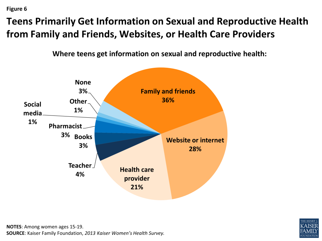
  • Teen girls ages 15 to 19 seek information about sexual and reproductive health issues from a variety of sources, primarily family and friends (36%), websites (28%), or health care providers (21%) (Figure 6).53 
Figure 5: Many Young Women Place a High Value on Confidentiality but are Unaware Private Plans can Send Explanation of Benefits (EOBs) to Parents
Figure 6: Teens Primarily Get Information on Sexual and Reproductive Health from Family and Friends, Websites, or Health Care Providers
  1. CDC. Youth Risk Behavior Surveillance System: US, 2013. MMWR, 63(-4). 2014. ↩︎
  2. Ibid. ↩︎
  3. Ibid. ↩︎
  4. Ibid. ↩︎
  5. Ibid. ↩︎
  6. Kaiser Family Foundation, Women and Health Care in the Early Years of the ACA: Key Findings from the 2013 Kaiser Women’s Health Survey, May 2014. ↩︎
  7. The White House, “1 is 2 Many: Take Action Against Abuse.” ↩︎
  8. CDC. National Intimate Partner and Sexual Violence Survey, 2011. ↩︎
  9. AP/MTV Digital Abuse Study, 2011 (http://www.athinline.org) ↩︎
  10. Kaiser Family Foundation, Health and Access to Care and Coverage for Lesbian, Gay, Bisexual, and Transgender Individuals in the U.S., January 2014. ↩︎
  11. Kaiser Family Foundation analysis of the 2013 Kaiser Women’s Health Survey. ↩︎
  12. Ibid. ↩︎
  13. Ryan, S. “Discussions About Contraceptions or STDs with Partners Before First Sex” PSRH, 39(3):149–157, 2007. ↩︎
  14. CDC. Teenagers in the United States: Sexual Activity, Contraceptive Use, and Childbearing, 2006-2010 National Survey of Family Growth. 2011. ↩︎
  15. Shafii T. Association between condom use at sexual debut and subsequent sexual trajectories: A longitudinal study using biomarkers. AJPH, 97(6). 2007. ↩︎
  16. CDC. Youth Risk Behavior Surveillance System: US, 2013. MMWR, 63(-4). 2014. ↩︎
  17. Ibid. ↩︎
  18. Ibid. ↩︎
  19. Kaiser Family Foundation analysis of the 2013 Kaiser Women’s Health Survey. ↩︎
  20. CDC. Teenagers in the United States: Sexual Activity, Contraceptive Use, and Childbearing, 2006-2010 National Survey of Family Growth. 2011. ↩︎
  21. ACOG, Committee on Adolescent Health Care: Long-Acting Reversible Contraception Working Group, 2012. ↩︎
  22. CDC. Youth Risk Behavior Surveillance System: US, 2013. MMWR, 63(-4). 2014. ↩︎
  23. In a June 2014 ruling, the Supreme Court limited the scope of the preventive services requirement and some employers may not need to abide by this requirement. For more information on preventive services now covered by the ACA, refer to the Kaiser Family Foundation fact sheet “Preventive Services Covered by Private Health Plans under the Affordable Care Act,” and for more information on the Supreme Court ruling, refer to “Potential Supreme Court Decision: Who Will Bear the Coverage ‘Burdens?’”. ↩︎
  24. Secura, G.M., et al. (2010). The Contraceptive CHOICE Project: Reducing Barriers to Long-Acting Reversible Contraception. American Journal of Obstetrics and Gynecology 203(2): 115.e1-115.e7. ↩︎
  25. Guttmacher Institute “U.S. Teenage Pregnancies, Births and Abortions, 2010: National Trends by Age, Race and Ethnicity” May 2014. ↩︎
  26. Guttmacher Institute. Teen Pregnancy and Lessons Learned, 2002. ↩︎
  27. CDC National Vital Statistics Reports, “Births: Preliminary Data for 2013”, 63(2)2014. ↩︎
  28. CDC National Vital Statistics Reports, “Births: Final Data for 2012”, 62(9)2013. ↩︎
  29. The National Campaign.  Teen Childbearing in Rural America.  January 2013. ↩︎
  30. Finer, LB & Zolna, MR. Shifts in intended and unintended pregnancies in the United States, 2001-2008. American Journal of Public Health 104: S43-S48, 2014. ↩︎
  31. Ibid. ↩︎
  32. Guttmacher Inst. Characteristics of U.S. Abortion patients, 2008. May 2010. ↩︎
  33. Ibid. ↩︎
  34. CDC. Sexually Transmitted Disease Surveillance. 2012. ↩︎
  35. CDC. Sexually Transmitted Disease Surveillance. 2012. ↩︎
  36. CDC.HPV Vaccine Information for Clinicians- Fact Sheet. 2012. ↩︎
  37. For more information on preventive services now covered by the ACA, refer to the Kaiser Family Foundation fact sheet Preventive Services Covered by Private Health Plans under the Affordable Care Act. ↩︎
  38. CDC. Reported STDs in the United States: 2012 National Data for Chlamydia, Gonorrhea, and Syphilis. 2014. ↩︎
  39. Kaiser Family Foundation analysis of the 2013 Kaiser Women’s Health Survey. ↩︎
  40. Cunningham, S. “Relationships Between Perceived STD-Related Stigma STD-Related Shame and STD Screening Among a Household Sample of Adolescents” PSRH, 2009. ↩︎
  41. Kaiser Family Foundation analysis of the 2013 Kaiser Women’s Health Survey. ↩︎
  42. CDC. HIV/AIDS Surveillance in Adolescents and Young Adults,2012 ↩︎
  43. Ibid. ↩︎
  44. CDC. Youth Risk Behavior Surveillance System: US, 2013. MMWR, 63(-4). 2014. ↩︎
  45. MAC AIDS Fund, U.S. Teen Survey Headline Highlights, 2014. ↩︎
  46. Kaiser Family Foundation analysis of Urban Institute tabs of ASEC supplement to CPS, 2013. ↩︎
  47. Gallup. In U.S., Uninsured Rate Sinks to 13.4% in Second Quarter, 2014. ↩︎
  48. Kaiser Family Foundation analysis of the 2013 Kaiser Women’s Health Survey. ↩︎
  49. HHS Office of Population Affairs: Family Planning, Title X Family Planning. ↩︎
  50. Guttmacher Institute. “The Central Role of Medicaid in the Nation’s Family Planning Effort”,2012. ↩︎
  51. Guttmacher Institute. Minors’ access to contraceptive services. State Policies in Brief. 2013. ↩︎
  52. Guttmacher Institute. Parental Involvement in Minors’ Abortions. State Policies 2013. ↩︎
  53. Kaiser Family Foundation analysis of the 2013 Kaiser Women’s Health Survey. ↩︎
News Release

Report Examines Trends in the Medicare Part D Plan Marketplace

Published: Aug 18, 2014

A new comprehensive Kaiser Family Foundation report analyzes key trends that have shaped the Medicare Part D marketplace since the program launched nine years ago, providing a detailed assessment of changes in plan availability, enrollment, premiums and cost sharing in both private stand-alone drug plans, and Medicare Advantage drug plans.

After a period of steady increases, premiums and cost sharing for drugs have been relatively stable since 2010.  Medicare beneficiaries enrolled in stand-alone Part D plans this year typically pay $40 for a 30-day supply of a preferred brand-name drug, up $12 or 43 percent since 2006, and $85 for a 30-day supply of a non-preferred brand-name drug, up $30 or 55 percent since 2006.  In contrast, the typical monthly cost sharing for generics ($2 for preferred and $5 for non-preferred generics) is no more expensive now than when the program began.  These trends have most likely contributed to greater use of generics among Medicare’s 37 million Part D plan enrollees, and modest growth in Medicare Part D spending overall.

Other findings from Medicare Part D in Its Ninth Year: The 2014 Marketplace and Key Trends, 2006-2014 include:

  • Average monthly premiums in stand-alone Part D plans have been essentially flat since 2010, but there is significant variation across plans – for example, from $12.80 per month to $111.40 per month for plans offering the basic Part D benefit.  Premiums for older, established plans have generally increased more rapidly than the national average, while newer plans tend to enter with relatively low premiums in order to build enrollment.  As a result, beneficiaries who stay in the same plan tend to pay more over time, and earlier research finds that relatively few enrollees switch plans voluntarily in a given year.
  • In 2014, 72 percent of stand-alone plans include a preferred pharmacy network, which offers the lowest cost sharing for enrollees.  This represents a sharp increase since 2011, when just 7 percent of plans used preferred pharmacy networks.  In some plans, there are limitations on access to preferred pharmacies within a reasonable travel distance, which could make it difficult for enrollees in these plans to take advantage of this lower cost sharing.
  • About 11 million enrollees with low incomes receive extra help through the Low-Income Subsidy program, which reduces their cost sharing, and fully or partially covers their drug plan premiums if they are enrolled in designated plans.  However, about 1.3 million low-income enrollees are enrolled in higher-cost stand-alone plans, and are paying a premium, averaging $17.85 per month, more than in any previous year.  While some of these enrollees may be choosing to stick with their current plans, and pay monthly premiums, others may be unaware that there are plans available to them at no cost.

The report is authored by researchers at the Foundation, Georgetown University, and NORC at the University of Chicago.


Ebola in West Africa: Four Questions for the U.S. Response Going Forward

Published: Aug 18, 2014

As of August 14, 2014, the Ebola virus has infected an estimated 1,975 individuals across four countries in West Africa, leading to 1,069 deaths (including three Americans). The official reported numbers, frightening as they are, likely vastly underestimate the true magnitude of the outbreak. Ebola has severely impacted the daily life of affected communities, and raised concerns across the globe about its ongoing spread. The fact that this outbreak has led to so many cases and deaths (approximately 45% of all cases of Ebola ever reported have come since March of this year) is concerning for the individuals and families struggling with the disease, and leads to questions regarding the global capacity to detect and respond to such events.  It also brings up four key policy questions for the U.S. concerning its engagement with the international community’s efforts to combat Ebola and other emerging infectious disease outbreaks.

HAS THE U.S. RESPONSE MATCHED THE NEED?

The U.S. government has incrementally ratcheted up its assistance to address the growing Ebola outbreak. The U.S. Agency for International Development (USAID) initially gave $2.1 million in emergency support to multilateral agencies such as the World Health Organization (WHO) and the United Nations Children’s Fund (UNICEF) for their response to Ebola in the region, and a limited number of experts from Centers for Disease Control and Prevention (CDC), the Department of Defense (DoD), and other U.S. agencies were in the region providing technical assistance and support. As case numbers continued to climb, the disease spread to additional countries, and the three Americans were diagnosed with Ebola, USAID announced the deployment of a Disaster Assistance Response Team (DART) and the release of an additional $12.45 million in emergency support for the public health response in the region. The State Department issued a travel warning and ordered the departure of family members of its mission staff in Liberia while the CDC announced on August 7 its intention to provide 50 infectious disease experts within 30 days to assist in the response and issued its own travel warnings for the region.  U.S. personnel and resources are meant to join and bolster the broader national and international responses focused on the disease.

The emergency funding made available for this particular outbreak is in addition to ongoing U.S. support for global emerging infectious disease preparedness and response.  Key bilateral USG funding mechanisms for this work include (but are not limited to) the CDC’s Global Disease Detection (GDD) efforts, USAID’s Pandemic Influenza and Other Emerging Threats (PIOET) efforts, and Department of Defense’s Cooperative Biological Engagement (CBE) program (see chart).1 

Key U.S. Government Accounts for Emerging Infectious Disease Surveillance and Response Capacity Building in Developing Countries, FY2011-FY2015

Whether or not the U.S. response has matched the need is a complex question. As the chart indicates, however, U.S. funding for these programs has remained mostly stable over the last 5 years. The White House, HHS, CDC, USAID, DoD and other agencies, noting the need for greater attention and investment in such programs, did announce in February 2014 the launch of a new “Global Health Security Agenda” meant to catalyze further action by U.S. government and its partners on emerging diseases and global health security.  While no additional funding for this effort has been made available yet, the President’s FY2015 budget request does include an additional $45 million to support CDC’s work on the agenda.

In addition, none of the funding had focused on West Africa prior to this Ebola outbreak. USAID/PIOET has focused on central and eastern Africa, along with South America and South and Southeast Asia, while the DoD/CBE program has been primarily focused on former Soviet states along with parts of Asia and central/Eastern Africa.  The CDC maintains or is in the process of setting up 10 GDD centers around the globe, though none are in West Africa (the nearest GDD centers are in Egypt and Kenya). This shows the limitations of the current levels of funding and also the inherent difficulty of trying to predict where the next important infectious disease epidemic might spring up, because such outbreaks are by their nature unpredictable. In another recent example, the 2009 H1N1 outbreak emerged from Mexico, not Asia as had been presupposed by epidemiologists and where the global influenza surveillance effort had been primarily focused.

Despite U.S. contributions and a growing international response to the Ebola outbreak, the needs are still great in the region, with health workers and basic supplies still lacking in many areas. Sierra Leone reports receiving just $7 million of the $25 million it says it needs for Ebola response while Liberia has received $6 million of the $21 million it needs.

HOW DOES THE EBOLA RESPONSE FIT INTO THE BROADER U.S. GLOBAL HEALTH EFFORT?

The U.S. provides ongoing funding for global health programs in all of the Ebola-affected countries, including (depending on the country) HIV, tuberculosis, malaria, maternal and child health, family planning/reproductive health, and water programs (see Table 1).  The $14.55 million made available to combat Ebola this year is equal to just a small proportion (2 percent) of the $625.97 million Nigeria received in U.S. global health assistance in FY2013, though it also represents a funding level almost thirty times as large as U.S. global health assistance to Sierra Leone.

Table 1. U.S. Global Health Assistance to Ebola-Affected Countries, FY2013 Total and by Program Area
CountryTotal U.S. Global Health AssistanceBilateral HIVTBMalariaMCHFPRHWater
Guinea$17,880,000 –$12,371,000$2,502,000$3,007,000
Liberia$46,932,000$3,500,000$12,370,000$11,038,000$7,004,000$13,020,000
Sierra Leone$500,000$500,000
Nigeria$625,974,000$455,746,000$13,008,000$73,272,000$45,675,000$33,496,000$4,777,000
Data source: www.foreignassistance.gov

An oft-debated question in global health policy has been: do global health programs that focus on specific diseases or conditions contribute – should they contribute – to building general health capacity and community resilience?  The circumstances of the Ebola outbreak underscore the links between poor public health capacity and the ability to address specific diseases. After all, any global health or development program is likely to be affected when health workers are becoming infected and dying at an alarming rate, clinics and hospitals are being inundated with patients or shut down, medical staff are not reporting to work or striking for better working conditions, and restrictions on travel and border crossings are in effect.  In this case, there is already significant concern about the effects of Ebola on the ability of these countries to address other diseases.

HOW TO STRIKE THE RIGHT BALANCE BETWEEN ACCESS AND REGULATORY SAFETY?

The two candidate Ebola treatments far enough along in the process for use in humans were funded by the DoD, and the National Institutes of Health and Biomedical Advanced Research Development Authority (both within the Department of Health and Human Services), along with the Canadian government, primarily for purposes of developing countermeasures to potential bioterrorism incidents involving the Ebola virus. Though none of the treatments has yet been clinically tested on humans, one of the drugs, ZMapp, has been administered to three people this month (two Americans and a Spanish citizen), and is expected to be provided to several Liberian Ebola patients soon. The Food and Drug Administration (FDA), responsible for regulating the development and use of such treatments has taken the unusual step of making an Expanded Access (“compassionate use”) exemption for Ebola treatment, making it available despite the lack of human testing. These actions have sparked debates about innovation, research, development, and access to medicines for neglected diseases such as Ebola, the use of drugs or vaccines prior to regulatory approval, the merits of fast-tracking approval of treatments, and the ethics of first access to limited quantities of life-saving drugs or vaccines.  A World Health Organization-convened panel to examine these questions for the current Ebola outbreak recently concluded that, provided certain conditions are met, it is ethical to offer unproven interventions. While these recent debates revolve around the circumstances of this particular Ebola outbreak, they have implications for global health more generally. 

CAN THE U.S. HELP COUNTRIES GET AHEAD OF THE CURRENT OUTBREAK OR WILL THIS REMAIN A CATCH UP GAME?

The international response so far has not been able to meet the needs of the countries facing this Ebola outbreak.  By many accounts, there remains a serious lack of basic supplies, protective gear, and laboratory capacity, and an insufficient number of health workers to put into place all of pieces of the response that will be necessary to contain this outbreak.  There remains an urgent need to fill these gaps, that the U.S., along with other countries and multilateral organizations, can help address with continuing and expanded support as needed. Given the attention to this topic, as Congress and the Administration consider what comes after addressing the immediate needs in West Africa they face a uniquely powerful and opportune moment to focus on the key questions and debates that have been raised by the outbreak and response.

  1. The DoD also supports the Global Emerging Infection Surveillance and Response System (DoD-GEIS), but current budget numbers are not publicly available. In FY2012, the most recent budget year available, the GEIS budget was $47 million. ↩︎

Medicare Part D in Its Ninth Year: The 2014 Marketplace and Key Trends, 2006-2014

Authors: Jack Hoadley, Laura Summer, Elizabeth Hargrave, Juliette Cubanski, and Tricia Neuman
Published: Aug 18, 2014

Executive Summary

Since 2006, Medicare beneficiaries have had access through Medicare Part D to prescription drug coverage offered by private plans, either stand-alone prescription drug plans (PDPs) or Medicare Advantage prescription drug plans (MA-PD plans). Now in its ninth year, Part D has evolved due to changes in the private plan marketplace and the laws and regulations that govern the program. This report presents findings from an analysis of the Medicare Part D marketplace in 2014 and changes in features of the drug benefit offered by Part D plans since 2006.

In 2014, more than 37 million Medicare beneficiaries are enrolled in Medicare drug plans, an increase of 2 million compared to 2013 and 15 million since 2006.

  • The majority (62 percent) of Part D enrollees are in PDPs, but enrollment in MA-PD plans is growing more rapidly, representing half of the net increase in enrollment from 2013 to 2014. About 6.5 million Medicare beneficiaries with drug coverage from their former employers now get that coverage through a Part D plan designed solely for that firm’s retirees. Partly due to changes in law that took effect in 2013, enrollment in employer plans has quadrupled since 2006.

In 2014, three Part D sponsors account for half of all Part D PDP and MA-PD enrollees.

  • UnitedHealth, Humana, and CVS Caremark have enrolled half of all participants in Part D. This level of market concentration is relatively unchanged since 2006. UnitedHealth and Humana have held the highest shares of enrollment since the program began, while enrollment in CVS Caremark has grown through the acquisition of other plan sponsors. UnitedHealth, by itself, has maintained the top position for all nine years of the program, and in 2014 provides coverage to more than one in five PDP and MA-PD enrollees.
  • On average, PDP enrollees pay premiums of $37.75 per month in 2014. PDP premiums vary widely even for plans with equivalent benefits, ranging from $12.80 to $111.40 per month for plans offering the basic Part D benefit. UnitedHealth’s AARP MedicareRx Saver Plus PDP, which was new in 2013, raised its premiums by 54 percent (an average increase of about $8 per month) in 2014. By contrast, WellCare’s Classic PDP lowered its premium by 38 percent (an average decrease of about $13 per month) in 2014.
  • Part D enrollees in MA-PD plans pay lower premiums on average ($14.70) than those in PDPs.

Cost sharing for brand-name drugs has been relatively stable in recent years, but has risen substantially since the start of Part D; MA-PD plan enrollees generally pay somewhat higher cost sharing than PDP enrollees.

  • Cost sharing for brands between 2006 and 2014 has increased by about 50 percent for beneficiaries enrolled in PDPs and by about 70 percent for those in MA-PD plans. Copayments for brand-name drugs are higher than those typically charged by large employer plans, while copayments for generics are generally lower.
  • On average, MA-PD plan enrollees pay somewhat higher cost sharing for their drugs than PDP enrollees, particularly for brand-name drugs. For example, median cost sharing for preferred and non-preferred brands in MA-PD plans is $45 and $95, respectively, compared to $40 and $85 in PDPs.

In 2014, about three-fourths of all plans (76 percent of PDPs and 75 percent of MA-PD plans) use five cost-sharing tiers: preferred and non-preferred tiers for generic drugs, preferred and non-preferred tiers for brand drugs, and a tier for specialty drugs.

  • Four-tier arrangements were most common until 2012 when plans began shifting toward the five-tier cost-sharing design.

Part D plans typically use specialty tiers for high-cost drugs and charge coinsurance of from 25 percent to 33 percent during the benefit’s initial coverage period, as in previous years.

  • These initial high out-of-pocket costs may create a financial barrier to starting use of specialty drugs, which are expected to be a significant cost driver for Medicare in the future. Users who incur these initial high out-of-pocket costs are likely to reach the benefit’s catastrophic threshold within a short period and thus see their coinsurance reduced to 5 percent.

Use of preferred pharmacy networks has grown rapidly in recent years, and for some PDP enrollees, access to preferred pharmacies is geographically limited.

  • The share of Part D stand-alone drug plans with this type of pharmacy network grew from 7 percent in 2011 to 72 percent in 2014. Enrollees in these plans pay lower cost sharing if they use preferred pharmacies and higher cost-sharing if they use a non-preferred pharmacy. In some plans, however, there is no preferred pharmacy within a reasonable travel distance, which could make it difficult for enrollees in these plans to take advantage of this lower cost sharing.

About one in six LIS beneficiaries enrolled in PDPs (1.3 million beneficiaries) are paying a premium for their Part D plan in 2014.

  • About 11 million Part D enrollees receive extra help through the Part D Low-Income Subsidy (LIS), a majority of whom (8 million) are enrolled in stand-alone PDPs. The subsidy reduces cost sharing and pays their drug plan premiums, as long as they enroll in PDPs designated as benchmark plans. But 16 percent of LIS beneficiaries enrolled in PDPs (1.3 million) are paying monthly premiums in 2014, and of this group, two-thirds are paying $10 or more per month. In addition, 300,000 LIS beneficiaries enrolled in MA-PD plans (19 percent) are paying premiums in 2014. CMS does not reassign these beneficiaries to a zero-premium PDP because they have actively selected the plan they are in. On average, LIS beneficiaries paying premiums for their PDPs pay $17.85 per month, well above the average in previous years.

Only 5 percent of PDP enrollees are in plans with the highest star ratings (4 stars or more).

  • More than half of all PDP enrollees are in plans with 3.5 stars out of a maximum five stars. Nearly one-fourth of PDP enrollees are in plans with fewer than 3 stars; plans at this level for three years in a row are subject to removal from the program.

While the Part D program has matured since 2006, the marketplace also changes every year. Plans can and do enter and drop out of the market annually, and enrollees can and do experience changes in premiums, cost sharing for their medications, which drugs are covered by their plan, and which pharmacies they can use without paying higher cost sharing. Now in its ninth year of operation, the Part D program has enjoyed relative stability in recent years. The program has had consistently high levels of plan participation, offering dozens of plan choices for beneficiaries in each region and broad access to generic and brand-name drugs.

Beneath the surface, however, there are some sobering trends. This analysis highlights the cost and access trends that could pose challenges for Part D enrollees. Although premiums have been flat for several years, average premiums have increased by nearly 50 percent between 2006 and 2014. In addition, median cost sharing for brand-name drugs has increased over these years. Finally, many low-income beneficiaries are paying steadily higher premiums for coverage when they could be enrolled in premium-free plans.

Introduction

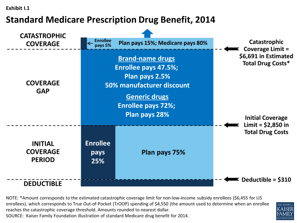
Since 2006, Medicare beneficiaries have had access to prescription drug coverage offered by private plans, either stand-alone prescription drug plans (PDPs) or Medicare Advantage prescription drug plans (MA-PD plans). These Medicare drug plans (also referred to as Part D plans) receive payments from the government to provide Medicare-subsidized drug coverage to enrolled beneficiaries. Part D plans are required to offer a defined standard benefit or one that is equal in value (Exhibit I.1). They may also offer an enhanced benefit. Medicare drug plans must meet defined requirements, but may vary in terms of premiums, benefit design, gap coverage, formularies, and utilization management rules.

Exhibit I.1: Standard Medicare Prescription Drug Benefit, 2014

In 2014, more than 37 million Medicare beneficiaries are enrolled in Medicare drug plans, including 23 million in PDPs and 14 million in MA-PD plans.1 , 2  About 11 million Part D enrollees are receiving extra help through the Part D Low-Income Subsidy (LIS) program to pay their drug plan premiums and cost sharing. Part D has evolved since its inception in 2006 due to changes in the private plan marketplace and the regulations that govern the program. The 2010 Affordable Care Act (ACA) is bringing significant improvements to the program, primarily phasing out the coverage gap, or “doughnut hole,” in the drug benefit.3  In addition to a 50 percent manufacturer discount on the price of brand-name drugs in the gap, the law further reduces cost sharing for brand-name and generic drugs in the gap over time, reducing cost sharing to the level that applies before the gap and eliminating the coverage gap in 2020. In addition, the Centers for Medicare & Medicaid Services (CMS) has implemented other statutory and regulatory changes that have resulted in some consolidation of Part D plan offerings, along with a degree of greater standardization.

This report presents findings from an analysis of the Medicare Part D marketplace in 2014, the program’s ninth year, and changes in various features of the drug benefit since 2006.4  It presents key findings in five different areas:

  • Enrollment and plan availability;
  • Premiums;
  • The design of Part D benefits, including cost sharing, specialty tiers, formularies, utilization management, the coverage gap, and preferred pharmacy networks;
  • The Low-Income Subsidy (LIS) program for low-income beneficiaries; and
  • Plan performance ratings.

The findings are based on data from CMS for all plans participating in Part D. More detail about the methods used in this analysis is provided on page 44.

Key Findings: Section 1: Part D Enrollment And Plan Availability

Beneficiary Participation in Part D

More than 37 million Medicare beneficiaries are enrolled in a Part D plan, either a PDP or MA-PD in 2014, representing 70 percent of all eligible Medicare beneficiaries. This is an increase of 2 million beneficiaries since 2013 and of 15 million beneficiaries since 2006 when only 53 percent of eligible beneficiaries were enrolled

1

. About half of this increase comes from additional enrollment in MA-PD plans, which is likely a mix of enrollees new to Part D and those who switched from PDPs to MA-PD plans. About one-fourth of the increase in 2014 is higher PDP enrollment, and another one-fourth is enrollment in employer-only Part D plans.

The 5.5 percent enrollment increase from 2013 to 2014 is lower than the average annual increase of 6.5 percent since the program’s start in 2006. Above-average growth in the two previous years was mainly a result of increased enrollment of retirees in employer-only Part D plans.5  Although many beneficiaries who are not enrolled in Part D plans have drug coverage from former employers or some other type of coverage equivalent to Part D, about 12 percent of Medicare beneficiaries are estimated to have no drug coverage whatsoever.6 

The share of Medicare beneficiaries with Part D coverage varies considerably by state

2

. States with the highest shares of Part D enrollment are California, New York, and Ohio, each with 75 percent of Medicare beneficiaries in Part D. Six states and the District of Columbia have fewer than 60 percent of their residents on Medicare in Part D plans. These states include several with high shares of federal employment; federal retirees get drug coverage outside Part D through the Federal Employees Health Benefits Program. The lowest level is 38 percent in Alaska.

Nationally, about 62 percent of Part D enrollees are in PDPs; the remaining 38 percent are in MA-PDs, with considerable variation by state

3

, Appendix Table 1, Appendix Table 2. PDP enrollment accounted for 72 percent of total enrollment in 2006, but this share has been declining over time as MA-PD plan enrollment has grown more rapidly than PDP enrollment in recent years. From 2006 to 2014, non-employer MA-PD plan enrollment grew by 10.5 percent annually, whereas non-employer PDP enrollment grew by only 2.3 percent annually. PDPs account for 100 percent of Part D enrollees in Alaska and more than 90 percent of enrollees in five other states with low populations (Delaware, New Hampshire, North Dakota, Vermont, and Wyoming). By contrast, MA-PD plans account for half or more of Part D enrollees in seven states. The highest shares of Part D enrollees in Medicare Advantage drug plans are in California, Florida, and several western states.

Between 2011 and 2014, total enrollment in employer-only Part D plans more than doubled from 2.9 million to 6.5 million beneficiaries

4

, Appendix Table 2. Total enrollment in employer-only Part D plans in 2014 is more than four times the level in 2006, the program’s first year. The biggest increase was between 2012 and 2013, when enrollment in these plans grew 63 percent. The growth rate slowed in 2014, but enrollment in employer-only plans still grew 10 percent.

The major impetus for this growth was a provision in the ACA that eliminated the tax deductibility of the 28 percent Retiree Drug Subsidy (RDS), effective in 2013.7  This subsidy, paid to employers who provide creditable prescription drug coverage to Medicare beneficiaries, was included in the original Part D legislation to encourage employers to maintain existing drug coverage for their retirees. In 2006, 7.2 million Medicare beneficiaries were covered in retiree health plans that received the RDS (with an average subsidy payment of $527 per person in 2006, rising to a projected $605 in 2014). With the changed tax status of the RDS, enrollment in subsidized retiree plans dropped to 3.3 million in 2012, and the Medicare Trustees project a drop to 0.9 million by 2019.8 

Most employers that no longer elected to receive the subsidy after the change in tax treatment have shifted their retirees to employer-only Part D plans. Most of the new enrollment was in employer-only PDPs. In 2013, enrollment was up 99 percent in employer-only PDPs and just 7 percent in employer-only MA-PD plans. In 2014, growth slowed overall, and there was a somewhat greater increase in employer MA-PD plan enrollment.

Continuity of Part D Plan Offerings

About one out of four PDPs that participated in Part D in its first year are still in the market today. There are 398 PDPs operating under the same contract and plan identification number in 2014 as in 2006. About one-fourth of these PDPs operate under the same plan name, while others have similar names. For example, what was originally the AARP MedicareRx Plan, sponsored by UnitedHealth, is now called AARP MedicareRx Preferred. Others have changed as a result of acquisitions; for example, the PDP offered as PacifiCare Comprehensive Plan in 2006 is now UnitedHealth’s AARP MedicareRx Enhanced PDP. About one-third of these continuously operating PDPs have changed their benefit type; in most cases, PDPs originally offering the basic benefit now offer an enhanced benefit.

These continuously operating PDPs accounted for nearly half of all PDP enrollees in 2006, and 57 percent in 2014. Most of the remaining PDP enrollees are in other plans offered by sponsors that have participated in Part D since 2006. Of the six plan sponsors that entered the Part D after the program’s first year, none have attracted a significant market share. The most successful new entrant has been Envision RxPlus, which held a 2.5 percent share of PDP enrollment in 2013, declining to 2 percent in 2014.

Part D Market Concentration

In 2014, the ten largest sponsors of Part D plans account for more than three-fourths of all enrollees, three firms account for half of all enrollees, and UnitedHealth alone accounts for more than one in five Part D enrollees (including 22 percent of PDP enrollees and 21 percent of MA-PD plan enrollees)

5

.9  This pattern of a few plan sponsors having a substantial share of Part D enrollment has held over the program’s first nine years. The ten largest Part D plan sponsors in 2014 have enrolled 29.5 million beneficiaries in either a stand-alone PDP or an MA-PD plan

Six of the top ten firms in 2014 sponsor both stand-alone PDPs and MA-PD plans. Kaiser Permanente is the only sponsor among the top ten that offers only MA-PD plans, and Wellpoint is the only other firm with more MA-PD enrollees than PDP enrollees. CVS Caremark, Express Scripts, and Envision offer only PDPs. Other than Kaiser Permanente, at least 40 percent of each of the top firms’ enrollment is in PDPs.

Enrollment growth since 2006 for CVS Caremark, Express Scripts, Aetna, and CIGNA is due largely to acquisitions of other plan sponsors. CVS Caremark has used an acquisitions strategy to become the third largest sponsor in the Part D marketplace—despite being suspended for new enrollment in its PDP products in the annual enrollment period for 2014. The parent company now includes 5 of the 18 firms that had the most enrollees in 2006.10  CIGNA and Aetna have grown their Part D market shares through similar acquisitions strategies. Express Scripts has grown both through its recent acquisition of Medco, but also through the overall increase in enrollment in employer-only plans since the RDS tax status change. Four plan sponsors dominate the employer-only segment of the Part D market, collectively accounting for about two-thirds of all enrollees in employer-only Part D plans: Express Scripts (34 percent), CVS Caremark (18 percent), UnitedHealth (8 percent), and Kaiser Permanente (7 percent).

UnitedHealth and Humana have been the two largest Part D plan sponsors from the start of the program, but their combined share of enrollment has dropped from 45 percent in 2006 to 38 percent in 2014. UnitedHealth, due in part to its successful marketing relationship with AARP, has maintained its top position for all nine years of the program and has seen its enrollment grow by about 43 percent since 2006. Humana has maintained a strong Part D presence, due in part to offering the lowest PDP premiums in 2006 and retaining many of those enrollees over time despite premium increases for its older plans. While higher-than-average premium increases and a loss of LIS benchmark status in most regions contributed to a drop in Humana’s Part D enrollment between 2006 and 2010, Humana’s introduction of new PDPs in 2011 and 2014 reversed this decline, contributing to a net enrollment gain of 40 percent in Humana’s Part D plans between 2006 and 2014.

There has been more turnover in the list of top Part D plans than plan sponsors, with only four of the top ten PDPs or MA-PD plans by enrollment in 2014 among the top ten in 2006. These four plans are UnitedHealth’s AARP MedicareRx Preferred PDP, Humana’s Enhanced PDP, CVS Caremark’s SilverScript Basic PDP, and Kaiser Permanente’s Senior Advantage HMO

7

. Within many plan sponsors’ offerings, there have been significant changes in enrollment, partly due to sponsors adding, dropping, or consolidating plans. Two of the top plans in 2014 (Humana’s Preferred Rx PDP and UnitedHealth’s AARP MedicareRx Saver Plus PDP) are recent entries to the market, featuring low initial premiums and preferred pharmacy networks.

The growth pattern among the largest PDP sponsors illustrates some of the different strategies used since the start of the program

8

. UnitedHealth has been the largest PDP sponsor since 2006, and Humana has generally been the second largest. CVS Caremark has used an acquisition strategy to move solidly into the third position. Aetna and CIGNA have moved higher up in recent years, also through acquisitions.

Enrollment shifts among the top plans and plan sponsors also have been brought about by automatic re-assignment of LIS beneficiaries. If a plan loses its designation as a benchmark plan (available to LIS beneficiaries for zero premium), CMS reassigns certain beneficiaries to a benchmark plan offered by the same sponsor if one is available; otherwise they are switched at random to a benchmark plan offered by another sponsor.

The most popular plans vary considerably by region. UnitedHealth has the largest PDP in a majority of regions in 2014.11  The firm’s AARP MedicareRx Preferred PDP is the largest PDP in 25 regions, and the SilverScript Basic PDP is the largest in 7 regions. Humana Preferred Rx PDP holds the lead in Colorado, and MedicareBlue Rx Standard PDP has the largest share of enrollment in the seven-state upper Midwest region.

The most popular plans also differ for non-LIS and LIS beneficiaries. In addition to being the largest plan overall, AARP MedicareRx Preferred PDP has enrolled about 30 percent of all non-LIS enrollees nationally and has the most non-LIS enrollees in 31 of 34 PDP regions

9

. Local Blue Cross Blue Shield PDPs have the largest share of non-LIS enrollment in Arkansas and the upper Midwest region, and Humana’s Enhanced PDP has the most non-LIS enrollees in the Idaho/Utah region.

With the help of its acquisition strategy, CVS Caremark’s SilverScript Basic PDP dominates the LIS market with more than one-fourth of national LIS enrollment and the highest share of LIS enrollees in 26 PDP regions, despite not receiving any new enrollees during the annual enrollment period. PDPs sponsored by Humana, UnitedHealth, Aetna, and CIGNA have the most LIS enrollees in the other 8 PDP regions. Like many PDPs with high LIS enrollment, SilverScript Basic PDP has attracted only a small share (14 percent) of non-LIS enrollees. By contrast, Humana’s Preferred Rx PDP and UnitedHealth’s AARP MedicareRx Saver Plus PDPs have attracted enrollment in nearly equal shares from both non-LIS and LIS beneficiaries, and they are among the top five plans by enrollment in each category. UnitedHealth’s AARP MedicareRx Preferred PDP has more than 600,000 LIS enrollees, despite its status as an enhanced PDP that charges a premium for LIS enrollees and despite the availability of a UnitedHealth PDP with a much lower premium that would be available to LIS beneficiaries for zero premium because it qualifies as a benchmark plan in all 34 regions.

Concentration of enrollment among PDPs nationally (at the plan level), as measured by a statistical measure of market competition, has declined since 2011 as enrollment has grown in the some of the newly offered PDPs. Concentration is greater within regions than at the national level.12  Furthermore, if non-LIS and LIS beneficiaries are treated as separate markets, both are more concentrated—especially within regions.13  The most concentrated regions tend to be in the northeastern and southwestern states.

Plan Availability

Choice remains plentiful in Part D; in 2014, the average Part D enrollee had a choice of 35 PDPs and 15 MA-PD plans. The average number of PDPs per region has come down from a high of 56 in 2007 to 35 in 2014 (weighted by regional enrollment). At least 28 PDPs are offered in every region this year (excluding the territories). In 2014, virtually all beneficiaries have at least one Medicare Advantage option with drug coverage as well, and the average beneficiary has 15 options for Medicare Advantage drug plan enrollment.14 

The number of PDPs offered increased somewhat between 2013 and 2014. There are 1,169 PDPs in 2014, up 13 percent compared to 2013, but still well below the number of PDPs offered between 2006 and 2010. While the number of PDPs rose sharply between 2006 and 2007, the number decreased each year until 2014 as a result of both marketplace and policy factors

10

. Over its first nine years, the Part D market has witnessed several mergers between sponsoring organizations and consolidation of plan offerings by sponsors. In 2010, CMS issued regulations aimed at discouraging duplicative plan offerings and plans with low enrollment. For example, many sponsors now offer just two plan options (one basic and one enhanced) instead of the three options they had offered in previous years.

The modest increase in PDP offerings from 2013 to 2014 reflects new offerings by both existing plan sponsors and sponsors new to the program in 2014 as well as a few offsetting plan terminations. Symphonix Health is offering a new basic PDP in 30 regions, co-branded in some regions with Rite Aid pharmacies. Stonebridge Life Insurance Company offers new basic and enhanced PDPs in 33 regions under the Transamerica MedicareRx name.   Together with two smaller plan sponsors, new plan sponsors offered 102 PDPs, but they attracted fewer than 700 enrollees per plan on average. Because some of these plans had premiums below the LIS benchmark amount in some regions, they received some enrollees through random assignments or reassignments by CMS (described in more detail in the section below on the Low-Income Subsidy Program). Existing plan sponsors added another 110 new PDPs to the market (some replacing existing PDPs and others replacing PDPs they had dropped a year earlier). One—Humana’s Walmart Rx PDP—attracted 660,000 enrollees (20,000 per region), but the others attracted only an average of 1,250 enrollees each. In addition, Envision RxPlus dropped the enhanced PDP it first offered in 2007, which did not attract a large number of enrollees.

Current CMS policies suggest that the number of PDPs might decline again in future years. In the call letter issued in early 2014 spelling out the terms of plan participation for the 2015 contract year, CMS reiterated the agency’s authority not to renew plans with low enrollment.15  Currently, 330 PDPs (28 percent of all PDPs in 2014) have fewer than 1,000 enrollees, the level at which CMS urges sponsors to consider plan withdrawal or consolidation; 105 of these PDPs have fewer than 100 enrollees each.16  The low-enrollment PDPs include many plans offered for the first time in 2014.

In addition to its policy on low-enrollment plans, CMS continues to maintain a policy that PDPs offered by the same sponsor must be meaningfully different from the sponsor’s other offerings. This policy encourages plan sponsors to reduce their PDP offerings, thereby simplifying the choice environment in Part D. In a rulemaking notice published in May 2014, the agency noted its intention to continue monitoring its policy on meaningful differences to determine whether changes may be necessary as the coverage gap closes.17 

In 2014, 1,610 Medicare Advantage drug plans are offered, essentially the same number as the year before. The number of MA-PD plans increased by about 50 percent between 2006 and 2009, from 1,333 plans to 1,991 plans.18  However, the availability of MA-PD plans has fallen since then; the 1,610 MA-PD plans offered in 2014 is about 19 percent lower than at the peak.

Key Findings: Section 2: Part D Premiums

Since 2006, the average PDP premium, weighted by enrollment, has increased by 46 percent, but the 2014 average is 2 percent lower than in 2013. The weighted average monthly premium paid by beneficiaries for stand-alone Part D coverage has increased since the start of the program, from $25.93 in 2006 to $37.75 in 2014

1

.19 ,20  Premiums have been essentially flat since 2010, up only 1 percent from 2010 to 2014. A key factor driving slow premium growth in recent years is the availability of generic versions of many drugs used for common chronic conditions, which helps to limit growth in total plan costs and hence premiums.21  National per capita expenditures on prescription drugs have grown considerably more slowly than Part D premiums from 2006 to 2014, up just 15 percent.22 

PDP premiums vary widely. Nationwide, the least expensive PDP has a $12.50 monthly premium, while the most expensive PDP has a $174.70 premium, a 14-fold difference. Although the difference can be explained partly by the relative generosity of the benefits offered or the relative efficiency across plans, these factors seem unlikely to explain the full difference. Even among plans with equivalent benefits (those offering the basic Part D benefit), premiums vary from $12.80 to $111.40 per month. As illustrated in the lowest and highest-premium PDPs in selected regions, benefit differences are modest relative to the large premium differences

2

. Although enrollees in the highest-premium enhanced plan have some coverage in the gap for generic drugs and no deductible, they face cost sharing similar to that in the lowest-premium PDPs. Those enrolled in the highest-premium basic PDP have a $255 deductible while those in the lowest-premium PDP have no deductible.

Average Part D premiums, including both PDPs and MA-PDs, are lower than average premiums for PDPs because MA-PD plan premiums are less than half of those for PDPs. The combined average has been essentially flat since 2010, hovering around $30 

3

. The average 2014 monthly premium amount attributable to drug benefits in MA-PD plans is $14.70, up 11 percent from $13.30 in 2013, and higher than in any year since the program began.23  The MA-PD average monthly premium is about $23 below the PDP average monthly premium, in part because many MA-PD plans reduce or eliminate their premiums by using a portion of rebates from the Medicare Advantage payment system.24   The modest increase in the MA-PD premium from 2013 to 2014 may reflect changes in the Medicare Advantage payment rules, which may have lowered these rebates. Nearly half (46 percent) of all MA-PD plans charge no premium for their drug benefit.

Four of the seven PDPs with the highest enrollment charged higher average premiums in 2014 compared to 2013, whereas three lowered their average premiums. More generally, the modest decrease in the average premium for all Part D enrollees hides larger changes at the plan level

4

. The plan with the highest enrollment, UnitedHealth’s AARP MedicareRx Preferred PDP, increased the monthly premium by 7 percent compared to 2013 (from $40.45 to $43.41). By contrast, UnitedHealth’s Saver Plus PDP increased its average premium by 54 percent (from $15.00 to $23.11). WellCare’s Classic PDP had the largest decrease among PDPs with the most enrollment, lowering its premium from $33.39 to $20.66, a 38 percent decrease.

Older, established plans generally have raised premiums more rapidly than the national average, while newer plans are more likely to set premiums low in order to build enrollment. As a result, beneficiaries who stay in the same plan tend to pay more over time, as earlier research finds relatively few enrollees switch plans voluntarily in a given year.25  Established plans tend to retain enrollees as they age, when they typically use more drugs, whereas newer plans attract younger enrollees who are likely to have lower drug use and also more likely to shop based on premiums when they first enter the market. Premiums for some new plans have increased rapidly within a year or two of entering the market. For some plan sponsors, this strategy may be a conscious attempt to attract younger enrollees in newer, less expensive plans while still retaining their existing enrollees in older, more expensive plans.

Most plans that have been in the program since 2006 have increased premiums by more than the national average. Overall, of 398 PDPs that have operated under the same contract and plan numbers from 2006 to 2014 (despite some corporate acquisitions and name changes), about half have monthly premiums in 2014 that are at least double the premium in 2006, and three-fourths have raised premiums over this period by more than the national average increase. For example, the average monthly premium for Humana’s Enhanced PDP in 2014 is more than three times its 2006 average ($47.57 versus $14.73)

5

. By contrast, one in six of these continuously operating PDPs has a lower premium in 2014 than in 2006. Silverscript Value PDP had nearly the same premium in 2006 and 2014 ($28.32 versus $29.43) (although there was some premium variation in the intervening years).

Enrollment in UnitedHealth’s AARP Medicare Saver Plus PDP was up by 46 percent between 2013 and 2014 even with an increase of $8 (54 percent) in the premium. Some of the enrollment gain came from random assignment of LIS enrollees, but enrollment by non-LIS beneficiaries was up by 20 percent as well. Of the three large PDPs with premium decreases from 2013 to 2014, two added enrollees.26  Our analysis of plan switching from 2006 to 2010 found that 87 percent of beneficiaries in any particular annual enrollment period did not change plans.27  Those whose premiums were increasing by $10 or more were more likely to change to plans with lower premiums; 21 percent of those with a $10 to $20 premium increase and 28 percent of those with a premium increase of $20 or more made a change of plans.

As with PDPs, average premiums vary considerably by MA-PD plan sponsor. Plans offered by UnitedHealth, with 20 percent of the MA-PD market, have a weighted average premium of $2.94 for the drug benefit (in addition to a Part C premium of $3.93 that covers the medical benefits normally provided by traditional Medicare). By contrast, Humana, the second largest company in this market segment (19 percent of MA-PD enrollees) has an average premium of $15.05 (plus $18.27 for Part C). The next two largest MA-PD sponsors are Kaiser Permanente, with a 6 percent market share and a $4.46 average premium (plus $39.27 for Part C), and Aetna, with a 4 percent market share and a $9.26 average premium (plus $10.39 for Part C).28 

Geographic Variations in Premiums

Average premiums are considerably higher in certain regions than in others in 2014. Beneficiaries enrolled in a basic PDP in New Mexico in 2014 pay an average of $17.57 per month; those in the Idaho/Utah PDP region pay $38.02, more than double the average in New Mexico 

6

.29  Regional differences in premiums have generally persisted from year to year and continued to grow wider in 2014. New Mexico and Arizona have been among the regions with the lowest average premiums since the program began, while the Idaho/Utah region has been among the most expensive regions.

At the same time, some regions have seen significant changes in their average PDP premiums relative to other regions. The average PDP premium in New York, for example, was below the national average from 2006 to 2010, and then increased to be above average each year since then. Regional differences in the average PDP premium were smaller in the program’s first two years, before plan sponsors could look at actual claims experience for guidance in setting premium levels. Although persistent regional differences in premiums are driven in part by underlying regional differences in drug utilization, further explanations are not readily apparent.

Geographic differences in premiums are greater for some plan sponsors than others; some sponsors charge as much as two or three times more for the identical basic PDP from one region to another. Fourteen plan sponsors offer a basic PDP in at least 29 of the 34 PDP regions. For eight of these national or near-national PDPs, premiums for the identical plan design are more than two times greater in one region than in another

7

. The largest absolute premium difference is for the Cigna-HealthSpring PDP, which charges beneficiaries $26.40 in Arizona and $75.80 in Florida for the same coverage. By contrast, the Humana Preferred Rx PDP has a difference of only $5.00 between its lowest and highest regions ($20.80 in New Mexico and $25.80 in New York). For five of these national or near-national PDPs, the highest premium is in Florida, even though Florida premiums overall are below the national average.

Within each region, some plan sponsors charge several times more than competing sponsors for their basic PDPs

8

. In Virginia, the highest premium for a basic PDP is $46.00 for the new Transamerica MedicareRx Classic PDP, which is nearly three times the $16.30 premium for the WellCare Classic PDP. The highest premium for a basic PDP is even higher in the region that includes Delaware, Maryland, and Washington, DC, where the BlueRx Standard plan charges $111.40, five times the lowest premium in its region ($21.90 for WellCare Classic PDP). By law, all basic PDPs provide a benefit with the same actuarial value. Different utilization patterns by plan enrollees (adverse selection, beyond what can be compensated for by the risk-adjustment system used by CMS) may be a key factor driving the larger premium differences.

Premium Variations by Plan Type

Beneficiaries selecting PDPs with an enhanced benefit package pay higher premiums on average for their Part D coverage, even for the part attributable to the basic benefit package. The weighted average monthly premium for PDPs with enhanced benefits is $48.83, compared to $29.51 for PDPs offering the basic benefit package

9

. Thus, enrollees pay about 65 percent more to get enhanced benefits.

Plan sponsors mostly add value in their enhanced plans by lowering deductibles and sometimes adding coverage in the gap. Most enhanced plans lower or eliminate plan deductibles; 89 percent of enhanced PDPs have no deductible, compared to 6 percent of basic PDPs. If eliminating the deductible were the only difference, beneficiaries would be paying an additional premium of $19.32 per month ($48.83 versus $29.51) or $232 annually to eliminate a $310 deductible. Some enhanced plans also expand the coverage of drugs during the coverage gap beyond the amount included in the basic benefit (36 percent of enhanced PDPs).   Plans may also use lower cost sharing as part of an enhanced benefit, but this is a less common feature of enhanced PDPs in 2014. Analysis of enhanced PDPs in earlier years sometimes revealed only small benefit differences compared to the same sponsor’s basic PDPs.30 

Starting with PDPs offered in 2011, CMS has required sponsors to ensure that benefits in enhanced PDPs are meaningfully different than the basic benefits and have a measurable added value. This policy has led to a larger spread between premiums for enhanced PDPs and basic PDPs than in previous years. In 2014, an enhanced PDP must have cost-sharing differences that result in at least $21 lower monthly out-of-pocket costs than the corresponding basic PDP—an amount that modestly exceeds the $14.56 premium difference between basic plans and less extensive enhanced PDPs ($29.51 versus $44.07).

Some PDP sponsors offer two enhanced plans, a less generous first option and a more generous second option; average monthly premiums for the more generous enhanced PDPs are higher than the premium of the first option ($64.94 versus $44.07). As part of its policy on meaningful differences, CMS allows sponsors to offer a second enhanced PDP only if expected out-of-pocket cost sharing amounts are lower (by $18 per month) than for the first enhanced PDP and the second enhanced PDP has coverage for at least some brand drugs in the coverage gap. The $20 difference in premiums slightly exceeds the required difference in out-of-pocket costs.31 

Although higher premiums partly reflect the cost of offering enhanced benefits, the portion of the premium that corresponds to the basic benefit ($39.20 on average for enhanced PDPs) is higher than the premium for basic PDPs ($29.51)

9

. For some sponsors, the difference is much greater. Risk selection may be a factor in these higher premiums to the extent that the enhanced plans have attracted beneficiaries with higher drug needs beyond differences captured by risk adjustment.

Some plan sponsors offer enhanced PDPs that have the minimum level of enhanced coverage required by the meaningful difference tests and are offered at low premiums with the apparent goal of attracting beneficiaries with low expected drug costs.32  In 2014, monthly premiums for two of these enhanced plans are less than those for the same sponsors’ basic plans.  Humana’s new enhanced PDP is offered at $12.60 per month, whereas its basic PDP (Preferred Rx) is $22.74.  Similarly, the enhanced PDP offered by Aetna/First Health is $44.53 per month, compared to $51.09 for the comparable basic PDP.  For several other plan sponsors, the portion of the premium attributable to a plan’s basic benefits (thus excluding the value of any enhanced benefit) is lower for their enhanced PDPs compared to their basic PDPs.

A key reason for lower premiums in these enhanced plans is favorable risk selection that occurs because they are attractive to non-LIS beneficiaries who are using few drugs and because there are few LIS beneficiaries enrolled in enhanced plans. CMS does not automatically enroll LIS beneficiaries in enhanced plans. LIS beneficiaries may choose an enhanced plan but must pay the full premium amount attached to the enhanced portion of the benefit, even if the total premium is below the LIS benchmark (which is the case for 43 PDPs in 2014).  In 2014, LIS enrollees represent 68 percent of all enrollees in basic PDPs, but only 11 percent of those in enhanced PDPs. In its May 2014 rulemaking, CMS noted its intention to continue monitoring the incentives for favorable risk selection and assessing the need for policy measures to address any market segmentation.33 

Key Findings: Section 3: Part D Benefit Design And Cost Sharing

Plan Benefit Design

Most Part D plans do not offer the defined standard benefit (with a $310 deductible in 2014 and 25 percent coinsurance); the vast majority have a tiered cost-sharing structure with incentives for enrollees to use less expensive generic and preferred brand-name drugs. In 2014, only 3 percent of PDPs and 2 percent of MA-PD plans offer the defined standard benefit that has no formulary tiers (with 2 percent and 1 percent of enrollment, respectively).

Use of a deductible by stand-alone PDPs is considerably higher in 2014 than in the first few years of the program, but down somewhat since 2010

1

. About 53 percent of PDPs charge a deductible this year, compared to a high of 60 percent in 2010.   Most PDPs with a deductible use the standard deductible allowed by law ($310 in 2014). A far smaller number of MA-PD plans (14 percent) than PDPs have a deductible in 2014.

In 2014, about three-fourths of all plans (76 percent of PDPs and 75 percent of MA-PD plans) use five cost-sharing tiers: preferred and non-preferred tiers for generic drugs, preferred and non-preferred tiers for brand drugs, and a tier for specialty drugs. About 73 percent of PDP enrollees and 81 percent of MA-PD enrollees are in plans with five tiers. Most of the other Part D enrollees are in plans with four tiers: one generic tier, two brand tiers, and a specialty tier.34  Four-tier arrangements were most common until 2012 when plans began shifting toward the five-tier cost-sharing design.

Part D Cost-Sharing Amounts

While cost sharing has been relatively stable in recent years, the median cost sharing for a 30-day supply of “non-preferred” brand-name drugs in stand-alone PDPs has increased by 55 percent since 2006, from $55 to $85, while cost sharing for preferred brand drugs increased by 43 percent, from $28 to $40 

2

. From 2011 to 2014, the spread between tiers widened modestly. Median cost sharing for preferred generic drugs in PDPs (or for generic drugs among plans with a single generic tier) is $2 in 2014, lower than in any year since the program began. For PDPs with two generic tiers (about two-thirds of all PDPs and PDP enrollment), the median cost sharing is $2 for the preferred generic tier and $5 for the non-preferred tier (the same as in 2013). Some PDPs set cost sharing for their non-preferred generic tier as high as $33.

Cost-sharing amounts for brand-name drugs vary widely across Part D plans in 2014, as they have in previous years. For preferred brand tiers, PDPs set copayment levels as low as $17 and as high as $45; for non-preferred tiers, the copayments range from $35 to $95. These ranges are less than in some previous years because of CMS guidance that sets maximum allowable copayment levels.

In 2014, median cost-sharing amounts are generally higher in MA-PD plans than in PDPs in all tiers.35  For example, the median cost sharing for preferred brands in MA-PD plans is $5 more than the median in PDPs ($45 versus $40) and $2 more for preferred generic drugs ($4 versus $2)

3

. The comparisons for UnitedHealth, the sponsor with largest share of both PDP and MA-PD enrollment, illustrate the pattern. For preferred and non-preferred generic drugs, UnitedHealth’s median cost sharing, weighted by enrollment, is $3 and $6 in its PDPs and $4 and $8 in its MA-PD plans, respectively. The differences for brand drugs for UnitedHealth’s plans mirror the national differences. Higher cost sharing for MA-PD plans is surprising, given the incentives for MA-PD plans to encourage use of drugs that might reduce other types of health care costs. Further work is needed to assess variations in copayments by Part D plan type, including for example, the extent to which these differences persist across all plan sponsors and within different geographic areas, as well as whether differences in tier placement of specific drugs or whether some plans cover more drugs than others on specific tiers may be a factor in explaining differences in cost-sharing amounts between types of Part D plans.

Copayments in the form of a flat dollar payment amount remain the most common type of cost sharing; however, the share of PDPs using percentage-based coinsurance for non-specialty brand-name drug tiers has increased since 2006. In 2014, 37 percent of PDPs with a tier for non-preferred brand drugs charge a coinsurance rate for drugs on that tier. Of these plans, nearly all have a mixed pricing design. Typically they use a flat copayment for their generic drug tiers, and many also use a flat copayment for preferred brand drugs. The use of percentage coinsurance for drugs remains uncommon among MA-PD plans.

For plans that use percentage coinsurance instead of dollar copayments, the actual amount an enrollee pays depends on the retail price of the drug. The median coinsurance percentage for PDPs in 2014 for the preferred brand tier is 20 percent. For drugs on the non-preferred brand tier, the median coinsurance rate is 40 percent, a substantial share of the drug’s cost. In fact, 39 PDPs require beneficiaries to pay half the cost of drugs on the non-preferred brand tier (which is less than the 75 percent coinsurance applied in some previous years).

Medicare Part D plans generally charge more than private-sector employer plans do for preferred and non-preferred brand drugs, but less for generics. At the median, PDPs charge $40 per month for a preferred brand in 2014, higher than the median $30 charged by employer plans in 2013, the most recent available data

2

.36  Cost-sharing differences are even greater for non-preferred brands ($85 for PDPs versus $50 for employer plans). By contrast, employers charge much higher copays for generic drugs than PDPs charge ($10 versus $2). Thus the spreads between cost sharing for brands and generics and between preferred and non-preferred brand drugs are greater in Medicare Part D plans. Compared to commercial health plans, the typical structure of cost sharing in Part D offers a greater incentive for plan enrollees to choose generics or preferred brand drugs.

Specialty Tiers

Specialty drugs appear to be one of the faster-growing segments of the Part D drug benefit. According to one of the pharmacy benefit managers (PBMs), the growth trend for specialty drugs in Medicare in 2013 was 14.7 percent, compared to no growth for non-specialty drugs.37  The growth for specialty drugs was entirely driven by increases in unit cost, rather than utilization. Although the drugs are expensive, specialty drugs represented only 11 percent of Part D drug spending in 2013.38 

Most Part D plans use a specialty tier for high-cost medications in 2014. In 2014, among Part D enrollees in plans using tiered cost sharing, 96 percent of PDP enrollees and 98 percent of MA-PD plan enrollees are in plans with a specialty tier. Specialty tiers are commonly used by Medicare drug plans for relatively expensive drugs (at least $600 per month in 2014—a level that has been unchanged since 2008).

About half of PDP enrollees and most MA-PD plan enrollees are in plans with a 33 percent coinsurance rate for specialty tier drugs. While CMS limits the coinsurance rate for drugs placed on a specialty tier to 25 percent, plans are allowed to impose higher cost sharing (up to 33 percent) for specialty tier drugs if offset by a lower deductible.39  In 2014, about 47 percent of PDP enrollees are in plans charging 33 percent coinsurance for specialty drugs in the initial coverage period

4

. By contrast, in 2006 only 13 percent of beneficiaries in PDPs with specialty tiers faced a 33 percent coinsurance rate for the specialty tier. In 2014, 81 percent of MA-PD plan enrollees are in plans with 33 percent coinsurance for specialty drugs—well above the 48 percent share in 2008.

Most plans without specialty tiers charge coinsurance for all covered brand-name drugs, including drugs that tend to be placed by other plans on specialty tiers. Cost sharing for specialty drugs in these plans may actually be higher than that in plans with specialty tiers. Only one national PDP (First Health Part D Essentials) has no specialty tier in 2014, instead placing specialty drugs either on a non-preferred brand tier with 43 percent coinsurance or a preferred brand tier with 15 percent coinsurance.

Placing a drug on the specialty tier or on a non-preferred brand tier with high coinsurance can have serious cost implications for plan enrollees, at least before they reach the catastrophic coverage phase of the Part D benefit. A specialty drug priced at the $600 threshold will cost the beneficiary between $150 and $200 per month during the initial coverage period prior to the coverage gap. But monthly cost sharing for other common specialty drugs, such as Copaxone (for multiple sclerosis), Enbrel (for rheumatoid arthritis), Gleevec (for certain cancers), and Truvada (for HIV) can range from $300 to $2,000, before a beneficiary reaches the coverage gap or qualifies for catastrophic coverage. The cost for the first month of Sovaldi, a newly approved drug for hepatitis C, can exceed $5,000.40  For beneficiaries who use specialty drugs and exceed the catastrophic coverage threshold, the cost sharing is lowered to 5 percent of the drug cost for the remainder of the year.

Formularies and Utilization Management

In 2014, the average PDP enrollee is in a plan where the formulary lists 83 percent of all eligible drugs, the same as in 2013 but slightly below the average in prior years. The scope of formulary coverage, however, continues to vary widely across PDPs in 2014. Some plans list all drugs from the CMS drug reference file on their formularies, while other plans list as few as 63 percent of these drugs.41  Even the most limited formularies, however, exceed the formulary requirements established under law and CMS program guidance.42  The seven largest PDPs range in formulary coverage from 73 percent to 92 percent of drugs in the reference file. The average MA-PD plan enrollee is in a plan with slightly more drugs on formulary (87 percent) than PDPs. Beneficiaries retain the option of requesting an exception to have the plan cover an off-formulary drug, or they can obtain the drug by paying the full purchase price out of pocket.

Since 2007, PDPs have applied utilization management (UM) restrictions to an increasing share of on-formulary drugs, increasing from 18 percent in 2007 to 35 percent in 2014 

5

. Even if a drug is listed on a plan’s formulary, utilization management rules, including step therapy, prior authorization, and quality limits, may restrict a beneficiary’s access to the drug.43  In 2014, more drugs are subject to prior authorization than to other UM tools. On average across all PDPs (weighted for enrollment), prior authorization is applied to 22 percent of drugs. Quantity limits (e.g., limiting a prescription to 30 pills for 30 days) are applied to 18 percent of drugs in 2014, whereas only 1 percent of drugs are subject to step therapy. MA-PD plans tend to apply UM restrictions to a somewhat smaller share of drugs; in particular, they are less likely to apply quantity limits.

The Coverage Gap

In 2014, most PDPs (82 percent) offer little or no gap coverage beyond what is required by law; PDPs offering extra gap coverage cost more and have attracted fewer enrollees.44  In 2014, beneficiaries reaching the gap pay 47.5 percent of the full price for brand-name drugs in the gap (after a manufacturer price discount of 50 percent and plans paying 2.5 percent), and 72 percent of the cost for generics (plans pay the remaining 28 percent). Under current law, beneficiaries will face average cost sharing of only 25 percent for all drugs in the gap by 2020—the same as in the initial coverage period—effectively eliminating the coverage gap.

In 2014, 95 percent of all PDP enrollees are in plans without additional gap coverage beyond what is required by law

6

. Overall, however, only 52 percent of PDP enrollees are potentially exposed to the gap in coverage if their spending exceeds the initial coverage limit. This lower percentage reflects the fact that LIS enrollees pay the same modest cost-sharing amounts in the gap as in the initial coverage period.  In 2014, the vast majority of non-LIS Part D enrollees (92 percent) are enrolled in PDPs with no gap coverage beyond what is required by the ACA.

A similar share of MA-PD plans (22 percent) and PDPs (18 percent) offer additional gap coverage in 2014 for more than a “few” drugs, but a much larger share of MA-PD plan enrollees than PDP enrollees are in such plans.45  About one-third (31 percent) of MA-PD plan enrollees have at least some additional gap coverage beyond what the ACA requires, a modest increase since 2006 in the share with gap coverage, but considerably lower than the level of gap coverage in 2011 (43 percent)

6

.46  The higher level of additional gap coverage among enrollees in MA-PD plans occurs largely because Medicare Advantage plans are able to use payments received from the government for providing benefits covered under Parts A and B to reduce cost sharing and premiums under Part D.47  Furthermore, because Medicare Advantage plans cover hospital and physician services and other Medicare benefits, they have stronger incentives than PDPs to offer at least some gap coverage to forestall the negative health and cost consequences that could arise if enrollees do not take their medications when they reach the gap. Despite these incentives, most MA-PD plans offer no additional gap coverage.

The vast majority of Part D enrollees with gap coverage (beyond that required by law) are in plans that cover only some generic drugs in the gap. In 2014, only about 3 percent of PDP enrollees and less than 1 percent of MA-PD plan enrollees have any significant gap coverage for brand-name drugs beyond the 50 percent discount and 2.5 percent payment that all plans must provide. Furthermore, gap coverage that includes all generic drugs (as opposed to a subset of generic drugs) has declined substantially over time. In 2014, only 7 percent of MA-PD plan enrollees and no PDP enrollees are in plans that cover all generics in the gap, compared to 28 percent and 3 percent in 2008.

Enrollees in stand-alone Part D plans tend to pay substantially higher premiums for plans with gap coverage (beyond that which is required by law) compared to those without such coverage. On average, the weighted monthly premium for a stand-alone PDP offering additional gap coverage for generic drugs is $89.12, about $54 per month above that for plans offering no gap coverage

7

.48  Plans with gap coverage for at least some brands are the most expensive, with average premiums of $107.85 for PDPs, which is about $19 per month higher than for PDPs covering only generics in the gap.

Preferred Pharmacy Networks

In 2014, 72 percent of all PDPs—representing 75 percent of all enrollees—have a preferred pharmacy network. By contrast, only 7 percent of PDPs (6 percent of enrollees) had a preferred pharmacy network in 2011

8

. Enrollees in these plans pay lower cost sharing for their prescriptions if they use preferred pharmacies.49  This new approach to plan design started in 2011 with the market entry of co-branded PDPs featuring relationships with specific pharmacy chains, such as the Humana Walmart-Preferred Rx PDP (new in 2011) and the Aetna CVS/Pharmacy PDP (new in 2012). Many other plan sponsors designated a preferred network in 2013 or 2014, mostly without a co-branded relationship. The idea behind these arrangements is that Part D plans are able to negotiate discounted prices at certain pharmacies in exchange for higher volume of sales. The lower cost sharing creates an incentive for enrollees to use the preferred pharmacies.

For most tiers, the median difference in cost sharing between filling a monthly prescription in a preferred pharmacy versus another network pharmacy is about $5. For example, in the AARP MedicareRx Saver Plus PDP sponsored by UnitedHealth, the copayment for a preferred brand drug is $20 in a preferred pharmacy and $30 in another network pharmacy ($35 versus $50 for other brand drugs). Copayments in the Humana Preferred Rx PDP at a preferred pharmacy are $1 for drugs on the preferred generic tier and $2 for drugs on the non-preferred generic tier, compared to $4 and $6, respectively, at other network pharmacies. Coinsurance differences for this Humana PDP are 20 percent versus 25 percent for a preferred brand drug and 35 percent versus 41 percent for a non-preferred brand drug.

Although the difference in cost for filling a single prescription is modest, the financial consequences for non-LIS Part D plan enrollees if they do not use preferred pharmacies can add up for beneficiaries taking multiple brand-name drugs.50  An enrollee in the AARP MedicareRx Saver Plus PDP who fills two brand drugs and one generic drug per month might pay an extra $252 over the year if she does not use one of the preferred pharmacies.

In 2013 (the most recent available data), PDPs with preferred pharmacy networks designated only about 30 percent of their network pharmacies as preferred.51  The share of preferred pharmacies in these PDPs ranged from 9 percent to 44 percent of network pharmacies. Overall, access to pharmacies is high. Most PDPs contract with at least 95 percent of all available pharmacies in their full pharmacy network. But generally plan sponsors do not offer the preferred terms to all pharmacies in their networks.

Limited information is available on the share of plan enrollees who fill prescriptions at preferred pharmacies. A CMS analysis of 2012 claims data found that the share of retail claims in preferred pharmacies ranged from 19 percent to 79 percent across 13 plans. For 7 of the 13 plans, the share of claims in preferred pharmacies was 37 percent or less.52 

For some PDPs, access to preferred pharmacies is geographically limited. In some plans, there is no preferred pharmacy within a reasonable travel distance. A look at preferred pharmacies in 2014, using 14 sample zip codes, shows how the smaller network of preferred pharmacies affects beneficiaries. At a distance that corresponds roughly to how far consumers might expect to travel to a pharmacy,53  enrollees in the plans with preferred pharmacy networks typically find that a smaller share of local pharmacies are in the preferred networks: from zero percent to 22 percent of all network pharmacies, depending on the community. Furthermore, the level of access varies considerably by plan. Enrollees in the basic-benefit PDP with the most enrollees in 2014 (Humana’s Preferred Rx PDP) have no preferred pharmacy that is relatively close in 8 of the 14 sample zip codes and only one in the other six zip codes, whereas the second largest basic-benefit plan (UnitedHealth’s AARP Medicare Rx Saver Plus PDP) has no preferred pharmacy in only 3 of 14 zip codes. By expanding their potential travel distance, plan enrollees can reach more preferred pharmacies. But even at this greater distance, Humana’s PDP (which relies solely on Walmart pharmacies) still has no nearby preferred pharmacy in three urban zip codes.

In the call letter issued in April 2014, CMS indicated that it has contracted for a study of beneficiary access to different types of pharmacies.54  In addition, it will monitor pharmacy networks and take action against plan sponsors with too little meaningful access to the pharmacies that offer preferred cost sharing.

Premiums increased from 2013 to 2014 for nearly all PDPs with preferred pharmacy networks. Proponents of this new model of Part D plan point to lower premiums as a sign of their role in holding down Part D costs. One study found that preferred pharmacy networks could reduce federal spending considerably as a result of lower premiums.55  In fact, savings depend on the degree of discounts negotiated with pharmacies, the difference in cost sharing, and the share of beneficiaries who use the preferred pharmacies. Premium trends from 2013 to 2014, however, do not show clear evidence of savings. Whereas the average PDP premium fell by 2 percent from 2013 to 2014, all but one of the national or near-national PDPs with preferred pharmacy networks raised premiums, and most did so by at least 10 percent.

Key Findings: Section 4: The Low-income Subsidy Program

Low-Income Subsidy Plan Availability

In 2014, 11.4 million Part D enrollees (30 percent of all Part D enrollees) were receiving the Low-Income Subsidy (LIS); of this total 8.3 million are enrolled in PDPs and 3.2 million in MA-PD plans. Most are deemed automatically eligible for the LIS based on being enrolled in both Medicare and Medicaid (or receiving benefits from Supplemental Security Income as well as Medicare). Based on data from 2009 (the most recent available data), only 16 percent obtain the LIS by applying under the program’s income and asset standards.56  The share of LIS enrollees varies considerably by state

1

. In several of the more rural western states, between 20 percent and 25 percent of Part D enrollees receive LIS subsidies. By contrast, over 40 percent of Part D enrollees are receiving the LIS in Alaska, the District of Columbia, Louisiana, Maine, and Mississippi.

More “benchmark” plans—those available to beneficiaries receiving Part D Low-Income Subsidies for no monthly premium—are available in 2014 than in 2013, but they represent a marginally lower percentage of all PDPs in 2014. The total number of benchmark plans for LIS enrollees nationwide is 352 in 2014, an increase of 21 PDPs (6 percent) above the number in 2013

2

. Several policies in place since 2011, including the “de minimis” policy that allows plans to waive a premium amount of up to $2 in order to retain their LIS enrollees, has kept the number of benchmark plans from dropping. The number of LIS benchmark plans varies by region, ranging from 4 in Nevada to 15 in the Indiana/Kentucky region.

The benchmark plan market remains volatile, however. The benchmark plan market has changed considerably over the program’s eight years, which has generated significant instability for low-income enrollees. Of the 409 benchmark plans offered in 2006, only 13 plans have qualified as benchmark plans in every year since then. For a number of other plans, mergers interrupted continuous benchmark status, but the acquiring plan sponsor had a benchmark plan into which enrollees were transferred.57  Of the 331 benchmark plans available to LIS recipients for zero premium at the start of 2013, 46 lost benchmark status for 2014, a few more than between 2012 and 2013.58 

As of the open enrollment period for the 2014 plan year (October 15 to December 7, 2013), one of every five LIS beneficiaries (1.9 million) were enrolled in benchmark PDPs in 2013 that failed to qualify as benchmark plans in 2014. To address this issue in part, CMS randomly reassigned about 392,000 PDP beneficiaries to PDPs operated by different sponsors for the 2014 benefit year (another 210,000 shifted to other PDPs operated by the same sponsors).59  Most of the others were not eligible for automatic reassignment by CMS because at some point they had switched plans on their own.

Premiums for Low-Income Subsidy Enrollees

About 1.3 million LIS beneficiaries (16 percent of all LIS enrollees in PDPs) remain in non-benchmark PDPs in 2014 and are paying premiums for Part D coverage this year, a modest decrease from 2013

3

. The average monthly premium paid by these enrollees is $17.85—a 51 percent increase from 2013

The proportion of LIS beneficiaries in PDPs paying premiums rose from 6 percent in 2006 to 26 percent in 2009, declined to 13 percent in 2011, but was back up to 16 percent in 2014 

5

. About half of the LIS beneficiaries paying premiums in 2014 are enrolled in PDPs offered by UnitedHealth, mostly in the MedicareRx Preferred PDP, which lost benchmark status in all regions over the past two years. Depending on the region, these 634,000 UnitedHealth enrollees are paying from $4.70 to $26.90 per month.

In addition to the LIS enrollees who pay premiums for their PDPs, another 304,000 LIS beneficiaries enrolled in MA-PD plans pay a Part D premium. They represent 19 percent of all LIS beneficiaries enrolled in MA-PD plans (excluding those in Medicare Advantage plans designated as special needs plans, which are restricted to specific types of beneficiaries, such as those dually eligible for Medicare and Medicaid).

The de minimis premium waiver policy that allows 79 additional plans to qualify as benchmark PDPs helps many LIS enrollees avoid disruption. Without the de minimis premium waiver, about 1.2 million LIS beneficiaries in these PDPs (about one of every seven LIS enrollees) would either pay a small premium or would have been reassigned to different PDPs to avoid a premium.

About 853,000 LIS beneficiaries in PDPs are paying monthly premiums of $10 or more in 2014, representing about two-thirds of the 1.3 million LIS beneficiaries enrolled in PDPs who pay any premium 

5

. Another 135,000 LIS beneficiaries in MA-PD plans also pay premiums of $10 or more in 2014. It is possible that the LIS enrollees who pay a premium to enroll in these plans do so because of formulary or other individual considerations; another possibility, however, is that these enrollees are not reevaluating their plan options each year, even when it could save them money. It may be that they do not know that there are zero-premium plans available to them or have been unable to navigate the process of switching plans to avoid paying a premium.

Key Findings: Section 5: Part D Performance Ratings

More than two thirds (72 percent) of all PDP enrollees are in plans with average ratings (3 and 3.5 of 5 stars), and another 5 percent are in plans with ratings of four stars or higher; nearly one-fourth (23 percent) of PDP enrollees are in plans with below-average ratings (fewer than 3 stars)

1

. CMS has reported performance ratings for Part D plans since the fall of 2006 and has used a five-star scale since the fall of 2008.60  In 2014, the Part D ratings are based on 15 measures in 4 categories. CMS has moved toward more use of outcome and patient experience measures (such as medication adherence for statins or diabetes medications), rather than process measures (such as call center performance). For 2014, the agency dropped three process measures (timeliness of enrollment transactions, ease of getting information from drug plan, and call center hold time for pharmacists), but did not add any new outcome measures. In contrast to the ratings for Medicare Advantage plans, however, CMS does not use quality ratings for Part D plans to determine bonus payments to these plans or to make plan assignments for LIS beneficiaries.

Overall Part D plan ratings in 2014 are up from 2013, but remain somewhat lower than in 2011. The degree to which differences reflect changing performance by the PDPs or modifications of the rating measures used by CMS is unclear. About 50 percent of PDPs have ratings of 3.5 stars or higher in 2014, compared to 39 percent of PDPs in 2013 and 56 percent of PDPs in 2011. Ratings in 2014 for MA-PD plans are much higher than for PDPs and are up from 2013.61  About 87 percent of MA-PD plans have drug plan ratings of 3.5 stars or higher in 2014, compared to 50 percent of PDPs. About 26 percent of MA-PD plans received 4.5 or 5.0 stars, compared to less than 1 percent of PDPs.

Based on the pattern of enrollment by plan ratings, there is little evidence to suggest that beneficiaries use ratings to guide their enrollment decisions. In 2014, the share of PDP enrollees in plans with relatively high ratings (3.5 stars or more)—60 percent—is somewhat higher than the share of PDPs (50 percent) with those ratings

1

. However, an analysis of plan switching between 2009 and 2010 shows that enrollees in plans with at least 4 stars were actually more likely to switch than those in lower rated plans (16 percent versus 10 percent). It also shows that those who did switch plans were only slightly more likely to end up in a higher-rated plan (29 percent versus 20 percent).62  In a recent set of focus groups, most seniors on Medicare were not aware of the star ratings. Overall, they thought ratings could be helpful, but thought they were unlikely to be a major factor in their plan choice.63  More research is needed to determine the role of performance ratings on individual beneficiary choices.

Under current CMS policy, plans with ratings of less than three stars for three years in a row are subject to a special “low performance” flag on the Medicare Plan Finder website and may have their contracts terminated. Wellpoint has received this designation for the second straight year for its MedicareRx Rewards Standard and Plus PDPs (about 48,000 enrollees in 24 regions). Despite increasing its rating from 2 to 2.5 stars, the MedicareRx Rewards PDPs lost nearly 20 percent of their enrollees, perhaps as a result of this designation. CIGNA received this designation for the HealthSpring PDPs it acquired in 2012 (421,000 enrollees in 34 regions). In addition, three of the seven sponsors with PDP contracts in Puerto Rico have the “low performance” flag.

Starting in 2012, beneficiaries have been eligible at any time outside the regular open enrollment period to switch from their current drug plan to a PDP with a five-star rating (or a MA-PD plan with an overall five-star rating). In 2014, however, no PDPs have five-star ratings (only three PDPs had five stars in 2013). Among MA-PD plans, 47 plans with about 772,000 enrollees earned five stars. They include all 34 Kaiser Permanente plans and several smaller plans operating in five different states. Information is not available on how many people have used this special enrollment period, but aggregate monthly enrollment numbers suggest that most Part D enrollees have not acted on this option.

Key Findings: Conclusion

Medicare Part D plans are an important source of prescription drug coverage for more than 37 million Medicare beneficiaries in 2014, the program’s ninth year. Participation in the program has grown more in recent years than in the first few years of the program, due to both increased enrollment of retirees in employer-only Part D plans and enrollment growth in Medicare as the baby boomers started reaching Medicare eligibility age in 2011.

Growth in average monthly Part D premiums has essentially flattened since 2010 after rising about 10 percent annually before then. Rising use of generic drugs, triggered by patent expirations for many popular brand-name drugs, has been a major factor in slowing premium growth—paralleling slower prescription drug spending growth in the broader health system.64  The result has been savings for both the government and Part D plan enrollees. However, both CBO and Medicare’s Office of the Actuary are projecting higher growth in drug spending in the future as the rate of patent expirations slows and as new drugs, including new treatments for hepatitis C, enter the market at prices far beyond those for older brand-name drugs.65 

Plan premiums vary substantially across regions and across different plans offered in each region. Beneficiaries in the region with the highest premiums pay monthly premiums that are twice as high, on average, as those in the region with the lowest premiums. And even within a region, among PDPs offering benefit packages having the same value, beneficiaries can pay five times as much in monthly premiums for one PDP compared to another. Despite these wide variations and large year-to-year increases for some of the program’s most popular plans, most enrollees remain in the same plan from one year to the next. In fact, seven of ten enrollees never changed plans across four annual enrollment periods from 2006 to 2010.66 

Enrollees have continued to face higher cost sharing for brand-name drugs, although many plans in recent years have lowered cost sharing for generic drugs, thus increasing incentives to select generics.67  A growing number of PDPs are switching from flat copayments to percentage-based coinsurance for brand-name drugs, and nearly all plans use coinsurance for specialty drugs. Many beneficiaries who use these expensive drugs will pay much lower coinsurance when they reach the catastrophic benefit phase than in the initial coverage period. But high initial cost sharing can deter enrollees from starting treatment with a new medication, meaning they never reach the out-of-pocket spending threshold that qualifies them for catastrophic coverage.

The Low-Income Subsidy (LIS) program continues to represent a significant source of savings for qualifying beneficiaries. But the continuing volatility of the PDP offerings available without a premium to LIS beneficiaries remains a concern. CMS assigned nearly 400,000 LIS beneficiaries to new plans in 2014, thus protecting their full LIS benefits but potentially resulting in disruptions in coverage. Nevertheless, 1.3 million LIS enrollees in PDPs and another 300,000 in MA-PD plans are paying monthly premiums for Part D coverage when they could be in zero-premium drug plans, including nearly one million LIS beneficiaries paying premiums of at least $10 per month in 2014.

A major new trend, starting in 2011, has been the introduction of preferred pharmacy networks—with lower cost sharing in a select set of pharmacies and higher cost sharing elsewhere. As of 2014, three-fourths of PDP enrollees are in these plans. But some beneficiaries in these plans may find that no preferred pharmacy is located near their homes. CMS is reviewing options for ensuring that beneficiaries have adequate access to the preferred pharmacies. Several PDPs that feature preferred pharmacy networks entered the market with low premiums, but premiums for those plans rose rapidly in subsequent years.

The Part D program has undergone various modifications in recent years. Part D enrollees have benefited from lower out-of-pocket costs on both brand-name and generic drugs in the gap because of changes specified in the 2010 Affordable Care Act. Ongoing efforts by CMS to streamline the program have led to a smaller and better-defined set of plan options for Part D enrollees. CMS has also strengthened the plan performance rating system, though there is little evidence that ratings play a significant role in plan selection. Fewer than one in ten PDP enrollees are in plans with at least 4 stars (out of 5), and nearly one-fourth are in PDPs with fewer than 3 stars—a level considered low performance.

One key measure of success of the Part D program is that it has increased the availability of prescription drugs among Medicare beneficiaries at a lower out-of-pocket cost than in the absence of drug coverage. This increased access has occurred as Part D program spending has come in considerably below the government’s original expectations. The Part D marketplace remains dynamic, however, with mergers continuing to reshape the market and changes affecting plan availability for Low-Income Subsidy beneficiaries.

Jack Hoadley and Laura Summer are with the Health Policy Institute, Georgetown University; Elizabeth Hargrave is with NORC at the University of Chicago;Juliette Cubanski and Tricia Neuman are with the Kaiser Family Foundation.

Key Findings: Methodology

This report presents an analysis of the Medicare Part D 2014 marketplace, prepared by Jack Hoadley and Laura Summer (Health Policy Institute, Georgetown University), Elizabeth Hargrave (NORC at the University of Chicago), and Juliette Cubanski and Tricia Neuman (Kaiser Family Foundation).Data on plan availability and premiums were collected primarily from a set of files published by CMS on a regular basis:

  • Plan “landscape” files, released each fall prior to the annual enrollment period. These files include basic plan characteristics, such as plan names, premiums, deductibles, gap coverage, and benchmark plan status.
  • Plan premium files, also released each fall. These files include more detail on plan characteristics, including premiums charged to LIS beneficiaries, the portions of the premiums allocated to the basic and enhanced benefits, and the separate drug premiums for MA-PD plans.
  • Plan crosswalk files, also released each fall. These files identify which plans are matched up when a plan sponsor changes its plan offerings from one year to the next.
  • Enrollment files, released on a monthly basis. These files include total enrollment by plan. We use February 2014 enrollments for enrollment-based analysis in this report (April 2014 for tables involving plan-level enrollment information for LIS enrollees, the only month for which LIS plan enrollment is available). Enrollment files suppress totals for plans with 10 or fewer enrollees. We impute a value of 5 enrollees for these plans.
  • LIS enrollment files, released each spring. These files include total enrollment counts for LIS enrollees.
  • Plan finder files, released each fall. These files, which supply information for the Plan Finder, contain cost-sharing amounts at the tier level, as well as tier labels.

Results on plan benefits and formularies were supplemented with results from analysis funded by the Medicare Payment Advisory Commission (MedPAC) and performed by Elizabeth Hargrave and Katie Merrell (Social & Scientific Systems, Inc.). This analysis used plan benefit and formulary files released by CMS, in addition to the plan landscape and enrollment files. An important element of this analysis is that a drug is defined as a unique chemical entity. Thus, a plan is counted as listing a drug on its formulary if it lists any brand or generic version or any form or strength of the chemical entity. Portions of this analysis are published in MedPAC’s annual reports to Congress and databooks. We appreciate the cooperation of Katie Merrell and the MedPAC staff in making information available for this report.

Key Findings: Appendix

Table 1: Medicare Part D Enrollment by Plan Type, by State, 2014
StateTotal Part D EnrollmentPDP EnrollmentMA-PD EnrollmentPDP % ofPart D EnrollmentMA-PD % ofPart D Enrollment
Alabama646,056437,531208,52568%32%
Alaska28,95028,9500100%0%
Arizona733,871347,990385,88147%53%
Arkansas377,784281,06896,71674%26%
California4,033,1812,026,7232,006,45850%50%
Colorado493,347245,375247,97250%50%
Connecticut427,864288,786139,07867%33%
Delaware119,124108,22410,90091%9%
District of Columbia46,82637,5109,31680%20%
Florida2,712,9231,337,9411,374,98249%51%
Georgia974,526587,740386,78660%40%
Hawaii161,48658,103103,38336%64%
Idaho165,98492,84873,13656%44%
Illinois1,346,5861,069,402277,18479%21%
Indiana777,757574,039203,71874%26%
Iowa402,631337,05365,57884%16%
Kansas314,950259,95854,99283%17%
Kentucky592,610437,087155,52374%26%
Louisiana535,467328,073207,39461%39%
Maine201,851147,15554,69673%27%
Maryland491,398424,68766,71186%14%
Massachusetts760,639545,460215,17972%28%
Michigan1,356,5891,046,608309,98177%23%
Minnesota636,129367,292268,83758%42%
Mississippi368,380302,97365,40782%18%
Missouri776,287506,230270,05765%35%
Montana112,47482,78029,69474%26%
Nebraska200,731171,05229,67985%15%
Nevada267,954135,624132,33051%49%
New Hampshire142,138130,36111,77792%8%
New Jersey1,002,552823,482179,07082%18%
New Mexico234,470131,403103,06756%44%
New York2,425,1731,347,6061,077,56756%44%
North Carolina1,193,369752,870440,49963%37%
North Dakota76,31072,2094,10195%5%
Ohio1,553,5601,032,299521,26166%34%
Oklahoma418,912324,57094,34277%23%
Oregon495,198223,250271,94845%55%
Pennsylvania1,792,560986,961805,59955%45%
Rhode Island144,29376,11068,18353%47%
South Carolina605,909425,134180,77570%30%
South Dakota94,28484,3829,90289%11%
Tennessee841,126485,362355,76458%42%
Texas2,297,9181,509,149788,76966%34%
Utah203,098100,456102,64249%51%
Vermont82,96775,9527,01592%8%
Virginia761,035584,788176,24777%23%
Washington679,248394,151285,09758%42%
West Virginia270,227186,49283,73569%31%
Wisconsin672,797406,662266,13560%40%
Wyoming52,16250,5161,64697%3%
Total excluding territories36,103,66122,818,42713,285,23463%37%
American Samoa81810100%0%
Guam2,9002,9000100%0%
Puerto Rico547,68618,914528,7723%97%
U.S. Virgin Islands10,54010,5400100%0%
Total including territories36,669,13922,854,99213,814,14762%38%
NOTE: PDP is prescription drug plan. MA-PD is Medicare Advantage Drug Plan. Includes enrollment in employer-only group plans.

SOURCE: Georgetown/NORC analysis of data from CMS for the Kaiser Family Foundation.

Table 2: National Medicare Part D Enrollment by Plan Type, 2006-2014

Year

200620072008200920102011201220132014
Total Part D Enrollment22,494,60724,155,38725,633,00526,705,65327,579,88629,309,78331,508,21635,285,60137,440,063
PDP Enrollment16,214,06716,917,67517,334,37517,487,41717,565,97618,599,03019,777,85922,472,15023,351,058
MA-PD Enrollment6,280,5407,237,7128,298,6309,218,23610,013,91010,710,75311,730,35712,813,45114,089,000
PDP % of Part D72%70%68%65%64%63%63%64%62%
MA-PD % of Part D28%30%32%35%36%37%37%36%38%
Employer Plan Enrollment1,522,4991,802,7542,127,0292,267,6942,350,2592,888,4643,616,0285,896,2046,548,948
Employer Plan % ofPart D7%7%8%8%9%10%11%17%17%
Employer   PDP Enrollment698,559751,004877,303903,467883,3681,537,9632,209,1354,397,5464,711,022
Employer MA-PD Enrollment823,9401,051,7501,249,7261,364,2271,466,8911,350,5011,406,8931,498,6581,837,926
PDP % of Employer Enrollment46%42%41%40%38%53%61%75%72%
MA-PD % of Employer Enrollment54%58%59%60%62%47%39%25%28%
Non-Employer Plan Part D Enrollment20,972,10822,352,63323,505,97624,437,95925,229,62726,421,31927,892,18829,389,39730,891,115
Non-Employer PDP Enrollment15,515,50816,166,67116,457,07216,583,95016,682,60817,061,06717,568,72418,074,60418,640,036
Non-EmployerMA-PD Enrollment5,456,6006,185,9627,048,9047,854,0098,547,0199,360,25210,323,46411,314,79312,251,074
PDP % of Non-Employer Enrollment74%72%70%68%66%65%63%62%60%
MA-PD % of Non-Employer Enrollment26%28%30%32%34%35%37%38%40%
NOTE: PDP is prescription drug plan. MA-PD is Medicare Advantage Drug Plan. Includes enrollment in the territories and in employer-only group plans.SOURCE: Georgetown/NORC analysis of data from CMS for the Kaiser Family Foundation.

Endnotes

  1. Centers for Medicare & Medicaid Services, Medicare Advantage, Cost, PACE, Demo, and Prescription Drug Plan Contract Report – Monthly Summary Report (Data as of February 2014) (available at http://www.cms.gov/MCRAdvPartDEnrolData/MCESR/list.asp). ↩︎
  2. Part D allows employer or union group health plan sponsors to enroll Part D eligible individuals in PDPs or MA-PD plans that are designed and open only to individuals affiliated with these sponsors. CMS publishes enrollment numbers for these employer-only plans, but does not release benefit design characteristics. As a result, employer-only plans are excluded from much of the analysis in this report. ↩︎
  3. Patient Protection and Affordable Care Act (PPACA) and the Health Care and Education Reconciliation Act of 2010 (HCERA) ↩︎
  4. All Medicare Part D Data analysis is available at https://modern.kff.org/medicare/resources-on-the-medicare-prescription-drug-benefit-2/. These analyses build on two previous reports prepared for the Kaiser Family Foundation that provided an in-depth look at Medicare drug plans in 2006 and 2007. See Jack Hoadley et al., “An In-Depth Examination of Formularies and Other Features of Medicare Drug Plans,” April 2006, available at https://modern.kff.org/medicare/report/an-in-depth-examination-of-formularies-and/; and Jack Hoadley et al., “Benefit Design and Formularies of Medicare Drug Plans: A Comparison of 2006 and 2007 Offerings,” November 2006, available at https://modern.kff.org/medicaid/report/benefit-design-and-formularies-of-medicare-drug/. This report also incorporates analysis of Part D data prepared by Elizabeth Hargrave and Katie Merrell (Social & Scientific Systems) for the Medicare Payment Advisory Commission (MedPAC). See methodology. ↩︎
  5. Part D allows employer or union group health plan sponsors to enroll Part D eligible individuals in PDPs or MA-PD plans that are designed and open only to individuals affiliated with these sponsors. CMS publishes enrollment numbers for these employer-only plans, but does not release benefit design characteristics. As a result, employer-only plans are excluded from much of the analysis in this report. ↩︎
  6. Medicare Payment Advisory Commission, Report to the Congress: Medicare Payment Policy, Chapter 14, March 2014. ↩︎
  7. For additional discussion of this topic, see Frank McArdle, Tricia Neuman and Jennifer Huang, “Retiree Health Benefits at the Crossroads,” Kaiser Family Foundation, April 2014. https://modern.kff.org/medicare/report/retiree-health-benefits-at-the-crossroads/. ↩︎
  8. 2014 Annual Report of the Boards of Trustees of the Federal Hospital Insurance and Federal Supplementary Medical Insurance Trust Funds, July 2014. ↩︎
  9. This look at market concentration focuses on the total program, including both PDPs and MA-PD plans. Other analysis shows that enrollment in Medicare Advantage plans (including plans that do and do not offer the Part D benefit) is concentrated in a handful of firms, with two firms (UnitedHealth and Humana) having 37 percent of Medicare Advantage enrollment. See Marsha Gold et al., “Medicare Advantage 2014 Spotlight: Enrollment Market Update,” Kaiser Family Foundation, May 2014, available at https://modern.kff.org/medicare/issue-brief/medicare-advantage-2014-spotlight-enrollment-market-update/. ↩︎
  10. The five firms are Caremark (later acquired by CVS), Member Health, Universal American, RxAmerica, and Health Net. ↩︎
  11. Most MA-PD plans are not offered on a regional basis, so this analysis is based only on PDP offerings. ↩︎
  12. Market competition among PDPs, as measured by the Herfindahl index, averages 1088 across the 34 regions for overall enrollment, down from 1262 in 2013 and 1474 in 2011, but above the 2010 level of 909. The comparable index value computed nationally for 2014 is 880. According to current guidelines used by the Department of Justice and the Federal Trade Commission, the Part D market is not concentrated. The guidelines indicate that markets in which the index is between 1500 and 2500 points are considered to be moderately concentrated, and those in which the index is in excess of 2500 points are considered to be highly concentrated. Overall, 4 of 34 regions qualify as moderately concentrated, while the other 30 are not concentrated. ↩︎
  13. In 2014, the non-LIS population reaches the level considered moderately concentrated in 11 of 34 regions and highly concentrated in another 2 regions. Comparable numbers for the LIS population are 13 moderately concentrated regions and 3 highly concentrated regions. ↩︎
  14. The estimate here includes only those MA plans that include Part D benefits. Overall, the average beneficiary has 18 MA plans available. Marsha Gold et al., “Medicare Advantage 2014 Spotlight: Enrollment Market Update,” Kaiser Family Foundation, May 2014, available at https://modern.kff.org/medicare/issue-brief/medicare-advantage-2014-spotlight-enrollment-market-update/. ↩︎
  15. CMS, “Announcement of Calendar Year (CY) 2015 Medicare Advantage Capitation Rates and Medicare Advantage and Part D Payment Policies and Final Call Letter,” April 2014. ↩︎
  16. Two different enhanced PDPs offered by one national sponsor average only about 560 per region. The PDPs offered by one of the new sponsors in 2014 average just 101 enrollees, and the PDPs offered by a new market entrant in 2013 average just 74 enrollees per region. ↩︎
  17. “Medicare Program; Contract Year 2015 Policy and Technical Changes to the Medicare Advantage and the Medicare Prescription Drug Benefit Programs; Final Rule, May 23, 2014. http://www.gpo.gov/fdsys/pkg/FR-2014-05-23/pdf/2014-11734.pdf. ↩︎
  18. This count excludes drug plans offered by Special Needs Plans, a type of Medicare Advantage Plan that limits membership to beneficiaries with specific diseases or characteristics. In 2014, 560 SNPs are offered; see Marsha Gold et al., “Medicare Advantage 2014 Spotlight: Plan Availability and Premiums,” Kaiser Family Foundation, December 2013, available at https://modern.kff.org/medicare/issue-brief/medicare-advantage-2014-spotlight-plan-availability-and-premiums/. ↩︎
  19. The 2014 average reported here ($37.75) is lower than the amount reported in the 2013 “First Look” spotlight ($39.90) because the new average is weighted by actual 2014 enrollment. Jack Hoadley et al., “Medicare Part D: A First Look at Plan Offerings in 2014,” October 2013, available at https://modern.kff.org/medicare/issue-brief/medicare-part-d-a-first-look-at-plan-offerings-in-2014/. The average amount is lower because net switches in plan enrollment in the fall open enrollment season (including LIS beneficiaries reassigned to new plans by CMS) were to lower-premium plans. Averages for some previous years differ by small amounts because different months are used for comparability. ↩︎
  20. This increase is similar to the 51 percent increase in the monthly premium between 2006 and 2014 for a single person enrolled in FEHB BC/BS (from $125.82/month in 2006 to $190.28/month in 2014). ↩︎
  21. For additional discussion of factors involved in the slow growth in costs, see Jack Hoadley, “Medicare Part D Spending Trends: Understanding Key Drivers and the Role of Competition,” May 2012, available at https://modern.kff.org/health-costs/issue-brief/medicare-part-d-spending-trends-understanding-key/. ↩︎
  22. This estimate is based on historical and projected expenditures published on the CMS website, available at http://www.cms.gov/Research-Statistics-Data-and-Systems/Statistics-Trends-and-Reports/NationalHealthExpendData/NationalHealthAccountsProjected.html. ↩︎
  23. The average premium excludes Special Needs Plans. The overall premium in 2014 for MA plans that include drug coverage is $35 per month, down 20 percent from 2010; see Marsha Gold et al., “Medicare Advantage 2014 Spotlight: Enrollment Market Update,” April 2014, available at https://modern.kff.org/medicare/issue-brief/medicare-advantage-2014-spotlight-enrollment-market-update/. ↩︎
  24. Information on these rebates is not available at the plan level. In 2013, CMS (personal communication) calculated that the average MA-PD premium prior to rebates was $9.50 per month lower than those for PDPs. Thus, the average plan applies a rebate amount of about $15.50 to lower the premium. ↩︎
  25. Jack Hoadley et al., “To Switch or Not to Switch: Are Medicare Beneficiaries Switching Drug Plans To Save Money?” October 2013, available at https://modern.kff.org/medicare/issue-brief/to-switch-or-not-to-switch-are-medicare-beneficiaries-switching-drug-plans-to-save-money/. ↩︎
  26. The third plan with a lower 2014 premium (SilverScript Basic) had an 11 percent drop in enrollment, but was not open to new enrollment during the annual enrollment period due to sanctions imposed by CMS. ↩︎
  27. Jack Hoadley et al., “To Switch or Not to Switch: Are Medicare Beneficiaries Switching Drug Plans To Save Money?” October 2013, available at https://modern.kff.org/medicare/issue-brief/to-switch-or-not-to-switch-are-medicare-beneficiaries-switching-drug-plans-to-save-money/. ↩︎
  28. These estimates for MA-PD plan sponsor shares of enrollment are slightly different from enrollment estimates in Gold et al. (May 2014, see endnote 15) because they exclude enrollees in Medicare Advantage plans that do not include Part D coverage. ↩︎
  29. Like the national averages, other averages presented here are weighted based on February 2014 enrollment. ↩︎
  30. Jack Hoadley et al., “Medicare Part D 2010 Data Spotlight: A Comparison of PDPs Offering Basic and Enhanced Benefits,” December 2009, available at https://modern.kff.org/medicare/report/medicare-part-d-2010-data-spotlight-a/. ↩︎
  31. The premium difference between the two types of enhanced plans is even greater ($107.85 versus $47.88) if Humana’s enhanced PDPs are excluded. In 2014, Humana’s second enhanced PDP does not meet the standard of covering “at least some” brand drugs in the coverage gap. ↩︎
  32. Some of this discussion is taken from the lead author’s blog at http://healthaffairs.org/blog/2014/03/04/assessing-a-cms-proposal-to-improve-competition-among-medicare-part-d-drug-plans/. ↩︎
  33. “Medicare Program; Contract Year 2015 Policy and Technical Changes to the Medicare Advantage and the Medicare Prescription Drug Benefit Programs; Final Rule, May 23, 2014. http://www.gpo.gov/fdsys/pkg/FR-2014-05-23/pdf/2014-11734.pdf. ↩︎
  34. In the program’s first two years, a small subset of enrollees were in PDPs with one tier each for brand and generic drugs, but use of this model had nearly disappeared by 2012. ↩︎
  35. This analysis does not examine differences in tier placement of specific drugs or whether some plans cover more drugs than others on specific tiers. ↩︎
  36. For 2013 estimates for employers, see Kaiser Family Foundation/HRET Survey of Employer-sponsored Health Benefits, available at https://modern.kff.org/private-insurance/report/2013-employer-health-benefits/. ↩︎
  37. Express Scripts, “The 2013 Drug Trend Report,” April 2014. ↩︎
  38. CMS, “Medicare Part D Specialty Tier,” April 7, 2014. http://www.cms.gov/Medicare/Prescription-Drug-Coverage/PrescriptionDrugCovGenIn/Downloads/SpecialtyTierMethodology.pdf. ↩︎
  39. CMS, “Medicare Part D Manual, Chapter 6, Part D Drugs and Formulary Requirements,” March 9, 2007. ↩︎
  40. Tricia Neuman, Jack Hoadley, and Juliette Cubanski, “The Cost Of A Cure: Medicare’s Role In Treating Hepatitis C,” available at http://healthaffairs.org/blog/2014/06/05/the-cost-of-a-cure-medicares-role-in-treating-hepatitis-c/. ↩︎
  41. These results are from analysis for MedPAC, conducted by Elizabeth Hargrave and Katie Merrell (see note 4). For that analysis, the universe of drugs includes all unique chemical entities in the CMS reference file. For example, plans are considered to cover a drug if they cover any version of drug, for example if they cover a generic version but not the brand version or if they omit certain forms or strengths of the drug. Formulary data were unavailable for the SilverScript plans offered by CVS Caremark, because these plans were under sanction at the time of the annual enrollment period. ↩︎
  42. Plans must list at least two drugs in every drug category and class, as well as most or all drugs in six protected classes. See CMS, Chapter 6, “Part D Drugs and Formulary Requirements” in the Medicare Part D Manual, available at http://www.cms.hhs.gov. ↩︎
  43. These results are also from the analysis for MedPAC (see note 4). That analysis classifies a drug as having a particular type of utilization management if that characteristic applies to any form or strength of the drug that is on the lowest possible tier used by that plan for that drug. ↩︎
  44. We classify plans labeled by CMS as covering few brands or few generics (defined as less than 10 percent of drugs in a particular category) as having “little or no coverage.” We have not analyzed information on which drugs are included in the “few” drugs covered by these plans. Similarly our category “mostly generics only” includes plans that add just a “few” brand drugs to their coverage of generics. ↩︎
  45. Another 25 percent of MA-PD plans have gap coverage for a “few” drugs in the gap, but these plans are excluded from our definition of gap coverage. ↩︎
  46. This estimate excludes enrollees in plans covering only a “few” drugs in the gap. ↩︎
  47. Medicare Payment Advisory Commission, Report to the Congress: Medicare Payment Policy, Chapter 3, March 2009. ↩︎
  48. PDPs offering an enhanced benefit, but little or no gap coverage, have a modestly higher average premium ($42.54) than the average for all PDPs with little or no coverage in the gap. ↩︎
  49. CMS has indicated that, as of 2015, it will no longer refer to preferred or non-preferred pharmacies; instead it will use the terminology of pharmacies that offer standard or preferred cost sharing. ↩︎
  50. Cost-sharing differentials across pharmacy types do not apply to LIS beneficiaries, because LIS cost-sharing amounts are set by law and updated in regulation each year. The government, however, is responsible for the higher cost sharing if the LIS beneficiary uses a non-preferred pharmacy. ↩︎
  51. Medicare Payment Advisory Commission, Report to the Congress: Medicare Payment Policy, Chapter 14, March 2014. ↩︎
  52. CMS, “Part D Claims Analysis: Negotiated Pricing Between Preferred and Non-Preferred Pharmacy Networks,” April 30, 2013. http://www.cms.gov/Medicare/Prescription-Drug-Coverage/PrescriptionDrugCovGenIn/Downloads/PharmacyNetwork.pdf. Note that this study did not name the plans. ↩︎
  53. Pharmacy network information for this analysis was obtained from the online Part D Plan Finder. When a zip code is entered, the Plan Finder sets various mileage ranges for display. In a more densely populated urban area, lower mileages are used, whereas a greater mileage is used for more rural areas. ↩︎
  54. CMS, “Announcement of Calendar Year (CY) 2015 Medicare Advantage Capitation Rates and Medicare Advantage and Part D Payment Policies and Final Call Letter,” April 2014. ↩︎
  55. Milliman, “The Impact of Preferred Pharmacy Networks on Federal Medicare Part D Costs, 2014-2023,” report prepared for the Pharmaceutical Care Management Association, October 2013. ↩︎
  56. Laura Summer, Jack Hoadley, and Elizabeth Hargrave, “The Medicare Part D Low-Income Subsidy Program: Experience to Date and Policy Issues for Consideration,” Kaiser Family Foundation, September 2010,” available at https://modern.kff.org/medicare/issue-brief/the-medicare-part-d-low-income-subsidy/. ↩︎
  57. For example, for 2013 enrollees in Community CCRx Basic PDPs in 19 regions were transferred into the SilverScript Basic PDPs as a result of the acquisition of Universal American by CVS Caremark in 2011. There were no new examples in 2014. ↩︎
  58. This excludes 16 plans where 210,000 LIS enrollees could be transferred to other benchmark plans offered by the same sponsor as a result of mergers; most of these were First Health PDPs acquired by Aetna. ↩︎
  59. In addition, another 124,000 enrollees who were in MA-PD plans that exited the market are classified as reassigned to a new PDP by CMS, but are not included in our counts. Many of these were reassigned to PDPs operated by the same sponsor as their MA-PD plan, unless they chose another MA-PD plan. Those who had no PDP available from the same sponsor were randomly reassigned to a PDP. ↩︎
  60. Star ratings are assigned at the contract level, not the plan level, and many plan sponsors operate all their PDPs under the same contract. Thus, Humana’s older and more expensive Enhanced PDP, the Preferred Rx PDP, and the newly offered Walmart Rx PDP are all assigned the same ratings even if enrollees in one plan rate them differently on satisfaction measures or have different outcomes. ↩︎
  61. Because the cut points by which CMS translates scores on the ratings criteria to stars is different for PDPs and MA-PD plans, comparisons between the star ratings should be viewed with some caution. ↩︎
  62. See Jack Hoadley et al., “To Switch or Not to Switch: Are Medicare Beneficiaries Switching Drug Plans To Save Money?” October 2013, available at https://modern.kff.org/report-section/to-switch-or-not-to-switch-issue-brief/, for the data and methods used for this finding. ↩︎
  63. Gretchen Jacobson et al., “How Are Choosing and Changing Health Insurance Plans?” Kaiser Family Foundation, May 2014, available at https://modern.kff.org/medicare/report/how-are-seniors-choosing-and-changing-health-insurance-plans/. ↩︎
  64. Jack Hoadley, “Medicare Part D Spending Trends: Understanding Key Drivers and the Role of Competition,” May 2012, available at https://modern.kff.org/health-costs/issue-brief/medicare-part-d-spending-trends-understanding-key/. ↩︎
  65. “2013 Annual Report of the Boards of Trustees of the Federal Hospital Insurance and Federal Supplementary Medical Insurance Trust Funds,” May 2013; “Congressional Budget Office’s April 2014 Medicare Baseline”; Tricia Neuman, Jack Hoadley, and Juliette Cubanski, “The Cost Of A Cure: Medicare’s Role In Treating Hepatitis C,” available at http://healthaffairs.org/blog/2014/06/05/the-cost-of-a-cure-medicares-role-in-treating-hepatitis-c/. ↩︎
  66. Jack Hoadley et al., “To Switch or Not to Switch: Are Medicare Beneficiaries Switching Drug Plans To Save Money?” October 2013, available at https://modern.kff.org/report-section/to-switch-or-not-to-switch-issue-brief/. ↩︎
  67. Jack Hoadley, Katie Merrell, Elizabeth Hargrave, and Laura Summer, “In Medicare Part D Plans, Low or Zero Copays and Other Features to Encourage the Use of Generic Statins Work, Could Save Billions,” Health Affairs 31(10): 2266-2275, October 2012. ↩︎
News Release

How Obamacare Is Doing Better But Feeling Worse  

Published: Aug 13, 2014

In his latest column for The Wall Street Journal’s Think Tank, Drew Altman explains why even as there are recent positive indicators of the Affordable Care Act’s performance and impact, public opinion about the law has not changed since passage of the law.

All previous columns by Drew Altman are available online.

One Year into Duals Demo Enrollment: Early Expectations Meet Reality

Author: MaryBeth Musumeci
Published: Aug 13, 2014

July 2014 marks a year since the first beneficiaries dually eligible for Medicare and Medicaid began receiving services through one of the new financial alignment demonstrations.  The demonstrations seek to maintain or decrease health care costs while maintaining or improving health outcomes for this vulnerable population of seniors and non-elderly people with significant disabilities.   In 2011, CMS anticipated that the three year demonstrations would begin in 2012, and CMS has estimated that the demonstrations will serve no more than 2 million beneficiaries.  To date, CMS has approved 13 demonstrations in which nearly 1.5 million beneficiaries in 12 states are eligible to enroll.  As of June 2014, just over 66,000 beneficiaries were enrolled in a capitated demonstration health plan in California, Illinois, Massachusetts, Ohio, and Virginia (Exhibit 1), with enrollment to follow in other states through early 2015.   At this early stage of implementation, some initial insights about the demonstrations are beginning to emerge:

Enrollment of Dual Eligible Beneficiaries in Demonstrations as a Share of the Number of Beneficiaries Eligible to Enroll in Demonstrations by State, June 2014
  • Practical, On-the-Ground Considerations Merit Measured Approaches to TimeframesEven though some time to design and plan the demonstrations was built into the implementation process, the work required before the demonstrations were ready to start enrolling and providing services to beneficiaries has taken longer than anticipated.  Initial planning for the demonstrations began in earnest when CMS awarded state design contracts in 2011, and envisioned a target implementation date by the end of 2012.  By the time that states submitted their demonstration proposals in June 2012, two states proposed implementing in 2012, while 13 were planning for 2013, and 11 anticipated 2014.  Among the demonstrations approved to date, nearly every state has delayed enrollment to allow extra time for key tasks such as completing health plan readiness reviews, conducting outreach to beneficiaries and providers, establishing systems to “intelligently” assign beneficiaries to health plans in a way that preserves continuity of care during transitions, setting and risk adjusting payment rates, and building adequate provider networks.  While not always a politically easy decision to make, delaying enrollment start dates has given CMS and states additional time needed to develop and implement the many policies and procedures needed to facilitate enrollment and deliver services through managed care arrangements.
  • New Partners, New Collaborations, New Metrics Present New Learning CurvesOne opportunity presented by the demonstrations is the potential to better integrate and coordinate long-terms services and supports (LTSS) and behavioral health care with physical health care.  The memoranda of understanding approving each state’s demonstration describe the care coordination that will occur both within the health plan care team through the person-centered planning process and between the health plan and other entities.  For example, Ohio plans must contract with Area Agencies on Aging to coordinate home and community-based waiver service for beneficiaries over age 60, Michigan plans must contract with the prepaid inpatient health plans that provide behavioral health services, and California plans must coordinate with the county behavioral health agencies for specialty mental health services and with county social services agencies for in-home services and supports.  Bringing these often siloed systems together will require change, learning, and the investment of resources on behalf of states, health plans, and providers.  For example, demonstration health plan staff in Virginia recently observed that while they  have case management experience, they are new to working in a managed care environment and experiencing a “steep. . . learning curve” with respect to administering LTSS.   The development of quality measures for LTSS also remains an area where additional work is needed.  The care coordination and service integration aspects of the demonstrations could have the potential to realize modest cost savings and improve beneficiary health outcomes, for example by reducing avoidable hospitalizations and emergency department visits and increasing the use of home and community-based services instead of institutional care.  At the same time, delivery system change requires adequate planning and resource investment to ensure that necessary services are not disrupted, especially for beneficiaries who rely on LTSS to live independently in the community.
  • Each State’s Demonstration Is Unique, and It Will Be Some Time Before Evaluation Results Are AvailableAnalysis of the approved memoranda of understanding reveals that the demonstrations are diverse in many respects.  Most states are testing capitated financial models through which services are delivered by private health plans, while others are testing managed fee-for-service models through which services are coordinated by entities such as Medicaid health homes (Washington) or accountable care organizations (Colorado).  While Massachusetts targets non-elderly beneficiaries with disabilities, other states focus on both elderly and non-elderly beneficiaries or on specific sub-populations, such as people who use LTSS.  Massachusetts’ demonstration also is unique in that it includes an independent living-LTSS coordinator as part of the beneficiary’s care team.  Some states are including Medicaid home and community-based waiver services in their demonstrations, with various financial incentives to promote community-based care over institutionalization.  The states’ demonstrations also are testing a range of methods of risk-adjusting the Medicaid portions of the capitated payment rates.�� Throughout the course of the demonstrations, state dissemination of information, through enrollment dashboards, early indicator, initial focus group, and monthly enrollment reports, and preliminary state-initiated evaluation findings, as well as  CMS’s evaluation of the demonstrations (conducted by RTI International), will be important sources of information from which to derive and apply insights about how to improve care and control costs for these vulnerable beneficiaries.  While CMS’s evaluation of the demonstrations calls for periodic reports, the first of which will be based on the initial six months of enrollment in each state, followed by quarterly, annual, and final reports, the evaluation plan does not specify which reports will be publicly available or in what timeframe.  CMS’s evaluation plan also cautions that the analysis may be limited by the quality and timeliness of claims and encounter data.  Consequently, complete information about the demonstrations’ impact is unlikely to be available in the near term.

The demonstrations will continue to develop over their three-year terms, during which additional insights will emerge.  For example, it is still too early to determine the sources of program savings, whether the models will be financially viable over the long-term, or the demonstrations’ overall impact on access to and quality of care and health outcomes, all of which will be important elements in evaluating the demonstrations’ overall success.  As additional states move toward implementation, they may be able to learn from earlier states’ implementation experiences.  The Kaiser Family Foundation will continue to track these efforts and is conducting case studies in three early implementation states, Massachusetts, Ohio, and Virginia, to gather and disseminate additional early lessons from the demonstrations in the initial stages of implementation.

Medicaid Health Homes: A Profile of Newer Programs

Authors: Julia Paradise and Mike Nardone
Published: Aug 6, 2014

Executive Summary

Section 2703 of the Affordable Care Act (ACA) established a new state option in the Medicaid program to implement “health homes” for individuals with chronic conditions, giving states a new tool to develop models of care designed to improve care coordination and reduce costs for high-need populations. The ACA also provided a 90% federal match rate for health home services during the first two years an approved health home program is in effect. As of this writing, 15 states have at least one health home program in place. In August 2012, the Kaiser Commission on Medicaid and the Uninsured (KCMU) issued a brief examining the first six health home programs. This update profiles health home programs in the nine states that have taken up the option in the intervening two years – Alabama, Idaho, Maine, Maryland, Ohio, South Dakota, Washington, Wisconsin, and Vermont. States implement their health home programs in their own ways, reflecting different targeting priorities, underlying delivery and payment systems, and visions of delivery system reform, as well as other state-level factors. Both diversity and themes can be seen in key areas of the more recent health home programs, as follows:

  • Geographic Scope. While the first health home states generally implemented their initiatives statewide, several states with newer programs limited their initiatives to selected counties initially. Local factors such as the existing provider infrastructure or geographic concentration of the target population may support a more limited approach.
  • Target Population. The newer health home states have used health homes to target both Medicaid beneficiaries with a broad cross-section of chronic conditions and narrower Medicaid populations defined by a particular chronic condition. Consistent with the vision of health homes as a tool for better integrating physical and behavioral health services for people with mental health conditions, the one constant among almost all health home states is the inclusion of individuals with serious mental illness in their target populations.
  • Health Home Providers. States whose programs serve a Medicaid population with a particular condition typically designate a narrower set of health home provider entities with significant experience serving that population. States targeting beneficiaries with a broader spectrum of chronic conditions generally rely on their existing network of primary care providers to provide health home services, with the health home structure and payment bolstering their capacity to serve people with complex chronic care needs. Two states also make separate payments to community-based or regional care coordination teams that support primary care practices operating as health homes.
  • Payment. While payment approaches vary, states generally pay health homes a per member per month (PMPM) rate based on the intensity of beneficiary needs and the staff resources required to meet them. Several states tier their payment rates to reflect different levels of beneficiary acuity and different interventions, and one state is implementing a payment withhold designed to incentivize provider-patient engagement and the development of care plans for health home beneficiaries. As health home programs become more firmly established and the parameters of what is approvable by CMS are more clearly defined, more states are likely to move in the direction of value-based payment.
  • Fee for service vs. managed care. Most of the nine states profiled in this brief are implementing their health home initiatives in a fee-for-service environment, in contrast to some of earlier states, which integrated health homes into their capitated managed care programs. This shift may, in part, reflect some of the complexities inherent in sorting out roles and responsibilities between managed care plans and health homes and preventing duplication of services and payment on behalf of health home enrollees.
  • HIT. Health home providers’ use of HIT to support care coordination and other health home services varies greatly by state, reflecting variation across states in the current capacity of providers, as well as in states’ ability to support health homes with HIT and their progress in developing a state HIE.

Looking Ahead

In a recent 50-state survey of Medicaid directors conducted by the KCMU, 21 states indicated that they planned to adopt or expand their use of health homes, evidence of the popularity of this new state plan option with enhanced federal financing. As state Medicaid programs continue to take action to improve health care delivery, the 90% federal match remains available for new health home programs, expansions of existing programs, and additional programs in states that already have health home programs in place. Later in 2014, the HHS Secretary is due to submit an interim Report to Congress on the five-year evaluation of the health home program required by the ACA. In the meantime, these state profiles of the health home programs now in operation illustrate how the option can be adapted to states’ diverse priorities and capacities, and inform their efforts to provide better care for Medicaid beneficiaries, advance health outcome goals, and spend Medicaid dollars more effectively.


Key Dimensions of Newer Medicaid Health Home Programs
Target PopulationProvidersPaymentGeographic ScopeEnrollment*
Alabama2 chronic conditions; one & risk for another; or SMI. ACA conditions, cancer, HIV, sickle cell anemia, organ transplant, others.Existing Enhanced PCCM practices & Primary Care Networks of  AlabamaPMPM4 regions covering 21 of 67 counties.70,206
IdahoDiabetes & asthma; or diabetes or asthma & risk for another condition; or SMI or SED.PCCM PCPs, if required  infrastructure & provider capabilities are in place.PMPMStatewide9,179
Maine2 chronic conditions or one & risk for another; & SMI or SED (not yet approved by CMS) . ACA conditions, tobacco use, COPD, HBP, hyperlipidemia, DD or autism spectrum disorders, acquired brain injury, others.Qualified PCCM practices in partnership with Community Care Teams or, for SMI/SED population, in partnership with behavioral health home organizations.PMPM. Higher rate for more complex patients.Statewide42,958
MarylandSMI or SED; or opioid substance use disorder and risk for another condition.Licensed psychiatric rehabilitation programs, mobile treatment services, & opioid treatment programsOne-time payment for intake & assessment, & PMPM.Statewide2,516
OhioSMI or SED.Community Behavioral Health Centers (CBHC)PMPM5 counties initially; statewide expansion planned10,312
South Dakota2 chronic conditions; one & risk for another; or SMI or SED. ACA conditions, COPD, HBP, others.Primary care physicians, PAs, advanced practice NPs, FQHCs, Indian Health Service Units, Rural Health Centers, & CMHCsTiered PMPMStatewide5,655
VermontOpioid addiction.Opioid Treatment Programs & physicians licensed to prescribe buprenorphine in Office-Based Opioid Treatment settings,  with PCMHs & Community Health TeamsPMPMStatewide (in 3 phases)2,949
Washington1 chronic condition & risk for another. Most ACA conditions, cancer, chronic respiratory conditions, dementia/Alzheimer’s, GI conditions, HIV/AIDS, intellectual disabilities, others.Regional health home lead entities contract with community-based care coordination organizations (CCOs) to provide health home services.One-time payment for outreach/care plan development, 2 PMPM levels, & incentives.Statewide except for Duals demonstration counties (King & Snohomish)22,792
WisconsinHIV/AIDS & another chronic condition or risk for another.AIDS Service OrganizationsOne-time payment for initial assessment/care plan development, & PMPM.4 counties with highest prevalence of HIV/AIDS188
* Source: http://www.medicaid.gov/State-Resource-Center/Medicaid-State-Technical-Assistance/Health-Homes-Technical-Assistance/Approved-Health-Home-State-Plan-Amendments.html

Issue Brief

INTRODUCTION

The Medicaid, the nation’s largest public health insurance program, serves more than 66 million low-income beneficiaries, many of whom have complex and chronic health care needs. Of the more than 9 million people who qualify for Medicaid based on a disability, research indicates that almost one-half suffer from mental illness and 45% have three or more diagnosed chronic conditions.1   Section 2703 of the Affordable Care Act (ACA) authorized a new state option in the Medicaid program, under a new section 1945 of the Social Security Act, to implement “health homes” for individuals with chronic conditions, giving states a new tool to develop more person-centered models of care that improve care coordination and potentially reduce costs for this high-need population. To promote health homes in Medicaid, the ACA also provided enhanced federal funding for states that take up the option. States receive a 90% federal match for health home services during the first two years an approved health home State Plan Amendment (SPA) is in effect.

As states seek to improve care delivery in Medicaid and grapple with ongoing budget pressures, the health home option has attracted significant state interest. As of this writing, 15 states have at least one approved SPA to provide health home services.2  In August 2012, the Kaiser Commission on Medicaid and the Uninsured (KCMU) issued a brief examining the first six approved Medicaid health home programs, with a focus on the first four states to receive CMS approval – Missouri, Rhode Island, New York, and Oregon – but also including Iowa and North Carolina. This brief provides an update describing the health home programs established in nine states that have taken up the option since then.

Key Health Home Parameters

Under the ACA, Medicaid beneficiaries, including individuals who are dually eligible for both Medicare and Medicaid, can potentially qualify for health home services if they have at least two chronic conditions, have one chronic condition and are at risk for another, or have one serious and persistent mental health condition. The ACA specifies a list of qualifying chronic conditions – mental health condition, substance use disorder, asthma, diabetes, heart disease, and obesity (Body Mass Index (BMI)>25) – but also authorizes the HHS Secretary to approve other health conditions that state may wish to target.

Health home services are defined to include:

  • comprehensive care management;
  • care coordination and health promotion;
  • comprehensive transitional care from inpatient to other settings;
  • patient and family support;
  • referral to community and social support services; and
  • use of health information technology (HIT) to link services, as feasible and appropriate.

States have broad latitude to determine the providers or entities that can serve as health homes. Under the ACA, health home services may be provided by a “designated provider,” which may be a physician, practice, clinic, or other entity or provider; a team of health professionals linked to a designated provider; or a community health team. All health home providers must have the necessary systems and infrastructure to provide health home services and meet quality standards established by the Secretary. They must have the ability to provide cost-effective and culturally appropriate person-centered services, and to develop a care plan for each individual that coordinates and integrates all the clinical services and non-clinical health supports that he or she needs. They must also use HIT to link services and foster communication among team members to the extent possible, establish a continuous quality improvement program, and report data to support program evaluation. States have considerable flexibility in establishing their payment methodologies for health home services, but must detail their payment methodology in their SPA.

Recently Approved Medicaid Health Home Programs

Since this time two years ago, nine states without previous health home programs have received CMS approval of their health home SPAs and implemented them – Alabama, Idaho, Maine, Maryland, Ohio, South Dakota, Washington, Wisconsin, and Vermont.3  These states’ programs provide new illustrations of ways that health home programs can be structured and tailored to support chronic care management for Medicaid beneficiaries. They include models that serve beneficiaries with a range of different chronic conditions, including conditions not on the ACA list, as well as models that more narrowly target to individuals with certain conditions. They also include models that use a state’s primary care case management (PCCM) infrastructure as the platform for its health homes, as well as one model distinguished by its reliance on a diverse set of administering organizations that are responsible for the provision of health home services to people with wide-ranging chronic health care needs. Following is a summary of the Medicaid health home programs in the nine states that have adopted the ACA option most recently.

Alabama

Target Population. Alabama’s health home program, which took effect in July 2012, targets Medicaid beneficiaries who have two chronic conditions, or one and a risk of developing another, or a serious mental illness (SMI). Building off the ACA list of chronic conditions, Alabama also included cancer, HIV, cardiovascular disease, chronic obstructive pulmonary disease, sickle cell anemia, and receipt of an organ transplant as qualifying conditions. As both Missouri and North Carolina did earlier, Alabama gained CMS approval to provide health home services to beneficiaries with just one of these chronic conditions based on data indicating that such individuals are per se at high risk of a second chronic condition.

According to the SPA, Alabama will identify individuals with a chronic condition on a monthly basis through analysis of Medicaid claims and/or Alabama Department of Mental Health payment data for the previous 18 months. In addition, the Primary Medicaid Provider (described below) or local hospital may refer a patient for enrollment. The health home program is limited to four geographic regions of Alabama that encompass 21 of its 67 counties, including Mobile and Madison Counties, two of the three largest counties in the state. Although the term of the enhanced match for health home services is set to expire in July 2014, Alabama recently submitted a Section 1115 waiver proposal to CMS that would expand health homes statewide as a bridge to implementation of capitated Regional Care Organizations, Alabama’s version of accountable care organizations. These organizations would be responsible for providing health home services for Medicaid enrollees with chronic conditions, as well as care coordination and case management for all Medicaid enrollees as needed.4 

Providers. Alabama is using its Enhanced Primary Care Case Management (EPCCM) program as a platform for providing health home services. Since 1997, under the state’s Patient 1st PCCM program, most Medicaid beneficiaries have been assigned to a Primary Medicaid Provider (PMP) who serves as their medical home and is responsible for providing necessary medical care to them either directly or through referral to other providers. Alabama subsequently enhanced its PCCM program by establishing regional Primary Care Networks of Alabama (PCNAs) to support PMPs’ care coordination and other medical home activities. PCNAs have a clinical team that includes a physician clinical director, a chronic care nurse, a nurse or social worker care coordinator, and a pharmacist. The clinical teams are also required to include an individual with behavioral health expertise to serve as a liaison between PMPs and community mental health and substance abuse providers. PMPs and PCNAs are required to have agreements with the state and each other to ensure that they meet state health home standards related to access to care, comprehensiveness and continuity of care, population data management and use of HIT, and capacity to provide culturally appropriate and person- and family-centered services.

Payment. Alabama pays both PMPs and PCNAs a per member per month (PMPM) amount for each beneficiary who is enrolled with a PMP and identified as eligible for health home services. To receive a PMPM payment, a PMP must document in the care management system that, at a minimum, he or she has monitored an eligible patient’s care management for treatment gaps or provided another health home service. The PMPM payment to the PCNA is intended to cover the cost of the health home services provided by PCNA clinical team members, including the review of individual-level data provided by the state on a monthly basis, to identify potential service gaps and take appropriate action.

HIT. Under a previous federal grant, the Alabama Medicaid agency developed an electronic health record (EHR) and clinical support tool called QTool. Also, the state contracts with the University of South Alabama to support Patient 1st through a web-based secure data management system called Real Time Medical Electronic Data Exchange (RMEDE), which provides timely reports on selected clinical measures, based on claims data. The Medicaid agency is responsible for developing the state Health Information Exchange (HIE) and will initially encourage the use of the HIE by implementing the federal voluntary EHR incentives, and will monitor utilization to determine whether additional steps may be necessary to encourage its adoption by PMPs.

Idaho

Target Population. Idaho received CMS approval to implement its statewide health home initiative in January 2013. Idaho’s program is an outgrowth of other state efforts to foster medical homes, including the Governor’s Idaho Medical Home Collaborative established in 2010. Idaho’s health home program targets Medicaid beneficiaries who have a serious and persistent mental illness (SPMI) or serious emotional disturbance (SED); diabetes and asthma; or either diabetes or asthma and are at risk for another condition. Those with diabetes or asthma are considered to be at risk for another condition if they have BMI>25, abnormal lipid levels, hypertension, or diseases of the respiratory system, or use tobacco. Medicaid beneficiaries who meet these criteria are automatically enrolled in a health home. They can also self-refer to a health home or be referred by any service provider.

Providers. Like Alabama, Idaho is using its PCCM program, Healthy Connections, as the foundation of its health home program. Specifically, designated health home providers must be Healthy Connection primary care providers, including physicians, clinical group practices, rural clinics, community health centers, community mental health centers, and home health agencies. However, to be designated providers, these primary care providers must have the infrastructure to provide health home services and submit an assessment ensuring that they have adequate provider capabilities. They must also meet requirements related to access, quality improvement, care coordination, and outreach and follow-up, and have achieved or be pursuing NCQA Level 1 recognition as a patient-centered medical home (PCMH).

Payment. Idaho pays health home providers a PMPM amount to cover the costs associated with delivering the full range of health home services. In setting the PMPM rate, the state took into account the composition of the team of health care professionals required to provide health home services, including a primary care provider, registered nurse, behavioral health professional, and clerical staff and medical assistant, as well as the provider costs associated with achieving Level 1 NCQA accreditation.

HIT. Idaho has developed a set of initial and final HIT standards for health home providers. Initially, health homes must have a structured information system in place to populate a disease management database and track and manage patients with chronic conditions. They must develop a plan to achieve the final HIT standards within 24 months, which include: having a systematic process for follow-up on tests, treatments, services, and referrals in the patient’s care plan; having HIT capacity such that information on patient health and care is accessible and adequate to permit identification of gaps in care and management of population health; and employing HIT and accessing members’ data through the Idaho Health Data Exchange, the state’s HIE, to conduct other processes necessary to provide health home services, to the extent feasible.

Maine

Target Population. MaineCare, Maine’s Medicaid program, implemented “Stage A” of its statewide health home initiative in January 2013, targeting individuals with a wide range of chronic conditions. The state added the following chronic conditions to those listed in the ACA: tobacco use, chronic obstructive pulmonary disease, hypertension, hyperlipidemia, developmental disabilities or autism spectrum disorders, acquired brain injury, seizure disorders, and cardiac and circulatory congenital abnormalities. For the most part, individuals with one of the qualifying conditions are considered per se at risk for another chronic condition based on research evidence cited in the SPA. “Stage B” of Maine’s health home program targets adults with SMI and children with SED. Stage B implementation began in April 2014, although CMS has not yet approved the SPA. MaineCare identifies beneficiaries who are eligible for health home services based on claims data. In addition, practices can notify MaineCare of beneficiaries who, though not identified through the analysis of claims data, appear eligible for health home services based on the practice’s clinical EHR documentation.

Providers. For beneficiaries with chronic conditions, health home practices (HHP) and Community Care Teams (CCT) together constitute Maine’s health home teams. HHPs build on the primary care practices in Maine’s existing PCCM program; to qualify as an HHP, a primary care practice must meet a set of additional requirements, which include having NCQA recognition as a PCMH (or a commitment to achieving this status), a fully implemented EHR, and a Memorandum of Understanding with a CCT; and to enroll eligible beneficiaries, they must confirm to the state that they will be participating in the health home initiative. Within one year, HHPs must also certify that they meet ten “Core Expectations” established by the state, which include, among others, a team-based approach to care, population risk stratification and management, inclusion of patients and families in implementation of the PCMH model, connections to community resources, and integration of HIT to support plans of care, evidence-based practices, and monitoring of outcomes.

CCTs are locally based multi-disciplinary groups of health professionals that work in partnership with HHPs to identify high-cost, high-risk patients, and provide wrap-around services and supports to help HHPs manage their care, including planning and coordinating referrals for community and social supports, as needed. Generally, about 5% of an HHP’s health home enrollees are offered the more intensive care coordination services provided by CCTs. Patient eligibility criteria for CCT services include a high number of inpatient admissions or (ED) visits, use of 15 or more medications for chronic care and/or multiple high-risk medications (e.g., insulin, Coumidin), high social service needs (e.g., homelessness), or identification by MaineCare as a high-risk/high-cost Medicaid enrollee. A CCT comprises a CCT manager who provides leadership and oversight, and a designated care management director and medical director. Care managers include nurses and social workers and/or behavioral health social workers, and lead care coordinators are matched to health home enrollees based on patients’ individual needs. Additional CCT staff may include nutritionists, case managers, pharmacists, community health workers, and others. Currently, ten CCTs have received state approval to provide health home services.

For beneficiaries with SMI or SED, Behavioral Health Home Organizations (BHHOs) that partner with primary care practices make up health home teams. BHHOs are licensed community mental health providers that also meet other criteria established by the state. As of March 2014, Maine had approved 27 Behavioral Health Homes.

Payment. HHPs receive higher PMPM payments for their health home-eligible patients. (They receive lower PMPM payments for PCCM patients who are not eligible for health home services.) To receive the health home PMPM, HHPs must, at a minimum, monitor their health home patients for treatment gaps or conduct outreach and engagement activities with health home enrollees assigned to a practice. CCTs also receive PMPM payments for the health home patients they serve and must document that they have engaged or reached out to these individuals or provided a health home service consistent with the individual’s care plan. In determining the PMPM amounts for HHPs and CCTs, the state estimated the staff costs associated with providing health home services, including both clinical and non-clinical staff. Given the more complex needs of the CCT patients, the health home PMPM for CCTs is considerably higher than the one for the HHPs. BHHOs and HHPs providing health home services for beneficiaries with SMI or SED also receive PMPM payments, tiered similarly to the PMPM payments for health homes for beneficiaries with chronic physical conditions.

HIT. As noted, HHPs are required to have fully implemented an EHR. In some cases, the HHP and CCT share a common EHR; otherwise, the HHP and CCT are expected to communicate using standardized direct secure messaging. The state has developed a Health Home Enrollment System (HHES) that both HHPs and CCTs can access to view their enrolled patients, refer new patients to health homes, attest that their patients have received the minimum required contact or services, and view reports indicating gaps in care. HHP and CCT teams can also access patient information through HealthInfoNet, Maine’s HIE.

South Dakota

Target Population. South Dakota’s health home SPA took effect in July 2013. The chronic conditions that qualify for health home services include all those identified in the ACA, as well as chronic obstructive pulmonary disease, hypertension, and musculoskeletal and neck and back disorders. Beneficiaries with a diagnosed SMI are also eligible for health home services. Tobacco use, pre-diabetic condition, cancer, hypercholesterolemia, depression, and use of six or more medications are all considered risk factors for another chronic condition

The state uses the Chronic Illness and Disability Payment System (CDPS) index to sort beneficiaries who have been determined eligible for health home services into four tiers based on their risk scores. Individuals with the lowest risk scores are offered the opportunity to receive health home services but are not assigned to a health home provider. Those with higher risk scores are assigned to a health home provider with whom they have an existing relationship or, absent such a relationship, are offered an opportunity to select a health home provider. In addition, health home providers can contact the state to identify beneficiaries they think should be considered eligible for health home services. Individuals who do not choose a health home provider within 30 days are auto-assigned to one.

Providers. In South Dakota, designated health home providers include state-licensed and Medicaid-enrolled providers who practice as primary care physicians, physician assistants, advanced practice nurse practitioners working in a clinical or group practice, federally qualified health centers (FQHC), Indian Health Service Units, rural health centers (RHC), and mental health professionals working in a community mental health center (CMHC). Providers must attest that they meet the health home provider standards set forth in the SPA and complete a health home orientation before Medicaid beneficiaries can be attributed to them. A designated health home provider leads a team that may include a behavioral health provider, a health coach/care coordinator, a pharmacist, support staff, and others as appropriate.

Payment.  South Dakota pays health home providers on a PMPM basis, with PMPM amounts based on their beneficiaries’ tiers as determined by the CDPS score. The state developed four payment tiers based on the estimated “Uncoordinated Care Costs” for individuals in each tier. These costs include claims for non-emergent use of EDs, all-cause readmissions, and hospital admissions for ambulatory care-sensitive conditions. To receive a PMPM payment, a health home provider must provide at least one health home service per quarter to an attributed member, and the service must be documented in the health home’s EHR and reported to the state.

HIT. Health home providers are required to have an EHR. As an interim step, while the state develops its HIE, the Medicaid program is sharing monthly claims data with health home providers. These data enable them to: analyze paid claims over a two-year period for their attributed members; view the dates and providers of their inpatient, ED, and other services; and review laboratory data.

Washington State

Washington’s health home program is somewhat distinctive in that it encompasses Medicaid beneficiaries with a broad range of chronic conditions and relies on diverse organizations that serve as administering entities and subcontract with community-based care coordination organizations to provide health home services.

Target Population. Washington began the roll-out of its health home initiative in July 2013, targeting individuals with one chronic condition and at risk for another. The qualifying chronic conditions include those listed in the ACA statute (except BMI >25) as well as: cancer; cerebrovascular disease; chronic respiratory conditions; coronary artery disease; dementia/ Alzheimer’s disease; gastrointestinal conditions; hematological conditions; HIV/AIDS; intellectual disability or disease; musculoskeletal conditions; neurological disease; and renal failure. A person is considered “at risk” for a second chronic condition if he or she has a CDPS risk score of at least 1.5, indicating that his or her expected Medicaid spending is 50% higher than expected spending for beneficiaries with disabilities who qualify for Washington’s Medicaid program based on their eligibility for SSI.

The first phase of Washington’s health home initiative was limited to three areas comprising 14 counties located primarily in the southern part of the state. In October 2013, the state expanded the program to three additional areas that include the remaining counties except King County (Seattle) and Snohomish County. (Washington has received CMS approval to move forward with a capitated financial alignment demonstration for dual eligible beneficiaries in those two counties and is not implementing health homes there.)

Fee-for-service (FFS) beneficiaries who are eligible for health home services are identified by the state based on their chronic condition and risk score, and enrolled with a designated health home provider based on zip code and provider capacity. Providers can also refer potentially eligible beneficiaries by contacting the state. Designated FFS health home providers assign their health home enrollees to one of their network-affiliated Care Coordination Organizations (CCO), described below, and the CCO, in turn, assigns the beneficiary to a Care Coordinator. For Medicaid beneficiaries enrolled in managed care, managed care organizations (MCOs) that are qualified as health homes, or that contract with a health home, identify eligible beneficiaries based on their chronic condition and risk score and automatically enroll them into their health homes. Again, the health home assigns the beneficiaries to one of its network-affiliated CCOs, which then assigns each one a Care Coordinator.

Providers. Washington used a Request for Applications (RFA) process to qualify entities to serve as health home providers, referred to as “health home lead entities,” in each of the six geographic areas in the state. Health home lead entities are required to maintain a network of community-based care coordination organizations (CCOs) with the capacity to serve at least 1,000 to 2,000 beneficiaries, and to subcontract with these organizations to provide health home services directly to beneficiaries. CCO responsibilities include assigning care coordinators to eligible beneficiaries, ensuring beneficiary engagement in the development of a Health Action Plan, monitoring care and outcomes, initiating changes in care, and addressing the full needs of the beneficiary consistent with his or her plan of care. In addition to maintaining and overseeing a network of CCOs, each health home lead entity must be able to carry out key administrative functions, such as staffing a toll-free hotline, reporting to the state on financial, health status, and performance and outcome metrics, and paying CCOs based on the services they provide. Washington has selected four to five health home lead entities in each of the six coverage areas. They include physical health managed care organizations, behavioral health managed care organizations, two regional Area Agencies on Aging serving the northwest and southeast parts of the state, and a health care consortium composed of regional health care organizations in north central Washington.

Payment. Washington has three different payment tiers for different sets of health home services, as follows: Outreach, Engagement, and Health Action Plan Development; Low-Level Health Home Care Coordination; and Intensive Health Home Care Coordination. The Outreach payment is a one-time payment to the health home lead entity, triggered by the submission to the state of a Health Action Plan for an eligible beneficiary and documentation that a health home service has been provided to that person. The other two payments reflect different levels of service intensity. Lower payments are made for Low-Level Health Home Care Coordination, which relies more heavily on telephonic than in-person encounters between providers and beneficiaries. Higher payments are made for Intensive Health Home Care Coordination, which involves a higher ratio of FTEs to health home beneficiaries.

In the Medicaid FFS program, Washington makes PMPM payments for both these levels of care coordination to health home entities, which must provide at least one health home service to an eligible individual to claim reimbursement. Both payment amounts include a withhold equal to roughly 2% of the overall PMPM amount. Although the withhold will not be applied in Year 1 of the program, in future years a health home lead entity must meet target health home participation rates, defined as the share of beneficiaries assigned to a health home who have an Outreach encounter, to receive the full PMPM payment. With respect to health home-eligible beneficiaries who are enrolled in Washington’s Medicaid managed care program, health home services are included in the contracts between the state and managed care plans, and the costs of these services are built into the overall capitation rates paid to plans. Finally, in most of Washington, health home services will be provided to dual eligible beneficiaries as part of the managed FFS Fiscal Alignment Demonstration that the state has developed in partnership with CMS. Washington is eligible to share in savings realized from the demonstration if it can meet quality metrics contained in its agreement (i.e., Memorandum of Understanding) with CMS.

HIT. Washington provides health homes with access to its Predictive Risk Intelligence System (PRISM), a secure, web-based clinical support tool. PRISM uses predictive modeling to support identification of Medicaid beneficiaries most in need of care coordination, integrates information from medical, social, behavioral health, and long-term care data systems, and provides beneficiary health and demographic information from Medicaid administrative data sources. This resource is intended to complement existing provider-specific EHRs; information-sharing is facilitated by the Washington State’s HIE, OneHealthPort.

More Targeted Health Home Initiatives

Several states have developed health home initiatives that more narrowly target beneficiaries with a single specified chronic condition and rely on a narrower group of providers with expertise in serving the targeted population.

The ACA’s explicit inclusion of behavioral health conditions in the list of health home qualifying conditions and the health home program’s emphasis on person-centered care management that integrates physical and behavioral health care, reflect the premise that health homes are a promising model for individuals with SMI and/or substance use disorders. Indeed, three of the first states to receive approval of their health home programs (Missouri, Rhode Island, and Iowa) targeted beneficiaries with a behavioral health condition. Maryland, Ohio, and Vermont have now launched programs targeting this population as well. Wisconsin’s health home program is also narrowly targeted, to Medicaid beneficiaries with HIV/AIDS.

Maryland

Target Population. Maryland’s statewide health home program targets Medicaid beneficiaries who have a SMI or SED, and those who have an opioid substance use disorder (SUD) and are at risk of another chronic condition. Individuals who are diagnosed with an opioid SUD are eligible for health home services if they are engaged in opioid maintenance therapy and are determined to be at risk for additional chronic conditions based on current use of tobacco, alcohol or other non-opioid substances, or a history of dependence on such substances. Maryland uses claims data to identify Medicaid beneficiaries who are potentially eligible for health home services. Managed care plans and the state’s behavioral health Administrative Services Organization, or ASO (see below), may also assist the state in identifying and referring potentially eligible individuals from among their own members; behavioral health care is carved out of Medicaid managed care contracts in Maryland. Once they have obtained consent from a beneficiary, the state, managed care plan, or ASO refers the individual to a health home provider near where he or she lives.

Providers. Only providers licensed by the Maryland Department of Health and Mental Hygiene as a Psychiatric Rehabilitation Program (PRP), a Mobile Treatment Services (MTS) provider, or an Opioid Treatment Program (OTP) can serve as health homes. In addition, these entities must be accredited by, or in the process of gaining accreditation from, an approved health home accreditation body – currently, either the Commission on Accreditation of Rehabilitation Facilities’ (CARF) Health Homes Standards or The Joint Commission’s Behavioral Health Homes Certification. To provide health home services to children and youth, entities must also have a minimum of three years of experience serving this population. The SPA details the staffing infrastructure that a PRP, MTS, or OTP must have in place dedicated to health home services and establishes minimum staffing ratios. To be approved as health homes, providers must complete an application documenting that they can perform all core health home services and meet all state-defined provider standards. PRPs, MTSs, and OTPs that apply and meet these standards may enroll Medicaid beneficiaries who are participating in their programs into health home services if the beneficiary consents. The state intends to use claims data and work with its behavioral health Administrative Services Organization (ASO) to identify beneficiaries who could benefit from health home services.

Payment. Maryland pays health home providers a PMPM amount based on the estimated employment costs of the required health home staff. To receive payment, a health home must have provided at least two health home services to an eligible individual in the previous month and documented these services in Maryland’s on-line provider portal. Health homes also receive a one-time payment for completing an initial intake and assessment for each health home enrollee.

HIT. Heath homes have access to Maryland’s e-Medicaid online provider portal through which they can report and review health home enrollees’ intake and assessment information, the staff assigned to them, their clinical baselines and data relating to their chronic conditions, and health home services provided to them. Health home providers also have access to reports generated by e-Medicaid based on these data at both the participant and provider level. Finally, health home providers must be enrolled in the state’s HIE, Chesapeake Regional Information System for our Patients (CRISP), to receive real-time hospital encounter alerts and access pharmacy data.

Ohio

Target Population. Ohio’s health home program targets Medicaid beneficiaries whose condition(s) meet the state’s definition of SPMI, including adults with SMI and children with SED. Ohio intends to implement its program statewide ultimately, but initially rolled it out in five counties, including three contiguous counties in the southern part of the state – Adams, Scioto, and Lawrence Counties – as well as Butler County, and Lucas County (Toledo), beginning in October 2012. Provider readiness and capacity to serve the SPMI population and geographic diversity (i.e., rural, urban, and suburban representation) were among the factors the state cited in selecting these counties to go first.

The designated health home providers are responsible for identifying individuals with SPMI who are currently affiliated with their site. SPMI individuals who are not affiliated with a site that is a health home provider, or who have no routine source of health care, may be identified through referral from another provider or an administrative data review and then connected to a health home to begin the comprehensive care management process.

Providers. Community behavioral health centers (CBHCs) are the designated health home providers in Ohio. To be designated as health homes, CBHCs must be state-certified to provide mental health services, and must also have state-defined core elements that demonstrate their capacity to integrate the full range of physical, behavioral health, and support services. For instance, CBHCs must directly provide certain medical screening and treatment services on site or have written agreements with primary care providers (PCP) to provide these services. CBHCs must also attain accreditation from one of several organizations recognized by the state for certifying integration of physical and behavioral health services.

Although CBHCs have some flexibility in to define their health home teams, the SPA envisions a multi-disciplinary team with certain core members, including a health home leader, an embedded PCP, a care manager, and a health home specialist who assists the care manager with care coordination, referrals, follow-up, family/consumer support, and health promotion services. CBHCs designated as health home providers are also required to establish partnerships with managed care plans in their area because, although most Ohio Medicaid beneficiaries are enrolled in managed care, behavioral health is carved out of the managed care contracts. CBHCs must, among other requirements, identify a single point of contact within the CBHC to work with each managed care plan, notify a plan when one of its members is referred for health home services by the CBHC itself or another provider, and include a managed care plan representative on the care management team for each health home enrollee.

Payment. Ohio pays CBHCs a per member per month (PMPM) rate for health home services, determined on the basis of cost information submitted by the CBHCs. To receive payment, CBHCs must submit a claim for health home services. A claim can be submitted if any of the health home service components are provided to an eligible individual. Ohio intends to incorporate a performance component in its health home PMPM rates once it has sufficient experience and baseline information to do so.

HIT. The state is phasing in HIT requirements. Initially, all CBHC health homes must have the ability to receive utilization data electronically. Within one year of designation as a health home provider, a CBHC must acquire a certified EHR and, by the end of the second year, it must be able to demonstrate that it is using the EHR to support all health home services, including population management. CBHC health homes are also required to participate in the statewide HIE once it is up and running in their area.

Vermont

Target Population. Vermont’s health home program, approved by CMS in March 2014, targets Medicaid beneficiaries who are receiving Medication Assisted Therapy (MAT) for opioid addiction either at regional specialty addictions treatment centers regulated as opioid treatment programs (OTP), or physician offices licensed to prescribe buprenorphine. Based on data showing that individuals with opioid addiction are at high risk of having other substance use disorders and co-occurring mental health conditions, opioid addiction alone is considered sufficient to qualify an individual as being at risk for a second chronic condition and thus eligible for health home services. Most beneficiaries who are potentially eligible for health home services are identified through providers, clinical assessment, the prior authorization process for buprenorphine prescriptions, and enrollment in methadone treatment. Vermont implemented health homes statewide in three regional phases, beginning in January 2013.

Providers. Vermont’s health homes build on the state’s existing provider infrastructure: specialty methadone OTPs; physicians who prescribe buprenorphine in Office-Based Opioid Treatment (OBOT) settings; and local Blueprint for Health PCMHs and Community Health Teams (CHTs) that coordinate care across the primary, acute, behavioral health and long-term care systems and typically comprise nurse care managers, health coaches, social workers, and behavioral health clinicians. Under Vermont’s “Hub and Spoke” approach, each patient in MAT will have one MAT prescriber – either a Hub OTP that provides methadone or buprenorphine to clinically complex patients, or a Spoke physician licensed to provide OBOT using buprenorphine; an established PCMH; and access to nurses and clinicians embedded at the Hub or in a CHT who are responsible for providing health home services. Vermont’s CHTs, which are funded by Vermont’s public and commercial insurers, are programmatically and operationally overseen by a single Administrative Agent (AA) within each of the 14 geographically distinct health service areas in the state.

Payment. Hubs and the AAs overseeing the CHTs receive reimbursement for the added staffing costs associated with the provision of health home services. Hubs are paid an enhanced monthly rate for each eligible health home enrollee to finance the provision of health home services. To submit a claim and receive payment on behalf of a health home patient, a Hub provider must be able to document provision of two services to the individual during the month – a face-to-face treatment encounter and one health home service. The state claims the 90% federal match only for the 30% share of the Hub monthly rate that is attributable to health home services. Payment for Spoke health home services are made to the AAs that oversee the Blueprint CHTs, to fund one RN care manager and one clinician case manager for every 100 buprenorphine patients within the AA’s health service area. The payments, which are made quarterly, are determined based on the average monthly number of unique patients for which Medicaid paid a buprenorphine pharmacy claim during the most recent-three month period.

HIT. The Blueprint for Health utilizes a central clinical registry, Covisint DocSite, a web-based registry that receives feeds of guideline-based data elements from practices and hospitals. Data sources include EMRs, hospital data systems, practice management systems, and data entered directly into the registry through Vermont’s HIE infrastructure. In addition to patient care and population management, the registry supports performance reporting with measures derived from national guidelines on health care quality and outcomes. Both HUB and Spoke health home providers document their health home services in the EMRs currently in use within each facility and practice. Vermont’s goal is that these providers will eventually be linked with the clinical registry and the HIE. Among their responsibilities, the AAs are expected to convene working teams to encourage the exchange of health information from practice-based EMRs through the HIE to the Blueprint central clinical registry.   

Wisconsin

Target Population. Approved in January 2013, Wisconsin’s health home initiative targets beneficiaries with HIV/AIDS who have or are at risk for at least one other chronic condition. An individual is considered to be at risk based on any of the following clinical indicators: a low CD4 cell count; BMI<18.5; elevated blood pressure; elevated fasting blood sugar levels; or hyperlipidemia. The SPA limits health home services to four of the six counties with the highest rates of HIV/AIDS prevalence in the state – Milwaukee, Brown (Green Bay), Dane (Madison), and Kenosha Counties.5  Medicaid beneficiaries in these counties who meet the health home eligibility criteria are automatically enrolled in the program.

Providers. In Wisconsin, AIDS Service Organizations (ASOs) that provide life care services to individuals with HIV/AIDS in the targeted counties are the health home providers. The Division of Public Health in the state’s Department of Health Services is responsible for designating ASOs and defining the geographic regions in which they operate. ASOs must collaborate with local health departments, county human service departments, and community-based organizations in providing HIV/AIDS-related services.

Payment. ASOs receive two health home payments: 1) a fee for the initial comprehensive assessment of each health home enrollee’s needs and the development of an integrated care plan; and 2) a PMPM case rate for providing health home services. The initial fee is paid only for individuals eligible for health home services who consent to participate in the program. The PMPM payment is made only on behalf of beneficiaries who have completed the assessment and care plan development process and have an assigned care manager. In developing the health home payment rates, Wisconsin considered a number of factors, including the costs of developing a core health home team and the acuity and chronicity of eligible beneficiaries’ conditions. The SPA includes assurances that health home payments will not result in duplication of payments or services associated with other Medicaid programs, including managed care.

HIT. ASO health home providers must document all contact with beneficiaries in an EHR. The health home’s care coordinator is responsible for ensuring that patients’ treatment plans are updated in the EHR as needed, and the EHR must be accessible to all members of a patient’s care team.

Observations on Newer Health Home Programs

Each state implements its Medicaid health home program in its own way, reflecting different perspectives on which populations drive state Medicaid costs, specifics of their underlying health care delivery and payment systems and stakeholder environments, the capacity of different providers to provide health home services, different visions of delivery system reform, and other state-level factors. (See the Appendix for a table summarizing key dimensions of the health home programs profiled in this report.) Looking across the more recent programs, both diversity and themes are evident:

  • Geographic Scope. While the first states to establish health home programs generally implemented their initiatives statewide, several of the newer health home states are limiting their initiatives to selected counties, at least initially. Important considerations were their current provider infrastructure (e.g., PCNAs present only in certain regions of Alabama), the geographic distribution of the target population (e.g., the counties with the highest concentration of HIV/AIDS in Wisconsin), and preferred payment/delivery model (e.g., the exclusion of counties included in Washington’s capitated financial alignment demonstration for dual eligible beneficiaries). It may also be that states are proceeding cautiously with statewide implementation because of the time-limited 90% federal match for health home services.
  • Target Population. As did most of the first health home states, several of the nine states profiled in this brief have established a broader set of qualifying chronic conditions than those listed in the ACA. At the same time, several states are more narrowly targeting individuals with particular chronic conditions. Consistent with the vision of health homes as a tool for better integrating physical and behavioral health services for people with mental health conditions, the one constant among almost all 15 health home states is their inclusion of individuals with serious mental illness in their target populations.
  • Health Home Providers. States that have tailored their health home programs to serve a narrower Medicaid population with a particular condition have also designated a narrower set of health home provider entities with significant experience serving that population. States targeting beneficiaries with a broader cross-section of chronic conditions are generally relying on their network of primary care providers to provide health home services, with health home requirements and payments providing mechanisms to bolster their capacity to serve beneficiaries with complex chronic care needs. Two states also make separate payments to care coordination teams that support health home practices in serving high-need members (Alabama and Maine). These approaches are all similar to those taken by the first cohort of health home states. However, Washington took a somewhat distinctive approach, identifying regional health home lead entities that are responsible for maintaining a network of community-based care coordination organizations, and accountable for administering the health home program.
  • Payment. While health home payment varies by state, states generally pay a PMPM rate that is determined based on assumptions about the composition and cost of the care team. Health home PMPM rates within a state may vary based on health home enrollees’ predicted risk and the staff resources required to meet their needs. One state (South Dakota) tiers its PMPM rates based on estimates of the costs associated with uncoordinated care for different beneficiaries. Collectively, these payment practices are similar to those used by some of the earlier health home states. But the array of state payment approaches to achieve different objectives continues to widen. As an illustration, while Iowa (an early state) permits health homes to earn additional payments based on their performance on selected health metrics (e.g., diabetes care), Washington is implementing a payment withhold to incentivize provider-patient engagement and the development of care plans. States are also exploring other strategies to encourage quality and cost control, such as shared savings models. As health home programs become more firmly established and the parameters of what CMS will approve are more clearly defined, more states are likely to move in the direction of value-based payment.
  • FFS vs. Managed Care Context. While several of the earlier health home states implemented their initiatives in a predominantly managed care environment, most of the states in the more recent group are implementing them in a FFS context, including two states (Maryland and Ohio) where the dominant delivery system is managed care, but behavioral health services are largely carved out of managed care contracts, posing barriers to integration of physical and behavioral health care. In part, this observed shift might reflect some of the complexities inherent in sorting out roles and responsibilities between managed care plans and health homes and preventing duplication of services and payment on behalf of health home enrollees.
  • HIT. Health home providers’ use of HIT to support care coordination and other services for health home beneficiaries varies greatly by state, reflecting variation in the current capacity of providers, as well as in states’ ability to support health homes with HIT and their progress in developing a state HIE. A number of the states profiled here specifically require that health home providers use an EHR, or they make web-based tools and health information available to health homes to support better care management for their enrollees. As more states move from development to implementation of statewide HIEs, they could become more prescriptive about health home providers’ use of them.

Looking Ahead

In a recent 50-state survey of Medicaid directors conducted by the KCMU, 21 states indicated that they planned to adopt or expand their use of health homes, evidence of the popularity of this new state plan option with enhanced federal financing.6  The eight-quarter 90% federal match for health home services remains available prospectively to any state that decides to pursue CMS approval of a health home SPA. It also remains available for geographic expansions of current programs and for new health home SPAs in states that already have approved health home programs. As state Medicaid programs continue to improve health care delivery, the health home option is one mechanism they can adopt to advance and finance more person-centered, coordinated systems of care for those with the highest needs and costs. An interim report to Congress on the independent evaluation of the health home program required by the ACA is due in 2014. That report will provide a comprehensive assessment of Medicaid health homes, from early decision-making about their development to their impact on key health and cost outcomes and lessons learned. In the meantime, the nine programs profiled in this brief along with the six implemented earlier on illustrate how states can adapt the option to their particular priorities, needs, and capacities. Taken together, their diverse approaches can help inform the efforts of other states seeking to provide better care for Medicaid beneficiaries, achieve better health outcomes, and spend Medicaid dollars more effectively.

The authors wish to thank the following state officials, who contributed to the descriptions of the health home programs profiled in this brief: Dr. Robert Moon (AL), Matt Wimmer (ID), Michele Probert (ME), Chuck Milligan and Morgan Cole (MD), John McCarthy (OH), Kirby Stone (SD), Kelly Gordon (VT), and Mary Anne Lindeblad and Alice Lind (WA).

Appendix

Appendix:  Key Dimensions of Newer Medicaid Health Home Programs
TargetPopulationChronicConditionsProvidersPaymentMethodologyRelationship to MCOsHITGeographicScopeEnrollment*
AlabamaTwo chronic conditions; one & risk for another; or SMIACA conditions, cancer, HIV, cardiovascular disease, chronic obstructive pulmonary disease (COPD), sickle cell anemia, & organ transplant.Existing Enhanced PCCM Primary Medicaid Providers (PMPs) & Primary Care Networks of Alabama (PCNAs).PMPM paid to both PMPs & PCNAs.N/AUse of state’s Medicaid EHR & clinical support tool is encouraged. Secure, web-based system generates reports based on claims data.Four regions encompassing 21 of 67 counties.70,206
IdahoTwo chronic conditions; one & risk for another; or SMI or SEDSMI or SED; or diabetes & asthma; or diabetes or asthma & risk for another condition. Risk factors include BMI>25, abnormal lipid levels, hypertension, respiratory disease, or tobacco use.PCCM PCPs, including physicians, group practices, rural clinics, CHCs, CMHCs, home health agencies, if required infrastructure & provider capabilities are in place.PMPM based on estimated staffing costs of health home team.N/AInitial standards require information system to support tracking & managing chronic care patients. Final standards require use of HIT for follow-up & referral & population health management, and use of  Idaho HIE as feasible.Statewide9,179
MaineTwo chronic conditions; or one & risk for another; or SMI or SED (not yet approved by CMS)ACA list, plus tobacco use, COPD, hypertension, hyperlipidemia, developmental disabilities or autism spectrum disorders, acquired brain injury, seizure disorders, cardiac & circulatory congenital disorders.PCCM practices qualified as Health Home Providers (HHP) in partnership with Community Care Teams (CCT). For beneficiaries with SMI/SED, PCCM practices in partnership with behavioral health home organizations are health homes.PMPM paid to both HHPs and CCTs based on estimated staff costs; higher PMPMs paid to CCTs reflect more complex needs of CCT patientsN/AHHPs must have fully implemented EHR. HHPs and CCTs have access to state-developed Health Home Enrollment System and Maine’s HIE for patient  information, tracking, & referral.Statewide42,958
MarylandSMI or SED; or one chronic condition & risk for anotherSMI or SED; or opioid substance use disorder (i.e., individuals in opioid maintenance therapy) & risk for another condition. Risk factors include current or previous tobacco, alcohol, or other non-opioid substance use.Licensed psychiatric rehabilitation programs, mobile treatment services, & opioid treatment programs.One-time payment for intake and assessment, and PMPM based on estimated staffing costsBehavioral health care is carved out of managed care contracts.Access to state’s on-line e-Medicaid provider portal, and also must be enrolled in the state HIE to receive real-time hospital encounter alerts & pharmacy data.Statewide2,516
OhioSMI or SEDSMI or SED.Community Behavioral Health Centers (CBHCs)PMPM based on cost information submitted by CBHCsBehavioral health care is carved out of managed care contracts; CBHCs must establish partnership with MCOs.Must be able to receive utilization data electroni-cally. Must acquire certified EHR &, by end of Year 2, use to support all health home services. Must participate in state HIE once operational in their area.Five counties initially; statewide expansion planned10,312
South DakotaTwo chronic conditions; or one & risk for another; or SMI or SEDACA conditions,  COPD, hyperten-ion, & musculo-keletal & neck & back disorders. Risk factors include tobacco use, pre-diabetic condition, cancer, hypercholestero-lemia, depression, & use of >6 medications.Primary care physicians, PAs, advanced practice NPs, FQHCs, Indian Health Service Units, Rural Health Centers, & CMHCsTiered PMPM rates based on patient risk score & estimated “Uncoordinated Care Costs” for enrollees in each tierN/AHealth home providers required to have EHR; State Medicaid agency provides health homes with monthly claims data to manage care.Statewide5,655
VermontOne chronic condition: individuals receiving Medication Assisted Therapy (MAT) for opioid addiction in specified settingsOpioid addiction.Specialty methadone Opioid Treatment Programs (OTP) or physicians licensed to prescribe buprenorphine in Office-Based Opioid Treatment (OBOT) settings, in conjunction with PCMHs & Community Health TeamsPMPM based on added staff costs and paid to regional addictions centers and administering entities for CHTsN/AHub and Spoke providers must document health home services in their EMRs & are eventually to be linked to state’s web-based central clinical registry through state HIE.Statewide (in three phases)2,949
WashingtonOne chronic condition & risk for anotherACA conditions (except BMI >25), cancer, cerebro-vascular disease, chronic respira-tory conditions, coronary artery disease, dementia/  Alzheimer’s, gastrointestinal conditions, hematological conditions, HIV/AIDS,  intellectual disabilities, musculoskeletal conditions, neurological disease, & renal failure. Risk defined as expected costs >150% costs for SSI population.Regional health home lead administrative entities contract with community-based care coordination organizations (CCO) (e.g., group practices, rural clinics, FQHCs, CMHCs, case management agencies, MCOs, hospitals, SUD treatment providers) to provide health home services.3-tiered approach: one-time payment for outreach/ care plan development; different PMPM rates for low level & intensive coordination; also, 2% withhold to incentivize outreach, care plan develop-ment, & provision of health home services.Health home services for eligible beneficiaries in MCOs are built into MCO contracts and capitation rates.Health homes have access to state’s secure, web-based clinical support tool to complement provider-specific EHRs.Statewide except for King (Seattle) and Snohomish counties (location of Dual Eligible Demonstration)22,792
WisconsinOne chronic condition (HIV/AIDS) & another or risk for anotherRisk factors include low CD4 cell count, BMI <18.5, elevated blood pressure, elevated fasting blood sugar level, and hyper-lipidemia.AIDS Service Organizations (ASO)Fee for initial assessment & development of an integrated care plan for each health home enrollee, & PMPM rate for health home services.State assures there will be no duplication of services or payments associated with other Medicaid programs including MCOs.All contacts with beneficiaries must be documented & treatment plans updated in EHR, which must be accessible to all members of care team.Four counties with highest prevalence of HIV/AIDS in state188
*Source: http://www.medicaid.gov/State-Resource-Center/Medicaid-State-Technical-Assistance/Health-Homes-Technical-Assistance/Approved-Health-Home-State Plan-Amendments.html

Endnotes

  1. The Faces of Medicaid III: Refining the Portrait of People with Multiple Chronic Conditions, Kronick R., Bella M., and Gilmer T., Center for Health Care Strategies, October 2009, http://www.chcs.org/media/Faces_of_Medicaid_III.pdf ↩︎
  2. Health Home Information Resource Center, http://www.medicaid.gov/State-Resource-Center/Medicaid-State-Technical-Assistance/Health-Homes-Technical-Assistance/Health-Home-Information-Resource-Center.html, accessed April 27, 2014. ↩︎
  3. Also, although not profiled here, since our last brief, Iowa has added a new health home program for adults and children with SPMI, and Rhode Island has added health homes for treatment of opioid addiction. ↩︎
  4. See Section 1115 Demonstration Proposal: Alabama Medicaid Transformation, submitted by the Alabama Medicaid Agency on May 30, 2014: http://www.medicaid.alabama.gov/documents/2.0_Newsroom/2.7_Topics_Issues/ 2.7.3_RCOs/2.7.3.3_1115_Waiver/2.7.3.3_1115_Waiver_Application_5-30-14.pdf ↩︎
  5. Wisconsin Department of Health Services HIV/AIDS Surveillance Annual Review, April 2014, http://www.dhs.wisconsin.gov/publications/P0/P00484.pdf ↩︎
  6. Medicaid in a Historic Time of Transformation: Results from a 50-State Medicaid Budget Survey for State Fiscal Years 2013 and 2014, Smith V., Gifford K., Ellis E., Rudowitz R., and Snyder L, Kaiser Commission on Medicaid and the Uninsured, October 2013, https://modern.kff.org/medicaid/report/medicaid-in-a-historic-time-of-transformation-results-from-a-50-state-medicaid-budget-survey-for-state-fiscal-years-2013-and-2014/ ↩︎
News Release

A Closer Look at the Courts’ Impact on Health Policy

Published: Aug 4, 2014

In his latest column for The Wall Street Journal’s Think Tank, Drew Altman maps what the combined impact of the Supreme Court decision on the Affordable Care Act’s Medicaid expansion and a plaintiff’s win in Halbig would look like and discusses the impact of court decisions on health policy.

All previous columns by Drew Altman are available online.