Poll Finding

KFF COVID-19 Vaccine Monitor: September 2021

Published: Sep 28, 2021

Findings

The KFF COVID-19 Vaccine Monitor is an ongoing research project tracking the public’s attitudes and experiences with COVID-19 vaccinations. Using a combination of surveys and qualitative research, this project tracks the dynamic nature of public opinion as vaccine development and distribution unfold, including vaccine confidence and acceptance, information needs, trusted messengers and messages, as well as the public’s experiences with vaccination.

Key Findings

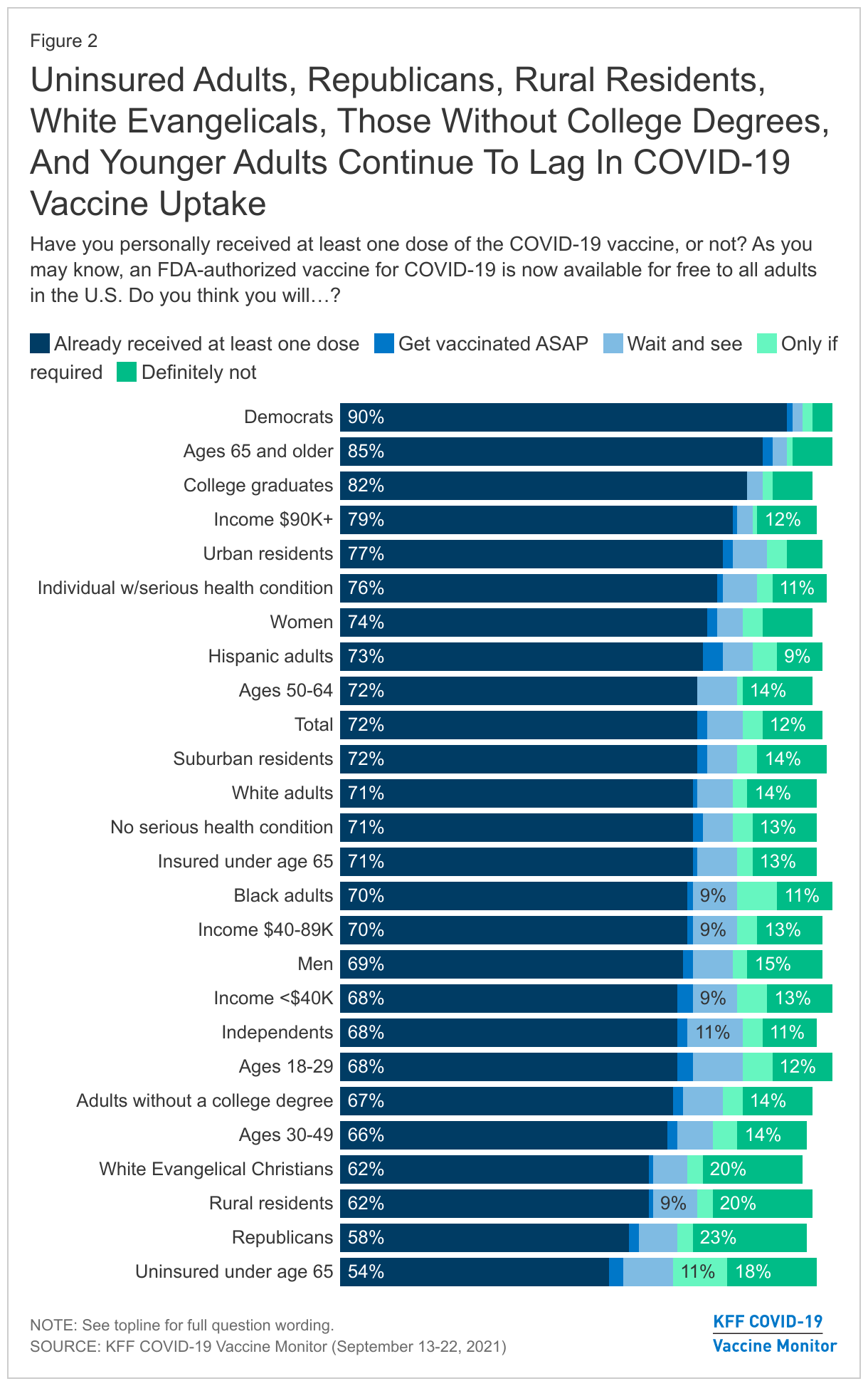
  • As the U.S. continues to grapple with the “third wave” of the COVID-19 pandemic, the latest KFF COVID-19 Vaccine Monitor finds that more than seven in ten U.S. adults (72%) now report being at least partially vaccinated, with the surge in cases, hospitalizations, and deaths due to the Delta variant being the main motivator for the recently vaccinated and other factors like full FDA approval of the Pfizer vaccine and an increase in vaccine mandates playing a more minor role. The largest increases in vaccine uptake between July and September were among Hispanic adults and those ages 18-29, and similar shares of adults now report being vaccinated across racial and ethnic groups (71% of White adults, 70% of Black adults, and 73% of Hispanic adults). Large gaps in vaccine uptake remain by partisanship, education level, age, and health insurance status.
  • With the FDA and CDC recently issuing recommendations related to COVID-19 booster shots, discussion of boosters appears to be a net positive for people who are already vaccinated, but a net negative for the unvaccinated. While a larger share of vaccinated adults say the information they have seen about boosters has been helpful (54%) than find it confusing (35%), among the unvaccinated almost twice as many find the information confusing as find it helpful (45% vs. 24%). Moreover, most unvaccinated adults see the booster discussion as a sign that the vaccines are not working as well as promised while most vaccinated adults see it as a sign that scientists are continuing to find ways to make vaccines more effective. Among fully vaccinated adults, a large majority say they would likely get a booster if the FDA and CDC recommended it for people like them, though vaccinated Republicans are somewhat less inclined than vaccinated Democrats.
  • Amid a slew of recent announcements about COVID-19 vaccine requirements, majorities favor requirements for health care workers, school teachers, college students, and federal government employees, but the public is more divided on employer mandates in general and on K-12 schools requiring vaccines for eligible students. More specifically, nearly six in ten (58%) support the new federal government mandate on larger employers to require vaccines or weekly testing for their workers, and nearly eight in ten (78%) support the requirement that these employers offer paid time off for workers to get vaccinated and recover from side effects.
  • Despite a lukewarm reception for employer COVID-19 vaccine mandates, such requirements do have the potential to further increase vaccine uptake somewhat. Asked what they would do if their employer required them to get vaccinated in order to continue working, about a third of unvaccinated workers say they would be likely to get vaccinated while two-thirds say they would be unlikely to do so (including half who say they would be “very” unlikely). However, when presented with the option to get vaccinated or face weekly testing (an option that larger employers could offer under the Biden plan), most unvaccinated workers (56%) say they would take the weekly testing option while just 12% say they’d get the shot and three in ten say they would leave their job.
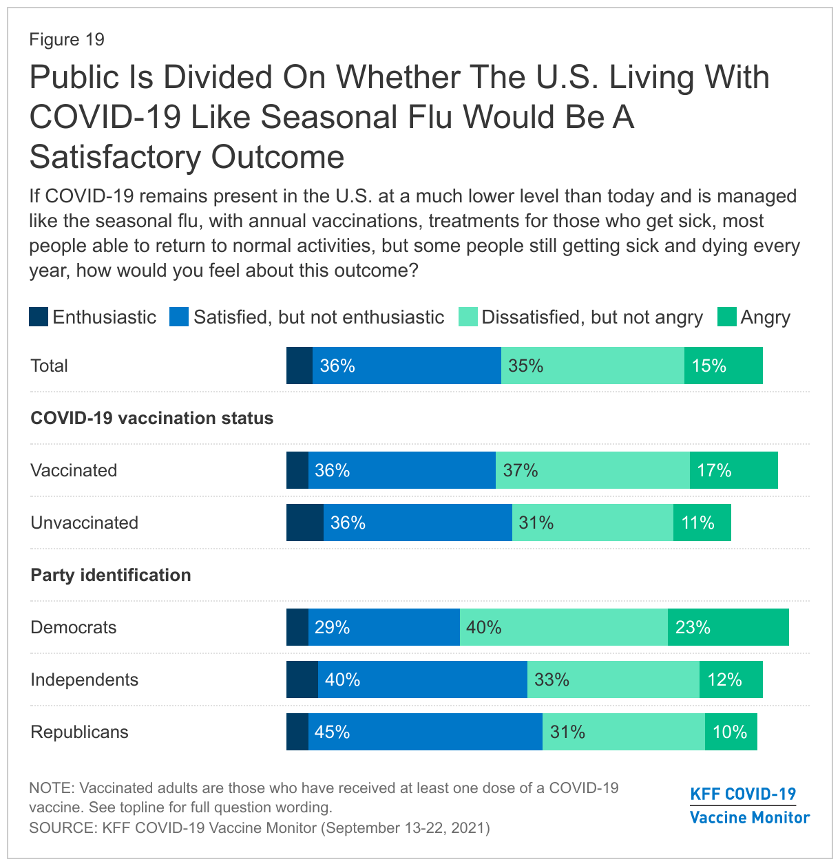
  • The public appears resigned to a future in which COVID-19 remains present in the U.S. and is managed much like the seasonal flu rather than one in which the disease is completely eliminated. Eight in ten (79%) believe COVID-19 is something the U.S. will learn to live with, and while the public divides on whether they would be satisfied or dissatisfied with this outcome, few say they would feel either enthusiastic (5%) or angry (15%) if the disease remains present in the U.S. and is managed with vaccines and treatments like seasonal flu, with some people still getting sick and dying every year but most able to return to their normal activities.
  • Partisanship and vaccination status continue to loom large as factors in how the public views both the U.S. vaccination effort and the government’s response to the pandemic in general. For example, while Democrats are most likely to see individuals refusing the COVID-19 vaccine and not taking enough precautions for the current surge in coronavirus cases, Republicans are most likely to view immigrants and tourists bringing the disease into the U.S. as a major reason for the surge. Similarly, the top reason vaccinated adults see driving high caseloads is vaccine refusal, while the unvaccinated say the main reason is that the vaccines aren’t working as well as promised. Some express anger as well, with two-thirds (65%) of Democrats and half (51%) of vaccinated adults saying the current state of the pandemic makes them angry at people who have not gotten a vaccine, and six in ten Republicans (59%) and a similar share of unvaccinated adults (56%) saying it makes them angry at the federal government.
  • Looking ahead to the potential future political implications of the ongoing pandemic, Democrats retain a slight edge over Republicans when it comes to who voters see as having the better approach to handling the pandemic, but independents are divided with 32% preferring the Democratic Party’s approach, 27% preferring the Republican Party’s approach, and another 27% saying they prefer neither. Moreover, while most independent voters (61%) say the U.S. response to the pandemic hasn’t changed their intentions about which party’s candidates to support in future elections, 21% say it makes them more likely to support Republican candidates and 15% say it makes them more likely to support Democrats.

In the midst of a “third wave” of the U.S. COVID-19 pandemic driven largely by the highly contagious Delta variant, more than seven in ten U.S. adults (72%) now report that they have received at least one dose of a COVID-19 vaccine, up from 67% in July. An additional 2% say they plan to get the vaccine as soon as possible. The share who say they want to “wait and see” how the vaccine works for others before getting it themselves dropped to 7% in September. Four percent of adults this month say they will get vaccinated only if required for work, school, or other activities and 12% say they will “definitely not” get the vaccine.

Three-Quarters Of Adults Report Being Vaccinated For COVID-19 As "Definitely Not" Group Shrinks Slightly For First Time (final data)

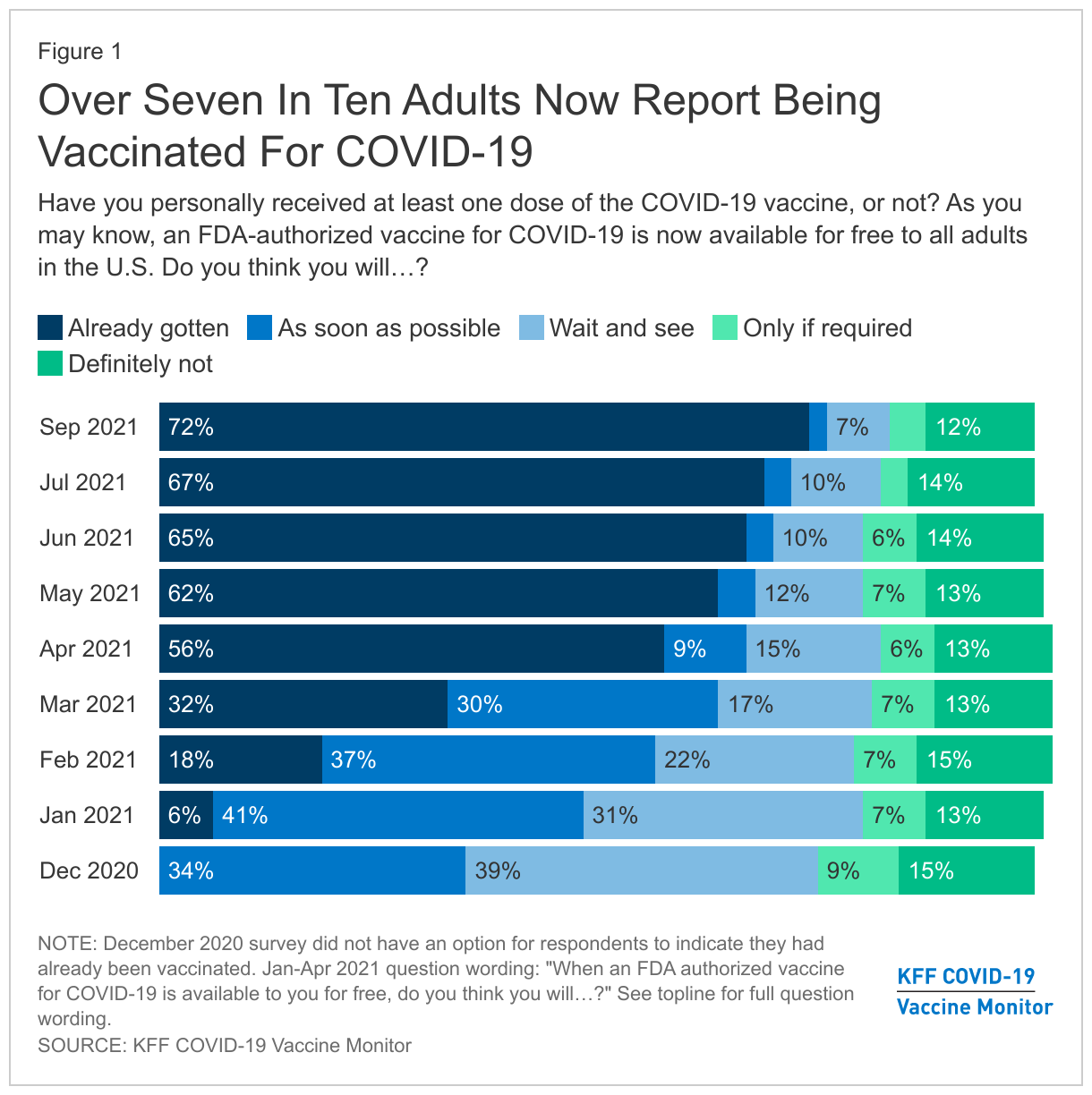
The largest increases in self-reported COVID-19 vaccination rates between July and September were among younger adults (up 11 percentage points among 18-29 year-olds) and Hispanic adults (up 12 percentage points). The largest remaining gap in vaccination rates is by partisanship, with 90% of Democrats saying they have gotten at least one dose compared to 68% of independents and 58% of Republicans. In addition, large differences in self-reported vaccination rates remain between older and younger adults, between those with and without college degrees, and between those with higher and lower incomes, while rural adults continue to lag behind those living in urban and suburban areas. Non-elderly adults without health insurance also continue to report one of the lowest COVID-19 vaccination rates of any group (54%).

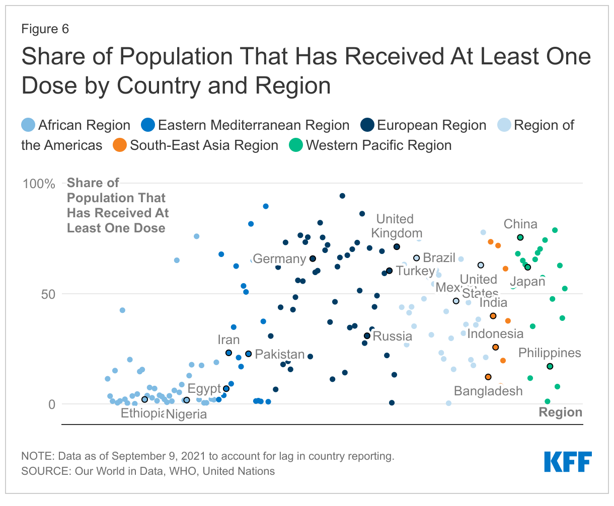
Similar shares of Hispanic (73%), Black (70%), and White (71%) adults now report having received at least one dose of a COVID-19 vaccine, a change from earlier in the vaccination effort when Black and Hispanic adults were much less likely to report being vaccinated than White adults, and reflecting other data showing that people of color make up a disproportionate share of recent vaccinations. KFF's analysis of state data on vaccination rates by race and ethnicity suggests that, when looking at people of all ages (including children who are not yet eligible to be vaccinated), White people continue to be vaccinated at higher rates than either Black or Hispanic people, although those gaps have narrowed over time.1 

Uninsured Adults, Republicans, Rural Residents, And Younger Adults Continue To Lag In COVID-19 Vaccine Uptake (final data)

The latest KFF COVID-19 Vaccine Monitor probed some potential reasons for getting vaccinated among those who received the vaccine more recently (since June 1) to understand the role of various factors in motivating the recently vaccinated, including the emergence of the Delta variant, the FDA giving full approval to the Pfizer vaccine, and an increase in vaccine mandates. We find that the rise of Delta and associated hospitalizations and deaths was the biggest motivating factor overall, while vaccine mandates and FDA approval played a more minor role.

More than one-third of those recently vaccinated say the increase in cases due to the Delta variant (39%), reports of local hospitals filling with COVID-19 patients (38%), and knowing someone who got seriously ill or died from the disease (36%) were major reasons they decided to get vaccinated. Altogether, 35% say one of these was the main reason they got vaccinated. Others were motivated by mandates of various sorts, including one-third (35%) who say a major reason for getting vaccinated was to participate in certain activities that required it such as traveling or attending events, and one in five (19%) who say a major reason was that their employer required it. Smaller shares choose such mandates as the main reason they got vaccinated (13% and 8%, respectively). Fifteen percent of those vaccinated since June2  say the FDA granting full approval to the Pfizer vaccine was a major factor in their decision, though just 2% of the recently vaccinated choose it as their main reason.

Among other reasons, 19% of the recently vaccinated say social pressure from family and friends was a major reason for getting vaccinated and 5% choose it as the main reason. Just 7% cite a financial incentive from their employer as a major reason and fewer than one percent choose it as the main reason.

Delta Variant, Increased Hospitalizations, And Personal Connections To Those Who Got Ill Or Died Are Biggest Motivators For Recently Vaccinated

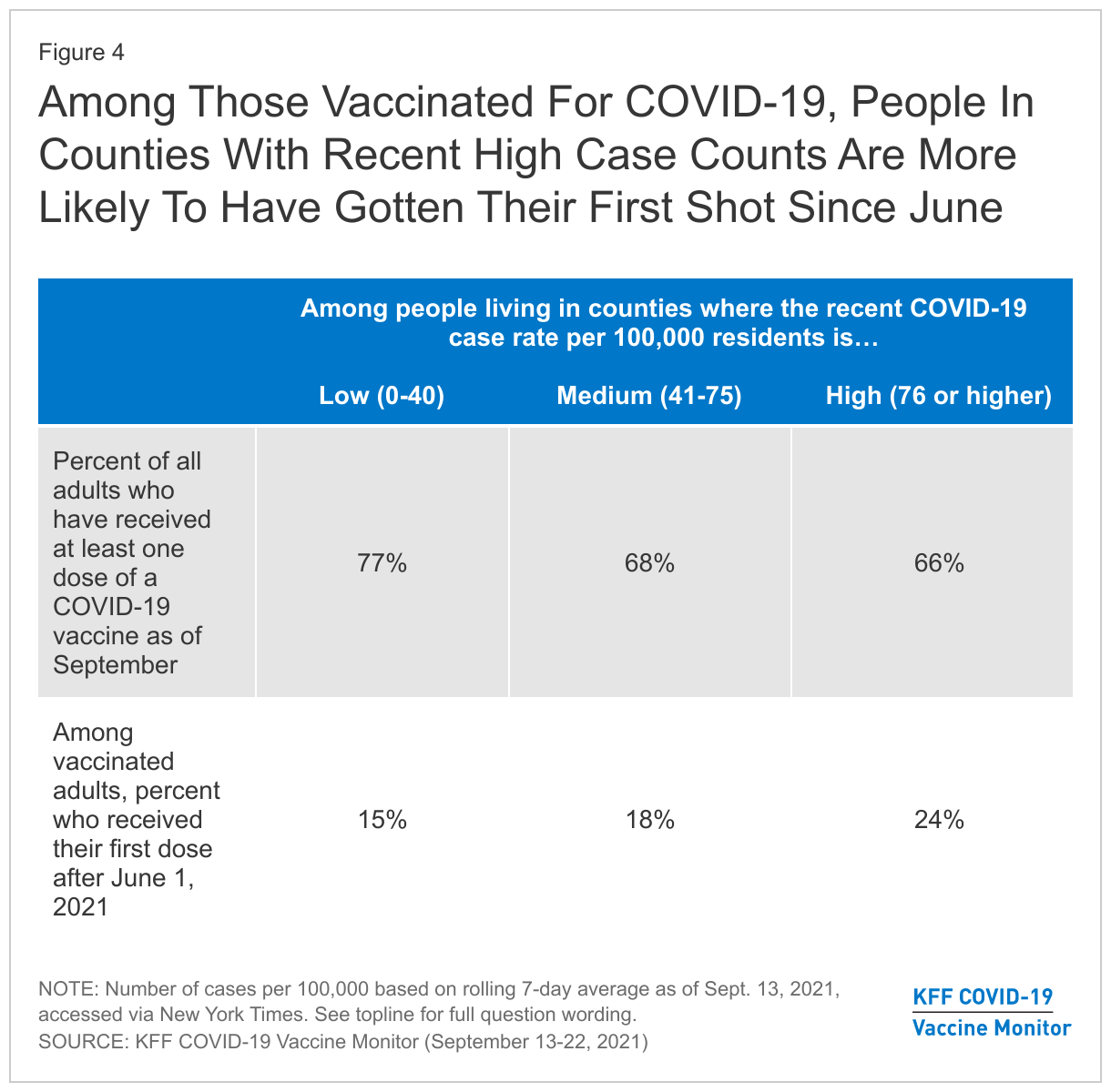
Further supporting the idea that increased cases and deaths due to the Delta variant were a major motivating factor for the recently vaccinated, we find that among vaccinated adults, those living in counties with high COVID-19 caseloads and deaths are more likely to say they got their vaccine after June 1 compared to those living in counties with lower caseloads and deaths3 . While overall vaccination rates in counties with high case counts lag somewhat behind those in areas with lower case counts, 24% of vaccinated adults in high caseload counties say they received their first dose after June 1 compared to 15% in counties with lower case counts. Similarly, 23% of vaccinated adults in counties where the recent COVID-19 death rate is above the national average say they got their vaccine after June 1 compared to 14% of vaccinated adults in counties with the lowest recent death rates.

Among Those Vaccinated For COVID-19, People In Counties With Recent High Case Counts Are More Likely To Have Gotten Their First Shot Since June

Boosters and Breakthrough Infections

In mid-August, the Biden Administration announced plans to begin rolling out COVID-19 booster doses to all Americans as early as September 20. More recently, the FDA instead authorized boosters of the Pfizer vaccine for older adults and certain high-risk individuals and a CDC panel issued similar recommendations.

The public’s attention to the conversation around COVID-19 vaccine boosters has increased since July, with about three-quarters (73%) now saying they’ve heard “a lot” or “some” about the possibility that booster doses may be necessary, up from six in ten in July. A slightly larger share of the public says the information they’ve seen about COVID-19 boosters has been helpful (45%) than the share who say it has been confusing (38%), but this varies greatly by vaccination status. Among those who are at least partially vaccinated, over half (54%) say the information they’ve seen has been helpful and about one-third (35%) say it has been confusing. Views are flipped among the unvaccinated, with almost half (45%) finding the information confusing, nearly twice the share who say it has been helpful (24%).

Larger Share Of Vaccinated Adults Find Booster Information Helpful, While Larger Share Of Unvaccinated Find It Confusing

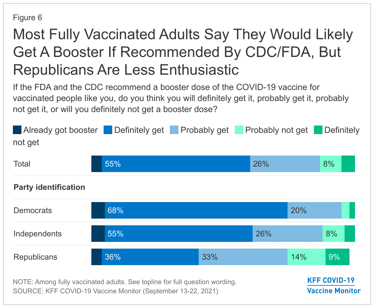
Among those who are fully vaccinated, a large majority say they will definitely (55%) or probably (26%) get a COVID-19 vaccine booster if the FDA and CDC recommend it for people like them, while small shares say they will probably not (8%) or definitely not get it (5%). Four percent of this group (3% of all adults) say they have already received a booster or additional vaccine dose. Notably, partisan differences in intentions to get a booster emerge even among the fully vaccinated population, with Democrats almost twice as likely as Republicans to say they’ll “definitely” get one if recommended (68% vs. 36%) and nearly a quarter (23%) of fully vaccinated Republicans saying they will probably or definitely not get a booster even if the FDA and CDC recommend it for people like them.

Most Fully Vaccinated Adults Say They Would Likely Get A Booster If Recommended By CDC/FDA, But Republicans Are Less Enthusiastic

Among those who say they will probably or definitely not get a booster even if the FDA and CDC recommended it for people like them, reasons for not wanting a booster include feeling they won’t need it (14%), believing more research is necessary (13%), saying they have already been vaccinated (9%) and lack of trust in the government or the CDC (8%).

In their own words: What is the main reason why you would not get a booster dose of the COVID-19 vaccine [if the FDA and CDC recommend it for vaccinated people like you]?

“Because they haven’t proved it as effective yet and if we really do need it or not.” – White man, age 54

“[I’m] confident [in the] first two doses.” – Hispanic man, age 21

“Because I got two first dose of the vaccine already and they definitely affected me and my health and there isn’t enough information about why I should get this booster shot.” – Black man, age 32

“Personal choice not enough evidence or study” – White woman, age 59

“More studies need to be done” – White woman, age 42

“I don’t trust anything the government says anymore.” – Black man, age 66

“I guess lack of trust in the government and the medical profession or I should say the CDC that part of it.” – White woman, age 68

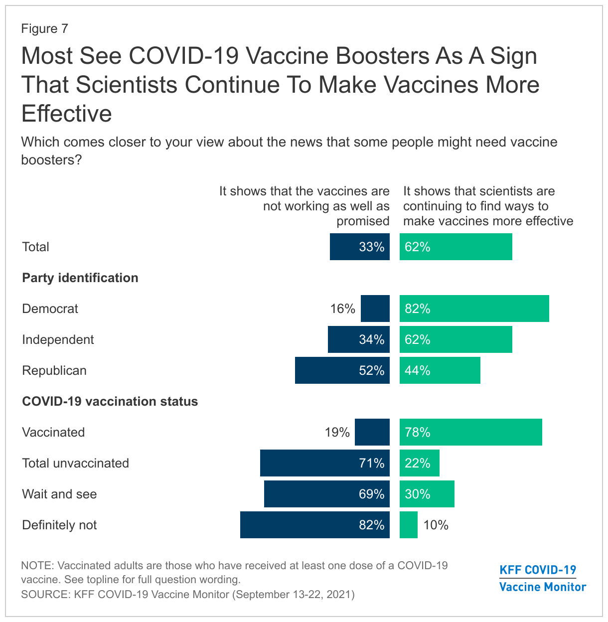
Overall, the booster discussion seems to have increased rather than decreased the public’s confidence in the COVID-19 vaccines, though the opposite is true for those who remain unvaccinated. More than six in ten adults overall (62%) say the news that some people might need boosters “shows that scientists are continuing to find ways to make vaccines more effective” while one-third say it “shows that the vaccines are not working as well as promised.” Among those who are unvaccinated however, seven in ten (71%) say news about boosters is a sign that the vaccines aren’t working, including 69% of those in the “wait and see” group and 82% of those in the “definitely not” camp. Views on this topic also diverge by partisanship, with eight in ten Democrats (82%) seeing the booster discussion as a sign that scientists are continuing to find ways to make vaccines more effective and Republicans more evenly divided between this view (44%) and believing that boosters show the vaccines aren’t working well (52%).

Most See COVID-19 Vaccine Boosters As A Sign That Scientists Continue To Make Vaccines More Effective

Views of Breakthrough Infections

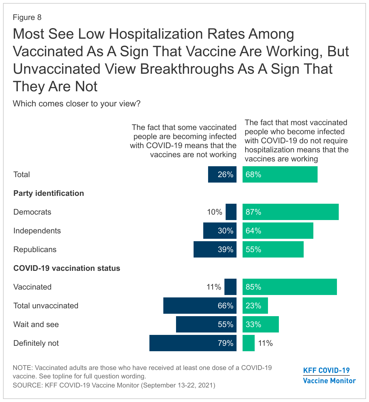
News about so-called “breakthrough” COVID-19 infections among some vaccinated people has also captured the public’s attention in recent weeks, with seven in ten U.S. adults saying they have heard “a lot” or “some” about these types of infections. Despite news about breakthrough infections, nearly seven in ten adults (68%), including majorities across partisan groups, say they agree more with the statement that “the fact that most vaccinated people who become infected with COVID-19 do not require hospitalization means that the vaccines are working” while about a quarter (26%) are more inclined to believe that “the fact that some vaccinated people are becoming infected with COVID-19 means that the vaccines are not working.”

However, as is the case with news about boosters, news of breakthrough infections plays more negatively among those who are currently unvaccinated, with two-thirds (66%, rising to 79% in the “definitely not” group) seeing breakthrough infections as a sign that the vaccines are not working.

Most See Low Hospitalization Rates Among Vaccinated As A Sign That Vaccine Are Working, But Unvaccinated View Breakthroughs As A Sign That They Are Not

Views on COVID-19 Vaccine Requirements

Vaccine Requirements For Work and School

In recent months, an increasing number of employers have announced COVID-19 vaccine requirements for their workers, many universities have begun to require vaccination for students, and some school districts are considering vaccine mandates for eligible students. In addition, on Sept 9, President Biden announced a COVID-19 action plan that includes a requirement for all federal government employees and contractors to be vaccinated as well as new requirements for employers with 100 or more employees.

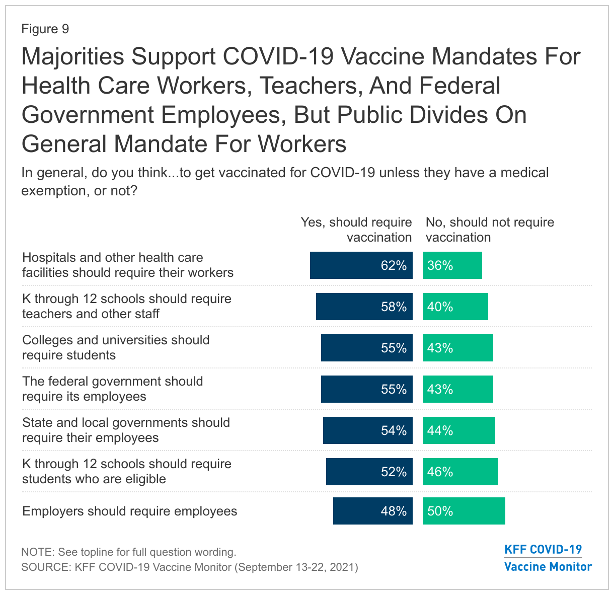
The public remains somewhat divided on whether employers and others should require COVID-19 vaccination, with higher support for vaccine requirements in some settings and deep divisions along partisan lines. About six in ten say that vaccines should be required for health care workers (62%) and school teachers (58%), while slim majorities support mandates for federal government employees (55%), college and university students (55%), and state and local government employees (54%). The public is more divided on whether employers in general should require their workers to be vaccinated for COVID-19 (48% say they should and 50% say they should not). Similarly, as some school districts around the country have started to announce COVID-19 vaccination requirements for eligible students, about half the public says schools should do this (52%) and the other half says they should not (46%).

Majorities Support COVID-19 Vaccine Mandates For Health Care Workers, Teachers, And Federal Government Employees, But Public Divides On General Mandate For Workers

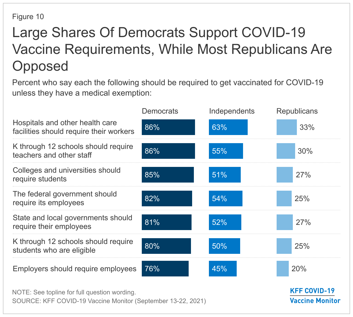
Not surprisingly, attitudes toward vaccine mandates differ greatly by partisan identification, with at least three in four Democrats saying COVID-19 vaccination should be required in each situation compared to around one-fifth to one-third of Republicans. Independents are divided on vaccine mandates in most settings, though a clear majority of independents (63%) says hospitals and other health care facilities should require their workers to be vaccinated.

Large Shares Of Democrats Support COVID-19 Vaccine Requirements, While Most Republicans Are Opposed

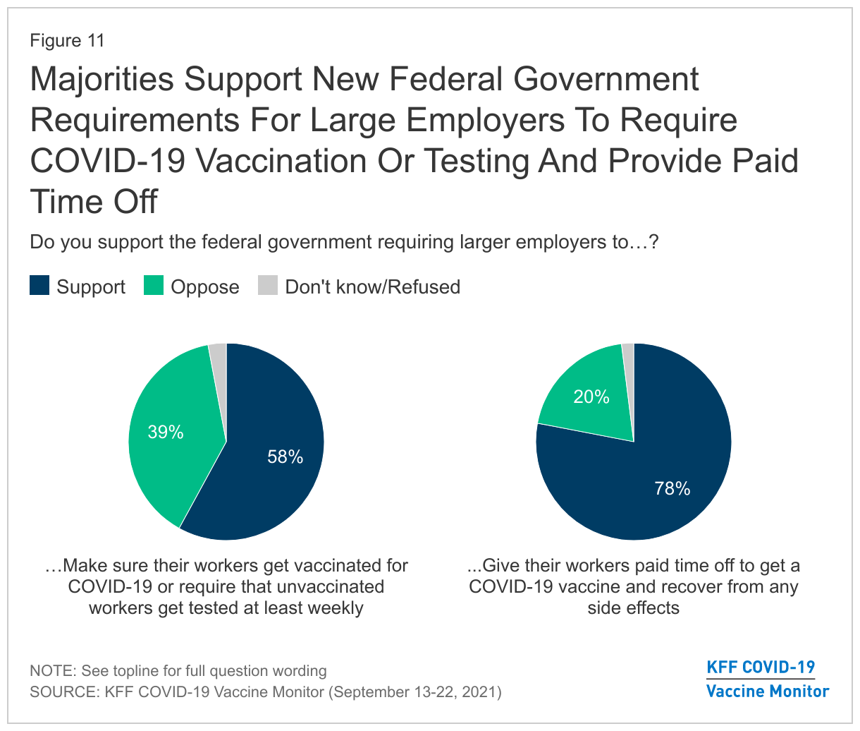
Asked more specifically about the federal government requirement for larger employers to make sure their workers get vaccinated for COVID-19 or require unvaccinated workers to get tested at least weekly, a key element of President Biden’s plan announced on September 9, nearly six in ten (58%) support this requirement while about four in ten (39%) are opposed. An even larger majority (78%) support another element of the plan, the federal government requiring larger employers to give their workers paid time off to get a COVID-19 vaccine and recover from any side effects.

Majorities Support New Federal Government Requirements For Large Employers To Require COVID-19 Vaccination Or Testing And Provide Paid Time Off

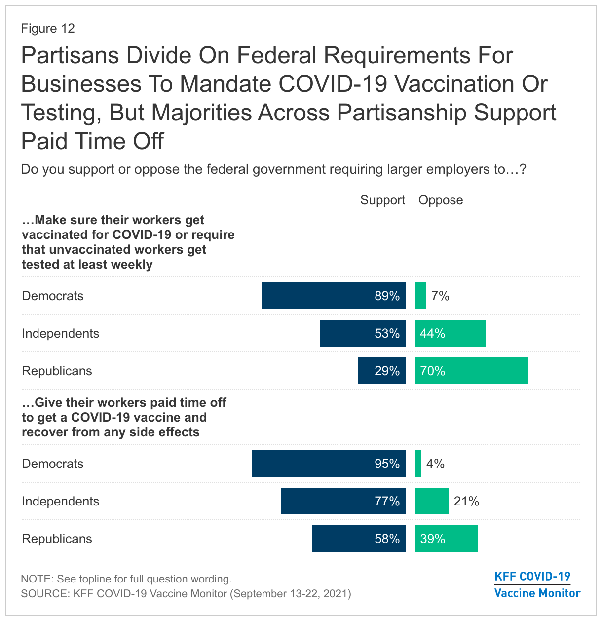
Partisans’ views differ on these new federal government requirements for employers, with the vast majority of Democrats in favor of both types of requirements. Among Republicans, a majority (58%) favor the requirement for employers to provide paid time off, but far fewer (29%) support the requirement to mandate vaccines or weekly testing while most (70%) are opposed. A large majority (77%) of independents supports the paid time off requirement, while independents are more divided on the worker vaccine mandate (53% support, 44% oppose).

Partisans Divide On Federal Requirements For Businesses To Mandate COVID-19 Vaccination Or Testing, But Majorities Across Partisanship Support Paid Time Off

Workers’ Experiences and Preferences

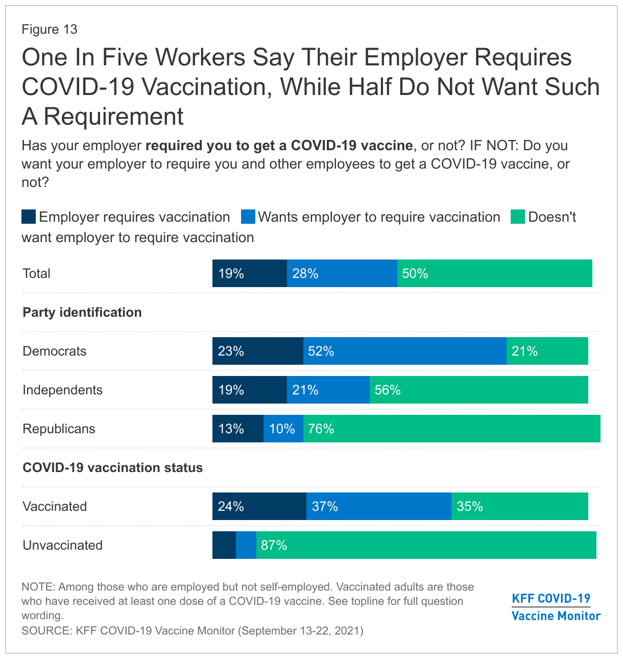
Among those who work for an employer (excluding the self-employed), 19% say their employer has already required them to get a COVID-19 vaccination, up from 9% in June. Half of all workers say they are not currently subject to an employer vaccine requirement and do not want their employer to require vaccination, while about three in ten (28%) are not currently required but want their employer to issue such a requirement. There are expected partisan divisions, with most workers who are Democrats saying they are already subject to an employer vaccine requirement or want their employer to issue one, and a large majority of Republicans (76%) as well as almost six in ten independents (56%) saying they don’t want their employer to require vaccination. Not surprisingly, the vast majority (87%) of unvaccinated workers are opposed to such a requirement, but as we found in our June survey, a substantial share (35%) of vaccinated workers are also opposed.

One In Five Workers Say Their Employer Requires COVID-19 Vaccination, While Half Do Not Want Such A Requirement

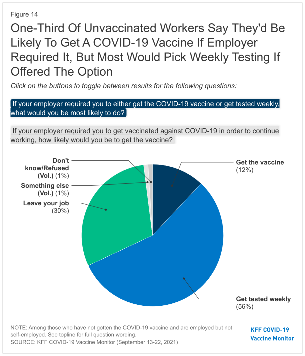
When unvaccinated workers are asked what they would do if their employer required them to get a COVID-19 vaccine in order to continue working, one-third (34%) say they’d be very or somewhat likely to get the vaccine, one in six (15%) say they would be “not too likely” to get it, and half (50%) say they would be “not at all likely” to get vaccinated. In a separate question that included an option for weekly testing, over half (56%) of unvaccinated workers say they would get tested weekly if presented with this option while 12% say they would get the vaccine and three in ten (30%) say they would leave their job.

One-Third Of Unvaccinated Workers Say They'd Be Likely To Get A COVID-19 Vaccine If Employer Required It, But Most Would Pick Weekly Testing If Offered The Option

Many workers continue to say they are not eligible for paid time off to get the COVID-19 vaccine and recover from side effects, or they are not sure if they are eligible. One-third (33%) of workers say their employer offers them paid time off to get a COVID-19 vaccine while three in ten say their employer does not offer this (31%) and 35% are unsure. Just over a third (35%) say they get paid time off to recover from vaccine side effects while 31% say they do not and 34% are unsure. The share of workers who report getting paid time off to get vaccinated or recover from side effects is lower among those with household incomes under $40,000 (23% and 28%, respectively) than it is among those earning at least $90,000 a year (37% and 44%), suggesting that increasing access to paid leave could help further reduce gaps in vaccination by age and income.

Views on State and Federal Laws Regarding Customer Vaccination Requirements

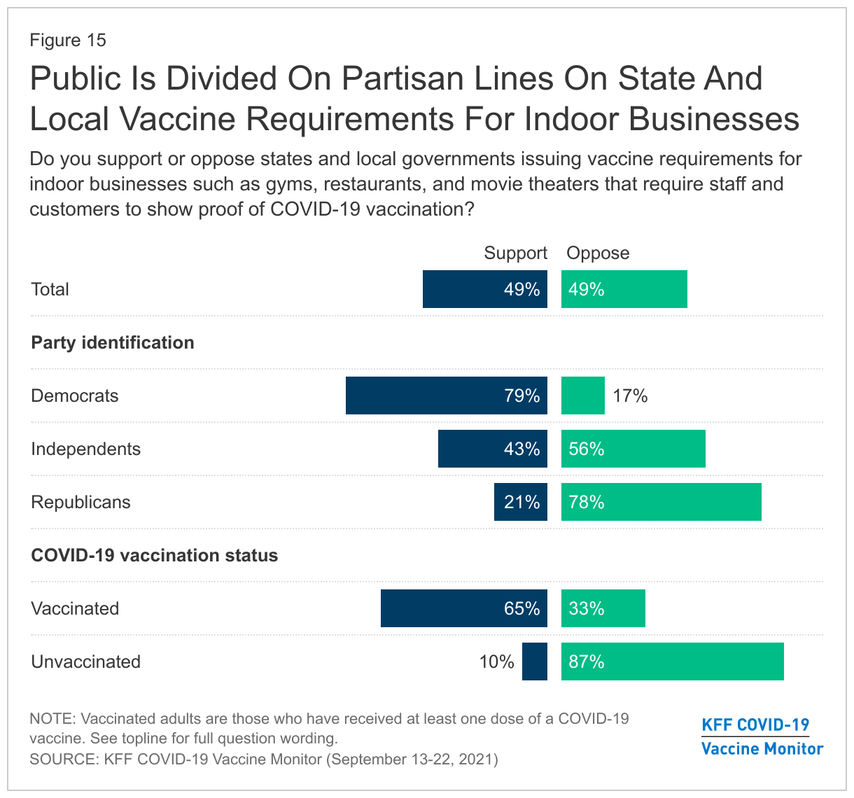
Similar to views on employer vaccine requirements, the public is divided and split on partisan lines when it comes to state and local laws regarding vaccine requirements for businesses. About half (49%) support states and local governments issuing COVID-19 vaccine requirements for indoor businesses like gyms, restaurants, and movie theaters, while the other half (49%) are opposed. About eight in ten Democrats (79%) support such laws while a similar share of Republicans (78%) are opposed. Among independents, a larger share opposes than supports such requirements (56% vs. 43%).

Public Is Divided On Partisan Lines On State And Local Vaccine Requirements For Indoor Businesses

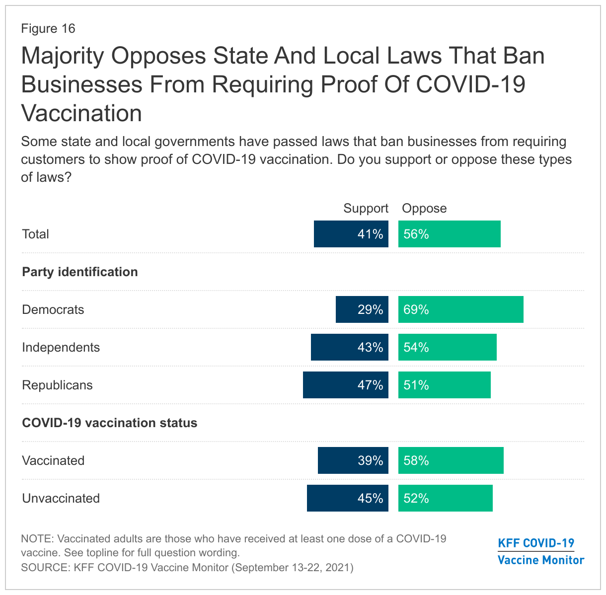
In recent months, some states and localities, including Florida, have issued orders that ban businesses from requiring their customers to show proof of COVID-19 vaccination. A slim majority (56%) of the public are opposed to these types of laws, while four in ten (41%) support them. Majorities of Democrats (69%) and independents (54%) oppose the bans, while Republicans are more evenly divided (47% support, 51% oppose).

Slight Majority Opposes State And Local Laws That Ban Businesses From Requiring Proof Of COVID-19 Vaccination

School Mask Mandates

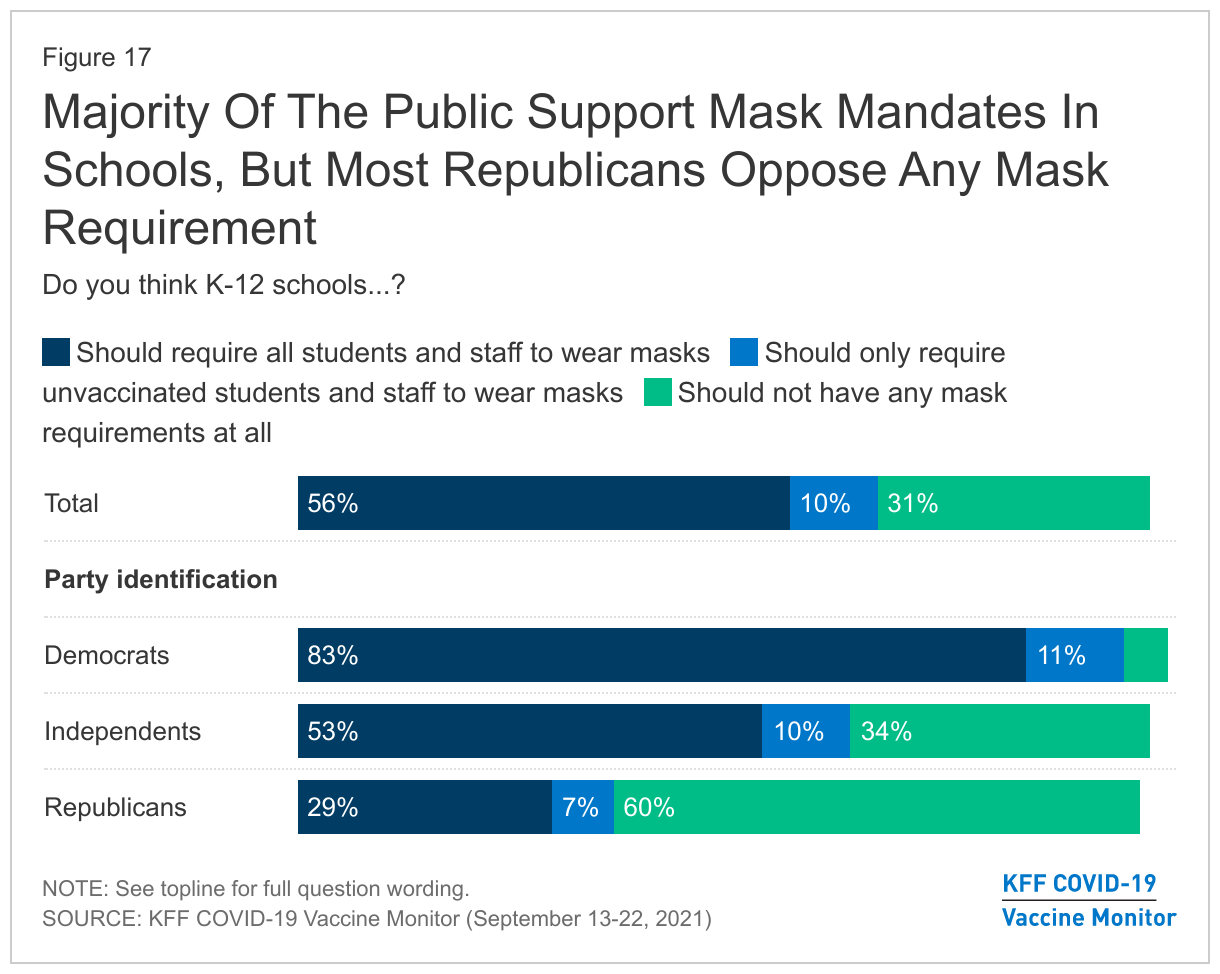
On another type of mandate question, a majority (56%) of the public says K-12 schools should require all staff and students to wear masks while at school and another 10% say schools should require masks for unvaccinated students and staff. About a third (31%) say schools should not have any mask mandate at all. As with other mandates, these views diverge by partisanship, with nearly all Democrats and six in ten independents supporting school mask requirements in some form and six in ten Republicans saying schools should not have any mask requirements at all.

Majority Of The Public Support Mask Mandates In Schools, But Most Republicans Oppose

The State Of The Pandemic, Government Response, And Political Implications

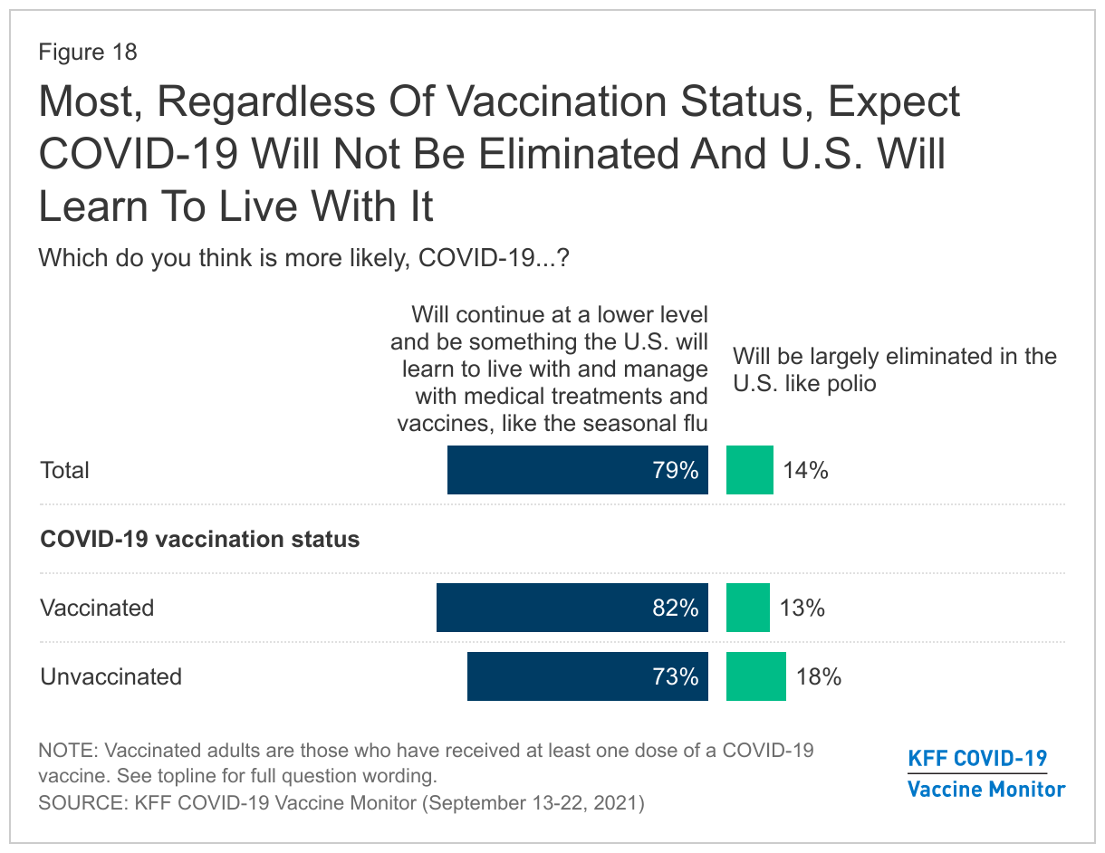
More than a year and a half since the start of the pandemic, most of the public expects COVID-19 will be something the U.S. will learn to live with and not something which will be eliminated. About eight in ten adults overall, and at least seven in ten across demographic groups, say they expect COVID-19 will “continue at a lower level and be something the U.S. will learn to live with and manage with medical treatments and vaccines, like the seasonal flu.” Few (14%) think COVID-19 will be “largely eliminated in the U.S. like polio.” Majorities of both vaccinated and unvaccinated adults see COVID-19 as something the U.S. will learn to live with and manage.

Most Say COVID-19 Is Likely To Continue At Lower Level And Be Something The U.S. Will Learn To Live With

A majority of the public seem resigned to accept an outcome where COVID-19 remains present in the U.S. and is “managed like the seasonal flu, with annual vaccinations, treatments for those who get sick, most people able to return to normal activities, but some people still getting sick and dying every year.” About a third (36%) say they would be satisfied with this outcome, but not enthusiastic, a similar share (35%) say they would be dissatisfied with this outcome, but not angry. While a majority appear to be accepting of this possible outcome, one in six (15%) say they would be angry about this potential outcome, rising to a about one in four Democrats (23%).

Public Is Divided On Whether COVID-19 Remaining Present In The U.S. And Managed Like The Seasonal Flu Would Be A Satisfactory Outcome

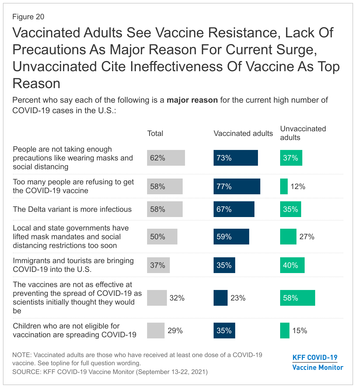
Asked about various factors that might be contributing to the current surge of COVID-19 cases, majorities of adults say people not taking enough precautions, the infectiousness of the Delta variant, and too many people refusing to get vaccinated are major reasons for the current high case rate. However, there are notable differences between what vaccinated adults and unvaccinated adults see as major reasons.

The top factors vaccinated adults see as driving the high case levels are too many people refusing the vaccine (77%), people not taking enough precautions (73%), and the infectiousness of the Delta variant (67%). The top factor that unvaccinated adults see as driving current case counts is that “the vaccines are not as effective at preventing the spread of COVID-19 as scientists initially thought they would be” (58%), followed by immigrants and tourists bringing COVID-19 into the U.S. (40%), people not taking enough precautions (37%), and the infectiousness of the Delta variant (35%).

Vaccinated Adults See People's Lack Of Precautions, Reluctance To Get Vaccinated As Major Reason For High Number Of COVID-19 Cases, Unvaccinated See Ineffectiveness Of Vaccine

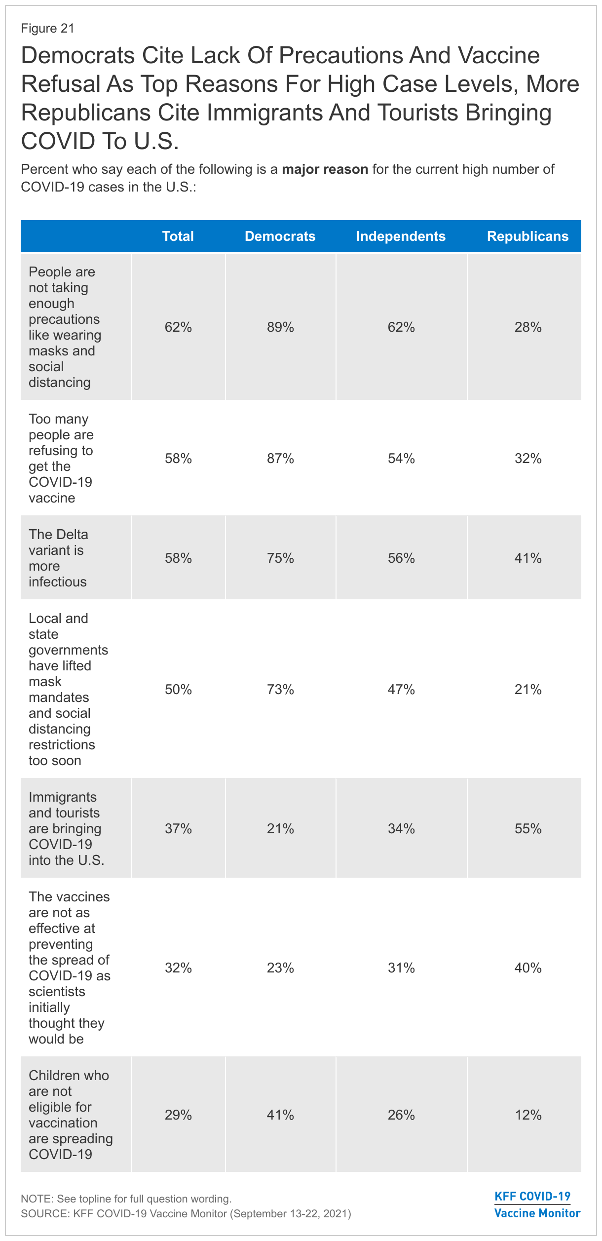
Unsurprisingly, there are some notable differences in what Democrats and Republicans say are the major reasons for the current high number of COVID-19 cases. Overwhelming majorities of Democrats say people not taking enough precautions like wearing masks and social distancing (89%), and too many people refusing to get the COVID-19 vaccine (87%) are major reasons for the current number high number of cases, whereas only about three in ten Republicans say the same. Large shares of Democrats also identify the infectiousness of the Delta variant (75%) and state and local governments being too quick to lift mask mandates and social distancing restrictions (73%) as major reasons why cases are so high, compared to fewer independents and Republicans who say the same. Notably, a majority of Republicans (55%) say immigrants and tourists bringing COVID-19 into the U.S. is a major reason for the high number of cases whereas fewer independents (34%) and Democrats (21%) see this as a major reason.

Democrats More Likely To Say Lack Of Precaution And Vaccinations Are Major Reasons For High Case Levels, Republicans More Likely To Say Immigrants And Tourists Bringing COVID-19

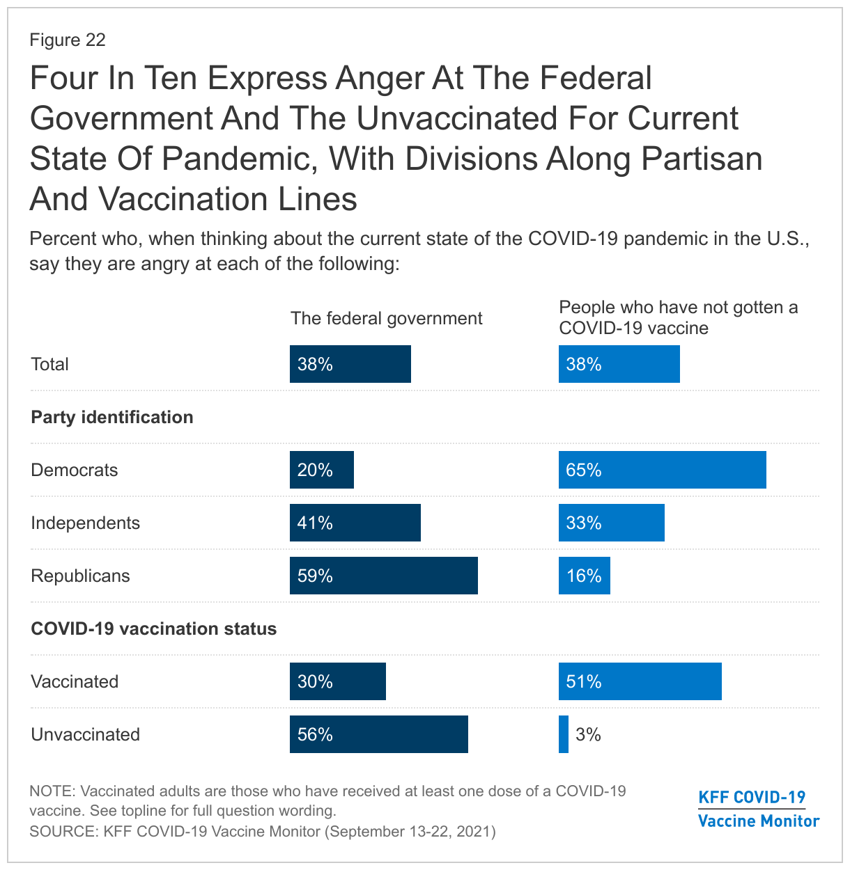
Despite a large share of the public seeing vaccine refusal as a major reason behind current high caseloads, a smaller share (38%) says the current state of the pandemic in the U.S. makes them feel “angry” at people who have not gotten a COVID-19 vaccine. The same share (38%) say they feel angry at the federal government for the current state of the pandemic. Not surprisingly, these shares diverge along partisan lines and between those who have and have not gotten a COVID-19 vaccine themselves. Half of vaccinated adults (51%) say they are angry with those who have not gotten the COVID-19 vaccine compared to just 3% of unvaccinated adults. A majority of unvaccinated adults (56%) say they are angry with the federal government compared to three in ten of those who are vaccinated. Across partisans, about two-thirds of Democrats say they are angry with the unvaccinated while about six in ten Republicans say they are angry at the federal government. Among independents, a somewhat larger share says they are angry with the federal government (41%) than says they are angry with people who have not gotten vaccinated (33%).

Large Shares Of Democrats, Vaccinated Adults Say They Are Angry At Those Remain Unvaccinated; Large Shares Of Republicans And The Unvaccinated Are Angry At The Federal Government

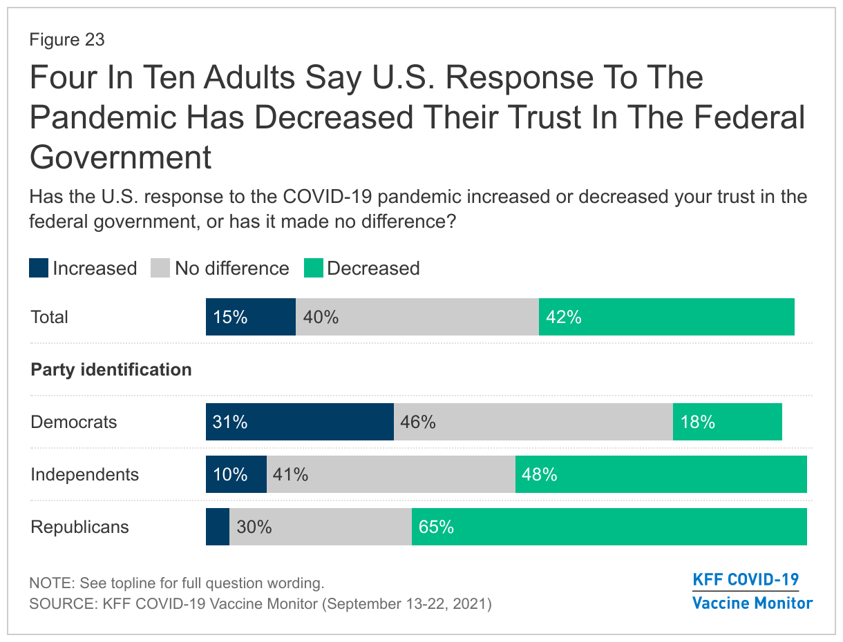
For a large share of the public, the response to the pandemic has taken a toll on their trust in the federal government. Four in ten adults (42%) say the U.S. response to COVID-19 had decreased their trust in the federal government, while just 15% say it has increased their level of trust.

Across partisans, Democrats are more likely to say their trust in the federal government has increased (31%) than to say it has decreased (18%) though a plurality say the U.S. response has made no difference in their trust in the federal government. About two-thirds of Republicans (65%) say the U.S. response to the pandemic has decreased their trust in the federal government, as do almost half of independents (48%).

Four In Ten Adults Say U.S. Response To The Pandemic Has Decreased Their Trust In The Federal Government

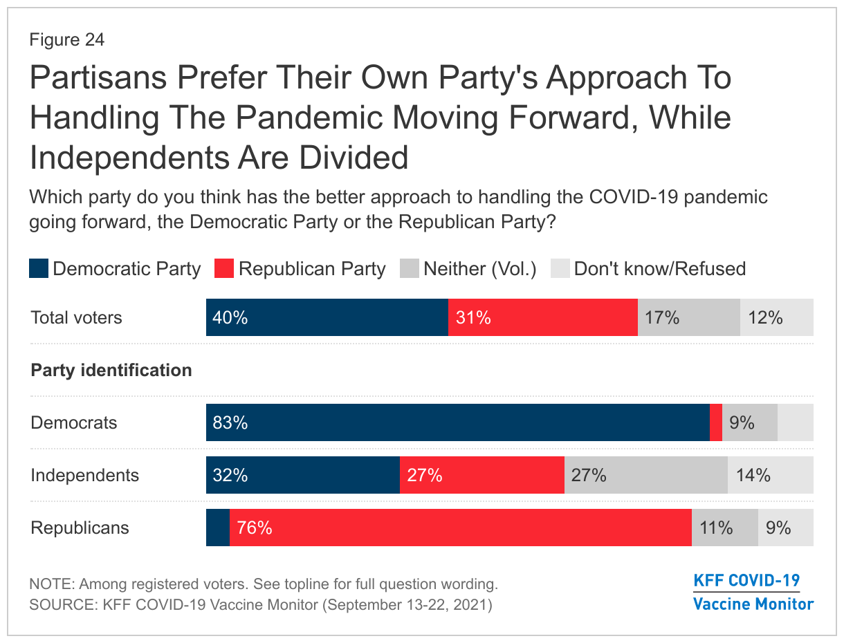
Despite a substantial share of the public expressing anger at the federal government for the current state of the pandemic, the Democratic Party retains a slight advantage over Republicans in voters’ trust to handle the pandemic going forward. Among registered voters, four in ten say the Democrats have the better approach to handling the pandemic while about a third (31%) prefer the Republican Party’s approach and 17% say they prefer neither. While about eight in ten partisan voters each prefer their own party’s approach, independents are divided with 32% preferring the Democrats’ approach, 27% preferring the Republicans’ approach, and about one in four (27%) saying they prefer neither party’s approach to handling the pandemic going forward.

Partisans Prefer Their Own Party's Approach To Handling The Pandemic Moving Forward, While Independents Are More Divided

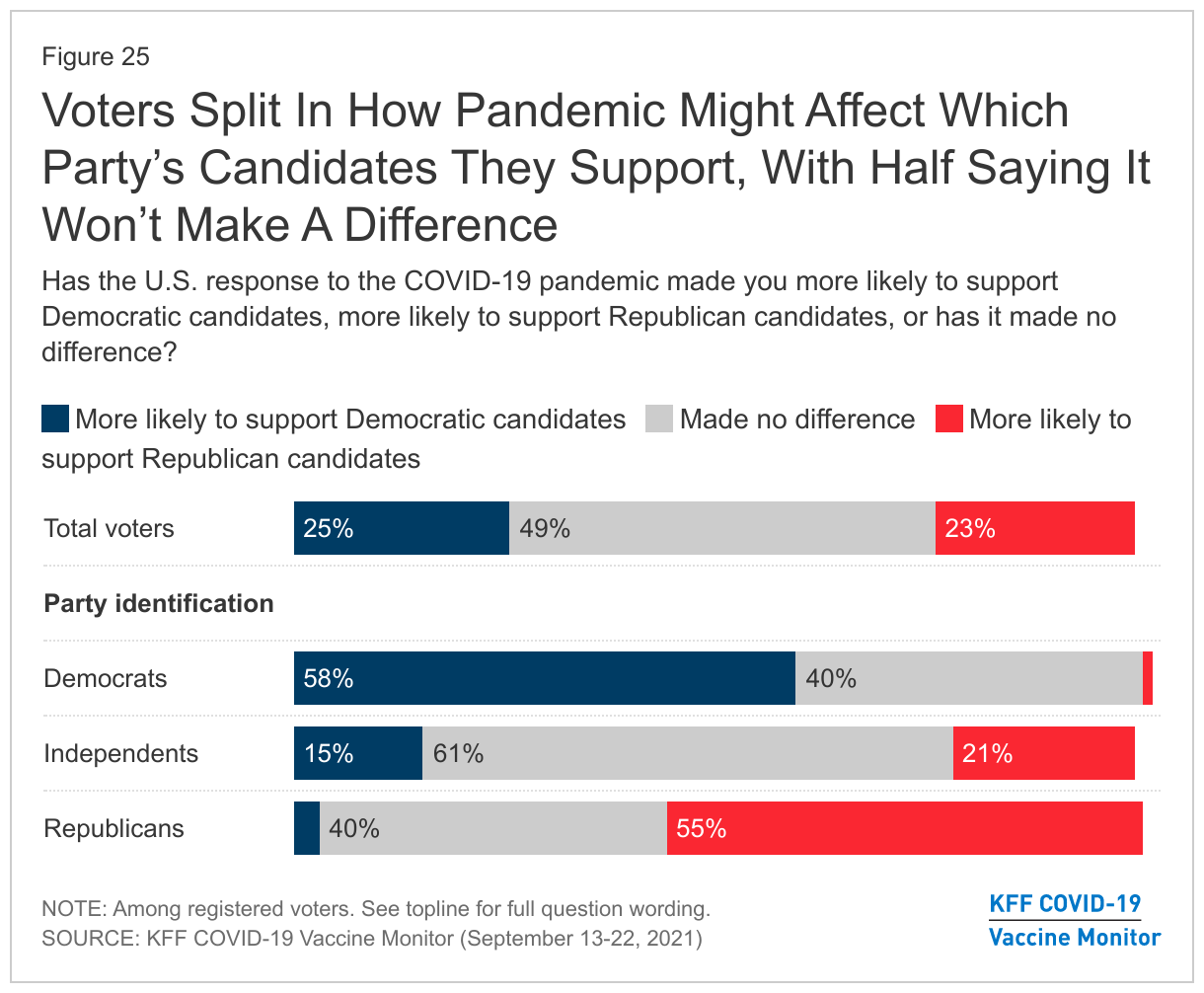
Asked about the potential impact of the pandemic on future voting, about half of registered voters (49%) say the say the U.S. response to the pandemic hasn’t changed which party’s candidates they will support in future elections. One in four voters say the country’s response to the pandemic has made them more likely to support Democratic candidates while a similar share (23%) say it has made them more likely to support Republican candidates. Most independents (61%) say the U.S. response to the pandemic has made no difference in the likelihood of supporting a party’s candidates, while 21% say it makes them more likely to support Republican candidates and 15% say it makes them more likely to support Democrats.

Most Voters Say Handling Of Pandemic Has Made No Difference To Which Party's Candidates They Will Support

Methodology

This KFF COVID-19 Vaccine Monitor was designed and analyzed by public opinion researchers at the Kaiser Family Foundation (KFF). The survey was conducted September 13-22, 2021, among a nationally representative random digit dial telephone sample of 1,519 adults ages 18 and older (including interviews from 339 Hispanic adults and 306 non-Hispanic Black adults), living in the United States, including Alaska and Hawaii (note: persons without a telephone could not be included in the random selection process). Phone numbers used for this study were randomly generated from cell phone and landline sampling frames, with an overlapping frame design, and disproportionate stratification aimed at reaching Hispanic and non-Hispanic Black respondents as well as those living in areas with high rates of COVID-19 vaccine hesitancy. Stratification was based on incidence of the race/ethnicity subgroups and vaccine hesitancy within each frame. High hesitancy was defined as living in the top 25% of counties as far as the share of the population not intending to get vaccinated based on the U.S. Census Bureau’s Household Pulse Survey.  The sample also included 30 respondents reached by calling back respondents that had previously completed an interview on the KFF Tracking poll at least six months ago. Another 123 interviews were completed with respondents who had previously completed an interview on the SSRS Omnibus poll (and other RDD polls) and identified as Hispanic (n =64; including 4 in Spanish) or non-Hispanic Black (n=59). Computer-assisted telephone interviews conducted by landline (171) and cell phone (1,348, including 1,007 who had no landline telephone) were carried out in English and Spanish by SSRS of Glen Mills, PA. To efficiently obtain a sample of lower-income and non-White respondents, the sample also included an oversample of prepaid (pay-as-you-go) telephone numbers (25% of the cell phone sample consisted of prepaid numbers) Both the random digit dial landline and cell phone samples were provided by Marketing Systems Group (MSG). For the landline sample, respondents were selected by asking for the youngest adult male or female currently at home based on a random rotation. If no one of that gender was available, interviewers asked to speak with the youngest adult of the opposite gender. For the cell phone sample, interviews were conducted with the adult who answered the phone. KFF paid for all costs associated with the survey.

The combined landline and cell phone sample was weighted to balance the sample demographics to match estimates for the national population using data from the Census Bureau’s 2019 U.S. American Community Survey (ACS), on sex, age, education, race, Hispanic origin, and region, within race-groups, along with data from the 2010 Census on population density. The sample was also weighted to match current patterns of telephone use using data from the July-December 2020 National Health Interview Survey The weight takes into account the fact that respondents with both a landline and cell phone have a higher probability of selection in the combined sample and also adjusts for the household size for the landline sample, and design modifications, namely, the oversampling of potentially undocumented respondents and of prepaid cell phone numbers, as well as the likelihood of non-response for the re-contacted sample. All statistical tests of significance account for the effect of weighting.

The margin of sampling error including the design effect for the full sample is plus or minus 3 percentage points. Numbers of respondents and margins of sampling error for key subgroups are shown in the table below. For results based on other subgroups, the margin of sampling error may be higher. Sample sizes and margins of sampling error for other subgroups are available by request. Sampling error is only one of many potential sources of error and there may be other unmeasured error in this or any other public opinion poll. Kaiser Family Foundation public opinion and survey research is a charter member of the Transparency Initiative of the American Association for Public Opinion Research.

This work was supported in part by grants from the Chan Zuckerberg Initiative DAF (an advised fund of Silicon Valley Community Foundation), the Ford Foundation, and the Molina Family Foundation. We value our funders. KFF maintains full editorial control over all of its policy analysis, polling, and journalism activities.

GroupN (unweighted)M.O.S.E.
Total1,519± 3 percentage points
COVID-19 Vaccination Status
Have gotten at least one dose of the COVID-19 vaccine1,102± 4 percentage points
Have not gotten the COVID-19 vaccine379± 6 percentage points
Race/Ethnicity
White, non-Hispanic766± 4 percentage points
Black, non-Hispanic306± 7 percentage points
Hispanic339± 7 percentage points
Party Identification
Democrats458± 6 percentage points
Republicans345± 6 percentage points
Independents489± 5 percentage points

Endnotes

  1. Differences in estimates of the number of people vaccinated between surveys and administrative data may be due to multiple factors, including survey timing, sampling error, lags in state data reporting, and missing data on race/ethnicity. ↩︎
  2. The item asking about full FDA approval was only asked of those who were vaccinated in August or September. Results are reported based on those vaccinated since June 1 since the sample size of those vaccinated in August and September is too small for analysis. ↩︎
  3. Case rates per 100,000 and death rates per 100,000 are based on 7-day average in each U.S. county as of September 13, 2021. Data access from the New York Times. ↩︎
News Release

As PEPFAR Nears its Two-Decade Mark, New Analysis Finds That Mortality Declined Substantially in PEPFAR Countries Over the Course of the Program

Published: Sep 27, 2021

A new KFF analysis finds the President’s Emergency Plan for AIDS Relief (PEPFAR) program was associated with large declines in mortality in PEPFAR recipient countries since its creation in 2003. The new analysis takes a closer look at PEPFAR’s health impact by assessing the all-cause mortality rate in 90 PEPFAR recipient countries compared to similar low-and middle-income countries. The all-cause mortality rate was 20% lower than expected had PEPFAR been absent.

PEPFAR countries with higher levels of investment saw the greatest decline in mortality, with an all-case mortality rate reduction of 27% over 2004-2018. Comparatively, countries who received low investment involvement saw a reduction of 16%, showing even with lower levels of investment, the PEPFAR program contributed to a decline in mortality.

Mortality continued to decline throughout all three PEPFAR phases, with the first two phases seeing the biggest drop (2004-2013), according to the new analysis, conducted by researchers at KFF and Brandeis University.

The PEPFAR program is the largest commitment by any nation to address not only HIV/AIDS, but any single disease in history. As the program approaches its two-decade mark and begins the process of developing the next five-year strategy, this new analysis finds promising results suggesting that future investments would likely continue to yield significant health impacts.

Assessing PEPFAR’s Impact: Analysis of Mortality in PEPFAR Countries

Authors: Jennifer Kates, Allyala Nandakumar, Gary Gaumer, Dhwani Hariharan, William Crown, Adam Wexler, Stephanie Oum, and Anna Rouw
Published: Sep 27, 2021

Issue Brief

Key Findings

PEPFAR, the U.S. global HIV program and the largest commitment by any nation to address a single disease in history, is at an important juncture nearing its two decade mark. We assessed its health impact by analyzing the change in the mortality rate in 90 PEPFAR recipient countries between 2004-2018 compared to similar low and middle income countries. We find that PEPFAR was associated with large, significant declines in mortality, as follows:

  • The all-cause mortality rate in PEPFAR recipient countries was 20% lower than what would have been expected without PEPFAR support.
  • This effect was strongest where PEPFAR’s investments were greatest; there was an almost 27% reduction in the all-cause mortality rate in countries where PEPFAR had the highest per capita spending compared to a 16% reduction in countries with the lowest per capita PEPFAR spending (relative to control countries).
  • The high investment PEPFAR countries were primarily those engaged in more intensive planning and programming through the PEPFAR “COP” process. PEPFAR COP countries experienced a 26% decline in the mortality rate compared to 17% in PEPFAR countries that did not prepare COPs. Because we did not assess the independent effect of PEPFAR spending in COP countries, it is unclear if mortality declines were due to greater spending, more intensive planning and programming, or some combination of both.
  • Finally, the decline in the mortality rate has continued over the course of the program, including in all three major five-year PEPFAR program phases. The biggest drops occurred in the first two phases, with a more modest, but significant, drop since.
  • These findings provide strong evidence that PEPFAR continues to have a significant and positive impact on health outcomes in the countries in which it works and that future investments would be expected to yield additional reductions in mortality. They also suggest that PEPFAR has had positive spillover effects beyond HIV.

Introduction

PEPFAR, the U.S. global AIDS program and largest commitment by any nation to address a single disease in history, is at an important juncture. First started as an emergency effort, when HIV was ravaging much of sub-Saharan Africa, the program is now nearing its two-decade mark. It also awaits the nomination by the President of a new Coordinator, is in the process of developing its next five-year strategy, and will soon be considered for reauthorization by Congress. As policymakers and others look towards PEPFAR’s future, understanding its impact will be an important input. While its impact has been documented in earlier studies1 , we sought to add to this body of knowledge by providing an assessment of its health impact over 15 years of the program. Working with researchers at Brandeis University, we undertook an analysis of the change in mortality in PEPFAR countries. Specifically, we analyzed the change in the all-cause mortality rate in 90 PEPFAR countries between 2004, the first year in which PEPFAR funding began, and 2018, the most recent year of complete data, compared to a control group of 67 low- and middle-income countries. We explored several model specifications, each of which had statistically significant results. Each specification controlled for numerous baseline variables which may also be expected to influence mortality outcomes and which help make the control group more comparable to the PEPFAR group. Still, it is important to note that there may be other, unobserved ways in which control countries differed from PEPFAR countries. We report the results here for our final model specification. See methodology for more detail and tables with results from all models.

Findings

Our analysis of PEPFAR’s estimated impact on all-cause mortality between 2004 and 2018 finds that:

PEPFAR countries, taken together, were associated with a significant decline in the all-cause mortality rate between 2004 and 2018, compared to what would have been expected. The all-cause mortality rate in PEPFAR countries was 20.4% lower than what would have been expected had PEPFAR been absent, suggesting the program has had a significant and positive impact on health outcomes. While countries that received PEPFAR support had higher mortality rates prior to the initiation of the program compared to controls, they, and control countries, saw a modest decline from 1990 to the introduction of PEPFAR, followed by a rapid decline in mortality in PEPFAR countries. (see Figure 1).

Figure 1: Trends in the All-Cause Mortality Rate, 1990-2018, PEPFAR and Control Countries

The mortality decline was greatest in countries with higher levels of PEPFAR investments. We segmented countries into three groups – high, medium, and low spending intensity – based on cumulative PEPFAR spending per capita in each country. In countries with high PEPFAR spending intensity, the all-cause mortality rate reduction was approximately 26.6% over the 2004-2018 period, compared to the control group. Reductions were less in medium and low intensity countries, respectively (14.0% and 15.7%) but even in these countries, PEPFAR was associated with a significant decline in mortality, compared to the control group (see Figures 2 and 3).

Figure 2: Trends in the All-Cause Mortality Rate, 1990-2018, PEPFAR Countries by Level of PEPFAR Spending​
Figure 3: Percent Change in the All-Cause Mortality Rate, PEPFAR Countries by Characteristic, 2004-2018​

Countries with the greatest PEPFAR investments were primarily countries engaged in more intensive planning and programming through the PEPFAR “COP” process.  Each year, a subset of countries receiving PEPFAR support is required to prepare Country Operational Plans (COPs). COPs document annual funding levels linked to results and serve as budget and target allocation and tracking tools. Country teams work intensively to develop these plans for their HIV programming, in concert with headquarters at the State Department, which approves them for funding.2  Our analysis finds that the all-cause mortality rate in PEPFAR COP countries3  declined by approximately 25.7% over the period, compared to 16.6% in PEPFAR countries that did not prepare COPs. (see Figure 3). Because we did not assess the independent effect of PEPFAR spending in COP countries, it is unclear if mortality declines were due to greater spending, more intensive planning and programming, or some combination of both, and it would be important to examine these different effects further.

Finally, the decline in the mortality rate has continued over the course of the program, including in all three major five-year PEPFAR phases, with the biggest drops occurring in the first two phases, and a more modest, but significant, drop since. We looked at three distinct five-year periods of the program, 2004-2008, 2008-2013 and 2013-2018, corresponding with PEPFAR’s authorization periods, to estimate the incremental mortality effects over time.  We find that the decline in the mortality rate has continued throughout the program, with an 7.9% decline occurring in the first five-year period, followed by an additional decline of 7.1% and 5.3%, respectively, in the two subsequent periods (see Figure 4). This pattern was similar in COP countries, although the mortality decline was greatest in the second five year phase of the program (8.8%, 9.4%, and 7.4%).

Figure 4: Incremental Percent Change in the All-Cause Mortality Rate, PEPFAR Countries, by Five-Year Period​

Implications

These findings build on prior analyses that also found reductions in mortality in PEPFAR countries, relative to others. Here, we offer additional evidence that PEPFAR continues to have a significant and positive impact on health outcomes in the countries in which it works, particularly in those countries where it has concentrated financial investments and engaged in more intensive planning and programming. Moreover, these effects have continued over the course of the program. Our findings also suggest that PEPFAR has had positive spillover effects beyond HIV. At the same time, and despite PEPFAR’s positive impact, HIV continues to take a toll in many low- and middle-income countries.4  Our finding that PEPFAR investments were associated with a continued reduction in mortality over time suggests that further program investments will also yield additional mortality benefits.  Taken together, these findings offer policymakers and other PEPFAR stakeholders new input into discussions concerning PEPFAR’s future, particularly given competing financial pressures and a challenging global health and development landscape.

Methodology

We used a difference-in-difference5 , quasi-experimental design to estimate a “treatment effect” (PEPFAR), based on comparison to a control group (the counterfactual). The difference-in-difference design compares the before and after change in outcomes for the treatment group to the before and after change in outcomes for the control group. Our outcome of interest was the crude death rate, all causes (per 1,000). We chose this outcome, instead of the HIV mortality rate, because available HIV mortality estimates are derived using assumptions that include the role of HIV treatment, which is itself one of PEPFAR’s interventions. We included data on the mortality rate starting in 1990, to assess patterns before and after PEPFAR.

We constructed a panel data set for 157 low- and middle- income countries between 1990 and 2018. Our PEPFAR group included 90 countries that had received PEPFAR support over the period. Our control group included 67 low and middle income countries that had not received any PEPFAR support or had received minimal PEPFAR support (<$1M over the period or <$.05 per capita) between 2004 and 2018.  Data on PEPFAR spending by country were obtained from the U.S. government’s https://foreignassistance.gov/ database and represent U.S. fiscal year disbursements. Data for the mortality rate were obtained from the World Bank’s World Development Indicators (WDI) (https://datatopics.worldbank.org/world-development-indicators/.  We explored several difference-in-difference model specifications. Each specification controlled for numerous baseline variables, compared to an unadjusted model, variables which may be expected to influence mortality outcomes and which help make the control group more comparable to the PEPFAR group.

Our baseline variables and model specifications were as follows:

Table 1: Baseline Variables
VariableData Source
1. GDP per capita (current USD)WDI, https://datatopics.worldbank.org/world-development-indicators/
2. Recipient of U.S. HIV funding prior to 2004 (dummy variable)USAID, https://foreignassistance.gov/
3. Total populationUnited Nations, Department of Economic and Social Affairs, Population Division (2019). World Population Prospects 2019, Online Edition. Rev, https://population.un.org/wpp/
4. Life expectancy at birth (years)WDI, https://datatopics.worldbank.org/world-development-indicators/
5. Total fertility rate (births per woman)WDI, https://datatopics.worldbank.org/world-development-indicators/
6. Percent urban population (of total population)WDI, https://datatopics.worldbank.org/world-development-indicators/
7. School enrollment, secondary (% gross)WDI, https://datatopics.worldbank.org/world-development-indicators/
8. WB country income classificationWorld Bank, https://datahelpdesk.worldbank.org/knowledgebase/articles/906519-world-bank-country-and-lending-groups
9. HIV prevalence (% of population ages 15-49)WDI, https://datatopics.worldbank.org/world-development-indicators/ (from UNAIDS).To address missing values in some cases, additional data were obtained from the Global Burden of Disease Collaborative Network,Global Burden of Disease Study 2019 (GBD 2019) Results.Seattle, United States: Institute for Health Metrics and Evaluation (IHME), 2020, http://ghdx.healthdata.org/gbd-results-tool.
10. Per capita donor spending on health (non-PEPFAR)OECD Creditor Reporting System database, https://stats.oecd.org/Index.aspx?DataSetCode=crs1
11. Per capita domestic health spending, government and private, PPP (current $)WDI, https://datatopics.worldbank.org/world-development-indicators/
Table 2: Model Specifications
ModelDifference-in Difference Specification
1Unadjusted model
2Includes baseline variables 1-9
3Includes baseline variables 1-11
4Includes baseline variables 1-9, and yearly per capita donor spending on health (non-PEPFAR) by all donors.

Our final model for main reported results is model 4 which, in addition to baseline variables, includes a yearly estimate of donor health spending from all sources other than PEPFAR (including, for example, U.S. spending on other health areas as well as spending by other bilateral and multilateral donors on health) to adjust for potential confounding influences of these other health investments on all-cause mortality. We did not include domestic health spending as a baseline variable in this model due to the potential confounding with donor health spending. The pre-intervention period for this model started in 2002.

Each of our model specifications produced similar, statistically significant results. In our final model, almost all results were significant at the p<0.001 level; one result was significant at the p<0.01 and three were significant at p<0.05. We also ran all models with and without China and India, the two most populous countries in the world, to assess whether they were influencing the results. In both cases, PEPFAR’s impact was still significant and results were similar.

Despite the strengths of the difference-in-difference design, there are limitations to this approach. While we adjusted for numerous baseline factors that could be correlated with mortality outcomes, there may be other, unobservable factors that are not captured here. Similarly, while our baseline factors are also intended to adjust for selection bias, and make the PEPFAR and control groups more comparable, there may be other ways in which control countries differed from PEPFAR countries (and factors which influenced which countries received PEPFAR support), which could bias the estimates.

Table 3: Baseline Mean Mortality Rate, All Causes, 2004(crude deaths per 1,000)
All PEPFAR countries10.5
COP countries12.6
Non-COP countries9.4
PEPFAR Spending Intensity
High12.3
Medium9.7
Low9.5
Table 4: Estimates of PEPFAR’s Impact on Mortality, 2004-2018(Percent change in all-cause mortality rate)
Model SpecificationModel 1Model 2Model 3Model 4
All PEPFAR countries-19.9%-22.5%-27.4%-20.4%
COP countries-22.8%-26.8%-29.6%-25.7%
Non-COP countries-17.9%-19.7%-25.0%-16.6%
PEPFAR Spending Intensity
High-25.0%-29.3%-30.6%-26.6%
Medium-20.0%-21.4%-28.3%-14.0%
Low-13.3%-15.3%-19.5%-15.7%
Time Period: All PEPFAR countries
2004-2008-9.0%-11.2%-13.9%-7.9%
2004-2013-15.0%-17.3%-21.2%-15.0%
2004-2018-19.9%-22.5%-27.4%-20.4%
Time Period: PEPFAR COP countries
2004-2008-7.8%-11.0%-12.3%-8.8%
2004-2013-15.9%-19.5%-21.5%-18.2%
2004-2018-22.8%-26.8%-29.6%-25.7%
NOTE: Refer to Table 2 for model specifications.
Table 5: Estimates of PEPFAR’s Impact on Mortality, 2004-2018(Percentage point difference-in-difference and standard errors)
Model SpecificationModel 1Model 2Model 3Model 4
All PEPFAR countries-2.095***(0.232)-2.364***(0.190)-2.879***(0.265)-2.139***(0.435)
COP countries-2.875***(0.294)-3.380***(0.262)-3.726***(0.341)-3.232***(0.541)
Non-COP countries-1.682***(0.236)-1.847***(0.179)-2.346***(0.218)-1.565***(0.423)
PEPFAR Spending Intensity
High-3.081***(0.304)-3.608***(0.247)-3.770***(0.299)-3.271***(0.495)
Medium-1.942***(0.304)-2.080***(0.244)-2.744***(0.326)-1.357*(0.542)
Low-1.263***(0.304)-1.451***(0.244)-1.850***(0.315)-1.494**(0.515)
Time Period: All PEPFAR countries
2004-2008-0.949**(0.355)-1.172***(0.261)-1.463***(0.357)-0.830*(0.401)
2004-2013-1.571***(0.269)-1.813***(0.208)-2.224***(0.287)-1.578***(0.413)
2004-2018-2.095***(0.232)-2.364***(0.190)-2.879***(0.265)-2.139***(0.435)
Time Period: PEPFAR COP countries
2004-2008-0.988*(0.434)-1.385***(0.372)-1.547**(0.473)-1.114*(0.502)
2004-2013-2.008***(0.335)-2.457***(0.292)-2.713***(0.376)-2.298***(0.513)
2004-2018-2.875***(0.294)-3.380***(0.262)-3.726***(0.341)-3.232***(0.541)
NOTES: Refer to Table 2 for model specifications. Standard errors are shown in parentheses.

***p < 0.001   **p < 0.01 *p < 0.05

Jen Kates, Adam Wexler, Stephanie Oum, and Anna Rouw are with KFF. Allyala Nandakumar, Gary Gaumer, Dhwani Hariharan, and William Crown are with Brandeis University.

Endnotes

  1. These include: Eran Bendavid E, Bhattacharya J. The President’s Emergency Plan for AIDS Relief in Africa: An Evaluation of Outcomes. Ann Intern Med. 2009;150:688-695. Available at: https://www.acpjournals.org/doi/10.7326/0003-4819-150-10-200905190-00117?url_ver=Z39.88-2003&rfr_id=ori%3Arid%3Acrossref.org&rfr_dat=cr_pub%3Dpubmed&; Bendavid E, Holmes CB, Bhattacharya J, Miller G. HIV Development Assistance and Adult Mortality in Africa. JAMA. 2012;307(19):2060–2067. Available at: https://jamanetwork.com/journals/jama/fullarticle/1157487; Wagner Z, Barofsky J, Sood N. PEPFAR Funding Associated With An Increase In Employment Among Males in Ten Sub-Saharan African Countries. Health Aff (Millwood). 2015;34(6):946-953. Available at: https://www.ncbi.nlm.nih.gov/pmc/articles/PMC4782769/; and Daschle T, Frist B. Building Prosperity, Stability, and Security Through Strategic Health Diplomacy: A Study of 15 Years of PEPFAR. Bipartisan Policy Center, Washington DC, 2018. Available at: https://bipartisanpolicy.org/download/?file=/wp-content/uploads/2019/03/Building-Prosperity-Stability-and-Security-Through-Strategic-Health-Diplomacy-A-Study-of-15-Years-of-PEPFAR.pdf. ↩︎
  2. State Department, PEPFAR 2021 Country and Regional Operational Plan (COP/ROP) Guidance for all PEPFAR Countries, February 11, 2021. Available at: https://www.state.gov/wp-content/uploads/2021/02/PEPFAR-COP21-Guidance-Final.pdf (accessed September 16, 2021). ↩︎
  3. Thirty-one countries. ↩︎
  4. https://www.unaids.org/en/resources/documents/2021/2021-global-aids-update. ↩︎
  5. Gertler, Paul J., Sebastian Martinez, Patrick Premand, Laura B. Rawlings, and Christel M. J. Vermeersch. 2016. Impact Evaluation in Practice, second edition. Washington, DC: Inter-American Development Bank and World Bank. ↩︎
News Release

How Marketplace Costs and Premiums Will Change if American Rescue Plan Subsidies Expire

Published: Sep 24, 2021

In a new Policy Watch, KFF analysts explore the potential impact of the expiration of the American Rescue Plan Act’s enhanced financial help and new eligibility for the Affordable Care Act’s health insurance Marketplace federal subsidies. While the COVID-19 relief legislation passed earlier this year provides greater subsidy assistance through 2022, Democrats in Congress are currently considering making the temporary federal help permanent or extending it as part of their planned budget reconciliation legislation.

The authors describe what is at stake in the current debate, from the additional costs to the federal government if the temporary relief is extended, to premium payments and/or deductibles rising for the millions of people currently receiving enhanced subsidies. The average Marketplace enrollee would see their premiums doubled and would have to pay about $800 more if enrolled the whole year. Low-income people, who are 42% of Marketplace enrollees, pay nothing or a minimal amount in premiums currently and would see the largest percentage increase in premium costs if the subsidies expire.

Also touched on are the potential political implications of the expiration of the enhanced subsidy assistance as Marketplace enrollees would receive their renewal notices in October, 2022, weeks before the midterm congressional elections.

How Marketplace Costs and Premiums will Change if Rescue Plan Subsidies Expire

Authors: Cynthia Cox, Karen Pollitz, and Giorlando Ramirez
Published: Sep 24, 2021

The American Rescue Plan Act (ARPA) passed earlier this year temporarily expanded subsidies available in the Affordable Care Act (ACA) health insurance Marketplaces, building on the ACA’s existing subsidies. Through the end of 2022, low-income families who were already eligible for financial assistance under the ACA are eligible for even more financial help to buy their own health insurance and pay for their copays and deductibles for coverage bought on healthcare.gov or their state’s exchange. Additionally, middle income families who were often priced out of ACA coverage before the ARPA, are now eligible for financial help with their monthly insurance premiums for the first time.

These new and additional subsidies were created under the ARPA as part of a larger pandemic relief strategy, but Democrats have long favored similar strategies to reduce the cost of ACA marketplace plans to enrollees. And the state of California, along with a handful of other states, had already implemented its own state-funded subsidies to address premium affordability. One of the key criticisms of the ACA has been the high and rising premiums, particularly for working families with incomes over four times the poverty level (a little more than $50,000 for a single person or just over $103,000 for a family of four), who previously were not eligible for financial assistance. While the relief package did not directly address high cost-sharing for these enrollees, larger premium subsidies can help them afford plans with lower deductibles.

Now, there is a debate in Congress over whether to make these additional premium subsidies permanent, or at least extend them for a longer time period. On the one hand, if Congress extends the ARPA subsidies or makes them permanent, federal costs would increase. On the other hand, if Congress does not extend these subsidies, premium payments will rise sharply for nearly all marketplace enrollees.

If the ARPA subsidies are extended, federal costs will rise

The Congressional Budget Office (CBO) and Joint Committee on Taxation (JCT) originally estimated that the additional temporary subsidies provided under the ARPA would increase federal deficits by $34.2 billion. Most of that cost is concentrated in the first couple of years since the additional subsidies expire at the end of 2022, though CBO expected some lingering costs as some subsidized people would remain enrolled for a time, even after the ARPA subsidy enhancements end.

The Department of Health and Human Services (HHS) reports that ARPA subsidies for existing consumers cost $537 million per month. It is likely these costs could rise next year as more people take up coverage during open enrollment.

If subsidies expire, premium payments could double for millions of Marketplace enrollees

Average Monthly Premium Payment for Individual Market Enrollees Under American Rescue Plan Act

According to HHS, the 8 million marketplace enrollees who signed up before the ARPA subsidies were enacted are now paying $68 per month, after accounting for an average monthly premium savings due to the ARPA of $67. Without the ARPA subsidies, premiums would double on average for these enrollees and they would pay an average of $800 per year more if enrolled for the full year.

Premiums or deductibles would increase most steeply for the lowest-income Marketplace enrollees

People with incomes between 1 and 1.5 times the poverty level currently represent 42% of enrollees, and, with the ARPA subsidies, now pay nothing or next to nothing for their monthly premium. Before the ARPA, these individuals had to contribute more than 2% of their income toward the benchmark silver plan premium. These lowest-income enrollees would therefore see the steepest percent increases if ARPA subsidies expire.

Because of these premium increases, some low-income people may move from very generous silver plans with deductibles under $200, to bronze plans with deductibles of about $7,000 – more than 30 times higher. HHS reports that the median deductible in the federal marketplace decreased by more than 90%, from $750 in 2020 to $50 in 2021, because some low-income enrollees moved from bronze to silver plans.

Millions of middle-income people would lose subsidy eligibility

Middle income individuals and families also buy coverage in the marketplace when they don’t have access to job-based group plan coverage. These include people who work for small businesses that don’t offer group health benefits, gig and other self-employed workers, and people who retire early, before the age of Medicare eligibility. We estimate that 3.7 million people (most with incomes between 4 and 6 times poverty) gained subsidy eligibility with the ARPA.

Under the ARPA, the vast majority of people buying their own health insurance coverage can be sheltered from premium increases by taking advantage of the subsidies offered in the ACA marketplace. If these subsidies expire, though, middle and upper-middle income people who lose subsidy eligibility will not only have to make up the difference in the subsidy; they will also be on the hook for any increase in the “sticker price” of the premium between now and January 1, 2023.

Although these individuals earn a living wage, it is often not enough to afford full-priced insurance. A 48-year-old making $60,000 per year would see their monthly premium payments increase by 36% if they lost subsidy eligibility, and that doesn’t account for any additional increase in the sticker price of premiums. Families and older enrollees would see even larger premium increases.

Without a subsidy, a 60-year-old’s health insurance premium currently averages more than $11,000 per year. If that 60-year-old has an income just above $51,000 – over four times the poverty level – their ARPA subsidy covers more than half of their monthly costs. Without the ARPA, their premium would increase 165%.

The timing of potential premium increases could have political implications

In the event ARPA subsidies are allowed to expire, the timing of the resulting impact on insurance affordability could become an election issue. The ARPA premium subsidy enhancements are set to expire at the end of 2022. Open enrollment begins on November 1, just one week before the midterm election is held on November 8, 2022.

What Does the CPS Tell Us About Health Insurance Coverage in 2020?

Authors: Jennifer Tolbert, Kendal Orgera, and Anthony Damico
Published: Sep 23, 2021

Data Note

As job and income losses mounted during 2020, many experts feared the economic upheaval caused by the COVID-19 pandemic would lead to disruptions in health coverage and increases in the number of people without health insurance. Yet, due to delays or data quality problems in federal surveys typically used to measure health coverage in the US, there has been limited comprehensive data to measure what happened to the number of uninsured people during 2020. The recent release of the Census Bureau’s Current Population Survey (CPS) Annual Social and Economic Supplement (ASEC) provides data on changes to health coverage during 2020. The data show that the number of people who were uninsured and the uninsured rate held steady in 2020.

This data note provides additional context and analysis to understand the 2020 CPS findings. It describes trends in health coverage prior to and during the pandemic and examines the characteristics of the uninsured population in 2020. We focus on nonelderly people, since there is virtually universal coverage among those age 65 and over because of Medicare. Due to known data quality issues with the 2019 CPS ASEC data, which was collected in March 2020 just at the onset of the pandemic and experienced low response rates, we use 2018 for comparisons to pre-pandemic coverage. We also discuss possible reasons for the stability in coverage shown in the recent data, including ongoing challenges with measuring coverage during the pandemic.

What happened to health coverage in 2020?

  • In 2020, 27.4 million nonelderly people were uninsured, and the uninsured rates was 10.2%. The uninsured rate was unchanged from 2018 but was higher than the uninsured rate in 2016 (9.1%) (Appendix Table A). The number of people who were uninsured in 2020 grew by more than 2.5 million from 2016 (Figure 1).
Uninsured Rates Among the Nonelderly Population, 2016-2020
  • Coverage declines in recent years reverse a trend that began following enactment of the ACA in 2010, when coverage for young adults below age 26 and early Medicaid expansion went into effect, and the number of uninsured people and the uninsured rate began to drop. When the major ACA coverage provisions went into effect in 2014, the number of uninsured and uninsured rate dropped dramatically and continued to fall through 2016.
  • For the nonelderly population, health coverage type remained surprisingly constant in 2020 compared to 2018. Similar to 2018, 58.7% of the nonelderly population was covered by employer-sponsored insurance, 6.4% purchased non-group coverage, 20.2% had Medicaid, and 4.5% had Medicare or military coverage in 2020 (Figure 2, Appendix Table A).
Health Insurance Coverage Among the Nonelderly Population, 2018-2020
  • For most demographic groups, changes in the uninsured rates from 2018 to 2020 were not significantly different. However, the uninsured rate among nonelderly non-Hispanic Black people increased from 10.5% in 2018 to 11.7% in 2020 while the rate for Asian people decreased from 7.7% in 2018 to 6.4% in 2020 (Figure 3).
Nonelderly Uninsured Rates By Race/Ethnicity, 2018-2020
  • Having a full-time, full-year job in 2020 reduced the risk of becoming uninsured. Among nonelderly adults working less than full-time full-year, the uninsured rate increased to 16.4% in 2020, up from 14.6% in 2018. In contrast, the uninsured rate for full-time full-year nonelderly adult workers was 8.4% in 2020, a decline of 1.1 percentage points from 2018 (Figure 4).
Uninsured Rates By Work Status Among Nonelderly Adults, 2018-2020

Who remained uninsured in 2020?

  • Most (84.3%) of the nonelderly uninsured are nonelderly adults. The uninsured rate among children was 5.6% in 2020, less than half the rate among nonelderly adults (11.9%), largely due to broader availability of Medicaid and CHIP coverage for children than for adults (Appendix Table B).
  • In 2020, over three quarters of uninsured individuals (76.1%) had at least one full-time worker in their family and an additional 11.2% had a part-time worker in their family (Figure 5).
Characteristics of the Nonelderly Uninsured, 2020
  • Individuals with income below 200% of the Federal Poverty Level (FPL; the federal poverty level was $20,852 for a family of two adults and a child in 2020) are at the highest risk of being uninsured. In total, more than eight in ten (82.6%) uninsured people were in families with incomes below 400% of poverty in 2020 (Figure 5).
  • People of color make up 43.6% of the nonelderly population, but account for over six in ten (62.8%) of the uninsured population in 2020. Hispanic people comprised the largest share of the uninsured (40.1%) while 37.2% of the uninsured are non-Hispanic White people (Figure 5). In general, people of color are at higher risk of being uninsured than White people. Hispanic, Black, and American Indian/Alaska Native people all have significantly higher uninsured rates than White people (6.7%) (Figure 3).

Discussion

Despite a public health crisis that caused significant economic turmoil, the CPS data indicate that health coverage during 2020 was relatively stable compared to before the pandemic. According to the data, the uninsured rate did not increase, and the share of people with private coverage through an employer and purchased directly in the individual market as well as those with Medicaid coverage did not change compared to 2018. While coverage overall was steady, certain groups experienced a greater risk of becoming uninsured in 2020, including nonelderly Black individuals and nonelderly adults who worked less than full-time.

The survey findings are consistent with other analyses of health coverage changes during 2020 that suggest job losses were higher than declines in employer-sponsored coverage. These analyses conclude that job losses occurred primarily among lower income workers who were less likely to obtain health coverage through their employer. Consequently, these individuals did not lose employment-based coverage when they lost their jobs. They may have already been uninsured or had coverage through another source, such as Medicaid or the ACA Marketplace. Also, some people who lost their jobs were placed on temporary furlough, and employers may have continued their health benefits. Additionally recent increases in Marketplace coverage, driven in part by more generous subsidies made available by the American Rescue Plan Act, occurred during 2021 and would not be captured in the 2020 data. However, administrative data suggests declines in employer coverage were somewhat larger than suggested by the CPS.

However, the survey findings are somewhat less consistent with administrative data showing large increases in Medicaid enrollment during the pandemic. Following implementation of the ACA’s Medicaid expansion, enrollment in Medicaid increased as many low-income working adults who did not have coverage through their jobs became eligible for Medicaid. While enrollment dropped in 2019, administrative data indicate Medicaid enrollment has grown by nearly 15% since the start of the pandemic. From 2018 to 2020, average monthly Medicaid enrollment increased by 4% according to administrative data, an increase not mirrored in the CPS. Provisions in the Families First Coronavirus Response Act (FFCRA) that require states to ensure continuous coverage for those enrolled in Medicaid as of March 18, 2020 to be eligible for enhanced federal Medicaid matching funds during the COVID-19 public health emergency (PHE) contributed to the enrollment growth.

Some of the discrepancies noted above may be related to the way in which the survey counts uninsured people or to ongoing challenges with response rates. The CPS counts people as uninsured if they lack coverage for the full year and thus does not capture those who may have lost insurance during the year. Other analyses of monthly data on health coverage from the CPS ASEC shows that a higher share of adults were uninsured for part of the year in 2020 compared to 2018, indicating that adults may have been more likely to lose coverage in 2020 than in 2018 (rates of part-year coverage for children were the same in 2018 and 2020). Also, KFF analysis of the March 2021 point-in-time coverage estimates shows a higher uninsured rate (10.8% as March 2021 versus 10.2% for full-year 2020), further indicating some loss of coverage due to the pandemic. In addition, though the Census Bureau made adjustments in the 2020 data collection to account for ongoing issues with response rates, there is evidence suggesting that the nonresponse bias persists with the 2020 data, especially among lower income individuals. The CPS also relies on respondents self-reporting their health coverage, which may not match administrative data.

As the US moves forward from the pandemic, continuing economic challenges and the unwinding of the PHE could lead to coverage disruptions in the coming year. Although the economy is rebounding, not all of the new jobs provide health coverage. Additionally, when the continuous coverage requirements in Medicaid end, states will need to redetermine eligibility for current enrollees, a process that can lead to loss of coverage even among those who remain eligible. Continued efforts will be important to ensure people who may be at risk of losing coverage are aware of and connected to potential alternative coverage options.

Appendix


Appendix Table A: Change in Selected Characteristics of the Nonelderly Uninsured, 2016, 2018, and 2020


Interactive DataWrapper Embed

Housing Affordability, Adequacy, and Access to the Internet in Homes of Medicaid Enrollees

Author: Bradley Corallo
Published: Sep 22, 2021

Issue Brief

Executive Summary

The COVID-19 pandemic and the ensuing economic disruption have drawn more attention to longstanding issues related to housing and internet access and how these issues can impact health. As the primary source of health insurance for low-income populations, Medicaid covers a considerable share of people living in homes that are unaffordable, inadequate, or have limited access to the internet. This brief examines housing adequacy, affordability, and internet access within the homes of Medicaid enrollees using data from the 2019 American Community Survey (prior to the COVID-19 pandemic) and assesses the limited role that Medicaid can play in helping to address these challenges. Key findings include the following:

  • Prior to the pandemic, in 2019, the majority (57%) of Medicaid enrollees lived in a home that was inadequate (defined as lacking complete plumbing or kitchen facilities or being overcrowded) or unaffordable (defined as costing more than 30% of household income), representing more than one-third (36%) of all individuals in such homes nationally.
  • We estimate that 13% of Medicaid enrollees did not have internet access in their home prior to the pandemic, either through a computer or cell phone, and an additional 13% have internet but with limited computer access in their homes (i.e., a smartphone was the only computer device in the home or no computer device).
  • The likelihood of Medicaid enrollees living in inadequate or unaffordable homes were especially high for Native Hawaiian/Other Pacific Islander enrollees (70%) and Hispanic enrollees (67%), as well as enrollees ages 18 and under (63%) and enrollees in metro areas (59%). Limited internet and computer access was highest among American Indian/Alaska Native enrollees (43%), enrollees ages 65 and older (41%), and enrollees in non-metro areas (31%).
  • Housing problems can negatively impact health, but Medicaid plays a narrow role in addressing these impacts. Medicaid has traditionally been able to cover certain non-clinical services (including housing-supports) through home and community-based services (HCBS) programs that support seniors and people with disabilities. Beyond HCBS programs, states have limited ways to leverage Medicaid for supporting access to some housing supports, though Medicaid generally cannot pay the direct costs of non-medical services like rent and food.

While housing insecurity and other “social determinants” can affect health, policies and programs outside of Medicaid – and the health care sector generally – have the greatest impact on housing issues among the broader Medicaid population. Recent legislation has created or extended funding for several federal housing programs, which likely helped to stabilize housing for many people during the pandemic. Additionally. one of the key priorities in the proposed infrastructure bill, the Infrastructure Investment and Jobs Act, would address some issues related to broadband access in rural and low-income communities if signed into law. The Centers for Disease Control and Prevention also implemented a temporary eviction moratorium that likely contributed to greater housing stability for people behind on rent; however, the Supreme Court ended the moratorium in August 2021, requiring that Congress authorize the moratorium to continue.

Why is housing important for health and the COVID-19 pandemic?

Housing can impact health in several ways. For example, housing adequacy may have a direct link to health through its effect on access to clean water, ability to store food or medications, prepare healthy meals, or maintain personal hygiene. Problems with housing affordability (typically defined as spending more than 30% of household income on housing) can lead to housing instability, overcrowding, and potentially homelessness, all of which have been associated with a range of physical and mental conditions. The causes of housing adequacy and affordability issues are extremely complex vary greatly by locality, with differences often reflecting state and local policy decisions, local economic conditions, availability of federal housing assistance, and historical and ongoing practices of housing discrimination.

Households with lower incomes generally have higher rates of living in unaffordable housing and having serious housing deficiencies or limited internet access. As the primary source of health insurance coverage for low-income populations, Medicaid covers many enrollees who are likely experiencing housing issues such as these. While Medicaid has traditionally been able to cover certain non-clinical services (including housing-supports) through home and community-based services (HCBS) programs that support seniors and people with disabilities, Medicaid generally cannot pay the direct costs of non-medical services like housing and food. However, there are more narrow ways in which Medicaid can be leveraged to help support access to some housing supports. Other programs outside of Medicaid – and the health care sector – are designed to address housing issues for low-income populations. At the federal level, for example, programs such as the Low-Income Housing Tax Credit Program, Housing Choice (Section 8) Voucher Program, and public housing are designed to improve access to affordable housing, although these programs have historically faced a range of unique challenges, including underfunding, long wait lists to receive benefits, and challenges locating housing units in desirable neighborhoods.

The COVID-19 pandemic has drawn more attention to housing issues related to affordability, quality, and internet access at home. For example, data from the Census Bureau’s Household Pulse Survey estimate that, between September 1 and September 13, 2021 (the latest data available), 14.6 million adults lived in households that were behind on rent or mortgage payments, and 4.5 million of these adults reported that they were “very likely” or “somewhat likely” to be evicted or experience foreclosure in the next two months. Moreover, as people spend more time in and around their homes during the pandemic, living in safe, adequate housing with complete amenities has also become increasingly important for personal health and social distancing. For example, living in a crowded household can potentially increase transmission of the coronavirus to other member of the household and limit their ability to effectively quarantine. Similarly, having internet access in the home has become a common way to receive health care and attend school, as well as to work from home where possible, while following social distancing guidelines during much of the pandemic.

What do the data say about housing affordability, adequacy, and access to internet for Medicaid enrollees prior to the pandemic?

In this brief, we follow the definitions for incomplete plumbing facilities, incomplete kitchen facilities, overcrowding, and unaffordable housing as defined by the U.S. Census Bureau’s ACS 2019 Subject Definitions. Notably, this brief’s definition of “inadequate housing” (defined below) differs from the U.S. Department of Housing and Urban Development’s (HUD’s) definition captured through the American Housing Survey (AHS). We did not use AHS data because the survey does not capture health insurance information for respondents.

Inadequate housing is either (1) a housing unit lacking complete plumbing and/or kitchen facilities as reported in the ACS or (2) “overcrowded” housing units. In the ACS, complete plumbing and kitchen facilities include hot and cold running water, a shower or bathtub, a sink with a faucet, a stovetop or range, and a refrigerator. Overcrowded housing units are those with more than 1 occupant per room (not counting bathrooms, porches, balconies, hallways, or unfinished basements, etc.).

Unaffordable housing is defined as paying more than 30% of household income on either (1) gross rent (contract rent plus most utilities) or (2) owner costs (mortgage payments, most utilities, real estate taxes, some insurance coverage, condominium fees, deeds of trust, and contracts to purchase). Housing units with zero or negative income are considered to live in unaffordable housing, while housing units who do not pay cash rent are assumed to live in affordable housing.

Internet access includes individuals living in homes that receive internet services through internet service providers or through a cell phone company, whether or not the household pays for internet services.

Limited computer access includes individuals living in homes that either (1) do not have a computer or (2) the only means to access the internet is with a smartphone (versus having a desktop, laptop, tablet, or another computer device available in the home, sometimes called “smartphone dependent”). We only report limited computer access for housing units with internet.

Even before the pandemic, the majority of Medicaid enrollees (57%) lived in inadequate or unaffordable housing, greatly exceeding the rate of the U.S. population overall (31%). In 2019, prior to the pandemic, nearly half (47%) of Medicaid enrollees lived in housing that was unaffordable, and 17% lived in crowded housing, both of which exceeded the national average (26% and 7%, respectively). Few Medicaid enrollees (1%) live in homes with incomplete plumbing or kitchen facilities, similar to the national average. Roughly one in 13 (8%) Medicaid enrollees live in a home that has two or all three of these conditions, exceeding the national rate of 3%. Overall, there are roughly 99 million people that live in inadequate or unaffordable housing across the U.S., and more than one-third (36% or 36 million) are enrolled in Medicaid. Although these data show national rates, other research shows that the share of people living in unaffordable housing varies greatly across localities.

The Majority of Medicaid Enrollees Live in Inadequate or Unaffordable Housing

The share of Medicaid enrollees living in homes that are inadequate or unaffordable varied across race/ethnicity in 2019. For example, seven in ten (70%) Native Hawaiian/Other Pacific Islander (NHOPI) enrollees live in a home with at least one of the selected housing conditions for inadequate or unaffordable housing, and two in ten (20%) live in homes with two or all three of the selected housing conditions. Additionally, American Indian and Alaska Native (AIAN) enrollees have the highest rates of incomplete plumbing or kitchen facilities, and AIAN enrollees were among the only demographic group we examined to exceed 2% on this measure. Generally, the shares of people of color enrolled in Medicaid exceeded the rates among White enrollees living in overcrowded and unaffordable housing.

Among different age groups, children enrolled in Medicaid (or CHIP) were the most likely to live in inadequate or unaffordable housing (63%). This pattern may reflect having multiple children (relative to the number of adults) within an inadequate or unaffordable housing unit. Enrollees in metro areas also experienced higher rates of inadequate or unaffordable housing compared to enrollees in non-metro areas, and the difference was especially large for unaffordable housing (49% vs. 38%). When looking at sex, although the differences were statistically significant at the p < .05 level (Appendix Table 1), rates of unaffordable housing were generally similar for males and females across all measures. For example, 56% of male enrollees and 58% of female enrollees lived in a home with any condition related to inadequate or affordable housing.

Percent of the U.S. Population and Medicaid Enrollees Living in Homes with Selected Housing Conditions by Race/Ethnicity, 2019

In 2019, roughly one in four Medicaid enrollees lived in a home without internet or with limited computer access. An estimated 13% of Medicaid enrollees have no internet access in their home, either through a computer or a cell phone. A similar share (13%) of Medicaid enrollees have internet access, but they either lack any type of computer device (1%) or the only computer in the home is a smartphone (12%), limiting the amount of tasks and activities that can be completed online. Previous KFF research showed Medicaid enrollees made up 32% of people across the U.S. without internet access in their home. When considering internet access in conjunction with limited computer access, Medicaid enrollees make up a slightly larger share. Of the 47 million individuals living in homes without internet or with limited computer access, 16 million (34%) are enrolled in Medicaid.

One in four Medicaid Enrollees Lives in a Home with Limited Internet or Computer Access.

Leading up to the pandemic, internet access and the availability of computers in the homes of Medicaid enrollees varies by race/ethnicity, age, sex, and metro/non-metro areas in 2019. More than four in ten (43%) AIAN enrollees had limited internet or computer access, including 27% who had no internet access in their homes. Black people also had among the highest rates of limited internet or computer access (34%), including 16% with no internet access in their homes. Enrollees who are ages 65 and older also had high rates, with 41% facing internet or computer limitations, with nearly one-third (30%) lacking internet in their homes. Non-metro areas also had high rates of internet or computer limitations (31%), with 17% of enrollees lacking access to the internet in their homes. Conversely, there was little difference between male and female enrollees, with 25% and 26% of enrollees reporting limited internet or computer access, respectively, although differences were statistically significant at the p < .05 level (Appendix Table 2).

The Share of Medicaid Enrollees Living in a Home with Internet and Computer Access by Selected Demographic Characteristics, 2019

What are the policy levers for Medicaid to address housing challenges?

State Medicaid programs can add certain non-clinical services, including housing supports, into home and community-based services (HCBS) programs to support seniors and people with disabilities. CMS released guidance in January 2021 to highlight opportunities to address SDOH in Medicaid and CHIP. That guidance specified that federal Medicaid matching funds are available for certain housing-related services and supports that promote health and community integration. These services are generally available for children with special health care needs, adults with disabilities, or seniors. Housing-related services in HCBS programs might include: home accessibility modifications (such as wheelchair ramps or grab bars in the shower); one-time community transition costs (such as payment of a security deposit, utility activation fees, and essential household furnishings); and housing and tenancy supports (such as help with a housing search, identifying adequacy of public transit, and assisting in arranging for and supporting move-in); and tenancy sustaining services (education or training on the role, rights, and responsibilities of the tenant and landlord).

Beyond HCBS authorities, Medicaid has limited ability to address housing related challenges for most enrollees. Primarily, Medicaid can help to finance many health and behavioral health services that can be critical in helping people obtain and maintain housing. Medicaid can play an important role in coordinating medical and non-medical services and act as a bridge to social services (e.g., case management). States can also require managed care organizations to screen for and provide referrals for social services. States and plans can also build partnerships across sectors to meet basic needs for enrollees – including building linkages with supportive housing programs. Plans may also have additional flexibilities to provide certain non-medical services outside of contractually-covered services (through what are known as “in-lieu-of” and “value-added” services), although state Medicaid agencies must approve which services can be counted toward the capitation rate paid to the plans. While there are examples of health plans and provider systems investing in affordable housing programs (e.g., community investment or reinvestment requirements), these programs are often hard to scale or replicate broadly given issues with housing costs and supply. Further, screening and referral may not help to address housing challenges for Medicaid enrollees. While Medicaid is an entitlement, affordable housing/rental assistance programs are generally capped and not available to all who qualify and need assistance.

Some states have used or are seeking approval to use Medicaid waivers to address housing issues for high need populations. For example, in October 2018, CMS approved North Carolina’s Section 1115 waiver which provides financing for a new pilot program, called “Healthy Opportunities Pilots,” to cover non-medical services that may include housing modifications (such as carpet replacement and air conditioner repair to improve a child’s uncontrolled asthma control). To be eligible, enrollees must have at least one physical or behavioral health risk factor and at least one social risk factor (including homelessness or housing insecurity). Pilot services in North Carolina are expected to begin in the Spring of 2022.

Arizona is currently requesting Section 1115 waiver approval to enhance and expand housing services and supports for enrollees who are homeless or at risk of becoming homeless and also have another high-risk condition. Services could include short-term, transitional housing (up to 18 months) for individuals leaving homelessness or institutional settings; community transitional services to provide financial assistance for non-recurring move-in expenses to assist members in obtaining housing; eviction prevention services, which may include payment of back rent, utility bills; home modification services or pre-tenancy and tenancy support services. The waiver application is still pending but, if approved, will be authorized in the fall of 2021.

In 2016, California began its “Whole Person Care” (WPC) pilot program authorized under Section 1115 waiver authority. This program operates in certain counties and targets high-risk, high-utilizing populations including individuals experiencing or at risk of homelessness. Common services offered by WPC pilots include housing-related services such as housing navigation, tenancy support, and landlord incentives. In June 2021, California requested CMS approval to sunset Section 1115 authority for the WPC pilot program, indicating plans to instead expand the WPC approach statewide via the state’s managed care delivery system (with the introduction of enhanced care management statewide and a new menu of state-approved in-lieu-of services). This Section 1115 request also included federal funding to support capacity building for this expanded initiative, called “California Advancing and Innovating Medi-Cal” (CalAIM). California intends to implement CalAIM in January 2022.

In addition to stable and adequate housing, lack of internet and computers have implications to receive Medicaid services via telehealth. Prior to the pandemic, state coverage of telehealth in Medicaid varied widely. States took many factors into consideration when establishing temporary policies during the pandemic to increase telehealth coverage and access, including budget limitations, patient and provider acceptance, scope of practice laws, operational/technology challenges and costs for providers and patients, evidence of quality and effectiveness for services delivered via telehealth, and concerns involving potential for fraud and abuse, among others. Although state coverage of telehealth in Medicaid still varies widely, many states vastly expanded the use of telehealth in response to the COVID-19 crisis. However, telehealth requires technology and internet access that is a challenge for many Medicaid enrollees. While state Medicaid programs can expand the use of telehealth, Medicaid funds cannot address broader issues of internet and computer access.

Looking Ahead

A growing body of literature shows that improving housing quality, affordability, and internet access is fundamental step to improving individual and population health. As the primary source of health insurance for low-income Americans, Medicaid covers a considerable share of people living in homes that are inadequate, unaffordable, or have limited access to the internet. Although Medicaid has a limited role in helping to address these issues for the broader Medicaid population, states have some existing policy levers and can use partnerships to provide some access to housing services and supports for narrow subsets of enrollees.

In response to the pandemic, the federal government has taken several steps to stabilize housing for low-income households during the pandemic. For example, The American Rescue Plan Act created or increased funding for several federal housing programs, including an increase in funding for the Emergency Rental Assistance (ERA) program to over $45 billion, which is a program administered through the states to help renters pay late rent and utilities. It is unclear whether ERA funds will be enough to cover low-income renters’ late rent and utilities, as estimates of need vary widely. Additionally, data from the Census Bureau’s Household Pulse Survey estimate that only 2.8 million of the 8.2 million adults behind on rent had applied for rental assistance through the state or local government, and the majority were still awaiting a response (1.4 million) or were denied (900,000) as of late August. The  current infrastructure proposal being debated in Congress also contains provisions to expand broadband internet access for rural and low-income communities, as well as funds for digital literacy training so that individuals can use the internet effectively for daily tasks. Moreover, the proposed infrastructure bill includes increased funding for replacing lead service lines, in additional to other steps, to improve access to safe drinking water. Earlier in the pandemic, the Centers for Disease Control and Prevention (CDC) issued a temporary eviction moratorium that prevented landlords from evicting tenants due to unpaid rent (although it did not stop rent, fees, penalties, or interest from accruing). However, the Supreme Court ended the eviction moratorium in August 2021, before it was set to expire, requiring that Congress authorize the moratorium to continue. Housing and internet issues pose major challenges to Medicaid enrollees and low-income populations generally – and these issues generally worsened during the pandemic. The breadth and scope of federal housing programs and supports will ultimately have implications for Medicaid enrollees’ home lives and associated health risks during the pandemic.

Methods

This brief analyzes data from the 2019 American Community Survey (ACS) 1-year file. The unit of analysis in this brief is the individual, rather than households or the housing unit, and we use the person weights in the ACS data file. Household characteristics, such as household income, housing costs, and internet access, are the same for all members of the household. However, individual characteristics, such race, age, and sex, are reported differently for each member of the household. For example, children and adults in the household may be reported separately in our findings, as well as individuals in a household comprised of people identifying with different race/ethnicities or sexes. Our findings will differ from other studies where the unit of analysis is the housing unit, which often report demographics based on the householder (rather than individuals in the house) and use housing unit weights in the ACS data file. All differences between Medicaid enrollees that are mentioned in the brief are significant at the p < .05 level, which are also shown in appendix tables.

Our analysis excluded people living in noninstitutional group quarters such as college dormitories and residential treatment centers because the ACS does not collect data on plumbing, kitchen facilities, or internet access for in these housing units. Notably, however, our analysis included both renters and owners.

As noted in the definitions box in the brief, the definitions for incomplete plumbing facilities, incomplete kitchen facilities, overcrowding, and unaffordable housing are defined by the U.S. Census Bureau’s ACS 2019 Subject Definitions. For unaffordable housing, we assumed that people with zero or negative income lived in unaffordable housing, and those who do not pay cash rent (but have positive household income) are assumed to live in affordable housing.

Metro and non-metro classifications are not part of the ACS microdata files. Metro and non-metro areas are defined by the USDA Economic Research Service. For this analysis, metro areas were defined as public use microdata areas (PUMAs) where more than 50% of the 2010 population lived in metro areas, and the remaining PUMAs were defined as non-metro areas. We received a crosswalk of metro/non-metro populations for each PUMA from a personal communication with USDA staff (June 17, 2021), which we joined with the ACS data. Our analysis used the same methods described further in a another Peterson-KFF Health System Tracker brief.

Appendix

Appendix Table 1: Percent of Medicaid Enrollees Living in Homes with Selected Housing Conditions by Race/Ethnicity, Age, Sex, and Metro/Non-Metro Status, 2019
Appendix Table 2: Percent of Medicaid Enrollees with No Internet or Limited Computer Access in their Home by Race/Ethnicity, Age, Sex, and Metro/Non-Metro Status, 2019

Tracking U.S. COVID-19 Vaccine Donations

Published: Sep 22, 2021

For the latest data on U.S. COVID-19 vaccine donations visit our tracker.

There remains a significant gap in vaccine access across the world, with only 2% of the population in low-income countries (LICs) receiving at least one vaccine dose, compared to 30% in lower-middle-income countries (LMICs), 54% in upper-middle-income countries (UMICs), and nearly two-thirds in high-income countries (HICs). One way to address this gap is for countries that have vaccines to donate them to countries in need, either via the multilateral COVAX mechanism or directly to countries and/or regions via bilateral donations. For its part, the U.S. government has pledged to donate at least 1.1 billion doses of COVID-19 vaccine for global use by 2022 and has been delivering doses to countries around the world since June.1  To understand more about these donated doses and where they have been directed, we analyzed data from the U.S. State Department, COVAX, and other sources. We find that, as of September 20, 2021:

  • The U.S. has donated approximately 140 million doses2  to at least 93 countries (see Table 1 and Figure 1). The ten countries receiving the most doses include: Pakistan (15.8 million), Bangladesh (6.5 million), Philippines (6.4 million), Colombia (6.0 million), South Africa (5.7 million), Vietnam (5.0 million), Indonesia (4.5 million), Guatemala (4.5 million), Uzbekistan (4.2 million), and Nigeria (4.0 million).
Recipients of U.S. COVID-19 Vaccine Donation Deliveries by Total Doses Received
  • Looking by country income, more than half of U.S. doses have been donated to LMICs (see Figure 2). Of the 140 million doses delivered to date, approximately 77 million (55%) have been provided to LMICs, followed by UMICs (36 million, 26%), LICs (10 million, 7%), and HICs (5 million, 4%). When standardized by population, LMICs still account for the largest amount received (24.9 thousand doses per million population), while UMICs and LICs have received smaller amounts (13.5 thousand and 13.3 thousand doses per million population), and HICs receiving the smallest amount with 4.4 thousand doses per million population.
Total Doses Received of U.S. COVID-19 Vaccine Donation Deliveries by Income
  • Countries in the Western Hemisphere have received the most U.S. doses (both in total and when standardized by population size; see Figure 3). Forty million doses (28%) have been provided to countries in the Western Hemisphere, followed by South and Central Asia (35 million, 25%), Sub-Saharan Africa (29 million, 21%), East Asia and the Pacific (29 million, 20%), Middle East and North Africa (4 million, 3%), and Europe and Eurasia (4 million, 3%). When standardized based on population size, the number of doses received by countries in the Western Hemisphere (50.1 thousand per million) is more than double the next largest region (Sub-Saharan Africa; 22.7 thousand doses per million population).
Total Doses Received of U.S. COVID-19 Vaccine Donation Deliveries by Region
  • The Moderna vaccine accounts for the largest share of U.S. donated doses (see Figure 4). Of the 140 million doses provided to date, 42% are Moderna, followed by Pfizer (25%), and Johnson & Johnson (19%).
U.S. COVID-19 Vaccine Donation Doses Delivered by Vaccine Product
  • The majority of U.S. donated doses have been provided through COVAX (see Figure 5). Approximately 53% of doses (74.7 million) have been provided through COVAX with 38% (54.0 million doses) provided directly to the recipient country.
U.S. COVID-19 Vaccine Donation Doses Delivered by Delivery Mechanism
  • The bulk of U.S. COVID-19 vaccine donations occurred in July 2021. By number of deliveries, most occurred in July (64 deliveries or 50%), followed by August (36 deliveries, 28%), June (7 deliveries, 6%), and through September 20 (17 deliveries, 13%). By number of doses delivered, most doses were still delivered in July (82.4 million doses, or 59%), followed by August (17.6 million doses, 13%), through September 20 (14.4 million doses, 10%), and June (12.3 million doses, 9%).

President Biden has said the U.S. will be the “arsenal of vaccines” for the globe, and the 140 million doses donated by the U.S. to date represent one component of the U.S. effort to expand access to Covid-19 vaccines. While the doses provided so far make the U.S. the single largest donor of vaccines worldwide, these donations remain a fraction of what the U.S. has promised to provide by the end of this year and into next and are far from sufficient to meet global needs. Continued monitoring of U.S. donations will help gauge progress toward meeting its global vaccination goals.

Table 1: U.S. COVID-19 Vaccine Donation Deliveries by Recipient Country
  1. The U.S. announced in June that it would donate 500 million doses of the Pfizer vaccine, and announced an additional 500 million dose donation of Pfizer vaccine in September; the U.S. plans to supply these Pfizer doses via COVAX. An additional number of Moderna and Johnson & Johnson vaccine doses are part of the 1.1. billion total pledge. The U.S. has stated that all of these doses are to be donated in 2021 and 2022. ↩︎
  2. While the U.S. reports that it had shipped over 160 million doses as of September 21, it also reports that it has delivered approximately 140 million doses to country recipients. ↩︎

Tracking Global COVID-19 Vaccine Equity: An Update

Published: Sep 22, 2021

Prompted by the global COVID-19 Summit, called on by President Biden on September 22 held in conjunction with the United Nations General Assembly (UNGA), we provide updated estimates of global COVID-19 vaccine access and equity (our prior analysis from July is here). We examine access by country income level and region, and also estimate progress toward global vaccination goals. These goals include reaching 40% vaccination coverage in all countries by the end of 2021 and 70% by mid-2022, called for by the World Health Organization and others.1  In addition, President Biden has called for reaching 70% fully vaccinated in all countries by fall 2022, ahead of next year’s UNGA meeting. For this analysis, we estimate the share of population within each grouping (income and region) expected to receive at least one dose against these targets in order to provide a best-case scenario (since reaching full vaccination would actually require more than one dose for many COVID-19 vaccines).

In our updated analysis we find that, as of September 9, there continue to be wide disparities in access and at current rates, most low-income countries (LICs) and most countries in Africa will not reach global vaccination targets. We also find that, compared to July, the rate at which vaccination would have to increase for LICs to meet global targets is even greater now, due to more ambitious goals and continued low rates of dose administration in these countries.

COVID-19 Vaccinations by Country Income

There are large differences in the share of the population that has received at least one vaccine dose by country income, with low-income countries lagging significantly behind. As of September 9, only 2% of the population in LICs had received at least one vaccine dose, compared to 30% in lower-middle-income countries (LMICs), 54% in upper-middle-income countries (UMICs), and nearly two-thirds (65%) in high-income countries (HICs). In 6 LICs (25%), fewer than 1% had received at least one vaccine dose. By contrast, in 6 HICs (8%), more than 80% of the population had (see Figure 1 and Figure 2).

Share of Population That Has Received At Least One Dose by Income
Share of Population That Has Received At Least One Dose by Country and Income

See Table 1 for the full list of countries in each income group by share of population that has received at least one dose.

Similarly, there is also a large gulf in the rate at which vaccines are being administered by country income. While the daily rate of first doses administered varies by country (see Figure 3), in late August, LMICs surpassed HICs and UMICs, due to both an increase in first doses being administered in LMICs and a decrease in rates among HICs and UMICs. However, all three income groups are vaccinating at a rate ranging from 19-29 times higher than LICs. See Table 2 for a breakdown of countries in each income group by coverage and daily administration rates.

Daily Rate of First Doses Administered per One Million People by Country and Income

If current trends continue, these disparities are likely to grow, and LICs are unlikely to meet vaccination targets. Based on current vaccination rates (using rates of first doses administered), HICs, UMICs, and LMICs are on track to have 40% or more of their populations having received at least one dose by the end of the year, whereas LICs would need to increase their daily rate by nearly 35 times in order to meet the same goal. HICs, UMICs, and LMICs are also on track to have 70% or more of their populations having received at least one dose by mid-2022, while LICs would need to increase their daily rate by 24 times (see Figure 4). As of September 9, almost all HICs (68 countries or 96%) had already met one or both of the WHO targets, as had just over a third of UMICs (18 or 35%). Less than a fifth of LMICs (9 or 17%) and no LICs had met these targets. In order to reach 70% of the population with at least one dose by next year’s UNGA meeting, LICs would need to increase their daily rate by 19 times.

Projected Share of Population That Has Received At Least One Dose by Income Using Global Targets

COVID-19 Vaccinations by Region

As with country income, there are large differences in the share of the population that has received at least one vaccine dose by region, with the highest coverage in the Western Pacific and smallest in Africa. As of September 9, the region with the highest coverage is the Western Pacific (67%) followed by the Americas (56%) and Europe (52%); Africa has the lowest coverage (4%) (see Figure 5 and Figure 6).

Share of Population That Has Received At Least One Dose by Region
Share of Population That Has Received At Least One Dose by Country and Region

See Table 3 for a breakdown of top countries in each region by coverage and daily administration rates.

The rate of vaccine administration is highest in South-East Asia and lowest in Africa. While rates of first doses administered vary by country (see Figure 7), South-East Asia currently has the highest rate of daily doses administered. This region is vaccinating at a rate 1.2 times that of the Western Pacific, 1.4 times that of Eastern Mediterranean nearly 2 times the rate of the Americas, 2.7 times that of Europe, and   6 times higher that of Africa. See Table 4 for a breakdown of countries in each region by coverage and daily administration rates.

Daily Rate of First Doses Administered per One Million People by Country and Region

These disparities are likely to grow based on current vaccination trends. Western Pacific, Europe, the Americas, and South-East Asia, and Eastern Mediterranean are all ahead of schedule toward reaching 40% by the end of 2021 while Africa would need to increase its rate of daily first doses administered by more than 6 times the current rate. They are also ahead of schedule to reach 70% by mid-2022, while Africa would need to increase its rate of daily first doses administered by approximately 5 times the current rate (see Figure 8). Certain countries, primarily those in Europe, have already met some of these vaccination targets. As of September 9, 35 European countries (66%) have met one or both of these targets, and more than half of countries in the Americas (54%) and the Western Pacific (52%) have met one or both of these targets. On the other hand, only 7% of countries in Africa (3 countries) have met either of these targets. In order to reach 70% of the population with at least one dose by next year’s UNGA meeting, the African region would need to increase its daily rate by nearly 4 times.

Projected Share of Population That Has Received At Least One Dose by Region Using Global Targets

Implications

These findings underscore an ongoing equity gap in access to COVID-19 vaccinations around the world, particularly for those living in the poorest countries and in countries in Africa. Furthermore, they suggest that if current rates continue, some of these disparities may grow and many low-income countries will not meet global targets. Increasing vaccine supply and stepping up the pace of vaccinations in those countries lagging furthest behind can narrow the equity gap and help all countries achieve COVID-19 vaccination coverage goals.

Tables

Table 1: Countries by Share of Population that Has Received at Least One Dose

Table 2: Countries by Daily Rate of First COVID-19 Vaccine Doses Administered per 1,000,000 People

Table 3: Countries by Share of Population that Has Received at Least One Dose

Table 4: Countries by Daily Rate of First Doses Administered by Region

Methodology

Vaccination Data: We used country-level vaccination data on doses administered, provided by Our World in Data (OWID), to assess global vaccination trends at the income and regional level. Totals for some entities were combined (Taiwan, Hong Kong, and Macao included as part of China, and Jersey and Guernsey were combined and reported as the Channel Islands). Where missing data in the daily doses provided existed between two dates for a country, we estimated the number of doses administered each day between the two reported dates assuming a linear distribution. For countries that have stopped reporting data, we assumed no change in new doses administered. For countries that report total doses administered but not share of population that has received at least one dose, we use OWID’s suggested methodology and calculated a lower-bound estimate. As a result, our estimates are conservative and the actual share of the population receiving one dose is likely higher. For data on daily administration of first doses, we calculated the rolling 7-day average in daily change of the number of people who have received at least one dose. For projecting increased rate needed for groupings to reach certain benchmarks (40% by end of 2021, 70% by July 1, 2022, and 70% by September 13, 2022), we calculated the rate needed to reach these benchmarks for each grouping, based on number of first doses already administered and population, and calculated the percentage change from the current daily rate in first doses being administered to the increased rate needed to reach these targets. Lastly, for all data, to account for any lag in country reporting, we use data up to one week prior (September 9, 2021).

Population Data: Population data were obtained from the United Nations World Population Prospects using 2020 estimates for total population (and the CIA World Factbook for Serbia and Kosovo). Totals for some entities were combined (Taiwan, Hong Kong, and Macao included as part of China), while others were separated (separating Kosovo from Serbia).

Income Data: Income classifications were obtained using World Bank data. Entities lacking an income classification were excluded from the income-level analysis.

Regional Data: Region classifications were obtained using World Health Organization data. Entities lacking a region classification were excluded from the region-level analysis.

  1. While the coverage goals seek to reach 40% and 60% coverage, it is not clear whether this refers to partial coverage (share of population that has received at least one dose) or full coverage (share of population that is fully vaccinated). For our analysis, we focus on share of population that has received at least one dose. Additionally, while these goals aim to vaccinate the global population, we look at populations by income-level and region. ↩︎
News Release

Many Medicare Beneficiaries Face High Out-of-Pocket Costs for Dental and Hearing Care, Whether in Traditional Medicare or Medicare Advantage

Analysis Provides Context About Existing Coverage and Costs as Congress Considers Adding Dental, Hearing and Vision Coverage to Medicare

Published: Sep 21, 2021

Many Medicare beneficiaries face high annual out-of-pocket costs for dental and hearing care — services that generally aren’t covered in traditional Medicare, but typically are covered by Medicare Advantage plans though the scope and value of these benefits vary, finds a new KFF analysis.

The analysis shows that, among beneficiaries who used each type of service, average annual out-of-pocket spending was $914 for hearing care and $874 for dental care in 2018, but considerably less ($230) for vision care. Among those who were in the top 10 percent in terms of their out-of-pocket costs for such services, 2.7 million beneficiaries spent $2,136 or more on their dental care, while 360,000 beneficiaries spent $3,600 or more on hearing services.

Beneficiaries can face high out-of-pocket costs whether they are in traditional Medicare or privately-run Medicare Advantage plans, the analysis finds. Among users of dental services, for instance, average out-of-pocket spending was $766 among beneficiaries in Medicare Advantage and $992 among those in traditional Medicare in 2018.

The analysis also finds that people on Medicare in communities of color, with disabilities, or with low incomes are disproportionately likely to have difficulty getting these services. About 16 percent of all Medicare beneficiaries reported in 2019 that there was a time in the last year that they could not get dental, hearing, or vision care, but this was reported by a greater percentage of beneficiaries under age 65 with long-term disabilities (35%); those enrolled in both Medicare and Medicaid (35%); with low incomes (e.g., 31% for those with income under $10,000); and Black and Hispanic beneficiaries (25% and 22%, respectively).

The new analysis also provides an overview of coverage of dental, hearing, and vision services in Medicare Advantage plans. While most plans offer coverage for these services, the extent of coverage varies and has limits.

  • Nearly all Medicare Advantage enrollees with access to dental coverage have preventive care benefits, and most have access to more extensive dental benefits. Cost sharing for more extensive dental services is typically 50 percent for in-network care, and typically is subject to an annual dollar cap on plan payments.
  • Similarly, almost all Medicare Advantage enrollees have access to hearing exams and hearing aid coverage. The coverage generally is subject to either a maximum annual dollar cap and/or frequency limits on how often plans cover the service.
  • Virtually all Medicare Advantage enrollees have access to vision exams and eyewear coverage, typically subject to maximum annual limits averaging about $160 per year.

The findings come as policymakers in Congress are considering adding dental, hearing, and vision benefits to Medicare as part of the budget reconciliation bill, one of several competing spending priorities in the debate. It would be the largest expansion of Medicare benefits since the Part D drug benefit was launched in 2006. (A similar 2019 proposal would have increased Medicare spending by more than $300 billion over 10 years according to the Congressional Budget Office.)

For the full analysis and other KFF data and analyses about Medicare, including the recent Medicare and Dental Coverage: A Closer Look, visit kff.org