KFF designs, conducts and analyzes original public opinion and survey research on Americans’ attitudes, knowledge, and experiences with the health care system to help amplify the public’s voice in major national debates.
In his latest column for The Wall Street Journal’s Think Tank, Drew Altman examines the public’s mixed views about prescription drug ads and their impact on prescribing patterns, based on a new Kaiser Family Foundation survey.
All previous columns by Drew Altman are available online.
The Affordable Care Act (ACA) extends health insurance coverage to people who lack access to an affordable coverage option. Under the ACA, as of 2014, Medicaid coverage is extended to low-income adults in states that have opted to expand eligibility, and tax credits are available for middle-income people who purchase coverage through a health insurance Marketplace. Millions of people have enrolled in these new coverage options, but millions of others are still uninsured. Some remain ineligible for coverage, and others may be unaware of the availability of new coverage options or still find coverage unaffordable even with financial assistance.
A recent Kaiser Family Foundation analysis provided national and state-by-state estimates of eligibility for ACA coverage options among those who remained uninsured, which showed that nearly half of the nonelderly uninsured are eligible for assistance in 2015.1 This analysis builds off of that work to provide national estimates of eligibility for ACA coverage options by race/ethnicity, including Whites, Blacks, and Hispanics. Analysis by additional groups was not possible due to sample size limitations. The analysis is based on Kaiser Family Foundation analysis of the 2015 Current Population Survey, combined with other data sources. We estimate coverage and eligibility as of early 2015, which is prior to the end of the 2015 Marketplace open enrollment period. An overview of the methodology underlying the analysis can be found in the Methods box at the end of the brief, and more detail is available in the Technical Appendices available here.
Background
The ACA fills historical gaps in Medicaid eligibility by extending Medicaid to nearly all nonelderly adults with incomes at or below 138% of the federal poverty level (FPL) ($27,724 for a family of three in 20152 ). With the June 2012 Supreme Court ruling, the Medicaid expansion essentially became optional for states, and as of September 2015, 30 states and DC had expanded Medicaid eligibility under the ACA. Under rules in place before the ACA, all states already extended public coverage to poor and low-income children, with a median income eligibility level of 255% of poverty in 2015.3 The ACA also established Health Insurance Marketplaces where individuals can purchase insurance and allows for federal tax credits for such coverage for people with incomes from 100% to 400% FPL ($19,790 to $79,160 for a family of three in 2015).4,5 Tax credits are generally only available to people who are not eligible for other coverage.
Because the ACA envisioned low-income people receiving coverage through Medicaid, people with incomes below poverty are not eligible for Marketplace subsidies. Thus, in the 20 states not implementing the Medicaid expansion, some adults fall into a “coverage gap” of earning too much to qualify for Medicaid but not enough to qualify for premium tax credits. In addition, undocumented immigrants are ineligible for Medicaid coverage and barred from purchasing coverage through a Marketplace. In most cases, lawfully present immigrants are subject to a five-year waiting period before they may enroll in Medicaid, though they can purchase coverage through a Marketplace and may receive tax credits for such coverage.
Eligibility for Assistance under the ACA by Race and Ethnicity
More than half (55%) of the total 32.3 million nonelderly uninsured are people of color. This includes 34% who identify as Hispanic, 14% who identify as Black, and 8% who identify as another group or mixed race (Figure 1).
Figure 1: Distribution of Nonelderly Uninsured by Race/Ethnicity, 2015
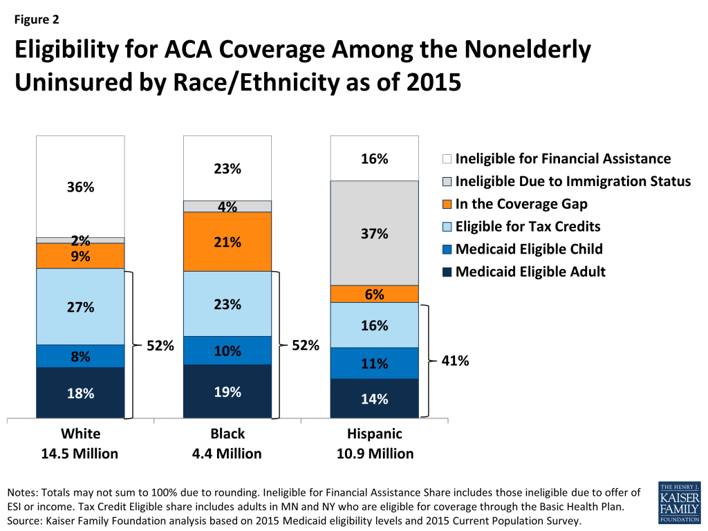
Just over half (52%) of uninsured Whites and Blacks qualify for assistance under the ACA (Figure 2). Over a quarter of uninsured Whites (26%) are Medicaid eligible children and adults, and 29% of uninsured Blacks are Medicaid eligible adults and children. Those who are Medicaid eligible include people who were previously eligible as well as those newly eligible under the ACA. Roughly a quarter of both uninsured Whites and Blacks qualify for premium tax credits to purchase coverage through the Marketplace.6 However, uninsured Blacks are more than twice as likely as uninsured Whites (21% vs. 9%) to fall into the coverage gap. This reflects the fact that a large share of uninsured Blacks resides in the southern region of the country where most states have not adopted the Medicaid expansion. Small shares of both uninsured Whites and Blacks are ineligible based on immigration status. Over a third of uninsured Whites (36%) and nearly a quarter of uninsured Blacks (23%) are ineligible for financial assistance either because they have an offer of ESI or an income above the limit for premium tax credits but could purchase unsubsidized Marketplace coverage.
A smaller share of uninsured Hispanics (41%) qualifies for assistance compared to uninsured Whites (52%). Much of this difference is because a larger share of uninsured Hispanics (37%) is ineligible due to immigration status compared to Whites (2%). Moreover, a small share of uninsured Hispanics falls into the coverage gap since several key states that have large numbers of uninsured Hispanics have adopted the expansion, including California, New York, and Arizona.
Figure 2: Eligibility for ACA Coverage Among the Nonelderly Uninsured by Race/Ethnicity as of 2015
Eligibility for Assistance Under the ACA by Race and Ethnicity and State Medicaid Expansion Status
Patterns of eligibility for each racial/ethnic group also vary depending on whether a state has expanded Medicaid to low-income adults.
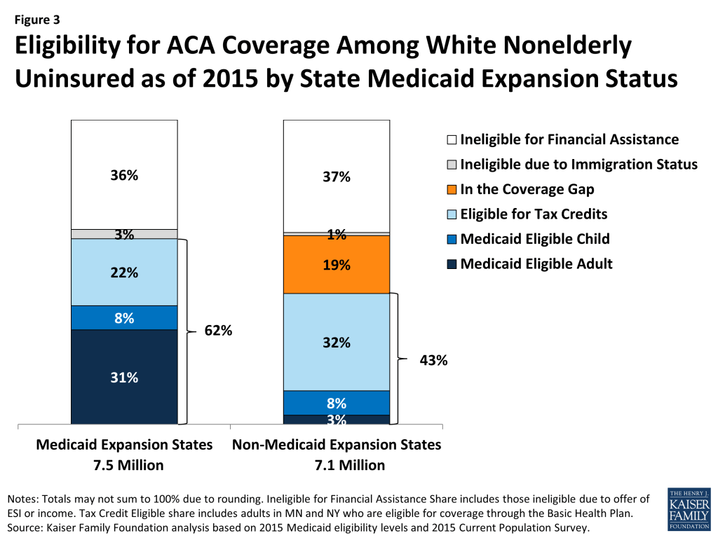
Uninsured Whites are more likely to be eligible for assistance in expansions states compared to non-expansion states (62% vs. 43%) since there is no coverage gap in the expansion states (Figure 3). Without the coverage gap, 40% of uninsured Whites are eligible for Medicaid in expansion states. In the non-expansion states only 11% are eligible for Medicaid, while 19% fall in the coverage gap. In the non-expansion states, eligibility for tax credits partially offsets the gap since individuals with incomes between 100-138% can receive tax credits in these states. As such, a larger share of uninsured Whites is eligible for tax credits in non-expansion states compared to expansion states (32% vs. 22%).
Figure 3: Eligibility for ACA Coverage Among White Nonelderly Uninsured as of 2015 by State Medicaid Expansion Status
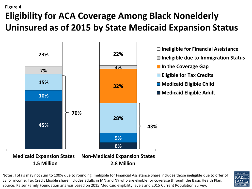
Medicaid expansion decisions have a large impact on eligibility for coverage among uninsured Blacks. In expansion states, seven in ten (70%) of uninsured Blacks are eligible for coverage, including over half (55%) who are eligible for Medicaid. In contrast, in non-expansion states only 15% of uninsured Blacks are eligible for Medicaid while nearly a third (32%) fall into the coverage gap. As such, in the expansion states, less than half (43%) of uninsured Blacks are eligible for assistance.
Figure 4: Eligibility for ACA Coverage Among Black Nonelderly Uninsured as of 2015 by State Medicaid Expansion Status
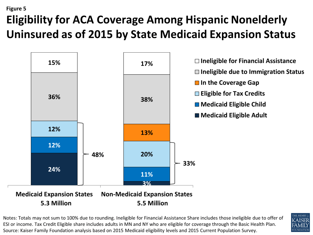
Most uninsured Hispanics remain ineligible for assistance in both expansion and non-expansion states. A larger share of uninsured Hispanics is eligible for assistance in expansion states compared to non-expansion states (48% vs. 33%). However, this difference is not as large as the differences observed for uninsured Blacks and Whites since a smaller share fall into the coverage gap in the non-expansion states and significantly larger shares remain ineligible due to immigration status in both expansion and non-expansion states.
Figure 5: Eligibility for ACA Coverage Among Hispanic Nonelderly Uninsured as of 2015 by State Medicaid Expansion Status
Discussion
Though millions of people have gained coverage under the ACA, many remain uninsured. The ACA provides new coverage options across the income spectrum for low and moderate-income people, and overall nearly half of the uninsured population appears to be eligible for Medicaid or subsidized Marketplace coverage. For these individuals, outreach and education about coverage and financial assistance may be important to continuing coverage gains that were seen in the first two years of full ACA implementation. However, there are distinctions in eligibility patterns by race and ethnicity.
The data show that the Medicaid expansion is an important coverage pathway for uninsured Blacks in states that have adopted the expansion, as over half of uninsured Blacks in these states are Medicaid eligible. However, Blacks are disproportionately impacted by the coverage gap resulting from state decisions not to expand Medicaid. Overall, uninsured Blacks are more than twice as likely as uninsured Whites to fall into the gap (21% vs. 9%), and nearly a third (32%) of uninsured Blacks in non-expansion states fall into the gap.
The data also show that a larger share of Hispanics remains outside the reach of the ACA compared to other groups. Overall, more than one-third of uninsured Hispanics remain ineligible for coverage options due to immigration status. In the absence of coverage options, many of these individuals will likely remain uninsured.
Across racial and ethnic groups, a remaining share of individuals also remains ineligible for assistance because they have access to employer coverage that may be considered affordable or have incomes too high to qualify for Medicaid or Marketplace subsidies. Increased penalties under the ACA’s so-called “individual mandate” in 2016 may encourage some of them to obtain coverage.
As the beginning of open enrollment for 2016 Marketplace coverage approaches, there are still substantial opportunities to increase coverage by reaching those who are eligible for help under the ACA. Understanding how eligibility for coverage options varies by race and ethnicity may help inform outreach and education efforts and provide increased understanding of the scope of remaining coverage gains that can be achieved. These differences also have important implications for efforts to promote greater health equity moving forward.
Samantha Artiga and Rachel Garfield are with the Kaiser Family Foundation. Anthony Damico is an independent consultant to the Kaiser Family Foundation.
Methods
This analysis uses data from the 2015 Current Population Survey (CPS) Annual Social and Economic Supplement (ASEC). The CPS ASEC provides socioeconomic and demographic information for the United Sates population and specific subpopulations. Importantly, the CPS ASEC provides detailed data on families and households, which we use to determine income for ACA eligibility purposes.
The CPS asks respondents about coverage at the time of the interview (for the 2015 CPS, February, March, or April 2015) as well as throughout the preceding calendar year. People who report any type of coverage throughout the preceding calendar year are counted as “insured.” Thus, the calendar year measure of the uninsured population captures people who lacked coverage for the entirety of 2014 (and thus were uninsured at the start of 2015). We use this measure of insurance coverage, rather than the measure of coverage at the time of interview, because the latter lacks detail about coverage type that is used in our model. Based on other survey data, as well as administrative data on ACA enrollment, it is likely that a small number of people included in this analysis gained coverage in 2015.
Medicaid and Marketplaces have different rules about household composition and income for eligibility. For this analysis, we calculate household membership and income for both Medicaid and Marketplace premium tax credits for each person individually, using the rules for each program. For more detail on how we construct Medicaid and Marketplace households and count income, see the detailed technical Appendix A available here.
Undocumented immigrants are ineligible for Medicaid and Marketplace coverage. Since CPS data do not directly indicate whether an immigrant is lawfully present, we draw on the methods underlying the 2013 analysis by the State Health Access Data Assistance Center (SHADAC) and the recommendations made by Van Hook et. al.7 ,8 This approach uses the Survey of Income and Program Participation (SIPP) to develop a model that predicts immigration status; it then applies the model to CPS, controlling to state-level estimates of total undocumented population from Department of Homeland Security. For more detail on the immigration imputation used in this analysis, see the technical Appendix B available here.
Individuals in tax-filing units with access to an affordable offer of Employer-Sponsored Insurance are still potentially MAGI-eligible for Medicaid coverage, but they are ineligible for advance premium tax credits in the Health Insurance Exchanges. Since CPS data do not directly indicate whether workers have access to ESI, we draw on the methods comparable to our imputation of authorization status and use SIPP to develop a model that predicts offer of ESI, then apply the model to CPS. For more detail on the offer imputation used in this analysis, see the technical Appendix C available here.
As of January 2014, Medicaid financial eligibility for most nonelderly adults is based on modified adjusted gross income (MAGI). To determine whether each individual is eligible for Medicaid, we use each state’s reported eligibility levels as of January 1, 2015, updated to reflect state implementation of the Medicaid expansion as of September 2015 and 2015 Federal Poverty Levels.9 Some nonelderly adults with incomes above MAGI levels may be eligible for Medicaid through other pathways; however, we only assess eligibility through the MAGI pathway.10
An individual’s income is likely to fluctuate throughout the year, impacting his or her eligibility for Medicaid. Our estimates are based on annual income and thus represent a snapshot of the number of people in the coverage gap at a given point in time. Over the course of the year, a larger number of people are likely to move and out of the coverage gap as their income fluctuates.
U.S. Department of Health and Human Services, Office of The Assistant Secretary for Planning and Evaluation, 2015 Poverty Guidelines. Available at: http://aspe.hhs.gov/2015-poverty-guidelines. ↩︎
U.S. Department of Health and Human Services, Office of The Assistant Secretary for Planning and Evaluation, 2014 Poverty Guidelines. Available at: http://aspe.hhs.gov/2014-poverty-guidelines↩︎
Tax credit eligibility in 2015 is based on 2014 poverty guidelines. In addition to the premium tax credits, the federal government also makes available cost-sharing subsidies to reduce what people with incomes between 100% and 250% of poverty have to pay out-of-pocket to access health services. The cost-sharing subsidies are also available on a sliding scale based on income. ↩︎
Includes individuals in Minnesota and New York who are eligible for coverage through the Basic Health Plan. ↩︎
Van Hook, J., Bachmeier, J., Coffman, D., and Harel, O. 2015. “Can We Spin Straw into Gold? An Evaluation of Immigrant Legal Status Imputation Approaches” Demography. 52(1):329-54. ↩︎
Based on state-reported eligibility levels as of January 1, 2015. Eligibility levels are updated to reflect state implementation of the Medicaid expansion as of September 2015 and 2015 Federal Poverty Levels, but may not reflect other eligibility policy changes since January 2015. The Kaiser Family Foundation State Health Facts. Data Source: Kaiser Commission on Medicaid and the Uninsured with the Georgetown University Center for Children and Families: Modern Era Medicaid: Findings from a 50-State Survey of Eligibility, Enrollment, Renewal, and Cost-Sharing Policies in Medicaid and CHIP as of January 2015, Kaiser Family Foundation, January 20, 2015. ↩︎
Non-MAGI pathways for nonelderly adults include disability-related pathways, such as SSI beneficiary; Qualified Severely Impaired Individuals; Working Disabled; and Medically Needy. We are unable to assess disability status in the CPS sufficiently to model eligibility under these pathways. However, previous research indicates high current participation rates among individuals with disabilities (largely due to the automatic link between SSI and Medicaid in most states, see Kenney GM, V Lynch, J Haley, and M Huntress. “Variation in Medicaid Eligibility and Participation among Adults: Implications for the Affordable Care Act.” Inquiry. 49:231-53 (Fall 2012)), indicating that there may be a small number of eligible uninsured individuals in this group. Further, many of these pathways (with the exception of SSI, which automatically links an individual to Medicaid in most states) are optional for states, and eligibility in states not implementing the ACA expansion is limited. For example, the median income eligibility level for coverage through the Medically Needy pathway is 15% of poverty in states that are not expanding Medicaid, and most states not expanding Medicaid do not provide coverage above SSI levels for individuals with disabilities. (See: O’Mally-Watts, M and K Young. The Medicaid Medically Needy Program: Spending and Enrollment Update. (Washington, DC: Kaiser Family Foundation), December 2012. Available at: http://modern.kff.org/medicaid/issue-brief/the-medicaid-medically-needy-program-spending-and/. And Kaiser Commission on Medicaid and the Uninsured, “Medicaid Financial Eligibility: Primary Pathways for the Elderly and People with Disabilities,” February 2010. Available at: http://modern.kff.org/medicaid/issue-brief/medicaid-financial-eligibility-primary-pathways-for-the-elderly-and-people-with-disabilities/. ↩︎
Kaiser Health Tracking Poll: October 2015 Findings
This month’s Kaiser Health Tracking Poll finds that the affordability of prescription drugs continues to be at the top of the public’s priority list for the President and Congress, with “making sure that high-cost drugs are affordable to those who need them” and “government action to lower prescription drug prices” picked as top priorities by majorities across political parties.Issues specific to the ACA, such as repealing provisions of the law or repealing the law entirely, fall much lower on the list. For example, while the public generally opposes the Cadillac tax, a provision of the health care law that has received a lot of attention recently, relatively few (30 percent) say it should be a top priority.
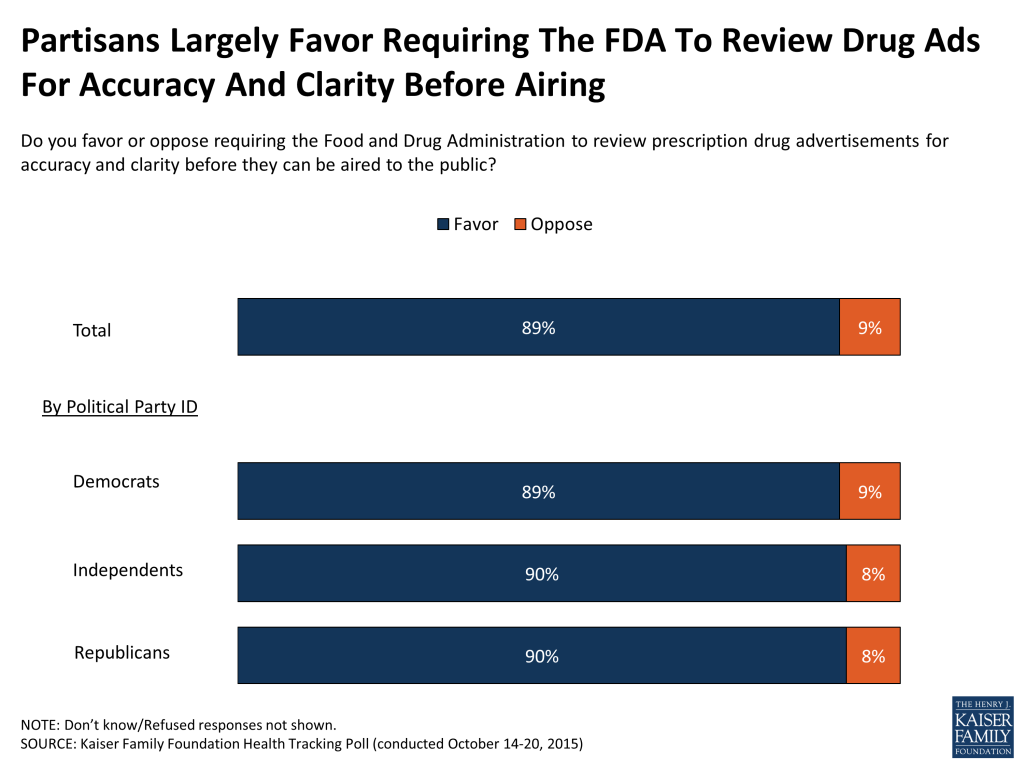
A large majority of Americans (82 percent) report seeing or hearing prescription drug ads, with about 3 in 10 (28 percent) saying they have talked with a doctor about a specific medicine as a result of an ad. About half of the public (51 percent) say they think that prescription drug advertising is mostly a good thing and many say drug advertisements do a good or excellent job of telling consumers which condition or disease the drug is designed to treat (50 percent), as well as the potential benefits (47 percent) and potential side effects they might experience (44 percent). On the other hand, the public overwhelmingly favors requiring the Food and Drug Administration (FDA) to review prescription drugs advertisements for accuracy and clarity before they can be aired to the public (89 percent), an opinion held by nearly identical shares of Republicans, Democrats, and independents.
The survey also found that health care expenses strain many family budgets – while 55 percent report no problems affording care, saying it is very or somewhat easy to afford, 42 percent say they find it difficult to afford health care, just above expenses like utilities (38 percent), housing (35 percent), food (31 percent) and transportation costs (30 percent). The share reporting a difficult time affording health care increases greatly among the uninsured and those with lower incomes.
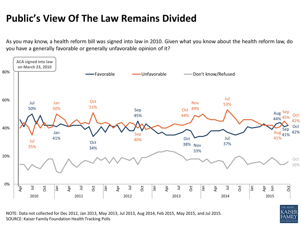
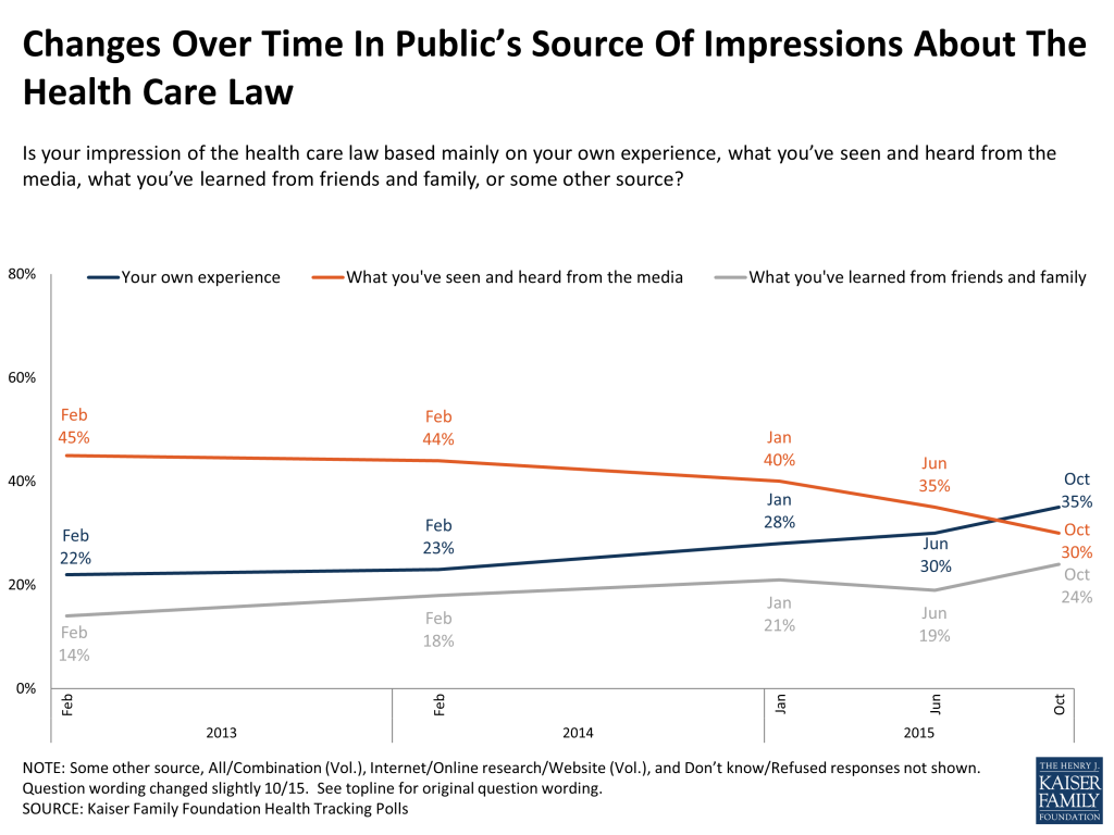
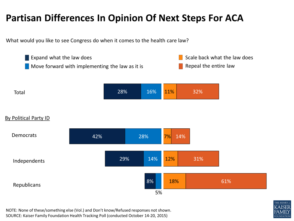
Favorable and unfavorable views of the health care law are tied this month with 42 percent favorable and 42 percent unfavorable. Compared to when most of the law’s provisions were just taking effect in early 2014, more now say their impression of the health care law is based on their own experience (35 percent now, 23 percent in February 2014), while fewer say it is based on what they’ve seen in the media (30 percent now, 44 percent in February 2014). In addition, the public continues to be divided on what Congress should do about the law – 32 percent say repeal, 11 percent say scale back, 16 percent say move forward with implementation, and 28 percent say expand the law.
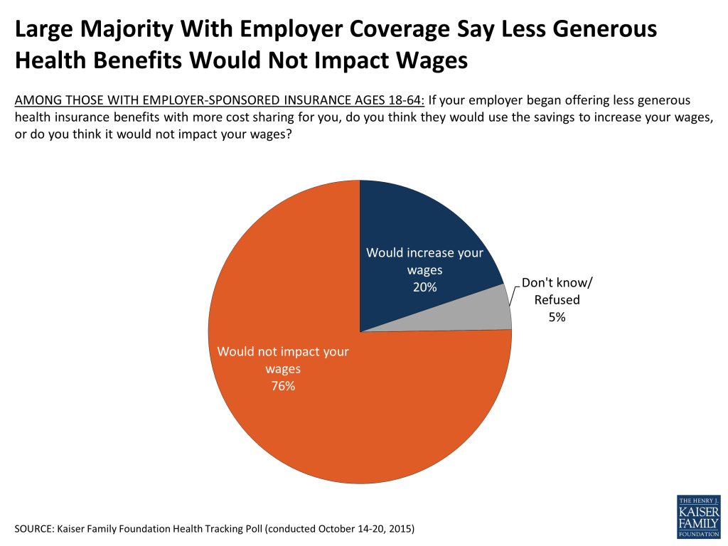
In the context of the debate around the so-called Cadillac Plan Tax on higher cost employer-sponsored plans, three-quarters of those with employer coverage (76 percent) say if their employer began offering less generous health insurance benefits, it would not result in an increase in their wages, while 2 in 10 (20 percent) say they think their wages would increase.
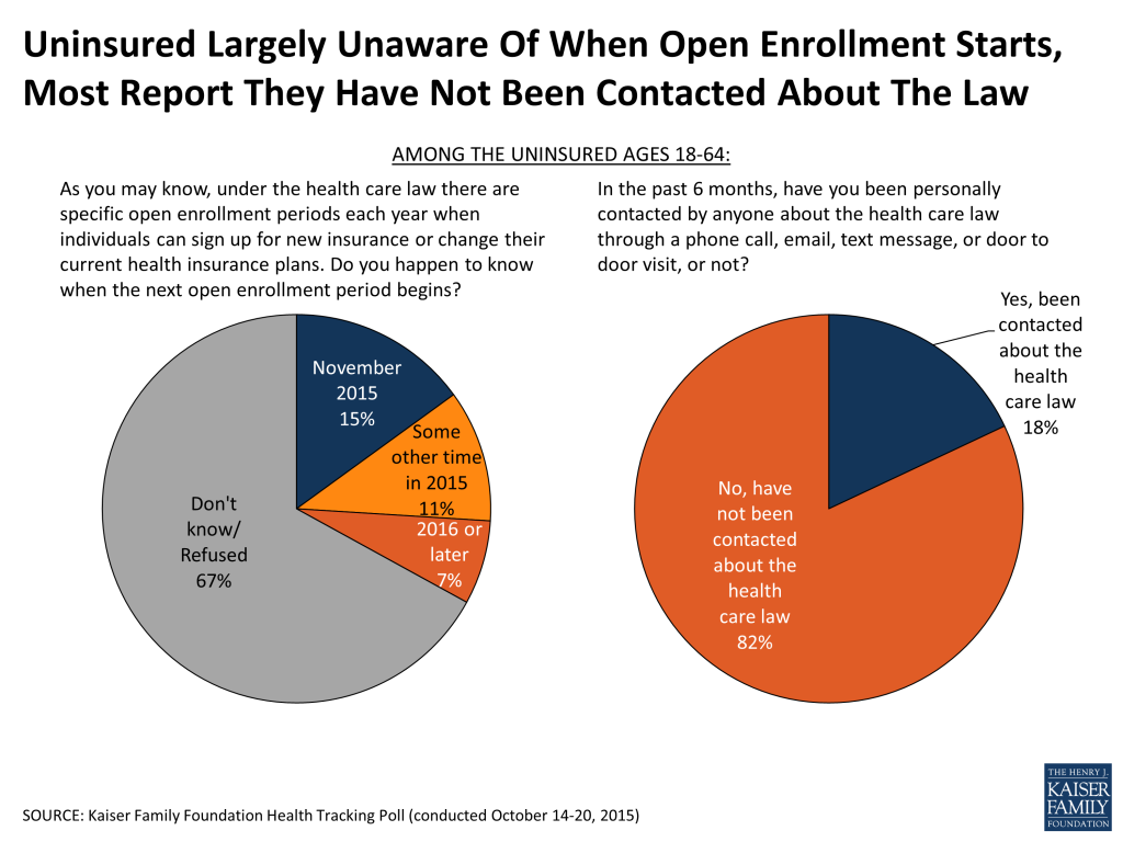
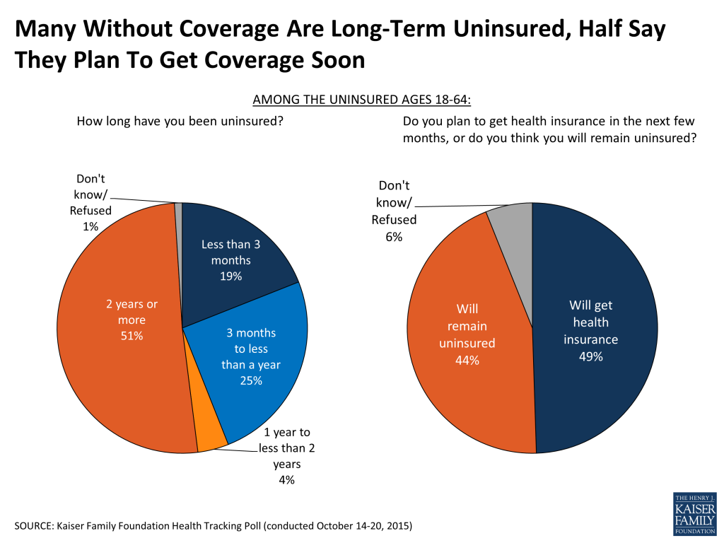
Few uninsured (15 percent) are aware that the third ACA enrollment period begins in November, however many (49 percent) say they expect to get health insurance in the next few months despite the fact that about half (51 percent) say they have been uninsured for 2 years or more.
The Public’s Health Care Priorities
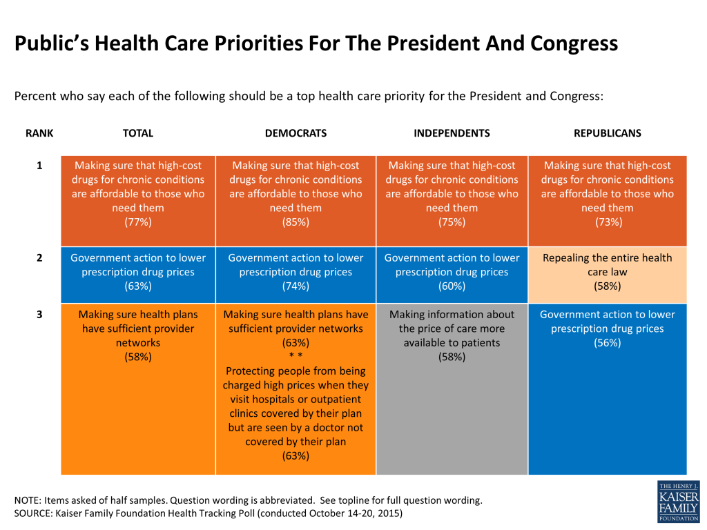
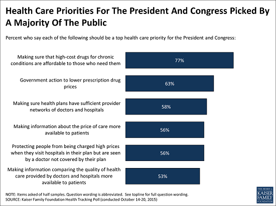
As some Presidential candidates begin releasing details of their health care platforms, the public’s opinion of priorities in health care becomes increasingly relevant. In April, the Kaiser Health Tracking Poll asked the public about which health care issues they thought the President and Congress should prioritize, and this month’s poll revisits that priorities list six months later to see if public opinion has shifted. The public largely prioritizes the same issues they did in April, with the cost of prescription drugs rising to the top. Making sure that high-cost drugs for chronic conditions, such as HIV, hepatitis, mental illness and cancer, are affordable to those who need them is viewed as a top priority by 77 percent of the public and more than 7 in 10 across party lines, and at least half of Democrats, Republicans, and independents say government action to lower prescription drug prices should be a top priority. Additionally, about half or more view provider network protections, increasing price and quality transparency and helping moderate income people pay for high out-of-pocket health care costs as top priorities. Issues specific to the ACA, such as repealing provisions of the law or repealing the law entirely, fall lower on the list and are named as top priorities by fewer Americans. However, repealing the ACA is named as a top priority by nearly 6 in 10 Republicans (58 percent), ranking second as their top priority.
Table 1: “Top Health Care Priorities” For The President And Congress
Percent who say each of the following should be a top health care priority for the President and Congress
Total
Democrats
Independents
Republicans
Making sure that high-cost drugs for chronic conditions, such as HIV, hepatitis, mental illness and cancer, are affordable to those who need them
77%
85%
75%
73%
Government action to lower prescription drug prices
63
74
60
56
Making sure health plans have sufficient provider networks of doctors and hospitals
58
63
57
55
Making information about the price of doctors’ visits, tests, and procedures such as hip replacements and MRIs more available to patients
56
60
58
51
Protecting people from being charged high prices when they visit hospitals or outpatient clinics covered by their health plan but are seen by a doctor not covered by their plan
56
63
57
50
Making information comparing the quality of health care provided by doctors and hospitals more available to patients
53
59
52
42
Making information about what doctors and hospitals are covered under different health insurance plans more available
50
54
50
49
Helping people with moderate incomes pay high out-of-pocket costs for medical care
48
62
45
37
Repealing the requirement that employers with 100 or more workers pay a fine if they don’t offer health insurance
38
47
37
37
Repealing the requirement that nearly all Americans have health insurance or else pay a fine
38
35
37
40
Repealing the entire health care law
37
28
33
58
Eliminating a tax on higher cost employer-sponsored health plans, also called Cadillac plans, that helps pay for the health care law
30
27
32
34
Reducing the amount of financial assistance available to help people buy health insurance in order to save the government money
29
33
27
31
Note: Items asked of half samples.
Figure 1
Prescription Drug Regulation And Advertising
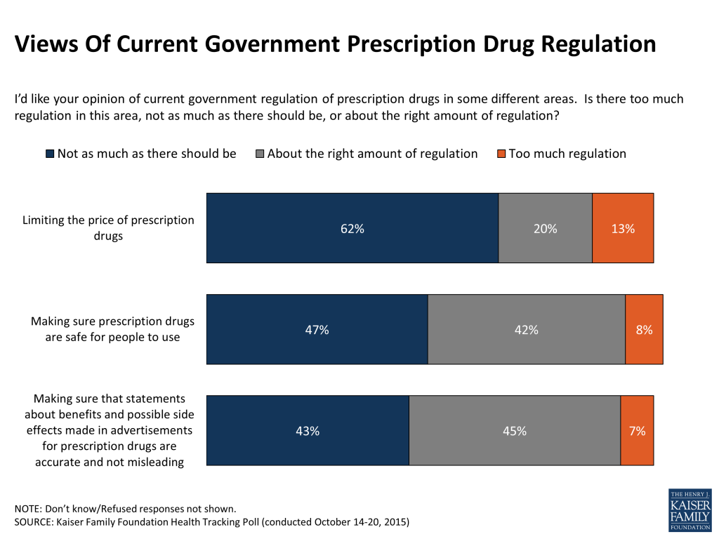
Not surprisingly, given the public’s desire for improved affordability of prescription drugs, many (62 percent) say there is not as much regulation as there should be limiting the price of prescription drugs. Much smaller shares say there is about the right amount of regulation (20 percent) or too much regulation (13 percent).
The public is more divided about the amount of regulation ensuring the safety of drugs and overseeing claims made in drug advertisements. About half (47 percent) say that there is not as much regulation as there should be making sure prescription drugs are safe for people to use, while about 4 in 10 (42 percent) say there is about the right amount and just 8 percent say there is too much regulation. Similarly, 43 percent say there is not as much government regulation as there should be making sure that statements about benefits and possible side effects made in advertisements for prescription drugs are accurate and not misleading, while 45 percent say there is about the right amount and 7 percent say there is too much.
Partisans differ in their opinion of whether current government regulation of prescription drugs is adequate. Democrats are more likely than Republicans to say there is not as much regulation as there should be across the various aspects asked about in the survey, while Republicans are more likely than Democrats to say there is about the right amount.
Figure 2
While the public is divided on whether there is about the right amount of regulation or not enough, an overwhelming majority (89 percent) say they favor requiring the Food and Drug Administration (FDA) to review prescription drug advertisements for accuracy and clarity before they can be aired to the public, something the FDA currently does not do.1 This opinion is held by nearly identical shares of Republicans, Democrats, and independents.
Figure 3
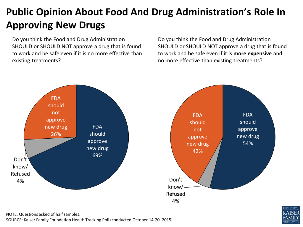
When asked whether the FDA should approve a drug that is found to work and be safe although it is no more effective than existing treatments, about 7 in 10 (69 percent) say it should be approved. However, when cost is added to the equation and the new, hypothetical drug is said to be both more expensive and no more effective than existing treatments, the share saying the FDA should approve it drops to 54 percent.
Figure 4
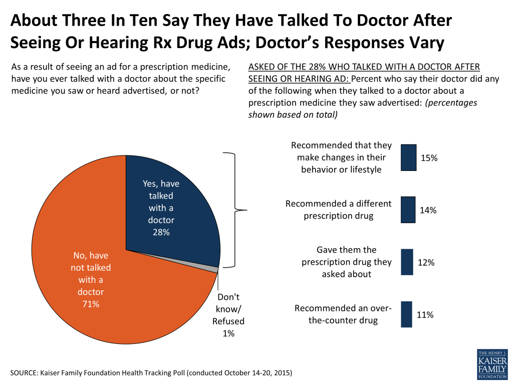
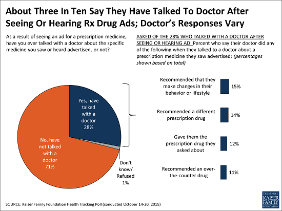
A large majority of Americans (82 percent) report seeing or hearing prescription drug advertisements, and 3 in 10 (28 percent) say they have talked with a doctor about the specific medicine they saw advertised. After talking to a doctor about a drug they saw, 15 percent of the public says the doctor recommended changes in their behavior or lifestyle, 14 percent say the doctor recommended a different prescription drug, 12 percent say they were given the drug they asked about, and 11 percent were instead recommended an over-the-counter option.
Figure 5
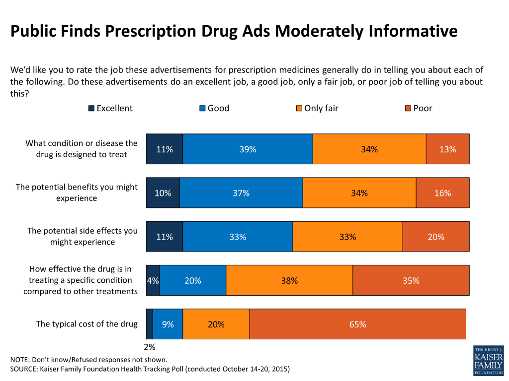
About half of the public (51 percent) say they think that prescription drug advertising is mostly a good thing, while 4 in 10 (39 percent) say the opposite. Regardless of whether they think drug advertisements are good or bad, the public seems to find them only moderately informative. Half (50 percent) say drug advertisements do a good or excellent job of telling consumers which condition or disease the drug is designed to treat. Over 4 in 10 say the advertisements do at least a good job telling consumers about the potential benefits (47 percent) and potential side effects they might experience (44 percent). About a quarter (24 percent) say the advertisements do at least a good job of informing consumers of how effective the drug is in treating a specific condition compared to other treatments. Just 11 percent say the ads are good or excellent at informing the public of the typical cost of the drug, while 20 percent say they do a fair job and a majority (65 percent) say they do a poor job.
Figure 6
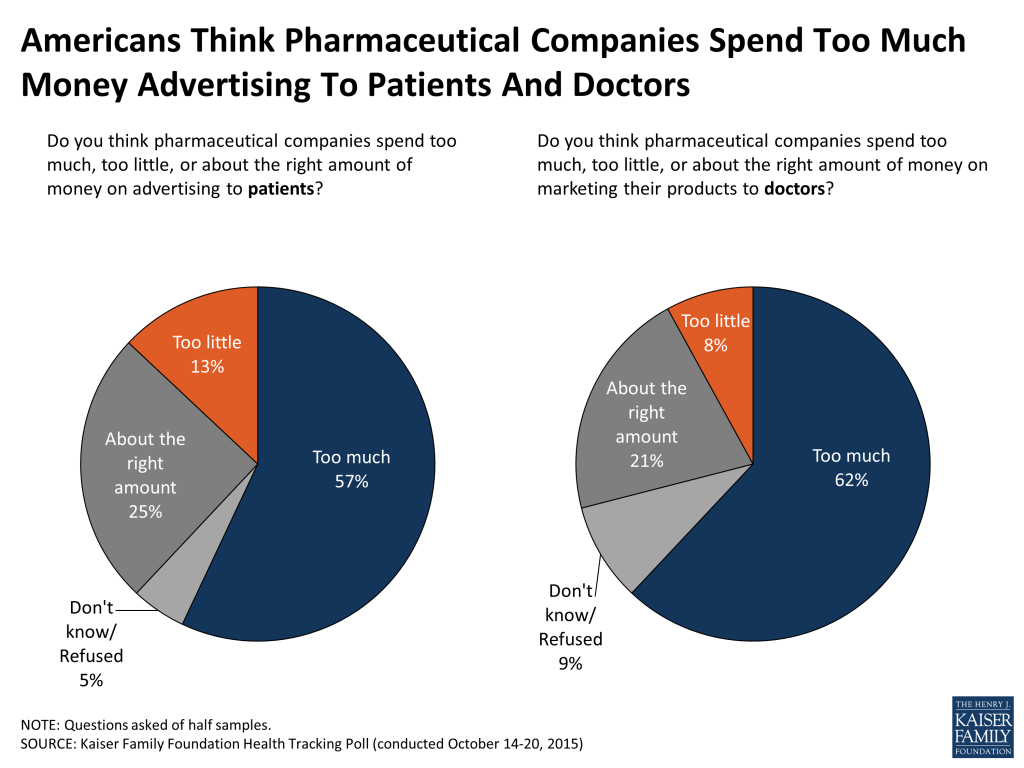
The public also believes that pharmaceutical companies spend too much money advertising to patients and doctors. About 6 in 10 (57 percent) say that pharmaceutical companies spend too much advertising to patients, 13 percent say too little and a quarter (25 percent) say the right amount. Nearly identical shares say the same about money spent marketing to doctors; 62 percent say they spend too much, 8 percent say too little, and 21 percent say about the right amount.
Figure 7
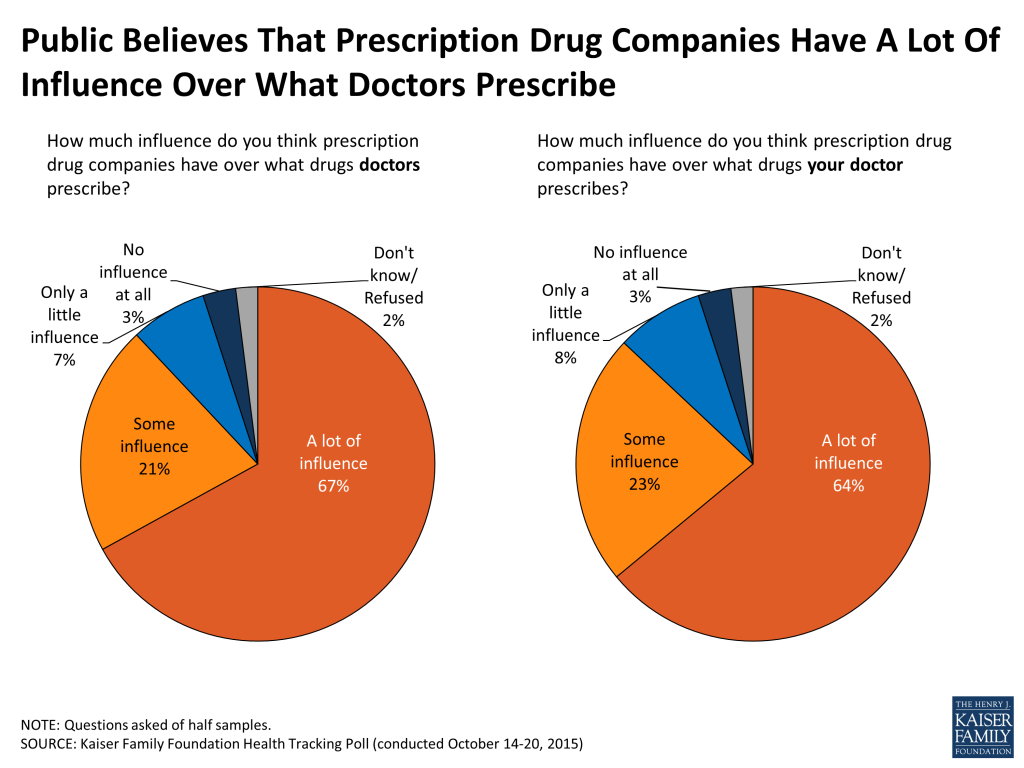
And, according to the public, pharmaceutical companies have quite a bit of influence over what doctors prescribe their patients – nearly 9 in 10 (88 percent) say they think they have at least some influence, including 67 percent who say they have a lot of influence. When asked specifically how much influence drug companies have over what their own doctor prescribes, similarly large shares say the pharmaceutical companies have considerable influence (64 percent say a lot and 23 percent say they have some influence).
Figure 8
Health Care And Family Budgets
When asked about how easy or difficult it is to afford different basic elements of most family budgets, many say affording things like food, gas, housing, and health care are at least somewhat easy, however 42 percent of the public says it is difficult to afford health care, followed by monthly utilities (38 percent), housing costs (35 percent), food (31 percent) and gas or other transportation costs (30 percent). There are stark differences by insurance status and income. Within each income bracket, individuals report difficulty affording various pocketbook expenses at roughly similar rates, those with higher incomes report less difficulty affording the expenses and those with lower incomes report more difficultly; however health care tops the list across all income brackets.
Table 2: Ranking Of Pocketbook Costs
Percent who say it is very or somewhat difficult to afford each of the following
Total
By Insurance Status (Ages 18-64)
By Annual Household Income
Insured
Uninsured
Less than $40,000
$40,000-$89,999
$90,000 or more
Health care
42%
38%
81%
56%
41%
16%
Monthly utilities, like electricity, heat, and phone
38
36
63
54
35
9
Rent or mortgage
35
34
63
50
32
12
Food
31
29
52
48
25
7
Gas or other transportation costs
30
29
46
44
24
7
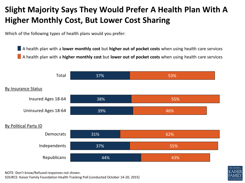
A slim majority (53 percent) of the public says, if given the choice, they would prefer a health plan with a higher monthly cost but lower out of pocket costs when using health care services, and just under 4 in 10 (37 percent) say they would prefer a plan with a lower monthly cost, but higher out of pocket cost sharing. These shares are similar across insurance status. Democrats (62 percent) and independents (55 percent) are more likely than Republicans (43 percent) to say they prefer a higher cost plan with lower cost sharing.
Figure 9
Views Of The ACA On The Eve Of Open Enrollment
Opinion Of The Law
In October, equal shares of the public report favorable and unfavorable views of the health care law (42 percent each). This even divide masks a persistent underlying partisan split in views of the law. This month, 63 percent of Democrats say they have a favorable view of the law, while 79 percent of Republicans say they have an unfavorable view. Independents are about evenly split with 41 percent reporting a favorable view and 43 percent unfavorable.
Figure 10
Source Of Public’s Impressions Of The Law
The public reports their impressions of the law come from a number of different sources, including 35 percent who say it is based on their own experience, 30 percent who say it’s based on what they’ve heard and seen from the media, and 24 percent who say it’s based on what they have learned from friends and family. Since most of the major provisions of the health care law went into effect in winter of 2014, the share saying their opinion of the law is based on their own experiences has increased from 23 percent in February 2014 to 35 percent this month, while the share saying it is based on what they’ve seen or heard from the media has declined, from over 4 in 10 (44 percent) in 2014 to 30 percent now.
Figure 11
Repeal Or Expand, Or Something In Between?
As has been the case for many months, the public does not converge around what Congress should do when it comes to the health care law. About 3 in 10 (32 percent) would like to see Congress repeal the entire law and 11 percent want to see it scaled back, while 16 percent would like to see implementation continue, and another 28 percent want to see the law expanded. As with views of the laws overall, views of what Congress should do vary widely by party.
Figure 12
One change to the ACA that Congress has been considering recently is repealing an upcoming tax on more expensive employer-sponsored health plans, which some have called the Cadillac Plan Tax. Some say this would result in employees being paid higher wages as employers would lower their health benefits in order to avoid the tax and pass the subsequent savings on to their employees. Those getting coverage through an employer largely believe that if their employer began offering less generous health insurance benefits, the change would not result in increases to their wages (76 percent), while 2 in 10 (20 percent) think their wages would increase.
Figure 13
Public Divided On Whether To Continue Debate Of ACA
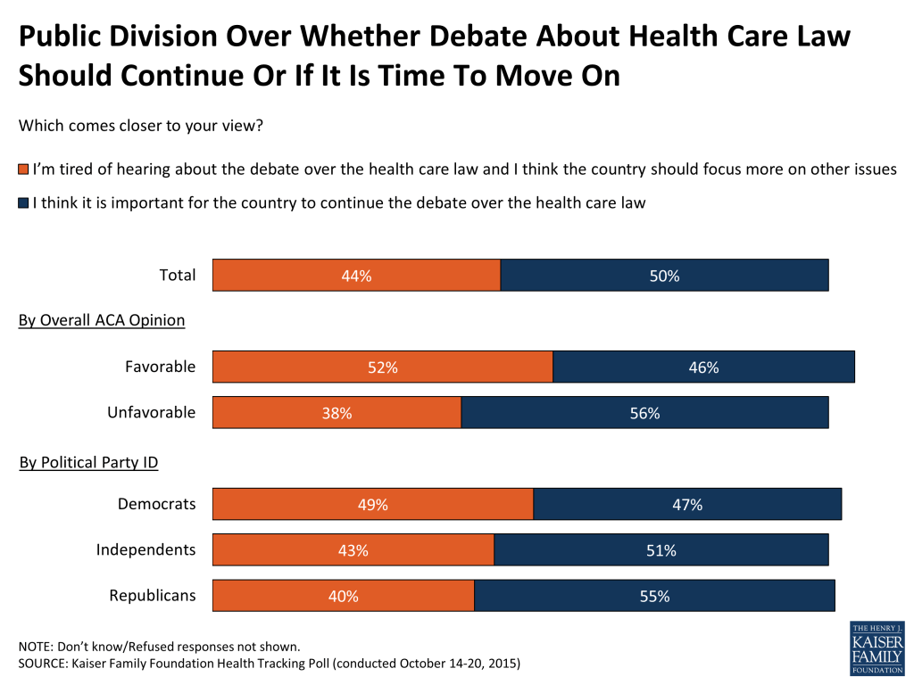
As the political debate about the future of the health care law continues in Congress and on the campaign trail, the public is fairly divided on whether this debate should continue or if it’s time to move on to other issues. Half (50 percent) say it is important for the country to continue the debate over the health care law while 44 percent say they are tired of hearing debate about the ACA and think the country should focus more on other issues. Democrats and independents are divided as to whether they want debate to continue or if it’s time to move on, whereas Republicans are more likely to say debate should continue rather than say it’s time for the country to focus more on other issues (55 percent vs. 40 percent).
Figure 14
Awareness Of Upcoming Open Enrollment Period
The third open enrollment period under the ACA starts November 1st, but at this point, relatively small shares of the public overall (17 percent) as well as the uninsured (15 percent), are aware of when open enrollment starts. In addition, about 2 in 10 uninsured (18 percent) say they have been personally contacted about the health care law in the past six months.
Figure 15
Currently Uninsured Likely Harder To Reach, Many Plan to Get Covered
As more people gain coverage through the Affordable Care Act and other sources, those who remain uninsured become a more difficult to reach group. About half of the uninsured (51 percent) say they have been uninsured for 2 years or more. While many have been without coverage for some time, about half of the uninsured (49 percent) say they plan to get coverage in the next few months, whereas 44 percent of the uninsured expect to remain uninsured.
Figure 16
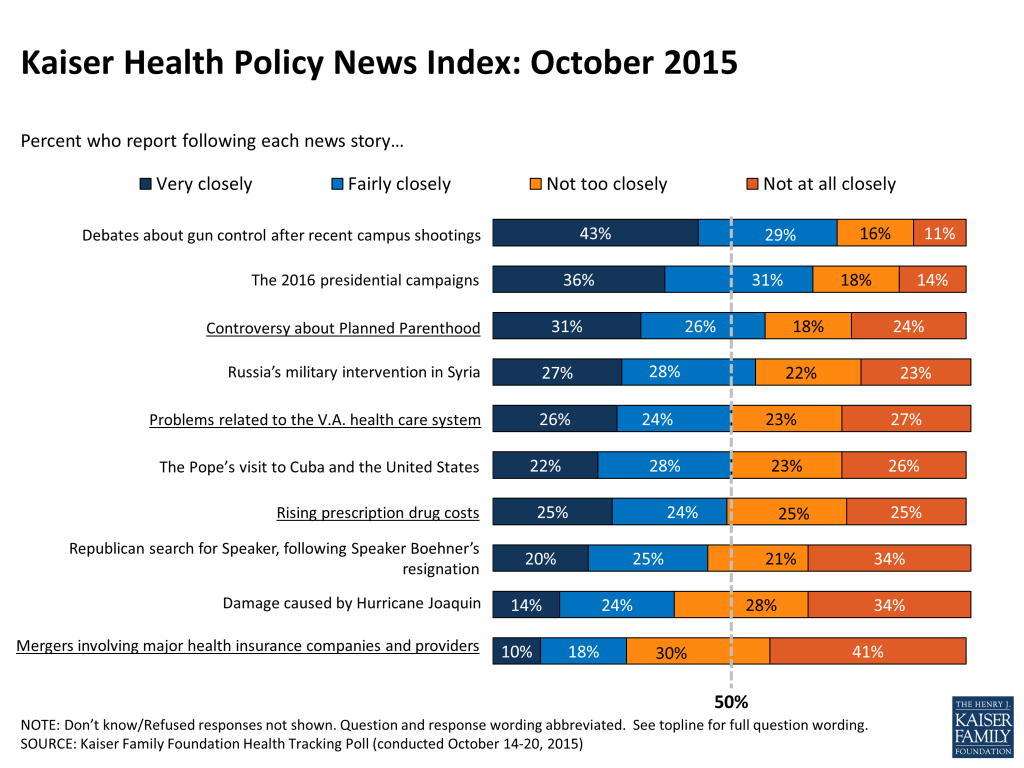
Kaiser Health Policy News Index: October 2015
The Kaiser Health Policy News Index is designed to help journalists and policymakers understand which health policy-related news stories Americans are paying attention to, and what the public understands about health policy issues covered in the news.
In the wake of a shootings on college campuses in Oregon and Arizona, 72 percent of the public says they have been following debates about gun control after these recent campus shootings ‘very’ or ‘fairly’ closely. And, as has been the case in recent months, a sizeable majority (67 percent) report following the presidential campaigns. Closer to half report following other national and international news stories such as the controversy around Planned Parenthood (57 percent), Russia’s military intervention in Syria (55 percent), the Pope’s visit to Cuba and the United States (50 percent), and the Republican search for a New Speaker of the House after Speaker Boehner’s resignation (45 percent). About half also report following two health policy related stories – news about problems with the Veterans Affairs health care system (50 percent) and the rising cost of prescription drugs (49 percent). Closer to 4 in 10 (38 percent) say they have followed coverage of damage caused by Hurricane Joaquin on the east coast. Lowest on the list of this month’s news items is coverage about health insurer and provider group mergers (28 percent).
Figure 17
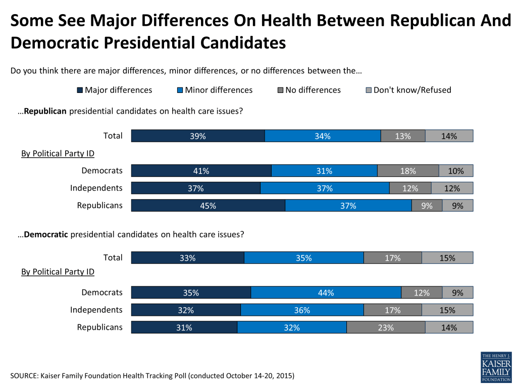
Differences In Presidential Candidates On Health
While two-thirds of the public say they are following the presidential campaigns at this point in the race, opinions are varied on whether there are major, minor or no differences on health care issues between the candidates for each party. When asked about differences among Republican candidates on health, about 7 in 10 (73 percent) of the public say there are differences, including 39 percent who say there are major differences, while just 13 percent say there are no differences. Similarly, when asked about Democratic candidates, nearly 7 in 10 (68 percent) say there are differences, including a third (33 percent) who say major differences, while 17 percent say there are no differences. Partisans are less likely to see differences among candidates of the party opposite their own – Democrats are more likely than Republicans to say there are no differences between the Republican candidates (18 percent vs. 9 percent), and Republicans are more likely than Democrats to say there are no differences between the Democratic candidates (23 percent vs. 12 percent). For both questions, those who say they are following news about the presidential election are more likely than those not following the races as closely to say there are differences between the candidates on health care issues (Republican candidates: 77 percent vs. 64 percent; Democratic candidates: 73 percent vs. 57 percent).
Figure 18
Kaiser Health Tracking Poll: October 2015 Methodology
This Kaiser Health Tracking Poll was designed and analyzed by public opinion researchers at the Kaiser Family Foundation (KFF). The survey was conducted October 14-20, 2015, among a nationally representative random digit dial telephone sample of 1,203 adults ages 18 and older, living in the United States, including Alaska and Hawaii (note: persons without a telephone could not be included in the random selection process). Computer-assisted telephone interviews conducted by landline (481) and cell phone (722, including 433 who had no landline telephone) were carried out in English and Spanish by Princeton Data Source under the direction of Princeton Survey Research Associates International (PSRAI). Both the random digit dial landline and cell phone samples were provided by Survey Sampling International, LLC. For the landline sample, respondents were selected by asking for the youngest adult male or female currently at home based on a random rotation. If no one of that gender was available, interviewers asked to speak with the youngest adult of the opposite gender. For the cell phone sample, interviews were conducted with the adult who answered the phone. KFF paid for all costs associated with the survey.
The combined landline and cell phone sample was weighted to balance the sample demographics to match estimates for the national population using data from the Census Bureau’s 2013 American Community Survey (ACS) on sex, age, education, race, Hispanic origin, nativity (for Hispanics only), and region along with data from the 2010 Census on population density. The sample was also weighted to match current patterns of telephone use using data from the July-December 2014 National Health Interview Survey. The weight takes into account the fact that respondents with both a landline and cell phone have a higher probability of selection in the combined sample and also adjusts for the household size for the landline sample. All statistical tests of significance account for the effect of weighting.
The margin of sampling error including the design effect for the full sample is plus or minus 3 percentage points. Numbers of respondents and margins of sampling error for key subgroups are shown in the table below. For results based on other subgroups, the margin of sampling error may be higher. Sample sizes and margins of sampling error for other subgroups are available by request. Note that sampling error is only one of many potential sources of error in this or any other public opinion poll. Kaiser Family Foundation public opinion and survey research is a charter member of the Transparency Initiative of the American Association for Public Opinion Research.
28% of Public Report Asking Doctor about a Drug They Saw Advertised, and 12% Say Their Doctor Prescribed It
Few Workers Expect Raises if Employers Reduce Health Benefits to Avoid Cadillac Tax as Many Economists Predict
With some presidential candidates laying out details of their health care platforms, the cost of prescription drugs remains at the top of the public’s health care priority list for the President and Congress, the October Kaiser Health Tracking Poll finds.
Making sure that high-cost drugs for chronic conditions, such as HIV, hepatitis, mental illness and cancer, are affordable for those who need them is the top priority, picked by more than three quarters of the public (77%). It was the top priority of Democrats, Republicans and independents alike, with at least seven in 10 of each group citing it.
The public ranks government action to lower prescription drug costs second, with 63 percent saying it is a top priority, including a majority of Republicans (56%). That’s similar to the share of Republicans who say repealing the entire Affordable Care Act is a top priority (58%).
Other priorities picked by more than half of the public include assuring provider networks are adequate, protections against surprise out of network bills, and increasing price and quality transparency.
In contrast, issues specific to the Affordable Care Act, such as repealing several of its provisions or the entire law, fall lower on the list. For example, while the public generally opposes the so-called Cadillac tax on more expensive employer health plans, just 30 percent pick eliminating it as a top priority, ranking it 12th on the poll’s priority list.
Economists generally believe that employers will raise workers’ wages if they reduce the cost of their health benefits to avoid the Cadillac tax. The poll finds few people with employer-sponsored coverage expect that to happen. Just 20 percent think their wages would increase if their employer offered less generous health benefits, while three quarters (76%) think wages would not increase.
Favorable and unfavorable views of the ACA overall were tied this month, with 42 percent holding each view. Compared to when most of the law’s provisions were just taking effect in early 2014, more now say their impression of the law is based on their own experience (35% now, up from 23% in February 2014), while fewer say it is based on what they’ve seen in the media (30% now, down from 44% in February 2014).
The survey also probes the public’s experiences with drug advertisements. A large majority (82%) report they’ve seen or heard such advertising, and 28 percent say they have talked with a doctor about a specific drug they saw advertised.
One in eight adults (12%) say they were given a specific drug after asking a doctor about its advertisements;15 percent say the doctor recommended changes in their behavior or lifestyle;14 percent say the doctor recommended a different prescription drug, and 11 percent say the doctor recommended an over-the-counter option. These findings are similar to the results of previous Kaiser polling in 2008.
About half of the public (51%) say prescription drug advertising is mostly a good thing. Half (50%) also say drug advertisements do a good or excellent job of telling consumers which condition or disease the drug is designed to treat, and nearly as many say the ads do at least a good job telling consumers about the potential benefits (47%) and potential side effects (44%).
The poll also finds a majority (57%) believes that drug companies spend too much money advertising to patients. A similar majority says the same about money spent marketing to doctors (62%), and two thirds (67%) say drug companies have a lot of influence over what doctors prescribe to their patients. In addition, 89 percent of the public favor having the Food and Drug Administration review drug ads for accuracy and clarity before the public sees them, something it does not do now.
The poll was designed and analyzed by public opinion researchers at the Kaiser Family Foundation and was conducted from October 14 to 20, 2015 among a nationally representative random digit dial telephone sample of 1,203 adults. Interviews were conducted in English and Spanish by landline (481) and cell phone (722). The margin of sampling error is plus or minus 3 percentage points for the full sample. For results based on subgroups, the margin of sampling error may be higher.
Updated Oct. 27, 2015 to include final rates for CA, ID, and NY, and an update to NM rates.
The table below presents an update to our previous analysis of 2016 changes in premiums for the second-lowest cost (“benchmark”) silver marketplace plans in major cities in all 50 states and the District of Columbia.
Among these major cities, the percent change from last year in the benchmark premium ranges from -10.6% in Seattle, Washington to 38.4% in Nashville, TN. The simple average of these rate changes is 10.1% before accounting for the premium tax credit.
For a 40 year old making $30,000 per year, the average change after tax credits would be -0.2% (holding age and income constant). 2016 benchmark silver rates for a 40 year old will range from $183 per month in Albuquerque, NM to $719 per month in Anchorage, Alaska before accounting for the tax credit. If this 40 year old makes $30,000 per year, the premium paid by the consumer after the tax credit would range from $163 per month in Anchorage, Alaska to $206 per month in most of the country.
We added a new row showing the average premium change weighed by the 2015 effectuated enrollment for the state in which the city is located. Enrollment data are not available for all counties or cities. The weighted average increase is 3.6% across these cities, before accounting for the premium tax credit.
For comparison, these cities saw an average change of -0.3% in the benchmark premium from 2014 – 2015 (the weighted average decrease was also -0.3%) before accounting for the tax credit.
Table 1: Monthly Silver Premiumsfor a 40 Year Old Non-Smoker Making $30,000 / Year
State
Major City
2nd Lowest Cost SilverBefore Tax Credit
2nd Lowest Cost SilverAfter Tax Credit
2015
2016
% Change from2015
2015
2016
% Change from2015
Average Percent Change
10.1%
-0.2%
Weighted Change
3.6%
-0.7%
Alabama
Birmingham
$264
$288
9.1%
$208
$206
-1.0%
Alaska
Anchorage
$547
$719
31.4%
$164
$163
-0.6%
Arizona
Phoenix
$177
$207
16.9%
$177
$206
16.4%
Arkansas
Little Rock
$299
$310
3.7%
$208
$206
-1.0%
California
Los Angeles
$258
$245
-5.0%
$208
$206
-1.0%
Colorado
Denver
$211
$279
32.2%
$208
$206
-1.0%
Connecticut
Hartford
$322
$318
-1.2%
$208
$206
-1.0%
Delaware
Wilmington
$301
$356
18.3%
$208
$206
-1.0%
DC
Washington
$242
$243
0.4%
$208
$206
-1.0%
Florida
Miami
$274
$262
-4.4%
$208
$206
-1.0%
Georgia
Atlanta
$255
$254
-0.4%
$208
$206
-1.0%
Hawaii
Honolulu
$200
$262
31.0%
$179
$182
1.7%
Idaho
Boise
$210
$273
30.0%
$208
$206
-1.0%
Illinois
Chicago
$215
$198
-7.9%
$208
$198
-4.8%
Indiana
Indianapolis
$329
$298
-9.4%
$208
$206
-1.0%
Iowa
Cedar Rapids
$246
$284
15.4%
$208
$206
-1.0%
Kansas
Wichita
$218
$248
13.8%
$208
$206
-1.0%
Kentucky
Louisville
$212
$227
7.1%
$208
$206
-1.0%
Louisiana
New Orleans
$296
$332
12.2%
$208
$206
-1.0%
Maine
Portland
$282
$285
1.1%
$208
$206
-1.0%
Maryland
Baltimore
$235
$249
6.0%
$208
$206
-1.0%
Massachusetts
Boston
N/A
N/A
N/A
N/A
N/A
N/A
Michigan
Detroit
$230
$226
-1.7%
$208
$206
-1.0%
Minnesota
Minneapolis
$183
$235
28.4%
$183
$206
12.6%
Mississippi
Jackson
$305
$277
-9.2%
$208
$206
-1.0%
Missouri
St Louis
$276
$287
4.0%
$208
$206
-1.0%
Montana
Billings
$241
$322
33.6%
$208
$206
-1.0%
Nebraska
Omaha
$264
$313
18.6%
$208
$206
-1.0%
Nevada
Las Vegas
$237
$261
10.1%
$208
$206
-1.0%
New Hampshire
Manchester
$247
$261
5.7%
$208
$206
-1.0%
New Jersey
Newark
$316
$330
4.4%
$208
$206
-1.0%
New Mexico
Albuquerque
$171
$183
7.0%
$171
$183
7.0%
New York
New York City
$372
$369
-0.8%
$208
$206
-1.0%
North Carolina
Charlotte
$326
$409
25.5%
$208
$206
-1.0%
North Dakota
Fargo
$272
$304
11.8%
$208
$206
-1.0%
Ohio
Cleveland
$247
$234
-5.3%
$208
$206
-1.0%
Oklahoma
Oklah. City
$219
$295
34.7%
$208
$206
-1.0%
Oregon
Portland
$213
$261
22.5%
$208
$206
-1.0%
Pennsylvania
Philadelphia
$268
$276
3.0%
$208
$206
-1.0%
Rhode Island
Providence
$260
$263
1.2%
$208
$206
-1.0%
South Carolina
Columbia
$276
$314
13.8%
$208
$206
-1.0%
South Dakota
Sioux Falls
$257
$309
20.2%
$208
$206
-1.0%
Tennessee
Nashville
$203
$281
38.4%
$203
$206
1.5%
Texas
Houston
$250
$256
2.4%
$208
$206
-1.0%
Utah
Salt Lake City
$215
$244
13.5%
$208
$206
-1.0%
Vermont
Burlington
$436
$468
7.3%
$208
$206
-1.0%
Virginia
Richmond
$260
$276
6.2%
$208
$206
-1.0%
Washington
Seattle
$254
$227
-10.6%
$208
$206
-1.0%
West Virginia
Huntington
$289
$341
18.0%
$208
$206
-1.0%
Wisconsin
Milwaukee
$333
$326
-2.1%
$208
$206
-1.0%
Wyoming
Cheyenne
$407
$426
4.7%
$208
$206
-1.0%
SOURCE: Kaiser Family Foundation analysis of premium data from Healthcare.gov and insurer rate filings to state regulators. For more information see “Analysis of 2016 Premium Changes and Insurer Participation in the Affordable Care Act’s Health Insurance Marketplaces” June, 2015.NOTES: Weighted changes are calculated using average benchmark premiums in the city, weighted by the state’s effectuated enrollment as of mid-2015.
Note: Based on information from Healthcare.gov, a previous version of this analysis reported a 40.9% increase in Albuquerque, NM. However, a low-cost insurer had not filed appropriate forms and was temporarily excluded from the Healthcare.gov window shopping tool. The table above now reflects premium information provided by the New Mexico Insurance Department, which indicates a benchmark increase of 7.0%.
People of color face longstanding and persistent disparities in accessing health coverage that contribute to greater barriers to care and poorer health outcomes. The Affordable Care Act (ACA) Medicaid expansion to adults with incomes at or below 138% of the federal poverty level (FPL) ($27,724 for a family of three in 2015) makes many uninsured adults of color newly eligible for the program, which could increase their access to care and promote greater health equity. However, in states that do not implement the Medicaid expansion, many poor adults fall into a coverage gap and will likely remain uninsured. This brief examines the impact of this coverage gap by race and ethnicity. It is based on analysis of Current Population Survey data and Medicaid eligibility rules for adults effective January 2015. (See Methods box for more information.) It finds that uninsured Black adults are more than twice as likely as White and Hispanic uninsured adults to fall into the coverage gap since a large share of this population resides in the South where many states have not adopted the Medicaid expansion. As such, the coverage gap may contribute to widening disparities in health and health care over time.
Background
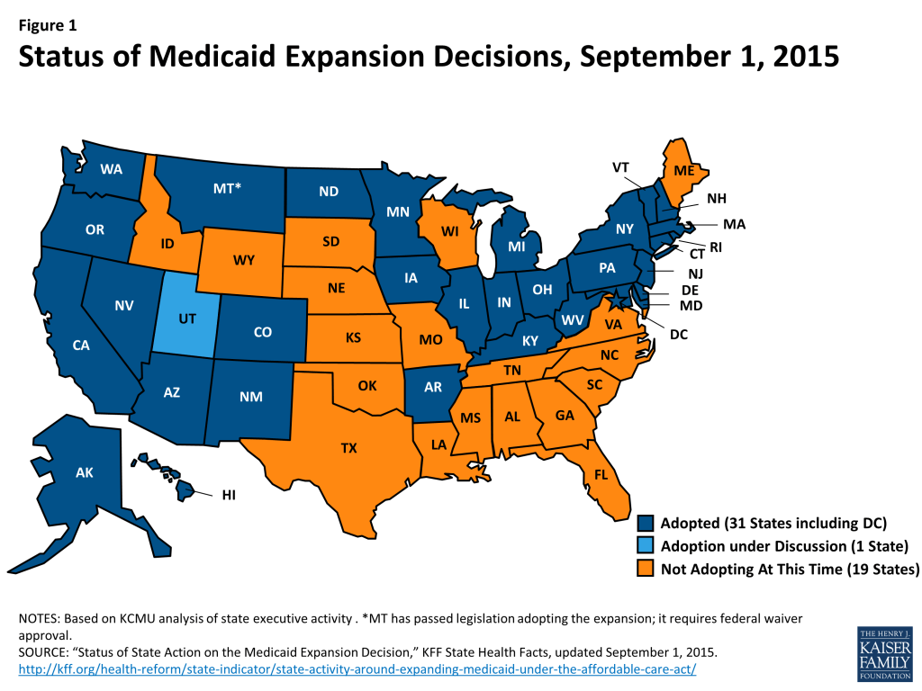
As enacted, the Medicaid expansion to low-income adults would occur nationwide, but it was effectively made a state option by the June 2012 Supreme Court ruling on the constitutionality of the ACA. As of September 2015, 30 states and DC, have adopted the expansion, while 20 states have not adopted the expansion (Figure 1).
Figure 1: Status of Medicaid Expansion Decisions, September 1, 2015
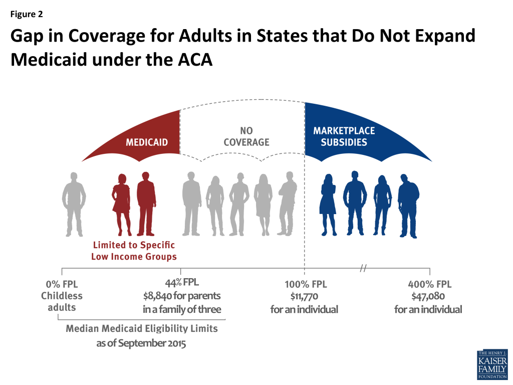
In states that have not expanded Medicaid, 3.1 million poor uninsured adults fall into a “coverage gap” and will likely remain uninsured. These individuals would have been eligible under the Medicaid expansion. However, in the absence of the expansion, they remain ineligible for Medicaid and do not earn enough to qualify for premium tax credits to purchase Marketplace coverage, which begin at 100% FPL (Figure 2). Most of these individuals are likely to remain uninsured as they have limited access to employer coverage and are likely to find the cost of unsubsidized Marketplace coverage prohibitively expensive.
Figure 2: Gap in Coverage for Adults in States that Do Not Expand Medicaid under the ACA
Findings
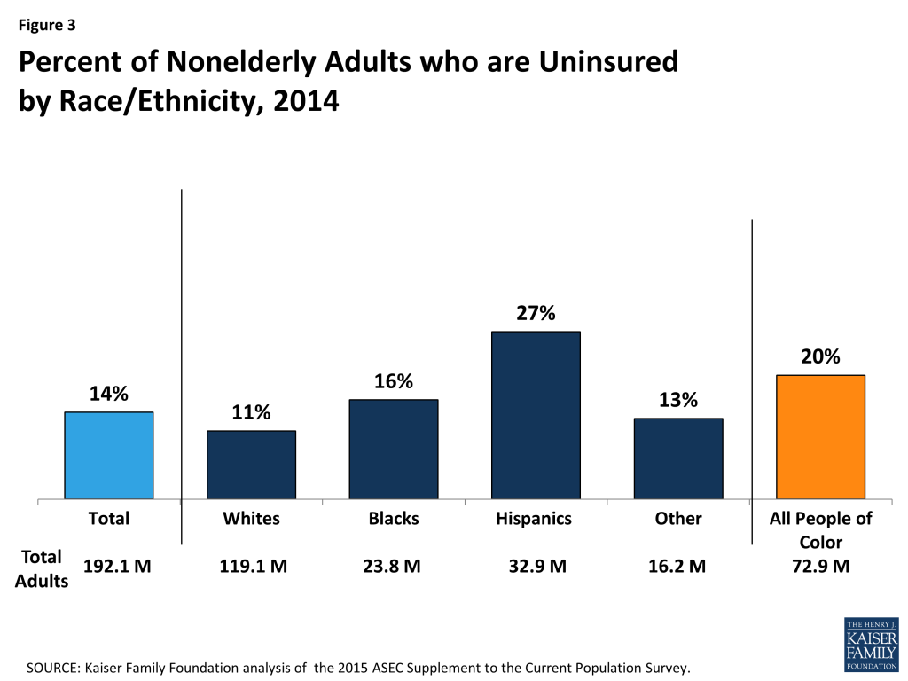
Though millions of people have gained coverage under the ACA, disparities in coverage by race and ethnicity remain. Among adults, people of color are nearly twice as likely to be uninsured than Whites (20% vs. 11%). Hispanic adults are at the highest risk of lacking coverage with more than one in four uninsured (27%), while 16% of Black adults are uninsured (Figure 3).
Figure 3: Percent of Nonelderly Adults who are Uninsured by Race/Ethnicity, 2014
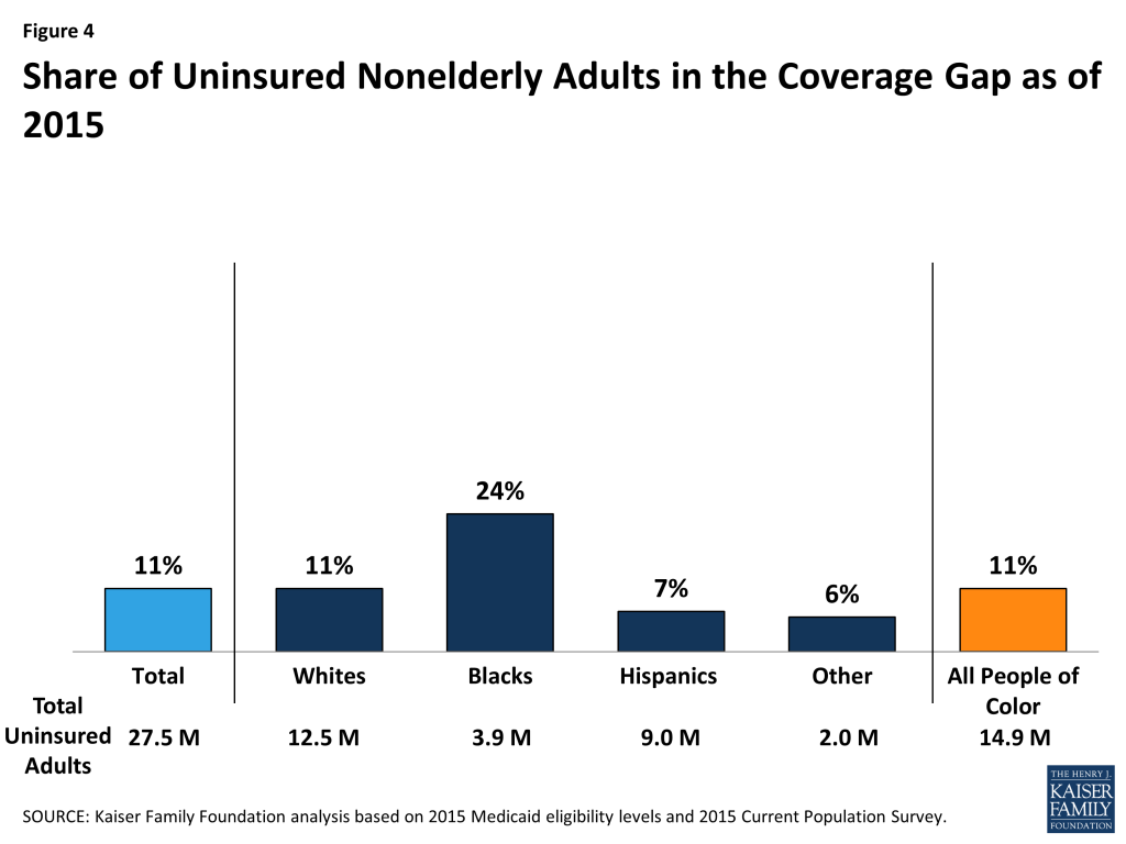
Over 1.7 million adults of color fall into the coverage gap, and uninsured Black adults are disproportionately likely to fall into the gap. Overall, about one in ten (11%) or 3.1 million of the total 27.5 million uninsured adults fall into the coverage gap in the 20 states that have not adopted the ACA Medicaid expansion. This group includes over 1.7 million adults of color. Uninsured Black adults are more than twice as likely as White and Hispanic uninsured adults to fall into the coverage gap. Nearly one-quarter (24%) of uninsured Black adults fall into the coverage gap, compared to 11% of White uninsured adults and 7% of Hispanic uninsured adults (Figure 4). This reflects the fact that a large share of uninsured Black adults resides in the southern region of the country where most states have not adopted the expansion. In contrast, Hispanics are less likely to fall into the gap since several key states that have large numbers of uninsured Hispanics have adopted the expansion, including California, New York, and Arizona.
Figure 4: Share of Uninsured Nonelderly Adults in the Coverage Gap as of 2015
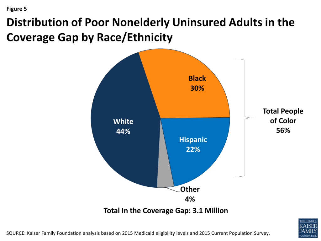
Adults of color make up over half (56%) of the total 3.1 million uninsured adults in the coverage gap. Hispanics (22%) and Blacks (30%) together account for more than half of uninsured adults in the coverage gap; other people of color make up another 4%, while the remaining 44% are White (Figure 5).
Figure 5: Distribution of Poor Nonelderly Uninsured Adults in the Coverage Gap by Race/Ethnicity
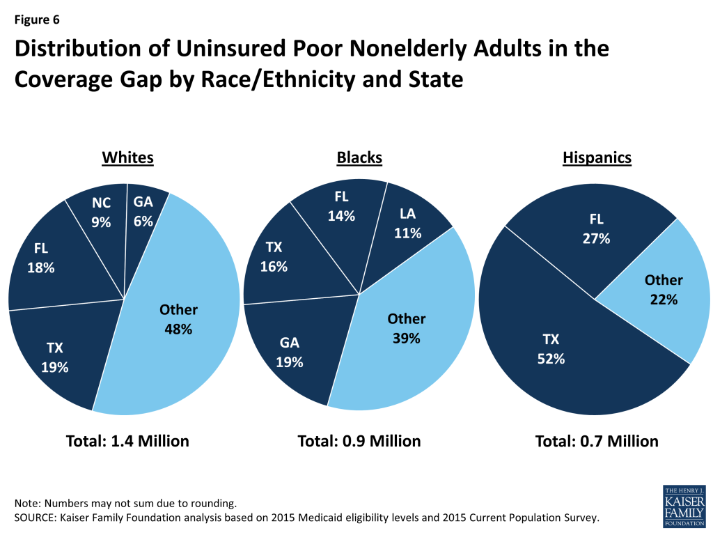
Large shares of adults who fall into the coverage gap reside in a small number of states, although the geographic distribution of people in the gap across states varies by racial and ethnic group. Overall, more than half (53%) of poor adults in the coverage gap reside in just three states, including Texas (25%), Florida (18%), and Georgia (10%). However, the distribution of people in the gap across states varies by racial and ethnic group. For example, over half of (52%) of the 1.4 million uninsured poor White adults in the coverage gap reside in Texas (19%), Florida (18%), North Carolina (9%) and Georgia (6%). Six in ten (61%) of the 0.9 million uninsured poor Black adults in the coverage gap reside in Georgia (19%), Texas (16%), Florida (14%) and Louisiana (11%). Among Hispanics, nearly eight in ten (78%) of the 0.7 million uninsured poor adults in the coverage gap reside in just two states, with over half (52%) in Texas and over one in four (27%) in Florida (Figure 6).
Figure 6: Distribution of Uninsured Poor Nonelderly Adults in the Coverage Gap by Race/Ethnicity and State
Conclusion
As enacted, the ACA was designed to create a new continuum of coverage options to significantly reduce the number of uninsured, including a Medicaid expansion to adults with incomes at or below 138% FPL. This expansion was intended to fill longstanding gaps in the program for adults and create a nationwide base of coverage for adults comparable to the national minimum Medicaid income eligibility levels for children. The Medicaid expansion particularly affects people of color given that they are disproportionately likely to both lack health insurance and have low incomes. Increasing health coverage rates can help promote increased access to care and address the persistent disparities many people of color face in securing health coverage.
In states that have not adopted the Medicaid expansion, many poor adults with incomes below the federal poverty level fall into a coverage gap because they remain ineligible for Medicaid but earn too little to qualify for premium tax credits for Marketplace coverage. As a result, they are likely to remain uninsured. The impact of the coverage gap varies by race and ethnicity, with poor uninsured Blacks most likely to fall into the gap, since they disproportionately reside in the southern region of the country where most states are not implementing the expansion. These continued gaps in access to health coverage will likely continue to contribute to racial and ethnic as well as geographic disparities in coverage and access to care.
Samantha Artiga and Rachel Garfield are with the Kaiser Family Foundation. Anthony Damico is an independent consultant to the Kaiser Family Foundation.
Methods
This analysis uses data from the 2015 Current Population Survey (CPS) Annual Social and Economic Supplement (ASEC). The CPS ASEC provides socioeconomic and demographic information for the United Sates population and specific subpopulations. Importantly, the CPS ASEC provides detailed data on families and households, which we use to determine income for ACA eligibility purposes.
The CPS asks respondents about coverage at the time of the interview (for the 2015 CPS, February, March, or April 2015) as well as throughout the preceding calendar year. People who report any type of coverage throughout the preceding calendar year are counted as “insured.” Thus, the calendar year measure of the uninsured population captures people who lacked coverage for the entirety of 2014 (and thus were uninsured at the start of 2015). We use this measure of insurance coverage, rather than the measure of coverage at the time of interview, because the latter lacks detail about coverage type that is used in our model. Based on other survey data, as well as administrative data on ACA enrollment, it is likely that a small number of people included in this analysis gained coverage in 2015.
Medicaid and Marketplaces have different rules about household composition and income for eligibility. For this analysis, we calculate household membership and income for both Medicaid and Marketplace premium tax credits for each person individually, using the rules for each program. For more detail on how we construct Medicaid and Marketplace households and count income, see the detailed technical Appendix A available here.
Undocumented immigrants are ineligible for Medicaid and Marketplace coverage. Since CPS data do not directly indicate whether an immigrant is lawfully present, we draw on the methods underlying the 2013 analysis by the State Health Access Data Assistance Center (SHADAC) and the recommendations made by Van Hook et. al.1 ,2 This approach uses the Survey of Income and Program Participation (SIPP) to develop a model that predicts immigration status; it then applies the model to CPS, controlling to state-level estimates of total undocumented population from Department of Homeland Security. For more detail on the immigration imputation used in this analysis, see the technical Appendix B available here.
Individuals in tax-filing units with access to an affordable offer of Employer-Sponsored Insurance are still potentially MAGI-eligible for Medicaid coverage, but they are ineligible for advance premium tax credits in the Health Insurance Exchanges. Since CPS data do not directly indicate whether workers have access to ESI, we draw on the methods comparable to our imputation of authorization status and use SIPP to develop a model that predicts offer of ESI, then apply the model to CPS. For more detail on the offer imputation used in this analysis, see the technical Appendix C available here.
As of January 2014, Medicaid financial eligibility for most nonelderly adults is based on modified adjusted gross income (MAGI). To determine whether each individual is eligible for Medicaid, we use each state’s reported eligibility levels as of January 1, 2015, updated to reflect state implementation of the Medicaid expansion as of September 2015 and 2015 Federal Poverty Levels.3 Some nonelderly adults with incomes above MAGI levels may be eligible for Medicaid through other pathways; however, we only assess eligibility through the MAGI pathway.4
An individual’s income is likely to fluctuate throughout the year, impacting his or her eligibility for Medicaid. Our estimates are based on annual income and thus represent a snapshot of the number of people in the coverage gap at a given point in time. Over the course of the year, a larger number of people are likely to move and out of the coverage gap as their income fluctuates.
Van Hook, J., Bachmeier, J., Coffman, D., and Harel, O. 2015. “Can We Spin Straw into Gold? An Evaluation of Immigrant Legal Status Imputation Approaches” Demography. 52(1):329-54. ↩︎
Based on state-reported eligibility levels as of January 1, 2015. Eligibility levels are updated to reflect state implementation of the Medicaid expansion as of September 2015 and 2015 Federal Poverty Levels, but may not reflect other eligibility policy changes since January 2015. The Kaiser Family Foundation State Health Facts. Data Source: Kaiser Commission on Medicaid and the Uninsured with the Georgetown University Center for Children and Families: Modern Era Medicaid: Findings from a 50-State Survey of Eligibility, Enrollment, Renewal, and Cost-Sharing Policies in Medicaid and CHIP as of January 2015, Kaiser Family Foundation, January 20, 2015. ↩︎
Non-MAGI pathways for nonelderly adults include disability-related pathways, such as SSI beneficiary; Qualified Severely Impaired Individuals; Working Disabled; and Medically Needy. We are unable to assess disability status in the CPS sufficiently to model eligibility under these pathways. However, previous research indicates high current participation rates among individuals with disabilities (largely due to the automatic link between SSI and Medicaid in most states, see Kenney GM, V Lynch, J Haley, and M Huntress. “Variation in Medicaid Eligibility and Participation among Adults: Implications for the Affordable Care Act.” Inquiry. 49:231-53 (Fall 2012)), indicating that there may be a small number of eligible uninsured individuals in this group. Further, many of these pathways (with the exception of SSI, which automatically links an individual to Medicaid in most states) are optional for states, and eligibility in states not implementing the ACA expansion is limited. For example, the median income eligibility level for coverage through the Medically Needy pathway is 15% of poverty in states that are not expanding Medicaid, and most states not expanding Medicaid do not provide coverage above SSI levels for individuals with disabilities. (See: O’Mally-Watts, M and K Young. The Medicaid Medically Needy Program: Spending and Enrollment Update. (Washington, DC: Kaiser Family Foundation), December 2012. Available at: http://modern.kff.org/medicaid/issue-brief/the-medicaid-medically-needy-program-spending-and/. And Kaiser Commission on Medicaid and the Uninsured, “Medicaid Financial Eligibility: Primary Pathways for the Elderly and People with Disabilities,” February 2010. Available at: http://modern.kff.org/medicaid/issue-brief/medicaid-financial-eligibility-primary-pathways-for-the-elderly-and-people-with-disabilities/. ↩︎
Ahead of the third annual Affordable Care Act open enrollment period, the Kaiser Family Foundation has updated and expanded its searchable collection of nearly 300 Health Reform Frequently Asked Questions.
Designed to help consumers and the navigators, brokers and others who assist them, the FAQs cover a wide range of topics including eligibility for subsidies, the individual mandate to maintain health coverage and information about health plans offered through state ACA marketplaces. The FAQs also address situations affecting young adults, women, early retirees, immigrants, and people with job-based health plans. The updated collection now reflects 2016 changes in the individual mandate tax penalty, standards for affordable health plans, and eligibility for marketplace subsidies. New FAQs also describe tax forms consumers may encounter, rules for auto-renewing marketplace coverage, and tips for the self-employed and other consumers with variable incomes, who may be asked by the marketplace to provide additional income verification.
Open enrollment for the marketplaces begins Nov. 1, 2015 and runs through Jan. 31, 2016. The Foundation encourages organizations assisting consumers to link to the FAQ web page. Each question and answer may be shared individually by direct link, via Twitter and Facebook, and the Foundation (@KaiserFamFound) will be tweeting and posting to Facebook a “FAQ of the Day.”
Other resources, including the Foundation’s Health Insurance Quiz and animated video, Health Insurance Explained – The YouToons Have It Covered (also available in Spanish), help consumers understand insurance concepts, such as premiums, deductibles and provider networks. The Foundation’s Health Insurance Marketplace Calculator will be updated with 2016 premium data when they are available in the coming weeks.
A growing share of Medicare beneficiaries have been enrolling in Medicare Advantage plans over the past decade, prompting some to question whether the balance between traditional Medicare and Medicare Advantage could be on the verge of tipping. Since 2006, the share of Medicare beneficiaries enrolled in a Medicare Advantage plan has nearly doubled, from 16 to 31 percent, but in some counties, the percentage is much higher. In this brief, we look beneath national trends to examine Medicare Advantage penetration rates and growth rates in counties across the country to assess the extent to which Medicare Advantage plans are poised to cover more beneficiaries than traditional Medicare across the country.
Medicare Advantage penetration rates and patterns of growth vary widely across the country, reflecting the diversity of markets and coverage decisions of beneficiaries. More specifically, we find:
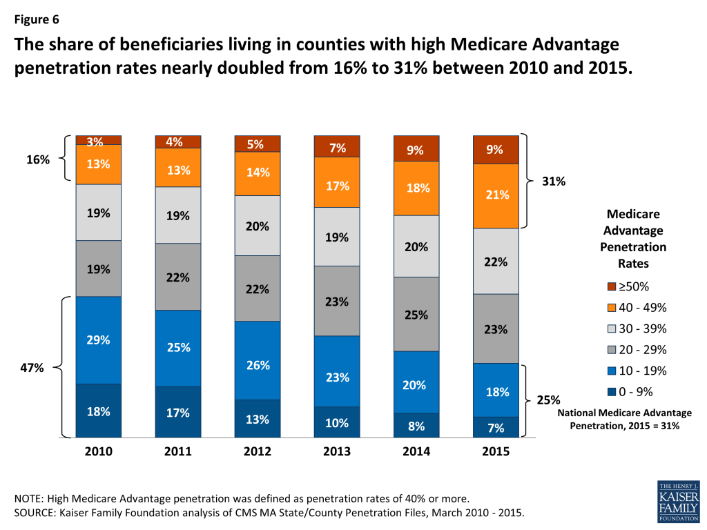
A small share (9%) of all Medicare beneficiaries lives in an area where at least 50 percent of all beneficiaries are in a Medicare Advantage plan. Another 21 percent of all Medicare beneficiaries are living in a county with 40-50 percent Medicare Advantage penetration. Beneficiaries living in areas with high Medicare Advantage penetration (≥40%) tend to be clustered in more populated urban areas, in a small number of states, and a small share of counties. For example, Medicare Advantage penetration is at or above 50 percent in 2015 in just 4 percent of all counties.
One-quarter of all Medicare beneficiaries (25%) lives in an area with relatively low Medicare Advantage enrollment (<20%). Another 23 percent of Medicare beneficiaries live in a county where Medicare Advantage penetration is below the national average (between 20 and 30%). Together, about half of all Medicare beneficiaries nationwide live in a county where Medicare Advantage penetration is at or below the national average, and where traditional Medicare covers the majority of beneficiaries.
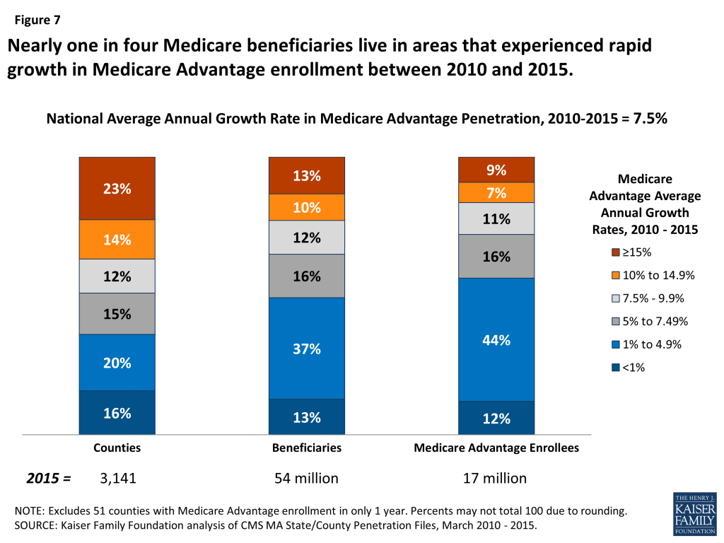
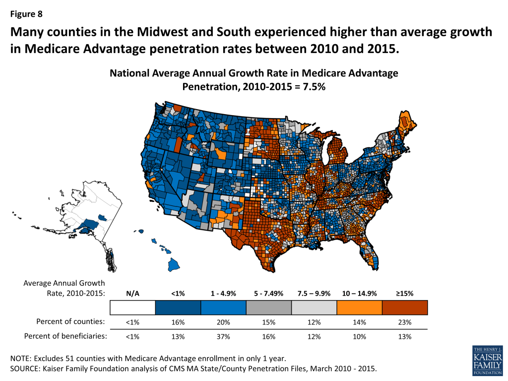
A small share of Medicare beneficiaries (13%) lives in an area where Medicare Advantage penetration rates have grown relatively rapidly in recent years (≥ 15% average annual growth rate since 2010, double the 7.5% national average). In contrast, half of all beneficiaries live in an area where Medicare Advantage penetration rates have increased by less than 5 percent annually since 2010, below the national average.
This analysis finds a small but growing share of the Medicare population living in a county with more beneficiaries in Medicare Advantage plans than traditional Medicare. Even as Medicare Advantage enrollment continues to rise, traditional Medicare is the primary source of coverage for the majority of beneficiaries in the majority of counties across the country. While the balance between traditional Medicare and Medicare Advantage may tip at some point in the future, it hasn’t happened yet.
Issue Brief
INTRODUCTION
Enrollment in Medicare Advantage plans nationwide is at an all-time high and continues to climb. Despite concerns that payment reductions enacted by the Affordable Care Act would cause enrollment to decline, Medicare Advantage enrollment has instead increased by 5.6 million, or 50 percent, since the law’s enactment.1 This steady rise in Medicare Advantage enrollment has led some to question whether the balance between traditional Medicare and private plans will soon tip, with more and more people enrolling in Medicare Advantage plans.2
With ongoing interest in the role and future of Medicare Advantage plans, this brief takes an in-depth look at Medicare Advantage enrollment and growth rates, by county, metropolitan areas, and state. We used publicly available Medicare Advantage State/County Penetration data from the Centers for Medicare and Medicaid Services (CMS) to determine Medicare Advantage penetration rates in 2015, and growth rates between 2010 and 2015. More information about the data and methods used is included in the Methodology box at the end of the brief. For the purpose of this analysis, we examined counties that had reached or exceeded 50 percent Medicare Advantage penetration, but use the term “relatively high” Medicare Advantage enrollment to incorporate counties in which at least 40 percent of beneficiaries are enrolled in a Medicare Advantage plan. We define relatively low penetration counties as counties with less than 20 percent of beneficiaries in a Medicare Advantage plan.
Variation in Medicare Advantage Penetration Rates
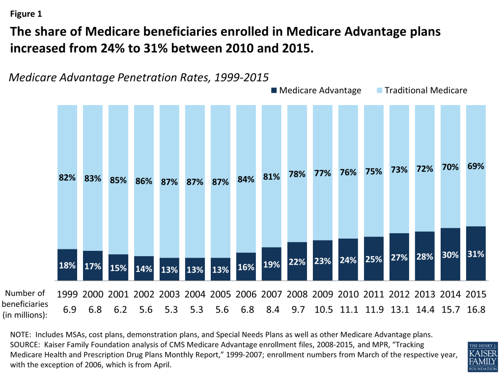
In 2015, nearly one-third (31%) of Medicare beneficiaries is enrolled in a Medicare Advantage plan, an increase from nearly one-quarter (24%) in 2010 (Figure 1). Nationally, traditional Medicare continues to be the primary source of coverage for the Medicare population, but Medicare Advantage enrollment and penetration has been on the rise.
Figure 1: The share of Medicare beneficiaries enrolled in Medicare Advantage plans increased from 24% to 31% between 2010 and 2015.
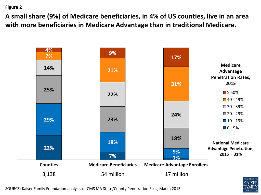
A small share (9%) of Medicare beneficiaries lives in an area where at least half of all beneficiaries are enrolled in a Medicare Advantage plan (Figure 2). Medicare Advantage penetration is at or above 50 percent in just 4 percent of counties. Another 21 percent of all Medicare beneficiaries, in 7 percent of counties, are living in a county with 40-50 percent Medicare Advantage penetration.
Figure 2: A small share (9%) of Medicare beneficiaries, in 4% of US counties, live in an area with more beneficiaries in Medicare Advantage than in traditional Medicare.
Beneficiaries living in areas with high Medicare Advantage penetration (≥40%) tend to be clustered in more populated urban areas because Medicare Advantage has historically had a stronger presence in more populated, urban areas, and in a small number of states (discussed below).
Conversely, a quarter of all Medicare beneficiaries (25%) live in an area with relatively low Medicare Advantage penetration (≤20%). In these counties, Medicare Advantage plans play a more minor role as the vast majority of beneficiaries in the county are in traditional Medicare. Penetration rates are at or below 20 percent in half (51 percent) of all counties.
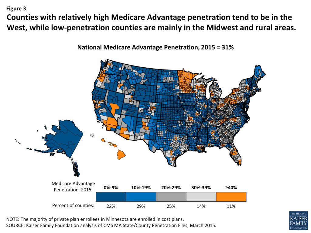
Counties with relatively high Medicare Advantage penetration rates tend to be in the West, but are also scattered across the Midwest, Pennsylvania, New York, and Florida(Figure 3). Low penetration areas are mainly in the Midwest and in rural states, but also in the Northeast and Mid-Atlantic regions. Even in regions with a strong Medicare Advantage presence, such as Southern California, there is often a range in Medicare Advantage penetration across counties, reflecting local market conditions. For example, Medicare Advantage penetration is 58 percent in San Bernardino County but 15 percent in Santa Barbara.
Figure 3: Counties with relatively high Medicare Advantage penetration tend to be in the West, while low-penetration counties are mainly in the Midwest and rural areas.
Some of the variation in Medicare Advantage penetration across the country reflects the concentration of Medicare beneficiaries in urban areas, where Medicare Advantage plans have a stronger presence (Figure 4). While just over one-third (35%) of counties are classified as “metropolitan” (with a population of 50,000 or more), 80 percent of Medicare beneficiaries live in these counties. A much larger share of metropolitan than micropolitan or rural counties have relatively high Medicare Advantage penetration (19%, 9% and 5%, respectively).
Figure 4: Relatively high Medicare Advantage enrollment rates are more common in more metropolitan areas than in other areas.
However, not all metropolitan areas have higher than average Medicare Advantage penetration rates (See Table 1). While Medicare Advantage penetration tends to be well above average in counties such as Los Angeles County (48%) and Miami-Dade (62%) in 2015, counties that include the Baltimore, Annapolis, and Wilmington metropolitan areas have penetration rates of 10 percent or less in 2015. Penetration is near average in the counties that include Detroit, Atlanta, Seattle, Milwaukee, and Chicago.
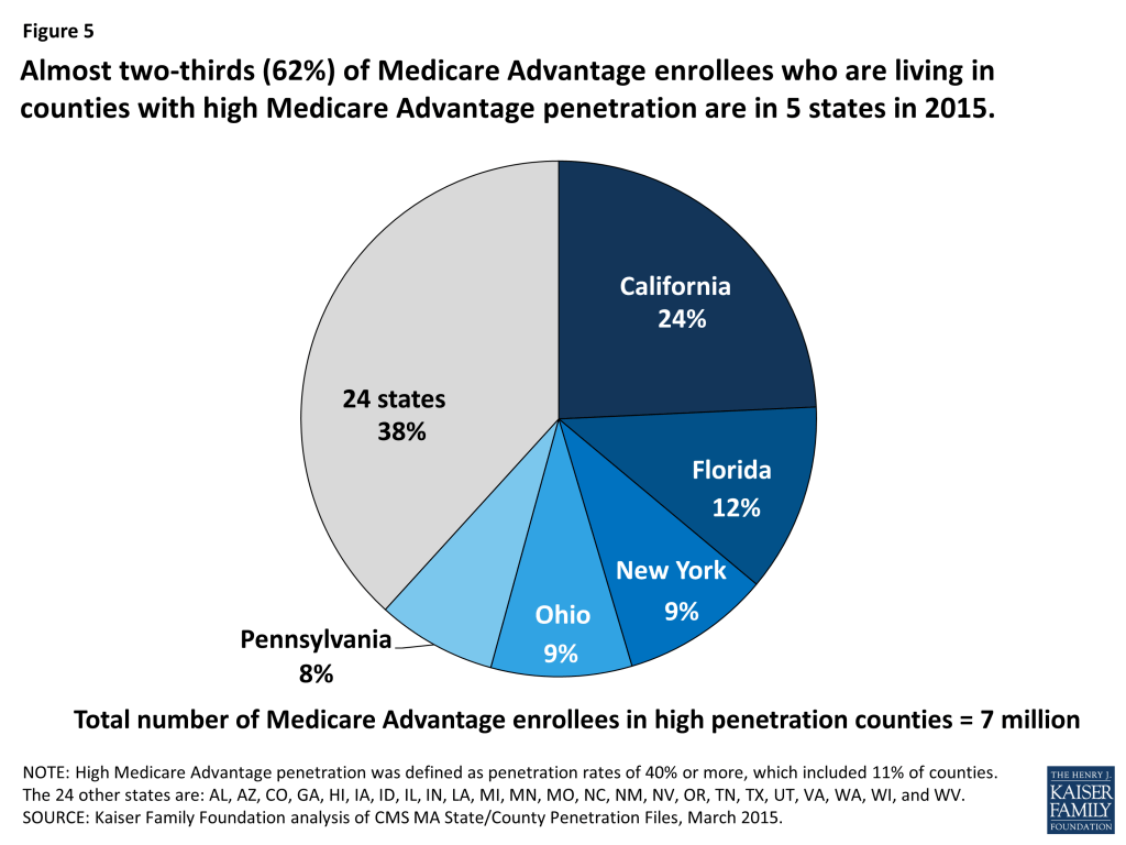
Almost two-thirds of Medicare Advantage enrollees who live in counties with relatively high Medicare Advantage penetration are clustered in five states (Figure 5). California alone accounts for about one-quarter (24%) of all Medicare Advantage enrollees living in high-penetration areas, in large part due to high enrollment rates in southern California, including Los Angeles, Orange, Riverside, San Bernardino, and San Diego counties (Table 2). Other states in which high-penetration counties are clustered include Florida, New York, Ohio and Pennsylvania.
Figure 5: Almost two-thirds (62%) of Medicare Advantage enrollees who are living in counties with high Medicare Advantage penetration are in 5 states in 2015.
Change in Medicare Advantage Penetration Over Time
Between 2010 and 2015, the share of beneficiaries living in counties with more than 50 percent Medicare Advantage penetration has tripled from 3 percent to 9 percent (Figure 6). Overall, the share of beneficiaries living in relatively high Medicare Advantage penetration areas (≥ 40%) has nearly doubled, from 16 percent to 31 percent during this period. Conversely, the share of beneficiaries living in areas with relatively low Medicare Advantage penetration has declined.
Figure 6: The share of beneficiaries living in counties with high Medicare Advantage penetration rates nearly doubled from 16% to 31% between 2010 and 2015.
About 13 percent of Medicare beneficiaries live in an area where Medicare Advantage penetration rates have grown very rapidly in recent years (defined as ≥ 15% average annual growth rate since 2010) – double the 7.5 percent national average (Figure 7). Another 5.1 million beneficiaries (10 percent) of all Medicare beneficiaries live in an area that experienced average annual growth in Medicare Advantage enrollment of 10 to 15 percent between 2010 and 2015.
More than three-quarters (77%) of the 1.5 million Medicare Advantage enrollees who live in counties that experienced high growth (≥ 15%) in Medicare Advantage penetration between 2010 and 2015 reside in four states: Michigan, Illinois, North Carolina and Texas. These high-growth counties tend to have below average Medicare Advantage penetration in 2015 (averaging 24%).
Figure 7: Nearly one in four Medicare beneficiaries live in areas that experienced rapid growth in Medicare Advantage enrollment between 2010 and 2015.
About half of all beneficiaries live in counties where Medicare Advantage penetration increased by less than 5 percent annually between 2010 and 2015. These slower-growth counties tend to have above average Medicare Advantage penetration rates in 2015 (averaging 43% in 2015).
The average annual growth in Medicare Advantage penetration between 2010 and 2015 varied widely across the country(Figure 8). The average annual growth in Medicare Advantage penetration between 2010 to 2015 ranges from a high of 34 percent (Lake County, IN and Lake County, IL) to a low of negative 5 percent in Santa Barbara County, California (Tables 4 and 5).
Figure 8: Many counties in the Midwest and South experienced higher than average growth in Medicare Advantage penetration rates between 2010 and 2015.
DISCUSSION
Medicare Advantage has become a larger part of the Medicare program over the past several years. Despite concerns that enrollment would drop in response to payment reductions included in the Affordable Care Act of 2010, enrollment has climbed steadily over the past five years, and is projected to continue to rise over the next decade.3 Medicare Advantage enrollment has increased across the country, although penetration and growth rates have been much higher in some parts of the country than others. Some areas have experienced more rapid growth than others in the past few years which may be due to a number of factors, such as market conditions, consumer preferences, and payment rates.
All signs suggest Medicare Advantage penetration will continue to rise but unevenly across the country. As of now, just nine percent of beneficiaries live in an area where more beneficiaries are enrolled in Medicare Advantage plans than traditional Medicare, and it seems likely this share will increase. Nonetheless, for the vast majority of beneficiaries, traditional Medicare is likely to remain the primary source of coverage for the foreseeable future. While the balance between traditional Medicare and Medicare Advantage may tip in the future, it hasn’t happened yet.
The authors appreciate the informative and helpful comments that Marsha Gold, Sc.D., Senior Fellow Emeritus at Mathematica Policy Research, Inc. provided on an earlier draft of this brief.
Methodology
Most of the data used in this analysis come from the Centers for Medicare and Medicaid Services (CMS) MA State/County Penetration file for March of 2015. These files contain the number of Medicare beneficiaries and Medicare Advantage enrollees at the county level. Medicare Advantage enrollment includes data for all plan types, including Local and Regional CCP, MSA, PFFS, demonstrations, national PACE, cost, and employer-sponsored plans. Data for counties with 10 or fewer enrollees are not included due to privacy laws and are thus not included in this analysis. The analysis also uses the Census Core based statistical areas (CBSAs) and combined statistical areas (CSAs) file, February 2013 to examine differences in penetration and growth rates in metropolitan, micropolitan, and rural areas.
To examine the extent to which Medicare Advantage penetration and growth rates are associated with county-level market and demographic characteristics, correlations were calculated separately between Medicare Advantage penetration in 2015 and average annual growth rates and the following variables: average traditional Medicare spending in a county; Medicare Advantage risk-adjusted rebate amounts; percent of Medicare Advantage enrollees in employer-sponsored (group) plans; percent of Medicare Advantage enrollees in Preferred Provider Organizations (PPOs); percent of Medicare Advantage enrollees in Health Maintenance Organizations (HMOs); percent of seniors with incomes below the poverty threshold; percent of county residents with incomes below the poverty threshold; median household income; share and number of Medicare beneficiaries that were new to Medicare; average age of Medicare beneficiaries 65 or older; average age of all Medicare beneficiaries; share of Medicare beneficiaries who were disabled; year of the oldest active Medicare Advantage plan; rural county designation; and Medicare Advantage payment quartiles.
All correlation coefficients indicated relatively weak relationships.
Correlation coefficients were less than 10 percent (positive or negative) when testing the relationship between Medicare Advantage penetration in 2015 and the following variables: Medicare Advantage payment quartiles; average beneficiary age; share of beneficiaries that were new to Medicare in 2015; local poverty rates; the share of beneficiaries who were disabled; and the percent of Medicare Advantage enrollees in employer-sponsored (group) plans. The correlations between Medicare Advantage penetration in 2015 and the percent of Medicare Advantage enrollees in PPOs and between Medicare Advantage penetration in 2015 and the average traditional Medicare spending in a county were each negative 18 percent. More moderate correlation coefficients were observed between 2015 penetration rates and the following variables: number of new Medicare beneficiaries (23%); rural county designation (-27%); risk-adjusted Medicare Advantage rebate amounts (30%); the percent of Medicare Advantage enrollees in HMOs (38%); and year of the oldest active Medicare Advantage plan (-40%).
Correlations were similarly weak (less than positive or negative 10%) between the Medicare Advantage annual penetration growth rate in a given county between 2010 and 2015 and the following county-based variables: share of beneficiaries new to Medicare; average beneficiary age; Medicare Advantage payment quartiles; percent of Medicare Advantage enrollees in Special Needs Plans; percent of Medicare Advantage enrollees in employer-sponsored (group) plans; share of beneficiaries who were disabled; rural county designation; year of the oldest active Medicare Advantage plan; and average traditional Medicare spending in a county. The relationship between growth rates and the remaining variables – percent of Medicare Advantage enrollees in HMOs, percent of Medicare Advantage enrollees in PPOs, risk-adjusted Medicare Advantage rebate amounts, and local poverty rates – did not exceed 18 percent.
Appendix
Table 1: The 5 Largest Counties by Penetration Group, 2015
State
County
Medicare Beneficiaries, 2015
Medicare Advantage Penetration Rate, 2015
Average Annual Medicare Advantage Penetration Growth Rate, 2010 -2015
All Counties MA Penetration >50
Florida
Miami-Dade
420,702
62%
4%
California
Riverside
321,249
57%
4%
Florida
Broward
283,971
54%
3%
California
San Bernardino
257,419
58%
4%
Pennsylvania
Allegheny
247,434
62%
1%
All Counties MA Penetration 40-50%
California
Los Angeles
1,344,850
48%
5%
Arizona
Maricopa
587,995
43%
0%
California
San Diego
463,635
47%
3%
California
Orange
443,197
47%
3%
New York
Kings
340,846
41%
4%
All Counties MA Penetration 30-40%
Texas
Harris
465,027
39%
7%
Michigan
Wayne
312,564
32%
16%
Nevada
Clark
294,530
39%
2%
Florida
Palm Beach
288,386
37%
4%
Texas
Dallas
286,947
30%
9%
All Counties MA Penetration 20-30%
Illinois
Cook
769,309
23%
20%
New York
Suffolk
266,811
21%
5%
Massachusetts
Middlesex
248,347
23%
0%
New York
Nassau
244,636
24%
4%
New York
Westchester
162,885
24%
7%
All Counties MA Penetration 10-20%
New Jersey
Bergen
158,800
14%
6%
New Jersey
Ocean
142,923
18%
5%
Maryland
Montgomery
142,262
10%
5%
Massachusetts
Essex
142,201
19%
2%
Illinois
DuPage
138,544
17%
29%
All Counties MA Penetration 0-10%
Maryland
Baltimore
146,830
9%
0%
Delaware
New Castle
89,223
10%
17%
Maryland
Anne Arundel
83,847
6%
-1%
New Hampshire
Hillsborough
69,740
8%
4%
California
Monterey
57,418
2%
10%
SOURCE: Kaiser Family Foundation analysis of CMS MA State/County Penetration Files, March 2015.
Table 2: The 50 Largest Counties with the Highest Medicare Advantage Penetration Rate, 2015– Sorted high to low by Medicare Advantage Penetration Rate, 2015
State
County
Medicare Beneficiaries, 2015
Medicare Advantage Penetration Rate, 2015
Average Annual Medicare Advantage Penetration Growth Rate, 2010 – 2015
Pennsylvania
Westmoreland
84,964
66%
1%
New York
Monroe
142,272
63%
1%
Pennsylvania
Allegheny
247,434
62%
1%
Florida
Miami-Dade
420,702
62%
4%
Oregon
Clackamas
71,193
61%
1%
California
San Bernardino
257,419
58%
4%
Oregon
Multnomah
110,238
58%
2%
Oregon
Marion
55,898
58%
1%
Oregon
Washington
74,146
57%
2%
California
Riverside
321,249
57%
4%
Louisiana
Jefferson
79,016
57%
3%
New York
Erie
185,347
56%
2%
Minnesota
Dakota
57,488
55%
5%
Minnesota
Hennepin
174,325
55%
4%
Minnesota
Ramsey
81,420
55%
4%
Colorado
Jefferson
92,064
54%
1%
Washington
Clark
73,150
54%
3%
New York
Bronx
187,059
54%
5%
Florida
Broward
283,971
54%
3%
Florida
Pasco
113,780
53%
4%
Colorado
Adams
53,543
53%
1%
North Carolina
Forsyth
63,689
53%
3%
Ohio
Stark
78,836
52%
3%
Florida
Hernando
52,948
52%
5%
Ohio
Summit
101,919
52%
5%
Ohio
Mahoning
52,328
51%
4%
Oregon
Lane
73,866
51%
2%
North Carolina
Guilford
84,408
50%
7%
Michigan
Kent
96,075
50%
9%
Colorado
Denver
83,249
50%
2%
New Mexico
Bernalillo
111,188
49%
3%
Ohio
Montgomery
104,217
49%
4%
Texas
El Paso
113,527
49%
9%
Ohio
Franklin
162,974
48%
5%
Texas
Nueces
53,651
48%
5%
Hawaii
Honolulu
165,753
48%
3%
California
Los Angeles
1,344,850
48%
5%
California
Orange
443,197
47%
3%
Pennsylvania
Dauphin
50,092
47%
3%
Florida
Polk
133,749
47%
7%
Florida
Hillsborough
202,003
47%
4%
California
San Diego
463,635
47%
3%
Idaho
Ada
62,962
47%
3%
Arizona
Pima
187,732
47%
2%
Florida
Pinellas
219,663
46%
5%
California
Contra Costa
175,189
46%
1%
Florida
Volusia
128,192
46%
4%
Louisiana
Orleans
55,895
46%
4%
Washington
Snohomish
106,900
45%
5%
California
Placer
71,991
45%
0%
NOTE: Only counties with more than 50,000 Medicare beneficiaries are included.SOURCE: Kaiser Family Foundation analysis of CMS MA State/County Penetration Files, March 2015.
Table 3: The 50 Largest Counties with the Lowest Medicare Advantage Penetration Rate, 2015– Sorted low to highby Medicare Advantage Penetration Rate, 2015
State
County
Medicare Beneficiaries, 2015
Medicare Advantage Penetration Rate, 2015
Average Annual Medicare Advantage Penetration Growth Rate, 2010 – 2015
California
Monterey
57,418
2%
10%
Delaware
Sussex
56,315
5%
20%
Maryland
Anne Arundel
83,847
6%
-1%
New Jersey
Atlantic
51,231
8%
0%
New Hampshire
Rockingham
55,764
8%
5%
New Hampshire
Hillsborough
69,740
8%
4%
Maryland
Baltimore
146,830
9%
0%
Delaware
New Castle
89,223
10%
17%
Maryland
Montgomery
142,262
10%
5%
New Jersey
Morris
82,111
10%
2%
Massachusetts
Barnstable
68,530
11%
4%
Illinois
Lake
97,077
12%
34%
California
San Luis Obispo
54,536
12%
-1%
Virginia
Fairfax
132,787
12%
5%
District of Columbia
Washington
87,367
13%
6%
Maryland
Baltimore City
96,704
13%
-1%
California
Tulare
56,553
13%
5%
New Jersey
Monmouth
111,656
13%
4%
New Jersey
Mercer
62,089
14%
3%
New Jersey
Bergen
158,800
14%
6%
Maryland
Prince George’s
113,587
14%
4%
Massachusetts
Plymouth
96,905
14%
0%
California
Santa Barbara
69,527
15%
-5%
Indiana
Lake
85,379
15%
34%
New Jersey
Middlesex
122,907
15%
6%
Massachusetts
Bristol
110,259
15%
3%
Virginia
Va. Beach City
62,735
16%
7%
Alabama
Madison
57,237
16%
8%
South Carolina
Horry
72,635
16%
11%
New Jersey
Burlington
80,871
16%
0%
New York
Orange
56,986
17%
13%
Illinois
DuPage
138,544
17%
29%
New Jersey
Camden
88,147
18%
1%
New York
Dutchess
53,869
18%
10%
New Jersey
Ocean
142,923
18%
5%
South Carolina
Charleston
63,423
18%
11%
New York
Rockland
53,270
18%
6%
Connecticut
New London
50,507
18%
12%
Arkansas
Pulaski
69,860
18%
9%
Massachusetts
Norfolk
119,955
18%
-1%
New Jersey
Passaic
76,897
18%
8%
Massachusetts
Essex
142,201
19%
2%
Iowa
Polk
65,437
19%
4%
New Jersey
Union
80,955
19%
6%
Kansas
Sedgwick
78,223
19%
7%
Illinois
Will
89,668
19%
33%
South Carolina
Richland
56,264
19%
6%
Illinois
Kane
66,644
20%
21%
Florida
Collier
84,003
21%
13%
New York
Suffolk
266,811
21%
5%
NOTE: Only counties with more than 50,000 Medicare beneficiaries are included.SOURCE: Kaiser Family Foundation analysis of CMS MA State/County Penetration Files, March 2015.
Table 4: The 50 Largest Counties with the Highest Medicare Advantage Average Annual Growth, 2010 – 2015 – Sorted high to low by Average Annual Medicare Advantage Penetration Growth Rate
State
County
Medicare Beneficiaries, 2015
Medicare Advantage Penetration Rate, 2015
Average Annual Medicare Advantage Penetration Growth Rate, 2010 – 2015
Indiana
Lake
85,379
15%
34%
Illinois
Lake
97,077
12%
34%
Illinois
Will
89,668
19%
33%
Illinois
DuPage
138,544
17%
29%
Texas
Hidalgo
90,690
35%
25%
Michigan
Washtenaw
51,064
28%
23%
Illinois
Kane
66,644
20%
21%
Illinois
Cook
769,309
23%
20%
Delaware
Sussex
56,315
5%
20%
Michigan
Macomb
160,039
31%
19%
Michigan
Oakland
217,794
31%
18%
Texas
Travis
113,201
25%
17%
Delaware
New Castle
89,223
10%
17%
Texas
Cameron
55,294
38%
16%
Michigan
Wayne
312,564
32%
16%
Florida
Lake
86,782
32%
15%
North Carolina
Mecklenburg
119,517
31%
15%
Florida
Citrus
51,772
32%
14%
North Carolina
Wake
117,475
31%
14%
Michigan
Genesee
83,653
35%
14%
Maine
Cumberland
56,599
28%
13%
Florida
Collier
84,003
21%
13%
New York
Orange
56,986
17%
13%
Florida
Sumter
59,153
32%
13%
New York
Onondaga
87,400
36%
12%
Connecticut
New London
50,507
18%
12%
South Carolina
Charleston
63,423
18%
11%
South Carolina
Horry
72,635
16%
11%
Florida
Sarasota
123,056
26%
11%
California
Monterey
57,418
2%
10%
New Jersey
Hudson
77,792
22%
10%
Texas
Denton
73,775
28%
10%
Massachusetts
Suffolk
100,001
22%
10%
Indiana
Marion
133,993
27%
10%
Florida
Escambia
62,360
28%
10%
New York
Dutchess
53,869
18%
10%
Illinois
Madison
50,492
30%
10%
North Carolina
Buncombe
53,135
25%
10%
Florida
Duval
139,652
31%
10%
Texas
El Paso
113,527
49%
9%
Wisconsin
Milwaukee
145,125
41%
9%
Texas
Fort Bend
67,623
33%
9%
Florida
Marion
101,107
39%
9%
Connecticut
Hartford
160,972
29%
9%
Arkansas
Pulaski
69,860
18%
9%
Georgia
Fulton
118,697
36%
9%
Georgia
DeKalb
89,849
39%
9%
Florida
Charlotte
58,326
31%
9%
Georgia
Gwinnett
85,751
35%
9%
Tennessee
Shelby
135,639
26%
9%
NOTE: Only counties with more than 50,000 Medicare beneficiaries are included.SOURCE: Kaiser Family Foundation analysis of CMS MA State/County Penetration Files, March 2015.
Table 5: The 50 Largest Counties with the Lowest Medicare Advantage Average Annual Growth, 2010 – 2015 – Sorted low to high by Average Annual Medicare Advantage Penetration Growth Rate
State
County
Medicare Beneficiaries, 2015
Medicare Advantage Penetration Rate, 2015
Average Annual Medicare Advantage Penetration Growth Rate, 2010 – 2015
California
Santa Barbara
69,527
15%
-5%
Pennsylvania
Montgomery
146,236
27%
-3%
California
Solano
67,849
39%
-2%
Pennsylvania
Chester
82,420
24%
-2%
Maryland
Anne Arundel
83,847
6%
-1%
Maryland
Baltimore City
96,704
13%
-1%
Pennsylvania
Bucks
121,609
32%
-1%
Pennsylvania
Delaware
98,396
28%
-1%
California
San Luis Obispo
54,536
12%
-1%
Massachusetts
Norfolk
119,955
18%
-1%
Massachusetts
Worcester
140,243
35%
0%
Arizona
Pinal
66,374
37%
0%
New Jersey
Burlington
80,871
16%
0%
New Jersey
Atlantic
51,231
8%
0%
California
Placer
71,991
45%
0%
Maryland
Baltimore
146,830
9%
0%
Massachusetts
Middlesex
248,347
23%
0%
Oklahoma
Tulsa
100,323
30%
0%
Arizona
Maricopa
587,995
43%
0%
Rhode Island
Providence
111,469
37%
0%
Pennsylvania
Philadelphia
245,320
43%
0%
Massachusetts
Plymouth
96,905
14%
0%
California
Contra Costa
175,189
46%
1%
Oregon
Marion
55,898
58%
1%
California
Marin
53,125
36%
1%
California
San Mateo
116,237
44%
1%
Pennsylvania
Westmoreland
84,964
66%
1%
California
Kern
104,434
36%
1%
California
Alameda
218,647
42%
1%
New York
Richmond
80,747
40%
1%
New York
Monroe
142,272
63%
1%
Pennsylvania
Allegheny
247,434
62%
1%
New Jersey
Camden
88,147
18%
1%
Colorado
Adams
53,543
53%
1%
Oregon
Clackamas
71,193
61%
1%
California
Sacramento
226,661
45%
1%
Colorado
Jefferson
92,064
54%
1%
Alabama
Jefferson
123,132
43%
1%
Pennsylvania
Erie
54,310
45%
1%
Colorado
Denver
83,249
50%
2%
Nevada
Clark
294,530
39%
2%
Arizona
Pima
187,732
47%
2%
Colorado
Arapahoe
80,342
44%
2%
Pennsylvania
Berks
77,402
34%
2%
Oregon
Multnomah
110,238
58%
2%
Oregon
Washington
74,146
57%
2%
New York
Erie
185,347
56%
2%
Massachusetts
Essex
142,201
19%
2%
California
Fresno
124,905
30%
2%
California
Ventura
129,251
29%
2%
NOTE: Only counties with more than 50,000 Medicare beneficiaries are included.SOURCE: Kaiser Family Foundation analysis of CMS MA State/County Penetration Files, March 2015.
Major Players in Domestic Violence, HIV and Women’s Health Confront Silence and Barriers to Care
MENLO PARK, Calif., Oct. 20, 2015 – One in three women in the United States experiences intimate partner violence. For women living with HIV, it is one in two. Having an abusive partner is associated with a higher risk for HIV and, for those living with HIV, worse health outcomes.
Coinciding with National Domestic Violence Awareness Month, Greater Than AIDS today launched Empowered: Women, HIV and Intimate Partner Violence to bring more attention to the issues and provide resources for women who may be at risk of, or dealing with, abuse and HIV.
The campaign is produced in partnership with the National Domestic Violence Hotline, loveisrespect, Planned Parenthood Federation of America, Positive Women’s Network-USA and The Well Project, with additional support from The Elizabeth Taylor AIDS Foundation.
Anchored by a 20-minute video featuring Tonya Lewis Lee – lawyer, author, producer and longtime advocate for women’s health issues – the campaign takes an up-close look at the issue from the perspective of five women living with HIV who have had experience with, and received services related to, intimate partner violence.
During the intimate conversation, Ms. Lee and the women discuss topics such as recognizing the signs of abuse, getting out and getting help, finding love again and moving forward. “What I took from my conversation with these five women is that this is an issue that can and does affect many women, and with care and support it is possible to move forward,” added Ms. Lee. “I was deeply inspired by them and I know others will be too.”
“While the women featured in the campaign have been public advocates in the HIV community, this is the first time many of them are talking so openly and publicly about the abuse they’ve experienced,” noted Tina Hoff, Senior Vice President and Director, Health Communication and Media Partnerships at the Kaiser Family Foundation, which directs Greater Than AIDS. “In speaking out, they are helping to confront the silent shame that keeps many women from getting help.”
“Our goal is for women to know that they are not alone and that there is help available,” said Cameka Crawford, Chief Communications Officer at the National Domestic Violence Hotline and loveisrespect. “Everyone deserves to be treated with dignity and respect.”
According to U.S. Centers for Disease Control and Prevention (CDC), women experiencing intimate partner violence – including physical violence, emotional abuse and/or controlling behavior – have an increased risk of HIV infection through forced sex with an infected partner, limited or compromised power to negotiate safer sex practices, and increased sexual risk-taking behavior.
For women living with HIV, lifetime abuse and the depression and trauma that often accompanies it can make it difficult to keep up with HIV medications and stay connected to care, which can significantly compromise their health. For some, sharing their HIV status can increase abuse or bring on violence.
More than 375 community-based organizations across the nation – including Minority Health Consortium in Richmond, Virginia; Allen Temple Baptist Church in Oakland, California; My Brother’s Keeper, Inc. in Jackson, Mississippi; and SisterLove, Inc. in Atlanta, Georgia, as well as Planned Parenthood health centers – are supporting the effort by organizing events to watch and discuss the video. The Positive Women’s Network-USA is utilizing the campaign to mobilize around its annual Day of Action to End Violence Against Women Living with HIV (October 23). A digital media campaign will extend the reach of the women’s stories.
“Trauma-informed care is a critical aspect of healing for women living with HIV,” said Naina Khanna, Executive Director, Positive Women’s Network-USA. “This campaign also helps to educate the organizations and clinicians that serve women living with and at risk for HIV to better understand that connection.”
“As the nation’s leading women’s health care provider, educator, and advocate, Planned Parenthood is delighted to be a partner in this joint effort to address the connection between HIV and relationship violence,” said Leslie Kantor, PhD, MPH, Vice President of Education for Planned Parenthood Federation of America. “We’re committed to helping remove the stigma and shame that so many women in abusive relationships experience and to getting them the resources they need.” In 2014, Planned Parenthood screened more than 1.6 million women for intimate partner violence and provided HIV testing to more than 650,000 people.
“Women are more likely to feel hope and engage in care when they know they are not alone in dealing with these issues and when they see others who have found a way out,” said Krista Martel, Executive Director, The Well Project, which supports women living with HIV.
Greater Than AIDS is a leading national public information response focused on the U.S. domestic epidemic. Launched in 2009 by the Kaiser Family Foundation and Black AIDS Institute, it is supported by a broad coalition of public and private sector partners, including: major media and other business leaders; Federal, state and local health agencies and departments; national leadership groups; AIDS service and other community organizations; and foundations, among others. Through targeted media messages and community outreach, Greater Than AIDS works to increase knowledge, reduce stigma and promote actions to stem the spread of the disease. While national in scope, Greater Than AIDS focuses on communities most affected.
About Kaiser Family Foundation
The Kaiser Family Foundation, a leader in health policy analysis, health journalism and communication, is dedicated to filling the need for trusted, independent information on the major health issues facing our nation and its people. The Foundation is a non-profit private operating foundation based in Menlo Park, California.
About National Domestic Violence Hotline / LoveIsRespect.Org
The National Domestic Violence Hotline is a non-profit organization providing victims and survivors with life-saving tools and immediate support. Loveisrespect is a project of the National Domestic Violence Hotline and Break the Cycle where highly trained peer advocates offer free phone, text and chat services to young people 24/7/365. Callers to the hotline 1-800-799-SAFE (7233) can expect highly trained advocates to offer compassionate support, crisis intervention information and referral services in more than 200 languages. Visitors to TheHotline.org and loveisrespect.org can find information about domestic violence, safety planning, local resources, and ways to support the organization.
About Planned Parenthood Federation of America
Planned Parenthood is the nation’s leading provider and advocate of high-quality, affordable health care for women, men, and young people, as well as the nation’s largest provider of sex education. With approximately 700 health centers across the country, Planned Parenthood organizations serve all patients with care and compassion, with respect and without judgment. Through health centers, programs in schools and communities, and online resources, Planned Parenthood is a trusted source of reliable health information that allows people to make informed health decisions. We do all this because we care passionately about helping people lead healthier lives.
About Positive Women’s Network
Positive Women’s Network – United States of America (PWN-USA) is a national membership body of women living with HIV, inclusive of transgender women. PWN-USA’s mission is to prepare and involve women living with HIV in all levels of policy and decision-making. Led by women with HIV, PWN-USA inspires, informs and mobilizes women with HIV to advocate for changes that improve our lives and uphold our rights. Visit www.pwn-usa.org and follow @uspwn on Twitter.
About The Well Project
The Well Project is a non-profit organization whose mission is to change the course of the HIV/AIDS pandemic through a unique and comprehensive focus on women and girls. The Well Project leverages technology to improve health outcomes and increase quality of life for women and girls living with HIV by expanding access to HIV information and improving health literacy; providing community building and support; advocacy and capacity development; and advancing the research agenda.
About The Elizabeth Taylor AIDS Foundation
Elizabeth Taylor established The Elizabeth Taylor AIDS Foundation (ETAF) in 1991 to support organizations delivering direct care and services to people living with HIV and AIDS, often to the most marginalized populations. Today, ETAF also provides funding for HIV prevention education and advocacy programs throughout the world, including existing organizations creating new and innovative techniques that help spread awareness of HIV prevention and treatment to targeted communities. To date, ETAF has granted $17 million to more than 675 organizations in 44 countries and 42 states in the U.S.
Almost one-half (46%) of nursing facility residents1 and about one in five (21%) seniors living in the community has probable or possible dementia,2 a syndrome characterized by a chronic, progressive decline in memory and other cognitive functions, such as communication and judgment. People with dementia often have complex medical and behavioral health needs, and many rely on family caregivers to provide assistance with self-care and other daily activities.3,4 As dementia advances, paid care may be needed. Most people with dementia have Medicare,5 but due to high out-of-pocket costs and lack of long-term services and supports (LTSS) coverage, low-income people with disabilities resulting from dementia may need Medicaid to fill in the coverage gaps. Medicaid plays an important role in providing LTSS and is increasingly focused on efforts to help seniors and people with disabilities remain in the community rather than reside in institutions.
Given the expected growth of the elderly population over the coming decades6 and barring medical breakthroughs, a larger share of Americans likely will have dementia, which has implications for Medicaid coverage, delivery system design, financing, and quality monitoring. This fact sheet describes Medicaid’s role for people with dementia who live in the community, highlighting common eligibility pathways, beneficiary characteristics, covered services, health care spending and utilization, and key policy issues.
How do people with dementia qualify for Medicaid?
About a quarter (24%) of adults with dementia living in the community has Medicaid coverage over the course of a year.7 Nearly all adults with dementia (95%) receive Medicare benefits,8 and some also may qualify for Medicaid through an age (65+) or disability-related pathway if they have low income and limited assets. Medicaid financial eligibility criteria vary by state, subject to certain federal minimum requirements. 9,10 In most states, people who qualify for Supplemental Security Income (SSI) benefits are automatically eligible for Medicaid.11 To be eligible for SSI, beneficiaries must have low incomes (approximately 74% of poverty, or $8,796 per year for an individual) and limited assets and be unable to work. States also have the option to provide Medicaid coverage to seniors and people with disabilities with income up to 100 percent of the federal poverty level ($11,770 per year for an individual in 2015). In addition, states may opt to offer Medicaid coverage to people who have spent down excess income or assets to meet the financial eligibility threshold.12
People with dementia also may qualify for Medicaid through pathways targeted to people with LTSS needs. Some states extend Medicaid eligibility to people that require a certain level of care but have incomes above limits for other pathways. In addition to income and asset requirements, these pathways require that people meet certain functional eligibility criteria (e.g., need institutional level of care, determined by need for assistance with a certain number of activities of daily living such as bathing or eating and/or instrumental activities of daily living such as cooking or managing medications). These criteria vary across states and eligibility pathways.13 However, functional eligibility criteria may not always account for the full extent needs among people with dementia. For example, some functional needs assessments may only account for a need for hands-on assistance and may not recognize a need for verbal or written cues or monitoring to complete daily activities, which may be experienced by people with dementia. As a result, not all people with dementia are eligible for Medicaid; instead, eligibility depends on the number, type, and extent of their functional needs.
Not all low-income people with dementia qualify for or are enrolled in Medicaid. Many people with dementia have low-incomes but are not covered by Medicaid. People may be ineligible due to not meeting financial eligibility or functional criteria. Over time, they may deplete their resources or income to meet their care needs or their functioning may deteriorate to the point where they do meet eligibility requirements. Alternatively, low-income people with dementia may be eligible but not aware that they qualify for Medicaid or may have difficulty navigating the application process. These people may attempt to rely on unpaid care from friends or family or pay for care out-of-pocket, which may be unsustainable over time as functioning declines. For an example of a senior with dementia whose functioning declined to the point where her needs could no longer be met by unpaid care from a family member, leading to her Medicaid application, see Text Box 1.
Text Box 1: Senior with Alzheimer’s disease is eligible for Medicaid as a result of her low income and functional limitations: Irene, age 70, Valrico, Florida
“At this point, anything helps . . . in retrospect, I would have applied for services earlier rather than later.” -Irene’s daughter, Julia
Julia cared for her mother, Irene, at home for five years before applying for Medicaid. While Irene remains in good physical health, she has Alzheimer’s disease, the most common type of dementia. Over the last year, Irene’s symptoms significantly worsened: she can no longer be safely left alone, and she needs help with a number of daily activities, such as dressing, preparing meals, and using the bathroom at night. These functional limitations are the types of needs that typically are assessed when determining whether an applicant meets a qualifying level of care for Medicaid eligibility.
Julia learned about Medicaid as an option for providing additional services for Irene through a local Alzheimer’s support group, although she delayed initiating the application process, in part because she thinks she was in denial about the extent to which Irene’s daily functioning had deteriorated. Julia thought that she could handle caring for Irene without assistance and did not anticipate how challenging this would be come as Irene’s disease progressed. Julia says that her own health has deteriorated as a result of the stress of her caregiving responsibilities.
Prior to Irene receiving Medicaid, Julia was paying out-of-pocket for a companion aide to help with Irene’s care, which she has difficulty affording due to Irene’s limited income and the fact that Julia left her job to move cross-county to care for Irene. Julia also believes that her mother now needs more care than the companion aide can provide and worries that Irene may fall or wander from the house. Now that she is eligible for Medicaid, Irene will receive 10 hours per week of in-home care, which Julia hopes will help Irene to continue living at home as long as possible.SOURCE: Kaiser Commission on Medicaid and the Uninsured, Medicaid Beneficiaries Who Need Home and Community-Based Services: Supporting Independent Living and Community Integration (March 2014).
Who is the population with dementia that is covered by Medicaid?
Medicaid beneficiaries with dementia differ from those who are not covered by Medicaid by gender, race, and income (Figure 1). Medicaid beneficiaries with dementia are more likely to be female and are more racially diverse than the non-Medicaid population with dementia. Unsurprisingly, given Medicaid’s financial eligibility criteria, Medicaid beneficiaries with dementia are more likely to have low incomes than those who are not covered by Medicaid. Consequently, Medicaid beneficiaries with dementia have few financial resources available to pay for care out-of-pocket. In addition, because nearly half (45%) of Medicaid beneficiaries with dementia live alone, they may not have regular access to unpaid caregiving from a family member.
Medicaid beneficiaries with dementia are more likely to report being in fair or poor health compared to those without Medicaid(Figure 2). Given their reported poorer health status, Medicaid beneficiaries may need more intensive care and/or a broader scope of services to manage their greater health needs. Nearly all Medicaid beneficiaries with dementia (90%) have multiple chronic health conditions, indicating that they may benefit from care coordination services and/or efforts to better integrate medical, behavioral health, and long-term services and supports.
Figure 1: Socio-Demographic Characteristics of Adults with Dementia in the Community, by Medicaid Coverage StatusFigure 2: Health Characteristics of Adults with Dementia in the Community, by Medicaid Coverage Status
What services does Medicaid cover for people with dementia?
Though most Medicaid beneficiaries with dementia are dually eligible for Medicare, Medicare does not cover all of the services, particularly LTSS, that they may need. Medicare is the primary payer for dual eligible beneficiaries, with Medicaid providing wrap-around services and filling in coverage gaps.14 States participating in Medicaid are required to cover certain services and may provide other services at state option.15 Beneficiaries receive services based on medical necessity. Mandatory Medicaid services that may be relevant to people with dementia include inpatient and outpatient hospital services; lab and x-ray; nursing facility services; home health aide services, including durable medical equipment; physician services; and non-emergency medical transportation. Optional Medicaid services that may be relevant to people with dementia include prescription drugs; physical therapy and related services, including speech-language and occupational therapy; private duty nursing; personal care services; hospice; case management; adult day health care programs; and respite services. In addition, the Affordable Care Act (ACA) offers states a new option, Community First Choice, to provide attendant care services and supports with enhanced federal matching funds; as of September 2015, five states (CA, MD, MT, OR, and TX) offer these services.16
Some states have taken advantage of the ACA’s Medicaid health homes option to target services to people with dementia. The ACA provides time-limited enhanced federal funding for states to offer health home services, such as case management, care coordination and health promotion, transition services from inpatient to other settings, individual and family support, referrals to community and social support services, and the use of health information technology to link services for beneficiaries with chronic conditions. Some states, such as Alabama, Michigan, New York, and Washington, include dementia as a qualifying condition for enrollment in their health home programs, and other states offer health home services to people with delusional or chronic cognitive conditions.17,18
Medicaid beneficiaries with dementia may qualify for home and community-based services (HCBS) waivers,19 some of which may include services targeted to people with dementia. For example, Massachusetts has a waiver that offers dementia coaching services and aims to divert frail, elderly beneficiaries from nursing facilities by providing services to support them in the community; the services offered by this waiver are listed in Text Box 2.20 Virginia also has a waiver targeted to people with dementia, which is limited to assisted living facility services.21 Unlike Medicaid state plan services, states can place enrollment caps on waiver services, which may result in waiting lists.22 HCBS are not necessarily medical in nature and aim to help individuals with LTSS needs, including those with dementia, reside in the community versus institutions. For an example of a senior with dementia who relies on Medicaid HCBS to live at home, see Text Box 3.
Text Box 2:Home and Community-Based Services Included in Massachusetts’ Frail Elder Waiver
Alzheimer’s/dementia coaching
Chore services (such as minor home repairs or maintenance)
Companion services (such as non-medical supervision and socialization)
Environmental accessibility adaptation
Grocery shopping and delivery
Home based wandering response systems
Home delivered meals
Home delivery of pre-packaged medication
Home health aide
Homemaker services
Laundry
Medication dispensing system
Occupational therapy
Personal care services
Respite care
Skilled nursing services
Supportive day program
Supportive home care aide (such as escort services)
Transitional assistance for beneficiaries moving from institutions to the community
Transportation services
Text Box 3: Medicaid provides necessary services to support senior with dementia living in the community: Mary, age 72, Kernersville, North Carolina
“Waiver services help me take care of my mother better and make her life as comfortable and easy as possible.” -Mary’s daughter, Karen
Mary’s dementia has worsened since her diagnosis a couple of years ago; she is not always able to recall the current date and day of the week, but she remembers her name and birth date and recognizes her daughter, Karen. In addition to dementia, Mary has multiple chronic conditions, including renal failure, diabetes, and a history of high blood pressure and strokes, and relies on a walker or wheelchair to get around.
Medicaid enabled Mary to move from an assisted living facility to Karen’s apartment. Medicaid now provides 47 hours of home health aide services per week to help Mary with preparing breakfast and lunch, dressing, and bathing while Karen is at work. Medicaid also paid for Mary’s bedside commode, bath bench, and wheelchair and provides incontinence supplies. Besides the services provided by Medicaid, Karen helps Mary with her personal hygiene at night, prepares her dinner, and helps get her ready for the day. Karen says that having Medicaid made Mary’s return home possible.SOURCE: Kaiser Commission on Medicaid and the Uninsured, Medicaid Beneficiaries Who Need Home and Community-Based Services: Supporting Independent Living and Community Integration (March 2014).
What is utilization and spending like for Medicaid beneficiaries with dementia?
Medicaid plays an important role in covering the cost of home-based care for adults with dementia. For services covered by Medicare and other payers, adults with dementia who do and do not have Medicaid have similar utilization and spending patterns. For example, there were no significant differences between the two groups in the likelihood of having a usual source of care, number of office or inpatient visits, and number of prescriptions (Table 1). Similarly, average per capita total spending and Medicare/other payer spending for the two groups was not significantly different (Figure 3). However, adults with dementia who have Medicaid are significantly more likely than those without Medicaid to use home-based health services (Table 1); further, Medicaid pays an average of $10,805 for each adult enrollee with dementia each year (Figure 3), primarily for home-based services (data not shown). Since Medicare and most other payers have very limited coverage of home-based services, low-income adults with dementia are unlikely to be able to afford these services without assistance from Medicaid.
Figure 3: Average Annual Per Capita Health Care Spending for Adults with Dementia in the Community, by Medicaid Coverage
Table 1: Health Care Access and Utilization Among Adults with Dementia Living in the Community, by Medicaid Coverage Status
Adults with Medicaid
Adults without Medicaid
Have usual source of care
90%
91%
Average number of office visits in past year
7.5
10.1
Average number of inpatient visits in past year
0.5
0.5
Average number of prescriptions filled in past year
42.1
39.5
Used any home health service in past year
64%*
39%
NOTES: The analysis excludes adults with partial-year Medicaid coverage and adults who reside in institutions. Dementia includes delirium, dementia, and amnestic and other cognitive disorders.
* Significantly different from adults without Medicaid at the p<0.05 level.
SOURCE: KCMU analysis of 2010-2012 pooled MEPS data.
Looking Ahead
Improving medical care and LTSS for people with dementia is likely to remain a major public health issue as well as the focus of ongoing medical research in the coming decades as policymakers, families, and other stakeholders consider cost-effective options to meet the needs of this vulnerable and expanding population. Medicaid beneficiaries with dementia have fewer financial resources to contribute toward the cost of care and are significantly more likely to use home-based services than people without Medicaid. People with dementia will likely need paid care as their functioning declines, and in the absence of other viable public or private financing options, Medicaid will continue to be the nation’s primary payer for LTSS.
A number of policy issues will inform ongoing efforts to improve health outcomes for Medicaid beneficiaries with dementia in a way that promotes inclusion, independence, and dignity. For example, people with cognitive impairments—such as difficulty communicating, understanding, or retaining new information—may face challenges with the complexities of the Medicaid application process. Special outreach, education, and counseling services could ease this process for people with dementia. States also may examine whether their functional needs assessment tools capture the full severity, scope, and duration of needs experienced by people with dementia as a result of a range of cognitive impairments.
In addition, new efforts in Medicaid service delivery may be targeted to people with dementia who live in the community. States now have several options through which they can provide Medicaid HCBS to meet the needs of beneficiaries with dementia. Efforts to integrate medical, long-term, and behavioral health services and supports may be particularly fruitful, given that most beneficiaries with dementia also have other chronic conditions. Further, as states develop programs, efforts could include developing dementia-specific measures to assess care quality, initiatives to ensure an adequate supply of direct care workers to meet this population’s needs, and dementia care training as part of provider credentialing to promote best practices.
KCMU analysis of 2011 National Health and Aging Trends Study (NHATS) data. NHATS estimate of dementia includes self- or proxy reported cognitive impairment that indicates probable or possible dementia. For more information on measurement of dementia in the NHATS, see Kasper, JD, Freedman VA, Spillman BC. Classification of Persons by Dementia Status in the National Health and Aging Trends Study. Technical Paper #5. 2013, available at www.nhats.org. ↩︎
Kasper, J, V. A. Freedman, B. C. Spillman, and J.L. Wolff. 2015. “The Disproportionate Impact of Dementia on Family and Unpaid Caregiving to Older Adults.” Health Affairs, 34(10): 1642-9. ↩︎
Freidman, E.M., R.A. Shih, K.M. Langa, and M.D. Hurd. 2015. “US Prevalence and Predictors of Informal Caregiving for Dementia.” Health Affairs. 34(10): 1637-41. ↩︎
KCMU analysis of pooled 2010-2012 Medical Expenditures Panel Survey data. Estimates of dementia based on MEPS are based on HCUP clinical classification code 653 MHSA: Delirium, dementia, and amnestic and other cognitive disorder. The clinical classification code aggregates procedures and diagnoses into clinically meaningful groups. It is based on ICD-9 codes and thus includes only people who use a health care service and had that service coded as related to dementia. ↩︎
U.S. Census Bureau Population Estimates and Projections in U.S. Department of Health and Human Services, A Profile of Older Americans: 2014 (Washington, DC: Administration on Aging, Administration on Community Living, 2015), available at http://www.aoa.acl.gov/Aging_Statistics/Profile/2014/docs/2014-Profile.pdf. ↩︎
KCMU analysis of pooled 2010-2012 Medical Expenditures Panel Survey data. Estimates of dementia based on MEPS are based on HCUP clinical classification code 653 MHSA: Delirium, dementia, and amnestic and other cognitive disorder. The clinical classification code aggregates procedures and diagnoses into clinically meaningful groups. It is based on ICD-9 codes and thus includes only people who use a health care service and had that service coded as related to dementia. ↩︎
See MACPAC, Report to the Congress on Medicaid and CHIP at Table 11, Medicaid Income Eligibility Levels as a Percentage of the Federal Poverty Level for Individuals Age 65 and Older and Persons with Disabilities by State, 2014, (Washington DC, March 2014), available at https://www.macpac.gov/wp-content/uploads/2015/01/2014-03-14_Macpac_Report.pdf. ↩︎
States that elect the § 209(b) option are permitted to use definitions of disability or financial eligibility standards that are more restrictive than the federal SSI rules, so long as the state’s rules are not more restrictive than those in effect in January, 1972. Section 209(b) states must allow SSI beneficiaries to establish Medicaid eligibility through a spend-down by deducting unreimbursed out-of-pocket medical expenses from their countable income. ↩︎
States may cover individuals with a need for institutional level care who also have incomes up to 300 percent of the SSI federal benefit rate ($26,388 per year for an individual in 2015) and, at state option, limited assets. States also may choose to provide Medicaid to people with functional needs that are less severe than those required to qualify for an institutional level of care; at state option, these groups include (1) people who are not otherwise eligible for Medicaid with income up to 150 percent of the federal poverty level ($17,655 per year for an individual in 2015) and no asset limit; and/or (2) people who would be eligible for Medicaid through an existing waiver with income below 300 percent of the SSI federal benefit rate. This last set of eligibility pathways are available through § 1915(i), which allows states to offer the same categories of home and community-based services under their Medicaid state plans as are available under waivers. Molly O’Malley Watts et al. How is the Affordable Care Act Leading to Changes in Medicaid Long-Term Services and Supports Today? State Adoption of Six LTSS Options (April 2013), Washington, DC: Kaiser Family Foundation, available at https://modern.kff.org/medicaid/issue-brief/how-is-the-affordable-care-act-leading-to-changes-in-medicaid-long-term-services-and-supports-ltss-today-state-adoption-of-six-ltss-options/. ↩︎
Medicaid also helps dual eligible beneficiaries with Medicare premiums and cost-sharing. For more information, see Katherine Young, Rachel Garfield, MaryBeth Musumeci, Lisa Clemans-Cope, and Emily Lawton, Medicaid’s Role for Dual Eligible Beneficiaries (Washington, DC: KCMU, August 2013), available at https://modern.kff.org/medicaid/issue-brief/medicaids-role-for-dual-eligible-beneficiaries/. ↩︎