KFF designs, conducts and analyzes original public opinion and survey research on Americans’ attitudes, knowledge, and experiences with the health care system to help amplify the public’s voice in major national debates.
The Kaiser Health Policy News Index is designed to help journalists and policymakers understand which health policy-related news stories Americans are paying attention to, and what the public understands about health policy issues covered in the news. This month’s Index finds that all health policy news stories ranked far behind two other stories that captured public attention this month: the search for the missing Malaysia Airlines flight and the conflict between Ukraine and Russia. Among health policy news, the most closely followed story was coverage of how many people have enrolled in health insurance options under the Affordable Care Act (ACA).
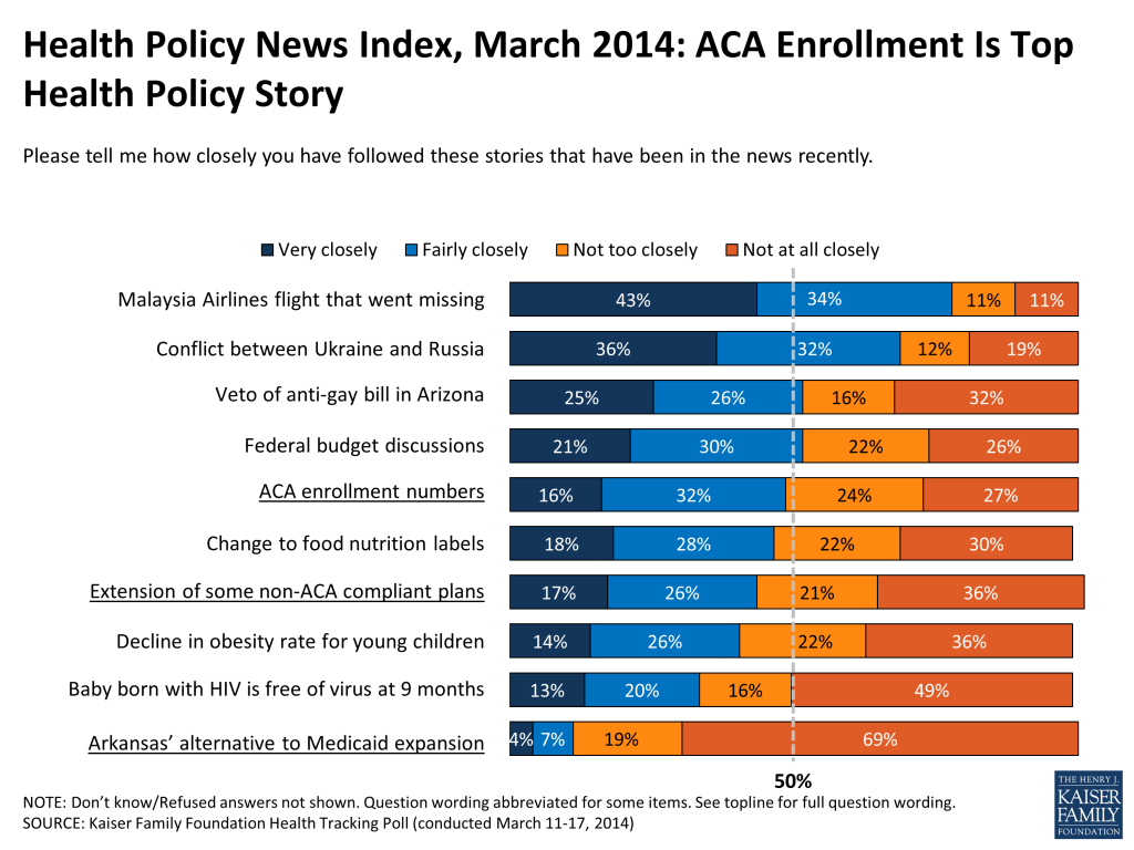
As the open enrollment period for new coverage options under the ACA comes to an end, the most-closely followed health policy news story this month was coverage of how many people have enrolled in these new options, with about half (48 percent) saying they followed this story “very closely” or “fairly closely.” Attention to this story trailed far behind the top two non-health news stories this month: the Malaysia Airlines flight that went missing over Southeast Asia (77 percent) and the conflict between Ukraine and Russia (68 percent), and just behind discussions in Washington about the federal budget and the veto of a bill in Arizona that would have given business owners the right to refuse service to gay people (51 percent each). Somewhat smaller shares report closely following other health-related news stories, including an upcoming change to food nutrition labels (46 percent), the announcement that some people who had their health plans canceled because of the ACA will be allowed to keep those plans for 2 more years (43 percent), a report finding a decline in the obesity rate for young children (40 percent), and news about a baby born with HIV who is apparently free of the virus after 9 months (33 percent). The least-closely followed health policy story asked about this month was news of the state of Arkansas’ alternative to Medicaid expansion, with only about one in ten (11 percent) saying they followed it “very closely” or “fairly closely.” Arkansas’ alternative to Medicaid expansion received national attention because it was the first state to win federal approval for a “private option”, which uses federal Medicaid money to help low-income people purchase private insurance, and because there was a contentious debate this month over continued funding.
Figure 1
It may not be surprising that relatively few Americans report paying close attention to news about one particular state’s action on Medicaid expansion. However, survey findings also indicate that many Americans remain unaware of the status of Medicaid expansion in their own states as well. Among those living in states that have expanded their Medicaid programs under the ACA to cover more low-income adults1 , about a third (34 percent) are aware that their state has opted for expansion, while 29 percent say their state has not expanded Medicaid and 36 percent say they don’t know. Among those living in states that have not expanded Medicaid, just over half (53 percent) are aware of their state’s decision, but still over one in ten (12 percent) believe that their state has expanded Medicaid, and about a third (34 percent) say they don’t know.
Figure 2: Awareness Of Medicaid Expansion Decisions
As you may know, the health care law gives states the option of expanding their Medicaid program to cover more low-income uninsured adults. As far as you know, has your state expanded its Medicaid program, or not?
Living In States That HAVE Expanded Medicaid*
Living In States That HAVE NOT Expanded Medicaid **
Yes, state has expanded Medicaid
34%
12%
No, state has not expanded Medicaid
29
53
Don’t Know/Refused
36
34
* States that have expanded Medicaid, excluding states which opted for an alternative to Medicaid expansion, or “private option” are AZ, CA, CO, CT, DE, DC, HI, IL, KY, MD, MA, MN, NV, NJ, NM, NY, ND, OH, OR, RI, VT, WA, WV**States that have not expanded Medicaid, excluding states where there is active discussion about Medicaid expansion, are AL, AK, FL, GA, ID, KS, LA, ME, MS, MT, NE, NC, OK, SC, SD, TN, TX, WI, WYNOTE: “State is pursuing or using federal money for alternative to Medicaid expansion, or ‘private option’ (VOL.)” responses not shown.
In some states, there is an ongoing, active debate about whether and how to expand Medicaid. Still, many residents of these states are unaware of the active discussions taking place in the state capitols. Among those living in states that have not yet, but are considering expanding Medicaid, only about three in ten correctly report that their state is considering expanding (28 percent, including 2 percent who volunteered that their state is considering an alternative, or “private option” to Medicaid expansion). Just under a quarter (23 percent) say their state is not considering expansion, 14 percent think their state’s Medicaid program has already been expanded, and , over a third (36 percent) are unsure.
Figure 3: Awareness Of Medicaid Expansion Debate In States Discussing Expansion
As far as you know, are your state’s governor and legislator discussing or considering expanding the state’s Medicaid program, or is this not something they’re considering?
Among those living in states that have NOT expanded Medicaidbut are considering expanding*
Yes, state is considering expanding
26%
State is considering an alternative, “private option” (VOL.)
2
No, state is not considering expanding
23
Don’t Know/Refused
36
State has already expanded Medicaid
14
*States considering Medicaid expansion are IN, MO, NH, PA, UT, VA
NOTE: These questions were asked as part of the March 2014 Kaiser Health Tracking Poll. For more results from that survey, including methods, see: Kaiser Health Tracking Poll: March 2014
Not including states which opted for an alternative to Medicaid ↩︎
The Affordable Care Act (ACA) provides premium subsidies to low and middle income people who buy insurance on their own through new health insurance marketplaces (also known as exchanges). Subsidies generally are available to people with incomes ranging from one to four times the poverty level ($11,490 to $45,960 for a single person and $23,550 to $94,200 for a family of four). Depending on their income, people are expected to pay 2% to 9.5% of their income towards the premium for the second-lowest-cost silver plan in their area, and the federal government covers the remainder of the cost through a tax credit. People choosing more expensive plans pay the entire additional cost, while those choosing less expensive plans get the savings. Tax credits are provided on an advance basis to people based on estimated annual income and then reconciled after-the-fact based on actual income through their tax returns.Through the end of February, 4.2 million people had applied for and selected a plan through the marketplaces. As expected, the vast majority of enrollees (83%) have qualified for premium subsidies, since people who are not eligible for premium subsidies can buy comparable coverage with similar consumer protections outside of the marketplaces. We estimate that about 21% of those eligible for premium subsidies have applied for assistance, with significant variation across states.Using the age and tax credit eligibility of enrollees reported by the federal government, along with the marketplace premiums within each state, we estimate that 3.5 million people have qualified for a total of about $10.0 billion in annual premium subsidies, or an average of about $2,890 per person. Total and average subsidies vary significantly by state depending on the share of eligible people who have signed up, the age distribution of enrollees, and the level of premiums in the state. We also estimate that had all states been able to enroll people at the rate of the five most successful states, an additional 3.1 million people would have qualified for premium subsidies, with an additional $8.6 billion in subsidies being provided.
Premium Subsidies by State
The table below shows estimates for each state of the total number of people who have selected a marketplace plan as of March 1, 2014, the percentage of enrollees who have qualified for assistance, the number of subsidized enrollees, subsidized enrollees as a percentage of those eligible, the average subsidy per enrollee, and total premium subsidies in the state. Estimates are based on enrollment as of March 1, 2014 as reported by the federal government, and do not account for the fact that some people have selected a plan but have not paid the first month’s premium.
Nationwide, an estimated 83% of marketplace enrollees qualify for subsidies, ranging from 13% in the District of Columbia and 35% in Hawaii to 92% in Wyoming and 93% in Mississippi. (Members of Congress and some of their staff obtain coverage through the DC exchange and are not eligible for subsidies, which is why the percentage there is so much lower than in the rest of the country.)
The take-up rate of subsidies – that is, the percentage of those eligible who have actually enrolled – is 21% in the U.S. as a whole and ranges from 10% or less in a number of states to 32% or more in Washington, Connecticut, California, Rhode Island, and Vermont. In general, states that are running their own exchanges have higher take-up rates, though some have low take-up due to widely-reported difficulties with their enrollment systems.
Among those qualifying for subsidies, we estimate that the average subsidy is $2,890 per person, ranging from a low of $1,350 in the District of Columbia and $1,780 in Utah to a high of $4,370 in Mississippi and $4,980 in Wyoming. These amounts are highly related to the premium levels in areas within each state. Tax credits are calculated by subtracting the amount each person is expected to pay based on a percentage of their income (which does not vary by state) from the premium for the second-lowest-cost silver plan in their area. Where premiums are low, tax credits will tend to be low as well, though the subsidized individuals themselves will pay the same as people with equivalent income who live in areas with higher premiums. Similarly, average subsidies will tend to be higher in states with older enrollees since they face higher premiums.
Based on enrollment as of March 1, 2014, estimated annual subsidies total $10.0 billion nationwide. Over half of that amount is going to people in five states (California, Florida, North Carolina, Texas, and New York), related both to the size of the states and the take-up rate of subsidized enrollees.
Discussion
A significant amount of financial assistance is already flowing to individuals through the ACA. The amount varies significantly by state based primarily on the total number of people eligible for subsidies, the take-up rate among those eligible, and the premium levels within the state.
Some of the states that are running their own exchanges have had a more successful rollout since open enrollment began in October, and these states also have been able to devote greater resources to outreach and consumer assistance through grants received from the federal government. In the five states with the highest take-up of subsidy eligibles, 39% of those eligible have already enrolled (compared to 21% in the U.S. as a whole). If all states were enrolling people at the rate of the five most successful, an additional 3.1 million people would have qualified, with an additional $8.6 billion in subsidies being provided.
Open enrollment goes until the end of March, and a last-minute surge in signups could boost premium subsidies significantly. The challenge going forward is to identify the strategies and practices used in states with higher enrollment and effectively implement them in states with lower enrollment. Enrolling most of the eligible population will likely involve more and improved methods of outreach and education and take several years to accomplish.
Table
State-by-State Data on Enrollment and Subsidies Received
Total Number of People Who Have Selected a Marketplace Plan as of March 1, 2014(Thousands of People)
Percentage of Enrollees Who Have Qualified for Assistance
Number of Subsidized Enrollees(Thousands of People)
Subsidized Enrollees as a Percentage of Subsidy-Eligible Individuals
Average Subsidy per Enrollee
Total Premium Subsidies (Millions of dollars)
Nationwide
4,242
83%
3,472
21%
$2,890
$10,019
Alabama
55
86%
47
18%
$2,880
$136
Alaska
7
87%
6
11%
$4,120
$24
Arizona
58
74%
43
14%
$1,940
$83
Arkansas
27
91%
25
17%
$3,230
$81
California
869
88%
765
40%
$3,060
$2,337
Colorado
83
57%
48
19%
$2,440
$116
Connecticut
57
73%
42
39%
$4,110
$172
Delaware
7
79%
5
18%
$2,940
$15
DC
6
13%
1
9%
$1,350
$1
Florida
442
90%
398
25%
$2,950
$1,173
Georgia
139
85%
118
18%
$2,870
$340
Hawaii
5
35%
2
6%
$1,790
$3
Idaho
44
91%
40
31%
$2,110
$84
Illinois
114
77%
88
17%
$2,240
$196
Indiana
65
88%
57
16%
$3,990
$228
Iowa
15
84%
13
10%
$2,410
$31
Kansas
29
78%
23
14%
$1,970
$45
Kentucky
55
70%
38
20%
$2,620
$101
Louisiana
46
87%
40
12%
$3,610
$143
Maine
25
90%
23
30%
$4,070
$93
Maryland
38
N/A
N/A
N/A
N/A
N/A
Massachusetts
13
N/A
N/A
N/A
N/A
N/A
Michigan
145
87%
126
29%
$2,610
$328
Minnesota
32
N/A
N/A
N/A
N/A
N/A
Mississippi
26
93%
24
12%
$4,370
$104
Missouri
74
85%
63
16%
$2,820
$178
Montana
23
86%
19
20%
$2,850
$55
Nebraska
26
87%
22
18%
$2,540
$56
Nevada
29
79%
23
15%
$2,620
$59
New Hampshire
22
74%
16
20%
$3,180
$51
New Jersey
74
83%
62
15%
$3,470
$214
New Mexico
15
78%
12
10%
$2,500
$29
New York
245
72%
176
23%
$2,650
$466
North Carolina
201
91%
182
27%
$3,320
$606
North Dakota
5
84%
4
10%
$2,730
$12
Ohio
79
85%
67
12%
$2,770
$186
Oklahoma
33
78%
26
10%
$2,230
$57
Oregon
39
79%
31
16%
$2,210
$68
Pennsylvania
160
80%
128
18%
$2,460
$314
Rhode Island
19
88%
17
41%
$3,050
$51
South Carolina
56
86%
48
14%
$3,110
$149
South Dakota
7
89%
6
9%
$3,180
$19
Tennessee
78
79%
62
16%
$2,020
$124
Texas
295
82%
242
12%
$2,440
$591
Utah
40
86%
34
17%
$1,780
$61
Vermont
24
55%
13
50%
$2,930
$39
Virginia
103
80%
82
16%
$2,690
$222
Washington
107
81%
87
32%
$3,280
$285
West Virginia
11
86%
9
13%
$3,170
$29
Wisconsin
71
90%
64
21%
$3,590
$231
Wyoming
7
92%
6
13%
$4,980
$31
Source: Kaiser Family Foundation analysis of March 2012 and 2013 CPS. See Methods for more details.
Methods
Methods
We estimated state-by-state financial assistance by extending prior analysis of those who are uninsured or buy coverage on their own discussed in our state estimates of subsidy-eligibles.
For each state we produced average tax credit amounts per eligible person by age using our analysis of the demographics of health insurance units within the state from the pooled 2012-2013 CPS-ASEC, adjusted by an imputation of whether an employer offer of coverage is available derived from the Survey of Income and Program Participation. Premiums for the second-lowest-cost silver plan are based on our analysis of federal data and compilation of insurer rate filings.
We applied those tax credit amounts to the actual age distribution of those who have selected a plan in each state, available in this addendum provided with the latest Marketplace enrollment statistics from the Department of Health and Human Services (HHS). For each state, we applied the percentage of enrollees receiving financial assistance to the total number of people who have selected a plan. Information is not yet available on how many of those who have selected a plan have paid the first month’s premium, which is the final step in enrollment.
We assumed that the age distribution of subsidy-eligible enrollees is the same as that for all individuals who have selected a plan, which is likely the case given that they are 83% of the enrolled population. Since state-by-state statistics on the income distribution of enrollees are not available, we assumed that it mirrors our estimates of those eligible for tax credits in each state. The Washington Health Plan Finder has released detailed statistics on the income distribution of enrollees, and that distribution closely matches our estimates of the eligible population in the state.
The share of Marketplace enrollees determined to receive financial assistance was not included in the HHS report for Maryland, Massachusetts, or Minnesota, so these three states were removed from the entire analysis.
Medicaid and the Children’s Health Insurance Program (CHIP) play an important role in providing health coverage for millions of children across the country. While the programs differ in terms of size and scope, financing and program design, together, they provide coverage to more than one in three children. In June 2013, over 28 million children were enrolled in Medicaid and another 5.7 million were enrolled in CHIP.1 This brief provides an overview of children’s coverage leading up to the implementation of the Affordable Care Act (ACA), a review of changes for children included in the ACA, and a look at issues leading up to the reauthorization of the CHIP program. Some key findings include the following:
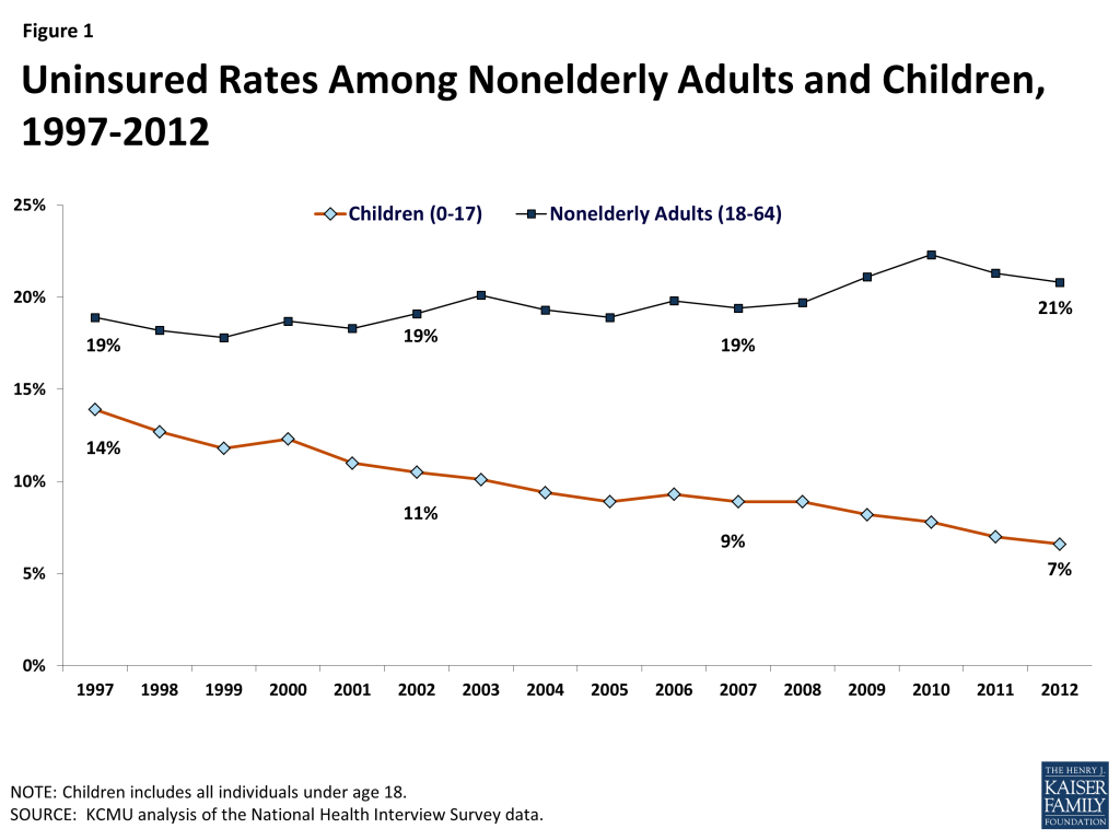
Experience with Medicaid and CHIP demonstrate that the combined effects of eligibility expansions, enrollment simplifications and outreach efforts lead to increases in coverage and reductions in the uninsured. Over the 1997 to 2012 period the rate of uninsured children was cut in half from 14% to a low of 7%.
Despite the success of Medicaid and CHIP, over 7 million children remain uninsured. Rates of uninsured children are higher in the south and the west, and nearly half of all uninsured children reside in six states (Arizona, California, Florida, Georgia, New York and Texas). An estimated 5.2 million are eligible for Medicaid or CHIP coverage but not enrolled.2
The Affordable Care Act (ACA) provides opportunities to further increase and strengthen children’s health coverage. The ACA requires states to better align coverage for children by transitioning coverage for all children up to 133% FPL to Medicaid. The ACA also further streamlines enrollment processes, increases outreach efforts for adults which could increase enrollment of children and calls for additional financing for CHIP through FY 2015 and enhanced financing for CHIP from 2016-2019 if the program is reauthorized. New coverage options will also provide access to uninsured children through the new Marketplaces
The future of CHIP reauthorization will have important implications for children’s coverage. Funding for CHIP reauthorization will be challenging and more research will need to highlight barriers to coverage as well as differences in coverage between CHIP and the Marketplace to understand the consequences tied to CHIP reauthorization.
More immediately, as the ACA is implemented, ongoing outreach and enrollment efforts will be important to achieving additional coverage gains for children.
Background
Medicaid and CHIP together provide health coverage to low-income children. Both programs are jointly financed by states and the federal government and largely administered by states within broad federal rules. However, programs differ in several key ways, including size and scope, financing, benefits and cost-sharing.
Medicaid’s size and scope is broader compared to CHIP. Enacted in 1965 under Title XIX of the Social Security Act, Medicaid was created to provide health care coverage to blind and disabled individuals and families with dependent children receiving cash assistance. It has expanded over time, particularly for children, and is now an important source of health and long-term care coverage for 55 million enrollees (including 28 million children), as of June 2013. Under federal law, prior to the ACA, states participating in Medicaid were required to cover children through age 5 up to 133% FPL and school-age children up to 100% FPL. Total Medicaid spending reached $415 billion in 2012. Children represent about 20% of Medicaid spending.
Created as part of the Balanced Budget Act of 1997, CHIP builds on Medicaid to provide insurance coverage to uninsured, low-income children above Medicaid income eligibility thresholds. States are permitted to use CHIP funds to create a separate CHIP program, expand their Medicaid program, or adopt a combination approach.3 In June 2013, about half of children (54%) in CHIP were enrolled in separate CHIP programs and the other half in Medicaid expansion CHIP programs.4 Compared to Medicaid, CHIP has a more limited health insurance role, covering 5.7 million low-income children with total expenditures of $10.6 billion in FY 2009.
Both Medicaid and CHIP are matching programs; however, the CHIP match rate is higher than Medicaid and CHIP financing is capped. Under both programs, the federal government matches state spending on eligible program beneficiaries according to formula that relies on states’ relative per capita income. To encourage participation among the states when CHIP was enacted, the federal government provides enhanced (relative to Medicaid) matching payments. On average, the federal government’s share of Medicaid spending is 57 percent, but it is 70 percent under CHIP. Another key difference is the financing structure and entitlement for Medicaid and CHIP. Under Medicaid, federal matching funds are guaranteed with no pre-set limits. Tied to this financing guarantee, Medicaid provides an entitlement to coverage and states are prohibited from imposing enrollment caps or waiting lists. Under CHIP federal funds are capped, nationwide, and each state operates under an allotment. Under separate CHIP programs, beneficiaries are not entitled to coverage and over time states have imposed caps and waiting lists to control CHIP spending.
Compared to Medicaid, states receive more flexibility around benefits and cost-sharing when operating separate CHIP programs. While states have considerable flexibility in designing their benefits under Medicaid and CHIP, for children, Medicaid requires certain benefits that are not required in CHIP, including Early and Periodic Screening, Diagnosis and Treatment (EPSDT), long-term care, services provided at Federally Qualified Health Centers (FQHCs) and many rehabilitative services. Under EPSDT, children are guaranteed comprehensive coverage including access to physical and mental health therapies, dental and vision care, personal care services and durable medical equipment, that may not be covered or may be limited in CHIP. States are generally prohibited from imposing premiums and cost-sharing for mandatory coverage of children in Medicaid, but states have more flexibility to use premiums and cost-sharing in separate CHIP programs. As of January 2013, 30 states required premiums and 27 states required co-payments for children in CHIP.5
Health Coverage of Children Pre-ACA
Experience with Medicaid and CHIP demonstrates that the combined effects of eligibility expansions, enrollment simplifications, and outreach efforts lead to increased coverage and reductions in the number of uninsured children over time. Medicaid provides the foundation of coverage for poor and near poor-children. CHIP was created in 1997 as a complement to Medicaid to provide coverage to uninsured children who were not eligible for Medicaid. CHIP, which provided states some flexibility on program design, as well as a higher federal match rate compared to Medicaid, helped spur efforts to expand eligibility to reach more low-income children, adopt strategies to simplify enrollment and renewal processes and conduct outreach and enrollment efforts. A year ahead of the implementation of the ACA, median eligibility levels for children were 235% FPL (considerably higher than coverage levels for adults) and states had adopted an array of enrollment simplification procedures to make it easier for children to obtain and maintain coverage. As a result of these combined efforts, Medicaid and CHIP have helped to reduce the uninsured rate for children to a record low of 7% in 2012. Coverage gains continued for children during the recent economic downturn when uninsured rates for adults (for whom Medicaid is much more limited) climbed (Figure 1).
Figure 1: Uninsured Rates Among Nonelderly Adults and Children, 1997-2012
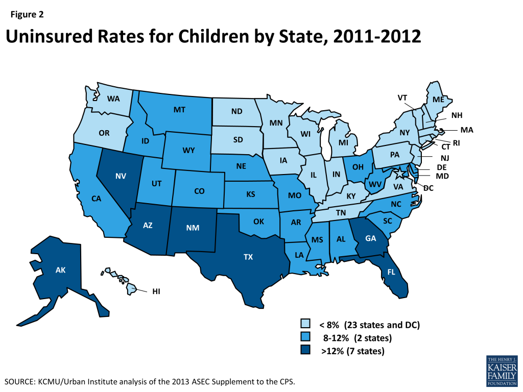
While Medicaid and CHIP help fill gaps in private coverage, geographic disparities in coverage remain. A child’s risk of being uninsured varies based on where he or she lives. Across states, children’s uninsured rates range from less than 5% in six states (CT, DC, HI, MA, MI, and VT) to over 15% in two states (NV and TX) (Figure 2). Nearly half (49%) of all uninsured children live in just six states (AZ, CA, FL, GA, NY, and TX).
Figure 2: Uninsured Rates for Children by State, 2011-2012
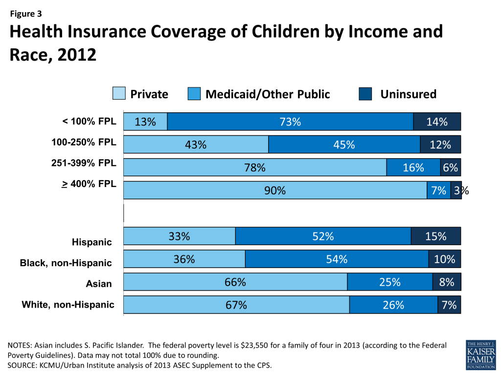
Medicaid and CHIP cover more than one in three (37%) children and play a particularly important role for all low-income children and children of color. Medicaid and CHIP are key sources of coverage for children in low-income families who often are not offered coverage through a parent’s employer and typically cannot afford the family share of premiums, even when it is offered. Similarly, Medicaid and CHIP serve as an important source of coverage for children of all races and ethnicities, and are a primary source of coverage for many children of color. Overall, the programs cover for about one in four White (26%) and Asian (25%) children, and over half of Hispanic (52%) and Black children (54%), who are more likely to live in low-income families than White children (Figure 3).
Figure 3: Health Insurance Coverage of Children by Income and Race, 2012
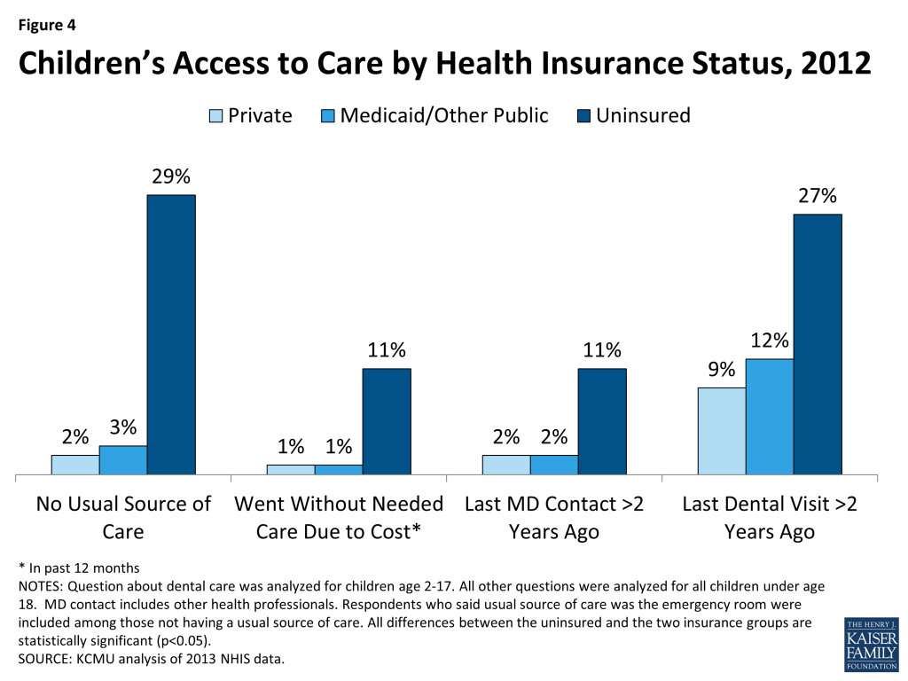
Children with Medicaid and CHIP coverage have significantly better access to care than uninsured children, and their access is comparable to privately covered children (Figure 4).6 States can implement CHIP as an expansion of Medicaid or as a separate CHIP program. Medicaid provides children with a comprehensive set of benefits, including screenings and treatments (EPSDT), check-ups, physician and hospital visits, and vision and dental care. In addition, given the limited incomes of enrollees, Medicaid significantly restricts cost-sharing requirements so families can afford care. CHIP provides a benefit package designed to meet children’s needs, although, within CHIP, states have more flexibility to charge premiums and cost-sharing and can provide a more limited set of benefits than with Medicaid. Most children (64%) enrolled in Medicaid and CHIP are served through managed care plans.7 Because children typically have low health care costs, they only account for about 20% of Medicaid program spending, even though they represent nearly half of all Medicaid enrollees.8
Figure 4: Children’s Access to Care by Health Insurance Status, 2012
Health Coverage for Children Under the ACA
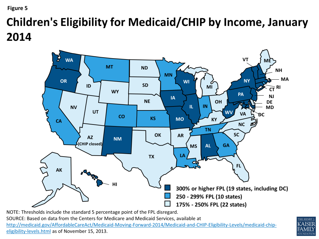
Under the ACA, eligibility for children through Medicaid and CHIP remains strong. The ACA requires states to use a uniform definition of income, called Modified Adjusted Gross Income (MAGI), to better coordinate eligibility across health care programs. Using MAGI, more than half of the states (29, including DC) cover children in families with incomes at or above 250% FPL and 19, including DC, cover children in families with incomes at or above 300% FPL (Figure 5). The ACA protects the gains already achieved in children’s coverage by requiring states to maintain eligibility thresholds for children that are at least equal to those they had in place at the time the law was enacted through September 30, 2019.
Figure 5: Children’s Eligibility for Medicaid/CHIP by Income, January 2014
The ACA and new guidance also help strengthen coverage for children and financing for CHIP. The ACA establishes a minimum Medicaid eligibility level of 138% FPL for all children up to age 19.9 Prior to the ACA, the federal minimum eligibility levels for children varied by age, and the federal minimum for older children ages 6 to 18 was 100% FPL. As a result of the law, 21 states needed to transition children from CHIP to Medicaid in 2014; states still receive the enhanced CHIP federal matching rate for coverage of these children. The ACA also requires that states provide Medicaid coverage to children aging off of foster care up to age 26 as of 2014.Under the ACA, there are no waiting periods for coverage, so new guidance limits states’ ability to impose waiting periods for CHIP to three months or less starting in 2014. Prior to the ACA, to be eligible for CHIP, children had to be uninsured, so a number of states had imposed a “waiting period” to be eligible for coverage. As of December 2013, 16 of the 38 states with CHIP waiting periods have announced plans to eliminate them, and additional states may revisit this issue in their upcoming legislative sessions.10 The Medicaid and CHIP Payment and Access Commission recently recommended that Congress should eliminate CHIP waiting periods to reduce complexity and promote continuity of coverage.11 In addition, the ACA extends the CHIP program through 2015; however, the law also includes a provision that would increase the CHIP matching rates by 23 percentage points from 2016-2019 if the program is reauthorized.
Under the ACA, streamlined enrollment processes, outreach efforts and new coverage gains for parents will spur increased enrollment of children. The ACA creates a continuum of new insurance options through a Medicaid expansion to adults and tax credits to purchase coverage in newly established Marketplaces. Due to the ruling by the Supreme Court, the ACA Medicaid expansion for adults is effectively an option, but new coverage through the Marketplaces and streamlined and coordinated enrollment processes are required in all states. All of these changes are expected to result in increased enrollment of children. Beyond the requirements to streamline enrollment, CMS has also provided states with options to implement additional targeted enrollment strategies that have already been used for children to enhance coverage for adults, such as using Express Lane Eligibility, whereby states can use administrative data from other programs such as Supplemental Nutrition Assistance Program, SNAP or food stamps, to enroll individuals in Medicaid, and 12-month continuous eligibility. Research shows that expanding coverage for parents leads to significant increases in coverage for children and more stable coverage for children over time; studies also show that, when parents are covered, children are more likely to receive needed care.12,13,14,15
While all states have already significantly expanded coverage to children through Medicaid and CHIP, not all eligible children are enrolled in the program due to lack of parent knowledge about their eligibility and historic enrollment barriers. Over 5.2 million of the 14 million (37%) currently uninsured individuals who are estimated to be eligible for Medicaid in 2014 are children.16 In states not implementing the Medicaid expansion, children account for 75% of the uninsured eligible for Medicaid or CHIP (Figure 6).
Figure 6: Uninsured Adults and Children Eligible for Medicaid / CHIP, 2014
Some currently uninsured children will gain access to new coverage options through the Marketplaces. Children in families with moderate incomes above Medicaid and CHIP eligibility limits but below 400% FPL who do not have access to affordable employer-sponsored insurance will be eligible for premium tax credits. They can use these subsidies to help offset the purchase of qualified health plans through the new Marketplaces. Overall, it is estimated that nearly half a million currently uninsured children will qualify for these new subsidies.17 Children in families with incomes above 400% FPL will also be able to access unsubsidized coverage in the Marketplaces.
Considerations for CHIP Reauthorization
CHIP reauthorization will be considered within the broader context of coverage and changes from the ACA. CHIP is funded through FY 2015, so Congress will soon need to consider CHIP reauthorization. Since CHIP was reauthorized in 2009, the ACA has altered the health care landscape by expanding Medicaid eligibility for children to 138% FPL and establishing tax credits and new options for coverage under the new health insurance Marketplaces.
If CHIP is not reauthorized, some children will face barriers to coverage. If Congress does not reauthorize CHIP, Medicaid expansion CHIP programs will be subject to the maintenance of eligibility requirements through FY 2019 and children in separate CHIP programs could transition to Marketplace coverage, if the Secretary of HHS certifies that this coverage is “at least comparable” to CHIP in terms of benefits and cost-sharing. However, some children will not be eligible for tax credits because a parent may have access to “affordable” employer coverage; however, the affordability test for employer coverage is based on a calculation of the individual coverage relative to a workers wages (not the cost of a family policy). This situation is referred to as the “family glitch” and could leave more children uninsured.
Premiums, cost-sharing and benefit differences across CHIP and the Marketplace will be considered in CHIP reauthorization debate. As noted earlier, 30 states require premiums in CHIP. Under the ACA, more adults will be eligible for Marketplace coverage. In the near-term, this could result in some families facing premiums in CHIP and the Marketplace.18 Compared to CHIP, and Marketplace coverage has higher cost-sharing requirements. A recent GAO report shows that 5 states with separate CHIP programs offered benefit packages and imposed coverage limits comparable to benchmark plans in the Marketplace, there was some variation, particularly around outpatient habilitative therapies and pediatric hearing services.19 More research is needed to understand the potential implications of these variations.
Funding CHIP reauthorization could be challenging. CHIP reauthorization will require additional federal funds; however, the increase in funds will be mitigated by the assumptions that, without CHIP, spending for Medicaid and tax credits will increase. However, since federal budget discussions are often focused on deficit reduction and new spending requires offsets, it will be challenging to finance CHIP reauthorization due to the increased CHIP matching rate included in the ACA, which increases the overall program cost. The length of the time the program is reauthorized for will also have fiscal implications.
Looking Ahead
Outreach and enrollment efforts in all states will be important for achieving sustained progress in expanding coverage to children. These efforts need to continue over the course of the year, since enrollment in Medicaid and CHIP is not limited to the open enrollment period of the Marketplaces. Even in states not moving forward with the Medicaid expansion at this time, children will be eligible for coverage through previously expanded Medicaid and CHIP eligibility levels. For children already enrolled in coverage, outreach efforts will focus on coverage retention, to reduce churning on and off of coverage. Looking ahead, the future of CHIP will have important implications for children’s coverage.
Leighton Ku and Matthew Broaddus, Coverage of Parents Helps Children, Too (Center on Budget and Policy Priorities, October 2006), http://www.cbpp.org/cms/?fa=view&id=754. ↩︎
Report to the Congress on Medicaid and CHIP (Medicaid and CHIP Payment and Access Commission, March 2014). MACPAC recommended prohibiting premiums for children in families with incomes below 150% FPL to better align premium policies in separate CHIP programs with Medicaid and to avoid premium stacking or the combined effect of premiums in CHIP and Marketplace coverage for low-income families. ↩︎
Information on Coverage of Services, Costs to Consumers, and Access to Care in CHIP and Other Sources of Insurance (GAO, 2013). http://www.gao.gov/products/gao-14-40. ↩︎
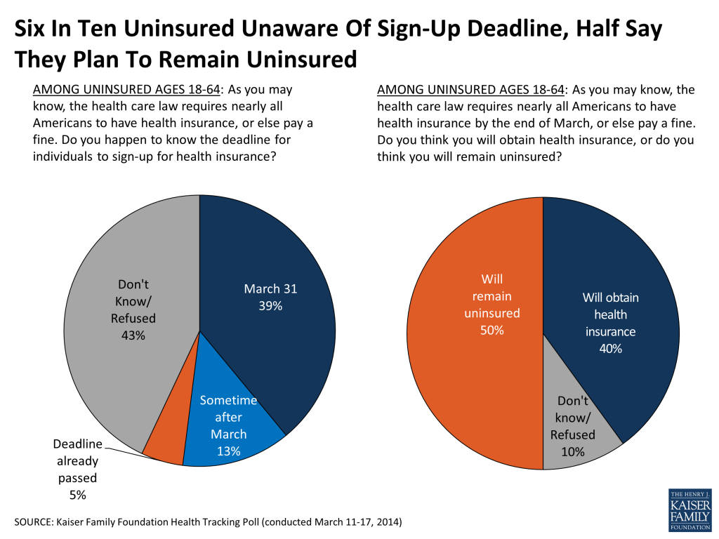
As the clock ticks down on open enrollment for new coverage options under the Affordable Care Act (ACA), the latest Kaiser Health Tracking Poll finds that six in ten of the uninsured are unaware of the March 31 deadline to sign up for coverage. When reminded of the deadline and the fine for not getting covered, half of those who lack coverage as of mid-March say they plan to remain uninsured. Meanwhile, four in ten of the uninsured are still unaware of the law’s subsidies to help lower-income Americans purchase coverage, and half don’t know about the law’s expansion of Medicaid. Among the public overall, general opinion of the ACA moved in a more positive direction this month for the first time since November’s post-rollout negative shift in opinion. While unfavorable views of the law continue to outpace favorable ones, the gap between negative and positive views now stands at eight percentage points, down from 16 percentage points in January. Four years after the ACA’s passage, a little over half the public says they are tired of hearing the national debate over the law and want the country to focus more on other things, while four in ten say it’s important for the debate to continue. At the same time, six in ten want Congress to keep the law in place and either leave it as is or work to improve it, while three in ten would prefer to see it either repealed and replaced with a Republican alternative or repealed and not replaced.
Most uninsured unaware of March 31 deadline, half plan to remain uninsured
In the final days of open enrollment for new health insurance options under the ACA, substantial shares of the uninsured remain unaware of the law’s individual mandate and the looming deadline to sign up for coverage. A third of those who lack coverage as of mid-March are unaware that the law requires nearly all Americans to have health insurance or pay a fine. When it comes to the specifics, four in ten of the uninsured (39 percent) are aware that the deadline to sign up for coverage is at the end of March, leaving about six in ten unaware of the March deadline.
When reminded of the mandate and the deadline, half of those without coverage as of mid-March say they think they will remain uninsured, while four in ten expect to obtain coverage and one in ten are unsure.
Figure 1
A third (33 percent) of the uninsured say they have tried to get insurance for themselves in the past 6 months, including 18 percent who report attempting to get coverage through a health insurance marketplace, 14 percent from Medicaid, and 13 percent directly from a private insurance company. Still, the large majority – 67 percent – say they have not attempted to get coverage.
FIGURE 2: One-Third Of Uninsured Report Trying To Get Coverage In Past 6 Months
AMONG THE UNINSURED AGES 18-64: Have you tried to get insurance for yourself in the past 6 months, or not? [If yes: From which of the following sources have you tried to get health insurance?]
Yes, have tried to get insurance in past 6 months
33%
Through the health insurance marketplace set up under the health care law*
18
From Medicaid*
14
Directly from a private insurance company*
13
From an employer*
9
From some other source*
2
No, have not tried to get insurance
67
* Multiple responses allowed
While some report trying to get coverage from new options available under the ACA, large shares of the uninsured remain unaware of two of the law’s key provisions that could help them get coverage. About half the uninsured are unaware that the ACA gives states the option of expanding their Medicaid programs, and more than four in ten don’t know that it provides financial help to low- and moderate-income individuals to help them purchase coverage. Despite extensive campaigns in media and on the ground attempting to get them enrolled, just one in nine (11 percent) of the uninsured say they have been personally contacted by anyone about the health care law through a phone call, email, text message, or door-to-door visit.
FIGURE 3: Awareness Of Key ACA Provisions Among The Uninsured
AMONG THE UNINSURED AGES 18-64: To the best of your knowledge, would you say the health reform law does or does not do each of the following?
CORRECT
INCORRECT
Yes
No
Don’t Know/Refused
Require nearly all Americans to have health insurance or else pay a fine
66%
24%
10%
Provide financial help to low and moderate income Americans who don’t get insurance through their jobs to help them purchase coverage
57
32
11
Give states the option of expanding their existing Medicaid program to cover more low-income, uninsured adults
49
33
19
Gap between unfavorable and favorable views shrinks this month, including among uninsured
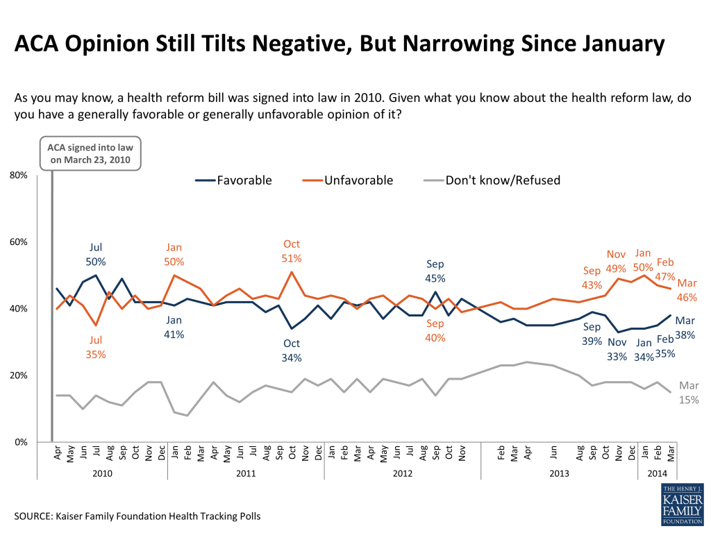
As the ACA turns four years old, overall public opinion on the law shifted in a more positive direction this month, though unfavorable views still outnumber favorable ones. In March, 46 percent say they have an unfavorable view of the law (down 4 percentage points since January), while 38 percent say they have a favorable view (up 4 percentage points since January). The gap between unfavorable and favorable views is now eight percentage points, down from a recent high of 16 points in November and January.
Figure 4
When those who view the law favorably are asked to say in their own words why they like the law, the most common reason by far is that it will expand access to health care and health insurance (61 percent), followed far behind by a perception that it will make health care more affordable and control costs (10 percent), and that it will be good for the country and people in general (7 percent). Open-ended reasons for unfavorable views are more widely dispersed, the most common being concerns about costs (23 percent), opposition to the individual mandate (17 percent), and concerns about government overreach (10 percent).
FIGURE 5: In Their Own Words: Reasons For Favorable Views
AMONG THE 38% WHO HAVE A FAVORABLE VIEW: Could you tell me in your own words what is the main reason you have a favorable opinion of the health reform law?
Category
Percent Mentioning
Quotes
Expanding access to care and insurance
61%
“Because it allows people without insurance the ability to get insurance.”“Because a lot of people who otherwise would not have insurance will now have it.”“Because I am able to keep my health insurance with my parents until age 26.”
Will make health care more affordable/control costs/lower costs
10
“Because it makes health insurance affordable for people without insurance.”“Because I think the health care system was too costly and the affordable health care act will cut costs.”
Country/people will be better off generally
7
“It makes health care better for Americans.”“it is beneficial to the general public.”
FIGURE 6: In Their Own Words: Reasons For Unfavorable Views
AMONG THE 46% WHO HAVE AN UNFAVORABLE VIEW: Could you tell me in your own words what is the main reason you have an unfavorable opinion of the health reform law?
Category
Percent Mentioning
Quotes
Cost concerns
23%
“It’s too expensive for regular people.”“it’s costing too much money. It’s supposed to help people with low incomes and it’s not.”“Because it’s a financial hardship on the U.S.”
Opposed to individual mandate/ Unconstitutional
17
“Don’t think it’s right to penalize people who don’t have health care.”“It’s unconstitutional, requiring people to have health insurance.”
Government-related issues
10
“I don’t like the government making personal decisions for me.”“I believe the government should stay out of health care”“There is too much government in our personal choices.”
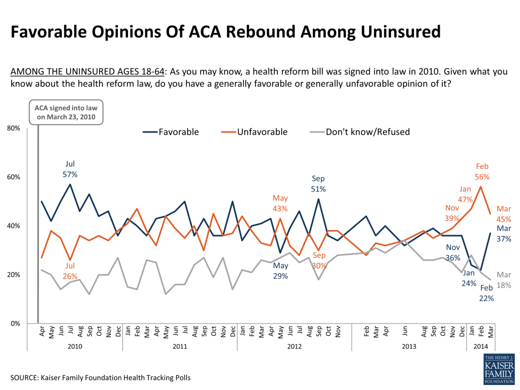
General opinion of the ACA among the uninsured, which had been trending negative for the past several months, also moved in a positive direction this month, returning closer to levels measured at the end of 2013. In March, 45 percent of the uninsured say they have an unfavorable view of the law (compared to 56 percent in February) and 37 percent have a favorable view (up sharply from 22 percent last month). Opinion among the uninsured in tracking polls has shown more month-to-month variation over time than among the total public, at least in part due to the relatively smaller sample size for this subgroup, but this month’s poll finds a clear change in direction, with attitudes shifting more positively towards the law after trending in a negative direction for several months. As more Americans gain coverage under the law, we can expect the group who remain uninsured to change over time, and some changes in opinion may be attributable to changes in who remains uninsured, rather than a shift in opinion among individuals.
Figure 7
The large majority of the public still gives both the federal government and their own state government a rating of “only fair” or “poor” when it comes to implementing the ACA, though ratings for both have inched up slightly since the end of 2013. Twenty-four percent now say the federal government is doing an “excellent” or “good” job, up 8 percentage points since December, and 28 percent now give a positive rating to their state government, up 5 percentage points in the same time frame. Positive ratings for state governments are also somewhat higher in states operating their own health care marketplace (37 percent say “excellent” or “good”) than in states that defaulted to the federal marketplace (24 percent).
FIGURE 8: Federal And State Governments Get Poor Ratings For ACA Implementation
Regardless of whether you support or oppose the health care law, how good a job would you say (INSERT) is doing implementing the law?
The federal government
Your state government
Total public
Total public
Among those in states operating their own marketplace
Among those in states defaulting to the federal marketplace*
NET Excellent/Good
24%
28%
37%
24%
Excellent
4
5
9
3
Good
20
23
28
21
NET Only fair/Poor
72%
59%
51%
62%
Only fair
33
33
32
33
Poor
39
26
19
29
Don’t know/Refused
4%
14%
12%
14%
*includes states with a state-federal partnership exchange
Over half report having personal conversations about ACA, but similar share are weary of national debate
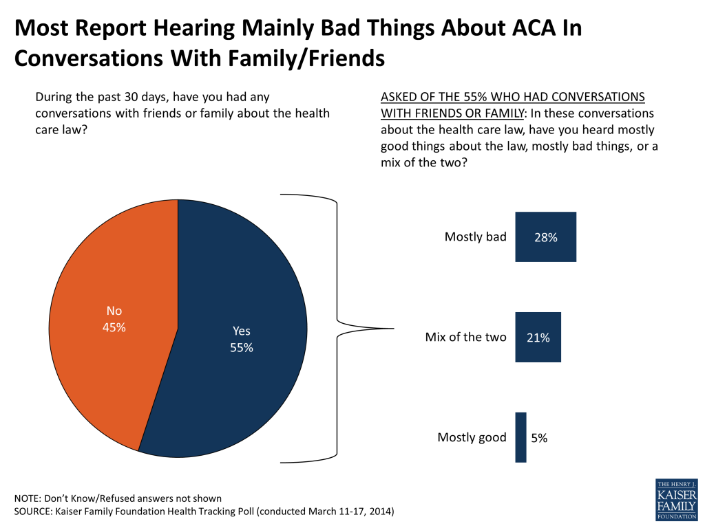
The ACA was a common topic of personal conversations this month, and the public reports that the tone of those conversations was mostly negative. Just over half the public (55 percent) say they had at least one conversation about the law with friends or family in the past month, up from 31 percent in January 2012 (the last time this question was asked). About half those who say they discussed the law with friends or family (28 percent of the public overall) report hearing mostly bad things about the law in these discussions, while a much smaller share (5 percent of the public overall) say they heard mostly good things and the remainder say it was a mix of the two.
Figure 9
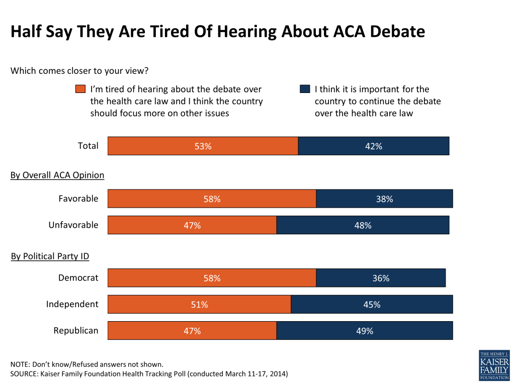
While personal conversations may be on the rise, many Americans appear to be weary of the national debate about the law. Just over half the public (53 percent) say they’re tired of hearing about the debate over the ACA and want the country to focus more on other issues, while about four in ten (42 percent) say they think it’s important for the country to continue the debate. Democrats and those with a favorable view of the law are more likely to say they’re tired of hearing about the debate, while Republicans and those who view the law unfavorably are more evenly split between those who are tired of hearing about it and those who want the debate to continue.
Figure 10
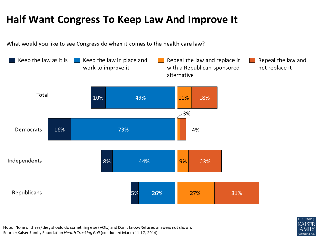
Perhaps reflecting this sense that the debate has gone on long enough, more of the public would like to see Congress keep the law in place and work to improve it (49 percent) or keep it as is (10 percent) rather than repeal it and replace it with a Republican-sponsored alternative (11 percent) or repeal it outright (18 percent).
Figure 11
Individual provisions mostly popular, including across parties, though many are not very well-known
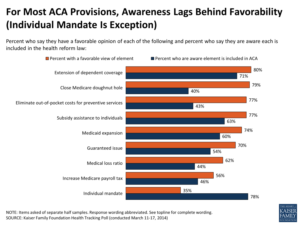
As previous Kaiser tracking polls have found, many of the ACA’s major provisions continue to be quite popular, including across party lines. For example, large shares of Americans – including at least seven in ten overall and at least six in ten Democrats, Republicans, and independents – have a favorable view of the fact that the law allows young adults to stay on their parents’ insurance plans up to age 26, closes the Medicare “doughnut hole” for prescription drug coverage, provides subsidies to low- and moderate-income Americans to help them purchase coverage, eliminates cost-sharing for preventive services, gives states the option of expanding Medicaid, and prohibits insurance companies from denying coverage based on pre-existing conditions. Nearly as many (including a majority across parties) have a favorable view of the “medical loss ratio” provision that requires insurance companies to give their customers a rebate if they spend too little money on services and too much on administration and profits. Somewhat more divisive is the law’s Medicare payroll tax on earnings for upper-income Americans, which is viewed favorably by about three-quarters of Democrats and just over half of independents, but just a third of Republicans.
The glaring exception to the popularity of individual provisions of the law is the requirement that nearly all Americans have health insurance or pay a fine, which is viewed unfavorably by roughly two-thirds of the public.
FIGURE 12: Many Elements Of ACA Continue To Be Popular Across Parties
Percent who say they have a FAVORABLE opinion of each provision of the law
Total Public
Democrat
Independent
Republican
Extension of dependent coverage
80%
87%
76%
76%
Close Medicare “doughnut hole”
79
89
75
73
Subsidy assistance to individuals
77
89
74
65
Eliminate out-of-pocket costs for preventive services
77
81
76
75
Medicaid expansion
74
89
69
62
Guaranteed issue
70
74
70
69
Medical loss ratio
62
68
64
54
Increase Medicare payroll tax on upper income
56
77
54
33
Individual mandate/penalty
35
56
31
16
Note: Question wording abbreviated. For full question wording, see survey topline.
At the same time that the public reports having a favorable view of many of the component parts of the ACA, large shares remain unaware that the law actually does some of these things. A few of the law’s provisions are both popular and relatively well-known – for example, 71 percent are aware that the law extends dependent coverage up to age 26, and eight in ten have a favorable view of this provision. More than half are also aware of several other popular provisions, including the law’s subsidy assistance to low and moderate income individuals (63 percent), Medicaid expansion (60 percent), and the so-called “guaranteed issue” provision that prohibits insurance companies from denying coverage based on health status (54 percent). Yet, in each of these three cases, the share who are aware of the provision lags roughly 15 percentage points behind the share who view it favorably.
Two other popular provisions are even less well-known. Fewer than half (43 percent) are aware that the law eliminates out-of-pocket costs for preventive services, and just four in ten (40 percent, including 38 percent of seniors) know that it gradually closes the Medicare prescription drug “doughnut hole.” At the other end of the spectrum, the law’s least popular provision – the individual mandate – is widely recognized, with nearly eight in ten (78 percent) correctly answering that the ACA requires nearly all Americans to have health insurance or else pay a fine.
Figure 13
Misperceptions also persist about things the ACA does not actually do. For example, nearly half the public (46 percent) think the law allows undocumented immigrants to receive financial help from the government to buy health insurance, and another two in ten (22 percent) are unsure whether it does. A third of the public (34 percent, including 32 percent of seniors) believe the law establishes a government panel to make decisions about end-of-life care for people on Medicare, with another quarter saying they are unsure (23 percent of the public, 25 percent of seniors).
FIGURE 14: Misperceptions About ACA Continue
To the best of your knowledge, would you say the health reform law does or does not do each of the following?
CORRECT
INCORRECT
No
Yes
Don’t Know/Refused
Allow undocumented immigrants to receive financial help from the government to buy health insurance
32%
46%
22%
Establish a government panel to make decisions about end-of-life care for people on Medicare
44
34
23
This Kaiser Health Tracking Poll was designed and analyzed by public opinion researchers at the Kaiser Family Foundation (KFF) led by Mollyann Brodie, Ph.D., including Liz Hamel, Bianca DiJulio, and Jamie Firth. The survey was conducted March 11-17, 2014, among a nationally representative random digit dial telephone sample of 1,504 adults ages 18 and older, living in the United States, including Alaska and Hawaii (note: persons without a telephone could not be included in the random selection process). Computer-assisted telephone interviews conducted by landline (753) and cell phone (751, including 415 who had no landline telephone) were carried out in English and Spanish by Princeton Data Source under the direction of Princeton Survey Research Associates International (PSRAI). Both the random digit dial landline and cell phone samples were provided by Survey Sampling International, LLC. For the landline sample, respondents were selected by asking for the youngest adult male or female currently at home based on a random rotation. If no one of that gender was available, interviewers asked to speak with the youngest adult of the opposite gender. For the cell phone sample, interviews were conducted with the person who answered the phone. KFF paid for all costs associated with the survey.
The combined landline and cell phone sample was weighted to balance the sample demographics to match estimates for the national population using data from the Census Bureau’s 2012 American Community Survey (ACS) on sex, age, education, race, Hispanic origin, nativity (for Hispanics only), and region along with data from the 2010 Census on population density. The sample was also weighted to match current patterns of telephone use using data from the January-June 2013 National Health Interview Survey. The weight takes into account the fact that respondents with both a landline and cell phone have a higher probability of selection in the combined sample and also adjusts for the household size for the landline sample. All statistical tests of significance account for the effect of weighting.
The margin of sampling error including the design effect for the full sample is plus or minus 3 percentage points. Numbers of respondents and margin of sampling error for key subgroups are shown in the table below. For results based on other subgroups, the margin of sampling error may be higher. Sample sizes and margin of sampling errors for other subgroups are available by request. Note that sampling error is only one of many potential sources of error in this or any other public opinion poll.
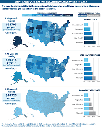
The March 2014 Visualizing Health Policy infographic shows examples of what Americans will pay for health insurance under the Affordable Care Act, using different scenarios for 40-year-old individuals living in different parts of the country.
The individual health insurance market historically has been highly concentrated, with only modest competition in most states. At the time the Affordable Care Act (ACA) was signed into law in 2010, a single insurer had at least half of the individual market in 30 states and the District of Columbia. While a dominant insurer may be able to negotiate lower rates from hospitals and physicians, without significant competitors or regulatory oversight, there is no guarantee that those savings would be passed along to consumers.1
Health insurance exchanges (also called marketplaces) are intended to promote price competition in the individual and small group insurance markets through greater transparency. Tax credits to reduce the cost of premiums, and in some cases out-of-pocket costs, encourage consumers to enroll through an exchange, which in turn gives insurers an incentive to participate in the new markets. Unlike the pre-ACA market, benefits are generally comprehensive and largely uniform, with cost-sharing presented in standardized tiers. With medical underwriting prohibited, premiums are easy to compare, focusing competition on price. Beyond exchanges, several other aspects of the ACA are intended to mitigate potential adverse effects of uncompetitive markets. For example, the ACA’s rate review provision requires scrutiny of large premium increases. The Medical Loss Ratio rule also ensures that plans experiencing a windfall from lower-than-expected health care expenses pass at least some of that back to consumers in the form of rebates.
Preliminary exchange enrollment data released by seven states provides an opportunity to look at how competition may be changing in the individual market. To do this, we compared early enrollment across insurers in these exchanges to market share statistics from each state’s 2012 individual market prior to full ACA implementation. While the early exchange enrollment results provide only a partial picture of state markets – they do not include coverage sold outside state exchanges or enrollees covered in grandfathered plans — seeing reduced market concentration within an exchange may well be a signal that the market overall is becoming more competitive, or vice versa. Over time, the availability of premium tax credits, which are only available inside exchanges, should greatly increase the number of individual market participants in state markets. If these new avenues for enrollment are more or less competitive, the overall markets are likely to be as well.
Analysis of the early results suggests a diversity of results across states. On one hand, two large states, California and New York, appear to be noticeably more competitive than their 2012 individual markets as a whole. On the other hand, exchanges in Connecticut (where two major insurers decided not to participate in the exchange) and Washington appear to be less competitive than their individual markets were in 2012. In some cases, market share among insurers has shifted significantly under the ACA, including some notable examples of new entrants picking up substantial enrollment. Full results for the seven states with available data are detailed below.
Measuring Insurance Market Competition
There are several ways to measure insurance market competition. Most analyses of exchange markets thus far have focused on the number of insurers participating in the marketplaces or whether there are any new entrants to the market. By these measures, exchange markets in most states are comprised of several insurers from which consumers can choose. While not all insurers that previously offered coverage in the individual market are participating in exchanges, new Consumer Operated and Oriented Plans (“CO-OPs”) are being offered in 23 states, as well as other insurers that previously offered Medicaid HMOs and are new to the individual market. Half of states have 4 or more insurers participating in their exchanges, and a dozen states have ten or more insurers offering. Some areas of the country, particularly in the rural south, only have a single insurer offering exchange coverage. This is the case in West Virginia, much of Alabama, and some parts of North Carolina, Florida, Mississippi and Arkansas. New Hampshire and parts of Wisconsin also have just one insurer offering exchange coverage.2 Exchange insurers offer multiple plans at various metal levels, so people living in areas with just one insurer still have some amount of choice in the products they purchase but are not necessarily benefiting from competitive market dynamics.
The number of insurers and new entrants tells us something about consumer choice, but choice does not always equate to competition. For example, a market may have several insurers participating, but if one large insurer controls the vast majority of the market, the market would still generally be considered uncompetitive. With plan-level enrollment numbers coming in from a handful of states, we are now able to see not only how many insurers are offering in these markets, but also how actual market share is distributed.
To look more closely at the concentration of actual enrollment, we examined three additional indicators of market competition:
The market’s Herfindahl–Hirschman Index (HHI)
The market share of the largest insurer
The number of insurers with greater than 5% market share
The Herfindahl-Hirschman Index is a measure of how evenly market share is distributed across insurers in the market.3 HHI values range from 0 to 10,000, with an HHI closer to zero indicating a more competitive market and closer to 10,000 indicating a less competitive market. An HHI index below 1,000 generally indicates a highly competitive market; an HHI between 1,000 and 1,500 indicates an unconcentrated market; a score between 1,500 and 2,500 indicates moderate concentration; and a value above 2,500 indicates a highly concentrated (uncompetitive) market.
Another way to measure market competition is by simply looking at the share of the market held by the largest insurer. An insurer that controls a significant portion of the market may be able to leverage that market share to charge higher premiums (or negotiate lower rates from providers).
Finally, the number of insurers with at least 5% market share is a measure of the degree of choice consumers have. As opposed to simply looking at the total number of insurers participating in a market, setting a threshold (in this case 5% market share) gives an idea of which insurers have sufficient enrollment to potentially grow in the future. For more discussion on these measures of competition, see our October 2011 brief.
Market Competition in Seven State Exchanges
As of the publication of this brief, seven states (California, Connecticut, Minnesota, Nevada, New York, Rhode Island, and Washington) had released marketplace enrollment numbers by insurer. As noted above, we compared enrollment statistics in each of these seven states to enrollment data in the state’s individual market in 2012, which is made publicly available by the Department of Health and Human Services under the Affordable Care Act’s Medical Loss Ratio provision.
The exchange markets in these seven states are not necessarily representative of the markets in the remaining 44 states. Each of these seven states is running its own exchange, rather than partnering with the federal government or defaulting to a federally facilitated exchange, and subsequently had significantly more funds available for outreach and marketing. All but Minnesota and Nevada are currently in the top ten states leading the nation in marketplace enrollment as a percent of the number of potential marketplace enrollees.
Additionally, the market indicators we examined reflect competition at the state level, not the local level, where competition among insurers truly takes place. Premiums in most states are also set at the local area (by rating areas, which are typically groups of neighboring counties). With the exception of California, states have not released regional exchange plan enrollment data, making a systematic comparison of premiums and market competition difficult in most states. When possible, though, we note whether an insurer that priced relatively low in the majority of the state was able to pick up market share.
California
The California exchange market is shaping up to be more competitive than its 2012 individual market. All three indicators (HHI, market share of largest insurer, and number of insurers with greater than 5% market share) point to increased competition. California’s individual market was highly concentrated in 2012, but the exchange market has only moderate concentration.
California Insurance Market Competition
Market
Herfindahl-Hirschman Index (HHI)
% Market Share of Largest Company
Number of Companies over 5% Market Share
2012 Individual Market
3,052 (Highly Concentrated)
47%
3
2014 Exchange Market(As of January 31, 2014)
2,418 (Moderately Concentrated)
30%
4
How Competitive is Exchange?
More Competitive
More Competitive
More Competitive
Source:Kaiser Family Foundation.
There are eleven insurers participating in California’s exchange throughout the state, including eight plans that previously made up 90% of the 2012 individual market. Four new plans (L.A. Care Health Plan, Molina Healthcare, Western Health Advantage, and Valley Health Plan) are also being offered, but together only make up 5% of the exchange’s market. Not all plans are available in all areas of the state.
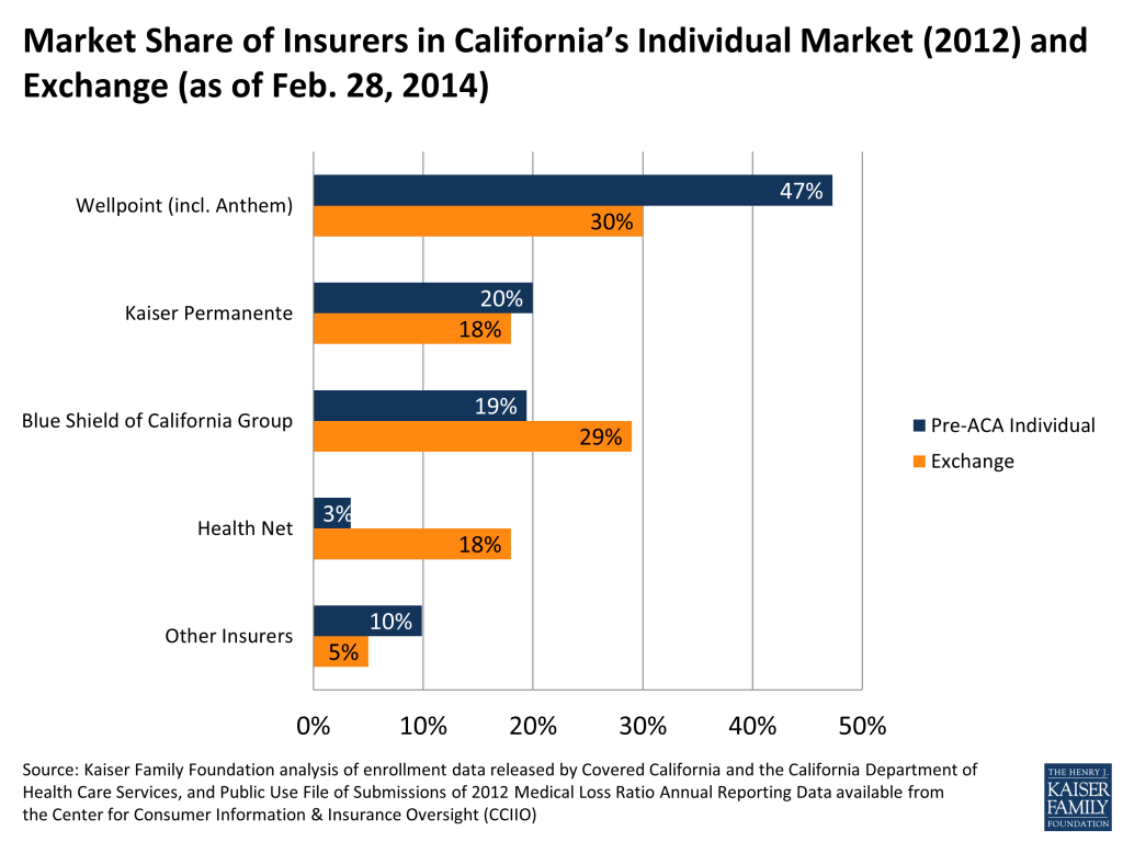
Wellpoint, the parent company of Anthem Blue Cross of California and the state’s largest individual market insurer, has significantly less market share in the exchange than it did in the 2012 individual market (30% vs. 47%). Blue Shield of California picked up substantial market share, most likely because it was able to offer the lowest premiums in several parts of the state.
Figure 1
Health Net, previously holding only 3% of the market, now has 18% market share in the exchange. This insurer has the lowest premiums in much of Southern California, where it is also leading enrollment.
Connecticut
In Connecticut the exchange market looks to be significantly less competitive than its 2012 individual market. All three market indicators (HHI, market share of largest insurer, and number of insurers with greater than 5% market share) point to less competition in the exchange compared to the individual market in 2012.
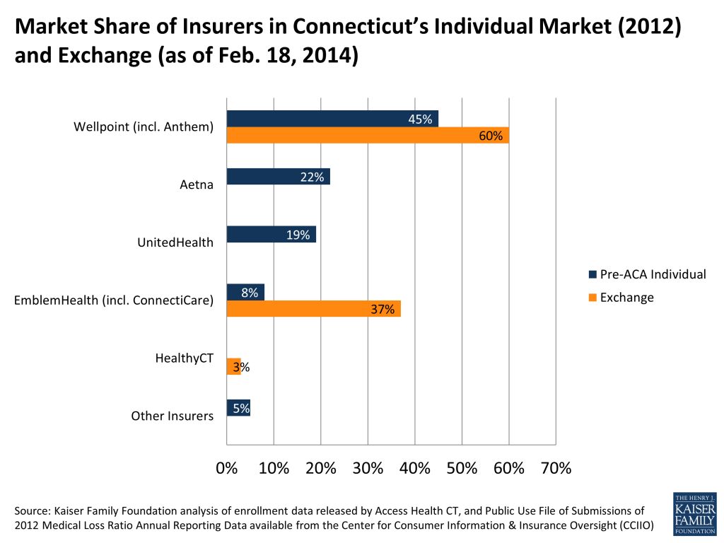
Connecticut’s exchange has just 3 insurers participating. Although five initially indicated they would participate in the state’s exchange, Aetna and UnitedHealth subsequently pulled out. Cigna, a sizable insurer in the state’s group markets, also decided against participating in the state’s exchange.
Connecticut Insurance Market Competition
Market
Herfindahl-Hirschman Index (HHI)
% Market Share of Largest Company
Number of Companies over 5% Market Share
2012 Individual Market
2,962 (Highly Concentrated)
45%
4
2014 Exchange Market(As of February 18, 2014)
4,978 (Highly Concentrated)
60%
2
How Competitive is Exchange?
Less Competitive
Less Competitive
Less Competitive
Source:Kaiser Family Foundation.
Two of the three exchange insurers, Wellpoint (Anthem) and EmblemHealth (ConnectiCare), together made up just over half (54%) of the individual market in 2012, and now control 97% of the exchange market. The other 2% of the market is HealthyCT, a new entrant. HealthyCT is a CO-OP plan formed in late 2011 that uses a patient-centered medical home model.
Figure 2
Despite a less competitive exchange market and higher than average premiums, Connecticut has been very successful in enrolling consumers. Exceeding the state’s own expectations, it is currently ranked second in the nation of states that have enrolled the largest portion of their potential exchange enrollees (Vermont is currently number 1). Connecticut’s success could be attributed in part to its usage of Apple-inspired storefronts in enrolling residents through the exchange. Designed to simplify the complexities of health insurance, these retail-like stores are staffed with enrollment counselors and brokers who walk consumers through the enrollment process.
In an effort to encourage more insurers to participate in the first years of the exchange, Connecticut offered a form of market exclusivity to those insurers agreeing to offer coverage in 2014. Insurers that decided not to participate in 2014 are barred from entering for at least 2 more years. While it is not known how heavily this policy factored into insurer’s decisions to enter the exchange market in 2014, it is notable that California and New York instituted similar policies and were able to achieve more competitive exchange markets.
Minnesota
Looking only at the competition indicators, Minnesota’s exchange market closely resembles its 2012 individual market. The state’s HHI (3,999 vs. 4,104) and the largest insurer’s market share (59% vs. 58%) appear to be relatively unchanged from 2012. While the indicators are comparable in the exchange and the 2012 individual market, the insurer leading enrollment in the exchange was actually a very small player in Minnesota’s individual market in 2012.
Minnesota Insurance Market Competition
Market
Herfindahl-Hirschman Index (HHI)
% Market Share of Largest Company
Number of Companies over 5% Market Share
2012 Individual Market
3,999 (Highly Concentrated)
59%
4
2014 Exchange Market(As of February 19, 2014)
4,104 (Highly Concentrated)
58%
3
How Competitive is Exchange?
Similar
Similar
Less Competitive
Source: Kaiser Family Foundation.
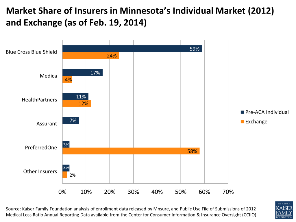
With some of the lowest exchange premiums in the country, PreferredOne was able to seize a significant portion of the exchange market and has clearly had a noticeable effect on the competitive landscape in the state. PreferredOne currently controls more than half (58%) of the exchange market, whereas it held just 3% of the 2012 individual market. In the Minneapolis region, PreferredOne is able to offer the least expensive silver plan in part by offering a narrow network version of its other plans. As part of PreferredOne’s “Select” network, these plans only contracts with 17 hospitals in the state, compared to its broader “Choice” network, which contracts with 136 hospitals in the state. The Select network comes with lower monthly premiums: a 40 year-old enrolling in an Accent Select silver plan would pay $154 per month, compared to $172 per month for a broader network Accent Choice silver plan.
Figure 3
PreferredOne has significantly outpaced the previously dominant insurer in the state, Blue Cross Blue Shield. Controlling 59% of the individual market in 2012, Blue Cross Blue Shield (which priced significantly higher than PreferredOne) only has 24% market share in the exchange. Because of these significant market share shifts in the exchange, it’s possible that a different picture of the competitiveness of Minnesota’s individual market will emerge once information on enrollment outside the exchange becomes available.
Combined, four companies – PreferredOne, Blue Cross Blue Shield, HealthPartners, and Medica – have enrolled 98% of the exchange market. (In 2012, these insurers accounted for 90% of the total market share.) UCare, a nonprofit health plan that previously served Medicare and Medicaid enrollees and is a new entrant in the individual market, comprises 2% market share in the exchange.
Nevada
Nevada’s exchange is moderately more competitive than the state’s pre-ACA individual market was overall. While the exchange HHI score is roughly unchanged, the market share held by the largest insurer decreased somewhat (from 44% to 37%) and the number of insurers with more than 5% market share also increased (from 3 to 4 insurers).
Nevada Insurance Market Competition
Market
Herfindahl-Hirschman Index (HHI)
% Market Share of Largest Company
Number of Companies over 5% Market Share
2012 Individual Market
3,198 (Highly Concentrated)
44%
3
2014 Exchange Market(As of March 4, 2013)
3,049 (Highly Concentrated)
37%
4
How Competitive is Exchange?
Similar
More Competitive
More Competitive
Source: Kaiser Family Foundation.
In Nevada, two companies (UnitedHealth and Wellpoint) currently make up 48% of exchange market enrollment. These two insurers previously held 78% of the 2012 individual enrollment, but have lost significant market share to a new entrant.
Leading enrollment in the Nevada exchange is a new insurance company called Nevada Health CO-OP. With 37% of the exchange market, Nevada Health is the only CO-OP plan to have gained significant enrollment in the seven states with available data. Another prominent new player on the exchange market is St. Mary’s Health Plans, which holds 15% of market share. Prior to its participation on the exchange, the health plan only offered coverage in the small group and large group markets.
Figure 4
New York
Of the seven states, New York’s exchange market is the most competitive and is also more competitive than its pre-ACA individual market as a whole. The state’s individual market was moderately concentrated, but its exchange market is now considered unconcentrated (with an HHI of less than 1,500).
New York Insurance Market Competition
Market
Herfindahl-Hirschman Index (HHI)
% Market Share of Largest Company
Number of Companies over 5% Market Share
2012 Individual Market
1,641 (Moderately Concentrated)
28%
5
2014 Exchange Market(As of December 30, 2014)
1,197 (Unconcentrated)
18%
7
How Competitive is Exchange?
More Competitive
More Competitive
More Competitive
Source: Kaiser Family Foundation.
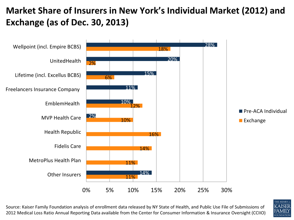
New York’s exchange acts as an active purchaser, meaning the state selectively contracts with plans, rather than allowing any qualified insurer to participate. Even so, the state has 16 parent companies offering plans in the exchange in various parts of the state, 7 of which hold market shares greater than five percent.
Figure 5
Ten of these companies offered coverage to New Yorkers purchasing their own insurance before the ACA. All together these ten companies enrolled 81% of the individual market in 2012, and now make up just over 54% of exchange enrollment. New York’s exchange introduced six new insurers to the individual market that combined hold 45% of the exchange market. The largest new entrant to New York’s market is Health Republic, a CO-OP plan that originally received sponsorship from Freelancers Union but is now licensed as an independent company. Other sizable new entrants are Fidelis Care and MetroPlus Health Plan, both of which served Medicaid beneficiaries before the ACA.
While New York’s largest individual market insurer, Wellpoint Inc. (which includes Empire Blue Cross Blue Shield), controlled 28% of the 2012 individual market, it now holds only 18% of the exchange market. Several smaller insurers have picked up market share. MVP Health Care, for example, held a mere 2% of the individual market in 2012, but now has about 10% of the exchange market.
UnitedHealth previously held a substantial portion (20%) of the 2012 individual market. Currently the insurer represents only 2% of the exchange market, perhaps because it priced relatively high compared to its competitors.
Rhode Island
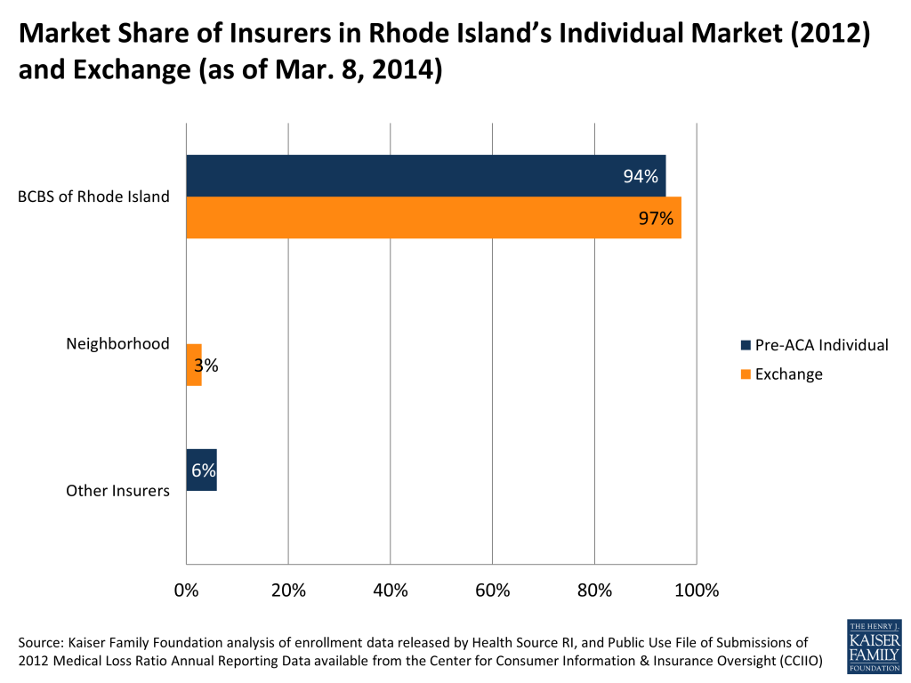
All three of the competition indicators suggest that Rhode Island’s exchange market is similarly situated to its 2012 individual market. Rhode Island’s exchange, like its 2012 individual market, is extremely concentrated, with almost all of the market controlled by a single insurer (Blue Cross & Blue Shield of Rhode Island).
Rhode Island Insurance Market Competition
Market
Herfindahl-Hirschman Index (HHI)
% Market Share of Largest Company
Number of Companies over 5% Market Share
2012 Individual Market
8,824 (Highly Concentrated)
94%
1
2014 Exchange Market(As of March 8, 2014)
9,361 (Highly Concentrated)
97%
1
How Competitive is Exchange?
Similar
Similar
Similar
Source: Kaiser Family Foundation.
There are only two insurers competing in Rhode Island’s exchange market. Blue Cross Blue Shield of Rhode Island holds 97% market share. That it controls so much of the exchange is unsurprising as the insurer previously held 94% of the overall individual market before the ACA.
Rhode Island’s other plan, Neighborhood Health Plan of Rhode Island (NHPRI), currently holds 3% of the market. Before the ACA, NHPRI served Medicaid enrollees, but entered into the exchange this year. Rhode Island’s exchange director has indicated that they are in conversations with other carriers and are hopeful for additional entrants in the coming years.
Figure 6
Washington
Much like its individual market in 2012, Washington’s exchange market is shaping up to be highly concentrated. Washington State initially rejected filings from several insurers wishing to participate in the state’s exchange, temporarily leaving the state with just four exchange insurers. Shortly before the exchanges opened, however, the state approved additional insurers, bringing participation to a total of 9 insurers (three of which are owned by the same parent company, Premera).
Washington Insurance Market Competition
Market
Herfindahl-Hirschman Index (HHI)
% Market Share of Largest Company
Number of Companies over 5% Market Share
2012 Individual Market
3,230 (Highly Concentrated)
40%
3
2014 Exchange Market(As of January 31, 2014)
4,309 (Highly Concentrated)
62%
3
How Competitive is Exchange?
Less Competitive
Less Competitive
Similar
Source: Kaiser Family Foundation.
Three parent companies hold about 92% of the exchange market: Premera, Group Health, and Centene. Coordinated Care (a Centene subsidiary) is a new entrant that has picked up substantial market share in the exchange. Centene contracted with the state of Washington in 2012 to serve Medicaid beneficiaries and subsequently entered into the individual exchange market. It now offers the lowest silver premiums in all areas in which it operates.
Figure 7
While Premera’s premiums are not the lowest, the insurer did pick up a substantial portion of the market, now controlling nearly two thirds of the exchange market. Premera did offer the second-lowest cost silver plans in much of the state and may have benefited from more name-recognition than Centene.
As in Minnesota, market share in Washington’s exchange has shifted significantly as compared to the pre-ACA individual market. Regence, a major player in the individual market previously, has picked up very few exchange enrollees. However, if Regence is still enrolling a significant number of people outside the exchange, the individual market as a whole may end up being more competitive than the exchange-only enrollment information suggests.
Conclusion
The long-term success of the exchanges and other ACA provisions governing market rules will be measured in part by how well they facilitate market competition, providing consumers with a diversity of choices and hopefully lower prices for insurance than would have otherwise been the case. With the first open enrollment period not yet completed, it is too soon to tell how well the exchanges will work to improve competition in the individual insurance market, which historically has been highly concentrated and dominated by a small number of insurers in most states. Exchange enrollment will certainly change – especially during this last month of open enrollment, but also throughout the year as enrollees gain and lose eligibility – and it will be several years before we can truly evaluate the success of the new markets.
Only scattered information is available so far on enrollment across plans. Seven state-run exchanges have released market share data, but these enrollment numbers do not include individual market enrollment outside of the exchange. Off-exchange individual markets will continue to exist alongside exchanges, so exchange enrollment alone does not tell the whole story of consumer choice and competition.
Nonetheless, early indications suggest that some exchange markets are more competitive than their states’ individual markets before the ACA. In particular, the two largest states, California and New York, have significantly more competitive exchange markets compared to their individual markets in 2012. Two states (Connecticut and Washington) that have also been successful at enrolling consumers seem to have less competition than in their 2012 individual markets. Results from the remaining states generally show either similar levels of competition as their pre-ACA markets or mixed signs.
Several insurers with lower-cost silver options have gained significant market share (most enrollees are choosing silver plans). Some exchange insurers may have found a competitive edge in offering narrow network plans that have lower premiums but give enrollees fewer choices of providers. Recent Kaiser polling suggests that consumers who are either uninsured or buying their own insurance prefer a cheaper plan with a narrow network to one that has a higher premium but a broad network. Minnesota’s PreferredOne, in particular, appears to have gained significant market share by offering a narrow network plan that comes with the lowest-cost silver premium in the country.
While new entrants to the market have generally not picked up meaningful market share, there are notable exceptions where new plans have altered the competitive landscape significantly, such as in Nevada. And, in Minnesota (where competition appears similar to what it was before) and Washington (where it appears to be somewhat less competitive), exchange enrollment is distributed across plans very differently from how it was before in the individual market. This suggests a more dynamic market than indicated by aggregate statistics alone and points to the potential for greater price competition in the future.
Methods
Market share was calculated as the percent of a given state’s individual or exchange market enrollment that was accounted for by a given insurer (plans that shared a parent company within a given state were collapsed into one insurer). Exchange enrollment numbers reflect nongroup (individual market) purchasers only and do not include SHOP enrollees. The Herfindahl–Hirschman Index (HHI) was calculated by taking the sum of squares of market share by state.
Pre-ACA individual market enrollment data were obtained from Public Use File of Submissions of 2012 Medical Loss Ratio Annual Reporting Data available from the Center for Consumer Information & Insurance Oversight (CCIIO).
The sources for each state’s plan level enrollment data are listed below:
The Medical Loss Ratio provision assures that insurers cannot profit excessively relative to the premiums they charge, but it does not guarantee that insurers will push to get the lowest costs and charge to lowest premiums. ↩︎
The HHI is generally calculated as the sum of squares of market share of the 50 largest companies. For example, if a state had five insurance carriers, and one carrier has 60% market share while the others each have 10%, the HHI would be 4,000 (because 60^2 + 10^2 + 10^2 + 10^2 + 10^2 = 4,000). ↩︎
MPR/Kaiser Family Foundation analysis of CMS Medicare Advantage enrollment files, 2008-2014, and MPR, “Tracking Medicare Health and Prescription Drug Plans Monthly Report,” 2001-2007. Report of the Medicare Board of Trustees, 2002.
The “Great Recession” that started roughly in 2007 and peaked in 2010 affected many individuals, indicated by steep rises in unemployment and accompanying declines in incomes and increases in poverty rates. These economic changes were accompanied by changes in health insurance coverage. Coverage trends since the start of the recession and in the post-2010 recovery are associated not only with these direct economic effects, but also with broader demographic trends, existing underlying coverage trends, changes in workforce, and regional population shifts. This brief examines changes in insurance coverage in light of all these factors.
The recession was marked by an increase of almost 6 million uninsured individuals between 2007 and 2010. The losses in coverage were mostly driven by large numbers of individuals losing employer-sponsored insurance, although gains in Medicaid coverage partly offset these losses. The recession caused an increase in the low-income population, a group that tends to have lower employer coverage rates, higher Medicaid coverage rates, and higher uninsured rates than other groups. Increased economic opportunities after the recession between 2010 and 2012 saw this population decrease, and correspondingly saw a decrease in national uninsured rates.
The main contributor to increasing post-recession coverage rates, even with increased employment, was Medicaid, not employer coverage. Employer coverage rates did stabilize after 2010 after long trends of decline predating the recession, but this change was likely caused by provisions in the Affordable Care Act (ACA) that allowed young adults to continue as dependents on parents’ private plans until age 26. Although full-time work increased and joblessness decreased after the recession, employer coverage rates continue to decline for many. This is especially true in small-to-medium firms and in firms that have historically low coverage rates. These firms grew the most among all firms in terms of employment after the recession.
Population shifts also contributed to coverage trends. The Northeast and Midwest, despite having the largest gains in coverage post-recession (partly because of Medicaid policies), also saw decreases in overall population. The West had slightly lower gains in coverage while the South did not experience significant gains in coverage. However, these regions experienced population growth. This dynamic will be important in considering the ACA’s impact, since most states that are not currently expanding Medicaid are in these two regions.
Issue Brief: Introduction
Though the effects of the Great Recession, which peaked in 2010, are still being felt today, the economy is slowly improving. Since 2010, the unemployment rate has fallen, while real gross domestic product (GDP) and real personal incomes have increased. In this brief we address the question of whether the decline in employer sponsored insurance (ESI) and the associated increases in uninsured rates that occurred with the sharp decline in economic activity between 2007 and 2010 have begun to reverse now that the economy is improving. We find that there has been very little change in the ESI rate, in fact there is some evidence that it is continuing to decline albeit at a much slower rate. There continues to be an increase in public coverage which has resulted in a decline in the number of uninsured in the last two years, both among adults and children. There has been an increase in ESI coverage among young adults, because of the Affordable Care Act (ACA) provisions allowing them to retain family coverage.
Issue Brief: The Improving Economic Picture
Economic indicators suggest a modest economic recovery since the peak of the recession in 2010. The unemployment rate increased from 4.6 percent in 2007 to peak at 9.6 percent in 2010 (Figure 1). By 2012, the unemployment rate had fallen to 8.1 percent. The most recent data (December 2013) show that the unemployment rate has continued to fall to 6.7 percent. Real GDP fell from $14.9 trillion in 2007 to $14.4 trillion in 2009. Beginning in 2010, real GDP has increased reaching $15.5 trillion in 2012 (Figure 2). Real personal incomes, shown in Figure 3, fell between 2007 and 2010 but increased by 2012. Real median household income fell from $54,489 in 2007 to $50,831 in 2010, but reached $51,017 by 2012. Real per capita income fell from $29,682 in 2007 to $27,968 in 2010 and increased to $28,281 by 2012.
Figure 1: National Unemployment Rate, 2000-2012Figure 2: Real GDP, 2000-2012Figure 3: Real Personal Income, 2000-2012
Issue Brief: Changes In Coverage Among The Nonelderly Population
Figure 4 and Table 1 show the changes in health insurance coverage between 2007 and 2012. In the early years of the recession, from 2007 to 2010, the ESI rate fell dramatically from 64.3 percent to 59.7 percent. During this period, 9.5 million people lost ESI coverage. There was no significant change in the rate of private non-group coverage during this period. Some of the loss of ESI was offset by increases in Medicaid and Children’s Health Insurance Program (CHIP) coverage. There was an increase in Medicaid/CHIP coverage from 11.8 percent to 14.4 percent from 2007 to 2010, meaning 7.4 million more people had public coverage. The net result was an increase in the uninsured rate from 16.6 percent to 18.5 percent, an increase of 5.7 million individuals, between 2007 and 2010. Between 2010 and 2012, when the economy began to improve, the loss of health insurance coverage generally halted (Figure 4). There was no change in the non-group coverage rate. However, there was an increase of 0.5 percentage points in Medicaid and CHIP coverage, meaning 1.5 million people gained Medicaid or CHIP coverage. There were also an additional 1.1 million individuals who had ESI coverage, mostly young adults (data not shown). These modest increases in coverage resulted in the uninsured rate falling from 18.5 percent to 17.7 percent and the number of uninsured falling by 1.8 million.
Figure 4: Percentage Point Changes in Health Insurance Coverage Among the Nonelderly, 2007-2012
Changes in Coverage by Income
Much of the change in uninsured between 2007 and 2012 occurred among those with incomes below 200 percent of the federal poverty level (FPL). Between 2007 and 2010, the number of people in the middle-income group – those with incomes of 200 to 399 percent FPL – fell by 3.5 million and the number of individuals with incomes at or above 400 percent FPL fell by 6.0 million. All of the net population growth was among those with incomes below 200 percent FPL. Over the three-year period, an additional 13.9 million people had incomes below 200 percent FPL (Figure 5). The lowest income group experienced the sharpest decline in ESI coverage – from 31.4 percent to 28.1 percent. They also experienced the largest increase in Medicaid/CHIP coverage. The uninsured rate in this group increased from 31.2 to 32.3 percent, and there was an increase of 5.4 million uninsured low-income individuals. This increase in the uninsured population happened because of both the increase in the uninsured rate and the increase in the size of the low-income population.
Figure 5: Percentage Point Changes in Health Insurance Coverage Among the Nonelderly, by Income, 2007-2010
Between 2010 and 2012, the most important changes (Figure 6) continued to occur among low-income individuals. The low-income population continued to increase, though not as much as in the previous three years. Almost all of the increase in public coverage occurred among those with incomes below 200 percent FPL, as did virtually all of the reduction in the uninsured. Among those with incomes below 200 percent FPL, the number of uninsured fell by 1.9 million, accounting for the entire drop in the number of uninsured over this period.
Figure 6: Percentage Point Changes in Health Insurance Coverage Among the Nonelderly, by Income, 2010-2012
Changes in Coverage by Age
Historically, coverage options for adults—particularly low-income adults—were more limited than those for children due to limits on Medicaid eligibility for adults. We next examine the changes in insurance coverage for adults and children separately, given the differences in availability of public coverage between the two groups.
Adults
There was a 4.6 percentage point decline in ESI among adults in the early years of the recession, which was partially offset by a 1.5 percentage point increase in Medicaid enrollment (Figure 7). Thus, the uninsured rate increased by 3.0 percentage points, from 19.1 percent to 22.0 percent. The increase in the number of uninsured adults was 6.4 million from 2007 to 2010. Most of the increase was among low-income adults, where the number of uninsured increased by 5.6 million (Table 2). Between 2010 and 2012, the overall ESI rate among adults did not change, but as a result of the increase in public and nongroup coverage, the uninsured rate declined by 0.8 percentage points, from 22.0 to 21.3 percent. The number of uninsured adults declined by 1.1 million. All of the decline was among low-income adults (Table 2). Changes in coverage among adults are affected by ACA provisions that allow young adults to stay on their parents’ policy. Because the policy was enacted in 2010, in Figure 8 we used 2009 as the base year because we wanted to make sure that we were able to clearly see the effects pre and post implementation of the provision. Although there appears to have been no real change in ESI coverage among adults between 2009 and 2012, there are in fact two offsetting trends that become apparent when ESI coverage among adults is broken out by age cohorts. Figure 8 and Table 3 show that among young adults (ages 19-26), ESI coverage increased by 4.3 percentage points from 2009 to 2012. In contrast, during this same period, individuals in the two oldest age groups (ages 35-54 and ages 55-64) experienced a continuing decline in ESI coverage. For those between the ages of 35 and 54 there was a statistically significant decrease in ESI coverage of 1.6 percentage points, and adults between the ages of 55 and 64 saw an even larger loss of ESI coverage of 2.6 percentage points. The overall rates of ESI among adults appear to be flattening out because the dramatic increase in ESI among young adults is masking the continuing decrease in ESI that is occurring among the two older age cohorts. The age-related trends underlying the seemingly constant rate of ESI among all adults have significant implications. The increase in ESI among young adults implies that the provision in the ACA that allow children up to age 26 to stay on their parents’ insurance as of September 2010 is having the intended effects; whereas the decrease in ESI among older individuals, ages 35-64, indicates that the bulk of the working force is continuing to experience significant declines in ESI coverage.
Figure 7: Percentage Point Changes in Health Insurance Coverage Among Adults, 2007-2012Figure 8: Percentage Point Changes in Health Insurance Coverage Among Adults by Age Group, 2009-2012
Children
Patterns of coverage changes between 2007 and 2012 differ between children and adults. In the early years of the Great Recession, 2007 to 2010, the decline in ESI coverage was slightly larger for children than for adults: the ESI rate for children dropped 4.9 percentage points compared to 4.6 for adults. However, there was a much larger increase in Medicaid and CHIP coverage for children than there was for adults. Among children, Medicaid/CHIP coverage rose from 23.5 percent to 29.1 percent, or an increase of 4.4 million children (Figure 9). As a result, despite the severe recession and sharp decline in ESI coverage, the uninsured rate actually fell for children. Between 2007 and 2010, the number of uninsured children fell by 600,000. Between 2010 and 2012, there was a small but not statistically significant increase in the ESI rate among children, and there was a small increase in public coverage (Figure 9). Because of the small increases in public and private coverage, there was a small decline in the uninsured rate among children, from 10.1 percent to 9.2 percent, a decrease of 700,000 children. Thus, the uninsured rate for children declined in both periods throughout 2007 to 2012.
Figure 9: Percentage Point Changes in Health Insurance Coverage Among Children, 2007-2012
Changes in Coverage by Family Work Status
Consistent with declines in incomes, there were major shifts in patterns of family work status during the recession (Table 5). The number of individuals in households with one or two full-time workers fell by 3.9 million and 7.0 million respectively between 2007 and 2010 (Figure 10). At the same time, there was an increase of 6.2 million in the number of individuals living in households with only part-time workers and an increase of 9.2 million individuals living in households with no workers. Since the likelihood of lacking ESI coverage and the uninsured rate is much higher in households with only a part-time worker or no workers, the changes in employment affected the ESI rates. In addition to changes in work status, there were declines in ESI rates both among those who remained in two full-time workers or one full-time worker households by 1.2 percentage points and 1.7 percentage points respectively. Similarly, there were declines in rates of ESI in households with only a part-time worker or no workers as well. Thus, declines in ESI coverage were not simply caused by the shift from full-time to part-time and no worker households; the likelihood of having ESI coverage also declined among households with workers of any work status. Because of the shifts among work status groups, all of the increase in the uninsured occurred among individuals living in households with part-time or no-workers; increases of 2.4 million and 3.6 million uninsured people respectively. From 2010 to 2012 this pattern changed (Figure 11). There was an increase of 2.2 million individuals living in households with one full-time worker and declines in the number of individuals living in households with only a part-time and no worker. There was a small increase in the rate of ESI for families with 2 full-time workers, with part-time workers and with no workers, though the increase was only significant for families with a part-time workers. Among households with one full-time worker the ESI rate continued to decline from 64.7 percent to 64.0 percent. Thus, among those in households with one full-time worker – almost 140 million people – the likelihood of ESI coverage is continuing to fall.
Figure 10: Percentage Point Changes in Health Insurance Coverage Among the Nonelderly, by Family Work Status, 2007-2010Figure 11: Percentage Point Changes in Health Insurance Coverage Among the Nonelderly, by Family Work Status, 2010-2012
Changes in Coverage by Demographic Characteristics
In addition to declines in incomes and employment discussed in previous sections, there were also two important demographic changes that have occurred in recent years. The first is the decline in the white population and an increase in the number of Hispanics, blacks, and “others.” The “others” category includes American Indians, Alaska Natives, Asians, Pacific Islanders, and anyone with two or more races.. From 2007 to 2012, the white population declined by 6.1 million people while the number of Hispanics increased by 6.5 million and “others” by 4.5 million. The shift in demographics is important particularly since Hispanics have much lower rates of ESI and higher uninsured rates than whites. The “other” group tends to have coverage patterns that are much closer to that of whites. In addition, geographically, there was stagnant population growth in the Northeast, a decline in population size in the Midwest, and increases of 4.0 million and 2.0 million people in the South and West respectively. Thus, the population continued to shift toward regions in which there were lower ESI rates and higher likelihood of being uninsured.
Race/Ethnicity
Between 2007 and 2010, all racial and ethnic groups saw declines in ESI and increases in uninsured rates (Table 6 and Figure 12). Among whites, there was a decline in ESI coverage, which was somewhat offset by Medicaid and CHIP coverage. The uninsured rate among whites increased from 11.7 percent to 13.7 percent and the number of uninsured increased by 2.8 million. Among blacks, there was a very large drop in ESI coverage from 53.4 percent to 46.3 percent. Again, some of this was offset by public coverage, but the uninsured rate increased from 19.9 percent to 22.1 percent and the number of uninsured black individuals increased by 800,000. Hispanics saw a smaller than average drop in ESI coverage although ESI coverage rates were already lower than those for other groups. Hispanics also experienced an increase in public coverage and no significant change in uninsured rate. However, because of the increase in the size of Hispanic population, the number of uninsured Hispanics increased by 1.1 million. The “other” group saw a decline in ESI coverage about equal to the national average. Public coverage for this group increased, as did the uninsured rate from 17.0 percent to 19.0 percent. The increase in the number of uninsured in this group was 1.0 million. Racial and ethnic group coverage trends changed starting in 2010 (Figure 13). From 2010 to 2012, the ESI rate stayed constant for whites but increased sharply for blacks. There were small, but statistically insignificant changes in ESI rates for the other two racial and ethnic groups. Overall, there was an increase in public coverage, particularly among Hispanics. The uninsured rate declined for each group, larger declines for blacks, Hispanics, and ”others”; 1.6 percentage points, 1.4 percentage points, and 2.5 percentage points respectively. The stabilization of ESI rates, or in some cases increases, coupled with continued small increases in public coverage led to an overall decline in uninsured rates for all racial and ethnic groups. For each group, there were fewer uninsured individuals. But for each group the rate of ESI coverage was lower in 2012 than it was in 2007.
Figure 12: Percentage Point Changes in Health Insurance Coverage Among the Nonelderly, by Race/Ethnicity, 2007-2010Figure 13: Percentage Point Changes in Health Insurance Coverage Among the Nonelderly, by Race/Ethnicity, 2010-2012
Geographic Region
The shift in populations among regions between 2007 and 2010 was also important, as regions have different underlying uninsured rates and ESI rates. Overall, the shift of the population towards the South and West lowered ESI rates and raised uninsured rates nationwide, as these regions have lower coverage rates than other regions. Still, all regions saw drops in ESI and increases in uninsured between 2007 and 2010 (Figure 14). The Northeast, which saw little change in overall population, had a sharp decline of 4.0 percentage points in the ESI rate and an increase in the uninsured rate of 2.1 percentage points. The number of uninsured in the Northeast increased by 1.0 million. The Midwest saw the sharpest drop in ESI coverage – 5.7 percentage points – and the largest increase in the uninsured rate – 2.4 percentage points, corresponding to 1.4 million more uninsured people. The South saw a 4.1 percentage point decline in the ESI coverage rate that was partially offset by an increase in Medicaid and CHIP coverage. But the uninsured rate in the South increased from 20.4 percent to 21.7 percent, an increase that, combined with population growth in that region, led to an increase of 1.9 million uninsured individuals. Similarly in the West, the 4.8 percentage point decline in ESI rate was not fully offset by increases in public coverage and the uninsured rate increased by 1.9 percentage points or 1.4 million individuals. In the last two years, ESI rates were largely unchanged in each region (Figure 15). There were increases in public coverage, particularly in Northeast and West. In the Northeast, the large increase in public coverage resulted in the number of uninsured declining by almost 1 million individuals, about as much as it had increased between 2007 and 2010. In contrast, the small changes in coverage in the South did little to reverse the large increase in the uninsured population seen in the first three years.
Figure 14: Percentage Point Changes in Health Insurance Coverage Among the Nonelderly, by Region, 2007-2010Figure 15: Percentage Point Changes in Health Insurance Coverage Among the Nonelderly, by Region, 2010-2012
Issue Brief: Changes In Coverage Among Workers
While the previous sections have looked at all nonelderly individuals, this section will look solely at nonelderly workers. Between 2007 and 2010 the number of workers declined by 4.9 million (Table 8). All of this decrease was experienced in small and medium size firms (<1,000 workers) or among the self-employed. Overall, there was a decline in the rate of ESI among workers from 72.5 percent to 69.6 percent, meaning 7.7 million fewer workers had ESI. The percentage of workers without coverage increased from 17.6 percent to 19.6 percent, resulting in 2 million more uninsured workers. The decline in the rate of ESI coverage occurred in each firm size category; from 65.6 percent to 62.3 percent in small and medium firms and from 83.5 percent to 80.3 percent in large firms (Figure 16). There was an increase of almost 1 million uninsured workers in small and medium firms and 1.2 million in large firms.
Figure 16: Percentage Point Changes in Health Insurance Coverage Among Workers, by Firm Size, 2007-2010
Between 2010 and 2012, the number of workers increased by 2.1 million, with 1.1 million more workers in small and medium sized firms and 1.0 million in large firms. The rate of ESI continued to decline for all workers by about half a percentage point (Figure 17). All of the decline in the ESI rate was in small and medium size firms. In large firms, the ESI rate increased slightly (0.8 percentage points).
Figure 17: Percentage Point Changes in Health Insurance Coverage Among Workers, by Firm Size, 2010-2012
There are also differences in coverage changes between those workers in industries with high rates of ESI coverage and those in industries with lower rates of ESI coverage (Table 9). High ESI industries are those with high ESI coverage rates (more than 80 percent in 2012). This group consisted primarily of finance, manufacturing, information and communications firms. Low ESI industries had ESI rates lower than 80 percent in 2012. These industries included primarily agriculture, construction, and wholesale and retail trade. Between 2007 and 2010, the decline in the number of workers, 4.9 million, was roughly split evenly between high and low ESI industries. However, the drop in the rate of employer sponsored insurance was greater in low ESI industries than high ESI industries—3.3 percentage points (66.0 percent to 62.7 percent) versus 1.9 percentage points (84.4 percent to 82.5 percent) (Figure 18). The increase in the uninsured rate among workers was also higher in low ESI industries. Thus, most growth in the number of uninsured workers during this period was among those in low ESI industries.
Figure 18: Percentage Point Changes in Health Insurance Coverage Among Workers, by Industry, 2007-2010
Almost all of the growth in workers between 2010 and 2012 —1.8 million out of 2.1 million total—was in low ESI industries. At the same time, the rate of ESI continued to decline in low ESI industries, falling from 62.7 to 62.3 percent. The rate of ESI stabilized in the high ESI industries.
Thus, while there were some gains in coverage for some workers in more recent years, most of the job growth that has occurred since the peak of the Great Recession has been in industries or firms where the rate of ESI continues to decline. These trends indicate that economic recovery may not be accompanied by large gains in employer coverage.
Figure 19: Percentage Point Changes in Health Insurance Coverage Among Workers, by Industry, 2010-2012
Conclusion
This analysis provides insight into changing uninsured rates since the recession and has several implications for what might happen to coverage moving forward. First, while the rate of employer sponsored insurance has stabilized for some groups in recent years, it has not led to large gains in ESI as the economy has improved. The overall stability of the ESI rate between 2010 and 2012 in part reflects the movement of the number of workers towards full time work, which would itself increase the ESI rate as full-time workers are more likely to have insurance than part-time or non-workers. However, the ESI rate among full-time workers as a group has actually declined, offsetting the potential positive effect of increases in full-time workers on coverage. Similarly, the rate of ESI continued to decline in low ESI industries and among small and medium firms, which have had sizable job growth in recent years. Given patterns of coverage for adults over age 26, which are not impacted by the ACA policy allowing young adults to stay on parents’ coverage and are thus indicative of underlying trends, it appears that an underlying trend of declining ESI persists. While coverage expansions under the Affordable Care Act will create more coverage options outside of employer-based coverage, ESI is still expected to remain the foundation of the health insurance system moving forward. Thus, it will be important to monitor whether recent trends in ESI coverage continue and whether and how the ACA can fill in gaps in availability of ESI.
Second, most of the changes in the uninsured occurred among low-income individuals. The severe recession and associated slow economic growth are increasing the size of this group. The number of people living in families with incomes below twice the poverty level grew by 13.9 million between 2007 and 2010 and another 1.1 million between 2010 and 2012. The low-income population saw large declines in coverage leading up to the peak of the recession (2007 to 2010) and small gains in coverage as the economy has started to improve (2010 to 2012). These changes have largely driven overall coverage, indicating that coverage for the low-income population is an important contributor to national trends. Correspondingly, coverage expansions under the ACA focus on increasing coverage for people with low or moderate incomes. However, with about half of states not expanding their Medicaid programs, many low-income adults are likely to remain uninsured.
Last, coverage changes for different age groups indicate that policies regarding the availability of insurance can make a difference in coverage patterns. During and after the recession, coverage for children was stabilized by growth in Medicaid and CHIP enrollment that offset loss of private coverage. In contrast, adults, who were less likely to be eligible for Medicaid, had smaller gains in public coverage to offset losses in private insurance, particularly during the period leading up to the peak of the recession (2007-2010). In more recent years, gains in private coverage among young adults (age 19-25), reflecting a 2010 ACA policy enabling these individuals to remain on their parents’ coverage, drove a decline in the number of uninsured adults. These patterns indicate that recent policies to expand coverage available to people of other ages may affect coverage moving forward. Given that the largest increases in the number of uninsured continue to be in the South and West, regions where many states have been the most resistant toward the expansion in the ACA, it will be important to monitor how availability of affordable coverage affects patterns in the future.
This issue brief was prepared by John Holahan and Megan McGrath of the Urban Institute
Appendix: Methods Notes
The data for this report is based on Urban Institute analysis of the Census Bureau’s March Supplement to the Current Population Survey (the CPS Annual Social and Economic Supplement or ASEC). The CPS supplement is the primary source of annual health insurance coverage information in the United States.
There is debate over whether the CPS is measuring the number of uninsured for an entire year (as intended) or whether responses more closely reflect the number of uninsured at a point-in-time. In this paper, we assume that the CPS is essentially a measurement of point-in-time coverage, primarily because the number of uninsured in the CPS has historically been significantly closer to point-in-time estimates and well above the full year estimates of other surveys. While there is also a concern that the CPS understates Medicaid/CHIP enrollment and thus, possibly overstates the number of uninsured,*none of the estimates presented here have been adjusted to take into account possible underreporting of Medicaid/CHIP coverage. However, it is unlikely that the size of the Medicaid undercount varies substantially over time.
We use the health insurance unit (HIU) as the unit of analysis for determining family-level income. A HIU includes members of the nuclear family who can be covered under one health insurance policy (i.e., policyholder, spouse, children who are under age 19 and full-time students under age 23). Use of HIUs in determining family-level income leads to results that differ from those obtained when household income is used because the latter includes the income of all relatives and unrelated individuals living together. The income of the HIU more accurately reflects the income available to individuals when purchasing private insurance or determining eligibility for public programs. We look at changes in coverage dividing the population into three income groups based on percent of the federal poverty level (FPL). The FPL’s are useful because they adjust for both inflation and family size.
In 2011, the Census Bureau revised its health coverage imputation methodology for those who did not respond to health insurance questions. The revisions address the differences between the way that health insurance coverage is collected in the CPS ASEC and the way it is imputed. Previously, dependent coverage assignments were limited only to the policyholder’s spouse and/or children. The revisions now allow all members in the household to be assigned dependent coverage, and the increase in the imputed number of dependents with coverage more accurately reflects individual reporting. These revisions were reflected in the calendar year 2010 CPS ASEC data, and revised extracts were released for 1999 to 2009 data years allowing a methodologically consistent trend to be examined from 1999 to 2010. Overall, the new editing process led to a 0.6 percentage point decrease in the number of uninsured in 2009. The release of the 2010 Census has impacted our use of the 2010 CPS dataset and our ability to create time trends spanning the last decade. Every year, the CPS survey is weighted according to the most recent Census so that the results of the survey sample may be generalized to reflect the composition of the entire population. Since 2000, the CPS datasets have been created using weights based on the demographic information from the 2000 Decennial Census. With the release of the 2010 Decennial Census, the Census Bureau updated the previously published 2010 CPS data using weights based on the newly gathered information from the 2010 Census. While this update enables the 2010 CPS dataset to more accurately reflect the current demographics of the population, it leads to two different sets of estimates for 2010: those based on the 2000 weights and those based on the 2010 weights. It is important to take note that CPS data for previous years in the decade continues to use weights based on the 2000 Census. Through rigorous testing, we found that the changes resulting from the updates were too small to be considered statistically significant, with a few minor exceptions. The most important is in race/ethnicity, where the change in weights resulted in a statistically significant decrease in the total number of whites and a statistically significant increase in the total number of Hispanics and people from other races. There were no changes in the rates of ESI, Medicaid, or other forms of insurance. However, the changes in the numbers of whites, Hispanics, and “other race/ethnicity” meant that some of the reported decline in the number of whites without insurance and increase in the number of Hispanics and “other” were due to the change in weights. For example, 600,000 of the 1.4 million person decline in the number of white uninsured that we report in this paper was due to the change in weights (reflecting a greater decline in the white population). Similarly, there were 300,000 more Hispanic uninsured and 400,000 more “other” uninsured because of the larger estimated size of these populations.
We use NHIS data to assign coverage to young adults, ages 15-26 years old, who report private coverage from outside the household but don’t report what that coverage is. We analyzed the corresponding year’s NHIS data to obtain the total proportion who have such coverage and the share of ESI among those with coverage outside the household. We applied this proportion to the CPS, assigning these individuals to either ESI or private non group coverage so that the rates match those seen among this population in the NHIS. This method results in the overall share among this group with ESI and private non group coverage matching that of the NHIS.
* Davern M, Klerman JA, Ziegenfuss J, Lynch V, Baugh D, Greenberg G. A partially corrected estimate of Medicaid enrollment and uninsurance: results from an imputational model developed off linked survey and administrative data. J Econ Soc Meas. 2009; 34(4):219-40; Call KT, Davidson G, Sommers AS, Feldman R, Farseth P, Rockwood T. Uncovering the missing Medicaid cases and assessing their bias for estimates of the uninsured. Inquiry Winter 2001/2002;38(4): 396-408
Tables
Table 1: Nonelderly
Coverage Distribution within Income Category
Change (Millions of People)
Coverage Distribution within Income Category
Change (Millions of People)
2007
2010
2007-10
2012
2010-12
2007-12
All Incomes (millions of people)
261.4
265.9
4.4a
266.9
1.0a
5.5a
Employer
64.3%
59.7%
-4.7%*
-9.5a
59.8%
0.2%
1.1b
-8.5a
Medicaid/CHIP
11.8%
14.4%
2.6%*
7.4a
14.9%
0.5%*
1.5a
9.0a
Medicare/TRICARE/Other federal
2.5%
2.9%
0.3%*
1.0a
3.0%
0.1%
0.3
1.3a
Private Nongroup
4.8%
4.6%
-0.2%#
-0.2
4.6%
0.0%
0.0
-0.2
Uninsured
16.6%
18.5%
1.9%*
5.7a
17.7%
-0.8%*
-1.8a
3.9a
Less than 200% of FPL
91.0
105.0
13.9a
106.1
1.1b
15.0a
Employer
31.4%
28.1%
-3.4%*
0.8a
28.9%
0.8%*
1.2a
2.0a
Medicaid/CHIP
29.2%
31.7%
2.5%*
6.7a
32.8%
1.1%*
1.5a
8.2a
Medicare/TRICARE/Other federal
3.7%
3.7%
0.1%
0.6a
4.0%
0.2%#
0.3a
0.9a
Private Nongroup
4.4%
4.2%
-0.2%
0.4a
4.2%
0.0%
0.0
0.4a
Uninsured
31.2%
32.3%
1.0%*
5.4a
30.2%
-2.1%*
-1.9a
3.6a
200 to 399% of FPL
75.2
71.7
-3.5a
72.2
0.5
-3.0a
Employer
74.0%
71.4%
-2.6%*
-4.4a
71.6%
0.2%
0.5
-3.9a
Medicaid/CHIP
4.5%
5.6%
1.1%*
0.6a
5.5%
-0.1%
0.0
0.6a
Medicare/TRICARE/Other federal
2.4%
3.0%
0.6%*
0.3a
2.9%
-0.1%
-0.1
0.3a
Private Nongroup
5.0%
5.1%
0.1%
-0.1
5.3%
0.1%
0.1
0.0
Uninsured
14.0%
14.8%
0.8%*
0.1
14.7%
-0.1%
0.0
0.1
400% of FPL and above
95.2
89.2
-6.0a
88.6
-0.5
-6.6a
Employer
88.1%
87.4%
-0.7%*
-5.9a
87.3%
-0.1%
-0.6
-6.5a
Medicaid/CHIP
0.8%
1.0%
0.2%*
0.2a
1.1%
0.1%
0.0
0.2a
Medicare/TRICARE/Other federal
1.5%
1.7%
0.2%#
0.1
1.8%
0.1%
0.0
0.1
Private Nongroup
4.9%
4.7%
-0.3%#
-0.5a
4.6%
-0.1%
-0.1
-0.6a
Uninsured
4.6%
5.2%
0.6%*
0.2
5.3%
0.1%
0.1
0.3b
Source: Urban Institute, 2013. Based on data from the 2008, 2011, and 2013 ASEC Supplement to the Current Population Survey.Note: Excludes persons aged 65 and older and those in the Armed Forces.* Indicates change in percent of people is statistically significant (at the 95% confidence level).# Indicates change in percent of people is statistically significant (at the 90% confidence level).a Indicates change in numbers of people is statistically significant (at the 95% confidence level).b Indicates change in numbers of people is statistically significant (at the 90% confidence level).
Table 2: Adults by Income
Coverage Distribution within Income Category
Change (Millions of People)
Coverage Distribution within Income Category
Change (Millions of People)
2007
2010
2007-10
2012
2010-12
2007-12
All Incomes (millions of people)
182.8
187.1
4.3a
188.7
1.7b
6.0a
Employer
65.9%
61.3%
-4.6%*
-5.8a
61.3%
0.0%
1.1
-4.7a
Medicaid/CHIP
6.7%
8.2%
1.5%*
3.0a
8.7%
0.6%*
1.2a
4.2a
Medicare/TRICARE/Other federal
3.0%
3.4%
0.4%*
0.8a
3.5%
0.1%
0.3
1.1a
Private Nongroup
5.3%
5.1%
-0.2%
-0.1
5.2%
0.1%
0.2
0.1
Uninsured
19.1%
22.0%
3.0%*
6.4a
21.3%
-0.8%*
-1.1a
5.3a
Less than 200% of FPL
57.5
67.7
10.2a
69.2
1.5a
11.7a
Employer
32.0%
28.8%
-3.2%*
1.1a
30.0%
1.2%*
1.2a
2.4a
Medicaid/CHIP
18.4%
19.6%
1.2%*
2.7a
20.6%
1.0%*
1.0a
3.7a
Medicare/TRICARE/Other federal
5.0%
4.9%
-0.2%
0.4a
5.2%
0.3%
0.3a
0.7a
Private Nongroup
5.6%
5.2%
-0.3%
0.4a
5.3%
0.0%
0.1
0.4a
Uninsured
39.0%
41.5%
2.4%*
5.6a
39.0%
-2.5%*
-1.1a
4.5a
200 to 399% of FPL
52.3
50.6
-1.7a
51.4
0.8
-0.9b
Employer
72.8%
69.9%
-2.9%*
-2.7a
70.0%
0.1%
0.6
-2.1a
Medicaid/CHIP
2.4%
3.0%
0.6%*
0.3a
3.3%
0.3%
0.2b
0.4a
Medicare/TRICARE/Other federal
2.7%
3.5%
0.7%*
0.3a
3.3%
-0.2%
-0.1
0.3a
Private Nongroup
5.3%
5.6%
0.3%
0.1
5.7%
0.1%
0.1
0.1
Uninsured
16.7%
18.0%
1.3%*
0.4b
17.7%
-0.3%
0.0
0.4b
400% of FPL and above
73.0
68.8
0.0%
-4.2a
68.2
-0.6
-4.8a
Employer
87.7%
87.0%
-4.2a
86.6%
-0.4%
-0.8
-4.9a
Medicaid/CHIP
0.6%
0.7%
0.1%
0.0
0.8%
0.1%
0.0
0.1b
Medicare/TRICARE/Other federal
1.6%
1.8%
0.2%#
0.1
1.9%
0.1%
0.1
0.1
Private Nongroup
5.0%
4.6%
-0.4%*
-0.5a
4.7%
0.1%
0.0
-0.5a
Uninsured
5.1%
5.9%
0.8%*
0.4a
6.0%
0.1%
0.0
0.4a
Source: Urban Institute, 2013. Based on data from the 2008, 2011, and 2013 ASEC Supplement to the Current Population Survey.Note: Excludes persons aged 65 and older and those in the Armed Forces.* Indicates change in percent of people is statistically significant (at the 95% confidence level).# Indicates change in percent of people is statistically significant (at the 90% confidence level).a Indicates change in numbers of people is statistically significant (at the 95% confidence level).b Indicates change in numbers of people is statistically significant (at the 90% confidence level).
Table 3: Adults by Age
Coverage Distribution within Income Category
Change (Millions of People)
Coverage Distribution within Income Category
Change (Millions of People)
2007
2009
2007-09
2012
2009-12
2007-12
Adults 19-25
28.2
29.1
0.9a
30.0
0.9a
1.8a
Employer
54.7%
50.1%
-4.5%*
-0.8a
54.4%
4.3%*
1.7a
0.9a
Medicaid/CHIP
9.4%
11.3%
1.9%*
0.6a
11.5%
0.2%
0.2
0.8a
Medicare/TRICARE/Other federal
1.5%
1.6%
0.1%
0.0
1.9%
0.3%#
0.1a
0.2a
Private Nongroup
5.2%
5.4%
0.2%
0.1
4.9%
-0.5%#
-0.1
0.0
Uninsured
29.3%
31.7%
2.3%*
1.0a
27.4%
-4.3%*
-1.0a
-0.1
Adults 26-34
35.6
36.4
0.8a
37.3
0.9a
1.7a
Employer
63.2%
57.1%
-6.1%*
-1.7a
57.2%
0.1%
0.5
-1.2a
Medicaid/CHIP
6.8%
9.0%
2.1%*
0.8a
9.1%
0.2%
0.1
1.0a
Medicare/TRICARE/Other federal
1.2%
1.6%
0.4%*
0.1a
1.7%
0.1%
0.1
0.2a
Private Nongroup
4.4%
4.5%
0.1%
0.1
4.5%
0.0%
0.0
0.1
Uninsured
24.4%
27.9%
3.5%*
1.5a
27.4%
-0.4%
0.1
1.6a
Adults 35-54
85.7
84.5
-1.2a
83.0
-1.5a
-2.7a
Employer
69.9%
66.4%
-3.6%*
-3.9a
64.8%
-1.6%*
-2.3a
-6.2a
Medicaid/CHIP
6.0%
7.2%
1.1%*
0.9a
7.8%
0.6%*
0.4a
1.3a
Medicare/TRICARE/Other federal
2.4%
2.6%
0.2%#
0.2
2.9%
0.2%
0.1
0.3a
Private Nongroup
5.2%
4.7%
-0.5%*
-0.5a
4.9%
0.2%
0.1
-0.4a
Uninsured
16.4%
19.1%
2.7%*
2.1a
19.7%
0.5%#
0.2
2.3a
Adults 55-64
33.3
35.4
2.1a
38.5
3.1a
5.2a
Employer
68.0%
65.8%
-2.2%*
0.7b
63.2%
-2.6%*
1.1a
1.7a
Medicaid/CHIP
6.1%
7.0%
1.0%*
0.5a
8.1%
1.1%*
0.6a
1.1a
Medicare/TRICARE/Other federal
7.9%
7.7%
-0.2%
0.1
7.9%
0.2%
0.3a
0.4a
Private Nongroup
6.5%
6.0%
-0.5%#
0.0
6.8%
0.8%*
0.5a
0.4a
Uninsured
11.6%
13.4%
1.9%*
0.9a
14.0%
0.5%
0.6a
1.5a
Source: Urban Institute, 2013. Based on data from the 2008, 2011, and 2013 ASEC Supplement to the Current Population Survey.Note: Excludes persons aged 65 and older and those in the Armed Forces.* Indicates change in percent of people is statistically significant (at the 95% confidence level).# Indicates change in percent of people is statistically significant (at the 90% confidence level).a Indicates change in numbers of people is statistically significant (at the 95% confidence level).b Indicates change in numbers of people is statistically significant (at the 90% confidence level).
Table 4: Children by Income
Coverage Distribution within Income Category
Change (Millions of People)
Coverage Distribution within Income Category
Change (Millions of People)
2007
2010
2007-10
2012
2010-12
2007-12
All Incomes (millions of people)
78.6
78.8
0.1
78.2
-0.6
-0.5
Employer
60.6%
55.8%
-4.9%*
-3.8a
56.2%
0.4%
0.0
-3.7a
Medicaid/CHIP
23.5%
29.1%
5.6%*
4.4a
29.7%
0.6%#
0.3
4.8a
Medicare/TRICARE/Other federal
1.4%
1.6%
0.2%*
0.2a
1.6%
0.0%
0.0
0.2a
Private Nongroup
3.6%
3.4%
-0.1%
-0.1
3.2%
-0.2%
-0.2
-0.3a
Uninsured
10.9%
10.1%
-0.8%*
-0.6a
9.2%
-0.9%*
-0.7a
-1.4a
Less than 200% of FPL
33.6
37.3
3.7a
36.9
-0.4
3.3a
Employer
30.5%
26.8%
-3.7%*
-0.3
26.9%
0.1%
-0.1
-0.3
Medicaid/CHIP
47.7%
53.6%
5.9%*
4.0a
55.5%
1.9%*
0.5
4.5a
Medicare/TRICARE/Other federal
1.4%
1.7%
0.3%*
0.2a
1.7%
0.0%
0.0
0.2a
Private Nongroup
2.5%
2.4%
-0.2%
0.0
2.2%
-0.1%
-0.1
0.0
Uninsured
17.9%
15.6%
-2.3%*
-0.2
13.7%
-1.9%*
-0.8a
-1.0a
200 to 399% of FPL
22.8
21.1
-1.8a
20.8
-0.3
-2.1a
Employer
76.7%
75.0%
-1.7%*
-1.7a
75.5%
0.5%
-0.1
-1.8a
Medicaid/CHIP
9.4%
11.8%
2.4%*
0.3a
11.1%
-0.7%
-0.2
0.2
Medicare/TRICARE/Other federal
1.7%
1.9%
0.3%
0.0
1.9%
0.0%
0.0
0.0
Private Nongroup
4.2%
4.0%
-0.2%
-0.1b
4.1%
0.1%
0.0
-0.1
Uninsured
8.0%
7.2%
-0.8%#
-0.3a
7.3%
0.1%
0.0
-0.3a
400% of FPL and above
22.2
20.4
-1.8a
20.5
0.1
-1.7a
Employer
89.6%
88.8%
-0.8%#
-1.8a
89.5%
0.7%
0.2
-1.6a
Medicaid/CHIP
1.5%
2.2%
0.8%*
0.1a
2.2%
-0.1%
0.0
0.1a
Medicare/TRICARE/Other federal
1.2%
1.3%
0.1%
0.0
1.2%
-0.1%
0.0
0.0
Private Nongroup
4.5%
4.8%
0.3%
0.0
4.2%
-0.7%#
-0.1b
-0.1a
Uninsured
3.2%
2.9%
-0.3%
-0.1a
3.0%
0.1%
0.0
-0.1b
Source: Urban Institute, 2013. Based on data from the 2008, 2011, and 2013 ASEC Supplement to the Current Population Survey.Note: Excludes persons aged 65 and older and those in the Armed Forces.* Indicates change in percent of people is statistically significant (at the 95% confidence level).# Indicates change in percent of people is statistically significant (at the 90% confidence level).a Indicates change in numbers of people is statistically significant (at the 95% confidence level).b Indicates change in numbers of people is statistically significant (at the 90% confidence level).
Table 5: Nonelderly by Family Work Status
Coverage Distribution within Income Category
Change (Millions of People)
Coverage Distribution within Income Category
Change (Millions of People)
2007
2010
2007-10
2012
2010-12
2007-12
2 Full-time Workers
72.9
65.9
-7.0a
66.0
0.1
-6.9a
Employer
85.1%
83.9%
-1.2%*
-6.8a
84.3%
0.4%
0.4
-6.4a
Medicaid/CHIP
3.1%
3.7%
0.7%*
0.2a
3.4%
-0.3%*
-0.2a
0.0
Medicare/TRICARE/Other federal
1.1%
1.3%
0.1%
0.0
1.1%
-0.2%
-0.1
-0.1
Private Nongroup
3.3%
3.4%
0.1%
-0.2b
3.4%
0.0%
0.0
-0.2b
Uninsured
7.4%
7.7%
0.4%
-0.3b
7.8%
0.1%
0.1
-0.2
1 Full-time Worker
139.6
135.7
-3.9a
137.9
2.2a
-1.7a
Employer
66.4%
64.7%
-1.7%*
-4.9a
64.0%
-0.7%*
0.5
-4.5a
Medicaid/CHIP
9.3%
10.5%
1.3%*
1.4a
11.4%
0.8%*
1.4a
2.7a
Medicare/TRICARE/Other federal
1.5%
1.7%
0.2%*
0.2b
1.9%
0.2%*
0.3a
0.5a
Private Nongroup
5.0%
4.7%
-0.3%*
-0.6a
4.7%
0.0%
0.1
-0.5a
Uninsured
17.8%
18.3%
0.6%*
0.1
18.0%
-0.4%
-0.1
0.0
Only Part-Time Workers
18.6
24.8
6.2a
24.5
-0.4
5.8a
Employer
37.2%
32.3%
-4.8%*
1.1a
33.5%
1.2%#
0.2
1.3a
Medicaid/CHIP
23.2%
25.9%
2.6%*
2.1a
26.2%
0.3%
0.0
2.1a
Medicare/TRICARE/Other federal
3.0%
3.3%
0.3%
0.3a
3.2%
-0.1%
0.0
0.2a
Private Nongroup
8.2%
7.6%
-0.6%
0.4a
7.1%
-0.5%
-0.2
0.2a
Uninsured
28.4%
30.8%
2.5%*
2.4a
30.0%
-0.9%
-0.3
2.1a
Non-workers
30.2
39.5
9.2a
38.5
-0.9a
8.3a
Employer
21.2%
19.1%
-2.1%*
1.1a
19.6%
0.6%
0.0
1.2a
Medicaid/CHIP
37.2%
38.0%
0.9%
3.8a
40.0%
1.9%*
0.4
4.2a
Medicare/TRICARE/Other federal
10.2%
9.1%
-1.1%*
0.5a
9.6%
0.5%
0.1
0.6a
Private Nongroup
5.1%
4.5%
-0.6%*
0.2a
4.7%
0.2%
0.1
0.3a
Uninsured
26.4%
29.3%
2.9%*
3.6a
26.1%
-3.2%*
-1.5a
2.1a
Source: Urban Institute, 2013. Based on data from the 2008, 2011, and 2013 ASEC Supplement to the Current Population Survey.Note: Excludes persons aged 65 and older and those in the Armed Forces.* Indicates change in percent of people is statistically significant (at the 95% confidence level).# Indicates change in percent of people is statistically significant (at the 90% confidence level).a Indicates change in numbers of people is statistically significant (at the 95% confidence level).b Indicates change in numbers of people is statistically significant (at the 90% confidence level).
Table 6: Nonelderly by Race/Ethnicity
Coverage Distribution within Income Category
Change (Millions of People)
Coverage Distribution within Income Category
Change (Millions of People)
2007
2010
2007-10
2012
2010-12
2007-12
White Only (Non-Hispanic)
166.7
162.8
-3.9a
160.5
-2.2a
-6.1a
Employer
72.3%
68.3%
-4.0%*
-9.3a
68.3%
0.0%
-1.4a
-10.8a
Medicaid/CHIP
7.6%
9.4%
1.8%*
2.6a
9.7%
0.3%#
0.3
2.8a
Medicare/TRICARE/Other federal
2.7%
3.0%
0.4%*
0.5a
3.2%
0.2%#
0.2
0.7a
Private Nongroup
5.8%
5.6%
-0.2%
-0.5a
5.5%
-0.1%
-0.3
-0.8a
Uninsured
11.7%
13.7%
2.0%*
2.8a
13.3%
-0.4%*
-0.9a
1.9a
Black Only (Non-Hispanic)
33.2
33.3
0.1
33.7
0.5
0.6
Employer
53.4%
46.3%
-7.1%*
-2.3a
48.0%
1.8%*
0.8a
-1.5a
Medicaid/CHIP
21.0%
25.2%
4.2%*
1.4a
25.0%
-0.2%
0.0
1.4a
Medicare/TRICARE/Other federal
3.4%
3.8%
0.4%
0.1
3.8%
0.0%
0.0
0.2b
Private Nongroup
2.4%
2.6%
0.2%
0.1
2.6%
0.0%
0.0
0.1
Uninsured
19.9%
22.1%
2.3%*
0.8a
20.6%
-1.6%*
-0.4b
0.3
Hispanic
43.4
48.1
4.7
49.9
1.8#
6.5a
Employer
42.5%
40.0%
-2.5%*
0.8a
40.2%
0.1%
0.8a
1.6a
Medicaid/CHIP
20.3%
23.6%
3.3%*
2.5a
24.7%
1.1%*
1.0a
3.5a
Medicare/TRICARE/Other federal
1.5%
1.9%
0.4%*
0.3a
1.8%
-0.1%
0.0
0.2a
Private Nongroup
2.7%
2.4%
-0.3%
0.0
2.7%
0.3%
0.2a
0.2b
Uninsured
32.9%
32.1%
-0.9%
1.1a
30.7%
-1.4%*
-0.1
1.0a
Other
18.2
21.7
3.6a
22.7
1.0a
4.5a
Employer
63.5%
59.0%
-4.5%*
1.3a
60.4%
1.4%
0.9a
2.2a
Medicaid/CHIP
12.2%
14.6%
2.3%*
0.9a
15.1%
0.5%
0.3b
1.2a
Medicare/TRICARE/Other federal
2.3%
2.2%
-0.1%
0.1
2.5%
0.2%
0.1
0.1a
Private Nongroup
5.1%
5.3%
0.2%
0.2a
5.5%
0.3%
0.1
0.3a
Uninsured
17.0%
19.0%
2.0%*
1.0a
16.5%
-2.5%*
-0.4a
0.7a
Source: Urban Institute, 2013. Based on data from the 2008, 2011, and 2013 ASEC Supplement to the Current Population Survey.Note: Excludes persons aged 65 and older and those in the Armed Forces.* Indicates change in percent of people is statistically significant (at the 95% confidence level).# Indicates change in percent of people is statistically significant (at the 90% confidence level).a Indicates change in numbers of people is statistically significant (at the 95% confidence level).b Indicates change in numbers of people is statistically significant (at the 90% confidence level).
Table 7: Nonelderly by Region
Coverage Distribution within Income Category
Change (Millions of People)
Coverage Distribution within Income Category
Change (Millions of People)
2007
2010
2007-10
2012
2010-12
2007-12
Northeast
46.6
47.0
0.4a
46.9
-0.1
0.3b
Employer
69.0%
65.0%
-4.0%*
-1.6a
65.5%
0.5%
0.2
-1.4a
Medicaid/CHIP
13.2%
15.0%
1.9%*
0.9a
16.4%
1.4%*
0.6a
1.6a
Medicare/TRICARE/Other federal
1.5%
1.7%
0.2%#
0.1b
1.9%
0.1%
0.1
0.2a
Private Nongroup
4.3%
4.1%
-0.2%
-0.1
3.9%
-0.2%
-0.1
-0.2b
Uninsured
12.1%
14.2%
2.1%*
1.0a
12.4%
-1.8%*
-0.9a
0.2
Midwest
57.4
57.2
-0.2
56.5
-0.6a
-0.8a
Employer
70.1%
64.4%
-5.7%*
-3.4a
64.8%
0.5%
-0.2
-3.6a
Medicaid/CHIP
10.7%
13.9%
3.2%*
1.8a
13.8%
0.0%
-0.1
1.7a
Medicare/TRICARE/Other federal
2.3%
2.4%
0.1%
0.1
2.5%
0.1%
0.0
0.1
Private Nongroup
4.5%
4.5%
0.0%
0.0
5.0%
0.4%*
0.2b
0.2b
Uninsured
12.4%
14.8%
2.4%*
1.4a
13.9%
-0.9%*
-0.6a
0.8a
South
95.5
98.8
3.2a
99.5
0.7a
4.0a
Employer
60.4%
56.3%
-4.1%*
-2.1a
56.1%
-0.2%
0.2
-1.9a
Medicaid/CHIP
11.4%
13.9%
2.5%*
2.9a
14.2%
0.3%
0.4
3.3a
Medicare/TRICARE/Other federal
3.5%
3.8%
0.3%*
0.4a
3.9%
0.1%
0.1
0.6a
Private Nongroup
4.3%
4.2%
-0.1%
0.1
4.3%
0.1%
0.1
0.2
Uninsured
20.4%
21.7%
1.3%*
1.9a
21.4%
-0.3%
-0.1
1.8a
West
61.9
62.9
1.0a
63.9
1.0a
2.0a
Employer
61.5%
56.6%
-4.8%*
-2.4a
57.0%
0.4%
0.8a
-1.6a
Medicaid/CHIP
12.2%
15.0%
2.8%*
1.9a
15.7%
0.7%*
0.6a
2.5a
Medicare/TRICARE/Other federal
2.1%
2.6%
0.5%*
0.3a
2.7%
0.1%
0.1
0.4a
Private Nongroup
6.1%
5.7%
-0.4%
-0.2
5.3%
-0.4%#
-0.2
-0.4a
Uninsured
18.1%
20.0%
1.9%*
1.4a
19.3%
-0.8%*
-0.3
1.1a
Source: Urban Institute, 2013. Based on data from the 2008, 2011, and 2013 ASEC Supplement to the Current Population Survey.Note: Excludes persons aged 65 and older and those in the Armed Forces.* Indicates change in percent of people is statistically significant (at the 95% confidence level).# Indicates change in percent of people is statistically significant (at the 90% confidence level).a Indicates change in numbers of people is statistically significant (at the 95% confidence level).b Indicates change in numbers of people is statistically significant (at the 90% confidence level).
Table 8: Workers by Firm Size
Coverage Distribution within Income Category
Change(Millions of People)
Coverage Distribution within Income Category
Change (Millions of People)
2007
2010
2007-10
2012
2010-12
2007-12
All Workers
147.8
142.9
-4.9a
145.0
2.1a
-2.8a
Employer
72.5%
69.6%
-2.9%*
-7.7a
69.3%
-0.3%
1.0b
-6.7a
Medicaid/CHIP
3.5%
4.3%
0.7%*
0.9a
4.5%
0.3%*
0.5a
1.4a
Medicare/TRICARE/Other federal
1.3%
1.4%
0.1%*
0.1
1.5%
0.1%
0.1
0.3a
Private Nongroup
5.1%
5.1%
0.0%
-0.3
5.1%
0.0%
0.1
-0.2
Uninsured
17.6%
19.6%
2.0%*
2.0a
19.6%
0.0%
0.4
2.4a
Small and Medium(Less than 1000 workers) or Self-Employed
90.6
84.9
-5.7a
86.0
1.1b
-4.6a
Employer
65.6%
62.3%
-3.3%*
-6.5a
61.3%
-1.0%*
-0.2
-6.7a
Medicaid/CHIP
4.0%
4.9%
0.9%*
0.5a
5.4%
0.5%*
0.5a
1.0a
Medicare/TRICARE/Other federal
1.3%
1.4%
0.0%
0.0
1.5%
0.2%#
0.2a
0.1
Private Nongroup
6.9%
6.8%
-0.2%
-0.5a
7.0%
0.2%
0.2
-0.3b
Uninsured
22.2%
24.7%
2.5%*
0.9a
24.8%
0.2%
0.4
1.3a
Large Firms (1000 workers or more)
57.2
58.0
0.8
58.9
1.0a
1.8a
Employer
83.5%
80.3%
-3.2%*
-1.2a
81.1%
0.8%*
1.2a
0.1
Medicaid/CHIP
2.8%
3.3%
0.6%*
0.4a
3.3%
-0.1%
0.0
0.4a
Medicare/TRICARE/Other federal
1.2%
1.5%
0.3%*
0.2a
1.4%
-0.1%
0.0
0.1a
Private Nongroup
2.2%
2.6%
0.4%*
0.3a
2.3%
-0.3%*
-0.2b
0.1
Uninsured
10.3%
12.2%
1.9%*
1.2a
11.9%
-0.3%
-0.1
1.1a
Source: Urban Institute, 2013. Based on data from the 2008, 2011, and 2013 ASEC Supplement to the Current Population Survey.Note: Excludes children, persons aged 65 and older and those in the Armed Forces.* Indicates change in percent of people is statistically significant (at the 95% confidence level).# Indicates change in percent of people is statistically significant (at the 90% confidence level).a Indicates change in numbers of people is statistically significant (at the 95% confidence level).b Indicates change in numbers of people is statistically significant (at the 90% confidence level).
Table 9: Workers by Industry Type
Coverage Distribution within Income Category
Change(Millions of People)
Coverage Distribution within Income Category
Change (Millions of People)
2007
2010
2007-10
2012
2010-12
2007-12
All Workers
147.8
142.9
-4.9a
145.0
2.1a
-2.8a
Employer
72.5%
69.6%
-2.9%*
-7.7a
69.3%
-0.3%
1.0b
-6.7a
Medicaid/CHIP
3.5%
4.3%
0.7%*
0.9a
4.5%
0.3%*
0.5a
1.4a
Medicare/TRICARE/Other federal
1.3%
1.4%
0.1%*
0.1
1.5%
0.1%
0.1
0.3a
Private Nongroup
5.1%
5.1%
0.0%
-0.3
5.1%
0.0%
0.1
-0.2
Uninsured
17.6%
19.6%
2.0%*
2.0a
19.6%
0.0%
0.4
2.4a
Workers in High ESI Industries1
52.3
49.7
-2.6a
50.0
0.3
-2.3a
Employer
84.4%
82.5%
-1.9%*
-3.1a
82.7%
0.2%
0.3
-2.8a
Medicaid/CHIP
1.8%
1.9%
0.1%
0.0
2.2%
0.3%*
0.2a
0.1b
Medicare/TRICARE/Other federal
0.9%
1.2%
0.3%*
0.1a
1.0%
-0.1%
-0.1
0.1
Private Nongroup
3.6%
3.6%
0.0%
-0.1
3.5%
-0.1%
-0.1
-0.1
Uninsured
9.3%
10.8%
1.6%*
0.5a
10.6%
-0.3%
-0.1
0.4a
Workers in Low ESI Industries2
95.5
93.2
-2.4a
95.0
1.8a
-0.5
Employer
66.0%
62.7%
-3.3%*
-4.6a
62.3%
-0.4%
0.7
-3.9a
Medicaid/CHIP
4.4%
5.5%
1.1%*
0.9a
5.8%
0.3%
0.4a
1.2a
Medicare/TRICARE/Other federal
1.5%
1.6%
0.1%
0.0
1.7%
0.1%
0.2b
0.2a
Private Nongroup
5.9%
5.9%
0.0%
-0.2
5.9%
0.0%
0.1
-0.1
Uninsured
22.1%
24.3%
2.2%*
1.5a
24.3%
0.0%
0.5
2.0a
Source: Urban Institute, 2013. Based on data from the 2008, 2011, and 2013 ASEC Supplement to the Current Population Survey.Note: Excludes children, persons aged 65 and older and those in the Armed Forces.1 High ESI Industries include industries with an ESI rate of 80% or higher in 2012: Finanace;Manufacturing; Info and Communications; Education; Utilities; Mining; and Public Administration.2 Low ESI Industries include industries with an ESI rate of lower than 80% in 2012: Agriculture;Arts/Entertainment/Recreation; Construction; Former Military; Health and Social Services; Other Services, Professional;Transportation; and Wholesale and Retail Trade.* Indicates change in percent of people is statistically significant (at the 95% confidence level).# Indicates change in percent of people is statistically significant (at the 90% confidence level).a Indicates change in numbers of people is statistically significant (at the 95% confidence level).b Indicates change in numbers of people is statistically significant (at the 90% confidence level).