Medicare Part D: A First Look at Plan Offerings in 2016

Authors: Jack Hoadley, Juliette Cubanski, and Tricia Neuman
Published: Oct 13, 2015

Introduction

During the Medicare open enrollment period, which runs from October 15 to December 7 each year, beneficiaries have the opportunity to enroll in a plan that provides Part D prescription drug coverage, either a stand-alone prescription drug plan (PDP) as a supplement to traditional Medicare, or a Medicare Advantage drug plan (MA-PD), which provides all Medicare-covered benefits including prescription drugs. Of the nearly 40 million beneficiaries enrolled in Part D plans, about 6 in 10 are in PDPs and the rest in MA-PDs.1 

This issue brief provides an overview of the 2016 PDP marketplace, focusing on key changes from 2015, based on our analysis of data from the Centers for Medicare & Medicaid Services (CMS).2 ,3  In 2016, the typical Medicare beneficiary will have a choice of more than two dozen PDPs. Many will see higher premiums and deductibles if they remain in their current plan. As in the past, Part D enrollees need to consider that their plan may require coinsurance, rather than flat copayments, for brand-name and specialty drugs, and differential cost sharing for prescriptions depending on their choice of pharmacy. These factors, as well as which drugs are included on a plan’s formulary, may affect out-of-pocket costs as much as premiums. Other highlights include:

  • In 2016, beneficiaries in each region will have a choice of 26 PDPs, on average, down by 4 from 2015.
  • The average PDP premium (weighted by 2015 plan enrollment) is projected to increase by 13 percent from 2015 to 2016, from $36.68 to $41.46 per month. Even if a number of beneficiaries switch or are reassigned to lower-premium plans, the average premium increase for 2016 is likely to be the largest since 2009.
  • More than one-third of the 11.2 million PDP enrollees who do not receive Low-Income Subsidies (LIS) would pay premiums of $60 or more per month in 2016 if they stay in the same plan.
  • Nearly 4.4 million of these enrollees not receiving the LIS face a premium increase of at least $10 per month in 2016 if they stay in the same plan.
  • Two-thirds of all PDPs will have deductibles in 2016, a higher share than in previous years. A growing share of PDPs will impose the maximum deductible allowed by law, which increased from $320 in 2015 to $360 in 2016, the largest increase in the deductible since the start of the program.
  • Most PDPs charge coinsurance, rather than flat copayments, for non-preferred brand-name and specialty drugs, which could lead to higher out-of-pocket costs for those who use high-cost drugs.
  • Nearly all PDPs (84 percent in 2016) use tiered pharmacy networks, with lower cost sharing in selected network pharmacies and higher cost sharing in other network pharmacies, a significant increase from just a few years ago when only a small share of plans used this type of preferred pricing (7 percent in 2011).
  • Beneficiaries receiving the LIS will have access to 7 plans for no monthly premium in 2016, on average, fewer than in any past year. About 1.9 million LIS enrollees who are slated to be in PDPs where they will pay premiums must switch plans or be reassigned by CMS in order to have premium-free coverage in 2016.

Findings

Part D Plan Availability

In 2016, beneficiaries across the country continue to have a substantial number of Part D plan choices.

  • The average beneficiary will have a choice of 26 PDPs in 2016, down from 30 in 2015 and 55 at the peak in 2007 (Figure 1).4  Beneficiaries will also have access to 16 Medicare Advantage prescription drug plans, on average.5 
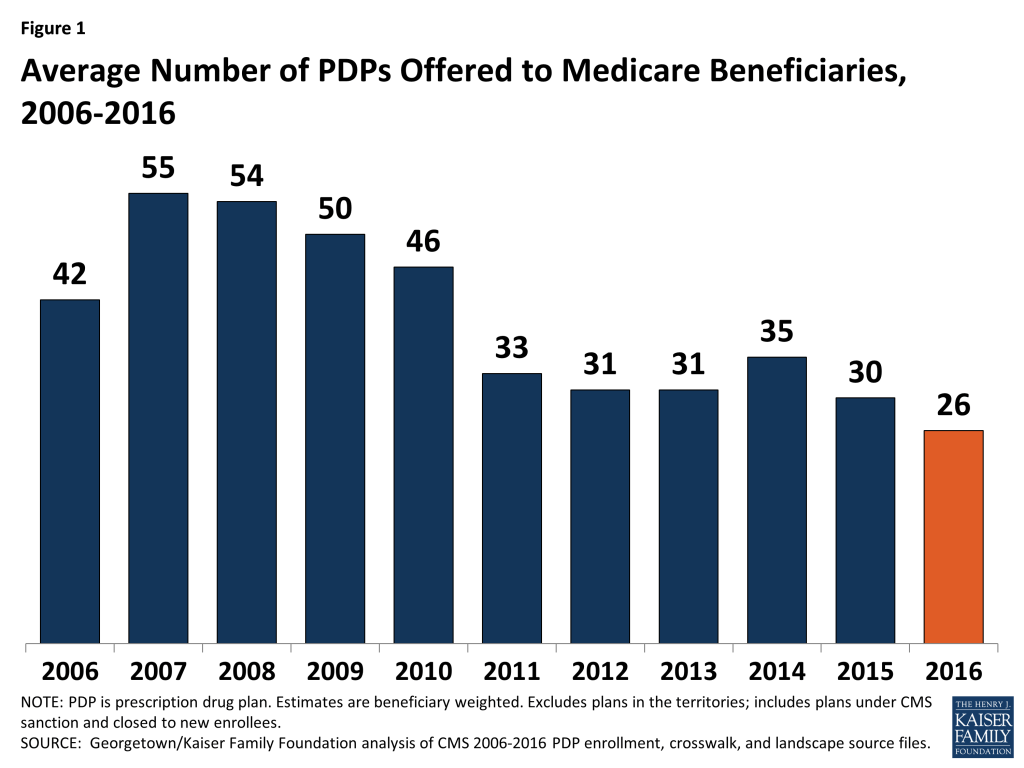
Figure 1: Average Number of PDPs Offered to Medicare Beneficiaries, 2006-2016
  • The number of PDPs per region in 2016 will range from a low of 19 PDPs in the Alaska region to a high of 29 PDPs in the Pennsylvania/West Virginia region (Figure 2; Appendix 1, Table A1). The number of plans is lower in all but one region (Pennsylvania/West Virginia) compared to 2015; there are five fewer PDPs in Alaska, Florida, and Illinois in 2016.
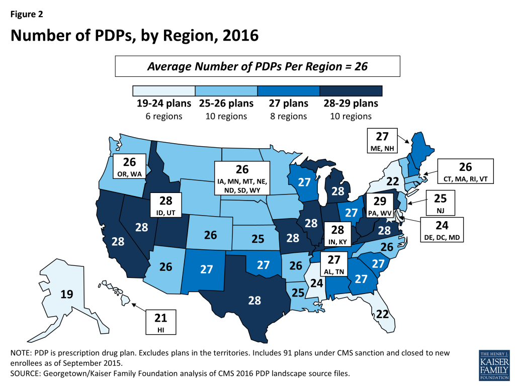
Figure 2: Number of PDPs, by Region, 2016
  • A total of 886 PDPs will be offered nationwide in 2016, down by 11 percent from the 1,001 PDPs offered in 2015 and the lowest number of PDPs in the program’s history (Figure 3). The total number of PDPs in 2016 represents less than half the number offered at the peak level in 2007 of 1,875 plans. The lower number of plans reflects both the cumulative effect of mergers among plan sponsors and the response to CMS policies that encourage plan sponsors to eliminate low-enrollment plans and to drop multiple PDPs that are not meaningfully different from each other.
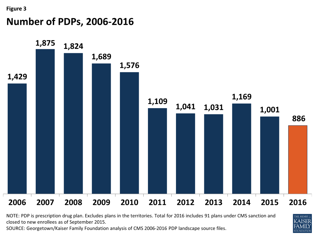
Figure 3: Number of PDPs, 2006-2016
  • In 2016, there are 11 plan sponsors offering 23 PDPs on a national or near-national basis. The number of national or near-national plan sponsors is down from 18 in 2009, as a result of corporate acquisitions and some firms exiting the market after not achieving a substantial market share. In addition, more sponsors are offering two PDPs, whereas it was more common to offer three in the program’s early years.
  • In July 2015, the PDP sponsor Torchmark Corporation was placed under a sanction that banned marketing activities and new enrollments. Its PDPs, marketed under the United American name, have 208,000 enrollees in 91 PDPs across all regions in September 2015.

For 2016, 31 new PDPs are entering the market, and 146 PDPs are exiting the program.6  (See Appendix 2 for more detail on market dynamics.)

  • Two new sponsors are entering the PDP market in 2016: Magellan Rx America, offering PDPs in 20 regions, and QualChoice Advantage, offering a PDP only in Arkansas.
  • Among the 146 exiting plans, 143 are offered by sponsors that offer other PDPs, and enrollees in most of them (137 of 143) will be automatically assigned to another PDP offered by that sponsor. This process should ensure a seamless transition and minimize disruption that would otherwise result from plan terminations. The other 3 exiting PDPs are offered by sponsors (each operating in a single region) leaving the market entirely

Premiums

The national average monthly PDP premium is expected to increase for 2016, marking a significant departure from recent years when premiums were essentially flat. Even if a number of beneficiaries switch or are reassigned to lower-premium plans, effective in January 2016, the average premium increase for 2016 is likely to be the largest amount in any year since 2009.

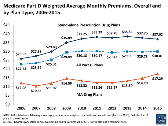
  • The projected average monthly PDP premium for 2016 will be $41.46 (weighted by September 2015 enrollment, assuming beneficiaries remain in their current plan) (Figure 4).7  This is a 13 percent projected increase ($4.66) from the weighted average monthly premium of $36.68 in 2015, and a 60 percent increase from $25.93 in 2006, the first year of the Medicare Part D drug benefit. As a point of comparison, since 2006, the medical care consumer price index (CPI) has increased 34 percent and the CPI for all items has increased 18 percent.
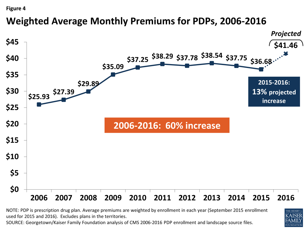
Figure 4: Weighted Average Monthly Premiums for PDPs, 2006-2016
  • In prior years, the average premium after the end of the open enrollment period has been 4 percent to 5 percent lower than the projection made during the open enrollment period, due to existing enrollees switching to a lower premium plan, new enrollees choosing low-premium plans, and reassignments of some LIS beneficiaries to cheaper plans. For example, the average premium in February 2015 was $37.20,which is about 4 percent ($1.63) below the projected premium of $38.83 calculated prior to enrollment changes.8  Applying a similar adjustment to our projected premium for 2016 suggests that the premium increase, after open enrollment, is likely to be lower, but still larger than in any year since 2009.
  • For PDPs offering only the basic benefit, the 2016 weighted average premium is projected to be 8 percent higher in 2016 than in 2015 (based on current enrollment patterns), whereas premiums for enhanced PDPs are projected to rise by about 17 percent.9 

A growing share of PDP enrollees are paying premiums that are well above the national average.

  • In 2016, over one-third of PDP enrollees not receiving the LIS (36 percent) are projected to have premiums of at least $60 per month if they stay in their plans—a substantial increase from the 10 percent of enrollees paying premiums at this level in 2015 (Figure 5). Among them, nearly 400,000 are projected to pay premiums of at least $100 per month. By contrast, 14 percent of these PDP enrollees are scheduled to pay premiums of less than $20 per month.
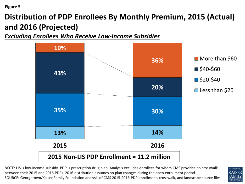
Figure 5: Distribution of PDP Enrollees By Monthly Premium, 2015 (Actual) and 2016 (Projected)

CMS reported that the average premium for standard Part D coverage offered by PDPs and Medicare Advantage drug plans will “remain stable” at an estimated $32.50 in 2016.10  The higher premium reported here is based on PDPs only, including PDPs offering both basic and enhanced coverage. Enhanced plans typically have higher premiums than basic PDPs. Our estimate does not assume any voluntary switches by beneficiaries and reassignments by CMS of Low-Income Subsidy enrollees to different plans, nor do we make any assumptions about plan choices made by new enrollees in 2016.

Monthly Premium Changes for Enrollees

Underneath these national trends, premium changes for individual PDPs from 2015 to 2016 vary widely (Figure 6).
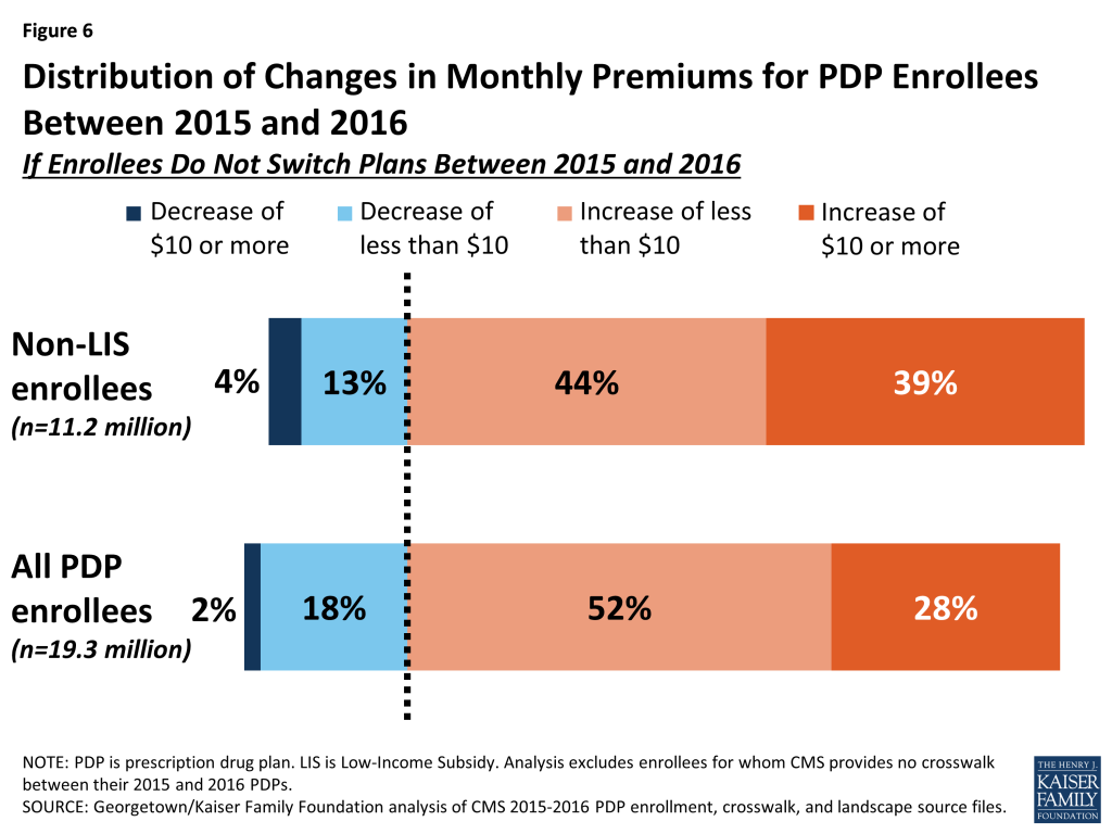
Figure 6: Distribution of Changes in Monthly Premiums for PDP Enrollees Between 2015 and 2016
  • Among the 11.2 millionPart D PDP enrollees who are responsible for paying the entire premium (which excludes LIS recipients), most (83 percent) are projected to have a higher premium in 2016 if they stay in their current plans, including 4.4 million (39 percent) who are projected to have a premium increase of at least $10 per month. Conversely, nearly half a million (448,000) are projected to experience a premium decrease of $10 or more.
  • Taking into account all PDP enrollees, including the LIS enrollees whose premiums are partially paid by the government, 80 percent are in plans in which premiums are projected to rise in 2016 if they stay in their current plans; this includes 28 percent in plans that will have an increase of $10 or more in their monthly premium in 2016 assuming no enrollment changes. By contrast, 2 percent of all PDP enrollees are in plans projected to have a premium decrease of $10 or more.

Premium Changes for PDPs with the Most Enrollees

Changes to premiums from 2015 to 2016, averaged across regions and weighted by 2015 enrollment, vary widely across some of the most popular PDPs (Figure 7). These variations reflect factors such as higher premiums in older plans and substantial geographic variations.11  Although variation in benefits is also a factor, premium variation persists even among PDPs that offer benefits actuarially equivalent to the basic benefit defined in law.
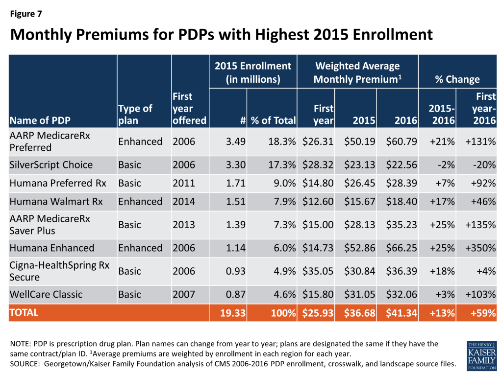
Figure 7: Monthly Premiums for PDPs with Highest 2015 Enrollment
  • Average premiums for seven of the eight largest PDPs will increase for 2016. Five of these seven PDPs will have larger average percentage increases than the national average. Average premiums for three of these PDPs are projected to increase by at least 20 percent in 2016.
  • The highest increases, in percentage terms, are for Humana Enhanced PDP, with 1.1 million enrollees in 2015, and AARP MedicareRx Saver Plus, with 1.4 million enrollees. On average, premiums for both PDPs will rise 25 percent (from $52.86 to $66.25 for Humana Enhanced and from $28.13 to $35.23 for AARP MedicareRx Saver Plus). The average monthly premium for the PDP with the most enrollees in 2015, AARP MedicareRx Preferred, with 3.5 million enrollees, will increase by 21 percent between 2015 and 2016, from $50.19 to $60.79.
  • By contrast, enrollees in one of the largest PDPs will experience a modest decrease in their monthly premium if they stay in the same plan. The average monthly premium for SilverScript Choice will decrease by 2 percent ($22.56 in 2016 versus $23.13 in 2015).

Enrollees in some of the most popular PDPs could see bigger or smaller premium increases than the national average, depending on the region where they live.

  • UnitedHealth’s AARP MedicareRx Preferred PDP is raising premiums by as little as 9 percent (in Oregon/Washington) but as high as 37 percent (in Alaska) (Figure 8). The range is even greater for CVS Health’s SilverScript Choice PDP, which is reducing premiums by as much as 36 percent (in Arkansas) and increasing premiums by as much as 24 percent (in Florida).
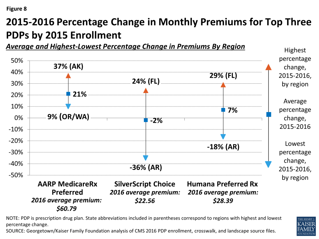
Figure 8: 2015-2016 Percentage Change in Monthly Premiums for Top Three PDPs by 2015 Enrollment

Monthly premiums for the most popular PDPs available since the start of the Part D program in 2006 have changed in different ways.

  • The average premium for Humana PDP Enhanced, with 1.1 million enrollees in 2015, is more than four times higher than it was in 2006, having increased from $14.73 to $66.25. Of the eight most popular PDPs, this plan is projected to have the most expensive monthly premium in 2016.
  • The average premium for UnitedHealth’s AARP Preferred MedicareRx PDP, the PDP with the most enrollees in 2015 (3.5 million), has more than doubled since 2006, from $26.31 to $60.79 in 2016.
  • By contrast, the monthly premium for SilverScript Choice, operated by CVS Health, with 2.5 million enrollees in 2015, is 20 percent lower in 2016 ($22.56) than it was in 2006 ($28.32).

Premium Variation and Changes by Region

Average PDP monthly premiums, weighted by 2015 enrollment, will vary widely in 2016 across regions, along with the change in premiums from 2015 to 2016.

  • Average PDP premiums will range from $29.70 per month in the New Mexico region (one of only three regions with an average under $35) to $49.61 per month in New Jersey and $45.31 in Florida (Appendix 1, Table A2).
  • Premium changes from 2015 to 2016 vary considerably by region. For example, average premiums in Arkansas are projected to fall by about 1 percent, whereas average premiums will be at least 20 percent higher in Arizona and Florida (Figure 9).
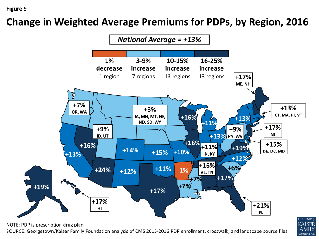
Figure 9: Change in Weighted Average Premiums for PDPs, by Region, 2016

Premiums for Higher-Income Enrollees

Average and plan-level premium amounts do not take into account the income-related Part D premium that took effect in 2011 for Part D enrollees with higher annual incomes ($85,000/individual and $170,000/couple). Established by the Affordable Care Act of 2010 (ACA), the income-related Part D premium requires higher-income enrollees to make an additional payment to the government for Part D coverage, regardless of the plan selected. In 2016, the monthly surcharge will range from $12.70 to $72.90, depending on income, in addition to the monthly premium payment for the specific Part D plan.12  Nearly 6 percent of Part D enrollees are expected to make these additional payments in 2016.13  Under current law, the income thresholds are not indexed to increase annually until 2020, meaning that by 2019, a projected 8 percent of Part D enrollees will pay income-related premiums.

Benefit Design

In 2016, for the second year in a row, all Part D PDPs will offer an alternative benefit design to the defined standard benefit, which has a $360 deductible in 2016 and 25 percent coinsurance for all covered drugs. Some plans modify or eliminate the deductible, and all PDPs use some type of varying cost-sharing tiers for covered generic and brand-name drugs.

Deductibles

The standard (maximum) Part D deductible is increasing by $40 in 2016, the largest one-year increase since the program began. It is adjusted each year by a statutory formula based on the annual percentage increase in average per capita aggregate expenditures for covered Part D drugs. Other amounts for the standard benefit design parameters are increasing as well (see Appendix 3 for the 2006-2016 standard benefit amounts).

  • Two-thirds of PDPs (67 percent) will charge a deductible in 2016, up from 58 percent in 2015 (Figure 10). The share of PDPs with a deductible is the highest ever in the program. Most PDPs adding deductibles have relatively few enrollees, so the share of PDP enrollees facing a deductible is likely to change more modestly. Nearly two-thirds of all Part D enrollees are in plans that are increasing the deductible for 2016.
  • Most PDPs with a deductible (53 percent) will charge the standard $360 amount, which is also the highest share in the program’s history. Another 14 percent of all PDPs have a deductible below the standard amount.
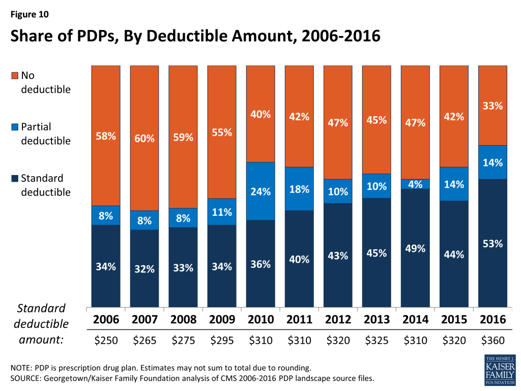
Figure 10: Share of PDPs, By Deductible Amount, 2006-2016

Tiered Cost Sharing

  • The use of formulary tiers has been common since the program’s beginning in 2006, but for the second year in a row, all PDPs will use tiered cost sharing. Similar to 2015, most PDPs will use five tiers (two for generic drugs, two for brand-name drugs, and one for higher-cost specialty drugs).
  • Over the years, there has been a trend toward the use of coinsurance in place of flat copayments for some formulary tiers. Coinsurance typically means higher out-of-pocket costs for more expensive drugs, such as those over $200 per month. Coinsurance has been used by nearly all plans for the specialty tier since 2006, and that coinsurance cannot exceed 33 percent. For all PDPs, the specialty tier coinsurance is set between 25 percent and 33 percent. In the program’s early years coinsurance was uncommon for other tiers, but in 2016, over 90 percent of PDPs are using coinsurance for their non-preferred brand tiers; about 40 percent do so for their preferred brand tiers.14 
  • For brand tiers, the typical coinsurance is 20 percent for preferred brands and 40 percent for non-preferred brands. CMS guidance allows coinsurance for these tiers to be set as high as 25 percent and 50 percent, respectively. Some PDPs have elected to set coinsurance at these maximum levels.

The Coverage Gap

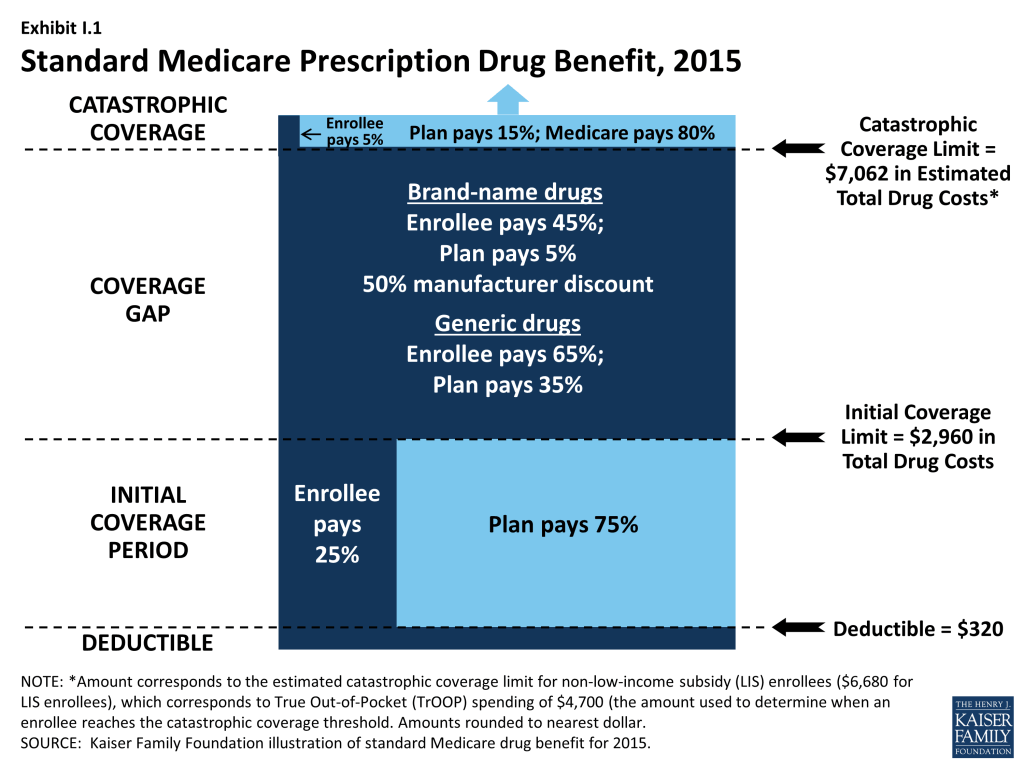
The coverage gap, or “doughnut hole,” is gradually becoming a less salient feature of the Part D benefit design, as a result of changes made by the ACA. It will be fully eliminated as of 2020, when beneficiaries will only be responsible for 25 percent of their total drug costs in the gap. Since 2011, any beneficiary with drug costs high enough to reach the gap has paid less than the full cost of the price of their drugs. In 2016, manufacturer prices for brand-name drugs purchased in the gap will be discounted by 50 percent, with plans paying an additional 5 percent of the cost and enrollees paying the remaining 45 percent. Plans will pay 42 percent of the cost for generic drugs in the gap, with enrollees paying 58 percent. In 2016, the coverage gap begins after an enrollee incurs $2,960 in total drug spending and ends after an enrollee has spent a total of $4,850 out of pocket (or $7,515 in total drug costs under the standard benefit).15  At that point, catastrophic coverage begins, where enrollees generally pay only 5 percent of drug costs.

Most Part D plans will offer no gap coverage in 2016 beyond what is required by the ACA under the standard benefit. With all Part D enrollees now getting coverage for a share of their costs in the gap, the value of additional gap coverage offered by plans will become lower each year until 2020, when the gap is fully closed.

  • In 2016, about 78 percent of all PDPs will offer no additional gap coverage. This is a small increase from 2015, when 74 percent of PDPs offered no additional gap coverage—meaning a slightly smaller share of plans will offer some gap coverage beyond what the ACA requires in 2016 than in 2015. One national PDP (First Health Part D Value Plus) added gap coverage, and one near-national plan (Symphonix PrimeSaver Rx) dropped gap coverage.

Tiered Pharmacy Networks

Nearly all PDPs (85 percent) use tiered pharmacy networks. In these networks, enrollees pay preferred (lower) cost sharing for their prescriptions when they use selected network pharmacies and higher cost sharing in other network pharmacies.

  • The share of PDPs with tiered preferred pharmacy networks is down slightly from 87 percent in 2015, but still a significant increase from just a few years ago when only a small share of plans used this type of preferred pricing (7 percent in 2011).

The cost implications of tiered pharmacy networks for enrollees vary across PDPs.

  • For example, among the national and near-national PDPs with tiered pharmacy networks, the AARP MedicareRx Saver Plus PDP charges a $20 copayment for a preferred brand drug in a pharmacy that offers preferred cost sharing and $33 in another network pharmacy that does not offer preferred cost sharing. The Humana Walmart Rx PDP charges a $1 copayment for preferred generic drugs and $4 for non-preferred generics at a pharmacy with preferred cost sharing, compared to $10 and $33, respectively, at other network pharmacies where preferred cost sharing is not offered. These differentials are somewhat smaller than in 2015.

Low-income Subsidy (Benchmark) Plans

In 2016, the total availability of premium-free (benchmark) plans—that is, PDPs available for no monthly premium to Low-Income Subsidy (LIS) enrollees—will be at its lowest level in the program’s ten years (Figure 11; Appendix 1, Table A3).
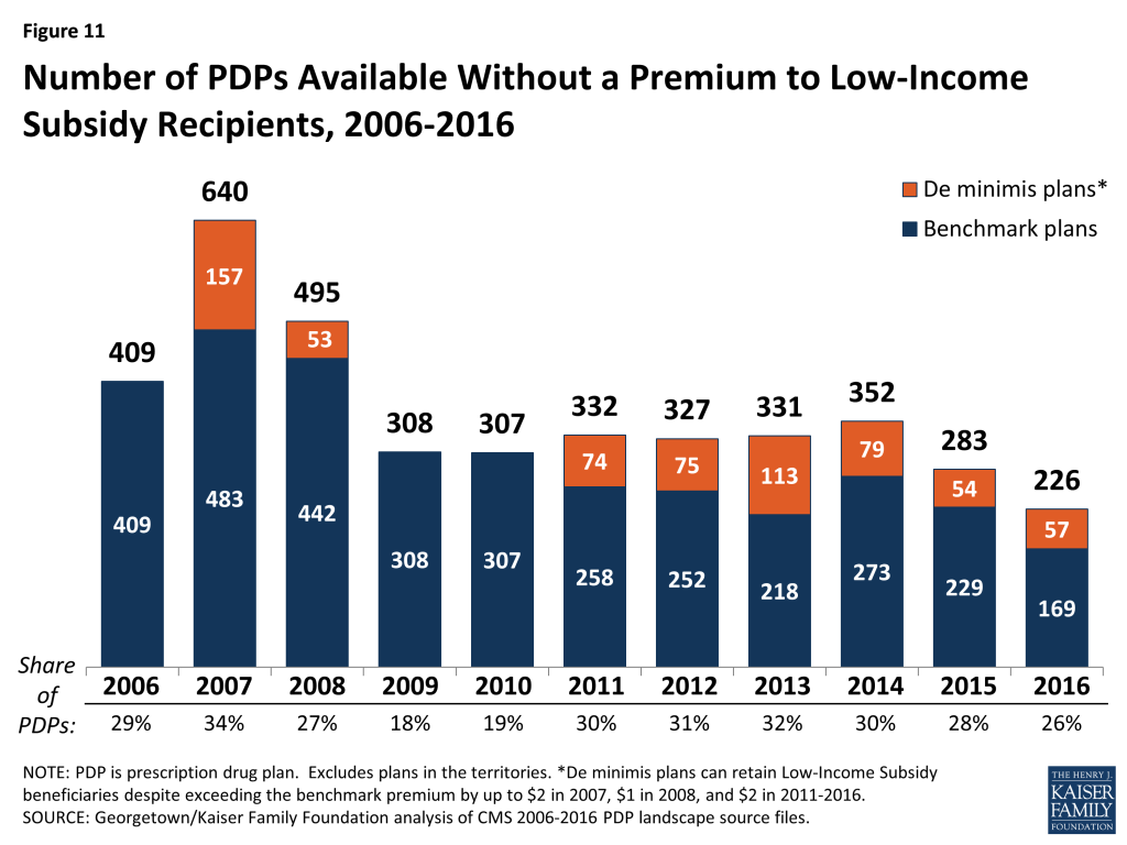
Figure 11: Number of PDPs Available Without a Premium to Low-Income Subsidy Recipients, 2006-2016
  • In 2016, 226 plans will be available for enrollment of LIS recipients for zero premium. This represents a 20 percent decrease in plans for LIS recipients, or 57 fewer plans than in 2015 and 126 fewer plans than in 2014.
  • On average (weighted by enrollment), LIS have 7 benchmark plans available to them for 2016, or about one-fourth the number of PDP choices available overall. All LIS enrollees retain the option to select other plans offered in their area, but if they enroll in a non-benchmark plan, they must pay a share of the monthly premium.
  • Of the 226 benchmark plans in 2016, about one in four (57 plans) qualify through the “de minimis” policy—about the same number as the 54 “de minimis” plans in 2015. Policies adopted by CMS in previous years make it easier for PDPs to qualify as benchmark plans, including the “de minimis” policy that allows plans to waive a premium amount of up to $2 in order to retain their LIS enrollees.16 
  • Among the 2015 benchmark plans, 72 PDPs have lost their benchmark status due to either higher premiums in 2016 or to a lower regional benchmark in 2016 (one other exited the market completely). About 742,000 LIS beneficiaries (9 percent of LIS enrollment in PDPs in 2015) are enrolled in these 73 plans, meaning these beneficiaries may experience some disruption in their coverage for 2016. In 2016, 25 PDPs will newly qualify for benchmark status: 14 PDPs new to the program and 11 older PDPs (in nine other cases, two benchmark PDPs were consolidated by the plan sponsor).

Availability of Benchmark Plans by Region

The number of benchmark plans available in 2016 will vary by region, from 10 benchmark PDPs in the Arizona, Idaho/Utah, and Pennsylvania/West Virginia regions to just 2 benchmark PDPs in the Hawaii region (out of 21 PDPs overall) and 3 (of 22) in the Florida region (Figure 12).
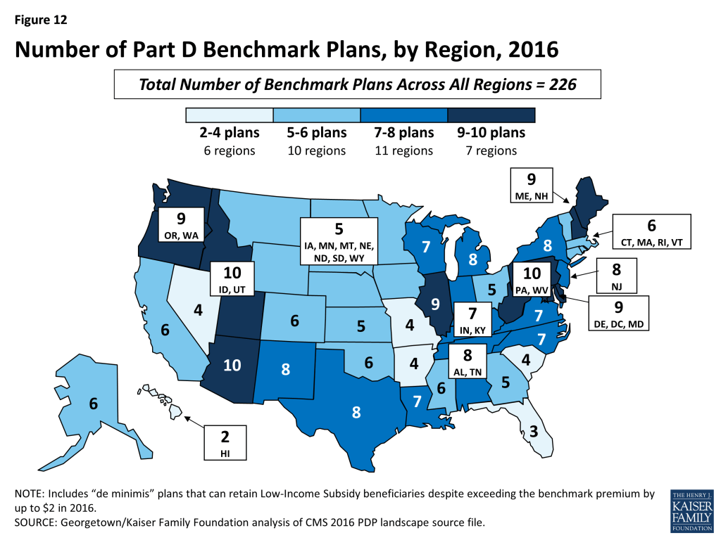
Figure 12: Number of Part D Benchmark Plans, by Region, 2016
  • Benchmark plan availability will decline in 26 of 34 regions between 2015 and 2016, while one additional benchmark plan will be available in 3 regions (Figure 13).
  • Year-to-year changes in most regions are relatively modest; the largest change is the loss of seven benchmark plans in the Hawaii region, after gaining five benchmark plans for 2015 and losing six for 2014. As a result of losing this many benchmark plans, 92 percent of Hawaii’s LIS beneficiaries are projected to pay a premium unless they are reassigned or switch plans. In five other regions, between 40 percent and 50 percent of LIS beneficiaries are in this same situation. In regions where the availability of benchmark plans is more stable, the share of affected LIS beneficiaries is much smaller.
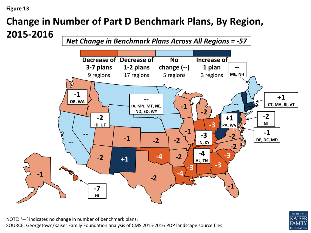
Figure 13: Change in Number of Part D Benchmark Plans, By Region, 2015-2016

Impact of Benchmark Plan Changes for Low-Income Subsidy Enrollees

About 1.9 million people—about one in four LIS beneficiaries (24 percent)—are enrolled in PDPs in 2015 that will not qualify as benchmark plans in 2016 (Figure 14).
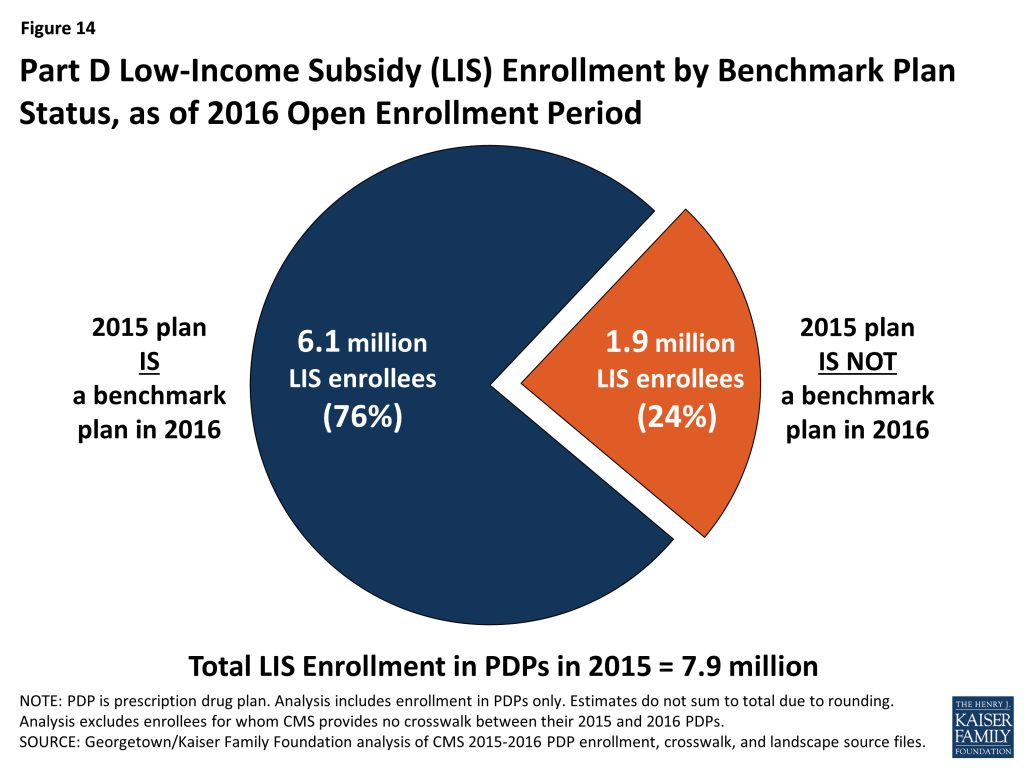
Figure 14: Part D Low-Income Subsidy (LIS) Enrollment by Benchmark Plan Status, as of 2016 Open Enrollment Period
  • This group includes 742,000 beneficiaries who were in benchmark plans in 2015; the remaining three-fifths (60 percent) of these beneficiaries are currently enrolled in non-benchmark plans and thus paid a premium in 2015.
  • About 764,000 LIS enrollees will pay premiums of at least $20 per month and about 53,000 LIS enrollees will pay premiums of at least $50 per month if they do not switch to other PDPs.
  • The number of LIS beneficiaries who will potentially pay a premium in 2016 unless they enroll in (or are switched to) benchmark plans (1.9 million) is up slightly from the 1.8 million LIS beneficiaries who were in a similar situation at the time of the open enrollment period for 2015. CMS will reassign those LIS enrollees who were randomly assigned by CMS to their current plan, and several states will help reassign those enrolled in their state pharmacy assistance programs (SPAPs).17  Effective for January 2015, CMS reassigned about one-fifth of those scheduled to pay a premium. Many other LIS beneficiaries who are currently not enrolled in plans that will be premium-free in 2016 must switch plans on their own or pay a premium if they remain in their 2015 plan. Those in the latter group will not be automatically reassigned by CMS because in the past they or someone assisting them made a choice to switch plans. Most affected LIS beneficiaries will receive a letter from CMS or their SPAP either informing them of their reassignment or reminding them that they can choose a different plan and avoid paying a premium.

Benchmark Plans by Plan Sponsor

The number of premium-free plans for LIS enrollees offered by the major Part D organizations has fluctuated substantially over the years.

  • For 2016, six PDP sponsors will offer benchmark plans in at least half of the 34 regions.18  No sponsor will offer benchmark plans in all 34 regions in 2016; three sponsors (Aetna, CVS Health, and Humana) offer benchmark plans in at least 33 regions.
  • In 2015, about 70 percent of LIS enrollees in PDPs are in plans operated by just four plan sponsors (CVS Health, Humana, UnitedHealthcare, and Cigna) (Figure 15). The first two of these sponsors offer PDPs that qualify as benchmark plans in at least 32 of the 34 PDP regions in 2016. By contrast, UnitedHealth offers PDPs that qualify as premium-free in 15 regions in 2016, down from 33 in 2015. Cigna offers PDPs that qualify as premium-free in 12 regions in 2016, down from 23 in 2015. Over half of the LIS beneficiaries projected to pay premiums are currently enrolled in UnitedHealth or Cigna PDPs.
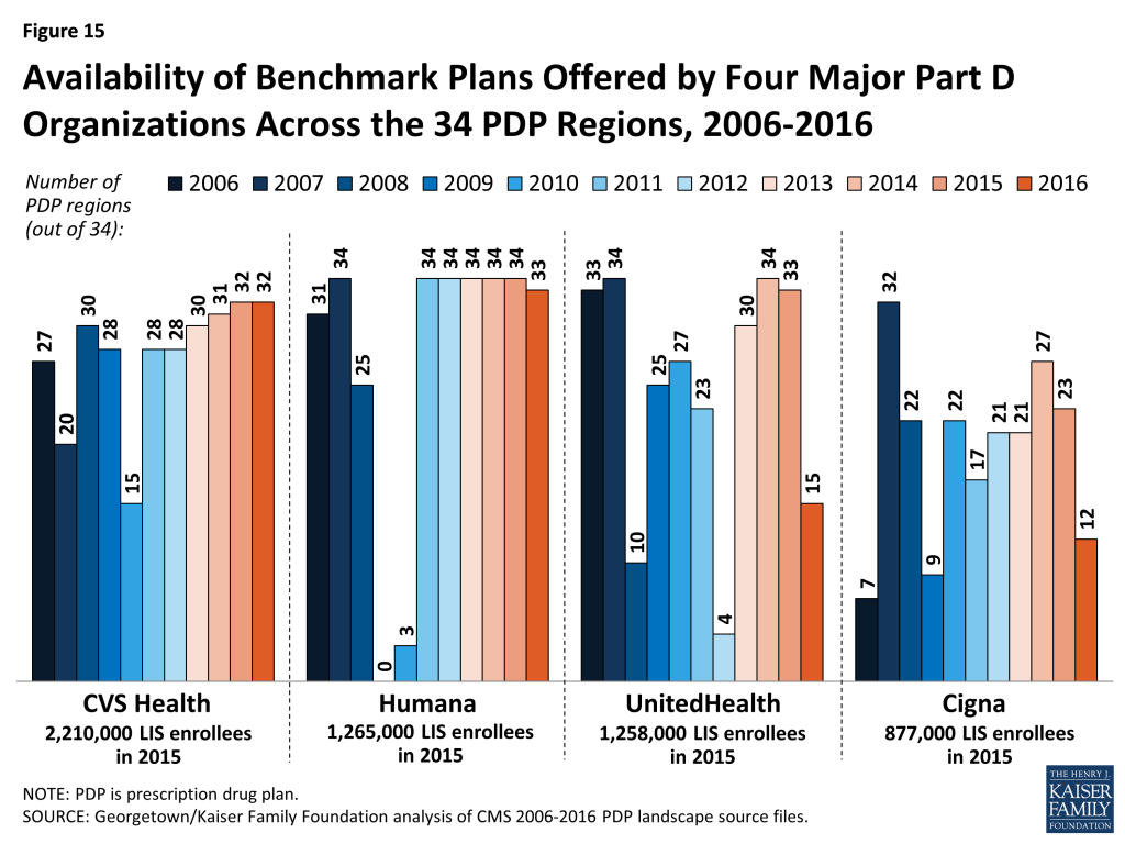
Figure 15: Availability of Benchmark Plans Offered by Four Major Part D Organizations Across the 34 PDP Regions, 2006-2016
  • The LIS enrollees in PDPs offered by these sponsors are split between premium-free benchmark plans and other plans operated by these sponsors. For example, 64 percent of UnitedHealthcare’s LIS enrollees are in non-benchmark PDPs and thus pay premiums of $21.06 on average. Many of them are in the AARP MedicareRx Preferred PDP, which qualified as a benchmark PDP in the program’s earlier years.

Discussion

This review of the Part D plan landscape for 2016 and changes over time indicates that most PDP enrollees can expect to see some changes in their prescription drug coverage and costs in 2016. For most enrollees, premiums are projected to be higher in 2016 than in 2015, and many will also see higher deductibles and more cost-sharing tiers with coinsurance. LIS enrollees will have fewer PDP options available at a zero premium, and many be reassigned to different plans or will need to switch to a different plan to continue without a premium. Beneficiaries have options during open enrollment to select plans that better meet their needs, including plans with lower premiums. Although premiums tend to be the most visible feature when comparing plans, beneficiaries need to consider other factors, especially whether their drugs are on a plan’s formulary, whether their usual pharmacy offers preferred cost sharing, and the total out-of-pocket costs (including both premiums, deductibles, and cost sharing) for coverage of their prescription drug needs.

Changes in Part D plan costs and benefit design from one year to the next have been a defining featuring of the program since its beginning. The reduced number of PDPs for 2016 could make the process of comparing and reviewing plan options a little easier for beneficiaries to undertake during the open enrollment period, but the more than two dozen PDP options in each region may still discourage many from reevaluating their choices. While the annual enrollment period is the best opportunity for people on Medicare to evaluate their plan options and make changes, our analysis of plan switching by PDP enrollees not receiving the LIS showed that about 87 percent stayed in the same plan in annual enrollment periods between 2006 and 2010.19  Even when they were projected to face large premium increases, a majority of PDP enrollees stayed in the same plan from one year to the next. Among LIS enrollees, although many are reassigned each year to new plans by CMS, few (14 percent) of those not eligible for reassignment by CMS and projected to pay a premium switched to new plans in 2010.20  Finding ways to get more Part D enrollees engaged in comparing and reviewing plans and making changes that could save them money remains an ongoing challenge for CMS and policymakers.

Appendix

Appendix 1: Information about PDPs by State

Table A1: Number of PDPs by State, 2006-2016
STATE/TERRITORY200620072008200920102011201220132014201520162015-2016 change
U.S. Total1,4291,8751,8241,6891,5761,1091,0411,0311,1691,001886-115
Alabama4156534946343233353027-3
Alaska2745474541292523282419-5
Arizona4353514946303029343026-4
Arkansas4058555249343030342926-3
California4755565147333332363228-4
Colorado4355555348312829343026-4
Connecticut4451514748343030332726-1
Delaware4755524845333129362724-3
District of Columbia4755524845333129362724-3
Florida4357585449323334352722-5
Georgia4255545045323030343027-3
Hawaii2946494741282523292521-4
Idaho4456545148353332373128-3
Illinois4256534946353332383328-5
Indiana4253524844323131353128-3
Iowa4153524846333332343026-4
Kansas4053524846333130332925-4
Kentucky4253524844323131353128-3
Louisiana3952504745323030332825-3
Maine4153534643302828322827-1
Maryland4755524845333129362724-3
Massachusetts4451514748343030332726-1
Michigan4054555146353433363128-3
Minnesota4153524846333332343026-4
Mississippi3852494745323029332824-4
Missouri4153524845323031353128-3
Montana4153524846333332343026-4
Nebraska4153524846333332343026-4
Nevada4454534946312929343228-4
New Hampshire4153534643302828322827-1
New Jersey4457575247333029342925-4
New Mexico4357555047323030363127-4
New York4661555150332928312522-3
North Carolina3851524947333030342926-3
North Dakota4153524846333332343026-4
Ohio4360584946343333373127-4
Oklahoma4256524946333030363127-4
Oregon4557554844323030353026-4
Pennsylvania52666357553836383929290
Rhode Island4451514748343030332726-1
South Carolina4559565347343231353127-4
South Dakota4153524846333332343026-4
Tennessee4156534946343233353027-3
Texas4760565350333332363228-4
Utah4456545148353332373128-3
Vermont4451514748343030332726-1
Virginia4153524844323031353128-3
Washington4557554844323030353026-4
West Virginia52666357553836383929290
Wisconsin4554575348322930332927-2
Wyoming4153524846333332343026-4
TERRITORY          
American Samoa134432111110
Guam134432111220
Northern Mariana Islands134432111110
Puerto Rico10283433291716161376-1
Virgin Islands467764311110
NOTE: PDP is prescription drug plan. Analysis for 2016 includes 91 plans under CMS sanction and closed to new enrollees as of September 2015.
SOURCE: Georgetown/Kaiser Family Foundation analysis of CMS PDP crosswalk and landscape source files.
Table A2: Monthly Premiums for PDPs by State, 2016
STATE/TERRITORYMinimum PremiumMaximum PremiumWeighted Average Premium% Change, 2015-2016
U.S. Total$11.40$174.70$41.4613%
Alabama$18.40$117.20$42.1616%
Alaska$18.40$90.20$42.5319%
Arizona$18.40$109.70$39.9924%
Arkansas$11.40$131.90$34.59-1%
California$18.40$132.00$41.9613%
Colorado$18.40$140.20$41.3814%
Connecticut$18.40$127.60$39.6613%
Delaware$18.40$87.10$41.3515%
District of Columbia$18.40$87.10$41.3515%
Florida$18.40$174.70$45.3121%
Georgia$18.40$135.50$40.4417%
Hawaii$18.40$80.10$34.9117%
Idaho$18.40$162.10$44.179%
Illinois$18.40$157.40$42.9016%
Indiana$18.40$130.20$40.6411%
Iowa$18.40$124.20$36.693%
Kansas$18.40$125.20$41.7515%
Kentucky$18.40$130.20$40.6411%
Louisiana$16.80$106.10$35.957%
Maine$18.40$119.30$38.7117%
Maryland$18.40$87.10$41.3515%
Massachusetts$18.40$127.60$39.6613%
Michigan$18.40$117.50$42.5511%
Minnesota$18.40$124.20$36.693%
Mississippi$17.30$119.20$37.057%
Missouri$18.40$124.10$38.4210%
Montana$18.40$124.20$36.693%
Nebraska$18.40$124.20$36.693%
Nevada$18.40$134.40$40.0616%
New Hampshire$18.40$119.30$38.7117%
New Jersey$18.40$104.70$49.6117%
New Mexico$12.00$152.70$29.7012%
New York$18.40$93.40$43.1513%
North Carolina$18.40$120.50$43.0112%
North Dakota$18.40$124.20$36.693%
Ohio$18.40$128.00$39.5813%
Oklahoma$18.40$163.80$41.8311%
Oregon$18.40$154.20$39.577%
Pennsylvania$18.40$149.60$40.789%
Rhode Island$18.40$127.60$39.6613%
South Carolina$18.40$124.40$41.446%
South Dakota$18.40$124.20$36.693%
Tennessee$18.40$117.20$42.1616%
Texas$18.40$163.00$42.8917%
Utah$18.40$162.10$44.179%
Vermont$18.40$127.60$39.6613%
Virginia$18.40$124.50$43.9019%
Washington$18.40$154.20$39.577%
West Virginia$18.40$149.60$40.789%
Wisconsin$18.40$139.40$44.3516%
Wyoming$18.40$124.20$36.693%
TERRITORY
American Samoa$25.50$25.50$25.503%
Guam$28.70$33.60$28.7134%
Northern Mariana Islands$19.10$19.10$19.1063%
Puerto Rico$6.80$70.20$40.805%
Virgin Islands$38.00$38.00$38.00-13%
NOTE: PDP is prescription drug plan. Analysis for 2016 includes 91 plans under CMS sanction and closed to new enrollees as of September 2015. Average monthly premium is weighted by 2015 enrollments for the region in which the state is located. Terminated plans are excluded in calculation of premium change.
SOURCE: Georgetown/Kaiser Family Foundation analysis of CMS 2015-2016 PDP crosswalk and landscape source files. 
Table A3: Number of PDPs Below Low-Income Subsidy Benchmark by State, 2006-2016
STATE/TERRITORY20062007200820092010201120122013201420152016
U.S. Total409640495308307332327331352283226
Alabama9171512911121311128
Alaska81715765471176
Arizona61072891010111210
Arkansas13231812151715151264
California1014967566966
Colorado10191286754576
Connecticut112014121312106856
Delaware152118111112131313109
District of Columbia152118111112131313109
Florida610855432543
Georgia142118118141213985
Hawaii818105761010492
Idaho14201499111210131210
Illinois152319121010101014109
Indiana13191712914131115107
Iowa1420169810981055
Kansas1120171091210101375
Kentucky13191712914131115107
Louisiana11121071310121414117
Maine142118547810799
Maryland152118111112131313109
Massachusetts112014121312106856
Michigan14261711912121013108
Minnesota1420169810981055
Mississippi12211513101412131396
Missouri101513613588864
Montana1420169810981055
Nebraska1420169810981055
Nevada79515422444
New Hampshire142118547810799
New Jersey14201876691012108
New Mexico8141178867778
New York151615911111212888
North Carolina13211711811981087
North Dakota1420169810981055
Ohio102215658881285
Oklahoma1220138101091112106
Oregon15201579891012109
Pennsylvania15261891112121413910
Rhode Island112014121312106856
South Carolina1626201513151214874
South Dakota1420169810981055
Tennessee9171512911121311128
Texas161915141112131211108
Utah14201499111210131210
Vermont112014121312106856
Virginia16211713111010101397
Washington15201579891012109
West Virginia15261891112121413910
Wisconsin14211616101010101287
Wyoming1420169810981055
TERRITORY           
American SamoaN/AN/AN/AN/AN/AN/AN/AN/AN/AN/AN/A
GuamN/AN/AN/AN/AN/AN/AN/AN/AN/AN/AN/A
Northern Mariana IslandsN/AN/AN/AN/AN/AN/AN/AN/AN/AN/AN/A
Puerto RicoN/AN/AN/AN/AN/AN/AN/AN/AN/AN/AN/A
Virgin IslandsN/AN/AN/AN/AN/AN/AN/AN/AN/AN/AN/A
NOTE: Benchmark plans are not designated (N/A) in the territories because low-income beneficiaries residing in the territories are not eligible for the low-income subsidy. Analysis for 2016 includes 91 plans under CMS sanction and closed to new enrollees as of September 2015.
SOURCE: Georgetown/Kaiser Family Foundation analysis of CMS 2006-2016 PDP landscape source files.

Appendix 2: Market Dynamics

  • Among the 31 new PDPs in the market, 21 are offered by sponsors totally new to the program: Magellan Rx America (20 PDPs in 20 regions) and QualChoice Advantage (1 PDP in Arkansas). The other new PDPs are additional offerings in a few regions by three national or near-national plan sponsors (EnvisionRxPlus, Symphonix Heath, and WellCare).
  • Four firms that offer PDPs on a national or near-national basis are eliminating one of the PDPs they offer in all or most regions. Aetna continued consolidating the PDPs it acquired from Coventry and now sponsors three PDPs instead of four, eliminating the Aetna Medicare Rx Premier PDP (42,000 enrollees across all regions). Two of its three offerings in each region are marketed under the First Health name. Cigna, after consolidating PDPs from its acquisition of HealthSpring, is eliminating one of its three PDPs (Cigna-HealthSpring Rx Secure-Max PDP with 22,000 enrollees). Express Scripts is eliminating the SmartD Rx Saver PDPs it acquired in 2014 (73,000 enrollees), leaving only two PDPs per region. Finally, TransAmerica eliminated its MedicareRx Choice PDPs (20,000 enrollees), leaving it with just a single PDP per region (and also dropped all PDPs in three regions, affecting another 2,000 enrollees).
  • Three plan sponsors, each operating a single PDP in just one region, left the program completely: Alliance Medicare RX PDP, Colorado Access Vista Medicare PDP, Health Alliance Medicare Prescription Plan – Basic PDP. Each PDP had about 1,000 enrollees.
  • Four other plan sponsors (EnvisionRxPlus, MedicareBlue Rx, SmartSaver Rx, and United American) made small adjustments to their offerings. The decision by Blue Cross Blue Shield plans in the upper Midwest region to drop their Value Plus PDP will affect about 100,000 enrollees, but the other changes have much smaller effects.

Appendix 3: Medicare Part D Standard Benefit Parameters, 2006-2016
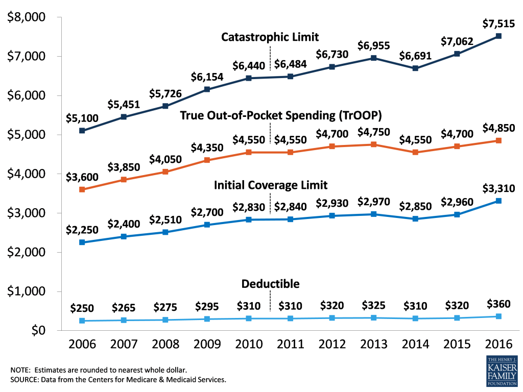
Appendix 3: Medicare Part D Standard Benefit Parameters, 2006-2016

Endnotes

  1. These enrollment counts include nearly 7 million Part D enrollees in employer-only plans, not otherwise analyzed for this spotlight. ↩︎
  2. Centers for Medicare and Medicaid Services, “Medicare Advantage Premiums Remain Stable; Enrollment at All-Time High,” September 21, 2015; 2016 PDP, MA, and SNP Landscape Source Files and related files are available at http://www.cms.hhs.gov/PrescriptionDrugCovGenIn/. ↩︎
  3. For analysis of the 2015 Part D marketplace and ten-year trends, see Jack Hoadley, Juliette Cubanski, and Tricia Neuman, “Medicare Part D at Ten Years: The 2015 Marketplace and Key Trends, 2006-2015,” Kaiser Family Foundation, October 2015, available at https://modern.kff.org/medicare/report/medicare-part-d-at-ten-years-the-2015-marketplace-and-key-trends-2006-2015/; analysis of the Part D marketplace for earlier years is available at https://modern.kff.org/. ↩︎
  4. The average is weighted by enrollment. ↩︎
  5. Gretchen Jacobson, Anthony Damico, and Tricia Neuman, “What’s In and What’s Out? Medicare Advantage Market Entries and Exits for 2016,” Kaiser Family Foundation, October 2016. ↩︎
  6. In addition, two PDPs offered by First Health (Aetna) changed contract numbers. ↩︎
  7. Based on authors’ analysis using the CMS 2016 Part D Crosswalk file. ↩︎
  8. During 2015, the average premium continued to drop, most likely due to plan elections by newly eligible beneficiaries, who are likely to enroll in plans with below-average premiums. The average PDP premium fell from $37.20 in February to $37.02 in April to $36.68 in September, a net drop of 1 percent in seven months. ↩︎
  9. The average premium will increase from $28.18 in 2015 to $30.41 in 2016 for basic-benefit PDPs and will increase from $47.15 to $55.06 for enhanced-benefit PDPs. Enrollees in 37 PDPs will switch from enhanced to basic, but excluding them does not affect the rates of increase. ↩︎
  10. CMS, “Medicare Prescription Drug Premiums Projected to Remain Stable”, available at https://www.cms.gov/Newsroom/MediaReleaseDatabase/Press-releases/2015-Press-releases-items/2015-07-29.html. ↩︎
  11. Jack Hoadley, Juliette Cubanski, and Tricia Neuman, “Medicare Part D at Ten Years: The 2015 Marketplace and Key Trends, 2006-2015,” Kaiser Family Foundation, October 2015, available at https://modern.kff.org/medicare/report/medicare-part-d-at-ten-years-the-2015-marketplace-and-key-trends-2006-2015/. ↩︎
  12. Centers for Medicare & Medicaid Services, “Annual Release of Part D National Average Bid Amount and Other Part C & D Bid Related Information,” July 29, 2015. ↩︎
  13. Juliette Cubanski and Tricia Neuman, “Medicare’s Income-Related Premiums: A Data Note,” June 2015, available at https://modern.kff.org/medicare/issue-brief/medicares-income-related-premiums-a-data-note/. ↩︎
  14. These calculations are made from the Plan Finder for one region and cover only national and near-national plans. ↩︎
  15. This amount corresponds to the estimated catastrophic coverage limit for non-Low-Income Subsidy enrollees ($7,063 for LIS enrollees), which corresponds to True Out-of-Pocket (TrOOP) spending of $4,850 (the amount used to determine when an enrollee reaches the catastrophic coverage threshold). ↩︎
  16. Plans qualifying through the de minimis policy are eligible for new enrollees, but will not receive auto-assigned enrollees. ↩︎
  17. Estimates for the total number of beneficiaries subject to paying a premium are based on plan data from the landscape and crosswalk files, together with CMS enrollment reports. The number to be reassigned will be released by CMS in November or December 2015. ↩︎
  18. These counts of benchmark plans include those designated as de minimis plans, which will not receive auto-assigned enrollees. ↩︎
  19. Jack Hoadley, Elizabeth Hargrave, Laura Summer, Juliette Cubanski, and Tricia Neuman, “To Switch or Not to Switch: Are Medicare Beneficiaries Switching Drug Plans To Save Money?” Kaiser Family Foundation, October 2013, available at https://modern.kff.org/medicare/issue-brief/to-switch-or-not-to-switch-are-medicare-beneficiaries-switching-drug-plans-to-save-money/. ↩︎
  20. Jack Hoadley, Laura Summer, Elizabeth Hargrave, Samuel Stromberg, Juliette Cubanski, and Tricia Neuman, “To Switch or Be Switched: Examining Changes in Drug Plan Enrollment among Medicare Part D Low-Income Subsidy Beneficiaries” Kaiser Family Foundation, July 2015, available at https://modern.kff.org/medicare/report/to-switch-or-be-switched-examining-changes-in-drug-plan-enrollment-among-medicare-part-d-low-income-subsidy-enrollees/. ↩︎
What’s In and What’s Out? Medicare Advantage Market Entries and Exits for 2016

Authors: Gretchen Jacobson, Anthony Damico, and Tricia Neuman
Published: Oct 13, 2015

Issue Brief

During the debate surrounding the Affordable Care Act (ACA), some questioned whether plans would exit as a result of the payment reductions to Medicare Advantage plans, leading to a drop in plan choices, and eventually, a decline in enrollment. Instead, Medicare Advantage enrollment growth has exceeded expectations, increasing from 24 percent of beneficiaries in 2010 to almost one-third (31%) of beneficiaries in 2015.1  Between 2010 and 2015, the total number of plans declined modestly, but beneficiaries in 2015 still had the option to choose among 18 Medicare Advantage plans, on average.2 

This Data Note examines the availability of plans nationwide and by state, in 2016, and tracks changes in plan availability since 2012. The analysis uses the Centers for Medicare and Medicaid Services (CMS) 2016 Medicare Advantage Landscape Source file released September 15, 2015 and the 2016 Part C&D Plan Crosswalk file released October 1, 2015; the analysis excludes employer-based (group) Medicare Advantage plans, Special Needs Plans (SNPs) and other plans not available for general enrollment. It documents the number and share of Medicare Advantage enrollees affected by plan withdrawals each year, the characteristics of plans that will be entering or exiting the market in 2016, and the potential implications of these changes for Medicare Advantage enrollees.3 

Our analysis finds that the Medicare Advantage market is relatively stable in terms of plan participation and beneficiary choice.

  • On average, Medicare beneficiaries will be able to choose among 19 Medicare Advantage plans in 2016, a slight increase from last year (18 plans per beneficiary).
  • The majority of plans available in 2015 will continue to be offered in 2016.
  • A smaller number of plans will exit or enter the market than in any year since 2012.
  • In most states, the total number of plans offered in 2016 will be greater than or equal to the number offered in 2015.
  • Among the minority of 2015 plans exiting the market in 2016, most have relatively low enrollment, which means that relatively few beneficiaries will be affected by the market exits.
  • Several firms will offer Medicare Advantage plans for the first time in 2016, including some that will be led by local, established health care systems.

Medicare Advantage Plan Availability

Nationwide

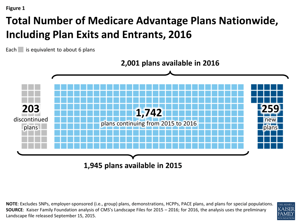
The total number of Medicare Advantage plans will be similar in 2016 to the number in 2015, increasing by 3 percent from 1,945 plans in 2015 to 2,001 plans in 2016 (Figure 1). The number of plans reflects both plan exits and entries. Between 2015 and 2016, fewer Medicare Advantage plans will exit than enter: 203 plans will exit markets across the country at the end of 2015 while 259 new plans will enter markets in 2016.   The majority of plans that will be offered in 2016 (87%) were also available in 2015.

Figure 1: Total Number of Medicare Advantage Plans Nationwide, Including Plan Exits and Entrants, 2016

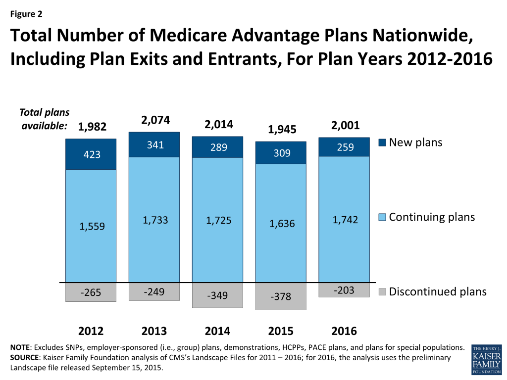
A smaller number of Medicare Advantage plans will exit the market in 2016 than in any year since 2012 (Figure 2). Similarly, a smaller number of plans will enter the market in 2016 than in any year since 2012.

Figure 2: Total Number of Medicare Advantage Plans Nationwide, Including Plan Exits and Entrants, For Plan Years 2012-2016

By State

In 37 states and the District of Columbia, the total number of plans offered in 2016 will be greater than or equal to the number offered in 2015. In 13 states, the number of plans offered in 2016 will equal the number offered in 2015, including five states that will have no departing plans or new plans. Ohio and Washington will experience the largest net increase in the number of plans offered between 2015 and 2016 (15 plans and 12 plans, respectively). In the remaining 13 states and Puerto Rico, there will be fewer plans offered in 2016. Beneficiaries in two states (CA and NY) will see large numbers of both new plans and departing plans (20 or more) in 2016.

Plans per Beneficiary

Medicare beneficiaries will be able to choose among 19 plans, on average, in 2016, a slight increase from the number available to beneficiaries in 2015 (Figure 3). Beneficiaries in metropolitan areas will be able to choose from 21 plans, on average, and beneficiaries in non-metropolitan areas will be able to choose from among 11 plans. Among the 19 Medicare Advantage plans available to the average beneficiary in 2016, 16 plans will offer Part D prescription drug coverage (MA-PDs).

Figure 3: Average Number of Medicare Advantage Plans Available to Beneficiaries, 2009-2016

New Firms

Several firms will offer Medicare Advantage plans for the first time in 2016. Some of these firms, such as Johns Hopkins, are led by local, established health care systems that have less experience as insurers. Other firms, such as Medical Mutual of Ohio, are large, established health insurers that are branching out to Medicare Advantage. Firms entering the Medicare Advantage market for the first time in 2016 will be offering plans in nine states (AR, FL, IA, KY, MD, MN, NC, OH, and OK). In four of these states (AR, IA, MD, and OK), the average Medicare Advantage penetration was less than 20 percent – far below the national average of 31 percent. Firms may perceive these states as ripe for Medicare Advantage enrollment growth.

Effect of Plan Exits on Enrollees

The vast majority of Medicare Advantage enrollees will not be affected by plans exiting the market in 2016. Three percent of Medicare Advantage enrollees (about 328,000 enrollees) are in plans that are exiting the market at the end of 2015 and will need to find an alternative source of Medicare coverage, either another Medicare Advantage plan or traditional Medicare (Appendix Table 1). At the end of 2014, a larger number (roughly 480,000 enrollees) and a slightly larger share (about 4%) of the Medicare Advantage population were affected by plan departures.4 

The share of Medicare Advantage enrollees affected by plan departures ranges from less than 1 percent in 15 states, the District of Columbia, and Puerto Rico to more than 10 percent in 2 states (AL and WY). New York will have the largest number of enrollees in plans that will not be offered in 2016 (roughly 70,000 enrollees) – more than twice the number of enrollees in exiting plans in North Carolina (about 31,000 enrollees), the state with the second largest number of affected enrollees. However, in both of these states, the affected enrollees account for a relatively small share of the state’s total Medicare Advantage enrollment (9% and 8%, respectively).   In two states (AL and WY), a larger share (14% and 13%, respectively) but smaller number (less than 25,000 and less than 300, respectively) of enrollees are in plans that will not be offered in 2016. In 18 states, the District of Columbia, and Puerto Rico, fewer than 1,000 people are enrolled in plans in 2015 that will not be offered in 2016.

Characteristics of Medicare Advantage Market Exits and Entries

Plan Type

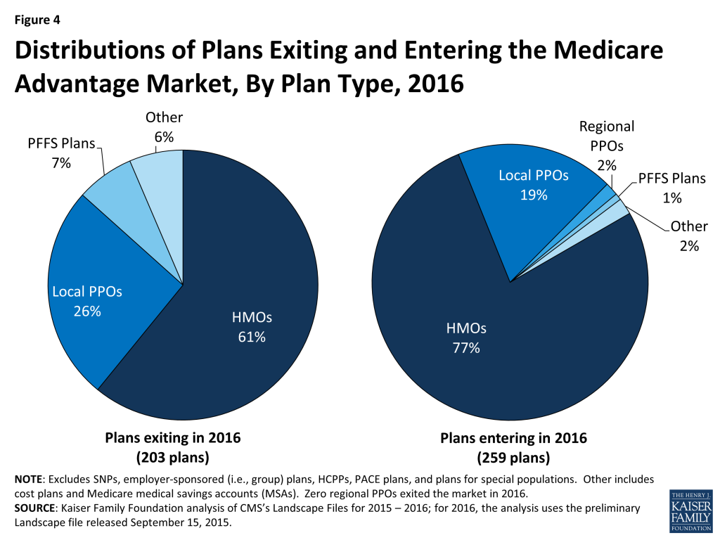
Among the relatively few plans exiting the Medicare Advantage market in 2016, most (61%) are HMOs and about one-quarter (26%) are local PPOs (Figure 4). These shares are similar to the overall composition of plan offerings in 2015.   PFFS plans are somewhat overrepresented among departing plans. The reduction in PFFS plans available between 2015 and 2016 continues the trend in PFFS plan exits that has been observed since the enactment of the Medicare Improvements for Patients and Providers Act (MIPPA) of 2008, which required most PFFS plans to adopt provider networks. HMOs comprise the about three-fourths (77%) of the new plans that will be offered in 2016, but a somewhat smaller share (68%) of all Medicare Advantage plans offered in 2016 (Figure 4).

Figure 4: Distributions of Plans Exiting and Entering the Medicare Advantage Market, By Plan Type, 2016

Tax Status

The majority of the 203 plans departing the market at the end of 2015 are for-profit plans (77%), a share which is similar to the proportion of available plans in 2015 that were for-profit (Appendix Table 2). Similarly, most new plans are for-profit plans (71%) in 2016.

Enrollment

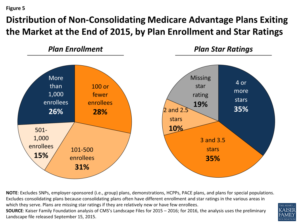
Among the relatively small number of plans that are departing from the market (excluding those that consolidated into new plans) before 2016, most have relatively few enrollees in 2015. Nearly three-quarters (74%) have 1,000 or fewer enrollees, and more than half (59%) have fewer than 500 enrollees in 2015 (Figure 5; Appendix Table 3). The average number of enrollees in a plan available for general enrollment was 6,164 in 2015. This analysis excludes the plans that will consolidate into new plans, because the plans that are consolidating often have different enrollment levels in the various areas in which they serve, which cannot be separately analyzed.

Figure 5: Distribution of Non-Consolidating Medicare Advantage Plans Exiting the Market at the End of 2015, by Plan Enrollment and Star Ratings

Quality Ratings

The majority of rated plans exiting the market at the end of 2015 have average or below average ratings (3.5 stars or fewer), or are missing star ratings (Figure 5). Plans with below average ratings (2 or 2.5 stars) represent a small share of all departing plans (13%), but among these plans with below average ratings, a disproportionate share (25%) is departing (Appendix Table 3). The departing plans that are missing star ratings never were rated because they were too new or had too few enrollees. This analysis excludes the plans that will consolidate into new plans, because the plans that are consolidating often have different star ratings in the various areas in which they serve, which cannot be separately analyzed.

Discussion

More Medicare Advantage plans will be offered in 2016 than in 2015, nationally and in many states, with the fewest market exits in any year since 2012. The vast majority of plans that were available in 2015 will continue to be available in 2016. Among the 203 plans (10% of plans) exiting the market, most had relatively low enrollment. Overall, 3 percent of all Medicare Advantage enrollees are in plans in 2015 that will not be offered in 2016. In all likelihood, beneficiaries affected by plan exits will have other Medicare Advantage options available, including new plans vying for beneficiaries, in addition to traditional Medicare.

Gretchen Jacobson and Tricia Neuman are with the Kaiser Family Foundation; and Anthony Damico is an independent consultant.


Appendix

 Appendix Table 1: Plan Entries and Exits in the Medicare Advantage Market, 2015-2016
StateTotal plans in 2015Plans departingby January 2016Plans continuing (post-consolidation) in 2016New plans in 2016Total plans in 2016Number of 2015 market enrollees in departing plansPercent of 2015 market enrollees in departing plans
Total U.S.194520317422592001327,7873%
Alabama2512442824,66514%
Alaska00000N/A
Arizona4183353815,4335%
Arkansas283252271730%
California202241782019828,6102%
Colorado503471482,5861%
Connecticut231221232,5302%
Delaware615384906%
District of Columbia110111120%
Florida154221321514718,6302%
Georgia3252753214,3316%
Hawaii141130132,4314%
Idaho381371383,9735%
Illinois684644683,5732%
Indiana40535134811,8325%
Iowa325272291,6512%
Kansas312294332000%
Kentucky351348420%
Louisiana312295341,0211%
Maine323297363,4586%
Maryland152136192,9147%
Massachusetts462444485790%
Michigan566503533,9101%
Minnesota331324360%
Mississippi171160161430%
Missouri463435487,4433%
Montana131122149503%
Nebraska161151161,2914%
Nevada263231241,4151%
New Hampshire100104140%
New Jersey382365416350%
New Mexico224180183,1744%
New York161241373016769,7109%
North Carolina3653133430,9958%
North Dakota100100100%
Ohio89584201041,9490%
Oklahoma352336392480%
Oregon826760764,6232%
Pennsylvania118101081412213,5182%
Puerto Rico289198277470%
Rhode Island110110110%
South Carolina20020020660%
South Dakota130131140%
Tennessee553523553,9381%
Texas119191002412411,5142%
Utah160162181,3141%
Vermont707075578%
Virginia613583613,1952%
Washington63261147515,2875%
West Virginia202183211,1593%
Wisconsin5034785510,7233%
Wyoming3121320313%
NOTE: Columns do not sum to the Total U.S. due to plans offered in more than one state. Plans with service area reductions were categorized as departing plans in states in which they will no longer operate, as continuing plans in states in which they will continue to operate, and as new plans in states in which they will operate for the first time. Plan counts and enrollment excludes SNPs, employer-sponsored (i.e., group) plans, demonstrations, HCPPs, PACE plans, and plans for special populations. New plans include plans that previously operated in some states and will be offered for the first time in other states in 2016.SOURCE: Kaiser Family Foundation analysis of CMS’s Landscape Files for 2015 – 2016; for 2016, the analysis uses the preliminary Landscape file released September 15, 2015.
Appendix Table 2: Plan Type and Tax Status of Discontinued and New Plans in 2015 and 2016
Total number of plans in 2015Plans departing by January 2016Plans continuing in 2016New plans in 2016Total number of plans in 2016
NumberPercent of total plans in 2015NumberPercent of total plans in 2016
Total194520310%174225913%2,001
Plan Type
    HMOs1,27512410%1,15120015%1,351
    Local PPOs4655211%4134810%461
    Regional PPOs4300%4349%47
    PFFS plans691420%5524%57
    Cost plans8678%7922%81
    MSA plans7686%1375%4
Tax Status
    Not-for-profit588427%546315%577
    For-profit1,35315712%1,19618413%1,380
    Unknown tax       status44100%044100%44
NOTE: Excludes SNPs, employer-sponsored (i.e., group) plans, demonstrations, HCPPs, PACE plans, and plans for special populations.SOURCE: Kaiser Family Foundation analysis of CMS’s Landscape Files for 2015 – 2016; for 2016, the analysis uses the preliminary Landscape file released September 15, 2015.
Appendix Table 3: Enrollment and Ratings of Discontinued Plans in 2015 and 2016
Total number of plans in 2015Plans departing by January 2016
NumberPercent of total plans in 2015
Total1,94520310%
    Consolidating Plansn/a78n/a
    Non-consolidating, departing plansn/a125n/a
Number of Enrollees, Among Non-Consolidating Plans
    100 or fewer enrollees1663521%
    101-5002893913%
    501-1000216199%
    1001+1,274323%
Star Rating, Among Non-Consolidating Plans
    4 or more stars1,059444%
    3 and 3.5 stars580448%
    2 and 2.5 stars521325%
    Missing star rating254249%
NOTE: Excludes SNPs, employer-sponsored (i.e., group) plans, demonstrations, HCPPs, PACE plans, and plans for special populations. Consolidated plans were excluded from this analysis because they often have different enrollment levels and star ratings in the various areas in which they serve, which cannot be analyzed separately. Plans that are relatively new or have few enrollees are not rated and thus are missing star ratings. n/a denotes cells not applicable.SOURCE: Kaiser Family Foundation analysis of CMS’s Landscape Files for 2015 – 2016; for 2016, the analysis uses the preliminary Landscape file released September 15, 2015.

Endnotes

  1. Gretchen Jacobson, Anthony Damico, Tricia Neuman, and Marsha Gold. Medicare Advantage 2015 Spotlight: Enrollment Market Update. Menlo Park (CA): 2015. https://modern.kff.org/medicare/issue-brief/medicare-advantage-2015-spotlight-enrollment-market-update/ ↩︎
  2. Gretchen Jacobson, Anthony Damico, Tricia Neuman, and Marsha Gold. Medicare Advantage 2015 Data Spotlight: Overview of Plan Changes. Menlo Park (CA): 2014. https://modern.kff.org/medicare/issue-brief/medicare-advantage-2015-data-spotlight-overview-of-plan-changes/ ↩︎
  3. Plans that consolidate or withdraw from the certain counties, but remain in others, are counted among the exiting plans for areas where they will no longer offer plans in 2016. ↩︎
  4. Gretchen Jacobson, Tricia Neuman, and Anthony Damico. What’s In and What’s Out? Medicare Advantage Market Entries and Exits in 2015. Menlo Park (CA): 2014. https://modern.kff.org/medicare/issue-brief/whats-in-and-whats-out-medicare-advantage-market-entries-and-exits-for-2015/ ↩︎
News Release

Nearly Half of the Uninsured, or 15.7 Million People, Are Eligible for Medicaid or Subsidized Affordable Care Act Coverage, Analysis Finds

Published: Oct 13, 2015

State-Level Numbers Provide Estimates of How Many Could Be Reached During Third ACA Open Enrollment Period

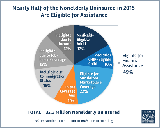
Weeks away from the Affordable Care Act’s third open enrollment period, a new Kaiser Family Foundation analysis finds nearly half (49% or 15.7 million) of the 32.3 million nonelderly people in the United States without health insurance at the beginning of 2015 are eligible for Medicaid or subsidized coverage through an ACA marketplace.

On a state level, the share of the uninsured population eligible for those two forms of insurance-related financial assistance ranges from 35 percent in Nebraska and Texas to 75 percent in West Virginia, according to the analysis, which uses data from the 2015 Current Population Survey Annual Social and Economic Supplement and other sources.

The analysis, based on an eligibility model developed by Kaiser researchers, provides state-level data on people without insurance who are eligible for Medicaid or subsidized ACA coverage, and on those who are ineligible.

Five states, including some with the largest populations, account for approximately 40 percent of the uninsured population that could receive Medicaid or subsidized private coverage under the Affordable Care Act. Among these are California (2.1 million uninsured eligible for assistance), Texas (1.5 million eligible), Florida (1.1 million eligible), New York (865,000 eligible), and Pennsylvania (656,000 eligible).

Ten percent (3.1 million) of the nonelderly uninsured fall into a coverage gap in which they earn too much to be eligible for Medicaid but not enough to qualify for financial assistance through an ACA marketplace. The gap exists in the 20 states that have opted not to expand Medicaid – the state/federal insurance program serving low-income people — under the health care law.

Among states that haven’t expanded Medicaid, the largest number of people in the coverage gap live in Texas (766,000 people), Florida (567,000), Georgia (305,000), and North Carolina (244,000).

New Estimates of Eligibility for ACA Coverage among the Uninsured is available at kff.org

For more information on the uninsured population in the United States, see our updated fact sheet Key Facts About the Uninsured Population.

The Latest on Geographic Variation in Medicare Spending: A Demographic Divide Persists But Variation Has Narrowed

Authors: Juliette Cubanski, Tricia Neuman, and Chapin White
Published: Oct 9, 2015

Executive Summary

Geographic variation in Medicare utilization and spending has been a frequent subject of discussion and analysis among researchers and policymakers for many years. Some researchers have suggested that the differences in Medicare spending across geographic areas resulted mainly from differences in practice patterns, which could be addressed by policy interventions, such as changes in financial incentives for providers. Other researchers have emphasized differences in beneficiaries’ health and socioeconomic status as drivers of geographic variation in Medicare spending, which are less amenable to policy intervention than practice patterns.

This paper contributes to the body of research on geographic variation in Medicare spending by analyzing variation in Medicare per capita spending at the county level, using the most current data available (2013); analyzing detailed county-level data on utilization and spending for specific types of services; and examining changes over time from 2007 to 2013 in county-level Medicare per capita spending growth rates. We rank counties based on Medicare per capita spending in 2013 and spending growth rates between 2007 and 2013, and examine characteristics of counties at the top and bottom of the rankings. (A related interactive map shows Medicare per beneficiary spending, and spending growth, in counties across the U.S.) The primary data source for this analysis is the February 2015 update of the Medicare Geographic Variation Public Use File (GV PUF) from the Centers for Medicare & Medicaid Services (CMS).

Key Findings from this Analysis

Geographic Variation in 2013 Medicare Per Capita Spending

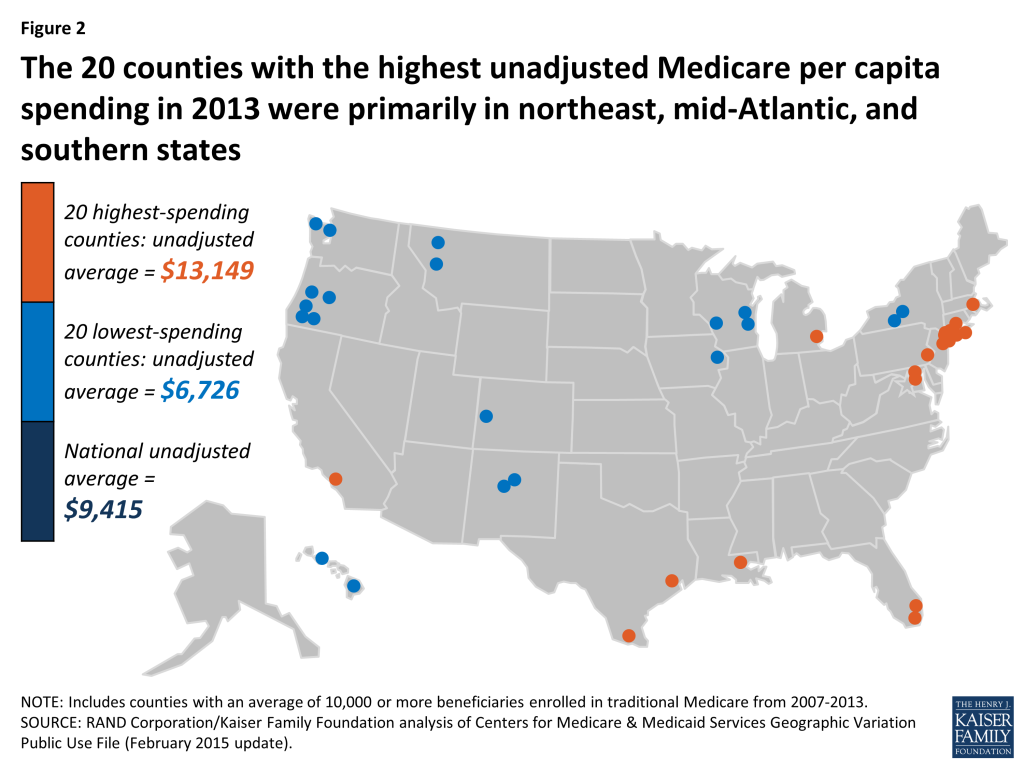
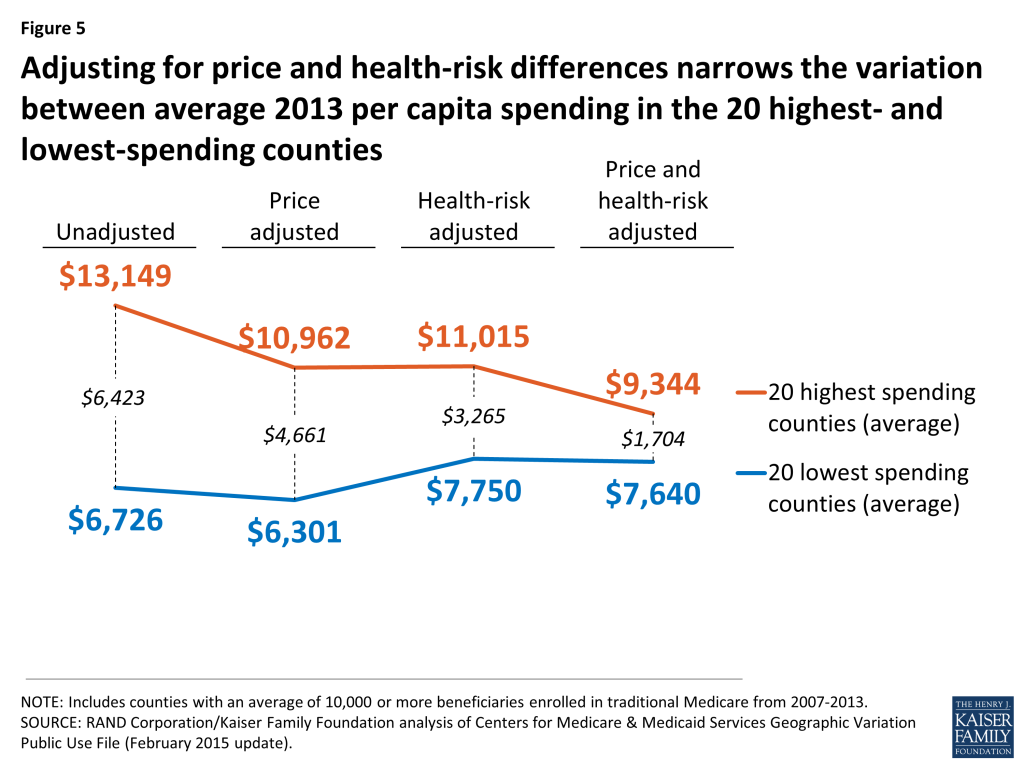
  • Unadjusted Medicare per capita spending averaged $9,415 in 2013, but was nearly two times greater in the 20 counties with the highest per capita spending ($13,149) than in the 20 counties with the lowest per capita spending ($6,726).
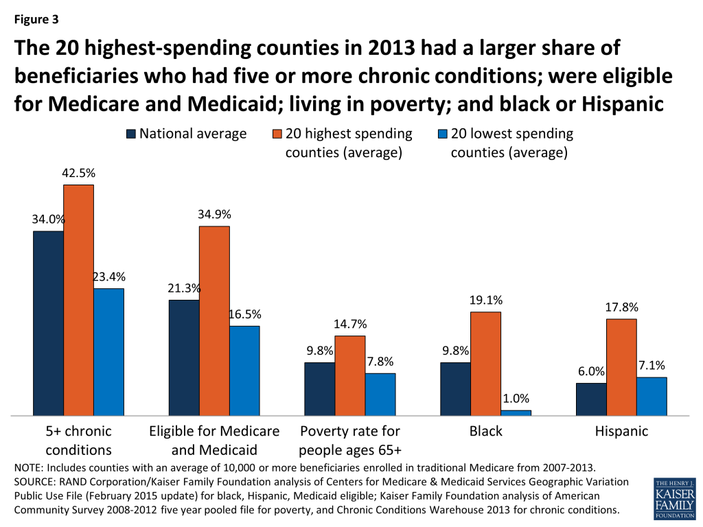
  • The 20 counties with the highest unadjusted Medicare per capita spending in 2013 were primarily in northeast, mid-Atlantic, and southern states. Compared to the 20 lowest-spending counties, and the national average, the 20 highest-spending counties have much sicker and poorer beneficiary populations, on average, and a substantially greater share of black and Hispanic beneficiaries.
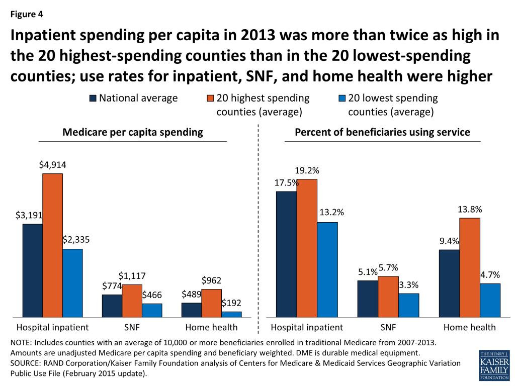
  • Medicare per capita spending on hospital inpatient care is more than twice as high in the highest-spending counties than in the lowest-spending counties, making it by far the most important service category in terms of explaining spending differences between the highest- and lowest-spending counties.
  • When we adjust per capita spending in the 20 highest-spending counties and the 20 lowest-spending counties to account for differences in Medicare prices and beneficiaries’ health risk, we find that the gap between the averages narrows substantially—from a 96 percent difference ($13,139 versus $6,726) to a 22 percent difference ($9,344 versus $7,640)—but does not disappear.
  • Ranking counties based on price- and health-adjusted spending, we find that 19 of the 20 counties with the highest adjusted per capita spending are in the south, with Texas and Louisiana together accounting for 14 of the 20 counties. The 20 highest-spending counties stand out for having significantly more post-acute care providers per capita and significantly fewer physicians than the 20 lowest-spending counties.

Geographic Variation in Medicare Per Capita Spending Growth Rates, 2007-2013

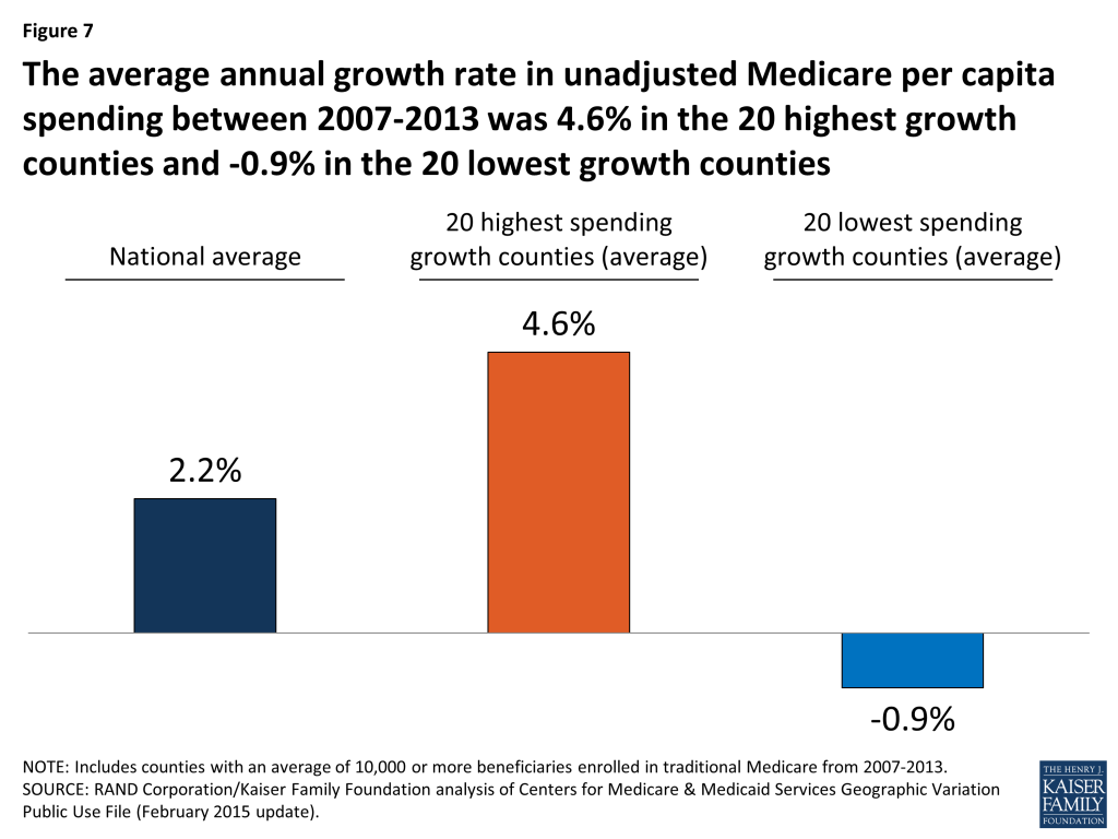
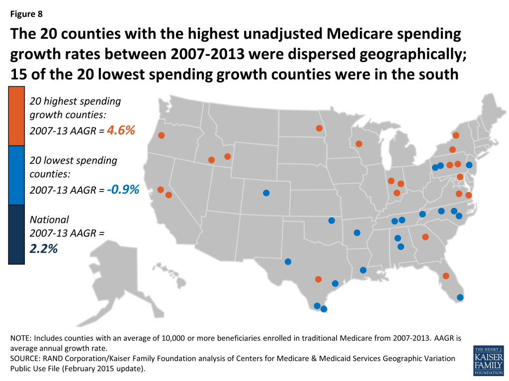
  • The average annual rate of growth in unadjusted Medicare per capita spending between 2007 and 2013 was 2.2 percent nationwide, but ranged from -0.9 percent among the 20 counties with the lowest spending growth rate to 4.6 percent among the 20 counties with the highest spending growth rate.
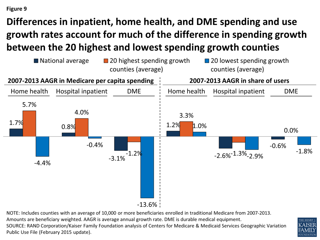
  • Fifteen of the 20 counties with the lowest spending growth rates are in southern states; the 20 counties with the highest spending growth rates are more geographically dispersed. In the counties with the lowest spending growth rates, Medicare per capita spending for hospital services, home health care, and durable medical equipment fell from 2007 to 2013.

Change in Geographic Variation, 2007-2013

  • Counties with relatively high unadjusted Medicare per capita spending in 2007 tended to experience relatively low spending growth between 2007 and 2013, and vice versa. But counties at the top of the ranking of unadjusted Medicare per capita spending have tended to remain at the top over time.
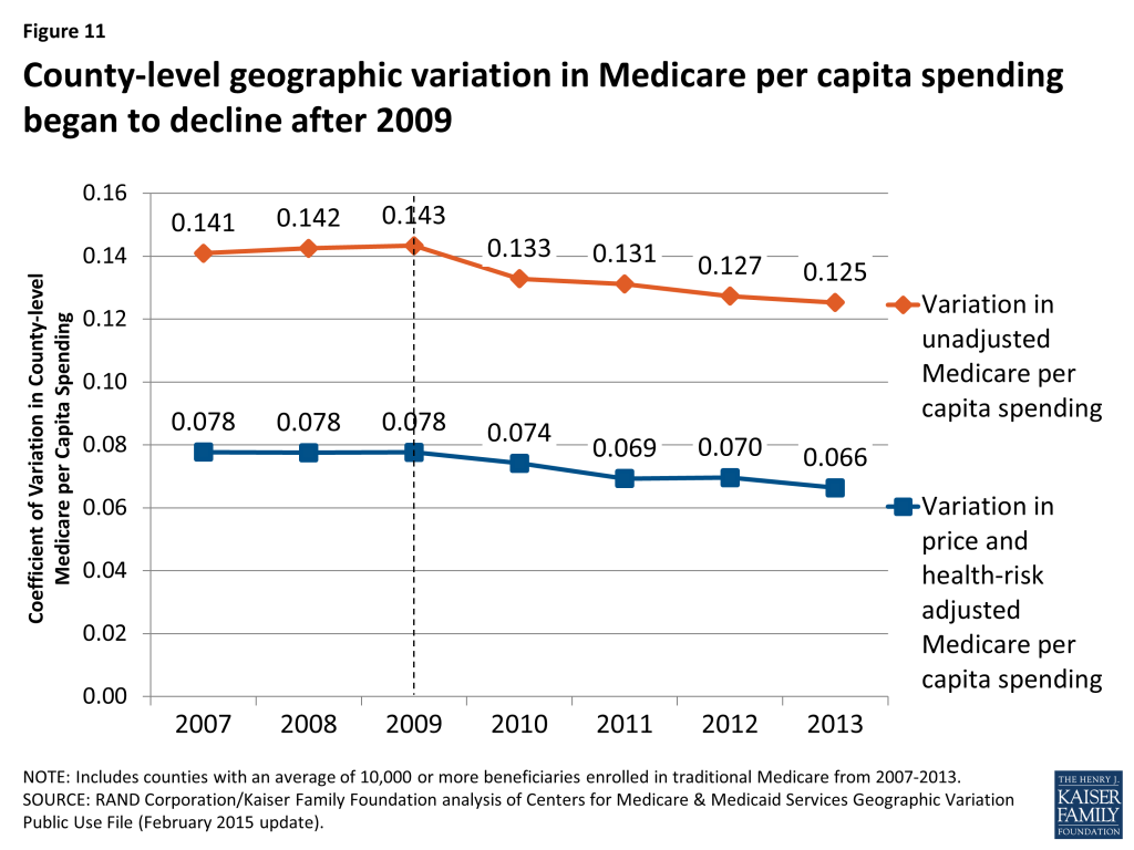
  • The amount of geographic variation in unadjusted Medicare spending—as measured by the coefficient of variation—began to decline after 2009, indicating a modest narrowing of geographic variation in recent years.

Our analysis shows that geographic variation in Medicare per capita spending persists, although the gap between the highest- and lowest-spending counties appears to have narrowed since 2009. Recent activities, including new efforts to change how providers deliver care and how Medicare pays for it, may be helping to curb Medicare spending in many parts of the country, including areas with some of the more notable excesses in spending. The Affordable Care Act included a number of provisions designed to encourage greater efficiency in the delivery of care for Medicare beneficiaries by modifying incentives for providers to reduce excess costs and improve quality of care. Yet even with such efforts, deep differences in per capita Medicare spending in different parts of the country remain and are likely to persist due to underlying differences in beneficiary characteristics related to poverty and poor health, along with differences in the prices that Medicare pays for services, that contribute to variations in spending.

Report: Introduction

In 2009, the physician and author Atul Gawande focused the attention of the health policy community on McAllen, Texas, linking exceptionally high Medicare spending in that city to what he characterized as a profit-oriented “culture of money” among providers.1  Although research on geographic variation in health care utilization and spending predated that article by many years, Gawande’s article struck a nerve and attracted significant attention among policymakers and researchers.

Gawande’s work built on examinations of differences in Medicare spending per capita among hospital referral regions (HRRs)2  by researchers at Dartmouth University. Dartmouth researchers concluded that such differences could not be explained by differences in health status, and that “increased Medicare spending in high-cost regions provides no important benefits in terms of survival.”3  The Dartmouth researchers suggested that the differences in spending across HRRs resulted mainly from differences in practice patterns, which could be addressed by policy interventions, such as changes in financial incentives for providers.4 

In contrast, other researchers have emphasized differences in beneficiaries’ health status as drivers of geographic variation in Medicare spending. Reschovsky et al. found that differences in disease burden were largely responsible for geographic variation in Medicare spending, based on their analysis of data from 60 communities.5  Similarly, Zuckerman et al. found that beneficiary demographics and health status help to explain geographic differences in Medicare spending, but also found that even after adjusting for other possibly relevant factors, such as provider supply measures, significant unexplained differences remained.6  Sheiner also concluded, based on a state-level analysis, that much of the geographic variation in Medicare spending can be explained by differences in health status and demographics, which are less amenable to policy intervention than practice patterns.7 

In 2009, Congress directed the Institute of Medicine (IOM) to conduct a series of studies on geographic variation in Medicare spending and in the broader health care system. The IOM documented significant variation in spending even within high-spending and low-spending areas; showed that much of the geographic variation in Medicare spending is attributable to differences in post-acute care spending; and ultimately recommended against changes in payment policy designed primarily to reduce geographic variation in spending.8  The IOM expressed some concern that reductions in payments to providers in high-spending areas could inadvertently penalize providers practicing appropriately who happened to work in high-fraud areas.

This paper contributes to the body of research on geographic variation in Medicare spending in three ways. First, we analyze variation in Medicare per capita spending at the county level, rather than at the state or HRR level, using the most current data available (through 2013). Second, we analyze detailed data on utilization and spending for specific types of services in our comparisons of high- versus low-spending counties. Third, we examine changes over time from 2007 to 2013 in county-level Medicare per capita spending to compare counties with high versus low rates of growth, and to assess whether geographic variation in per capita spending is increasing or decreasing.

Our analysis addresses the following questions:

  • How does Medicare per capita spending vary by county in 2013, and what are the characteristics of the counties with the highest and lowest Medicare per capita spending? How does the amount of variation, and the characteristics of high- versus low-spending counties, differ if rankings are based on unadjusted Medicare spending versus Medicare spending adjusted for differences in prices and beneficiary health status?
  • How much variation exists across counties in the rate of growth in Medicare per capita spending between 2007 and 2013, and what are the characteristics of the counties with the highest and lowest per capita spending growth rates?
  • Did the amount of geographic variation in Medicare per capita spending increase or decrease from 2007 to 2013?

Report: Data And Methods

The primary data source for this analysis is the February 2015 update of the Medicare Geographic Variation Public Use File (GV PUF) from the Centers for Medicare & Medicaid Services (CMS).9  We analyzed data at the county level (the most-granular level available), focusing on 2007 and 2013, the earliest and latest years in the 2015 GV PUF. The GV PUF reports spending and beneficiary characteristics only among Medicare beneficiaries enrolled in both Parts A and B and in traditional Medicare (i.e., excluding beneficiaries enrolled in a private Medicare Advantage plan). To avoid mistakenly identifying counties as high- or low-spending based on a few individual outliers, our analysis included only the 736 counties with an average of 10,000 or more traditional Medicare beneficiaries from 2007 through 2013. The national averages discussed in our analysis include all counties, regardless of the number of beneficiaries in any given year.

We ranked the 736 counties in our analysis using three different spending measures. The first measure is unadjusted Medicare per capita spending in 2013, which enables us to show how counties rank on their actual Medicare per capita spending levels, including the effects of differences in prices and health risk. (In this context, ‘price’ refers to Medicare payment rates for services, which are set based on formulas that take into account differences in local wages and certain provider characteristics such as add-on payments for teaching hospitals.) The second measure is price and health-risk adjusted Medicare per capita spending in 2013, which enables us to show how counties rank when differences in prices and health risk are factored out. The third measure is the average annual rate of growth from 2007 to 2013 in unadjusted Medicare per capita spending.

For each of these three spending measures, we identified and compared the counties at the top and bottom of the rankings. For ease of display, we focus on comparisons of the 20 top and bottom counties. We tested whether our results were sensitive to the selection of 20 counties in each group by replicating our analysis for groups of 50 counties; the results were not appreciably different. Our analysis compares beneficiary-weighted averages across these groups of 20 counties for Medicare beneficiary characteristics, health care provider supply measures, and service spending and use, as well as the county-level poverty rate:

  • Beneficiary characteristics include percent black, percent Hispanic, percent eligible for both Medicare and Medicaid, and health risk scores (“hierarchical condition categories,” or HCCs) from the GV PUF; the share of traditional Medicare beneficiaries with five or more chronic conditions, based on our analysis of a five percent sample of Medicare claims from the 2013 CMS Chronic Conditions Data Warehouse (CCW); and the percent of county residents ages 65 and over living in poverty, based on our analysis of American Community Survey (ACS) 2008-2012 five-year pooled data from the 2013-2014 Area Health Resources File (AHRF); and the percent of beneficiaries living in metropolitan areas, based on our analysis of the AHRF.
  • Measures of health care provider supply are reported per 10,000 county residents and include the number of physicians, primary care physicians as a percent of all physicians, hospital beds, skilled nursing facility beds, home health agencies, ambulatory surgical centers, and hospices. Supply measures are from our analysis of the AHRF for various years.
  • Measures of spending and utilization from the GV PUF include the share of beneficiaries using specific Medicare-covered services, spending per capita and per user, and event counts (days, visits, procedures) per 1,000 beneficiaries.
  • County-level poverty from the AHRF is the poverty rate among county residents of all ages.

To examine whether geographic variation in county-level Medicare per capita spending increased or decreased between 2007 and 2013, we calculated the “coefficient of variation” (COV) in county-level spending. This measure is useful for measuring trends in spending variation, while adjusting for inflation.

Our analyses use the entire population of U.S. counties and the entire population of Medicare fee-for-service beneficiaries within those counties, rather than a random sample. Although conventional tests of statistical significance are not necessary in this situation, we present results from statistical significance testing for the comparisons of county-level averages in the appendix tables. For more details on the data and methods used in this analysis, see Appendix 1: Data and Methods.

Report: Findings

How does Medicare per capita spending vary by county in 2013, and what are the characteristics of the counties with the highest and lowest Medicare per capita spending?

Unadjusted Medicare per capita spending in 2013 averaged $9,415 nationwide, but was nearly two times greater, on average, in the 20 counties with the highest per capita spending ($13,149) than in the 20 counties with the lowest per capita spending ($6,726) (Figure 1). Unadjusted Medicare per capita spending in 2013 ranged from a low of around $6,000 in Josephine County, Oregon to a high of more than $16,000 in Miami-Dade County, Florida (Appendix 2: Table 1).

Figure 1: Medicare per capita spending in 2013 was twice as large in the 20 highest-spending counties than in the 20 lowest-spending counties

Most (13 of 20) of the counties with the highest unadjusted Medicare per capita spending in 2013 are in states in the northeastern and mid-Atlantic regions of the country (NY, MD, NJ, PA, CT, MA), five are in Southern states (FL, TX, LA), and the remaining two are in California and Michigan (Figure 2).10  In contrast, most (14 of 20) of the counties with the lowest per capita spending are in western states (OR, CO, NM, HI, MT, WA). The 20 highest-spending counties included substantially larger numbers of Medicare beneficiaries than the 20 lowest-spending counties (totaling 4.6 million versus 735,000 in 2013).

Figure 2: The 20 counties with the highest unadjusted Medicare per capita spending in 2013 were primarily in northeast, mid-Atlantic, and southern states

The highest-spending counties differ from the lowest-spending counties on several dimensions, including beneficiary health status, income, race and ethnicity, and measures of provider supply (Figure 3; Appendix 2: Table 2). For example, 42.5 percent of beneficiaries in the highest-spending counties have five or more chronic conditions, almost double the rate among beneficiaries in the lowest-spending counties (23.4%), and higher than the national average (34.0%). The average poverty rate among people ages 65 and older is nearly two times greater in the 20 highest-spending counties (14.7%) than in the 20 lowest-spending counties (7.8%), and higher than the national average (9.8%). Relatively high poverty rates in the highest-spending counties are reflected in the larger share of beneficiaries dually eligible for Medicare and Medicaid: 34.9 percent in the 20 counties with the highest Medicare per capita spending compared to 16.5 percent in the 20 counties with the lowest per capita spending. A much larger share of beneficiaries in the highest-spending counties are black (19.1%) than in the lowest-spending counties (1.0%) or nationally (9.8%). Similarly, Hispanic beneficiaries account for 17.8% percent of beneficiaries in the highest-spending counties, but just 7.1 percent of beneficiaries in the lowest-spending counties and 6.0 percent nationally.

Figure 3: The 20 highest-spending counties in 2013 had a larger share of beneficiaries who had five or more chronic conditions; were eligible for Medicare and Medicaid; living in poverty; and black or Hispanic

Counties with higher unadjusted Medicare per capita spending in 2013 typically had a larger supply of various types of providers than the lowest-spending counties (Appendix 2: Table 2). Notably, the 20 highest-spending counties had 33.7 doctors per 10,000 county residents in 2012 (the most recent year available), 9.7 more than the national average and 9.3 more than in the lowest-spending counties. The highest-spending counties also had more hospital beds and home health agencies per 10,000 county residents compared to both the national average and the lowest-spending counties, but a smaller number of hospices and ambulatory surgical centers.

The 20 highest- and lowest-spending counties differed substantially in spending per capita for specific Medicare-covered services in 2013 (Figure 4; Appendix 2: Table 3). By far the most important service category in terms of explaining spending differences between the highest- and lowest-spending counties is hospital inpatient care—which is perhaps not surprising, given that inpatient spending is among the most costly types of Medicare-covered service both on a per-capita and a per-user basis. Average spending per capita on hospital inpatient care in 2013 was more than twice as high in the highest-spending counties than in the lowest-spending counties ($4,914 versus $2,335). The difference in hospital inpatient spending is due to a combination of a larger share of the beneficiary population using hospital inpatient services, higher prices paid, and greater quantity and intensity of services received by inpatient users in the 20 highest-spending counties. For example, in the highest-spending counties, an average of 19.2 percent of traditional Medicare beneficiaries had a hospital inpatient stay, compared to the national average of 17.5 percent and 13.2 percent in the 20 lowest-spending counties. Hospital inpatient use was also higher in the 20 highest-spending counties, averaging 2,081 days per 1,000 beneficiaries, compared to 1,530 nationally and 988 in the 20 lowest-spending counties.

Figure 4: Inpatient spending per capita in 2013 was more than twice as high in the 20 highest-spending counties than in the 20 lowest-spending counties; use rates for inpatient, SNF, and home health were higher

The 20 highest-spending counties in 2013 also had substantially higher spending and use for post-acute care (skilled nursing facility (SNF) and home health care services) relative to the national average and the 20 lowest-spending counties. SNF spending per capita in 2013 averaged $1,117 in the 20 highest-spending counties, 44 percent higher than the national average ($774) and 140 percent higher than in the 20 lowest-spending counties ($466). The per capita spending differences were even larger for home health services ($962, $489, and $192, respectively). The percent of traditional Medicare beneficiaries using SNF in the 20 highest-spending counties in 2013 (5.7%) was higher than national average (5.1%) and higher than in the lowest-spending counties (3.3%). The differences in use rates for home health are even more striking: 13.8 percent of beneficiaries used home health services in the 20 highest-spending counties in 2013, compared to a national average of 9.4 percent, and just 4.7 percent in the 20 lowest-spending counties. The number of SNF covered days per 1,000 beneficiaries was significantly higher in the 20 highest-spending counties (2,429) than the national average (1,887) or the average for 20 lowest-spending counties (1,093). Home health visits per 1,000 beneficiaries averaged 6,207 in the highest-spending counties—six times more than in the lowest-spending counties (1,019) and twice the national average (3,062).

Taken together, these findings suggest that higher unadjusted county-level Medicare per capita spending is partly driven by having a traditional Medicare beneficiary population that is poorer and sicker than average and that uses hospital inpatient services and post-acute care at higher rates and with greater intensity than beneficiaries in lower-spending counties. Counties with relatively high Medicare per capita spending also have a larger supply of certain health care providers than lower-spending counties, which may be related to having a sicker beneficiary population.

How does the amount of variation, and the characteristics of high- versus low-spending counties, differ if rankings are based on unadjusted Medicare spending versus Medicare spending adjusted for differences in prices and beneficiary health status?

Ranking counties based on their actual (unadjusted) Medicare per capita spending reveals the counties where Medicare spends the most and the least, but these spending amounts reflect both the prices that Medicare pays for services at the local level and the health status of beneficiaries living in each county. When we adjust for these price and health-risk differentials and compare the average adjusted per capita spending amounts between the 20 highest-spending counties and the 20 lowest-spending counties, we find that the gap between the averages narrows substantially—from a 96 percent difference ($13,139 versus $6,726) to a 22 percent difference ($9,344 versus $7,640)—but does not disappear (Figure 5). This reduction in the gap between the average spending amounts based on adjusted per capita spending makes sense, since the adjustment mitigates two of the factors (price and health risk) that contribute to county-level spending variation.

Figure 5: Adjusting for price and health-risk differences narrows the variation between average 2013 per capita spending in the 20 highest- and lowest-spending counties

Another way of exploring the effect of price and health-risk adjustments is to examine the ranking of counties based on adjusted Medicare per capita spending, which produces a different set of counties at the top and bottom of the rankings than ranking based on unadjusted per capita spending. Based on this ranking, 19 of the 20 counties with the highest adjusted Medicare per capita spending are located in southern states (TX, LA, FL, OK, AL), with 9 counties located in Texas alone, and only one county located in a non-southern state (OH) (Figure 6; Appendix 2: Table 4). In contrast, a majority (17 out of 20) of the lowest spending counties based on price and risk-adjusted per capita spending are located in western states (CA, CO, HI, NM, OR), including 9 counties in California alone; the remaining 3 counties are in AK and NY.

Figure 6: The 20 counties with the highest price- and health-risk adjusted Medicare per capita spending in 2013 were primarily in the south; the 20 lowest adjusted spending counties were primarily in the west

Based on the county rankings by price and health-risk adjusted spending, we find that some demographic differences between the 20 counties at the top and bottom of the ranking, but those differences are not as large as the differences between the counties ranked by unadjusted per capita spending. The 20 highest adjusted spending counties have a somewhat sicker beneficiary population (HCC score of 1.11 versus 0.96), and a larger share of black (8.9% versus 6.8%) and Hispanic (15.8% versus 10.6%) beneficiaries, but a smaller share of beneficiaries eligible for both Medicare and Medicaid (25.3% versus 28.9%) (Appendix 2: Table 5).

In terms of provider supply, the 20 counties with the highest adjusted per capita Medicare spending had 26.5 percent fewer physicians per 10,000 residents than the 20 counties with the lowest adjusted spending, but a larger supply of hospital beds and ambulatory surgical centers, as well as more post-acute providers, including SNF beds, home health agencies, and hospices. Higher adjusted Medicare per capita spending in the top 20 adjusted spending counties could reflect what the Dartmouth researchers refer to as “practice patterns” related to having a larger supply of certain types of providers, or it could reflect higher levels of demand related to having somewhat sicker beneficiary populations.

How much variation exists across counties in the rate of growth in Medicare per capita spending between 2007 and 2013, and what are the characteristics of the counties with the highest and lowest per capita spending growth rates?

The annual rate of growth in Medicare per capita spending between 2007 and 2013 averaged 2.2 percent nationally, and ranged from -0.9 percent, on average, among the 20 counties with the lowest spending growth rate (i.e., a decline in nominal per capita spending) to 4.6 percent, on average, among the 20 counties with the highest spending growth rate (Figure 7).

Figure 7: The average annual growth rate in unadjusted Medicare per capita spending between 2007-2013 was 4.6% in the 20 highest growth counties and -0.9% in the 20 lowest growth counties

Between 2007 and 2013, five counties experienced negative average annual growth in per capita spending: Miami-Dade County, FL (-1.84%), Hidalgo County, TX (-1.70%); Wilson County, TN (-0.35%), Orange County, NC (-0.17%), and Walker County, AL (-0.08%). Fifteen of the 20 counties with the lowest spending growth rates are in southern states, while the 20 counties with the highest spending growth rates are more geographically dispersed (Figure 8; Appendix 2: Table 6). None of the 20 counties with the highest spending growth rates between 2007 and 2013 were among the 20 counties with the highest per capita spending amounts in 2013; similarly, none of the 20 counties with the lowest spending growth rates between 2007 and 2013 were among the 20 counties with the lowest per capita spending amounts in 2013.

Figure 8: The 20 counties with the highest unadjusted Medicare spending growth rates between 2007-2013 were dispersed geographically; 15 of the 20 lowest spending growth counties were in the south

Unlike the 20 highest-spending and lowest-spending counties, where a comparison reveals several differences in beneficiary characteristics in 2013, there are few notable differences in health status or demographics between the counties with the highest spending growth rates and lowest spending growth rates (Appendix 2: Table 7). The 20 counties with the highest spending growth rates had somewhat fewer Medicare beneficiaries in 2013 than counties with the lowest spending growth rates (totaling 658,000 versus 994,000), but these two sets of counties were similar in terms of average HCC scores, the share of black beneficiaries, and the share of beneficiaries who were eligible for both Medicare and Medicaid in 2013. The only demographic characteristic that differed between counties with the highest and lowest spending growth rates was that Hispanic beneficiaries represented a much larger share of beneficiaries in the lowest spending growth counties, on average, in 2013 (32.4% versus 4.4%); this is likely due to the fact that Miami-Dade County and a handful of counties in Texas with much higher-than-average shares of Hispanic beneficiaries were among the 20 counties with the lowest Medicare per capita spending growth rates across these years.

We also did not observe major changes in beneficiary demographics between 2007 and 2013 that would suggest that such changes played a large role in the rate of Medicare per capita spending growth in these counties. We did observe a difference in the average annual rate of growth in the overall poverty rate among county residents of all ages, which increased at an average annual rate of 4.4 percent in the 20 counties with the highest spending growth rates, compared to 2.3 percent in the 20 counties with the lowest spending growth rates. Average annual growth in the share of black, Hispanic, and Medicare-Medicaid eligible beneficiaries was slightly higher in the highest spending growth counties than in the lowest spending growth counties, while Medicare Advantage penetration increased at the same average annual rate in both sets of counties.

We examined changes in the rate of growth in measures of provider supply to assess whether counties with higher rates of Medicare per capita spending growth also had faster growth in provider supply compared to counties with lower spending growth rates (Appendix 2: Table 7). Contrary to expectations, we found no discernable relationship. For example, in the 20 counties with the fastest growth in Medicare per capita spending, the average number of physicians per 10,000 county residents grew slightly at an average annual growth rate of 0.4% (from 21.0 in 2007 to 21.5 in 2012, the latest year available), and was unchanged in the 20 slowest-growing counties (27.4 in both 2007 and 2012). For another example, we observed a decline over time in the number of hospital beds and skilled nursing facility beds per 10,000 county residents in both the 20 counties with the highest spending growth rates and the 20 counties with the lowest spending growth rates.

Although we did not observe major distinctions between high-spending growth and low-spending growth counties in terms of changes in beneficiary demographics and provider supply measures, we did observe notable differences between these groups of counties in the rate of change in service spending and use between 2007 and 2013. Three service categories account for much of the difference in spending growth between the counties with the highest and lowest spending growth rates: hospital inpatient, home health, and durable medical equipment (DME) (Figure 9; Appendix 2: Table 8).

Figure 9: Differences in inpatient, home health, and DME spending and use growth rates account for much of the difference in spending growth between the 20 highest and lowest spending growth counties

In the 20 highest spending growth counties, average hospital spending per capita increased by 4.0 percent between 2007 and 2013, while it decreased by 0.4 percent in the 20 lowest spending growth counties. Readmission rates increased by 0.2 percent, on average, in the highest spending growth counties, but decreased by 0.8 percent in lowest spending growth counties. The difference in growth in spending on home health services was even more striking: increasing at an average annual rate of 5.7 percent in the highest spending growth counties, but decreasing at an average annual rate of 4.4 percent in the lowest spending growth counties. DME spending per capita fell in both the highest and lowest spending growth counties, but the average annual decrease was much smaller in the former set of counties than the latter (-1.2% versus -13.6%).

Compared to the 20 lowest spending growth counties, the 20 counties with the highest spending growth experienced higher average annual growth in the share of beneficiaries using home health services (3.3% versus 1.0%), and a smaller average annual decrease in the share of beneficiaries using hospital inpatient services (-1.3% versus -2.9%). Conversely, the 20 lowest spending growth counties experienced a reduction in the rate of growth in users of DME services, compared to a flat rate of growth in the highest spending growth counties (-1.8% versus 0.0%).

Did the amount of geographic variation in Medicare per capita spending increase or decrease from 2007 to 2013?

Our analysis shows that, in general, counties with relatively high Medicare per capita spending in 2007 tended to experience relatively low spending growth between 2007 and 2013, and vice versa (Figure 10). But although county-level 2007 Medicare per capita spending is negatively related to spending growth over time, high levels of Medicare per capita spending by county have tended to persist over time. Of the 20 counties with the highest per capita spending in 2013, all but two were among the 20 highest-spending counties in 2007 (Appendix 2: Table 9).

Figure 10: Medicare per capita spending growth between 2007-2013 is negatively related to Medicare per capita spending levels in 2007

To further explore the question of whether geographic variation narrowed or widened over these years, we measured the beneficiary-weighted county-level coefficient of variation for each year from 2007 through 2013 for two spending measures: unadjusted per capita spending, and price and health-risk adjusted per capita spending, including all counties (not just counties with 10,000 or more beneficiaries). We found that the coefficient of variation for unadjusted per capita spending increased slightly from 2007 (0.141) to 2009 (0.143), and then decreased each year thereafter, falling to 0.125 in 2013, a 13 percent decline (Figure 11; Appendix 2: Table 10). The coefficient of variation in adjusted per capita spending followed a similar trend, rising initially and then falling by 15 percent from 2009 to 2013 (from 0.078 to 0.066). We also examined the coefficient of variation by type of service, and found that declines in geographic variation were particularly pronounced for three service categories: home health, durable medical equipment, and hospice. This convergence, or narrowing of variation, in county-level Medicare per capita spending in recent years represents the continuation of a trend since the 1970s toward a reduction in geographic variation in Medicare per capita spending.11 

Figure 11: County-level geographic variation in Medicare per capita spending began to decline after 2009

Report: Conclusion

Previous research on geographic variation in Medicare spending suggested that wide variation in per capita spending was driven by differences in the supply of providers combined with an inappropriate profit orientation in some areas, and that the gap between high-spending and low-spending areas could be narrowed by policies that encourage providers in high-spending areas to behave more like providers in low-spending areas. More recent research has shown that the areas of the country with relatively high unadjusted Medicare per capita spending are marked by a confluence of poor health, high rates of poverty, and high prices. Thus, changing provider practice patterns may help to curtail spending growth and reduce variation in spending across counties but will not eliminate the abiding socioeconomic, demographic, and health disparities between the highest- and lowest-spending counties.

At the same time, our analysis shows that differences in county-level spending remain even after adjusting for differences in prices and beneficiary health status that affect Medicare per capita spending. In light of our finding that counties with the highest price- and health-risk adjusted per capita spending have a larger supply of certain types of providers, including post-acute care providers, the question remains whether higher spending in these areas is driven by medical practice styles or by demand for care from a relatively sicker beneficiary population, or some combination of both. Further research is needed to understand this relationship.

In recent years, policies have been implemented within Medicare that may have helped to curb some of the more notable excesses in high-spending areas of the country, and new efforts are underway in the program to change how providers deliver care and how Medicare pays for it. These activities include: an increased focus on program integrity in Medicare, with a special emphasis on high-fraud regions and services; a new competitive bidding program for durable medical equipment; a hospital readmission reduction program; the Medicare Shared Savings Program; and bundled payments for episodes of care. It is beyond the scope of this paper to quantify the extent to which these policies have affected geographic variation in Medicare per beneficiary spending, but our findings suggest that they may have played some role in the narrowing of variation.

The Affordable Care Act included a number of provisions designed to encourage greater efficiency in the delivery of care for Medicare beneficiaries by modifying incentives for providers to reduce excess costs and improve quality of care. Some of these initiatives may help to constrain the growth in per capita spending in all areas and further reduce the variation between the highest- and lowest-spending areas, but some regional differences are likely to persist due to profound differences in the health and socioeconomic characteristics of the Medicare population across the county, along with differences in the prices Medicare pays for services.

We gratefully acknowledge Anthony Damico for assistance with data analysis, and two external reviewers for valuable feedback on a draft of this report.

Appendices: Appendix 1: Data And Methods

The primary data source for this analysis is the February 2015 update of the Medicare Geographic Variation Public Use File (GV PUF) from the Centers for Medicare & Medicaid Services (CMS).12  The GV PUF includes data for the U.S. overall and for three different geographic levels: state, county, and hospital referral region (HRR). We analyzed data at the county level because that is the most-granular level available. Our analysis focuses on the years 2007 and 2013, the earliest and latest years, respectively, in the 2015 GV PUF.

The GV PUF reports spending and beneficiary characteristics only among Medicare beneficiaries enrolled in both Parts A and B (i.e., not just one or the other), and in the traditional Medicare program (i.e., excluding beneficiaries enrolled in a private Medicare Advantage plan). Because of increases in Medicare Advantage enrollment, the share of Medicare beneficiaries included in the GV PUF study population declined from 71 percent in 2007 (33.0 million out of 46.7 million) to 62 percent in 2013 (34.3 million out of 55.2 million).

The GV PUF include three types of spending measures: “actual costs” (unadjusted Medicare payments, excluding beneficiary cost sharing and third-party payments), “standardized costs” (that is, a simulated measure of costs calculated by CMS using a single national price schedule that reflects the quantity and intensity of services but does not include market- or provider-level price adjustments), and “standardized risk-adjusted costs” (that is, standardized costs adjusted for differences in health risk by dividing by the HCC (hierarchical condition categories) score). (In this paper, we refer to “standardized costs” as price-adjusted spending, and “standardized risk-adjusted costs” as price- and risk-adjusted spending.) In addition, for each combination of county, year, and service category we created a set of Medicare price indexes, equal to the ratio of actual costs over standardized costs. In a county with prices equal to the national average, the price index equals 1.00. These price indexes reflect the market-level and provider-specific adjustments that are applied in each county in Medicare’s price-setting formulas, such as differences in local wages and certain provider characteristics such as add-on payments for teaching hospitals. In our discussion of spending by service category, we focus on spending per capita since this measure is the product of the percent of beneficiaries using each service, the Medicare price index for that type of service, and the standardized (i.e., price-adjusted) costs per user.

The county-level GV PUF include 3,136 counties, but many of those counties contain relatively few Medicare beneficiaries. Medicare per capita spending in those small counties can vary widely from county to county and from year to year due to random beneficiary-level variation. To avoid mistakenly identifying counties as high- or low-spending based on a few individual outliers, our analysis included only the 736 counties with an average of 10,000 or more traditional Medicare beneficiaries from 2007 through 2013. These 736 counties included 25.9 million traditional Medicare beneficiaries in 2013, which represents 76 percent of the GV PUF population in that year. The national averages discussed in our analysis include all counties, regardless of the number of beneficiaries in any given year.

We merged the county-level GV PUF with county-level measures of population: the poverty rate among county residents of all ages and the supply of health care providers from the Area Health Resources Files (AHRF) produced by the Health Resources and Services Administration (HRSA).13  For some measures of population demographics and supply, the most recent data available in the AHRF was prior to 2013. To calculate county-level supply measures, we divided the number of providers (e.g., active physicians) by the total number of county residents (i.e., not just Medicare beneficiaries). To calculate national average measures of supply, we first summed supply and population nationwide, and then calculated supply per capita.

We analyzed county-level data on the share of traditional Medicare beneficiaries with multiple chronic conditions, using a 5 percent sample of claims from the 2013 CMS Chronic Conditions Data Warehouse (CCW). We calculated the percent of beneficiaries living in metropolitan areas, based on our analysis of the AHRF. We also analyzed county-level data from the American Community Survey (ACS) 2008-2012 five-year pooled data from the 2013-2014 AHRF on the share of county residents ages 65 and older living in poverty. We matched variables from these separate data files to the GV PUF using the five-digit Federal Information Processing Standard (FIPS) codes, which uniquely identify counties and county-level equivalent areas in the U.S.

We ranked the 736 counties in our analysis using three different spending measures: 1) unadjusted Medicare per capita spending in 2013, to show how counties rank on their actual Medicare per spending levels, regardless of price and health risk differences; 2) price- and health-risk adjusted Medicare per capita spending in 2013; and 3) the annual rate of growth from 2007 to 2013 in unadjusted Medicare per capita spending.14  Our measure of county-level price- and health-risk adjusted spending equals price-adjusted spending divided by the mean HCC score.

For each of these three spending measures, we identified the 20 counties at the top and bottom of the rankings, which yielded six sets of 20 counties. We tested whether our results were sensitive to the selection of 20 counties in each group by replicating our analysis for groups of 50 counties. The results were not appreciably different. For each of those six sets of counties, we calculated beneficiary-weighted averages of spending and utilization measures and demographics, which gives greater weight to counties with larger numbers of traditional Medicare beneficiaries.

Our analysis compares these groups of counties in terms of Medicare beneficiary characteristics, health care provider supply measures, spending and utilization measures, and county-level poverty:

  • Beneficiary characteristics include percent black, percent Hispanic, percent eligible for both Medicare and Medicaid, and health risk scores (HCCs) from the GV PUF; the percent of traditional Medicare beneficiaries with five or more chronic conditions, based on our analysis of a five percent sample of Medicare claims from the 2013 CCW; and the percent of county residents ages 65 and over living in poverty, based on our analysis of ACS 2008-2012 five-year pooled data from the 2013-2014 AHRF, and the percent of beneficiaries living in metropolitan areas, based on our analysis of the AHRF.
  • Measures of health care provider supply are reported per 10,000 county residents and include the number of physicians, primary care physicians as a percent of all physicians, hospital beds, skilled nursing facility beds, home health agencies, ambulatory surgical centers, and hospices. Supply measures are from our analysis of the AHRF for various years.
  • Measures of spending and utilization from the GV PUF include the percent of beneficiaries using specific Medicare-covered services (hospital inpatient, outpatient, evaluation & management, procedures, skilled nursing facility, home health, durable medical equipment, and hospice), spending per capita and per user, and event counts (days, visits, procedures) per 1,000 beneficiaries.
  • County-level poverty from the AHRF is the poverty rate among county residents of all ages.

We used the “coefficient of variation” (COV) as a summary measure of the amount of geographic variation in county-level Medicare per capita spending to examine whether geographic variation increased or decreased between 2007 and 2013. The COV equals the beneficiary-weighted standard deviation in Medicare per capita spending divided by the beneficiary-weighted mean. We included all 3,136 counties in the COV calculation. The COV is useful for measuring trends in spending variation, while adjusting for inflation.

Our analyses use the entire population of U.S. counties and the entire population of Medicare fee-for-service beneficiaries within those counties, rather than a random sample. Although conventional tests of statistical significance are not necessary in this situation, we present results from statistical significance testing for the comparisons of county-level averages in the appendix tables. For these tests, we used the TTEST procedure in SAS, weighted by the number of beneficiaries and assuming unequal variance.

Appendices: Appendix 2: Tables

Table 1: Counties with the Highest and Lowest Unadjusted Medicare Per Capita Spending, 2013
Rank in 2013CountyState2013 Medicare per capita spending(unadjusted)2013 Medicare per capita spending(price and health-risk adjusted)2007-2013 Medicare per capita spending growth rate
United States average$9,415$9,3432.2%
20 highest-spending counties (unadjusted) 
1Miami-DadeFL$16,386$11,179-1.8%
2KingsNY$14,998$8,2351.5%
3BronxNY$14,903$7,9482.1%
4Baltimore CityMD$14,370$9,5051.6%
5Los AngelesCA$13,309$9,0213.2%
6QueensNY$12,909$8,3491.8%
7EssexNJ$12,902$9,1481.8%
8PhiladelphiaPA$12,811$9,0602.0%
9BrowardFL$12,664$10,3571.3%
10WayneMI$12,566$9,7611.7%
11HudsonNJ$12,475$8,9521.9%
12SuffolkMA$12,274$8,4121.9%
13New YorkNY$12,208$9,1841.3%
14HarrisTX$12,195$10,4181.6%
15HidalgoTX$12,182$8,971-1.7%
16TangipahoaLA$12,130$11,0661.5%
17BaltimoreMD$12,115$9,8112.4%
18RichmondNY$12,113$9,0771.3%
19PassaicNJ$11,976$9,5422.5%
20New HavenCT$11,952$8,9802.8%
20 lowest-spending counties (unadjusted) 
1JosephineOR$6,058$7,5132.1%
2MesaCO$6,263$7,6182.4%
3Santa FeNM$6,288$7,8712.7%
4TompkinsNY$6,310$7,6591.7%
5MissoulaMT$6,404$8,2951.3%
6HawaiiHI$6,433$6,2693.0%
7FlatheadMT$6,434$8,2601.7%
8DouglasOR$6,550$7,5212.8%
9ClallamWA$6,655$8,3112.4%
10JacksonOR$6,692$7,9081.8%
11DeschutesOR$6,757$8,5012.4%
12OutagamieWI$6,767$7,9132.0%
13IslandWA$6,800$8,0112.4%
14LaneOR$6,860$7,8102.8%
15SheboyganWI$6,869$8,3071.2%
16HonoluluHI$6,923$6,6723.3%
17DubuqueIA$6,946$8,7333.0%
18SteubenNY$6,973$7,6312.5%
19BernalilloNM$7,034$7,7692.9%
20La CrosseWI$7,034$7,7273.5%
SOURCE: RAND Corporation/Kaiser Family Foundation analysis of Centers for Medicare & Medicaid Services Geographic Variation Public Use File (February 2015 update).
Table 2: Average Total Spending, Beneficiary Demographics, and Provider Supply Measures for Counties with the Highest and Lowest Unadjusted Medicare Per Capita Spending, 2013
National average20 highest spending counties (unadjusted)20 lowest spending counties (unadjusted)High-low difference
Medicare per capita spending (unadjusted)$9,415$13,149$6,72695.5%****
Medicare per capita spending (price and health-risk adjusted)$9,343$9,344$7,64022.3%****
Health risk (hierarchical condition categories [HCC] score)1.001.190.8737.3%****
Medicare price index1.061.211.0712.8%****
Number of beneficiaries (traditional Medicare and Medicare Advantage, in thousands)50,1814,645735532.3%****
Medicare Advantage enrollment share31.6%42.8%42.2%1.4%
Beneficiary demographics (% of beneficiaries)
Black9.8%19.1%1.0%1763.9%****
Hispanic6.0%17.8%7.1%151.2%**
Eligible for Medicare and Medicaid21.3%34.9%16.5%111.8%****
Poverty rate among people ages 65 and older9.8%14.7%7.8%88.5%
Residing in a metropolitan area85.3%100.0%77.1%29.7%**
Five or more chronic conditions34.0%42.5%23.4%81.6%
Characteristics of overall county population
Poverty rate16.0%20.0%15.6%28.5%***
Supply of health care providers (per 10,000 county residents)
Physicians24.0633.7424.4837.8%*
Primary care physicians as a % of all physicians38.5%37.1%41.3%-10.1%**
Hospital beds25.3028.3022.3326.7%
Skilled nursing facility beds51.4944.5538.0317.1%
Home health agencies0.400.620.18248.0%***
Ambulatory surgical centers0.170.160.20-18.1%
Hospices0.120.080.13-38.3%*
NOTE: P-values are calculated by applying a t-test to the difference between the 20 highest and 20 lowest-spending counties, assuming unequal variance. *: p-value<0.10, **: p-value<0.05, ***: p-value<0.01, ****: p-value<0.001.

SOURCE: RAND Corporation/Kaiser Family Foundation analysis of Centers for Medicare & Medicaid Services Geographic Variation Public Use File (February 2015 update) for spending and most beneficiary demographics; American Community Survey 2008-2012 pooled data for poverty among people ages 65 and older; a 5 percent sample of claims from the 2013 CMS Chronic Conditions Data Warehouse (CCW) for five or more chronic conditions; Area Health Resources File for metropolitan area residents, characteristics of overall county population, and provider supply measures (various years). 

Table 3: Average Spending and Use of Specified Medicare-Covered Services for Counties with the Highest and Lowest Unadjusted Medicare Per Capita Spending, 2013
MeasureNational average20 highest spending counties (unadjusted)20 lowest spending counties (unadjusted)High-low difference
Hospital inpatient    
Spending per capita$3,191$4,914$2,335110.5%****
Percent using17.5%19.2%13.2%45.8%****
Price index1.241.571.2525.8%****
Standardized costs per user$14,722$16,230$14,29513.5%****
Covered days per capita1,5302,081988110.7%****
Readmission rate18.0%21.2%14.8%44.0%****
Outpatient    
Spending per capita$1,195$1,184$1,03814.1%
Percent using63.7%56.0%61.1%-8.3%
Price index1.021.081.044.0%
Standardized costs per user$1,846$1,939$1,65217.3%***
Visits per capita4,2213,6264,071-10.9%
Evaluation & management
Spending per capita$904$1,323$634108.8%****
Percent using87.8%86.7%84.7%2.4%**
Price index0.961.020.939.9%****
Standardized costs per user$1,078$1,489$80385.4%****
Visits per capita13,31617,8979,97979.3%****
Procedures
Spending per capita$605$785$46767.9%****
Percent using61.1%62.8%54.6%15.1%****
Price index0.981.060.9610.9%****
Standardized costs per user$1,011$1,170$89630.6%****
Procedures per capita4,6126,0113,62965.6%****
Skilled nursing facility
Spending per capita$774$1,117$466139.8%****
Percent using5.1%5.7%3.3%72.3%****
Price index0.971.091.017.5%**
Standardized costs per user$15,840$18,008$14,03828.3%****
Covered days per capita1,8872,4291,093122.3%****
Home health
Spending per capita$489$962$192402.0%****
Percent using9.4%13.8%4.7%193.4%****
Price index0.961.091.027.4%**
Standardized costs per user$5,428$5,942$3,95750.2%****
Visits per capita3,0626,2071,019509.1%****
Durable medical equipment
Spending per capita$199$182$15517.7%**
Percent using27.6%27.2%22.7%19.8%***
Price index0.940.930.96-3.4%****
Standardized costs per user$770$727$6964.4%
Events per capita1,7231,5971,37116.6%*
Hospice
Spending per capita$305$296$26312.6%
Percent using2.7%2.3%2.5%-5.8%
Price index0.991.111.046.8%**
Standardized costs per user$11,499$11,448$9,96614.9%*
Covered days per capita1,8891,5611,619-3.6%
NOTE: P-values are calculated by applying a t-test to the difference between the 20 highest and 20 lowest-spending counties, assuming unequal variance. *: p-value<0.10, **: p-value<0.05, ***: p-value<0.01, ****: p-value<0.001.

SOURCE: RAND Corporation/Kaiser Family Foundation analysis of Centers for Medicare & Medicaid Services Geographic Variation Public Use File (February 2015 update).

Table 4: Counties with the Highest and Lowest Adjusted Medicare Per Capita Spending, 2013
Rank in 2013CountyState2013 Medicare per capita spending(unadjusted)2013 Medicare per capita spending(price and health-risk adjusted)2007-2013 Medicare per capita spending growth rate
United States average$9,415$9,3432.2%
20 highest-spending counties (adjusted) 
1SmithTX$10,369$11,5722.4%
2CollinTX$9,932$11,4291.1%
3HuntTX$10,999$11,3432.2%
4MontgomeryTX$10,887$11,2832.1%
5HendersonTX$10,379$11,2382.2%
6Palm BeachFL$11,925$11,2212.3%
7EtowahAL$9,493$11,1952.3%
8Miami-DadeFL$16,386$11,179-1.8%
9DentonTX$10,379$11,1531.5%
10St. TammanyLA$10,808$11,1461.4%
11BayFL$10,167$11,0802.5%
12TangipahoaLA$12,130$11,0661.5%
13ClevelandOK$9,269$10,9452.1%
14RapidesLA$9,935$10,9381.9%
15ParkerTX$10,175$10,9243.3%
16BossierLA$10,311$10,9181.6%
17JeffersonOH$10,393$10,9073.1%
18OrangeTX$10,241$10,9041.9%
19OuachitaLA$10,913$10,8911.4%
20JohnsonTX$11,011$10,8803.6%
20 lowest-spending counties (adjusted) 
1HawaiiHI$6,433$6,2693.0%
2San FranciscoCA$10,144$6,6132.7%
3HonoluluHI$6,923$6,6723.3%
4YoloCA$8,060$7,1272.9%
5SolanoCA$9,158$7,1542.1%
6MendocinoCA$7,894$7,2873.4%
7AnchorageAK$7,930$7,3082.9%
8SacramentoCA$9,447$7,3694.4%
9San JuanNM$8,257$7,3772.1%
10Santa ClaraCA$9,797$7,4103.1%
11ImperialCA$9,799$7,4184.1%
12MonroeNY$8,030$7,4341.6%
13San JoaquinCA$9,123$7,4993.1%
14LinnOR$7,169$7,5124.7%
15JosephineOR$6,058$7,5132.1%
16HumboldtCA$7,624$7,5193.7%
17DouglasOR$6,550$7,5212.8%
18MultnomahOR$7,853$7,5433.1%
19ErieNY$7,978$7,5722.5%
20MesaCO$6,263$7,6182.4%
SOURCE: RAND Corporation/Kaiser Family Foundation analysis of Centers for Medicare & Medicaid Services Geographic Variation Public Use File (February 2015 update).
Table 5: Average Total Spending, Beneficiary Demographics, and Provider Supply Measures for Counties with the Highest and Lowest Adjusted Medicare Per Capita Spending, 2013
National average20 highest spending counties (adjusted)20 lowest spending counties (adjusted)High-low difference
Medicare per capita spending (unadjusted)$9,415$12,119$8,52942.1%****
Medicare per capita spending (price and health-risk adjusted)$9,343$11,179$7,26353.9%****
Health risk (hierarchical condition categories [HCC] score)1.001.110.9615.6%****
Medicare price index1.061.021.24-18.3%****
Number of beneficiaries (traditional Medicare and Medicare Advantage, in thousands)50,1811,2141,507-19.5%
Medicare Advantage enrollment share31.6%40.7%47.2%-13.8%
Beneficiary demographics (% of beneficiaries)
Black9.8%8.9%6.8%30.4%
Hispanic6.0%15.8%10.6%48.7%
Eligible for Medicare and Medicaid21.3%25.3%28.9%-12.5%
Poverty rate among people ages 65 and older9.8%11.6%9.1%28.0%
Residing in a metropolitan area85.3%98.5%90.4%9.0%
Characteristics of overall county population
Poverty rate16.0%16.2%15.6%3.7%
Supply of health care providers (per 10,000 county residents)
Physicians24.0622.2430.25-26.5%**
Primary care physicians as a % of all physicians38.5%39.7%41.3%-3.9%
Hospital beds25.3027.4522.8919.9%
Skilled nursing facility beds51.4946.3935.3331.3%*
Home health agencies0.401.020.15587.8%****
Ambulatory surgical centers0.170.190.1341.4%**
Hospices0.120.140.06119.0%*
NOTE: P-values are calculated by applying a t-test to the difference between the 20 highest and 20 lowest-spending counties, assuming unequal variance. *: p-value<0.10, **: p-value<0.05, ***: p-value<0.01, ****: p-value<0.001.

SOURCE: RAND Corporation/Kaiser Family Foundation analysis of Centers for Medicare & Medicaid Services Geographic Variation Public Use File (February 2015 update) for spending and most beneficiary demographics; American Community Survey 2008-2012 pooled data for poverty among people ages 65 and older; Area Health Resources File for metropolitan area residents, characteristics of overall county population, and provider supply measures (various years).

Table 6: Counties with the Highest and Lowest Medicare Per Capita Spending Growth Rates, 2007-2013
RankCountyState2007Medicare per capita spending(unadjusted)2013Medicare per capita spending(unadjusted)2007-2013 Medicare per capita spending growth rate
United States average$8,272$9,4152.2%
20 highest spending growth counties
1AlleganyMD$8,421$11,4465.2%
2Eau ClaireWI$6,042$8,1425.1%
3CassND$5,883$7,8955.0%
4Twin FallsID$5,896$7,8784.9%
5JeffersonNY$6,093$8,1194.9%
6WayneIN$7,201$9,5464.8%
7BellTX$6,945$9,2044.8%
8BartholomewIN$6,614$8,7174.7%
9LinnOR$5,442$7,1694.7%
10TippecanoeIN$6,864$9,0034.6%
11ClarkeGA$6,934$9,0904.6%
12CentrePA$6,733$8,8144.6%
13BonnevilleID$6,200$8,1054.6%
14TuolumneCA$6,749$8,7984.5%
15ChesterfieldVA$6,508$8,4614.5%
16SacramentoCA$7,283$9,4474.4%
17Hampton CityVA$7,020$9,0924.4%
18ChemungNY$6,370$8,2354.4%
19MarionFL$7,585$9,7784.3%
20NorthumberlandPA$7,335$9,4394.3%
20 lowest spending growth counties
1Miami-DadeFL$18,315$16,386-1.8%
2HidalgoTX$13,504$12,182-1.7%
3WilsonTN$9,194$9,000-0.4%
4OrangeNC$7,559$7,482-0.2%
5WalkerAL$8,700$8,656-0.1%
6BeaverPA$8,595$8,6350.1%
7ShelbyAL$8,183$8,2630.2%
8St. LandryLA$10,189$10,3460.3%
9JohnstonNC$9,197$9,3500.3%
10SurryNC$8,326$8,4730.3%
11WarrenNJ$9,774$9,9660.3%
12PulaskiAR$7,950$8,1200.4%
13WilliamsonTN$7,496$7,6600.4%
14Fort BendTX$9,942$10,2100.4%
15CameronTX$11,354$11,6620.4%
16ButlerPA$8,346$8,6140.5%
17BoulderCO$7,449$7,7160.6%
18EctorTX$9,084$9,4110.6%
19WashingtonTN$7,202$7,4630.6%
20WashingtonOK$6,819$7,0840.6%
SOURCE: RAND Corporation/Kaiser Family Foundation analysis of Centers for Medicare & Medicaid Services Geographic Variation Public Use File (February 2015 update).
Table 7: Average Spending, Beneficiary Demographics, and Provider Supply Measures for Counties with the Highest and Lowest Medicare Per Capita Spending Growth Rates, 2007 and 2013
National average20 highest spending growth counties20 lowest spending growth countiesHigh-low AAGR difference
20072013AAGR20072013AAGR20072013AAGR
Medicare per capita spending (unadjusted)$8,272$9,4152.2%$6,951$9,0894.60%$12,124$11,513-0.9%5.4%***
Medicare per capita spending (price and health-risk adjusted)$8,218$9,3432.2%$7,377$8,9073.20%$9,906$9,9270.0%3.2%*
Health risk (hierarchical condition categories [HCC] score)110.0%0.9610.7%1.161.15-0.3%0.9%***
Medicare price index1.041.060.2%1.031.090.90%1.021.030.0%0.8%*
Number of beneficiaries (traditional Medicare and Medicare Advantage, thousands)42,50750,1812.80%5456583.20%8219943.20%0.0%
Medicare Advantage enrollment share22.3%31.6%6.0%22.90%31.4%5.5%28.80%39.4%5.4%0.1%
Beneficiary demographics (% of beneficiaries)
Black9.4%9.80%0.8%8.0%8.6%1.1%8.7%8.9%0.4%0.7%
Hispanic5.5%6.0%1.3%3.8%4.4%2.3%31.8%32.4%0.3%2.%****
Eligible for Medicare and Medicaid20.4%21.3%0.7%19.7%22.4%2.1%34.7%35.1%0.2%1.9%***
Residing in a metropolitan area84.9%85.3%0.1%88.0%88.0%0.0%93.6%93.6%0.0%0.0%
Characteristics of overall county population
Poverty rate13.0%16.0%3.5%13.2%17.1%4.4%17.5%20.0%2.3%2.2%
Supply of health care providers (per 10,000 county residents)
Physicians23.3224.060.5%21.0121.530.4%27.3727.360.0%0.4%
Primary care physicians as a % of all physicians39.6%38.3%-0.6%39.8%38.6%-0.5%43.2%42.9%-0.1%-0.4%
Hospital beds26.6125.3-0.80%30.9527.95-1.7%33.831.35-1.2%-0.4%
SNF beds53.6151.49-0.70%50.2748-0.8%42.6141.56-0.4%-0.4%
Home health agencies0.310.44.10%0.250.25-0.2%0.841.175.6%-5.8%****
Ambulatory surgical centers0.160.171.10%0.230.21-1.1%0.160.160.0%-1.1%
Hospices0.10.123.10%0.10.111.2%0.090.12.4%-1.1%

NOTE: AAGR is average annual growth rate. SNF is skilled nursing facility. P-values are calculated by applying a t-test to the difference between the 20 highest and 20 lowest-spending counties, assuming unequal variance. *: p-value<0.10, **: p-value<0.05, ***: p-value<0.01, ****: p-value<0.001.

SOURCE: RAND Corporation/Kaiser Family Foundation analysis of Centers for Medicare & Medicaid Services Geographic Variation Public Use File (February 2015 update) for spending and most beneficiary demographics; Area Health Resources file for metropolitan area residents, characteristics of overall county population, and provider supply measures (various years).

Table 8: Average Spending and Use of Specified Medicare-Covered Services for Counties with the Highest and Lowest Medicare Per Capita Spending Growth Rates, 2007-2013
MeasureNational average20 highest spending growth counties20 lowest spending growth countiesHigh-low AAGR difference
20072013AAGR20072013AAGR20072013AAGR
Hospital inpatient    
Spending per capita$3,048$3,1910.8%$2,601$3,2854.00%$3,614$3,527-0.4%4.4%****
Percent using20.5%17.5%-2.6%18.6%17.3%-1.3%22.0%18.40%-2.9%1.6%****
Price index1.181.240.9%1.151.32.0%1.231.250.3%1.6%****
Standardized costs per user$12,650$14,7222.6%$12,201$14,7793.2%$13,254$15,0552.1%1.1%****
Covered days per capita1,9011,530-3.6%1,6011,443-1.7%2,3291,796-4.2%2.5%****
Readmission rate19.2%18.0%-1.1%17.5%17.7%0.2%20.3%19.3%-0.8%1.0%***
Outpatient    
Spending per capita$767$1,1957.70%$710$1,2299.60%$680$1,0547.6%2.0%*
Percent using62.8%63.7%0.2%58.9%61.5%0.7%57.7%60.9%0.9%-0.2%
Price index0.971.020.800.971.020.8%0.950.960.2%0.6%***
Standardized costs per user$1,260$1,8466.6%$1,235$1,9537.9%$1,255$1,8116.3%1.6%**
Visits per capita3,8064,2211.7%3,7344,5933.5%3,0273,4962.4%1.1%
Evaluation & management  
Spending per capita$768$9042.8%$635$8254.5%$987$1,1021.8%2.6%****
Percent using89.1%87.8%-0.2%88.6%87.6%-0.2%89.6%88.4%-0.2%0.0%
Price index0.980.96-0.4%0.950.94-0.2%0.960.95-0.1%0.0%
Standardized costs per user$883$1,0783.4%$754$9994.8%$1,140$1,2932.1%2.7%****
Visits per capita13,09313,3160.3%11,53112,5061.4%16,71416,003-0.7%2.1%****
Procedures    
Spending per capita$541$6051.9%$488$5953.4%$655$638-0.5%3.8%****
Percent using60.9%61.1%0.1%58.8%59.5%0.2%63.6%63.1%-0.1%0.3%*
Price index0.980.980.0%0.950.960.2%0.960.980.3%-0.1%
Standardized costs per user$908$1,0111.8%$869$1,0212.7%$1,060$1,026-0.5%3.3%****
Procedures per capita4,2714,6121.3%3,8104,2081.7%5,1444,699-1.5%3.2%****
Skilled nursing facility   
Spending per capita$641$7743.2%$564$7164.1%$629$7282.5%1.6%*
Percent using5.3%5.1%-0.7%4.7%4.8%0.3%4.8%4.6%-0.8%1.1%
Price index0.970.970.0%0.981.010.5%0.920.92-0.1%0.7%***
Standardized costs per user$12,581$15,8403.9%$12,325$15,0383.4%$14,174$17,2433.3%0.1%
Covered days per capita1,9661,887-0.7%1,7351,7750.4%2,0391,939-0.8%1.2%
Home health
Spending per capita$443$4891.7%$273$3815.7%$2,121$1,621-4.4%10.1%****
Percent using8.8%9.4%1.2%6.9%8.4%3.3%17.1%18.2%1.0%2.3%***
Price index0.960.960.0%0.981.010.5%0.940.93-0.3%0.7%***
Standardized costs per user$5,282$5,4280.5%$4,008$4,4661.80%$10,499$7,814-4.8%6.6%****
Visits per capita3,2463,062-1.0%1,7462,1893.8%26,00811,289-13.0%16.8%****
Durable medical equipment   
Spending per capita$241$199-3.10%$219$204-1.2%$514$214-13.6%12.4%****
Percent using28.6%27.6%-0.6%27.3%27.3%0.0%34.3%30.8%-1.8%1.8%****
Price index0.990.94-1.0%0.990.94-0.9%0.990.92-1.2%0.3%**
Standardized costs per user$849$770-1.6%$808$791-0.4%$1,420$753-10.0%9.7%***
Events per capita1,9501,723-2.0%1,8331,731-1.0%2,9981,946-6.9%6.0%****
Hospice      
Spending per capita$244$3053.8%$190$2816.7%$280$4126.6%0.1%
Percent using2.4%2.7%2.3%2.0%2.6%4.5%2.4%2.9%3.6%0.9%
Price index1.010.99-0.3%1.031.03-0.1%10.97-0.5%0.4%**
Standardized costs per user$10,313$11,4991.8%$8,941$10,3452.5%$11,307$13,9753.6%-1.1%
Covered days per capita1,6781,8892.0%1,3521,7274.2%1,8442,4244.7%-0.5%
NOTE: AAGR is average annual growth rate. P-values are calculated by applying a t-test to the difference between the 20 highest and 20 lowest-spending counties, assuming unequal variance. *: p-value<0.10, **: p-value<0.05, ***: p-value<0.01, ****: p-value<0.001.SOURCE: RAND Corporation/Kaiser Family Foundation analysis of Centers for Medicare & Medicaid Services Geographic Variation Public Use File (February 2015 update).
Table 9: Top 20 Counties with the Highest Unadjusted Medicare Per Capita Spending,2007 and 2013
Top 20 Counties in 2007Top 20 Counties in 2013
CountyState2007 Medicare per capita spending(unadjusted)Rank in 2007Rank in 2013CountyState2013 Medicare per capita spending(unadjusted)Rank in 2013Rank in 2007
Miami-DadeFL$18,314.6511Miami-DadeFL$16,38611
KingsNY$13,741.5722KingsNY$14,99822
HidalgoTX$13,504.04315BronxNY$14,90334
BronxNY$13,130.1043Baltimore CityMD$14,37045
Baltimore CityMD$13,063.1654Los AngelesCA$13,309517
BrowardFL$11,700.0869QueensNY$12,90967
QueensNY$11,630.6576EssexNJ$12,90278
EssexNJ$11,624.0987PhiladelphiaPA$12,81189
PhiladelphiaPA$11,380.8498BrowardFL$12,66496
WayneMI$11,377.521010WayneMI$12,5661010
CameronTX$11,354.431125HudsonNJ$12,4751114
New YorkNY$11,299.011213SuffolkMA$12,2741218
RichmondNY$11,210.861318New YorkNY$12,2081312
HudsonNJ$11,139.521411HarrisTX$12,1951415
HarrisTX$11,109.231514HidalgoTX$12,182153
TangipahoaLA$11,066.911616TangipahoaLA$12,1301616
Los AngelesCA$11,021.51175BaltimoreMD$12,1151720
SuffolkMA$10,963.291812RichmondNY$12,1131813
NassauNY$10,762.731923PassaicNJ$11,9761923
BaltimoreMD$10,493.622017New HavenCT$11,9522030
SOURCE: RAND Corporation/Kaiser Family Foundation analysis of Centers for Medicare & Medicaid Services Geographic Variation Public Use File (February 2015 update).
Table 10: Coefficient of Variation in County-Level Medicare Per Capita Spending, By Type of Service, 2007-2013
Type of service20072008200920102011201220132007-2013 difference2007-2013 % change
All services0.1410.1420.1430.1330.1310.1270.125-0.016-11.1%
Hospital inpatient0.1690.1740.1790.1740.1750.1710.1700.0010.6%
Outpatient0.1840.1810.1790.1790.1820.1850.1850.0010.3%
Evaluation & management0.2120.2170.2170.2140.2130.2070.207-0.005-2.4%
Procedures0.1800.1890.1900.1880.1910.1880.1850.0053.0%
Skilled nursing facility0.2220.2190.2190.2200.2250.2300.2320.0104.6%
Home health0.6670.6960.6640.5210.5300.5090.501-0.166-24.8%
Durable medical equipment0.2450.2020.1770.1600.1520.1470.159-0.086-35.0%
Hospice0.3500.3290.3170.3080.2970.2900.280-0.070-20.1%
NOTE: Coefficients of variation by type of service do not sum to coefficient of variation in total spending for all services.

SOURCE: RAND Corporation/Kaiser Family Foundation analysis of Centers for Medicare & Medicaid Services Geographic Variation Public Use File (February 2015 update). 

Endnotes

  1. A. Gawande, “The Cost Conundrum: What a Texas Town can Teach Us about Health Care,” New Yorker (June 2009); available at http://www.newyorker.com/magazine/2009/06/01/the-cost-conundrum. ↩︎
  2. Hospital referral regions (HRRs) are regional markets for tertiary medical care including at least one hospital performing major cardiovascular procedures and neurosurgery. See “Appendix on the Geography of Health Care in the United States” in Center for the Evaluative Clinical Sciences Dartmouth Medical School, The Quality of Medical Care in the United States: A Report on the Medicare Program, 1999; available at http://www.dartmouthatlas.org/atlases/99Atlas.pdf. ↩︎
  3. E.S. Fisher, D.E. Wennberg, T.A. Stukel, D.J. Gottlieb, F.L. Lucas, E.L. Pinder, “The Implications of Regional Variations in Medicare Spending. Part 2: Health Outcomes and Satisfaction with Care,” Annals of Internal Medicine 138, no. 4 (February 18 2003): 288-298. ↩︎
  4. J. Skinner, E.S. Fisher, Reflections on Geographic Variations in U.S. Health Care, May 12 2010; available at http://www.dartmouthatlas.org/downloads/press/Skinner_Fisher_DA_05_10.pdf. ↩︎
  5. J.D. Reschovsky, J. Hadley, P.S. Romano, “Geographic Variation in Fee-for-Service Medicare Beneficiaries’ Medical Costs Is Largely Explained by Disease Burden,” Medical Care Research and Review OnlineFirst (May 28 2013); available at http://mcr.sagepub.com/content/early/2013/04/26/1077558713487771.abstract. ↩︎
  6. S. Zuckerman, T. Waidmann, R. Berenson, J. Hadley, “Clarifying Sources of Geographic Differences in Medicare Spending,” New England Journal of Medicine 363, no. 1 (July 1 2010): 54-62. ↩︎
  7. L. Sheiner, “Why the Geographic Variation in Health Care Spending Cannot Tell Us Much about the Efficiency or Quality of Our Health Care System,” Brookings Papers on Economic Activity, Vol. 2014, No. 2, 2014, pp. 1-72. ↩︎
  8. J.P. Newhouse, A.M. Garber, R.P. Graham, M.A. McCoy, M. Mancher, A. Kibria, et al., editors. Variation in Health Care Spending: Target Decision Making, Not Geography. Washington (DC): National Academies Press, 2013. ↩︎
  9. Centers for Medicare & Medicaid Services, Medicare Data for the Geographic Variation Public Use File: A Methodological Overview, February 2015; available at http://www.cms.gov/Research-Statistics-Data-and-Systems/Statistics-Trends-and-Reports/Medicare-Geographic-Variation/Downloads/Geo_Var_PUF_Methods_Paper.pdf. ↩︎
  10. The top 20 counties are different when ranked by total, rather than per capita, Medicare spending in 2013. Nine counties appear on both lists, but some counties—most likely by virtue of the number of traditional Medicare beneficiaries residing in the county (e.g., Cook County, Illinois; Maricopa County, Arizona; and San Diego County, California)—appear on the list of 20 highest-spending counties by total spending but not by per capita spending. ↩︎
  11. See Figure 4 in Congressional Budget Office, Geographic Variation in Health Care Spending, February 2008, Pub. No. 2978; available at http://www.cbo.gov/ftpdocs/89xx/doc8972/02-15-GeogHealth.pdf. ↩︎
  12. Centers for Medicare & Medicaid Services, Medicare Data for the Geographic Variation Public Use File: A Methodological Overview, February 2015; available at http://www.cms.gov/Research-Statistics-Data-and-Systems/Statistics-Trends-and-Reports/Medicare-Geographic-Variation/Downloads/Geo_Var_PUF_Methods_Paper.pdf. ↩︎
  13. Health Resources and Services Administration, Technical and User Documentation for the 2013-2014 County Area Health Resources Files, 2015; available at http://datawarehouse.hrsa.gov/DataDownload/ARF/AHRF_USER_TECH_2013-2014.zip. ↩︎
  14. We calculated the annual growth rate in x from 2007 to 2013 as   ↩︎
News Release

California Health Care Foundation and Kaiser Family Foundation Join Forces to Produce California Healthline

Published: Oct 9, 2015


OAKLAND and MENLO PARK, CA  – The California Health Care Foundation (CHCF) and the Henry J. Kaiser Family Foundation have agreed to establish a new partnership that will take over daily publication of California Healthline (CHL) beginning in late January 2016. CHL is the California Health Care Foundation’s free, daily digest of health care policy news and opinion for our nation’s largest state. CHL will be produced by the Kaiser Family Foundation’s editorially independent nonprofit news service, Kaiser Health News (KHN), which will be responsible for the publication’s editorial content. KHN is the nation’s leading source for in-depth news on health care policy and politics. With support from the California Health Care Foundation, Kaiser Health News will expand CHL’s editorial staff and hire additional journalists based in California. The goal is to provide useful and informative coverage of the state’s health care system.

This partnership continues the California Health Care Foundation’s longstanding support of health care journalism and its commitment to providing timely, relevant information to policymakers in California’s health policy community. This new partnership ensures that CHL will continue to serve its core audiences in government, industry, academia, and the media by distributing digests and original content through CHL and on californiahealthline.org. The partnership enables CHL to expand its readership and its statewide footprint by producing more original reporting and disseminating content through KHN’s California and national media partners and through social media channels. All original CHL content will be created and edited by Kaiser Health News and made freely available for republishing. Many syndication options will be available for media outlets.

“This partnership begins an exciting new era for California Healthline,” said Sandra R. Hernández, president and CEO of the California Health Care Foundation. “Over the past 16 years, CHL has developed a loyal following within California, helping public and private sector health policy leaders stay informed with timely, accurate information about the constantly changing health care landscape. We are confident that our readers will be well served by the Kaiser Health News team’s unwavering commitment to the highest journalistic standards and its impressive distribution channels.”

“This is a great opportunity to add a larger California dimension to KHN and form an exciting new partnership with the California Health Care Foundation, which shares our commitment to providing the best possible health policy information to the public,” said Kaiser Family Foundation President and CEO Drew Altman.

Based in the Kaiser Family Foundation’s office in Washington, DC, Kaiser Health News has expanded its reporting capacity beyond the Capital Beltway through partnerships with National Public Radio and its member stations, regional and national news organizations, the PBS NewsHour, CNN, and several of California’s leading health care foundations. The CHL partnership will expand Kaiser Health News’s West Coast reporting capacity and highlight California’s outsized influence on the nation’s health care system. The project will help the California Health Care Foundation and Kaiser Family Foundation achieve their goals of producing and disseminating information to help policymakers, health industry leaders, and the general public to understand and improve the health care system. Stay tuned for more announcements regarding this new initiative early next year.

This partnership agreement does not include iHealthBeat, CHL’s sister newsletter on health information technology. The California Health Care Foundation is investigating various arrangements to enable iHealthBeat’s continued publication.

For more on the partners, visit the California Health Care Foundation, Kaiser Family Foundation, and Kaiser Health News.

Women’s Health Issues Journal: Medicaid and Women’s Health Coverage Two Years into the Affordable Care Act

Published: Oct 7, 2015

In this Women’s Health Issues journal article, Usha Ranji and Alina Salganicoff discuss Medicaid’s role as the mainstay of health coverage for low-income women in the nation and the impact of the passage of the Affordable Care Act (ACA) on women’s health coverage.

Abstract

Full text of Medicaid and Women’s Health Coverage Two Years into the Affordable Care Act

The Wisconsin Health Care Landscape

Published: Oct 7, 2015

Wisconsin has long been a leader among states in expanding coverage to its low-income residents since even before the major coverage provisions of the Affordable Care Act (ACA) took effect on January 1, 2014. While Governor Scott Walker decided not to adopt the Medicaid expansion, thousands of previously uninsured Wisconsinites have enrolled in health coverage through the state’s broad BadgerCare Medicaid waiver, which increases coverage to low-income populations, and through the new Health Insurance Marketplace. This fact sheet provides an overview of population health, health coverage, and the health care delivery system in Wisconsin in the era of health reform.

Demographics

Figure 1: Wisconsin is located in the Midwest region of the U.S.

Wisconsin is home to over 5.6 million people, making it the 20th most populous state in the U.S.1  Encompassing just over 54,000 square miles, Wisconsin is the 25th largest state in geographic terms.2  Wisconsin is bordered by four states and is one of 12 states located in the country’s Midwest region (Figure 1).3  Wisconsin’s topography is mostly flat, with hills rolling along the western third of the state.4  On the east and north, the state is bordered by two of the Great Lakes: Lake Michigan and Lake Superior. The western border is defined by the St. Croix and Mississippi Rivers.

Much of Wisconsin is rural, but the majority of the population lives in metropolitan areas. Among the state’s 72 counties, four (Milwaukee, Dane,5  Waukesha, and Brown) have total populations of 200,000 or more (Appendix, Figure 10).6  A majority (74%) of the state’s population lives in metropolitan areas;7  more than one-third of the state’s total population resides in the four large counties.8 

The socio-demographic profile of Wisconsinites varies across the state, but it is generally more homogeneous than in other states in the Midwest and the U.S. overall (Table 1). A larger share of Wisconsinites identify as White compared to the national average (84% versus 62%), while half as many identify as Black (6% in Wisconsin versus 12% nationally) and less than half as many identify as Hispanic (7% in Wisconsin versus 17% nationally). Additionally, there are 11 federally recognized American Indian tribes in Wisconsin, who account for approximately 1% of Wisconsin’s population.9  One in four Wisconsin residents are children; nearly all (97%) are U.S.-born citizens. Over one-quarter (28%) of nonelderly adults have at least a college degree and three in four residents live in a household with at least one full-time worker.10 

Table 1: Selected Demographic Characteristics of the Wisconsin Population,Compared to the Midwest and United States Overall, 2013
 WisconsinMidwest United States
Race/Ethnicity  
White84%78%62%
Black6%10%12%
Hispanic7%7%17%
Other Race/EthnicityNSD5%8%
Age   
0-1825%25%25%
19-6459%60%61%
65+16%15%14%
Citizenship Status   
U.S.-Born Citizen97%93%87%
Naturalized CitizenNSD3%6%
Non-CitizenNSD4%7%
Educational Attainment of Adults (19-64)   
High School Graduate or Less38%41%41%
Some College/Assoc. Degree34%31%29%
College Grad or Greater28%28%30%
Employment Characteristics of Nonelderly   
Households with at Least 1 Full-time Worker75%74%73%
NOTE: Data may not sum to 100% due to rounding and data restrictions.SOURCE: Kaiser Family Foundation estimates based on the Census Bureau’s March 2014 Current Population Survey (CPS: Annual Social and Economic Supplement).

Milwaukee County is more racially/ethnically diverse than other parts of Wisconsin. For example, over a quarter (26%) of Milwaukee County’s residents identifies as Black, versus 6% across the state. Additionally, the majority of the black population in Wisconsin is concentrated in Milwaukee. Almost three-quarters (71%) Wisconsin residents who identify as Black reside in Milwaukee County.11  At the same time, about one in ten of Milwaukee County’s residents identify as Hispanic, compared to 7% statewide, and approximately a third (37%) of the state’s residents who identify has Hispanic live in Milwaukee County.

Figure 2: Poverty Rates by Race/Ethnicity and Age in Wisconsin, 2013

While the overall share of Wisconsinites living in poverty is slightly lower than the national average (11% vs. 15%), Wisconsin has wide disparities in poverty rates by race/ethnicity and age. In Wisconsin, Blacks are more than five times as likely and Hispanics are more than four times as likely as Whites to be poor (Figure 2). As in most other states, children in Wisconsin are also substantially more likely than adults to live in a poor household. As of 2013, one in six (16%) Wisconsin children under age 19 were living in poverty, compared to one in ten nonelderly adults (10%) and 6% of individuals age 65 and over.12 

State Economy

Wisconsin’s economy continues to recover after the recession. As of August 2015, Wisconsin had a lower unemployment rate (4.5%) than the national average (5.1%).13  In 2014, Wisconsin’s total Gross Domestic Product (GDP) was $293 billion, making it the 20th largest state economy in the country.14  Wisconsin’s GDP increased 2.9% between 2013 and 2014, less than national average GDP growth (3.9%) during the same time period.15  The health care and social assistance sectors are major contributors to the state economy, accounting for around four percent of the total increase in GDP between 2013 and 2014.16  Other major private industries in Wisconsin include manufacturing and real estate.17 

Population Health

Wisconsin ranks above the national average in key measures of state population health. Wisconsin ranks 23rd among the 50 states in the United Health Care Foundation’s report, America’s Health Rankings 2014.18  In the Commonwealth Fund rankings of state health system performance, Wisconsin moved up from 9th to 7th place between 2009 and 2014.19  According to the CDC, heart diseases, diabetes, and homicide death rates in Wisconsin are below national averages.20  However, Wisconsin has higher death rates for Parkinson’s disease and alcohol-induced causes.21  Wisconsin has among the lowest teen pregnancy rates in the country. Teen pregnancy has been decreasing steadily, and the rate is almost half of what it was two decades ago.22 

Disparities in health and health care access exist in Wisconsin. As in other states across the country, measures of health status in Wisconsin vary by race/ethnicity, and the patterns of variation are similar to those observed at the national level (Table 2, on the next page). Almost one-third (31%) of Black residents report being in fair or poor general health, compared to 14% of those who identify as White. Over four in ten (43%) Hispanics and about half (51%)of Blacks  report having frequent mental distress, compared to one-third (34%) of Whites. Additionally, Blacks are more likely to smoke (31%) and have diabetes (15%) than Whites (18% and 9%, respectively).  Disparities in access to care also exist in Wisconsin. As is the case nationally, Blacks in Wisconsin are more likely than Whites to report having no usual source of care (26% versus 17%). However, Whites in the state are more likely than Blacks not to have had a doctor visit in the past two years (17% versus 10%).

Table 2: Selected Measures of Health Status and Health Access by Race/Ethnicity in Wisconsin Compared to the United States, 2013
Share reporting that they: WisconsinUnited States
WhiteBlack HispanicWhiteBlack Hispanic
Have fair or poor general health14%31%NSD16%23%27%
Are overweight or obese67%76%67%63%73%68%
Smoke18%31%NSD19%20%14%
Have frequent mental distress34%51%44%33%36%34%
Have no usual source of care17%26%NSD18%26%41%
Have not had a checkup in the past 2 years17%10%NSD17%11%22%
Have diabetes9%15%NSD10%15%13%
Data may not sum to 100% due to rounding and data restrictions. Data for Whites and Blacks exclude Hispanics.SOURCE: KCMU analysis of the Centers for Disease Control and Prevention (CDC)’s Behavioral Risk Factor Surveillance System (BRFSS) 2014 Survey Results.

The infant mortality rate within the state also varies by race/ethnicity. The number of deaths per 1,000 live births for Black infants in Wisconsin is more than double that for either White or Hispanic infants (13.9 for Blacks versus 5.3 for Whites and 5.6 for Hispanics). Additionally, while the infant mortality rates for Whites and Hispanics in Wisconsin are almost identical to the national rates, the infant mortality rate for Blacks is higher in Wisconsin than in the nation overall (13.9 versus 12.2 deaths per 1,000 live births).23 

Geographic disparities in health and health care access also exist across the state. A report by the Wisconsin Center for Health Equity gave lower grades for overall health to Wisconsinites living in rural communities and large urban communities, such as Milwaukee County, than to those living in suburbs or small cities.24  Large urban communities have higher death rates and higher rates of “unhealthy days” than rural or small and suburban communities. 25 

State and local efforts are underway to address health disparities in Wisconsin. The Wisconsin Department of Health Services (DHS) includes a Minority Health Program that aims to improve the health of vulnerable populations in Wisconsin by providing state-level leadership on policy measures and aligning efforts to address health disparities across state agencies. The program serves communities directly through a number of activities, including administering community grants (since 2006), running the minority public health information campaign, publishing the Minority Health Reports, and supporting the Minority Health Leadership Council.26  Between April 2011 and April 2012, the state also convened the Health Disparities Task Force to discuss how to coordinate efforts to reduce health disparities across DHS. Educational institutions in the state are also working to understand health disparities throughout Wisconsin. For example, the University of Wisconsin Population Health Institute’s (UWPHI) Making Wisconsin the Healthiest State project identifies disparities in health outcomes, health behaviors, and clinical care by gender, race/ethnicity, geography, and socioeconomic status. The disparities that are identified provide a basis for developing targeted interventions.27 

Health Coverage in Wisconsin Prior to the ACA

Figure 3: Health Insurance Coverage of the Nonelderly Population, 2013 

In 2013, prior to the implementation of the ACA, the majority (87%) of Wisconsinites had health insurance. The insured population includes about six in 10 (62%) with employer-sponsored insurance (ESI), nearly 20% enrolled in Medicaid or the Children’s Health Insurance Program (CHIP), and six percent purchasing coverage directly (Figure 3).

Prior to the implementation of the ACA, 11% of nonelderly adults and children in Wisconsin – more than half a million people – were uninsured (Figure 3).28  This uninsured rate was lower than the national average uninsured rate of 15% (which reflects state uninsured rates ranging from 4% in Massachusetts to 23% in Nevada and Texas). As shown in Figure 11 (Appendix), the nonelderly uninsured population in Wisconsin was unevenly distributed across the state’s counties. Individuals with lower incomes were also more likely to lack coverage than those with higher income – the uninsured rate among nonelderly individuals was 20% among those with income below 100%FPL, but 5% among those with income of 400%FPL or more.  As in other states, uninsured rates in Wisconsin varied by family work status, with nonelderly individuals in families without a full-time worker more likely to be uninsured than those in families with a full-time worker. Hispanics were also more like to be uninsured (17%) than either Whites (9%) or Blacks (11%) (Figure 4).29 

Figure 4: Uninsured Rates by Family Income, Family Work Status, and Race/Ethnicity, 2013

Medicaid and CHIP help to fill gaps in access to private coverage. Since 1999, Wisconsin’s Medicaid program has been shaped by a Medicaid Section 1115 waiver called BadgerCare, which provides a health coverage safety-net for low-income families transitioning from welfare to work.30  In 2008, BadgerCare Plus was created to expand Medicaid coverage to all uninsured children (through age 18), pregnant women with incomes below 300% FPL, and parents and caretaker relatives with incomes below 200% FPL. In 2009, childless adults with incomes below 200% FPL were added, but enrollment was capped and a wait list was established, and this population was provided with a more limited benefit plan called the BadgerCare Plus Core Plan. In 2012, the state imposed monthly premiums on parents and caretakers with incomes above 133% FPL. Although Wisconsin expanded coverage for low-income parents and other adults, the program still plays a larger role for children than adults. As of 2013, almost one-third of Wisconsin children (32%) were enrolled in Medicaid or CHIP, compared to one in ten nonelderly adults (10%).31 

Figure 5: Medicaid Enrollment and Expenditures, FY 2011

While a majority of Medicaid enrollees in Wisconsin are children and non-elderly adults, the elderly and people with disabilities account for most of the expenditures in the program. As of Fiscal Year 2011, children made up 40% of Medicaid enrollees in Wisconsin, but accounted for about one-tenth (12%) of total Medicaid expenditures (Figure 5).32  In contrast, the elderly and people with disabilities accounted for one-quarter (25%) of enrollees, but 70% of total program expenditures. Average spending per beneficiary in Wisconsin was $5,414, the fourth lowest in the Midwest and lower than the national average of $5,790 (Figure 6).33 

Medicaid costs are shared by the state and the federal government, with the federal government paying more than half (60%) of the cost of Wisconsin Medicaid. For every dollar that Wisconsin spends on Medicaid, the federal government sends $1.39 in matching funds to the state.34  Medicaid spending accounted for 17% of total state spending in SFY 2013, 15% of state general fund spending, and 41% of all federal funds spent by the state (Figure 7).35  Medicaid is the second largest category of state general fund spending behind elementary and secondary education, but it is the single largest source of federal funds flowing into the state.36 

The Affordable Care Act in Wisconsin

Figure 6: Average State Medicaid Spending per Beneficiary Among States in the Midwest Region, FY 2011

As implemented in 2014, a main goal of the Affordable Care Act (ACA) was to extend health coverage to many of the 47 million nonelderly individuals across the country who were uninsured in 2013, including many of the 500,000 uninsured Wisconsinites. The ACA accomplishes this goal through insurance market reforms and by establishing new coverage pathways, including an expansion of Medicaid to cover nearly all nonelderly adults up to 138% FPL ($16,242 for an individual and $27,724 for a family of three in 2015) and by providing premium subsidies to most individuals with incomes from 100 to 400% FPL to purchase coverage on the Health Insurance Marketplace. The Supreme Court decision on the ACA’s constitutionality effectively made the adult Medicaid expansion a state option, and Wisconsin is one of 20 states that has not adopted the expansion.37 , 38 

Effects of the ACA on BadgerCare

Figure 7: Budget Expenditures by Funding Source for Wisconsin, SFY 2013

Wisconsin made changes to BadgerCare, its existing Medicaid waiver for adults, following implementation of the ACA, but the state did not implement the ACA Medicaid expansion. As noted, prior to the ACA, Wisconsin had already extended coverage to parents and other adults with incomes up to 200% FPL under a demonstration waiver. However, the state capped enrollment and provided a more limited benefit package than the full Medicaid benefit package for other adults. Following implementation of the ACA, Wisconsin reduced BadgerCare eligibility levels for parents and childless adults to 100% FPL. At the same time, the state also removed the enrollment cap and provided a more comprehensive benefit package to childless adults than previously applied.39  Many adults who lost Medicaid eligibility are eligible for subsidies for the purchase of Marketplace coverage established by the ACA. However, these adults are likely to face higher out-of-pocket costs under Marketplace coverage than in BadgerCare.

Because Wisconsin has not implemented the full ACA Medicaid expansion up to 138% FPL, the state does not receive the enhanced federal matching funds available to states for newly eligible adults under the ACA. As such, it is forgoing significant federal funding. However, unlike in other states that have not implemented the Medicaid expansion, in Wisconsin, there is no “coverage gap” for adults below 100%FPL. The Wisconsin Hospital Association continues to advocate for accepting the Medicaid expansion to retain dollars the state loses by continuing not to expanding.40  For more information about Wisconsin’s current waiver, see Wisconsin’s BadgerCare Program and the ACA.

Overall, Medicaid enrollment in Wisconsin has increased since the implementation of the ACA, although different populations have had different enrollment trends. Between Summer 2013 and June 2015, total Medicaid enrollment in Wisconsin increased by 6%, or over 62,000 individuals.41  While eligibility for childless adults decreased from 200% FPL to 100% FPL, enrollment increased almost eight fold, or 765%, from 16,774 individuals in Summer 2013 to 145,098 individuals in June 2015 reflecting removal of the enrollment cap on this population.42  In contrast, enrollment for parents decreased by 28%, from 222,060 individuals in Summer 2013 to 160,128 individuals in June 2015, reflecting the eligibility reduction from 200% FPL to 100% FPL.43  Enrollment of children with incomes above poverty, whose parents lost eligibility, also has declined by almost 6% since September 2013.44 

While Wisconsin’s enrollment system was already more sophisticated and coordinated than other state systems prior to the ACA, ACA requirements prompted the state to further streamline and improve its system. As of January 2015, individuals in Wisconsin could apply for both Medicaid and Health Insurance Marketplace coverage through multiple pathways, including in-person, over the phone, by mail, and online.45  Wisconsin also has an online portal through which users can apply for a variety of services including Medicaid, Supplemental Nutrition Assistance Program (SNAP), cash assistance, and child care subsidies.46 

Health Insurance Marketplace

During the first two ACA open enrollment periods, Wisconsinites were able to shop for health plans through HealthCare.gov, the federal Health Insurance Marketplace. Under the ACA, states had the option to establish their own State-based Marketplace, build a Marketplace in partnership with the federal government, or default to the Federally-facilitated Marketplace. Governor Scott Walker announced in January 2012 that Wisconsin would not set up a State-based Marketplace, making the state one of 27 for which the federal government has established and is running the Health Insurance Marketplace.47 ,48  Thirteen insurers offered Qualified Health Plans (QHPs) in the Wisconsin Marketplace in 2014 and fifteen offered them in 2015.49  In 2015, the monthly premium for the benchmark QHP in Milwaukee before tax credits was $333 for an individual. This premium was fifth highest compared to premiums in the largest city in other states.50 

Figure 8: Number of Individuals Enrolled and Paying Premiums in a Marketplace Plan, as a Share of the Potential Marketplace Population in Midwestern States, as of June 2015

As of June 2015, 183,682 Wisconsinites had enrolled in Marketplace coverage during the 2014-2015 open enrollment period, most (90%) of whom received premium subsidies to purchase coverage.51  Almost one third (32%) of Marketplace enrollees in Wisconsin were under age 35.52  While the majority (56%) of total individuals enrolling in the 2014-2015 open enrollment period were reenrolling, over four in ten (44%) Wisconsinites who enrolled in Marketplace coverage were new customers.53 ,54  Among all states, Wisconsin had the 17th largest share of the potential Marketplace population enrolled in a Marketplace plan (53% ) and had the second largest share in the Midwest, after Michigan (Figure 8).55 

Support for outreach and enrollment in Wisconsin is being provided by the federal government and private organizations. In August 2013, the federal government provided just over $1 million in grant funding to six Navigator entities operating in Wisconsin.56  During the second open enrollment period (2014-2015), only three consumer agencies received funding: The Board of Regents of the University of Wisconsin System, Partners for Community Development, Inc., and Northwest Wisconsin Concentrated Employment program, Inc. Together, the three agencies in the second open enrollment period received just over $1 million in Navigator grant funding.57  In September 2015, the Centers for Medicare and Medicaid Services announced the Navigator grantees for the third open enrollment period (2015-2016), and Wisconsin will continue to have three grantees – Forest County Potawatomi Community, Northwest Wisconsin Concentrated Employment Program, Inc., and The Board of Regents of the University of Wisconsin System – receiving approximately $1.3 million.58  Wisconsin’s community health centers have also played an important role in helping individuals enroll in coverage. The U.S. Department of Health and Human Services awarded federally-qualified health centers (FQHCs) in Wisconsin more than $2.6 million for Fiscal Years 2013 and 2014 to assist with outreach and enrollment under the ACA.59 

Delivery System and the Safety Net

More than half of Medicaid and CHIP beneficiaries in Wisconsin are enrolled in comprehensive risk-based managed care plans. As of July 2015, over 750,000 beneficiaries, or 63% of the total Medicaid and CHIP population in Wisconsin, were enrolled in one of the state’s 19 managed care plans.60  Of the 19 managed care plans operating in the state, six plans are owned by a multi-state parent firm (including Anthem, Humana, Centene, Molina, and United Health Group).61  Nearly half of the Medicaid and CHIP beneficiaries enrolled in a managed care plan are enrolled in one of these six plans.62 

Wisconsin is focused on delivery and payment reform to improve health outcomes, reduce disparities, and contain costs. Under the State Innovation Models (SIM) initiative, CMS has awarded grants to states to design, implement, and evaluate multi-payer health care delivery and payment reforms aimed at improving quality of care and health system performance while decreasing costs for Medicaid, CHIP, and Medicare beneficiaries. In December 2014, Wisconsin was awarded a one-year $2.49 million SIM Model Design grant to develop a State Health Care Innovation Plan (SHIP) – a state-level plan for health system transformation.63 

The Wisconsin Department of Health Services (DHS) in partnership with the Wisconsin Statewide Value Committee (SVC), a committee formed in 2011 to accelerate progress in health care value, is leading the state’s SIM Model Design effort. Through the development of the SHIP, the state plans to: identify best practices in care delivery; align value-based purchasing and payment strategies across public and private payers; establish standardized quality and cost measures; and address regulatory barriers to coordinated, high-quality health care. The state’s SHIP will also include a special focus on strategies to improve access to behavioral health care and improve care coordination between behavioral and physical health.64 

In the late 1990s, Wisconsin implemented two programs to expand options and streamline care for seniors and persons with disabilities. Family Care Partnership, which began in 1996, provides Medicaid long-term services and supports and Medicare acute care through a single integrated health plan. As of July 2015, 3,000 dual eligible beneficiaries across 14 counties were voluntarily enrolled in one of four Family Care Partnership managed care plans.65  Family Care, which started in 1999, integrates institutional care with home and community-based services, such as Medicaid personal care and home health services in a single benefit plan (acute/primary Medicaid and Medicare services are excluded).66 ,67  As of July 2015, over 40,000 people in 58 counties were voluntarily enrolled in one of eight Family Care  health plans.68 

To improve birth outcomes, reduce infant mortality, and strengthen families, the Milwaukee Health Department has deployed an evidence-based nurse home visiting program called Nurse-Family Partnership. In 2011, 100 babies died before their first birthday in Milwaukee, making Milwaukee’s infant mortality rate among the highest in the world.69  Nurse-Family Partnership is a voluntary program for low-income women pregnant with their first child. Nurse home visits begin during pregnancy and occur on a weekly, bi-weekly, or monthly basis until the child is two years old.70  Nurses work with women to improve pregnancy health, develop parenting skills, ensure the home environment is safe, and connect women to community resources (job training, child care etc.) to improve family self-sufficiency. Nurse-Family Partnership Program effects identified in the research literature include: improved prenatal health, reduction in childhood injuries, and increased maternal employment, among others.71  In addition to Nurse-Family Partnership, the Milwaukee Health Department has developed and implemented several other direct service programs to reduce infant mortality.

Figure 9: Selected Characteristics of Patients Served by Federally-Funded Health Centers in Wisconsin, 2013

Wisconsin’s safety-net providers play an important role in delivering health care to vulnerable populations. Wisconsin’s community health centers and hospitals provide access to primary, preventive, and acute care services for low-income and underserved residents. There are 16 Federally Qualified Health Centers (FQHCs) in Wisconsin that operate 96 sites throughout the state. In 2013, FQHCs saw over 280,000 patients and provided more than 1.1 million patient visits. Nearly a quarter (23%) of FQHC patients were uninsured and 60% had Medicaid or CHIP coverage. Nearly all (94%) had incomes below 200% FPL, including about two-thirds (64%) who had incomes below the federal poverty level (Figure 9). One FQHC in Wisconsin, Family Health Center of Marshfield, saw nearly one-third of all health center patients in the state in 2013.72  Family Health Center of Marshfield serves a predominantly rural area in North Central Wisconsin.73 

Even with Wisconsin’s safety-net providers, there are Health Professional Shortage Areas (HPSAs) and unmet needs for care. As of April 2014, there were 104 federally designated primary care Health Professional Shortage Areas (HPSAs), and just 71% of the need for primary health care in Wisconsin was being met. The state had 95 dental care and 103 mental health care HPSAs,74  and less than half (43%) of the dental health care need and just over 20% of the mental health care need was being met. Approximately half of physicians completing graduate medical education in Wisconsin remain in-state to practice, which is very similar to the national average (46% in Wisconsin versus 47% nationally).75  Wisconsin is one of numerous states whose licensure laws limit the autonomy of nurse practitioners in at least one area of practice.76 

Looking Ahead

There is much to watch in Wisconsin. Individuals who have newly gained coverage in the Marketplace are beginning to interact with their new health plans and seek care. By preserving its limited Medicaid expansion, Wisconsin continues to forgo significant federal funding available for coverage of adults. However, there is no gap in coverage for adults in Wisconsin unlike other states that have not implemented the Medicaid expansion and Wisconsin could elect to move forward with the full expansion in the future. Meanwhile, the health care system and providers in Wisconsin, as in all states, is evolving in response to new demands, changing health care markets, and emerging models of health care delivery and payment. It remains to be seen how these and other changes under the ACA will affect the health, health care access, and health care utilization of Wisconsinites in the long term.

Appendix

Figure 10: Wisconsin, Nonelderly Population by County, 2009-2013
Figure 11: Wisconsin Nonelderly Uninsured by County, 2009-2013
  1. The Kaiser Family Foundation’s State Health Facts. Data Source: Kaiser Family Foundation estimates based on the Census Bureau’s March 2014 Current Population Survey (CPS: Annual Social and Economic Supplement). Accessed August 28, 2015. “Total Number of Residents,” https://modern.kff.org/other/state-indicator/total-residents/. ↩︎
  2. World Atlas, United States, http://www.worldatlas.com/aatlas/infopage/usabysiz.htm. ↩︎
  3. U.S. Department of Commerce, Economics, and Statistics Administration, Census Regions and Divisions of the United States (U.S. Census Bureau), http://www.census.gov/geo/maps-data/maps/pdfs/reference/us_regdiv.pdf. ↩︎
  4. World Atlas, Wisconsin, http://www.worldatlas.com/webimage/countrys/namerica/usstates/wiland.htm. ↩︎
  5. Madison, Wisconsin is in Dane County, Wisconsin. ↩︎
  6. US Census Bureau, 2009-2013 American Community Survey, County Total Population Estimates. ↩︎
  7. The Kaiser Family Foundation’s State Health Facts. Data Source: Kaiser Family Foundation estimates based on the Census Bureau’s March 2014 Current Population Survey (CPS: Annual Social and Economic Supplements). Accessed September 9, 2015. “Population Distribution by Metropolitan Status,” https://modern.kff.org/other/state-indicator/metropolitan-distribution/. ↩︎
  8. US Census Bureau, 2009-2013 American Community Survey, County Total Population Estimates. ↩︎
  9. Wisconsin Department of Health Services, Healthiest Wisconsin 2020 Baseline and Health Disparities Report, Demographic Overview Powerpoint (January 2014). ↩︎
  10. Kaiser Family Foundation estimates based on the Census Bureau’s March 2014 Current Population Survey (CPS: Annual Social and Economic Supplements). ↩︎
  11. Kaiser Family Foundation estimates based on the Census Bureau’s March 2014 Current Population Survey (CPS: Annual Social and Economic Supplement). ↩︎
  12. Kaiser Family Foundation estimates based on the Census Bureau’s March 2014 Current Population Survey (CPS: Annual Social and Economic Supplements). ↩︎
  13. Local Area Unemployment Statistics (August 2015), http://www.bls.gov/web/laus/laumstrk.htm. ↩︎
  14. U.S. Bureau of Economic Analysis, Current-Dollar GDP by State, Wisconsin, 2014 (June 10, 2015). ↩︎
  15. Ibid. ↩︎
  16. Ibid. ↩︎
  17. Ibid. ↩︎
  18. United Health Care Foundation, America’s Health Rankings (2014), http://www.americashealthrankings.org/ ↩︎
  19. The Commonwealth Fund. Aiming Higher: Scorecard on State Health System Performance, 2014. http://www.commonwealthfund.org/publications/fund-reports/2014/apr/2014-state-scorecard ↩︎
  20. Ibid. ↩︎
  21. The Centers for Disease Control and Prevention (CDC), National Center for Health Statistics, Division of Vital Statistics, National Vital Statistics Reports (NVSR) Volume 63, Number 9, Table 19, August 31, 2015, http://www.cdc.gov/nchs/data/nvsr/nvsr63/nvsr63_09.pdf. ↩︎
  22. K. Host and S. Henshaw. “U.S. Teen Pregnancies, Births and Abortions, 2010: National and State Trends by Age, Race and Ethnicity.” http://www.guttmacher.org/pubs/USTPtrends10.pdf ↩︎
  23. Matthews, TJ, M.S., et. al. Infant Mortality Statistics from the 2010 Period Linked Birth/Infant Death Data Set. Division of Vital Statistics. National Vital Statistics Report, Vol 62, No. 8, December 8, 2013. As published on State Health Facts at Infant Mortality Rate (Deaths per 1,000 Live Births) by Race/Ethnicity. ↩︎
  24. Wisconsin Center for Health Equity (April 2014) Health Disparities. Madison, WI. ↩︎
  25. Ibid. ↩︎
  26. Wisconsin Department of Health Services, Minority Health Program, https://www.dhs.wisconsin.gov/minority-health/index.htm ↩︎
  27. University of Wisconsin Population Health Institute, Health Disparity Graphs, https://uwphi.pophealth.wisc.edu/programs/match/healthiest-state/progress-report/2014/disparity.htm ↩︎
  28. Kaiser Family Foundation estimates based on the Census Bureau’s March 2014 Current Population Survey (CPS: Annual Social and Economic Supplements). ↩︎
  29. Ibid. ↩︎
  30. Prior to the Affordable Care Act (ACA), states could only cover childless adults and receive federal Medicaid funds by obtaining a Section 1115 waiver which allowed states to operate their Medicaid programs in ways not otherwise allowed under federal laws to promote the objectives of the program. ↩︎
  31. Ibid. ↩︎
  32. Kaiser Commission on Medicaid and the Uninsured and Urban Institute estimates based on data from FY 2011 MSIS. ↩︎
  33. Ibid. ↩︎
  34. 79 Fed. Reg. 71426-71428 (Dec. 2, 2014) , at http://www.gpo.gov/fdsys/pkg/FR-2014-12-02/pdf/2014-28398.pdf. ↩︎
  35. Kaiser Commission on Medicaid and the Uninsured estimates based on the NASBO November 2014 State Expenditure Report (actual data for SFY 2013). ↩︎
  36. Ibid. ↩︎
  37. MaryBeth Musumeci, A Guide to the Supreme Court’s Affordable Care Act Decision (Kaiser Family Foundation, June 2012), https://modern.kff.org/health-reform/issue-brief/a-guide-to-the-supreme-courts-affordable/. ↩︎
  38. State Health Facts, Status of State Action on the Medicaid Expansion Decision, 2015 (September 1, 2015), https://modern.kff.org/health-reform/state-indicator/state-activity-around-expanding-medicaid-under-the-affordable-care-act/. ↩︎
  39. Childless adults will not be offered family planning services or tuberculosis-related services. Additionally, both childless adults and TMA adults will not receive pregnancy related services, but will be assessed for pregnancy related Medicaid coverage. ↩︎
  40. Wisconsin Hospital Association, “The Valued Voice”, January 9, 2015, Volume 59, Issue 1, http://www.wha.org/Data/Sites/1/pubarchive/valued_voice/WHA-Newsletter-1-9-2015.pdf ↩︎
  41. State Health Facts. “Total Medicaid and CHIP Child Enrollment, January 2014 – January 2015” (Kaiser Family Foundation, March 20, 2015), https://modern.kff.org/health-reform/state-indicator/total-monthly-medicaid-and-chip-enrollment/. ↩︎
  42. Affordable Care Act and Medicaid Reform in Wisconsin Enrollment and Coverage Trends Chartpack, (University of Wisconsin Population Health Institute, July 2015),  http://uwphi.pophealth.wisc.edu/programs/health-policy/ebhpp/health-reform/chartpack-summer-2015.pdf ↩︎
  43. Affordable Care Act and Medicaid Reform in Wisconsin Enrollment and Coverage Trends Chartpack, (University of Wisconsin Population Health Institute, July 2015),  http://uwphi.pophealth.wisc.edu/programs/health-policy/ebhpp/health-reform/chartpack-summer-2015.pdf ↩︎
  44. Affordable Care Act and Medicaid Reform in Wisconsin Enrollment and Coverage Trends Chartpack, (University of Wisconsin Population Health Institute, July 2015),  http://uwphi.pophealth.wisc.edu/programs/health-policy/ebhpp/health-reform/chartpack-summer-2015.pdf ↩︎
  45. Tricia Brooks, Joe Touschner, Samantha Artiga, Jessica Stephens, and Alexandra Gates, Modern Era Medicaid: Findings from a 50-State Survey of Eligibility, Enrollment, Renewal, and Cost-Sharing Policies in Medicaid and CHIP as of January 2015  (January 2015), https://modern.kff.org/health-reform/report/modern-era-medicaid-findings-from-a-50-state-survey-of-eligibility-enrollment-renewal-and-cost-sharing-policies-in-medicaid-and-chip-as-of-january-2015/ ↩︎
  46. Ibid. ↩︎
  47. State Health Facts. “State Decisions for Creating Health Insurance Marketplaces” (Kaiser Family Foundation, February 19, 2015), http://modern.kff.org/health-reform/state-indicator/health-insurance-exchanges/. ↩︎
  48. “Governor Walker Turns Down ObamaCare Funding.” Press release from Governor Scott Walker. January 18, 2012. http://walker.wi.gov/newsroom/press-release/governor-walker-turns-down-obamacare-funding ↩︎
  49. State Health Facts, “Number of Issuers Participating in the Individual Health Insurance Marketplaces” (Kaiser Family Foundation), https://modern.kff.org/other/state-indicator/number-of-issuers-participating-in-the-individual-health-insurance-marketplace/. ↩︎
  50. State Health Facts, “Monthly Silver Premiums for a 40 Year Old Non-Smoker Making $30,000/Year” (Kaiser Family Foundation, 2014-2015), https://modern.kff.org/other/state-indicator/monthly-silver-premiums-for-a-40-year-old-non-smoker-making-30000year-2014-2015/. ↩︎
  51. Office of the Assistant Secretary for Planning and Evaluation (ASPE), Health Insurance Marketplaces 2015 Open Enrollment Period: March Enrollment Report, 11-15-14 to 2-15-15 (including SEP activity reported through 2-22-15)(HHS, March 10, 2015), http://aspe.hhs.gov/health/reports/2015/MarketPlaceEnrollment/Mar2015/ib_2015mar_enrollment.pdf. ↩︎
  52. Ibid. ↩︎
  53. Ibid. ↩︎
  54. According to ASPE’s March 2015 Enrollment Report: “New Consumers” are those individuals who selected a 2015 plan through the Marketplaces (with or without the first premium payment having been received directly by the issuer) and did not have an active 2014 Marketplace plan selection as of November 1, 2014. ↩︎
  55. State Health Facts. “Marketplace Enrollment as a Share of the Potential Marketplace Population” (Kaiser Family Foundation, April 19, 2014), https://modern.kff.org/health-reform/state-indicator/marketplace-enrollment-as-a-share-of-the-potential-marketplace-population/ ↩︎
  56. 2013 Grantees: Partners for Community Development, Inc., Northwest Wisconsin Concentrated Employment Program, Inc., Legal Action of Wisconsin, Inc./SeniorLAW, National Council of Urban Indian Health, National Healthy Start Association, and R&B Receivables Management Corporation DBA R&B Solutions ↩︎
  57. Center for Consumer Information and Insurance Oversight, “2014 Navigator Grant Recipients”, (Centers for Medicare and Medicaid Services, September 8, 2014), http://www.cms.gov/CCIIO/Programs-and-Initiatives/Health-Insurance-Marketplaces/Downloads/Navigator-Grantee-Summaries_UPDATED-with-Subgrantees-12-05-2014_pdf.pdf ↩︎
  58. Center for Consumer Information and Insurance Oversight, “2015 Navigator Grant Recipients”, (Centers for Medicare and Medicaid Services, September 2, 2015), https://www.cms.gov/CCIIO/Programs-and-Initiatives/Health-Insurance-Marketplaces/Downloads/2015_Navigator_Grantee_Summaries_FINAL_09-01-2015.pdf ↩︎
  59. HRSA, Wisconsin: Health Center Outreach and Enrollment Assistance, http://www.hrsa.gov/about/news/2013tables/outreachandenrollment/wi.html. ↩︎
  60. Wisconsin Department of Human Services, ForwardHealth Monthly HMO Enrollment Reports (accessed on September 10, 2015), https://www.forwardhealth.wi.gov/WIPortal/Tab/42/icscontent/managed%20care%20organization/reports_data/ monthlyreports/index.htm.spage. ↩︎
  61. State Health Facts, “Medicaid MCOs and their Parent Firms” (Kaiser Family Foundation), https://modern.kff.org/other/state-indicator/medicaid-mcos-and-their-parent-firms/. ↩︎
  62. Wisconsin Department of Human Services, ForwardHealth Monthly HMO Enrollment Reports (accessed on September 10, 2015), https://www.forwardhealth.wi.gov/WIPortal/Tab/42/icscontent/managed%20care%20organization/reports_data/ monthlyreports/index.htm.spage. ↩︎
  63. Wisconsin Department of Human Services, State Innovation Models Initiative — Wisconsin Round Two Model Design Award (accessed on September 8, 2015), https://www.dhs.wisconsin.gov/sim/index.htm. ↩︎
  64. Wisconsin SHIP Application – Project Narrative, https://www.dhs.wisconsin.gov/sim/project-narrative.pdf. ↩︎
  65. Wisconsin Department of Human Services, ForwardHealth Monthly HMO Enrollment Reports (accessed on September 10, 2015), https://www.forwardhealth.wi.gov/WIPortal/Tab/42/icscontent/managed%20care%20organization/reports_data/ monthlyreports/index.htm.spage. ↩︎
  66. Wisconsin Department of Human Services, Key Differences Between Family Care and Family Care Partnership (accessed September 10, 2015), https://www.dhs.wisconsin.gov/familycare/differences.htm. ↩︎
  67. Wisconsin Department of Human Services, Services included in IRIS, Family Care, Partnership and PACE, https://www.dhs.wisconsin.gov/publications/p0/p00570.pdf. ↩︎
  68. Wisconsin Department of Human Services, ForwardHealth Monthly HMO Enrollment Reports (accessed on September 10, 2015), https://www.forwardhealth.wi.gov/WIPortal/Tab/42/icscontent/managed%20care%20organization/reports_data/ monthlyreports/index.htm.spage. ↩︎
  69. City of Milwaukee Health Department. Getting to Know City of Milwaukee Health Department – 2012. http://city.milwaukee.gov/ImageLibrary/Groups/healthAuthors/ADMIN/PDFs/MHDOVERVIEW_publicrev07-20-12.pdf ↩︎
  70. Milwaukee Health Department. Nurse Family Partnership. http://city.milwaukee.gov/health/nurseFamilyPartnersh23828.htm#.VgAlE99VhBf ↩︎
  71. Milwaukee Health Department. Nurse Family Partnership. http://city.milwaukee.gov/health/nurseFamilyPartnersh23828.htm#.VgAlE99VhBf ↩︎
  72. U.S. Department of Health and Human Services, Health Resources and Services Administration (HRSA), Health Center Program Grantee Data, http://bphc.hrsa.gov/uds/datacenter.aspx?q=d&bid=050840&state=WI&year=2014. ↩︎
  73. Health Affairs Blog, Teaching Health Centers: Targeted Expansion for Immediate GME Reform (April 2015), http://healthaffairs.org/blog/2015/04/24/teaching-health-centers-targeted-expansion-for-immediate-gme-reform/. ↩︎
  74. Bureau of Clinician Recruitment and Service, Health Resources and Services Administration (HRSA), U.S. Department of Health & Human Services, HRSA Data Warehouse: Designated Health Professional Shortage Areas Statistics, as of April 28, 2014. ↩︎
  75. https://www.aamc.org/download/362168/data/2013statephysicianworkforcedatabook.pdf. ↩︎
  76. American Association of Nurse Practitioners, State Practice Environment 2014, http://www.aanp.org/legislation-regulation/state-legislation-regulation/state-practice-environment. ↩︎
News Release

Medicare’s Drug Benefit Is Firmly-Established After Its First Decade, With Flat Premiums in Recent Years but Higher Cost-Sharing Over Time 

Published: Oct 6, 2015

With Medicare Part D nearing the end of its tenth year, the program — which now provides drug coverage to 72 percent of all Medicare beneficiaries — has experienced no growth in average premiums in recent years but some notable increases in cost-sharing, according to a new report from the Kaiser Family Foundation.

At a time of heightened public concern about the cost of prescription drugs, the report, Medicare Part D at Ten Years: The 2015 Marketplace and Key Trends, 2006-2015, and a companion article in Health Affairs, examine the program’s first decade just ahead of the 2016 Medicare open enrollment period (October 15-December 7). Both papers were co-authored by Jack Hoadley of Georgetown University and Juliette Cubanski and Tricia Neuman of the Foundation. Among the key findings:

  • Among Part D’s 39 million enrollees in 2015, 61 percent are in stand-alone drug plans that supplement traditional Medicare, and the rest are covered by Medicare Advantage prescription drug plans; over the past decade, the share in Medicare Advantage drug plans has increased from 28 percent to 39 percent, reflecting the overall trend in Medicare Advantage enrollment growth.
  • The average monthly premium charged by stand-alone drug plans has been flat since 2010, though it has increased more than 40 percent since the start of the program, from $26 to $37. Average monthly premiums for Medicare Advantage drug plans are lower by comparison, but have been increasing since 2011.


Part_D_premium_trend_2015


  • All stand-alone drug plans have a specialty tier, and about half of all enrollees in these plans face 33 percent coinsurance for high-cost specialty drugs. Medicare Part D stand-alone plans tend to have higher copays for brand-name and specialty tier drugs than do large employer-sponsored plans, but lower copays for generics.
  • 81 percent of stand-alone Part D enrollees are now in plans with tiered pharmacy networks, a dramatic increase from 6 percent in 2011. Under such arrangements, beneficiaries pay less at pharmacies where plans have negotiated lower prices – but more if they use other pharmacies.

Both the full report and the Health Affairs article, Medicare’s Part D Drug Benefit at 10 Years: Firmly Established And Still Evolving, are available at kff.org.

Health Affairs Article: Medicare’s Part D Drug Benefit At 10 Years: Firmly Established But Still Evolving

Authors: Jack Hoadley, Juliette Cubanski, and Tricia Neuman
Published: Oct 6, 2015

Despite initial controversy and uncertainties, Medicare Part D now provides drug coverage to thirty-nine million beneficiaries through dozens of private plans in each region. Although firmly established, the program faces challenges, including projected spending growth. Enrollees also face challenges as plans adopt new strategies to control costs.

Abstract

Full text of Medicare’s Part D Drug Benefit At 10 Years: Firmly Established But Still Evolving (toll-free link)

A companion report, “Medicare Part D at Ten Years: The 2015 Marketplace and Key Trends, 2006-2015,” is also available.

Medicare Part D at Ten Years: The 2015 Marketplace and Key Trends, 2006-2015

Authors: Jack Hoadley, Juliette Cubanski, and Tricia Neuman
Published: Oct 5, 2015

Executive Summary

Since 2006, Medicare beneficiaries have had access through Medicare Part D to prescription drug coverage offered by private plans, either stand-alone prescription drug plans (PDPs) or Medicare Advantage prescription drug plans (MA-PD plans). Now in its tenth year, Part D has evolved due to changes in the private plan marketplace and the laws and regulations that govern the program. This report presents findings from an analysis of the Medicare Part D marketplace in 2015 and changes in features of the drug benefit offered by Part D plans since 2006. Key findings are summarized below.

Key Findings

Part D Enrollment and Plan Availability

In 2015, more than 39 million Medicare beneficiaries are enrolled in Medicare drug plans. Since 2006, the share of Medicare beneficiaries enrolled in a Part D plan has increased from 53 percent to 72 percent of all eligible Medicare beneficiaries.
  • The majority (61 percent) of Part D enrollees are in PDPs, but enrollment in MA-PD plans is growing more rapidly. MA-PD plan enrollment accounts for two-thirds of the net increase in Part D enrollment from 2014 to 2015, and the share of MA-PD enrollment has grown over the past decade from 28 percent to 39 percent.
  • In 2015, 6.6 million Medicare beneficiaries are enrolled in an employer-only Part D plan designed solely for retirees of a former employer. Enrollment in employer-only Part D plans has quadrupled since 2006.
The average Part D enrollee had a choice of 30 PDPs and 15 MA-PD plans in 2015.
  • The average number of PDPs offered to enrollees has dropped from a high of 55 plans in 2007 to 30 plans in 2015. Between 2014 and 2015, the average number of PDPs offered to enrollees dropped from 35 to 30 plans, while the number of MA-PD plans per enrollee increased slightly from 14 to 15 plans.
In 2015, three Part D sponsors account for half of all Part D PDP and MA-PD enrollees.
  • UnitedHealth, Humana, and CVS Health have enrolled half of all participants in Part D. This level of market concentration is relatively unchanged since 2006. UnitedHealth and Humana have topped enrollment since the program began, while enrollment in CVS Health has grown through acquisition of other plan sponsors. UnitedHealth, by itself, has maintained the top position for all ten years of the program, and in 2015 provides coverage to more than one in five PDP and MA-PD enrollees.

Part D Premiums

Average monthly PDP premiums have been essentially flat since 2010; MA-PD premiums have risen modestly in the past few years.
  • PDP enrollees pay $37.02 per month, on average, in 2015, whereas enrollees in MA-PD plans pay only $17.29.The combined average for PDP and MA-PD plan enrollees is $30.02 in 2015.
  • Humana’s Walmart Rx PDP, which was new in 2014, raised its premiums by 24 percent (an average increase of about $3 per month) in 2015. By contrast, the SilverScript Choice PDP lowered its premium by 21 percent (an average decrease of about $6 per month) in 2015.
PDP premiums vary widely across plans and across regions.
  • Premiums vary for plans with equivalent benefits, ranging from $12.60 to $101.40 per month for plans offering the basic Part D benefit.
  • One source of variation is geographic differences. Average PDP premium for plans with the basic benefit are $16.97 in New Mexico and $36.90 in the Idaho/Utah region.

Part D Benefit Design and Cost Sharing

In 2015, most plans use five cost-sharing tiers: preferred and non-preferred tiers for generic drugs, preferred and non-preferred tiers for brand drugs, and a tier for specialty drugs.
  • The vast majority of all Part D enrollees (80 percent of PDP enrollees and 91 percent of MA-PD enrollees) are in plans that use five cost-sharing tiers, a design that gained popularity starting in 2012.
Cost sharing for brand-name drugs has been relatively stable in recent years, but has risen substantially since the start of Part D; MA-PD plan enrollees generally pay somewhat higher cost sharing than PDP enrollees.
  • Cost sharing for brands increased between 2006 and 2015 by about 36 percent for beneficiaries enrolled in PDPs and by nearly 70 percent for those in MA-PD plans. In the same period, cost sharing for generics decreased.
  • On average, MA-PD plan enrollees pay somewhat higher cost sharing for their drugs than PDP enrollees, particularly for brand-name drugs. For example, median cost sharing for preferred and non-preferred brands in MA-PD plans is $45 and $95, respectively, compared to $38 and $80 in PDPs.
  • Copayments for brand-name drugs are higher than those typically charged by large employer plans, while copayments for generics are lower.
  • In 2015, many PDP enrollees are in plans that charge coinsurance instead of copayments: 28 percent of enrollees face copayments for preferred brand drugs and 63 percent for non-preferred brand drugs.
Nearly all Part D plans use specialty tiers for high-cost drugs and charge coinsurance of 25 percent to 33 percent during the benefit’s initial coverage period.
  • Nearly half of all PDP enrollees and nearly three quarters of all MA-PD plan enrollees are in plans that charge the maximum 33 percent for these high-cost drugs.
The use of tiered pharmacy networks has grown rapidly in recent years and is now the norm in PDPs.
  • The share of Part D stand-alone drug plans with tiered pharmacy networks grew from 7 percent in 2011 to 87 percent in 2015. Enrollees in these plans pay lower cost sharing if they use pharmacies offering preferred cost sharing and higher cost sharing if they use other pharmacies.

Low-Income Subsidy Program

  • About 11.7 million Part D enrollees (30 percent) receive extra help through the Part D Low-Income Subsidy (LIS), a majority of whom (8 million) are enrolled in stand-alone PDPs. The subsidy reduces cost sharing and pays their drug plan premiums, as long as they enroll in PDPs designated as benchmark plans.
  • In 2015, 15 percent of LIS beneficiaries enrolled in PDPs (1.2 million) are paying monthly premiums, and of this group, three-fourths are paying $10 or more per month. In addition, 381,000 LIS beneficiaries enrolled in MA-PD plans are paying premiums in 2015. CMS does not reassign these beneficiaries to a zero-premium PDP because they have actively selected the plan they are in.
  • On average, LIS beneficiaries paying premiums for their PDPs pay $18.90 per month, well above the average in previous years.
  • Part D Plan Performance Ratings
Nearly half of PDP enrollees are in plans with the highest star ratings (4 stars or more).
  • Part D plan ratings in 2015 are up considerably from 2014 levels. The share of PDP enrollees in plans with at least four stars out of a maximum five stars rose from 5 percent in 2014 to 48 percent in 2015.

Discussion

Now in its tenth year of operation, the Part D program has experienced relative stability in recent years. The program has had consistently high levels of plan participation, offering dozens of plan choices for beneficiaries in each region and broad access to generic and brand-name drugs. While the Part D program has matured since 2006, the marketplace also changes every year. Plans can and do enter and drop out of the market annually, and enrollees can and do experience changes in premiums, cost sharing for their medications, which drugs are covered by their plan, and which pharmacies they can use without paying higher cost sharing.

Beneath the surface, there are trends that could pose cost and access challenges for Part D enrollees. At a time of heightened public concern about the cost of prescription drugs, median cost sharing for brand-name drugs has increased over the years and more plans impose coinsurance for brand tiers. Although premiums have been flat in recent years, the high cost of newly approved drugs and others in the pipeline could change that trend. In the absence of an absolute limit on out-of-pocket costs, Part D enrollees with high drug use could face growing out-of-pocket costs.

Introduction

Since 2006, Medicare beneficiaries have had access to prescription drug coverage offered by private plans, either stand-alone prescription drug plans (PDPs) or Medicare Advantage prescription drug plans (MA-PD plans). These Medicare drug plans (also referred to as Part D plans) receive payments from the government to provide Medicare-subsidized drug coverage to enrolled beneficiaries. Part D plans are required to offer a defined standard benefit or one that is equal in value (Exhibit I.1). They may also offer an enhanced benefit. Medicare drug plans must meet defined requirements, but may vary in terms of premiums, benefit design, gap coverage, formularies, and utilization management rules.

Exhibit I.1: Standard Medicare Prescription Drug Benefit, 2015

In 2015, more than 39 million Medicare beneficiaries are enrolled in Medicare drug plans, including 24 million in PDPs and 15 million in MA-PD plans.1 , 2  About 12 million Part D enrollees are receiving extra help through the Part D Low-Income Subsidy (LIS) program to pay their drug plan premiums and cost sharing. Part D has evolved since its inception in 2006 due to changes in the private plan marketplace and the regulations that govern the program. The 2010 Affordable Care Act (ACA) is bringing significant improvements to the program, primarily phasing out the coverage gap, or “doughnut hole,” in the drug benefit.3  In addition to a 50 percent manufacturer discount on the price of brand-name drugs in the gap, the law further reduces cost sharing for brand-name and generic drugs in the gap over time, reducing cost sharing to the level that applies before the gap and eliminating the coverage gap in 2020. In addition, the Centers for Medicare & Medicaid Services (CMS) has implemented other statutory and regulatory changes that have resulted in some consolidation of Part D plan offerings, along with a degree of greater standardization.

This report presents findings from an analysis of the Medicare Part D marketplace in 2015, the program’s tenth year, and changes in various features of the drug benefit since 2006.4  It presents key findings in five different areas:

  • Enrollment and plan availability;
  • Premiums;
  • The design of Part D benefits, including cost sharing, specialty tiers, formularies, utilization management, the coverage gap, and tiered pharmacy networks;
  • The Low-Income Subsidy (LIS) program for low-income beneficiaries; and
  • Plan performance ratings.

The findings are based on data from CMS for all plans participating in Part D. More detail about the methods used in this analysis is provided on page 53.

Key Findings: Section 1: Part D Enrollment And Plan Availability

Beneficiary Participation in Part D

More than 39 million Medicare beneficiaries are enrolled in a Part D plan, either a PDP or MA-PD in 2015, representing 72 percent of all eligible Medicare beneficiaries. This is an increase of nearly 2 million beneficiaries since 2014 and of nearly 17 million beneficiaries since 2006 when only 53 percent of eligible beneficiaries were enrolled in Part D plans

1

. In 2006, a larger share of Medicare beneficiaries received drug coverage from other sources such as former employers, so that a total of 90 percent of beneficiaries had coverage for their drugs from some source.5  In 2012 (the most recent year for which data are available), 88 percent had drug coverage at least comparable to Part D coverage and 12 percent of Medicare beneficiaries had no drug coverage whatsoever.6 

More than half of the ten-year increase comes from additional enrollment in MA-PD plans, which is likely a mix of enrollees new to Part D or to Medicare altogether and those who switched from traditional Medicare supplemented by PDP coverage to MA-PD plans.7  The rest of the increase is a mix of higher PDP enrollment and more enrollment in employer-only Part D plans. About two-thirds of the increase from 2014 to 2015 is from enrollment gains for MA-PD plans.

The 4.8 percent enrollment increase from 2014 to 2015 is lower than some earlier years. Growth was higher in 2007 and 2008 as the program ramped up and higher again in 2012 and 2013 as a result of increased enrollment of retirees in employer-only Part D plans. Over ten years, the average annual rate of increase is 6.4 percent.

The share of Medicare beneficiaries with Part D coverage varies by state, ranging from 38 percent (Alaska) to 77 percent (Michigan)

2

. States with the highest shares of Part D enrollment are California, Michigan, New York, and Ohio, each with 75 percent of Medicare beneficiaries in Part D. Alaska, Maryland, Wyoming, and the District of Columbia have fewer than 60 percent of their residents on Medicare in Part D plans. Some of these states have high shares of federal employment; federal retirees get drug coverage outside Part D through the Federal Employees Health Benefits Program.

Nationally, about 61 percent of Part D enrollees are in PDPs; the remaining 39 percent are in MA-PD plans, with considerable variation by state 

2

, Appendix Table 1, Appendix Table 2. PDP enrollment accounted for 72 percent of total enrollment in 2006, but this share has been declining over time as MA-PD plan enrollment has grown more rapidly than PDP enrollment in recent years. From 2006 to 2015, non-employer MA-PD plan enrollment grew by 10.5 percent annually, whereas non-employer PDP enrollment grew by only 2.4 percent annually. The more rapid growth in MA-PD enrollment from 28 percent to 39 percent of Part D enrollees reflects the broader trend of greater enrollment in Medicare Advantage.

PDPs account for 100 percent of Part D enrollees in Alaska and more than 90 percent of enrollees in six other states with low populations (Delaware, New Hampshire, North Dakota, South Dakota, Vermont, and Wyoming). By contrast, MA-PD plans account for half or more of Part D enrollees in five states: Arizona, California, Florida, Hawaii, and Oregon.

Between 2011 and 2013, total enrollment in employer-only Part D plans doubled from 2.9 million to 5.9 million beneficiaries, rising more modestly to 6.6 million in 2015

4

, Appendix Table 2). Total enrollment in employer-only Part D plans in 2015 is more than four times the level in 2006. The biggest increase was between 2012 and 2013, when enrollment in these plans grew 63 percent. The growth rate slowed to less than 1 percent in 2015.

The major impetus for this growth was a provision in the ACA that eliminated the tax deductibility of the 28 percent Retiree Drug Subsidy (RDS), effective in 2013.8  This subsidy, paid to employers who provide creditable prescription drug coverage to Medicare beneficiaries, was included in the original Part D legislation to encourage employers to maintain existing drug coverage for their retirees. In 2006, 7.2 million Medicare beneficiaries were covered in retiree health plans that received the RDS (with an average subsidy payment of $527 per person in 2006, rising to a projected $625 in 2015). With the changed tax status of the RDS, enrollment in subsidized retiree plans dropped to 2.7 million in 2014, and the Medicare Trustees project a drop to 2.2 million in 2015 and 0.9 million by 2019.9 

Most employers that no longer elected to receive the subsidy after the change in tax treatment have shifted their retirees to employer-only Part D plans. Most of the new enrollment was in employer-only PDPs. In 2013, enrollment was up 99 percent in employer-only PDPs and just 7 percent in employer-only MA-PD plans. In 2014 and 2015, as growth in employer plans slowed overall, there was a modest shift toward MA-PD plan enrollment.

Continuity of Part D Plan Offerings

About one-fifth of the PDPs that participated in Part D in its first year are still in the market today. There are 315 PDPs operating under the same contract and plan identification number in 2015 as in 2006. About one-fourth of these PDPs operate under the same plan name, while others have similar names. For example, what was originally the AARP MedicareRx Plan, sponsored by UnitedHealth, is now called AARP MedicareRx Preferred. Others have changed as a result of acquisitions; for example, five PDPs offered by Sterling in 2006 are now known as WellCare Simple PDPs. About one-fourth of these continuously operating PDPs have changed their benefit type; in most cases, PDPs originally offering the basic benefit now operate as enhanced benefit PDPs (a change in status no longer allowed by CMS).

These continuously operating PDPs accounted for about 44 percent of all PDP enrollees in 2006, and 55 percent of total enrollment in 2015. Most of the remaining PDP enrollees are in other plans offered by sponsors that have participated in Part D since 2006. Of the six plan sponsors that entered the Part D market after the program’s first year, none have attracted a significant market share. The most successful new entrant has been Envision RxPlus, which held a 2.5 percent share of PDP enrollment in 2013, declining to 2 percent in 2015.

Firm Participation

In 2015, the ten largest sponsors of Part D plans account for more than three-fourths of all enrollees, three firms account for half of all enrollees, and UnitedHealth alone accounts for more than one in five Part D enrollees (including 21 percent of PDP enrollees and 20 percent of MA-PD plan enrollees)

5

.10  This pattern of a few plan sponsors having a substantial share of Part D enrollment has held over the program’s first ten years. The ten largest Part D plan sponsors in 2015 have enrolled 30.9 million beneficiaries in either a stand-alone PDP or an MA-PD plan

Patterns are similar for the PDP and MA-PD plan markets, viewed separately

7

. In the PDP market alone, the top three sponsors (UnitedHealth, CVS Health, and Humana) account for nearly 60 percent of enrollment in 2015—slightly more than the 54 percent share held by the top three sponsors (UnitedHealth, Humana, and Member Health) in 2006. Among MA-PD plans, UnitedHealth and Humana each have 20 percent of the market in 2015, followed by Kaiser Permanente, with 9 percent; these are the same three sponsors that held the most MA-PD market share in 2006.

The growth pattern among the largest PDP sponsors illustrates some of the different strategies used since the start of the program

8

. UnitedHealth has been the largest PDP sponsor since 2006, and Humana has generally been the second largest. CVS Health has used an acquisition strategy to move solidly into the third position. Aetna and Cigna have moved higher up in recent years, also through acquisitions. It is noteworthy that both acquiring firms in recently proposed mergers (Aetna and Anthem) lost enrollment in the PDP market from 2014 to 2015, whereas both firms to be acquired (Humana and Cigna) gained enrollment.

Seven of the top ten firms in 2015 sponsor both stand-alone PDPs and MA-PD plans. Kaiser Permanente is the only sponsor among the top ten that offers only MA-PD plans, and Anthem is the only other firm with more MA-PD enrollees than PDP enrollees. CVS Health and Express Scripts offer only PDPs. Other than Kaiser Permanente and Anthem, at least 60 percent of each of the top firms’ enrollment is in PDPs.

Enrollment growth since 2006 for CVS Health, Express Scripts, Aetna, and Cigna is due largely to acquisitions of other plan sponsors. CVS Health has used an acquisitions strategy to become the third largest sponsor in the Part D marketplace. The parent company now includes 5 of the 18 firms that had the most enrollees in 2006. Cigna and Aetna have grown their Part D market shares through similar acquisitions strategies. Express Scripts has grown both through its recent acquisition of Medco, but also through the overall increase in enrollment in employer-only plans since the RDS tax status change. Four plan sponsors dominate the employer-only segment of the Part D market, collectively accounting for about two-thirds of all enrollees in employer-only Part D plans: Express Scripts (34 percent), CVS Health (16 percent), UnitedHealth (10 percent), and Kaiser Permanente (7 percent).

National plan sponsors have dominated the Part D PDP market from the start. Firms serving all or most regions hold 94 percent of the PDP market in 2015, up from 89 percent from 2006. Most other sponsors with plans in no more than a few regions are local Blue Cross Blue Shield (BCBS) plans. Among the PDPs serving no more than a few regions, the only non-Blue plan with a PDP market share of greater than 1 percent in a region is the WPS Insurance Company, a not-for-profit plan sponsor with 7 percent of the market in Wisconsin. BCBS plans with large market share in their regions are the coalition of BCBS plans in the seven-state upper Midwest region (23 percent), the Health Care Service Corporation affiliates in Illinois (21 percent) and Oklahoma (14 percent), Arkansas BCBS (14 percent), the coalition of BCBS plans in southern New England (11 percent), and Blue Cross Blue Shield of Kansas (10 percent). Five regions have no PDP sponsored by a BCBS plan.

UnitedHealth and Humana have been the two largest Part D plan sponsors from the start of the program, but their combined share of enrollment has dropped from 45 percent in 2006 to 39 percent in 2015. UnitedHealth, due in part to its successful marketing relationship with AARP, has maintained its top position for all ten years of the program and has seen its enrollment grow by about 46 percent since 2006. Humana has maintained a strong Part D presence, due in part to offering the lowest PDP premiums in 2006 and retaining many of those enrollees over time despite premium increases for its older plans. While higher-than-average premium increases and a loss of LIS benchmark status in most regions contributed to a drop in Humana’s Part D enrollment between 2006 and 2010, Humana’s introduction of new lower-premium PDPs in 2011 and 2014 reversed this decline, contributing to a net enrollment gain of 62 percent in Humana’s Part D plans between 2006 and 2015.

Market Concentration

At the national level, the Part D market among PDPs is not concentrated. As measured by the Herfindahl-Hirschman index, a statistical measure of market competition, the index value of 1,362 falls a little below the threshold for a concentrated market.11 

Within regions, however, the Part D (at the firm level), is moderately concentrated with an average index value across regions of 1,896. Overall, 30 of 34 regions qualify as moderately concentrated, while 2 are highly concentrated and 2 are not concentrated. The two regions classified as highly concentrated are Florida and Nevada.

If non-LIS and LIS beneficiaries are treated as separate markets in each region, both are more concentrated at the firm level than at the level of overall enrollment. In 2015, the LIS population reaches the level considered moderately concentrated in 25 of 34 regions and highly concentrated in another 3 regions. Comparable numbers for the non-LIS population are 20 moderately concentrated regions and 14 highly concentrated regions. The non-LIS market is considerably more concentrated than the LIS market, probably because the process for assigning LIS beneficiaries to benchmark plans reduces concentration. The most concentrated regions among non-LIS beneficiaries are Alaska, Arizona, Florida, Hawaii, New Jersey, and New York.

Proposed plan acquisitions of Humana by Aetna and Cigna by Anthem would increase market share among two of the top ten Part D plan sponsors. Should the proposed acquisition of Humana by Aetna be approved by federal regulators, the combined firm will increase its market share from 18 percent to 24 percent and surpass UnitedHealth to become the largest sponsor of Part D plans (both for PDPs and MA-PD plans). The share of enrollment for the top three firms would increase from 50 percent to 56 percent. The share of the top three firms for PDP enrollment would increase from 58 percent to 64 percent.

By contrast, the MA-PD plan market is less concentrated at the national level, but much more concentrated at the local level.12  Only three firms in the MA-PD market, accounting for about half of MA-PD plan enrollment (excluding special needs plans), offer plans in at least half the states. The vast majority of MA-PD plan sponsors are local or regional, offering plans in just one or two states. These firms collectively account for about 30 percent of MA-PD enrollment.

Market Share Among Part D Plans

There has been some turnover among the top Part D plans from 2014 to 2015, with one plan moving into the top ten PDPs or MA-PD plans by enrollment

9

. Humana’s Walmart Rx PDP, new in 2014, moved up to the fifth position, while Kaiser Permanente’s Senior Advantage dropped from the ninth to the eleventh spot. In addition to Humana Walmart Rx PDP, four other top plans gained significant numbers 0f enrollees from 2014 to 2015: Cigna-HealthSpring Rx Secure PDP, SilverScript Choice PDP, AARP MedicareRx Saver Plus PDP, and Humana Gold Plus HMO. The first two of these gained enrollees through consolidations of other plans offered in 2014 by the same sponsor. Three of the top plans in 2015 (Humana’s Preferred Rx PDP and Walmart Rx PDP and UnitedHealth’s AARP MedicareRx Saver Plus PDP) are recent entries to the market, featuring low initial premiums and tiered pharmacy networks.

Only three of the top ten PDPs or MA-PDs by enrollment in 2015 were among the top ten in 2006. They are UnitedHealth’s AARP MedicareRx Preferred PDP, Humana’s Enhanced PDP, and CVS Health’s SilverScript Choice PDP (renamed from SilverScript Basic in 2015)

9

. Within many plan sponsors’ offerings, there have been significant changes in enrollment, partly due to sponsors adding, dropping, or consolidating plans. Six of the original top ten plans from 2006 exited the market due to consolidations by plan sponsors, some after being acquired by another sponsor.

Enrollment gains at the plan level between 2014 and 2015 were experienced by both plans raising premiums and plans with significant premium reductions. Two PDPs gaining large numbers of enrollees (Humana Walmart Rx PDP and UnitedHealth’s AARP MedicareRx Saver Plus PDP) raised premiums by more than 20 percent, but still had relatively low premiums compared to the competition. In particular, the Humana Walmart Rx PDP, which was introduced in 2014 and had the lowest premium in most regions in 2015 despite a premium increase, nearly doubled its enrollment (95 percent) between April 2014 and April 2015 and became the fourth largest PDP in 2015. By contrast, Humana’s more expensive plan (Humana Enhanced PDP) experienced a 8 percent loss in enrollment between 2014 and 2015, Over the program’s first decade, Humana has refreshed its offerings by introducing new low-premium plans while raising premiums for its older plans. Two other PDPs with large enrollment gains from 2014 to 2015 had significant premium reductions (SilverScript Choice PDP and Cigna-HealthSpring Rx Secure-Xtra PDP). It is unclear whether the gains were beneficiaries new to Medicare, transfers from other PDPs offered by the same sponsor, or switchers from plans offered by other sponsors.

Low premiums were associated with enrollment growth at times other than the annual open enrollment period. Humana has been most successful in this regard, benefiting from its strategy of offering PDPs with low premiums to capture a large share of the market. The firm’s Walmart Rx PDP enrolled 229,000 new members outside the annual enrollment period (February to December 2014) for a 35 percent increase in enrollment and another 164,000 new members (12 percent increase) between February and September 2015. Because most enrollees have no option to switch plans in these months, it is likely that most of these new enrollees are newly eligible Medicare beneficiaries opting for the least expensive plan. UnitedHealth’s AARP MedicareRx Saver Plus PDP and the WellCare Classic PDP, also offering some of the lowest PDP premiums during 2014, picked up substantial numbers of enrollees during 2014 and the UnitedHealth plan had further gains during 2015.

Enrollment shifts among the top plans and plan sponsors also have been brought about by automatic re-assignment of LIS beneficiaries. If a plan loses its designation as a benchmark plan (available to LIS beneficiaries for zero premium), CMS reassigns certain beneficiaries to a benchmark plan offered by the same sponsor if one is available; otherwise they are switched at random to a benchmark plan offered by another sponsor. In 2015, for example, Aetna and CVS Health each picked up nearly 90,000 enrollees through these types of reassignments. By contrast, three PDPs not designated as benchmark plans experienced disenrollment of LIS enrollees and thus had among the largest decreases in total enrollment from 2014 to 2015.

The most popular plans vary considerably by region. UnitedHealth and CVS Health each have the largest PDPs in nearly half of all regions in 2015.13  UnitedHealth’s AARP MedicareRx Preferred PDP is the largest PDP in 16 regions, and CVS Health’s SilverScript Choice PDP is the largest in 14 regions. Humana Preferred Rx PDP holds the lead in Colorado and Nevada. Humana Walmart Rx PDP and Cigna-HealthSpring Secure PDP have the largest shares of enrollment in the Idaho/Utah region and Hawaii, respectively.

The most popular plans also differ for non-LIS and LIS beneficiaries. AARP MedicareRx Preferred PDP has enrolled 27 percent of all non-LIS beneficiaries nationally and has the most non-LIS enrollees in 29 of 34 PDP regions

10

. The next most popular non-LIS plan, Humana’s Walmart Rx PDP, with 12 percent of non-LIS enrollees, has the most non-LIS enrollees in three regions, and local Blue Cross Blue Shield PDPs have the largest share of non-LIS enrollment in Arkansas and the upper Midwest region.

CVS Health’s SilverScript Choice PDP dominates the LIS market with more than one-fourth of national LIS enrollment (28 percent) and the highest share of LIS enrollees in 25 PDP regions. PDPs sponsored by Humana, Cigna, and WellCare have the most LIS enrollees in the other 9 PDP regions. Unlike the situation in recent years, four of the five PDPs with the most LIS enrollees have an enrollee mix with at least one-third non-LIS enrollees.

Plan Availability

Choice remains plentiful in Part D; in 2015, the average Part D enrollee had a choice of 30 PDPs and 15 MA-PD plans. The average number of PDPs per region has come down from a high of 56 in 2007 and 35 in 2014 to 30 in 2015 (weighted by regional enrollment)

11

. At least 24 PDPs are offered in every region this year (excluding the territories). In 2015, virtually all beneficiaries have at least one Medicare Advantage option with drug coverage as well, and the average beneficiary has 15 options for Medicare Advantage drug plan enrollment, down from 26 in 2009 and up from 14 in 2014.14 

The number of PDPs offered was down by 14 percent from 2014 to 2015. There are 1,001 PDPs in 2015, well below the number of PDPs offered between 2006 and 2010. While the number of PDPs rose sharply between 2006 and 2007, the number decreased each year since (other than 2014) as a result of both marketplace and policy factors

12

. Over its first ten years, the Part D market has witnessed several mergers between sponsoring organizations and consolidation of plan offerings by sponsors. In 2010, CMS issued regulations aimed at discouraging duplicative plan offerings and plans with low enrollment. For example, many sponsors now offer just two plan options (one basic and one enhanced) instead of the three options they had offered in previous years.

The drop in PDP offerings from 2014 to 2015 reflects plan terminations and a few offsetting new offerings. The only near-national plan sponsor leaving Part D, HealthMarkets, had never attracted significant enrollment in its two years. Three plan sponsors with a small regional presence also terminated contracts. In addition, Anthem terminated its MedicareRx Rewards PDPs in 24 regions. These PDPs entered the program in 2006, but enrollment had fallen steadily in recent years. The largest number of terminations (168 PDPs) reflected plan consolidations by five national plan sponsors and two local plan sponsors. Some consolidations resulted from earlier mergers among sponsors, and others were in response to CMS guidance on duplicative plan offerings. Partially offsetting the plan terminations were 70 new plans, nearly all from three national or near-national plan sponsors (EnvisionRx, Symphonix Health, and United American) with relatively few enrollees. There are two entirely new contracts offering one PDP in Colorado and two in Nevada. Together all the new plans attracted only 170,000 enrollees (about 1,000 enrollees for the new contracts). Over half (93,000) were in one new plan (sponsored by Blue Cross Blue Shield in the upper Midwest region); the rest averaged just over 1,000 enrollees per plan. Some enrollees in new PDPs appear to have shifted from others offered by the same sponsor.

Current CMS policies suggest that the number of PDPs might decline again in future years. In the call letter issued in early 2015 spelling out the terms of plan participation for the 2016 contract year, CMS reiterated the agency’s authority not to renew plans with low enrollment.15  Currently, 257 PDPs (26 percent of all PDPs in 2015) have fewer than 1,000 enrollees, the level at which CMS urges sponsors to consider plan withdrawal or consolidation; 63 of these PDPs have fewer than 100 enrollees each.16  The low-enrollment PDPs include the Symphonix Premier Rx and Symphonix Rite Aid Premier Rx PDPs in 25 regions, which were offered for the first time in 2014.

In addition to its policy on low-enrollment plans, CMS continues to maintain a policy that PDPs offered by the same sponsor must be meaningfully different from the sponsor’s other offerings. This policy encourages plan sponsors to reduce their PDP offerings, thereby simplifying the choice environment in Part D.

In 2015, 1,605 Medicare Advantage drug plans are offered, essentially the same number as the year before. The number of MA-PD plans increased by about 50 percent between 2006 and 2009, from 1,333 plans to 1,991 plans.17  However, the availability of MA-PD plans has fallen since then; the 1,605 MA-PD plans offered in 2014 is about 19 percent lower than at the peak. The number of MA-PD plans available to the average Medicare Part D enrollee has remained nearly constant at 15 plans since 2011.

Key Findings: Section 2: Part D Premiums

Since 2006, the average PDP premium, weighted by enrollment, has increased by 43 percent, but the 2015 average is 2 percent lower than in 2014 and 4 percent lower than at the peak in 2013. The weighted average monthly premium paid by beneficiaries for stand-alone Part D coverage has increased since the start of the program, from $25.93 in 2006 to $37.02 in 2015

1

.18 ,19  Premiums have been essentially flat since 2010, down slightly from 2010 to 2015. A key factor driving slow premium growth in recent years is the availability of generic versions of many drugs used for common chronic conditions, which helps to limit growth in total plan costs and hence premiums.20 

The average monthly Part D premium, including both PDPs and MA-PDs, has increased from around $23 per month in 2006 to $30 per month in 2015, but has been essentially flat since 2010

1

.

Average monthly MA-PD plan premium are lower than average premiums for PDPs, but have been increasing since 2011 (compared to the flat premium trend for PDPs). The average 2015 monthly premium amount attributable to drug benefits in MA-PD plans is $17.29, up 18 percent from $14.70 in 2014 and up 30 percent from $13.30 in 2013. MA-PD premiums on average are higher in 2015 than in any year since the program began.21 

At the same time, the MA-PD average monthly premium is about $20 below the PDP average monthly premium, because many MA-PD plans use a portion of rebates from the Medicare Advantage payment system to reduce or eliminate their premiums. In 2015, CMS calculated that the average MA-PD premium prior to rebates was about $3 per month lower than those for PDPs (a smaller differential than in previous years); thus, the average plan applied a rebate amount of about $17 to lower the premium in 2015.22  The increase in the MA-PD premium from 2013 to 2015 may reflect changes in the Medicare Advantage payment rules, which may have lowered these rebates. Nearly half (42 percent) of all MA-PD plans, with 52 percent of MA-PD enrollees, charge no premium for their drug benefit.

PDP premiums vary widely. Nationwide, the least expensive PDP has a $12.60 monthly premium, while the most expensive PDP has a $171.90 premium, a 14-fold difference. Although the difference can be explained partly by the relative generosity of the benefits offered or the relative efficiency across plans, these factors seem unlikely to explain the full difference. Even among plans with equivalent benefits (those offering the basic Part D benefit), premiums vary from $12.60 to $101.40 per month. As illustrated in the lowest and highest-premium PDPs in the Florida region, benefit differences are modest relative to the large premium differences

2

. Although enrollees in the highest-premium enhanced plan have some coverage in the gap and no deductible and flat cost sharing for brand drugs, they face higher cost sharing for generic and specialty drugs than the lowest-premium enhanced PDP in Florida. Those enrolled in the highest-premium basic PDP have a higher deductible than those in the lowest-premium basic PDP and are subject to coinsurance for brand drugs.

Seven of the eight PDPs with the highest enrollment charged higher average premiums in 2015 compared to 2014, whereas one lowered its average premium. More generally, the modest decrease in the average premium for all Part D enrollees hides larger changes at the plan level

3

. For example, the plan with the highest enrollment, UnitedHealth’s AARP MedicareRx Preferred PDP, increased the monthly premium by 16 percent compared to 2014 (from $43.43 to $50.19). All three plans sponsored by Humana raised premiums by 11 percent or more. By contrast, the Silverscript Choice PDP, offered by CVS Health, lowered its average premium by 21 percent (from $29.47 to $23.13).

Some older, established plans have raised premiums more rapidly than the national average, while newer plans tend to set premiums low in order to build enrollment but may raise them rapidly in subsequent years. As a result, beneficiaries who stay in the same plan tend to pay more over time, as earlier research finds relatively few enrollees switch plans voluntarily in a given year.23  Established plans tend to retain enrollees as they age, when they typically use more drugs, whereas newer plans attract younger enrollees who are likely to have lower drug use and also more likely to shop based on premiums when they first enter the market. Premiums for some new plans have increased rapidly within a year or two of entering the market. For some plan sponsors, this strategy may be a conscious attempt to attract younger enrollees in newer, less expensive plans while still retaining their existing enrollees in older, more expensive plans.

Most plans that have been in the program since 2006 have increased premiums by more than the national average. Overall, of 315 PDPs that have operated under the same contract and plan numbers from 2006 to 2015 (despite some corporate acquisitions and name changes), about 40 percent have monthly premiums in 2015 that are at least double the premium in 2006, and two-thirds have raised premiums over this period by more than the national average increase. For example, the average monthly premium for Humana’s Enhanced PDP in 2015 is more than 3.5 times its 2006 average ($52.86 versus $14.73)

4

. Over the same period, the premium for UnitedHealth’s AARP Medicare Rx Preferred PDP nearly doubled ($50.19 versus $26.31). By contrast, one-fourth of these continuously operating PDPs have a lower premium in 2015 than in 2006. Silverscript Choice PDP had a 18-percent lower premium in 2015 compared to 2006 ($23.15 versus $28.32).

Some of the program’s newer plans have experienced large percentage premium increases. The average premium for Humana’s Preferred Rx PDP is higher by 79 percent ($14.80 to $26.42) in four years after entering the program. UnitedHealth’s AARP MedicareRx Saver Plus PDP has experienced a net 87-percent premium increase ($15.00 to $28.09) in three years.

Overall, enrollment increased (by 13 percent) in plans that lowered premiums, while enrollment was generally flat (down by 1 percent) in plans that raised premiums. PDPs that lowered premiums by at least 20 percent had an average enrollment gain of 34 percent. By contrast, PDPs that raised premiums by at least 30 percent experienced a 15 percent average drop in enrollment. Patterns were not consistent, however, as PDPs that raised premiums 20 percent to 30 percent gained enrollment, and those that lowered premiums up to 10 percent lost enrollment. Some of the enrollment gain came from random assignment of LIS enrollees, but enrollment by non-LIS beneficiaries was considerably higher as well. Our analysis of plan switching from 2006 to 2010 found that 87 percent of beneficiaries in any particular annual enrollment period did not change plans.24  But generally consistent with patterns in 2015, those whose premiums were increasing by $10 or more were more likely to change to plans with lower premiums; 21 percent of those with a $10 to $20 premium increase and 28 percent of those with a premium increase of $20 or more changed plans.

As with PDPs, average premiums vary considerably by MA-PD plan sponsor. Plans offered by UnitedHealth, with 20 percent of the MA-PD market, have a weighted average premium of $11.44 for the drug benefit (in addition to a Part C premium of $5.02 that covers the medical benefits normally provided by traditional Medicare). The other leader in this market segment is Humana, also with 20 percent of MA-PD enrollees, which has a modestly higher average premium of $14.37 (plus $17.94 for Part C). The next two largest MA-PD sponsors are Kaiser Permanente, with a 9 percent market share and a $4.79 average premium (plus $35.85 for Part C), and Aetna, with a 6 percent market share and a $7.13 average premium (plus $16.62 for Part C).25 

Geographic Variations in Premiums

Average premiums are considerably higher in certain regions than in others in 2015. Beneficiaries enrolled in a basic PDP pay an average of $36.89 in the Idaho/Utah, more than double the average ($16.97) in New Mexico

6

.26  Regional differences in premiums have generally persisted from year to year and continued to grow wider in 2015. New Mexico and Arizona have been among the regions with the lowest average premiums since the program began, while the Idaho/Utah region has been among the most expensive regions.

At the same time, some regions have seen significant changes in their average PDP premiums relative to other regions. The average PDP premium in New York, for example, was below the national average from 2006 to 2010, and then increased to be above average each year since then. Regional differences in the average PDP premium were smaller in the program’s first two years, before plan sponsors could look at actual claims experience for guidance in setting premium levels.

Although persistent regional differences in premiums are driven in part by underlying regional differences in drug utilization, further explanations are not readily apparent. Plan risk scores, averaged by region for 2013 (the most recent year available) are correlated modestly (r=0.24) with that year’s average premium for basic PDPs, providing some support for the notion that utilization is a factor. In 2013, there was also a modest correlation (r=0.33) between the number of basic PDPs in each region with the average premium for those PDPs, counter to the notion that more competing plans leads to lower plan bids. In 2015, however, number of plans was not correlated with premiums, but was modestly correlated (r=-0.25) with a measure of concentration; regions that were more concentrated had lower premiums—again running counter to expectations. More research is needed to understand the patterns of geographic variation in Part D premiums.

Geographic differences in premiums are greater for some plan sponsors than others; some sponsors charge as much as three times more for the identical basic PDP from one region to another. Twelve plan sponsors offer a basic PDP in at least 30 of the 34 PDP regions. For seven of these national or near-national PDPs, premiums for the identical plan design are at least two times greater in one region than in another

6

. The largest absolute premium difference is for the Cigna-HealthSpring PDP, which charges beneficiaries $20.50 in Arizona and $83.30 in Florida for the same coverage—a difference of $62.80 (a wider difference than in 2014). By contrast, the Humana Preferred Rx PDP has a difference of only $13.30 between its lowest and highest regions ($20.20 in New Mexico and $33.50 in New York), but that difference is also wider than in 2014. For six of these national or near-national PDPs, the highest premiums are in states (Florida, Missouri) where premiums overall are below the national average.

Within each region, some plan sponsors charge several times more than competing sponsors for their basic PDPs

7

. In the region that includes Delaware, Maryland, and Washington, DC, the highest premium for a basic PDP is $34.30 for United American’s Select PDP, which is only one-third higher than the $25.30 premium for Aetna’s Medicare Rx Saver PDP. This region had the largest range of premiums in 2014, but several of the high-premium plans exited the market including the BlueRx Standard PDP with a 2014 premium of $111.40. The largest premium range among basic PDPs is in Florida, where the Express Scripts Medicare-Value PDP charges $91.40, seven times the lowest premium in its region ($17.60 for Aetna Medicare Rx Saver PDP). By law, all basic PDPs provide a benefit with the same actuarial value. Different utilization patterns by plan enrollees (adverse selection, beyond what can be compensated for by the risk-adjustment system used by CMS) may be a key factor driving the larger premium differences.

Premium Variations by Plan Type

Beneficiaries selecting PDPs with an enhanced benefit package pay higher premiums on average for their Part D coverage, even for the part attributable to the basic benefit package. The weighted average monthly premium for PDPs with enhanced benefits is $47.81, compared to $28.28 for PDPs offering the basic benefit package

8

. Thus, enrollees pay nearly 70 percent more to get enhanced benefits.

Plan sponsors mostly add value in their enhanced plans by lowering deductibles and sometimes adding coverage in the gap. Most enhanced plans lower or eliminate plan deductibles; 71 percent of enhanced PDPs have no deductible, compared to 7 percent of basic PDPs (the share of enhanced PDPs without a deductible is down from 89 percent in 2014). If eliminating the deductible were the only difference, beneficiaries would be paying an additional premium of $19.53 per month ($47.81 versus $28.28) or $234 annually to eliminate a $320 deductible. Some enhanced plans also expand the coverage of drugs during the coverage gap beyond the amount included in the basic benefit (48 percent of enhanced PDPs). Plans also may use lower cost sharing as part of an enhanced benefit, but as shown in the section below on cost sharing, enhanced PDPs on average charged higher cost sharing in 2015.

Starting with PDPs offered in 2011, CMS has required sponsors to ensure that benefits in enhanced PDPs are meaningfully different than the basic benefits and have a measurable added value. This policy has led to a larger spread between premiums for basic PDPs and enhanced PDPs than in previous years. In 2015, an enhanced PDP must have cost-sharing differences that result in at least $20 lower monthly out-of-pocket costs than the corresponding basic PDP—an amount that is essentially offset by the $19.53 average monthly premium difference between basic plans and enhanced PDPs.

Some PDP sponsors offer two enhanced plans, a less generous first option and a more generous second option; average monthly premiums for the more generous enhanced PDPs offered by these sponsors are much higher than the first option’s premium ($65.15 versus $28.78). As part of its policy on meaningful differences, CMS allows sponsors to offer a second enhanced PDP only if expected out-of-pocket cost sharing amounts are lower (by $25 per month) than for the first enhanced PDP and the second enhanced PDP has coverage for at least some brand-name drugs in the coverage gap. The $36 difference in premiums exceeds the required difference in out-of-pocket costs.

Although higher premiums partly reflect the cost of offering enhanced benefits, the portion of the premium that corresponds to the basic benefit ($38.60 on average for enhanced PDPs) is higher than the premium for basic PDPs ($28.28)

8

. For some sponsors, the difference is much greater. Risk selection may be a factor in these higher premiums, although in 2013 enrollees in enhanced PDPs actually had lower risk scores (0.94) than those in basic PDPs (1.05), mostly attributable to enrollees in the less generous enhanced PDPs. But it may be that the enhanced plans have attracted beneficiaries with higher drug needs beyond differences captured by risk adjustment. Furthermore, even though program rules seem to disallow it, plan sponsors may cross-subsidize some of the supplemental portion of bids for enhanced plans with the basic component in order to maximize the government subsidy.27 

Some plan sponsors offer enhanced PDPs that have the minimum level of enhanced coverage required by the meaningful difference tests and are offered at low premiums with the apparent goal of attracting beneficiaries with low expected drug costs. In 2015, for example, one of Humana’s enhanced PDPs (Walmart Rx) is offered at an average premium of $15.67 per month, whereas its basic PDP (Preferred Rx) is $26.42. For several other plan sponsors, the portion of the premium attributable to a plan’s basic benefits (thus excluding the value of any enhanced benefit) is lower for their enhanced PDPs compared to their basic PDPs. A key reason for lower premiums in these enhanced plans is favorable risk selection that occurs because they are attractive to non-LIS beneficiaries who are using few drugs and because there are relatively few LIS beneficiaries enrolled in enhanced plans. In 2013, the average risk score for enrollees in the less generous enhanced PDPs was 0.93, compared to 1.04 in the more generous enhanced PDPs.

Key Findings: Section 3: Part D Benefit Design And Cost Sharing

Plan Benefit Design

Most Part D plans do not offer the defined standard benefit (with a $320 deductible in 2015 and 25 percent coinsurance); all PDPs and most MA-PD plans have a tiered cost-sharing structure with incentives for enrollees to use less expensive generic and preferred brand-name drugs. For the first time in 2015, no PDPs offer the defined standard benefit without formulary tiers. Among MA-PD plans, 2 percent offer the defined standard benefit with 1 percent of enrollment.28 

A majority of Part D enrollees are in enhanced plans. In 2015, 53 percent of all Part D enrollees are in enhanced plans, designed to offer some benefits beyond the basic benefits defined in law. Nearly half (45 percent) of PDP enrollees and 72 percent of MA-PD enrollees are in enhanced plans.

Use of a deductible by stand-alone PDPs is considerably higher in 2015 than in the first few years of the program. About 58 percent of PDPs charge a deductible this year, compared to a high of 60 percent in 2010. Most PDPs with a deductible use the standard deductible allowed by law ($320 in 2015). Nearly half of PDP enrollees are in plans with no deductible (48 percent of enrollees), compared to 56 percent of PDP enrollees in 2006

1

. A smaller number of MA-PD plans (37 percent) than PDPs have a deductible in 2015, but use of a deductible is up substantially from 2014 (14 percent). More than half of the MA-PD plans with a deductible set the level lower than the maximum of $320. Overall, 51 percent of all Part D enrollees are enrolled in plans with no deductible, and 33 percent are in plans with the maximum deductible. In contrast to Part D, only a small share of workers with employer sponsored drug coverage (12 percent) face a separate drug deductible, averaging $231 in 2015.29 

In 2015, the vast majority of all Part D enrollees (80 percent of PDP enrollees and 91 percent of MA-PD plan enrollees) are in plans that use five cost-sharing tiers: preferred and non-preferred tiers for generic drugs, preferred and non-preferred tiers for brand drugs, and a tier for high-cost specialty drugs (see section below, ‘Specialty Tiers’)

2

. Overall, 84 percent of the combined enrollment in PDPs and MA-PDs are in plans with five tiers. In 2015, 90 percent of PDPs and 87 percent of MA-PD plans used five-tier designs. Most of the other Part D enrollees are in plans with four tiers: one generic tier, two brand tiers, and a specialty tier.30  By contrast, enrollees in 2006 were in PDPs with a greater variety of tier structures, including significant numbers in plans with three-tier and four-tier arrangements. Four-tier arrangements were most common until 2012 when plans began shifting toward the five-tier cost-sharing design.

Part D plans use more cost-sharing tiers than private-sector employer plans. Whereas all PDP enrollees and nearly all MA-PD enrollees are in plans with four or more tiers, only 23 percent of covered workers in employer-sponsored plans are in plans with that many tiers, while 13 percent are in plans with two tiers or no tiered cost sharing.31  The trend among employer plans has been to use more tiers, and some have gone to five tiers, but this design is used much less often than in Part D.

Part D Cost-Sharing Amounts

While cost sharing has been relatively stable in recent years, the median cost sharing for a 30-day supply of non-preferred brand-name drugs in stand-alone PDPs has increased by 45 percent since 2006, from $55 to $80, while cost sharing for preferred brand drugs increased by 36 percent, from $28 to $38

3

. Median cost sharing in PDPs for both brand tiers was modestly lower in 2015 compared to 2014. Cost-sharing amounts for brand-name drugs vary widely across Part D plans in 2015, as they have in previous years. For preferred brand tiers, PDPs charge copayments as low as $19 and as high as $45. About 80 percent of spending on brand drugs for Part D enrollees was for drugs on preferred brand tiers,32  so these are the cost-sharing levels encountered most often. For non-preferred brand tiers, copayments range from $35 to $95. These ranges are less than in some previous years because of CMS guidance that sets maximum allowable copayment levels.

Median cost sharing for preferred generic drugs in PDPs (or for generic drugs among plans with a single generic tier) is $1 in 2015, lower than in any year since the program began. As a result of lower generic copays, the spread between brand and generic tiers widened modestly from 2011 to 2015. For PDPs with two generic tiers (most PDPs and PDP enrollment), the median cost sharing is $1 for the preferred generic tier and $4 for the non-preferred tier. These copay amounts are lower than in any previous year; in fact, the copay for non-preferred generics is lower than the copay for the single generic tier as recently as 2011. By contrast, however, one PDP charges a $28 copayment for its non-preferred generic tier in 2015, well above any other PDP.

Despite the trend to higher cost sharing, beneficiaries’ average total out-of-pocket costs have not increased. According to MedPAC, for the average Part D enrollee not receiving the LIS, monthly out-of-pocket spending declined from $59 to $47 from 2007 to 2012 (the most recent year available).33  The impact of partially closing the coverage gap and more use of generic drugs has generally balanced the impact of higher cost sharing for brands.

In 2015, median cost-sharing amounts are generally higher in MA-PD plans than in PDPs in all tiers. For example, the median cost sharing for preferred brands in MA-PD plans is $7 more than the median in PDPs ($45 versus $38) and $2 more for preferred generic drugs ($3 versus $1)

4

. The comparisons for UnitedHealth, the sponsor with largest share of both PDP and MA-PD enrollment, illustrate the pattern. For preferred and non-preferred generic drugs, UnitedHealth’s median cost sharing, weighted by enrollment, is $2 and $5 in its PDPs and $2 and $8 in its MA-PD plans, respectively. The differences for brand drugs for UnitedHealth’s plans mirror the national differences. It is unclear why cost sharing is higher for MA-PD plans, especially since more of them offer enhanced benefits. Further work is needed to assess variations in copayments by Part D plan type, including for example, the extent to which these differences persist across all plan sponsors and within different geographic areas. Another question is whether there are differences in tier placement of specific drugs and whether some plans cover more drugs than others on specific tiers that may be factors in explaining differences in cost-sharing amounts between types of Part D plans.

Combined across PDPs and MA-PD plans in 2015, median cost-sharing amounts for generic drugs (weighted by enrollment) are $2 for preferred generics and $6 for non-preferred generics. For brand drugs, median copayments are $40 and $90 for preferred and non-preferred brands.

Copayments in the form of a flat dollar payment amount remain the most common type of cost sharing; however, the share of PDPs using percentage-based coinsurance for non-specialty brand-name drug tiers has increased since 2006. In 2015, 68 percent of PDPs with a tier for non-preferred brand drugs charge a coinsurance rate for drugs on that tier, a large jump from 37 percent in 2014. Nearly two-thirds (63 percent) of PDP enrollees are in plans with coinsurance for this tier. Of these plans, nearly all have a mixed pricing design. Typically they use a flat copayment for their generic drug tiers, and many also use a flat copayment for preferred brand drugs; 27 percent of PDPs (28 percent of enrollees) use coinsurance for preferred brand tiers, about the same as in 2014. The use of percentage coinsurance for drugs remains uncommon among MA-PD plans (13 percent for the non-preferred brand tier). In 2006, only a small share of PDPs with tiered cost sharing used coinsurance for their brand tiers (12 percent of enrollees for preferred brands and 14 percent of enrollees for non-preferred brands), but in addition nearly one-fourth of PDP enrollees were in standard plans with 25-percent coinsurance. Overall, 43 percent and 18 percent of Part D enrollees have coinsurance for non-preferred brands and preferred brands, respectively.

For plans that use percentage coinsurance instead of dollar copayments, the actual amount an enrollee pays depends on the retail price of the drug. The median coinsurance percentage for PDPs in 2015 for the preferred brand tier is 20 percent. For a brand-name drug with a typical cost of $250, the coinsurance would be $50, more than the median copay amount. For drugs on the non-preferred brand tier, the median coinsurance rate is 40 percent, a substantial share of the drug’s cost and more than the median copay for this tier. In fact, 132 PDPs (up from 29 in 2014) require beneficiaries to pay half the cost of drugs on the non-preferred brand tier, the maximum allowed under CMS guidance.

Cost sharing is generally higher in enhanced PDPs than in basic PDPs. Analysis of enhanced PDPs in earlier years sometimes revealed only small benefit differences compared to the same sponsor’s basic PDPs.34  In 2015, cost sharing in each tier is generally higher for enhanced PDPs than in basic PDPs. For generic drugs, median cost-sharing amounts (weighted by enrollment) are $3 and $5 (preferred and non-preferred tiers) for enrollees in enhanced PDPs, compared to $1 and $4 for those in basic PDPs. For brand drugs, they are $40 and $80 (preferred and non-preferred) versus $35 and $60. Enrollees in enhanced PDPs generally have no deductible, which may constitute the added actuarial value that characterizes enhanced plans. As noted in Section 2, average monthly premiums are about $20 higher for enhanced PDPs, raising questions about the value of these plans for Part D enrollees.

Medicare Part D plans generally charge more than private-sector employer plans do for preferred and non-preferred brand drugs, but less for generics. At the median, PDPs charge $38 per month for a preferred brand in 2015, higher than the median $30 charged by employer plans in 2015,

3

.35  Cost-sharing differences are even greater for non-preferred brands ($80 for PDPs versus $50 for employer plans). On the other hand, only about one-fourth of workers are in employer plans that use coinsurance for brand tiers. Employer plans charge much higher copays for generic drugs than PDPs charge ($10 versus $1). Thus the spreads between cost sharing for brands and generics and between preferred and non-preferred brand drugs are greater in Medicare Part D plans. Compared to commercial health plans, the typical structure of cost sharing in Part D offers a greater incentive for plan enrollees to choose generics or preferred brand drugs. Furthermore, employer plans are much less likely to use two generic tiers.

Part D enrollees in some plans have the potential for savings if they obtain prescriptions by mail order; in other plans cost sharing is lower at retail pharmacies. Only 40 percent of PDPs (with about half of PDP enrollees) discount the cost sharing for a 90-day supply of a preferred brand drug obtained by mail order versus the same 90-day supply at retail. Among these PDPs, cost sharing is typically about 10 percent lower. About one-tenth of PDP (4 percent of enrollees) actually charge more; in most cases the cost sharing is equivalent to that charged for pharmacies not offering preferred cost sharing (see section on tiered pharmacy networks). Part D allows plans to offer mail order, but requires a level playing field in that at least one retail pharmacy must be able to dispense prescriptions with 90-day supplies. According to a recent study, mail order represented about 8 percent of prescriptions for 300 top drugs dispensed in Part D in 2010 and about 14 percent of spending on those drugs. The study found that Part D plan sponsors do not achieve savings when patients use mail order, because total mail order pharmacies may charge more for drug than retail pharmacies in Part D.36 

About one-fifth of Part D PDP enrollees are in plans that offer discounted cost sharing for a 90-day supply at retail pharmacies. In 2015, 11 percent of PDPs with 19 percent of PDP enrollees have discounted cost sharing for a 90-day supply of a drug on a preferred brand tier. Most PDPs offering this discount charge the equivalent of 2.5 monthly copays for a 90-day supply, amounting to about a 17 percent discount. A handful of PDPs charge two monthly copays. All other PDPs have no discount for a 90-day supply.

Specialty Tiers

Nearly all Part D plans use a specialty tier for high-cost medications in 2015. In 2015, all PDP enrollees and 99 percent of MA-PD plan enrollees are in plans with a specialty tier. Across the two enrollee populations, 99.5 percent are in plans with a specialty tier. Specialty tiers are used by Medicare drug plans for relatively expensive drugs (at least $600 per month in 2015—a threshold that has been unchanged since 2008).

Use of specialty drugs has increased rapidly in recent years (46 percent in 2014 and 15 percent in 2013), driven by growth in the average unit cost, rather than utilization.37  The introduction of new drugs to treat hepatitis C was a large driver of the increase in 2014. Although the trend is up, specialty drugs represented only 16 percent of Part D drug spending in 2014, up from 11 percent in 2014.38  Only 2 percent of Part D enrollees used a specialty drug in 2014.

About half of PDP enrollees and most MA-PD plan enrollees are in plans with a 33 percent coinsurance rate for specialty tier drugs. While CMS limits the coinsurance rate for drugs placed on a specialty tier to 25 percent, plans are allowed to impose higher cost sharing (up to 33 percent) for specialty tier drugs if offset by a lower deductible.39  In 2015, 48 percent of PDP enrollees with a specialty tier and 73 percent of MA-PD plan enrollees in a plan with a specialty tier are in plans charging the maximum 33 percent coinsurance for specialty drugs in the initial coverage period

5

. By contrast, in 2006 only 13 percent of beneficiaries in PDPs and 25 percent of enrollees in MA-PD plans with specialty tiers faced a 33 percent coinsurance rate. Overall, 57 percent of PDP and MA-PD plan enrollees are liable for 33 percent coinsurance for specialty tier drugs in 2015—up from 16 percent in 2006.

Placing a drug on the specialty tier or on a non-preferred brand tier with high coinsurance can have significant cost implications for plan enrollees, at least before they reach the catastrophic coverage phase of the Part D benefit. A specialty drug priced at the $600 threshold will cost the beneficiary between $150 and $200 per month during the initial coverage period prior to the coverage gap. But monthly cost sharing for other common specialty drugs, such as Copaxone (for multiple sclerosis), Enbrel (for rheumatoid arthritis), Gleevec (for certain cancers), and Truvada (for HIV) can range from $300 to $2,000, before a beneficiary reaches the coverage gap or qualifies for catastrophic coverage. The cost for the first month of Sovaldi, a newly approved drug for hepatitis C, can exceed $5,000.40  For beneficiaries who exceed the catastrophic coverage threshold, the cost sharing is lowered to 5 percent of the drug cost for the remainder of the year.

Tiered Pharmacy Networks

In 2015, 87 percent of all PDPs—representing 81 percent of all enrollees—have a tiered pharmacy network. By contrast, only 7 percent of PDPs (6 percent of enrollees) had a tiered pharmacy network in 2011

6

. Enrollees in these plans pay lower cost sharing for their prescriptions if they use pharmacies that offer preferred cost sharing.41  This approach to plan design started in 2011 with the market entry of co-branded PDPs featuring relationships with specific pharmacy chains, such as the Humana Walmart-Preferred Rx PDP (new in 2011) and the Aetna CVS/Pharmacy PDP (new in 2012). Many other plan sponsors designated a tiered network in 2013 or 2014, mostly without a co-branded relationship. The idea behind these arrangements is that Part D plans are able to negotiate discounted prices at certain pharmacies in exchange for higher volume of sales. The lower cost sharing creates an incentive for enrollees to use the designated pharmacies. CMS guidelines allow plans to assume use of preferred cost sharing in calculating whether cost sharing is actuarially equivalent to the defined standard benefit.

Tiered pharmacy networks have been employed much less often in Medicare Advantage. In 2015, only 27 percent of MA-PD plans (21 percent of enrollees) used tiered pharmacy networks

7

. This lower rate may seem surprising given that Medicare Advantage plans generally limit networks for other types of providers. The faster adoption of this approach among PDPs compared to MA-PD plans may reflect the efforts of PDP sponsors to match practices of their competitors who were early adopters of this change.

Proportionally, the discounts in cost sharing for filling a monthly prescription in a pharmacy using preferred cost sharing is greater for generic drugs. The median discount (weighted by enrollment) is $3 for preferred generics and $5 for non-preferred generics, which represents a discount of more than half for these tiers. For brand drugs, the differential is much more modest in percentage terms but greater in dollars. The discount is $5 for the preferred tier and $10 for the non-preferred tier (5 percentage points and 13 percentage points, respectively, for plans that use coinsurance instead of copays). There are no differentials for the specialty tier.

For example, in the AARP MedicareRx Saver Plus PDP sponsored by UnitedHealth, the copayment for a preferred brand drug is $20 in a designated pharmacy and $45 in another network pharmacy ($35 versus $60 for other brand drugs). Copayments in the Humana Walmart Rx PDP at a designated pharmacy are $1 for drugs on the preferred generic tier and $4 for drugs on the non-preferred generic tier, compared to $10 and $33, respectively, at other network pharmacies. Coinsurance differences for this Humana PDP are 20 percent versus 25 percent for a preferred brand drug and 35 percent versus 50 percent for a non-preferred brand drug.

Although the difference in cost for filling a single prescription is modest, the financial consequences for non-LIS Part D plan enrollees if they do not use pharmacies offering preferred cost sharing can add up for beneficiaries taking multiple brand-name drugs.42  An enrollee in the AARP MedicareRx Saver Plus PDP who fills two brand drugs and one generic drug per month might pay an extra $624 over the year if she does not use one of the designated pharmacies; an enrollee in Humana Walmart Rx PDP might pay an extra $228.

In 2014 (the most recent available data), PDPs with tiered pharmacy networks designated only about 24 percent of their network pharmacies as offering preferred cost sharing.43  But the size of the preferred cost sharing networks varied enormously from 1 percent to 99 percent of plans’ overall networks. Overall, access to pharmacies is high. Most PDPs contract with at least 95 percent of all available pharmacies in their full pharmacy network.44  But generally plan sponsors do not offer the preferred terms to all pharmacies in their networks.

Limited information is available on the share of plan enrollees who fill prescriptions at pharmacies offering preferred cost sharing. A CMS analysis of 2012 claims data found that the share of retail claims in pharmacies offering preferred cost sharing ranged from 19 percent to 79 percent across 13 plans. For 7 of the 13 plans, the share of claims in pharmacies offering preferred cost sharing was 37 percent or less.45 

For some PDPs, access to pharmacies with preferred cost sharing is limited. For some plans, there are few or no designated pharmacies within a reasonable travel distance.46  Medicare law requires that retail pharmacy networks as an entirety meet standards whereby certain shares of beneficiaries must have access to a network pharmacy close to their residence, with separate tests for urban, suburban, and rural areas.47  For example, 90 percent of beneficiaries in urban areas must have a network pharmacy within two miles of their home (90 percent within 5 miles for suburban areas and 70 percent within 15 miles in rural areas). CMS ensures that all plans meet these standards for their full pharmacy networks. But CMS found that 46 percent of PDPs or MA-PD plans would have failed if the test was applied just to the pharmacies offering preferred cost sharing.48  Plans were more likely to fail in urban area, whereas most plans would have met the standard in suburban and rural areas. If the urban access standard were widened from two miles to 4.5 miles, 90 percent of plans would have met the standard.

Plans sponsored by Humana illustrate the trend. In 2014, Humana’s PDPs on average designated only 10 percent of their network pharmacies as preferred, a lower rate than other national plan sponsors.49  Because Humana’s PDPs rely solely on Walmart pharmacies, access is lacking in urban areas where Walmart has no market presence.

In the call letter issued in April 2015, CMS indicated that it will monitor pharmacy networks and encourage plans to take action if they have too little meaningful access to the pharmacies that offer preferred cost sharing.50  Effective in 2016, the Medicare program intends to improve transparency by publishing information on plans’ access levels for the designated pharmacies. The agency will also require a sponsor to disclose in marketing materials if its network is an outlier on access standards. But the agency has not established specific access standards for tiered pharmacy networks offering preferred cost sharing, beyond the statutory standards that already apply to the overall networks.

Formularies and Utilization Management

In 2015, the average PDP enrollee is in a plan where the formulary lists 83 percent of all eligible drugs, the same as in 2013 and 2014 but slightly below the average in prior years. The scope of formulary coverage, however, continues to vary widely across PDPs in 2015. Some plans list all drugs from the CMS drug reference file on their formularies, while other PDPs list as few as 66 percent of these drugs.51  Even the most limited formularies, however, exceed the formulary requirements established under law and CMS program guidance.52  The seven largest PDPs range in formulary coverage from 74 percent to 89 percent of drugs in the reference file.53  The average MA-PD plan enrollee is in a plan with slightly more drugs on formulary (87 percent) than PDPs. Beneficiaries retain the option of requesting an exception to have the plan cover an off-formulary drug, or they can obtain the drug by paying the full purchase price out of pocket.

Since 2007, PDPs have applied utilization management (UM) restrictions to an increasing share of on-formulary drugs, increasing from 18 percent in 2007 to 39 percent in 2015

8

. Even if a drug is listed on a plan’s formulary, utilization management rules, including step therapy, prior authorization, and quality limits, may restrict a beneficiary’s access to the drug.54  In 2015, more drugs are subject to prior authorization than to other UM tools. On average across all PDPs (weighted for enrollment), prior authorization is applied to 23 percent of formulary drugs, about three times the use in 2007. Quantity limits (e.g., limiting a prescription to 30 pills for 30 days) are applied to 18 percent of drugs in 2015, whereas only 1 percent of drugs are subject to step therapy. MA-PD plans tend to apply UM restrictions to about the same share of drugs as PDPs.

The Coverage Gap

In 2015, most PDPs (74 percent) offer no gap coverage beyond what is required by law; PDPs offering extra gap coverage cost more and have attracted fewer enrollees

9

. In 2015, beneficiaries reaching the gap pay 45 percent of the full price for brand-name drugs in the gap (after a manufacturer price discount of 50 percent; plans pay the remaining 5 percent), and 65 percent of the cost for generics (plans pay the remaining 35 percent). Under current law, beneficiaries will face average cost sharing of only 25 percent for all drugs in the gap by 2020—the same as in the initial coverage period—effectively eliminating the coverage gap.

Plans offering gap coverage typically cover only a subset of drugs when enrollees are in the coverage gap. In past years, CMS has differentiated gap coverage by shares of drugs covered in the gap (few, some, many, or all). The agency terminated these descriptions starting in 2015 on the basis that they are no longer relevant as a result of phasing out of the coverage gap. In our analysis for past years, we classified plans labeled by CMS as covering few brands or few generics (defined as less than 10 percent of drugs in a particular category) as having “little or no coverage.” Because those distinctions are no longer available, some plans labeled as having gap coverage may have additional coverage for only a minimal share of drugs.

In 2015, 90 percent of all PDP enrollees are in plans without additional gap coverage beyond what is required by law

9

. Overall, however, only 49 percent of PDP enrollees are potentially exposed to the gap in coverage if their spending exceeds the initial coverage limit. This lower percentage reflects the fact that LIS enrollees pay the same modest cost-sharing amounts in the gap as in the initial coverage period. In 2015, the vast majority of non-LIS Part D enrollees (84 percent) are enrolled in PDPs with no gap coverage beyond what is required by the ACA.

A larger share of MA-PD plans (44 percent) than PDPs (26 percent) offer additional gap coverage in 2015, and a much larger share of MA-PD plan enrollees than PDP enrollees are in such plans. Nearly half (45 percent) of MA-PD plan enrollees have at least some additional gap coverage beyond what the ACA requires, well above the 10 percent for PDP enrollees

9

. The higher level of additional gap coverage among enrollees in MA-PD plans occurs largely because Medicare Advantage plans are able to use payments received from the government for providing benefits covered under Parts A and B to reduce cost sharing and premiums under Part D.55  Furthermore, because Medicare Advantage plans cover hospital and physician services and other Medicare benefits, they have stronger incentives than PDPs to offer at least some gap coverage to forestall the negative health and cost consequences that could arise if enrollees do not take their medications when they reach the gap. Despite these incentives, a majority of MA-PD plans offer no additional gap coverage. Overall, 77 percent of enrollees in PDPs or MA-PD plans are in plans with no gap coverage.

In earlier years, most Part D enrollees with gap coverage (beyond that required by law) were in plans that covered only some generic drugs in the gap. For example, in 2014, only about 3 percent of PDP enrollees and less than 1 percent of MA-PD plan enrollees had any significant gap coverage for brand-name drugs beyond the coverage that all plans must provide. Furthermore, most plans with gap coverage for generics included only a share of all generic drugs in that coverage. Although CMS no longer provides this breakdown, it is likely that the generosity of gap coverage beyond with the ACA requires plans to offer remains limited.

Enrollees in stand-alone Part D plans tend to pay substantially higher premiums for plans with gap coverage (beyond that which is required by law) compared to those without such coverage. On average, the weighted monthly premium for a stand-alone PDP offering additional gap coverage for at least some drugs is $71.00, about $38 per month above that for plans offering no gap coverage, despite the limited added coverage provided by these plans

10

.

Key Findings: Section 4: The Low-income Subsidy Program

Low-Income Subsidy Plan Availability

In 2015, 11.7 million Part D enrollees (30 percent of all Part D enrollees) were receiving the Low-Income Subsidy (LIS).56  To qualify for the subsidy, individuals must have incomes below 150 percent of the federal poverty level and modest assets or must qualify for Medicaid, Supplemental Security Income, or the Medicare Savings Programs. At the end of 2013, 88 percent of LIS beneficiaries were deemed automatically eligible for the LIS based on being enrolled in both Medicare and Medicaid or receiving benefits from Supplemental Security Income as well as Medicare.57  This share deemed eligible has been relatively constant since 2006. The other LIS beneficiaries qualified through applying and meeting the program’s income and asset standards.

The overall share of Part D enrollees who receive the LIS is down from 41 percent in 2006. In part this reflects the shift into Part D by those who previously obtained drug coverage from former employers; few with retiree coverage qualify for the LIS. But in 2015 LIS enrollees represent 36 percent of Part D enrollees who are not in employer-only plans, and that share is down from 44 percent in 2015.

The share of LIS enrollees out of all Part D varies considerably by state

1

. In several of the more rural western and midwestern states, fewer than 25 percent of Part D enrollees receive LIS subsidies. By contrast, over 40 percent of Part D enrollees are receiving the LIS in Alaska, the District of Columbia, Maine, and Mississippi. There is concern that many low-income beneficiaries are not receiving LIS, either because their assets exceed the limit, they are unaware of this benefit, or they had difficulty with the application.58 

About two-thirds of LIS enrollees are enrolled in PDPs, and the remainder are in MA-PD plans. Of the 11.7 million LIS beneficiaries, 8.0 million are enrolled in PDPs and 3.7 million are in MA-PD plans. About half of the latter group (48 percent) are in traditional MA-PD plans, a small number (8 percent) are in Medicare-Medicaid plans (MMPs) participating in the financial alignment initiative (known as dual demo plans) or national PACE plans (1 percent) and the rest (43 percent) are in special needs plans (SNPs), a type of Medicare Advantage plan that limits membership to beneficiaries with specific diseases or characteristics. The most common type of SNP is restricted to dual eligibles.

Fewer “benchmark” plans—those available to beneficiaries receiving Part D Low-Income Subsidies for no monthly premium—are available in 2015 than in any previous year, although they represent a somewhat higher percentage of all PDPs than in 2008 to 2010. The total number of benchmark plans for LIS enrollees nationwide is 283 in 2015, a decrease of 69 PDPs (20 percent) from the number of plans in 2014

2

. Several policies in place since 2011, including the “de minimis” policy that allows plans to waive a premium amount of up to $2 in order to retain their LIS enrollees, has kept the share of benchmark plans above the share of PDPs in 2009 and 2010, when that policy was not in effect. The number of LIS benchmark plans varies by region, ranging from 4 in Florida and Nevada to 12 in the Alabama/Tennessee, Arizona, and Idaho/Utah regions.

The benchmark plan market remains volatile, however. The benchmark plan market has changed considerably over the program’s eight years, which has generated significant instability for low-income enrollees. Of the 409 benchmark plans offered in 2006, only 9 plans have qualified as benchmark plans in every year since then. For a number of other plans, mergers interrupted continuous benchmark status, but the acquiring plan sponsor had a benchmark plan into which enrollees were transferred.59  Of the 352 benchmark plans available to LIS recipients for zero premium at the start of 2014, 78 lost benchmark status or exited the program in 2015, considerably more than the 46 that lost benchmark status between 2013 and 2014.60 

Compared to recent years, benchmark plans are less dominated by LIS beneficiaries. In 2015, 70 percent of the enrollees in benchmark plans were LIS beneficiaries. In 2014, LIS enrollees represented 74 percent of all enrollees in benchmark plans, down from the peak of 84 percent in 2009 and 2010. By contrast, LIS beneficiaries represented only 25 percent of enrollees in basic-benefit plans that did not qualify as benchmark plans and 11 percent of enrollees in enhanced plans in 2015.

As of the open enrollment period for the 2015 plan year (October 15 to December 7, 2014), one of every five LIS beneficiaries (1.8 million) were enrolled in benchmark PDPs in 2014 that failed to qualify as benchmark plans in 2015. To address this issue in part, CMS randomly reassigned about 386,000 PDP beneficiaries to PDPs operated by different sponsors for the 2015 benefit year (another 39,000 shifted to other PDPs operated by the same sponsors).61 

Most of the other LIS enrollees were not eligible for automatic reassignment by CMS because at some point they had switched plans on their own. The vast majority of LIS beneficiaries in this situation do not select new plans. Our analysis of plan switching by LIS beneficiaries found that only 14 percent of those in a non-benchmark plan and not eligible for reassignment by CMS elected to switch plans for 2010 (22 percent for 2009).62  Those who do switch nearly always elect a zero-premium plan, but most stay with their plan, despite the need to pay a premium.

Premiums for Low-Income Subsidy Enrollees

About 1.2 million LIS beneficiaries (15 percent of all LIS enrollees in PDPs) remain in non-benchmark PDPs in 2015 and are paying premiums for Part D coverage this year, a modest decrease from 2014

3

. The average monthly premium paid by these enrollees is $18.90—a 6 percent increase from 2014 but a 60 percent increase from 2013

The proportion of LIS beneficiaries in PDPs paying premiums rose from 6 percent in 2006 to 26 percent in 2009, declined to 13 percent in 2011, and was up to 15 percent in 2015

3

. Nearly half of the LIS beneficiaries paying premiums in 2015 are enrolled in the MedicareRx Preferred PDP offered by UnitedHealth, which lost benchmark status in all regions several years ago. Depending on the region, these 512,000 UnitedHealth enrollees are paying from $7.20 to $32.20 per month.

In addition to the LIS enrollees who pay premiums for their PDPs, another 381,000 LIS beneficiaries enrolled in MA-PD plans or SNPs pay a Part D premium. They represent 10 percent of all LIS beneficiaries enrolled in any type of MA-PD plan (21 percent of those in regular MA-PD plans). Altogether, 1.5 million beneficiaries or 13 percent of LIS beneficiaries in PDPs or MA-PD plans are paying a premium in 2015.

The de minimis premium waiver policy that allows 54 additional plans to qualify as benchmark PDPs in 2015 helps many LIS enrollees avoid disruption. Without the de minimis premium waiver, about 0.7 million LIS beneficiaries in these PDPs would either pay a small premium or would have been reassigned to different PDPs to avoid a premium.

About 849,000 LIS beneficiaries in PDPs are paying monthly premiums of $10 or more in 2015, representing nearly three-fourths of the 1.2 million LIS beneficiaries enrolled in PDPs who pay any premium 

5

. Another 159,000 LIS beneficiaries in MA-PD plans or SNPs also pay premiums of $10 or more in 2015. Thus, a total of 1.0 million LIS beneficiaries are paying at least $10 monthly. It is possible that the LIS enrollees who pay a premium to enroll in these plans do so because of formulary or other individual considerations; another possibility, however, is that these enrollees are not reevaluating their plan options each year, even when it could save them money. It may be that they do not know that there are zero-premium plans available to them or have been unable to navigate the process of switching plans to avoid paying a premium.

Key Findings: Section 5: Part D Performance Ratings

Nearly half (48 percent) of all PDP enrollees are in plans with ratings of four stars or higher, and most of the rest (45 percent) are in plans with average ratings (3 and 3.5 of 5 stars). But about 7 percent are in plans with low ratings (fewer than 3 stars)

1

. A higher share of MA-PD plan enrollees (65 percent) are in plans that are rated four stars or higher for the drug plan rating measures (Medicare Advantage plans also have star ratings based on Part A and Part B services).

CMS has reported performance ratings for Part D plans since the fall of 2006 and has used a five-star scale since the fall of 2008.63  In 2015, the Part D ratings are based on 13 measures in 4 categories. Over time, CMS has moved toward more use of outcome and patient experience measures (such as medication adherence for statins or diabetes medications), rather than process measures (such as call center performance). For 2015, the agency dropped two measures (call center foreign language interpreter and TTY availability, beneficiary access and performance problems), but did not add any new measures. In contrast to the ratings for Medicare Advantage plans, however, CMS does not use quality ratings for Part D plans to determine bonus payments to these plans. Nor does CMS use ratings when making plan assignments for LIS beneficiaries.

Overall Part D plan ratings in 2015 are up considerably from 2014. The degree to which differences reflect changing performance by the PDPs or modifications of the rating measures used by CMS is unclear. In 2015, the share of enrollees in plans with 4 or more stars rose from 5 percent to 48 percent. Plans offered by the two firms with the most enrollees (Humana and UnitedHealth) gained a half star to shift from 3.5 to 4.0. About 91 percent of PDPs have ratings of 3.5 stars or higher in 2015, compared to 50 percent of PDPs in 2014 and 39 percent of PDPs in 2013. Plans offered by CVS Health gained two stars as they emerged from CMS-imposed sanctions, and plans offered by Aetna, Cigna, and WellCare each gained a half star, moving from 3.0 to 3.5 stars. About 89 percent of MA-PD plans have drug plan ratings of 3.5 stars or higher in 2015, nearly the same share as PDPs.64  But more MA-PD plans have the highest ratings; about 24 percent have 4.5 or 5.0 stars, compared to just 3 percent of PDPs.

Based on the pattern of enrollment by plan ratings, there is little evidence to suggest that beneficiaries use ratings to guide their enrollment decisions. In 2015, the share of PDP enrollees in plans with relatively high ratings (3.5 stars or more)—92 percent—is nearly identical to the share of PDPs (91 percent) with those ratings

1

. However, an analysis of plan switching between 2009 and 2010 shows that enrollees in plans with at least 4 stars were actually more likely to switch than those in lower rated plans (16 percent versus 10 percent). The analysis also shows that those who did switch plans were only slightly more likely to end up in a higher-rated plan (29 percent versus 20 percent).65  In focus groups, most seniors on Medicare said they were not aware of the star ratings. Overall, they thought ratings could be helpful, but thought they were unlikely to be a major factor in their plan choice.66  More research is needed to determine the role of performance ratings on individual beneficiary choices.

Under current CMS policy, plans with ratings of less than 3 stars for three years in a row are subject to a special “low performance” flag on the Medicare Plan Finder website and may have their contracts terminated. In 2015, no PDPs and only 14 MA-PD plans have this designation, with a total of about 80,000 enrollees. Anthem had received this designation for the past two years for its MedicareRx Rewards Standard and Plus PDPs (about 48,000 enrollees in 24 regions), but the firm terminated these plans at the end of 2014.

Starting in 2012, beneficiaries have been eligible at any time outside the regular open enrollment period to switch from their current drug plan to a PDP with a 5-star rating (or a MA-PD plan with an overall 5-star rating). The only firms offering PDPs with 5-star ratings in 2015 actually had fewer enrollees in 2015 than in 2014 (289,000 versus 296,000). Among MA-PD plans, 102 plans with about 1.2 million enrollees earned five stars. They include 21 Kaiser Permanente plans with about half of the enrollees and a variety of other plans sponsored by different firms. Information is not available on how many people have used this special enrollment period, but aggregate monthly enrollment numbers suggest that most Part D enrollees have not acted on this option.

Key Findings: Conclusion

Medicare Part D plans are an important source of prescription drug coverage for more than 39 million Medicare beneficiaries in 2015, the program’s tenth year. Participation in the program has grown more in recent years than in the first few years of the program, due to both increased enrollment of retirees in employer-only Part D plans and enrollment growth in Medicare as the baby boomers started reaching Medicare eligibility age in 2011.

Growth in average monthly Part D premiums has essentially flattened since 2010 after rising about 10 percent annually before then. Rising use of generic drugs, triggered by patent expirations for many popular brand-name drugs, has been a major factor in slowing premium growth—paralleling slower prescription drug spending growth in the broader health system.67  The result has been savings for both the government and Part D plan enrollees. Overall Part D spending rose more rapidly in 2014, driven especially by new hepatitis C drugs, and the Medicare trustees project higher drug spending growth in the future as the rate of patent expirations slows and as other new drugs enter the market at prices far beyond those for older brand-name drugs.68 

Plan premiums vary substantially across regions and across different plans offered in each region. Beneficiaries in the region with the highest premiums pay monthly premiums that are twice as high, on average, as those in the region with the lowest premiums. And even within a region, among PDPs offering benefit packages having the same value, beneficiaries can pay as much as seven times as much in monthly premiums for one PDP compared to another. Despite these wide variations and large year-to-year increases for some of the program’s most popular plans, most enrollees remain in the same plan from one year to the next. In fact, seven of ten enrollees never changed plans across four annual enrollment periods from 2006 to 2010.69 

At a time of heightened public concern about the cost of prescription drugs,70  enrollees have continued to face higher cost sharing for brand-name drugs. At the same time, cost sharing is lower for generic drugs, thus increasing incentives to select generics.71  A growing number of PDPs are switching from flat copayments to percentage-based coinsurance for brand-name drugs, and nearly all plans use coinsurance for specialty drugs. Furthermore, the share of PDP enrollees in plans that charge the maximum coinsurance for specialty drugs (33 percent) increased from 13 percent to 48 percent between 2006 and 2015. Many beneficiaries who use these expensive drugs will pay much lower coinsurance (5 percent) when they reach the catastrophic benefit phase than in the initial coverage period. But Part D has no absolute limit on out-of-pocket spending, and high initial cost sharing can deter enrollees from starting treatment with a new medication, meaning they never reach the out-of-pocket spending threshold that qualifies them for catastrophic coverage.

The Low-Income Subsidy (LIS) program continues to represent a significant source of savings for qualifying beneficiaries. But the extent of annual changes in the PDP offerings available without a premium to LIS beneficiaries remains a concern. CMS assigned nearly 400,000 LIS beneficiaries to new plans in 2015, thus protecting their full LIS benefits but potentially resulting in disruptions in coverage. Nevertheless, about 1.5 million LIS enrollees in PDPs or MA-PD plans are paying monthly premiums for Part D coverage when they could be in zero-premium drug plans, including one million LIS beneficiaries paying premiums of at least $10 per month in 2015.

A major trend in recent years, starting in 2011, is the use of tiered pharmacy networks that offer lower cost sharing in a select set of pharmacies and higher cost sharing elsewhere. As of 2015, 81 percent of PDP enrollees are in these plans. Some of these enrollees may find that no pharmacy offering preferred cost sharing is located near their homes. CMS is now monitoring pharmacy networks and encourages plans to make changes if access to pharmacies offering preferred cost sharing is inadequate.

The Part D program has undergone various modifications in recent years. Part D enrollees have benefited from lower out-of-pocket costs on both brand-name and generic drugs in the gap because of changes specified in the 2010 Affordable Care Act. Ongoing efforts by CMS to streamline the program have led to a smaller and better-defined set of plan options for Part D enrollees. CMS has also strengthened the plan performance rating system, though there is little evidence that ratings play a significant role in plan selection. Ratings are up in 2015, with nearly half of PDP enrollees and nearly two-thirds of MA-PD plans enrollees in plans with at least 4 stars (out of 5).

One key measure of success of the Part D program is that it has increased the availability of prescription drugs among Medicare beneficiaries at a lower out-of-pocket cost than in the absence of drug coverage. This increased access has occurred as Part D program spending has come in considerably below the government’s original expectations. The Part D marketplace remains dynamic, however, with mergers continuing to reshape the market and changes affecting plan availability for Low-Income Subsidy beneficiaries.

Key Findings: Appendix

Table 1: Medicare Part D Enrollment by Plan Type, by State, April 2015
StateTotal Part D EnrollmentPDP EnrollmentMA-PD EnrollmentPDP % ofPart D EnrollmentMA-PD % ofPart D Enrollment
Alabama674,276447,424226,85266%34%
Alaska30,09930,07128100%0%
Arizona789,651377,690411,96148%52%
Arkansas394,194291,286102,90874%26%
California4,252,8452,039,6082,213,23748%52%
Colorado533,739267,590266,14950%50%
Connecticut465,855316,112149,74368%32%
Delaware126,865115,21911,64691%9%
District of Columbia49,19538,49010,70578%22%
Florida2,895,1761,384,9461,510,23048%52%
Georgia1,044,958596,444448,51457%43%
Hawaii168,10160,682107,41936%64%
Idaho179,45599,66079,79556%44%
Illinois1,419,3141,034,611384,70373%27%
Indiana811,017588,653222,36473%27%
Iowa420,023350,65169,37283%17%
Kansas327,740270,52657,21483%17%
Kentucky616,327446,704169,62372%28%
Louisiana562,025334,093227,93259%41%
Maine210,509148,43162,07871%29%
Maryland538,388471,79466,59488%12%
Massachusetts811,967575,973235,99471%29%
Michigan1,439,6221,087,610352,01276%24%
Minnesota667,788384,503283,28558%42%
Mississippi383,068310,20572,86381%19%
Missouri811,669516,265295,40464%36%
Montana120,58386,86633,71772%28%
Nebraska210,808179,88430,92485%15%
Nevada289,514146,261143,25351%49%
New Hampshire159,459146,41413,04592%8%
New Jersey1,054,953875,597179,35683%17%
New Mexico248,866138,456110,41056%44%
New York2,520,4621,376,4481,144,01455%45%
North Carolina1,252,048773,367478,68162%38%
North Dakota79,06074,9874,07395%5%
Ohio1,617,0891,022,252594,83763%37%
Oklahoma433,257335,02998,22877%23%
Oregon529,370237,533291,83745%55%
Pennsylvania1,865,1831,026,865838,31855%45%
Rhode Island149,84681,26268,58454%46%
South Carolina644,251445,225199,02669%31%
South Dakota99,34090,0379,30391%9%
Tennessee887,999494,460393,53956%44%
Texas2,435,2531,534,935900,31863%37%
Utah226,773117,282109,49152%48%
Vermont92,53884,5248,01491%9%
Virginia807,448596,796210,65274%26%
Washington725,583420,865304,71858%42%
West Virginia281,025193,59687,42969%31%
Wisconsin709,375411,714297,66158%42%
Wyoming55,40853,6841,72497%3%
Total excluding territories38,119,35723,529,58014,589,77762%38%
American Samoa71710100%0%
Guam2,9732,9730100%0%
Puerto Rico564,32211,600552,7222%98%
U.S. Virgin Islands10,88810,8880100%0%
Total including territories38,697,61123,555,11215,142,49961%39%
NOTE: PDP is prescription drug plan. MA-PD is Medicare Advantage Drug Plan. Includes enrollment in employer-only group plans.SOURCE: Georgetown/NORC analysis of data from CMS for the Kaiser Family Foundation.
Table 2: National Medicare Part D Enrollment by Plan Type, 2006-2015
Year2006200720082009201020112012201320142015
Total Part D Enrollment (in millions)22.524.225.626.727.629.331.535.337.439.2
PDP Enrollment16.216.917.317.517.618.619.822.523.424.0
MA-PD Enrollment6.37.28.39.210.010.711.712.814.115.3
PDP % of Part D72%70%68%65%64%63%63%64%62%61%
MA-PD % of Part D28%30%32%35%36%37%37%36%38%39%
Employer Plan Enrollment (in millions)1.51.82.12.32.42.93.65.96.56.6
Employer Plan % of Part D7%7%8%8%9%10%11%17%17%17%
Employer PDP Enrollment0.70.80.90.90.91.52.24.44.74.7
Employer MA-PD Enrollment0.81.11.21.41.51.41.41.51.81.9
PDP % of Employer Enrollment46%42%41%40%38%53%61%75%72%71%
MA-PD % of Employer Enrollment54%58%59%60%62%47%39%25%28%29%
Non-Employer Plan Part D Enrollment (in millions)21.022.423.524.425.226.427.929.430.932.6
Non-Employer PDP Enrollment15.516.216.516.616.717.117.618.118.619.3
Non-Employer MA-PD Enrollment5.56.27.07.98.59.410.311.312.313.4
PDP % of Non-Employer Enrollment74%72%70%68%66%65%63%62%60%59%
MA-PD % of Non-Employer Enrollment26%28%30%32%34%35%37%38%40%41%
NOTE: PDP is prescription drug plan. MA-PD is Medicare Advantage Drug Plan. Includes enrollment in the territories and in employer-only group plans.SOURCE: Georgetown/NORC analysis of data from CMS for the Kaiser Family Foundation.


Endnotes

  1. Centers for Medicare & Medicaid Services, Medicare Advantage, Cost, PACE, Demo, and Prescription Drug Plan Contract Report – Monthly Summary Report (Data as of April 2015) (available at http://www.cms.gov/MCRAdvPartDEnrolData/MCESR/list.asp). ↩︎
  2. Part D allows employer or union group health plan sponsors to enroll Part D eligible individuals in PDPs or MA-PD plans that are designed and open only to individuals affiliated with these sponsors. CMS publishes enrollment numbers for these employer-only plans, but does not release benefit design characteristics. As a result, employer-only plans are excluded from much of the analysis in this report. ↩︎
  3. Patient Protection and Affordable Care Act (PPACA) and the Health Care and Education Reconciliation Act of 2010 (HCERA) ↩︎
  4. This report is being released along with a companion article in the journal Health Affairs; see John F. Hoadley, Juliette Cubanski, and Patricia Neuman, “Medicare Part D Drug Benefit At 10 Years: Firmly Established But Facing Challenges,” Health Affairs; October 2015. Analysis from previous years of the Medicare Part D program conducted by the authors is available at modern.kff.org. ↩︎
  5. Department of Health and Human Services, “Over 38 Million People With Medicare Now Receiving Prescription Drug Coverage,” June 14, 2006, available at http://archive.hhs.gov/news/press/2006pres/20060614.html. ↩︎
  6. Medicare Payment Advisory Commission, Report to the Congress: Medicare Payment Policy, Chapter 14, March 2015. ↩︎
  7. There is evidence that Medicare Advantage enrollment growth (as a whole, beyond Part D) reflects decisions by baby boomers newly eligible for Medicare, but also small shifts in the larger pool of current beneficiaries switching from traditional Medicare to Medicare Advantage plans. Gretchen Jacobson, Patricia Neuman, and Anthony Damico, “At Least Half of New Medicare Advantage Enrollees Had Switched From Traditional Medicare During 2006-11,” Health Affairs 34(1): 48-55, January 2015. ↩︎
  8. For additional discussion of this topic, see Frank McArdle, Tricia Neuman and Jennifer Huang, “Retiree Health Benefits at the Crossroads,” Kaiser Family Foundation, April 2014, available at https://modern.kff.org/medicare/report/retiree-health-benefits-at-the-crossroads/. ↩︎
  9. 2015 Annual Report of the Boards of Trustees of the Federal Hospital Insurance and Federal Supplementary Medical Insurance Trust Funds, July 2015. ↩︎
  10. This look at market concentration focuses on the total program, including both PDPs and MA-PD plans. Other analysis shows that enrollment in Medicare Advantage plans (including plans that do and do not offer the Part D benefit) is concentrated in a handful of firms, with two firms (UnitedHealth and Humana) having 39 percent of Medicare Advantage enrollment. Gretchen Jacobson et al., “Medicare Advantage 2015 Spotlight: Enrollment Market Update,” June 2015, available at https://modern.kff.org/medicare/issue-brief/medicare-advantage-2015-spotlight-enrollment-market-update/. ↩︎
  11. According to current guidelines used by the Department of Justice and the Federal Trade Commission, the Part D market is not concentrated. The guidelines indicate that markets in which the index is between 1,500 and 2,500 points are considered to be moderately concentrated. Those in which the index is in excess of 2,500 points are considered to be highly concentrated. ↩︎
  12. The Herfindahl-Hirschman index for MA-PD plans nationally is 957, compared to 1,362 for PDPs and 1,047 for both types of plans combined. For more on Medicare Advantage enrollment shares at the local level, see Gretchen Jacobson, Anthony Damico, and Tricia Neuman, “Data Note: Medicare Advantage Enrollment, by Firm, 2015,” July 14, 2015, available at https://modern.kff.org/medicare/issue-brief/data-note-medicare-advantage-enrollment-by-firm-2015/. ↩︎
  13. This analysis if based only on PDP offerings. Most MA-PD plans are not offered on a regional basis, so breaking down enrollment by PDP region is not readily available. ↩︎
  14. This estimate includes only those MA plans that include Part D benefits. Overall, the average beneficiary has 18 MA plans available. Gretchen Jacobson et al., “Medicare Advantage 2015 Spotlight: Overview of Plan Changes,” Kaiser Family Foundation, December 2014, available at https://modern.kff.org/medicare/issue-brief/medicare-advantage-2015-data-spotlight-overview-of-plan-changes/. ↩︎
  15. CMS, “Announcement of Calendar Year (CY) 2016 Medicare Advantage Capitation Rates and Medicare Advantage and Part D Payment Policies and Final Call Letter,” April 2015. ↩︎
  16. Enhanced PDPs offered by two firms that entered the market in 2014 average 67 enrollees (Symphonix Premier/Rite Aid Premier Rx PDP) and 153 enrollees (Transamerica Medicare Rx Classic PDP). ↩︎
  17. This count excludes plans without drug coverage and all cost plans. It also excludes drug plans offered by Special Needs Plans (SNPs), a type of Medicare Advantage Plan that limits membership to beneficiaries with specific diseases or characteristics, and Medicare-Medicaid plans (MMPs) participating in the financial alignment initiative (known as dual demo plans). In 2015, 533 SNPs (excluding the territories) and 332 MMPs are offered. ↩︎
  18. The 2015 average reported here ($37.02) is lower than the amount reported in the 2015 “First Look” spotlight ($38.83) because the new average is weighted by actual 2015 enrollment. Jack Hoadley et al., “Medicare Part D: A First Look at Plan Offerings in 2015,” October 2014, available at https://modern.kff.org/medicare/issue-brief/medicare-part-d-a-first-look-at-plan-offerings-in-2015/. The average amount is lower because net switches in plan enrollment in the fall open enrollment season (including LIS beneficiaries reassigned to new plans by CMS) were to lower-premium plans. Averages for some previous years differ by small amounts because different months are used for comparability. ↩︎
  19. This increase is lower than the 57 percent increase in the monthly premium between 2006 and 2015 for a single person enrolled in FEHB BC/BS (from $125.82/month in 2006 to $197.23/month in 2015). ↩︎
  20. For additional discussion of factors involved in the slow growth in costs, see Jack Hoadley, “Medicare Part D Spending Trends: Understanding Key Drivers and the Role of Competition,” May 2012, available at https://modern.kff.org/health-costs/issue-brief/medicare-part-d-spending-trends-understanding-key/. ↩︎
  21. The average premium excludes Special Needs Plans (SNPs) and Medicare-Medicaid plans participating in the financial alignment initiative (known as dual demo plans). The average Part D premium for SNPs ($22.95) is higher than the MA-PD average, but most costs are incurred by the government since 90 percent of SNP enrollees are LIS beneficiaries. Zero premiums are reported for all MMP plans, which are only open to Medicare-Medicaid beneficiaries. The overall premium in 2015 for MA plans (including services for Parts A, B, and D) that include drug coverage is $38 per month, up 7 percent from 2014 but down 14 percent from 2010; see Gretchen Jacobson et al., “Medicare Advantage 2015 Spotlight: Enrollment Market Update,” June 2015, available at https://modern.kff.org/medicare/issue-brief/medicare-advantage-2015-spotlight-enrollment-market-update/. ↩︎
  22. Information on these rebates is not available at the plan level. CMS (personal communication) calculated that the average MA-PD premium prior to rebates in 2015 was about $3 per month lower than those for PDPs, down from $6.68 in 2014 and $9.50 in 2013. ↩︎
  23. Jack Hoadley et al., “To Switch or Not to Switch: Are Medicare Beneficiaries Switching Drug Plans To Save Money?” October 2013, available at https://modern.kff.org/medicare/issue-brief/to-switch-or-not-to-switch-are-medicare-beneficiaries-switching-drug-plans-to-save-money/. ↩︎
  24. Jack Hoadley et al., “To Switch or Not to Switch: Are Medicare Beneficiaries Switching Drug Plans To Save Money?” October 2013, available at https://modern.kff.org/medicare/issue-brief/to-switch-or-not-to-switch-are-medicare-beneficiaries-switching-drug-plans-to-save-money/. ↩︎
  25. Our estimates for MA-PD plan sponsor shares of enrollment are slightly different from enrollment estimates in another Kaiser Family Foundation issue brief. Gretchen Jacobson et al., “Medicare Advantage 2015 Spotlight: Enrollment Market Update,” June 2015, available at https://modern.kff.org/medicare/issue-brief/medicare-advantage-2015-spotlight-enrollment-market-update/. That analysis included enrollees in Medicare Advantage plans that do not include Part D coverage. Our enrollment shares include employer plans. ↩︎
  26. Like the national averages, other averages presented here are weighted based on April 2015 enrollment. ↩︎
  27. Andrew Stocking et al., “Examining the Number of Competitors and the Cost of Medicare Part D,” Working Paper 2014–04, July 2014, available at http://www.cbo.gov/sites/default/files/113th-congress-2013-2014/workingpaper/45553-PartD_1.pdf. ↩︎
  28. For this section, findings on MA-PD plans exclude plans without drug coverage, cost plans, Special Needs Plans (SNPs), and Medicare-Medicaid plans (MMPs) participating in the financial alignment initiative. ↩︎
  29. Kaiser Family Foundation/HRET Survey of Employer-Sponsored Health Benefits, 2015, available at https://modern.kff.org/health-costs/report/2015-employer-health-benefits-survey/. ↩︎
  30. In the program’s first two years, a small subset of enrollees were in PDPs with one tier each for brand and generic drugs, but use of this model had nearly disappeared by 2012. ↩︎
  31. Kaiser Family Foundation/HRET Survey of Employer-Sponsored Health Benefits, 2015, available at https://modern.kff.org/health-costs/report/2015-employer-health-benefits-survey/. ↩︎
  32. CBO reports that 70 percent of brand spending was for drugs on the preferred brand tier, 19 percent were non-preferred brands, and 10 percent were specialty drugs. Excluding specialty drugs, the share of preferred brand spending was thus 79 percent. Congressional Budget Office, “Competition and the Cost of Medicare’s Prescription Drug Program,” July 30, 2014. ↩︎
  33. Medicare Payment Advisory Commission, A Data Book: Health Care Spending and the Medicare Program, June 2015. Medicare Payment Advisory Commission, A Data Book: Medicare Part D Program, March 2010. ↩︎
  34. Jack Hoadley et al., “Medicare Part D 2010 Data Spotlight: A Comparison of PDPs Offering Basic and Enhanced Benefits,” December 2009, available at https://modern.kff.org/medicare/report/medicare-part-d-2010-data-spotlight-a/. ↩︎
  35. Calculation from Kaiser Family Foundation/HRET Survey of Employer-Sponsored Health Benefits, 2015. ↩︎
  36. Norman V. Carroll, “A Comparison of Costs of Medicare Part D Prescriptions Dispensed at Retail and Mail Order Pharmacies,” Journal of Managed Care and Specialty Pharmacy 20(9):959-67, September 2014. ↩︎
  37. Express Scripts, “The 2014 Drug Trend Report,” March 2015. ↩︎
  38. CMS, “Medicare Part D Specialty Tier,” April 7, 2015, available at http://www.cms.gov/Medicare/Prescription-Drug-Coverage/PrescriptionDrugCovGenIn/Downloads/CY-2016-Specialty-Tier-Methodology.pdf. ↩︎
  39. CMS, “Medicare Part D Manual, Chapter 6, Part D Drugs and Formulary Requirements,” March 9, 2007. ↩︎
  40. Tricia Neuman, Jack Hoadley, and Juliette Cubanski, “The Cost Of A Cure: Medicare’s Role In Treating Hepatitis C,” available at http://healthaffairs.org/blog/2014/06/05/the-cost-of-a-cure-medicares-role-in-treating-hepatitis-c/. ↩︎
  41. As of 2015, CMS no longer refers to preferred or non-preferred pharmacies; instead refers to pharmacies that offer standard or preferred cost sharing. ↩︎
  42. Cost-sharing differentials across pharmacy types do not apply to LIS beneficiaries, because LIS cost-sharing amounts are set by law and updated in regulation each year. The government, however, is responsible for the higher cost sharing if the LIS beneficiary uses a pharmacy that does not offer preferred cost sharing. ↩︎
  43. CMS, “Analysis of Part D Beneficiary Access to Preferred Cost Sharing Pharmacies,” April 28, 2015, available at http://www.cms.gov/Medicare/Prescription-Drug-Coverage/PrescriptionDrugCovContra/Downloads/PCSP-Key-Results-Report-Final-v04302015.pdf. ↩︎
  44. Medicare Payment Advisory Commission, Report to the Congress: Medicare Payment Policy, Chapter 14, March 2014. ↩︎
  45. CMS, “Part D Claims Analysis: Negotiated Pricing Between Preferred and Non-Preferred Pharmacy Networks,” April 30, 2013, available at http://www.cms.gov/Medicare/Prescription-Drug-Coverage/PrescriptionDrugCovGenIn/Downloads/PharmacyNetwork.pdf. Note that this study did not name the plans. ↩︎
  46. Jack Hoadley, “Maintaining Access to Medications When Plans Implement Tiered Pharmacy Networks,” JAMA Internal Medicine, published online, September 8, 2015. ↩︎
  47. Medicare rules do not count mail order options in meeting access standards. ↩︎
  48. CMS, “Analysis of Part D Beneficiary Access to Preferred Cost Sharing Pharmacies,” April 28, 2015, available at http://www.cms.gov/Medicare/Prescription-Drug-Coverage/PrescriptionDrugCovContra/Downloads/PCSP-Key-Results-Report-Final-v04302015.pdf. ↩︎
  49. Medicare Payment Advisory Commission, Report to the Congress: Medicare Payment Policy, Chapter 14, March 2015. ↩︎
  50. CMS, ““Announcement of Calendar Year (CY) 2016 Medicare Advantage Capitation Rates and Medicare Advantage and Part D Payment Policies and Final Call Letter,” April 2015. ↩︎
  51. These results are from analysis for MedPAC, conducted by Elizabeth Hargrave and Katie Merrell (see Methodology note). For that analysis, the universe of drugs includes all unique chemical entities in the CMS reference file. For example, plans are considered to cover a drug if they cover any version of drug, for example if they cover a generic version but not the brand version or if they omit certain forms or strengths of the drug. Formulary data were unavailable for plans under sanction at the time of the annual enrollment period. ↩︎
  52. Plans must list at least two drugs in every drug category and class, as well as most or all drugs in six protected classes. See CMS, Chapter 6, “Part D Drugs and Formulary Requirements” in the Medicare Part D Manual, available at http://www.cms.hhs.gov. ↩︎
  53. Medicare Payment Advisory Commission, Report to the Congress: Medicare Payment Policy, Chapter 14, March 2015. ↩︎
  54. These results are also from the analysis for MedPAC (see Methodology note). That analysis classifies a drug as having a particular type of utilization management if that characteristic applies to any form or strength of the drug that is on the lowest possible tier used by that plan for that drug. ↩︎
  55. Medicare Payment Advisory Commission, Report to the Congress: Medicare Payment Policy, Chapter 3, March 2009. ↩︎
  56. Total LIS enrollment in April 2015 calculated from the Medicare Beneficiary Summary File is modestly higher than the total derived from plan enrollment files: 12.2 million versus 11.7 million. ↩︎
  57. Authors’ analysis of the 5-percent sample, 2006-2013. ↩︎
  58. Laura Summer, Jack Hoadley, and Elizabeth Hargrave, “The Medicare Part D Low-Income Subsidy Program: Experience to Date and Policy Issues for Consideration,” Kaiser Family Foundation, September 2010,” available at https://modern.kff.org/medicare/issue-brief/the-medicare-part-d-low-income-subsidy/. ↩︎
  59. For example, in 2015, enrollees in different benchmark PDPs sponsored by Cigna in 16 regions were consolidated into a single benchmark PDP as a result of the acquisition of HealthSpring by Cigna in 2012. ↩︎
  60. This excludes 10 plans where 69,000 LIS enrollees had the option of being transferred to other benchmark plans offered by the same sponsor as a result of mergers. ↩︎
  61. In addition, enrollees in MA-PD plans that exited the market are classified as reassigned to a new PDP by CMS, but are not included in our counts. Many of these were reassigned to PDPs operated by the same sponsor as their MA-PD plan, unless they chose another MA-PD plan. Those who had no PDP available from the same sponsor were randomly reassigned to a PDP. ↩︎
  62. Jack Hoadley et al., “To Switch or Be Switched: Examining Changes in Drug Plan Enrollment among Medicare Part D Low-Income Subsidy Enrollees,” July 2015, available at https://modern.kff.org/medicare/report/to-switch-or-be-switched-examining-changes-in-drug-plan-enrollment-among-medicare-part-d-low-income-subsidy-enrollees/. ↩︎
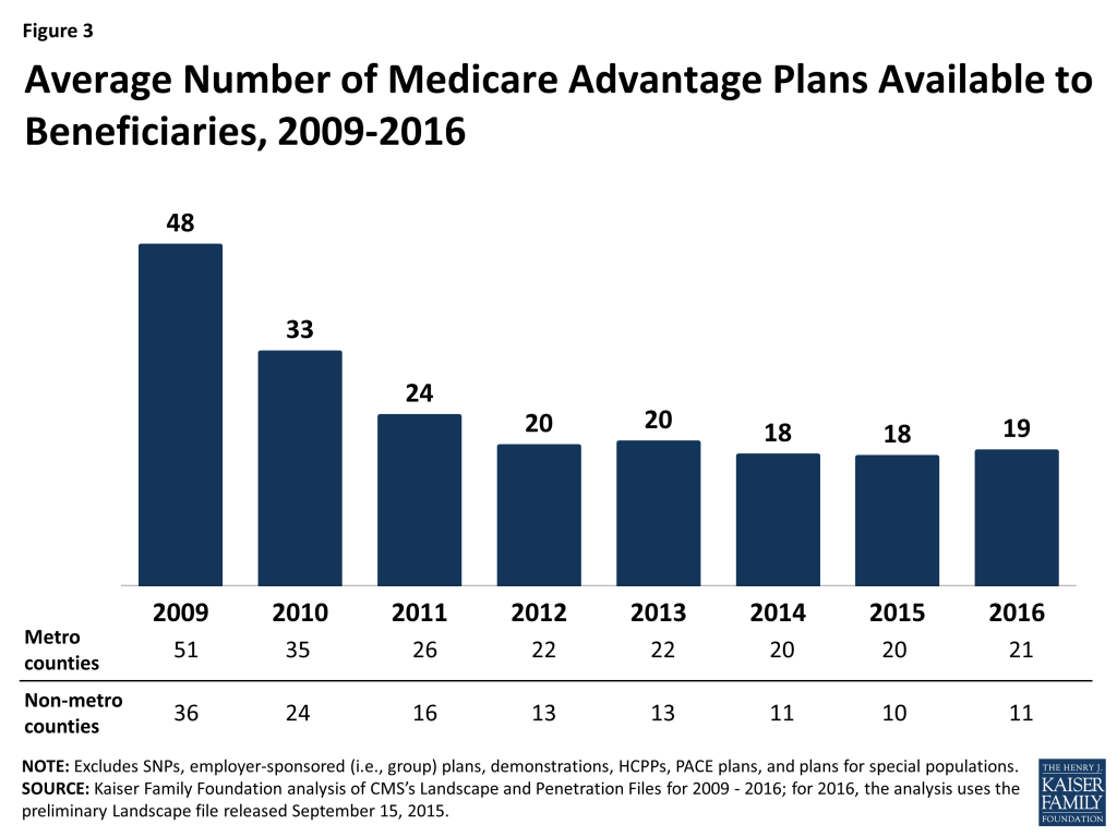
  63. Star ratings are assigned at the contract level, not the plan level, and many plan sponsors operate all their PDPs under the same contract. Thus, Humana’s older and more expensive Enhanced PDP, the Preferred Rx PDP, and the newly offered Walmart Rx PDP are all assigned the same ratings even if enrollees in one plan rate them differently on satisfaction measures or have different outcomes. ↩︎
  64. Because the cut points by which CMS translates scores on the ratings criteria to stars is different for PDPs and MA-PD plans, comparisons between the star ratings should be viewed with some caution. ↩︎
  65. See Jack Hoadley et al., “To Switch or Not to Switch: Are Medicare Beneficiaries Switching Drug Plans To Save Money?” October 2013, available at https://modern.kff.org/report-section/to-switch-or-not-to-switch-issue-brief/, for the data and methods used for this finding. ↩︎
  66. Gretchen Jacobson et al., “How Are Choosing and Changing Health Insurance Plans?” Kaiser Family Foundation, May 2014, available at https://modern.kff.org/medicare/report/how-are-seniors-choosing-and-changing-health-insurance-plans/. ↩︎
  67. Jack Hoadley, “Medicare Part D Spending Trends: Understanding Key Drivers and the Role of Competition,” May 2012, available at https://modern.kff.org/health-costs/issue-brief/medicare-part-d-spending-trends-understanding-key/. ↩︎
  68. “2015 Annual Report of the Boards of Trustees of the Federal Hospital Insurance and Federal Supplementary Medical Insurance Trust Funds,” July 2015; Tricia Neuman, Jack Hoadley, and Juliette Cubanski, “The Cost Of A Cure: Medicare’s Role In Treating Hepatitis C,” available at http://healthaffairs.org/blog/2014/06/05/the-cost-of-a-cure-medicares-role-in-treating-hepatitis-c/. ↩︎
  69. Jack Hoadley et al., “To Switch or Not to Switch: Are Medicare Beneficiaries Switching Drug Plans To Save Money?” October 2013, available at https://modern.kff.org/report-section/to-switch-or-not-to-switch-issue-brief/. ↩︎
  70. Drew Altman, “Why Higher Drug Costs Are Consumers’ Biggest Cost Worry,” Wall Street Journal, Washington Wire, available at http://blogs.wsj.com/washwire/2015/09/08/why-higher-drug-costs-are-consumers-biggest-cost-worry/. ↩︎
  71. Jack Hoadley, Katie Merrell, Elizabeth Hargrave, and Laura Summer, “In Medicare Part D Plans, Low or Zero Copays and Other Features to Encourage the Use of Generic Statins Work, Could Save Billions,” Health Affairs 31(10): 2266-2275, October 2012. ↩︎