Medicare Part D: A First Look at Prescription Drug Plans in 2018
Introduction
During the Medicare open enrollment period from October 15 to December 7 each year, beneficiaries can enroll in a plan that provides Part D drug coverage, either a stand-alone prescription drug plan (PDP) as a supplement to traditional Medicare, or a Medicare Advantage prescription drug plan (MA-PD), which provides all Medicare-covered benefits including drugs. Part D plans vary in numerous ways that can have a significant effect on an enrollee’s out-of-pocket spending, including premiums, deductibles, cost sharing, tier placement, the list of covered drugs, and preferred pharmacies.
This issue brief provides an overview of the 2018 Part D PDP landscape, the largest segment of the Part D marketplace, with 20.4 million enrollees in 2017 (excluding enrollees in employer-only PDPs, for whom plan premium and benefits data are unavailable). For detail on the data and methods, see the Methods section.
Key Findings
- For 2018, Medicare beneficiaries will have a choice of 23 Medicare Part D stand-alone PDPs and 17 MA-PD plans in their area, on average.
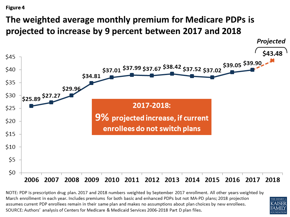
- The average monthly PDP premium will increase by 9 percent from 2017 t0 2018, to $43.48, weighted by 2017 plan enrollment. This estimate includes premiums for both basic and enhanced PDPs, assumes current PDP enrollees remain in their same plan, and makes no assumptions about plan choices by new enrollees or reassignment of low-income beneficiaries.
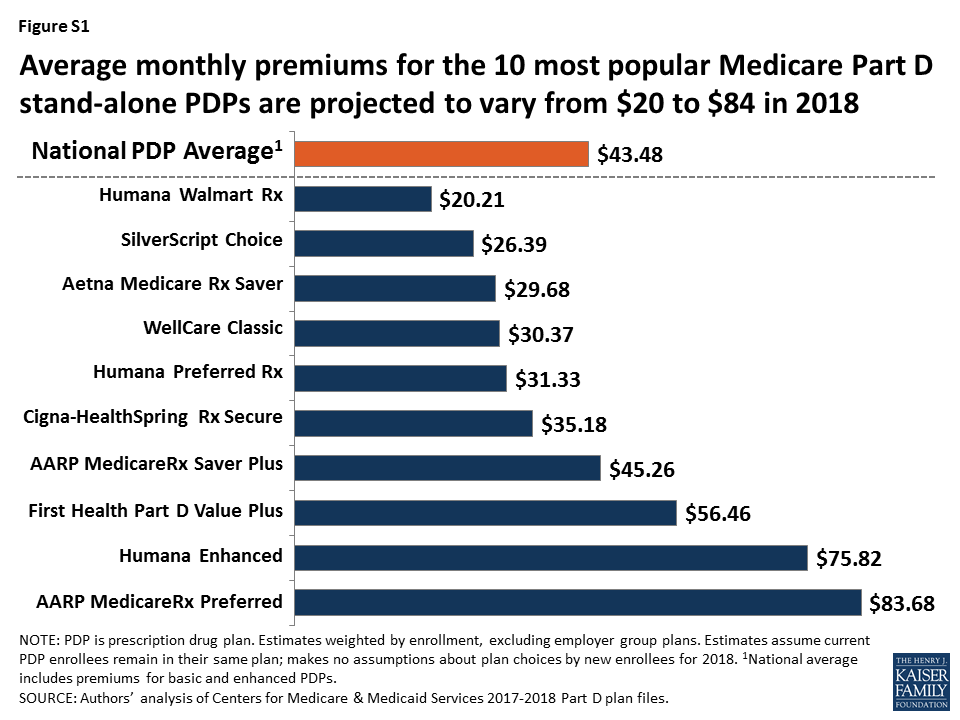
- PDP premiums vary widely across plans in 2018. Among the 10 PDPs with the highest enrollment, average premiums will range from $20.21 per month ($243 per year) for Humana Walmart Rx to $83.68 per month ($1,004 per year) for AARP Medicare Rx Preferred (Figure S1).
- Almost all PDPs in 2018 have five cost-sharing tiers, but specific copayments and coinsurance rates vary widely across PDPs. Nearly all PDPs charge coinsurance for higher-cost specialty and non-preferred drugs, which usually results in higher out-of-pocket costs for enrollees than when plans charge copayments.
- Medicare beneficiaries receiving the Low-Income Subsidy (LIS) will have a choice of six premium-free PDPs in 2018, on average. In 2018, 1.4 million low-income beneficiaries who are eligible for premium-free Part D coverage will pay Part D premiums averaging nearly $26 per month, unless they switch or are reassigned by CMS to premium-free plans.
Findings
Findings
Part D Plan Availability
In 2018, beneficiaries across the country continue to have a substantial number of Part D plan choices.
- The average beneficiary will have a choice of 23 PDPs in 2018, compared to 22 in 2017 and 56 at the peak in 2007 (Figure 1). In 2018, beneficiaries will also have access to 17 MA-PD plans, on average, up from 16 in 2017.

- The number of PDPs per region in 2018 will range from 19 PDPs in Alaska to 26 PDPs in the Pennsylvania/West Virginia region (Figure 2; Appendix 1, Table A1). The number of PDPs increased by one in every region compared to 2017, except Pennsylvania/West Virginia and North Carolina which have 2 more PDPs in 2018 than in 2017.

- A total of 782 PDPs will be offered nationwide in the 34 PDP regions in 2018, excluding PDPs in the territories. This represents an increase of 36 PDPs, or 5 percent, since 2017, but a reduction of 104 plans, or 12 percent, since 2016 (Figure 3). This total includes two plans that are under sanction and thus not open to new enrollment for 2018. There are no new plan sponsors offering PDPs in 2018, but there are new offerings by existing plan sponsors.

- The number of PDPs in 2018 represents less than half the number offered at the peak level of 1,866 plans in 2007. The reduction in plan availability over time reflects both the cumulative effect of mergers among plan sponsors and the response to CMS policies that encourage plan sponsors to eliminate low-enrollment plans and to drop multiple PDPs that are not meaningfully different from each other.
Premiums
National Premium Trends
The national average monthly PDP premium is expected to increase for the third year in a row—by 9 percent for 2018—based on current enrollment and assuming enrollees do not change plans. Even if a number of beneficiaries switch or are reassigned to lower-premium plans for 2018, the average premium is likely to be higher in 2018 than in 2017, and the three-year increase over the 2015 average premium will mark a significant shift upward.
- The projected average monthly PDP premium for 2018 will be $43.48 (Figure 4). This represents a 9 percent projected increase ($3.58) from the weighted average monthly premium of $39.90 in 2017, and a 68 percent increase from $25.89 in 2006, the first year of the Medicare Part D drug benefit. The 2017 and 2018 estimates are weighted by September 2017 enrollment. The 2018 estimate assumes that beneficiaries remain in their current plan and does not take into account the impact of the Low-Income Subsidy (LIS), which lowers or eliminates premiums for qualifying beneficiaries.
- CMS reported that the average premium for basic Part D coverage offered by PDPs and Medicare Advantage drug plans will be an estimated $33.50 in 2018. The premium reported here differs from the CMS-published premium because our estimate is based on PDPs only and includes PDPs offering both basic and enhanced coverage; enhanced plans typically have higher premiums than basic plans. Our premium estimate does not make any assumptions about plan changes by current PDP enrollees, reassignment of Low-Income Subsidy (LIS) enrollees by CMS, or enrollment decisions by new PDP enrollees.
- In prior years, the average premium calculated after taking into account enrollment decisions made during the open enrollment period has been 4 percent to 6 percent lower than the projection made assuming beneficiaries remain in their current plan. The difference is a result of existing enrollees switching to a lower premium plan, new enrollees choosing low-premium plans, and reassignments of some LIS beneficiaries to lower-premium plans. For example, the weighted average premium in March 2017, after plan elections for 2017 went into effect, was $40.42, which is 4 percent ($1.78) below the projected premium of $42.20 calculated prior to enrollment changes. Applying a similar adjustment to our projected premium for 2018 would produce a lower average premium after open enrollment, but one that would still be higher than in any previous year.
Distribution of PDP Enrollment by Premium Amount
- Among the 12.6 millionPart D PDP enrollees who are responsible for paying the entire premium (which excludes LIS recipients), many enrollees pay premiums that are well above the national average. In 2018, over one-third of PDP enrollees not receiving the LIS (35 percent) are projected to pay monthly premiums of at least $60 if they stay in their current plans (Figure 5). Among them, more than 380,000 (3 percent of non-LIS enrollees) are projected to pay monthly premiums of at least $100.

- The share of non-LIS enrollees who will pay monthly premiums less than $20 if they stay in their current plan is projected to decline substantially between 2017 and 2018—from 20 percent of all non-LIS enrollees in 2017 to 4 percent in 2018—while the share of non-LIS enrollees paying between $20 and $40 per month is expected to increase from 40 percent in 2017 to 49 percent in 2018.
Premium Variation and Changes for PDPs with the Most Enrollees
PDP premiums will continue to vary widely by plan in 2018, as in previous years.
- Among the 10 PDPs with the highest enrollment, average PDP premiums in 2018 will range from a low of $20.21 per month, or $243 annually, for the Humana Walmart Rx PDP to a high of $83.68 per month, or $1,004 annually, for the AARP MedicareRx Preferred PDP (Figure 6).
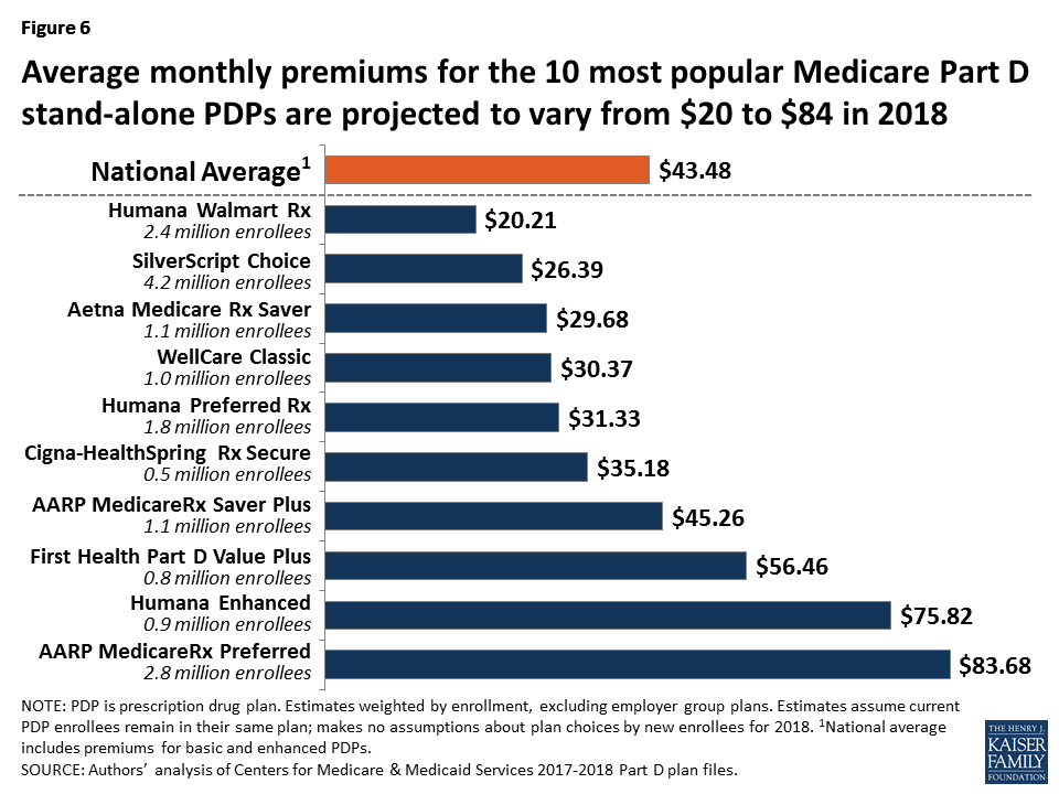
- There is no national PDP available in all 34 regions for under $20 in 2018, in contrast to previous years, although in 25 of 34 regions, there is at least one PDP with a premium under $20. The EnvisionRxPlus PDP is available in 12 regions for $12.60, while Humana Walmart Rx PDP is available in 2 regions for $18.40 (but $20.40 in 32 regions). Five different sponsors have the lowest premium in at least one region.
- At the high end, 14 PDPs have premiums of at least $125 per month. The highest is $197.10 for Blue Cross MedicareRx Plus PDP in Texas. None of these PDPs, which are mostly offered by sponsors that serve only one region or a few regions, has more than 51,000 enrollees in 2017.
Changes to premiums from 2017 to 2018, averaged across regions and weighted by 2017 enrollment, also vary widely across some of the most popular PDPs, as do the absolute amounts of monthly premiums for 2018 (Table 1).
| Table 1: Monthly Premiums for PDPs with Highest Enrollment | ||||||||||||
| Name of PDP | Type of plan | First year offered | 2017 enrollment(# in millions) | Weighted averagemonthly premium1 | Percent change | |||||||
| # | % of total | First year | 2017 | 2018 | 2017-2018 | First year-2018 | ||||||
| SilverScript Choice | Basic | 2006 | 4.24 | 20.8% | $28.32 | $29.05 | $26.39 | -9% | -7% | |||
| AARP MedicareRx Preferred | Enhanced | 2006 | 2.80 | 13.7 | $26.32 | $71.66 | $83.68 | 17% | 218% | |||
| Humana Walmart Rx | Enhanced | 2014 | 2.38 | 11.7 | $12.60 | $16.81 | $20.21 | 20% | 60% | |||
| Humana Preferred Rx | Basic | 2011 | 1.85 | 9.1 | $14.80 | $27.24 | $31.33 | 15% | 112% | |||
| Aetna Medicare Rx Saver | Basic | 2006 | 1.15 | 5.6 | $31.51 | $31.33 | $29.68 | -5% | -6% | |||
| AARP MedicareRx Saver Plus | Basic | 2013 | 1.06 | 5.2 | $15.00 | $37.22 | $45.26 | 22% | 202% | |||
| WellCare Classic | Basic | 2007 | 1.05 | 5.1 | $15.70 | $29.21 | $30.37 | 4% | 93% | |||
| Humana Enhanced | Enhanced | 2006 | 0.88 | 4.3 | $14.13 | $64.17 | $75.82 | 18% | 437% | |||
| First Health Part D Value Plus | Enhanced | 2012 | 0.76 | 3.7 | $25.44 | $44.91 | $56.46 | 26% | 122% | |||
| Cigna-HealthSpring Rx Secure | Basic | 2006 | 0.54 | 2.6 | $30.94 | $27.77 | $35.18 | 27% | 14% | |||
| TOTAL FOR ALL PDPS | 20.38 | 100% | $25.89 | $39.90 | $43.48 | 9% | 68% | |||||
| NOTE: PDP is prescription drug plan. Plan names can change from year to year; plans are designated the same if they have the same contract/plan ID. Analysis excludes enrollees in employer group plans and the territories except Puerto Rico. 1Average premiums are weighted by enrollment for each year (September 2017 enrollment for 2017 and 2018 premiums).SOURCE: Authors’ analysis of Centers for Medicare & Medicaid Services 2006-2018 Part D plan files. | ||||||||||||
- Average premiums for 8 of the 10 largest PDPs are projected to increase for 2018, by about $8 per month on average, assuming current enrollees do not switch plans (Figure 7). For 7 of the 8 PDPs, the increase is at least 15 percent—nearly twice as large as the rate of increase in the national average premium. For two of these PDPs (First Health Part D Value Plus and Cigna-HealthSpring Rx Secure) the increase is more than 25 percent. In dollar terms, the weighted average monthly premium is projected to increase by more than $10 for three of the 10 largest PDPs.

- Enrollees in the PDP with the most enrollees in 2017, SilverScript Choice (4.2 million enrollees), will see a 9 percent reduction in their monthly premium for 2018 if they remain in the same plan, from $29.05 to $26.39. The only other PDP among the top 10 that is lowering its monthly premium is Aetna Medicare Rx Saver, with a 5 percent reduction in the monthly premium.
- Enrollees in the second largest PDP, UnitedHealth’s AARP MedicareRx Preferred (2.8 million enrollees), will face a 17 percent increase in the average monthly premium, from $71.66 to $83.68. Of the 10 most popular PDPs, this plan is projected to have the highest monthly premium in 2018, as it did in 2017.
Monthly premiums for the three most popular PDPs available since the start of the Part D program in 2006 have changed in substantially different ways. Whereas one of the oldest PDPs is projected to have a lower premium in 2018 than in 2006, the other two PDPs have raised premiums repeatedly.
- The monthly premium for SilverScript Choice, with the highest number of PDP enrollees overall (4.2 million enrollees in 2017), is 7 percent lower in 2018 ($26.39) than it was in 2006 ($28.32).
- By contrast, the average premium for Humana Enhanced PDP, with 0.9 million enrollees in 2017, is more than five times higher than it was in 2006, having increased from $14.13 to $75.82.
- The average premium for UnitedHealth’s AARP Preferred MedicareRx PDP, the PDP with the second highest number of enrollees in 2017 (2.8 million), has more than tripled since 2006, from $26.32 to $83.68 in 2018.
Premium Variation and Changes by Region
Average PDP monthly premiums, weighted by 2017 enrollment, will vary in 2018 across regions, along with the change in premiums from 2017 to 2018.
- Average PDP premiums will range from $34.61 per month in the Arkansas region (one of only three regions with an average around $35) to $49.34 per month in New Jersey—40 percent higher than in Arkansas (Figure 8; Appendix 1, Table A2). Three other large states (California, Florida, and New York) have projected average premiums around $47, above the national average.
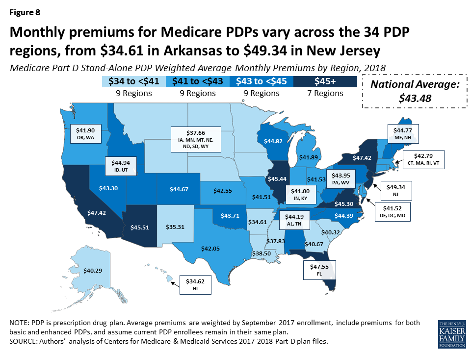
- Projected average premiums are higher in 2018 than in 2017 in every region, but the level of increase varies by region. For example, the average premium in New Jersey is projected to rise by 1 percent and by no more than 6 percent in three other regions. By contrast, average premiums will increase by more than 10 percent in 13 regions, including an increase of 17 percent in both Colorado and New Mexico.
Premium Increases and Decreases for Current Enrollees
Overall, more Part D enrollees are projected to face higher premiums in 2018 if they stay in their current plans, compared to the share of enrollees who were facing projected increases for 2017. And a larger share of current enrollees will see premiums increase than decrease if they remain in their current plan (Figure 9).
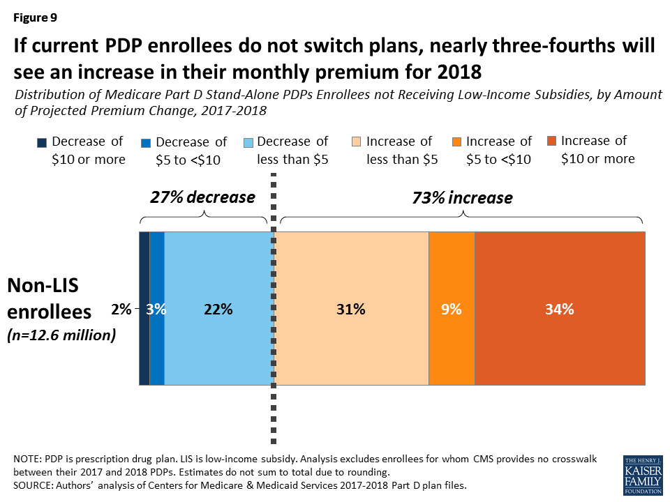
- Among the 12.6 millionPart D PDP enrollees who are responsible for paying the entire premium (which excludes LIS recipients), nearly three-fourths (73 percent) are projected to have a higher premium in 2018 if they stay in their current plans, compared to 63 percent who faced higher premiums if they didn’t switch plans for 2017.
- More than one-third of non-LIS enrollees (34 percent, or 4.2 million) are projected to have a premium increase of at least $10 per month if they remain in their current plans. By contrast, 2 percent (about 248,000 non-LIS PDP enrollees) are projected to see their premiums decrease by $10 or more.
- For non-LIS enrollees facing a projected premium increase, the average monthly increase will be $8.50. Those projected to see lower premiums will experience a smaller change—an average reduction of $4.71.
Benefit Design
In 2018, for the third year in a row, all Part D PDPs will offer an alternative benefit design to the defined standard benefit, which has a $405 deductible in 2018 and 25 percent coinsurance for all covered drugs. Some plans modify or eliminate the deductible, and virtually all PDPs will have a benefit design with five tiers for covered generic and brand-name drugs.
Basic versus Enhanced Benefits
Part D plans must offer either the defined standard benefit or an alternative equal in value (“actuarially equivalent”), which is the basic Part D benefit, and can also provide enhanced benefits.
- In 2018, almost half (46 percent) of plans will offer basic Part D benefits (although no plans will offer the defined standard benefit), while 54 percent will offer enhanced benefits (Figure 10). This is similar to the distribution in 2017, but over time, the share of PDPs offering enhanced benefits has increased while the share offering basic benefits has decreased.

- The weighted average premium in 2018 for enhanced benefit PDPs ($60.48) is nearly double the monthly premium for PDPs offering the basic benefit ($31.60), assuming no change in enrollment. The weighted average premium is projected to increase by 2 percent for basic-benefit PDPs, from $31.12 in 2017 to $31.60 in 2018, but by a much larger 15 percent for enhanced-benefit PDPs, from $52.48 to $60.48. In 2017, 41 percent of PDP enrollees were in enhanced-benefit plans.
Deductibles
The standard (maximum) Part D deductible is increasing by a modest $5 in 2018 from $400 to $405, compared to a $40 increase between 2016 and 2017 (from $360 to $400). The increase results from a statutory formula that adjusts the amount each year based on the annual percentage increase in average per capita aggregate expenditures for covered Part D drugs, and prior year revisions. For 2018, the annual percentage increase was 1.22 percent. Other amounts for the standard benefit design parameters are increasing by this percentage as well (Appendix 2).
- Nearly two-thirds of PDPs (63 percent) will charge a deductible in 2018, the same share as in 2017 (Figure 11). More than half of PDPs with a deductible will charge the standard $405 amount (52 percent), a somewhat larger share than in 2017. Another 11 percent of all PDPs charge a partial deductible, an amount below the standard deductible.

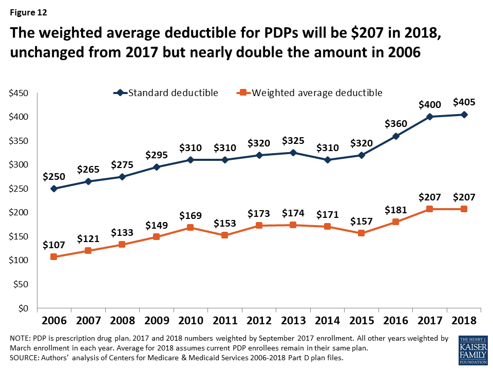
- Part D enrollees are projected to be in plans with a deductible of $207 in 2018, on average (Figure 12). This is unchanged from the weighted average deductible in 2017, but the average is up from $107 in 2006—a 93 percent increase, substantially higher than the increase in the average premium.
Tiered Cost Sharing
- As in recent years, all PDPs in 2018 will use tiered cost sharing; all but two PDPs (two local plans offered by the same plan sponsor, with few enrollees) will have five tiers. The typical five-tier design includes tiers for preferred generics, generics, preferred brands, non-preferred drugs (including a mix of brands and generics), and specialty drugs. Five-tier formularies have been the most common type since 2013.
- Overall, PDP cost-sharing amounts in 2018 are relatively similar to 2017 levels. For generic tiers, median copayments across PDPs are $1 for the preferred generic tier and $6 for the generic tier (formerly labeled the non-preferred generic tier in plans with two generic tiers). About 1 in 5 PDPs (19 percent) charge $0 for preferred generics to encourage use of these drugs, whereas a few charge $5 or more. A small number of PDPs charge $0 for both of their generic tiers. Copayments for generics (those not designated as preferred) vary more widely—from $0 to $20.
- Most PDPs charge copayments for preferred brand tiers, but one-fourth of PDPs in 2018 (24 percent) charge coinsurance. For preferred brand tiers, the median copayment in 2018 is $37, varying from $18 to $47; the median coinsurance rate is 20 percent.
- PDPs have increasingly charged coinsurance in place of flat copayments for non-preferred drugs, previously labeled non-preferred brands—often more expensive drugs or those for which plans have not negotiated large rebates from manufacturers. In 2018, virtually all PDPs are using coinsurance for their non-preferred drug tiers. The median coinsurance PDPs charge for non-preferred drugs is 40 percent, but coinsurance rates range from 24 percent to 50 percent.
- Since 2006, nearly all PDPs have charged coinsurance for the specialty tier. In 2018, the threshold for drugs to qualify for placement on a specialty tier is $670 for a one-month supply of the drug, the same as in 2017. For all PDPs, the specialty tier coinsurance ranges from 25 percent to 33 percent (the most allowed by CMS guidelines); most PDPs charge either 25 percent or 33 percent.
Tiered Cost Sharing in PDPs with the Most Enrollees
- Cost sharing for the ten largest PDPs varies across plans (Table 2). Two of the largest PDPs (Humana Preferred and WellCare Classic) have a $0 copayment for preferred generic drugs in 2018. Median copayments for generics range from $1 to $14 among the ten largest PDPs.
- Eight of the 10 largest PDPs charge copayments for preferred brands, varying from $30 (Aetna Medicare Rx Saver) to $47 (First Value Part D Value Plus). Three of the top PDPs reduced their copayments for preferred brands between 2017 and 2018. One of the top PDPs (AARP MedicareRx Saver Plus) increased its preferred brand copayment from $21 to $32.
- Coinsurance for non-preferred drugs varies in 2018 from 35 percent for three of the top PDPs to 50 percent (First Health Part D Value Plus), the maximum allowed by CMS guidance. Two of the top ten PDPs reduced the coinsurance for non-preferred brands (SilverScript Choice and WellCare Classic), but one PDP increased its coinsurance rate from 30 percent to 39 percent (AARP Medicare Rx Saver Plus).
- Five of the top PDPs use 25 percent coinsurance for their specialty tiers, the maximum allowed for plans with a standard deductible. One top PDP charges 26 percent coinsurance for specialty tier drugs, while the remaining four top PDPs charge 33 percent.
| Table 2: Median Cost Sharing (Copayments or Coinsurance Rates) for PDPs with the Highest Enrollment, 2017-2018 | ||||||||||||
| Name of PDP | Preferred generics | Generics | Preferred brands | Non-preferred drugs | Specialty drugs | |||||||
| 2017 | 2018 | 2017 | 2018 | 2017 | 2018 | 2017 | 2018 | 2017 | 2018 | |||
| SilverScript Choice | $3 | $3 | $14 | $14 | $46 | $42 | 50% | 46% | 33% | 33% | ||
| AARP MedicareRx Preferred | $3 | $5 | $10 | $12 | $35 | $37 | 40% | 40% | 33% | 33% | ||
| Humana Walmart Rx | $1 | $1 | $4 | $4 | 20% | 23% | 35% | 35% | 25% | 25% | ||
| Humana Preferred Rx | $0 | $0 | $1 | $1 | 20% | 20% | 35% | 35% | 25% | 25% | ||
| Aetna Medicare Rx Saver | $1 | $1 | $2 | $2 | $30 | $30 | 35% | 35% | 25% | 26% | ||
| AARP MedicareRx Saver Plus | $1 | $1 | $2 | $7 | $21 | $32 | 30% | 39% | 25% | 25% | ||
| WellCare Classic | $0 | $0 | $14 | $1 | $46 | $35 | 49% | 42% | 25% | 25% | ||
| Humana Enhanced | $3 | $3 | $7 | $7 | $42 | $42 | 44% | 44% | 33% | 33% | ||
| First Health Part D Value Plus | $2 | $1 | $5 | $2 | $47 | $47 | 50% | 50% | 33% | 33% | ||
| Cigna-HealthSpring Rx Secure | $2 | $1 | $7 | $5 | $40 | $35 | 45% | 39% | 25% | 25% | ||
| NOTE: PDP is prescription drug plan. Estimates are weighted medians for those plans that vary cost sharing by region (weighted by September 2017 enrollment).SOURCE: Authors’ analysis of Centers for Medicare & Medicaid Services 2017-2018 Part D plan files. | ||||||||||||
Gap Coverage
In 2018, most Part D plans will offer no gap coverage beyond what is required under the basic benefit; because of the Affordable Care Act provision to gradually close the gap by 2020, all enrollees will have substantial coverage in the gap regardless of which plan they are enrolled in. Under the basic benefit, in 2018, manufacturer prices for brand-name drugs purchased in the gap phase of the benefit will be discounted by 50 percent, with plans paying an additional 15 percent of the cost and enrollees responsible for 35 percent. Plans will pay 56 percent of the cost for generic drugs in the gap phase, with enrollees paying 44 percent.
- In 2018, 35 percent of all PDPs will offer some additional gap coverage beyond what the basic benefit covers, an increase from 28 percent in 2017 (Figure 13). UnitedHealth’s AARP MedicareRx Preferred expanded additional gap coverage from two PDP regions in 2017 to all 34 regions in 2018, and Aetna Medicare Rx Select, a new PDP in 2018, will offer additional gap coverage in the 20 regions where this plan is available.
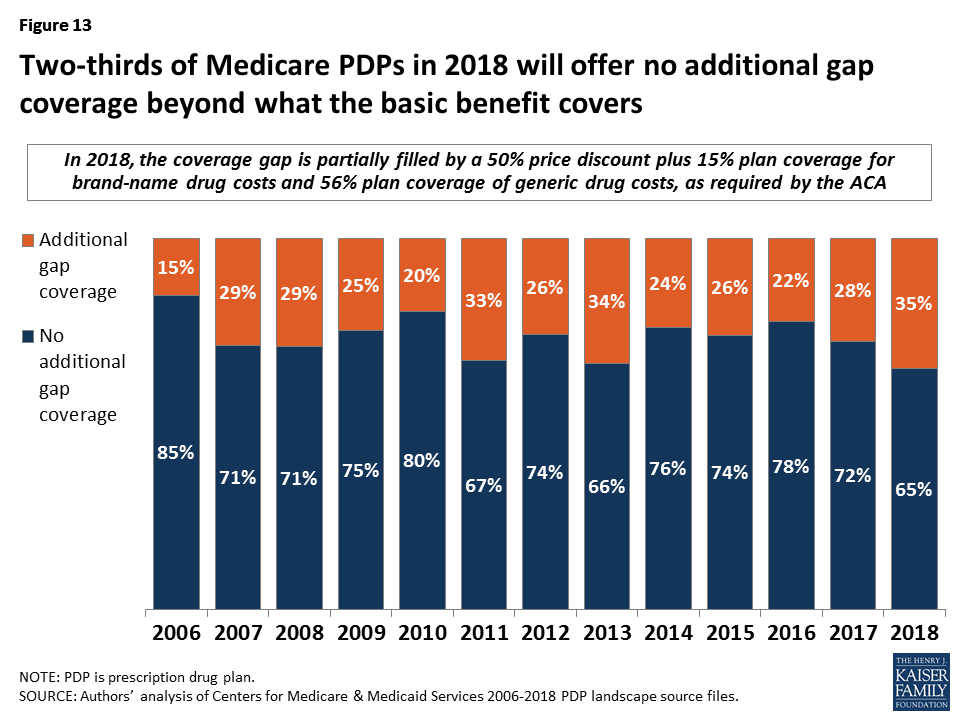
- Plans that offer additional gap coverage charge significantly higher premiums than those that do not. In 2018, the average monthly premium for PDPs with additional gap coverage will be $79.92, versus $30.92 for PDPs with no additional gap coverage beyond what the basic benefit covers. Given the level of gap coverage that all plans are required to provide, the value of the additional gap coverage may not be worth the extra $50, on average, for plans that offer it.
Low-income Subsidy (Benchmark) Plans
In 2018, the total number of premium-free benchmark plans—that is, PDPs available for no monthly premium to Low-Income Subsidy (LIS) enrollees—will be lower than in 2017 and the lowest level since the program started in 2006 (Figure 14; Appendix 1, Table A3).
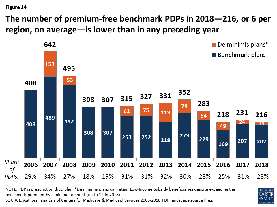
- In 2018, 216 plans will be premium-free benchmark plans available for enrollment of beneficiaries receiving the LIS. This represents a decrease of 15 PDPs qualifying as benchmark plans (a 6% decrease) from 2017 and the lowest number of benchmark plans available since the start of the Part D program in 2006.
- On average (weighted by enrollment), LIS beneficiaries have 6 benchmark plans available to them for 2018, or about one-fourth the average number of PDP choices available overall. All LIS enrollees can select any plan offered in their area, but if they enroll in a non-benchmark plan, they must pay some portion of their chosen plan’s monthly premium.
- Of the 216 benchmark plans in 2018, 14 plans qualify through the “de minimis” policy—fewer than the 24 de minimis plans in 2017. The de minimis policy makes it easier for plans to qualify by allowing them to waive a premium amount of up to $2 in order to retain their LIS enrollees. Plans qualifying through the de minimis policy are eligible for new enrollees, but will not receive auto-assigned enrollees.
- Among the 2017 benchmark PDPs, two plans (AARP MedicareRx Saver Plus and Cigna-HealthSpring Rx Secure) lost their benchmark status in several regions, accounting for much of the decline in benchmark plan availability between 2017 and 2018. In total, 26 PDPs have lost their benchmark status for 2018, while 11 PDPs will newly qualify as benchmark plans.
Benchmark Plans by Region
- The number of benchmark plans available in 2018 will vary by region, from just two benchmark PDPs in Florida (out of 21 PDPs overall) to 10 benchmark PDPs in the Delaware/Maryland/District of Columbia region (out of 21 PDPs) (Figure 15).
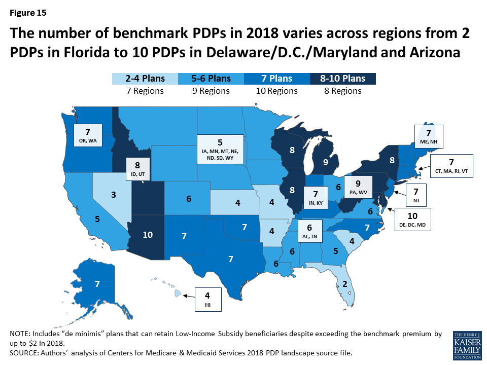
- Benchmark plan availability will be unchanged in 10 of 34 regions between 2017 and 2018. Nineteen regions will experience a decline in of one or two benchmark plans, while five regions will experience an increase in benchmark plan availability of one or two plans.
Benchmark Plans by Sponsor
The number of premium-free plans for LIS enrollees offered by the three largest Part D sponsors (based on total enrollment)—CVS Health/SilverScript, Humana, and UnitedHealth—has fluctuated substantially over the years (Figure 16).
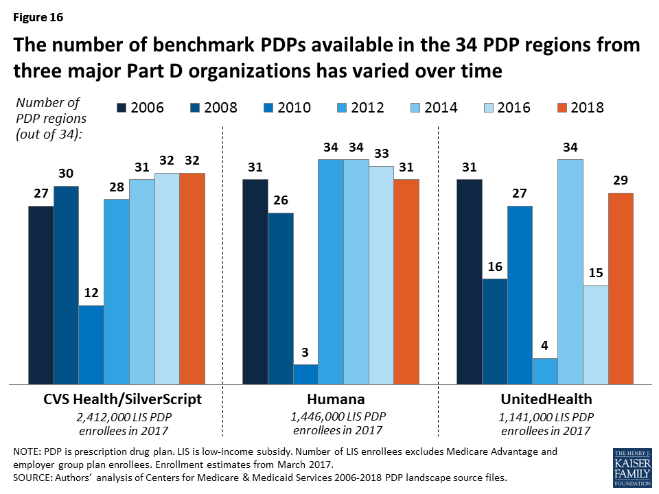
- In 2018, nearly two-thirds of LIS PDP enrollees (64 percent) are projected to be in PDPs operated by these three plan sponsors; including PDPs offered by Aetna brings to share up to 75 percent. All four sponsors offer PDPs that qualify as benchmark plans in at least 29 of the 34 PDP regions in 2018.
- For 2018, six PDP sponsors will offer benchmark plans in at least half of the 34 regions (including PDPs designated as de minimis plans, which will not receive auto-assigned enrollees). No sponsor will offer benchmark plans in all 34 regions in 2018; one sponsor (Aetna) will offer benchmark plans in 33 regions, and one sponsor (CVS Health) will do so in 32 regions.
Impact of Benchmark Plan Changes for Low-Income Subsidy Enrollees
- About 1.4 million LIS beneficiaries—nearly one in five LIS enrollees in PDPs in 2017 (19 percent)—are enrolled in PDPs in 2017 that will not qualify as benchmark plans in 2018 (Figure 17). CMS will reassign those LIS enrollees who were randomly assigned by CMS to their current plan, and several states will help reassign those enrolled in their state pharmacy assistance programs (SPAPs). Many other LIS beneficiaries who are currently not enrolled in plans that will be premium-free in 2018 must switch plans on their own or pay a premium if they remain in their 2017 plan. Those in the latter group will not be automatically reassigned by CMS because in the past they or someone assisting them made a choice to switch plans.
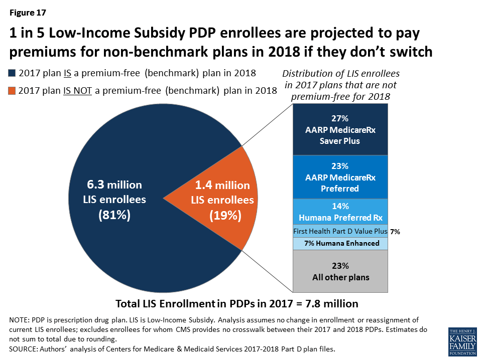
- On average, these 1.4 million LIS beneficiaries face PDP premiums that average $25.56 per month in 2018 ($307 per year) if they do not change plans or are not reassigned by CMS to new plans, compared to an average of $23.85 for LIS enrollees who faced premiums in 2017 if they stayed in their plans. Nearly half (49 percent) are projected to pay premiums of at least $20 per month, and 3 percent will pay at least $60 per month, if they do not switch plans. In 2017, LIS beneficiaries who paid monthly premiums for their coverage paid $26.65 on average.
- Among the LIS beneficiaries who may pay premiums in 2018, 38 percent (544,000) are in benchmark plans in 2017; the remaining 62 percent (903,000) are currently enrolled in non-benchmark plans and thus paid a premium in 2017. No one in the latter situation will be eligible for reassignment by CMS to a premium-free plan, and would need to switch to a premium-free plan on their own to avoid paying premiums. About half (46 percent) of the LIS enrollees who may pay premiums are in enhanced PDPs.
- About three-fourths of the 1.4 million LIS beneficiaries projected to pay premiums are currently enrolled in just five national PDPs: AARP MedicareRx Saver Plus (27 percent), AARP MedicareRx Preferred (23 percent), Humana Preferred (14 percent), First Health Part D Value Plus (7 percent), and Humana Enhanced (7 percent) (Figure 17). For two of these five PDPs, the affected LIS beneficiaries are projected to pay substantial premiums in 2018: $50.73 per month for the AARP MedicareRx Preferred PDP, and $44.89 for Humana Enhanced. Because they are enhanced PDPs, LIS enrollees in these two plans will not be reassigned to a new plan by CMS, so they must select a different plan in order to avoid paying these premiums.
Discussion
This analysis of the Medicare Part D PDP landscape for 2018 shows a modest increase in plan availability for 2018, along with wide variation in premiums across plans. Premium variation for plans similar in design could be due to a number of factors related to differences in plan costs and different market strategies across plan sponsors. For example, plan costs are influenced by the generosity in formulary coverage, tier placement and rebates, deductibles and cost-sharing amounts, use of preferred pharmacy networks, the health risk of enrollees, and geographic area. There is some evidence that some of the most popular PDPs that charge lower premiums have relatively narrow formulary coverage compared to PDPs charging higher premiums. Part D sponsors may also launch new PDPs with premiums well below the average, at least initially, in order to attract new or current enrollees to gain market share.
Part D plans vary in numerous ways that can have a significant effect on an enrollee’s out-of-pocket spending, including premiums, cost-sharing requirements, tier placement, the list of covered drugs, and preferred pharmacies. Although beneficiaries may focus on plan premiums as the primary measure of plan cost, an individual’s costs are also affected by the plan’s deductible, cost-sharing amounts, whether their current drugs are on formulary, and which pharmacy they use. A single drug on or off formulary may have a far larger effect on an enrollee’s total costs than the premiums or other plan design features. Some of these plan features are beyond the scope of this analysis, but they are critical for Medicare beneficiaries to consider when evaluating their Part D plan options.
Beneficiaries have the opportunity to compare Part D plans each year during the open enrollment period, and in 2018 will have nearly two dozen plans from which to choose. The open enrollment period presents both opportunities and challenges for Medicare beneficiaries to compare and choose a plan that best meets their individual needs, though prior research shows a relatively small share do so. Finding ways to get more Part D enrollees engaged in comparing and reviewing plans and making changes that could save them money remains an ongoing challenge for CMS and policymakers. In 2018, some Part D enrollees who retain their current plans may see lower premiums and lower overall costs. But more enrollees will face higher premiums and deductibles if they remain in their current plans, and could also see changes in their plan’s formulary coverage and cost-sharing amounts for their drugs, which could also affect their total out-of-pocket costs. As in prior years, Part D enrollees are likely to benefit from the opportunity to shop during open enrollment.
Juliette Cubanski, Tricia Neuman, and Kendal Orgera are with the Kaiser Family Foundation. Anthony Damico is an independent consultant.Jack Hoadley is Research Emeritus Professor at Georgetown University.
Methodology
This analysis focuses on the Medicare Part D stand-alone prescription drug plan marketplace in 2018 and trends over time. The analysis includes 20.4 million enrollees in stand-alone PDPs, excluding 4.4 million enrollees in employer-group only PDPs for whom plan premium and benefits data are unavailable.
Data on Part D plan availability, enrollment, and premiums were collected primarily from a set of data files released by the Centers for Medicare & Medicaid Services (CMS) on a regular basis:
- Part D plan landscape files, released each fall prior to the annual enrollment period. These files include basic plan characteristics, such as plan names, premiums, deductibles, gap coverage, and benchmark plan status. For this analysis, we used the 2018 PDP Landscape Source files, v-09-22-17, released on September 29, 2017.
- Part D plan and premium files, released each fall. These files include more detail on plan characteristics, including premiums charged to LIS beneficiaries, the portions of the premiums allocated to the basic and enhanced benefits, and the separate drug premiums for MA-PD plans.
- Part D plan crosswalk files, released each fall. These files identify which plans are matched up when a plan sponsor changes its plan offerings from one year to the next.
- Part D contract/plan/state/county level enrollment files, released on a monthly basis. These files include total enrollment by contract and plan at the state and county level. We use September 2017 enrollment counts for enrollment-weighted analysis in this report for 2017 and projected for 2018. Previous years’ data are based on March enrollment files for each year. Enrollment files suppress totals for plans with 10 or fewer enrollees.
- Part D Low-Income Subsidy enrollment files, released once annually (in March for 2017). These files include total enrollment counts for LIS enrollees. As with the other enrollment files, we exclude plans with small enrollment counts in estimates that are plan-enrollment weighted.
- Medicare plan benefit package files, released each fall. These files supply detailed information on the benefits offered by plans, including cost-sharing amounts for each formulary tier, tier labels, and the different cost-sharing amounts for standard and preferred cost-sharing pharmacies, where applicable.
- Medicare penetration files, released on a monthly basis. These files are used to estimate average counts of plans available per beneficiary.
This analysis adopts different methods with regard to the treatment of certain data elements than previously published analysis of the Part D marketplace conducted by the authors. Our previously published analysis used monthly enrollment files by plan rather than the contract/plan/state/county level enrollment files, and imputed a value of five enrollees for suppressed counts for plans with 10 or fewer enrollees (rather than excluding them, as we do in this analysis); for plan/county data, our prior analysis imputed a value of one beneficiary for all plan/county combinations for suppressed counts of 10 or fewer beneficiaries (rather than excluding them, as we do in this analysis).
Appendices
Appendix 1: Information about Medicare Part D Stand-alone Prescription Drug Plans (PDPs)
| Table A1: Number of Medicare Part D Stand-alone Prescription Drug Plans by State/Territory, 2006-2018 | |||||||||||||
| STATE/ TERRITORY | 2006 | 2007 | 2008 | 2009 | 2010 | 2011 | 2012 | 2013 | 2014 | 2015 | 2016 | 2017 | 2018 |
| U.S. Total | 1,429 | 1,866 | 1,824 | 1,687 | 1,576 | 1,007 | 1,041 | 1,031 | 1,169 | 1,001 | 886 | 746 | 782 |
| Alabama | 41 | 56 | 53 | 49 | 46 | 31 | 32 | 33 | 35 | 30 | 27 | 24 | 25 |
| Alaska | 27 | 45 | 47 | 45 | 41 | 26 | 25 | 23 | 28 | 24 | 19 | 18 | 19 |
| Arizona | 43 | 53 | 51 | 49 | 46 | 27 | 30 | 29 | 34 | 30 | 26 | 22 | 23 |
| Arkansas | 40 | 58 | 55 | 52 | 49 | 31 | 30 | 30 | 34 | 29 | 26 | 22 | 23 |
| California | 47 | 55 | 56 | 51 | 47 | 30 | 33 | 32 | 36 | 32 | 28 | 24 | 25 |
| Colorado | 43 | 55 | 55 | 53 | 48 | 28 | 28 | 29 | 34 | 30 | 26 | 23 | 24 |
| Connecticut | 44 | 51 | 51 | 47 | 48 | 31 | 30 | 30 | 33 | 27 | 26 | 21 | 22 |
| Delaware | 47 | 55 | 52 | 48 | 45 | 30 | 31 | 29 | 36 | 27 | 24 | 20 | 21 |
| District of Columbia | 47 | 55 | 52 | 48 | 45 | 30 | 31 | 29 | 36 | 27 | 24 | 20 | 21 |
| Florida | 43 | 57 | 58 | 54 | 49 | 29 | 33 | 34 | 35 | 27 | 22 | 20 | 21 |
| Georgia | 42 | 55 | 54 | 50 | 45 | 29 | 30 | 30 | 34 | 30 | 27 | 23 | 24 |
| Hawaii | 29 | 46 | 49 | 47 | 41 | 25 | 25 | 23 | 29 | 25 | 21 | 19 | 20 |
| Idaho | 44 | 56 | 54 | 51 | 48 | 32 | 33 | 32 | 37 | 31 | 28 | 24 | 25 |
| Illinois | 42 | 56 | 53 | 49 | 46 | 32 | 33 | 32 | 38 | 33 | 28 | 23 | 24 |
| Indiana | 42 | 53 | 52 | 48 | 44 | 29 | 31 | 31 | 35 | 31 | 28 | 23 | 24 |
| Iowa | 41 | 53 | 52 | 48 | 46 | 30 | 33 | 32 | 34 | 30 | 26 | 22 | 23 |
| Kansas | 40 | 53 | 52 | 48 | 46 | 30 | 31 | 30 | 33 | 29 | 25 | 22 | 23 |
| Kentucky | 42 | 53 | 52 | 48 | 44 | 29 | 31 | 31 | 35 | 31 | 28 | 23 | 24 |
| Louisiana | 39 | 52 | 50 | 47 | 45 | 29 | 30 | 30 | 33 | 28 | 25 | 20 | 21 |
| Maine | 41 | 53 | 53 | 46 | 43 | 27 | 28 | 28 | 32 | 28 | 27 | 23 | 24 |
| Maryland | 47 | 55 | 52 | 48 | 45 | 30 | 31 | 29 | 36 | 27 | 24 | 20 | 21 |
| Massachusetts | 44 | 51 | 51 | 47 | 48 | 31 | 30 | 30 | 33 | 27 | 26 | 21 | 22 |
| Michigan | 40 | 54 | 55 | 51 | 46 | 32 | 34 | 33 | 36 | 31 | 28 | 23 | 24 |
| Minnesota | 41 | 53 | 52 | 48 | 46 | 30 | 33 | 32 | 34 | 30 | 26 | 22 | 23 |
| Mississippi | 38 | 52 | 49 | 47 | 45 | 29 | 30 | 29 | 33 | 28 | 24 | 19 | 20 |
| Missouri | 41 | 53 | 52 | 48 | 45 | 29 | 30 | 31 | 35 | 31 | 28 | 23 | 24 |
| Montana | 41 | 53 | 52 | 48 | 46 | 30 | 33 | 32 | 34 | 30 | 26 | 22 | 23 |
| Nebraska | 41 | 53 | 52 | 48 | 46 | 30 | 33 | 32 | 34 | 30 | 26 | 22 | 23 |
| Nevada | 44 | 54 | 53 | 49 | 46 | 28 | 29 | 29 | 34 | 32 | 28 | 23 | 24 |
| New Hampshire | 41 | 53 | 53 | 46 | 43 | 27 | 28 | 28 | 32 | 28 | 27 | 23 | 24 |
| New Jersey | 44 | 57 | 57 | 52 | 47 | 30 | 30 | 29 | 34 | 29 | 25 | 21 | 22 |
| New Mexico | 43 | 57 | 55 | 50 | 47 | 29 | 30 | 30 | 36 | 31 | 27 | 23 | 24 |
| New York | 46 | 61 | 55 | 51 | 50 | 30 | 29 | 28 | 31 | 25 | 22 | 19 | 20 |
| North Carolina | 38 | 51 | 52 | 49 | 47 | 30 | 30 | 30 | 34 | 29 | 26 | 22 | 24 |
| North Dakota | 41 | 53 | 52 | 48 | 46 | 30 | 33 | 32 | 34 | 30 | 26 | 22 | 23 |
| Ohio | 43 | 60 | 58 | 49 | 46 | 31 | 33 | 33 | 37 | 31 | 27 | 22 | 23 |
| Oklahoma | 42 | 56 | 52 | 49 | 46 | 30 | 30 | 30 | 36 | 31 | 27 | 22 | 23 |
| Oregon | 45 | 57 | 55 | 48 | 44 | 29 | 30 | 30 | 35 | 30 | 26 | 21 | 22 |
| Pennsylvania | 52 | 66 | 63 | 57 | 55 | 35 | 36 | 38 | 39 | 29 | 29 | 24 | 26 |
| Rhode Island | 44 | 51 | 51 | 47 | 48 | 31 | 30 | 30 | 33 | 27 | 26 | 21 | 22 |
| South Carolina | 45 | 59 | 56 | 51 | 47 | 31 | 32 | 31 | 35 | 31 | 27 | 21 | 22 |
| South Dakota | 41 | 53 | 52 | 48 | 46 | 30 | 33 | 32 | 34 | 30 | 26 | 22 | 23 |
| Tennessee | 41 | 56 | 53 | 49 | 46 | 31 | 32 | 33 | 35 | 30 | 27 | 24 | 25 |
| Texas | 47 | 60 | 56 | 53 | 50 | 30 | 33 | 32 | 36 | 32 | 28 | 23 | 24 |
| Utah | 44 | 56 | 54 | 51 | 48 | 32 | 33 | 32 | 37 | 31 | 28 | 24 | 25 |
| Vermont | 44 | 51 | 51 | 47 | 48 | 31 | 30 | 30 | 33 | 27 | 26 | 21 | 22 |
| Virginia | 41 | 53 | 52 | 48 | 44 | 29 | 30 | 31 | 35 | 31 | 28 | 23 | 24 |
| Washington | 45 | 57 | 55 | 48 | 44 | 29 | 30 | 30 | 35 | 30 | 26 | 21 | 22 |
| West Virginia | 52 | 66 | 63 | 57 | 55 | 35 | 36 | 38 | 39 | 29 | 29 | 24 | 26 |
| Wisconsin | 45 | 54 | 57 | 53 | 48 | 29 | 29 | 30 | 33 | 29 | 27 | 24 | 25 |
| Wyoming | 41 | 53 | 52 | 48 | 46 | 30 | 33 | 32 | 34 | 30 | 26 | 22 | 23 |
| TERRITORY | |||||||||||||
| Territories Total | 17 | 46 | 53 | 52 | 44 | 27 | 22 | 20 | 17 | 12 | 11 | 11 | 13 |
| American Samoa | 1 | 3 | 4 | 4 | 3 | 2 | 1 | 1 | 1 | 1 | 1 | 1 | 1 |
| Guam | 1 | 3 | 4 | 4 | 3 | 2 | 1 | 1 | 1 | 2 | 2 | 2 | 3 |
| Northern Mariana Islands | 1 | 3 | 4 | 4 | 3 | 2 | 1 | 1 | 1 | 1 | 1 | 1 | 2 |
| Puerto Rico | 10 | 28 | 34 | 33 | 29 | 17 | 16 | 16 | 13 | 7 | 6 | 6 | 6 |
| Virgin Islands | 4 | 6 | 7 | 7 | 6 | 4 | 3 | 1 | 1 | 1 | 1 | 1 | 1 |
| NOTE: U.S. total count excludes PDPs in the territories. Totals include sanctioned plans closed to new enrollees as of September of prior year.SOURCE: Authors’ analysis of Centers for Medicare & Medicaid Services 2006-2018 Part D plan files. | |||||||||||||
| Table A2: Monthly Premiums for Medicare Part D Stand-alone Prescription Drug Plans by State, 2018 | ||||
| STATE/TERRITORY | Minimum Premium | Maximum Premium | Weighted AveragePremium | % Change,2017-2018 |
| U.S. Total | $12.60 | $197.10 | $43.48 | 9% |
| Alabama | $17.70 | $124.70 | $44.19 | 9% |
| Alaska | $20.40 | $96.70 | $40.29 | 7% |
| Arizona | $12.70 | $96.90 | $45.51 | 14% |
| Arkansas | $16.40 | $112.80 | $34.61 | 8% |
| California | $19.70 | $169.80 | $47.42 | 8% |
| Colorado | $20.40 | $190.90 | $44.67 | 17% |
| Connecticut | $12.60 | $122.60 | $42.79 | 7% |
| Delaware | $12.60 | $92.60 | $41.52 | 4% |
| District of Columbia | $12.60 | $92.60 | $41.52 | 4% |
| Florida | $17.70 | $169.40 | $47.55 | 12% |
| Georgia | $12.60 | $181.20 | $40.67 | 10% |
| Hawaii | $20.40 | $96.80 | $34.62 | 7% |
| Idaho | $20.40 | $184.50 | $44.94 | 13% |
| Illinois | $16.70 | $180.30 | $45.44 | 9% |
| Indiana | $17.70 | $157.40 | $41.00 | 9% |
| Iowa | $20.40 | $100.60 | $37.66 | 11% |
| Kansas | $20.40 | $155.60 | $42.55 | 11% |
| Kentucky | $17.70 | $157.40 | $41.00 | 9% |
| Louisiana | $17.70 | $90.00 | $38.50 | 8% |
| Maine | $12.60 | $148.80 | $44.77 | 14% |
| Maryland | $12.60 | $92.60 | $41.52 | 4% |
| Massachusetts | $12.60 | $122.60 | $42.79 | 7% |
| Michigan | $12.60 | $102.60 | $41.89 | 5% |
| Minnesota | $20.40 | $100.60 | $37.66 | 11% |
| Mississippi | $12.60 | $96.70 | $37.83 | 8% |
| Missouri | $20.40 | $152.60 | $41.51 | 12% |
| Montana | $20.40 | $100.60 | $37.66 | 11% |
| Nebraska | $20.40 | $100.60 | $37.66 | 11% |
| Nevada | $20.20 | $171.30 | $43.30 | 13% |
| New Hampshire | $12.60 | $148.80 | $44.77 | 14% |
| New Jersey | $19.70 | $99.60 | $49.34 | 1% |
| New Mexico | $17.40 | $153.40 | $35.31 | 17% |
| New York | $12.60 | $91.20 | $47.42 | 7% |
| North Carolina | $12.60 | $115.70 | $44.39 | 7% |
| North Dakota | $20.40 | $100.60 | $37.66 | 11% |
| Ohio | $12.60 | $162.70 | $41.53 | 11% |
| Oklahoma | $20.40 | $178.20 | $43.71 | 9% |
| Oregon | $12.60 | $160.50 | $41.90 | 14% |
| Pennsylvania | $12.60 | $157.80 | $43.95 | 11% |
| Rhode Island | $12.60 | $122.60 | $42.79 | 7% |
| South Carolina | $12.60 | $138.10 | $40.32 | 9% |
| South Dakota | $20.40 | $100.60 | $37.66 | 11% |
| Tennessee | $17.70 | $124.70 | $44.19 | 9% |
| Texas | $16.70 | $197.10 | $42.05 | 6% |
| Utah | $20.40 | $184.50 | $44.94 | 13% |
| Vermont | $12.60 | $122.60 | $42.79 | 7% |
| Virginia | $16.70 | $158.80 | $45.30 | 8% |
| Washington | $12.60 | $160.50 | $41.90 | 14% |
| West Virginia | $12.60 | $157.80 | $43.95 | 11% |
| Wisconsin | $19.70 | $157.70 | $44.82 | 9% |
| Wyoming | $20.40 | $100.60 | $37.66 | 11% |
| NOTE: Average monthly premium is weighted by 2017 enrollments for the region in which the state is located. Terminated plans are excluded in calculation of premium change.SOURCE: Authors’ analysis of Centers for Medicare & Medicaid Services 2017-2018 Part D plan files. | ||||
| Table A3: Number of Medicare Part D Stand-alone Prescription Drug Plans Below Low-Income Subsidy Benchmark by State, 2006-2018 | |||||||||||||
| STATE | 2006 | 2007 | 2008 | 2009 | 2010 | 2011 | 2012 | 2013 | 2014 | 2015 | 2016 | 2017 | 2018 |
| U.S. Total | 408 | 642 | 495 | 308 | 307 | 315 | 327 | 331 | 352 | 283 | 218 | 231 | 216 |
| Alabama | 9 | 17 | 15 | 12 | 9 | 11 | 12 | 13 | 11 | 12 | 7 | 7 | 6 |
| Alaska | 8 | 17 | 15 | 7 | 6 | 5 | 4 | 7 | 11 | 7 | 6 | 5 | 7 |
| Arizona | 6 | 10 | 7 | 2 | 8 | 9 | 10 | 10 | 11 | 12 | 10 | 10 | 10 |
| Arkansas | 13 | 23 | 18 | 12 | 15 | 16 | 15 | 15 | 12 | 6 | 4 | 5 | 4 |
| California | 10 | 14 | 9 | 6 | 7 | 5 | 6 | 6 | 9 | 6 | 6 | 6 | 5 |
| Colorado | 10 | 19 | 12 | 8 | 6 | 7 | 5 | 4 | 5 | 7 | 6 | 7 | 6 |
| Connecticut | 11 | 20 | 14 | 12 | 13 | 11 | 10 | 6 | 8 | 5 | 6 | 7 | 7 |
| Delaware | 15 | 21 | 18 | 11 | 11 | 11 | 13 | 13 | 13 | 10 | 10 | 10 | 10 |
| District of Columbia | 15 | 21 | 18 | 11 | 11 | 11 | 13 | 13 | 13 | 10 | 10 | 10 | 10 |
| Florida | 6 | 10 | 8 | 5 | 5 | 4 | 3 | 2 | 5 | 4 | 3 | 3 | 2 |
| Georgia | 14 | 21 | 18 | 11 | 8 | 13 | 12 | 13 | 9 | 8 | 5 | 4 | 5 |
| Hawaii | 8 | 18 | 10 | 5 | 7 | 6 | 10 | 10 | 4 | 9 | 2 | 5 | 4 |
| Idaho | 14 | 20 | 14 | 9 | 9 | 11 | 12 | 10 | 13 | 12 | 9 | 9 | 8 |
| Illinois | 15 | 23 | 19 | 12 | 10 | 9 | 10 | 10 | 14 | 10 | 9 | 9 | 8 |
| Indiana | 13 | 19 | 17 | 12 | 9 | 13 | 13 | 11 | 15 | 10 | 7 | 7 | 7 |
| Iowa | 14 | 20 | 16 | 9 | 8 | 9 | 9 | 8 | 10 | 5 | 5 | 6 | 5 |
| Kansas | 11 | 20 | 17 | 10 | 9 | 11 | 10 | 10 | 13 | 7 | 4 | 5 | 4 |
| Kentucky | 13 | 19 | 17 | 12 | 9 | 13 | 13 | 11 | 15 | 10 | 7 | 7 | 7 |
| Louisiana | 11 | 12 | 10 | 7 | 13 | 10 | 12 | 14 | 14 | 11 | 7 | 7 | 6 |
| Maine | 14 | 21 | 18 | 5 | 4 | 7 | 8 | 10 | 7 | 9 | 9 | 8 | 7 |
| Maryland | 15 | 21 | 18 | 11 | 11 | 11 | 13 | 13 | 13 | 10 | 10 | 10 | 10 |
| Massachusetts | 11 | 20 | 14 | 12 | 13 | 11 | 10 | 6 | 8 | 5 | 7 | 7 | 7 |
| Michigan | 14 | 26 | 17 | 11 | 9 | 11 | 12 | 10 | 13 | 10 | 7 | 8 | 9 |
| Minnesota | 14 | 20 | 16 | 9 | 8 | 9 | 9 | 8 | 10 | 5 | 5 | 6 | 5 |
| Mississippi | 12 | 21 | 15 | 13 | 10 | 13 | 12 | 13 | 13 | 9 | 6 | 7 | 6 |
| Missouri | 9 | 15 | 13 | 6 | 13 | 5 | 8 | 8 | 8 | 6 | 4 | 4 | 4 |
| Montana | 14 | 20 | 16 | 9 | 8 | 9 | 9 | 8 | 10 | 5 | 5 | 6 | 5 |
| Nebraska | 14 | 20 | 16 | 9 | 8 | 9 | 9 | 8 | 10 | 5 | 5 | 6 | 5 |
| Nevada | 7 | 9 | 5 | 1 | 5 | 4 | 2 | 2 | 4 | 4 | 4 | 4 | 3 |
| New Hampshire | 14 | 21 | 18 | 5 | 4 | 7 | 8 | 10 | 7 | 9 | 9 | 8 | 7 |
| New Jersey | 14 | 20 | 18 | 7 | 6 | 6 | 9 | 10 | 12 | 10 | 8 | 8 | 7 |
| New Mexico | 8 | 14 | 11 | 7 | 8 | 8 | 6 | 7 | 7 | 7 | 8 | 9 | 7 |
| New York | 15 | 16 | 15 | 9 | 11 | 11 | 12 | 12 | 8 | 8 | 7 | 8 | 8 |
| North Carolina | 13 | 21 | 17 | 11 | 8 | 10 | 9 | 8 | 10 | 8 | 5 | 7 | 7 |
| North Dakota | 14 | 20 | 16 | 9 | 8 | 9 | 9 | 8 | 10 | 5 | 5 | 6 | 5 |
| Ohio | 10 | 22 | 15 | 6 | 5 | 7 | 8 | 8 | 12 | 8 | 5 | 6 | 6 |
| Oklahoma | 12 | 20 | 13 | 8 | 10 | 9 | 9 | 11 | 12 | 10 | 6 | 7 | 7 |
| Oregon | 15 | 20 | 15 | 7 | 9 | 7 | 9 | 10 | 12 | 10 | 9 | 8 | 7 |
| Pennsylvania | 15 | 26 | 18 | 9 | 11 | 12 | 12 | 14 | 13 | 9 | 9 | 9 | 9 |
| Rhode Island | 11 | 20 | 14 | 12 | 13 | 11 | 10 | 6 | 8 | 5 | 6 | 7 | 7 |
| South Carolina | 16 | 26 | 20 | 15 | 13 | 14 | 12 | 14 | 8 | 7 | 4 | 6 | 4 |
| South Dakota | 14 | 20 | 16 | 9 | 8 | 9 | 9 | 8 | 10 | 5 | 5 | 6 | 5 |
| Tennessee | 9 | 17 | 15 | 12 | 9 | 11 | 12 | 13 | 11 | 12 | 7 | 7 | 6 |
| Texas | 16 | 19 | 15 | 14 | 11 | 11 | 13 | 12 | 11 | 10 | 7 | 6 | 7 |
| Utah | 14 | 20 | 14 | 9 | 9 | 11 | 12 | 10 | 13 | 12 | 9 | 9 | 8 |
| Vermont | 11 | 20 | 14 | 12 | 13 | 11 | 10 | 6 | 8 | 5 | 6 | 7 | 7 |
| Virginia | 16 | 21 | 17 | 13 | 11 | 10 | 10 | 10 | 13 | 9 | 7 | 7 | 6 |
| Washington | 15 | 20 | 15 | 7 | 9 | 7 | 9 | 10 | 12 | 10 | 9 | 8 | 7 |
| West Virginia | 15 | 26 | 18 | 9 | 11 | 12 | 12 | 14 | 13 | 9 | 9 | 9 | 9 |
| Wisconsin | 14 | 21 | 16 | 16 | 10 | 9 | 10 | 10 | 12 | 8 | 7 | 7 | 8 |
| Wyoming | 14 | 20 | 16 | 9 | 8 | 9 | 9 | 8 | 10 | 5 | 5 | 6 | 5 |
| NOTE: Benchmark plans are not shown for the territories because low-income beneficiaries residing in the territories are not eligible for the low-income subsidy. Estimates in some years/states include “de minimis” plans, which can retain Low-Income Subsidy beneficiaries despite exceeding the benchmark premium by a minimal amount (up to $2 in 2018).SOURCE: Authors’ analysis of Centers for Medicare & Medicaid Services 2006-2018 Part D plan files. | |||||||||||||
Appendix 2: Medicare Part D Standard Benefit Parameters, 2006-2018