KFF designs, conducts and analyzes original public opinion and survey research on Americans’ attitudes, knowledge, and experiences with the health care system to help amplify the public’s voice in major national debates.
El seguro de salud, explicado: ¡los YouToons lo tienen cubierto! desglosa conceptos de seguros como primas, deducibles y redes de proveedores. Explica cómo las personas pagan por su cobertura y cómo obtener cuidado médico y medicamentos recetados con distintos tipos de seguros de salud, incluyendo HMOs y PPOs.
El video está escrito y producido por la Kaiser Family Foundation, con la producción creativa y animación de Free Range Studios. La narradora es Pamela Silva Conde, periodista ganadora de seis premios Emmy y co conductora del ciclo de la cadena Univision Primer Impacto.
El Período de Inscripción Abierta (Open Enrollment Period) de 2016 comienza el 1 de noviembre de 2015. La Inscripción Abierta de 2016 termina el 31 de enero de 2016.
Si quiere compartir el video con su audiencia offline, puede solicitar permiso para descargarlo llenando el formulario que está abajo. No se requiere permiso de la Fundación para mostrar el video durante presentaciones, eventos o reuniones. Para compartir el video en sitios web, por favor incrustarlo directamente desde YouTube (haga clic en el enlace “Share”.). Le pedimos que siga el idioma de citaciones que figura en nuestra página de información sobre reimpresión, ver la sección de citas llamada “Other Website Features”.
Based on the previously released English-language video, “El seguro de salud, explicado: ¡los YouToons lo tienen cubierto!” breaks down insurance concepts, such as premiums, deductibles and provider networks. It also explains how individuals pay for coverage and obtain medical care and prescription drugs when enrolled in various types of health insurance, including HMOs and PPOs.
Medicaid is one of the country’s biggest payers for prescription drugs, but because prescription drugs have accounted for a small share of total Medicaid spending, Medicaid’s pharmacy benefit policies have not been at the top of mainstream healthcare policy debate. However, with the approval of new specialty drugs, such as the Hepatitis C treatment Sovaldi, states are mindful that the price tag for the Medicaid drug program could increase significantly. While states have implemented many cost-saving policies targeting their Medicaid prescription drug benefits, there remains room for additional cost savings, better management, and improved health outcomes. To ensure appropriate policy for this central benefit and achieve these goals, it is important to understand which drugs are most frequently prescribed and which drive spending.
Using state drug utilization data, as well as an industry drug database, this issue brief examines trends in Medicaid drug prescriptions and drug spending before rebates from 2010 through 2012.1 As part of the Medicaid drug benefit, manufacturers provide rebates to the state and federal government. However, rebates are based on proprietary data and they are not available to the public at the drug level. As a result we are unable to include them, or use this data to calculate total Medicaid drug spending. After presenting this analysis, we place these findings in the context of policy discussions. Key findings of the analysis include:
Comprising 35% of prescriptions and 34% of spending before rebates in 2012, Central Nervous System Agents, a class of drugs that include pain killers, antidepressants, and antipsychotics, constitute the largest share of Medicaid drug utilization and spending. Within this drug class, pain killers and fever reducers represent a third of utilization.
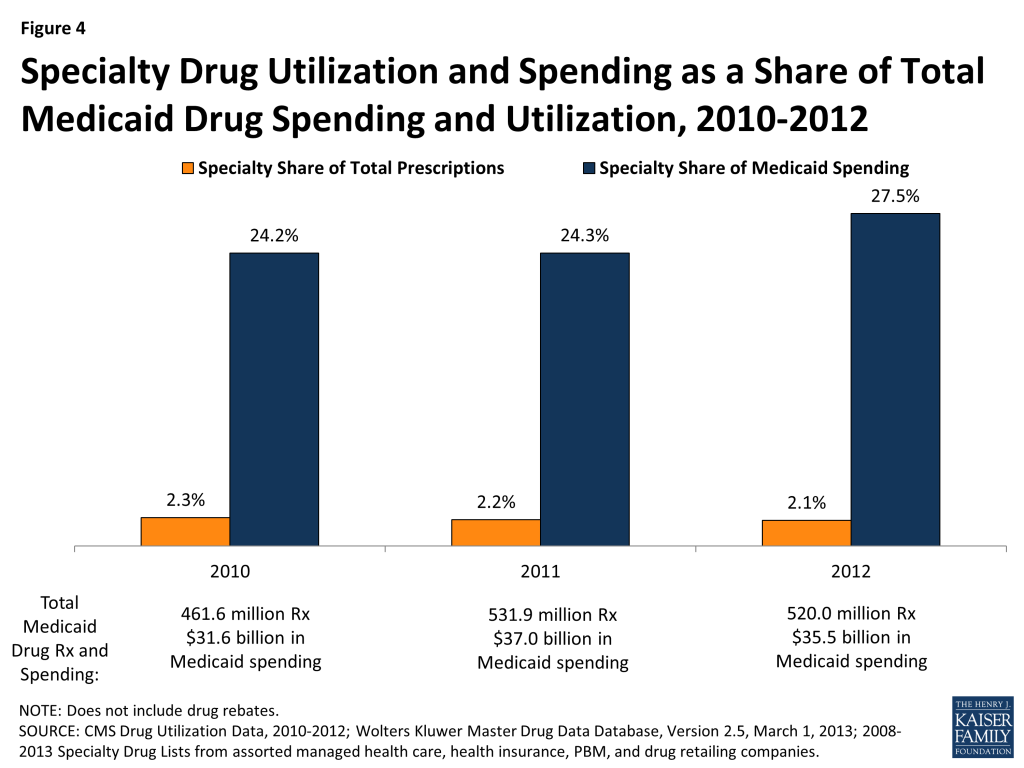
Specialty drugs account for just two percent of drug utilization in 2012, but they comprise 28% of drug spending. This share increased from 2010 when they totaled 24% of drug spending before rebates. The specialty drug share of total drug spending varies at the state level.
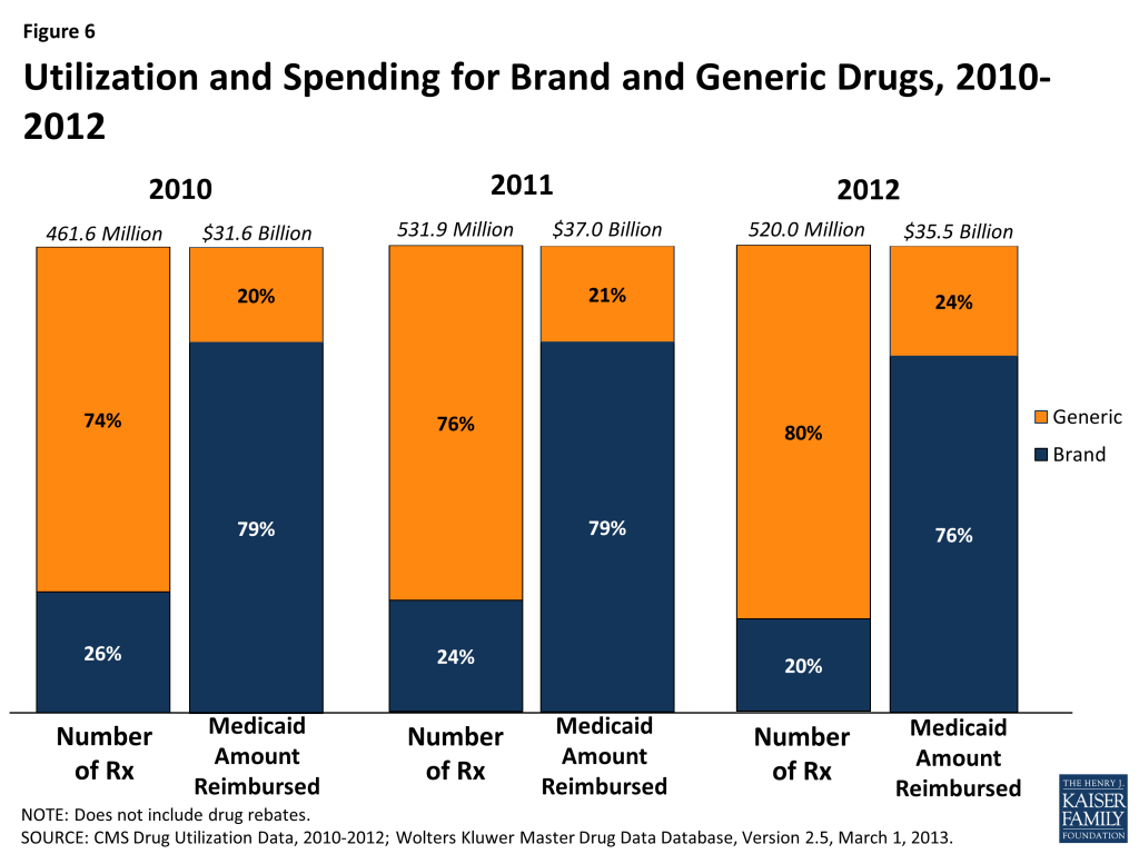
Brand-name drugs account for a disproportionate amount of drug spending. In 2012, they accounted for 20% of Medicaid drug prescriptions but 76% of spending. In the past three years, the share of Medicaid drugs that are generic has risen slightly, possibly due to a number of blockbuster brand drugs losing their exclusivity and facing generic competition in the past several years.
Issue Brief
Introduction
Medicaid is one of the country’s biggest payers for prescription drugs2 , but because prescription drugs account for only about 5 percent of total Medicaid spending3 , Medicaid’s pharmacy benefit policies have not been at the top of mainstream healthcare policy debate. However, with the approval of new specialty drugs, such as the Hepatitis C treatment Sovaldi, states are mindful that the price tag for the Medicaid drug program could increase significantly. While states have implemented many cost-saving policies targeting their Medicaid prescription drug benefits, there remains room for additional cost savings, better management, and improved health outcomes.4 In order to create policy to reach these goals, it is fundamental to understand what the most frequently prescribed drugs are and what drugs are driving spending. In this paper, we first provide a background for understanding the Medicaid drug benefit. Then we analyze recent spending and utilization trends by drug class, specialty drug status, and brand or generic status. Finally, we discuss some of the policy implications of these findings. A detailed explanation of the data and methods underlying the analysis is available in Appendix B at the end of the brief.
Background
In 1991, Congress created the Medicaid Drug Rebate Program to control the rising cost of the prescription drug benefit in the Medicaid program. In return for Medicaid reimbursement for their prescription drugs, it requires that all manufacturers enter into rebate agreements with the Secretary of Health and Human Services.5 Prior to the Affordable Care Act of 2010, the Drug Rebate Program prohibited the collection of federally-mandated rebates from manufacturers for drugs dispensed to beneficiaries enrolled in managed care plans if the health plans paid for those drugs out of their capitated rates. Consequently, many states chose to “carve out” pharmacy benefits from the package of services included in managed care and pay for drugs on a fee-for-service basis so that the state could capture the rebates directly. However, the ACA changed the rules for the rebate program, requiring manufacturers to pay the standard Medicaid rebate amount for drugs paid for by managed care plans in addition to the traditional fee-for-service claims. This change has prompted some states that utilized a carved-out approach for outpatient drug services to switch to a carved-in approach.6 Drug rebates offset a sizable share of gross Medicaid drug spending: in FY 2010, rebates recouped 42% of outpatient fee-for-service drug spending.7
Over half of Medicaid fee-for-service drug expenditures before rebates in FY 2010 were for individuals with disabilities.8 Medicaid also spends more money before rebates on individuals with disabilities at the recipient level than any other eligibility group. Persons with disabilities tend to have complex health needs including physical, behavioral or cognitive ailments that lead to long-term use of drug therapies. They also tend to be older (ages 45 and up), and increasing age is associated with greater use of prescription drugs. Medicaid spends relatively little on outpatient prescription drugs for persons aged 65 and older, as they predominately receive prescription drugs through Medicare. Children, pregnant women, and other caretaker adults enrolled in Medicaid tend to use prescription drugs more for shorter-term, acute illnesses. Although Medicaid spends more money for prescription drugs on individuals with disabilities than other eligibility groups, prescription drug spending has grown the fastest for adults over the FY 2007 to 2010 period.9 This is in large part due to enrollment growth within the adult eligibility group during this period, which in turn, is in large part due to the recession and slow recovery.10 However, despite this growth within the adult eligibility group, and despite the Medicaid enrollment growth, total Medicaid spending for prescribed drugs has remained relatively stable.11 Reasons for the slow growth in Medicaid drug expenditures include states’ emphasis on promoting the use of generic drugs; the introduction of many newly available, generic versions of blockbuster brand-name medications; increases in manufacturer rebates, as required by the Affordable Care Act; and other cost containment efforts implemented by states.12
Despite the historically low growth rates of expenditures in recent years, federal and state Medicaid administrators continue to see prescription drug spending as an area where substantial savings could be achieved while continuing to meet enrollee health needs. Pressures to restrain the growth of Medicaid spending have long existed for states and the federal government, due to overall health care cost growth that exceeds inflation. These pressures were exacerbated by the 2007-2009 recession and its slow recovery. Reimbursement to pharmacies for prescribed drugs, including ingredient costs and dispensing fees, is an area of ongoing concentration for states and the federal government.13 Administrators are also looking for ways to better manage drug benefits, such as reconsidering managed care “carve outs” and adopting more stringent authorization and review strategies. Consistent with trends across the health insurance marketplace, administrators also are reexamining cost sharing requirements. Final rules issued by CMS in July 2012 allow states to apply higher cost-sharing amounts for certain Medicaid-covered drugs.14
Government projections point to rapid escalation in Medicaid drug expenditures in the near future.15 Factors expected to contribute to higher growth include increases in enrollment due to Medicaid coverage expansions authorized by the Affordable Care Act; continued growth in use and costs of specialty drugs; and fewer new generic drugs entering the marketplace to temper the long-term upward trend of increasing per unit drug costs (e.g. due to price increases for existing drugs and introduction of new drugs at relatively higher prices). Medicaid administrators are reassessing the ways that federal and state rules affect the use of and costs for prescribed drugs, in light of these trends.
Trends in Drug Spending and Utilization
Spending and Utilization by Drug Class
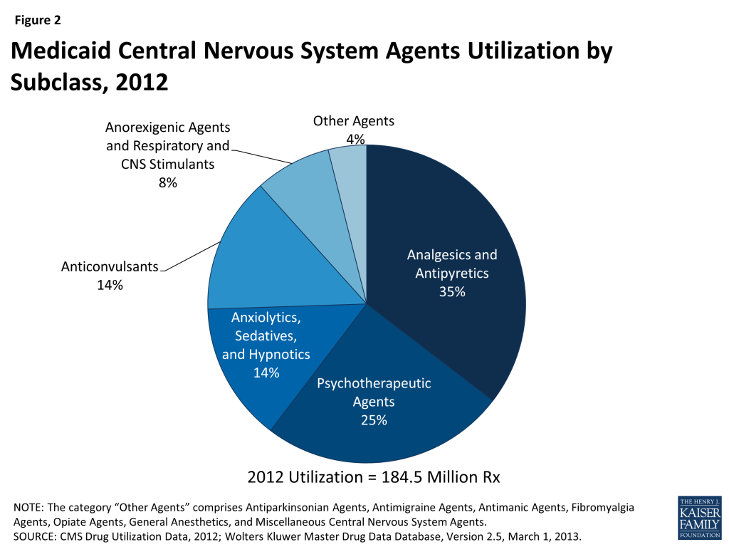
Using drug classes defined by the American Hospital Formulary Service,16 we found that Central Nervous System (CNS) Agents were the largest drug class of Medicaid prescriptions in 2010, 2011, and 2012, both in terms of number of prescriptions and total spending (Figure 1 and Figure 3). This class of drugs accounted for over a third of total prescriptions and over a third of total spending in each of those years (Appendix Table A1). The Central Nervous System Agents class of drugs has 12 subclasses that encompass a range of drugs, but most of the use and spending concentrates in five of them (Figure 2 and Appendix Table A2).17 The text box below summarizes these five subclasses.
Analgesics and Antipyretics is the largest subclass of CNS Agents ranked by use, and third when ranked by expenditures. Drugs in this subclass are used to manage pain, fever and inflammation.
Psychotherapeutic Agents is the second largest subclass of CNS Agents ranked by use, and first when ranked by expenditures. Drugs in this subclass include antidepressants and antipsychotics used in treatment of emotional and mental disorders and serious mental illness.
Anxiolytics, Sedatives and Hypnotics is the third largest subclass of CNS Agents ranked by use but sixth by expenditures. This subclass primarily encompasses benzodiazepines and other drugs often used to treat anxiety and insomnia, although they may be used for other conditions. Most of the highly-utilized drugs in this subclass are available as generics.
Anticonvulsants is the fourth largest subclass of CNS Agents, ranked by use or expenditures. As the name suggests, drugs in this class are used to manage epileptic seizures but increasingly they may also be used as mood stabilizers or to treat chronic neuropathic pain.
Anorexigenic Agents and Respiratory and CNS Stimulants is the fifth largest subclass of CNS Agents ranked by use, but second when ranked by expenditures. Drugs in this subclass include popular treatments for attention deficit hyperactivity disorder (ADHD) and narcolepsy.
Because the CNS class encompasses so many different types of drugs, we examine this class at the subclass level. Analgesics, or painkillers, are the most commonly used drugs worldwide, so the fact that CNS drugs account for most Medicaid prescription drugs and drug spending is not surprising. There are numerous generic options within this subclass, contributing to its lower rank in terms of total expenditures.
Figure 1: Medicaid Drug Utilization by Class, 2012Figure 2: Medicaid Central Nervous System Agents Utilization by Subclass, 2012Figure 3: Medicaid Drug Spending by Class, 2012
Similarly, the high levels of use of CNS Agents is consistent with Medicaid’s position as the largest source of funding for mental health and substance abuse services in the United States, together referred to as behavioral health services.18
Other classes that account for a large number of prescriptions include Anti-Infective Agents, Cardiovascular Drugs (used to treat high blood pressure and high cholesterol), Hormones and Synthetic Substitutes (frequently used to treat diabetes and auto-immune diseases, as well as to prevent pregnancies), Autonomic Drugs (frequently used to treat asthma and muscle spasms) and Gastrointestinal Drugs (Figure 1). These classes include treatments for many different acute illnesses and chronic conditions and are not unusual to see at or near the top of lists of high-use classes in any insurance program.
Most of these high-use classes also show up at the top of the list of classes ranked by Medicaid expenditures (Figure 3), but the high expenditure list also includes small-to-moderate use classes such as Blood Formation, Coagulation & Thrombosis (used for treating and preventing blood clots); Miscellaneous Therapeutic Agents; and Antineoplastic Agents (used for chemotherapy). These classes contain large numbers of drugs used to treat a wide range of conditions, but a common theme among them is that they include relatively high percentages of biologic and specialty drugs, contributing to high average costs per prescription.
Spending and Utilization for Specialty Drugs
While there is no universally accepted definition of specialty drugs and Medicaid programs use varying definitions, products designated as specialty drugs tend to require either difficult or unusual medication delivery, or complex treatment maintenance.19 Price is also frequently considered an indicator of specialty drugs, but some argue that price alone generally should not be used to define this type of drug.20
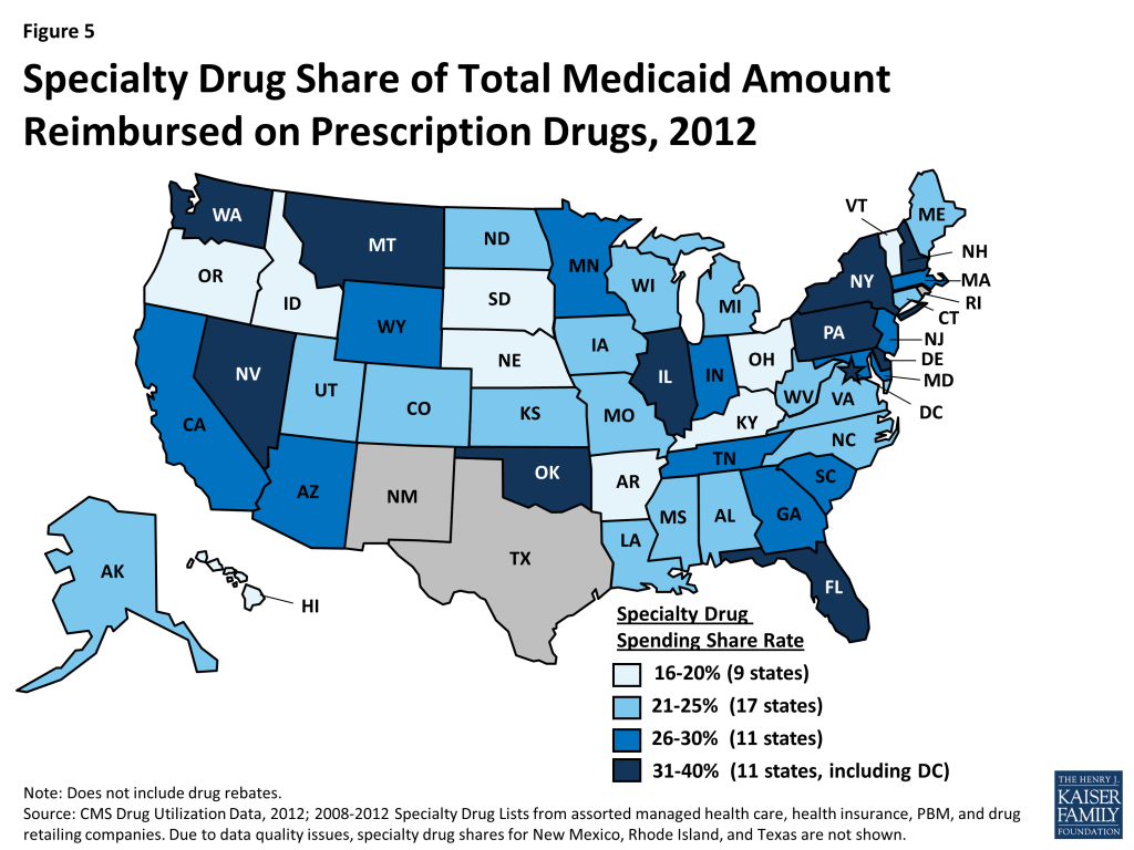
We find that specialty drugs account for a disproportionate amount of drug spending. Between 2010 and 2012, specialty drugs accounted for 2 of total prescriptions, but they accounted for about a quarter of total Medicaid drug spending before rebates (Figure 4). Additionally, specialty drugs’ share of total Medicaid spending on drugs grew from 24 percent in 2010 to 28 percent in 2012. As shown in Figure 5, there is variation at the state level in the share of total Medicaid drug spending that specialty drugs comprise, ranging from a low of 16 percent in Kentucky to a high of 39 percent in the District of Columbia.21
Figure 4: Specialty Drug Utilization and Spending as a Share of Total Medicaid Drug Spending and Utilization, 2010-2012Figure 5: Specialty Drug Share of Total Medicaid Amount Reimbursed on Prescription Drugs, 2012
Spending and Utilization for Brand vs Generic Drugs
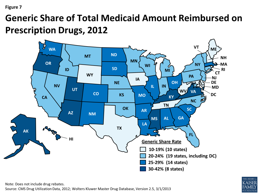
A generic drug is equivalent to a brand drug (also known as an “innovator” drug) in “dosage form, strength, route of administration, quality, performance characteristics, and intended use,” but it is often sold at a lower price.22 The generic dispensing rate of total Medicaid prescriptions has increased from 74 percent in 2010 to 80 percent in 2012. Consequently, the generic share of total Medicaid drug spending has also increased slightly from 20 percent in 2010 to 24 percent in 2012 (Figure 6). The generic share of total Medicaid drug spending varies from state to state, ranging from 13 percent in Rhode Island to 41 percent in Alaska (Figure 7). Although it is argued that dramatic savings could be achieved if all states could reach the generic dispensing rates in states such as Virginia or Alaska, it is important to remember that many factors may influence these rates. Each state has different mixes of patients by age, race, gender, disability, managed care participation, and other factors known to influence the numbers and types of prescriptions dispensed.
Figure 6: Utilization and Spending for Brand and Generic Drugs, 2010-2012Figure 7: Generic Share of Total Medicaid Amount Reimbursed on Prescription Drugs, 2012
Discussion
Managing Medicaid prescription drug benefits is a balancing act between prices, rebates, and use. Policy makers aim to provide the necessary prescription drugs to those who need them while still being mindful of Medicaid spending and cost constraints. In recent years, states have emphasized promoting the use of generic drugs.23 These efforts take many forms including reduced (or no) cost sharing for patients when using generic drugs, higher dispensing fees or other incentives for pharmacists when dispensing generics, and physician education and feedback efforts by third-party payers and other groups (e.g., counter detailing, prescribing analyses). Economic factors played a role in encouraging more generic use, as Medicaid programs and patients sought relief from financial pressures stemming from the economic recession of 2007-2009 and the slow pace of economic recovery in its wake. Additionally, especially in 2011 and 2012, a large number of patents for blockbuster drugs expired. 24 Frequently deemed the “patent cliff,” this brought competition from lower-priced generics.
Policy makers are also vigilant of the high usage rates of certain classes of drugs. As described earlier, analgesics and antipyretics are the most commonly prescribed subclass within the Central Nervous System class of drugs. Use of opioids, which fall within this subclass, is an area of continued vigilance for Medicaid because opioids are the most commonly “diverted” drugs – that is, legally obtained, but subsequently used for illegal, and typically not medically necessary, reasons.25 Policy makers are also mindful of the high usage of behavioral health drugs, focusing on rates of off-label use; polypharmacy; appropriate dosage; use by very young children (< 6) and children in foster care; and prescribing patterns in nursing homes.26 One approach used by states has been to support evidence-based reviews to assess the extent to which drugs within a class may be interchangeable and to inform decisions about the use of particular benefit management tools (e.g., adding or removing prior authorization requirements), to support patient or provider education efforts, and other activities intended to improve the appropriateness of drug therapies.
States are increasingly looking at ways to better manage high-use, high-cost beneficiaries. Small percentages of Medicaid beneficiaries are responsible for large shares of total program expenditures in each state, and the same is true for prescription drug benefits. These individuals tend to have multiple medical and/or mental health conditions. Although there are likely to be opportunities for significant cost savings among these patients by addressing issues such as polypharmacy, and inappropriate and sometimes dangerous prescribing, the challenge is focusing efforts in ways that avoid both overuse and underuse of prescription drugs and that also take into account potential effects beyond the drug benefit. Simply targeting these beneficiaries with the intent to cut drug spending may be counter-productive if the approaches used result in higher costs in other parts of the Medicaid budget. In some cases, it may be appropriate to spend more money on prescription drugs to try to avoid more costly care in the future, such as hospitalizations.
At the same time, policy makers grapple with the very real concern that some drugs, specialty drugs, are so expensive that widespread use of them would cause fiscal problems at the state and federal level. Sovaldi is one such specialty drug, which the FDA approved in December 2013 for the treatment of Hepatitis C. Its manufacturer, Gilead Sciences, has set the list price at $1,000 a pill for Sovaldi, with total costs coming to $84,000 for a standard 12 week course of treatment.27 Sovaldi demonstrated cure rates above 90% in clinical trials without the side-effects found in other Hepatitis C treatments,28 but its high cost is a serious cause of concern for all health insurance providers, especially Medicaid. Some estimates are reporting that Medicaid plans will be covering up to 30 percent of Sovaldi patients, generating costs of at least $1 billion this year.29 In October 2014, the FDA approved Harvoni, another Hepatitis C treatment that is a fixed-dose combination tablet. It is priced comparably to Sovaldi when the latter is taken in combination with the other necessary antivirals approved as part of the treatment.30 The rapid growth of expenditures for specialty drugs is a major area of focus for federal and state policymakers.
Conclusion
Medicaid drug utilization and spending are concentrated within certain types of drugs. Specialty drugs comprise a small share of utilization, but their relatively high price tag is a cause of great concern for Medicaid pharmacy directors. Most prescriptions are for generic drugs, but brand drugs dominate spending. Individuals in different eligibility groups have very different spending patterns. The vast majority of drug prescriptions are for drugs in the Central Nervous System class. These imbalances point to many of the issues with which Medicaid pharmacy directors are grappling. Looming largest on the horizon is the financial complications of the increased use of specialty drugs, which raise issues of management of complex drug regimens and difficult questions concerning return on investment. Sovaldi and its successor Harvoni are two examples of this type of drug, and there are likely to be many more in the future. States are approaching this challenge in a variety of ways. They are also faced with the task of managing the behavioral health needs of Medicaid beneficiaries while also addressing the significant total cost for central nervous system agents and concerns about overuse of these medications. At the same time, these trends underscore the importance of policy actions long in place, such as the continued emphasis on generic utilization, and the Medicaid Drug Rebate Program.
This brief was prepared by Brian Bruen from George Washington University and Katherine Young from the Kaiser Family Foundation.
Appendices
Table A1: Drug Spending and Utilization by Drug Class, 2010-2012
Rx in Thousands
Medicaid Amount Reimbursed in Millions(not including rebates)
Drug Class
Typical Usage
2010
2011
2012
2010
2011
2012
Central Nervous System Agents
Broad category including pain relievers, antipsychotics, antidepressants
High blood pressure, treatment of peripheral edema
11,533
12,487
12,498
$226
$273
$278
Blood Formation, Coagulation & Thrombosis
Treatment and prevention of blood clots, coronary artery disease
7,063
7,911
7,548
$2,000
$2,134
$1,976
Miscellaneous Therapeutic Agents
Osteoporosis, gout, and coronary artery disease
4,085
4,342
4,162
$1,232
$1,504
$1,682
Antineoplastic Agents
Chemotherapy
1,674
1,876
1,923
$1,074
$1,178
$1,255
Smooth Muscle Relaxants
Urinary incontinence
1,465
1,522
1,431
$114
$118
$106
Pharmaceutical Aids
Flavored syrup vehicle, used as to create oral liquid formulations of medications, e.g. for children or the elderly
328
192
191
$5
$4
$5
Devices
Used to clean surfaces prior to use/procedures, e.g. to prepare the skin before checking blood glucose/sugar
180
158
212
$2
$2
$2
Local Anesthetics
Local anesthesia
175
192
185
$6
$8
$9
Serums, Toxoids and Vaccines
Autoimmune disease treatment
92
99
121
$114
$139
$142
Diagnostic Agents
Cardiac stress test
75
121
128
$9
$13
$19
Oxytocics
Postpartum hemorrhage, labor induction
75
70
62
$1
$1
$1
Heavy Metal Antagonists
Iron overload
35
38
36
$97
$115
$118
Contraceptives
Contraception devices
28
30
33
$11
$13
$16
Enzymes
Hunter Syndrome, Gaucher disease
9
10
9
$89
$112
$107
Dental Agents
Dental caries
9
12
10
$0
$0
$0
Blood Derivatives
Intravascular volume expansion
3
3
3
$2
$2
$3
Disinfectants
Disinfectants
2
1
1
$0
$0
$0
Gold Compounds
Rheumatoid arthritis
0
0
0
$0
$0
$0
Cellular Therapy
Prostate Cancer
0
0
0
$0
$0
$1
Unknown Class
1,055
353
202
$57
$12
$34
Source: CMS Drug Utilization Data, 2010-2012; Wolters Kluwer Master Drug Database, Version 2.5, 3/1/2013
Table A2: Central Nervous System Agent Spending and Utilization by Subclass, 2010-2012
Rx in Thousands
Medicaid Amount Reimbursed in Millions (not including rebates)
Drug Subclass
2010
2011
2012
2010
2011
2012
Analgesics and Antipyretics
58,730
68,285
65,341
$1,579
$1,781
$1,697
Anorexigenic Agents and Respiratory and CNS Stimulants
11,366
13,864
14,322
$1,550
$2,062
$2,176
Anticonvulsants
21,842
24,793
25,553
$1,190
$1,322
$1,317
Antimanic Agents
858
935
923
$17
$18
$16
Antimigraine Agents
988
1,183
1,182
$132
$133
$117
Antiparkinsonian Agents
2,234
2,493
2,513
$62
$55
$51
Anxiolytics, Sedatives, and Hypnotics
23,960
26,570
26,093
$374
$387
$345
Central Nervous System Agents, Misc
1,575
2,154
2,348
$264
$392
$474
Fibromyalgia Agents
79
113
90
$8
$13
$12
General Anesthetics
61
68
76
$5
$6
$7
Opiate Antagonists
67
80
84
$9
$13
$15
Psychotherapeutic Agents
41,438
46,984
46,018
$5,831
$6,865
$5,802
Source: CMS Drug Utilization Data, 2010-2012; Wolters Kluwer Master Drug Database, Version 2.5, 3/1/2013
Appendix B: Methodology
For our analysis of Medicaid drug trends, we used 2010-2013 State Drug Utilization Data merged with Wolters Kluwer Master Drug Data Base Version 2.5 (MDDB, V2.5). The State Drug Utilization Data is publicly available data used as part of the Medicaid Drug Rebate Program (MDRP). It provides data on the number of prescriptions, Medicaid spending, and cost-sharing for rebate-eligible Medicaid outpatient drugs at the National Drug Code (NDC) level. The MDDB provides pricing and product information for drug products. We used the State Drug Utilization Data available as of September 2013 and the MDDB, V2.5 from March 2013.
We merged the State Drug Utilization Data and the MDDB at the NDC-level to incorporate brand versus generic status and the American Hospital Formulary Service (AHFS) Therapeutic Class Code. We classified single-source; single-source, co-licensed; and multi-source, originator drugs all as brand drugs. Because there is no official definition of a specialty drug, we compiled a list of drugs that a variety of managed care organizations and pharmacy benefit management service organizations31 classified as specialty drugs.
We looked at the data in the 2010 to 2012 time frame. Only fee-for-service drugs were eligible for rebates through the MDRP until May 23, 2010, and as a result the State Drug Utilization Data prior to 2010 only reflected fee-for-service drugs until 2010. We used data from 2010 on, which includes both fee-for-service and managed care. There were a handful of quarters for states that had either missing or unreliable state drug utilization data between 2010 and 2012.32 For those quarters, we trended the spending and utilization data for each of the analyses by state using data for that state in the surrounding quarters.
Limitations
An important caveat is that the State Drug Utilization Data does not include rebates, which have a considerable effect on Medicaid drug spending.33 In addition to utilization data, rebates are calculated using manufacturer pricing data that is not available to the public, and as a result, it is difficult to obtain this information at the NDC-level.
Medicaid beneficiaries largely self-administer drugs they obtain in an outpatient setting, however it is necessary for physicians or other medical practitioners to administer some drugs. Although physician-administered outpatient drugs have always been included in the MDRP, a 2004 OIG report found that in 2001, only 17 states collected rebates for these drugs.34 The Deficit Reduction Act of 2005 specifically required states to collect manufacturer rebates on certain claims for physician-administered drugs, including all single-source drugs and the top 20 multiple-source (generic) drugs ranked by expenditures. States can collect rebates on other multiple-source drugs administered by physicians, and CMS encouraged them to do so. However, another survey by the U.S. Department of Health and Human Services Office of Inspector General found that about one-quarter of state Medicaid programs (13 of 49 responding) did not meet the mandated requirements as of early 2009.35 Coordination of outpatient drug benefits and physician-administered drugs covered under the medical benefit raises another set of issues for states, including choices about coverage of specific drugs under either the outpatient drug benefit or medical benefit part of the program. Many drugs that states classify as specialty drugs require a physician to administer or supervise dosing. Thus, we may not be capturing all specialty drugs in our analysis. In addition, states may be missing out on rebates for these specialty drugs.
As part of the rebate program, manufacturers are required to report all covered drugs currently under their labeler code, as well the quarterly Average Manufacturer Price (AMP) for each National Drug Code (NDC). The drug rebate is calculated by statute and is based upon a lower-of formula involving AMP; what type of drug it is, including if it is a brand or a generic; the best price if it is a brand-name drug; and the Consumer Price Index-Urban. AMP is defined as the “average price paid to the manufacturer for the drug in the United States by wholesalers for drugs distributed to retail community pharmacies; and retail community pharmacies that purchase drugs directly from the manufacturer” with some exclusions (SSA Section 1927(k)(1)(A)). The NDC is a unique code that identifies each drug according to its labeler, strength, dosage form, package form, and package size. The best price is the lowest price paid by any payer. ↩︎
U.S. Department of Health and Human Services- Office of Inspector General. “States Collections of Rebates for Drugs Paid Through Medicaid Managed Care Organizations” (OEI-03-11-00480), September 2012. Available at http://oig.hhs.gov/oei/reports/oei-03-11-00480.pdf. ↩︎
Kaiser Commission on Medicaid and the Uninsured and the Urban Institute estimates based on data from FY 2007 through FY 2010 MSIS. Because 2010 data were unavailable, 2009 MSIS data were used for CO, ID, MO, NC, and WV, and then adjusted to 2010 CMS-64 spending levels. MSIS drug spending represents fee-for-service spending only. ↩︎
V. Smith, K. Gifford, and R. Rudowitz, “Headed for a Crunch: An Update on Medicaid Spending Coverage and Policy Heading into an Economic Downturn” Kaiser Family Foundation, September 2008; V. Smith, K. Gifford, E. Ellis, R. Rudowitz, M. Watts, C. Marks, “The Crunch Continues: Medicaid Spending, Coverage and Policy in the Midst of a Recession: Results from a 50-State Medicaid Budget Survey for State Fiscal Years 2009 and 2010” Kaiser Family Foundation, September 2009; V. Smith, K. Gifford, E. Ellis, R. Rudowitz, L. Snyder, “Hoping for Economic Recovery, Preparing for Health Reform: A Look at Medicaid Spending, Coverage and Policy Trends Results from a 50-State Medicaid Budget Survey for State Fiscal Years 2010 and 2011” Kaiser Family Foundation, September 2010; V. Smith, K. Gifford, E. Ellis, R. Rudowitz, L. Snyder, “Moving Ahead Amid Fiscal Challenges: A Look at Medicaid Spending, Coverage and Policy Trends Results from a 50-State Medicaid Budget Survey for State Fiscal Years 2011 and 2012” Kaiser Family Foundation, October 2011; V. Smith, K. Gifford, E. Ellis, R. Rudowitz, and L. Snyder, “Medicaid Today; Preparing for Tomorrow: A Look at State Medicaid Program Spending, Enrollment and Policy Trends Results from a 50-State Medicaid Budget Survey for State Fiscal Years 2012 and 2013” Kaiser Family Foundation, October 2012; V. Smith, K. Gifford, E. Ellis, R. Rudowitz, and L. Snyder, “Medicaid in a Historic Time of Transformation: Results from a 50-State Medicaid Budget Survey for State Fiscal Years 2013 and 2014” Kaiser Family Foundation, October 2013. ↩︎
Medicaid and Children’s Health Insurance Programs: Essential Health Benefits in Alternative Benefit Plans, Eligibility Notices, Fair Hearing and Appeal Processes, and Premiums and Cost Sharing; Exchanges: Eligibility and Enrollment; Final Rule. 78 Federal Register 135, 15 July 2013, pp. 42160-42322. ↩︎
American Hospital Formulary Service drug classes are from the American Society of Health-System Pharmacists (www.ahfsdruginformation.com). We accessed them through the Wolters Kluwer Master Drug Data Base (Version 2.5). See Appendix B: Methodology for more details. ↩︎
As rebates at the drug level are not available to the public, we are unable to include rebates in this analysis. ↩︎
D. Blaser, A. Lewtas, et al. “How to Define Specialty Pharmaceuticals – A Systematic Review” American Journal of Pharmaceutical Benefits, 2(6), 2010. See also Academy of Managed Care Pharmacy. “AMCP Format for Formulary Submission Guidelines”, version 3.1, December 2012. Available at http://www.amcp.org/practice-resources/amcp-format-formulary-submisions.pdf. ↩︎
The Academy for Managed Care Pharmacy acknowledges that price is frequently a consideration in definitions used by individual organizations, but does not include price in its definition and argues that price alone should not be used to define specialty drugs. ↩︎
Due to data quality issues, we have not calculated specialty drug shares in New Mexico, Rhode Island, and Texas. ↩︎
See, for example, Government Accountability Office. “Children’s Mental Health: Concerns Remain about Appropriate Services for Children in Medicaid and Foster Care” December 2012. Available at http://www.gao.gov/assets/660/650716.pdf. ↩︎
We pulled formulary information from Aetna Specialty CareRx, BlueCross BlueShield of Rhode Island, CVS Caremark Specialty Pharmacy Services, Express Scripts, and Wellmark. ↩︎
The state drug utilization data for the following states and quarters was either missing or unreliable: Colorado 2011Q4, Hawaii 2012Q2-Q4, Indiana 2012Q3, North Dakota 2012Q4, Texas 2012Q1 and 2012Q3, Utah 2012Q1, Virginia 2010Q2-2010Q4. ↩︎
U.S. Department of Health and Human Services- Office of Inspector General. “Medicaid Rebates for Physician-Administered Drugs” (OEI-03-02-00660) September 2012. Available at http://oig.hhs.gov/oei/reports/oei-03-11-00480.pdf. ↩︎
U.S. Department of Health and Human Services- Office of Inspector General. “States Collection of Medicaid Rebates for Physician-Administered Drugs” (OEI-03-09-00410) June 2011. Available at http://oig.hhs.gov/oei/reports/oei-03-09-00410.pdf. States continue to face challenges carrying out these requirements: Providers may not report all of the information needed to support rebate claims; state systems may not accurately capture relevant information or may accept claims without complete documentation; and manufactures may challenge claims because of concerns over the accuracy of claims information. For example, see Nebraska Department of Health and Human Services. “Medicaid Drug Rebate Program – National Drug Code (NDC) Reporting Requirement for Physician Administered Drugs New Quantity Limits” Provider Bulletin No. 13-63. September 5, 2013. Available at http://dhhs.ne.gov/medicaid/Documents/PB1363.pdf. ↩︎
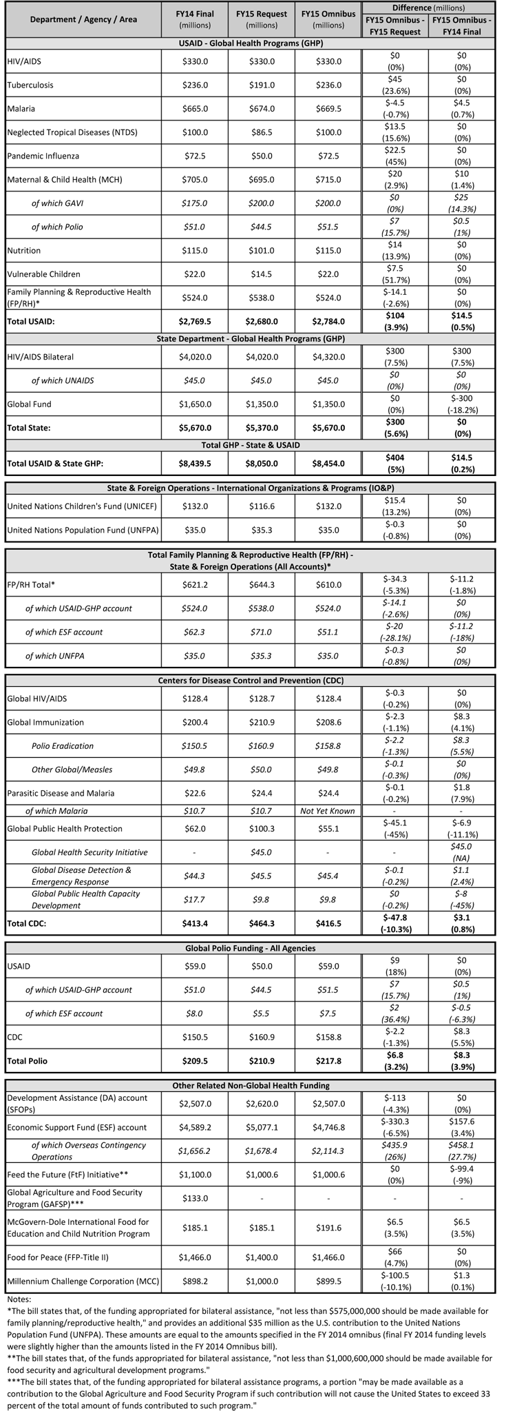
Congress released the FY 2015 Omnibus bill (H.R. 83) on December 9, 2014, which includes funding for U.S. global health programs at the U.S. Agency for International Development (USAID), the Department of State, and the Centers for Disease Control and Prevention (CDC), as well as agency-wide emergency funding to address the Ebola crisis. Excluding the emergency Ebola funding, total known* funding for U.S. global health programs in the FY 2015 Omnibus is $9.1 billion, which is essentially flat compared to FY 2014, but is $353 million (4%) above the President’s FY 2015 Budget Request. The tables below compare U.S. global health funding in the FY 2015 Omnibus to final FY 2014 funding amounts (as specified on ForeignAssistance.gov, Agency operating plans, and in the “Consolidated Appropriations Act, 2014” and the President’s FY 2015 Budget Request). An additional table provides a summary of emergency funding for Ebola.
Funding for most global health programs remained essentially flat compared to FY 2014 levels. However, funding for bilateral HIV programs increased by $300 million above FY 2014 levels and the President’s FY 2015 request, while funding for the U.S. contribution to the Global Fund to Fight AIDS, Tuberculosis and Malaria (Global Fund) decreased by an equal amount ($300 million).
It is important to note that policy provisions such as the Global Gag Rule (Mexico City Policy) and a prohibition on funding for the United Nations Population Fund (UNFPA) that were included in the House version of the FY 2015 State and Foreign Operations (SFOPs) appropriation bill (H.R. 5013) were not included in the FY 2015 Omnibus.
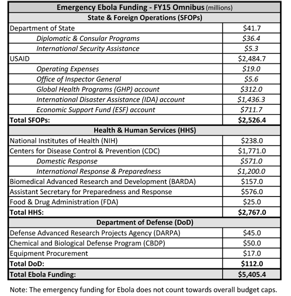
The FY 2015 Omnibus also included emergency funding to address the Ebola crisis, for which the Administration had requested $6.2 billion. The FY 2015 Omnibus provides $5.4 billion in emergency funding for Ebola: $2.5 billion is provided to USAID and the State Department, $2.8 billion is provided to the Department of Health & Human Services (HHS), and $112 million is provided to the Department of Defense (DoD). This funding is not counted towards overall budget caps.
*Some funding amounts (e.g. NIH funding for international HIV research) are determined at the agency level, and are not earmarked by Congress in the Omnibus bill.
In 2014, more than 16 million Medicare beneficiaries (30%) were enrolled in Medicare Advantage plans – private plans, such as HMOs or preferred provider organization (PPOs) that receive funds from the federal government (Medicare) to provide Medicare-covered benefits to enrollees. Under the current Medicare program, Medicare Advantage plans are offered as an alternative to the traditional Medicare fee-for-service program, and Medicare beneficiaries can enroll in a Medicare Advantage plan, change Medicare Advantage plans, or switch from Medicare Advantage to traditional Medicare during the annual open enrollment period. Federal payments to Medicare Advantage plans were gradually reduced by the Affordable Care Act of 2010 (ACA) with the goal of creating greater parity in payments between the traditional Medicare program and Medicare Advantage by 2017.1
Beneficiaries will be able to choose from 18 Medicare Advantage plans, on average, in 2015, the same number of plans as in 2014. While some plans will leave the market in 2015, others are entering or expanding and most enrollees (over 95 percent) will be able to remain in their same plan in 2015 if they choose. About 480,000 beneficiaries – less than 5 percent of all enrollees – will need to find new plans because their 2014 plan will no longer be available in 2015.2
Most beneficiaries (78 percent) will have access to zero-premium plans in 2015, though the emphasis on such plans could be declining. The average beneficiary who remains in the same Medicare Advantage plan in 2014 and 2015 will pay $41 per month, an increase of $7 per month, or 20 percent, on average; beneficiaries could avoid higher premiums by changing plans or decide that their current plan still is attractive despite the higher premium. All Medicare Advantage plans will include a limit on enrollees’ out-of-pocket expenses for services covered under Medicare Parts A and B, but the plans’ limits will be about $240 higher, on average, in 2015 than in 2014. Deductibles for Part D drug coverage will also increase, on average. These changes are consistent with historical trends, and indicate that Medicare Advantage plans can be expected to provide somewhat less financial protection in 2015 than they have historically.
This Data Spotlight, like those prepared by us in previous years, reviews trends in Medicare Advantage plan choices available to beneficiaries, premiums and other plan characteristics in 2015. The brief does not, however, analyze changes in benefits or cost sharing requirements for individual services, which could be major factors in an enrollee’s out of pocket expenses.3 Nor does it examine changes in provider networks that could affect beneficiaries’ access to preferred physicians and other health care providers. This spotlight is part of a series of spotlights tracking key changes in the Medicare Advantage program. The analysis is based on publicly available data from the Centers for Medicare and Medicaid Services (CMS).4
Plan Offerings in 2015
Number of Plans Offered
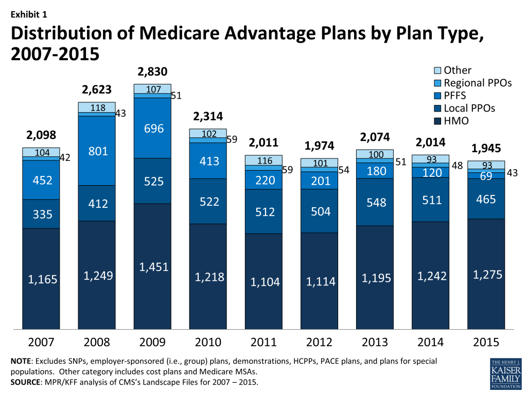
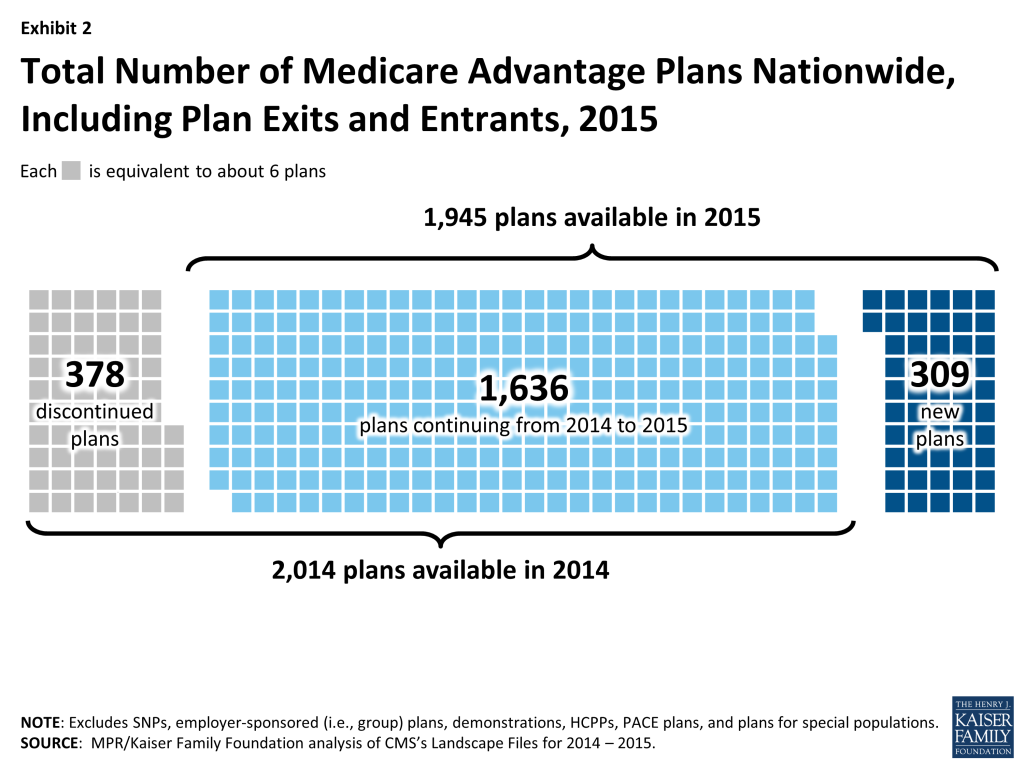
In total, 1,945 Medicare Advantage plans will be available nationwide for individual enrollment in 2015 (Exhibit 1), 69 fewer plans than were available in 2014 as the aggregate number of departing plans (378 plans) outnumber new entrants (309 plans; Exhibit 2).5
Exhibit 1: Distribution of Medicare Advantage Plans by Plan Type, 2007-2015Exhibit 2: Total Number of Medicare Advantage Plans Nationwide, Including Plan Exits and Entrants, 2015
To a considerable extent, the decline in plans reflects the diminished role of PFFS plans in the Medicare Advantage marketplace since the Medicare Improvements for Patients and Providers Act (MIPPA) of 2008, which required most PFFS plans to adopt provider networks. In 2015, 69 PFFS plans will be offered compared to 120 in 2014 and a high of 801 in 2008 (Table A1). The number of local PPOs offered will decline by 46 plans (from 511 in 2014 to 465 in 2015), and the number of regional PPOs will decline by 6 plans (from 48 in 2014 to 43 in 2015). In contrast, the total number of HMOs available for enrollment will increase from 1,242 plans to 1,275 between 2014 and 2015.
Earlier analysis provides detail on the nature of change at the national and state level as plans enter and depart the market in 2015.6 While virtually every state (except AK and WY) will have some change in plan offerings, most of the plans exiting the market had relatively few enrollees and most had average or below average quality star ratings.
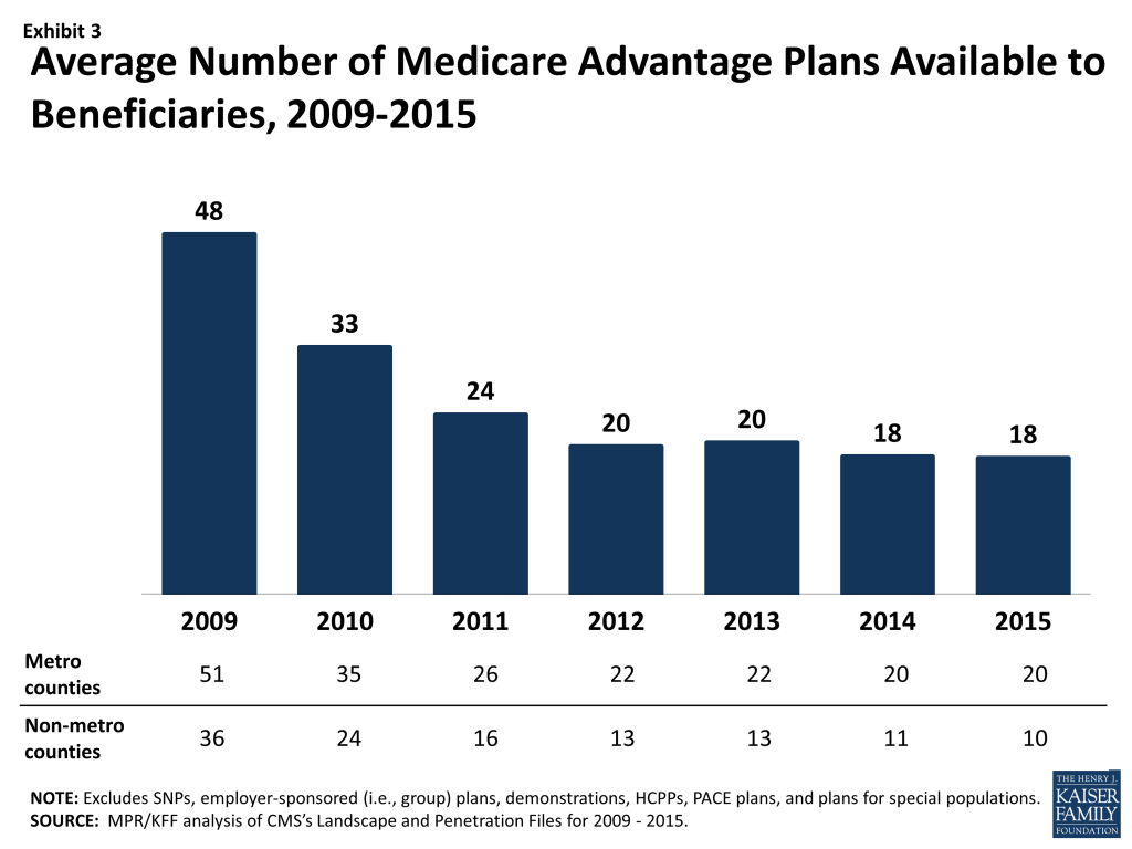
Medicare beneficiaries will be able to choose from among 18 plans, on average, in 2015 – the same number of plans as in 2014 (Exhibit 3). Beneficiaries in metropolitan areas will be able to choose from 20 plans, on average, the same number of plans as in 2014. Beneficiaries in non-metropolitan areas will be able to choose from among 10 plans, on average, down one plan from 2014. The average number of plans available in the lowest cost counties will somewhat decrease from 17 plans to 15 plans while the average number of plans available in the highest cost counties will increase from 21 plans to 22 plans (Table A2).
Exhibit 3: Average Number of Medicare Advantage Plans Available to Beneficiaries, 2009-2015
Access to Medicare Advantage Plans
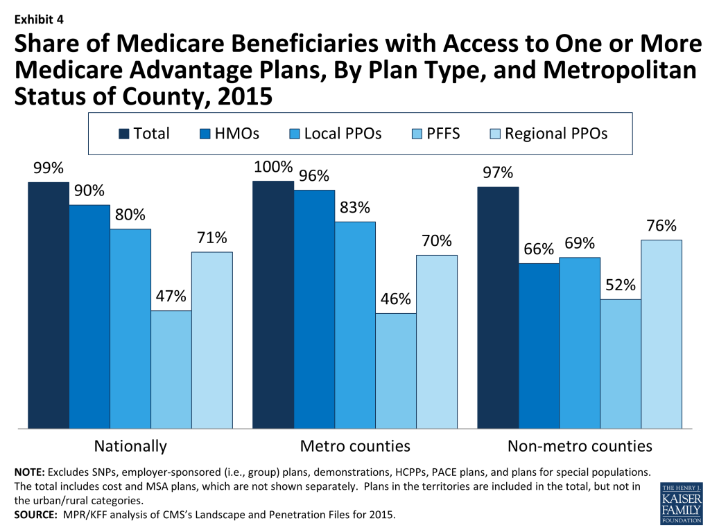
As in recent years, virtually all Medicare beneficiaries (99%) will continue to have access to a Medicare Advantage plan as an alternative to traditional Medicare (Exhibit 4). All beneficiaries in metropolitan areas (100%) and the vast majority of beneficiaries in non-metropolitan areas (97%) will continue to have access to one or more Medicare Advantage plans. In terms of choice, the main change between 2014 and 2015 is that fewer beneficiaries, particularly those in non-metropolitan areas, will have access to a PFFS plan in 2015.
Exhibit 4: Share of Medicare Beneficiaries with Access to One or More Medicare Advantage Plans, By Plan Type, and Metropolitan Status of County, 2015
Plan Premiums
People on Medicare have said that many factors are important to them when selecting their plan, including plans’ premiums, cost-sharing, extra benefits, prescription drug coverage, and provider networks.7 Premiums are the most visible and the easiest of these factors to compare, even though the other factors are also important as they affect beneficiaries’ out-of-pocket costs and access to providers. Medicare beneficiaries enrolled in Medicare Advantage plans pay the Part B premium like other beneficiaries (less any rebate provided by the Medicare Advantage plan). Medicare Advantage enrollees may also pay an additional monthly premium charged by the Medicare Advantage plan for plan benefits and prescription drug coverage. This analysis of premiums includes only Medicare Advantage plans that offer prescription drug coverage (MA-PDs), and excludes the minority of Medicare Advantage plans (14%) that do not cover prescription drugs, in order to better approximate apples-to-apples comparisons across plan types and years.
Monthly Premiums (Unweighted By Enrollment)
We first examined the change in premiums, without weighting them for plan enrollment, to show the changes plans are making and implications for average premiums in plans available to beneficiaries. The analysis includes plans with no premiums as well as plans with monthly premiums. In 2015, the average premium for MA-PDs (unweighted by plan enrollment) will be $53 per month – an increase of $2 from 2014 (Table A3). Premiums for HMOs will average $38 per month, up $3 from 2014. Similar to prior years, HMOs will continue to have lower premiums than regional PPOs ($68 per month), local PPOs ($81 per month) and PFFS plans ($88 per month). Regional PPOs will have the largest change in premiums, on average, in which average premiums will increase 14 percent, on average, from $59 per month in 2014 to $68 per month in 2015. In contrast, premiums for PFFS plans will decrease, on average, from $91 per month in 2014 to $88 per month in 2015.
Monthly Premiums (Weighted By Enrollment), Assuming Enrollees Remain in the Same Plan
Our second analysis of Medicare Advantage premiums examines the impact of premium changes among plans offered in both years, assuming enrollees remained in the same plan. These enrollee “weighted average” premiums are a clearer indication than unweighted premiums of the amount paid by the average Medicare Advantage enrollee because enrollment differs substantially across plans. Similar to the prior analysis, this analysis includes plans with no premiums as well as plans with monthly premiums.
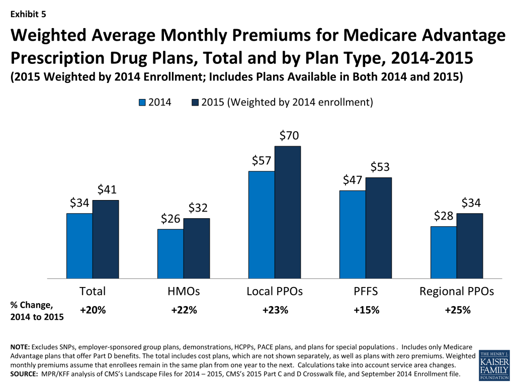
The premiums for MA-PDs available in both years, weighted by 2014 enrollment, will be about $41 per month, an increase of $7 per month (or 20 percent) compared to 2014 (Exhibit 5). In 2015, as in previous years, monthly premiums for HMO enrollees will be lower than for all other plan types, on average, assuming beneficiaries stay in their same plan. Enrollees in local PPOs will pay more in monthly premiums than enrollees in other types of Medicare Advantage plans, and will face larger increases in premiums (in absolute dollar terms) than enrollees in HMOs, regional PPOs, and PFFS plans if they remain in the same plan, on average. Historically, actual average premiums, available after beneficiaries respond to new plan choices, have been lower than premiums shown in this analysis because beneficiaries tend to select lower premium plans, if they switch plans.8 We will analyze the premiums for plans selected by beneficiaries in 2015 after the open enrollment period.
Exhibit 5: Weighted Average Monthly Premiums for Medicare Advantage Prescription Drug Plans, Total and by Plan Type, 2014-2015
In general, MA-PDs that will continue to be offered in 2014 had lower average premiums in 2014 (weighted by enrollment) than plans that are exiting the market in 2014 (Table A1). Plans remaining in the market had average premiums of $34 per month whereas plans exiting the market had average premiums of $52 per month. This pattern is true both in the aggregate and for most plan types, and suggests that these higher premium plans that are exiting the market were less competitive than the plans with lower premiums. As was true last year, PFFS plans are an exception to this pattern; the average premium for PFFS departing plans was slightly lower than the average premium for continuing plans in 2014 ($45 versus $47). Since plan premiums are a function of many factors (including benefits, cost-sharing, provider networks, local practice patterns, and payments from the Medicare program), interpreting differences in premiums by plan type is complex.9
Access to Plans with No Premium
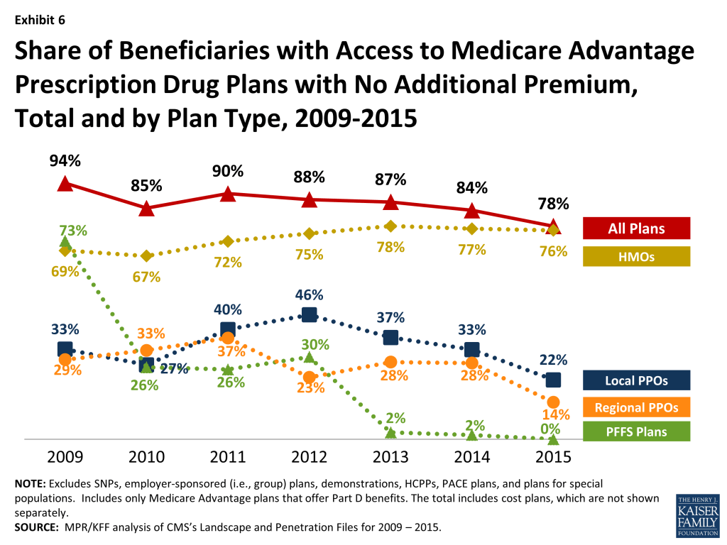
Medicare Advantage plans with no additional premium other than the Medicare Part B premium – so called “zero premium plans” – have been a feature of the Medicare Advantage landscape for many years. Slightly more than three-quarters (78%) of all beneficiaries will have access to a zero-premium MA-PD in 2015 (Exhibit 6). This is a decline from 84 percent in 2014, and a high of 94 percent in 2009. However, despite declines in the availability of zero premium plans, our analysis has shown that historically the share of beneficiaries enrolled in zero-premium plans has remained relatively steady; since 2011, about half of all Medicare Advantage enrollees have been enrolled in a zero-premium MA-PD.10
Exhibit 6: Share of Beneficiaries with Access to Medicare Advantage Prescription Drug Plans with No Additional Premium, Total and by Plan Type, 2009-2015
As in past years, beneficiaries are most likely to have zero premium HMOs available. In 2015, 76 percent of beneficiaries will have access to at least one zero premium HMO, while a minority of beneficiaries will have access to zero-premium local PPOs (22%) and regional PPOs (14%); no zero-premium PFFS plans will be available.
Box 1: Availability of Special Needs Plans in 2015
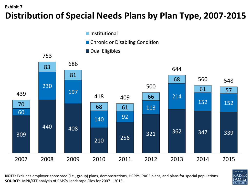
Special Needs Plans (SNPs) are a type of Medicare Advantage plan that was authorized in 2003 as part of the Medicare Prescription Drug, Improvement and Modernization Act (MMA) to provide a managed care option for beneficiaries with significant or relatively specialized health care needs. Medicare beneficiaries can enroll in a SNP if they are dually eligible for Medicare and Medicaid (D-SNPs), require an institutional-level of care (I-SNPs), or have a severe or chronic condition (C-SNP). Most SNPs are HMOs, but they can also be PPOs.–When SNPs were authorized, there were few requirements beyond those otherwise required of other Medicare Advantage plans. The Medicare Improvements for Patients and Providers Act (MIPPA) of 2008 established additional requirements for SNPs, including requiring all SNPs to provide a care management plan to document how care would be provided for enrollees and requiring C-SNPs to limit enrollment to beneficiaries with specific diagnoses or conditions. As a result of the new MIPPA requirements, the number of SNPs declined in 2010. The ACA required D-SNPs to have a contract with the Medicaid agency for every state in which the plan operates, beginning in 2013. Additionally, in 2013, joint federal-state financial alignment demonstrations to improve the coordination of Medicare and Medicaid for dually eligible beneficiaries began to enroll beneficiaries. Today, financial alignment demonstrations are underway in 12 states: California, Colorado, Illinois, Massachusetts, Michigan, Minnesota, New York, Ohio, South Carolina, Texas, Virginia, and Washington. The financial alignment demonstrations could influence the availability of D-SNPs in these states, either increasing or decreasing the availability of SNPs, depending on the design of the demonstration.–In 2015, 548 SNPs will be available, a slight decrease from the 560 plans available in 2014 (Exhibit 7; Table A7). The availability of SNPs will continue to vary across states in 2015, as it has in prior years. In 2015, at least one SNP of any type will be available in all states but seven (AK, MT, NH, ND, SD, VT, and WY); while Maine did not have SNPs available in 2014, 3 new D-SNPs will be available in Maine in 2015. As in 2014, SNPs will be most numerous in selected high population states, notably Florida (92 plans), California (69 plans), New York (56 plans), and Texas (31 plans). While the number of available SNPs declined in three (FL, NY, and TX) of these four highly populated states, Florida in particular will see a decline in the total number of available SNPs from 130 SNPs in 2014 to 92 SNPs in 2015. This decline partly reverses the growth in SNPs in Florida between 2013 and 2014 (from 112 plans in 2013 to 130 plans in 2014), and is proportionate across all plan types.–
Exhibit 7: Distribution of Special Needs Plans by Plan Type, 2007-2015
–The total number of D-SNPs will slightly decrease from 347 plans to 339 plans between 2014 and 2015, with some variation across states. The number of D-SNPs almost doubled in Arizona, from 12 plans in 2014 to 22 plans in 2015, while the number of D-SNPs in Florida declined from 71 plans in 2014 to 49 plans in 2015. Other states will experience smaller changes in the availability of D-SNPs. Notably, states with ongoing financial alignment demonstrations to improve the coordination of Medicare and Medicaid for dual eligibles will not see large changes, if any, in the number of available D-SNPs between 2014 and 2015. The total number of C-SNPs will remain the same in 2015 as in 2014 (152 plans), and the total number of I-SNPs will slightly decrease from 61 plans in 2014 to 57 plans in 2015. With the exception of Florida, no states will experience large changes in the availability of C-SNPs and I-SNPs.
Plan Availability and Premiums by Firm
While many organizations offer Medicare Advantage plans, a handful of firms and affiliates account for the majority of all Medicare Advantage enrollment in 2014.11 We examine trends among and across these firms and affiliates that account for large shares of Medicare Advantage enrollment nationally: UnitedHealthcare, Humana, Blue Cross and Blue Shield (BCBS) affiliated companies (including Wellpoint BCBS plans), Kaiser Permanente, Aetna, Wellcare, and Cigna. The analysis accounts for the merger between Coventry and Aetna in late 2013 as well as other previous mergers.
Change in Number and Availability of Plans Offered By Firm
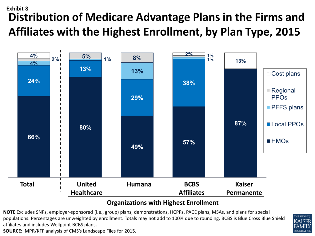
Nationally, these firms and affiliates dominate the plan offerings, and 60 percent of available plans will be offered by one of these firms or affiliates in 2015 (Table A4). The types of plans offered vary across these firms and affiliates, due to different business strategies and different markets in which they offer plans. Plan strategies are reflected both in the types of plans they offer and, taking service area into account, the share of beneficiaries to whom they are available (Exhibit 8, Table A5).
Exhibit 8: Distribution of Medicare Advantage Plans in the Firms and Affiliates with the Highest Enrollment, by Plan Type, 2015
Humana. As in recent prior years, in 2015, Humana will be offering plans to a larger share of Medicare beneficiaries nationwide (86%), and will be offering a broader mix of plan types, than any other firm or affiliated companies. About half of all Humana Medicare Advantage plans in 2015 will be HMOs (49%) and about three in ten will be local PPOs (29%); PFFS plans comprise a much larger proportion (13%) of Humana’s plan offerings than other large firms’ offerings. In 2015, Humana HMOs, local PPOs, and regional PPOs will be available to more than half of beneficiaries (56%, 54%, and 61%, respectively) and Humana PFFS plans will be available to more than four in ten beneficiaries (44%). This means that, in many markets, Humana will be offering competing plans of different plan types.
UnitedHealthcare. UnitedHealthcare also has historically had a large Medicare Advantage footprint and it will continue to do so in 2015. More than two-thirds (69%) of Medicare beneficiaries will have access to a UnitedHealthcare plan in 2015. Like Humana, UnitedHealthcare’s offerings also reflect a diversified mix of plan types, but the firm relies more heavily on HMOs than other plan types. Eighty percent of UnitedHealthcare’s plans will be HMOs, with smaller share of other plan types offered, including local PPOs (13%), regional PPOs (5%), and PFFS plans (1%).
Blue Cross and Blue Shield Affiliates (BCBS). In contrast to Humana and UnitedHealthcare that are single companies (or groups of companies), BCBS affiliates originally were separate companies in individual states that are affiliated nationally. Today, such affiliated companies may cover multiple states and some have converted from non-profit to for-profit status, most notably Wellpoint with its acquisition of Anthem BCBS.12 We analyze the BCBS affiliates together because the affiliation results in some similarities in approach. In 2015, more than half of their Medicare Advantage offerings will be HMOs (57%) while 38 percent will be local PPOs. Nearly three out of four beneficiaries nationwide (71%) will have access to a BCBS affiliated plan, including 21 percent who will have with access to a Wellpoint BCBS plan and 58 percent who will have access to plans offered by other companies under the BCBS trademark. UnitedHealthcare, Humana, and BCBS affiliates are the only firms and affiliates that offer regional PPOs in 2015, as was also true in 2014.
Kaiser Permanente. Fewer beneficiaries (15%) will have access to a Kaiser Permanente plan than many other firms included in this analysis. Kaiser Permanente has historically been geographically concentrated but its plans tend to have many enrollees. In contrast to other firms that have diversified their Medicare Advantage offerings considerably since the mid-2000s, Kaiser Permanente only offers HMOs (87%) and cost plans, which are somewhat similarly structured. In 2015, Kaiser Permanente will offer fewer cost plans (5 plans in 2015 versus 14 plans in 2014), but the change will have relatively little impact on the total share of beneficiaries with access to a Kaiser Permanente plan.
Aetna. With its acquisition of Coventry, Aetna’s footprint in the Medicare Advantage market has expanded. Aetna historically was strong in the group market and the Coventry acquisition has strengthened its presence in the individual market.13 In 2015, Aetna plans will be available to 45 percent of all beneficiaries, up from 33 percent in 2014 prior to the acquisition. In 2015, Aetna HMOs and local PPOs will be available to 42 percent and 33 percent of beneficiaries, respectively; both Coventry and Aetna have offered only HMOs or local PPOs since the start of 2011.
Other Firms. About one-quarter (25%) and one-fifth (19%) of beneficiaries will have access to a plan offered by Wellcare and Cigna, respectively. Both firms heavily emphasize HMOs, with Wellcare exclusively offering HMOs and Cigna offering predominantly HMOs. Many other firms participate in the Medicare Advantage. Such companies are particularly relevant to HMO offerings, where they provide one or more options to 79 percent of beneficiaries.
Change in Plan Premiums By Firm
The firms and affiliates with the most Medicare Advantage enrollees have historically differed in how aggressively they have priced their products, over time and across markets. For instance, some may offer wider provider networks in exchange for higher premiums. Others provide more limited benefit expansion (beyond traditional Medicare benefits) in exchange for lower premium plans. As with our other analyses of premiums, this analysis of premiums by firm includes only MA-PDs, and excludes the Medicare Advantage plans that do not cover prescription drugs, in order to better approximate apples-to-apples comparisons.
As part of its strategy for retaining enrollment while reducing costs, UnitedHealthcare announced that for 2015 it introduced premiums across most of its plans that previously had zero-premiums. As premiums in these plans increased, UnitedHealthcare also is introducing new zero-premium plans with less generous benefits and/or higher cost-sharing.14 UnitedHealthcare has also stated that it will introduce more plans with narrow provider networks consisting of one hospital or health system. Overall, average premiums increased across all plan types offered by UnitedHealthCare, increasing from an average of $11 in 2014 to $27 in 2015 (Table A6).
Other companies will also have sizeable premium increases for some plan offerings. Average premiums for local PPOs offered by BCBS affiliates increased from $89 per month to $109 per month between 2014 and 2015; these premium increases occurred for BCBS plans offered by Wellpoint as well as other BCBS affiliates.
Limits on Out-of-Pocket Spending
The traditional Medicare program does not include a limit on out-of-pocket spending for services covered under Parts A and B, which is one reason most beneficiaries have supplemental coverage to limit their financial liability. Historically, Medicare HMOs provided beneficiaries with an alternative way to obtain comprehensive coverage and early (circa 1980s) plans had relatively limited cost sharing. With the growth of cost sharing in Medicare Advantage and its predecessor programs, out-of-pocket limits became increasingly important as a way for health plans to demonstrate their value to beneficiaries who might also be considering traditional Medicare, with or without supplemental coverage.
In 2006, when they were first authorized, regional PPOs were required by law to have a limit on out-of-pocket spending for benefits under Parts A and B. In 2010, more than three-quarters of plans (79%) of any type provided out-of-pocket spending limits as an extra benefit for enrollees.15 Beginning in 2011, CMS required all Medicare Advantage plans to include a limit on enrollees’ out-of-pocket expenses for services covered under Parts A and B (no more than $6,700 each year,), with higher limits allowed for services received out-of-network. CMS encouraged plans to limit enrollees’ out-of-pocket expenses to no more than $3,400 per year by allowing plans with lower out-of-pocket limits to charge higher cost-sharing for some services. These out-of-pocket limits do not include expenses for prescription drugs covered under Part D, which have a separate catastrophic cap ($4,700 in 2015), nor do they include expenses for services not covered by the plan, such as dental care or over-the-counter medications.
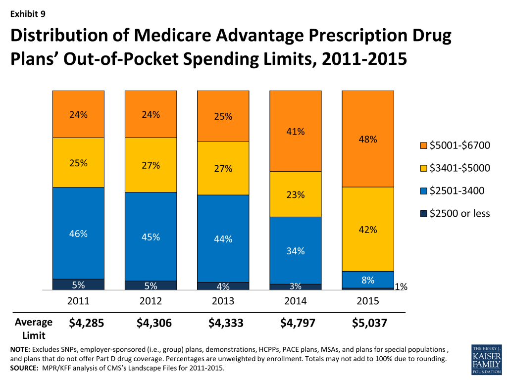
In 2015, out-of-pocket limits for MA-PDs will be higher, on average, than in 2014, increasing by 5 percent, on average, from $4,797 in 2014 to $5,037 in 2015, continuing the trend in rising out-of-pocket limits observed over the past few years (Exhibit 9). The share of MA-PDs that limit out-of-pocket expenses to $3,400 or less has decreased from 51 percent in 2011 to 9 percent in 2015. In contrast, almost half (48%) of plans will have limits above $5,000 in 2015, up from 24 percent in 2011.
Exhibit 9: Distribution of Medicare Advantage Prescription Drug Plans’ Out-of-Pocket Spending Limits, 2011-2015
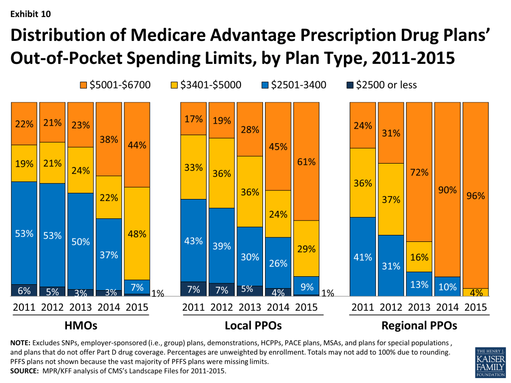
Average out-of-pocket limits vary by plan type, but across all plan types, out-of-pocket limits have increased over the past few years (Exhibit 10). Out-of-pocket spending limits exceed $5,000 for virtually all regional PPOs (96%), 61 percent of local PPOs, and a smaller share of HMOs (44%). However, most HMOs (92%) will have limits above $3,400 in 2015, up from 60 percent in 2014. Similarly, 90 percent of local PPOs and 100 percent of regional PPOs will have limits above $3,400 in 2015 (up from 69% and 90%, respectively, in 2014).
Exhibit 10: Distribution of Medicare Advantage Prescription Drug Plans’ Out-of-Pocket Spending Limits, by Plan Type, 2011-2015
If MA-PD enrollees stay in the same plan in 2014, out-of-pocket limits will increase an average of $170 (from $4,898 in 2014 to $5,068 in 2015). Enrollees in local PPOs will see the largest increase in out-of-pocket limits if they don’t switch plans ($323, on average), followed by regional PPO enrollees ($261, on average) with smaller average increases in out-of-pocket limits for HMO enrollees ($162, on average; Table A1). While the average out-of-pocket limit among Medicare Advantage plans has increased, it still is somewhat lower in 2015 than the limit that has been proposed for traditional Medicare under many Medicare reform proposals ($5,500).16 However, increases in out-of-pocket limits over time mean that beneficiaries enrolled in Medicare Advantage plans have less protection against high out-of-pocket costs than beneficiaries with Medigap plans.17
Prescription Drug Coverage
Traditional Medicare did not offer an outpatient prescription drug benefit prior to 2006, and Medicare Advantage plans were an important source of prescription drug coverage for Medicare beneficiaries. While many plans offered some coverage for prescription drugs prior to 2006, beginning in 2006, all beneficiaries had access to a prescription drug plan, either through free-standing prescription drug plans (PDPs) or a Medicare Advantage plan that included drug coverage (MA-PD).
The initial design of the Medicare drug benefit included a coverage gap, or “doughnut hole,” which required beneficiaries with relatively high drug costs to pay 100 percent of their expenses in the coverage gap until they qualified for catastrophic protection. The ACA gradually closes the doughnut hole and eliminates the gap by 2020. In 2015, beneficiaries will be responsible for no more than 45 percent of the cost of brand-name drugs and 75 percent of the cost of generic drugs in the gap.
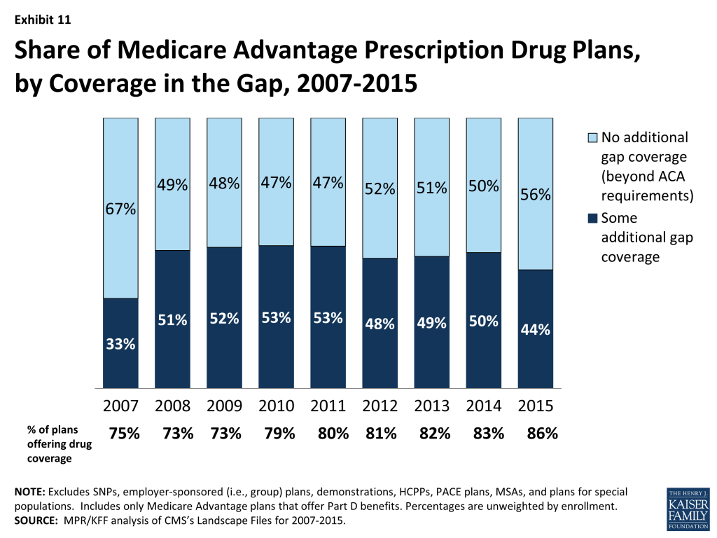
In 2015, eighty-six percent of Medicare Advantage plans will offer prescription drug coverage, up from 83 percent in 2014 and 75 percent in 2007 (Exhibit 11). Historically, Medicare Advantage plans without a drug benefit were developed to meet the needs of beneficiaries who may have access to other sources of prescription drug coverage, as well as those who for any other reason do not want to purchase such coverage.
Exhibit 11: Share of Medicare Advantage Prescription Drug Plans, by Coverage in the Gap, 2007-2015
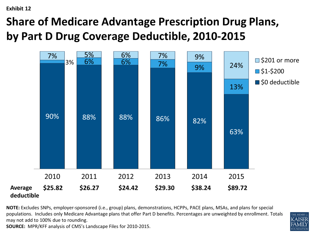
The standard design of the drug benefit also includes an initial coverage deductible of $320 in 2015. Plans can vary the benefit design as long as they provide cost-sharing that is at least actuarially equivalent to the standard benefit, and MA-PDs have historically had lower cost-sharing that may have helped to attract enrollees. In 2015, fewer plans in Medicare Advantage are designed to eliminate the deductible entirely (63% in 2015 versus 82% in 2014; Exhibit 12). This mirrors the trend in PDPs, although no deductible plans are still more common in Medicare Advantage plans than PDPs; 47 percent of PDPs have no deductible.18 In 2015, the average deductible for MA-PDs will be $89.72, up from $38.24 in 2014. Almost one-quarter (24%) of MA-PDs will have deductibles greater than $200 in 2015, an increase from 9 percent of MA-PDs in 2014. This increase in prescription drug deductibles could indicate that MA-PDs may be increasing cost-sharing for prescription drugs, since the deductible is the most visible part of cost-sharing; however, cost-sharing for plans needs to be analyzed in its totality, including cost-sharing for drugs as well as medical services, in order to draw conclusions.
Exhibit 12: Share of Medicare Advantage Prescription Drug Plans, by Part D Drug Coverage Deductible, 2010-2015
Less than half (44%) of MA-PDs will provide additional coverage in the Part D coverage gap in 2015, beyond that which is required by the ACA, down from 50 percent in 2014 (Exhibit 11). As in prior years, coverage in the Part D doughnut hole will vary by plan type, with a larger than average share of PFFS plans (62%), and a smaller than average share of HMOs (46%), local PPOs (39%), and regional PPOs (12%), providing additional coverage in the gap, beyond that which is required by the ACA (data not shown).
Quality Ratings
For many years, the CMS has posted quality ratings of Medicare Advantage plans to provide Medicare beneficiaries with additional information about plans offered in their area. All Medicare Advantage plans are rated on a 1 to 5 star scale, with 1 star representing poor performance, 3 stars representing average performance, and 5 stars representing excellent performance. The quality scores for Medicare Advantage plans are derived from plan and beneficiary information collected in three surveys – HEDIS®, CAHPS®, and HOS – and administrative data. For example, the performance measures include whether the plans’ enrollees received the appropriate screening tests, the number of complaints CMS received about the plan, and how enrollees rated the communication skills of the plans’ physicians. CMS assigns quality ratings at the contract level, rather than for each individual plan. This means that every Medicare Advantage plan covered under the same contract receives the same quality rating (and most contracts cover multiple plans).
In 2012, Medicare Advantage plans began receiving bonus payments based on quality ratings. These payments were initially established in the ACA and provided for bonus payments to plans that receive 4 or more stars and to unrated plans beginning in 2012. In addition to the bonus payments established by the ACA, CMS launched a demonstration for 2012 through 2014 that increased the size of bonuses for these plans, and also provided bonuses to plans rated as average (receiving 3 or 3.5 stars), using the same 1 to 5 star scale. In 2015, the bonus payments will revert back to those that were authorized under the ACA, and plans with 3 or 3.5 stars will not receive bonus payments. Beneficiaries can enroll in a plan with 5 stars at any time during the year, not just during the annual open enrollment period.
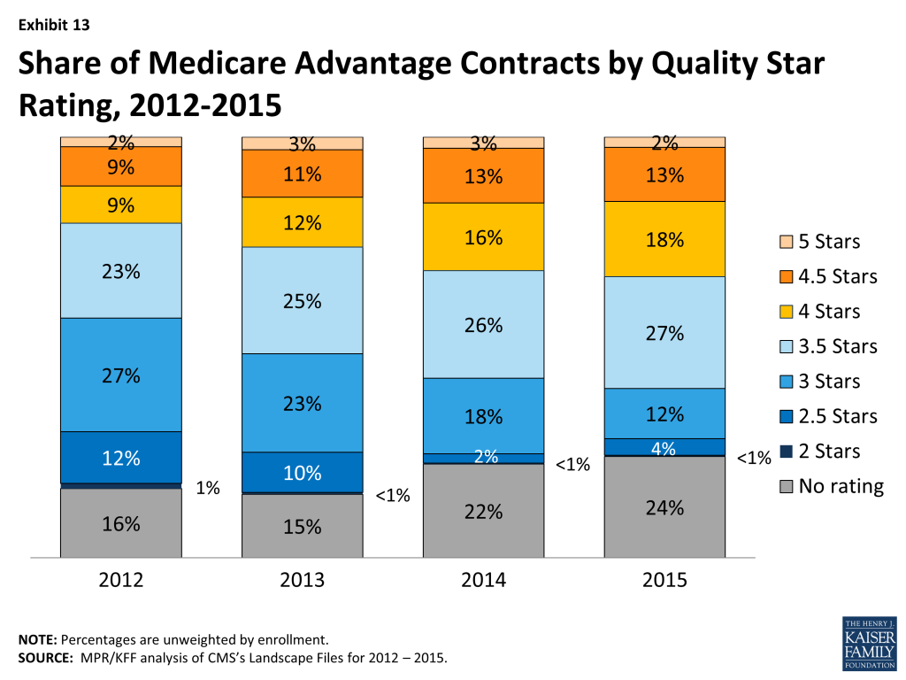
In 2015, one-third (33%) of Medicare Advantage contracts will have ratings of four or more stars, though just 2 percent of contracts attained the highest star rating – five stars (Exhibit 13). All of these Medicare Advantage contracts will qualify for bonus payments in 2015. Almost four in ten contracts (39%) will have average ratings (3 or 3.5 stars), and 4 percent of contracts will have below average ratings (2 or 2.5 stars) in 2015; almost one-quarter (24%) of contracts will be too new or have too few enrollees to be rated.
Exhibit 13: Share of Medicare Advantage Contracts by Quality Star Rating, 2012-2015
From the beneficiary perspective, the vast majority of Medicare beneficiaries (97%) will have access to at least one plan with four or more stars in 2015, an increase from about half (51%) in 2012 . This significant increase in access to plans with four or more stars is primarily due to Humana offering a regional PPO with four stars in most parts of the country.
The share of Medicare Advantage contracts with four or more stars has steadily grown since 2012, when the CMS bonus payment demonstration began, and has increased from one-fifth (20%) of plans in 2012. The increase in star quality ratings for plans during the CMS bonus demonstration could be attributed to many factors. Plans clearly responded to the financial incentives pertaining to quality-based ratings and bonuses in the ACA and demonstration, and over time, appear to have learned to modify their practices to maximize quality bonus payments. In addition, CMS has modified the methodology used for determining quality-based ratings; for example, they eliminated the normal distribution of ratings across plans, which had the effect of limiting the number of highly rated plans. It remains to be seen whether quality ratings will continue to improve.
Discussion
Medicare beneficiaries will continue to be able to choose from numerous Medicare Advantage plans and 95 percent of beneficiaries enrolled in Medicare Advantage in 2014 will be able to stay with the same plan unless they choose to switch to another. Markets are by nature unstable as they transition in response to competition. Over the past several years, the Medicare Advantage marketplace has been relatively stable, with relatively few plan exits that could cause disruption in coverage. Firms continue to offer diverse products and most beneficiaries have a choice of HMOs and PPOs, while fewer beneficiaries have access to PFFS plans. Medicare Advantage plans’ low premiums (relative to Medigap) and their ability to package traditional Part A and B benefits, prescription drugs, and some aspects of supplemental coverage into a single offering have proven popular both with insurers and a sizeable subgroup of Medicare beneficiaries.
Consistent with trends elsewhere in the health insurance market, premiums for Medicare Advantage plans are increasing. This change is greater when viewed in percentage terms than absolute dollar terms and is best viewed in conjunction with an analysis of benefits and out of pocket costs for services. While this brief does not examine details on the benefit and cost sharing requirements of Medicare Advantage plans, it documents the increase in out-of-pocket limits across plans, which exposes Medicare beneficiaries with relatively high costs to greater financial risk. Further work is needed to determine the changes in Medicare Advantage plan benefits in response to the ACA and their impact on enrollees’ actual out-of-pocket costs. The reality is that both traditional Medicare and Medicare Advantage plans face challenges in providing financial protection to beneficiaries.
This issue brief was prepared by Gretchen Jacobson and Tricia Neuman from the Kaiser Family Foundation, Anthony Damico (Independent Consultant), and Marsha Gold, Senior Fellow Emeritus of Mathematica Policy Research.
Appendix Tables
Table A1. Medicare Advantage Plan Market Entries and Exits, Average Monthly Premiums and Average Out-of-Pocket Spending Limits for Medicare Advantage Prescription
All Medicare Advantage Plans (MA-PD and MA-only plans)
All plans
HMO
Local PPO
PFFS
Regional PPO
Cost
MSA
2014 Plan Total
2,014
1,242
511
120
48
87
6
Total number of staying plans
1,636
1,048
388
68
43
83
6
Number of staying plans with no service area reductions
1,377
906
312
33
41
79
6
Number of staying plans with reduced service areas
147
79
46
22
–
–
–
Number of consolidating plans, post consolidation
112
63
30
13
2
4
Total number of departing plans
378
194
123
52
5
4
–
Number of plans departing due to consolidation
163
90
47
20
2
4
–
Number of terminating plans
215
104
76
32
3
–
–
Number of new plans
309
227
77
1
–
3
1
2015 Plan Total
1,945
1,275
465
69
43
86
7
Total Medicare Advantage enrollees, as of September 2014
10,930,426
7,425,556
1,886,009
292,971
966,165
348,328
11,397
Number of staying plans’ enrollees
10,450,594
7,183,221
1,710,614
251,723
945,311
348,328
11,397
Number of enrollees losing access to their plan
479,832
242,335
175,395
41,248
20,854
–
–
Average premiums of MA-PDs, weighted by 2014 enrollment
Premiums for all plans, 2014
$35.23
$26.56
$57.57
$46.32
$28.62
$109.09
N/A
Terminating plans, 2014
$51.51
$40.84
$64.96
$44.93
$75.47
N/A
N/A
Staying plans, 2014
$34.48
$26.08
$56.82
$46.54
$27.59
$109.09
N/A
2015 Premiums for remaining 2014 plans
$41.49
$31.84
$70.06
$53.45
$34.47
$112.13
N/A
Change in premiums for plans available in both 2014 and 2015
$7.01
$5.76
$13.24
$6.91
$6.88
$3.04
N/A
Share of enrollees in MA-PDs with no premiums, among plans available in both 2014 and 2015
2014
56%
67%
27%
28%
59%
1%
N/A
2015
44%
55%
14%
7%
42%
1%
N/A
Change in share of plans with no premiums
-13%
-12%
-14%
-21%
-17%
0%
N/A
Average premiums paid per enrollee, among MA-PDs with premiums (excluding zero premium plans) and available in both 2014 and 2015
2014
$79.23
$78.33
$78.04
$64.32
$67.68
$110.66
N/A
2015
$74.04
$70.33
$81.02
$57.19
$59.66
$113.25
N/A
Average out-of-pocket spending limits per year among MA-PDs, weighted by 2014 enrollment, among plans available in both 2014 and 2015
2014
$4,898
$4,689
$5,012
N/A
$6,389
N/A
N/A
2015
$5,068
$4,852
$5,335
N/A
$6,650
$3,359
N/A
Change in average out-of-pocket spending limits
$170
$162
$323
N/A
$261
N/A
N/A
Total MA-PD enrollees, as of September 2014
10,331,741
7,246,187
1,848,656
202,268
870,350
164,280
–
Number of staying MA-PDs’ enrollees
9,879,504
7,007,807
1,675,876
180,097
851,444
164,280
–
Number of enrollees losing access to their MA-PD
452,237
238,380
172,780
22,171
18,906
–
–
NOTE: Excludes Special Needs Plans (SNPs), demonstrations, Health Care Prepayment Plans (HCPPs), Program of All Inclusive Care for the Elderly (PACE) plans, employer-sponsored (i.e., group) plans, plans for special populations and plans that do not offer Part D benefits.
SOURCE: MPR/KFF analysis of CMS’s Landscape Files for 2014 and 2015 and CMS’s 2014 and 2015 Part C and D Crosswalk file and September 2014 enrollment.
Table A2. Average Number of Plans Available to Beneficiaries by County of Residence, 2009-2015
2009
2010
2011
2012
2013
2014
2015
National Average
48
33
24
20
20
18
18
Metro counties
51
35
26
22
22
20
20
Non-metro counties
36
24
16
13
13
11
10
Fee-for-Service Costs, by Quartile
Lowest cost quartile
45
28
18
17
17
17
15
Second quartile
46
31
20
17
16
15
14
Third quartile
44
30
20
17
18
16
16
Highest cost counties
53
37
30
24
24
21
22
NOTE:Excludes SNPs, employer-sponsored (i.e., group) plans, demonstrations, HCPPs, PACE plans, and plans for special populations.
SOURCE: MPR/KFF analysis of CMS’s Landscape and Penetration Files for 2009 – 2015.
Table A3. Unweighted Average Monthly Premiums for Medicare Advantage Prescription Drug Plans, by Plan Type, 2009-2015
2009
2010
2011
2012
2013
2014
2015
Change, 2014-2015
All Plans
$51.81
$55.86
$50.61
$49.80
$51.43
$51.47
$53.42
$1.95
HMOs
$34.52
$40.11
$36.24
$33.20
$34.11
$35.37
$38.28
$2.91
Local PPOs
$65.12
$70.17
$65.72
$69.14
$72.57
$74.92
$81.02
$6.10
PFFS plans
$74.46
$75.09
$65.79
$70.96
$83.29
$90.93
$87.86
-$3.07
Regional PPOs
$55.68
$59.29
$53.38
$55.64
$56.89
$59.30
$67.85
$8.55
NOTE: Excludes SNPs, demonstrations, HCPPs, PACE plans, employer-sponsored (i.e., group) plans, and plans for special populations. Premiums include plans with premiums as well as plans with no premiums. Cost plans are included in the total but are not shown separately.
SOURCE: MPR/KFF analysis of CMS’s Landscape Files for 2009-2015.
Table A4. Number of Medicare Advantage Plans Available, by Plan Type and Firm, 2009-2015
Table A6. Unweighted Average Monthly Premiums for Medicare Advantage Prescription Drug Plans, by Plan Type and Firm, 2014 and 2015
2014
2015
All
HMOs
Local PPOs
PFFS Plans
Regional PPOs
Cost Plans
All
HMOs
Local PPOs
PFFS Plans
Regional PPOs
Cost Plans
All Plans Combined
$51.47
$35.37
$74.92
$90.93
$59.30
$143.43
$53.42
$38.28
$81.02
$87.86
$67.85
$141.09
UnitedHealthCare
$10.92
$13.09
$3.57
$14.00
$2.86
N/A
$26.59
$26.23
$29.62
$43.00
$20.17
N/A
Humana
$48.33
$13.92
$66.20
$84.00
$83.26
N/A
$47.42
$18.73
$73.09
$93.90
$87.29
N/A
BCBS – Total
$70.92
$51.63
$89.26
$32.92
$27.10
$129.75
$76.14
$50.34
$108.93
$41.95
$53.03
$108.40
Wellpoint BCBS
$39.88
$12.32
$65.29
$35.00
N/A
N/A
$37.94
$12.14
$80.75
N/A
$61.50
N/A
Other BCBS plans
$81.17
$65.64
$96.95
$32.92
$21.83
$129.75
$85.57
$61.39
$114.35
$41.95
$36.10
$108.40
Kaiser Permanente
$49.21
$49.06
N/A
N/A
N/A
$50.05
$48.86
$47.50
N/A
N/A
N/A
$72.00
Aetna
$29.32
$22.36
$42.65
N/A
N/A
N/A
$37.68
$31.34
$47.46
N/A
N/A
N/A
WellCare
$37.34
$37.34
N/A
N/A
N/A
N/A
$7.10
$7.10
N/A
N/A
N/A
N/A
CIGNA
$22.72
$22.36
$35.00
N/A
N/A
N/A
$23.89
$23.34
$33.75
N/A
N/A
N/A
Other
$63.24
$44.94
$88.08
$92.09
N/A
$160.44
$61.72
$49.11
$90.15
$64.40
N/A
$148.04
NOTE: Excludes SNPs, demonstrations, HCPPs, PACE plans, employer-sponsored (i.e., group) plans, and plans for special populations. BCBS are BlueCross BlueShield affiliates, which includes Wellpoint BCBS plans. In 2015, Aetna includes plans acquired through the merger with Coventry. Total for 2014 includes 6 MSAs, and total for 2015 includes 7 MSAs. Premiums include plans with premiums as well as plans with no premiums. N/A indicates plan not available.
SOURCE: MPR/KFF analysis of CMS’s Landscape Files for 2014 and 2015.
Table A7. Number and Type of Special Needs Plans, by State, 2014 and 2015
State
2014
2015
Overall
Dual eligibles
Institutional
Chronic conditions
Overall
Dual eligibles
Institutional
Chronic conditions
Alabama
5
4
1
0
5
4
1
0
Alaska
0
0
0
0
0
0
0
0
Arizona
27
12
2
13
34
22
2
10
Arkansas
6
3
0
3
8
5
0
3
California
64
30
2
32
69
29
2
38
Colorado
8
4
3
1
8
4
3
1
Connecticut
2
1
1
0
3
2
1
0
Delaware
3
1
1
1
4
1
2
1
District of Columbia
5
3
1
1
7
3
2
2
Florida
130
71
11
48
92
49
4
39
Georgia
15
9
2
4
16
10
2
4
Hawaii
1
1
0
0
4
4
0
0
Idaho
1
1
0
0
1
1
0
0
Illinois
9
5
1
3
10
6
1
3
Indiana
7
2
1
4
8
3
1
4
Iowa
3
1
0
2
3
1
0
2
Kansas
2
1
0
1
2
0
1
1
Kentucky
5
3
0
2
10
6
0
4
Louisiana
12
9
0
3
14
10
0
4
Maine
0
0
0
0
3
3
0
0
Maryland
8
2
3
3
9
2
3
4
Massachusetts
10
6
3
1
10
6
3
1
Michigan
13
9
3
1
12
8
3
1
Minnesota
11
11
0
0
9
9
0
0
Mississippi
7
5
0
2
8
6
0
2
Missouri
11
6
1
4
10
4
2
4
Montana
0
0
0
0
0
0
0
0
Nebraska
1
0
0
1
1
0
0
1
Nevada
5
0
0
5
6
0
0
6
New Hampshire
0
0
0
0
0
0
0
0
New Jersey
9
3
4
2
8
3
4
1
New Mexico
10
6
2
2
7
4
2
1
New York
57
42
10
5
56
40
10
6
North Carolina
6
3
1
2
11
6
1
4
North Dakota
0
0
0
0
0
0
0
0
Ohio
18
11
3
4
18
11
3
4
Oklahoma
1
0
1
0
1
0
1
0
Oregon
10
6
3
1
12
7
4
1
Pennsylvania
21
10
6
5
21
10
6
5
Puerto Rico
17
12
1
4
16
12
0
4
Rhode Island
1
0
1
0
1
0
1
0
South Carolina
8
4
1
3
8
3
1
4
South Dakota
0
0
0
0
0
0
0
0
Tennessee
7
6
1
0
7
6
1
0
Texas
35
24
3
8
31
21
3
7
Utah
2
2
0
0
2
2
0
0
Vermont
0
0
0
0
0
0
0
0
Virginia
14
4
4
6
11
2
4
5
Washington
6
5
1
0
6
5
1
0
West Virginia
1
1
0
0
1
1
0
0
Wisconsin
17
14
2
1
19
15
3
1
Wyoming
0
0
0
0
0
0
0
0
Total, U.S.
560
347
61
152
548
339
57
152
NOTE: Columns do not sum to U.S. total because some SNPs overlap state boundaries.
SOURCE: MPR/KFF analysis of CMS’s Landscape Files for 2014-2015.
Plan specific information about cost-sharing requirements and benefits is at www.medicare.gov on the “Find Health and Drug Plan” database. However, this database does not include summary statistics on the characteristics of plans available nationwide or in particular areas. Further research is needed to assess changes in benefits and cost sharing among Medicare Advantage plans over time. ↩︎
A non-consolidating plan is one that is no longer available anywhere in the country and whose beneficiaries must find another Medicare Advantage plan, or switch to traditional Medicare. A consolidating plan is one that has merged with one or more other consolidating plans to form a plan newly-available in 2015, and whose 2014 MA enrollees will be automatically rolled over into that new post-consolidation plan. If two plans consolidate into one, then this analysis counts that as one departing plan. ↩︎
The primary goal of the Affordable Care Act (ACA) is to increase access to health care by expanding health insurance coverage, but another major thrust of the law is support for innovation in health care delivery and payment aimed at improving patient care and population health and reducing health care costs. The ACA-established Center for Medicare and Medicaid Innovation (Innovation Center) within the Centers for Medicare and Medicaid Services (CMS) is testing an array of alternative payment and service delivery models through numerous demonstration and pilot programs designed to lower costs for Medicare, Medicaid, and the Children’s Health Insurance Program (CHIP) while maintaining or improving the quality of care for beneficiaries.1 This fact sheet provides an overview of one of these programs – the State Innovation Models (SIM) initiative.
What is SIM?
The State Innovation Models (SIM) initiative provides federal grants to states, under cooperative agreements, to design and test innovative, state-based multi-payer health care delivery and payment systems. The distinctive purpose of the SIM initiative is to test whether new models with potential to improve care and lower costs in Medicare, Medicaid, and CHIP will produce better results when implemented in the context of a state-sponsored plan that involves multiple payers, broader state innovation, and larger health system transformation to improve population health.2 A premise of the SIM initiative is that states have important policy and regulatory authorities and the ability to convene a broad array of public and private stakeholders – means that can be used to leverage the development of initiatives in which multiple payers participate, potentially enhancing their effectiveness.
In 2012, the CMS Innovation Center invited states to submit SIM proposals for a first round of Model Design or Model Testing awards. Under the terms of the SIM initiative, state proposals must be sponsored and submitted by the Governor’s office.
Model Testing awards. Round One Model Testing awards were intended for states with fully developed proposals for state-wide health system transformation. They provide funding for states to implement their State Health Care Innovation Plan, a document that describes their state’s vision and model for health system transformation and the full range of levers and strategies the state intends to use to implement, test, and evaluate its model. In announcing the SIM funding opportunity, CMS stated that it would give preference to state proposals that relied on already-existing CMS approaches, such as Medicare Shared Savings Accountable Care Organizations (ACOs), Medicaid health homes, and/or bundled or episode-based payment. Model Testing proposals are evaluated based on state commitment to and rationale for system transformation, and on the proposed models’ potential to improve care and health for Medicare, Medicaid, and CHIP beneficiaries and reduce program costs. States’ Model Testing proposals were required to meet the following requirements among others:
estimate the proposal’s anticipated cost savings, specifically for Medicare, Medicaid, and CHIP;
provide an evidence base for the state’s approaches;
describe how community health and prevention would be integrated;
describe coordination with other initiatives in the state; and
specify procedures for data collection, performance monitoring, and reporting.
Model Design awards. The purpose of the Model Design awards was to provide support for states to create State Health Care Innovation Plans. In addition to outlining the state’s proposed approach to system transformation, Innovation Plans also had to indicate how the state’s initiatives would coordinate with or build on other initiatives sponsored by CMS or other HHS agencies. To receive a Round One Model Design award, states had to commit to completing their Innovation Plan and applying for a Model Testing award (or, if not yet ready, another Model Design award) in a second round of SIM funding.
In February 2013, the Innovation Center awarded a total of nearly $300 million in Round One SIM grants to 25 states for Model Testing, Model Pre-Testing, or Model Design (Figure 1). Six states – Arkansas, Maine, Massachusetts, Minnesota, Oregon, and Vermont — received a total of $250 million in Model Testing awards to implement and test their Innovation Plans over 42 months. CMS determined that some Model Testing applicants were not yet ready for a Model Testing grant, but awarded three of them – Colorado, New York, and Washington — a total of $4 million in Model Pre-Testing awards to refine their Innovation Plans over six months. Sixteen states received Model Design awards totaling $31 million to plan and develop Innovation Plans over six months.3 Each state that received a SIM award is expected to develop an evaluation plan that includes monitoring all populations and payers involved in the state’s initiative. In addition, the Innovation Center will conduct a national evaluation focused on Medicare, Medicaid, and CHIP enrollees that will assess each state’s model and also compare state models.4
Figure 1: State Innovation Models (SIM) Round One Awards
The rest of this brief focuses on key dimensions of the approaches in the six Round One Model Testing states, which are furthest along in implementing multi-payer reforms.
What approaches are the Model Testing states taking?
The Innovation Plans in the Model Testing states have key commonalities but also vary in their approaches to delivery system and payment reform. All six Model Testing states include Medicaid, CHIP, and commercial payers in their Innovation Plans. All of them also include or plan to include Medicare. Oregon is including its state employee plan as well (Table 1).
Table 1: Participating Payers in SIM Model Testing States
State
Medicaid/CHIP
Medicare
Public Employees
Commercial Payers
Arkansas
x
x
x
Maine
x
x
x
Massachusetts
x
x
x
Minnesota
x
x
x
Oregon
x
x
x
x
Vermont
x
x
x
SOURCE: Centers for Medicare & Medicaid Services; project narratives from Round One SIM applications; State Innovation Models and other SIM resources.
The States’ approaches expand the role of primary care and integrated care models. Most Model Testing states use an enhanced primary care model, such as patient-centered medical homes (PCMH), as the foundation of their delivery system transformation (Table 2). Enhanced primary care models focus on care coordination and patient-centered care management, and involve linkages between primary care and services such as specialty care, behavioral health care, and public health and community resources (Table 3). In states with integrated delivery systems, these enhanced primary care models may be embedded in ACOs, Accountable Communities, or other arrangements in which health care providers share financial risk and responsibility for the health of a defined population. Some Model Testing states are also creating new workforce models that include team-based care and non-traditional health care workers, such as Community Health Workers or Peer Wellness Specialists who connect patients to community resources, provide wellness coaching, and are part of care teams.
Table 2: Delivery System Features in SIM Model Testing States
State
Patient-Centered Medical Homes (PCMH)
Health Homes
Behavioral Health Homes
Accountable Care Organizations (ACO)
New Workforce Models/Team-Based Care
Arkansas
x
x
x
Maine
x
x
x
x
x
Massachusetts
x
x
Minnesota
x
x
x
Oregon
x
x
x
Vermont
x
x
SOURCE: Centers for Medicare & Medicaid Services; project narratives from Round One SIM applications; State Innovation Models and other SIM resources.
Table 3: Care Linkages in SIM Model Testing States
State
Primary Care & Specialty Care
Primary Care & Behavioral Health
Primary Care & Long-Term Care
Primary Care & Public Health
Primary Care &Community Organizations/ Social Services
Primary Care & Oral Health
Arkansas
x
Maine
x
x
x
x
x
Massachusetts
x
x
x
Minnesota
x
x
x
x
x
Oregon
x
x
x
x
x
x
Vermont
x
x
x
x
SOURCE: Centers for Medicare & Medicaid Services; project narratives from Round One SIM applications; State Innovation Models and other SIM resources.
Most Innovation Plans involve an emphasis on improving care for high-risk, high-cost populations. Arkansas and Maine, for example, are using Medicaid health home, or health home-type models, which coordinate care among providers for individuals with multiple chronic conditions (Table 2). Maine is also using behavioral health homes and practice-based “community care teams,” which are teams of health care workers within medical homes that manage the care of high-risk, high-cost patients, including linking them to community-based services.
All six Model Testing states are using multiple payment models (Table 4). For example, payers included in Arkansas’ and Minnesota’s SIM programs will make per-member-per-month (PMPM) payments to medical homes, health homes, or both, to coordinate care for patients. The extra payments help to finance ongoing operational expenses associated with care coordination and case management, as well as practice transformation tools, technology, and services. Payers in both states are also testing shared savings models to reward providers for quality performance and control of cost growth, as well as episode-based payment or prospective payment for certain services or health conditions.
Table 4: Payment Models in SIM Model Testing States
State
Per-Member-Per-Month (PMPM) Payment
Shared Savings
Shared Savings and Risk
Episode-Based/Bundled Payment
Prospective Paymentor Partial/ Global Capitation
Bonus Payments
Arkansas
x
x
x
Maine
x
x
x
Massachusetts
x
x
x
Minnesota
x
x
x
x
Oregon*
x
x
x
x
x
x
Vermont
x
x
x
x
x
*Each CCO in Oregon may choose its own alternative provider payment methodologies.SOURCE: Centers for Medicare & Medicaid Services; project narratives from Round One SIM applications; State Innovation Models and other SIM resources.
A key purpose of the alternative payment models is to change provider financial incentives. States are using various approaches that tie provider payment to performance rather than volume. Performance-based payment models range from financial bonuses to providers who meet specified benchmarks to arrangements that place providers at financial risk based on their performance relative to quality and cost goals. For example, payers in Massachusetts are offering bonus payments to providers who demonstrate quality primary care performance. Payers in all six Model Testing states are using models in which providers share in payer savings (and sometimes losses) based on how their performance measures up against pre-set quality and cost-containment targets.
Payers in Arkansas and Vermont are using forms of bundled payment, including episode-based payments and case rates. An alternative to fee-for-service (FFS) payment, bundled payment refers to a single payment to a provider or group of providers (who may work in multiple settings) for all services involved in an episode of care or the treatment for a specific condition (e.g., a hospitalization and related follow-up care for heart surgery). The providers share financial accountability for the entire episode or treatment and thus have incentives to contain costs by improving patient care and thereby reducing avoidable hospital admissions or readmissions. Payers in Maine’s SIM initiative plan to evolve their ACO payment system to increase provider accountability over time, moving from shared savings to shared savings/risk, and eventually to partial capitation (fixed monthly payment for a defined set of services and FFS for other services) or global capitation. Under Oregon’s Innovation Plan, each payer may choose its own provider payment methodologies.
States testing payment models that involve provider financial risk usually calibrate providers’ financial exposure to their capacity to bear risk. For example, their models may call for providers in less integrated systems, who have limited leverage to manage the overall care of patients, to share in savings only, while providers in more integrated systems with collective accountability and greater risk-bearing capacity share in both savings and losses.
What does SIM mean for Medicaid?
Improving care and reducing costs in Medicaid are key goals of the SIM initiative. States are using multi-payer collaborations to leverage greater impacts from existing Medicaid innovations, such as Minnesota’s Medicaid ACOs and Maine’s Medicaid health homes, for both Medicaid and other payers. States are also capitalizing on other payers’ innovations, such as Medicare’s bundled payments for care improvement, to benefit Medicaid. The coordinated participation of multiple payers in state delivery system and payment reforms enhances the potential of these efforts to strengthen the role of primary care, foster more integrated care for high-need, high-cost beneficiaries, and drive improvement in quality and outcomes in Medicaid.
Although experience in the Model Testing states is still limited, three of the Model Testing states – Oregon, Maine, and Vermont – have begun to release quarterly progress reports on the implementation of their Innovation Plans.5 All three states have reported being on-track or surpassing their first-year goals.6 Furthermore, Oregon has reported that all its Coordinated Care Organizations (CCO) —the states ACOs – made progress on some measures of care improvement and that, overall, the CCOs slowed growth in per capita Medicaid spending.7 States have also faced challenges in designing, implementing, and testing their Innovation Plans. Securing payer and provider collaboration can be difficult, and building consensus on goals, methods, and metrics can be challenging. In addition, even within states, payers and providers have different capacities to innovate and collaborate, to which states must tailor their goals and strategies.8
The Innovation Center is expected to provide up to $730 million in Round Two SIM grants in Fall 2014. Up to $700 million will be used to fund up to 12 Model Testing awards and the remainder will fund up to 15 Model Design grants.9 Both the existing SIM programs and the new ones may benefit from another CMS effort, the recently launched Innovation Accelerator Program (IAP). The IAP, a collaboration involving CMS’ Center for Medicaid and CHIP Services, Innovation Center, Medicare-Medicaid Coordination Office, and other federal offices, was created to provide states with resources and technical assistance in areas such as data analytics and adoption of common quality metrics, and opportunities for state-to-state learning, to support Medicaid-focused delivery system and payment reforms, aligned with efforts in Medicare and the commercial market.10
The SIM Round Two Funding Opportunity Announcement refers to Round One’s three Model Pre-Test states and 16 Model Design states collectively as 19 Model Design states. ↩︎
A new Kaiser Family Foundation report finds that funding for global malaria control and elimination activities has risen from US$871 million in 2005 to US$2.6 billion in 2013. However, total funding is significantly below US$5.1 billion, the goal set by the Global Malaria Action Plan, which is a framework endorsed by world leaders in 2008 to reach global malaria reduction targets.
Additionally, support for malaria research and development (R&D) activities in 2013 was estimated to be US$549 million, below the estimated annual need of US$750-900 million and the lowest level of funding since 2010.
The Global Fund to Fight AIDS, Tuberculosis and Malaria is the largest source of funding for malaria in the world, providing 40 percent of total available resources in 2013, followed by the United States (26%), and domestic resources (20%). For R&D, the largest funder was the U.S. National Institutes of Health (25% in 2013), followed by the Bill & Melinda Gates Foundation (22%).
The full analysis is available on the Kaiser Family Foundation’s website.
Since the establishment of global malaria incidence and mortality reduction targets in the Millennium Development Goals (MDGs) in 2000, significant progress has been made in addressing the global malaria epidemic. Between 2000 and 2012, global malaria incidence rates are estimated to have decreased by 25% and mortality rates by 42%, and more than 30 countries are actively pursuing malaria elimination. Despite this progress, however, there were approximately 207 million malaria cases and 627,000 deaths in 2012, and close to 100 countries have ongoing malaria transmission. In addition, approximately half the world’s population remains at risk for malaria.1 As such, it is unclear whether global malaria control targets set out by the World Health Organization (WHO) and the Roll Back Malaria (RBM) Partnership, including reducing malaria cases by 75% and malaria deaths to near zero by the end of 2015, will be reached.2,3,4
Critical to reaching global malaria targets is adequate funding. The Global Malaria Action Plan (GMAP), released by Roll Back Malaria in 2008 as a framework to guide malaria control efforts through 2015, estimated that funding would need to reach an average of US$5.1 billion annually between 2011 and 2020 in order to reach malaria control and elimination targets. Additionally, GMAP estimates that funding for malaria research and development (R&D) would need to reach at US$750-900 million annually between 2008-2018.5
This report provides an analysis of malaria funding trends for control and elimination and R&D activities over time compared to the estimated need presented in the GMAP. It also looks ahead to assess projected funding availability. The report is based on analysis of data obtained from the United States (U.S.) government; the Global Fund to Fight AIDS, Tuberculosis and Malaria (Global Fund); the Organisation for Economic Co-operation and Development (OECD) Development Assistance Committee (DAC); WHO; Policy Cures; and the Bill & Melinda Gates Foundation (Gates Foundation) (see Methodology for more information). The analysis is timely as the global community is in the process of evaluating progress on the MDGs, and looks beyond 2015 to set new and updated malaria targets.6,7 As it finds, while funding for malaria has risen significantly over time, it is far below estimated need and the gap is significant.
Key Findings Include:
Global Funding for Malaria Control and Elimination:
In 2013, funding for malaria control reached US$2.6 billion, its highest level to date.
Approximately two-thirds of all funding for malaria control is concentrated among just two donors: the Global Fund, which is the single largest source of malaria funding, accounting for 40% (US$1.0 billion) of funding in 2013, and U.S. bilateral funding (US$675 million, 26%). The next largest source, domestic resources provided by malaria-affected countries, accounts for one-fifth of funding (US$527 million, 20%), followed by the United Kingdom (U.K.) (US$179 million, 7%), and the World Bank (US$71 million, 3%).
Funding for malaria control has increased significantly over the past decade, rising three fold between 2005 and 2013, (from US$871 million in 2005 to US$2.6 billion in 2013), largely due to the creation of the Global Fund. Recent increases, however, have slowed.
Global Funding for Malaria R&D:
In 2013, funding for malaria R&D activities totaled US$549 million. This represents a decrease of US$38 million (7%) from 2012 levels and the second consecutive year of declines in R&D funding for malaria.
The U.S. National Institutes of Health (NIH) accounted for the largest share (25%) of funding for malaria R&D activities followed by the Gates Foundation (22%), the pharmaceutical and biotechnology industry (15%), the U.K. Department for International Development (DFID) (5%), and the Wellcome Trust (5%).
Global Funding Gap & Looking Ahead:
Despite significant increases over the past decade, total funding for malaria control activities is significantly below the GMAP’s estimated annual need of US$5.1 billion. Similarly, support for malaria R&D programs was also below the estimated annual need (US$750-900 million).
While funding levels for malaria control activities beyond 2013 are not yet known for all funding sources, projected data are available from the U.S. and the Global Fund, the two largest funders for malaria efforts, and both are projected to increase their funding in the next several years. However, even with these increases, projected funding would only reach US$3.0 billion in each year between 2014 and 2016, still leaving a gap of more than US$2 billion. In addition, the concentration of malaria funding from these two donors makes funding highly dependent on their future funding trajectories.
While projections of future funding levels are not available for malaria R&D activities, if the funding declines of the past two years continue, the gap between estimated need and available resources will increase.
Taken together, these estimates indicate that unless significant additional resources are provided, this gap cannot be filled. As the global community meets to decide on updated malaria control targets and funding needs, it will be critical to assess where resources are likely to come from, particularly given the large gap identified here.
Report: Introduction
Since the establishment of global malaria incidence and mortality reduction targets (see Box 1), significant progress has been made in addressing the global malaria epidemic. Between 2000 and 2012, the WHO estimates that global malaria incidence rates decreased by 25% and mortality rates decreased by 42%, saving an estimated 3.3 million lives, with more than 30 countries actively pursuing malaria elimination. Despite this progress, approximately 207 million malaria cases and 627,000 deaths occurred in 2012, and close to 100 countries report ongoing malaria transmission. Approximately half the world’s population remains at risk for malaria making it unclear whether global malaria targets set out by the WHO and RBM, including reducing malaria cases by 75% and malaria deaths to near zero by the end of 2015, will be reached. 8,9,10,11
Box 1: Global Malaria Reduction Targets
The global community has established multiple targets and objectives over time to guide efforts to address malaria. These targets and objectives, which form the basis of estimated funding needs, include:–Millennium Development Goal (MDG) 6, 2000: Combat HIV/AIDS, Malaria and Other Diseases
Target 6.C: Have halted by 2015 and begun to reverse the incidence of malaria and other major diseases.
World Health Assembly Target, 2005
Reduce malaria cases by 75% between 2000 and 2015.
Roll Back Malaria (RBM) GMAP, 2008/2011:
Endorsed WHA target of reducing malaria by 75% between 2000 and 2015;
Reduce global malaria deaths to near zero by end 2015; and
Eliminate malaria by end 2015 in 8-10 new countries (since 2008).
Sources: United Nations, Millennium Development Goals, 2000; WHO, Fifty-Eighth World Health Assembly: Resolutions and Decisions Annex, May 2005; Roll Back Malaria, The Global Malaria Action Plan: For a malaria-free world, September 2008; Roll Back Malaria, Refined/Updated GMAP Objectives, Targets, Milestones and Priorities Beyond 2011, June 2011.
Critical to reaching global malaria targets is adequate funding. The GMAP, released by RBM in 2008 to provide a global framework for guiding malaria control efforts through the end of 2015, estimated that funding would need to reach an average of US$5.1 billion annually between 2011 and 2020 in order to reach global targets.12 Funding for malaria control and elimination supports efforts to prevent infection, including the provision of insecticide-treated bed nets (ITNs), indoor residual spraying (IRS), and intermittent preventive treatment in pregnancy (IPTp), as well as the treatment of infection, including antimalarial drugs such as artemisinin-based combination therapy (ACT).
Funding needs for malaria R&D, which supports the development of new diagnostics, vector control products, vaccines, and treatment, were estimated at US$750-900 million annually between 2008-2018.13 As the global community evaluates progress on the MDGs, and looks beyond 2015 with concurrent efforts to update the GMAP and develop a global technical strategy for malaria, this report provides an analysis of malaria funding trends over the past decade by funding source (see Box 2), and looks ahead, to assess projected funding availability relative to need.14,15
Box 2: Sources of Funding for Malaria
This report highlights four major funding streams for malaria: donor governments, multilateral organizations, domestic resources, and the private sector.
Donor Governments: Provide direct funding to support malaria programs in affected countries, make contributions to multilateral organizations that in turn support malaria activities, and provide funding for research and development activities.
Multilateral Organizations: Provide assistance for malaria using pooled funds from member contributions and other means. Contributions to multilateral organizations are usually made by governments, but can be provided by private organizations and individuals, as in the case of the Global Fund. Some multilateral organizations are designed to address specific issues (such as the Global Fund, which also finances HIV and TB efforts as well as related health systems improvements), while other multilateral organizations that are not specifically designed to address malaria, may include malaria activities within their broader portfolio (such as the World Bank).
Domestic Resources: Including both spending by country governments that also receive international assistance for malaria and by households/individuals within these countries, represent a significant and critical part of the response.
Private Sector & Public-Private Partnerships: Foundations (charitable and corporate philanthropic organizations), corporations, faith-based organizations, and international non-governmental organizations (NGOs) provide support for malaria activities in recipient countries not only in terms of funding, but through in-kind support; commodity donations; and co-investment strategies with government and other sectors. Public Private Partnerships (PPPs) include initiatives such as the Affordable Medicines Facility-malaria (AMFm), an innovative financing mechanism developed to increase access to ACTs through the provision of highly subsidized prices. First created in 2009 and housed at the Global Fund, it received funding from donors and worked primarily through the private sector. In 2012, the AMFm was transitioned into the core grant management and financial processes of the Global Fund and renamed the Private Sector Co-payment Mechanism.
This report includes analysis of funding for malaria control and R&D activities based on data obtained from the U.S. government; the Global Fund; the OECD DAC; WHO; Policy Cures, an independent research organization that tracks funding for global health research and development activities; and the Gates Foundation (see Methodology for more information). All data are provided in current US dollars. Detailed data by source and year are provided in an Appendix.
Report: Findings
Global Funding for Malaria Control & Elimination
Total funding for malaria control and elimination provided by donor governments, multilateral organizations, and domestic sources was estimated to be US$2.6 billion in 2013. Approximately two thirds of all funding for malaria control is concentrated among just two donors: the Global Fund, which is the single largest source of malaria funding, accounting for 40% (US$1.0 billion) of funding in 2013 and the U.S. (US$675 million, 26%), primarily through its bilateral President’s Malaria Initiative (PMI).16 The next largest source, domestic resources provided by malaria-affected countries, accounts for one-fifth of funding (US$527 million, 20%), followed by the U.K. (US$179 million, 7%), and the World Bank (US$71 million, 3%) (see Figure 1). Together, these five sources accounted for 97% of all funding for malaria control activities (see Box 2 for a description of funding sources).
Figure 1: Funding Source as a Share of Total Resources for Malaria Control, 2013
Funding in 2013 represents an increase of more than US$100 million, or 4%, over 2012 levels. In general, funding has grown significantly over the past decade, increasing from US$871 million in 2005 to US$2,581 million in 2013, a three-fold increase. In recent years, however, increases have been much smaller: between 2005 and 2009, funding increased by US$1.39 billion, compared to an increase of US$0.31 billion between 2009 and 2013 (see Figure 2).[endnote 137075-5]
Figure 2: Global Funding for Malaria Control, 2005-2013
Most of the growth since 2005 can be attributed to the Global Fund, first created in 2002 and which quickly has grown to become the single largest source of malaria funding in the world, and to funding from the U.S. government; the Global Fund accounted for 43% of the growth over the period and the U.S. accounted for 33%. Combined funding increases from all other sources accounted for 24% of the growth over the period. As a result, the combined share of total resources provided by the Global Fund and the U.S. has increased, rising from 48% in 2005 (35% from the Global Fund and 13% from U.S.) to 67% in 2013 (40% from the Global Fund and 26% from the U.S.) (see Figure 3).
Figure 3: Distribution of Funding for Malaria Control, by Source, 2005-2013
While domestic funding demonstrated an overall increase between 2005 and 2013 (rising from US$436 million in 2005 to US$527 million in 2013), it has declined in recent years from its peak of US$598 million in 2011. Additionally, it has declined as a share of total resources from 50% in 2005 to 20% in 2013 as funding provided by the U.S. and the Global Fund has risen faster. Funding from the U.K. rose from US$35 million in 200717 to an estimated US$179 million in 2013, while funding from the World Bank grew from US$15 million in 2005 to a peak level of US$95 million in 2009 and has since declined to an estimated US$71 million in 2013.
Global Funding for Malaria R&D
According to data from Policy Cures, total funding for malaria research and development activities in 2013 was estimated to be US$549 million, a decrease of US$38 million compared to 2012 levels (US$587 million) and was at its lowest level of funding since 2010 (see Figure 4).[endnote 137075-7]
Figure 4: Global Funding for Malaria Research & Development, 2007-2013
The NIH accounted for the largest share (25%) of malaria research and development funding in 2013, followed by the Gates Foundation (22%) [the Gates Foundation also provides other funding for malaria (see Box 3)]. The third largest source of funding for malaria R&D is the pharmaceutical and biotechnology industry (15%), followed by DFID (5%), and the Wellcome Trust (5%), a charitable organization in the U.K. that supports biomedical research and the medical humanities (see Figure 5).
Figure 5: Donors as a Share of Total Funding for Malaria Research & Development, 2013
Box 3: The Bill & Melinda Gates Foundation
The Gates Foundation, founded in 2000, has grown to become a major funder of global health efforts and provides significant resources to support malaria control and eradication as well as R&D. We obtained data directly from the Foundation to estimate its total funding for malaria over time.
Cumulatively, the Gates Foundation has provided close to $2 billion between 2001 and 2013 for malaria efforts, not including contributions to the Global Fund (which supports HIV, TB, and malaria).
Funding in 2013 from the Gates Foundation reached US$192 million for combined malaria control and R&D efforts, which makes it one of the largest donors to malaria. The Foundation recently announced that it would be increasing its malaria spending by 30%.
Note: Gates Foundation data include funding for both malaria control and elimination and R&D activities (due to differences in reporting methodologies, the data presented here should not be used in conjunction with G-FINDER data to estimate Gates Foundation contributions to malaria control activities). Data do not include the Foundation’s contributions to the Global Fund which may in turn be used for malaria activities. See Methodology for additional information.–Sources: Analysis of data provided by the Gates Foundation; Bill & Melinda Gates Foundation, Gates Foundation Commits More than $500 Million to Tackle The Burden of Infectious Disease in Developing Countries, November 2014.
Global Funding Gap & Looking Ahead
Despite significant increases over the past decade, total funding for malaria control activities in 2013 was significantly below the GMAP’s estimated annual need of US$5.1 billion. Similarly, support for malaria R&D programs was also below the estimated annual need (US$750-900 million).18
While future funding levels for malaria control activities beyond 2013 are not yet known for all funding sources, projected data are available from the U.S. and the Global Fund, the two largest funders of malaria efforts. Both are projected to increase their funding in the next several years. The Global Fund has already allocated approximately US$4.3 billion for malaria in the period between 2014 and 2016 (US$1.4 billion annually), which would be a nearly US$400 million increase above 2013 levels.19 U.S. bilateral funding is projected to increase to US$693 million in 2014 (an $18 million increase), and US$701 in 2015 (an $8 million increase above 2014 levels).20 Based on these increases, and assuming funding from all other sources remains flat, total funding for malaria control would rise to US$3.0 billion in each year between 2014 and 2016 (see Figure 6). This would still leave a gap of US$2.1 billion. In fact, even if all other donors doubled their funding for malaria, there would still be a gap.
While projected funding levels are not available for malaria R&D activities, if the funding declines of the past two years continue, the gap between estimated need and available resources will increase.
Figure 6: Projected Global Funding for Malaria Control, 2005-2016
Separately, in its 2014 World Malaria Report, WHO has made future projections of malaria funding under two longer-term funding scenarios for 2020.21 The first scenario projects what would happen if malaria funding increased at the same rate as overall government expenditures are projected to increase. The second scenario adds to the first by projecting additional gains that would occur if donor governments met the official development assistance (ODA) target of 0.7% of Gross National Income, a global target first pledged by the United Nations General Assembly in 1970 and reaffirmed at subsequent international meetings.22 Despite these scenarios leading to increased funding for malaria, neither reaches the $5.1 billion estimated need. Scenario 1 results in a total funding estimate of US$3.8 billion in 2020 and Scenario 2 results in US$4.3 billion.
Report: Conclusion
Despite significant increases over the past decade, total funding for malaria control activities is significantly below the GMAP’s estimated annual need of US$5.1 billion. Similarly, support for malaria R&D programs was also below the estimated annual need (US$750-900 million).23 Projected funding levels, while increasing under different scenarios, also fall short of estimated need. Taken together, these findings raise significant questions and uncertainties about global malaria control and elimination efforts. As the global community meets to decide on updated malaria control targets and funding needs, it will be critical to assess where resources are likely to come from. First, unless significant additional resources are provided, this gap cannot be filled. Further, it is unclear where such resources could come from – beyond the U.S. and the Global Fund, other funding sources combined only account for about a third of total funding; they would have to more than double their share to fill the gap. Lastly, the concentration of funding from the U.S. and the Global Fund makes future funding highly dependent on, and therefore vulnerable to, their future funding trajectories. Unless significant additional resources are provided, this gap cannot be filled and it is unclear what this will mean for reaching global malaria targets and truly having a long lasting and deep impact on this disease.
Methodology
This report analyzes funding data for malaria control and elimination activities as well as R&D. All data are expressed in current (nominal) US dollars.
Malaria Control and Elimination. Funding data for malaria control and elimination activities were obtained from multiple sources including: the U.S. government; the Global Fund’s grant portfolio database; the WHO’s World Malaria Report 2014; and the OECD DAC Creditor Reporting System (CRS) database.
All funding data for malaria control and elimination activities represent disbursements, with the exception of U.S., which represents enacted funding amounts. A disbursement is the actual release of funds to, or the purchase of goods or services for, a recipient. Enacted amounts represent budgetary decisions that funding will be provided, regardless of the time at which actual outlays, or disbursements, occur. Data attributed to a donor include any earmarked (malaria-designated) amount, including earmarked contributions to multilateral initiatives such as the AMfm. Data do not include un-earmarked, general contributions to multilateral organizations, such as the United Nations or World Bank, which may in turn be used for malaria activities and are therefore attributed to the multilateral organization itself.
U.S. data include funding from the U.S. Agency for International Development (USAID), the Centers for Disease Control and Prevention (CDC), and the Department of Defense (DoD) and were obtained from the President’s FY 2015 budget request, Congressional appropriations bills and conference reports, federal agency budget and Congressional Justification (CJ) documents and operational plans, ForeignAssistance.gov (http://www.foreignassistance.gov/web/default.aspx), and through direct communication with the agencies and confirmed by the White House Office of Management and Budget (OMB). All U.S. totals represent funding for the specified fiscal year (the U.S. fiscal year runs from October 1-September 30). U.S. data for 2005 through 2014 are final funding levels. U.S. funding for 2015 was not yet finalized at the time of publication; U.S. data for 2015 are based on the President’s Budget Request.
Global Fund data for 2005 through 2013 were obtained from the Global Fund’s disbursement database (http://web-api.theglobalfund.org/) and represent funding provided during the calendar year (January 1-December 31). Projected funding levels for 2014 through 2016 are based on Global Fund reported planned allocations levels (http://www.theglobalfund.org/en/fundingmodel/allocationprocess/). It is important to note that actual allocations may differ due to final recipient country allocations across the three diseases.
Data for domestic resources were obtained from the WHO World Malaria Report 2014 (WMR). Domestic resources are based on financing data from national malaria control programmes (NMCPs).
Data were obtained from the OECD CRS database (http://stats.oecd.org/Index.aspx?datasetcode=CRS1) for the following donors: Australia, Austria, Belgium, Canada, Finland, France, Germany, Greece, Ireland, Italy, Japan, Korea, Luxembourg, Netherlands, New Zealand, Norway, Portugal, Spain, Switzerland, the United Kingdom, the European Commission (EC), the United Nations Children’s Fund (UNICEF), the World Bank, Kuwait, and the United Arab Emirates (UAE). The CRS database is based on the calendar year (January 1-December 31) and includes data through the 2012, the most recent year of available data. With the exception of the U.K., data for 2013-2016 for these donors assumes flat funding (excluding the U.K., these donors together accounted for approximately 7% of total malaria funding in 2012). In the case of the U.K., 2013 totals represent projected increases based on prior trends and official government documents; 2014 and 2015 totals assume flat funding.24,25
Research and Development: Data for R&D were obtained via special data request from Policy Cures, an independent research organization that has been tracking funding for global health research and development activities since 2007. This source was used because it is more comprehensive than the OECD CRS database, which does not include all donor funding for research and development activities, nor does it include funding from the private sector. R&D funding amounts included in this report are presented in nominal dollars and therefore, will not match data presented in Policy Cures’ annual G-FINDER Report and online database, which are presented in real (inflation adjusted) dollars.26
Gates Foundation: Data from the Gates Foundation were obtained through direct communication with the organization and include funding for both malaria control and research and development activities. Data for 2001 through 2008 are based on Gates Foundation internal reporting methodologies, while data for 2009 through 2013 are based on funding amounts reported by the Gates Foundation to the International Aid Transparency Initiative (IATI). Data do not include Gates Foundation’s contributions to the Global Fund which may in turn be used for malaria activities. In addition, data totals cannot be disaggregated into separate malaria control and elimination and R&D amounts, and due to differences in reporting methodologies, are not directly comparable to the data provided by Policy Cures on R&D activities.
Appendix
Global Funding for Malaria Control, 2005-2013
Source
2005
2006
2007
2008
2009
2010
2011
2012
2013
Global Fund
$308.2
$407.8
$350.9
$518.7
$1,014.0
$928.0
$620.9
$962.6
$1,043.4
United States
$110.4
$127.6
$285.9
$389.3
$424.0
$620.8
$655.5
$659.3
$675.0
Domestic Resources
$435.7
$473.6
$491.6
$493.1
$521.8
$555.6
$597.9
$520.9
$526.5
United Kingdom
–
–
$34.5
$34.0
$66.0
$140.6
$121.3
$146.7
$178.8
World Bank
$15.4
$12.8
$40.0
$37.0
$95.5
$71.7
$82.1
$70.6
$70.6
All Other Sources
$1.0
$20.5
$43.4
$90.7
$143.9
$138.1
$37.4
$109.5
$84.5
Total
$870.6
$1,042.3
$1,246.3
$1,562.9
$2,265.2
$2,454.6
$2,115.1
$2,469.5
$2,578.8
NOTES: “Domestic Resources” represents funding provided by malaria-affected countries. “All Other Sources” includes funding from all other donor governments and multilateral organizations not listed separately, and is based on analysis of their data reported to the OECD-DAC and of Global Fund reported contributions to the Affordable Medicines Facility-malaria (AMFm). The U.K. reported malaria funding to the OECD DAC for the first time in 2007. Decreased funding in 2011 was primarily due to a decline in disbursements from the Global Fund.SOURCES: Kaiser Family Foundation analysis of data from: the U.S. government; Global Fund to Fight AIDS, Tuberculosis and Malaria online data queries; OECD CRS online data queries; and WHO World Malaria Report 2014. See methodology for additional information.
The U.S. is also the single largest donor to the Global Fund, but contributions to the Global Fund are in turn used by the Global Fund to support HIV, TB, and malaria efforts. U.S. funding totals for malaria, therefore, do not include contributions to the Global Fund. See Methodology for additional information. ↩︎
The U.K. reported malaria funding to the OECD DAC for the first time in 2007. ↩︎
Roll Back Malaria, The Global Malaria Action Plan: For a malaria-free world, September 2008. ↩︎
These figures are based on Global Fund planned allocations but actual disbursement rates may vary and are also dependent on recipient country allocation decisions. For example, as of December 4, the Global Fund had disbursed US$714 million for malaria efforts for the year, below the planning annual average of $1.4 billion. ↩︎
For the U.S., 2014 amounts are final funding levels, 2015 is based on the President’s Budget Request, and 2016 assumes the same level of funding as 2015. ↩︎
United Nations, Resolution adopted by the General Assembly: 2626 (XXV). International Development Strategy for the Second United Nations Development Decade, October 1970. ↩︎
Roll Back Malaria, The Global Malaria Action Plan: For a malaria-free world, September 2008. ↩︎
The Kaiser Family Foundation, in partnership with the Peterson Center on Healthcare, today announced a new online hub dedicated to monitoring and assessing the performance of the U.S. health system.
The Peterson-Kaiser Health System Tracker provides comprehensive data on how the system is performing on critical quality and cost measures, offering clear, up-to-date information on relevant trends, drivers and issues. The Tracker also will illustrate how the United States is performing relative to other countries, and how different parts of the system are performing relative to one another. Regular in-depth insight briefs will delve into major issues, beginning with Assessing the Performance of the U.S. Health System, which presents an overview of trends in cost and outcomes and a detailed explanation of the Tracker’s purpose and approach. The site also will feature frequent blog posts synthesizing relevant research from a wide range of organizations.
The Health System Tracker is one of several initiatives of the new Peterson Center on Healthcare. Drew Altman, president and CEO of the Kaiser Family Foundation, is a member of the Peterson Center’s Advisory Board and today participated in a panel discussion about the Center at its launch event in Washington.
Health spending growth has consistently outpaced U.S. economic growth and is higher than medical spending in other wealthy countries. Despite spending more, the United States doesn’t have better health outcome in terms of life expectancy, mortality rates and other measures. This brief provides an overview of trends in health costs and the performance of the U.S. health system, including comparisons to countries from the Organisation for Economic Co-operation and Development (OECD). The brief charts growth in the nation’s per capita health spending along with the recent slowdown, touching on the roles of expanded Medicaid eligibility, increases in Medicare beneficiaries and the Affordable Care Act (ACA). Additionally, it discusses the health system’s effectiveness and capacity to provide services, including the accessibility and affordability of care.
The brief also introduces the Peterson-Kaiser System Tracker, an initiative of the Peterson Center on Healthcare and the Kaiser Family Foundation, and outlines its approach to gathering and synthesizing the latest research in these areas. The Tracker is an online information hub dedicated to monitoring and assessing the performance of the U.S. health system.
Read the brief on the Peterson-Kaiser System Tracker site.
This slideshow compares mortality rates in the United States and other industrialized countries for seven major causes of death. The data show that U.S. mortality rates for circulatory diseases and cancer have fallen in the past 30 years, driving a decline in the nation’s overall rate. However, mortality rates for leading causes of death other than cancer are higher in the United States than the average for comparable countries.
The slideshow is part of the Peterson-Kaiser Health System Tracker, an online information hub dedicated to monitoring and assessing the performance of the U.S. health system.