KFF designs, conducts and analyzes original public opinion and survey research on Americans’ attitudes, knowledge, and experiences with the health care system to help amplify the public’s voice in major national debates.
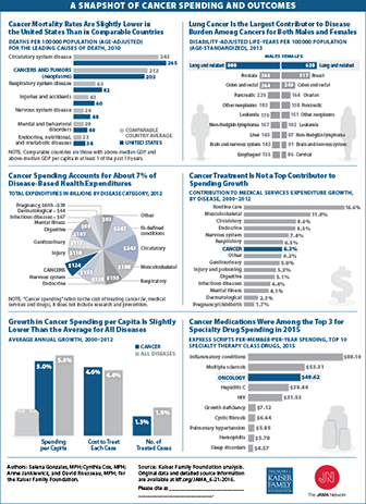
This Visualizing Health Policy infographic provides details on cancer spending and outcomes in the United States. The U.S. cancer mortality rate, 203 deaths per 100,000 population, was slightly lower than in comparable countries in 2010. Among cancers, lung cancer is the largest contributor to disease burden for both men and women. The United States spent $124 billion to treat cancer in 2012, which accounted for about 7% of the nation’s disease-based health expenditures. However, growth in cancer spending contributed slightly more than 6% to the nation’s medical services expenditure growth between 2000 and 2012, while the top 3 diseases contributed 36%. During that time, per capita spending on cancer increased 5%, which was slightly lower than the average for all diseases. Cancer medications were among the top three for specialty drug spending in 2015, behind medications for inflammatory conditions and multiple sclerosis.
This Visualizing Health Policy infographic provides details on cancer spending and outcomes in the United States. The U.S. cancer mortality rate, 203 deaths per 100,000 population, was slightly lower than in comparable countries in 2010. Among cancers, lung cancer is the largest contributor to disease burden for both men and women. The United States spent $124 billion to treat cancer in 2012, which accounted for about 7% of the nation’s disease-based health expenditures. However, growth in cancer spending contributed slightly more than 6% to the nation’s medical services expenditure growth between 2000 and 2012, while the top 3 diseases contributed 36%. During that time, per capita spending on cancer increased 5%, which was slightly lower than the average for all diseases. Cancer medications were among the top three for specialty drug spending in 2015, behind medications for inflammatory conditions and multiple sclerosis.
A Comprehensive Review of Research Finds That the ACA Medicaid Expansion Has Reduced the Uninsured Rate and Increased Access to Care in Expansion States
Multiple studies find that the Affordable Care Act’s Medicaid expansion has increased coverage, with enrollment exceeding expectations in some states, while producing budget savings for states and reductions in uncompensated care costs for hospitals, according to a Kaiser Family Foundation review of 61 studies and policy reports.
The literature review provides a useful reference on the effects of the ACA Medicaid expansion at a time when the future of the expansion – and the ACA more broadly — is a subject of debate in the presidential election and in Congress, and as some states that have not expanded Medicaid consider whether to do so. While most studies find that Medicaid expansion has improved access to care and use of services, studies of changes in health status have mixed results. Some studies also pointed to challenges following expansion, including provider shortages in some areas. Moreover, additional research will be important to assess the economic effects of state Medicaid expansions as states begin paying a small share of expansion costs and as cuts in federal payments for uncompensated care costs go into effect.
The brief is based on both peer-reviewed studies, government reports, and analyses by research and policy organizations between January 2014 and May 2016, using data from 2014 or later.
A Study of Medicare Advantage Plan Networks in 20 Counties Finds That Plans Include About Half of All Hospitals in Their Area
20 Percent of Plans Do Not Have An Academic Medical Center In-Network and 41 Percent Do Not Include their County’s National Cancer Institute-Designated Cancer Center
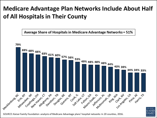
A Kaiser Family Foundation analysis of private Medicare plan networks finds that Medicare Advantage plans include about half of area hospitals in their network, on average, while one in five plans have no Academic Medical Center in-network. Among plans in an area with a National Cancer Institute-designated cancer center, more than two in five did not include the cancer center in their network.
The new study of the hospital networks of Medicare Advantage plans, which includes plan and firm-specific information for 409 plans in a geographically diverse sample of 20 counties in 2015, also finds that information about hospital networks is not readily available, sometimes inaccurate and rarely consumer friendly. More than 17 million of Medicare’s 57 million beneficiaries are enrolled in Medicare Advantage plans, and enrollment in the private plans is projected to reach 30 million by 2026.
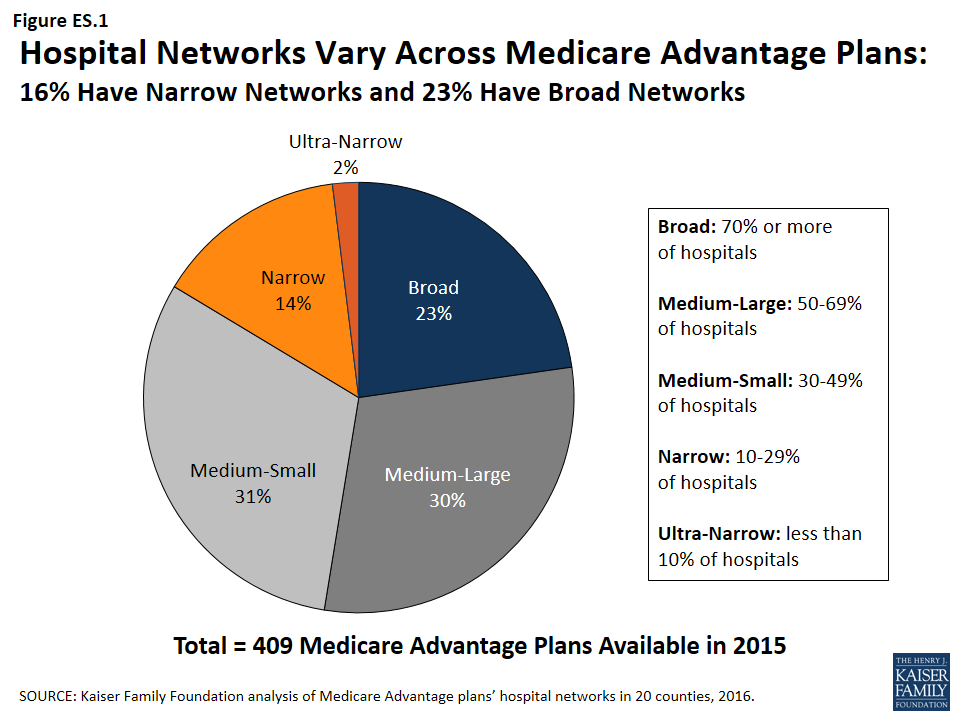
The analysis finds the size of hospital networks varies across Medicare Advantage plans. Almost a quarter of Medicare Advantage plans (23%) had broad networks, defined as including 70 percent or more of area hospitals, while about one in six plans (16%) had narrow networks, defined as those with fewer than 30 percent of hospitals in the county. Among HMOs, which comprise 75 percent of the plans in the study, premiums vary little by network size, with broad and narrow network plans having similar average monthly premiums of $37 and $36, respectively.
The majority of plans included at least one of their county’s Academic Medical Centers and one in five plans did not. Similarly, at least two in five (41%) Medicare Advantage plans did not include their county’s National Cancer Institute (NCI)-designated cancer center (among the counties with a cancer center). Academic Medical Centers are more likely to have physicians specializing in rarer conditions and complex medical conditions, and are more likely to conduct surgeries, such as heart surgery, for which better outcomes have been linked to higher volumes. Access to NCI cancer centers may be particularly relevant to beneficiaries with rarer cancers, more advanced-stage cancers, or other unique complicating conditions.
For Medicare Advantage enrollees who place a high value on access to a specific hospital in their area, the analysis underscores the importance of shopping carefully for a plan and the difficulties in doing so. Provider directories are not posted on the Medicare.gov “plan finder” tool, which is a government-sponsored resource to help consumers shop for plans available in their area. Provider directories obtained directly from the plans can be confusing or outdated. For instance, 11 of the 231 provider directories examined in this study included hospitals that had been closed or torn down.
A growing number of Medicare beneficiaries receive their care through HMOs and PPOs, known as Medicare Advantage plans; yet, little is known about the size and scope of the provider networks available to beneficiaries enrolled in these plans. Beneficiaries enrolled in Medicare Advantage plans can face significant expense if treated by an out-of-network provider, except in emergencies.
This report, the first broad-based study of Medicare Advantage networks, takes an in-depth look at plans’ hospital networks, examining their size and composition. The analysis draws upon data from 409 plans, including 307 HMOs and 102 local PPOs, serving beneficiaries in 20 diverse counties that together accounted for about one in seven (14%) Medicare Advantage enrollees nationwide in 2015. Key findings include:
On average, Medicare Advantage plan networks included about half (51%) of all hospitals in their county.
Most plans (80%) included an Academic Medical Center in their network, but one in five did not.
Two in five plans in areas with an NCI-designated cancer center did not include the center in their networks.
Almost one-quarter (23%) of Medicare Advantage plans in our study had broad hospital networks in 2015. About one in six plans (16%) had narrow or ultra-narrow networks (Figure ES.1).
In 9 of the 20 counties studied, none of the plans offered in 2015 had a broad network of hospitals within that county (Clark, NV; Cook, IL; Davison, TN; Harris, TX; Jefferson, AL; King, WA; Los Angeles, CA; Pima, AZ; and Salt Lake, UT).
Among HMOs, which comprised the majority of the plans in the study (75%), broad and narrow network plans had similar average premiums ($37 vs. $36 per month) and similar quality ratings (3.8 vs. 4.1 stars).
Figure ES 1: Hospital Networks Vary Across Medicare Advantage Plans: 16% Have Narrow Networks and 23% Have Broad Networks
People on Medicare often say that having access to specific doctors and hospitals is a high priority when choosing their Medicare Advantage plans. Yet, plan directories are often riddled with errors, omissions and outdated information that makes it difficult and sometimes impossible to tell which hospitals are included in-network – a finding that emerged over the course of this study.
Creating networks of providers is one of many strategies available to insurers to help control costs and manage the delivery of care. But narrower networks may also limit consumers’ access to certain providers or increase costs for care obtained out-of-network. For Medicare Advantage enrollees who place a high value on having access to a particular set of providers, or a broad range of providers, the findings underscore the importance of comparing provider networks during the Annual Election Period – a task that is easier said than done.
Report: Introduction And Study Focus
A growing share of Medicare beneficiaries receives their care through Medicare Advantage plans. Under such arrangements, plans offer an integrated benefit package that: combines Medicare Parts A and B, and usually also Part D; typically reconfigures cost-sharing; and often includes benefits not included in traditional Medicare.Medicare Advantage plans have proven increasingly popular with Medicare beneficiaries, partly because they offer “one stop shopping,” and their premiums are typically lower than the costs of stand-alone prescription drug plans combined with Medigap or other supplemental insurance. The number of Medicare beneficiaries enrolled in Medicare Advantage plans has more than tripled over the past decade, from about 5.3 million in 2005 to 17.6 million in 2016, and is projected to continue growing over the next decade.1
Despite the growth of the program, relatively little is known about size and scope of provider networks in Medicare Advantage plans. While beneficiaries in traditional Medicare can seek care from any provider participating in Medicare (virtually all hospitals and physicians), Medicare Advantage plans generally restrict coverage (except in emergencies) to affiliated network providers. Although practices vary, Health Maintenance Organizations (HMOs), the most common form of Medicare Advantage plan, generally require beneficiaries to receive care from a provider in the network in order to have the cost of the care covered. Beneficiaries enrolled in Preferred Provider Organizations (PPOs) can receive care from providers outside of their plan’s network and have the plan cover the cost of the care, but the cost-sharing for care received outside the network is typically higher than what beneficiaries would pay if they received the care from an in-network provider.
Beneficiaries can choose a plan or switch between Medicare Advantage and traditional Medicare once a year, during the annual open enrollment period between October 7 and December 15, and the change is effective beginning the following January 1. Medicare Advantage plans are allowed to change their networks at any time during the calendar year; beneficiaries are not allowed to change plans outside of the open enrollment period, unless they are granted an exception by the Centers for Medicare and Medicaid Services (CMS) if they had, for example, an ongoing existing relationship with a terminated provider.2
People on Medicare have said that when considering Medicare Advantage plans, access to certain hospitals and doctors is a top priority for them.3 Additionally, the structure of provider networks can influence the way in which beneficiaries access care, and network adequacy is one of the criteria used by CMS to evaluate plans before they are approved. CMS requires plans to include a specified number of doctors, hospitals, and other providers within a particular driving time and distance,4 but it is unclear how well these requirements are enforced. Further, according to CMS, Medicare Advantage plans have less prescriptive provider requirements than Qualified Health Plans (QHPs) or Medicaid Managed Care Organizations (MCOs), and are required to include fewer data elements in their provider directories.5
In a recent investigation, the Government Accountability Office (GAO) identified several serious deficiencies in CMS’s oversight and enforcement of network requirements for Medicare Advantage plans, and strongly recommended greater scrutiny of the plans’ networks.6 The GAO found that CMS reviews less than 1 percent of all networks and does little to assess the accuracy of the network data submitted by the plan. The GAO report found that CMS relies primarily upon complaints from beneficiaries and their caregivers to identify any problems with networks and does not assess whether plans that are renewing their current contracts continue to meet the network requirements.
This report is the first broad-based study of how provider networks are structured in Medicare Advantage. Although some historical work examined provider networks across different payers, these studies are old and relatively limited in the information they provide.7 More recent work has focused on health plans participating in exchanges under the Affordable Care Act (ACA), rather than Medicare Advantage. These more recent studies found that the scope of networks varies across the country, that some plans in the exchanges have networks that are substantially narrower than plans in the commercial markets, that HMOs have narrower networks than PPOs, and that plans with narrower networks may have lower premiums than plans with broader networks.8 One study also found that narrow network plans are less likely than broader plans in the exchanges to include an Academic Medical Center in the network.9 Plans offered in ACA exchanges with narrower networks of hospitals have not been found to have lower measures of quality or accessibility than broader network plans,10 but one survey showed that consumers in exchange plans with narrow hospital networks are less satisfied with their plan than consumers in plans with broader networks.11
Multiple studies also have documented problems with the accuracy, clarity, and ease of use of provider directories for both plans in the exchanges and Medicare Advantage plans, including one study that found that only about half of dermatologists listed in Medicare Advantage plans’ provider directories actually accepted the plan and could be contacted based on information provided in the directory.12 While this study did not set out to examine the accuracy of provider listings, we encountered a number of issues related to the accuracy and reliability of provider directories in the course of our research (see end of the Results section).
This report examines the size and composition of Medicare Advantage plans’ networks, focusing on hospitals. It presents data based on 20 diverse counties that account for 14 percent of all Medicare Advantage enrollees. The report addresses three key questions:
What share of Medicare Advantage plans have broad, medium, or narrow hospital networks, based on the share of hospitals and hospital beds included in the plan network, and to what extent does this vary across counties?
Do Medicare Advantage plans typically include Academic Medical Centers and NCI-Designated Cancer Centers when one is located in the county?
What is the relationship between network size and other plan features, including premiums, quality star ratings, per capita Medicare spending, parent organization, and plan tax status?
Report: Methods
We describe here the main elements of the study design. For a more detailed description of the study methods, see the Appendix.
Geographic Focus
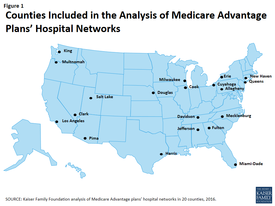
This study examined Medicare Advantage plans available in 2015 in 20 counties (Figure 1). The county is the smallest area, in general, that a Medicare Advantage plan must cover. Counties vary greatly in size and may not be the best metric to assess the health care market of particular locales. However, an analysis at the county level provided the most complete set of data available for this type of analysis, as well as a reasonable snapshot of the health care market accessible to beneficiaries in that region.
Figure 1: Counties Included in the Analysis of Medicare Advantage Plans’ Hospital Networks
The counties included in this study were chosen to encompass a sizeable share of Medicare Advantage enrollees, to be geographically dispersed across the country, and to range in per capita Medicare spending, the number of plans offered to Medicare beneficiaries, and Medicare Advantage penetration rate. They include large, urban areas with Medicare Advantage markets led by national firms (e.g., UnitedHealthcare) and local firms (e.g., UAB Health System). Together, these counties represent 14 percent of all Medicare Advantage enrollees in 2015.
Inclusion Criteria for Medicare Advantage Plans
Only HMOs and local PPOs were included in the analysis because the other types of Medicare Advantage plans either do not have networks (e.g., some private fee-for-service plans), or networks that are structured to cover areas larger than a county (e.g., regional PPOs), or are paid in unique ways that influence providers available to beneficiaries (e.g. cost plans). The analysis also excluded Special Needs Plans (SNPs), employer-sponsored group plans, and other plans that are not available to all Medicare beneficiaries. In total, across the 20 counties, we included 409 plans, 307 HMOs and 102 local PPOs. Among the 307 HMOs, 10 were closed panel HMOs, with physicians or groups of physicians directly employed by the HMO, and the remainder were open panel HMOs. Together, these plans enrolled 1.6 million Medicare beneficiaries in 2015, 92 percent of whom were in HMOs and 8 percent of whom were in PPOs. Both HMOs and local PPOs were available in all 20 counties, with the exception of Los Angeles where only HMOs were available to Medicare beneficiaries.
Main Sources of Data
Provider directories were the primary source of data used for the study. The directories were gathered between November and December 2014, to coincide with the Medicare Annual Election Period for 2015, and were either downloaded from the company’s website in a PDF format, when possible, or using a searchable directory embedded in the company website. The information extracted from this data was complemented with other information available on these plans and counties in CMS’s Medicare Advantage Enrollment file for March 2015 and Landscape file for 2015, and the American Hospital Association’s (AHA) 2014 survey of hospitals.
Measures of Hospital Network Size and Composition
All short-term general hospitals in the 20 counties included in the study, and their characteristics, were identified using data from the AHA 2014 survey of hospitals. (To support sensitivity analyses, hospitals in the adjacent counties were also identified.) Veterans Health Administration hospitals and children’s hospitals were excluded because of their unique financing or population focus. Two basic measures of network size were constructed for each health plan by county: (1) the share of hospitals in the county included in the directory, and (2) the share of hospital beds in the county associated with the hospitals included in the directory.
Classification of Networks by Size
This study categorized networks into one of four sizes based on the share of hospitals in the county that were included in the directory: broad (70% or more of the hospitals), medium (30-69% of hospitals), narrow (10-29% of hospitals), and ultra-narrow (less than 10% of hospitals). Only one other study we know of, conducted by McKinsey & Company, categorized networks by the share of hospitals in the county included in the network (Table 1).13 Broad networks were defined consistently in both studies, but narrower networks were classified and labeled somewhat differently here.
Table 1. Network Size Definitions
Share of Hospitals Included in Network
Kaiser Family Foundation Analysis of Medicare Advantage Networks
McKinsey & Company Analysis of Exchange Networks
0-9%
Ultra-Narrow
Ultra-Narrow
10-29%
Narrow
30-69%
Medium
Narrow
70%+
Broad
Broad
SOURCE: Kaiser Family Foundation analysis and Bauman N, Bello J, Coe E, and Lamb J. “Hospital networks: Evolution of the configurations on the 2015 exchanges,” McKinsey & Company, April 2015.
The McKinsey & Company study examined the size of the networks of plans offered in the ACA exchanges, and categorized networks into one of three network sizes. The difference between the categories used in this study and the McKinsey study is that this study includes a category for medium-sized networks. That is, this study uses the term “medium” to describe the size of networks that McKinsey described as “narrow.”
Analytic Variables: Teaching Hospitals and Cancer Centers
This study examined the presence of two specific types of hospitals in plan networks: teaching hospitals and cancer centers. Academic Medical Centers and minor teaching hospitals were identified based upon data from the AHA 2014 survey of hospitals. Each of the 20 counties had at least one Academic Medical Center within its borders, 11 of which included more than one, including Cook County with 12 Academic Medical Centers and Los Angeles County with 8 Academic Medical Centers. All but one of the counties (Mecklenburg) included at least one minor teaching hospital.
Cancer centers designated by the National Cancer Institute (NCI) were identified through the list of centers on the NCI website, and cancer centers accredited by the American College of Surgeons (ACS) were identified based upon data from the AHA 2014 survey of hospitals. Fifteen of the 20 counties in the study had at least one NCI-Designated Cancer Center within the borders of the county, including Cook, Harris, and Los Angeles counties that had more than one NCI Cancer Center, and all but one of the counties (Pima) had at least one hospital with an ACS-accredited cancer program.
Limitations
This study has some limitations. Notably, counties vary in size and do not necessarily provide a good measure of the natural market for the health plan and all of its enrollees. The study also focuses on large, urban areas, and does not provide information about plans’ networks in rural areas that have both fewer beneficiaries and providers. In many cases, physicians, not the beneficiary, may be key drivers in the choice of health plan and this analysis provides no information on the effective match between the breadth of physician networks and hospital networks. Hospital care also is increasingly complex and varied, and a general analysis of hospital networks provides limited insight into the availability of particular services the enrollee may need and where these services are best performed in any given community. Ultimately, what may be important to beneficiaries is the availability and quality of providers in their plan’s network, and not necessarily the size of the network.
Report: Results
Breadth of Hospital Networks
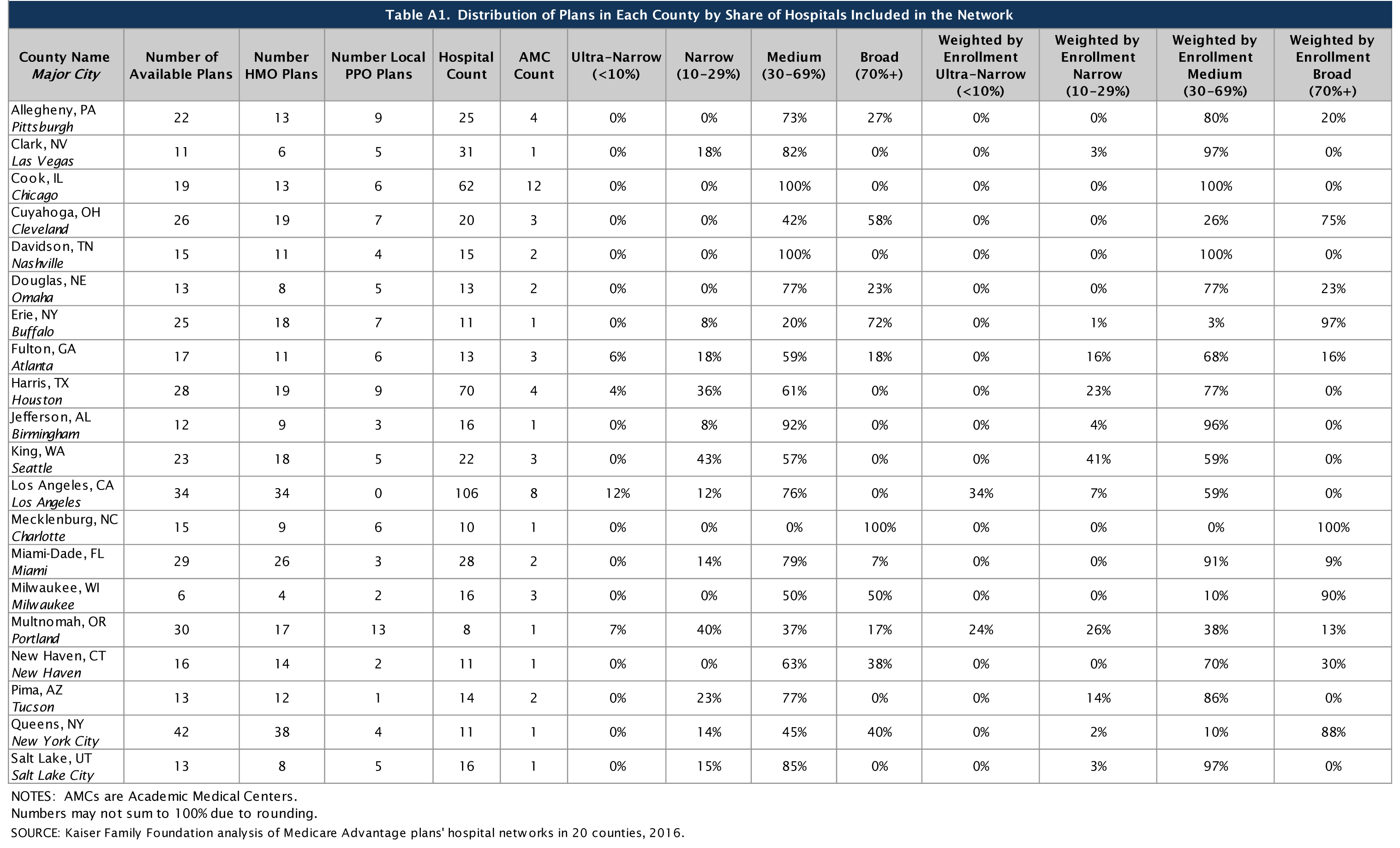
Counties included in this study differed in size and the number of hospitals, ranging from a high of 106 in Los Angeles County to a low of 8 in Multnomah County (Table A1). All of the Medicare Advantage plans in this study engaged in some selectivity in hospitals included in their network, but the share of hospitals included varied across plans, counties, and types of Medicare Advantage plans.
On average, plans included about half (51%) of the hospitals in the county in their network in 2015. About one-quarter (23%) of Medicare Advantage plans were classified in our analysis as having broad networks, meaning that they included at least 70 percent of the hospitals in the county (Figure 2). Most plans (61%) had medium sized networks, with between 30 and 69 percent of hospitals in the county. About one in six Medicare Advantage plans (16%) had narrow hospital networks, meaning that they included less than 30 percent of all hospitals in the county. This includes 8 plans (2%) that had less than 10 percent of the hospitals in the county within their network. Three of these 8 plans (in Multnomah and Fulton counties) did not include any hospitals within county borders but included hospitals in neighboring counties.14
Figure 2: Distribution of the Size of Plans’ Hospital Networks, 2015
By County
The share of a county’s hospitals included in plans’ networks, on average, ranged from 33 percent in Harris County to 79 percent in Mecklenburg County (Figure 3 and Table A2). These hospitals accounted for 61 percent of all hospital beds in the county, ranging from 38 percent in Los Angeles County to 94 percent in Mecklenburg. Measuring the breadth of the plan networks by the share of hospitals versus by the share of hospital beds included in the plan yielded similar results, such that plans with less than 30 percent of the hospitals in the county (narrow networks) had 26 percent of the hospital beds and similarly, plans with 70 percent or more of the hospitals in the county (broad networks) tended to include approximately 89 percent of the hospital beds in the county.
Figure 3: Medicare Advantage Plan Networks Include About Half of All Hospitals in Their County
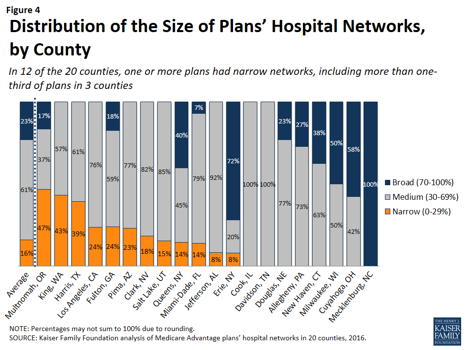
The breadth of hospital networks, and the availability of broad, medium, and narrow network plans, varied greatly across the 20 counties included in the study (Figure 4 and Table A1). Plans with broad networks were available in 11 of the 20 counties, and comprised at least half of the plans available in 4 counties (Milwaukee, Cuyahoga, Erie, and Mecklenburg), including one county (Mecklenburg) in which all plans had broad networks of hospitals. However, in nine of the 20 counties, beneficiaries did not have access to a broad network plan. In 12 of the 20 counties, one or more Medicare Advantage plans had narrow networks, including more than one-third of plans in 3 counties (Multnomah, King, and Harris).
Figure 4: Distribution of the Size of Plans’ Hospital Networks, by County
By Number of Hospitals in the County
The share of narrow network plans in a county does not appear to be related to the number of hospitals in the county. While some of the counties with narrow network plans, such as Multnomah, have relatively few hospitals, other counties with narrow network plans, such as Los Angeles and Harris counties, have many hospitals. For example, three plans in Los Angeles County included only 5 of the 106 hospitals in the county and one plan in Harris County included only 2 of the 70 hospitals in the county.
By Per Capita Medicare Spending
Per capita Medicare spending does not appear to be associated with the size of hospital networks offered by plans in a given county. The presence of narrow network plans does not appear to be related to whether per capita Medicare spending is relatively high or low in the county. For example, narrow networks plans are available in Miami-Dade and Harris counties, both of which have historically had very high per capita Medicare spending, and in Multnomah and Erie counties, which have historically had low per capita Medicare spending. In each of the 20 counties, regardless of per capita Medicare spending, beneficiaries have the option of enrolling in a plan that does not have a narrow network. This finding suggests that plans in high-cost areas are no more likely than those in low-cost areas to use limited provider networks to reduce their costs.
By Enrollment
The distribution of plans by network size is generally similar to the distribution of enrollees by network size, indicating that beneficiaries are neither disproportionately enrolled in broad networks nor narrow networks (Figure 5 and Table A1). About one in six Medicare Advantage enrollees (16%) were in plans with narrow networks, two-thirds (66%) were in plans with medium networks, and 18 percent were in plans with broad networks. In most of the counties in the study, beneficiaries could choose only between broad and medium plans (5 counties) or between medium and narrow plans (7 counties). (In Mecklenburg, beneficiaries could only choose among broad network plans, and in Davidson and Cook, beneficiaries could only choose among medium network plans.) In 2 of the counties (Erie and Queens) with broad, medium and narrow networks, beneficiaries were disproportionately enrolled in broad network plans, but in the other 3 counties (Fulton, Miami-Dade, and Multnomah), enrollment in broad network plans was relatively proportionate to the availability of broad network plans in the county.
Figure 5: Distribution of the Size of Plans’ Hospital Networks Versus Medicare Advantage Plan Enrollment
HMOs Versus PPOs
HMOs tend to have narrower hospital networks than PPOs, across the 20 counties studied (Figure 6). In most counties, a larger share of local PPOs had broad networks, and a larger share of HMOs had narrow networks (Tables A3 and A4).
Figure 6: Distribution of the Size of HMOs’ and Local PPOs’ Hospital Networks
Since about three-quarters of the plans included in this study were HMOs, HMOs comprised the majority of plans across all network sizes (Figure 7). However, a disproportionately large share (85%) of narrow and ultra-narrow network plans were HMOs (either closed panel or open panel HMOs) while only two-thirds of broad network plans were HMOs. Similarly, PPOs comprised a smaller share of narrow network plans (15%) than broad network plans (34%).
Figure 7: Distribution of HMOs and Local PPOs by Network Size
In some cases, HMOs and local PPOs offered by the same firm in a market shared the same network, although the structure of PPOs provides some coverage for the cost of care at hospitals not in the network.15 About one-third (37%) of local PPOs shared a provider network (and provider directory) with at least one HMO offered by the same firm.
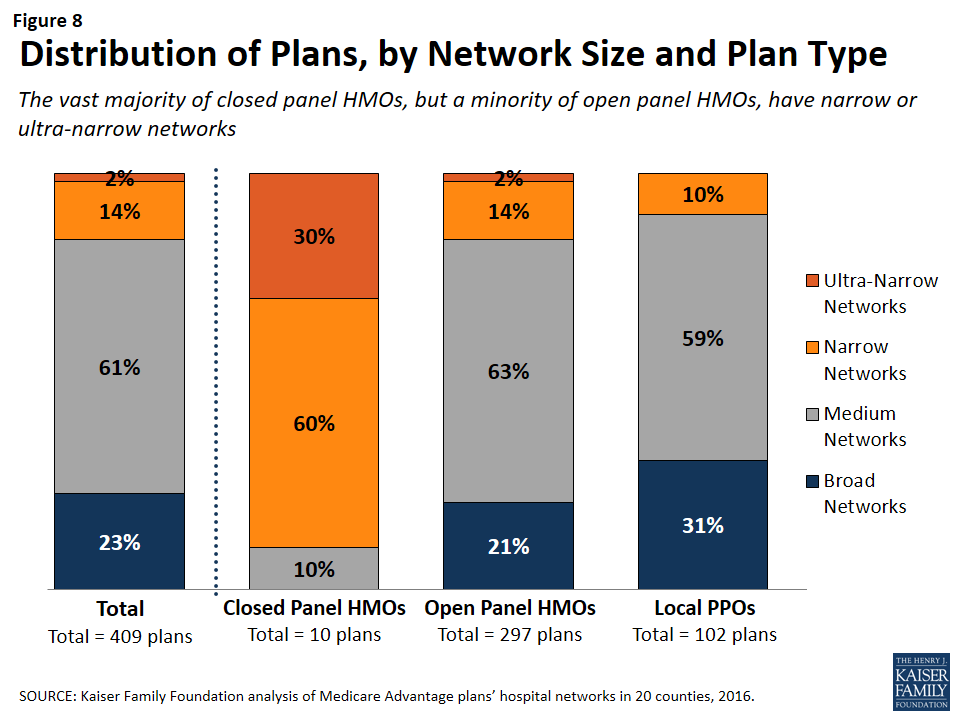
Closed Versus Open Panel HMOs
Most HMOs have open panel designs in which the parent organization has non-exclusive contracts with a range of providers located in the area, and the providers typically accept multiple insurers. A small share of HMOs have closed panel designs in which the parent organization has exclusive contracts with physicians (employed either directly or in groups) and sometimes also owns hospitals or contracts with hospitals in other ways that result in more centralized hospital capacity. While the data available to distinguish between closed and open panel HMOs are limited, such data suggest that only ten plans in our study had closed panel designs (Figure 8 and Table A5). Five of the ten plans were offered by Kaiser Permanente in Los Angeles, Multnomah, and Fulton, and typically had narrower networks than other plans, consistent with their design. The other five closed-panel HMOs were offered by Group Health Cooperative in King County and Leon Medical Centers in Miami-Dade County, both of which included a larger share of hospitals in the county than Kaiser Permanente.
Figure 8: Distribution of Plans, by Network Size and Plan Type
With the exception of Leon Medical Centers, which had a medium-sized network, all of the other nine closed-panel HMOs had narrow or ultra-narrow networks (as compared to only 16 percent of open-panel HMOs). However, closed-panel HMOs comprised a small share of all narrow or ultra-narrow network plans, and only nine of the 67 plans with narrow or ultra-narrow networks (13%) were closed panel HMOs (Figure 8). The fact that closed-panel HMOs typically have narrow networks is by design; they often operate as systems of care, where the hospitals are often owned by the parent company and used primarily if not exclusively by members. Despite the comparatively narrow networks of many of these closed-panel HMOs, they generally attract a relatively large number of beneficiaries.
Inclusion of Teaching Hospitals and Cancer Centers
While high quality medical care can be provided in a variety of hospital settings, some conditions can benefit from care provided in certain types of facilities. Access to specialized medical care is also important to many Medicare beneficiaries since about one-quarter (26%) of Medicare beneficiaries are in fair or poor health and 45 percent have four or more chronic conditions.16 Academic Medical Centers are more likely than minor teaching hospitals or other hospitals to have physicians specializing in rarer conditions or operations, such as liver or bone-marrow transplants, autoimmune disorders such as lupus, or other complex medical conditions. Academic Medical Centers are also more likely to conduct more surgeries, such as heart surgery, for which better outcomes have been linked to higher volumes of surgeries. Both Academic Medical Centers (also known as major teaching hospitals) and minor teaching hospitals have residency and/or internship training programs (or medical school affiliation reported by the American Medical Association) but, unlike Academic Medical Centers, minor teaching hospitals are not members of the Council of Teaching Hospitals.
Access to high quality cancer treatment is also important to many Medicare beneficiaries since the incidence of cancer is more than 10 times higher among people ages 65 and older than among younger people.17 To gain insight into the type of cancer treatment available to Medicare Advantage enrollees, this study examined access to cancer centers designated by the National Cancer Institute (NCI) and hospitals accredited by the American College of Surgeons (ACS). The NCI has designated 69 cancer centers in 35 states as NCI-Designated Cancer Centers in recognition of their leadership and resources in the development of more effective approaches to prevention, diagnosis, and treatment of cancer, and many but not all of these centers are affiliated with Academic Medical Centers. The ACS Commission on Cancer accredits cancer programs within hospitals that meet ACS quality and service standards, and this accreditation is designed to be an indicator of higher quality cancer care.
Academic Medical Centers and Minor Teaching Hospitals
More than three-quarters (80%) of all Medicare Advantage plans analyzed in this study included at least one Academic Medical Center in the county in its network of hospitals, including 78 percent of HMOs and 88 percent of PPOs (Figure 9). Another 6 percent of plans included an Academic Medical Center in the adjacent county but not in the county studied (not shown). In total, 86 percent of plans included an Academic Medical Center in the primary county or in a bordering county. Additionally, the vast majority of plans (92%) included at least one minor teaching hospital in the county, including all of the plans in 14 counties. In 15 of the 20 counties, more than three-quarters of the plans included an Academic Medical Center, including 7 counties in which all of the plans included an Academic Medical Center in the provider network (Table A6). However, in 2 counties (Jefferson and Multnomah), less than half of all Medicare Advantage plans included the Academic Medical Center in the county.
Figure 9: Share of Plans Including an Academic Medical Center in the Hospital Network, by County
Larger plans were more likely to include an Academic Medical Center, on average, and as a result a somewhat larger share (91%) of Medicare Advantage enrollees are in a plan that includes an Academic Medical Center in its network.
The vast majority (92%) of broad network plans included an Academic Medical Center, while a much smaller share of plans with narrow networks (51%) included an Academic Medical Center (Figure 10). In most counties, a larger share of plans with broad networks than plans with narrow networks included at least one Academic Medical Center (Table A7).
Figure 10: Share of Plans Including an Academic Medical Center in the Hospital Network
Cancer Centers
NCI-Designated Cancer Centers tend to have greater access to clinical trials, especially early-stage clinical trials, than community hospitals and other treatment centers. While many hospitals in a community are likely to be able to treat multiple types of cancer, access to NCI Cancer Centers may be particularly relevant to beneficiaries with rarer cancers, more advanced-stage cancers, or other unique complicating conditions.
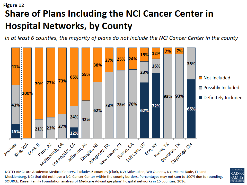
NCI-Designated Cancer Centers. Among the 15 counties with an NCI Cancer Center, 15 percent of Medicare Advantage plans listed the NCI Cancer Center in the provider directory, 43 percent of plans included the Academic Medical Center with which the center was affiliated (but did not explicitly indicate that the cancer center was included), and 41 percent did not include the NCI Cancer Center in the county among providers listed in the directory (Figure 11 and Table A7).
In 6 of the 15 counties with an NCI Cancer Center, the majority of Medicare Advantage plans did not include the NCI Cancer Center in its provider network (Figure 12).
Figure 11: Share of Plans Including NCI Cancer Centers in Provider NetworksFigure 12: Share of Plans Including the NCI Cancer Center in Hospital Networks, by County
This lack of clarity as to whether an NCI Cancer Center is included in a plan’s provider network may be attributable to the considerable variation in the way in which the cancer centers are listed in the plans’ provider directories. For example, the Huntsman Cancer Institute in Salt Lake County is affiliated with the University of Utah and is located across the street from their main Academic Medical Center. Some of the provider directories for Medicare Advantage plans offered in Salt Lake County list Huntsman Cancer Center explicitly, in addition to listing the University of Utah Medical Center, but other provider directories only list the University of Utah Medical Center, and do not mention the Huntsman Cancer Institute. In these situations, it is unclear whether a Medicare beneficiary can assume that coverage of care at the Academic Medical Center includes care at the affiliated cancer center, and the answer most likely varies across plans.
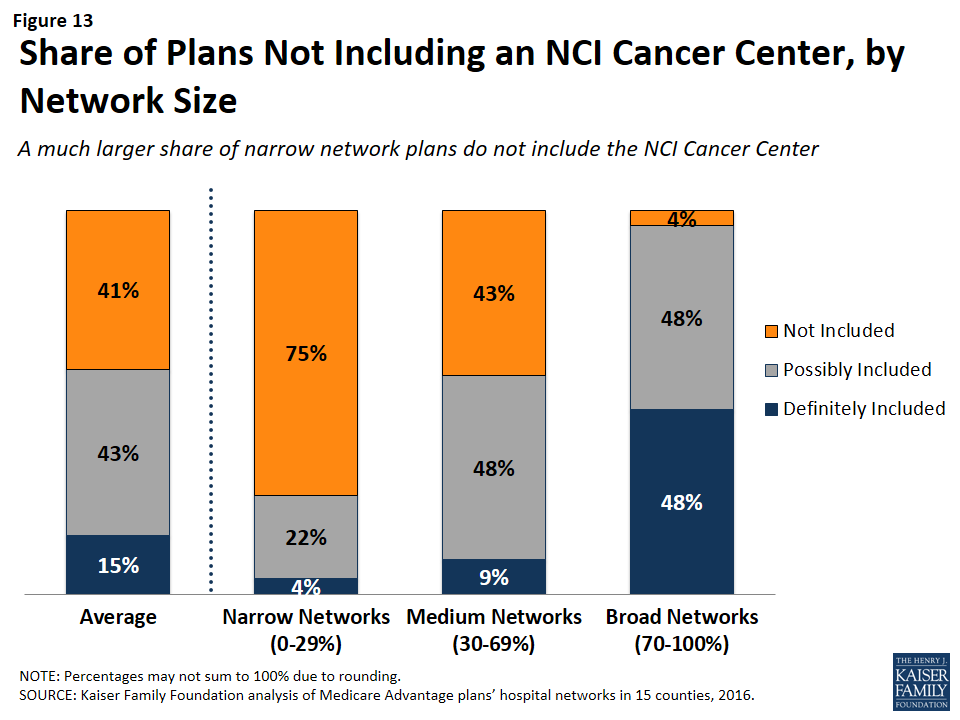
NCI Cancer Centers were less likely to be included in plans with narrow networks than plans with broader networks (Figure 13). These results were generally consistent across the counties.
Figure 13: Share of Plans Not Including an NCI Cancer Center, by Network Size
Even when NCI-Designated Cancer Centers are excluded from the provider network, plans may choose to selectively refer enrollees to them, when appropriate, although it is beyond the scope of this analysis to assess the extent to which these referrals occur. Contract negotiations with cancer centers can be complex, particularly when a cancer center is in a strong negotiating position, which may explain why many plans do not include them in the plan networks.
ACS-Accredited Cancer Programs. The vast majority of plans (94%) included at least one hospital with a cancer program accredited by the ACS Commission on Cancer. A larger share (21%) of narrow network plans than medium (4%) or broad network plans (0%) did not include at least one hospital with a cancer program accredited by the ACS (Figure 14). Plans’ inclusion of hospitals with ACS-accredited cancer programs also varied somewhat across counties. In 13 counties, every plan included at least one hospital with an ACS-accredited cancer program, while 12 percent of plans in Los Angeles did not include such a hospital in their network; however, in all counties, most of the plans without a hospital with an ACS-accredited cancer program had narrow networks.
Figure 14: Share of Plans Not Including a Hospital With a Cancer Program Accredited by the ACS, by Network Size
Overall, 3 percent of plans had neither a hospital with an ACS-accredited cancer program nor an NCI Cancer Center in their provider network. While few beneficiaries are evaluating provider networks based on their access to cancer centers, if beneficiaries wanted to know whether a network included hospitals affiliated with an NCI Cancer Center or hospitals with ACS-accredited cancer programs, they would need to use data sources other than the provider directory because these designations are not indicated in the directories.
Other Specialty Units and Facilities
For specialty care more broadly, unless the affiliate is explicitly mentioned in the provider directory, it is unclear whether a hospital’s affiliates are also covered by a plan, or whether coverage is restricted to acute care hospitalization at the specific hospital listed in the directory. For example, it is often unclear as to whether a hospital’s affiliated heart center, rehabilitation center, or women’s center is included in the plan network that includes the main, acute care hospital. This lack of clarity makes it difficult for beneficiaries to determine which affiliated providers would be in a plan’s network.
Relationship Between Breadth of Network and Other Plan Features
Plan Premiums by Network Size
Average premiums for Medicare Advantage plans generally increased with the size of the network (Figure 15). The average premium for Medicare Advantage plans with broad networks ($51 per month) was almost 50 percent higher than the average premium for narrow network plans ($35 per month).
Figure 15: Average Premiums of Medicare Advantage Plans, by Network Size and Plan Type
However, the correlation between premiums and network size disappeared after comparing networks within plan types. Among HMOs, the average premium for narrow network plans ($36 per month) was the same as the average premium for broad network plans. Among PPOs, the average premium for narrow network plans is much lower ($28 per month) than for medium network plans ($87 per month) and broad network plans ($79 per month). However, since only 10 local PPOs had narrow networks, more research with a larger sample of narrow network local PPOs is needed to confirm these findings. Overall, premiums varied more between HMOs and local PPOs than by network size.
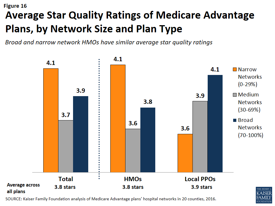
Star Quality Ratings by Network Size
The size and composition of the plans’ provider networks are not used by CMS to assign star quality ratings to the plans; however, the ratings may nonetheless be correlated with the size of the networks if the hospitals excluded from the narrower networks had either a positive or negative effect on plan ratings. Overall, the average star quality ratings for narrow network plans (4.1 stars) were similar to the average ratings for medium or broad network plans (3.7 and 3.9 stars, respectively; Figure 16).
Figure 16: Average Star Quality Ratings of Medicare Advantage Plans, by Network Size and Plan Type
Within counties, the relationship between plan ratings and network sizes was inconsistent. In some counties, narrow network plans had higher average quality ratings than medium or broad network plans, but in other counties the narrow network plans had lower average quality ratings.
Among local PPOs, the average plan ratings generally increased with the size of the network, and plans with broader networks had somewhat higher average ratings (4.1 stars) than plans with narrow networks (3.6 stars). However, more research with a larger sample of narrow network local PPOs is needed to confirm these findings since only 10 local PPOs in our study had narrow networks. Among HMOs, there was a different dynamic between plan ratings and the size of the network, and narrow network HMOs had higher plan ratings (4.1 stars) than HMOs with broad networks (3.8 stars). Taken as a whole, the relationship between plans’ quality ratings and the size of plans’ networks is likely more closely related to factors other than the size of plans’ networks.
Firm as a Predictor of Network Size
Among the firms offering plans in these 20 counties, none were more likely than others to have narrow networks in multiple counties, with the exception of Kaiser Permanente, which only has narrow hospital networks (Table A8). For example, while Humana included more than 70 percent (broad network) of the hospitals in Mecklenburg, it had narrow provider networks in 5 counties (Harris, Los Angeles, Multnomah, Queens, and Salt Lake) and medium networks in 12 other counties. Likewise, some Blue Cross Blue Shield (BCBS) affiliated plans had broad hospital networks in some counties (e.g., Cuyahoga, Miami-Dade), but had narrow hospital networks in other counties (e.g., Harris).
Interestingly, among plans with the same name that were offered in multiple counties, the size of the plan network often varied across counties. For example, the Humana Choice plan in Multnomah, Oregon included only 13 percent of the hospitals in the county, whereas the Humana Choice plan in Cuyahoga, Ohio included 70 percent of the hospitals in the county. As a consequence, enrollees cannot use the firm or the plan name as a signal about the size of the plan network. This finding also suggests that local market characteristics typically are a stronger influence on network design than particular firm philosophies.
Size of Hospitals by Network Size
The size of the hospitals (measured by the number of beds) included in provider networks could provide some information about the plan’s capacity to provide inpatient care to enrollees, and may have some relationship to the quality of care and enrollees’ satisfaction with their care, although the evidence for this is mixed. Several studies have found that larger hospitals have lower mortality rates than smaller hospitals;18 however, patients have also rated lower their satisfaction with the care received at large hospitals than at smaller hospitals.19
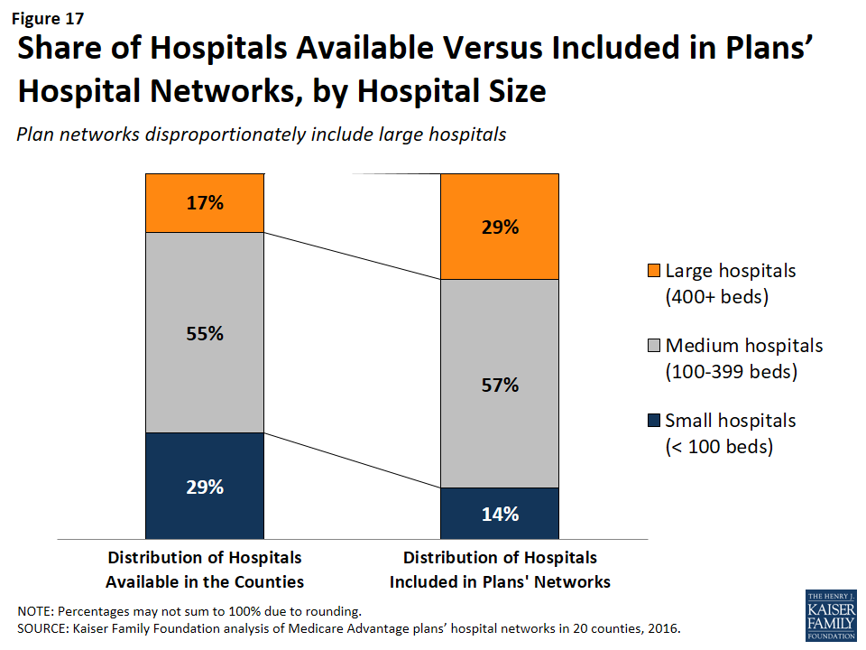
Across the 20 counties, Medicare Advantage plans were more likely to include larger hospitals (400 beds or more) than smaller hospitals (less than 100 beds). While 17 percent of all hospitals in the 20 counties were large hospitals, they accounted for 29 percent of all hospitals in the plans’ provider networks (Figure 17).
Figure 17: Share of Hospitals Available Versus Included in Plans’ Hospital Networks, by Hospital Size
Similarly, while 29 percent of all hospitals were small, these hospitals accounted for only 14 percent of the hospitals in the plans’ provider networks. These findings were generally consistent at the county-level, and, in all counties, large hospitals were either over-represented or proportionately represented in plan networks.
Network size did not appear to be correlated with the size of the hospitals included in the network. Large hospitals comprised more than one-third of hospitals in both narrow and broad network plans (37% and 35%, respectively), but a smaller share (23%) of hospitals in medium networks.
Ownership of Hospitals by Network Size
Most hospitals operate on a not for profit basis, so it is not surprising that such hospitals also constituted most of the hospitals in plans’ networks. However, relative to their prevalence in the counties, plan networks were less likely to include for-profit hospitals, which accounted for 39 percent of the hospitals in the counties, but only one-quarter (26%) of the hospitals in the plan networks. These findings generally are consistent across the individual counties studied.
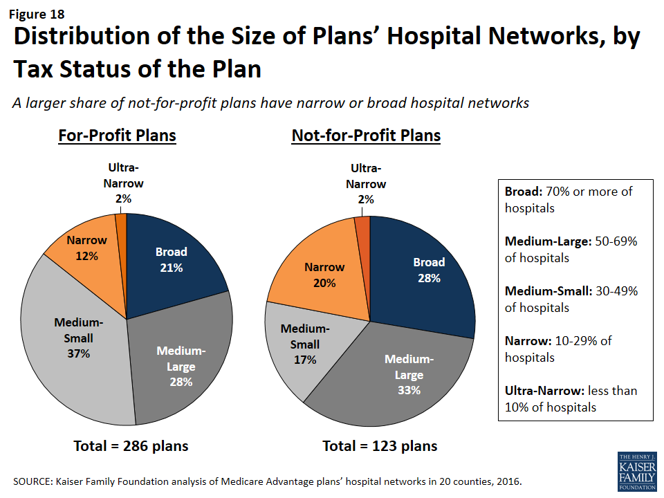
Plan Tax Status by Network Size
In theory, a plan’s tax status could influence the firm’s approach towards creating the plan’s provider network, since not-for-profit plans may be able to dedicate a larger share of their revenue towards payments to providers and benefits for enrollees. A larger share of not-for-profit plans (28%) than for-profit plans (21%) had broad hospital networks (Figure 18). At the same time, a larger share of not-for-profit plans (22%) than for-profit plans (15%) had narrow or ultra-narrow hospital networks. These findings greatly varied across counties, and not-for-profit plans did not consistently have narrower or broader networks than for-profit plans in the same county.
Figure 18: Distribution of the Size of Plans’ Hospital Networks, by Tax Status of the Plan
Report: Findings On The Adequacy Of Provider Directories
Provider directories are the main resource available to beneficiaries who want to know which providers are in the different networks of Medicare Advantage plans. Plans are required by CMS to make a provider directory available to all current and potential enrollees, but the CMS website used by consumers to compare plans does not include a link to plan directories or provide a tool that can be used by plan shoppers to check to see whether their preferred doctors or hospitals are included in plans’ networks. While this analysis focused only on hospitals, and not physicians or other providers, it adds to a growing body of literature that shows that provider directories currently have a number of problems that limit their value in helping to inform beneficiaries. These limitations generally fall into two categories: burden and accuracy of information.
Beneficiary Burden
Plans are required to make their provider directory available to current and potential enrollees, and typically provide the information on the firm’s website. In gathering information for our study, we found accessing and using these directories to identify provider networks to be challenging. The plan websites varied in overall layout, the grouping of plans into provider directories, and the format in which the directory is available. Some companies have only one directory that includes all of its HMO and PPO plans, others have separate directories for each individual plan, and some do not have a current directory available at all.
As an example, in 2015, a Medicare beneficiary in Cook County, Illinois could choose from 19 HMO or local PPO Medicare Advantage plans, which had 10 unique provider networks offered by eight different firms. Once beneficiaries go to the applicable firm’s website, locate the link to learn about plans offered in their area, and input some geographic information, they have access to information about the plan’s provider network, but the information is not available in a consistent format across plans. In Cook County, seven of the 10 plan networks had a provider directory that could be downloaded as a PDF from the firm website. For two networks (covering five plans), the only way to learn about the providers in the network was to search the firm’s online database by type of provider or facility to generate a list of providers. For the one remaining network in Cook County (one plan), the provider network was available as a separate downloadable list for each type of provider.
Among the seven directories that were available as a PDF document in Cook County, the content and organization varies. Three of the seven list the network pharmacies, while the other four have a separate document or require an online search to find pharmacy coverage. Dental and vision services are also only included in three of the directories. Information about other services, such as transplant facilities or providers with translation capabilities, is included in some but not all directories. One of the Cook County directories does not include a table of contents or index and is over 600 pages long. (Similarly, other counties, such Los Angeles, have directories with page-counts in the thousands.)
Errors in Directories
In all 20 counties included in this study, errors in the provider directories were common. For example, some directories list facilities as acute-care hospitals when the facilities are actually outpatient centers or rehabilitation institutes. Hospitals with the same address are frequently listed by different names across directories, often reflecting failures to update the directories when hospitals change their names or ownership. In other cases, there are blatant errors. For example, a directory for a plan in Miami-Dade County lists Larkin Community Hospital twice, once with the correct address and once with the address of St. Catherine’s Rehabilitation Hospital.
One of the most obvious signs that some directories are not up-to-date is that some directories include hospitals that have been closed for several years. In 2015, 11 out of the 231 directories examined in this study include hospitals that had been closed or torn down, including one directory that listed a hospital that had been closed since 2005. Another plan’s website provided a directory for its 2015 plan that stated it was last updated in August 2013. A call to the plan’s customer service line confirmed that all of the most current documents were posted online, but that the online search tool should be used for the most up-to-date information. Similarly, this study excluded seven plans offered by three companies because either a provider directory was not available for 2015 and the company declined to provide a directory when contacted, or the searchable directory embedded in the company website did not allow for information to be saved.
Overall, while information about provider networks is available for the vast majority of plans, finding the information often requires Medicare beneficiaries to invest significant time to locate the directories, many of which are inaccurate or incomplete, and none of which facilitate comparisons across multiple plans or firms.
Report: Discussion
This study documents, for the first time, considerable diversity in the breadth of hospital networks used by Medicare Advantage plans– an issue of potential importance to people on Medicare who say having access to specific hospitals and physicians is a high priority when choosing a plan. Medicare Advantage plans are generally selective, with their networks including only a subset of the hospitals in the area. The average size and composition of hospital networks varies within and across counties. Plans with broader hospital networks are more likely to include Academic Health Centers and NCI-approved cancer centers than plans with narrow networks. In 9 out of the 20 counties in the study, broad network plans were not offered and beneficiaries in these counties can only select a Medicare Advantage plan with a narrow or medium-sized network.
In general, hospital network size was not correlated with factors such as star quality ratings, plan premiums (for HMOs), per capita Medicare spending, number of hospitals in the county, or specific firms. None of the firms (with the exception of Kaiser Permanente) were more (or less) likely than others to have broad or narrow network plans across counties. The size of a plan’s network may instead be explained more by the ability of individual plans to negotiate favorable rates with hospitals in their service area, as well as other market conditions.
While not the focus of this study, we encountered a number of issues in compiling this information that could pose challenges to consumers trying to determine the breadth of the hospital networks of Medicare Advantage plans offered in their area. The Medicare Plan Finder does not include any information on provider networks. Plans are required to make network information available to consumers upon request, but CMS does not require plans to release this information in a uniform format, putting the burden on consumers to sort through directories and search tools to determine if a particular provider is in a given plan’s network. In the course of our research, it became clear that the directories used in this study were often riddled with errors, including the incorrect names or addresses for the hospitals, and other blatant mistakes such as the inclusion of hospitals that no longer existed.
It is not entirely clear how the networks of Medicare Advantage and ACA marketplace plans compare. McKinsey & Company released a report in 2015 that examined the networks of plans offered in exchanges, using a similar but not identical taxonomy for classifying hospital network size. Although the studies are not directly comparable because they used different methods (e.g., included different counties), this analysis suggests that a much smaller share of Medicare Advantage plans than exchange plans have broad hospital networks (23% of Medicare Advantage plans compared to 55% of ACA marketplace plans).20 Further research is needed to compare the size and scope of plan networks in Medicare, the ACA marketplace, Medicaid, and employer sponsored insurance.
It is important to note that Medicare Advantage enrollees have the option of switching to traditional Medicare during the annual open enrollment period, and that traditional Medicare includes the vast majority of providers and arguably the broadest possible provider network. Yet, switching between Medicare Advantage and traditional Medicare can be complicated by considerations such as the availability of Medigap plans and other supplemental coverage, and the need for a separate Part D drug plan.21 For these and other reasons, switching rates between Medicare Advantage and traditional Medicare are typically low.22
Policymakers could consider a number of options to improve the accuracy of information in the provider directories and the extent to which plans comply with network adequacy requirements. CMS could, for example, review the provider directories more frequently for errors and compliance with network adequacy requirements. As noted by the GAO,23 CMS currently reviews less than 1 percent of all provider directories and does not routinely review the networks of plans that are renewing their current contract. More frequent reviews by CMS could encourage plans to keep their directories up-to-date and in compliance with CMS network requirements.
Additionally, CMS has stated that Medicare Advantage plans have less prescriptive network adequacy requirements than the ACA Qualified Health Plans (QHPs) and Medicaid Managed Care Organizations (MCOs). While these three programs serve different purposes and different populations,24 CMS may want to review areas in which Medicare Advantage requirements are more lenient, and potentially beef up the requirements for Medicare Advantage plans and harmonize the requirements across the three programs, as CMS has suggested.25
CMS could also take steps to make it easier for consumers to obtain and compare information about Medicare Advantage provider networks. Medicare.gov could post on its Medicare Plan Finder each plan’s provider network to make it easier for beneficiaries to access provider networks when they are comparing other features of Medicare Advantage plans. CMS could require all plans to publish network information in a uniform format and develop a consumer-friendly online tool with up-to-date information on each Medicare Advantage plan’s provider network to facilitate plan comparisons. CMS could also categorize the size of plans’ networks to allow beneficiaries and their caregivers to use this information when selecting a plan. While the size of the network would likely not be the sole factor used to select a plan, it could be an important, relevant consideration when deciding between two otherwise similar plans.
Creating networks of providers is one of many strategies available to insurers to help control costs and manage the delivery of care, but narrow networks may also limit consumers’ access to certain providers and increase the cost for care obtained out-of-network. For Medicare Advantage enrollees who place a high value on having access to a particular set of providers, or a broad range of providers, the results of this study underscore why it is important for beneficiaries to review provider networks before choosing among Medicare Advantage plans, despite the difficulties of doing so. The study also underscores the need for accurate, readily available information to make it easier for consumers, insurance counselors and others to compare provider networks across plans, and for ongoing oversight of network requirements to meet the expected and unexpected health care needs of beneficiaries enrolled in Medicare Advantage plans.
Appendix
Methods
This study examined Medicare Advantage plans available in 2015 in 20 counties: Allegheny County, PA; Clark County, NV; Cook County, IL; Cuyahoga County, OH; Davidson County, TN; Douglas County, NE; Erie County, NY; Fulton County, GA; Harris County, TX; Jefferson County, AL; King County, WA; Los Angeles County, CA; Mecklenburg County, NC; Miami-Dade County, FL; Milwaukee County, WI; Multnomah County, OR; New Haven County, CT; Pima County, AZ; Queens County, NY; and Salt Lake County, UT. The county is the smallest area, in general, that a Medicare Advantage plan must cover. Counties vary greatly in size and may not be the best metric to assess the health care market of particular locales, but an analysis at the county level provided the most complete set of data available for this type of analysis as well as a reasonable snapshot of the health care market accessible to beneficiaries in that region.
The counties were chosen so as to encompass a sizeable share of Medicare Advantage enrollees, be geographically dispersed across the country, include large, urban areas with many Medicare beneficiaries, include Medicare Advantage markets that are led by national firms (e.g., UnitedHealthcare) and local firms (e.g., UAB Health System), and range in per capita Medicare spending, number of plans offered to Medicare beneficiaries, and Medicare Advantage penetration rate (Table 2). Together, these counties account for 14 percent of all Medicare Advantage enrollees in 2015.
Table 2. Characteristics of Counties Included in the Analysis in 2015
County
Largest city
Number of Medicare beneficiaries
Medicare Advantage penetration rate, 2015
Share of enrollees in plans offered by one firm
Medicare Advantage payment quartile
Year oldest plan established
Academic Medical Center in county?
NCI-designated Cancer Center in the county?
Allegheny, PA
Pittsburgh
247,434
62%
41%
1
1985
Yes
Yes
Clark, NV
Las Vegas
294,530
38%
51%
1
1985
Yes
No
Cook, IL
Chicago
769,309
17%
32%
1
1985
Yes
Yes
Cuyahoga, OH
Cleveland
241,669
37%
33%
2
1987
Yes
Yes
Davidson, TN
Nashville
89,800
42%
48%
1
1996
Yes
Yes
Douglas, NE
Omaha
75,402
23%
58%
2
1985
Yes
Yes
Erie, NY
Buffalo
185,347
56%
62%
4
1985
Yes
Yes
Fulton, GA
Atlanta
118,697
35%
33%
2
1997
Yes
Yes
Harris, TX
Houston
465,027
39%
21%
1
1988
Yes
Yes
Jefferson, AL
Birmingham
123,132
42%
39%
1
1994
Yes
Yes
King, WA
Seattle
283,171
34%
30%
3
1980
Yes
Yes
Los Angeles
Los Angeles
1,344,850
43%
40%
1
1985
Yes
Yes
Mecklenburg, NC
Charlotte
119,517
31%
39%
3
1985
Yes
No
Miami-Dade
Miami
420,702
62%
28%
1
1986
Yes
No
Milwaukee, WI
Milwaukee
145,125
41%
73%
2
1995
Yes
No
Multnomah, OR
Portland
110,238
58%
27%
4
1980
Yes
Yes
New Haven, CT
New Haven
153,214
28%
41%
1
1996
Yes
Yes
Pima, AZ
Tucson
187,732
46%
53%
3
1986
Yes
Yes
Queens, NY
New York City
326,376
43%
26%
1
1986
Yes
No
Salt Lake, UT
Salt Lake City
122,904
41%
43%
3
2003
Yes
Yes
SOURCE: Kaiser Family Foundation analysis of CMS Medicare Advantage enrollment and landscape files for 2015.
Inclusion Criteria for Medicare Advantage Plans
Only HMOs and local PPOs were included in the analysis because the other types of Medicare Advantage plans either do not have networks (e.g., some private fee-for-service plans), or networks that are structured to cover areas larger than a county (e.g., regional PPOs), or are paid in unique ways that influence providers available to beneficiaries (e.g. cost plans). The analysis also excluded Special Needs Plans (SNPs), employer-sponsored group plans, and other plans that are not available to all Medicare beneficiaries. In total, across the 20 counties, we included 307 HMOs and 102 local PPOs. Among the 307 HMOs, 10 were closed panel HMOs, with physicians or groups of physicians directly employed by the HMO, and the remainder were open panel HMOs. Together, these plans enrolled 1.6 million Medicare beneficiaries in 2015, 92 percent of whom were in HMOs and 8 percent of whom were in PPOs. Both HMOs and local PPOs were available in all 20 counties, with the exception of Los Angeles County where only HMOs were available to Medicare beneficiaries.
Main Sources of Data
Provider directories were the primary source of data used for the study. The directories were gathered between November and December 2014, to coincide with the Medicare Annual Election Period for 2015, and were either downloaded from the company’s website in a PDF format, when possible, or downloaded using the searchable directory embedded in the company website. The information extracted from these data was complemented with other information available on these plans and counties in CMS’s Medicare Advantage Enrollment file for March 2015, CMS’s Medicare Advantage Landscape file for 2015, and the American Hospital Association’s (AHA) 2014 survey of hospitals.
Excluded Plans
Seven plans offered by three companies were excluded from the analysis because either a provider directory was not available for 2015 and the company declined to provide a directory when contacted, or the searchable directory embedded in the company website did not allow for information to be saved.
Tiered Networks
Two counties from our sample include HMOs with tiered networks of hospitals. The difference in tier designates a difference in co-pay for a hospital admission. Consequently, even though all of the hospitals listed in the directory are considered “in-network,” the cost for a hospital stay will differ depending on the hospital’s tier. While the provider directories designate each hospital’s tier, the information about the difference in cost-sharing only can be found in the plan’s Summary of Benefits document.
The two plans with tiered networks were different with respect to the breakdown of the hospitals into more expensive and less expensive tiers and the disparities in cost-sharing for hospital stays between the two tiers. For the tiered network in Cook County, the difference in co-pay between tier 1 and tier 2 is $50 per day for days 1 through 4 ($200 total potential difference). The less expensive tier (tier 1) only includes five hospitals, all owned by Advocate Health Care. The majority of the hospitals in the network (22 facilities) are in tier 2, with the more expensive co-pay. In contrast, most of the hospitals in Erie County’s tiered network plan are in the less expensive tier. For this plan’s tier A hospitals, there is a co-pay of $400 per admission, while tier B hospitals require a co-pay of $900 per admission. However, only one of the network’s eight hospitals in Erie County is in tier B. For both of these plans with tiered networks, the analysis included all hospitals in either tier as in-network hospitals because in Cook County the difference in cost-sharing for hospitals in the two tiers was relatively nominal and for the plan in Erie County, the set of hospitals in the second tier was deemed to be sufficiently small. Overall, the inclusion of hospitals in both tiers likely had a negligible effect on the results of the analysis.
Data Entry
The data from the provider directories was inputted twice, by two independent people, and all discrepancies in the data entry were resolved by manually checking the relevant provider directory. Whenever directories contained typos or slight variations in the name of a hospital, the addresses were used to verify a hospital’s inclusion in the network. The Centers for Medicare and Medicaid Services’ Provider of Services (POS) file was used to match each hospital location with its unique provider identification number.
Measures of Hospital Network Size and Composition
All short-term general hospitals in the 20 counties included in the study and their characteristics were identified using the data from the AHA 2014 survey of hospitals. (To support sensitivity analyses, hospitals in the adjacent counties were also identified.) Veterans Health Administration hospitals and children’s hospitals were excluded because of their unique financing or population focus. Two basic measures of network size were constructed for each health plan by county: (1) the share of hospitals in the county that were listed in the directory; and (2) the share of hospital beds in the county that were associated with the hospitals listed in the directory.
Categorizing Networks by Size
This study categorized networks into one of four sizes based on the share of hospitals in the county that were included in the directory: broad (70% or more of the hospitals), medium (30-69% of hospitals), narrow (10-29% of hospitals), and ultra-narrow (less than 10% of hospitals). These definitions differ from those used by the only other known study, conducted by McKinsey & Company, that categorized networks by the share of hospitals in the county included in the network. The McKinsey & Company study examined the size of networks of plans in the Affordable Care Act (ACA) exchanges, and categorized networks into one of three network sizes; the difference between the categories used in this study and the McKinsey study is that this study includes a category for medium-sized networks. That is, this study uses the term “medium” to describe the size of networks that McKinsey described as “narrow”.
For the 10 plans that were closed-panel HMOs, the study used the same four categories to characterize the size of the network. HMOs with closed panel designs are those in which the parent organization has exclusive contracts with physicians (employed either directly or in groups) and sometimes also owns hospitals or contracts with hospitals in other ways that result in more centralized hospital capacity. HMOs with open panel designs, which include the majority of HMOs today, are those in which the parent organization has non-exclusive contracts with a range of providers located in the area, and the providers typically accept multiple insurers. One of the primary reasons people enroll in closed panel HMOs is because they want to have access to the plan’s network of hospitals and doctors, whereas people in other plans generally do not have access to these physicians and facilities.
Definitions for Specialty Hospitals
Access to specialized medical care is important to many Medicare beneficiaries since about one-quarter (26%) of Medicare beneficiaries are in fair or poor health and 45 percent have four or more chronic conditions.26 This study examined the presence of two types of specialty hospitals in plan networks: teaching hospitals and cancer centers. Teaching hospitals can provide access to more specialized care and may provide better care for complex medical conditions, such as organ transplants, certain cancer surgeries, and autoimmune disorders. Both Academic Medical Centers (also known as major teaching hospitals) and minor teaching hospitals have residency and/or internship training programs (or medical school affiliation reported by the American Medical Association) but, unlike Academic Medical Centers, minor teaching hospitals are not members of the Council of Teaching Hospitals. Academic Medical Centers and minor teaching hospitals were identified based upon data from the AHA 2014 survey of hospitals. Each of the 20 counties had at least one Academic Medical Center within its borders, 11 of which included more than one, including Cook County with 12 Academic Medical Centers and Los Angeles County with 8 Academic Medical Centers. All but one of the counties (Mecklenburg) included at least one minor teaching hospital.
To gain insight into the type of cancer treatment available to Medicare Advantage enrollees, the study examined access to cancer centers designated by the National Cancer Institute (NCI) and hospitals accredited by the American College of Surgeons (ACS). The NCI has designated 69 cancer centers in 35 states as NCI-Designated Cancer Centers in recognition of their leadership and resources in the development of more effective approaches to prevention, diagnosis, and treatment of cancer, and many but not all of these centers are affiliated with Academic Medical Centers. The ACS Commission on Cancer accredits cancer programs within hospitals that meet ACS quality and service standards, and this accreditation is designed to be an indicator of higher quality cancer care. NCI-Designated Cancer Centers were identified through the list of centers on the NCI website, and ACS-accredited cancer centers were identified based upon data from the AHA 2014 survey of hospitals. Fifteen of the 20 counties in the study had at least one NCI Cancer Center within the borders of the county, including Cook, Harris, and Los Angeles counties that had more than one NCI Cancer Center, and all but one of the counties (Pima) had at least one hospital with an ACS-accredited cancer program.
Limitations
The report does not assess several important questions about provider networks. The report does not assess whether networks are adequate to meet the needs of plan enrollees nor does it assess whether the networks meet the minimum requirements for Medicare Advantage provider networks as specified by CMS.27 The report also does not assess whether the quality of providers or the quality of care received varies by the size of a plan’s network of providers. Additionally, the report only assesses the network of hospitals included in a plan’s provider network, and does not examine the physicians and other types of providers in the plans’ networks. Also, this report looked only at urban areas where Medicare Advantage plans should have access to a sufficient supply of providers with which to contract; in rural areas, provider networks may be quite different.
Overlap Between Counties, Hospital Referral Regions, and Metropolitan Statistical Areas
The largest limitation of this analysis stems from the fact that Medicare Advantage plan networks vary widely in the size of the geographic region that they cover. While the networks of some plans are limited to a single county, other plans available in that county offer beneficiaries access to hospitals in neighboring counties and even in bordering states. In order to compare the breadth of coverage for plans within a particular area, we chose to analyze each plan’s network within the county because this is the largest geographic measure that all plans are required to cover. The county analysis therefore provides the most complete set of data available for this type of analysis. For most of the selected counties, this geographic restriction also provides a reasonable snapshot of the health care market accessible to seniors in that region.
However, in some major metropolitan areas where residents frequently cross county lines, this method of analysis is flawed. For example, the proximity and accessibility of Queens County to New York, Kings, and Bronx counties, and the distribution of major medical centers in these neighboring areas, means that many Queens residents go to hospitals outside of their county. In this case, counting the number of hospitals that a plan network covers within Queens County is not necessarily a good measure of a network’s coverage.
Although counties were chosen as the geographical lens for this study, there are other established regional divisions that could be used to evaluate the size of provider networks. The extent to which these regions overlap with counties gives a sense of how significantly the results may differ depending upon the way the country is divided into coverage areas. The Dartmouth Atlas of Health Care created Hospital Referral Regions (HRR) as representations of regional health care markets that include a major referral center.28 The overlap of these HRRs with counties is highly variable, although it depends somewhat on whether a county is primarily rural or urban. In the more rural counties, the entire county accounts for only one small portion of an HRR (all of Fulton County in Georgia accounts for only 15% of HRR 144). For big counties with a larger urban population, one county may contain several HRRs (Cook County in Illinois spans eight different HRRs, including all of HRR 156). In only one case is there almost exact overlap between the county and a single HRR (Clark County in Nevada with HRR 279).
Another potential way to analyze network coverage is Metropolitan Statistical Areas (MSAs), established by the Office of Management and Budget based on core urban areas and their surrounding economically integrated regions.29 Every MSA includes at least one entire county. For 4 of the counties (Clark, Pima, Salt Lake, and New Haven), the county accounts for 95-100% of its MSA. Two counties represent less than 20 percent of the MSA (17% for Fulton and 11% for Queens) and the remaining counties represent between 33 percent (Multnomah) and 81 percent (Erie) of the MSA in which they are located. This could indicate that by restricting our analysis to the county in these areas, we may have excluded some portion of a county resident’s health care market.
Appendix Tables
Click on Table A1 to enlarge.
Table A2. Distribution of Hospital Beds by Plan Network Size
County NameMajor City
Avg. HospitalsPer Plan
Avg. Shareof HospitalsPer Plan
Avg. Beds Per Plan
Avg. Shareof BedsPer Plan
Avg. Share of beds Ultra-Narrow plans(<10%)
Avg. Share of Beds Narrow Plans(10-29%)
Avg. Share of Beds Medium Plans (30-69%)
Avg. Share of Beds Broad Plans (70%+)
Allegheny, PAPittsburgh
15
61%
5,286
81%
N/A
N/A
76%
92%
Clark, NVLas Vegas
12
39%
2,758
55%
N/A
29%
61%
N/A
Cook, ILChicago
33
53%
8,767
54%
N/A
N/A
54%
N/A
Cuyahoga, OHCleveland
13
66%
4,188
69%
N/A
N/A
35%
93%
Davidson, TNNashville
9
60%
3,061
70%
N/A
N/A
70%
N/A
Douglas, NEOmaha
7
57%
1,409
66%
N/A
N/A
56%
99%
Erie, NYBuffalo
8
69%
3,086
78%
N/A
57%
54%
87%
Fulton, GAAtlanta
6
48%
2,045
56%
0%
30%
62%
80%
Harris, TXHouston
23
33%
6,461
55%
5%
37%
68%
N/A
Jefferson, ALBirmingham
7
46%
2,588
70%
N/A
28%
73%
N/A
King, WASeattle
9
40%
1,997
48%
N/A
32%
61%
N/A
Los Angeles, CALos Angeles
36
34%
8,534
38%
4%
16%
47%
N/A
Mecklenburg, NCCharlotte
8
79%
2,294
94%
N/A
N/A
N/A
94%
Miami-Dade, FLMiami
13
48%
4,488
62%
N/A
36%
65%
77%
Milwaukee, WIMilwaukee
11
68%
2,221
80%
N/A
N/A
67%
93%
Multnomah, ORPortland
4
44%
1024
40%
0%
16%
49%
91%
New Haven, CTNew Haven
7
63%
1,939
77%
N/A
N/A
66%
96%
Pima, AZTucson
5
34%
1,692
63%
N/A
35%
71%
N/A
Queens, NYNew York City
6
56%
2,491
59%
N/A
27%
51%
79%
Salt Lake, UTSalt Lake City
8
49%
1,609
63%
N/A
41%
67%
N/A
NOTES: N/A indicates not applicable.SOURCE: Kaiser Family Foundation analysis of Medicare Advantage plans’ hospital networks in 20 counties, 2016.
Table A3. Distribution of Local HMOs in Each County by the Share of Hospitals Included in the Network
County NameMajor City
Number of HMOs
Hospital Count
Ultra-Narrow(<10%)
Narrow(10-29%)
Medium (30-69%)
Broad(70%+)
Weighted by Enrollment Ultra-Narrow(<10%)
Weighted by Enrollment Narrow(10-29%)
Weighted by Enrollment Medium (30-69%)
Weighted by Enrollment Broad (70%+)
Allegheny, PAPittsburgh
13
25
0%
0%
77%
23%
0%
0%
83%
17%
Clark, NVLas Vegas
6
31
0%
33%
67%
0%
0%
4%
96%
0%
Cook, ILChicago
13
62
0%
0%
100%
0%
0%
0%
100%
0%
Cuyahoga, OHCleveland
19
20
0%
0%
58%
42%
0%
0%
30%
70%
Davidson, TNNashville
11
15
0%
0%
100%
0%
0%
0%
100%
0%
Douglas, NEOmaha
8
13
0%
0%
75%
25%
0%
0%
83%
17%
Erie, NYBuffalo
18
11
0%
0%
28%
72%
0%
0%
3%
97%
Fulton, GAAtlanta
11
13
9%
18%
64%
9%
0%
21%
75%
3%
Harris, TXHouston
19
70
5%
42%
53%
0%
0%
24%
76%
0%
Jefferson, ALBirmingham
9
16
0%
11%
89%
0%
0%
6%
94%
0%
King, WASeattle
18
22
0%
56%
44%
0%
0%
51%
49%
0%
Los Angeles, CALos Angeles
34
106
12%
12%
76%
0%
34%
7%
59%
0%
Mecklenburg, NCCharlotte
9
10
0%
0%
0%
100%
0%
0%
0%
100%
Miami-Dade, FLMiami
26
28
0%
15%
77%
8%
0%
0%
91%
9%
Milwaukee, WIMilwaukee
4
16
0%
0%
50%
50%
0%
0%
10%
90%
Multnomah, ORPortland
17
8
12%
53%
24%
12%
34%
36%
13%
18%
New Haven, CTNew Haven
14
11
0%
0%
71%
29%
0%
0%
72%
28%
Pima, AZTucson
12
14
0%
25%
75%
0%
0%
14%
86%
0%
Queens, NYNew York City
38
11
0%
16%
45%
39%
0%
2%
9%
89%
Salt Lake, UTSalt Lake City
8
16
0%
0%
100%
0%
0%
0%
100%
0%
SOURCE: Kaiser Family Foundation analysis of Medicare Advantage plans’ hospital networks in 20 counties, 2016.
Table A4. Distribution of Local PPOs in Each County by the Share of Hospitals Included in the Network
County NameMajor City
Number of Local PPOs
Hospital Count
Ultra-Narrow (<10%)
Narrow(10-29%)
Medium(30-69%)
Broad(70%+)
Weighted by EnrollmentUltra-Narrow(<10%)
Weighted by Enrollment Narrow(10-29%)
Weighted byEnrollment Medium(30-69%)
Weighted by EnrollmentBroad (70%+)
Allegheny, PAPittsburgh
9
25
0%
0%
67%
33%
0%
0%
70%
30%
Clark, NVLas Vegas
5
31
0%
0%
100%
0%
0%
0%
100%
0%
Cook, ILChicago
6
62
0%
0%
100%
0%
0%
0%
100%
0%
Cuyahoga, OHCleveland
7
20
0%
0%
0%
100%
0%
0%
0%
100%
Davidson, TNNashville
4
15
0%
0%
100%
0%
0%
0%
100%
0%
Douglas, NEOmaha
5
13
0%
0%
80%
20%
0%
0%
36%
64%
Erie, NYBuffalo
7
11
0%
29%
0%
71%
0%
8%
0%
92%
Fulton, GAAtlanta
6
13
0%
17%
50%
33%
0%
5%
49%
46%
Harris, TXHouston
9
70
0%
22%
78%
0%
0%
7%
93%
0%
Jefferson, ALBirmingham
3
16
0%
0%
100%
0%
0%
0%
100%
0%
King, WASeattle
5
22
0%
0%
100%
0%
0%
0%
100%
0%
Los Angeles, CALos Angeles
0
106
N/A
N/A
N/A
N/A
N/A
N/A
N/A
N/A
Mecklenburg, NCCharlotte
6
10
0%
0%
0%
100%
0%
0%
0%
100%
Miami-Dade, FLMiami
3
28
0%
0%
100%
0%
0%
0%
100%
0%
Milwaukee, WIMilwaukee
2
16
0%
0%
50%
50%
0%
0%
11%
89%
Multnomah, ORPortland
13
8
0%
23%
54%
23%
0%
0%
97%
3%
New Haven, CTNew Haven
2
11
0%
0%
0%
100%
0%
0%
0%
100%
Pima, AZTucson
1
14
0%
0%
100%
0%
0%
0%
100%
0%
Queens, NYNew York City
4
11
0%
0%
50%
50%
0%
0%
36%
64%
Salt Lake, UTSalt Lake City
5
16
0%
40%
60%
0%
0%
16%
84%
0%
SOURCE: Kaiser Family Foundation analysis of Medicare Advantage plans’ hospital networks in 20 counties, 2016.
Table A5. Share of Hospitals Included in the Provider Networks of Closed Panel HMOs
County
Name of Closed Panel HMO
Does the HMO own hospitals in the county?
Number of Plans Offered
Number of Unique Networks
Number of Hospitals (located in county) Included in the Network
Number of Hospitals Owned by the HMO in the County
Number of Hospitals not Owned by the HMO
Percentage of Hospitals in the County Included in the Network
Among All Plans in the County, Average Percentage of Hospitals Included in Networks
Fulton
Kaiser Permanente
No
2
1
2
0
13
15%
48%
King
Group Health Cooperative
Yes
4
1
6
1
21
27%
40%
Los Angeles
Kaiser Permanente
Yes
1
1
8
7
99
8%
34%
Multnomah
Kaiser Permanente
No
2
1
0*
0
8
0%
44%
Miami-Dade
Leon Medical Centers (CIGNA)
No
1
1
13
0
28
46%
48%
NOTE: *Kaiser Permanente’s HMO in Multnomah included one hospital in 2014, but this hospital was dropped from the network in 2015; the 2015 Kaiser Permanente plan in Multnomah includes hospitals in neighboring counties.SOURCE: Kaiser Family Foundation analysis of Medicare Advantage plans’ hospital networks in 20 counties, 2016.
Table A6. Inclusion of Academic Medical Centers (AMCs) Distributed by Plan Network Size
County NameMajor City
AMC Count
Share of Plans that Include 1 or More AMC
Share of HMOs Including 1 or More AMC
Share of Local PPOs Including 1 or More AMC
Share Including AMC Ultra-Narrow(<10%)
Share Including AMC Narrow(10-29%)
Share Including AMC Medium(30-69%)
Share Including AMC Broad (70%+)
Allegheny, PAPittsburgh
4
100%
100%
100%
N/A
N/A
100%
100%
Clark, NVLas Vegas
1
64%
67%
60%
N/A
0%
78%
N/A
Cook, ILChicago
12
100%
100%
100%
N/A
N/A
100%
N/A
Cuyahoga, OHCleveland
3
100%
100%
100%
N/A
N/A
100%
100%
Davidson, TNNashville
2
93%
91%
100%
N/A
N/A
93%
N/A
Douglas, NEOmaha
2
100%
100%
100%
N/A
N/A
100%
100%
Erie, NYBuffalo
1
72%
72%
71%
N/A
0%
0%
100%
Fulton, GAAtlanta
3
82%
73%
100%
0%
33%
100%
100%
Harris, TXHouston
4
96%
95%
100%
0%
100%
100%
N/A
Jefferson, ALBirmingham
1
42%
33%
67%
N/A
0%
45%
N/A
King, WASeattle
3
83%
78%
100%
N/A
100%
69%
N/A
Los Angeles, CALos Angeles
8
82%
82%
N/A
25%
25%
100%
N/A
Mecklenburg, NCCharlotte
1
100%
100%
100%
N/A
N/A
N/A
100%
Miami-Dade, FLMiami
2
100%
100%
100%
N/A
100%
100%
100%
Milwaukee, WIMilwaukee
3
100%
100%
100%
N/A
N/A
100%
100%
Multnomah, ORPortland
1
27%
12%
46%
0%
0%
45%
60%
New Haven, CTNew Haven
1
75%
71%
100%
N/A
N/A
60%
100%
Pima, AZTucson
2
85%
83%
100%
N/A
33%
100%
N/A
Queens, NYNew York City
1
57%
53%
100%
N/A
67%
42%
71%
Salt Lake, UTSalt Lake City
1
85%
75%
100%
N/A
100%
82%
N/A
NOTES: AMCs are Academic Medical Centers. N/A indicates not applicable.SOURCE: Kaiser Family Foundation analysis of Medicare Advantage plans’ hospital networks in 20 counties, 2016.
Table A7. Share of NCI-Designated Cancer Centers Included in Plans’ Provider Directories
County with a NCI Cancer Center
Cancer Center
Cancer Center Affiliation with a Major Academic Medical Center
Academic Medical Center
Total Number of Plans Offered in the County
Number of Plans Including the AMC
Number of Plans that Explicitly Mention the NCI Cancer Center in the Provider Directory
Number of Plans that Include the AMC but do not Mention the NCI Cancer Center in the Directory
Allegheny
Univeristy of Pittsburgh Cancer Center
Yes
UPMC Shadyside
22
21
0
9
Cook
Robert H. Lurie Comprehensive Cancer Center
Yes
Northwestern Memorial Hospital
19
0
0
0
Cook
University of Chicago Comprehensive Cancer Center
Yes
University of Chicago Medical Center
19
4
0
4
Cuyahoga
Seidman Cancer Center
Yes
University Hospitals Case Medical Center
26
26
15
11
Davidson
Vanderbilt-Ingram Cancer Center
Yes
Vanderbilt Medical Center
15
14
0
14
Douglas
Buffett Cancer Center
Yes
Nebraska Medical Center
13
8
0
8
Erie
Roswell Park Cancer Institute
Yes
Buffalo General Hospital
25
22
18
4
Fulton
Winship Cancer Institute
Yes
Emory University Hospitals
17
13
0
13
Harris
University of Texas M.D. Anderson Cancer Institute
Yes
UTHealth – Memorial Hermann Texas Medical Center
28
26
0
26
Harris
Baylor Dan L. Duncan Cancer Institute
Yes
Baylor St. Luke’s Medical Center
28
13
0
13
Jefferson
UAB Comprehensive Cancer Institute
Yes
UAB Hospital
12
5
0
5
King
Fred Hutchinson Cancer Institute
Yes
University of Washington Medical Center
23
10
0
10
Los Angeles
USC Norris Comprehensive Cancer Center
Yes
USC Keck
34
6
4
2
Los Angeles
Jonsson Comprehensive Cancer Center UCLA
Yes
UCLA Medical Center
34
8
0
8
Los Angeles
City of Hope
No
N/A
34
N/A
2
N/A
Multnomah
Knight Cancer Institute
Yes
OHSU Hospital
30
8
0
8
New Haven
Yale Cancer Center
Yes
Yale New Haven Hospital
16
12
0
12
Pima
University of Arizona Cancer Center
Yes
University of Arizona Medical Center
13
3
0
3
Salt Lake
Huntsman Cancer Institute
Yes
University of Utah Hospital
13
11
8
3
NOTES: AMCs are Academic Medical Centers. N/A indicates not applicable.SOURCE: Kaiser Family Foundation analysis of Medicare Advantage plans’ hospital networks in 20 counties, 2016.
Table A8. Distribution of Plan Network Size by Firm and County
Firm
Firm Enrollment
Share of Medicare Advantage Enrollees in the County
Number of Plans
Share of Plans Including an AMC
Average Share of Hospitals Included in Network
Average Share of Hospital Beds Included in Network
Allegheny
Advantra (Aetna)
19,759
20%
6
100%
76%
92%
BCBS
45,089
45%
9
100%
60%
87%
Humana
426
<1%
1
100%
36%
33%
UPMC for Life
35,558
35%
6
100%
52%
68%
Clark
Aetna
4,626
5%
4
100%
48%
59%
Humana
36,985
37%
3
33%
43%
64%
UnitedHealth Group
57,156
58%
4
50%
27%
45%
Cook
Aetna
2,321
3%
4
100%
66%
68%
BCBS
10,179
13%
5
100%
48%
53%
Cigna
11,591
15%
3
100%
48%
49%
Community Care Alliance of Illinois
354
<1%
1
100%
47%
39%
Humana
32,373
41%
2
100%
60%
65%
Meridian Health Plan
<50
<1%
1
100%
44%
43%
UnitedHealth Group
14,494
18%
1
100%
44%
49%
Anthem
8,484
11%
2
100%
47%
44%
Cuyahoga
Aetna
5,364
12%
5
100%
87%
93%
Anthem
27,373
59%
3
100%
85%
94%
Gateway Health Medicare Assured
419
1%
3
100%
85%
97%
HealthSpan
616
1%
4
100%
35%
24%
Humana
2,838
6%
2
100%
68%
78%
Paramount Elite
<50
<1%
3
100%
80%
92%
SummaCare Medicare Advantage Plans
920
2%
4
100%
40%
32%
UnitedHealth Group
8,493
18%
2
100%
45%
44%
Davidson
BCBS
6,804
25%
5
100%
61%
72%
Cigna
16,215
59%
3
100%
67%
79%
Humana
2,984
11%
3
100%
67%
79%
UnitedHealth Group
1,032
4%
1
0%
47%
47%
WellCare
125
<1%
2
100%
40%
46%
Anthem
464
2%
1
100%
67%
73%
Douglas
Aetna
4,155
27%
4
100%
81%
92%
Health Alliance Medicare
118
1%
3
100%
38%
46%
HeartlandPlains Health
404
3%
1
100%
46%
52%
Humana
2,231
14%
3
100%
46%
48%
UnitedHealth Group
8,593
55%
2
100%
58%
80%
Erie
BCBS
13,769
19%
5
100%
82%
92%
Excellus Health Plan
8,350
11%
4
100%
82%
92%
Fidelis Care
375
1%
3
0%
36%
31%
Independent Health
49,262
67%
5
100%
82%
94%
MVP Health Care
97
<1%
4
100%
73%
70%
Universal American
383
1%
2
0%
27%
57%
WellCare
1,807
2%
2
0%
64%
88%
Fulton
Aetna
4,522
20%
5
100%
68%
71%
Anthem
886
4%
2
100%
54%
59%
Cigna
1,011
4%
1
100%
54%
56%
Humana
7,309
32%
2
100%
50%
79%
Kaiser Permanente
3,382
15%
2
0%
15%
29%
Piedmont WellStar HealthPlans
961
4%
1
100%
38%
36%
UnitedHealth Group
1,955
9%
2
100%
38%
45%
WellCare
2,774
12%
1
100%
69%
82%
Anthem
<50
<1%
1
0%
0%
0%
Harris
Aetna
7,065
6%
6
100%
47%
65%
BCBS
2,265
2%
3
67%
23%
39%
Cigna
25,642
21%
2
100%
39%
72%
Humana
5,834
5%
2
100%
29%
56%
KelseyCare Advantage
19,045
16%
5
100%
16%
35%
Memorial Hermann Health Insurance Company
1,116
1%
2
100%
16%
31%
UnitedHealth Group
11,613
9%
2
100%
35%
54%
Universal American
37,346
30%
3
100%
50%
75%
WellCare
8,362
7%
2
100%
40%
61%
Anthem
4,550
4%
1
100%
24%
52%
Jefferson
BCBS
10,318
29%
2
100%
56%
90%
Cigna
5,383
15%
2
0%
44%
61%
Humana
1,342
4%
2
0%
31%
55%
UnitedHealth Group
6,129
17%
2
0%
44%
61%
VIVA Medicare
12,690
35%
4
75%
52%
75%
King
BCBS
18,273
25%
7
100%
34%
47%
Group Health Cooperative
19,714
27%
4
100%
27%
31%
Humana
6,640
9%
5
100%
40%
50%
Soundpath Health
4,310
6%
4
0%
50%
50%
UnitedHealth Group
24,366
33%
2
100%
64%
81%
Anthem
673
1%
1
100%
36%
51%
Los Angeles
Aetna
1,735
<1%
2
100%
45%
44%
BCBS
29,463
8%
2
100%
26%
31%
Anthem
4,581
1%
2
100%
55%
58%
Care1st Health Plan
14,580
4%
2
100%
52%
56%
Central Health Medicare Plan
12,850
3%
2
100%
39%
36%
Citizens Choice Health Plan
6,340
2%
3
100%
37%
36%
Health Net
30,421
8%
5
100%
40%
47%
Humana
7,426
2%
3
0%
5%
2%
Inter Valley Health Plan
5,103
1%
1
0%
17%
19%
Kaiser Permanente
122,794
32%
1
100%
8%
10%
SCAN Health Plan
46,013
12%
2
100%
41%
49%
UnitedHealth Group
74,072
19%
4
100%
39%
53%
Universal American
723
<1%
1
100%
37%
34%
WellCare
7,944
2%
2
100%
41%
37%
Anthem
17,990
5%
2
0%
12%
18%
Mecklenburg
Aetna
3,756
14%
4
100%
90%
98%
BCBS
7,717
29%
5
100%
70%
92%
Humana
6,145
23%
2
100%
80%
92%
UnitedHealth Group
8,917
34%
4
100%
80%
92%
Miami-Dade
Aetna
11,487
6%
6
100%
45%
60%
AvMed Medicare
14,446
7%
1
100%
75%
65%
BCBS
3,992
2%
1
100%
82%
88%
Cigna
44,416
22%
1
100%
46%
70%
CarePlus Health Plans
14,994
7%
2
100%
54%
73%
Freedom Health
<50
<1%
2
100%
21%
36%
HealthSun Health Plans
22,221
11%
3
100%
43%
57%
Humana
33,361
16%
3
100%
58%
74%
Optimum HealthCare
<50
<1%
2
100%
18%
36%
UnitedHealth Group
52,113
25%
3
100%
55%
70%
WellCare
924
<1%
2
100%
64%
70%
Anthem
6,549
3%
3
100%
44%
61%
Milwaukee
Anthem
823
3%
1
100%
69%
87%
Humana
4,677
14%
2
100%
56%
70%
UnitedHealth Group
27,020
83%
3
100%
75%
81%
Multnomah
BCBS
6,407
15%
4
100%
63%
60%
CareOregon Advantage
558
1%
1
100%
63%
60%
FamilyCare Health Plans
124
<1%
5
0%
25%
20%
Health Net
6,973
16%
4
0%
63%
42%
Humana
956
2%
2
0%
13%
10%
Kaiser Permanente
10,385
24%
2
0%
0%
0%
MODA Health Plan
387
1%
3
100%
100%
100%
PacificSource Medicare
<50
<1%
1
0%
38%
30%
Providence Health Plans
10,188
23%
5
0%
13%
16%
UnitedHealth Group
7,942
18%
3
0%
71%
65%
New Haven
Aetna
8,387
24%
4
100%
73%
97%
Anthem
390
1%
1
100%
64%
89%
ConnectiCare
16,688
48%
5
100%
64%
94%
UnitedHealth Group
7,400
21%
4
0%
45%
25%
WellCare
1,879
5%
2
100%
73%
94%
Pima
BCBS
9,203
17%
1
100%
36%
65%
Health Net
5,454
10%
2
100%
36%
69%
Humana
6,262
11%
3
100%
40%
77%
Phoenix Health Plans
70
<1%
2
100%
36%
65%
SCAN Health Plan
659
1%
1
100%
43%
66%
UnitedHealth Group
28,645
51%
2
100%
36%
65%
Anthem
5,461
10%
2
0%
14%
28%
Queens
Access Medicare
554
1%
2
100%
55%
55%
Aetna
2,435
3%
3
100%
82%
87%
Affinity Health Plan
82
<1%
3
0%
55%
47%
AgeWell New York
<50
<1%
1
0%
27%
22%
AlphaCare of New York
140
<1%
1
0%
45%
48%
Amida Care
<50
<1%
1
100%
45%
49%
Anthem
16,640
21%
2
100%
73%
72%
Centers Plan for Healthy Living
<50
<1%
1
0%
36%
42%
Easy Choice Health Plan of New York
104
<1%
1
0%
27%
28%
Elderplan
3,048
4%
2
100%
55%
68%
EmblemHealth Medicare
10,202
13%
5
100%
71%
79%
Fidelis Care
1925
2%
3
0%
73%
66%
Healthfirst Medicare Plan
11,271
14%
3
67%
70%
74%
Humana
220
<1%
1
100%
18%
26%
Liberty Health Advantage
1,051
1%
1
100%
27%
32%
MetroPlus Health Plan
256
<1%
1
0%
36%
42%
Quality Health Plans
<50
<1%
2
100%
18%
26%
Touchstone Health
1,977
2%
4
0%
36%
34%
UnitedHealth Group
29,417
36%
4
50%
77%
77%
Anthem
1,259
2%
1
100%
64%
68%
Salt Lake
Aetna
3,550
8%
1
100%
38%
51%
BCBS
7,548
17%
4
100%
61%
77%
Humana
3,949
9%
3
67%
27%
38%
Molina Healthcare
242
1%
1
100%
38%
51%
SelectHealth
8,130
18%
1
0%
31%
36%
UnitedHealth Group
20,835
47%
3
100%
69%
86%
NOTES: AMCs are Academic Medical Centers. BCBS are BlueCross BlueShield affiliates.Denominator of Medicare Advantage enrollees only includes plans that were analyzed as part of this analysis.SOURCE: Kaiser Family Foundation analysis of Medicare Advantage plans’ hospital networks in 20 counties, 2016.
See Centers for Medicare and Medicaid Services, Memo to Medicare Advantage Organizations “Enrollment Opportunities for Individuals Affected by a Significant Provider Network Change,” August 27, 2015. ↩︎
US Government Accountability Office, “Medicare Advantage: Actions Needed to Enhance CMS Oversight of Provider Network Adequacy,” August 2015. Available at: http://www.gao.gov/products/GAO-15-710↩︎
Gold M, Hurley R, Lake T, Ensor TW, and Berenson RA. “Arrangements Between Managed Care Plans and Physicians: Results from 1994 Survey of Managed Care Plans.” Selected External Research Series no. 3. Washington, DC: Physician Payment Review Commission, February 1995. Lake T, Gold M, and Hurley R. “HMO Provider Networks in Medicare+Choice: Comparing Medicare and Commercial Lines of Business.” Managed Care Quarterly, vol. 9, no. 4, autumn 2001, pp. 16-22. And Gold M, Mittler J, Draper D, and Rousseau D. “Participation of Plans and Providers in Medicaid and SCHIP Managed Care.” Health Affairs, vol. 22, no. 1, January/February 2003, pp. 230-240. ↩︎
Haeder SF, Weimer DL, and Mukamel DB. “California Hospital Networks Are Narrower In Marketplace Than In Commercial Plans, But Access and Quality Are Similar,” Health Affairs, May 2015; 34(12): 741-748. ↩︎
Manatt Health, “Directory Assistance: Maintaining Reliable Provider Directories for Health Plan Shoppers,” California HealthCare Foundation, September 2015. Available at: http://www.chcf.org/~/media/MEDIA%20LIBRARY%20Files/PDF/PDF%20D/PDF%20DirectoryAssistanceProvider.pdf; Resneck JS, Quiggle A, Liu M, and Brewster DW. “The Accuracy of Dermatology Network Physician Directories Posted by Medicare Advantage Health Plans in an Era of Narrow Networks.” JAMA Dermatol. 2014; 150(12):1290-1297. ↩︎
The only other study that has examined the breadth of plans’ provider networks based on the share of hospitals included in each plan is McKinsey & Company’s study that examined plans available on the 2015 ACA exchanges. That study found that 55% of these plans had broad networks, 22% had narrow networks, 17% had ultra-narrow networks, and 6% had tiered networks. McKinsey’s “narrow network” size category corresponds to our study’s “medium” size category (30-69% of hospitals), and the “ultra-narrow” category is the same as our study’s “narrow” size (less than 30% of hospitals). (See Table 1 for the differences in definitions.) A comparison of McKinsey’s results with ours indicates that broad networks were more common among ACA exchange plans than Medicare Advantage plans available in 2015. The share of plans with networks that include less than 30% of hospitals is similar among ACA exchange plans and Medicare Advantage plans. Our study did not separate tiered networks into a separate category because they accounted for less than 1% of the plans examined. ↩︎
This would generally be true unless the HMO enrollee received authorization from the plan to receive care from an out-of-network provider. ↩︎
McClellan MB and Staiger DO. “Comparing Hospital Quality at For-Profit and Not-for-Profit Hospitals,” National Bureau of Economic Research, January 2000. Pages 93-112. Foster D and Zrull L. “Hospital Performance Differences by Size and Teaching Status,” Truven Health Analytics, June 2013. Available at: http://100tophospitals.com/portals/2/assets/HOSP_12677_0513_100TopHospPerformanceClass_RB_WEB.pdf↩︎
McFarland DC, Ornstein KA, and Holcombe RF. “Demographic Factors and Hospital Size Predict Patient Satisfaction Variance – Implications for Hospital Value-Based Purchasing.” Journal of Hospital Medicine. 2015; 10:503-509. Blizzard R. “Does Hospital Size Matter for Inpatient Satisfaction?” Gallup, July 2004. Available at: http://www.gallup.com/poll/12499/does-hospital-size-matter-inpatient-satisfaction.aspx↩︎
Jacobson GA, Neuman P, and Damico A. “At Least Half of New Medicare Advantage Enrollees Had Switched From Traditional Medicare During 2006-11” Health Affairs. January 2015; 34(1):48-55. ↩︎
US Government Accountability Office, “Medicare Advantage: Actions Needed to Enhance CMS Oversight of Provider Network Adequacy,” August 2015. Available at: http://www.gao.gov/products/GAO-15-710↩︎
US Government Accountability Office, “Medicare Advantage: Actions Needed to Enhance CMS Oversight of Provider Network Adequacy,” August 2015. Available at: http://www.gao.gov/products/GAO-15-710↩︎
La crisis de $73 mil millones de Puerto Rico ha sido tema de los medios de comunicación nacionales, y de debate en el Congreso en los últimos meses. Además, varios de los principales medios de prensa han reportado sobre una inminente crisis de la atención de salud relacionada con cuestiones demográficas y del financiamiento del cuidado de salud, y exacerbada por la actual situación económica y el aumento de casos de trasmisión del virus del Zika. Las siguientes gráficas ofrecen un panorama general de la población de Puerto Rico, así como de los problemas actuales y futuros que están impactando en el sistema de salud de la isla.
1. ¿Cómo se compara Puerto Rico con los 50 estados y DC en indicadores demográficos y económicos clave?
Figure 1: Indicadores demográficos y económicos seleccionados sobre Puerto Rico, en comparación con los 50 estados y DC
El estado libre asociado de Puerto Rico es un territorio de Estados Unidos ubicado en el Caribe, con una población de aproximadamente 3.5 millones de personas. Los puertorriqueños son ciudadanos estadounidenses pero se diferencian de los 50 estados y DC en una variedad de indicadores demográficos y económicos:
Puerto Rico es mucho menos racial y étnicamente diverso que los 50 estados y DC, con casi la totalidad de la población que se identifica como hispana.
La isla se desempeña peor económicamente, con una tasa de pobreza tres veces superior a la de los estados, y una tasa de desempleo dos veces mayor. Además, una parte sustancial de la población activa trabaja en la industria de servicios.1
2. ¿Cómo está cambiando la población de Puerto Rico?
Figure 2: Cambio porcentual en la población por grupo de edad entre 2006 y 2014
La recesión económica de Puerto Rico comenzó en 2006.2, 3 Entre 2006 y 2014, su población se había reducido en un 10 por ciento, principalmente a causa de la extensa migración de puertorriqueños al continente de los Estaos Unidos desde los años ‘50.4,5,6 Los jóvenes representan una parte desproporcionada de los que han emigrado, con una caída del 25% en el número de personas entre los 0 a 14 años, y una caída del 15% en los de 15 a 44 años. El número de adultos mayores de la isla ha aumentado un 22% desde 2006.
3. ¿Cómo se compara Puerto Rico con los 50 estados y DC en indicadores de salud clave?
Figure 3: Indicadores de salud seleccionados de Puerto Rico, comparado con los 50 estados y DC
Al igual que con los indicadores demográficos y económicos, Puerto Rico se diferencia de los 50 estados y DC en varios indicadores de salud clave:
La proporción de adultos que reportan una salud general mala/regular es dos veces más alta en Puerto Rico en comparación con el resto de Estados Unidos.
Las tasas de VIH y de mortalidad infantil también son más altas en Puerto Rico comparado con el resto de Estados Unidos.
4. ¿Cómo está afectando el Zika a Puerto Rico?
Figure 4: Número total de casos de Zika adquiridos localmente entre marzo-junio de 2016, por semana
El primer caso de Zika adquirido localmente en Estados Unidos fue reportado en Puerto Rico en diciembre de 20057 . El número de casos en la isla ha crecido a 1,259, a partir del 8 de junio de 2016,8 y se espera que sigan aumentando.9 El Zika adquirido localmente se trasmite a través de la picadura de mosquitos infectados, y en el caso de mujeres embarazadas infectadas, el virus puede causar microcefalia y otros severos defectos cerebrales en el feto, en el caso de embarazadas infectadas. Además, los CDC están investigando la relación entre el Zika y el sindrome de Guillain-Barré, una rara enfermedad que causa debilidad muscular y, en algunos casos, parálisis. Desde mayo de 2016 ha habido una muerte relacionada con el Zika , y un caso en el que el feto presentó microcefalia luego que la madre desarrollara la infección.10 El virus plantea un reto de salud pública y financiera para la isla; de acuerdo con los CDC, se estima que el costo de cuidar a un solo niño con defectos de nacimiento ascendería a millones.11
5. ¿Cuál es la cobertura de salud de la población?
Figure 5: Cobertura de salud de la población total en Puerto Rico y los 50 estados y DC, 2014
Debido en parte a las altas tasas de desempleo y pobreza, casi la mitad de los puertorriqueños están cubiertos por Medicaid, mientras que alrededor de un tercio están cubiertos por un Seguro Patrocinado por el Empleador (ESI, en inglés). Un 11% adicional de la población está cubierta por Medicare. Los programas de Medicaid y Medicare en Puerto Rico se generan principalmente a través de la atención médica administrada.12,13
6. ¿Cómo funcionan los fondos de Medicaid en Puerto Rico comparado con otros estados?
Figure 6: Diferencias en las reglas del financiamiento federal de Medicaid entre Puerto Rico y los 50 estados y DC
Mientras que Medicaid cubre a una gran parte de la población de Puerto Rico, los fondos federales de Medicaid para la isla difieren de los de los 50 estados y DC en dos aspectos importantes. Mientras que estos últimos reciben una tasa de contrapartida federal que oscila entre el 50% -83%, en función del ingreso per cápita del estado en un año determinado, la tasa de participación federal de Puerto Rico se fija en el 55%. Por otra parte, a diferencia de los 50 estados y DC, la tasa federal anual para el Medicaid de Puerto Rico tiene un tope, y la isla generalmente, agota su asignación federal de Medicaid antes que termine el año fiscal.14,15
Además, las tasas de pago de Medicare Advantage (MA) en Puerto Rico son sustancialmente más bajas que las de los estados,16 llevando a unas tasas de reembolso más bajas para proveedores y planes. CMS ha emitido un aviso de tasa final para el Medicare Advantage Payment Policies para CY 2017 que se espera aumenten la ganancia para los planes de MA en Puerto Rico.17
7. ¿Cuál es el desglose de los fondos federales de Medicaid de Puerto Rico?
Figure 7: Financiamiento federal del Medicaid de Puerto Rico, FY 2014
El ACA designó dos fuentes temporales de fondos disponibles de Medicaid para Puerto Rico, además de su límite anual de Medicaid. La primera fuente de financiación es una asignación de $5.5 millones disponibles entre julio de 2011 y septiembre de 2019. Puerto Rico se ha basado en gran medida en esta adjudicación y en el año fiscal 2014, que compone el 71% del total de la financiación federal de Medicaid para el territorio. En ese mismo año fiscal, Puerto Rico había utilizado el 42% de los $ 5.5 mil millones. La segunda fuente de financiación fue una asignación de $925 millones que la isla recibió en lugar de los fondos que habría recibido para la creación de su propio mercado. Estos fondos también están disponibles hasta el año fiscal 2019 y sólo tienen acceso a ellos después que la primera fuente de financiación del ACA se haya agotado. Se estima que ambas fuentes de financiación se agoten para el final del año fiscal 2017.18 Ante la ausencia de reautorización de fondos del ACA, Puerto Rico se enfrentará a retos adicionales para financiar su programa de Medicaid.
8. ¿Qué desafíos está enfrentando el sistema de salud de Puerto Rico?
Figure 8: Los desafíos que está enfrentando el sistema de salud de Puerto Rico
El sistema de salud de Puerto Rico enfrenta una serie de desafíos, ya que los jóvenes emigran al continente de los Estados Unidos, las personas mayores constituyen ahora una mayor proporción de la población comparada con hace una década; los indicadores de salud son peores que los del resto de Estados Unidos; el sistema de seguridad pública de la isla cubre a más de la mitad de la población y se enfrenta a problemas de financiación; y el número de transmisiones de virus del Zika ha estado creciendo constantemente en los últimos meses, y se espera que continúe. Además, la isla ha experimentado una emigración sustancial de medicos a el continente de los Estados Unidos continental, en particular entre los especialistas y sub-especialistas.19,20,21
La crisis de la deuda está haciendo que sea más difícil para la isla responder a estas cuestiones. El retraso en los pagos por parte del gobierno a los planes de cuidado de salud del Medicare y Medicaid han provocado una cascada de retrasos en los pagos a los proveedores médicos y a otros, y han habido informes de escasez de energía y de agua en los hospitales, retrasos en la llegada de suministros médicos, despido de trabajadores hospitalarios, y el cierre de plantas de hospitales y áreas de servicios. A medida que aumentan el número de casos Zika, es probable que el sistema de salud y económico de Puerto Rico se enfrenten a retos aún mayores.22 ,23 ,24, 25
A Kaiser Family Foundation analysis of Affordable Care Act proposed marketplace rates finds benchmark silver plan premiums are projected to increase 10 percent in 2017 on average across 14 major metropolitan areas.
Based on proposed rate filings in 13 states plus the District of Columbia where complete information is currently available, the analysis assesses how premiums for the second lowest-cost silver plan – which is the basis for enrollees’ tax credits — would change in 2017. The average increase, weighted by 2016 state marketplace enrollment, is higher this year than in the previous years. However, the analysis notes that the vast majority of marketplace customers who receive premium subsidies under the health law would be protected from premium increases if they shop around and choose one of their market’s lowest-cost plans.
The analysis finds changes in benchmark premiums vary widely from market to market, ranging from a decrease of 13 percent in Providence, R.I., to an increase of 18 percent in Portland, Ore. Generally, about two-thirds of ACA marketplace enrollees choose silver plans; and in 2015, about half of those who selected a plan selected one of the two lowest-cost within a metal tier. By charting the most commonly-selected plans available to consumers, the analysis reflects new plans in the marketplaces and the effects of insurer competition to attract consumers with lower premiums. The results may differ from increases for any one insurer or averages across all insurers in the market.
As in the past, the analysis finds shifts among the insurers offering the two lowest-cost silver plans – a change that impacts what consumers pay and underscores the potential savings from actively shopping in the marketplace. In nine of the 14 major cities, at least one insurer with one of the two lowest-cost silver plans in 2016 isn’t among the two lowest-cost silver plans in 2017, the analysis finds. Consumers receiving tax credits in those plans may need to change plans to avoid paying a larger share of their income on premiums.
Additionally, the analysis finds that the number of insurers participating in 2017 ACA marketplaces in half of the states (including DC) will hold steady or increase relative to the beginning of 2016, while the remaining will see a net decrease, often as a result of the withdrawal of UnitedHealth. Complete 2017 rate information isn’t yet available for all states, and plans’ final rates may differ from the proposals as a result of each state’s rate review process. As more states report complete and updated data, Kaiser will update the Analysis of 2017 Premium Changes and Insurer Participation in the Affordable Care Act’s Health Insurance Marketplaces.
Walgreens and Greater Than AIDS Team Up In National Effort To Encourage HIV Testing and Prevention
Select Walgreens Locations in 150 Cities Across the Nation to Host Free HIV Testing Events June 23 – 25, including Atlanta, Baltimore, Chicago, Dallas, New Orleans and Memphis, Among Other Cities
DEERFIELD, Ill., June 14, 2016 – In the lead up to National HIV Testing Day on June 27, Walgreens and Greater Than AIDS, a leading national public information response to the domestic HIV/AIDS epidemic, are teaming with health departments and local AIDS service organizations (ASOs) to offer free HIV testing and counseling about new prevention strategies, including Pre-Exposure Prophylaxis (PrEP).
Testing will take place at select Walgreens stores in 150 participating cities, June 23-25:
Thursday, June 23 from 3 p.m. – 7 p.m.
Friday, June 24 from 3 p.m. – 7 p.m.
Saturday, June 25 from 10 a.m. – 2 p.m.
Results are provided on site by trained counselors. Alere North America, bioLytical Laboratories and OraSure have donated test kits for the activation.
For a complete list of participating Walgreens locations and supporting partners, as well as more information about HIV testing, including year-round testing sites, visit www.greaterthan.org/walgreens.
Why get tested? While the Centers for Disease Control and Prevention (CDC) advises that all Americans be screened for HIV as a part of routine health care[1], many Americans have never been tested or are not being tested as often as recommended. According to national surveys by the Kaiser Family Foundation 43 percent of Americans report never having been tested, and another 37 percent say they have not been tested in a year or longer. With early diagnosis and treatment, someone with HIV can live a healthy normal lifespan.
“This month marks 35 years since the first case of HIV. We’ve come a long way, but getting tested is a critical first step in staying healthy regardless of status,” said Tina Hoff, senior vice president and director of health communication and media partnerships at the Kaiser Family Foundation, which leads Greater Than AIDS.
Richard Ashworth, president of pharmacy and retail operations for Walgreens, said, “We are fortunate to have a strong presence in — and close relationship with — communities across America, making us uniquely suited to serve those living with HIV or at risk of being exposed to HIV. It’s one of the best ways I know to champion everyone’s right to be happy and healthy.”
“HIV is still a real and serious disease. But with the right treatment and care, people living with HIV can expect to live as long as the average person,” said Glen Pietrandoni, pharmacist and senior director of virology, specialty products and services at Walgreens. “So it’s important to take control of your health by getting a test and learning your status. If negative, there are now prevention options like PrEP, which can help prevent you from getting HIV if you are exposed to the virus. If positive, getting into care early makes a big difference in the long run.”
I Got Tested: What’s Next?, an informational guide available in both English and Spanish from Greater Than AIDS and Walgreens, will be distributed at hundreds of HIV-specialized pharmacies and through local partners in June. The guide includes information about the benefits of early treatment and PrEP.
PrEP is available by prescription to help people who are HIV negative stay negative. When taken as prescribed, PrEP has been shown to reduce the risk of HIV infection by more than 90 percent4. Condoms should be used for added protection and to protect against other sexually transmitted diseases. More information about PrEP is available at http://www.cdc.gov/hiv/basics/prep.html.
About WalgreensWalgreens (www.walgreens.com), one of the nation’s largest drugstore chains, is included in the Retail Pharmacy USA Division of Walgreens Boots Alliance, Inc. (NASDAQ: WBA), the first global pharmacy-led, health and wellbeing enterprise. More than 8 million customers interact with Walgreens each day in communities across America, using the most convenient, multichannel access to consumer goods and services and trusted, cost-effective pharmacy, health and wellness services and advice. Walgreens operates 8,173 drugstores with a presence in all 50 states, the District of Columbia, Puerto Rico and the U.S. Virgin Islands. Walgreens digital business includes Walgreens.com, drugstore.com, Beauty.com and VisionDirect.com. More than 400 Walgreens stores offer Healthcare Clinic or other provider retail clinic services.
About Greater Than AIDSGreater Than AIDS is a leading national public information response focused on the U.S. domestic epidemic. Launched in 2009 by the Kaiser Family Foundation together with the Black AIDS Institute, it is supported today by a broad coalition of public and private sector partners, including: major media and other business leaders; Federal, state and local health agencies and departments; national leadership groups; AIDS service and other community organizations; and foundations, among others. Through targeted media messages and community outreach, Greater Than AIDS works to increase knowledge, reduce stigma and promote actions to stem the spread of the disease. While national in scope, Greater Than AIDS focuses on communities most affected.
About Kaiser Family FoundationThe Kaiser Family Foundation, a leader in health policy analysis, health journalism and communication, is dedicated to filling the need for trusted, independent information on the major health issues facing our nation and its people. The Foundation is a non-profit private operating foundation based in Menlo Park, California.
[1] Branson BM, Handsfield HH, Lampe MA, et al. Centers for Disease Control and Prevention. Revised recommendations for HIV testing of adults, adolescents, and pregnant women in health-care settings. MMWR. 2006;55(RR14):1-17.
This brief highlights low-income workers and the impact of ACA coverage expansions on this population. While low-income workers are a diverse group, unique characteristics and challenges differentiate them from their higher income counterparts. Key findings of this analysis include the following:
Low-income workers are more likely to be young, people of color, and female than higher income workers. Low-income workers also tend to have lower levels of education and more limited access to health insurance than workers with higher incomes. Addressing the challenges that many low-income workers face could help to reduce existing economic and health disparities between demographic groups.
Low-income workers may not have access to jobs that provide full-time, full year employment or jobs with comprehensive benefit packages, including health insurance. Low-income workers work nearly as many hours per week and weeks per year as higher income workers and are more likely to work in the agriculture and service industries and for small firms that are typically less likely to provide comprehensive benefit packages (including health insurance) as consistently as other employers.
Medicaid plays an important role in providing health coverage for low-income workers, particularly those in families living below poverty. More than one in five low-income workers received Medicaid or other public coverage in 2014. Furthermore, one in three low-income workers in families living below poverty relied on Medicaid or other public coverage in 2014. Compared to higher income workers, low-income workers are less likely to have coverage through their employer and are more likely to be uninsured.
Coverage expansions implemented under the ACA have produced substantial coverage gains for low-income workers and a corresponding reduction in the uninsured. From 2013 to 2014, low-income workers experienced large gains in coverage as a result of the Medicaid expansion and the availability of subsidies in the health insurance Marketplaces under the ACA. Low-income workers in expansion states were more likely to have coverage than those in non-expansion states.
Nearly a quarter of uninsured low-income workers in non-expansion states fall into the coverage gap. Low-income workers in non-expansion states with incomes too high for Medicaid but too low for subsidies in the Marketplace do not have an affordable coverage option and will likely remain uninsured.
Issue Brief
Introduction
Approximately 145 million nonelderly adults ages 19 to 64 in the United States worked in 2014. Nearly one in three of these workers (30%) were in families that earned less than 250% of the Federal Poverty Level (FPL), or $30,790 for an individual in 2014. Since the end of the Great Recession in 2009, real (inflation-adjusted) hourly wages have largely stagnated or fallen for low-income workers.1 Furthermore, the wage gap between the highest income workers and low-income workers has been widening over the past three decades.2 Prior to 2014, health insurance coverage rates for low-income workers had been falling, largely due to reductions in employer-based health coverage.3
The implementation of the Affordable Care Act (ACA) in 2014 created new coverage opportunities for workers who were not offered insurance by their employer. The expansion of Medicaid to nearly all adults with incomes up to 138% FPL in Medicaid expansion states and the availability of premium tax credits through the Marketplaces led to large gains in coverage, particularly among low-income adults.4 Medicaid has always been an important source of coverage for low-income families and children; however, eligibility rules in place prior to the ACA excluded childless adults from coverage. The elimination of these rules in states that chose to adopt the expansion increased Medicaid eligibility for low-income working adults.
Although low-income workers are a diverse population, distinct characteristics and challenges differentiate low-income workers from their higher income counterparts, especially when it comes to health insurance coverage. Using data from the Census Bureau’s 2014 and 2015 Annual Social and Economic Supplement to the Current Population Survey (CPS ASEC), this brief compares the demographic and employment characteristics and health coverage status of nonelderly adult low-income workers with those of higher income workers. We define low-income workers as non-elderly adult workers (ages 19-64) in families that earned less than 250% FPL. Higher income workers are non-elderly adult workers in families that earned 250% FPL or more. This brief also examines the change in health coverage among low-income workers following implementation of the ACA and provides estimates of eligibility for ACA coverage options among low-income workers who remain uninsured.
Who are low-income workers?
Low-income workers are more likely to be young, people of color, and female and to have lower levels of educational attainment compared to higher-income workers, Nearly half (47%) of low-income workers are between the ages of 19 and 34, compared to just one third of higher income workers (31%) (Appendix Table 1). More than half (51%) of low-income workers are people of color compared to less than one third of higher income workers (30%) Female workers are also overrepresented at lower income levels. Women make up 47% of the workforce overall, but comprise half of low-income workers. Eighty-five percent of low-income workers lack a college degree, and nearly one in five (17%) has not graduated from high school.
These differences are even more pronounced for workers living below poverty. Very low income workers living below 100% FPL are even more likely to be young (53%), people of color (56%), and female (56%) than workers of any other income group (Appendix Table 1). This trend persists across all measures.
A larger share of low-income workers are members of families with dependent children than higher income workers; however, over half of low-income workers are adults without dependent children. Over four in ten (45%) low-income workers are members of families with dependent children, compared to one third (34%) of higher income workers (Figure 1). Low-income workers are also more likely to be single parents compared to higher income workers (11% versus 2%). At the same time, more than half (55%) of low-income workers are adults without dependent children, including 31% who are single adults. This group is particularly noteworthy because prior to the ACA, these low-income individuals were largely ineligible for Medicaid due to categorical eligibility limits.
Figure 1: Family Composition of Low-Income and Higher Income Workers, 2014
Low-income workers are more likely to be non-citizens than their higher income counterparts. Sixteen percent of low-income workers are non-citizens, compared to just 6% of higher income workers (Appendix Table 1). Immigrants, particularly recent immigrants, may face language and other barriers that limit their employment options which may lead to lower paying jobs that lack comprehensive benefits, including health insurance. Immigrants, particularly those who are not citizens, also face disproportionate barriers to accessing health coverage and care.5
How much are low-income workers working?
Low-income workers are more likely to work part-time or part-year and to report doing so for job-related reasons compared to higher income workers. Although the majority of low-income workers work both full-time (defined as 35 hours or more per week) and full-year (defined as 50 weeks or more per year), the share of full-time, full-year workers is significantly lower among low-income workers than among higher income workers (56% versus 77%) (Figure 2). While low and higher income workers worked similar numbers of hours per week (37 versus 40) in 2014, some low-income workers may be acquiring those hours through multiple part-time jobs rather than a single full-time job (Appendix Table 2). This distinction is important to note because part-time positions may pay lower wages and may provide more limited benefit packages than full-time positions. Furthermore, part-time positions may not be subject to the employer shared responsibility provision under the ACA. This provision requires that employers with 50 or more full-time equivalent employees provide affordable health coverage options to their employees or face a penalty.6
Figure 2: Time Worked Last Year by Low-Income and Higher Income Workers, 2014
Low-income workers are more likely to work in the agriculture and service industries and for smaller firms compared to higher income workers. The share of low-income workers in the agriculture and service industries is far greater than the share of higher income workers employed in these fields (43% versus 26%) (Figure 3). This difference is important given that the agriculture and service industries are typically less likely to offer benefits like health insurance to employees.7 More than four in ten low-income workers work for firms with fewer than 50 employees, compared with just three in ten higher income workers (42% versus 30%). Firms with fewer than 50 workers are exempt from employer responsibility requirements for health coverage under the Affordable Care Act (ACA).8 Therefore, low-income workers may be less likely to receive health coverage through their employer if they work for a small firm.
Figure 3: Industry of Low-Income and Higher Income Workers, 2014
What is the health insurance status of low-income workers?
The share of low-income workers who have health coverage through their employers is lower than that of higher income workers. Less than one third (31%) of low-income workers had employer-sponsored insurance through their own job in 2014 compared to half (58%) of higher income workers (Figure 4). Low-income workers were also half as likely to have employer-sponsored insurance coverage as a dependent compared to higher income workers (11% versus 21%). As previously mentioned, low-income workers are more likely to be employed by smaller firms that are less likely to offer health benefits and are more likely to work in industries with lower levels of health coverage on average, such as the agriculture and service industries. Furthermore, low-income workers are more likely to work part-time than their higher income counterparts and may not be offered health benefits through their employers for this reason.
Figure 4: Health Insurance Coverage of Low-Income and Higher Income Workers, 2014
Under the ACA, employers with 50 or more full-time equivalent employees are required to offer health insurance coverage that meets minimum value and affordability standards to their full-time workers or pay a fine. These requirements were not in effect in 2014, but have been fully implemented in 2016. Coverage is deemed affordable under the ACA if the employee contribution for individual coverage for the lowest-priced plan offered is no more than 9.66% of the employee’s household income in 2016. Employees offered coverage that does not meet the affordability standard may qualify for premium tax credits to purchase coverage in the Marketplaces. However, if coverage offered by their employer meets these affordability standards, low-income workers are ineligible for premium tax credits to help pay for coverage in the Marketplace even if they perceive the employer coverage to be unaffordable to them.
Medicaid plays an important role in providing health coverage for low-income workers, particularly those who make less than 100% FPL. In 2014, more than one-fifth (23%) of low-income workers received Medicaid or other public coverage, compared to just 7% of higher income workers (Figure 4). Medicaid is even more important as a source of health coverage for workers with very low incomes. One in three (33%) low-income workers below poverty relied on Medicaid or other public coverage in 2014 (Figure 5). Without Medicaid, many vulnerable workers living below poverty would likely remain uninsured.
Figure 5: Health Insurance Coverage of Workers by Income Level, 2014
Following implementation of the ACA’s coverage expansions in January 2014, low-income workers experienced large gains in coverage. Under the ACA, health coverage was extended to individuals who did not previously have access to affordable coverage through an expansion of Medicaid to low-income individuals under 138% FPL ($27,310 for a family of three in 2014) and through premium tax credits available to individuals with incomes 100%-400% FPL who purchase coverage in the Marketplaces. While the Medicaid expansion was intended to be implemented nationwide, a June 2012 Supreme Court ruling essentially made it optional for states. As of 2014, 27 states (including DC) had adopted the Medicaid expansion.910
From 2013 to 2014, the share of low-income workers enrolled in Medicaid and other public coverage grew from 18% to 23%, and the share of low-income workers who purchased health insurance in the individual or non-group market (a category that includes coverage through the health insurance Marketplaces in 2014) rose from 6% to 10% (Figure 6). Over the same period, the share of low-income workers who were uninsured dropped from 35% in 2013 to 26% in 2014. The share of low-income workers with employer-sponsored insurance remained relatively constant over this period. Even with these gains in coverage, over a quarter (26%) of low-income workers (more than 11 million) remained uninsured in 2014.
Figure 6: Health Insurance Coverage of Low-Income and Higher Income Workers, 2013 – 2014
Higher income workers experienced coverage gains from 2013 to 2014 as well, resulting in a two-percentage-point reduction in the share who were uninsured (10% to 8%). However, since the ACA coverage provisions primarily targeted people in the low-income range, coverage gains among the higher income worker population were more limited than those observed among low-income workers.
Low-income workers who live in states that have expanded Medicaid under the ACA are more likely to have health coverage than in than those who live in states that have not expanded Medicaid. In states that adopted the Medicaid expansion in 2014, the share of low-income workers covered by Medicaid or other public coverage increased from 22% in 2013 to 30% in 2014 (Figure 7). The percentage of individuals covered in the non-group market also increased from 6% in 2013 to 9% in 2014. These coverage expansions contributed to a decline in the uninsured rate in Medicaid expansion states from 31% in 2013 to 22% in 2014.
Figure 7: Health Insurance Coverage of Low-Income Workers by State Medicaid Expansion Status, 2013-2014
In states that did not adopt the Medicaid expansion, Medicaid and other public coverage covered just 15% of the low-income working population in 2014. While coverage of low-income workers did increase in non-expansion states, these coverage gains were seen in the non-group and employer-sponsored insurance markets. Without the coverage gains in Medicaid, low-income workers in non-expansion states were more likely to remain uninsured in 2014 than those in Medicaid expansion states—30% of low-income workers were uninsured in non-expansion states in 2014, compared to 22% in expansion states (Figure 7).
Over half of uninsured low-income workers are eligible for coverage either through Medicaid or subsidized Marketplace coverage. Among uninsured low-income workers, nearly one quarter (23%) are estimated to be eligible for Medicaid and three in ten (31%) are estimated to be eligible for tax credits in the Marketplace (Figure 8). For low-income workers in particular, outreach and education about available coverage options is important to build upon the coverage gains experienced by this population in 2014. Misperceptions about cost, lack of awareness of financial assistance, and confusion about eligibility rules were cited as barriers to some eligible uninsured individuals gaining coverage.11 Others reported that coverage was still too costly, even with the availability of financial assistance.12
Figure 8: Eligibility for ACA Coverage Among Uninsured Low-Income Workers in Medicaid Expansion and Non-Expansion States, 2015
Over one in ten low-income workers fall into the coverage gap. Because the ACA envisioned all people below 138% FPL receiving coverage through Medicaid, it does not provide financial assistance to people below 100% FPL for coverage in the Marketplace. Consequently, 12% of all low-income workers (24% of low-income workers in non-expansion states) have incomes above Medicaid eligibility limits but below the lower limit for Marketplace premium tax credits and fall into the “coverage gap.”13 Workers with incomes less than 100% FPL are even more vulnerable; 61% of workers with incomes below poverty fall into the coverage gap in non-expansion states (data not shown).
Another 22% of uninsured low-income workers are undocumented immigrants who are ineligible for ACA coverage under federal low. The remaining 13% are ineligible for financial assistance in the Marketplaces due to an offer of employer-sponsored coverage or due to income. These workers could purchase unsubsidized coverage in the Marketplaces; however, that coverage is likely unaffordable to them.
Conclusion
Low-income workers make up almost one third of the American workforce, yet distinct characteristics and challenges differentiate this population from their higher income counterparts. Low-income workers are more likely to be young, people of color, female, and to have lower levels of education than those with higher incomes. They also may not have access to jobs that provide full-time, full-year employment. Low-income workers are more likely than higher income workers to work in the agriculture and service industries and to work for small firms that are typically less likely to provide comprehensive benefit packages (including health insurance) as consistently as other employers.
Coverage expansions implemented under the ACA have produced large health coverage gains for low-income workers and a corresponding reduction in the uninsured. These coverage gains have been particularly large in states that have expanded their Medicaid programs. Low-income workers who live in states that have expanded their Medicaid programs are more likely to have health coverage than those who live in states that have not expanded Medicaid. Even with these promising improvements in health coverage rates under the ACA, coverage rates among the low-income worker population continue to lag behind the rates among higher income workers. Despite the fact that they are working nearly as many hours per week and weeks per year as higher income workers, low-income workers are far less likely to receive health insurance through their employers and far more likely to be uninsured than higher income workers. While Medicaid provides coverage to nine million low-income workers without other affordable coverage options, not all low-income workers are eligible for coverage. Nearly one quarter of uninsured workers in non-expansion states fall into the coverage gap, with incomes too high for Medicaid but too low for subsidies in the Marketplace. Although these individuals are working, they do not have access to an affordable coverage option and will likely remain uninsured.
Given the differences between low and higher income workers in a range of demographic characteristics (including race, age, and gender), addressing the challenges that many low-income workers face in accessing health insurance could help to reduce existing economic and health disparities between demographic groups. Broadening coverage through the Medicaid expansion, combined with additional outreach and enrollment efforts targeted at this population and efforts to improve the affordability of existing coverage options, could help to connect the remaining uninsured to affordable health coverage throughout the country.
Appendix
Appendix Table 1: Characteristics of Adult Workers (Ages 19-64) by Income Level, 2014
All Workers
Workers Above and Below 250% FPL
Workers by Income Level
Low-Income Workers<250% FPL
Higher Income Workers≥250 % FPL
Very Low Income Workers<100% FPL
Low Income Workers100% FPL – 249% FPL
Higher Income Workers250% FPL – 399% FPL
Highest Income Workers≥400% FPL
Total Number of Workers (in thousands)
145,008
43,044
101,965
9,714
33,329
32,693
69,271
Age
19 – 34
36%
47%
31%*
53%
45%^
37%^
28%^
35 – 54
46%
41%
48%*
38%
42%^
47%^
48%^
55 – 64
19%
12%
21%*
9%
13%^
17%^
24%^
Gender
Male
53%
50%
54%*
44%
52%^
53%^
54%^
Female
47%
50%
46%*
56%
48%^
47%^
46%^
Race/Ethnicity
White
64%
49%
70%*
44%
51%^
62%^
74%^
Hispanic
17%
27%
12%*
30%
27%^
18%^
9%^
Black
11%
16%
9%*
19%
15%^
12%^
8%^
Other
8%
8%
8%*
7%
8%
7%
9%^
Education
Less than high school
8%
17%
4%*
24%
15%^
7%^
2%^
High school graduate
27%
36%
23%*
35%
36%
32%^
19%^
Some college
30%
32%
29%*
30%
33%^
33%^
27%^
Bachelor’s or higher
35%
15%
44%*
12%
16%^
28%^
51%^
Citizenship Status
Native born
83%
76%
86%*
73%
76%^
83%^
87%^
Naturalized
8%
8%
8%
7%
8%^
8%^
8%^
Non-citizen
9%
16%
6%*
20%
15%^
8%^
5%^
Health Status
Excellent/very good
69%
62%
72%*
59%
63%^
68%^
74%^
Good
25%
29%
23%*
30%
29%
26%^
21%^
Fair/poor
6%
9%
5%*
10%
8%^
6%^
4%^
Average Household Size
3.1
3.4
3.0*
3.5
3.4^
3.2^
2.9^
Family Composition
Single adult
22%
31%
18%*
34%
30%^
23%^
16%^
Married adults and adults living together
40%
24%
47%*
15%
26%^
39%^
51%^
Single parent with children
5%
11%
2%*
18%
9%^
4%^
1%^
Two parents with children
23%
21%
24%*
18%
22%^
24%^
25%^
Other families with children
9%
13%
8%*
15%
13%^
11%^
7%^
No. of Workers in Family
Multiple full-time workers in family
42%
17%
53%*
6%
20%^
41%^
58%^
One full-time worker in family
50%
64%
44%*
56%
66%^
55%
40%^
Part-time workers only in family
8%
19%
3%*
38%
13%^
4%^
2%^
* Indicates a statistically significant difference from low-income workers <250% FPL at p<.05 level.^ Indicates a statistically significant difference from very low income workers <100% FPL at p<.05 level.NOTE: Data may not sum to 100% due to rounding.SOURCE: Kaiser Family Foundation analysis of the 2015 ASEC Supplement to the CPS.
Appendix Table 2: Employment Characteristics of Adult Workers (Ages 19-64) by Income Level, 2014
All Workers
Workers Above and Below 250% FPL
Workers by Income Level
All Low-Income Workers<250% FPL
All Higher Income Workers≥250 % FPL
Very Low Income Workers<100% FPL
Low Income Workers100% FPL – 249% FPL
Higher Income Workers250% FPL – 399% FPL
Highest Income Workers≥400% FPL
Avg. Annual Income of Worker
$51,802
$20,593
$64,977*
$10,091
$23,654^
$36,262^
$78,529^
Average Hourly Wage(among those paid hourly)
$16.65
$12.86
$18.75*
$11.57
$13.16^
$15.99^
$20.59^
Weeks Worked per Year
Average
47.6
44.7
48.8*
38.0
46.7^
48.3^
49.1^
Median
52.0
52.0
52.0
50.0
52.0^
52.0^
52.0^
Hours Worked per Week
Average
39.5
37.0
40.4*
34.0
37.8^
39.3^
41.0^
Median
40.0
40.0
40.0
40.0
40.0
40.0
40.0
Work Status
Full-Time, Full-Year
71%
56%
77%*
32%
64%^
74%^
79%^
Full-Time, Part-Year
12%
17%
9%*
27%
14%^
11%^
9%^
Part-Time, Full Year
10%
14%
8%*
19%
13%^
9%^
7%^
Part-Time, Part Year
8%
12%
6%*
23%
9%^
7%^
5%^
Reasons for Working Part-Time (Among Part-Time Workers)
Job Related
36%
45%
31%*
51%
42%^
33%^
29%^
Child Care/Family
20%
18%
22%*
16%
19%^
21%^
23%^
School/Training
15%
15%
15%
16%
15%
15%
14%
Health/Medical
10%
9%
10%*
7%
10%^
11%^
10%^
Vacation/Pers. Day or Holiday
10%
6%
12%*
4%
7%^
10%^
13%^
Other
9%
7%
10%*
7%
7%
9%^
10%^
Employer Firm Size
Under 10
19%
25%
17%*
30%
24%^
18%^
16%^
10-49
14%
17%
13%*
17%
17%
15%^
12%^
50-99
7%
8%
7%
6%
8%^
8%^
7%
100-999
18%
16%
19%*
14%
17%^
19%^
19%^
1,000+
41%
34%
44%*
33%
34%^
40%^
46%^
Industry
Agriculture/ Service
31%
43%
26%*
50%
41%^
32%^
24%^
Professional/ Public Admin
25%
17%
28%*
16%
18%^
22%^
31%^
Education/Health
23%
19%
24%*
17%
19%^
23%^
25%^
Manufacturing/ Infrastructure
16%
14%
17%*
10%
15%^
17%^
17%^
Other
5%
7%
5%*
7%
7%
6%^
4%^
* Indicates a statistically significant difference from low-income workers <250% FPL at p<.05 level.^ Indicates a statistically significant difference from very low income workers <100% FPL at p<.05 level.NOTE: Industry classifications: Agriculture/Service includes agriculture, construction, leisure and hospitality services, wholesale and retail trade. Education/Health includes education and health services. Professional/Public Admin includes finance, professional and business services, information and public administration. Manufacturing/Infrastructure includes mining, manufacturing, utilities, and transportation. Data may not sum to 100% due to rounding.SOURCE: Kaiser Family Foundation analysis of the 2015 ASEC Supplement to the CPS.
Appendix Table 3: Health Coverage of Adult Workers (Ages 19-64) by Income Level, 2013-2014
2013
2014
All Workers
Low-Income Workers<250% FPL
Higher Income Workers≥250% FPL
All Workers
Low-Income Workers<250% FPL
Higher Income Workers≥250% FPL
Health Coverage
Employer-Sponsored Insurance
68%
41%
80%*
68%
42%
79%*~
Own ESI
50%
30%
58%*
50%
31%
58%*~
Dependent ESI
18%
11%
22%*
18%
11%
21%*
Non-Group
5%
6%
5%*
7%~
10%~
7%*~
Medicaid/Other Public
9%
18%
5%*
11%~
23%~
7%*~
Uninsured
17%
35%
10%*
13%~
26%~
8%*~
Expansion States
Employer-Sponsored Insurance
69%
40%
81%*
68%~
39%
79%*~
Own ESI
50%
29%
58%*
49%~
28%~
57%*~
Dependent ESI
19%
11%
23%*
19%
11%
22%*
Non-Group
5%
6%
5%*
7%~
9%~
6%*~
Medicaid/Other Public
10%
22%
6%*
14%~
30%~
7%*~
Uninsured
15%
31%
9%*
11%~
22%~
7%*~
Non-Expansion States
Employer-Sponsored Insurance
67%#
41%
79%*#
68%
45%~#
78%*#
Own ESI
50%
31%#
59%*
50%#
34%~#
58%*#
Dependent ESI
17%#
10%
20%*#
17%#
11%
20%*#
Non-Group
5%
6%
5%*
8%~#
10%~
7%*~
Medicaid/Other Public
8%#
14%#
5%*
8%#
15%#
6%*#
Uninsured
19%#
39%#
11%*#
16%~#
30%~#
9%*~#
* Indicates a statistically significant difference from low-income workers <250% FPL within the same year at p<.05 level.~ Indicates a statistically significant difference from 2013 health insurance coverage at p<.05 level.# Indicates a statistically significant difference from coverage in Medicaid expansion states within the same year at p<.05 level.NOTE: In this table, Medicaid expansion states include the 27 states (including DC) that adopted the Medicaid expansion in 2014. Five additional states have adopted the Medicaid expansion since 2014, including Pennsylvania, Indiana, Alaska, Montana, and Louisiana. Wisconsin covers adults up to 100% FPL in Medicaid but did not adopt the Medicaid Expansion. Data may not sum to 100% due to rounding.SOURCE: Kaiser Family Foundation analysis of the 2014 and 2015 ASEC Supplements to the CPS.
Appendix Table 4: Eligibility for ACA Health Coverage Among Uninsured Adult Workers (Ages 19-64), 2015
Total Uninsured Workers
UninsuredLow-Income Workers<250% FPL
UninsuredHigher Income Workers≥250 % FPL
Uninsured Workers
Medicaid Eligible
16%
23%
5%*
Tax Credit Eligible
27%
31%
22%*
In the Coverage Gap
7%
12%
2%*
Ineligible for Coverage due to Immigration Status
17%
22%
10%*
Ineligible for Financial Assistance due to ESI Offer
19%
11%
30%*
Ineligible for Financial Assistance due to Income
14%
2%
31%*
Uninsured Workers in Medicaid Expansion States
Medicaid Eligible
27%
41%
9%*
Tax Credit Eligible
23%
25%
21%*
In the Coverage Gap
N/A
N/A
N/A
Ineligible for Coverage due to Immigration Status
18%
23%
11%*
Ineligible for Financial Assistance due to ESI Offer
18%
9%
29%*
Ineligible for Financial Assistance due to Income
14%
2%
31%*
Uninsured Workers in Non-Expansion States
Medicaid Eligible
2%~
3%~
0%*~
Tax Credit Eligible
32%~
37%~
25%*~
In the Coverage Gap
16%~
24%~
4%*~
Ineligible for Coverage due to Immigration Status
16%
21%
10%*
Ineligible for Financial Assistance due to ESI Offer
20%~
13%~
31%*
Ineligible for Financial Assistance due to Income
13%
2%
30%*
* Indicates a statistically significant difference from uninsured low-income workers <250% FPL at p<.05 level.~ Indicates a statistically significant difference from eligibility for coverage in Medicaid expansion states at p<.05 level.NOTES: In this table, Medicaid expansion states include the 32 states (including DC) that have adopted the Medicaid expansion as of April 2016. Wisconsin covers adults up to 100% FPL in Medicaid but did not adopt the Medicaid Expansion. Tax credit eligible includes individuals eligible for the Basic Health Plan. Income eligibility for both Medicaid and Marketplace subsidies is assessed by grouping people into “health insurance units” (HIUs) and calculating HIU income according to Medicaid and Marketplace program rules. HIUs differ from Census families, which are used to determine household income. This distinction results in a small number of workers that reside in higher income households falling into the coverage gap. Data may not sum to 100% due to rounding.SOURCE: Kaiser Family Foundation analysis based on 2015 Medicaid eligibility levels updated to reflect state Medicaid expansion decisions as of April 2016 and 2015 ASEC Supplement to the CPS.
Josh Bivens, Elise Gould, Lawrence Mishel and Heidi Shierholz, Raising America’s Pay: Why It’s Our Central Economic Policy Challenge, (Washington, DC, Economic Policy Institute, June 2014). Available at: http://www.epi.org/publication/raising-americas-pay. ↩︎
Five additional states have adopted the ACA Medicaid expansion since 2014, including Pennsylvania, Indiana, Alaska, Montana, and Louisiana. Wisconsin covers adults up to 100% FPL in Medicaid but did not adopt the ACA expansion. ↩︎
In our analysis of eligibility for coverage for low-income workers, we define Medicaid expansion states as all states that have adopted the Medicaid expansion as of April 2016, including Louisiana. ↩︎