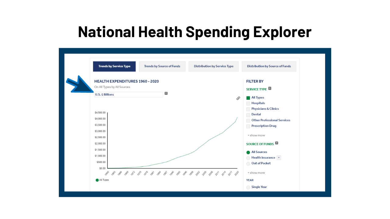
Visualizing Health Policy: A Snapshot of Cancer Spending and Outcomes June 21, 2016 Infographic This Visualizing Health Policy infographic provides details on cancer spending and outcomes in the United States. The U.S. cancer mortality rate, 203 deaths per 100,000 population, was slightly lower than in comparable countries in 2010. Among cancers, lung cancer is the largest contributor to disease burden for both men and…
Visualizing Health Policy: Recent Trends in Employer-Sponsored Health Insurance Premiums January 5, 2016 Infographic This Visualizing Health Policy infographic charts recent trends in employer-sponsored health insurance premiums. Between 1999 and 2015, premiums increased by 203 percent, outpacing both inflation and workers’ earnings. However, growth of premiums for family coverage slowed toward the end of that time period, from an average of 11 percent a…
Visualizing Health Policy: Recent Trends in Prescription Drug Costs April 5, 2016 Infographic This Visualizing Health Policy infographic with JAMA spotlights national spending on prescription drugs and the public’s views on pharmaceutical prices.
Visualizing Health Policy: Primary Care Practitioners’ Perspectives on Delivery System Changes November 24, 2015 Infographic This infographic takes a look at primary care practioners’ (PCPs’) perspectives on recent changes to the health care delivery system.
Health of the Healthcare System November 19, 2015 Video Health of the Healthcare System is a diagnostic look at the state of our healthcare system. How does the U.S. healthcare system compare to health systems of other high-income countries, and how has it fared over time? Kaiser Health News and former-NPR reporter, Julie Rovner, takes us through a check-up…
Visualizing Health Policy: The Costs and Outcomes of Mental Health and Substance Use Disorders in the US August 1, 2017 Infographic This Visualizing Health Policy infographic looks at costs and outcomes of mental health and substance use disorders in the United States (US).
Visualizing Health Policy: U.S. Public Opinion on Health Care Reform, 2017 March 29, 2017 Infographic This Visualizing Health Policy infographic with JAMA spotlights public opinion on health reform in the United States as of 2017, including priorities and views of the Affordable Care Act (also known as Obamacare) and its provisions.
State-by-State Effects of a Ruling for the Challengers in King v. Burwell June 2, 2015 Interactive A map and table showing the number of people now receiving premium subsidies who would lose them if the Court finds for the challengers; the total amount of federal subsidy dollars; the average subsidy (or average premium tax credit) that subsidized enrollees have qualified for; and the average increase in premiums that subsidized enrollees would face if the subsidies are disallowed.
Visualizing Health Policy: Health Care Costs September 26, 2012 Infographic The September 2012 Visualizing Health Policy infographic examines health costs in the United States, including how costs have changed, how they compare to some other countries, and how they impact American families. See the full-size infographic at The Journal of the American Medical Association View the related Slideshow Visualizing Health Policy is…
Visualizing Health Policy: Health Care in the 2012 Election October 11, 2012 Infographic The October 2012 Visualizing Health Policy infographic provides a snapshot of how health care–related issues are shaping the 2012 presidential election, including the percentage of Democrats, Republicans, and independents who named health care or the economy as the issue that is most important in determining their vote for President; which…