Medicare Advantage 2016 Spotlight: Enrollment Market Update
Issue Brief
The number and share of Medicare beneficiaries enrolled in Medicare Advantage has steadily climbed over the past decade, and this trend in enrollment growth is continuing in 2016. The growth in enrollment has occurred despite reductions in payments to plans enacted by the Affordable Care Act of 2010 (ACA).1 As of 2016, the payment reductions have been fully phased-in in 78 percent of counties, accounting for 70 percent of beneficiaries and 68 percent of Medicare Advantage enrollees.
This Data Spotlight reviews national and state-level Medicare Advantage enrollment trends as of March 2016 and examines variations in enrollment by plan type and firm. It analyzes the most recent data on premiums, out-of-pocket limits, Part D cost sharing, and plans’ quality ratings. Key findings include:
- Medicare Advantage enrollment has increased in virtually all states over the past year. Almost one in three people on Medicare (31% or 17.6 million beneficiaries) is enrolled in a Medicare Advantage plan in 2016 (Figure 1). The penetration rate exceeds 40 percent in 5 states.
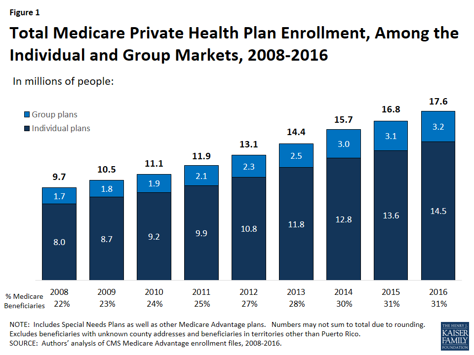
- Over 3 million enrollees (18%) are in a group plan in 2016.
- UnitedHealthcare and Humana together account for 39 percent of enrollment in 2016; enrollment continues to be highly concentrated among a handful of firms, both nationally and in local markets. If Aetna acquired Humana with no divestitures in 2016, the combined firm would account for 25 percent of Medicare Advantage enrollees nationwide.
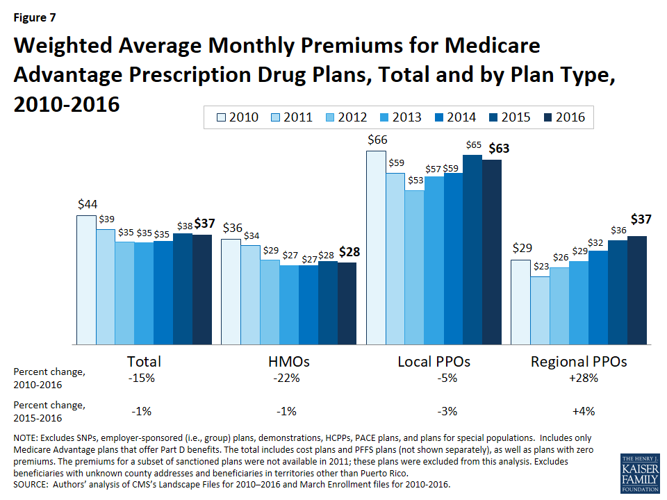
- On average, premiums paid by enrollees were relatively constant between 2015 and 2016 ($37 per month in 2016 versus $38 per month in 2015), although premiums vary widely across states, counties, and plan types.
- Medicare Advantage plans, unlike traditional Medicare, are required to provide an out-of-pocket limit (not to exceed $6,700) for services covered under Parts A and B. In 2016, the average enrollee had an out-of-pocket limit of $5,223 – nearly $1,000 higher than it was in 2011 ($4,313). More than one-third of all enrollees in Medicare Advantage prescription drug plans in 2016 (37%) are in plans with limits at the maximum.
Overall Trends in Enrollment
Nationwide Enrollment
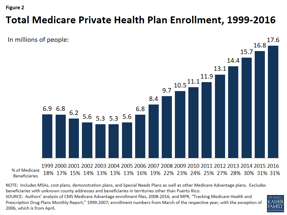
In 2016, 17.6 million beneficiaries – 31 percent of the Medicare population – are enrolled in a Medicare Advantage plan (Figure 2). Total Medicare Advantage enrollment grew by about 0.9 million beneficiaries, or 5 percent, between 2015 and 2016. Although this is a slower rate of growth in percentage terms than any year since 2006, the growth reflects the ongoing expansion of the position Medicare Advantage plays in the Medicare program. The growth in Medicare Advantage enrollment reflects both the influence of seniors aging on to Medicare as well as small shifts in the larger pool of beneficiaries in traditional Medicare switching to Medicare Advantage plans.2
Trends in Enrollment by Plan Type
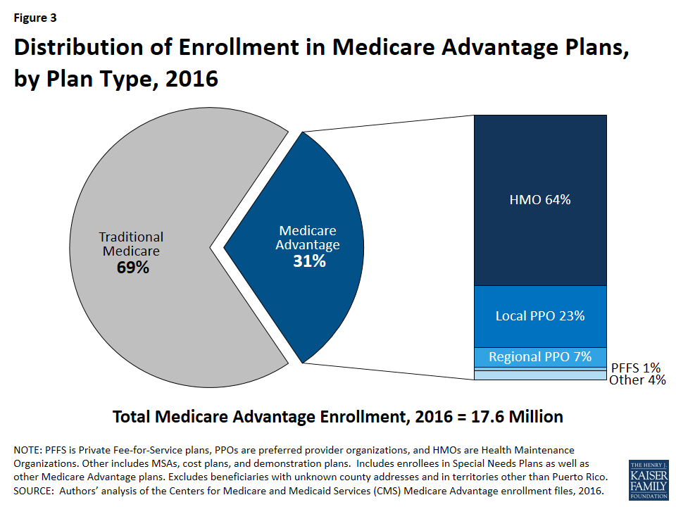
As has been the case each year since 2007, about two-thirds (64%) of Medicare Advantage enrollees are in HMOs in 2016 (Figure 3). Almost one-third of enrollees are in PPOs – with more in local PPOs (23%) than regional PPOs (7%) – and the remainder are in Private Fee-For Service (PFFS) plans (1%) and other types of plans (4%), including cost plans and Medicare Medical Savings Accounts (MSAs).
- Enrollment in HMOs increased by 0.6 million to 11.3 million beneficiaries in 2016 (Figure 4 and Table A1).
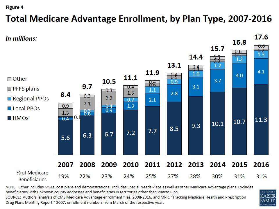
- Enrollment in local PPOs and regional PPOs increased by 0.1 million each, with 4.1 million beneficiaries in local PPOs and 1.3 million beneficiaries in regional PPOs 2016.
A key difference between an HMO and a PPO is that the latter provides enrollees with more flexibility to see providers outside of the plan’s provider network. Local PPOs, like HMOs, are required to serve areas no smaller than a county, whereas regional PPOs are required to serve areas defined by one or more states with a uniform benefit package across the service area.
- PFFS Plans. Enrollment in PFFS plans (0.2 million) has slowly declined since MIPPA of 2008 required PFFS plans in most parts of the country to have networks of providers, and today, about 1 percent of all Medicare Advantage enrollees are in these plans. Among PFFS plan enrollees, 26 percent are in counties in which PFFS plans are exempted from network requirements.
Group Enrollment
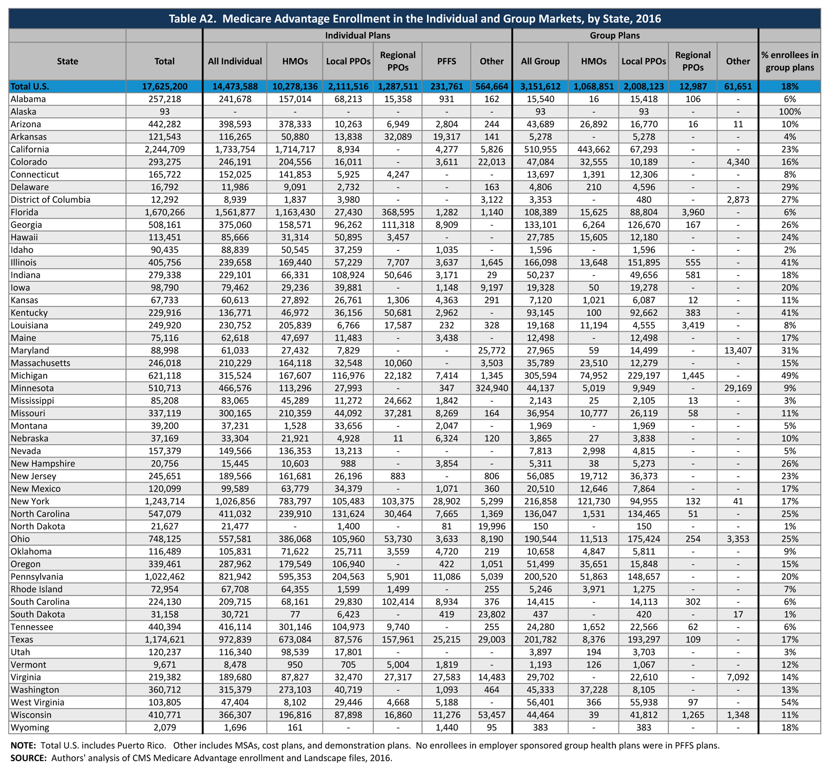
Most Medicare beneficiaries who enroll in Medicare Advantage plans do so as individuals, but a small number enroll through groups, comprised largely of plans sponsored by unions and employers for retirees. Under these arrangements, employers or unions contract with a Medicare Advantage insurer and Medicare pays the insurer a fixed payment per enrollee to provide benefits covered by Medicare, and the employer or union, and often the retiree as well, pays a premium for any additional benefits or lower cost-sharing.3 About 3.2 million of the 17.6 million enrollees (18%) are in a group plan in 2016 (Figure 5 and Table A2). Employers (and their retirees) appear to continue to favor local PPOs over HMOs, which contrasts with the individual market, with almost double the number of group plan enrollees in local PPOs compared to HMOs.
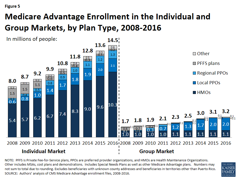
While the national share of Medicare Advantage enrollees in group plans has never been very large, in some states, the share of Medicare Advantage enrollees in group plans is much larger than average, including West Virginia (54%), Michigan (49%), Kentucky (41%), Illinois (41%), and Maryland (31%). In Ohio, enrollment in group plans dropped between 2015 and 2016, due to the Ohio Public Employees Retirement System’s decision to terminate its group Medicare Advantage plan, and instead provide a defined contribution that its retirees can use to help pay for an individual Medicare Advantage, Medigap, or other Medicare supplement plan.4
Historically, group Medicare Advantage plans have received higher Medicare payments, on average, than plans in the individual Medicare Advantage market.5 However beginning in 2017, CMS will be changing its payment methodology for group plans with the goal of more closely aligning payments with the average individual plan bid.6 This change will be fully phased-in by 2018 and is expected to lower payments to group plans as the Medicare Payment Advisory Commission (MedPAC) has recommended in the past.
Medicare Advantage Enrollment Growth by State
In 2016, enrollment increased in all states in 2015, with the exception of Ohio where enrollment declined by 8 percent, in large part to the Ohio Public Employees Retirement System pulling out of the Medicare Advantage group market and ceasing to sponsor a Medicare Advantage plan (Table 1). In 9 states (DE, IA, MD, ME, MS, MT, ND, NH, and SD) and the District of Columbia, enrollment increased by more than 10 percent – double the national average – including four states (DE, IA, ND, and NH) in which enrollment increased by more than 20 percent. All of these states have Medicare Advantage penetration rates far below the national average with relatively few enrollees and their growth rates are sensitive to small changes in enrollment.
| Table 1. Medicare Advantage Enrollment and Penetration Rate, by State, 2015-2016 | ||||||
| State | 2015 Total Enrollment | 2016 Total Enrollment | Change in Total Enrollment,2015-2016 | Percent Change in Enrollment,2015-2016 | 2015 Penetration Rate | 2016 Penetration Rate |
| Total U.S. | 16,761,673 | 17,625,200 | 863,527 | 5% | 31% | 31% |
| Alabama | 238,091 | 257,218 | 19,127 | 8% | 25% | 26% |
| Alaska | 56 | 93 | N/A | N/A | <1% | <1% |
| Arizona | 425,454 | 442,282 | 16,828 | 4% | 38% | 38% |
| Arkansas | 114,326 | 121,543 | 7,217 | 6% | 19% | 20% |
| California | 2,127,666 | 2,244,709 | 117,043 | 6% | 38% | 39% |
| Colorado | 281,467 | 293,275 | 11,808 | 4% | 37% | 36% |
| Connecticut | 157,692 | 165,722 | 8,030 | 5% | 25% | 26% |
| Delaware | 13,841 | 16,792 | 2,951 | 21% | 8% | 9% |
| District of Columbia | 11,033 | 12,292 | 1,259 | 11% | 13% | 14% |
| Florida | 1,570,845 | 1,670,266 | 99,421 | 6% | 40% | 41% |
| Georgia | 460,670 | 508,161 | 47,491 | 10% | 31% | 33% |
| Hawaii | 110,465 | 113,451 | 2,986 | 3% | 46% | 46% |
| Idaho | 87,837 | 90,435 | 2,598 | 3% | 32% | 31% |
| Illinois | 371,007 | 405,756 | 34,749 | 9% | 18% | 19% |
| Indiana | 264,104 | 279,338 | 15,234 | 6% | 23% | 24% |
| Iowa | 81,541 | 98,790 | 17,249 | 21% | 14% | 17% |
| Kansas | 61,600 | 67,733 | 6,133 | 10% | 13% | 14% |
| Kentucky | 212,948 | 229,916 | 16,968 | 8% | 25% | 26% |
| Louisiana | 232,445 | 249,920 | 17,475 | 8% | 30% | 31% |
| Maine | 66,307 | 75,116 | 8,809 | 13% | 22% | 24% |
| Maryland | 76,375 | 88,998 | 12,623 | 17% | 8% | 9% |
| Massachusetts | 233,084 | 246,018 | 12,934 | 6% | 19% | 20% |
| Michigan | 595,239 | 621,118 | 25,879 | 4% | 32% | 32% |
| Minnesota | 480,474 | 510,713 | 30,239 | 6% | 53% | 55% |
| Mississippi | 76,776 | 85,208 | 8,432 | 11% | 14% | 15% |
| Missouri | 311,364 | 337,119 | 25,755 | 8% | 28% | 29% |
| Montana | 34,758 | 39,200 | 4,442 | 13% | 18% | 19% |
| Nebraska | 34,982 | 37,169 | 2,187 | 6% | 11% | 12% |
| Nevada | 146,094 | 157,379 | 11,285 | 8% | 33% | 34% |
| New Hampshire | 17,295 | 20,756 | 3,461 | 20% | 7% | 8% |
| New Jersey | 222,846 | 245,651 | 22,805 | 10% | 15% | 16% |
| New Mexico | 113,807 | 120,099 | 6,292 | 6% | 31% | 32% |
| New York | 1,212,239 | 1,243,714 | 31,475 | 3% | 37% | 37% |
| North Carolina | 512,924 | 547,079 | 34,155 | 7% | 29% | 30% |
| North Dakota | 17,878 | 21,627 | 3,749 | 21% | 15% | 18% |
| Ohio | 811,503 | 748,125 | -63,378 | -8% | 38% | 34% |
| Oklahoma | 111,013 | 116,489 | 5,476 | 5% | 17% | 17% |
| Oregon | 323,765 | 339,461 | 15,696 | 5% | 44% | 44% |
| Pennsylvania | 1,001,864 | 1,022,462 | 20,598 | 2% | 40% | 40% |
| Rhode Island | 71,009 | 72,954 | 1,945 | 3% | 35% | 35% |
| South Carolina | 209,812 | 224,130 | 14,318 | 7% | 23% | 23% |
| South Dakota | 26,400 | 31,158 | 4,758 | 18% | 17% | 20% |
| Tennessee | 412,042 | 440,394 | 28,352 | 7% | 34% | 35% |
| Texas | 1,098,678 | 1,174,621 | 75,943 | 7% | 31% | 32% |
| Utah | 113,034 | 120,237 | 7,203 | 6% | 33% | 34% |
| Vermont | 8,984 | 9,671 | 687 | 8% | 7% | 7% |
| Virginia | 206,427 | 219,382 | 12,955 | 6% | 16% | 16% |
| Washington | 348,467 | 360,712 | 12,245 | 4% | 30% | 30% |
| West Virginia | 99,454 | 103,805 | 4,351 | 4% | 24% | 25% |
| Wisconsin | 388,732 | 410,771 | 22,039 | 6% | 38% | 38% |
| Wyoming | 2,071 | 2,079 | N/A | N/A | 2% | 2% |
| NOTE: Includes employer-sponsored plans, special needs plans, and other private plans. N/A indicates based on too few (less than 50) enrollees to report. Total U.S. includes Puerto Rico. Between March 2015 and March 2016, the CMS Division of Consumer Assessment and Plan Performance improved the determinations used to assign Medicare beneficiaries to geographic areas in their monthly Medicare Advantage Penetration files. This edit fixed an undercount of approximately 1% of actual Medicare enrollment, potentially making prior-year penetration rates look comparatively higher. SOURCE: Authors’ analysis of CMS Medicare Advantage enrollment and Landscape files, 2015-2016. | ||||||
In most states, the majority of enrollees are in HMOs; however, in 9 states (AK, HI, IL, IN, IA, KY, MI, MT, and WV), the majority of enrollees are in local PPOs (Table A1). Most of these states (MI, IL, and HI being exceptions) are heavily rural and also have Medicare Advantage penetration rates below the national average. Additionally, in a few states (MN, ND, and SD), the preponderance of private plan enrollees are in cost plans, which are paid differently from Medicare Advantage plans and allow enrollees to see any Medicare provider (and pay the cost-sharing they would pay in traditional Medicare).
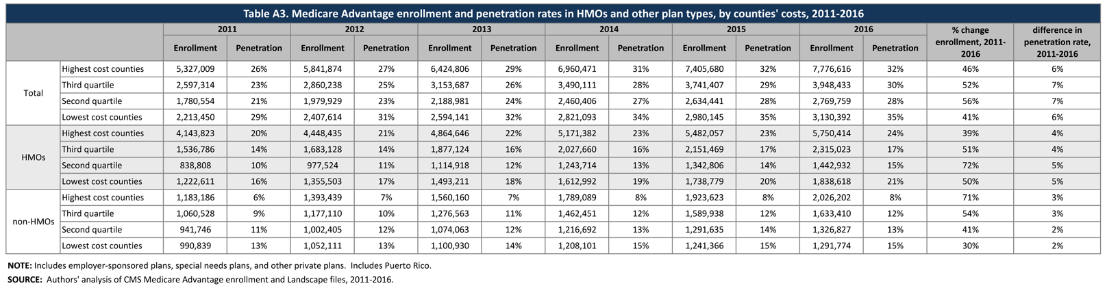
Enrollment Growth by County, based on Medicare Spending Quartiles. Over the years, Congress and various Administrations have made a number of changes to payment and participation rules for plans. Many of these changes have revolved around plan payment levels, seeking to balance plan participation and plan choices for beneficiaries with parity in payments between traditional Medicare and Medicare Advantage. The ACA reduced payments to all plans, and varied payment policy with the level of traditional Medicare spending in counties, grouped into four quartiles. In 2017, when payments are fully phased in, the payments will range from 95 percent of traditional Medicare spending for counties in the top quartile of Medicare spending to 115 percent of traditional Medicare spending for counties in the bottom quartile of Medicare spending, and 100 percent and 107.5 percent of Medicare spending in the two middle quartiles.
As of 2016, payment reductions have been fully implemented in 78 percent of all counties nationwide; these counties account for 70 percent of all Medicare beneficiaries nationwide and 68 percent of all Medicare Advantage enrollees. The payment changes authorized by the ACA will be fully phased-in in all states in 2017.
The year-to-year changes in penetration rate continue to be similar across the four quartiles (Table A3). Similar to prior years, the penetration rate grew by 6 percent in both the highest quartile counties and in the lowest quartile counties, and by 7 percent each in the two middle quartiles between 2011 and 2016. Overall penetration is also similar across the quartiles (ranging from 28% to 35%) and does not appear to be correlated with payment differences by quartile of traditional Medicare spending.
Medicare Advantage Penetration
In 23 states, at least 30 percent of Medicare beneficiaries are enrolled in Medicare private plans, including 5 states (FL, HI, MN, OR, and PA) in which at least 40 percent of beneficiaries are enrolled in Medicare private plans (Figure 6). These five states account for 21 percent of all Medicare private plan enrollees. While Medicare Advantage enrollment is increasing in many states, Medicare Advantage enrollment continues to be very low (less than 10 percent of Medicare beneficiaries) in 6 states (AK, DE, MD, NH, VT, and WY). This variation reflects the history of managed care in the state, the uneven prevalence of employer-sponsored insurance for retirees, and growth strategies pursued by various Medicare Advantage sponsors, among other factors.
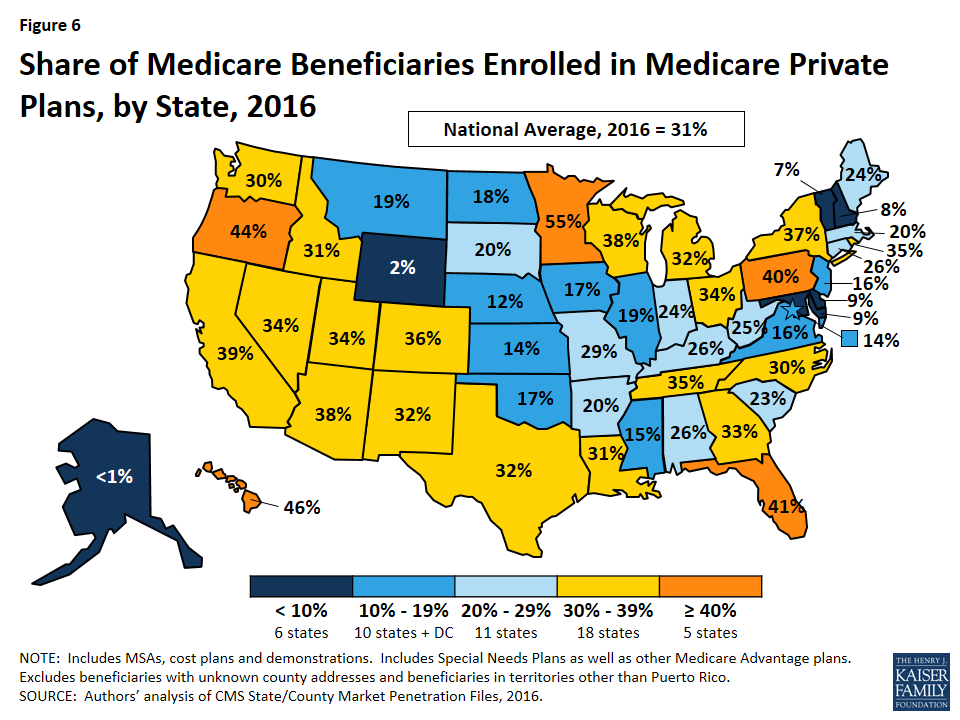
Within states, Medicare Advantage penetration varies across counties. For example, 44 percent of beneficiaries in Los Angeles County, California are enrolled in Medicare Advantage plans compared to only 11 percent of beneficiaries in Santa Cruz County, California.
Premiums
Medicare Advantage enrollees are responsible for paying the Part B premium, in addition to any premium charged by the plan. The Medicare Advantage premium paid by enrollees reflects the difference between the plan’s costs of providing Part A and B benefits and any supplemental benefits offered, and the federal payment to the plan for Part A and B benefits. Plans receive a percentage of the difference between their bid and the maximum federal payment (known as a rebate) and are required to use this amount to offer extra benefits, reduce cost sharing, or reduce the Part B premium. If the plan includes the Medicare Part D prescription drug benefit, as most plans do, the plan may also use the rebate to reduce the Part D premium. This brief analyzes premiums for Medicare Advantage plans that offer prescription drug benefits (MA-PDs) because the vast majority (89%) of Medicare Advantage enrollees is in MA-PDs and Medicare Advantage enrollees who seek Part D prescription drug benefits are, for the most part, required to get them through their plan if the plan offers prescription drugs.
Average Premium Trends
The average MA-PD enrollee pays a monthly premium of about $37 in 2016, about $1 per month (1%) less than in 2015 (Figure 7). 7 Actual premiums paid by enrollees vary widely, across and within counties, by plan type and other plan characteristics. Average premiums range from $28 per month for HMO enrollees to $63 per month for local PPOs and $76 per month for PFFS plan enrollees (Table A4). Since the ACA was enacted in 2010, average Medicare Advantage premiums paid by HMO enrollees and local PPO enrollees have decreased and average premiums paid by regional PPOs and PFFS enrollees have increased.
Zero Premium Plans
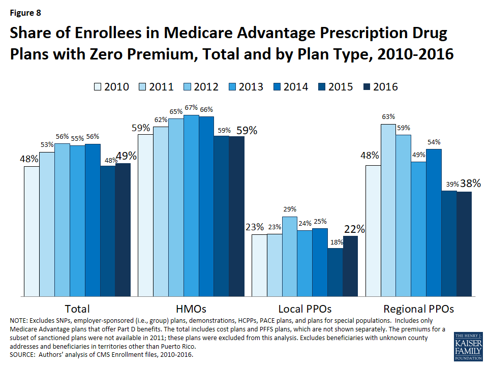
In 2016, as in prior years, most Medicare beneficiaries (81%) had a choice of at least one “zero premium” MA-PD8 plans that charge no additional premium for coverage, other than the monthly Part B premium. Between 2015 and 2016, the share of enrollees in zero premium MA-PDs remained relatively unchanged (48% in 2015 versus 49% in 2016), about the same share as in 2010 (Figure 8). Similar to prior years, a larger share of HMO enrollees is enrolled in zero premium plans (59%) than regional PPO enrollees (38%) or local PPO enrollees (22%). No zero premium PFFS plans were offered in 2015 or 2016 (Table A4).
Premium Variation Across States
Comparing premiums across states is complicated by the fact that premiums reflect many factors, including the underlying costs of care in a given county relative to the national average, the level of payments to Medicare Advantage plans in the area, and firms’ strategy about whether to use plans’ rebates to offer extra benefits, reduce cost-sharing, or lower premiums. Additionally, as previously discussed, premiums vary across plan types and enrollment by plan type varies across states.
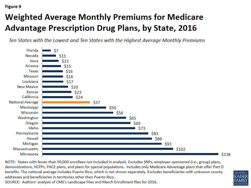
Average monthly MA-PD premiums paid per enrollee range from $7 (Florida) to $138 (Minnesota, which is mainly cost rather than risk-based plans plans), relative to the $37 per month average premium in 2016 (Figure 9).9 Average monthly premiums exceed $70 in seven states: Hawaii, Massachusetts, Michigan, Minnesota, North Dakota ($123; not displayed in exhibit), Pennsylvania, and Idaho. In contrast, average monthly premiums are less than $20 in seven states: Arizona, Iowa, Florida, Louisiana, Missouri, Nevada, and Texas. (States with fewer than 50,000 Medicare Advantage enrollees are not displayed in the exhibit.)
Premiums also vary greatly within a state since plans and federal payments to plans vary by county. For example, MA-PD enrollees pay an average of $3 per month in Los Angeles County, California but $64 per month in San Francisco County, California. Similarly, MA-PD enrollees pay, on average, $18 per month in Queens, New York but $75 per month in Albany, New York.
Cost Sharing
Medicare Advantage plans are required to provide all Medicare covered services, and have some flexibility in setting cost-sharing for specific Medicare-covered services. In addition, since 2011 Medicare Advantage plans have been required to limit enrollees’ out-of-pocket expenditures for services covered under Parts A and B – in contrast with traditional Medicare.
Out-Of-Pocket Limits
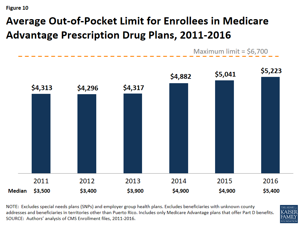
In 2011, CMS began requiring all Medicare Advantage plans to limit enrollees’ out-of-pocket expenditures for Part A and B in-network services to no more than $6,700 annually, and recommended a limit of $3,400 or lower.10
In 2016, the average out-of-pocket limit an MA-PD enrollee faces is $5,223, up from $5,041 in 2015 and $4,313 in 2011 (Figure 10). More than half of all enrollees (52%) are in plans with limits above $5,000 in 2016, up from 46 percent in 2015. More than one-third of all enrollees in 2016 (37%) are in plans with limits at the $6,700 maximum, as compared to 32 percent in 2015 and 17 percent in 2011 (data not shown).
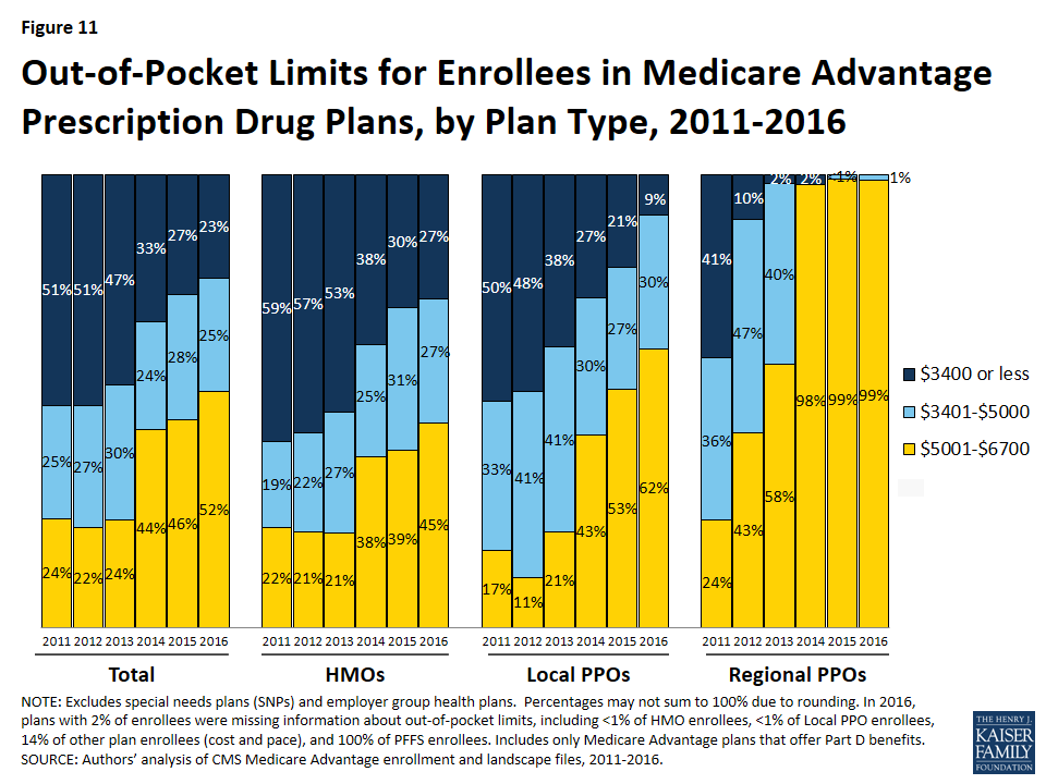
HMO enrollees have generally had lower out-of-pocket limits than enrollees in local PPOs or regional PPOs, and this remains the case in 2016 (Figure 11). Virtually all regional PPO enrollees (99%) and nearly two-thirds of local PPO enrollees (62%) are in plans with limits above $5,000 in 2016. In comparison, 45 percent of HMO enrollees are in plans with limits above $5,000 in 2016. Yet, across all plan types, the share of enrollees in plans with limits above $5,000 has greatly increased and, similarly, the share of enrollees in plans with limits at or below the recommended limit has decreased across all plan types since 2011.
Part D Cost Sharing
The standard Medicare Part D benefit in 2016, for both stand-alone prescription drug plans (PDPs) and MA-PDs, has a $360 deductible and 25 percent coinsurance up to an initial coverage limit of $3,310 in total drug costs, followed by a coverage gap (the so-called “donut hole”) where beneficiaries pay a larger share of total costs until their total out of pocket Part D spending reaches $4,850. After exceeding this catastrophic threshold, beneficiaries pay 5 percent of the cost of drugs.11
Part D Deductibles
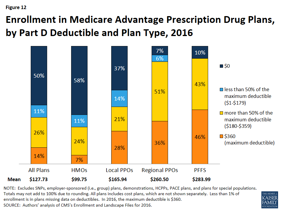
Both free-standing (stand-alone) prescription drug plans (PDPs) and Medicare Advantage plans have the flexibility to vary the cost-sharing design of their Part D benefit; however, CMS limits the plans’ deductibles and in 2016 the deductible cannot exceed $360. In 2016, just 14 percent of MA-PD enrollees are in a plan with the maximum Part D deductible. Half (50%) are in plans with no Part D deductible and the rest (36%) have deductibles less than $360 (Figure 12). Since sponsors of MA-PDs can use their rebate dollars and bonus payments to lower Part D costs, enrollees in MA-PDs historically have had lower Part D deductibles (and premiums) than enrollees in PDPs.12 Among Medicare Advantage enrollees, those in HMOs (58%), followed by local PPOs (37%), are most likely to be in a plan with no deductible.
Medicare Advantage Enrollment, by Firm
Enrollment by Firm
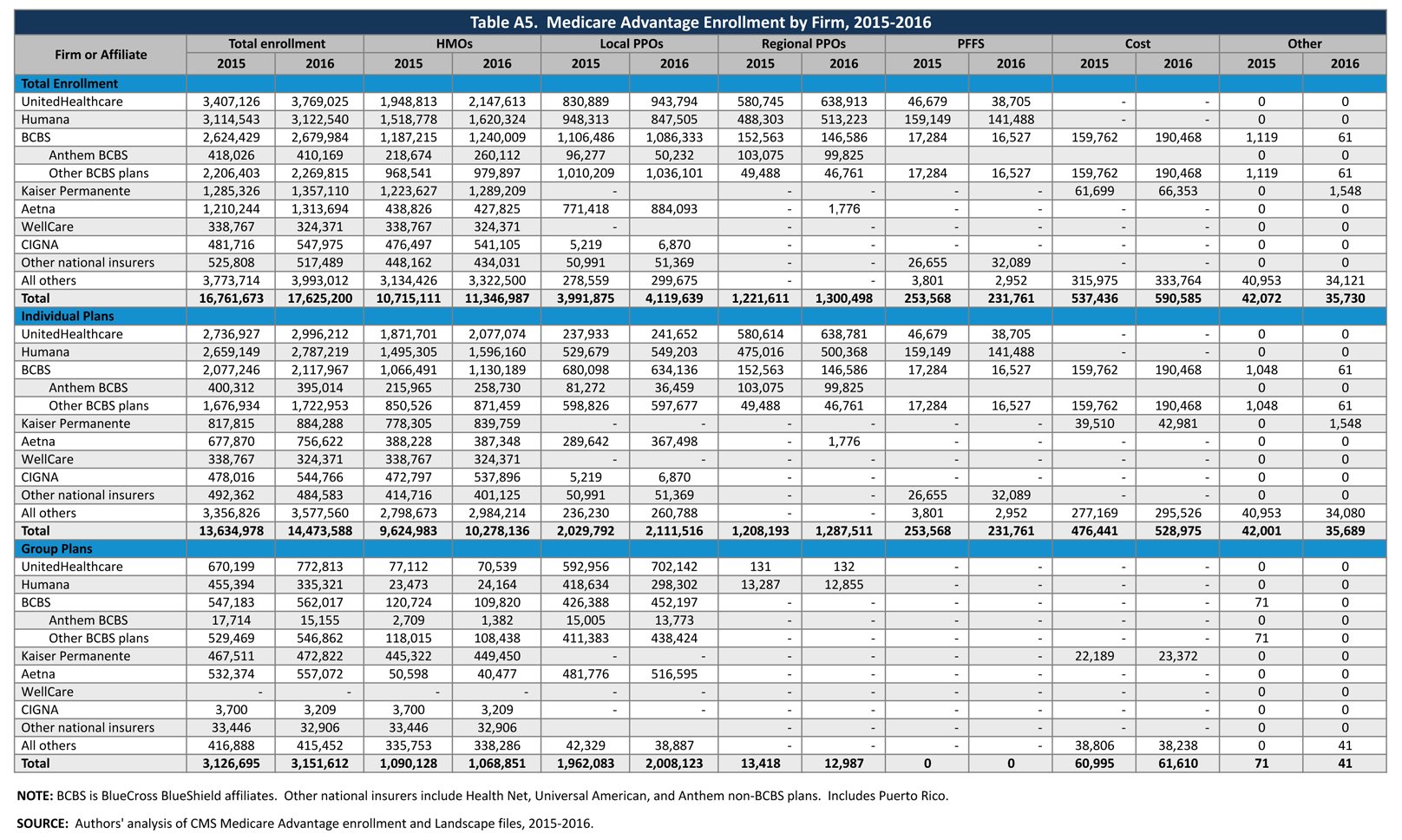
Medicare Advantage enrollment tends to be highly concentrated among a small number of firms (Figure 13). In 2016, six firms or affiliates accounted for about three-quarters (73%) of the market, including UnitedHealthcare, Humana, Blue Cross Blue Shield (BCBS) affiliated plans, Kaiser Permanente, Aetna, and Cigna. UnitedHealthcare, Humana, and the BCBS affiliates together account for just over half (54%) of Medicare Advantage enrollment. Enrollment in UnitedHealthcare’s plans grew more than any other firm, increasing by more than 360,000 beneficiaries between 2015 and 2016 (Table A5).
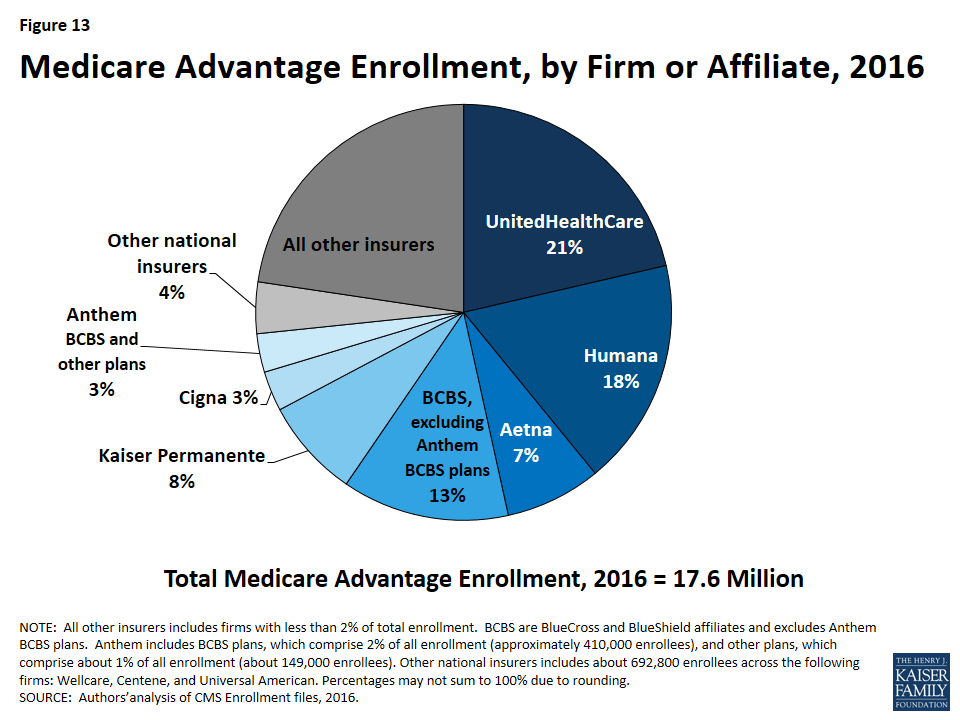
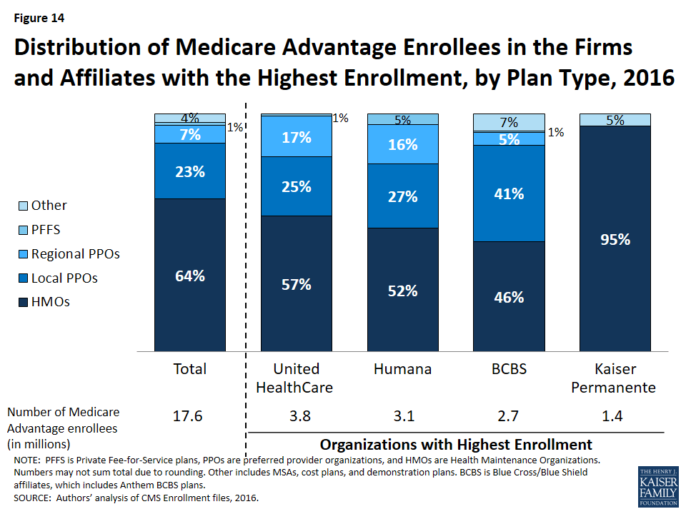
Firms differ in how they position themselves in the market, including the plan types they offer. Almost all of Kaiser Permanente’s enrollees (95%) are in HMOs with the remainder (5%) in cost plans (Figure 14). In contrast, enrollment in UnitedHealthcare and Humana plans is mostly in HMOs, but also includes significant shares in local PPOs and regional PPOs. Humana’s distribution of enrollment across plan types continues the shift from earlier years when a much larger share of Humana’s enrollees was in PFFS plans. Enrollment in BCBS plans is split between HMOs (46%) and local PPOs (41%), with the remainder in regional PPOs and other plan types including PFFS plans.
Market Concentration by State
In most states, a few firms dominate Medicare Advantage enrollment (Figure 15). Similar to prior years, in every state other than New York, the three largest firms or BCBS affiliates account for at least 50 percent of enrollment. In 37 states and the District of Columbia, at least 75 percent of enrollees are in plans offered by one of three firms.
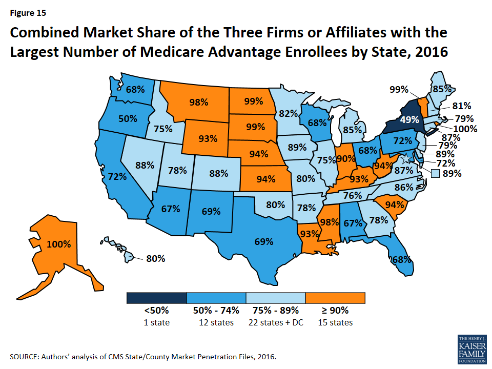
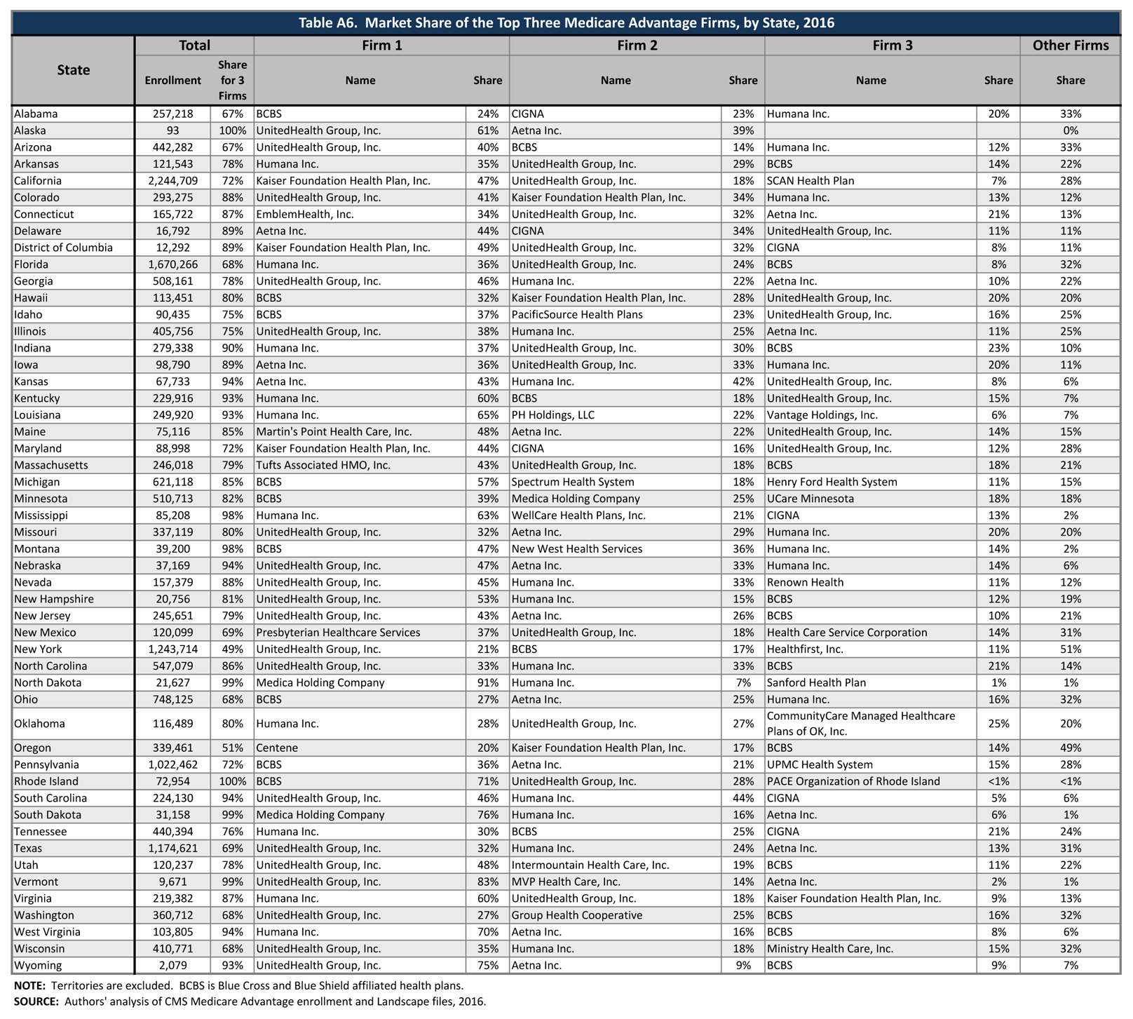
In 13 states, one company has more than half of all Medicare Advantage enrollment – an indicator that these markets may not be very competitive (Table A6). With the exception of North Dakota and South Dakota, all of these states are dominated by either UnitedHealthcare, Humana, or BCBS affiliated plans. (Medica Holding Company’s plans dominate Medicare Advantage enrollment in the Dakotas.)
UnitedHealthcare has the largest share of enrollment in 19 states and is among the top three firms in an additional 18 states and the District of Columbia. Humana has the largest enrollment in 10 states and is among the top 3 firms in another 19 states. Plans offered by BCBS affiliates have the most enrollees in 9 states and are among the top firms in another 16 states. Kaiser Permanente’s presence is more geographically focused than other major national firms, with a heavy concentration in California, Colorado, the District of Columbia and Maryland. Kaiser Permanente has more enrollees than any other firm in California, the District of Columbia and Maryland. In some states, locally operated plans play a much larger role than the national firms, and include EmblemHealth (CT), Martin’s Point Health Care (ME), Tufts Associated HMO (MA), New West (MT), Presbyterian Healthcare Services (NM), and Medica Holding Company (ND and SD).
Potential Effects of Proposed Mergers
Enrollment in Medicare Advantage plans has been highly concentrated within a handful of firms throughout its history. If the acquisition of Humana by Aetna and the acquisition of Cigna by Anthem are approved, then Medicare Advantage enrollment could become more concentrated, particularly if few divestitures are required.
If no divestitures are required in the acquisition of Humana by Aetna, then the combined firm would account for 25 percent of Medicare Advantage enrollment nationwide – more than UnitedHealthcare, which accounts for 21 percent of enrollment this year (Table A7). In 2016, Aetna’s total (individual and group) enrollment increased by 100,000 whereas Humana’s stayed flat because large increases in enrollment in individual Humana plans were offset by a decline in enrollment in group Humana plans due to the Ohio Public Employees Retirement System terminating their contract with Humana.
The acquisition of Cigna by Anthem would have a less visible impact on the national Medicare Advantage market. In 2016, Anthem had about 410,000 enrollees in BCBS licensed Medicare Advantage plans and about 150,000 in other plans. Nationwide, Anthem accounts for 3 percent of all Medicare Advantage enrollment and Cigna accounts for another 3 percent, so the combined entity would reflect about 6 percent of Medicare Advantage enrollment, if no divestitures were required. However, the effects of mergers are likely to vary substantially across states and even within states based on locality depending on where Medicare Advantage firms offer their plans and how many beneficiaries are enrolled in them. For example, Anthem (which was formerly known as Wellpoint) gained scale when it merged with BCBS licensees in a number of states. It now offers its Medicare Advantage plans through its BCBS affiliated plans (offered in CA, CO, CT, GA, IN, KY, ME, MO, NH, NV, NY, OH, VA, and WI),13 as well as through independently licensed products.
Star Quality Ratings
For many years, CMS has posted quality ratings of Medicare Advantage plans to provide beneficiaries with additional information about plans offered in their area. All plans are rated on a 1 to 5 star scale, with 1 star representing poor performance, 3 stars representing average performance, and 5 stars representing excellent performance. CMS assigns quality ratings at the contract level, rather than for each individual plan, meaning that each plan covered under the same contract receives the same quality rating (and most contracts cover multiple plans of the same type). Since 2012, Medicare Advantage plans with 4 or more stars and plans without ratings have been receiving bonus payments based on quality ratings.14 Beneficiaries can enroll in a plan with 5 stars at any time during the year, not just during the annual open enrollment period.
Between 2013 and 2016, the share of enrollees in plans with 4 or more stars has steadily increased, from 37 percent in 2013 to 68 percent in 2016 (Figure 16). Much of the increase in enrollment in plans with four or more stars has occurred in the plans with 4 or 4.5 stars, while the share of enrollees in plans with 5 stars has been relatively stable.
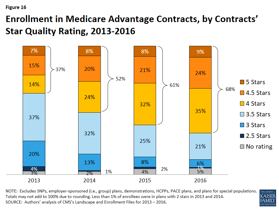
Notably, while a larger share of beneficiaries is in a Medicare Advantage plan with relatively high star ratings, seniors have said in focus groups that they do not use the star ratings to select their plan.15 Nonetheless, the star ratings may be correlated with factors that seniors do use to select their plan, including provider networks, and plan benefits and costs, and thus may be correlated with enrollment.
Discussion
Enrollment in Medicare Advantage plans continues to grow nationally, by state, and across quartiles of traditional Medicare spending, despite concerns about the reductions in payments enacted in the ACA. Medicare Advantage premiums have remained relatively flat. However, plans’ limits on out-of-pocket costs have steadily grown, increasing by almost $1,000 on average since 2011, indicating that enrollees with significant medical needs have less financial protection in plans than they have in the past. Additional work is needed to understand plans’ cost-sharing and provider networks, including changes over time and variation across plans. A key concern is whether beneficiaries have the information they need to make fully informed health plan choices from one year to the next, taking into account changes in their plan’s coverage and/or provider network, and changes in their own health care needs.
Looking to the future, both the Congressional Budget Office and the Health and Human Services (HHS) Office of the Actuary (OACT) project that Medicare Advantage enrollment and penetration rate will continue to grow over the next decade, with CBO projecting that about 41 percent of Medicare beneficiaries will be enrolled in Medicare Advantage in 2026. Enrollment will likely grow more in some parts of the country than in others, reflecting the diversity of markets and the coverage decisions of beneficiaries. This growth may prompt some to question at what point the balance between traditional Medicare and Medicare Advantage will tip in favor of Medicare Advantage, with the preponderance of beneficiaries in Medicare Advantage plans, and what this will mean both for beneficiaries in traditional Medicare and those in Medicare Advantage.16
Gretchen Jacobson, Giselle Casillas, and Tricia Neuman are with the Kaiser Family Foundation; Anthony Damico is an independent consultant; and Marsha Gold is a Senior Fellow Emeritus with Mathematica Policy Research and independent consultant.
Appendices
Appendix A: Special Needs Plans
Special Needs Plans (SNPs) restrict enrollment to specific types of beneficiaries with significant or relatively specialized care needs, including beneficiaries: (1) dually eligible for Medicare and Medicaid (D-SNPs); (2) requiring a nursing home or institutional level of care (I-SNPs); or (3) with severe chronic or disabling conditions (C-SNPs.)
Enrollment in SNPs increased modestly from 2.0 million to 2.1 million beneficiaries between 2015 and 2016 (Figure A1 and Table A8). In 2016, SNP enrollees account for about 12 percent of total Medicare Advantage enrollment, but account for a larger share of the Medicare Advantage enrollment in some states. In five states and the District of Columbia, enrollment in SNPs comprises more than one-fifth of Medicare Advantage enrollment (35% in DC, 28% in SC, 22% in AZ, 21% in AR, and 20% in AL and MS; data not shown).
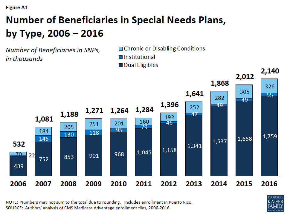
Similar to prior years, most SNP enrollees are in HMOs (86%), with 11 percent enrolled regional PPOs and 3 percent in local PPOs. The majority of SNP enrollees (82%) are in plans serving those dually eligible for Medicare and Medicaid (D-SNPs). Enrollment of dually eligible beneficiaries in D-SNPs varies greatly by state, and is particularly prevalent in Hawaii (50%) and Arizona (40%) (Table A8).
Separately, several states are undertaking demonstrations with CMS to improve the alignment of Medicare and Medicaid for dually eligible beneficiaries using a capitated model, with the first state (Washington) beginning enrollment in its demonstration in July 2013. As of March 2016, more than 400,000 dual eligibles were enrolled in the demonstrations (Table A9). Most of these enrollees are not included in the SNP enrollment statistics provided here because they operate under unique authority and CMS classifies them as demonstrations. Minnesota is an exception because the demonstration uses its existing D-SNPs to improve the administrative alignment of Medicare and Medicaid in the state’s D-SNPs. In most states operating demonstrations for dual eligibles, enrollment in D-SNPs has increased since the demonstrations began in 2013. In the few states in which enrollment in D-SNPs has declined since 2013 (CA, MI, and MN), the decline has been much smaller than the total enrollment in the state demonstration. As a consequence, in all states operating demonstrations, the total number of dual eligibles in capitated Medicare arrangements has increased since 2013. It is unclear whether D-SNPs will continue to operate alongside the demonstrations in these states or how the demonstrations will affect the growth in D-SNP enrollment over time.
Appendix B: Tables
| Table A1. Medicare Advantage Enrollment by State and Plan Type, 2016 | |||||||
| State | Total | Distribution of Enrollment, by State and Plan Type | |||||
| % in HMOs | % in Local PPOs | % in Regional PPOs | % in PFFS Plans | % in Cost Plans | % in Other Plans | ||
| Total U.S. | 17,625,200 | 64% | 23% | 7% | 1% | 3% | <1% |
| Alabama | 257,218 | 61% | 33% | 6% | <1% | 0% | <1% |
| Alaska | 93 | 0% | 100% | 0% | 0% | 0% | 0% |
| Arizona | 442,282 | 92% | 6% | 2% | 1% | <1% | 0% |
| Arkansas | 121,543 | 42% | 16% | 26% | 16% | 0% | <1% |
| California | 2,244,709 | 96% | 3% | 0% | <1% | <1% | <1% |
| Colorado | 293,275 | 81% | 9% | 0% | 1% | 8% | 1% |
| Connecticut | 165,722 | 86% | 11% | 3% | 0% | 0% | 0% |
| Delaware | 16,792 | 55% | 44% | 0% | 0% | 0% | 1% |
| District of Columbia | 12,292 | 15% | 36% | 0% | 0% | 49% | 0% |
| Florida | 1,670,266 | 71% | 7% | 22% | <1% | <1% | <1% |
| Georgia | 508,161 | 32% | 44% | 22% | 2% | 0% | 0% |
| Hawaii | 113,451 | 41% | 56% | 3% | 0% | 0% | 0% |
| Idaho | 90,435 | 56% | 43% | 0% | 1% | 0% | 0% |
| Illinois | 405,756 | 45% | 52% | 2% | 1% | <1% | 0% |
| Indiana | 279,338 | 24% | 57% | 18% | 1% | 0% | <1% |
| Iowa | 98,790 | 30% | 60% | 0% | 1% | 9% | <1% |
| Kansas | 67,733 | 43% | 48% | 2% | 6% | 0% | <1% |
| Kentucky | 229,916 | 20% | 56% | 22% | 1% | 0% | 0% |
| Louisiana | 249,920 | 87% | 5% | 8% | <1% | 0% | <1% |
| Maine | 75,116 | 63% | 32% | 0% | 5% | 0% | 0% |
| Maryland | 88,998 | 31% | 25% | 0% | 0% | 44% | <1% |
| Massachusetts | 246,018 | 76% | 18% | 4% | 0% | 0% | 1% |
| Michigan | 621,118 | 39% | 56% | 4% | 1% | 0% | <1% |
| Minnesota | 510,713 | 23% | 7% | 0% | <1% | 69% | 0% |
| Mississippi | 85,208 | 53% | 16% | 29% | 2% | 0% | 0% |
| Missouri | 337,119 | 66% | 21% | 11% | 2% | 0% | <1% |
| Montana | 39,200 | 4% | 91% | 0% | 5% | 0% | 0% |
| Nebraska | 37,169 | 59% | 24% | <1% | 17% | <1% | <1% |
| Nevada | 157,379 | 89% | 11% | 0% | 0% | 0% | 0% |
| New Hampshire | 20,756 | 51% | 30% | 0% | 19% | 0% | 0% |
| New Jersey | 245,651 | 74% | 25% | <1% | 0% | 0% | <1% |
| New Mexico | 120,099 | 64% | 35% | 0% | 1% | 0% | <1% |
| New York | 1,243,714 | 73% | 16% | 8% | 2% | <1% | <1% |
| North Carolina | 547,079 | 44% | 49% | 6% | 1% | 0% | <1% |
| North Dakota | 21,627 | 0% | 7% | 0% | <1% | 92% | 1% |
| Ohio | 748,125 | 53% | 38% | 7% | <1% | 1% | <1% |
| Oklahoma | 116,489 | 66% | 27% | 3% | 4% | 0% | <1% |
| Oregon | 339,461 | 63% | 36% | 0% | <1% | 0% | <1% |
| Pennsylvania | 1,022,462 | 63% | 35% | 1% | 1% | 0% | <1% |
| Rhode Island | 72,954 | 94% | 4% | 2% | 0% | 0% | <1% |
| South Carolina | 224,130 | 30% | 20% | 46% | 4% | 0% | <1% |
| South Dakota | 31,158 | <1% | 22% | 0% | 1% | 76% | 0% |
| Tennessee | 440,394 | 69% | 29% | 2% | 0% | 0% | <1% |
| Texas | 1,174,621 | 58% | 24% | 13% | 2% | 2% | <1% |
| Utah | 120,237 | 82% | 18% | 0% | 0% | 0% | 0% |
| Vermont | 9,671 | 11% | 18% | 52% | 19% | 0% | 0% |
| Virginia | 219,382 | 40% | 25% | 12% | 13% | 9% | 1% |
| Washington | 360,712 | 86% | 14% | 0% | <1% | 0% | <1% |
| West Virginia | 103,805 | 8% | 82% | 5% | 5% | 0% | 0% |
| Wisconsin | 410,771 | 48% | 32% | 4% | 3% | 13% | 1% |
| Wyoming | 2,079 | 8% | 18% | 0% | 69% | 0% | 5% |
| NOTE: Total U.S. includes Puerto Rico. Includes employer-sponsored plans, special needs plans, and other private plans. Other includes MSAs and demonstration plans.SOURCE: Authors’ analysis of CMS Medicare Advantage enrollment and Landscape files, 2016. | |||||||
(click on table image to enlarge) –
(click on table image to enlarge) –
| Table A4. Weighted Average Premiums and the Share of Enrollees with Zero Premium in Medicare Advantage Prescription Drug Plans(MA-PDs), 2010-2016 | |||||||
| 2010 | 2011 | 2012 | 2013 | 2014 | 2015 | 2016 | |
| Weighted Average Monthly Premiums for MA-PDs | |||||||
| Total | $44 | $39 | $35 | $35 | $35 | $38 | $37 |
| HMOs | $36 | $34 | $29 | $27 | $27 | $28 | $28 |
| Local PPOs | $66 | $59 | $53 | $57 | $59 | $65 | $63 |
| Regional PPOs | $29 | $23 | $26 | $29 | $32 | $36 | $37 |
| PFFS Plans | $55 | $43 | $42 | $51 | $63 | $68 | $76 |
| Share of Enrollees in MA-PDs with Zero Premium | |||||||
| Total | 48% | 53% | 56% | 55% | 56% | 48% | 49% |
| HMOs | 59% | 62% | 65% | 67% | 66% | 59% | 59% |
| Local PPOs | 23% | 23% | 29% | 24% | 25% | 18% | 22% |
| Regional PPOs | 48% | 63% | 59% | 49% | 54% | 39% | 38% |
| PFFS Plans | 15% | 23% | 29% | 17% | 17% | 0% | 0% |
| NOTE: Excludes SNPs, employer-sponsored (i.e., group) plans, demonstrations, HCPPs, PACE plans, and plans for special populations. Includes only Medicare Advantage plans that offer Part D benefits. The total includes cost plans (not shown separately), as well as plans with zero premiums. The premiums for a subset of sanctioned plans were not available in 2011; these plans were excluded from this analysis. Excludes beneficiaries with unknown county addresses and beneficiaries in territories other than Puerto Rico.SOURCE: Authors’ analysis of CMS’s Landscape Files for 2010–2016 and March Enrollment files for 2010-2016. | |||||||
(click on table image to enlarge)–
(click on table image to enlarge)–
| Table A7. Medicare Advantage Market Share by Firm, by State, 2016 | ||||||||
| State | Total Medicare Advantage Enrollment | Medicare Advantage Penetration Rate | HumanaMedicare Advantage Market Share | AetnaMedicare AdvantageMarket Share | CombinedAetna-HumanaMarket Share | CignaMedicare AdvantageMarket Share | AnthemMedicare Advantage Market Share | Combined Anthem-Cigna Market Share |
| Total U.S. | 17,625,200 | 31% | 18% | 7% | 25% | 3% | 3% | 6% |
| Alabama | 257,218 | 26% | 20% | 1% | 21% | 23% | <1% | 23% |
| Alaska | 93 | <1% | 39% | 39% | ||||
| Arizona | 442,282 | 38% | 12% | 1% | 13% | 12% | 3% | 14% |
| Arkansas | 121,543 | 20% | 35% | 7% | 42% | 2% | 2% | |
| California | 2,244,709 | 39% | 3% | 1% | 4% | 4% | 4% | |
| Colorado | 293,275 | 36% | 13% | 1% | 14% | <1% | <1% | |
| Connecticut | 165,722 | 26% | 0% | 21% | 21% | 8% | 8% | |
| Delaware | 16,792 | 9% | 10% | 44% | 53% | 34% | 34% | |
| District of Columbia | 12,292 | 14% | 0% | 7% | 7% | 8% | 8% | |
| Florida | 1,670,266 | 41% | 36% | 6% | 42% | 3% | 2% | 5% |
| Georgia | 508,161 | 33% | 22% | 10% | 32% | 9% | 1% | 9% |
| Hawaii | 113,451 | 46% | 12% | <1% | 12% | |||
| Idaho | 90,435 | 31% | 9% | <1% | 9% | |||
| Illinois | 405,756 | 19% | 25% | 11% | 36% | 5% | <1% | 5% |
| Indiana | 279,338 | 24% | 37% | 3% | 40% | 1% | 15% | 16% |
| Iowa | 98,790 | 17% | 20% | 36% | 56% | |||
| Kansas | 67,733 | 14% | 42% | 43% | 86% | 1% | 1% | |
| Kentucky | 229,916 | 26% | 60% | 2% | 62% | 16% | 16% | |
| Louisiana | 249,920 | 31% | 65% | 1% | 66% | |||
| Maine | 75,116 | 24% | 6% | 22% | 29% | 3% | 3% | |
| Maryland | 88,998 | 9% | 2% | 8% | 10% | 16% | 16% | |
| Massachusetts | 246,018 | 20% | <1% | 1% | 1% | <1% | <1% | |
| Michigan | 621,118 | 32% | 9% | 2% | 11% | |||
| Minnesota | 510,713 | 55% | 6% | <1% | 7% | |||
| Mississippi | 85,208 | 15% | 63% | 1% | 64% | 13% | 13% | |
| Missouri | 337,119 | 29% | 20% | 29% | 48% | <1% | 2% | 2% |
| Montana | 39,200 | 19% | 14% | <1% | 15% | |||
| Nebraska | 37,169 | 12% | 14% | 33% | 47% | |||
| Nevada | 157,379 | 34% | 33% | 4% | 37% | 4% | 4% | |
| New Hampshire | 20,756 | 8% | 15% | 2% | 17% | 12% | 12% | |
| New Jersey | 245,651 | 16% | 0% | 26% | 26% | <1% | 3% | 3% |
| New Mexico | 120,099 | 32% | 13% | 1% | 14% | 2% | 2% | |
| New York | 1,243,714 | 37% | 2% | 5% | 7% | 6% | 6% | |
| North Carolina | 547,079 | 30% | 33% | 10% | 43% | 2% | 2% | |
| North Dakota | 21,627 | 18% | 7% | 0% | 7% | |||
| Ohio | 748,125 | 34% | 16% | 25% | 41% | 25% | 25% | |
| Oklahoma | 116,489 | 17% | 28% | 3% | 31% | |||
| Oregon | 339,461 | 44% | 1% | <1% | 1% | |||
| Pennsylvania | 1,022,462 | 40% | 4% | 21% | 25% | 5% | <1% | 5% |
| Rhode Island | 72,954 | 35% | <1% | <1% | ||||
| South Carolina | 224,130 | 23% | 44% | 2% | 46% | 5% | <1% | 5% |
| South Dakota | 31,158 | 20% | 16% | 6% | 23% | |||
| Tennessee | 440,394 | 35% | 30% | 1% | 31% | 21% | 2% | 23% |
| Texas | 1,174,621 | 32% | 24% | 13% | 37% | 10% | 3% | 12% |
| Utah | 120,237 | 34% | 6% | 8% | 15% | |||
| Vermont | 9,671 | 7% | <1% | 2% | 2% | |||
| Virginia | 219,382 | 16% | 60% | 5% | 65% | 3% | 3% | |
| Washington | 360,712 | 30% | 9% | <1% | 9% | <1% | <1% | |
| West Virginia | 103,805 | 25% | 70% | 16% | 86% | |||
| Wisconsin | 410,771 | 38% | 18% | <1% | 18% | 1% | 1% | |
| Wyoming | 2,079 | 2% | 3% | 9% | 11% | |||
| NOTE: Totals may not sum to 100% due to rounding. Includes employer-sponsored plans, special needs plans, and other private plans. Total U.S. includes Puerto Rico. Blank cells indicate no plans offered. Anthem includes BCBS plans and other plans.SOURCE: Authors’ analysis of CMS Medicare Advantage enrollment and Landscape files, 2016. | ||||||||
| Table A8. Enrollment in Special Needs Plans (SNPs), by Plan Type and State, 2016 | ||||||
| State | Enrollment in Special Needs Plans | Total Dual Eligibles (in 2014) | % of Dual Eligibles in D-SNPs | |||
| Total | Dual eligibles(D-SNPs) | Institutional(I-SNPs) | Chronic or disabling conditions (C-SNPs) | |||
| Total U.S. | 1,852,085 | 1,482,050 | 55,439 | 314,596 | 11,063,740 | 13% |
| Alabama | 51,365 | 51,103 | 262 | 0 | 222,740 | 23% |
| Alaska | 0 | 0 | 0 | 0 | 17,420 | 0% |
| Arizona | 96,389 | 80,156 | 2,192 | 14,041 | 199,180 | 40% |
| Arkansas | 25,705 | 12,877 | 12,828 | 138,480 | 9% | |
| California | 191,776 | 145,860 | 2,451 | 43,465 | 1,424,500 | 10% |
| Colorado | 12,278 | 9,417 | 2,772 | 89 | 112,220 | 8% |
| Connecticut | 17,222 | 14,310 | 2,912 | 0 | 181,120 | 8% |
| Delaware | 2,232 | 988 | 520 | 724 | 30,440 | 3% |
| District of Columbia | 4,253 | 4,045 | 80 | 128 | 32,580 | 12% |
| Florida | 301,744 | 232,581 | 3,840 | 65,323 | 819,220 | 28% |
| Georgia | 98,080 | 52,120 | 2,541 | 43,419 | 330,800 | 16% |
| Hawaii | 20,068 | 20,068 | 0 | 0 | 39,860 | 50% |
| Idaho | 2,120 | 2,120 | 0 | 0 | 45,980 | 5% |
| Illinois | 14,249 | 11,561 | 944 | 1,744 | 402,620 | 3% |
| Indiana | 3,130 | 1,720 | 753 | 657 | 205,580 | 1% |
| Iowa | 0 | 0 | 0 | 0 | 91,920 | 0% |
| Kansas | 285 | 0 | 228 | 57 | 71,540 | 0% |
| Kentucky | 7,246 | 6,093 | 79 | 1,074 | 198,640 | 3% |
| Louisiana | 33,419 | 31,084 | 0 | 2,335 | 218,100 | 14% |
| Maine | 2,667 | 2,563 | 0 | 104 | 96,480 | 3% |
| Maryland | 12,443 | 5,601 | 2,870 | 3,972 | 148,480 | 4% |
| Massachusetts | 37,924 | 37,580 | 132 | 212 | 320,920 | 12% |
| Michigan | 12,489 | 12,384 | 16 | 89 | 330,840 | 4% |
| Minnesota | 36,591 | 36,591 | 0 | 0 | 149,660 | 24% |
| Mississippi | 16,675 | 14,697 | 0 | 1,978 | 172,020 | 9% |
| Missouri | 27,362 | 11,653 | 314 | 15,395 | 199,400 | 6% |
| Montana | 33 | 33 | 0 | 0 | 27,420 | <1% |
| Nebraska | 11 | 11 | 0 | 0 | 45,340 | <1% |
| Nevada | 9,998 | 0 | 514 | 9,484 | 60,200 | 0% |
| New Hampshire | 28 | 28 | 0 | 0 | 35,120 | <1% |
| New Jersey | 16,309 | 14,211 | 1,898 | 200 | 229,660 | 6% |
| New Mexico | 13,443 | 13,142 | 301 | 0 | 86,000 | 15% |
| New York | 218,678 | 201,444 | 16,474 | 760 | 900,480 | 22% |
| North Carolina | 25,306 | 19,764 | 2,457 | 3,085 | 345,240 | 6% |
| North Dakota | 0 | 0 | 0 | 0 | 17,540 | 0% |
| Ohio | 17,368 | 14,294 | 1,131 | 1,943 | 376,040 | 4% |
| Oklahoma | 156 | 0 | 156 | 0 | 124,120 | 0% |
| Oregon | 27,872 | 22,193 | 748 | 4,931 | 128,180 | 17% |
| Pennsylvania | 124,470 | 111,431 | 3,383 | 9,656 | 469,580 | 24% |
| Rhode Island | 1,610 | 11 | 1,599 | 0 | 43,360 | <1% |
| South Carolina | 62,133 | 22,518 | 0 | 39,615 | 164,720 | 14% |
| South Dakota | 0 | 0 | 0 | 0 | 22,880 | 0% |
| Tennessee | 79,561 | 79,561 | 0 | 0 | 285,100 | 28% |
| Texas | 162,745 | 130,210 | 229 | 32,306 | 740,940 | 18% |
| Utah | 8,036 | 8,036 | 0 | 0 | 39,620 | 20% |
| Vermont | 0 | 0 | 0 | 0 | 30,880 | 0% |
| Virginia | 5,379 | 1,737 | 163 | 3,479 | 204,900 | 1% |
| Washington | 26,226 | 24,574 | 1,652 | 0 | 200,040 | 12% |
| West Virginia | 371 | 371 | 0 | 0 | 93,240 | <1% |
| Wisconsin | 24,640 | 21,309 | 1,828 | 1,503 | 180,020 | 12% |
| Wyoming | 0 | 0 | 0 | 0 | 12,380 | 0% |
| NOTE: Excludes Puerto Rico. Blank cells indicate no plans offered.SOURCE: Authors’ analysis of CMS Medicare Advantage enrollment and Landscape files, 2016. Number of dual eligibles by state is derived from the CMS Chronic Conditions Data Warehouse standard analytic files for 2014. | ||||||
| Table A9. Enrollment in Dual Eligible Special Needs Plans and Financial/Administrative Alignment Demonstrations, by State, 2016 | ||||
| State | Enrollment in Dual Eligible Special Needs Plans (D-SNPs) | Enrollment in Financial Alignment Demonstration | ||
| 2013 | 2016 | Change,2013-2016 | ||
| Total U.S. | 1,099,100 | 1,482,050 | 382,950 | 365,826 |
| Alabama | 38,281 | 51,103 | 12,822 | 0 |
| Alaska | 0 | 0 | 0 | 0 |
| Arizona | 68,495 | 80,156 | 11,661 | 0 |
| Arkansas | 9,189 | 12,877 | 3,688 | 0 |
| California | 190,668 | 145,860 | -44,808 | 126,057 |
| Colorado | 8,444 | 9,417 | 973 | 0 |
| Connecticut | 4,612 | 14,310 | 9,698 | 0 |
| Delaware | 733 | 988 | 255 | 0 |
| District of Columbia | 1,756 | 4,045 | 2,289 | 0 |
| Florida | 135,100 | 232,581 | 97,481 | 0 |
| Georgia | 17,500 | 52,120 | 34,620 | 0 |
| Hawaii | 15,442 | 20,068 | 4,626 | 0 |
| Idaho | 662 | 2,120 | 1,458 | 0 |
| Illinois | 5,617 | 11,561 | 5,944 | 48,192 |
| Indiana | 2,998 | 1,720 | -1,278 | 0 |
| Iowa | 726 | 0 | -726 | 0 |
| Kansas | 0 | 0 | 0 | 0 |
| Kentucky | 683 | 6,093 | 5,410 | 0 |
| Louisiana | 18,354 | 31,084 | 12,730 | 0 |
| Maine | 2,553 | 2,563 | 10 | 0 |
| Maryland | 5,480 | 5,601 | 121 | 0 |
| Massachusetts | 23,616 | 37,580 | 13,964 | 12,524 |
| Michigan | 15,490 | 12,384 | -3,106 | 34,177 |
| Minnesota | 36,975 | 36,591 | -384 | 36,591 |
| Mississippi | 9,336 | 14,697 | 5,361 | 0 |
| Missouri | 8,383 | 11,653 | 3,270 | 0 |
| Montana | 0 | 33 | 33 | 0 |
| Nebraska | 1,073 | 11 | -1,062 | 0 |
| Nevada | 12 | 0 | -12 | 0 |
| New Hampshire | 12 | 28 | 16 | 0 |
| New Jersey | 23,745 | 14,211 | -9,534 | 0 |
| New Mexico | 6,076 | 13,142 | 7,066 | 0 |
| New York | 124,216 | 201,444 | 77,228 | 5,801 |
| North Carolina | 10,585 | 19,764 | 9,179 | 0 |
| North Dakota | 0 | 0 | 0 | 0 |
| Ohio | 11,754 | 14,294 | 2,540 | 62,177 |
| Oklahoma | 0 | 0 | 0 | 0 |
| Oregon | 19,271 | 22,193 | 2,922 | 0 |
| Pennsylvania | 93,372 | 111,431 | 18,059 | 0 |
| Rhode Island | 11 | 11 | 0 | |
| South Carolina | 9,213 | 22,518 | 13,305 | 1,418 |
| South Dakota | 0 | 0 | 0 | 0 |
| Tennessee | 51,760 | 79,561 | 27,801 | 0 |
| Texas | 87,476 | 130,210 | 42,734 | 48,010 |
| Utah | 7,497 | 8,036 | 539 | 0 |
| Vermont | 0 | 0 | 0 | 0 |
| Virginia | 635 | 1,737 | 1,102 | 27,470 |
| Washington | 16,988 | 24,574 | 7,586 | 0 |
| West Virginia | 44 | 371 | 327 | 0 |
| Wisconsin | 14,278 | 21,309 | 7,031 | 0 |
| Wyoming | 0 | 0 | 0 | 0 |
| NOTE: Excludes Puerto Rico. Blank cells indicate no plans offered. Excludes dual eligible beneficiaries enrolled in financial/administrative alignment demonstrations who are missing state designation. All enrollment is from March of the respective year.SOURCE: Authors’ analysis of CMS Medicare Advantage enrollment and Landscape files, 2013 and 2016. | ||||
Endnotes
- The ACA reductions in payments to plans will be fully implemented in 2017. ↩︎
- G. Jacobson, P. Neuman, and A. Damico. “At Least Half of New Medicare Advantage Enrollees Had Switched From Traditional Medicare During 2006-11,” Health Affairs, vol. 34 no. 1, p. 48-55, January 2015. Also see G. Jacobson, T. Neuman, and A. Damico. “Medigap Enrollment Among New Medicare Beneficiaries: How Many 65-Year Olds Enroll In Plans With First-Dollar Coverage?” Washington DC: Kaiser Family Foundation, April 2015. Available at: https://modern.kff.org/medicare/issue-brief/medigap-enrollment-among-new-medicare-beneficiaries/, Last accessed June 5, 2015. ↩︎
- F. McArdle, T. Neuman and J. Huang. “Retiree Health Benefits at the Crossroads”. Washington DC: Henry J. Kaiser Family Foundation, April 2014. Available at: https://modern.kff.org/medicare/report/retiree-health-benefits-at-the-crossroads/. ↩︎
- Sutherly, B. “OPERS Retirees Face Big Changes.” The Columbus Dispatch. November 27, 2015. Available at: http://www.dispatch.com/content/stories/local/2015/11/27/opers-retirees-face-big-changes.html. ↩︎
- Medicare Payment Advisory Commission “Chapter 13. The Medicare Advantage Program: Status Report” in Report to Congress: Medicare Payment Policy, Washington DC, March 2015. pp 313-343. ↩︎
- Centers for Medicare and Medicaid Services, “Announcement of Calendar Year (CY) 2017 Medicare Advantage Capitation Rates and Medicare Advantage and Part D Payment Policies and Final Call Letter,” April 4, 2016. Available at: https://www.cms.gov/Medicare/Health-Plans/MedicareAdvtgSpecRateStats/Downloads/Announcement2017.pdf. ↩︎
- In the fall of 2015, we calculated that beneficiaries who were enrolled in Medicare Advantage plans at that time would pay a premium of $41 per month in 2016, compared to $38 per month in 2015, which assumed they remained in the same plan. Among Medicare Advantage enrollees in 2016, the average premium actually paid by enrollees ($37 per month) is slightly lower than the amount estimated in the fall, with the difference in estimates reflecting both changes in beneficiaries enrolled in Medicare Advantage plans from 2015 to 2016 and shifts by enrollees among plans and plan types. ↩︎
- G. Jacobson, M. Gold, A. Damico, T. Neuman, and G. Casillas. “Medicare Advantage 2016 Data Spotlight: Overview of Plan Changes,” Washington DC: Henry J. Kaiser Family Foundation, December 2015. Available at: https://modern.kff.org/medicare/issue-brief/medicare-advantage-2016-data-spotlight-overview-of-plan-changes/. ↩︎
- In Minnesota, 69% of private plan enrollment is in cost plans, which have higher average premiums than Medicare Advantage plans. ↩︎
- Limits were required for regional PPOs since they were first authorized in 2006. ↩︎
- J. Hoadley, J. Cubanski, and T. Neuman, “Medicare Part D: A First Look At Plan Offerings in 2016” Kaiser Family Foundation, October 2015. ↩︎
- J. Hoadley, J. Cubanski, and T. Neuman, “Medicare Part D at Ten Years: The 2015 Marketplace and Key Trends, 2006-2015,” Kaiser Family Foundation, October 2015. ↩︎
- See https://www.anthem.com/health-insurance/about-us/anthem-overview. ↩︎
- CMS conducted a demonstration between 2012 and 2014 that provided bonus payments to the vast majority of plans. For more information, see G. Jacobson, T. Neuman, A. Damico and J. Huang, “Medicare Advantage Plan Star Ratings and Bonus Payments in 2012,” Kaiser Family Foundation, November 2011. Available at: https://modern.kff.org/medicare/report/medicare-advantage-2012-star-ratings-and-bonuses/. ↩︎
- G. Jacobson, C. Swoope, M. Perry, and M.C. Slosar. “How are Seniors Choosing and Changing Health Insurance Plans?” Kaiser Family Foundation, May 2014. Available at: https://modern.kff.org/medicare/report/how-are-seniors-choosing-and-changing-health-insurance-plans/. ↩︎
- T. Neuman, G. Casillas, and G. Jacobson. “Medicare Advantage and Traditional Medicare: Is the Balance Tipping?” Washington DC: Henry J. Kaiser Family Foundation, October 2015. Available at: https://modern.kff.org/report-section/medicare-advantage-and-traditional-medicare-is-the-balance-tipping-issue-brief/. ↩︎