Medicare Advantage Hospital Networks: How Much Do They Vary?
Executive Summary
A growing number of Medicare beneficiaries receive their care through HMOs and PPOs, known as Medicare Advantage plans; yet, little is known about the size and scope of the provider networks available to beneficiaries enrolled in these plans. Beneficiaries enrolled in Medicare Advantage plans can face significant expense if treated by an out-of-network provider, except in emergencies.
This report, the first broad-based study of Medicare Advantage networks, takes an in-depth look at plans’ hospital networks, examining their size and composition. The analysis draws upon data from 409 plans, including 307 HMOs and 102 local PPOs, serving beneficiaries in 20 diverse counties that together accounted for about one in seven (14%) Medicare Advantage enrollees nationwide in 2015. Key findings include:
- On average, Medicare Advantage plan networks included about half (51%) of all hospitals in their county.
- Most plans (80%) included an Academic Medical Center in their network, but one in five did not.
- Two in five plans in areas with an NCI-designated cancer center did not include the center in their networks.
- Almost one-quarter (23%) of Medicare Advantage plans in our study had broad hospital networks in 2015. About one in six plans (16%) had narrow or ultra-narrow networks (Figure ES.1).
- In 9 of the 20 counties studied, none of the plans offered in 2015 had a broad network of hospitals within that county (Clark, NV; Cook, IL; Davison, TN; Harris, TX; Jefferson, AL; King, WA; Los Angeles, CA; Pima, AZ; and Salt Lake, UT).
- Among HMOs, which comprised the majority of the plans in the study (75%), broad and narrow network plans had similar average premiums ($37 vs. $36 per month) and similar quality ratings (3.8 vs. 4.1 stars).
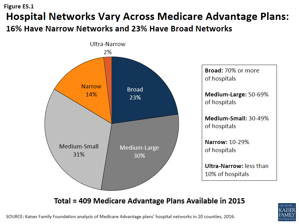
Figure ES 1: Hospital Networks Vary Across Medicare Advantage Plans: 16% Have Narrow Networks and 23% Have Broad Networks
People on Medicare often say that having access to specific doctors and hospitals is a high priority when choosing their Medicare Advantage plans. Yet, plan directories are often riddled with errors, omissions and outdated information that makes it difficult and sometimes impossible to tell which hospitals are included in-network – a finding that emerged over the course of this study.
Creating networks of providers is one of many strategies available to insurers to help control costs and manage the delivery of care. But narrower networks may also limit consumers’ access to certain providers or increase costs for care obtained out-of-network. For Medicare Advantage enrollees who place a high value on having access to a particular set of providers, or a broad range of providers, the findings underscore the importance of comparing provider networks during the Annual Election Period – a task that is easier said than done.
Report
Introduction and Study Focus
A growing share of Medicare beneficiaries receives their care through Medicare Advantage plans. Under such arrangements, plans offer an integrated benefit package that: combines Medicare Parts A and B, and usually also Part D; typically reconfigures cost-sharing; and often includes benefits not included in traditional Medicare. Medicare Advantage plans have proven increasingly popular with Medicare beneficiaries, partly because they offer “one stop shopping,” and their premiums are typically lower than the costs of stand-alone prescription drug plans combined with Medigap or other supplemental insurance. The number of Medicare beneficiaries enrolled in Medicare Advantage plans has more than tripled over the past decade, from about 5.3 million in 2005 to 17.6 million in 2016, and is projected to continue growing over the next decade.1
Despite the growth of the program, relatively little is known about size and scope of provider networks in Medicare Advantage plans. While beneficiaries in traditional Medicare can seek care from any provider participating in Medicare (virtually all hospitals and physicians), Medicare Advantage plans generally restrict coverage (except in emergencies) to affiliated network providers. Although practices vary, Health Maintenance Organizations (HMOs), the most common form of Medicare Advantage plan, generally require beneficiaries to receive care from a provider in the network in order to have the cost of the care covered. Beneficiaries enrolled in Preferred Provider Organizations (PPOs) can receive care from providers outside of their plan’s network and have the plan cover the cost of the care, but the cost-sharing for care received outside the network is typically higher than what beneficiaries would pay if they received the care from an in-network provider.
Beneficiaries can choose a plan or switch between Medicare Advantage and traditional Medicare once a year, during the annual open enrollment period between October 7 and December 15, and the change is effective beginning the following January 1. Medicare Advantage plans are allowed to change their networks at any time during the calendar year; beneficiaries are not allowed to change plans outside of the open enrollment period, unless they are granted an exception by the Centers for Medicare and Medicaid Services (CMS) if they had, for example, an ongoing existing relationship with a terminated provider.2
People on Medicare have said that when considering Medicare Advantage plans, access to certain hospitals and doctors is a top priority for them.3 Additionally, the structure of provider networks can influence the way in which beneficiaries access care, and network adequacy is one of the criteria used by CMS to evaluate plans before they are approved. CMS requires plans to include a specified number of doctors, hospitals, and other providers within a particular driving time and distance,4 but it is unclear how well these requirements are enforced. Further, according to CMS, Medicare Advantage plans have less prescriptive provider requirements than Qualified Health Plans (QHPs) or Medicaid Managed Care Organizations (MCOs), and are required to include fewer data elements in their provider directories.5
In a recent investigation, the Government Accountability Office (GAO) identified several serious deficiencies in CMS’s oversight and enforcement of network requirements for Medicare Advantage plans, and strongly recommended greater scrutiny of the plans’ networks.6 The GAO found that CMS reviews less than 1 percent of all networks and does little to assess the accuracy of the network data submitted by the plan. The GAO report found that CMS relies primarily upon complaints from beneficiaries and their caregivers to identify any problems with networks and does not assess whether plans that are renewing their current contracts continue to meet the network requirements.
This report is the first broad-based study of how provider networks are structured in Medicare Advantage. Although some historical work examined provider networks across different payers, these studies are old and relatively limited in the information they provide.7 More recent work has focused on health plans participating in exchanges under the Affordable Care Act (ACA), rather than Medicare Advantage. These more recent studies found that the scope of networks varies across the country, that some plans in the exchanges have networks that are substantially narrower than plans in the commercial markets, that HMOs have narrower networks than PPOs, and that plans with narrower networks may have lower premiums than plans with broader networks.8 One study also found that narrow network plans are less likely than broader plans in the exchanges to include an Academic Medical Center in the network.9 Plans offered in ACA exchanges with narrower networks of hospitals have not been found to have lower measures of quality or accessibility than broader network plans,10 but one survey showed that consumers in exchange plans with narrow hospital networks are less satisfied with their plan than consumers in plans with broader networks.11
Multiple studies also have documented problems with the accuracy, clarity, and ease of use of provider directories for both plans in the exchanges and Medicare Advantage plans, including one study that found that only about half of dermatologists listed in Medicare Advantage plans’ provider directories actually accepted the plan and could be contacted based on information provided in the directory.12 While this study did not set out to examine the accuracy of provider listings, we encountered a number of issues related to the accuracy and reliability of provider directories in the course of our research (see end of the Results section).
This report examines the size and composition of Medicare Advantage plans’ networks, focusing on hospitals. It presents data based on 20 diverse counties that account for 14 percent of all Medicare Advantage enrollees. The report addresses three key questions:
- What share of Medicare Advantage plans have broad, medium, or narrow hospital networks, based on the share of hospitals and hospital beds included in the plan network, and to what extent does this vary across counties?
- Do Medicare Advantage plans typically include Academic Medical Centers and NCI-Designated Cancer Centers when one is located in the county?
- What is the relationship between network size and other plan features, including premiums, quality star ratings, per capita Medicare spending, parent organization, and plan tax status?
Methods
We describe here the main elements of the study design. For a more detailed description of the study methods, see the Appendix.
Geographic Focus
This study examined Medicare Advantage plans available in 2015 in 20 counties (Figure 1). The county is the smallest area, in general, that a Medicare Advantage plan must cover. Counties vary greatly in size and may not be the best metric to assess the health care market of particular locales. However, an analysis at the county level provided the most complete set of data available for this type of analysis, as well as a reasonable snapshot of the health care market accessible to beneficiaries in that region.
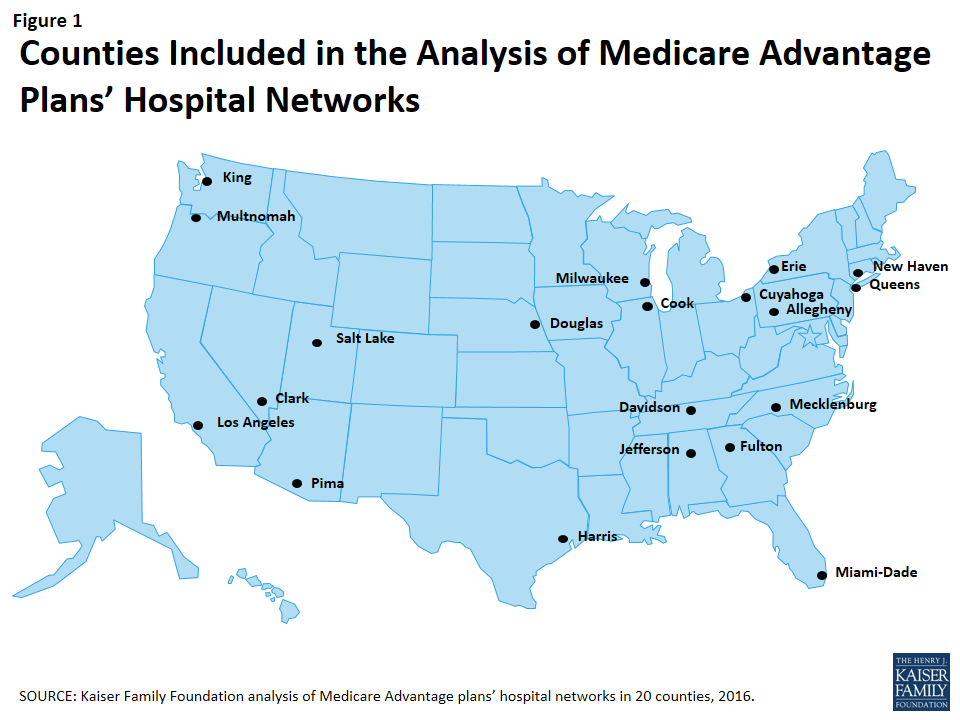
Figure 1: Counties Included in the Analysis of Medicare Advantage Plans’ Hospital Networks
The counties included in this study were chosen to encompass a sizeable share of Medicare Advantage enrollees, to be geographically dispersed across the country, and to range in per capita Medicare spending, the number of plans offered to Medicare beneficiaries, and Medicare Advantage penetration rate. They include large, urban areas with Medicare Advantage markets led by national firms (e.g., UnitedHealthcare) and local firms (e.g., UAB Health System). Together, these counties represent 14 percent of all Medicare Advantage enrollees in 2015.
Inclusion Criteria for Medicare Advantage Plans
Only HMOs and local PPOs were included in the analysis because the other types of Medicare Advantage plans either do not have networks (e.g., some private fee-for-service plans), or networks that are structured to cover areas larger than a county (e.g., regional PPOs), or are paid in unique ways that influence providers available to beneficiaries (e.g. cost plans). The analysis also excluded Special Needs Plans (SNPs), employer-sponsored group plans, and other plans that are not available to all Medicare beneficiaries. In total, across the 20 counties, we included 409 plans, 307 HMOs and 102 local PPOs. Among the 307 HMOs, 10 were closed panel HMOs, with physicians or groups of physicians directly employed by the HMO, and the remainder were open panel HMOs. Together, these plans enrolled 1.6 million Medicare beneficiaries in 2015, 92 percent of whom were in HMOs and 8 percent of whom were in PPOs. Both HMOs and local PPOs were available in all 20 counties, with the exception of Los Angeles where only HMOs were available to Medicare beneficiaries.
Main Sources of Data
Provider directories were the primary source of data used for the study. The directories were gathered between November and December 2014, to coincide with the Medicare Annual Election Period for 2015, and were either downloaded from the company’s website in a PDF format, when possible, or using a searchable directory embedded in the company website. The information extracted from this data was complemented with other information available on these plans and counties in CMS’s Medicare Advantage Enrollment file for March 2015 and Landscape file for 2015, and the American Hospital Association’s (AHA) 2014 survey of hospitals.
Measures of Hospital Network Size and Composition
All short-term general hospitals in the 20 counties included in the study, and their characteristics, were identified using data from the AHA 2014 survey of hospitals. (To support sensitivity analyses, hospitals in the adjacent counties were also identified.) Veterans Health Administration hospitals and children’s hospitals were excluded because of their unique financing or population focus. Two basic measures of network size were constructed for each health plan by county: (1) the share of hospitals in the county included in the directory, and (2) the share of hospital beds in the county associated with the hospitals included in the directory.
Classification of Networks by Size
This study categorized networks into one of four sizes based on the share of hospitals in the county that were included in the directory: broad (70% or more of the hospitals), medium (30-69% of hospitals), narrow (10-29% of hospitals), and ultra-narrow (less than 10% of hospitals). Only one other study we know of, conducted by McKinsey & Company, categorized networks by the share of hospitals in the county included in the network (Table 1).1 Broad networks were defined consistently in both studies, but narrower networks were classified and labeled somewhat differently here.
| Table 1. Network Size Definitions | ||
| Share of Hospitals Included in Network | Kaiser Family Foundation Analysis of Medicare Advantage Networks | McKinsey & Company Analysis of Exchange Networks |
| 0-9% | Ultra-Narrow | Ultra-Narrow |
| 10-29% | Narrow | |
| 30-69% | Medium | Narrow |
| 70%+ | Broad | Broad |
| SOURCE: Kaiser Family Foundation analysis and Bauman N, Bello J, Coe E, and Lamb J. “Hospital networks: Evolution of the configurations on the 2015 exchanges,” McKinsey & Company, April 2015. | ||
The McKinsey & Company study examined the size of the networks of plans offered in the ACA exchanges, and categorized networks into one of three network sizes. The difference between the categories used in this study and the McKinsey study is that this study includes a category for medium-sized networks. That is, this study uses the term “medium” to describe the size of networks that McKinsey described as “narrow.”
Analytic Variables: Teaching Hospitals and Cancer Centers
This study examined the presence of two specific types of hospitals in plan networks: teaching hospitals and cancer centers. Academic Medical Centers and minor teaching hospitals were identified based upon data from the AHA 2014 survey of hospitals. Each of the 20 counties had at least one Academic Medical Center within its borders, 11 of which included more than one, including Cook County with 12 Academic Medical Centers and Los Angeles County with 8 Academic Medical Centers. All but one of the counties (Mecklenburg) included at least one minor teaching hospital.
Cancer centers designated by the National Cancer Institute (NCI) were identified through the list of centers on the NCI website, and cancer centers accredited by the American College of Surgeons (ACS) were identified based upon data from the AHA 2014 survey of hospitals. Fifteen of the 20 counties in the study had at least one NCI-Designated Cancer Center within the borders of the county, including Cook, Harris, and Los Angeles counties that had more than one NCI Cancer Center, and all but one of the counties (Pima) had at least one hospital with an ACS-accredited cancer program.
Limitations
This study has some limitations. Notably, counties vary in size and do not necessarily provide a good measure of the natural market for the health plan and all of its enrollees. The study also focuses on large, urban areas, and does not provide information about plans’ networks in rural areas that have both fewer beneficiaries and providers. In many cases, physicians, not the beneficiary, may be key drivers in the choice of health plan and this analysis provides no information on the effective match between the breadth of physician networks and hospital networks. Hospital care also is increasingly complex and varied, and a general analysis of hospital networks provides limited insight into the availability of particular services the enrollee may need and where these services are best performed in any given community. Ultimately, what may be important to beneficiaries is the availability and quality of providers in their plan’s network, and not necessarily the size of the network.
Results
Breadth of Hospital Networks
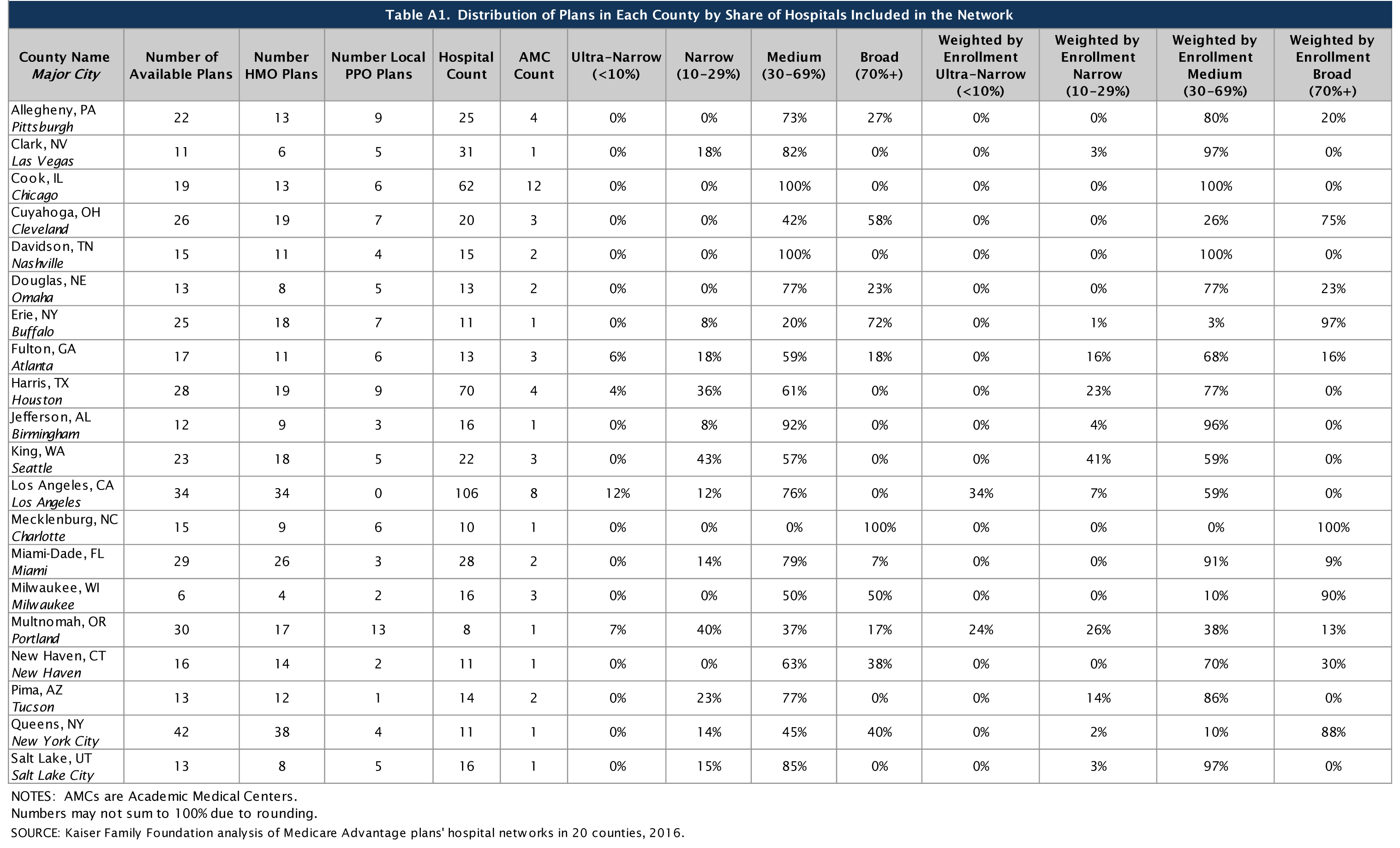
Counties included in this study differed in size and the number of hospitals, ranging from a high of 106 in Los Angeles County to a low of 8 in Multnomah County (Table A1). All of the Medicare Advantage plans in this study engaged in some selectivity in hospitals included in their network, but the share of hospitals included varied across plans, counties, and types of Medicare Advantage plans.
On average, plans included about half (51%) of the hospitals in the county in their network in 2015. About one-quarter (23%) of Medicare Advantage plans were classified in our analysis as having broad networks, meaning that they included at least 70 percent of the hospitals in the county (Figure 2). Most plans (61%) had medium sized networks, with between 30 and 69 percent of hospitals in the county. About one in six Medicare Advantage plans (16%) had narrow hospital networks, meaning that they included less than 30 percent of all hospitals in the county. This includes 8 plans (2%) that had less than 10 percent of the hospitals in the county within their network. Three of these 8 plans (in Multnomah and Fulton counties) did not include any hospitals within county borders but included hospitals in neighboring counties.1
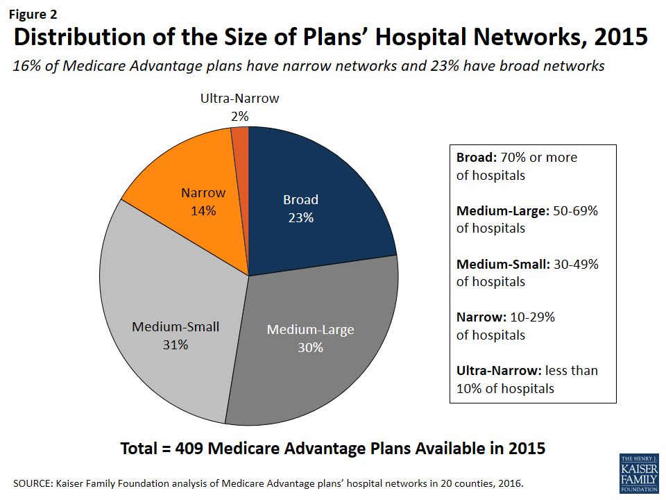
Figure 2: Distribution of the Size of Plans’ Hospital Networks, 2015
By County
The share of a county’s hospitals included in plans’ networks, on average, ranged from 33 percent in Harris County to 79 percent in Mecklenburg County (Figure 3 and Table A2). These hospitals accounted for 61 percent of all hospital beds in the county, ranging from 38 percent in Los Angeles County to 94 percent in Mecklenburg. Measuring the breadth of the plan networks by the share of hospitals versus by the share of hospital beds included in the plan yielded similar results, such that plans with less than 30 percent of the hospitals in the county (narrow networks) had 26 percent of the hospital beds and similarly, plans with 70 percent or more of the hospitals in the county (broad networks) tended to include approximately 89 percent of the hospital beds in the county.
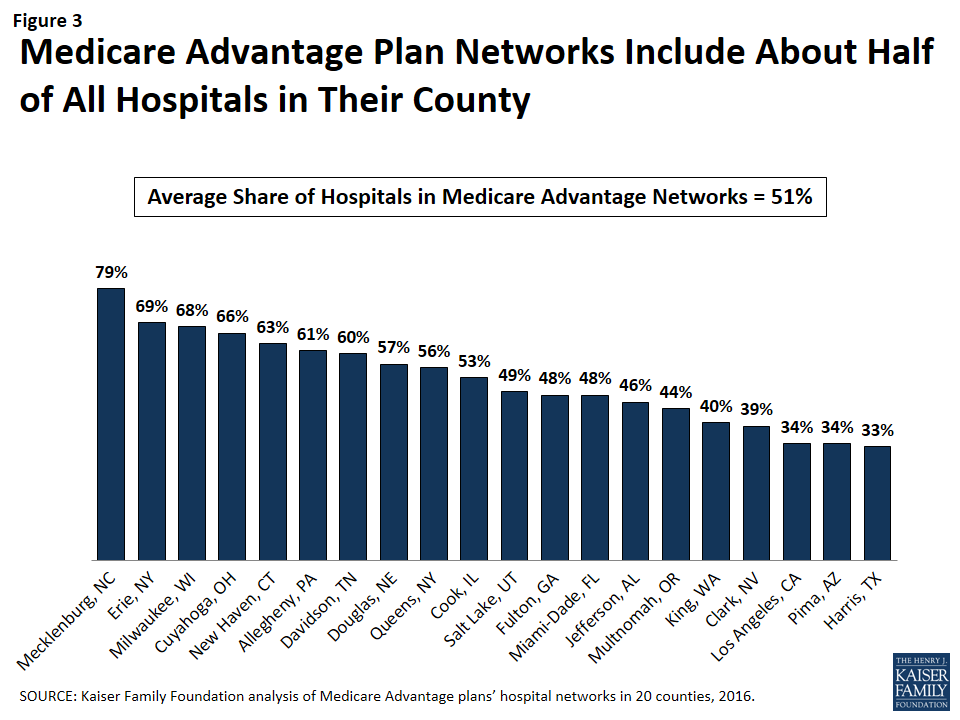
Figure 3: Medicare Advantage Plan Networks Include About Half of All Hospitals in Their County
The breadth of hospital networks, and the availability of broad, medium, and narrow network plans, varied greatly across the 20 counties included in the study (Figure 4 and Table A1). Plans with broad networks were available in 11 of the 20 counties, and comprised at least half of the plans available in 4 counties (Milwaukee, Cuyahoga, Erie, and Mecklenburg), including one county (Mecklenburg) in which all plans had broad networks of hospitals. However, in nine of the 20 counties, beneficiaries did not have access to a broad network plan. In 12 of the 20 counties, one or more Medicare Advantage plans had narrow networks, including more than one-third of plans in 3 counties (Multnomah, King, and Harris).
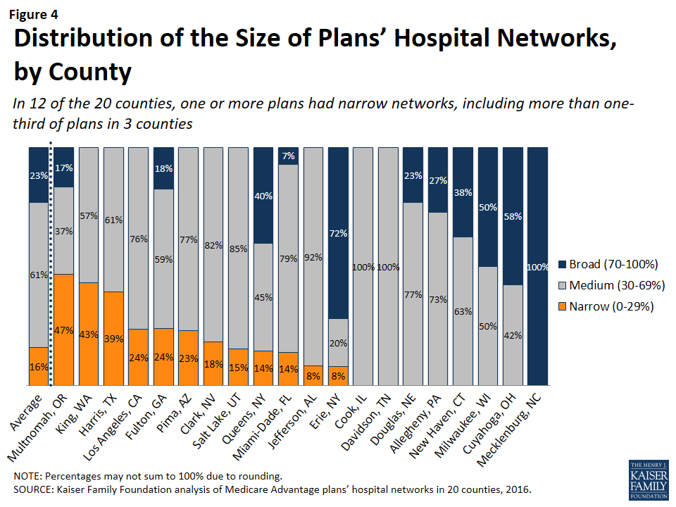
Figure 4: Distribution of the Size of Plans’ Hospital Networks, by County
By Number of Hospitals in the County
The share of narrow network plans in a county does not appear to be related to the number of hospitals in the county. While some of the counties with narrow network plans, such as Multnomah, have relatively few hospitals, other counties with narrow network plans, such as Los Angeles and Harris counties, have many hospitals. For example, three plans in Los Angeles County included only 5 of the 106 hospitals in the county and one plan in Harris County included only 2 of the 70 hospitals in the county.
By Per Capita Medicare Spending
Per capita Medicare spending does not appear to be associated with the size of hospital networks offered by plans in a given county. The presence of narrow network plans does not appear to be related to whether per capita Medicare spending is relatively high or low in the county. For example, narrow networks plans are available in Miami-Dade and Harris counties, both of which have historically had very high per capita Medicare spending, and in Multnomah and Erie counties, which have historically had low per capita Medicare spending. In each of the 20 counties, regardless of per capita Medicare spending, beneficiaries have the option of enrolling in a plan that does not have a narrow network. This finding suggests that plans in high-cost areas are no more likely than those in low-cost areas to use limited provider networks to reduce their costs.
By Enrollment
The distribution of plans by network size is generally similar to the distribution of enrollees by network size, indicating that beneficiaries are neither disproportionately enrolled in broad networks nor narrow networks (Figure 5 and Table A1). About one in six Medicare Advantage enrollees (16%) were in plans with narrow networks, two-thirds (66%) were in plans with medium networks, and 18 percent were in plans with broad networks. In most of the counties in the study, beneficiaries could choose only between broad and medium plans (5 counties) or between medium and narrow plans (7 counties). (In Mecklenburg, beneficiaries could only choose among broad network plans, and in Davidson and Cook, beneficiaries could only choose among medium network plans.) In 2 of the counties (Erie and Queens) with broad, medium and narrow networks, beneficiaries were disproportionately enrolled in broad network plans, but in the other 3 counties (Fulton, Miami-Dade, and Multnomah), enrollment in broad network plans was relatively proportionate to the availability of broad network plans in the county.
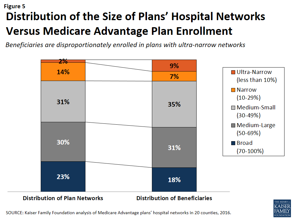
Figure 5: Distribution of the Size of Plans’ Hospital Networks Versus Medicare Advantage Plan Enrollment
HMOs Versus PPOs
HMOs tend to have narrower hospital networks than PPOs, across the 20 counties studied (Figure 6). In most counties, a larger share of local PPOs had broad networks, and a larger share of HMOs had narrow networks (Tables A3 and A4).
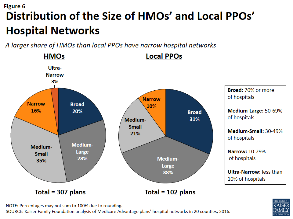
Figure 6: Distribution of the Size of HMOs’ and Local PPOs’ Hospital Networks
Since about three-quarters of the plans included in this study were HMOs, HMOs comprised the majority of plans across all network sizes (Figure 7). However, a disproportionately large share (85%) of narrow and ultra-narrow network plans were HMOs (either closed panel or open panel HMOs) while only two-thirds of broad network plans were HMOs. Similarly, PPOs comprised a smaller share of narrow network plans (15%) than broad network plans (34%).
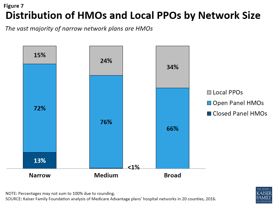
Figure 7: Distribution of HMOs and Local PPOs by Network Size
In some cases, HMOs and local PPOs offered by the same firm in a market shared the same network, although the structure of PPOs provides some coverage for the cost of care at hospitals not in the network.2 About one-third (37%) of local PPOs shared a provider network (and provider directory) with at least one HMO offered by the same firm.
Closed Versus Open Panel HMOs
Most HMOs have open panel designs in which the parent organization has non-exclusive contracts with a range of providers located in the area, and the providers typically accept multiple insurers. A small share of HMOs have closed panel designs in which the parent organization has exclusive contracts with physicians (employed either directly or in groups) and sometimes also owns hospitals or contracts with hospitals in other ways that result in more centralized hospital capacity. While the data available to distinguish between closed and open panel HMOs are limited, such data suggest that only ten plans in our study had closed panel designs (Figure 8 and Table A5). Five of the ten plans were offered by Kaiser Permanente in Los Angeles, Multnomah, and Fulton, and typically had narrower networks than other plans, consistent with their design. The other five closed-panel HMOs were offered by Group Health Cooperative in King County and Leon Medical Centers in Miami-Dade County, both of which included a larger share of hospitals in the county than Kaiser Permanente.
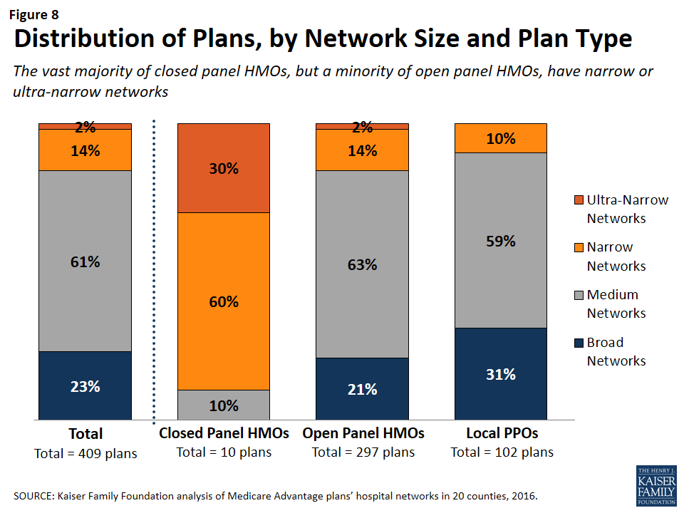
Figure 8: Distribution of Plans, by Network Size and Plan Type
With the exception of Leon Medical Centers, which had a medium-sized network, all of the other nine closed-panel HMOs had narrow or ultra-narrow networks (as compared to only 16 percent of open-panel HMOs). However, closed-panel HMOs comprised a small share of all narrow or ultra-narrow network plans, and only nine of the 67 plans with narrow or ultra-narrow networks (13%) were closed panel HMOs (Figure 8). The fact that closed-panel HMOs typically have narrow networks is by design; they often operate as systems of care, where the hospitals are often owned by the parent company and used primarily if not exclusively by members. Despite the comparatively narrow networks of many of these closed-panel HMOs, they generally attract a relatively large number of beneficiaries.
Inclusion of Teaching Hospitals and Cancer Centers
While high quality medical care can be provided in a variety of hospital settings, some conditions can benefit from care provided in certain types of facilities. Access to specialized medical care is also important to many Medicare beneficiaries since about one-quarter (26%) of Medicare beneficiaries are in fair or poor health and 45 percent have four or more chronic conditions.3 Academic Medical Centers are more likely than minor teaching hospitals or other hospitals to have physicians specializing in rarer conditions or operations, such as liver or bone-marrow transplants, autoimmune disorders such as lupus, or other complex medical conditions. Academic Medical Centers are also more likely to conduct more surgeries, such as heart surgery, for which better outcomes have been linked to higher volumes of surgeries. Both Academic Medical Centers (also known as major teaching hospitals) and minor teaching hospitals have residency and/or internship training programs (or medical school affiliation reported by the American Medical Association) but, unlike Academic Medical Centers, minor teaching hospitals are not members of the Council of Teaching Hospitals.
Access to high quality cancer treatment is also important to many Medicare beneficiaries since the incidence of cancer is more than 10 times higher among people ages 65 and older than among younger people.4 To gain insight into the type of cancer treatment available to Medicare Advantage enrollees, this study examined access to cancer centers designated by the National Cancer Institute (NCI) and hospitals accredited by the American College of Surgeons (ACS). The NCI has designated 69 cancer centers in 35 states as NCI-Designated Cancer Centers in recognition of their leadership and resources in the development of more effective approaches to prevention, diagnosis, and treatment of cancer, and many but not all of these centers are affiliated with Academic Medical Centers. The ACS Commission on Cancer accredits cancer programs within hospitals that meet ACS quality and service standards, and this accreditation is designed to be an indicator of higher quality cancer care.
Academic Medical Centers and Minor Teaching Hospitals
More than three-quarters (80%) of all Medicare Advantage plans analyzed in this study included at least one Academic Medical Center in the county in its network of hospitals, including 78 percent of HMOs and 88 percent of PPOs (Figure 9). Another 6 percent of plans included an Academic Medical Center in the adjacent county but not in the county studied (not shown). In total, 86 percent of plans included an Academic Medical Center in the primary county or in a bordering county. Additionally, the vast majority of plans (92%) included at least one minor teaching hospital in the county, including all of the plans in 14 counties. In 15 of the 20 counties, more than three-quarters of the plans included an Academic Medical Center, including 7 counties in which all of the plans included an Academic Medical Center in the provider network (Table A6). However, in 2 counties (Jefferson and Multnomah), less than half of all Medicare Advantage plans included the Academic Medical Center in the county.
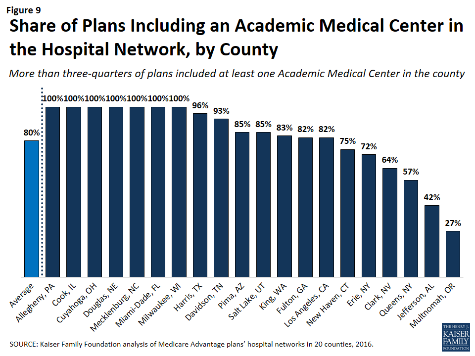
Figure 9: Share of Plans Including an Academic Medical Center in the Hospital Network, by County
Larger plans were more likely to include an Academic Medical Center, on average, and as a result a somewhat larger share (91%) of Medicare Advantage enrollees are in a plan that includes an Academic Medical Center in its network.
The vast majority (92%) of broad network plans included an Academic Medical Center, while a much smaller share of plans with narrow networks (51%) included an Academic Medical Center (Figure 10). In most counties, a larger share of plans with broad networks than plans with narrow networks included at least one Academic Medical Center (Table A7).
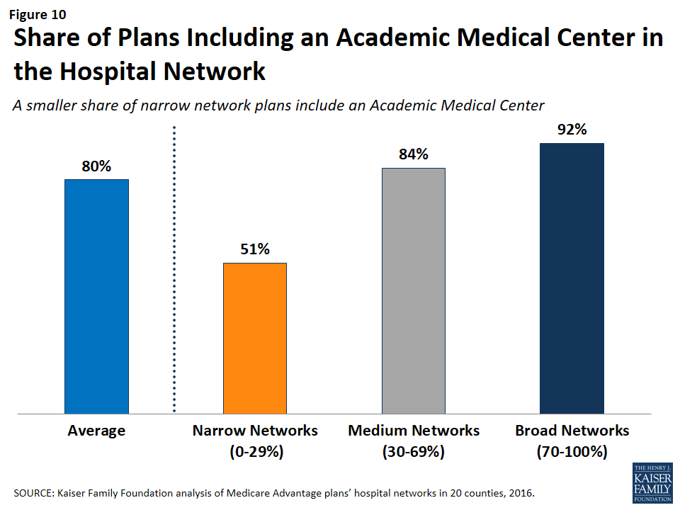
Figure 10: Share of Plans Including an Academic Medical Center in the Hospital Network
Cancer Centers
NCI-Designated Cancer Centers tend to have greater access to clinical trials, especially early-stage clinical trials, than community hospitals and other treatment centers. While many hospitals in a community are likely to be able to treat multiple types of cancer, access to NCI Cancer Centers may be particularly relevant to beneficiaries with rarer cancers, more advanced-stage cancers, or other unique complicating conditions.
NCI-Designated Cancer Centers. Among the 15 counties with an NCI Cancer Center, 15 percent of Medicare Advantage plans listed the NCI Cancer Center in the provider directory, 43 percent of plans included the Academic Medical Center with which the center was affiliated (but did not explicitly indicate that the cancer center was included), and 41 percent did not include the NCI Cancer Center in the county among providers listed in the directory (Figure 11 and Table A7).
In 6 of the 15 counties with an NCI Cancer Center, the majority of Medicare Advantage plans did not include the NCI Cancer Center in its provider network (Figure 12).
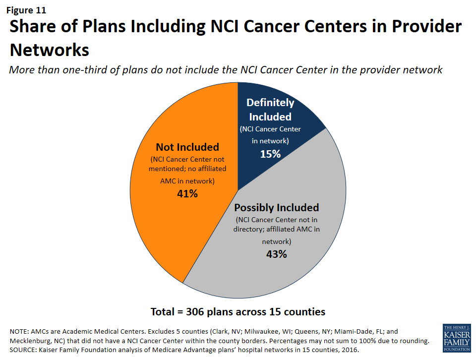
Figure 11: Share of Plans Including NCI Cancer Centers in Provider Networks
Figure 12: Share of Plans Including the NCI Cancer Center in Hospital Networks, by County
This lack of clarity as to whether an NCI Cancer Center is included in a plan’s provider network may be attributable to the considerable variation in the way in which the cancer centers are listed in the plans’ provider directories. For example, the Huntsman Cancer Institute in Salt Lake County is affiliated with the University of Utah and is located across the street from their main Academic Medical Center. Some of the provider directories for Medicare Advantage plans offered in Salt Lake County list Huntsman Cancer Center explicitly, in addition to listing the University of Utah Medical Center, but other provider directories only list the University of Utah Medical Center, and do not mention the Huntsman Cancer Institute. In these situations, it is unclear whether a Medicare beneficiary can assume that coverage of care at the Academic Medical Center includes care at the affiliated cancer center, and the answer most likely varies across plans.
NCI Cancer Centers were less likely to be included in plans with narrow networks than plans with broader networks (Figure 13). These results were generally consistent across the counties.
Figure 13: Share of Plans Not Including an NCI Cancer Center, by Network Size
Even when NCI-Designated Cancer Centers are excluded from the provider network, plans may choose to selectively refer enrollees to them, when appropriate, although it is beyond the scope of this analysis to assess the extent to which these referrals occur. Contract negotiations with cancer centers can be complex, particularly when a cancer center is in a strong negotiating position, which may explain why many plans do not include them in the plan networks.
ACS-Accredited Cancer Programs. The vast majority of plans (94%) included at least one hospital with a cancer program accredited by the ACS Commission on Cancer. A larger share (21%) of narrow network plans than medium (4%) or broad network plans (0%) did not include at least one hospital with a cancer program accredited by the ACS (Figure 14). Plans’ inclusion of hospitals with ACS-accredited cancer programs also varied somewhat across counties. In 13 counties, every plan included at least one hospital with an ACS-accredited cancer program, while 12 percent of plans in Los Angeles did not include such a hospital in their network; however, in all counties, most of the plans without a hospital with an ACS-accredited cancer program had narrow networks.
Figure 14: Share of Plans Not Including a Hospital With a Cancer Program Accredited by the ACS, by Network Size
Overall, 3 percent of plans had neither a hospital with an ACS-accredited cancer program nor an NCI Cancer Center in their provider network. While few beneficiaries are evaluating provider networks based on their access to cancer centers, if beneficiaries wanted to know whether a network included hospitals affiliated with an NCI Cancer Center or hospitals with ACS-accredited cancer programs, they would need to use data sources other than the provider directory because these designations are not indicated in the directories.
Other Specialty Units and Facilities
For specialty care more broadly, unless the affiliate is explicitly mentioned in the provider directory, it is unclear whether a hospital’s affiliates are also covered by a plan, or whether coverage is restricted to acute care hospitalization at the specific hospital listed in the directory. For example, it is often unclear as to whether a hospital’s affiliated heart center, rehabilitation center, or women’s center is included in the plan network that includes the main, acute care hospital. This lack of clarity makes it difficult for beneficiaries to determine which affiliated providers would be in a plan’s network.
Relationship Between Breadth of Network and Other Plan Features
Plan Premiums by Network Size
Average premiums for Medicare Advantage plans generally increased with the size of the network (Figure 15). The average premium for Medicare Advantage plans with broad networks ($51 per month) was almost 50 percent higher than the average premium for narrow network plans ($35 per month).
Figure 15: Average Premiums of Medicare Advantage Plans, by Network Size and Plan Type
However, the correlation between premiums and network size disappeared after comparing networks within plan types. Among HMOs, the average premium for narrow network plans ($36 per month) was the same as the average premium for broad network plans. Among PPOs, the average premium for narrow network plans is much lower ($28 per month) than for medium network plans ($87 per month) and broad network plans ($79 per month). However, since only 10 local PPOs had narrow networks, more research with a larger sample of narrow network local PPOs is needed to confirm these findings. Overall, premiums varied more between HMOs and local PPOs than by network size.
Star Quality Ratings by Network Size
The size and composition of the plans’ provider networks are not used by CMS to assign star quality ratings to the plans; however, the ratings may nonetheless be correlated with the size of the networks if the hospitals excluded from the narrower networks had either a positive or negative effect on plan ratings. Overall, the average star quality ratings for narrow network plans (4.1 stars) were similar to the average ratings for medium or broad network plans (3.7 and 3.9 stars, respectively; Figure 16).
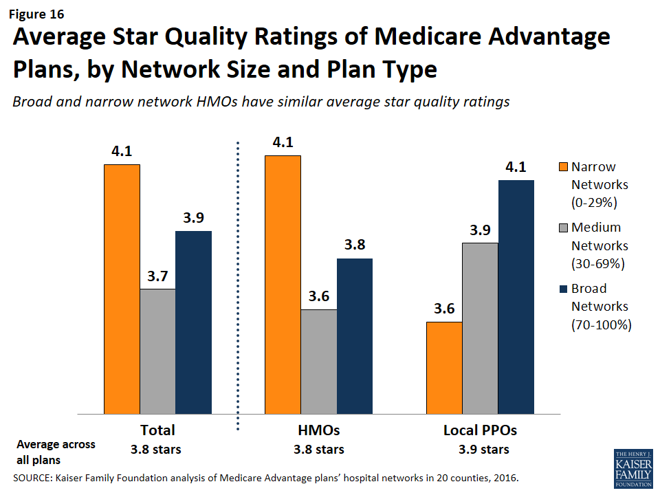
Figure 16: Average Star Quality Ratings of Medicare Advantage Plans, by Network Size and Plan Type
Within counties, the relationship between plan ratings and network sizes was inconsistent. In some counties, narrow network plans had higher average quality ratings than medium or broad network plans, but in other counties the narrow network plans had lower average quality ratings.
Among local PPOs, the average plan ratings generally increased with the size of the network, and plans with broader networks had somewhat higher average ratings (4.1 stars) than plans with narrow networks (3.6 stars). However, more research with a larger sample of narrow network local PPOs is needed to confirm these findings since only 10 local PPOs in our study had narrow networks. Among HMOs, there was a different dynamic between plan ratings and the size of the network, and narrow network HMOs had higher plan ratings (4.1 stars) than HMOs with broad networks (3.8 stars). Taken as a whole, the relationship between plans’ quality ratings and the size of plans’ networks is likely more closely related to factors other than the size of plans’ networks.
Firm as a Predictor of Network Size
Among the firms offering plans in these 20 counties, none were more likely than others to have narrow networks in multiple counties, with the exception of Kaiser Permanente, which only has narrow hospital networks (Table A8). For example, while Humana included more than 70 percent (broad network) of the hospitals in Mecklenburg, it had narrow provider networks in 5 counties (Harris, Los Angeles, Multnomah, Queens, and Salt Lake) and medium networks in 12 other counties. Likewise, some Blue Cross Blue Shield (BCBS) affiliated plans had broad hospital networks in some counties (e.g., Cuyahoga, Miami-Dade), but had narrow hospital networks in other counties (e.g., Harris).
Interestingly, among plans with the same name that were offered in multiple counties, the size of the plan network often varied across counties. For example, the Humana Choice plan in Multnomah, Oregon included only 13 percent of the hospitals in the county, whereas the Humana Choice plan in Cuyahoga, Ohio included 70 percent of the hospitals in the county. As a consequence, enrollees cannot use the firm or the plan name as a signal about the size of the plan network. This finding also suggests that local market characteristics typically are a stronger influence on network design than particular firm philosophies.
Size of Hospitals by Network Size
The size of the hospitals (measured by the number of beds) included in provider networks could provide some information about the plan’s capacity to provide inpatient care to enrollees, and may have some relationship to the quality of care and enrollees’ satisfaction with their care, although the evidence for this is mixed. Several studies have found that larger hospitals have lower mortality rates than smaller hospitals;5 however, patients have also rated lower their satisfaction with the care received at large hospitals than at smaller hospitals.6
Across the 20 counties, Medicare Advantage plans were more likely to include larger hospitals (400 beds or more) than smaller hospitals (less than 100 beds). While 17 percent of all hospitals in the 20 counties were large hospitals, they accounted for 29 percent of all hospitals in the plans’ provider networks (Figure 17).
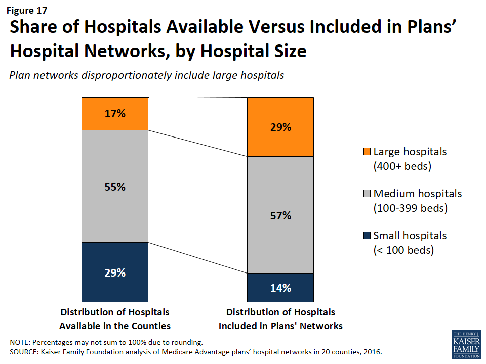
Figure 17: Share of Hospitals Available Versus Included in Plans’ Hospital Networks, by Hospital Size
Similarly, while 29 percent of all hospitals were small, these hospitals accounted for only 14 percent of the hospitals in the plans’ provider networks. These findings were generally consistent at the county-level, and, in all counties, large hospitals were either over-represented or proportionately represented in plan networks.
Network size did not appear to be correlated with the size of the hospitals included in the network. Large hospitals comprised more than one-third of hospitals in both narrow and broad network plans (37% and 35%, respectively), but a smaller share (23%) of hospitals in medium networks.
Ownership of Hospitals by Network Size
Most hospitals operate on a not for profit basis, so it is not surprising that such hospitals also constituted most of the hospitals in plans’ networks. However, relative to their prevalence in the counties, plan networks were less likely to include for-profit hospitals, which accounted for 39 percent of the hospitals in the counties, but only one-quarter (26%) of the hospitals in the plan networks. These findings generally are consistent across the individual counties studied.
Plan Tax Status by Network Size
In theory, a plan’s tax status could influence the firm’s approach towards creating the plan’s provider network, since not-for-profit plans may be able to dedicate a larger share of their revenue towards payments to providers and benefits for enrollees. A larger share of not-for-profit plans (28%) than for-profit plans (21%) had broad hospital networks (Figure 18). At the same time, a larger share of not-for-profit plans (22%) than for-profit plans (15%) had narrow or ultra-narrow hospital networks. These findings greatly varied across counties, and not-for-profit plans did not consistently have narrower or broader networks than for-profit plans in the same county.
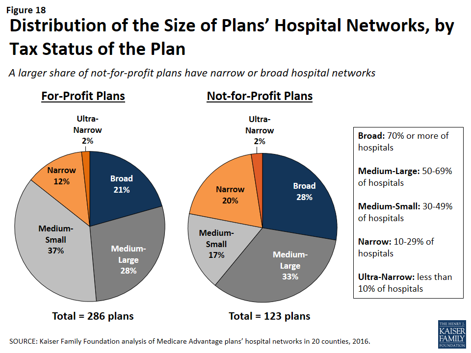
Figure 18: Distribution of the Size of Plans’ Hospital Networks, by Tax Status of the Plan
Findings on the Adequacy of Provider Directories
Provider directories are the main resource available to beneficiaries who want to know which providers are in the different networks of Medicare Advantage plans. Plans are required by CMS to make a provider directory available to all current and potential enrollees, but the CMS website used by consumers to compare plans does not include a link to plan directories or provide a tool that can be used by plan shoppers to check to see whether their preferred doctors or hospitals are included in plans’ networks. While this analysis focused only on hospitals, and not physicians or other providers, it adds to a growing body of literature that shows that provider directories currently have a number of problems that limit their value in helping to inform beneficiaries. These limitations generally fall into two categories: burden and accuracy of information.
Beneficiary Burden
Plans are required to make their provider directory available to current and potential enrollees, and typically provide the information on the firm’s website. In gathering information for our study, we found accessing and using these directories to identify provider networks to be challenging. The plan websites varied in overall layout, the grouping of plans into provider directories, and the format in which the directory is available. Some companies have only one directory that includes all of its HMO and PPO plans, others have separate directories for each individual plan, and some do not have a current directory available at all.
As an example, in 2015, a Medicare beneficiary in Cook County, Illinois could choose from 19 HMO or local PPO Medicare Advantage plans, which had 10 unique provider networks offered by eight different firms. Once beneficiaries go to the applicable firm’s website, locate the link to learn about plans offered in their area, and input some geographic information, they have access to information about the plan’s provider network, but the information is not available in a consistent format across plans. In Cook County, seven of the 10 plan networks had a provider directory that could be downloaded as a PDF from the firm website. For two networks (covering five plans), the only way to learn about the providers in the network was to search the firm’s online database by type of provider or facility to generate a list of providers. For the one remaining network in Cook County (one plan), the provider network was available as a separate downloadable list for each type of provider.
Among the seven directories that were available as a PDF document in Cook County, the content and organization varies. Three of the seven list the network pharmacies, while the other four have a separate document or require an online search to find pharmacy coverage. Dental and vision services are also only included in three of the directories. Information about other services, such as transplant facilities or providers with translation capabilities, is included in some but not all directories. One of the Cook County directories does not include a table of contents or index and is over 600 pages long. (Similarly, other counties, such Los Angeles, have directories with page-counts in the thousands.)
Errors in Directories
In all 20 counties included in this study, errors in the provider directories were common. For example, some directories list facilities as acute-care hospitals when the facilities are actually outpatient centers or rehabilitation institutes. Hospitals with the same address are frequently listed by different names across directories, often reflecting failures to update the directories when hospitals change their names or ownership. In other cases, there are blatant errors. For example, a directory for a plan in Miami-Dade County lists Larkin Community Hospital twice, once with the correct address and once with the address of St. Catherine’s Rehabilitation Hospital.
One of the most obvious signs that some directories are not up-to-date is that some directories include hospitals that have been closed for several years. In 2015, 11 out of the 231 directories examined in this study include hospitals that had been closed or torn down, including one directory that listed a hospital that had been closed since 2005. Another plan’s website provided a directory for its 2015 plan that stated it was last updated in August 2013. A call to the plan’s customer service line confirmed that all of the most current documents were posted online, but that the online search tool should be used for the most up-to-date information. Similarly, this study excluded seven plans offered by three companies because either a provider directory was not available for 2015 and the company declined to provide a directory when contacted, or the searchable directory embedded in the company website did not allow for information to be saved.
Overall, while information about provider networks is available for the vast majority of plans, finding the information often requires Medicare beneficiaries to invest significant time to locate the directories, many of which are inaccurate or incomplete, and none of which facilitate comparisons across multiple plans or firms.
Discussion
This study documents, for the first time, considerable diversity in the breadth of hospital networks used by Medicare Advantage plans– an issue of potential importance to people on Medicare who say having access to specific hospitals and physicians is a high priority when choosing a plan. Medicare Advantage plans are generally selective, with their networks including only a subset of the hospitals in the area. The average size and composition of hospital networks varies within and across counties. Plans with broader hospital networks are more likely to include Academic Health Centers and NCI-approved cancer centers than plans with narrow networks. In 9 out of the 20 counties in the study, broad network plans were not offered and beneficiaries in these counties can only select a Medicare Advantage plan with a narrow or medium-sized network.
In general, hospital network size was not correlated with factors such as star quality ratings, plan premiums (for HMOs), per capita Medicare spending, number of hospitals in the county, or specific firms. None of the firms (with the exception of Kaiser Permanente) were more (or less) likely than others to have broad or narrow network plans across counties. The size of a plan’s network may instead be explained more by the ability of individual plans to negotiate favorable rates with hospitals in their service area, as well as other market conditions.
While not the focus of this study, we encountered a number of issues in compiling this information that could pose challenges to consumers trying to determine the breadth of the hospital networks of Medicare Advantage plans offered in their area. The Medicare Plan Finder does not include any information on provider networks. Plans are required to make network information available to consumers upon request, but CMS does not require plans to release this information in a uniform format, putting the burden on consumers to sort through directories and search tools to determine if a particular provider is in a given plan’s network. In the course of our research, it became clear that the directories used in this study were often riddled with errors, including the incorrect names or addresses for the hospitals, and other blatant mistakes such as the inclusion of hospitals that no longer existed.
It is not entirely clear how the networks of Medicare Advantage and ACA marketplace plans compare. McKinsey & Company released a report in 2015 that examined the networks of plans offered in exchanges, using a similar but not identical taxonomy for classifying hospital network size. Although the studies are not directly comparable because they used different methods (e.g., included different counties), this analysis suggests that a much smaller share of Medicare Advantage plans than exchange plans have broad hospital networks (23% of Medicare Advantage plans compared to 55% of ACA marketplace plans).1 Further research is needed to compare the size and scope of plan networks in Medicare, the ACA marketplace, Medicaid, and employer sponsored insurance.
It is important to note that Medicare Advantage enrollees have the option of switching to traditional Medicare during the annual open enrollment period, and that traditional Medicare includes the vast majority of providers and arguably the broadest possible provider network. Yet, switching between Medicare Advantage and traditional Medicare can be complicated by considerations such as the availability of Medigap plans and other supplemental coverage, and the need for a separate Part D drug plan.2 For these and other reasons, switching rates between Medicare Advantage and traditional Medicare are typically low.3
Policymakers could consider a number of options to improve the accuracy of information in the provider directories and the extent to which plans comply with network adequacy requirements. CMS could, for example, review the provider directories more frequently for errors and compliance with network adequacy requirements. As noted by the GAO,4 CMS currently reviews less than 1 percent of all provider directories and does not routinely review the networks of plans that are renewing their current contract. More frequent reviews by CMS could encourage plans to keep their directories up-to-date and in compliance with CMS network requirements.
Additionally, CMS has stated that Medicare Advantage plans have less prescriptive network adequacy requirements than the ACA Qualified Health Plans (QHPs) and Medicaid Managed Care Organizations (MCOs). While these three programs serve different purposes and different populations,5 CMS may want to review areas in which Medicare Advantage requirements are more lenient, and potentially beef up the requirements for Medicare Advantage plans and harmonize the requirements across the three programs, as CMS has suggested.6
CMS could also take steps to make it easier for consumers to obtain and compare information about Medicare Advantage provider networks. Medicare.gov could post on its Medicare Plan Finder each plan’s provider network to make it easier for beneficiaries to access provider networks when they are comparing other features of Medicare Advantage plans. CMS could require all plans to publish network information in a uniform format and develop a consumer-friendly online tool with up-to-date information on each Medicare Advantage plan’s provider network to facilitate plan comparisons. CMS could also categorize the size of plans’ networks to allow beneficiaries and their caregivers to use this information when selecting a plan. While the size of the network would likely not be the sole factor used to select a plan, it could be an important, relevant consideration when deciding between two otherwise similar plans.
Creating networks of providers is one of many strategies available to insurers to help control costs and manage the delivery of care, but narrow networks may also limit consumers’ access to certain providers and increase the cost for care obtained out-of-network. For Medicare Advantage enrollees who place a high value on having access to a particular set of providers, or a broad range of providers, the results of this study underscore why it is important for beneficiaries to review provider networks before choosing among Medicare Advantage plans, despite the difficulties of doing so. The study also underscores the need for accurate, readily available information to make it easier for consumers, insurance counselors and others to compare provider networks across plans, and for ongoing oversight of network requirements to meet the expected and unexpected health care needs of beneficiaries enrolled in Medicare Advantage plans.
Appendix
Methods
This study examined Medicare Advantage plans available in 2015 in 20 counties: Allegheny County, PA; Clark County, NV; Cook County, IL; Cuyahoga County, OH; Davidson County, TN; Douglas County, NE; Erie County, NY; Fulton County, GA; Harris County, TX; Jefferson County, AL; King County, WA; Los Angeles County, CA; Mecklenburg County, NC; Miami-Dade County, FL; Milwaukee County, WI; Multnomah County, OR; New Haven County, CT; Pima County, AZ; Queens County, NY; and Salt Lake County, UT. The county is the smallest area, in general, that a Medicare Advantage plan must cover. Counties vary greatly in size and may not be the best metric to assess the health care market of particular locales, but an analysis at the county level provided the most complete set of data available for this type of analysis as well as a reasonable snapshot of the health care market accessible to beneficiaries in that region.
The counties were chosen so as to encompass a sizeable share of Medicare Advantage enrollees, be geographically dispersed across the country, include large, urban areas with many Medicare beneficiaries, include Medicare Advantage markets that are led by national firms (e.g., UnitedHealthcare) and local firms (e.g., UAB Health System), and range in per capita Medicare spending, number of plans offered to Medicare beneficiaries, and Medicare Advantage penetration rate (Table 2). Together, these counties account for 14 percent of all Medicare Advantage enrollees in 2015.
| Table 2. Characteristics of Counties Included in the Analysis in 2015 | ||||||||
| County | Largest city | Number of Medicare beneficiaries | Medicare Advantage penetration rate, 2015 | Share of enrollees in plans offered by one firm | Medicare Advantage payment quartile | Year oldest plan established | Academic Medical Center in county? | NCI-designated Cancer Center in the county? |
| Allegheny, PA | Pittsburgh | 247,434 | 62% | 41% | 1 | 1985 | Yes | Yes |
| Clark, NV | Las Vegas | 294,530 | 38% | 51% | 1 | 1985 | Yes | No |
| Cook, IL | Chicago | 769,309 | 17% | 32% | 1 | 1985 | Yes | Yes |
| Cuyahoga, OH | Cleveland | 241,669 | 37% | 33% | 2 | 1987 | Yes | Yes |
| Davidson, TN | Nashville | 89,800 | 42% | 48% | 1 | 1996 | Yes | Yes |
| Douglas, NE | Omaha | 75,402 | 23% | 58% | 2 | 1985 | Yes | Yes |
| Erie, NY | Buffalo | 185,347 | 56% | 62% | 4 | 1985 | Yes | Yes |
| Fulton, GA | Atlanta | 118,697 | 35% | 33% | 2 | 1997 | Yes | Yes |
| Harris, TX | Houston | 465,027 | 39% | 21% | 1 | 1988 | Yes | Yes |
| Jefferson, AL | Birmingham | 123,132 | 42% | 39% | 1 | 1994 | Yes | Yes |
| King, WA | Seattle | 283,171 | 34% | 30% | 3 | 1980 | Yes | Yes |
| Los Angeles | Los Angeles | 1,344,850 | 43% | 40% | 1 | 1985 | Yes | Yes |
| Mecklenburg, NC | Charlotte | 119,517 | 31% | 39% | 3 | 1985 | Yes | No |
| Miami-Dade | Miami | 420,702 | 62% | 28% | 1 | 1986 | Yes | No |
| Milwaukee, WI | Milwaukee | 145,125 | 41% | 73% | 2 | 1995 | Yes | No |
| Multnomah, OR | Portland | 110,238 | 58% | 27% | 4 | 1980 | Yes | Yes |
| New Haven, CT | New Haven | 153,214 | 28% | 41% | 1 | 1996 | Yes | Yes |
| Pima, AZ | Tucson | 187,732 | 46% | 53% | 3 | 1986 | Yes | Yes |
| Queens, NY | New York City | 326,376 | 43% | 26% | 1 | 1986 | Yes | No |
| Salt Lake, UT | Salt Lake City | 122,904 | 41% | 43% | 3 | 2003 | Yes | Yes |
| SOURCE: Kaiser Family Foundation analysis of CMS Medicare Advantage enrollment and landscape files for 2015. | ||||||||
Inclusion Criteria for Medicare Advantage Plans
Only HMOs and local PPOs were included in the analysis because the other types of Medicare Advantage plans either do not have networks (e.g., some private fee-for-service plans), or networks that are structured to cover areas larger than a county (e.g., regional PPOs), or are paid in unique ways that influence providers available to beneficiaries (e.g. cost plans). The analysis also excluded Special Needs Plans (SNPs), employer-sponsored group plans, and other plans that are not available to all Medicare beneficiaries. In total, across the 20 counties, we included 307 HMOs and 102 local PPOs. Among the 307 HMOs, 10 were closed panel HMOs, with physicians or groups of physicians directly employed by the HMO, and the remainder were open panel HMOs. Together, these plans enrolled 1.6 million Medicare beneficiaries in 2015, 92 percent of whom were in HMOs and 8 percent of whom were in PPOs. Both HMOs and local PPOs were available in all 20 counties, with the exception of Los Angeles County where only HMOs were available to Medicare beneficiaries.
Main Sources of Data
Provider directories were the primary source of data used for the study. The directories were gathered between November and December 2014, to coincide with the Medicare Annual Election Period for 2015, and were either downloaded from the company’s website in a PDF format, when possible, or downloaded using the searchable directory embedded in the company website. The information extracted from these data was complemented with other information available on these plans and counties in CMS’s Medicare Advantage Enrollment file for March 2015, CMS’s Medicare Advantage Landscape file for 2015, and the American Hospital Association’s (AHA) 2014 survey of hospitals.
Excluded Plans
Seven plans offered by three companies were excluded from the analysis because either a provider directory was not available for 2015 and the company declined to provide a directory when contacted, or the searchable directory embedded in the company website did not allow for information to be saved.
Tiered Networks
Two counties from our sample include HMOs with tiered networks of hospitals. The difference in tier designates a difference in co-pay for a hospital admission. Consequently, even though all of the hospitals listed in the directory are considered “in-network,” the cost for a hospital stay will differ depending on the hospital’s tier. While the provider directories designate each hospital’s tier, the information about the difference in cost-sharing only can be found in the plan’s Summary of Benefits document.
The two plans with tiered networks were different with respect to the breakdown of the hospitals into more expensive and less expensive tiers and the disparities in cost-sharing for hospital stays between the two tiers. For the tiered network in Cook County, the difference in co-pay between tier 1 and tier 2 is $50 per day for days 1 through 4 ($200 total potential difference). The less expensive tier (tier 1) only includes five hospitals, all owned by Advocate Health Care. The majority of the hospitals in the network (22 facilities) are in tier 2, with the more expensive co-pay. In contrast, most of the hospitals in Erie County’s tiered network plan are in the less expensive tier. For this plan’s tier A hospitals, there is a co-pay of $400 per admission, while tier B hospitals require a co-pay of $900 per admission. However, only one of the network’s eight hospitals in Erie County is in tier B. For both of these plans with tiered networks, the analysis included all hospitals in either tier as in-network hospitals because in Cook County the difference in cost-sharing for hospitals in the two tiers was relatively nominal and for the plan in Erie County, the set of hospitals in the second tier was deemed to be sufficiently small. Overall, the inclusion of hospitals in both tiers likely had a negligible effect on the results of the analysis.
Data Entry
The data from the provider directories was inputted twice, by two independent people, and all discrepancies in the data entry were resolved by manually checking the relevant provider directory. Whenever directories contained typos or slight variations in the name of a hospital, the addresses were used to verify a hospital’s inclusion in the network. The Centers for Medicare and Medicaid Services’ Provider of Services (POS) file was used to match each hospital location with its unique provider identification number.
Measures of Hospital Network Size and Composition
All short-term general hospitals in the 20 counties included in the study and their characteristics were identified using the data from the AHA 2014 survey of hospitals. (To support sensitivity analyses, hospitals in the adjacent counties were also identified.) Veterans Health Administration hospitals and children’s hospitals were excluded because of their unique financing or population focus. Two basic measures of network size were constructed for each health plan by county: (1) the share of hospitals in the county that were listed in the directory; and (2) the share of hospital beds in the county that were associated with the hospitals listed in the directory.
Categorizing Networks by Size
This study categorized networks into one of four sizes based on the share of hospitals in the county that were included in the directory: broad (70% or more of the hospitals), medium (30-69% of hospitals), narrow (10-29% of hospitals), and ultra-narrow (less than 10% of hospitals). These definitions differ from those used by the only other known study, conducted by McKinsey & Company, that categorized networks by the share of hospitals in the county included in the network. The McKinsey & Company study examined the size of networks of plans in the Affordable Care Act (ACA) exchanges, and categorized networks into one of three network sizes; the difference between the categories used in this study and the McKinsey study is that this study includes a category for medium-sized networks. That is, this study uses the term “medium” to describe the size of networks that McKinsey described as “narrow”.
For the 10 plans that were closed-panel HMOs, the study used the same four categories to characterize the size of the network. HMOs with closed panel designs are those in which the parent organization has exclusive contracts with physicians (employed either directly or in groups) and sometimes also owns hospitals or contracts with hospitals in other ways that result in more centralized hospital capacity. HMOs with open panel designs, which include the majority of HMOs today, are those in which the parent organization has non-exclusive contracts with a range of providers located in the area, and the providers typically accept multiple insurers. One of the primary reasons people enroll in closed panel HMOs is because they want to have access to the plan’s network of hospitals and doctors, whereas people in other plans generally do not have access to these physicians and facilities.
Definitions for Specialty Hospitals
Access to specialized medical care is important to many Medicare beneficiaries since about one-quarter (26%) of Medicare beneficiaries are in fair or poor health and 45 percent have four or more chronic conditions.1 This study examined the presence of two types of specialty hospitals in plan networks: teaching hospitals and cancer centers. Teaching hospitals can provide access to more specialized care and may provide better care for complex medical conditions, such as organ transplants, certain cancer surgeries, and autoimmune disorders. Both Academic Medical Centers (also known as major teaching hospitals) and minor teaching hospitals have residency and/or internship training programs (or medical school affiliation reported by the American Medical Association) but, unlike Academic Medical Centers, minor teaching hospitals are not members of the Council of Teaching Hospitals. Academic Medical Centers and minor teaching hospitals were identified based upon data from the AHA 2014 survey of hospitals. Each of the 20 counties had at least one Academic Medical Center within its borders, 11 of which included more than one, including Cook County with 12 Academic Medical Centers and Los Angeles County with 8 Academic Medical Centers. All but one of the counties (Mecklenburg) included at least one minor teaching hospital.
To gain insight into the type of cancer treatment available to Medicare Advantage enrollees, the study examined access to cancer centers designated by the National Cancer Institute (NCI) and hospitals accredited by the American College of Surgeons (ACS). The NCI has designated 69 cancer centers in 35 states as NCI-Designated Cancer Centers in recognition of their leadership and resources in the development of more effective approaches to prevention, diagnosis, and treatment of cancer, and many but not all of these centers are affiliated with Academic Medical Centers. The ACS Commission on Cancer accredits cancer programs within hospitals that meet ACS quality and service standards, and this accreditation is designed to be an indicator of higher quality cancer care. NCI-Designated Cancer Centers were identified through the list of centers on the NCI website, and ACS-accredited cancer centers were identified based upon data from the AHA 2014 survey of hospitals. Fifteen of the 20 counties in the study had at least one NCI Cancer Center within the borders of the county, including Cook, Harris, and Los Angeles counties that had more than one NCI Cancer Center, and all but one of the counties (Pima) had at least one hospital with an ACS-accredited cancer program.
Limitations
The report does not assess several important questions about provider networks. The report does not assess whether networks are adequate to meet the needs of plan enrollees nor does it assess whether the networks meet the minimum requirements for Medicare Advantage provider networks as specified by CMS.2 The report also does not assess whether the quality of providers or the quality of care received varies by the size of a plan’s network of providers. Additionally, the report only assesses the network of hospitals included in a plan’s provider network, and does not examine the physicians and other types of providers in the plans’ networks. Also, this report looked only at urban areas where Medicare Advantage plans should have access to a sufficient supply of providers with which to contract; in rural areas, provider networks may be quite different.
Overlap Between Counties, Hospital Referral Regions, and Metropolitan Statistical Areas
The largest limitation of this analysis stems from the fact that Medicare Advantage plan networks vary widely in the size of the geographic region that they cover. While the networks of some plans are limited to a single county, other plans available in that county offer beneficiaries access to hospitals in neighboring counties and even in bordering states. In order to compare the breadth of coverage for plans within a particular area, we chose to analyze each plan’s network within the county because this is the largest geographic measure that all plans are required to cover. The county analysis therefore provides the most complete set of data available for this type of analysis. For most of the selected counties, this geographic restriction also provides a reasonable snapshot of the health care market accessible to seniors in that region.
However, in some major metropolitan areas where residents frequently cross county lines, this method of analysis is flawed. For example, the proximity and accessibility of Queens County to New York, Kings, and Bronx counties, and the distribution of major medical centers in these neighboring areas, means that many Queens residents go to hospitals outside of their county. In this case, counting the number of hospitals that a plan network covers within Queens County is not necessarily a good measure of a network’s coverage.
Although counties were chosen as the geographical lens for this study, there are other established regional divisions that could be used to evaluate the size of provider networks. The extent to which these regions overlap with counties gives a sense of how significantly the results may differ depending upon the way the country is divided into coverage areas. The Dartmouth Atlas of Health Care created Hospital Referral Regions (HRR) as representations of regional health care markets that include a major referral center.3 The overlap of these HRRs with counties is highly variable, although it depends somewhat on whether a county is primarily rural or urban. In the more rural counties, the entire county accounts for only one small portion of an HRR (all of Fulton County in Georgia accounts for only 15% of HRR 144). For big counties with a larger urban population, one county may contain several HRRs (Cook County in Illinois spans eight different HRRs, including all of HRR 156). In only one case is there almost exact overlap between the county and a single HRR (Clark County in Nevada with HRR 279).
Another potential way to analyze network coverage is Metropolitan Statistical Areas (MSAs), established by the Office of Management and Budget based on core urban areas and their surrounding economically integrated regions.4 Every MSA includes at least one entire county. For 4 of the counties (Clark, Pima, Salt Lake, and New Haven), the county accounts for 95-100% of its MSA. Two counties represent less than 20 percent of the MSA (17% for Fulton and 11% for Queens) and the remaining counties represent between 33 percent (Multnomah) and 81 percent (Erie) of the MSA in which they are located. This could indicate that by restricting our analysis to the county in these areas, we may have excluded some portion of a county resident’s health care market.
Appendix Tables
Click on Table A1 to enlarge.
| Table A2. Distribution of Hospital Beds by Plan Network Size | ||||||||
| County Name Major City |
Avg. Hospitals Per Plan |
Avg. Share of Hospitals Per Plan |
Avg. Beds Per Plan | Avg. Share of Beds Per Plan |
Avg. Share of beds Ultra-Narrow plans (<10%) |
Avg. Share of Beds Narrow Plans (10-29%) |
Avg. Share of Beds Medium Plans (30-69%) | Avg. Share of Beds Broad Plans (70%+) |
| Allegheny, PA Pittsburgh |
15 | 61% | 5,286 | 81% | N/A | N/A | 76% | 92% |
| Clark, NV Las Vegas |
12 | 39% | 2,758 | 55% | N/A | 29% | 61% | N/A |
| Cook, IL Chicago |
33 | 53% | 8,767 | 54% | N/A | N/A | 54% | N/A |
| Cuyahoga, OH Cleveland |
13 | 66% | 4,188 | 69% | N/A | N/A | 35% | 93% |
| Davidson, TN Nashville |
9 | 60% | 3,061 | 70% | N/A | N/A | 70% | N/A |
| Douglas, NE Omaha |
7 | 57% | 1,409 | 66% | N/A | N/A | 56% | 99% |
| Erie, NY Buffalo |
8 | 69% | 3,086 | 78% | N/A | 57% | 54% | 87% |
| Fulton, GA Atlanta |
6 | 48% | 2,045 | 56% | 0% | 30% | 62% | 80% |
| Harris, TX Houston |
23 | 33% | 6,461 | 55% | 5% | 37% | 68% | N/A |
| Jefferson, AL Birmingham |
7 | 46% | 2,588 | 70% | N/A | 28% | 73% | N/A |
| King, WA Seattle |
9 | 40% | 1,997 | 48% | N/A | 32% | 61% | N/A |
| Los Angeles, CA Los Angeles |
36 | 34% | 8,534 | 38% | 4% | 16% | 47% | N/A |
| Mecklenburg, NC Charlotte |
8 | 79% | 2,294 | 94% | N/A | N/A | N/A | 94% |
| Miami-Dade, FL Miami |
13 | 48% | 4,488 | 62% | N/A | 36% | 65% | 77% |
| Milwaukee, WI Milwaukee |
11 | 68% | 2,221 | 80% | N/A | N/A | 67% | 93% |
| Multnomah, OR Portland |
4 | 44% | 1024 | 40% | 0% | 16% | 49% | 91% |
| New Haven, CT New Haven |
7 | 63% | 1,939 | 77% | N/A | N/A | 66% | 96% |
| Pima, AZ Tucson |
5 | 34% | 1,692 | 63% | N/A | 35% | 71% | N/A |
| Queens, NY New York City |
6 | 56% | 2,491 | 59% | N/A | 27% | 51% | 79% |
| Salt Lake, UT Salt Lake City |
8 | 49% | 1,609 | 63% | N/A | 41% | 67% | N/A |
| NOTES: N/A indicates not applicable. SOURCE: Kaiser Family Foundation analysis of Medicare Advantage plans’ hospital networks in 20 counties, 2016. |
||||||||
| Table A3. Distribution of Local HMOs in Each County by the Share of Hospitals Included in the Network | ||||||||||
| County Name Major City |
Number of HMOs | Hospital Count | Ultra- Narrow (<10%) |
Narrow (10-29%) |
Medium (30-69%) | Broad (70%+) |
Weighted by Enrollment Ultra-Narrow (<10%) |
Weighted by Enrollment Narrow (10-29%) |
Weighted by Enrollment Medium (30-69%) | Weighted by Enrollment Broad (70%+) |
| Allegheny, PA Pittsburgh |
13 | 25 | 0% | 0% | 77% | 23% | 0% | 0% | 83% | 17% |
| Clark, NV Las Vegas |
6 | 31 | 0% | 33% | 67% | 0% | 0% | 4% | 96% | 0% |
| Cook, IL Chicago |
13 | 62 | 0% | 0% | 100% | 0% | 0% | 0% | 100% | 0% |
| Cuyahoga, OH Cleveland |
19 | 20 | 0% | 0% | 58% | 42% | 0% | 0% | 30% | 70% |
| Davidson, TN Nashville |
11 | 15 | 0% | 0% | 100% | 0% | 0% | 0% | 100% | 0% |
| Douglas, NE Omaha |
8 | 13 | 0% | 0% | 75% | 25% | 0% | 0% | 83% | 17% |
| Erie, NY Buffalo |
18 | 11 | 0% | 0% | 28% | 72% | 0% | 0% | 3% | 97% |
| Fulton, GA Atlanta |
11 | 13 | 9% | 18% | 64% | 9% | 0% | 21% | 75% | 3% |
| Harris, TX Houston |
19 | 70 | 5% | 42% | 53% | 0% | 0% | 24% | 76% | 0% |
| Jefferson, AL Birmingham |
9 | 16 | 0% | 11% | 89% | 0% | 0% | 6% | 94% | 0% |
| King, WA Seattle |
18 | 22 | 0% | 56% | 44% | 0% | 0% | 51% | 49% | 0% |
| Los Angeles, CA Los Angeles |
34 | 106 | 12% | 12% | 76% | 0% | 34% | 7% | 59% | 0% |
| Mecklenburg, NC Charlotte |
9 | 10 | 0% | 0% | 0% | 100% | 0% | 0% | 0% | 100% |
| Miami-Dade, FL Miami |
26 | 28 | 0% | 15% | 77% | 8% | 0% | 0% | 91% | 9% |
| Milwaukee, WI Milwaukee |
4 | 16 | 0% | 0% | 50% | 50% | 0% | 0% | 10% | 90% |
| Multnomah, OR Portland |
17 | 8 | 12% | 53% | 24% | 12% | 34% | 36% | 13% | 18% |
| New Haven, CT New Haven |
14 | 11 | 0% | 0% | 71% | 29% | 0% | 0% | 72% | 28% |
| Pima, AZ Tucson |
12 | 14 | 0% | 25% | 75% | 0% | 0% | 14% | 86% | 0% |
| Queens, NY New York City |
38 | 11 | 0% | 16% | 45% | 39% | 0% | 2% | 9% | 89% |
| Salt Lake, UT Salt Lake City |
8 | 16 | 0% | 0% | 100% | 0% | 0% | 0% | 100% | 0% |
| SOURCE: Kaiser Family Foundation analysis of Medicare Advantage plans’ hospital networks in 20 counties, 2016. | ||||||||||
| Table A4. Distribution of Local PPOs in Each County by the Share of Hospitals Included in the Network | ||||||||||
| County Name Major City |
Number of Local PPOs | Hospital Count | Ultra-Narrow (<10%) | Narrow (10-29%) |
Medium (30-69%) |
Broad (70%+) |
Weighted by Enrollment Ultra-Narrow (<10%) |
Weighted by Enrollment Narrow (10-29%) |
Weighted by Enrollment Medium (30-69%) |
Weighted by Enrollment Broad (70%+) |
| Allegheny, PA Pittsburgh |
9 | 25 | 0% | 0% | 67% | 33% | 0% | 0% | 70% | 30% |
| Clark, NV Las Vegas |
5 | 31 | 0% | 0% | 100% | 0% | 0% | 0% | 100% | 0% |
| Cook, IL Chicago |
6 | 62 | 0% | 0% | 100% | 0% | 0% | 0% | 100% | 0% |
| Cuyahoga, OH Cleveland |
7 | 20 | 0% | 0% | 0% | 100% | 0% | 0% | 0% | 100% |
| Davidson, TN Nashville |
4 | 15 | 0% | 0% | 100% | 0% | 0% | 0% | 100% | 0% |
| Douglas, NE Omaha |
5 | 13 | 0% | 0% | 80% | 20% | 0% | 0% | 36% | 64% |
| Erie, NY Buffalo |
7 | 11 | 0% | 29% | 0% | 71% | 0% | 8% | 0% | 92% |
| Fulton, GA Atlanta |
6 | 13 | 0% | 17% | 50% | 33% | 0% | 5% | 49% | 46% |
| Harris, TX Houston |
9 | 70 | 0% | 22% | 78% | 0% | 0% | 7% | 93% | 0% |
| Jefferson, AL Birmingham |
3 | 16 | 0% | 0% | 100% | 0% | 0% | 0% | 100% | 0% |
| King, WA Seattle |
5 | 22 | 0% | 0% | 100% | 0% | 0% | 0% | 100% | 0% |
| Los Angeles, CA Los Angeles |
0 | 106 | N/A | N/A | N/A | N/A | N/A | N/A | N/A | N/A |
| Mecklenburg, NC Charlotte |
6 | 10 | 0% | 0% | 0% | 100% | 0% | 0% | 0% | 100% |
| Miami-Dade, FL Miami |
3 | 28 | 0% | 0% | 100% | 0% | 0% | 0% | 100% | 0% |
| Milwaukee, WI Milwaukee |
2 | 16 | 0% | 0% | 50% | 50% | 0% | 0% | 11% | 89% |
| Multnomah, OR Portland |
13 | 8 | 0% | 23% | 54% | 23% | 0% | 0% | 97% | 3% |
| New Haven, CT New Haven |
2 | 11 | 0% | 0% | 0% | 100% | 0% | 0% | 0% | 100% |
| Pima, AZ Tucson |
1 | 14 | 0% | 0% | 100% | 0% | 0% | 0% | 100% | 0% |
| Queens, NY New York City |
4 | 11 | 0% | 0% | 50% | 50% | 0% | 0% | 36% | 64% |
| Salt Lake, UT Salt Lake City |
5 | 16 | 0% | 40% | 60% | 0% | 0% | 16% | 84% | 0% |
| SOURCE: Kaiser Family Foundation analysis of Medicare Advantage plans’ hospital networks in 20 counties, 2016. | ||||||||||
| Table A5. Share of Hospitals Included in the Provider Networks of Closed Panel HMOs | |||||||||
| County | Name of Closed Panel HMO | Does the HMO own hospitals in the county? | Number of Plans Offered | Number of Unique Networks | Number of Hospitals (located in county) Included in the Network | Number of Hospitals Owned by the HMO in the County | Number of Hospitals not Owned by the HMO | Percentage of Hospitals in the County Included in the Network | Among All Plans in the County, Average Percentage of Hospitals Included in Networks |
| Fulton | Kaiser Permanente | No | 2 | 1 | 2 | 0 | 13 | 15% | 48% |
| King | Group Health Cooperative | Yes | 4 | 1 | 6 | 1 | 21 | 27% | 40% |
| Los Angeles | Kaiser Permanente | Yes | 1 | 1 | 8 | 7 | 99 | 8% | 34% |
| Multnomah | Kaiser Permanente | No | 2 | 1 | 0* | 0 | 8 | 0% | 44% |
| Miami-Dade | Leon Medical Centers (CIGNA) | No | 1 | 1 | 13 | 0 | 28 | 46% | 48% |
| NOTE: *Kaiser Permanente’s HMO in Multnomah included one hospital in 2014, but this hospital was dropped from the network in 2015; the 2015 Kaiser Permanente plan in Multnomah includes hospitals in neighboring counties. SOURCE: Kaiser Family Foundation analysis of Medicare Advantage plans’ hospital networks in 20 counties, 2016. |
|||||||||
| Table A6. Inclusion of Academic Medical Centers (AMCs) Distributed by Plan Network Size | ||||||||
| County Name Major City |
AMC Count | Share of Plans that Include 1 or More AMC | Share of HMOs Including 1 or More AMC | Share of Local PPOs Including 1 or More AMC | Share Including AMC Ultra-Narrow (<10%) |
Share Including AMC Narrow (10-29%) |
Share Including AMC Medium (30-69%) |
Share Including AMC Broad (70%+) |
| Allegheny, PA Pittsburgh |
4 | 100% | 100% | 100% | N/A | N/A | 100% | 100% |
| Clark, NV Las Vegas |
1 | 64% | 67% | 60% | N/A | 0% | 78% | N/A |
| Cook, IL Chicago |
12 | 100% | 100% | 100% | N/A | N/A | 100% | N/A |
| Cuyahoga, OH Cleveland |
3 | 100% | 100% | 100% | N/A | N/A | 100% | 100% |
| Davidson, TN Nashville |
2 | 93% | 91% | 100% | N/A | N/A | 93% | N/A |
| Douglas, NE Omaha |
2 | 100% | 100% | 100% | N/A | N/A | 100% | 100% |
| Erie, NY Buffalo |
1 | 72% | 72% | 71% | N/A | 0% | 0% | 100% |
| Fulton, GA Atlanta |
3 | 82% | 73% | 100% | 0% | 33% | 100% | 100% |
| Harris, TX Houston |
4 | 96% | 95% | 100% | 0% | 100% | 100% | N/A |
| Jefferson, AL Birmingham |
1 | 42% | 33% | 67% | N/A | 0% | 45% | N/A |
| King, WA Seattle |
3 | 83% | 78% | 100% | N/A | 100% | 69% | N/A |
| Los Angeles, CA Los Angeles |
8 | 82% | 82% | N/A | 25% | 25% | 100% | N/A |
| Mecklenburg, NC Charlotte |
1 | 100% | 100% | 100% | N/A | N/A | N/A | 100% |
| Miami-Dade, FL Miami |
2 | 100% | 100% | 100% | N/A | 100% | 100% | 100% |
| Milwaukee, WI Milwaukee |
3 | 100% | 100% | 100% | N/A | N/A | 100% | 100% |
| Multnomah, OR Portland |
1 | 27% | 12% | 46% | 0% | 0% | 45% | 60% |
| New Haven, CT New Haven |
1 | 75% | 71% | 100% | N/A | N/A | 60% | 100% |
| Pima, AZ Tucson |
2 | 85% | 83% | 100% | N/A | 33% | 100% | N/A |
| Queens, NY New York City |
1 | 57% | 53% | 100% | N/A | 67% | 42% | 71% |
| Salt Lake, UT Salt Lake City |
1 | 85% | 75% | 100% | N/A | 100% | 82% | N/A |
| NOTES: AMCs are Academic Medical Centers. N/A indicates not applicable. SOURCE: Kaiser Family Foundation analysis of Medicare Advantage plans’ hospital networks in 20 counties, 2016. |
||||||||
| Table A7. Share of NCI-Designated Cancer Centers Included in Plans’ Provider Directories | |||||||
| County with a NCI Cancer Center | Cancer Center | Cancer Center Affiliation with a Major Academic Medical Center | Academic Medical Center | Total Number of Plans Offered in the County | Number of Plans Including the AMC | Number of Plans that Explicitly Mention the NCI Cancer Center in the Provider Directory | Number of Plans that Include the AMC but do not Mention the NCI Cancer Center in the Directory |
| Allegheny | Univeristy of Pittsburgh Cancer Center | Yes | UPMC Shadyside | 22 | 21 | 0 | 9 |
| Cook | Robert H. Lurie Comprehensive Cancer Center | Yes | Northwestern Memorial Hospital | 19 | 0 | 0 | 0 |
| Cook | University of Chicago Comprehensive Cancer Center | Yes | University of Chicago Medical Center | 19 | 4 | 0 | 4 |
| Cuyahoga | Seidman Cancer Center | Yes | University Hospitals Case Medical Center | 26 | 26 | 15 | 11 |
| Davidson | Vanderbilt-Ingram Cancer Center | Yes | Vanderbilt Medical Center | 15 | 14 | 0 | 14 |
| Douglas | Buffett Cancer Center | Yes | Nebraska Medical Center | 13 | 8 | 0 | 8 |
| Erie | Roswell Park Cancer Institute | Yes | Buffalo General Hospital | 25 | 22 | 18 | 4 |
| Fulton | Winship Cancer Institute | Yes | Emory University Hospitals | 17 | 13 | 0 | 13 |
| Harris | University of Texas M.D. Anderson Cancer Institute | Yes | UTHealth – Memorial Hermann Texas Medical Center | 28 | 26 | 0 | 26 |
| Harris | Baylor Dan L. Duncan Cancer Institute | Yes | Baylor St. Luke’s Medical Center | 28 | 13 | 0 | 13 |
| Jefferson | UAB Comprehensive Cancer Institute | Yes | UAB Hospital | 12 | 5 | 0 | 5 |
| King | Fred Hutchinson Cancer Institute | Yes | University of Washington Medical Center | 23 | 10 | 0 | 10 |
| Los Angeles | USC Norris Comprehensive Cancer Center | Yes | USC Keck | 34 | 6 | 4 | 2 |
| Los Angeles | Jonsson Comprehensive Cancer Center UCLA | Yes | UCLA Medical Center | 34 | 8 | 0 | 8 |
| Los Angeles | City of Hope | No | N/A | 34 | N/A | 2 | N/A |
| Multnomah | Knight Cancer Institute | Yes | OHSU Hospital | 30 | 8 | 0 | 8 |
| New Haven | Yale Cancer Center | Yes | Yale New Haven Hospital | 16 | 12 | 0 | 12 |
| Pima | University of Arizona Cancer Center | Yes | University of Arizona Medical Center | 13 | 3 | 0 | 3 |
| Salt Lake | Huntsman Cancer Institute | Yes | University of Utah Hospital | 13 | 11 | 8 | 3 |
| NOTES: AMCs are Academic Medical Centers. N/A indicates not applicable. SOURCE: Kaiser Family Foundation analysis of Medicare Advantage plans’ hospital networks in 20 counties, 2016. |
|||||||
| Table A8. Distribution of Plan Network Size by Firm and County | ||||||
| Firm | Firm Enrollment | Share of Medicare Advantage Enrollees in the County | Number of Plans | Share of Plans Including an AMC | Average Share of Hospitals Included in Network | Average Share of Hospital Beds Included in Network |
| Allegheny | ||||||
| Advantra (Aetna) | 19,759 | 20% | 6 | 100% | 76% | 92% |
| BCBS | 45,089 | 45% | 9 | 100% | 60% | 87% |
| Humana | 426 | <1% | 1 | 100% | 36% | 33% |
| UPMC for Life | 35,558 | 35% | 6 | 100% | 52% | 68% |
| Clark | ||||||
| Aetna | 4,626 | 5% | 4 | 100% | 48% | 59% |
| Humana | 36,985 | 37% | 3 | 33% | 43% | 64% |
| UnitedHealth Group | 57,156 | 58% | 4 | 50% | 27% | 45% |
| Cook | ||||||
| Aetna | 2,321 | 3% | 4 | 100% | 66% | 68% |
| BCBS | 10,179 | 13% | 5 | 100% | 48% | 53% |
| Cigna | 11,591 | 15% | 3 | 100% | 48% | 49% |
| Community Care Alliance of Illinois | 354 | <1% | 1 | 100% | 47% | 39% |
| Humana | 32,373 | 41% | 2 | 100% | 60% | 65% |
| Meridian Health Plan | <50 | <1% | 1 | 100% | 44% | 43% |
| UnitedHealth Group | 14,494 | 18% | 1 | 100% | 44% | 49% |
| Anthem | 8,484 | 11% | 2 | 100% | 47% | 44% |
| Cuyahoga | ||||||
| Aetna | 5,364 | 12% | 5 | 100% | 87% | 93% |
| Anthem | 27,373 | 59% | 3 | 100% | 85% | 94% |
| Gateway Health Medicare Assured | 419 | 1% | 3 | 100% | 85% | 97% |
| HealthSpan | 616 | 1% | 4 | 100% | 35% | 24% |
| Humana | 2,838 | 6% | 2 | 100% | 68% | 78% |
| Paramount Elite | <50 | <1% | 3 | 100% | 80% | 92% |
| SummaCare Medicare Advantage Plans | 920 | 2% | 4 | 100% | 40% | 32% |
| UnitedHealth Group | 8,493 | 18% | 2 | 100% | 45% | 44% |
| Davidson | ||||||
| BCBS | 6,804 | 25% | 5 | 100% | 61% | 72% |
| Cigna | 16,215 | 59% | 3 | 100% | 67% | 79% |
| Humana | 2,984 | 11% | 3 | 100% | 67% | 79% |
| UnitedHealth Group | 1,032 | 4% | 1 | 0% | 47% | 47% |
| WellCare | 125 | <1% | 2 | 100% | 40% | 46% |
| Anthem | 464 | 2% | 1 | 100% | 67% | 73% |
| Douglas | ||||||
| Aetna | 4,155 | 27% | 4 | 100% | 81% | 92% |
| Health Alliance Medicare | 118 | 1% | 3 | 100% | 38% | 46% |
| HeartlandPlains Health | 404 | 3% | 1 | 100% | 46% | 52% |
| Humana | 2,231 | 14% | 3 | 100% | 46% | 48% |
| UnitedHealth Group | 8,593 | 55% | 2 | 100% | 58% | 80% |
| Erie | ||||||
| BCBS | 13,769 | 19% | 5 | 100% | 82% | 92% |
| Excellus Health Plan | 8,350 | 11% | 4 | 100% | 82% | 92% |
| Fidelis Care | 375 | 1% | 3 | 0% | 36% | 31% |
| Independent Health | 49,262 | 67% | 5 | 100% | 82% | 94% |
| MVP Health Care | 97 | <1% | 4 | 100% | 73% | 70% |
| Universal American | 383 | 1% | 2 | 0% | 27% | 57% |
| WellCare | 1,807 | 2% | 2 | 0% | 64% | 88% |
| Fulton | ||||||
| Aetna | 4,522 | 20% | 5 | 100% | 68% | 71% |
| Anthem | 886 | 4% | 2 | 100% | 54% | 59% |
| Cigna | 1,011 | 4% | 1 | 100% | 54% | 56% |
| Humana | 7,309 | 32% | 2 | 100% | 50% | 79% |
| Kaiser Permanente | 3,382 | 15% | 2 | 0% | 15% | 29% |
| Piedmont WellStar HealthPlans | 961 | 4% | 1 | 100% | 38% | 36% |
| UnitedHealth Group | 1,955 | 9% | 2 | 100% | 38% | 45% |
| WellCare | 2,774 | 12% | 1 | 100% | 69% | 82% |
| Anthem | <50 | <1% | 1 | 0% | 0% | 0% |
| Harris | ||||||
| Aetna | 7,065 | 6% | 6 | 100% | 47% | 65% |
| BCBS | 2,265 | 2% | 3 | 67% | 23% | 39% |
| Cigna | 25,642 | 21% | 2 | 100% | 39% | 72% |
| Humana | 5,834 | 5% | 2 | 100% | 29% | 56% |
| KelseyCare Advantage | 19,045 | 16% | 5 | 100% | 16% | 35% |
| Memorial Hermann Health Insurance Company | 1,116 | 1% | 2 | 100% | 16% | 31% |
| UnitedHealth Group | 11,613 | 9% | 2 | 100% | 35% | 54% |
| Universal American | 37,346 | 30% | 3 | 100% | 50% | 75% |
| WellCare | 8,362 | 7% | 2 | 100% | 40% | 61% |
| Anthem | 4,550 | 4% | 1 | 100% | 24% | 52% |
| Jefferson | ||||||
| BCBS | 10,318 | 29% | 2 | 100% | 56% | 90% |
| Cigna | 5,383 | 15% | 2 | 0% | 44% | 61% |
| Humana | 1,342 | 4% | 2 | 0% | 31% | 55% |
| UnitedHealth Group | 6,129 | 17% | 2 | 0% | 44% | 61% |
| VIVA Medicare | 12,690 | 35% | 4 | 75% | 52% | 75% |
| King | ||||||
| BCBS | 18,273 | 25% | 7 | 100% | 34% | 47% |
| Group Health Cooperative | 19,714 | 27% | 4 | 100% | 27% | 31% |
| Humana | 6,640 | 9% | 5 | 100% | 40% | 50% |
| Soundpath Health | 4,310 | 6% | 4 | 0% | 50% | 50% |
| UnitedHealth Group | 24,366 | 33% | 2 | 100% | 64% | 81% |
| Anthem | 673 | 1% | 1 | 100% | 36% | 51% |
| Los Angeles | ||||||
| Aetna | 1,735 | <1% | 2 | 100% | 45% | 44% |
| BCBS | 29,463 | 8% | 2 | 100% | 26% | 31% |
| Anthem | 4,581 | 1% | 2 | 100% | 55% | 58% |
| Care1st Health Plan | 14,580 | 4% | 2 | 100% | 52% | 56% |
| Central Health Medicare Plan | 12,850 | 3% | 2 | 100% | 39% | 36% |
| Citizens Choice Health Plan | 6,340 | 2% | 3 | 100% | 37% | 36% |
| Health Net | 30,421 | 8% | 5 | 100% | 40% | 47% |
| Humana | 7,426 | 2% | 3 | 0% | 5% | 2% |
| Inter Valley Health Plan | 5,103 | 1% | 1 | 0% | 17% | 19% |
| Kaiser Permanente | 122,794 | 32% | 1 | 100% | 8% | 10% |
| SCAN Health Plan | 46,013 | 12% | 2 | 100% | 41% | 49% |
| UnitedHealth Group | 74,072 | 19% | 4 | 100% | 39% | 53% |
| Universal American | 723 | <1% | 1 | 100% | 37% | 34% |
| WellCare | 7,944 | 2% | 2 | 100% | 41% | 37% |
| Anthem | 17,990 | 5% | 2 | 0% | 12% | 18% |
| Mecklenburg | ||||||
| Aetna | 3,756 | 14% | 4 | 100% | 90% | 98% |
| BCBS | 7,717 | 29% | 5 | 100% | 70% | 92% |
| Humana | 6,145 | 23% | 2 | 100% | 80% | 92% |
| UnitedHealth Group | 8,917 | 34% | 4 | 100% | 80% | 92% |
| Miami-Dade | ||||||
| Aetna | 11,487 | 6% | 6 | 100% | 45% | 60% |
| AvMed Medicare | 14,446 | 7% | 1 | 100% | 75% | 65% |
| BCBS | 3,992 | 2% | 1 | 100% | 82% | 88% |
| Cigna | 44,416 | 22% | 1 | 100% | 46% | 70% |
| CarePlus Health Plans | 14,994 | 7% | 2 | 100% | 54% | 73% |
| Freedom Health | <50 | <1% | 2 | 100% | 21% | 36% |
| HealthSun Health Plans | 22,221 | 11% | 3 | 100% | 43% | 57% |
| Humana | 33,361 | 16% | 3 | 100% | 58% | 74% |
| Optimum HealthCare | <50 | <1% | 2 | 100% | 18% | 36% |
| UnitedHealth Group | 52,113 | 25% | 3 | 100% | 55% | 70% |
| WellCare | 924 | <1% | 2 | 100% | 64% | 70% |
| Anthem | 6,549 | 3% | 3 | 100% | 44% | 61% |
| Milwaukee | ||||||
| Anthem | 823 | 3% | 1 | 100% | 69% | 87% |
| Humana | 4,677 | 14% | 2 | 100% | 56% | 70% |
| UnitedHealth Group | 27,020 | 83% | 3 | 100% | 75% | 81% |
| Multnomah | ||||||
| BCBS | 6,407 | 15% | 4 | 100% | 63% | 60% |
| CareOregon Advantage | 558 | 1% | 1 | 100% | 63% | 60% |
| FamilyCare Health Plans | 124 | <1% | 5 | 0% | 25% | 20% |
| Health Net | 6,973 | 16% | 4 | 0% | 63% | 42% |
| Humana | 956 | 2% | 2 | 0% | 13% | 10% |
| Kaiser Permanente | 10,385 | 24% | 2 | 0% | 0% | 0% |
| MODA Health Plan | 387 | 1% | 3 | 100% | 100% | 100% |
| PacificSource Medicare | <50 | <1% | 1 | 0% | 38% | 30% |
| Providence Health Plans | 10,188 | 23% | 5 | 0% | 13% | 16% |
| UnitedHealth Group | 7,942 | 18% | 3 | 0% | 71% | 65% |
| New Haven | ||||||
| Aetna | 8,387 | 24% | 4 | 100% | 73% | 97% |
| Anthem | 390 | 1% | 1 | 100% | 64% | 89% |
| ConnectiCare | 16,688 | 48% | 5 | 100% | 64% | 94% |
| UnitedHealth Group | 7,400 | 21% | 4 | 0% | 45% | 25% |
| WellCare | 1,879 | 5% | 2 | 100% | 73% | 94% |
| Pima | ||||||
| BCBS | 9,203 | 17% | 1 | 100% | 36% | 65% |
| Health Net | 5,454 | 10% | 2 | 100% | 36% | 69% |
| Humana | 6,262 | 11% | 3 | 100% | 40% | 77% |
| Phoenix Health Plans | 70 | <1% | 2 | 100% | 36% | 65% |
| SCAN Health Plan | 659 | 1% | 1 | 100% | 43% | 66% |
| UnitedHealth Group | 28,645 | 51% | 2 | 100% | 36% | 65% |
| Anthem | 5,461 | 10% | 2 | 0% | 14% | 28% |
| Queens | ||||||
| Access Medicare | 554 | 1% | 2 | 100% | 55% | 55% |
| Aetna | 2,435 | 3% | 3 | 100% | 82% | 87% |
| Affinity Health Plan | 82 | <1% | 3 | 0% | 55% | 47% |
| AgeWell New York | <50 | <1% | 1 | 0% | 27% | 22% |
| AlphaCare of New York | 140 | <1% | 1 | 0% | 45% | 48% |
| Amida Care | <50 | <1% | 1 | 100% | 45% | 49% |
| Anthem | 16,640 | 21% | 2 | 100% | 73% | 72% |
| Centers Plan for Healthy Living | <50 | <1% | 1 | 0% | 36% | 42% |
| Easy Choice Health Plan of New York | 104 | <1% | 1 | 0% | 27% | 28% |
| Elderplan | 3,048 | 4% | 2 | 100% | 55% | 68% |
| EmblemHealth Medicare | 10,202 | 13% | 5 | 100% | 71% | 79% |
| Fidelis Care | 1925 | 2% | 3 | 0% | 73% | 66% |
| Healthfirst Medicare Plan | 11,271 | 14% | 3 | 67% | 70% | 74% |
| Humana | 220 | <1% | 1 | 100% | 18% | 26% |
| Liberty Health Advantage | 1,051 | 1% | 1 | 100% | 27% | 32% |
| MetroPlus Health Plan | 256 | <1% | 1 | 0% | 36% | 42% |
| Quality Health Plans | <50 | <1% | 2 | 100% | 18% | 26% |
| Touchstone Health | 1,977 | 2% | 4 | 0% | 36% | 34% |
| UnitedHealth Group | 29,417 | 36% | 4 | 50% | 77% | 77% |
| Anthem | 1,259 | 2% | 1 | 100% | 64% | 68% |
| Salt Lake | ||||||
| Aetna | 3,550 | 8% | 1 | 100% | 38% | 51% |
| BCBS | 7,548 | 17% | 4 | 100% | 61% | 77% |
| Humana | 3,949 | 9% | 3 | 67% | 27% | 38% |
| Molina Healthcare | 242 | 1% | 1 | 100% | 38% | 51% |
| SelectHealth | 8,130 | 18% | 1 | 0% | 31% | 36% |
| UnitedHealth Group | 20,835 | 47% | 3 | 100% | 69% | 86% |
| NOTES: AMCs are Academic Medical Centers. BCBS are BlueCross BlueShield affiliates. Denominator of Medicare Advantage enrollees only includes plans that were analyzed as part of this analysis. SOURCE: Kaiser Family Foundation analysis of Medicare Advantage plans’ hospital networks in 20 counties, 2016. |
||||||
Endnotes
Report
Introduction and Study Focus
Jacobson G, Casillas G, Damico A, Neuman T, and Gold M. “Medicare Advantage 2016 Spotlight: Enrollment Market Update,” Kaiser Family Foundation, May 2016. Available at: https://www.kff.org/medicare/issue-brief/medicare-advantage-2016-spotlight-enrollment-market-update/
See Centers for Medicare and Medicaid Services, Memo to Medicare Advantage Organizations “Enrollment Opportunities for Individuals Affected by a Significant Provider Network Change,” August 27, 2015.
Jacobson G, Swoope C, Perry M, and Slosar MC. “How are Seniors Choosing and Changing Health Insurance Plans?” Kaiser Family Foundation, May 2014. Available at: https://www.kff.org/medicare/report/how-are-seniors-choosing-and-changing-health-insurance-plans/
For example, see Centers for Medicare and Medicaid Services, “CY2016 MA HSD Provider and Facility Specialties and Network Adequacy Criteria Guidance.” Available at: https://www.cms.gov/Medicare/Medicare-Advantage/MedicareAdvantageApps/Downloads/CY2016_MA_HSD_Network_Criteria_Guidance.pdf For more information about requirements for Medicare Advantage plans and how they compare to Qualified Health Plans and Medicare Managed Care Organizations, see Lipschutz D, Callow A, Pollitz K, et al., “Comparison of Consumer Protections in Three Health Insurance Markets: Medicare Advantage, Qualified Health Plans and Medicaid Managed Care Organizations,” March 2015. Available at: https://www.kff.org/medicare/report/comparison-of-consumer-protections-in-three-health-insurance-markets/
Centers for Medicare and Medicaid Services, “Announcment of Calendar Year 2017 Medicare Advantage Capitation Rates and Medicare Advantage and Part D Payment Policies and Final Call Letter,” April 4, 2016, page 157. Available at: https://www.cms.gov/Medicare/Health-Plans/MedicareAdvtgSpecRateStats/Downloads/Announcement2017.pdf For more information about how Medicare Advantage requirements compare to requirements for Qualified Health Plans and Medicaid Managed Care Organizations, see Lipschutz D, Callow A, Pollitz K, et al., “Comparison of Consumer Protections in Three Health Insurance Markets: Medicare Advantage, Qualified Health Plans and Medicaid Managed Care Organizations,” March 2015. Available at: https://www.kff.org/medicare/report/comparison-of-consumer-protections-in-three-health-insurance-markets/
US Government Accountability Office, “Medicare Advantage: Actions Needed to Enhance CMS Oversight of Provider Network Adequacy,” August 2015. Available at: http://www.gao.gov/products/GAO-15-710
Gold M, Hurley R, Lake T, Ensor TW, and Berenson RA. “Arrangements Between Managed Care Plans and Physicians: Results from 1994 Survey of Managed Care Plans.” Selected External Research Series no. 3. Washington, DC: Physician Payment Review Commission, February 1995. Lake T, Gold M, and Hurley R. “HMO Provider Networks in Medicare+Choice: Comparing Medicare and Commercial Lines of Business.” Managed Care Quarterly, vol. 9, no. 4, autumn 2001, pp. 16-22. And Gold M, Mittler J, Draper D, and Rousseau D. “Participation of Plans and Providers in Medicaid and SCHIP Managed Care.” Health Affairs, vol. 22, no. 1, January/February 2003, pp. 230-240.
Coe E, Leprai C, Oatman J, and Ogden J. “Hospital networks: Configurations on the exchanges and their impact on premiums,” McKinsey & Company, December 2013. Available at: http://healthcare.mckinsey.com/hospital-networks-configurations-exchanges-and-their-impact-premiums; Bello J, Coe E, Kari K, Oatman J, and Rivera S. “Exchanges year 2: New findings and ongoing trends,” McKinsey & Company, December 2014. Available at: http://healthcare.mckinsey.com/exchanges-year-2-new-findings-and-ongoing-trends; Dorner SC, Jacobs DB, and Sommers BD. “Adequacy of Outpatient Specialty Care Access in Marketplace Plans Under the Affordable Care Act.” JAMA. 2015; 314(16): 1749-1750. Sloan C and Carpenter E. “Exchange Plans Include 34 Percent Fewer Providers than the Average for Commercial Plans.” Avalere, July 2015. Available at: http://avalere.com/expertise/managed-care/insights/exchange-plans-include-34-percent-fewer-providers-than-the-average-for-comm/print; also reference the skinny on narrow networks; Polsky D and Weiner J. “State Variation in Narrow Networks on the ACA Marketplaces,” Robert Wood Johnson Foundation, August 2015. Available at: http://ldi.upenn.edu/sites/default/files/rte/state-narrow-networks.pdf
Bauman N, Coe E, Ogden J, and Parikh A. “Hospital networks: Updated national view of configurations on the exchanges,” McKinsey & Company, June 2014. Available at: http://healthcare.mckinsey.com/hospital-networks-updated-national-view-configurations-exchanges
Haeder SF, Weimer DL, and Mukamel DB. “California Hospital Networks Are Narrower In Marketplace Than In Commercial Plans, But Access and Quality Are Similar,” Health Affairs, May 2015; 34(12): 741-748.
Bauman N, Bello J, Coe E, and Lamb J. “Hospital networks: Evolution of the configurations on the 2015 exchanges,” McKinsey & Company, April 2015. Available at: http://healthcare.mckinsey.com/sites/default/files/2015HospitalNetworks.pdf
Manatt Health, “Directory Assistance: Maintaining Reliable Provider Directories for Health Plan Shoppers,” California HealthCare Foundation, September 2015. Available at: http://www.chcf.org/~/media/MEDIA%20LIBRARY%20Files/PDF/PDF%20D/PDF%20DirectoryAssistanceProvider.pdf; Resneck JS, Quiggle A, Liu M, and Brewster DW. “The Accuracy of Dermatology Network Physician Directories Posted by Medicare Advantage Health Plans in an Era of Narrow Networks.” JAMA Dermatol. 2014; 150(12):1290-1297.
Methods
Bauman N, Bello J, Coe E, and Lamb J. “Hospital networks: Evolution of the configurations on the 2015 exchanges,” McKinsey & Company, April 2015. Available at: http://healthcare.mckinsey.com/sites/default/files/2015HospitalNetworks.pdf
Results
The only other study that has examined the breadth of plans’ provider networks based on the share of hospitals included in each plan is McKinsey & Company’s study that examined plans available on the 2015 ACA exchanges. That study found that 55% of these plans had broad networks, 22% had narrow networks, 17% had ultra-narrow networks, and 6% had tiered networks. McKinsey’s “narrow network” size category corresponds to our study’s “medium” size category (30-69% of hospitals), and the “ultra-narrow” category is the same as our study’s “narrow” size (less than 30% of hospitals). (See Table 1 for the differences in definitions.) A comparison of McKinsey’s results with ours indicates that broad networks were more common among ACA exchange plans than Medicare Advantage plans available in 2015. The share of plans with networks that include less than 30% of hospitals is similar among ACA exchange plans and Medicare Advantage plans. Our study did not separate tiered networks into a separate category because they accounted for less than 1% of the plans examined.
This would generally be true unless the HMO enrollee received authorization from the plan to receive care from an out-of-network provider.
Kaiser Family Foundation, “A Primer on Medicare,” March 2015. Available at: https://www.kff.org/medicare/report/a-primer-on-medicare-key-facts-about-the-medicare-program-and-the-people-it-covers/
Potetz L and DeWilde LF. “Cancer and Medicare: A Chartbook,” American Cancer Society Cancer Action Nework, February 2009. Available at: http://www.allhealth.org/briefingmaterials/CancerandMedicareChartbookFinalfulldocumentMarch11-1412.pdf
McClellan MB and Staiger DO. “Comparing Hospital Quality at For-Profit and Not-for-Profit Hospitals,” National Bureau of Economic Research, January 2000. Pages 93-112. Foster D and Zrull L. “Hospital Performance Differences by Size and Teaching Status,” Truven Health Analytics, June 2013. Available at: http://100tophospitals.com/portals/2/assets/HOSP_12677_0513_100TopHospPerformanceClass_RB_WEB.pdf
McFarland DC, Ornstein KA, and Holcombe RF. “Demographic Factors and Hospital Size Predict Patient Satisfaction Variance – Implications for Hospital Value-Based Purchasing.” Journal of Hospital Medicine. 2015; 10:503-509. Blizzard R. “Does Hospital Size Matter for Inpatient Satisfaction?” Gallup, July 2004. Available at: http://www.gallup.com/poll/12499/does-hospital-size-matter-inpatient-satisfaction.aspx
Discussion
Bauman N, Bello J, Coe E, and Lamb J. “Hospital networks: Evolution of the configurations on the 2015 exchanges,” McKinsey & Company, April 2015. Available at: http://healthcare.mckinsey.com/sites/default/files/2015HospitalNetworks.pdf
For an example of the difficulties that may be encountered when switching from Medicare Advantage to traditional Medicare, see Neuman T, “Traditional Medicare … Disadvantaged?” March 31, 2016. Available at: https://www.kff.org/medicare/perspective/traditional-medicare-disadvantaged/
Jacobson GA, Neuman P, and Damico A. “At Least Half of New Medicare Advantage Enrollees Had Switched From Traditional Medicare During 2006-11” Health Affairs. January 2015; 34(1):48-55.
US Government Accountability Office, “Medicare Advantage: Actions Needed to Enhance CMS Oversight of Provider Network Adequacy,” August 2015. Available at: http://www.gao.gov/products/GAO-15-710
Lipschutz D, Callow A, Pollitz K, et al., “Comparison of Consumer Protections in Three Health Insurance Markets: Medicare Advantage, Qualified Health Plans and Medicaid Managed Care Organizations,” March 2015. Available at: https://www.kff.org/medicare/report/comparison-of-consumer-protections-in-three-health-insurance-markets/
Centers for Medicare and Medicaid Services, “Announcment of Calendar Year 2017 Medicare Advantage Capitation Rates and Medicare Advantage and Part D Payment Policies and Final Call Letter,” April 4, 2016, page 157. Available at: https://www.cms.gov/Medicare/Health-Plans/MedicareAdvtgSpecRateStats/Downloads/Announcement2017.pdf For more information about how Medicare Advantage requirements compare to requirements for Qualified Health Plans and Medicaid Managed Care Organizations, see Lipschutz D, Callow A, Pollitz K, et al., “Comparison of Consumer Protections in Three Health Insurance Markets: Medicare Advantage, Qualified Health Plans and Medicaid Managed Care Organizations,” March 2015. Available at: https://www.kff.org/medicare/report/comparison-of-consumer-protections-in-three-health-insurance-markets/
Appendix
Kaiser Family Foundation, “A Primer on Medicare,” March 2015. Available at: https://www.kff.org/medicare/report/a-primer-on-medicare-key-facts-about-the-medicare-program-and-the-people-it-covers/
US Government Accountability Office, “Medicare Advantage: Actions Needed to Enhance CMS Oversight of Provider Network Adequacy,” August 2015. Available at: http://www.gao.gov/products/GAO-15-710
See The Dartmouth Atlas of Health Care. Available at: http://www.dartmouthatlas.org/data/region/
See US Census Bureau definitions of Metropolitan and Micropolitan Statistical Areas. Available at: http://www.census.gov/population/metro/